
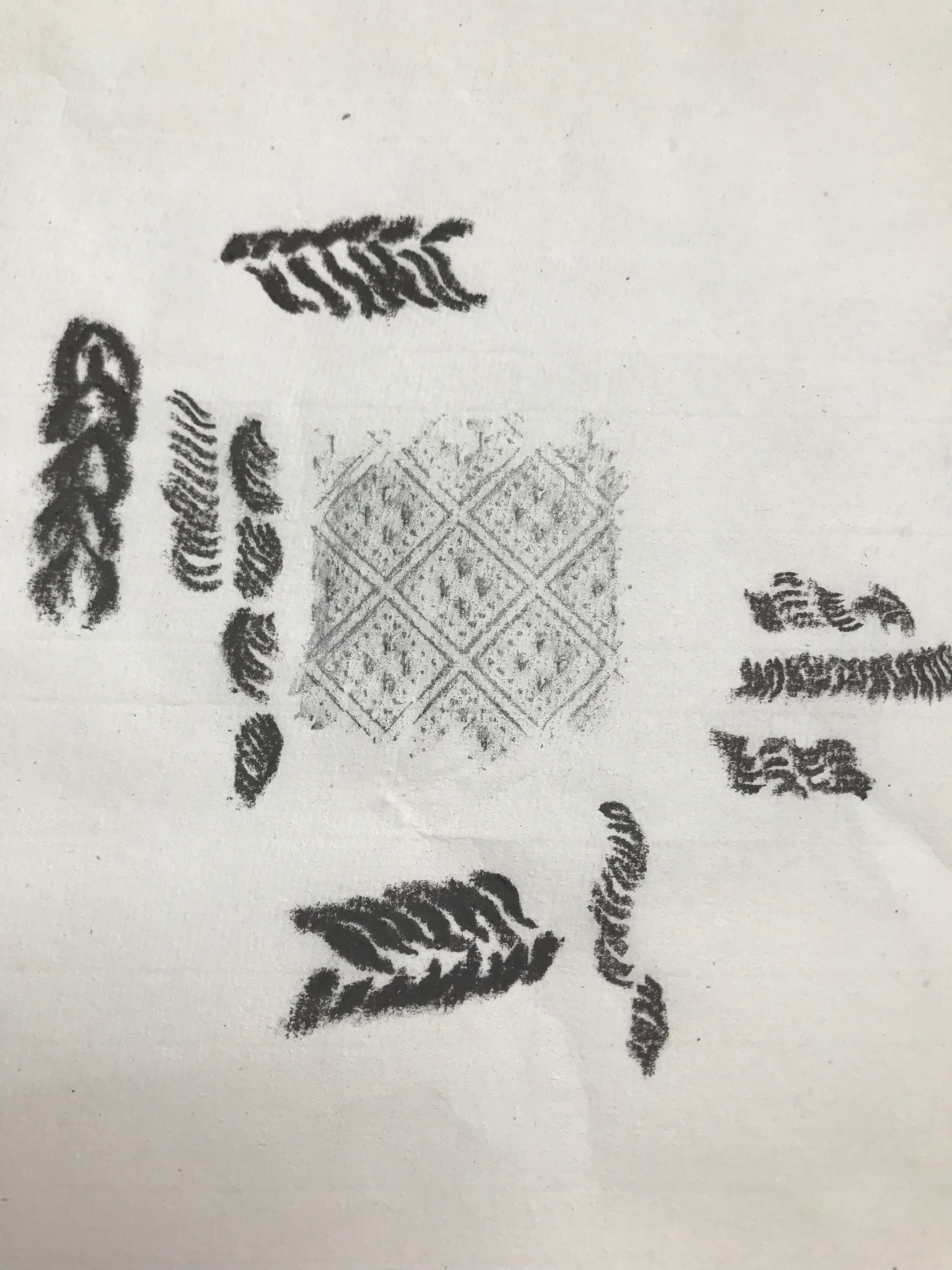
I went about this exercise backwards rather, in that I started playing about with frottage first. My initial sortie wasn’t always successful as the paper in my sketchbook was too thick and the pencil I randomly chose was too hard (HB). With a bit of trial and error I found I got much better results with a thinner paper (actually a scrap of packing paper from an Amazon parcel) and a 6B pencil – I got slightly carried away then and even ended up in the shower doing a rubbing of the hose! – see A5 sketchbook. Once I started looking around the house there were myriad different textures everywhere – even my husband started spotting them and directed my attention to the glass in our windows and doors (we live in an old early Edwardian house and have most of the original patterned glass). By this time I had remembered some uber-thin paper I bought for Chinese brush painting which is great for rubbings (with care) and adds interest from its own slightly uneven texture.
I wanted to include some of the rubbings in my other work on texture and have done so although the thinness of the Chinese paper is a bit limiting in terms of the robustness of strokes and marks which can be made.
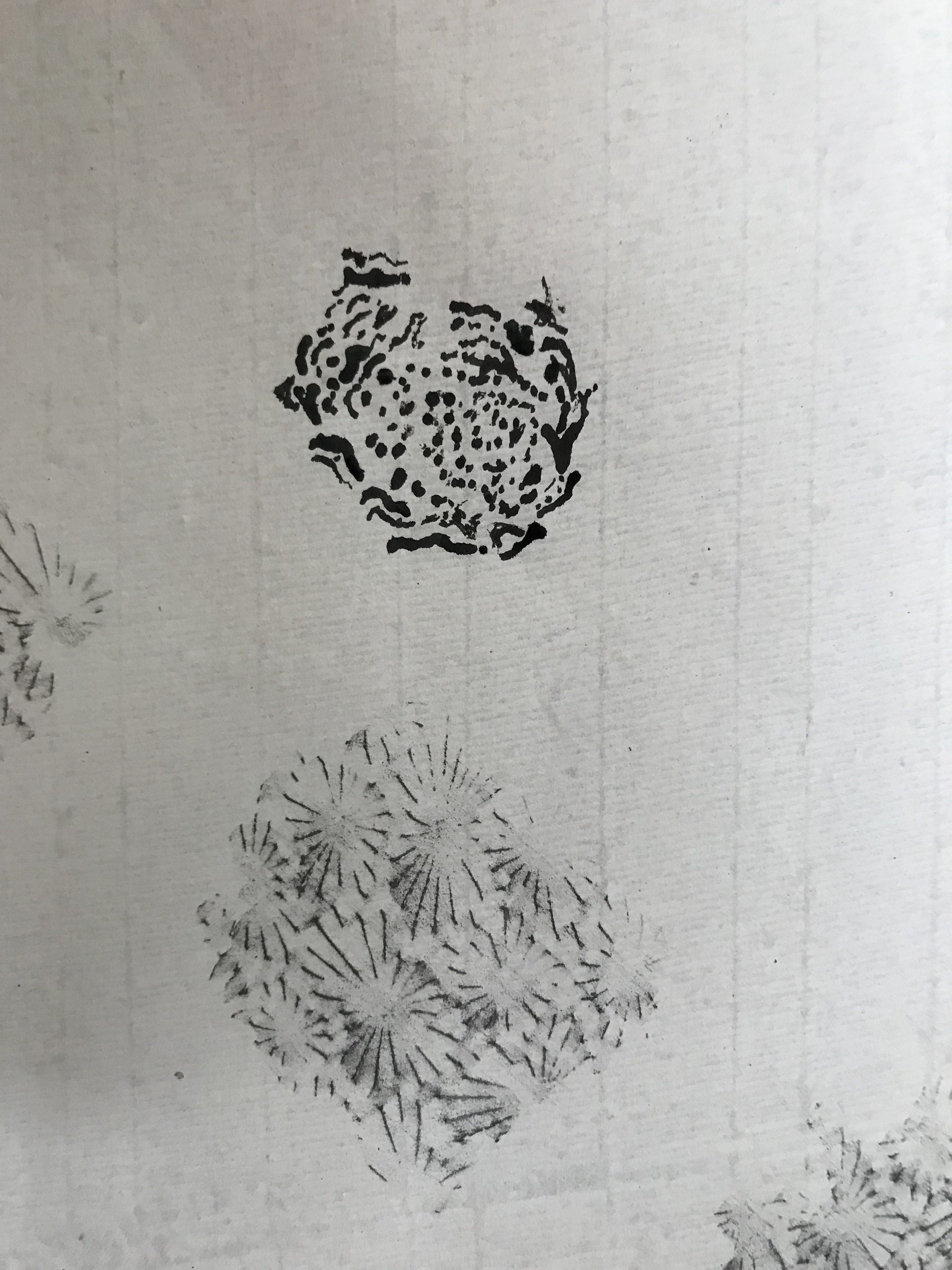
I tried to capture the texture of a piece of knitwear using a Conte crayon; the thickness of it could denote whole individual stitches, and the sharp edges were used to catch the plies of an individual stitch. The rubbing in the centre does not mirror the knitted pattern exactly, but on the other hand I felt it did represent the regular spacing characteristic of a lot of knitted fabric.

I approached the depiction of the skin of a (slightly dried-up) lemon using my favourite medium from Exercise 1 – the stick and ink. On close inspection of the lemon, the indentations formed themselves into lines and whorls and the pattern was very complex, and I had to play about with the relation between the size of individual dots and the size of “runs” of dots with this medium – not sure I have it entirely right, might need another go. I did this on a sheet of rubbings from a piece of glass – the rubbing pattern again is not exactly the same, although it does indicate to my eye a surface of hills and depressions; but I included it mainly because I felt it depicted that burst of tangy taste in your mouth when you bite on a lemon.

The bark on a log was fun to try – I used watered ink and made the patches by pressing the paintbrush head flat; the dark shadows at the edges of each patch were drawn in using a thick black marker pen, and I finally found a perfect use of the dreaded black oil pastel, which was perfect for the scumbly areas in-between the bark flakes. Again, I chose to do this on a sheet including a rubbing which gave the impression of a wavy surface, which you get from looking at the bark with half-closed eyes.


For a smooth and shiny soapstone statuette I wanted to try applying sweeps of ink with a palette knife, so reverted to a sketch book page as a more robust support. This method has the potential to represent planes of light and dark well and to enable clear edges between light and dark (although I think I need more practice in using it accurately). Great fun to do, though!


Finally, I had a go at depicting the surface of a piece of natural sponge – this proved quite a challenge, and again I opted for sketchbook paper. I wetted the paper over an area the rough shape of the sponge, dropped in some ink, and then tried to scrape into it using the end of a paintbrush. I can’t claim this was an overwhelming success; interestingly, it all dried more quickly than I expected, and the scraping soon became rather difficult. I think the overall effect looks more like a negative photograph of a sponge than the sponge itself.


It has been helpful to be pushed into experimenting with a wider range of methods of showing texture than I have tried hitherto; some of my experiments have met with some success (particularly the bark and the soapstone), whilst others have been less so. I am aware I have still only basically used ink with a few forays into pastel, crayon and pen – clearly this aspect of drawing is very much the tip of the iceberg as far as I am concerned, and is an area which I shall need to work on a lot more over the coming weeks and months.
