Painting 1 (UPM); Assignment 5; Notes on feedback

WHAT?

A helpful feedback session and a wide-ranging discussion online. Key points noted below, in no particular order except as they arose.

SO WHAT?

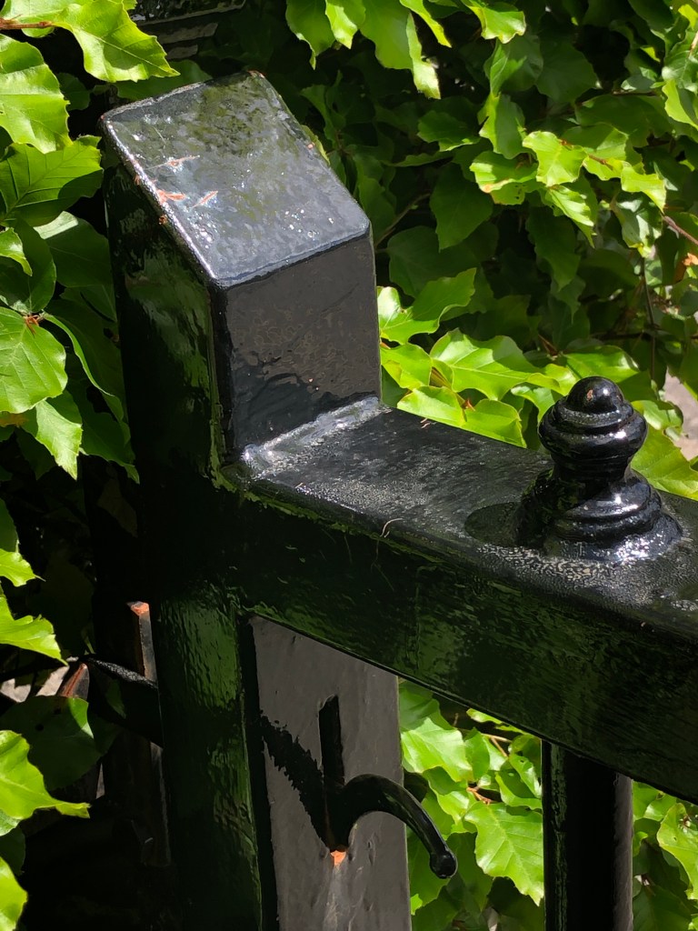
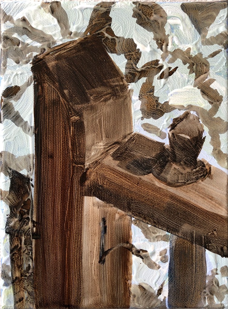
  • “Gate” painting is really exciting – gives the impression that I enjoyed painting it. However, the light green final layer is spatially confusing.
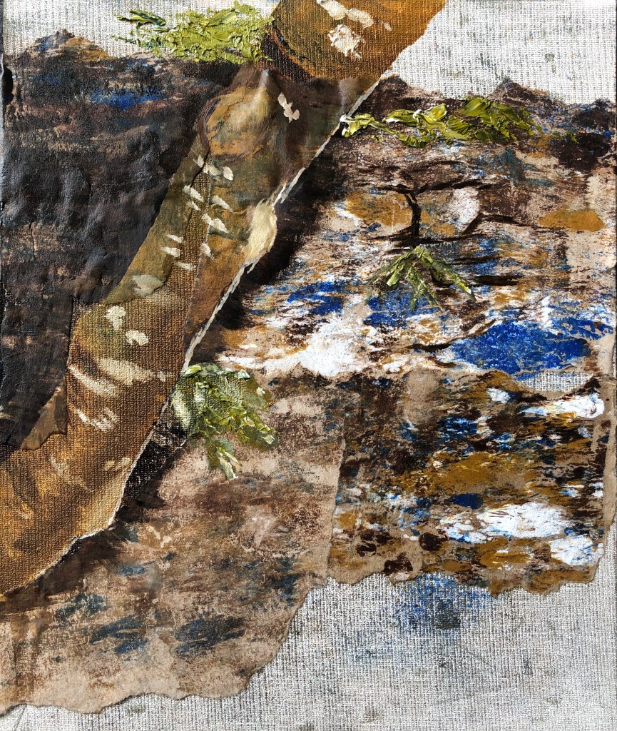
  • “Tree on the wall” painting – light in the photo was very even, so quite impressive that I managed something not a flat mess. Very experimental.
  • “Purple flowers” – add a blue to take the darks to a near black
  • Priming – a moveable feast, not everyone does it. Need to find a canvas to suit me – ranges from rough fabric right through to fine linen, and this determines how the paint flows across the canvas, e.g. linen feels very silky, bit like a non-stick frying pan, plus you can see the weave; consider investing in some test samples. Also consider the weight of a big canvas. Sizing (with rabbit or fish skin glue) doesn’t make the canvas impermeable, but will stiffen and tighten it. Some people then prime in white, e.g. with gesso or acrylic, others use colour. My tutor doesn’t prime, but uses an underpainting – consider asking other tutors how they prime their canvases? Good canvas suppliers are Atlantis and Cornelisson, also worth checking out Jackson’s; also need pairs of stretcher bars and a staple gun. Canvas is expensive though, so consider using boards and linen. Working large on canvas has a particular quality that connects with history. However, if you choose to use a lot of gesso, it’s not worth using canvas, might as well use board.
  • Trust your own instincts – let the goal guide you.
  • National Gallery technical bulletin is good for methods and materials.
  • Essay – NEEDS WORK!! Referencing (Author, date) needs to go directly after any quotations, facts, etc – it’s not enough to just put a list at the end. The list at the end is then  a referencing list – a bibliography is different and includes all the things you have read around the subject, even if you don’t actually use them in the essay. I will fail a plagiarism test without these references within the text – so BEWARE!
  • Book recommendation: “On not knowing how artists think”.
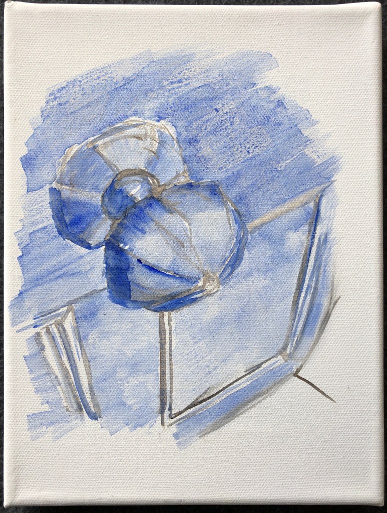
  • Paint handling – I suddenly go very thick, and this would be better if I was working much bigger. Oil paint dries from the back, so a canvas without primer will dry quicker (so goodness knows how long mine will take!). A brush mark has a beginning, a middle and an end, and painting as thickly as I have means I am not leaving the stroke with any elegance. If I want to do this, consider using a clean brush to carve in. Could also put a blob of paint down and then draw it out with a clean brush. Blue paper rolls are good for cleaning, and mix with a palette knife. Have more paint on your brush than you need so your brush doesn’t leave a mark.
  • In Exercise 2, the ink paintings were lovely and tonally varied, but the watercolours lost the drama and precision of the darker colours. I did have a go at taking one of the ink paintings and rendering it in a different combination of watercolours (burnt umber, ultramarine, light red and cadmium yellow) to try and get those darks:

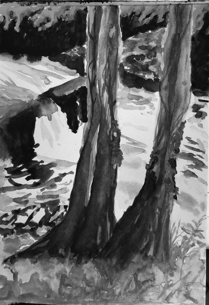
(watercolour; watercolour saved as monochrome; original ink painting).

I think I have got my darks darker, but in focusing on that I have inadvertently lost some of my lights. Having painted in oils for a while, I found myself treating the watercolour paints in the same manner and have lost some of their translucency as a result – hence the rather “solid” finish. So much to think about!

  • Curation – this was fine, a nice idea, says something about me. Thinking about unusual curation is definitely something to take forward.

NOW WHAT?

I feel as though I’ve learned loads about painting, especially using water mixable oils, but still am at the very beginning of my learning journey. It’s easy to get overwhelmed, but my way forward is to

  • do my research 
  • pick people’s brains 
  • don’t drown
  • choose a thing and work through it so at the end I can say “I know about…x…and I have ways to use it” and then move on to the next thing.

Review of Part 5 against assessment criteria

Demonstration of visual skills: Materials, techniques, observational skills, visual awareness, design and compositional skills.

Having taken advice from other more experienced students (thank you, Anna and Fiona) I got myself organised with a specially dedicated sketchbook – which had been my boon companion during Drawing 1 but had slightly fallen by the wayside during UPM – and made sure I did more sketching, from blind continuous line right through to careful developed observational drawings. 

I had been keen throughout UPM to really get to grips with water mixable oils and took this as my chance. Much research and experimenting, some disastrous and some more successful, has gone on; I have learned loads, but know I have barely scratched the surface, and completely understand that the way to learn is to do, consider, and do again. I have also experimented with perspective, which was not a huge strength from Drawing 1, but which I am learning to love as a compositional tool.

Quality of outcome: Content, application of knowledge, presentation of work in a coherent manner, discernment, conceptualisation of thoughts, communication of ideas.

In my assignment work in particular, but also inspired by some of the exercises (especially the one where I painted rubbish), I have found myself looking more and better at unregarded, secretive corners of the garden, and parts that one passes every day (the gate, the doorknob, the number plate) without really “seeing” them. These have been the subject of my assignment paintings.

I also chose to curate them in a manner in which they are, so to speak, hiding in plain sight, surrounded by miscellaneous unrelated paraphernalia. I think the lush quality of the oil paint has been helpful in making them stand out as different, whilst not being showy and dominant.

Demonstration of creativity: Imagination, experimentation, invention, development of a personal voice.

I got my sketchbook going (see above) and it was a relief to have it to “retire” to. Having said that, I haven’t used it as much as I would have wished, as my new caring responsibilities have taken much of my time and it has been harder to follow things through consistently – I have had to grab my art in snatches rather than wallowing in time for it to wander at will. 

My learning log has been a boon here – I have been made to use my time efficiently and effectively and have kept my log bang up to date as I was doing the work, which has meant that I have been more incisive and analytical and it has been of more practical use – “What works? What doesn’t? Log it, learn from it, put it into practice next time.”  This has been especially helpful to me in exploring a new medium and different ways of working with it, meaning that I keep using things that go well, and things that go less well can straight away be tried again using a different approach.

Context: Reflection, research, critical thinking (learning logs and essay).

I have been inspired by various artists in my way of looking, especially Tanya Wood with her close attention to the everyday, and Maria Sibylla Merian reminding me of the importance of using an eye for detail.

Walter Sickert has been invaluable in helping me tackle the focus on colour mixing agreed with my tutor (less is more). Mary Anne Aytoun-Ellis’s exploratory and inventive practice and working methods have encouraged me to dip my toe in the water of gesso possibilities. And Royal Talens are to be commended for their helpful, basic YouTube videos on the nature and use of water mixable paint.

So I have learned a lot from others. I have also taught myself something (it’s been said to me in various ways enough times, but you don’t always take things on board till it happens to you) – research, analysis and planning are all good, but it’s also good to see where your unconscious choices are leading you, and think what this tells you about yourself.

Painting 1 (UPM); Assignment 5 – final selection and curation

WHAT?

I made the decision to work in water mixable oil paints for this Part and to learn about their properties and nature, and wanted my assignment work to reflect this.

I re-read Woolf, V. (1925) Mrs Dalloway right at the start of this Part, and was struck by this passage: “The hall of the house was cool as a vault. Mrs. Dalloway raised her hand to her eyes, and, as the maid shut the door to, and she heard the swish of Lucy’s skirts, she felt like a nun who has left the world and feels fold round her the familiar veils and the response to old devotions. The cook whistled in the kitchen. She heard the click of the typewriter. It was her life, and, bending her head over the hall table, she bowed beneath the influence, felt blessed and purified…”.

 I began by intending to show my house in this spirit. However I found that, each time I chose an image to paint it was of the garden or the exterior of the house – and I believe that’s because I’m not actually loving my house much just at the moment – it’s all upside down, furniture out of place, full of builders, gasmen, carers, physiotherapists, plumbers, hospital beds, wheelchairs and commodes….so my art has shown me that, in fact, I feel the exact opposite to Mrs Dalloway about my own environment.

SO WHAT?

So, the images are all of the garden and exterior. I have experimented with various techniques using the water-mixable oils (see other blog posts in this assignment section) and have selected all except for the first, the eucalyptus, which I felt turned out to be unattractive to look at and tonally uninteresting.

Having selected my paintings, I turned to James Putnam’s Art and Artifact: The Museum as Medium (2nd edition, 2009, London: Thames & Hudson). I was drawn to the Wunderkammer idea (pages 10-12) and in particular the curation of the following (in this order):

  • Louise Lawler (Pollock and Tureen, 1984) – page 98
  • Joao Penalva (The Ormsson Collection, 1997) – page 89
  • Nikolaus Lang (To the Gotte Brothers and Sisters, 1973/4) – page 83
  • Mark Dion Cabinet of Curiosities for the Wexner Center for the Arts, 1997) – page 74

I decided to curate my paintings on bookshelves, much in the style of Mark Dion, surrounded by other objects which bore no particular relation to them. 

I played about with the arrangement, going for a fairly cluttered effect so that the viewer almost “happened” upon the paintings in the course of exploring the whole image. I have left the piles of books still tied up in string as an indication of the continuing disorder in the house – I’ve deliberately gone for a higgledy-piggledy effect to reflect the state of the house (not to mention my mental state in trying to deal with it all).

NOW WHAT?

  • I learned a lot about using water-mixable oils through this Part:
    • How to get to grips with the possibilities and limitations of the particular colours I have by making colour cards
    • How to build up very dilute layers (learned as a possibility from my tutor)
    • Impasto is not as easy as it looks
    • Filberts are my current favourite brushes
    • Oil does not get on well with PVA glue (even though water-mixable)
  • I have experimented with the use of gesso as part of a painting (which I learned from Mary Anne Aytoun-Ellis) and would like to develop this further.
  • I have tried hard to improve my colour choices, working with limited palettes and with somewhat muted colours with pops of bright pure colour (as learned from, amongst others, Sickert) and more subtle use of complementaries.
  • I enjoyed considering the curation of my work, researching all the possibilities and making my mini-Wunderkammer, which greatly suited my “collecting” nature. I have not particularly thought before about making paintings that go together (except when making series) and it has been beneficial to be asked to consider that.

Finally, I have learned about self-analysis via painting; what the organising brain wants to do is not always the way the creative heart decides to go. Not quite sure why I was surprised by this, but I was.

Painting 1 (UPM); Assignment 5 – preparation (7)

WHAT?

I wanted to experiment further with a way of pulling together my “gesso first painting layer” method with my “building up dilute layers” method. I also wanted to make a companion piece to the “door knob” painting – it felt as though it should be part of a pair. I chose a composition of muted colours so I could look at Sickert’s method of putting in a pop of pure colour to bring an image to life. 

SO WHAT?

An initial drawing was key here, both to sort out the perspective, and also to analyse the tones of the number plate. I drew with an HB pencil on a sheet of A4 printing paper, which was all I had to hand at the time.

I chose a matching canvas size to the “doorknob” painting, and also decided that I would replicate the technique of not taking the coloured part of the painting to the edges. This time, though, I did cover the edges with a thin layer of plain gesso, before mixing in a dash of burnt umber and roughing out the bare bones of the image in a thicker layer of gesso.

Once that was dry, I worked with a small filbert on the number plate in layers of dilute oil paint using a mixture of burnt umber and ultramarine. Towards the end I added a touch of titanium white to get my greys.

After leaving that to dry a little overnight, I indicated the colours of the stones. I had decided to add Indian yellow to my palette as the best yellow to create the gold on the plate, and I added this now to the umber/ultramarine mix to get the greenish stone, and to burnt umber on its own to  get the browner stone. I worked into the stones with finger tips to get that splodgy effect, and also the edge of a palette knife to scratch out the streaks. I ran some dilute yellow around the number plate in places to get that faded grey/gold colour, before finally adding my pops of pure Indian yellow with a rigger to bring it all to life.

NOW WHAT?

  • I think the use of my gesso method is still valid in this type of image; it is not as obvious as it was in the “gate” painting, but it still shows up here, especially in the numbers, and was useful in helping to “catch hold” of the final application of pure colour.
  • I feel I have progressed in my use of complementary colours here, using them more subtly (a bluey grey with an orangy-yellow), with just a dash of pure colour at the end.
  • I also feel that I have progressed over this Part in my consideration of the colours I choose for my palette, rather than just grabbing the first one. Making colour cards (as suggested by Anna, another student) has really helped and I am going to keep all the ones I have made as a reference for the future – they are ensuring that I begin to understand the possibilities (and limitations) of the particular paints I possess.

Painting 1 (UPM); Assignment 5 – preparation (6)

WHAT?

I wanted to try another painting on a white background, building up very dilute layers of oil as if it were watercolour – as I had tried with some tulips from my garden in one of the Exercises. Having enjoyed painting my front gate most recently, I thought I’d have a go at my front doorknob:

SO WHAT?

The perspective, as well as the construction of the doorknob, were going to cause me some issues here; I began with a blind continuous line drawing as is my practice, and this was a real mess, so I made a detailed pencil drawing to nail perspective, construction and tone.

I decided to work from my pencil drawing without further reference to my photo or the doorknob itself. I laid myself out a simple palette of ultramarine blue, burnt umber and titanium white (although in the end I didn’t use the latter at all). 

Working on an 18 x 24cm canvas again, I made the decision to divert from my drawing slightly by leaving the edges of the painting undefined. I mixed a very watery dilution of burnt umber and lightly marked in some structural lines and edges to guide me with a large flat brush, and put in some blue washes to define some key tones, then left it overnight to dry.

The next time I swapped to my large filbert and began to add more dilute oil washes to build up the image. I reached a point where I felt I was losing the definition of the structure of the knob, and here I stood back and took stock. The painting still retained its watercolour-y feel, and my burnt umber underpainting still showed through. I had hit a problem which doesn’t often happen to me – to decide whether to stop here or go on; usually it’s either obvious to me that more is needed, or I feel the picture is enough (or I’ve lost the will to live with it) and so I stop. Here though, a clear decision was needed:

to leave the painting as it is, like a watercolour, or

  • to let it dry for a few hours and work on it more so it became more clearly an oil painting.

I chose the former, partly because I liked the watercolour effect, and also because I was afraid I would start to blur the structure further unless I abandoned my big filbert.

NOW WHAT?

  • Despite loving the free-gesso-sploshing style I enjoyed in my last painting of the garden gate, I feel there is also space in my practice for this sort of carefully constructed work which is built up over time using dilute layers.
  • I am beginning to really appreciate the possibilities for mark-making of a filbert.
  • A tonal drawing remains so valuable, especially in this type of image, which is to all intents and purposes monochrome.

Painting 1 (UPM); Assignment 5 – preparation (5)

WHAT?

As part of my research into the work of Mary-Anne Aytoun Ellis (see earlier blog posts, e.g. Assignment 4), I had been interested in her use of gesso as an integral part of the work, not just as a base layer. I wanted to work on this, and found a leafy, textured corner of the garden by my front gate which I thought could be dramatic with its light/dark contrasts.

SO WHAT?

Never having really studied my garden gate in any detail before, and wanting this painting to feel quite free, I made sure to get in some sketches first, both continuous line and tonal:

I began by using the technique I had developed in one of the Exercises; mixing a small amount of oil paint into the gesso before applying it to the canvas, and then putting it on thickly with gestural marks to mirror the positions and textures of the eventual image.

I used my “greens” chart (see blog post “preparation (4)”) to select my mix ofyellow and blue, choosing ultramarine blue and lemon yellow, and I added burnt umber and titanium white to my palette. I was painting a small cormer of the garden, and chose a small canvas to indicate this – 18 x 24cm.

Once this was dry, I began applying paint using a large flat brush, trying not to fiddle with details but just indicate roughly where things would go. I put the darks in first (ultramarine/burnt umber mix) in a watery mix, and left these overnight so the painting was dry to the touch.

Next, this time using a large filbert, I firmed up the detail of the gate using a couple of layers (where needed) of dilute paint, and loosely added the darker area of foliage.

Again, I left this to dry a bit overnight before adding the final layer of a pretty thick partial mix of the existing green with some more lemon yellow. I did add a few dabs of titanium white on the leaves in a couple of places, but found they killed the painting, so blended them in.

NOW WHAT?

  • I have always struggled to paint a mass of leaves, and I think that this gesso technique is one way of achieving the effect; in particular, in this painting, I wanted the gate to be the focus and the foliage just to be indicated, and I think this has worked.
  • I really enjoyed the bold strokes with the larger brushes – I am a bit of a fiddler – so I am going to try and use the bigger brushes more.
  • Even though this is basically a browny-greeny image, I think that this time (as was not the case with the eucalyptus painting I tried in “…preparation (1)”), I have managed enough tonal contrast to make it lively and interesting.

Painting 1(UPM); Assignment 5 – preparation (4)

WHAT?

Because my greens are causing me a bit of an issue, I took a bit of time out to try and understand my water-mixable oils a little better.

SO WHAT?

I made a sample chart of my three blues (ultramarine, cobalt and phthalo turquoise) across the top and my three yellows (raw sienna, Indian yellow and lemon yellow) down the side, so I could look at the effect of mixing each in turn. I also added a bit of titanium white so I could judge its effect on each mixture, as well as each “neat” paint. I applied the paints undiluted.

NOW WHAT?

I am going to stick this up on my easel to help inform my palette choices in future, depending on the sort of green I’ll want.

Painting 1 (UPM); Assignment 5 – preparation (3)

WHAT?

We have a walled garden with several trees growing along one side; we let this area grow fairly wild, and I love looking at the old stone wall under the trees. Here is a photo of one small section:

I liked the lichened trunk against the lichened wall, and decided to try to paint this using some of the techniques I tried in the online workshop I attended through OCA with Clare Wilson (see separate blog post in April 2021), although this time only using Cobra water-mixable oils.

SO WHAT?

I chose a primed board first of all (24 x 30 cm). I wanted to use collage, and prepared some slightly creased packing paper from an Amazon parcel as the paper I would tear up. I put a couple of blobs of each colour of my chosen palette – raw sienna, burnt umber, cobalt blue and titanium white – onto a glass plate, rolled over them back and forth with a roller, and then printed onto the packing paper a few times, rubbing into the back with my fingers to add texture:

I then covered the white of the board by wiping off the remains of the paint on the roller:

First rookie error here – I tore up my sheets of collage paper into the shapes needed to indicate the stones of the wall, and then tried to stick them on with PVA glue. Somehow I thought, because the glue was water-mixable and the paint was water-mixable, that this would not be an issue. However, the packing paper, being unprimed, soaked up the oil and was very reluctant to adhere to the board. I left it overnight, but had to apply more glue the next day to achieve some sort of bond:

I thought I should leave it over another night in the hope it would set into some sort of workable surface, and used the time to do some sketchbook drawings – a blind continuous line drawing and some detailed studies:

I wanted to go for a suggestion of tree and wall rather than a photo-realistic image. I began with the tree, blocking it in using a wide flat in dilute raw sienna, before working in some burnt umber and cobalt, finally adding a little white mixed with a touch of raw umber for the highlights at the edge of the trunk and the lichen. I darkened the shadow on the wall behind the tree with some umber/blue strokes applied with the edge then dragged with the flat of the brush, and added a couple of shadows under stones of the wall in one patch in the same mix, just as an indication.

I came a bit unstuck with my indications of leaves. Due to time constraints I had made another rookie error – skipping the making of a colour card. As a result my green which I could mix with the sienna and the cobalt was a tad sludgy, and not improved with the addition of white (even sludgier). I decided to add another yellow to my palette – I thought my lemon yellow would be a bit garishly bright, so went for the Indian yellow; I mixed this with a little blue and white very loosely and just applied some streaks with the edge of a palette knife. I think this just lifted the painting a little, it would have tended to the unremittingly gloomy otherwise:

NOW WHAT?

  • This is clearly not an archival painting – the thin packing paper will succumb to the oil paint and start to disintegrate.
  • Despite this, I am glad I did the experiment – the printed collage made for an effective textured background to contrast with the painted-on tree trunk.
  • I am also glad I made the decision to add another yellow to my palette at the last minute, and to choose to apply this impasto with the knife to add yet another texture.
  • I do feel I have captured something of the secretive nature of this little corner of the garden, without letting it become too gloomy.

To repeat this technique, I would consider finding another thin paper (maybe a robust tissue paper? – I’d want something which would tear to give satisfyingly ragged edges) and coat it with a dilute layer of gesso before printing onto it, in the hope that this would stop the oil absorption and allow for better adhesion with the PVA.

Painting 1 (UPM); Assignment 5 preparation (2)

WHAT?

I wanted to try painting a flower in oils against a dark background. Our purple clematis was out against a shady trellis, so seemed perfect for this task. I decided to revert to my method of building up layers of dilute oil paint, rather than going with one big impasto bang.

SO WHAT?

Working with water-mixable paint (all Cobra except for the ultramarine) I chose titanium white, ultramarine and madder lake for the lilac-y purple, Indian yellow for the yellow streaks on the flowers as well as for the green leaves/stems, and burnt umber to secure my dark background. I made a colour card to test out some of the combinations:

Working on a 30 x 24cm primed board, I worked directionally and quickly with a very dilute semi-mix of the ultramarine and burnt umber, to denote the trellis as one looked up at it from below. It was so dilute that it soon began running down the board…….

…..but I mopped up the worst by scrubbing directionally into it with a rag:

I liked the mix of dark and light to mirror the lights and shadows of the trellis, so I put this aside for a couple of days till it was touch-dry.

Then I mixed my purple and, with a large filbert, began to apply thin dilute layers. I was concerned that the brush would pick up the dark paint from the base layer, but it didn’t. I continued gradually adding layers, sticking for now to my large filbert:

By this point I was finding the large filbert too clunky, so changed to my small filbert for the final layers:

I hadn’t quite decided what to do about stalks and leaves throughout the painting (and the ultramarine/Indian yellow mix was really luxuriant); however, I decided that less is more and to stop here – I often find I over-complicate an image at the final stages.

NOW WHAT?

  • The rough “trellis” background pleased me, it somehow felt “woody”; it has made the overall image fairly dark, but then it was a dark corner in real life.
  • I worked up several layers, mostly remembering to go from lean to fat, occasionally forgetting. Previous layers don’t always show through as much as I’d hoped, but that’s mainly because I needed the (opaque) white to achieve my lilac-y purple.
  • I watched on a video on YouTube (not noted down, poor practice), which said that with oils, especially the alla prima method, you were adding paint all the time which had already been mixed on the palette, rather than mixing on the canvas (because the underneath layers were still wet, leading to sludge), and I did find this to be largely true; however, I did experiment with putting a dab of colour on and then blending it into what was already there with the flat of a dry brush to get smooth gradations, and I think this was a valid technique.
  • I have gone from my stark purple/yellow contrasts in Assignment 4 to the converse – tiny tiny pops of yellow against the purple – I wonder if they are too small to be effective?

Overall, I was pleased with the way my starting palette choices performed for this painting, they enabled me to create a range of tones; possibly the umber/ultramarine combination was a little overbearing as mentioned above, but this was the first time I have used a rag seriously to create an effect (as opposed to removing small mistakes and picking up drips), so I am still content with it.

Painting 1 (UPM); Assignment 5 preparation (1)

WHAT?

I am trying a range of different techniques for this assignment, based on the work I have done so far. Here I wanted to look again at a slightly unfocused background painted in thinned oil paint, with a close up focus on the immediate foreground in thicker paint straight from the tube.

NOW WHAT?

My subject was a eucalyptus plant growing in a large terracotta pot on our patio. I am fascinated by the leaf arrangements of eucalyptus, and wanted this to be my focus.

My palette was titanium white, madder lake, ultramarine, lemon yellow and burnt umber.

I chose to work on a 30×30 primed board. I began with my method, from Ex 4, of putting down a ground of gesso mixed with a dash of oil paint; I began with a dash of lemon yellow, and added in a trace of burnt umber at the end.

Next, with thinned paint, I roughly indicated the corner of the patio table and some other patio plants, added some shadows with very thin madder/ ultramarine mix and a fan brush, and then brushed very lightly over the whole with a large dry flat.

Next I came to the eucalyptus, which I wanted to apply in thick paint using a palette knife. I roughed in the stems in a mix of lemon yellow/white, and then mixed my base leaf colour – I started with lemon yellow and ultramarine, knocked the brightness down with a tiny bit of its complementary colour, the madder, and then toned it down further with some of the white to give that slightly greyish-green. I applied this quite quickly with the knife; my intention being to get the paint on the board and then work into it. 

To be honest, I began to flounder here, torn between keeping the thick paint gestural, and yet feeling that the close foreground needed to be detailed (to contrast with the fuzzy soft-focus background), which I found tricky with the thick paint and the knife. I had painted the two more distant stems with a brush and less paint, so I repeated the trick of light stroking with the end of the large dry flat – frankly this went less well, I dragged too much paint, so I stopped. I tried to add fine details using my long-handled rigger, but my motor control was just not good enough, so I gave that up and swapped to a short sable. This got swamped by the paint so I reverted to the rigger, but held close up and my hand resting on a mahl stick. The outcome, I fear, was neither one thing nor the other – but I learned a lot.

NOW WHAT?

I think I rather expected to be able to immediately be able to create a convincing impasto – a bit like a cross between Frank Auerbach and Bob Ross. Turns out it’s not as easy as it looks…..clearly the hundreds of hours of practice is mandatory.

Also, the soft-focus background was too sparse, and rather unclear around the table leg. Would almost have been better to have no background at all and aim for a more botanical-style painting. As it is I have ended up with an uninteresting background and an unclear foreground, and it didn’t feel worth trying to rescue. Onwards and upwards.