WHAT?
This was a one-hour webinar, a continuation of last week’s session on composition. Alice said that, if you thought about trump cards in a card game, they outshine everything else in the game, and that artists have techniques which they use in a similar way to make you look at what they actually want you to see.
SO WHAT?
Lighting: as an example she discussed Rembrandt’s “The Night Watch”, 1642, Rijksmuseum (which I am lucky enough to have seen, amazing). Apparently Rembrandt was commissioned to paint this group of people so he set them as a scene like this; the most important chap is front central, and your eye goes to him first because it looks for the point of highest contrast, which is his white ruff against the black clothing, and the eye is then led around the painting in order of decreasing contrast.
Line: here we looked at Tintoretto’s “The Miracle of the Slave”, 1548, and traced our way around the painting in a rough figure of eight, starting with St. Mark coming straight down in the centre and a line leading more or less directly down to the other key figure in this busy painting, the slave lying on the ground.
As a combination of lighting and line we looked at Caravaggio’s “The Calling of St. Matthew”, 1599-1600 which, as you would expect, has some dramatic shafts of light against a chiaroscuro background causing some strong contrasts which help the eye move around. Also it is not immediately apparent which character is St. Matthew – until Alice pointed out a set of hands, virtually in a line, all pointing to the end figure!
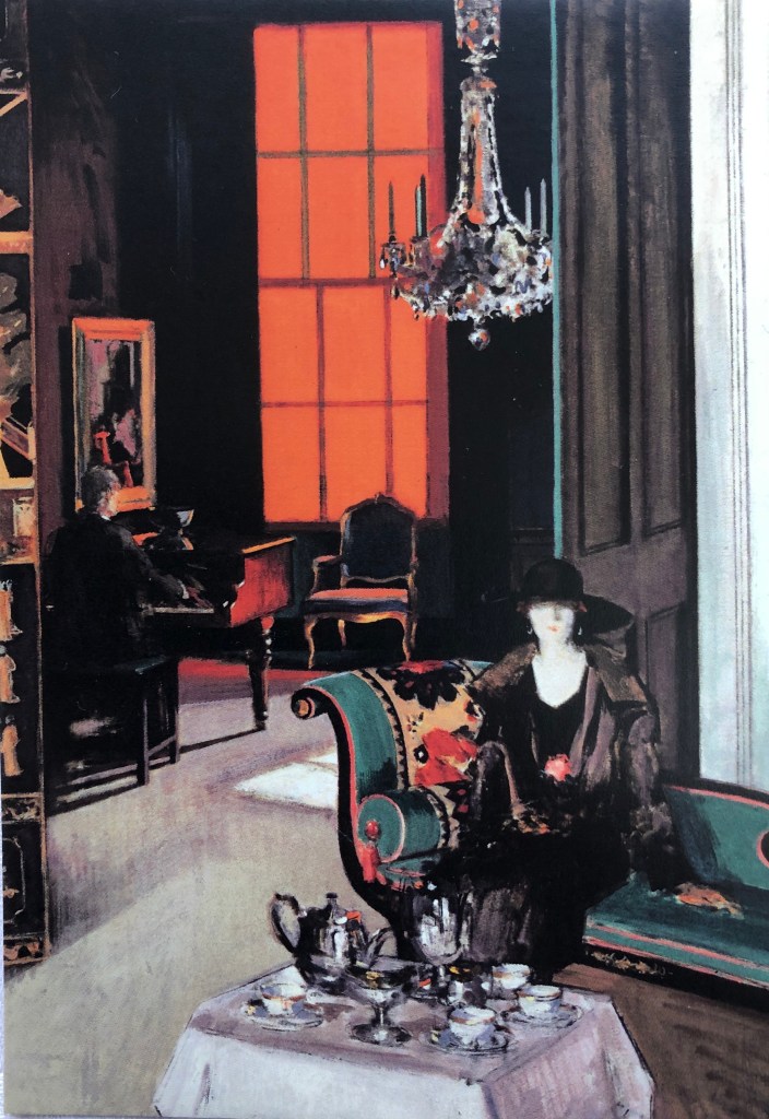
Hats and eyes: here we looked at a couple of paintings by Renoir, “Luncheon of the Boating Party”, 1882 and “Dance at Moulin de la Galette”, 1876. The “entry” point into both of these appears to be a character, or pair of characters, who are mid-ground and slightly in their own space, looking out towards the foreground, almost out of the painting. The way round the painting is then to follow their eyes, see whom they are looking at, where they are looking, and so on. One is also led to follow sets of matching hats around the picture; in the first of the above they all seem to be a matching bright yellowy/orange with blue ribbons which stand out and are really distinctive. In the second there is also the use of pairs following the colour pink (as discussed in the previous session).
The Golden Section: I hadn’t got to grips with this before and it might take a bit of practice!! To find the spot, fold one corner of a rectangle up to the edge and draw a line down to show the square; then fold the opposite top coroner down to the line to make another square – this leaves a rectangle. The two squares are static and the rectangle dynamic (see last session) and the point where they meet is the golden section, and this is where you want to place your key thing which leads the viewer in. Alice discussed this looking at David Hockney’s “Mr and Mrs Clark and Percy”, 1970-1, and Matisse’s “The Conversation”, 1908-12. Also, most of Ben Nicholson’s works use the golden section.
High Contrast: as well as being drawn to the point of highest contrast between light and dark, the eye will be attracted to contrasts in colour, which she illustrated by comparing and contrasting Ben Nicholson’s 1924 picture “First Abstract Painting, Chelsea”, c 1923-4, with Matisse’s “The Snail”, 1953.
NOW WHAT?
A lot to take in – was pleased I had remembered some of the points from last week (e.g. pairs) and could “see” them as Alice talked about them.
My takeaways from this session are going to be:
- Think about that “high contrast of light and dark” point when I am building a composition of interiors in Part 4
- Look at some paintings and try to spot the golden section.