I hunted around my studio to find some objects/materials with which to apply paint. I worked in water-mixable oils on oil-prepared paper, using mainly lemon yellow and cobalt blue (a combination which I thought would be helpful to me in distinguishing layering from blending), with just the end of some burnt umber which was already on my palette.
SO WHAT?
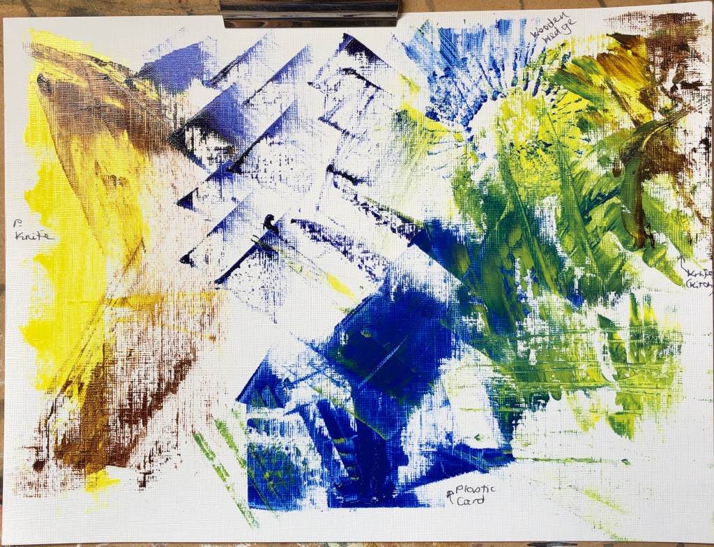
On this first sheet I experimented with a painting knife, a credit card, a wooden wedge and an ordinary rounded kitchen knife. I had previously thought of knives as a way of applying paint quite thickly, and was surprised by just how thin a paint layer can actually be achieved. I looked at layering and blending – I did find the painting knife the best for laying flat layers on top of each other, although I had fun making marks with the wooden wedge.
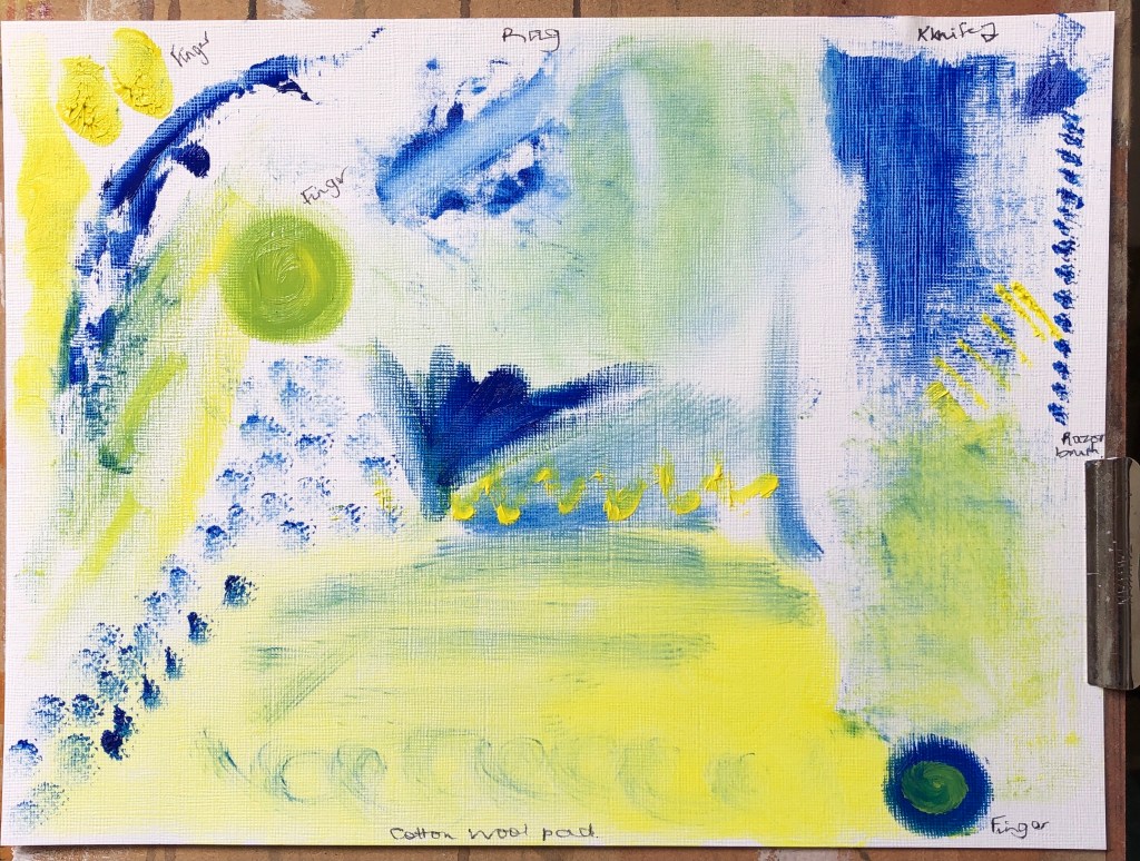
Next I used a combination of a rag, my fingers, a cotton wool pad and an old shaver cleaning brush. The latter was useful for mark-making on top of an existing paint layer, but the other three were more effective at blending. The rag and pad really allowed for some thin initial layers of paint, but adding further layers on top was tricky without blending occurring. It was hard to get accurate edges – the best for this was a finger, although you’ve got to be careful how much paint you use; too much and it stands up from the paper when you take your finger away – great if you want texture, but not otherwise.
NOW WHAT?
The most useful learning I did here was finding out about applying really thin layers – up to now, if I wanted a thin layer, I’ve been using dilute paint, whereas now I see that a rag with undiluted paint will do as well for a first layer, and dragged knives are good for subsequent layers with minimal blending.
I have decided to work with oil paints, partly because I need to learn more about them, and partly because I sometimes have to break off work suddenly in my role as full-time carer, and oils stay wet whereas acrylics dry up on me.
To begin with I have two sets of brushes and paints, one upstairs in the attic and one downstairs. I appreciate I shall need to mix them at some point.
SO WHAT?
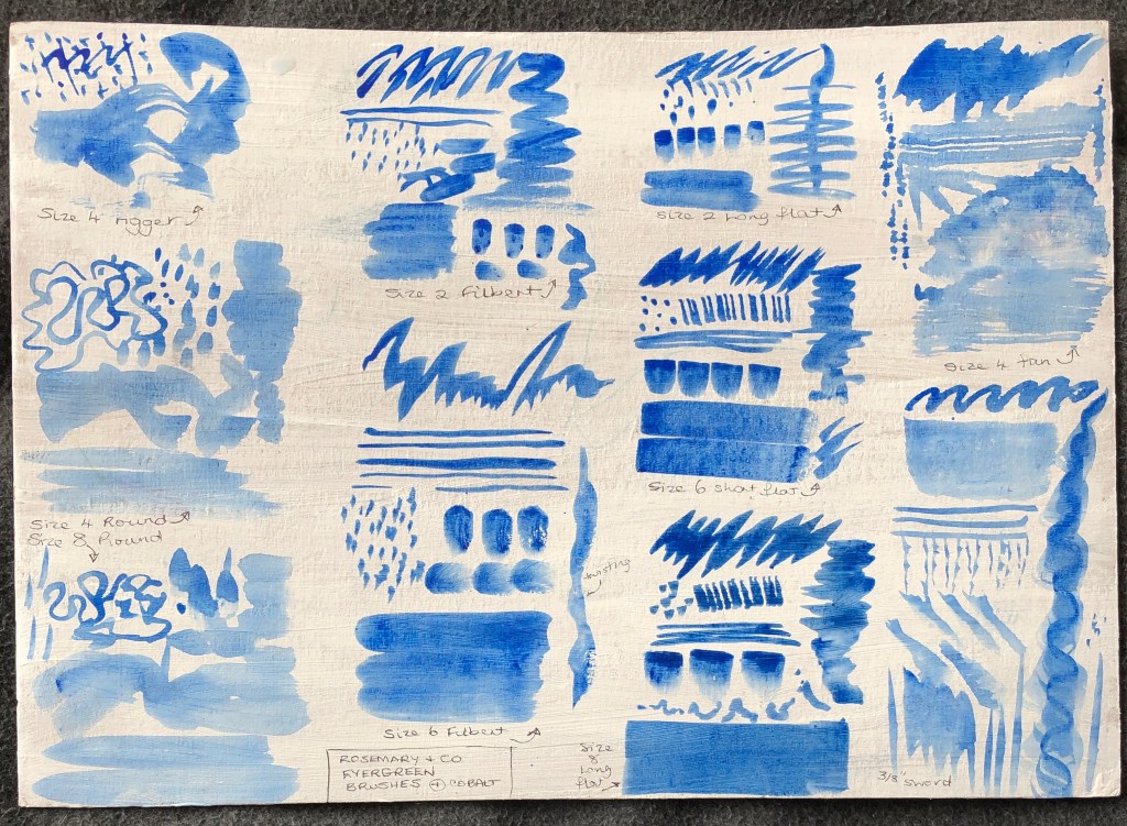
I made a range of marks with my upstairs paints, which are Cobra water-mixable oils, and my brushes, which are a set of alla prima brushes from Rosemary & Co, quite soft bristles. I worked on a bit of cardboard which had previously been coated back and front with gesso. My paint was diluted (with water) and I found that it ran overmuch on this surface and made some marks indistinct, so I did a few more with undiluted paint on oil-prepared paper:
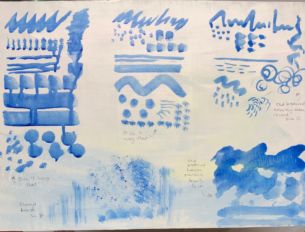
I also tried my downstairs set, mainly bristle flats, rounds and filberts, using Jackson’s oil colours, just slightly diluted with Zest-It, on oil-prepared paper:
I found that:
Most brushes were capable of a range of marks
The flats give a slightly crisper, cleaner edge
The sword and the fan allow for special effects
The numbers on the brushes seem peculiar to the range – for example, a size 10 in one range is much bigger than a size 12 in another
Possibly one gets what one pays for – for example, my more expensive hog flat gave a crisper, better defined mark, and was much easier to clean at the end, than my cheap brush.
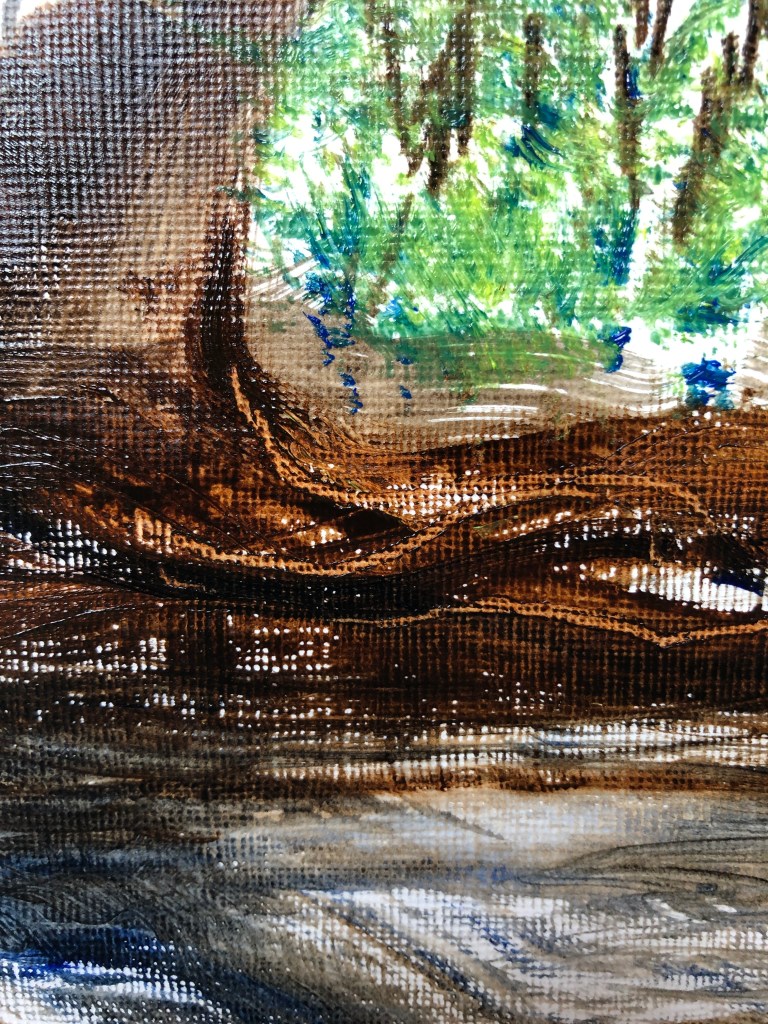
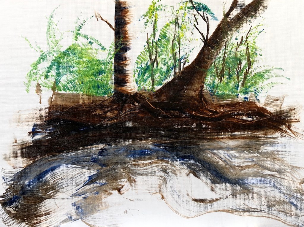
Next I painted a landscape from memory, a much loved (and much-drawn) section of riverbank on the River Tavy just down the road from our house.
I used my Cobra water-mixable oils (burnt umber and ultramarine for the darks, cobalt blue and lemon yellow for the greens) and three brushes:
A size 8 flat for the trees and bank
A sword for the tree roots in the bank (also drawn into with the solid end of the brush for highlights), and parts of the water
A fan for the foliage and parts of the water.
I worked onto prepared oil paper, size A4. In my memory, the sunlight shone from behind and to the right of the trees:
I really enjoyed the precision of the flat and the dragging marks possible with it. I was a bit “jabby” with the fan but I can see that, with practice, it has potential to be useful for layers of foliage, and also for colour mixing on the surface (I picked up bits of separate yellow and blue). The sword also has promise for those narrow-wide-narrow flowing marks, a bit like italic script, but I need to work more at learning how to handle it for less random effects.
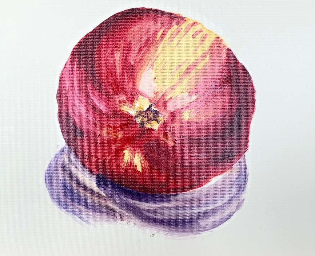
Finally, I set up an apple on a white sheet of paper to explore using my large size 8 Winsor & Newton hog filbert. The lamp was directly overhead but I was sitting in a conservatory and, even though it was a very overcast and rainy day, there were multiple shadows. I made a quick biro sketch in my sketchbook, then set to work painting on oil-prepared paper using Jackson’s oils diluted with Zest-It. My small palette consisted of crimson, yellow ochre and ultramarine violet.
I discovered two main things:
Getting a clean edge with the filbert was not easy – my apple has become quite distorted in my efforts to tidy up the edges!
The paint that is carried along by the brush as one makes a stroke gets “dumped” at the end when you take the brush off the paper – to be considered carefully.
NOW WHAT?
The exercise immediately sent me back to a book I had recently acquired: Auping, M, Elderfield, J & Sontag, S (1995), Howard Hodgkin Paintings, Thames & Hudson Ltd, London. Close scrutiny of his later works allowed me to pick out many of the marks I had made in the first part of the exercise and to “work backwards” through his paintings to identify how he had constructed them.
This also reminded me of a remark made by my previous tutor: “A brushstroke has a beginning, a middle and an end”. I could identify this in Hodgkin’s paintings. In my landscape, I could see that the most effective marks were those where I had thought about the beginning and end (having previously been someone who just “goes for” a painting, and ends up with a lot of unresolved middles as a result). The beginnings and ends of the strokes became clearer to me as very different beasts when painting the apple with the large filbert. So, my way forward: don’t just go for it, stop and think about all parts of each stroke. Should be quite meditative if I can pull it off.
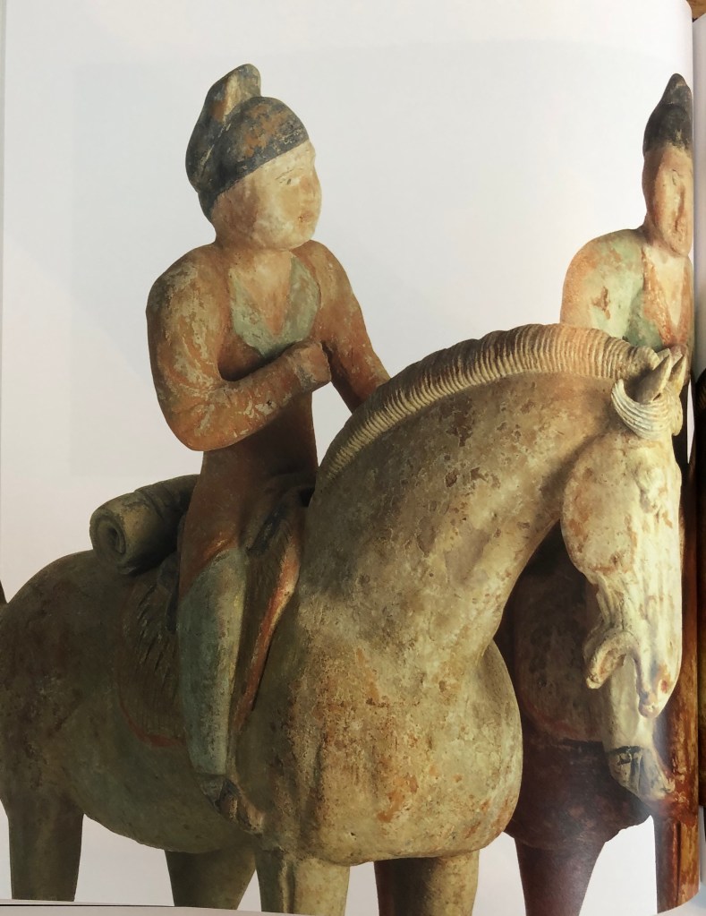
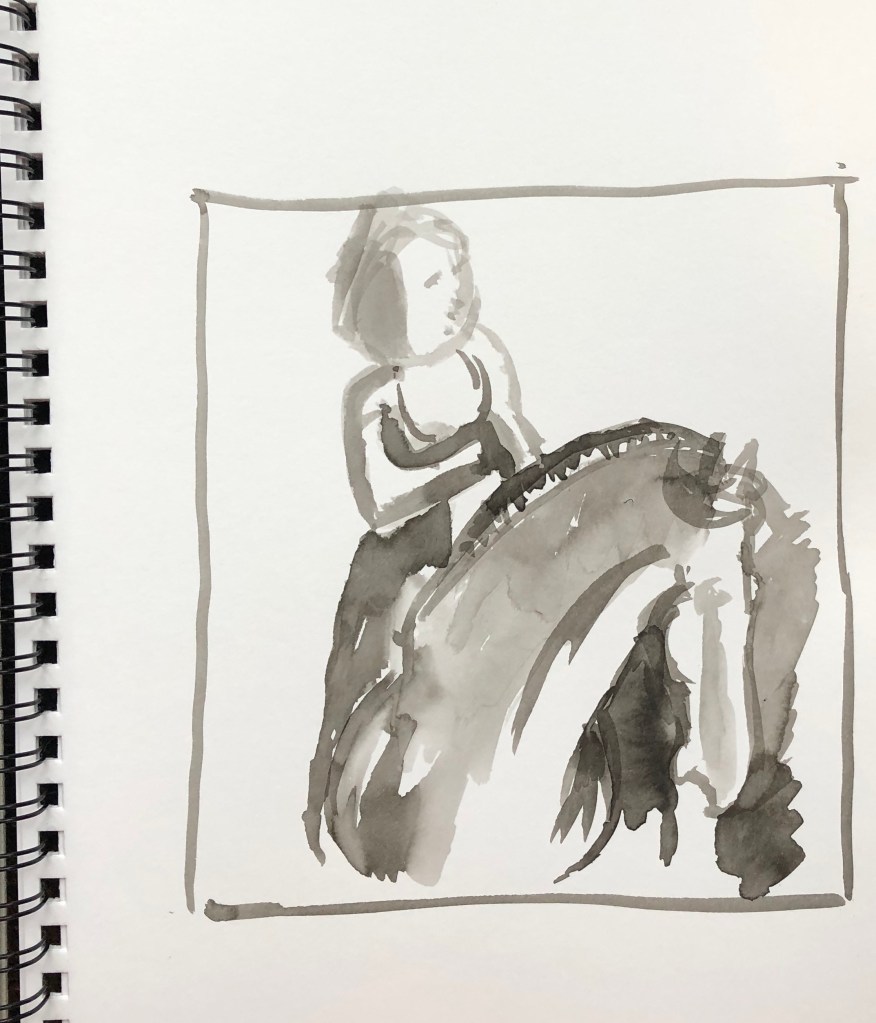
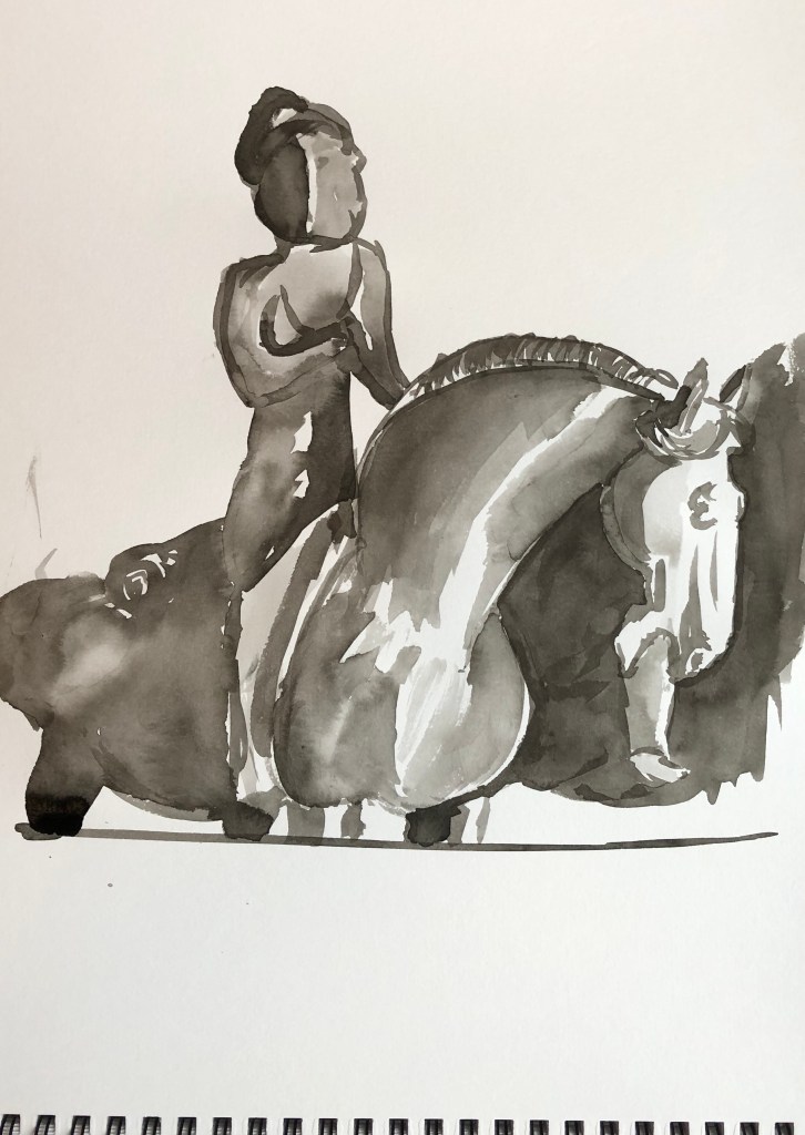
I chose an image of some Chinese pottery from the Compton Verney collection; I am interested in pottery and also Oriental art; as in, it intrinsically appeals, rather than knowing much about it. I focused on the left hand horse and rider for my 10 min upside-down drawing. The notes suggested I choose a different found image for the 20 min painting but I wanted to try and get this right, so stuck with the same picture for both.
SO WHAT?
I chose to use Chinese ink, partly because it seemed appropriate to depict a Chinese stimulus, and also because I am very familiar with it and felt it would be a medium that would respond quickly to a timed task. I used a size 6 round sable.
For my 10 min picture I drew myself a quick frame in my multimedia sketchbook approx the relative dimensions of the photo. I found it a bit discombobulating working upside down and decided to detach myself completely from the “meaning” of the image by painting in the negative spaces – however, I was conscious of working to a time limit and made some errors in placement which threw me out rather.
I therefore decided to stick with this image for the 20 min task, and worked a bit larger, in A3. I must confess to putting in some light (dilute) guiding lines to help me with my bolder wash areas, and I think this has allowed me to have more success in detailed areas like the horse’s head, ears and mane, where I got muddled previously. I managed to build a few washes to create form but would have developed this more had there not been a time limit.
NOW WHAT?
I have learned that:
This is quite a liberating technique for subjects where one had a bit of a mental block – I’ve always said I can’t draw horses to save my life, yet this is the best horse I ever done (even though it’s pottery)
Using negative space to define shapes only works if you really take the time to look; “slapdash” approximation doesn’t work
This exercise confirms my choice of ink as a good medium for rapid tone and form building as it dries so quickly, allowing you to apply the next layer within minutes
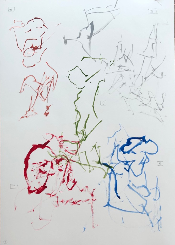
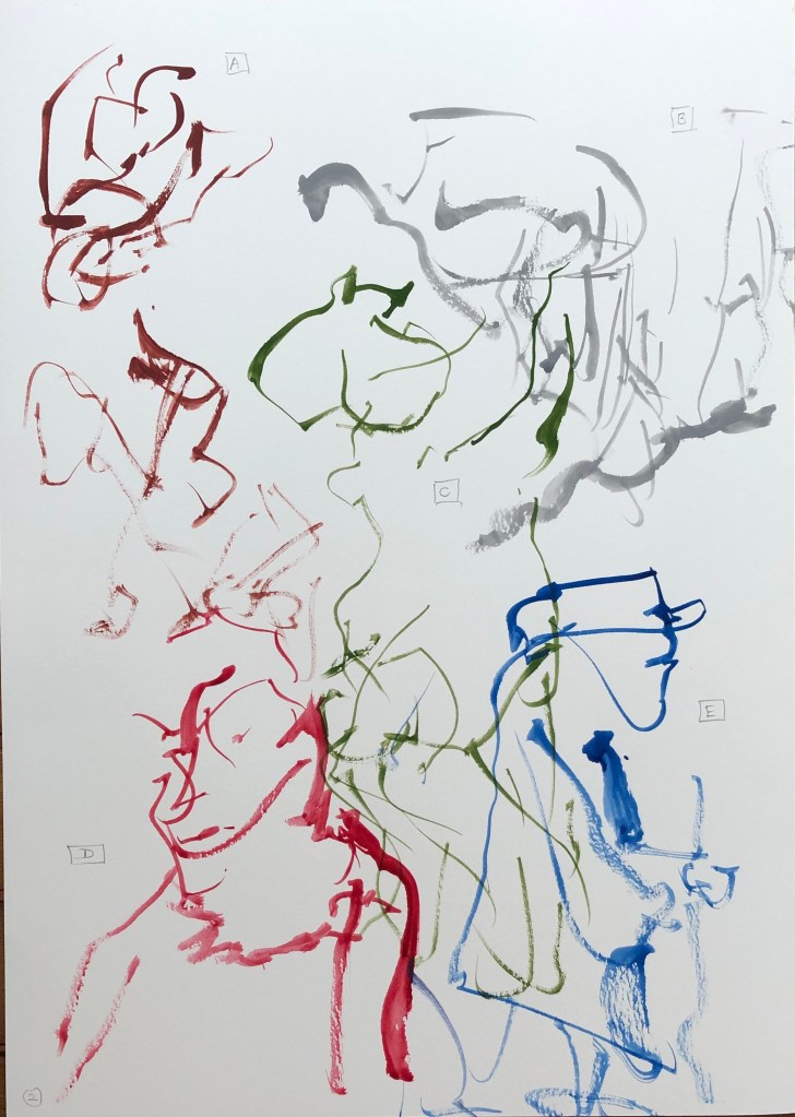
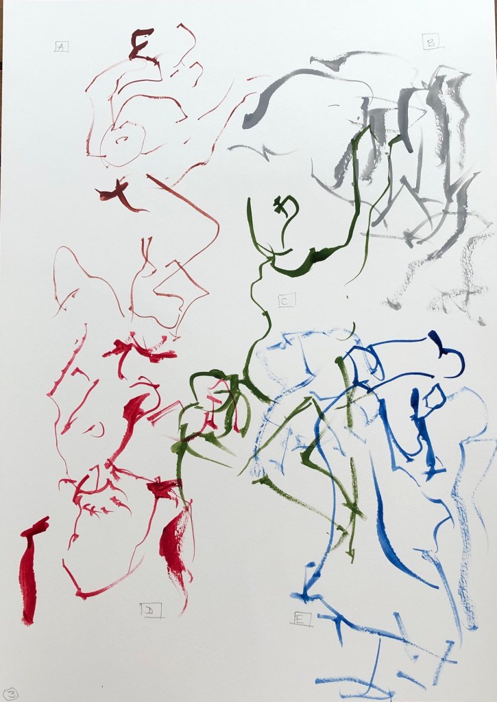
I decided to work with a size 2 rigger in gouache, which makes clear marks, and is quick drying – which to me was an advantage so I could see which picture was supposed to be which.
I maintained the same colours and positioning on the page for the three attempts:
A was Indian Red
B was Neutral Grey
C was Olive Green
D was Crimson
E was Rowney Blue
Attempt 1 was a learning curve in drawing with my left (non-dominant) hand with a rigger like a pencil, 1 minute per image, looking only at the found image and not at my page. Interestingly the one which is pretty unrecognisable is the landscape, the rest being (to my eyes) clearly figures of some sort.
In Attempt 2 I tried to vary the line thickness a bit to convey darker areas – but without looking at it I found this difficult; with a pencil you can feel whether you are making a heavier mark, but without looking at the rigger, you can feel the end of the brush bending but don’t know what sort of mark has resulted.
In Attempt 3 I persisted with my attempt to indicate tone with some heavier marks, and also began all but the first image in a different place to see if I could find an easier way to encapsulate the picture in one minute. Not a great improvement, just different.
NOW WHAT?
I have learned:
I need to practise this technique more – it is something I tried in Drawing 1 with pencils or pens, but these are rigid objects where you can “feel” your way; whereas a brush is a flexible tool and reacts differently – a lighter touch which I need to learn
Overlapping images are OK – not everything needs to be neat
I liked the flowing quality of some of my lines – these can’t be controlled in the same way as a pen or pencil, and feel looser as a result
A one-minute drawing/painting felt much easier with a figure which seems like a continuous whole – landscape was an assemblage of separate parts which were difficult to place without looking, especially when you took your brush away to reload with paint.
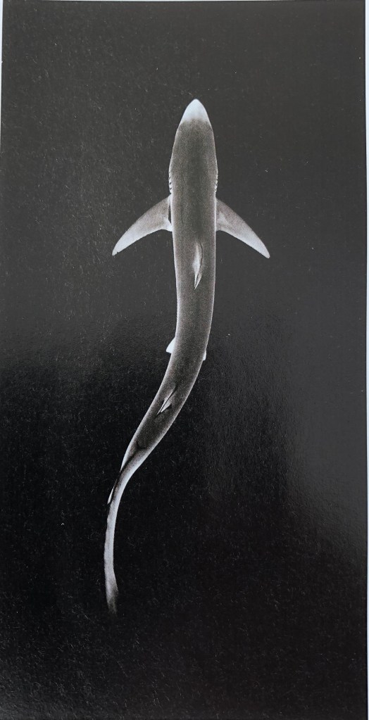
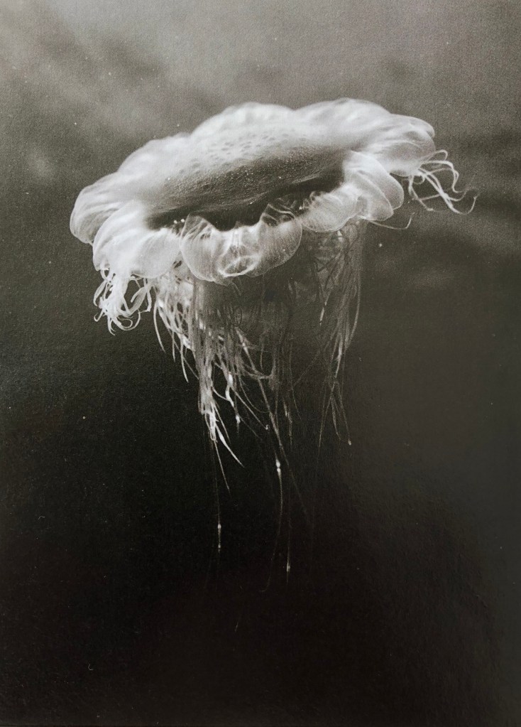
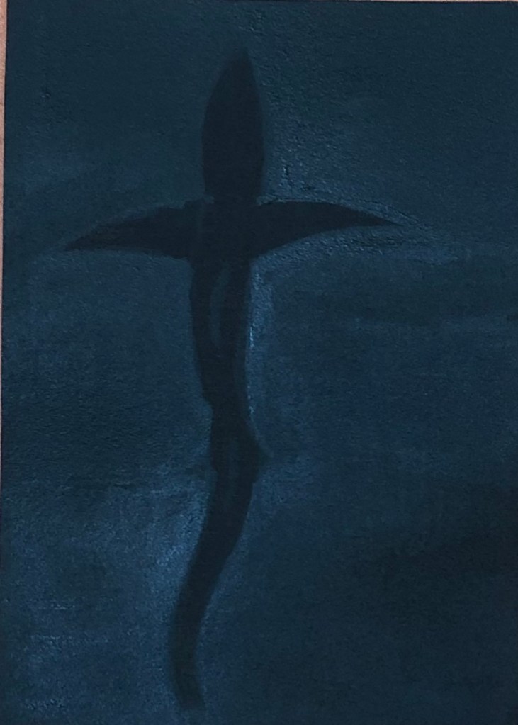
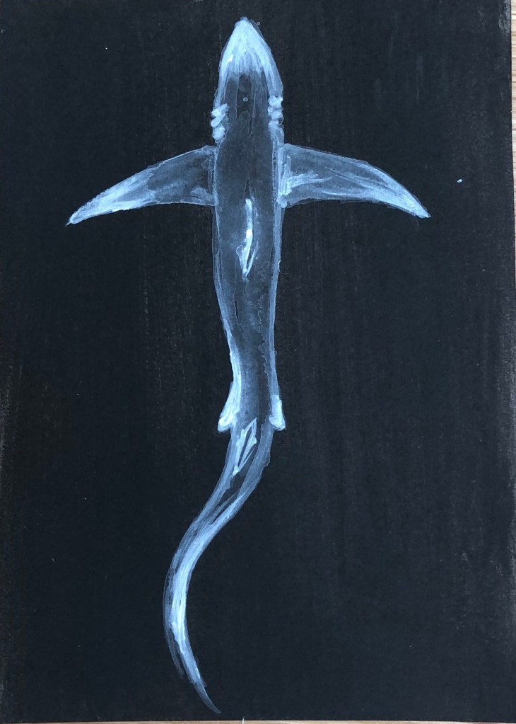
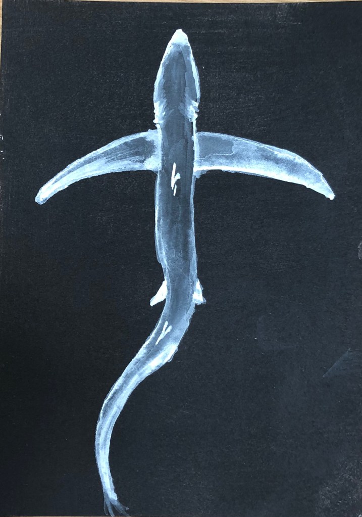
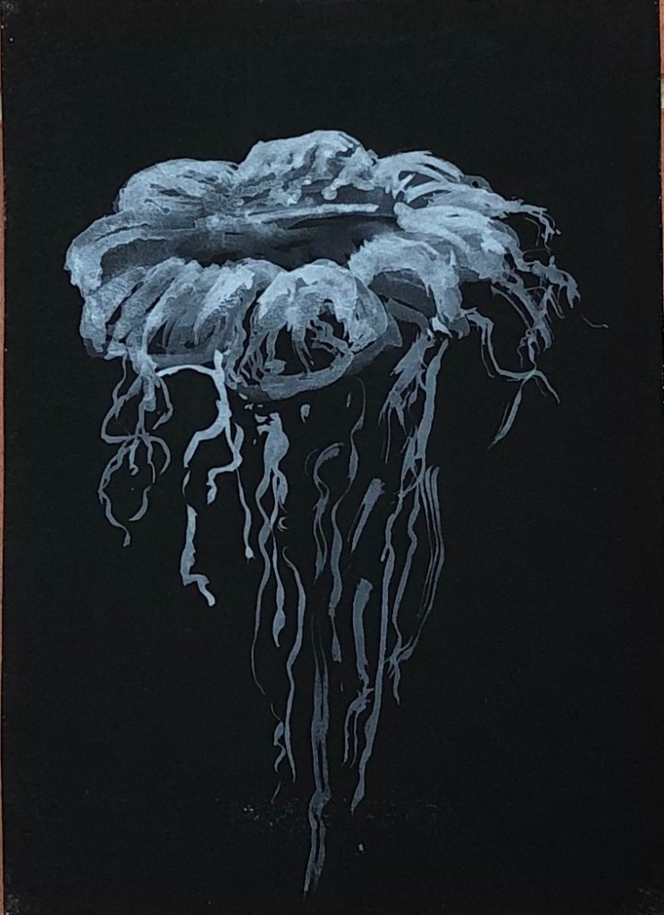
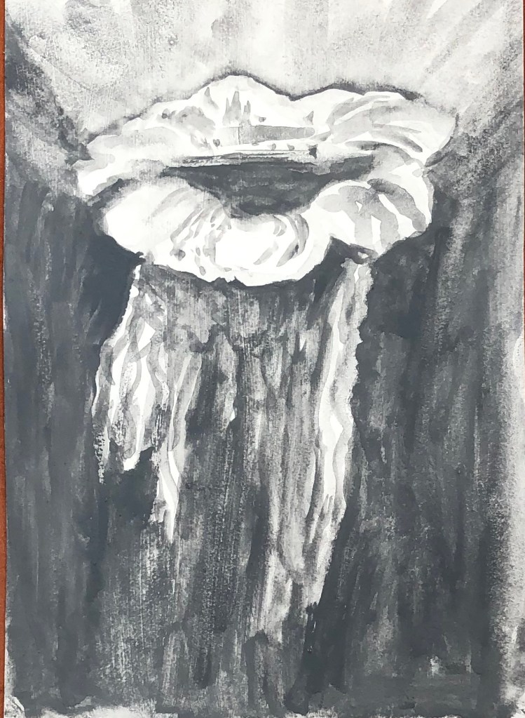
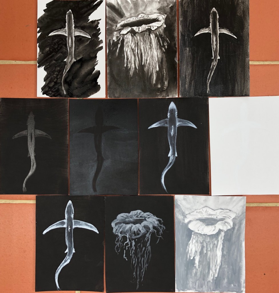
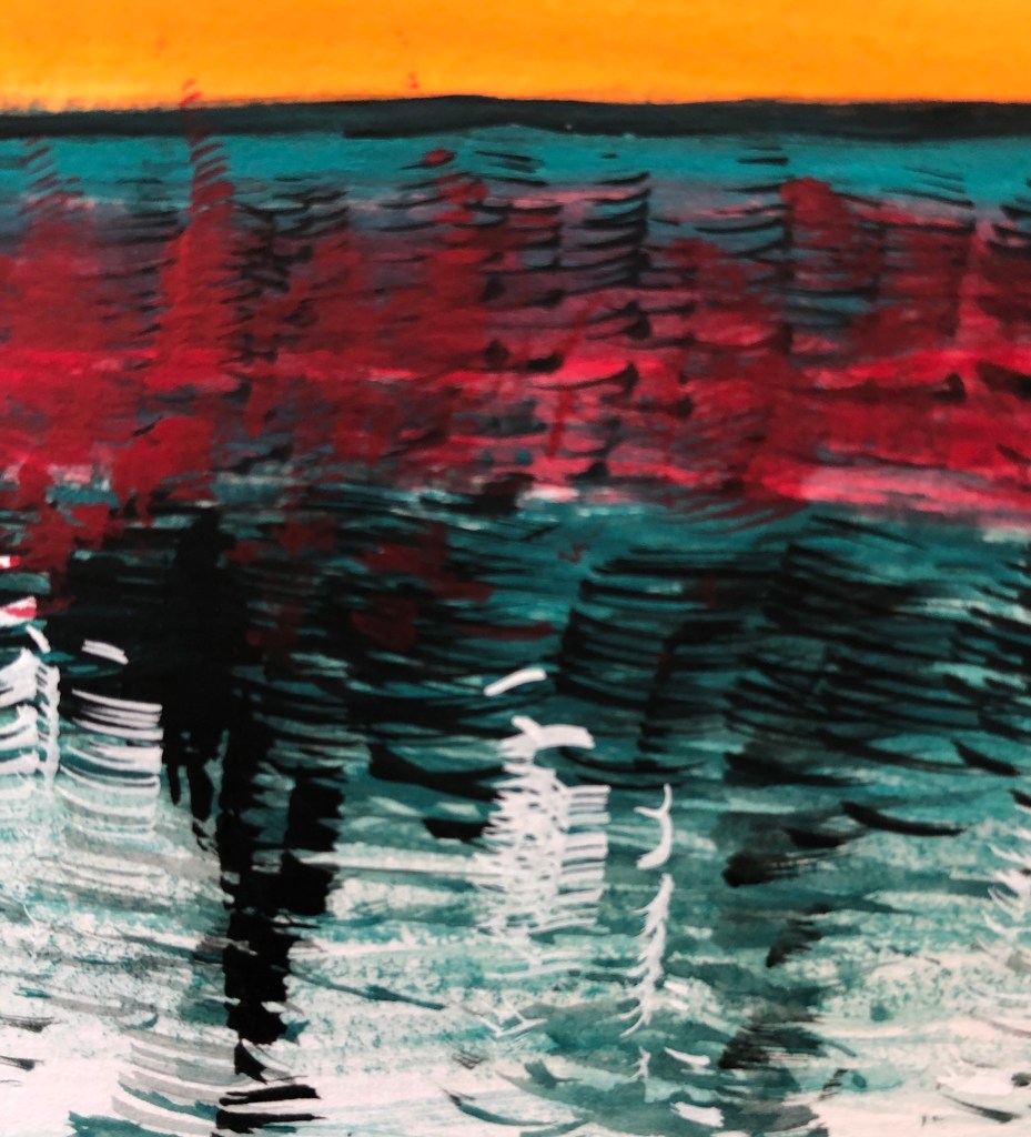
I prepared 10 pieces of hot pressed watercolour paper with black or white acrylic grounds. The two found images I chose to work from were black and white photographs taken by marine scientist and freediver, James Monnington. He dives all around the world but I have chosen two of his images taken down here in the South West; the lion’s mane jellyfish, found in seas around the West Country and Wales, and the blue shark, seen off the coast of Cornwall. I chose these two images as a contrast – one for its simple and elegant lines, and the other for a mass of detail of which I hoped to give an impression rather than an exact representation.
SO WHAT?
Blue shark in black ink on a white background, using a size 6 round sable. Tried to paint this by putting in the negative shape first and then building up layers of diluted ink within the body of the shark, leaving the very outer edges of its body white. I always seem to find it hard to get crisp edges when painting negative shapes – done better here on the fins than the body, although pleased I managed to indicate the gill slits. Painted this on a hot day so the layers dried quickly and I didn’t get too many “cauliflowers”, which are easily forgotten until too late.
Lion’s mane jellyfish on a white background using black ink using size 6 sable. Not sure how to tackle this; decided to put an extremely dilute ink wash around the body to preserve the white of that, then streaked the rest of the sheet with water, turned image upside down and dropped in lots of undiluted black ink and let it run down, trying to lead it with the tip of the brush and encourage it to go where I wanted. Then painted simple details of the body with a small amount of ink and almost dry brush. Not much like the original, but hopefully you’d recognise it as a jellyfish!
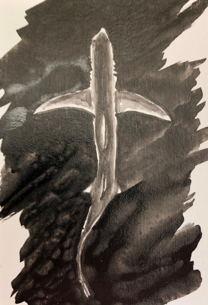
Blue shark in black acrylic on white acrylic ground using size 6 sable. I found slightly dilute black paint hard to apply over the white acrylic ground – I thought I’d applied the ground evenly with vertical and then horizontal stokes, but the black acrylic showed up quite streaky in vertical lines and had to have a second coat applied in virtually undiluted paint, with just a damp brush. I haven’t got the shape of the shark sufficiently sinuous and, once the black is on, it’s hard to get off if in the wrong place. Live and learn.
Blue shark in black Chinese ink on a black acrylic ground. This gave me permission to simplify the image as the light parts of the image could only be conveyed by the shininess of the ink against the matt background – but then it was hard to build up gradations of tone with the ink as it was all just shiny, and the tonal gradations can only be seen from certain angles. It is dramatic, however, when seen in the right light.
Blue shark – Black acrylic on black acrylic ground, size 6 sable.Tried bit of dilute acrylic just to draw an outline – the second it dried it had been absorbed and was invisible. Decided to build up the background with several layers of black to leave a lighter reverse “silhouette” of the shark without any detail – this worked, although needed to go over it over and over – fortunately a hot day so it dried very quickly, although the paper became quite warped.
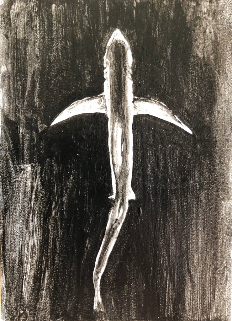
Blue shark – White acrylic on black acrylic ground, size 2 rigger to allow detail. Built up the tones by starting with very dilute white – again, seemed to be absorbed very quickly and marks soon very ghostly – but gradually got thicker and thicker paint for the lighter whites. It’s still ghostly but I left it like that, seems appropriate for the stealthy subject matter.
Blue shark in white gouache on white acrylic with size 6 sable. Again tried to go for a white silhouette against the white ground. The chalkiness of the gouache, combined with the fact that it is a whiter white than the acrylic, makes it just about visible, although not something that I would ever use, it’s difficult to make out and photograph.
Blue shark in white gouache on black acrylic with a size 2 rigger. Managed to get a similar ghostly effect as with the white acrylic – stands out more, but slightly less ethereal because the permanent white gouache is a brighter white than my titanium white acrylic – so which you choose would depend on what effect you want.
Lion’s mane jellyfish in grey gouache on black acrylic with size 6 round sable. I’ve enjoyed this the most so far – adding grey to make an image lighter felt counter-intuitive but it’s turned out very jellyfish-y.
Lion’s mane jellyfish in grey gouache on white acrylic using size 6 round sable. Oddly, having just used grey as my “light”, it felt tricky to now change back to the more traditional use of it as “dark” – I don’t think my end product is nearly as translucent.
NOW WHAT?
I haven’t previously done much black and white painting, apart from quite a bit of drawing with black ink on white paper. I’ve learned that:
Shiny black (in this case, ink) onto matt black (in this case, acrylic) can give a distinctive and eye-catching outcome
Paintings of ghostly, ethereal images are more easily achieved effectively on a dark background – specifically I liked thin white acrylic on black and grey gouache on black
I need to give more careful thought to my backgrounds, both in terms of colour and tone, but also in terms of texture, e.g. matt or shiny.
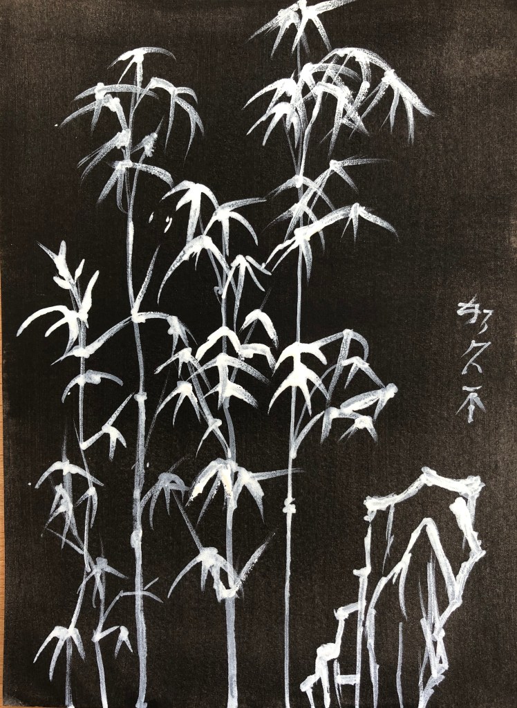
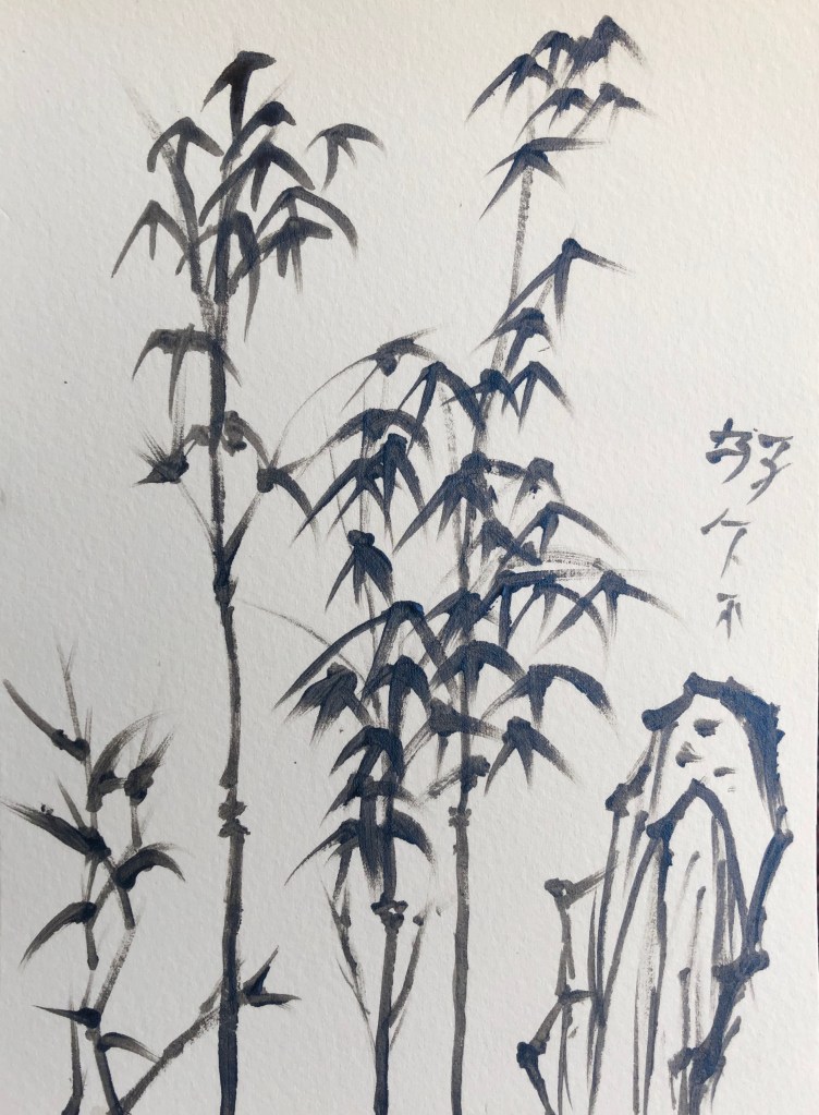
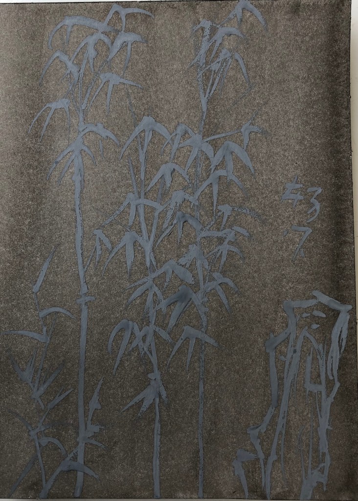
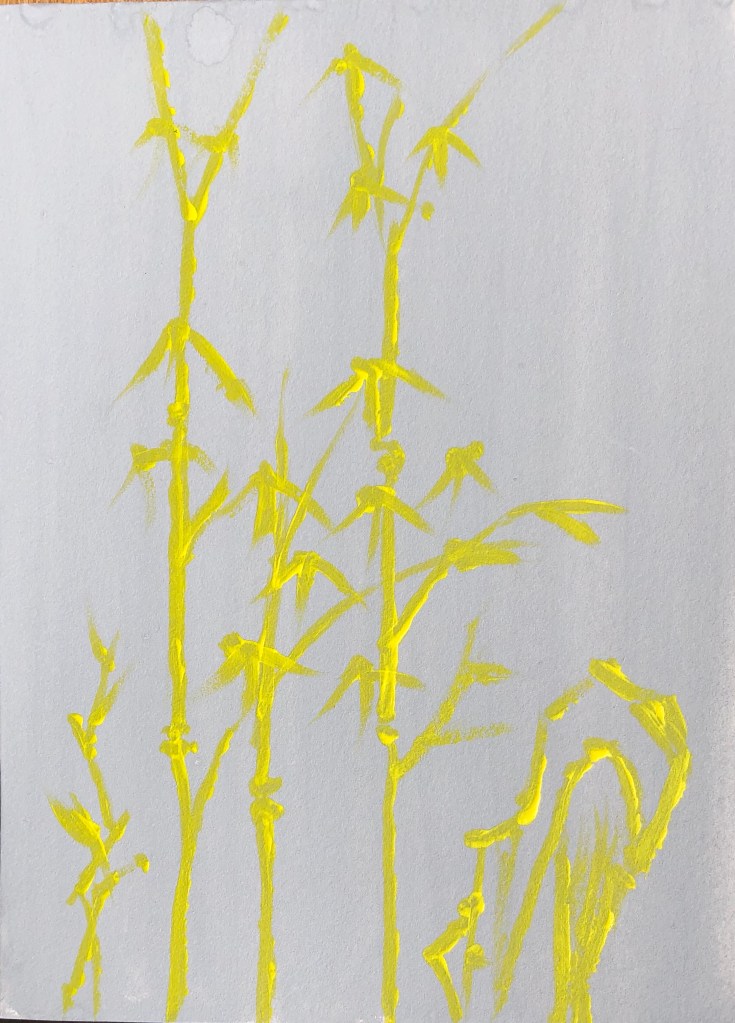
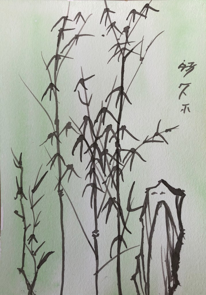
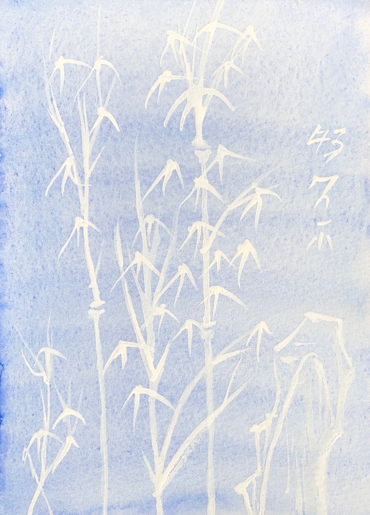
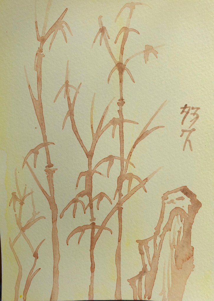
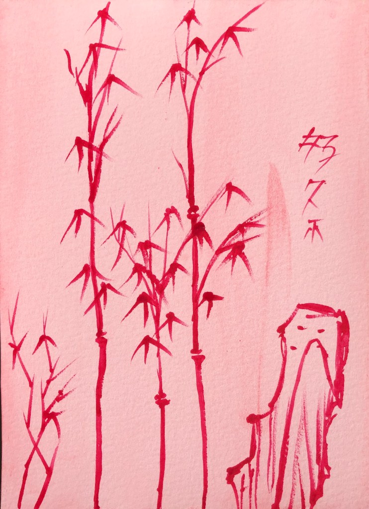
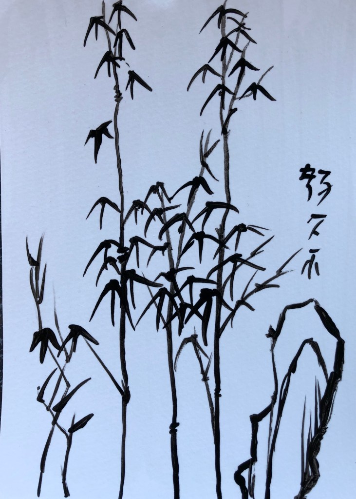
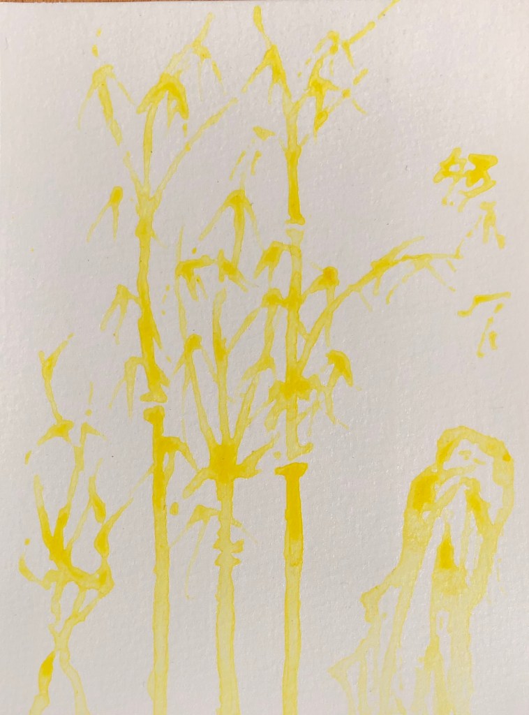
20 sheets HP watercolour paper prepared with various backgrounds as directed using fan brush to get even surface (except for the acrylic varnish, where I used a small hog flat as didn’t want to risk my fan brush). Found image selected to work on has been hoarded for years – bamboo with mountain background – person who sent it to me said “Everything in Chinese painting is symbolic….The painting of Bamboo is second only to landscape in prestige and is infinitely more important than the painting of birds or animals.”
SO WHAT?
Thin perylene maroon watercolour paint applied using rigger to splodgy thin black ink background. I made the paint very (too) watery – hard to make it show up.
Black egg tempera, only slightly dilute, on splodgy perylene maroon watercolour background, applied with rigger. Much more effective as far as clear line making concerned, also able to perfect my leaf-drawing action (press and flick)
White egg tempera, fairly neat, on black acrylic background, applied with rigger. Did this as a photo negative. Favourite so far.
Acrylic satin varnish on black egg tempera, took a chance using the rigger to apply, gave it a good wash and seems fine. Image clearly visible even when light not directly shining on it, and very dramatic when it is!
5.Black Chinese ink on white gouache. Struggled a bit to get pointy ends on this surface, and if the brush was wetted with water then the marks spread out – as if the surface was absorbing them as the brush hit the paper. Less good combo.
Blue iridescent acrylic on white watercolour. A weird one – very hard to spread the acrylic over the watercolour background, felt like painting dry-brush all the time, even though the rigger was wet – not sure if it’s because this acrylic paint very thick?
Experimented with grey gouache on thin black ink. From an oblique angle it’s quite an effective contrast of light on dark, whereas straight on it looks quite flat.
Well, this was weird – Pebeo high viscosity Buff Titanium acrylic on thin black ink. Any dilute acrylic marks just seemed to be absorbed into the inked paper and vanished- the only marks which I could keep clear were with neat acrylic, sometimes gone over several times. Paint colour creamy rather than white.
White acrylic on very thin green gouache. A similar tendency (though not so bad) for dilute paint to be absorbed – only thick undiluted acrylic stood out – but hard to be accurate with thick paint using a rigger.
Really thin white acrylic on thin gouache – this was too thin, had to ladle it on to make any impression at all. Clearly visible when wet, but virtually vanished when dry.
11. Thick watercolour (burnt sienna) over grey egg tempera. A pleasing combo – the egg tempera background offers enough resistance to the brush so that it doesn’t skid, without being a drag which makes making the mark you want difficult. Only downside is that the W/colour fades considerably as it dries – you’d need a few layers for it to really stand out.
Thick yellow high viscosity acrylic on grey gouache. This high visc acrylic really lives up to its name – tried using it with a damp rigger but it really didn’t want to be dragged – in the end dried the brush and just used the paint neat – gives an interesting uneven effect.
13. Thin black Chinese ink on thin watercolour – this went on and dried like a dream – an easy-to-use combo.
14. White egg tempera on very thin watercolour – I started off with some very thin egg tempera but could soon see that it was too watery to stand out, so I made it a bit thicker to get a good contrast.
15. Thin burnt sienna watercolour over very thin primary yellow acrylic. Again, a surface offering a pleasing but not overbearing resistance to a runny paint. The watercolour fades but is still clearly visible and layers could be built up.
16. Thick permanent rose watercolour on very thin acrylic (cadmium red). This was a good combo, both in terms of applying medium to background – right amount of resistance yet flow – and also dark red on light red.
17. Thin black acrylic over watercolour splodges (ultramarine and Hooker’s green). This ran well – have learnt not to make it too dilute, so it flowed well over the surface and was clearly visible. The splodges work effectively as a background, making it look from a distance as if there is a load more plant material behind.
18. Thin black gouache on thin acrylic yellow splodges. Pleasing dramatic colour combo. The gouache gave strong coverage even though very dilute.
19. Black acrylic on varnish, applied with a damp rigger – the acrylic seemed to glide smoothly over the surface, only breaking up a little when the paint load was low. Satisfying smooth service to paint on. Interesting that the background looks blue in the photo but bright white in real life.
20. Very thin high viscosity yellow acrylic on varnish. The brush runs well when loaded but, when asked to make a thinner more delicate line, the paint starts to break and bobble into droplets on the surface – as expected from a shiny surface.
NOW WHAT?
I have learned that:
If I am going to paint over a ground, particularly a chalky ground such as gouache, in acrylic, I need to make sure that the acrylic is thick enough not to disappear – although bits of “ghostliness” would be good for a mysterious image.
Unexpectedly, painting on varnish is easier than I thought, and the paint doesn’t slide everywhere; also, painting with varnish on a dark surface shows up surprisingly well
Ink and watercolour are good combinations (although I did know this already – but always good to have it confirmed!)
The medium I have most enjoyed using, both as a background and a medium, has been the egg tempera – it provides a matt, very slightly resistant surface for painting onto, and it has produced effective images over a range of backgrounds.
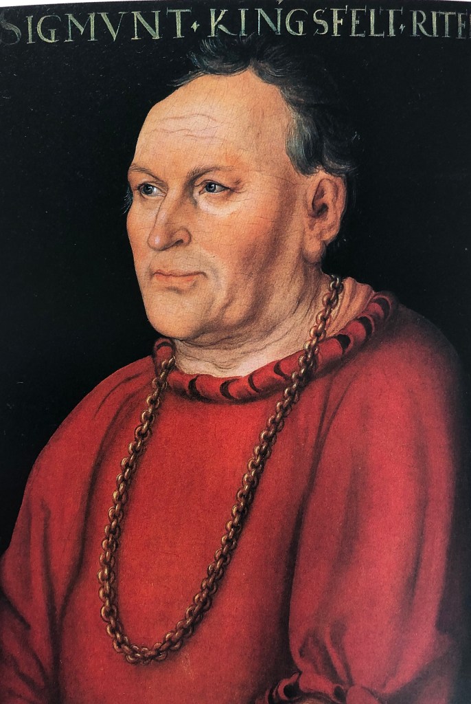
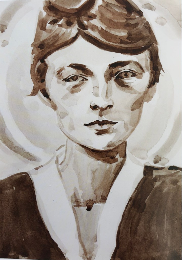
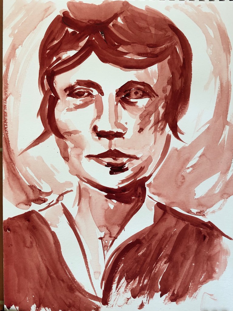
I chose Elizabeth Peyton out of the other “messy” artists I had researched because of her use of colour and the apparent looseness of her brushstrokes.
IMAGE 1
WHAT?
“Georgia O’Keefe (after Stieglitz 1917)”
2006
Watercolour on paper
14.25 x 10.25 in
Collection of JK Brown and Eric G. Diefenbach, New York
This painting makes me feel that I want to know the person who is the subject and want her to know me; she looks out at you demurely, politely but slightly disinterestedly, and you feel I suppose slightly defensive that this should be so. It reminds me of Alli Sharma’s work in style. The composition is cropped – she could have been “moved down” the page so that her whole head fitted in, but then you wouldn’t have got the nice prim blouse collar. The background has a circular shape which is left to the viewer to interpret but this keeps the eye moving around within the picture rather than wandering out. The brush strokes are large and directional, and the original looks like a sepia or raw umber. E.P. was painting at a time when figurative art was just coming back into fashion, and must have helped with her apparently simple yet evocative pictures of famous figures, whether of pop culture or historical, making them look like “ordinary”, real people.
SO WHAT?
I decided to work in monochrome watercolour too, and at roughly the same size. I chose perylene maroon, a colour which I like and is a bit warmer that the original, and a size 8 sable. I wanted to copy the general image, without worrying about achieving an exact likeness – I felt I wanted to do this quickly, be in the moment, and see what happened. I feel I have achieved something of the looseness of her style, but without her precision – actually quite a tricky combination.
NOW WHAT?
I have learned:
I enjoy working quickly and loosely like this, although the outcome does not always have the accuracy I might wish – but it would good for preliminary sketches of an image which eventually might need to be more exact and carefully constructed
I never usually try monochrome (except black and white) but it does make for a very striking, eye-catching image
I need to give thought to backgrounds as a way to keep the viewer looking
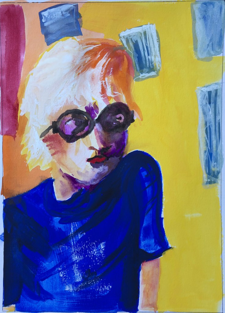
IMAGE 2
WHAT?
“David Hockney, Powis Terrace Bedroom”
1998
Oil on board
9.75 x 7 in
Kunstmuseum, Wolfsburg
I chose this image unashamedly because of its bright colours; lots of complementary contrasts between purple/yellow and blue/orange, with some zinging reds for good measure. Even though the subject figure looks quite serious, it feels like a happy painting. The figure more or less fills the page, but is offset from centre enough to see the things stuck on the wall behind, which continue that diagonal of his shoulders. It’s quite a small painting – you imagine the artist producing the board from her bag and saying to the sitter “Don’t move – that’s exactly the pose I want to capture!”
SO WHAT?
Again, I decided to work the same size as E.P., so I ruled that out in my multimedia sketchbook. I wanted to work quickly again to produce a rough copy, not concerning myself with likeness, but focusing more on exploring those colour combinations. I decided to work with gouache, a recent discovery for me – I like the slight chalkiness it has and the fact that you can overlay colours. I used a soft half-inch flat brush.
It was great fun to do, and I got some rough colour matches, although I think another layer of the background orange and yellow would have brought those out even more.
NOW WHAT?
I have learned:
Bright colours really can be fun!
As I have been experimenting with unfamiliar types of paint, I have enjoyed their differing textures. I now need to also consider their finish – the gouache is chalky, which “felt” good to me, but it gives a flat finish in comparison to E.P’s oil, which seems to retain and show the brush strokes in more detail.
If I want a really strong depth of colour, I might need to try building up layers rather than relying on the first applied fairly thickly.
In several of his pieces, the character is complete in parts and only indicated for the rest – this one is more traditionally filling the canvas (many others leave a substantial part of the canvas unoccupied), but the right side of the face is more developed than the left
Large crossing brushstrokes in the undefined background
Interesting to choose to work so large for a head-and-shoulders portrait
Quote from Cecily on the above website: “The place I’m interested in is where the mind goes when it’s trying to make up for what isn’t there.” Seems to sum up her images well.
Many paintings brightly coloured – this is a sedate example – she’s very good at flesh tones
Style seems chaotic but this is what pulls you in, because you can see there are bits of things which your brain can identify
Carole Benzaken
Example
“Magnolias 25 (Diptych)”
2016
Indian ink and pencils, laminated on glass
120 x 160 cm
Carole Benzaken & Galerie Nathalie Obadia,
Paris, Brussels
Just loved the combination of colours in this; also the technique reminded me a bit of my outcome for Drawing 1 Assignment 5
Some of her images are deliberately “fuzzy”, like a blurred camera shot
She experiments with a wide range of materials and techniques
Elizabeth Peyton
Example:
“David Hockney, Powis Terrace Bedroom”
1998
Oil on board
9.75 x 7 in
Kuntsmuseum Wolfsburg
Blue, orange, yellow, red – this image fairly jumps out at you
Her work seems to jump between near-monotones and then these brightly coloured pieces; also between pop-culture subjects and historic characters – but always portraits
Her brushstrokes are loose, often wide, and directional
She paints people, generally female, sometimes children, often on large, over-life-size supports
Dramatic angles in this composition with the vertical figure cutting through
Her figures look out of the picture, almost at you but more as if they’re looking at someone standing just behind you; somehow this makes them engaging and slightly mysterious
Her painting style “embraces” a lot of drips and runs
Despite the jolly, almost cartoon-like style, many of the characters in his pictures look sad – as here – I think sad faces pull the viewer in, make you wonder what’s wrong
The direction of brush strokes, so far as I can see, is not important to the picture
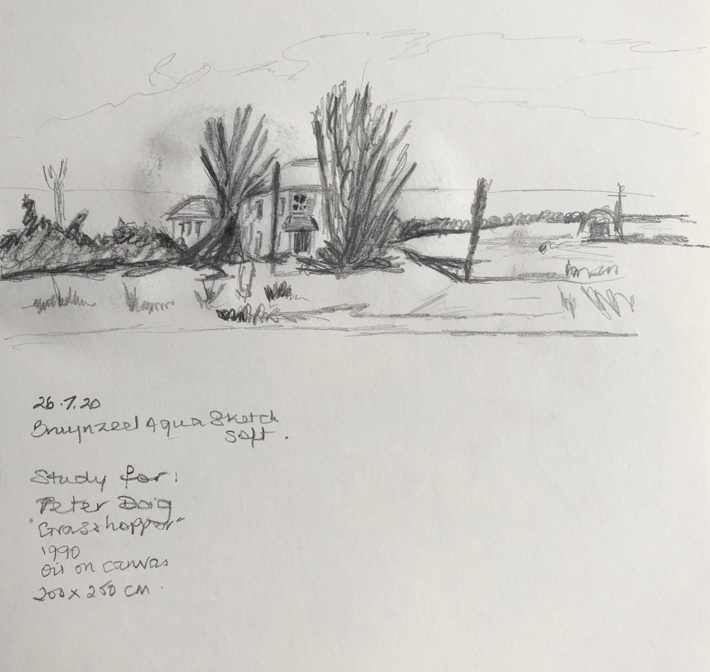
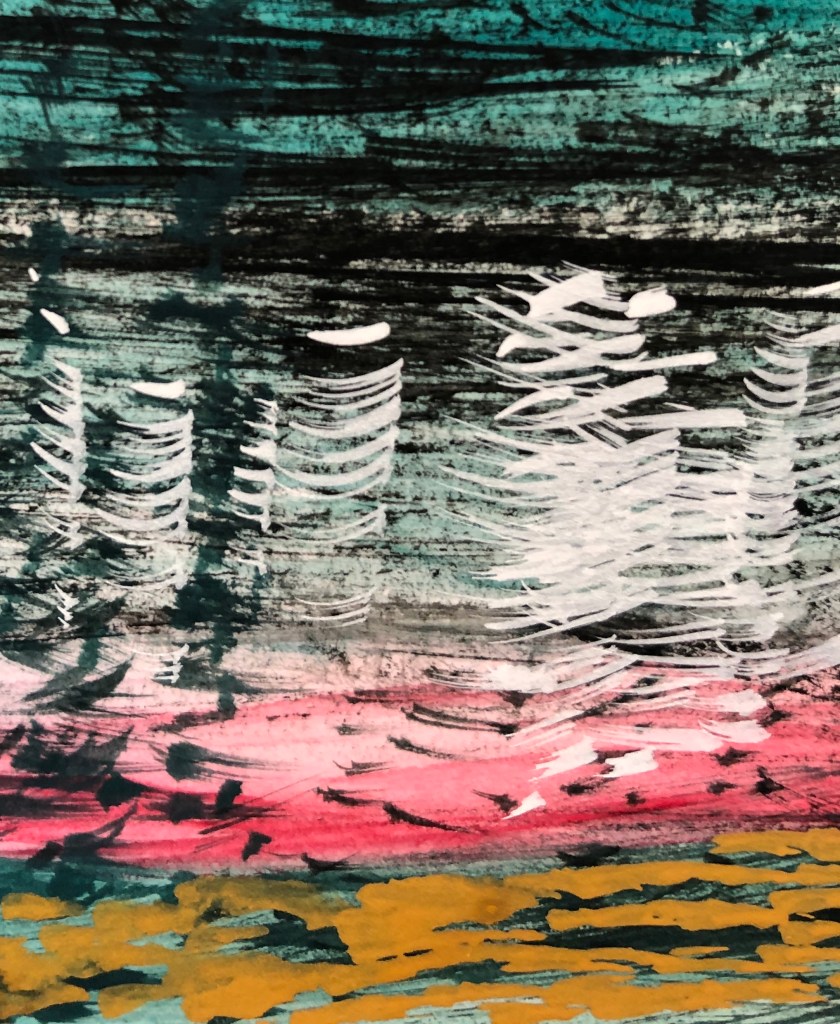
This painting takes me off somewhere warm and sparsely populated; the Catalogue Notes on www.sothebys.com suggest it is showing the wide open spaces of Canada, although apparently Doig himself said that the places he painted were dreamlike and imaginary. At first I was more interested in it than liking it but, the more I have worked with it, I have come to appreciate it. The composition is very striking, horizontal thirds, the top and bottom being quite textural, the middle section, where the eye settles first, much smoother. The things that grab your attention, house and large dark tree, are absolutely central.The palette is interesting – predominantly the complementary pairings of blue/orange and red/green, with a streak of yellow (quite a muted yellow) through the middle. The title seems to bear little relation to the image; the website above suggests that this is a grasshopper’s-eye view.
SO WHAT?
I did a quick pencil sketch of the central section with a water-soluble pencil, just so that I felt I understood its structure. What really interested me was the patterning of the top and bottom sections and how that was achieved, so I decided to focus on that to investigate further.
I decided to work in gouache, because I hadn’t used that to paint with before except as small highlights for watercolour paintings. I worked on multi-media paper in my sketchpad, using roughly the same proportions as the original, and laid down basic bands of colour and let them dry completely before working over them.
I was then able to experiment on the top and bottom sections to try and get that dotted, almost woven effect Peter Doig gets. I tried various marks with a fan brush; dabbing end-on with a flick seemed to produce something similar to his, so I played around with this in the sky with black and white, and in the water section with viridian and crimson. It was similar, but not right. Finally I tried making dashes with the corner of a soft flat brush in yellow ochre right at the bottom, and think this was possibly one of the techniques he might have used.
This is my final version.
NOW WHAT?
I realised that the scale at which we were working was vastly different; hence the exact mark making possibilities were not the same
What seems like a deceptively simple composition is actually a huge number of brushstrokes!
Interesting to think of patterns being made by varying brushstrokes
This picture is a bit spooky – makes you feel that you really should be running away, but you have to look. Reminds me of those James Bond films where the hero creeps over the ridge and finds the enemy den just as someone creeps up behind him and slugs him over the head.
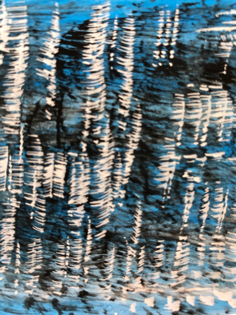
The composition is really clever – lots of diagonals in the mid ground buildings, that light-coloured curve to the left (a pool?) just making the whole thing not too unremittingly spiky, then the viewer effectively “cut off” from the mid ground by the foreground of vertical trees and a huge mesh of branches – almost as if it’s fence posts and wire net fencing. It’s quite a compulsive experience for the viewer as he tries to peer through the obstacles to make out what’s going on behind. Peter Doig has gone for a palette of complementary blue/orangey-brown (cool/warm). The use of so much white is interesting – why are the branches white? Is it meant to be snowy (more comfortable scene) or reflecting light, maybe from the curved structure which is actually a giant spotlight (less comfortable scene). The title again is ambivalent – “The Architect’s Home…” (cosy)…”in the Ravine” (not cosy). It was painted a year after “Grasshopper”.
SO WHAT?
This must have been constructed in so many layers (if it were me I would have gone from the back to the front) that I decided to look at just the foreground and see if I could replicate how Doig did it. This is another large painting, so I decided to just work a small section onto A3 stretched paper. I laid on a rapid wash of blue gouache using vertical brush strokes with a huge round, let that dry, then focused on just two trees (part), and built them up with layers of raw umber, burnt sienna, flame orange and yellow ochre.
Once that had dried, I used a rigger and white gouache to draw in the branches. Think it might have ended up looking a bit like one of David Hockney’s swimming pool paintings!
NOW WHAT?
I have learned:
The use of pattern can significantly enhance, indeed “make” a painting
Paintings like this, which involve one thing in front of another in front of another…need a lot of careful planning before you start
I rather like the effect of the image I’ve produced with its complementary colours and clean simple line pattern – so not everything needs to be complicated!
Uses pairs of complementary colours a lot (as here, blue and orange)
Interesting composition with the vertical foreground trees, and then the buildings at angles behind pulling you through into the dark woods in the background
The lattice of little branches might at first appear a barrier to a viewer, but actually it pulls you in to try and work out what’s behind – very clever
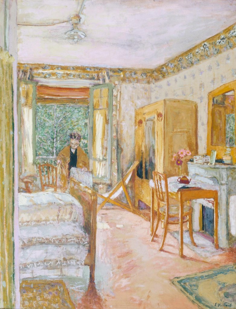
Edouard Vuillard
Sunlit Interior c.1920 Edouard Vuillard 1868-1940 Bequeathed by the Hon. Mrs A.E. Pleydell-Bouverie through the Friends of the Tate Gallery 1968 http://www.tate.org.uk/art/work/T01075
Example:
“Sunlit Interior”
1921
Distemper on paper mounted on canvas
32.75 x 25 in
Tate, London; Image released under Creative Commons CC-BY-NC-ND (3.0 Unported)
Pastel, sunny colours – either because of the medium used – or more likely the medium was deliberately selected to create this effect
Also uses juxtaposition of complementary colours; red/green, orange/blue – these add a bit of “zing” to what might otherwise be too sugary a scene
He really loved his pattern details – we went to an exhibition of paintings relating to his mother a couple of years ago at the Barber Institute, where his depiction of interiors with all their patterned wallpaper, carpet, china etc was striking
Strong contrasts between black elements and the fiery reds, oranges and yellows, which also then contrast with the icy whites and blues at the bottom
Unusual cross-shaped composition, with the vertical central tree and the horizontal central galloping figure – my eye is constantly drawn to the point where they meet