Feedback was given by my tutor via Google Meet discussion on 12/4/21.
SO WHAT?
In a very helpful discussion, several points emerged:
My thoughtful attitude to my work, and reflections on how one’s mood and circumstances affect one’s work, were appreciated
There are several useful short films and videos in the Resources section of the Painting OCALearn pages (look in “Technician’s workshop” for colour mixing videos)
My use of complementary colours for the assignment piece was a little “out there”, although I could explain my reasoning for the choice. My tutor suggested that I investigate using such pairings mixed with other colours, so that my use is more judicious and subtle. Also, consider not hitting every edge, but make some transitions looser. These contrasts will bring out the sharpness where you need it and makes it striking, rather than having it everywhere.
Use of texture via gesso underpainting was effective.
Look for the book “Formulas for Painters” by Robert Massey
My analysis of and use of other painters’ work is good
Going forward, I am going to focus on colour mixing. My tutor uses a cool palette of rose madder, cobalt blue, and lemon yellow, white, black, burnt umber and raw umber/sienna.
Experiment with limited palettes, and try to understand what a colour would break apart to be. Consider making a painting of one colour, e.g. yellow, i.e. the opposite of complementaries, and investigate closer colour relationships.
PRACTISE!! STARE!!
My practise of doing a tonal preparatory painting really helps
Contact other artists and ask about their starting palettes.
NOW WHAT?
I am pleased we have identified investigations into colour as my focus for Part 5, as I do feel that my practice would benefit from this.
Demonstration of visual skills: Materials, techniques, observational skills, visual awareness, design and compositional skills.
I had not painted in a round format before beginning this section. On a practical level a tondo needs a little extra preparation before starting, just in terms of getting a round/oval support; however, I found the advantages outweigh this – every painting I did felt as though I was turning a spotlight onto something, even something as mundane as a sink containing rubber gloves. It seemed to make the ordinary and familiar into something a bit special, encouraging the viewer to stop and take that extra second to pay attention. The technique of moving the template card over an image to find the right composition was really useful and stopped me from over-complicating my images by trying to cram too much detail in.
I have also had great fun playing with paint; at the beginning of this Part I was not quite sure whether to go for enamel paint or egg tempera; however I opted for the latter early on and have learned to mix my paint from its raw ingredients, which has made a material very different from the ready-made versions one can purchase.
Quality of outcome: Content, application of knowledge, presentation of work in a coherent manner, discernment, conceptualisation of thoughts, communication of ideas.
From this Part I have gained an understanding of unconsidered corners of my house as they might appear to an outsider, and what that outsider might infer about the house dweller (i.e. me) – for example, the series of paintings of my sink and draining board might tell the viewer that I paint; I collect natural objects such as feathers; that I like to keep things reasonably clean and tidy. My tutor in Drawing Skills 1 suggested I read Shirley Turkle’s 2007 book “Evocative Objects”, Massachusetts Institute of Technology, USA, which was a series of essays wherein people described the importance of particular objects to them; I think this Part has shown me that nearly everything, particularly when in its habitual environment, has a story to tell, and it is the job of the artist to tell that story in paint.
Demonstration of creativity: Imagination, experimentation, invention, development of a personal voice.
I think my assignment piece is an example of this; fairly early on in Drawing 1 I had experimented with a sketch of an interior view which frankly was beyond me at the time and I really struggled to analyse it. However, my tutor at the time saw potential in it and so I returned to the sketch and have reworked and adapted it, bringing an increased skill level and better understanding of perspective and composition to bear in order to create what I hope is a coherent and effective painting.
Context: Reflection, research, critical thinking (learning logs and essay).
I found artists such as Tori Day, Jacqueline Utley and Winifred Nicholson particularly influential. Tori’s focus on small corners of a domestic interior, presented often in isolation to emphasise their importance, resonated with me and encouraged me to look more closely at my own domestic environment. Jacqueline Utley’s colours just zing by virtue of her careful contrast of muted and bright; Winifred Nicholson’s use of colour is also very deliberate, and I loved her way of constructing a narrative around what can at first glance look just like a picture of some flowers in a vase until you take in and consider the background and placement of the vase.
I also took a short online course on colour with Jill Eisele through the St. Ives School of Painting (see blog post) in which, amongst other things, she looked at the possibility of painting with a limited palette based around pairs of complementary colours, and I have used this in some of the Exercises in this Part and in my final assignment.
Quite a bit of this Part of the course has been studied whilst living alone, my husband having suffered a disabling stroke and having been in hospital for many weeks now. I have found this has affected my approach to my work: my study has been a real life-saver as far as distracting me is concerned and I have been disposed to approach it positively, finding the need to come to terms with the unfamiliarity of painting in the round interesting and diverting; also, being alone in a house makes one look at it differently and be more reflective, almost treasuring, about it, which I hope has come through in my painting.
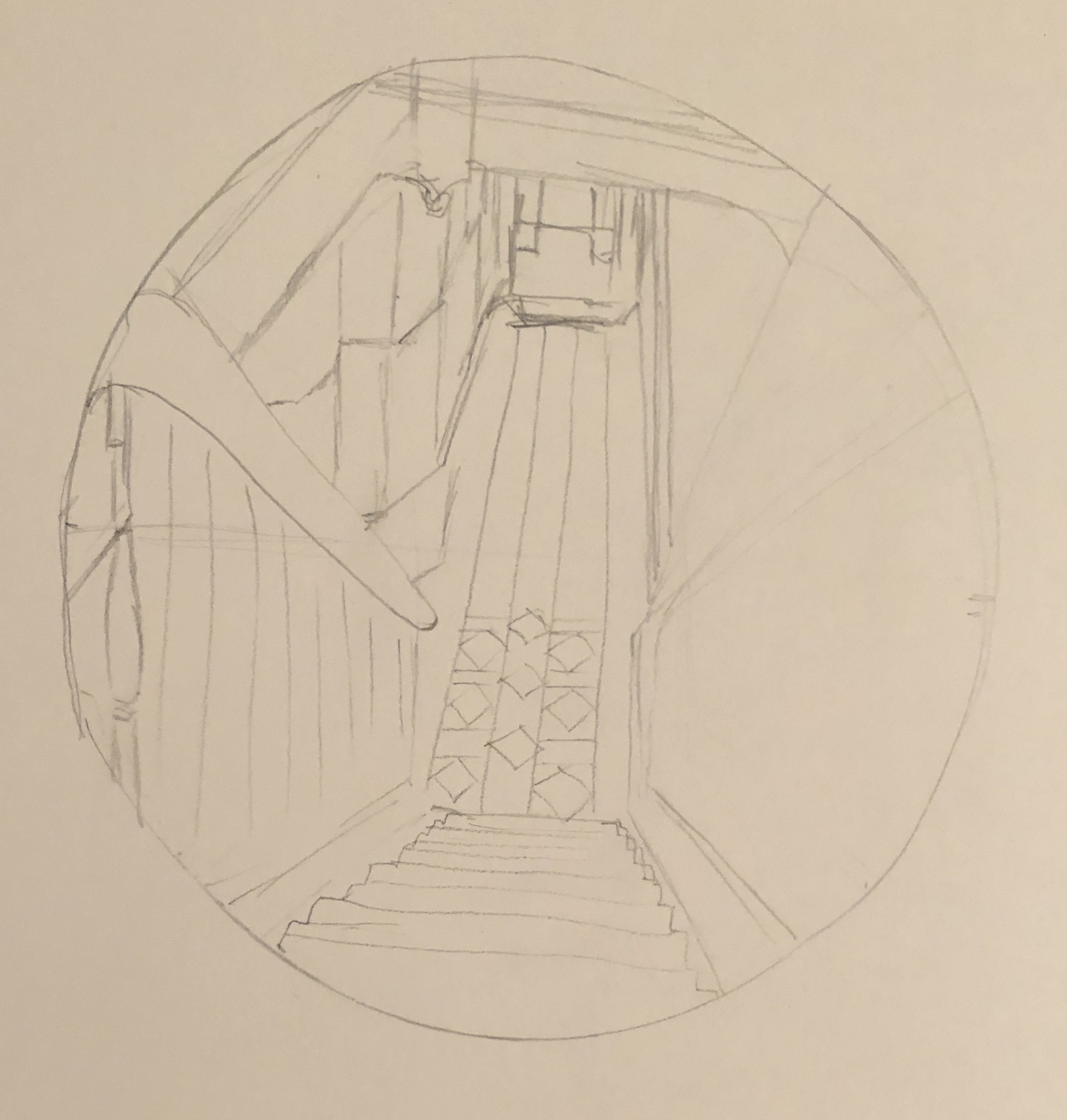
Early on in my degree, looking at Interiors as part of the Drawing Skills unit, I tried to sketch the view down the stairs from the landing at the top of the first flight. I really struggled, couldn’t work out by the end even which way the lines went, and chalked it up to experience as something that was just too hard. Here it is.
However, my tutor, having looked through my entire sketchbook, picked out this dreadful drawing as the one that had the most potential. I didn’t try to do anything further with it at the time, but I’ve remembered it ever since, and now seemed like the time to have a go. So, the subject of the assignment will be the view down the stairs – partly to preserve the view for posterity, as it will likely soon be radically altered by the installation of a stair lift for my husband, who has suffered a series of strokes.
An artist currently working in egg tempera, and whose work I admire, is Mary Anne Aytoun Ellis. She mainly, though not exclusively, paints landscapes, working at a range of scales. She works on paper which she mounts on board, mixes her own egg tempera, and often combines it with gesso, and ink or watercolour. This recent example, “Knot Garden”, egg tempera, gesso and watercolour on board, 18x25cm, shows the textured quality of her work:
I contacted her on Instagram, explaining my interest in her work and asking about her process; she replied that she uses gesso and egg tempera in an idiosyncratic way which she has evolved over the years. She often uses gesso in a very abstract way in the early stages of a piece, using large brushes, dripping and scratching into it when it’s wet or dry. She will sometimes pour egg tempera over it or mix pigment in to obtain unexpected effects and textures. She might also use the gesso to add highlights and detail, covering it with glazes of egg tempera or watercolour. She originally trained as a printmaker, but soon decided she wanted to make “…hybrid pictures that were a cross between drawings, paintings and print.” (See article in Artists and Illustrators, March 2021 edition). This method has taken her a long time to evolve, so I wasn’t going to try to emulate the whole thing straight off, but I did decide to incorporate the use of gesso into my assignment by way of experiment.
Finally, following on from my response to my tutor feedback from Part 3, and in the spirit of Mary Anne Aytoun Ellis, I wanted to try incorporating and working into a monoprint in some part of the painting.
SO WHAT?
I began working from this photograph:
I decided to increase my chances of success by tackling just one flight of the stairs. I also made the decision to simplify the image by mentally losing all extraneous detail such as the table, coat stand, bikes etc, to give myself clear lines.
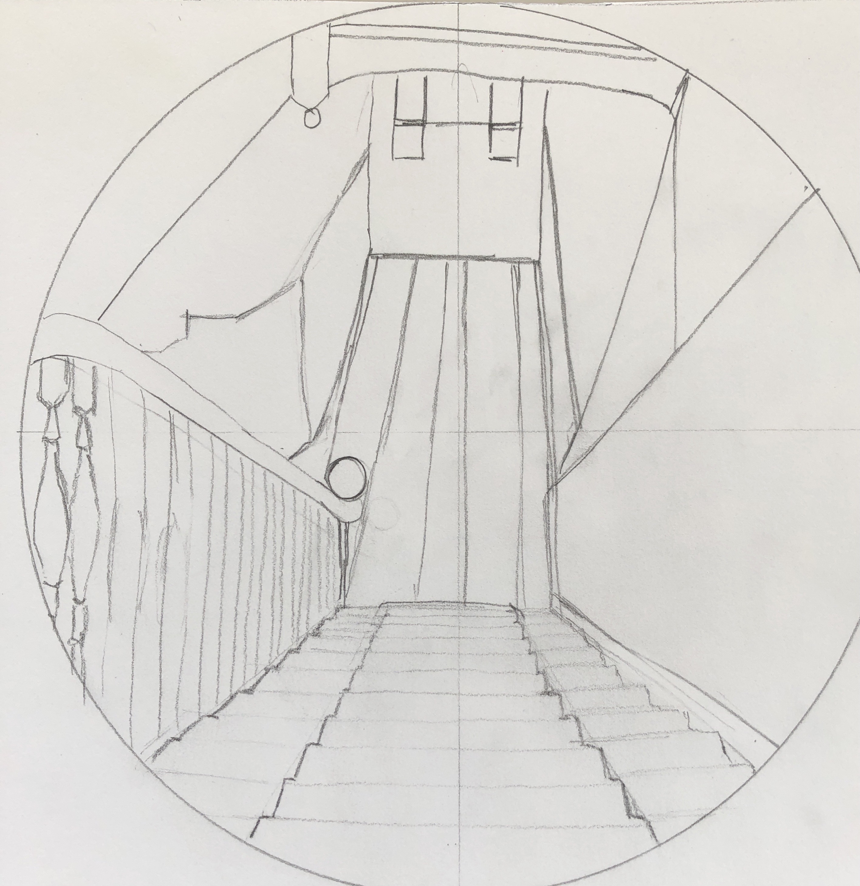
I made an initial sketch, and then refined this further into a scale drawing by abstracting the image a little into simple shapes and boxes with clear lines, mainly straight – just a few curves to break it up a bit and add interest. I decided to work at the size of a large sideplate (approx 22cm diameter):
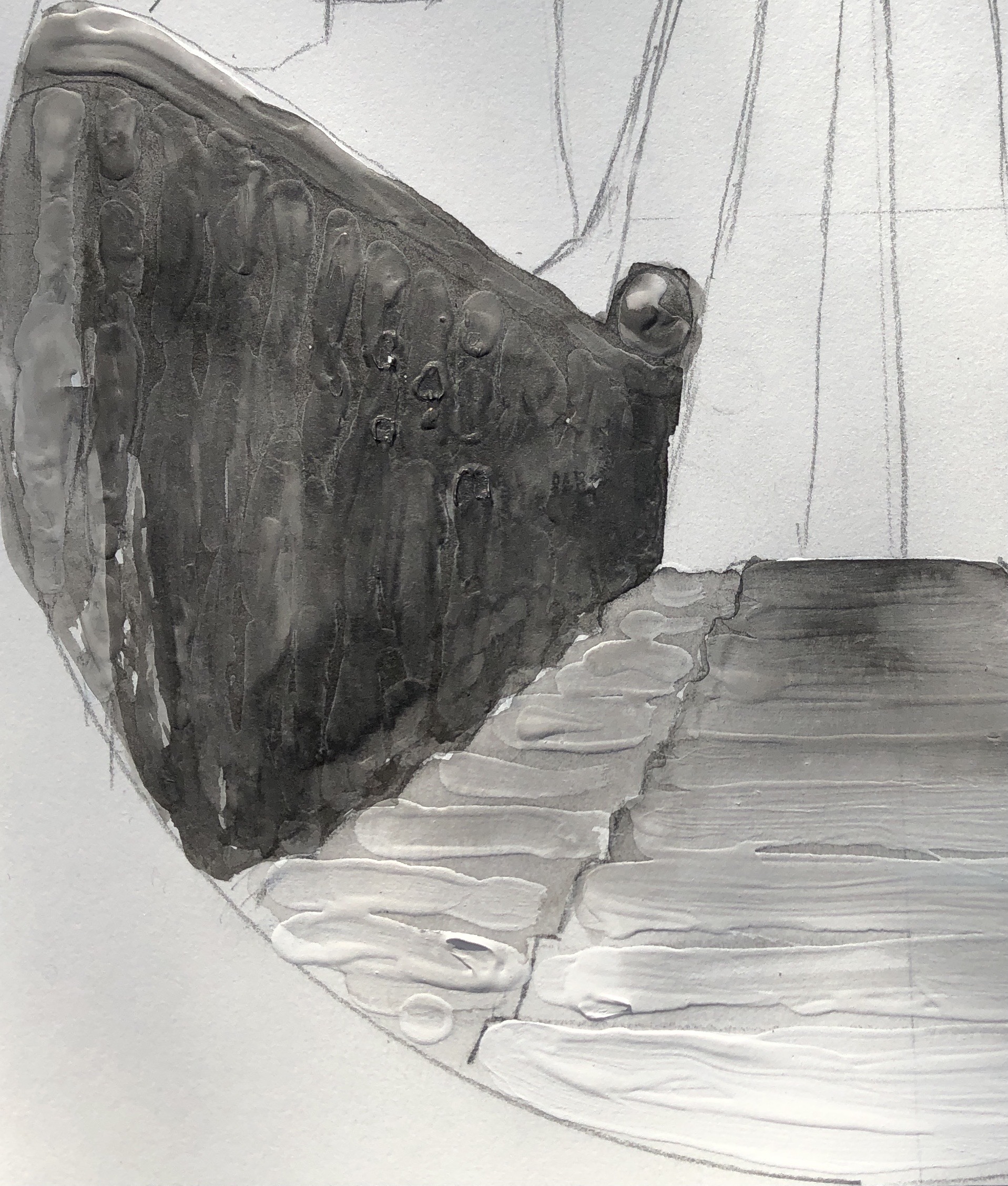
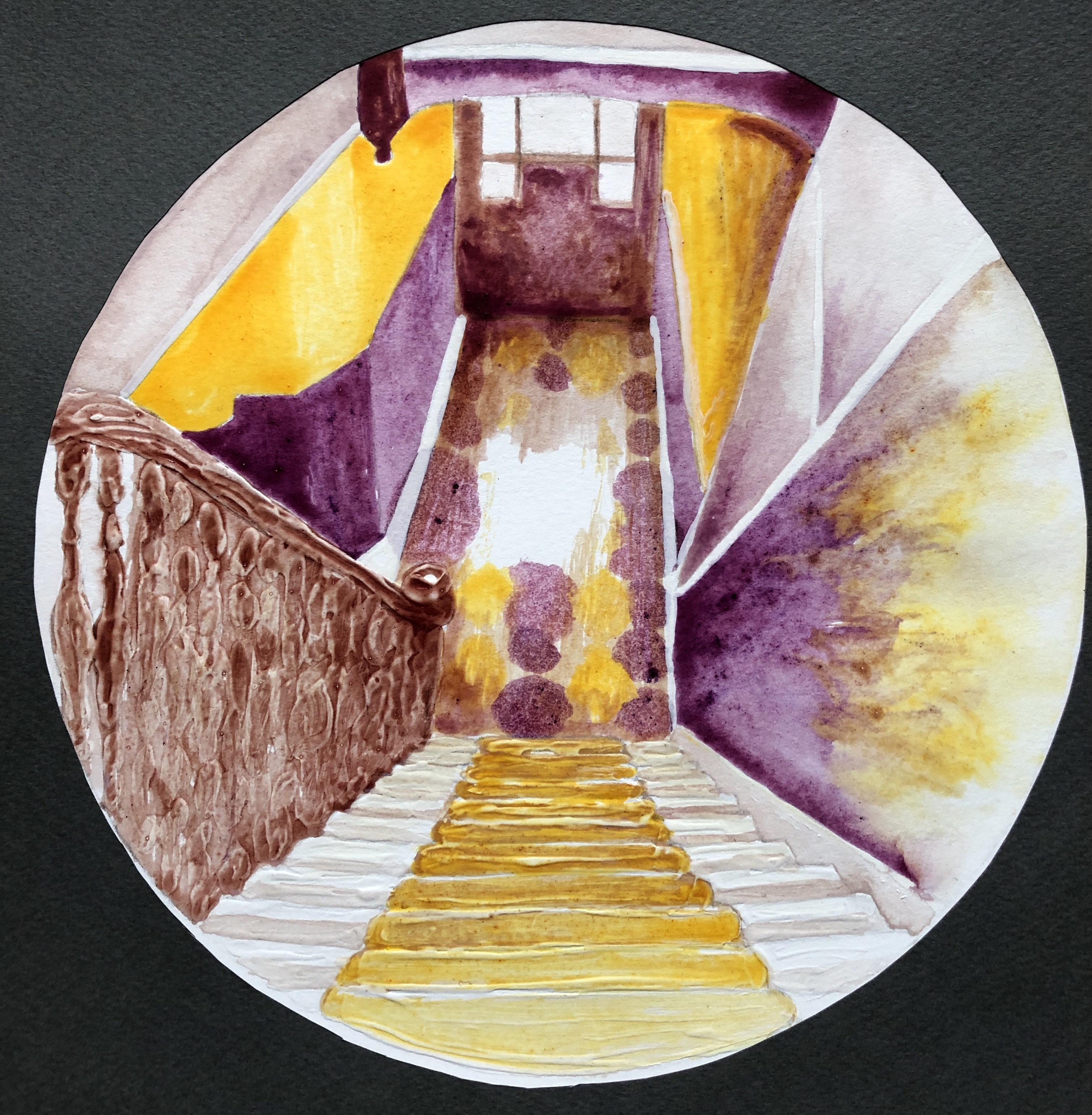
I wanted the focal point to be central, where the light hits the tiles down in the hallway.
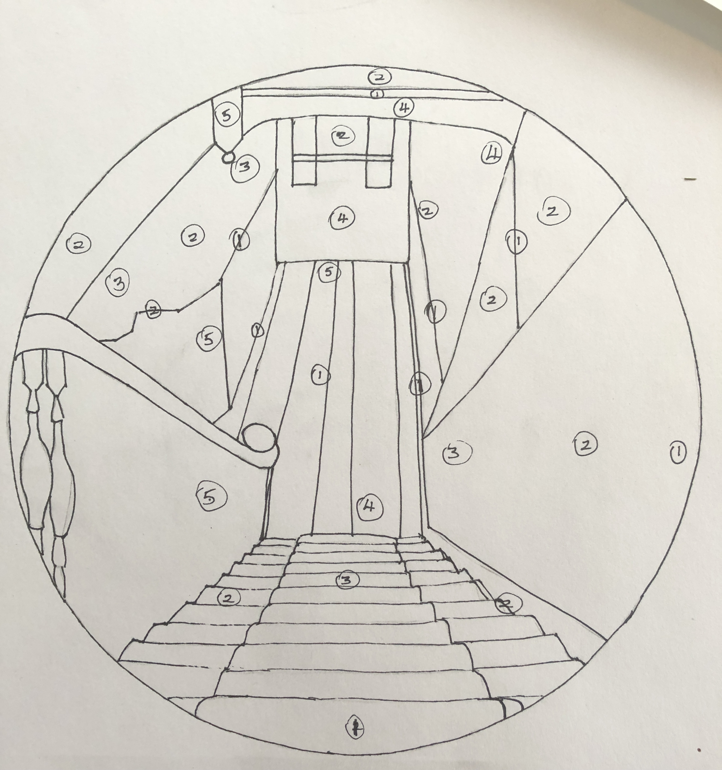
I did a tonal drawing; I found the tones quite hard to analyse, so made it basic by identifying 5 tones (from 1 being the lightest to 5 being the darkest), marking them in place, and then filling the drawing in with black Chinese ink, with a white Conte crayon for the lightest lines where needed:
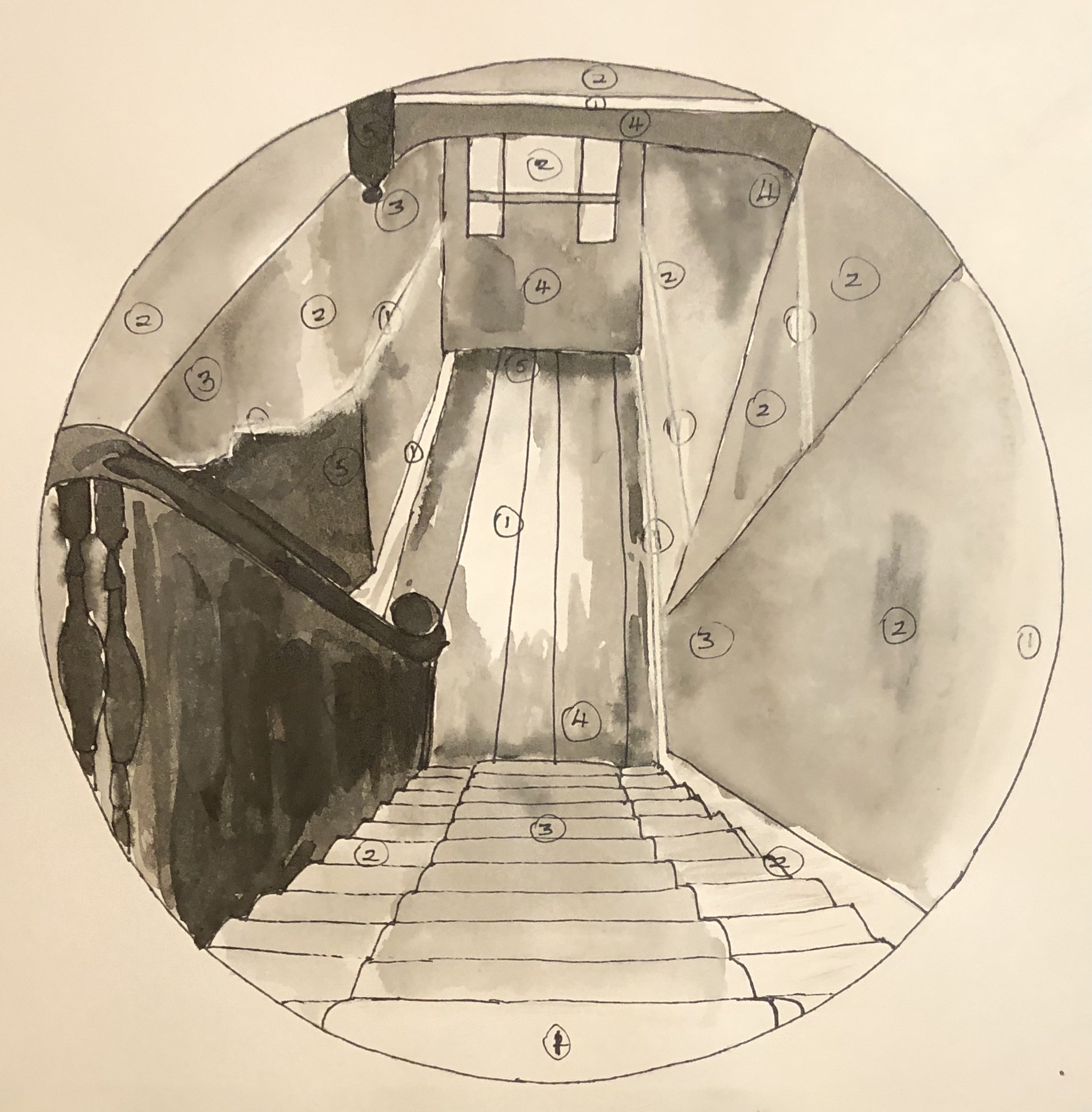
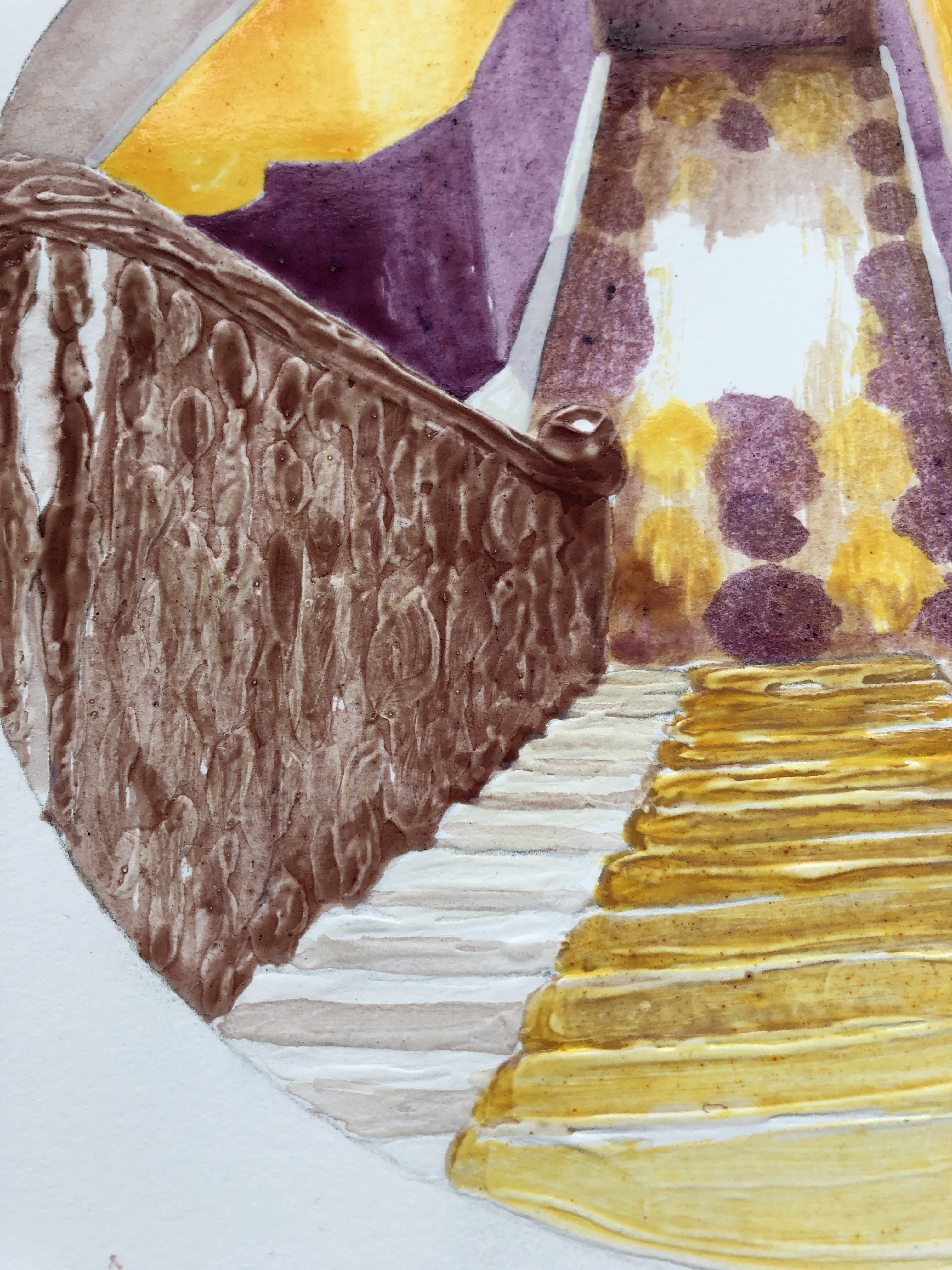
My next step was to experiment with the gesso. On a clean version of the drawing, I added some gesso to the stairs and the banisters, applying it with a paintbrush fairly freely, trying to get horizontal lines on the stairs and quite a curvy and bumpy texture on the banisters to indicate the posts going down. Once that was dry, I went over it in Chinese black ink to see the effect. Next I made a rough painting on another clean drawing to experiment with colour. I had looked at pairs of complementary colours in the Exercises, and picked yellow/purple to work with here as this pair gives the widest range of tones. I did my practice run with tube egg tempera; I mixed a purple from alizarin and cobalt blue, and also laid out Naples yellow, Titanium white and Ivory black.
I didn’t use the black in the painting, but tried adding some around the rim to see what the effect would be when I added a surround.
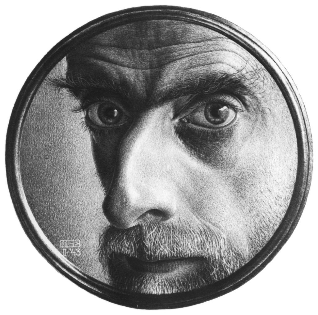
This actually reminded me of an Escher drawing I had looked at as part of my research in Drawing Skills:
M.C. Escher
Self Portrait II
1943
This made me think that my drawing of the stairs was rather like looking down a telescope the wrong way. I thought that the black surround was a bit heavy, and so resolved to make my surround a sort of metallic grey.
Now that I had my colour study, I worked from that and did not refer to the photograph again as I moved on to create the final version of the painting.
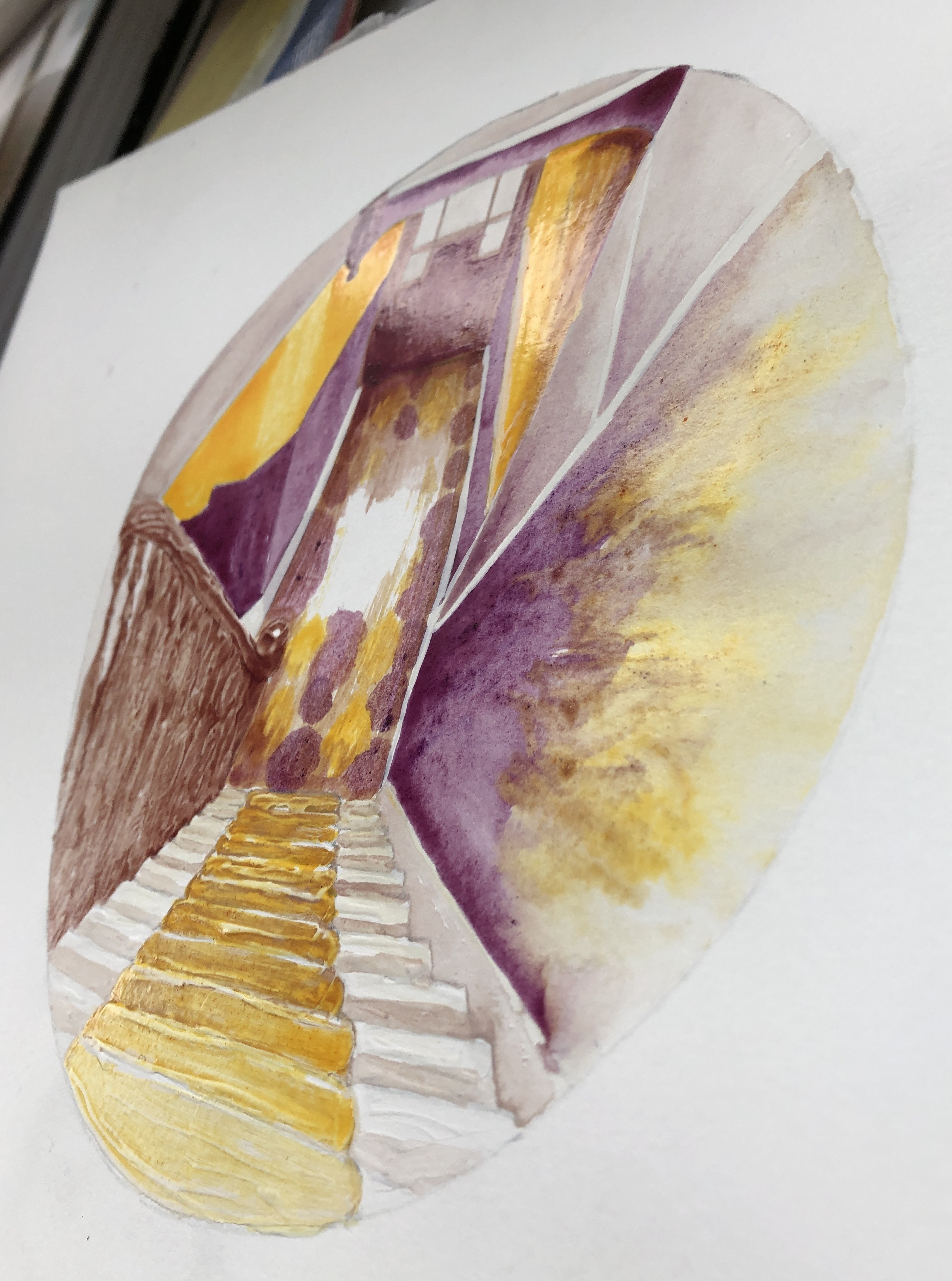
I worked on A3 HP watercolour paper, chosen because I had found this to be the best support in Part 3 for monoprinting. I wanted to begin with the monoprint, which would be the focal section of the painting, the floor tiles with the light on them; I picked this partly because I had found earlier in this section that monoprinting was a good way of reserving the white of the paper.
I made my own egg tempera, using Yellow and Purple shades of Brusho crystals as pigment. I made my paint fairly thick (only 3 droppers of white vinegar); the Yellow Brusho mixed in brilliantly, although the Purple crystals took quite a bit of stirring in. I had no white Brusho, and so decided to use the tube Titanium white egg tempera as it would only be needed in small quantities – my plan was to keep as much of the painting plain yellow or plain purple as possible, mixing grey/browns from a combination of these two as needed.
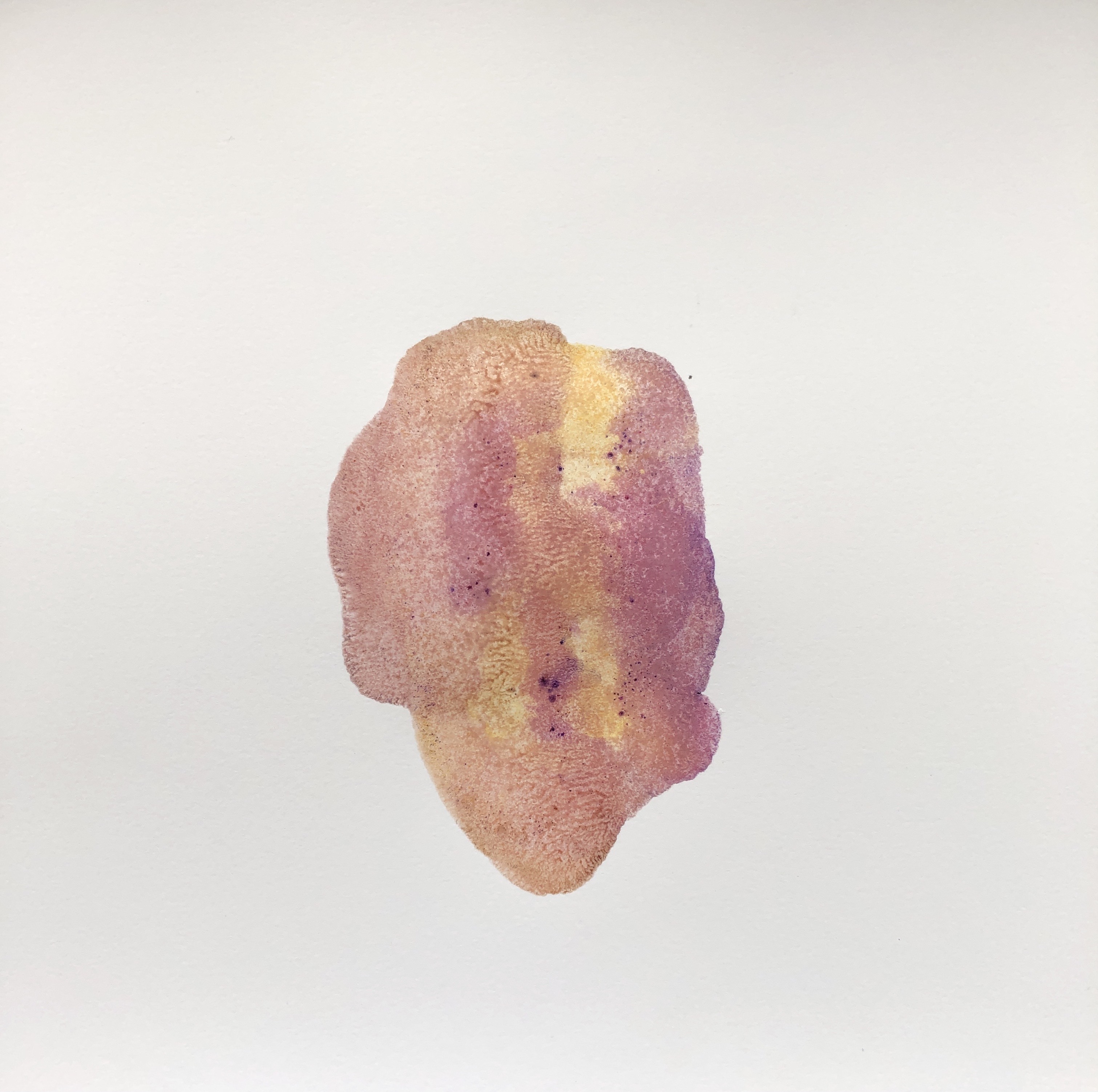
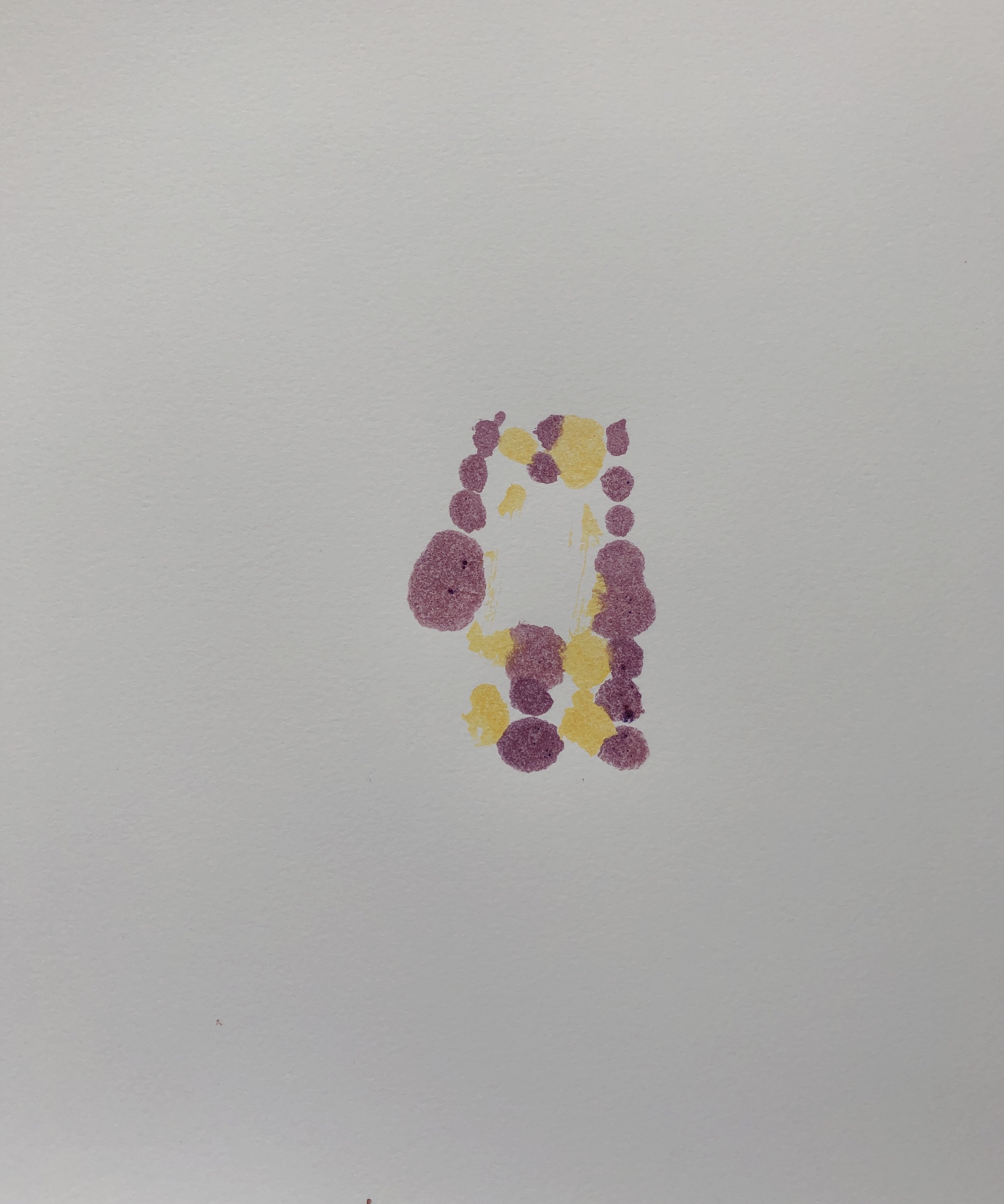
My first attempt at monoprinting with egg tempera was not a success – I put far too much on the plate, ending up with quite a dramatic splodge. Second attempt was better, and I decided to proceed with that:
I filled in the drawing around the print, added my gesso to the steps and banisters and, once it was dry, I began the painting. I tried various brushes; the paint was very glossy and several brushes I tried ended up leaving too much of a “channel”, so in the end I did the whole thing with a rigger, using the point for finer details and the side for bigger areas. The paint dried quickly and it was easy to show differences in tone by leaving some areas with just one coat, whilst building up layers in other parts.
Here is the completed painting, with additional photos showing close-up details of the gesso effect and a side view showing the sheen of the dried paint – perfect, I thought, for that slight shininess you get when looking at an image through glass (such as the glass of a telescope lens).
The final step was the surround, which I made from a dark grey sheet of pastel paper. Here is the final piece:
NOW WHAT?
I am pleased with the overall outcome because:
I feel it is a strong composition, the simplified perspective takes the eye in and out of the middle as the different sectors are explored; also I feel I have learned from the online courses on abstraction I have attended with St. Ives School of Painting, and have been able to simplify a complex starting image into blocks and shapes, something with which I have always struggled.
I am really enjoying exploring simplified palettes based around complementary colours, and I think I have chosen well with this pairing in this situation as it has allowed me to build up a range of tones.
I have built the painting around a monoprint.
I have experimented with gesso and enjoyed the effects I’ve achieved; I definitely want to use this more as I move forward.
There is something very satisfying about making your own paint, even though it was hugely messy and everything I touch now seems covered with a slightly sticky monolayer of egg.
I feel I’ve preserved our stairs for posterity, come what may!
If I were to think about changing how I did this:
I would think about investing in some proper dried pigment if I were to continue to make my own paint; the Brusho did well as a first attempt but, whereas some colours mixed in well with the egg/vinegar base, others were more resistant and gave a slightly gritty texture.
Home-made egg tempera is a very different beast from the ready-made tube variety, and I would need a lot more experimentation with brush selection and technique if I continued to use it.
My initial notes made at the Zoom meeting are in this format; the additional extra comments made after the written feedback are in italics like this.
Appreciate overall comment recognising the effort I have made to overcome the problems caused by the compound fracture of the shoulder of my dominant right arm at the beginning of this Part – and how it’s ended up being of benefit
Make sure that you sell what you are doing by making clear links in your written work between the research and your drawings
Research on the face – good comments, but need to include images so that the reader can easily compare and contrast; I NEED to go back through this blog post and add in some images – DONE
Make sure you acknowledge your sources, including referencing for internet images, and relate this specifically to your work
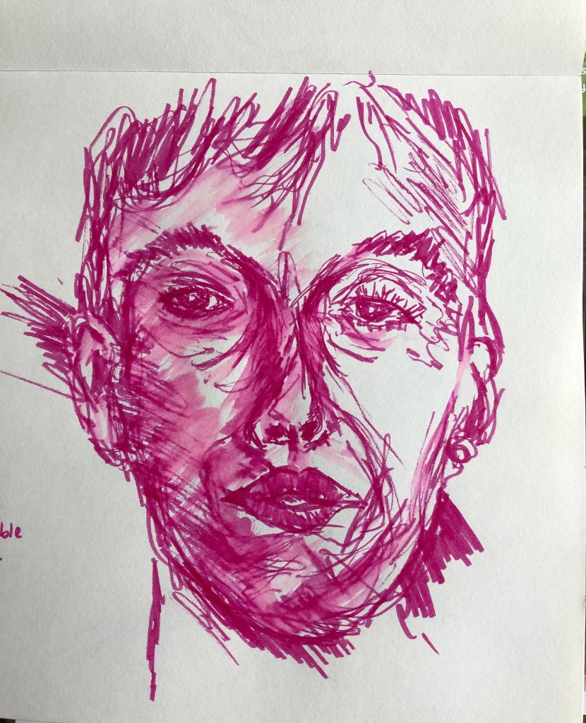
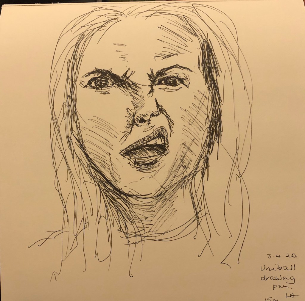
Purple pen self-portrait – tutor really liked this, she felt that it contained more marks than I usually include, which help to build form
“Studio window” self-portrait: composition was interesting, tutor has played around with the image and wonders if a square format would be good – she referred me to a local artist to her, Viv Owens – I have looked at her Facebook and WordPress pages – her record of daily drawings is impressive, and her paintings are striking not just because of the shape, but also her use of colour in backgrounds …..see notes below about the assignment pieces
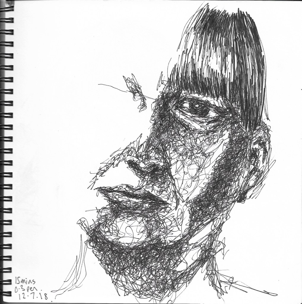
Tutor asked why I didn’t use pen more – I used to, but I think at the moment I have fallen into a habit of using an easy and forgiving medium for my left hand – but actually, thinking about this, my right arm is probably never going to regain the range of movement it once had, so I ought to get out of my dependency on charcoal for everything, and experiment with some different media. Tutor reminded me to use different thicknesses of fineliner, and to use my scribbly style to scribble tones and shapes, not thinking of them as a nose or an eye. Tutor has sent me some helpful examples of her work – some of
them are like the Maggi Hambling drawing of her mother that I liked (see blog on research of portraits) – see examples of tutor’s drawings here – and the fact that they are not necessarily showing the whole face does not in any way make them feel unfinished. Taking this forward:
I am going to try and do a face/head drawing a day, or as near as I can, and see if I can build this skill of looking at shape and tone rather than features – watch this space!
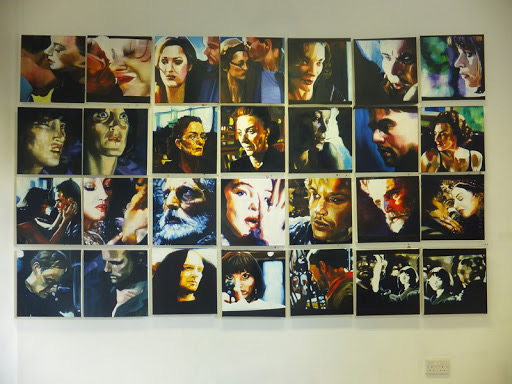
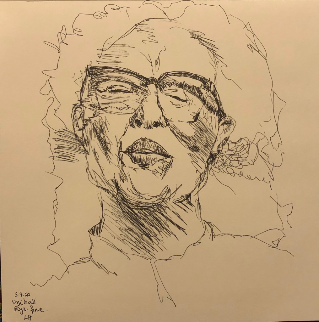
I am also going to try and include drawings of a range of different expressions in order to start addressing the point about identity and my first area for development – I have started this – I have allocated a square sketchbook to it (like Viv Owens’ work, to see what I think about this) – here are some of the first efforts:
Assignment line drawing: work a little more into the leg, feet and shoulder – they don’t feel rounded; glad Tutor found this a creative angle – I had really had to think and measure hard to tackle the
foreshortening. I WILL go back into the drawing to add more form to the parts mentioned – have been in and worked into it a bit, particularly into the lower parts
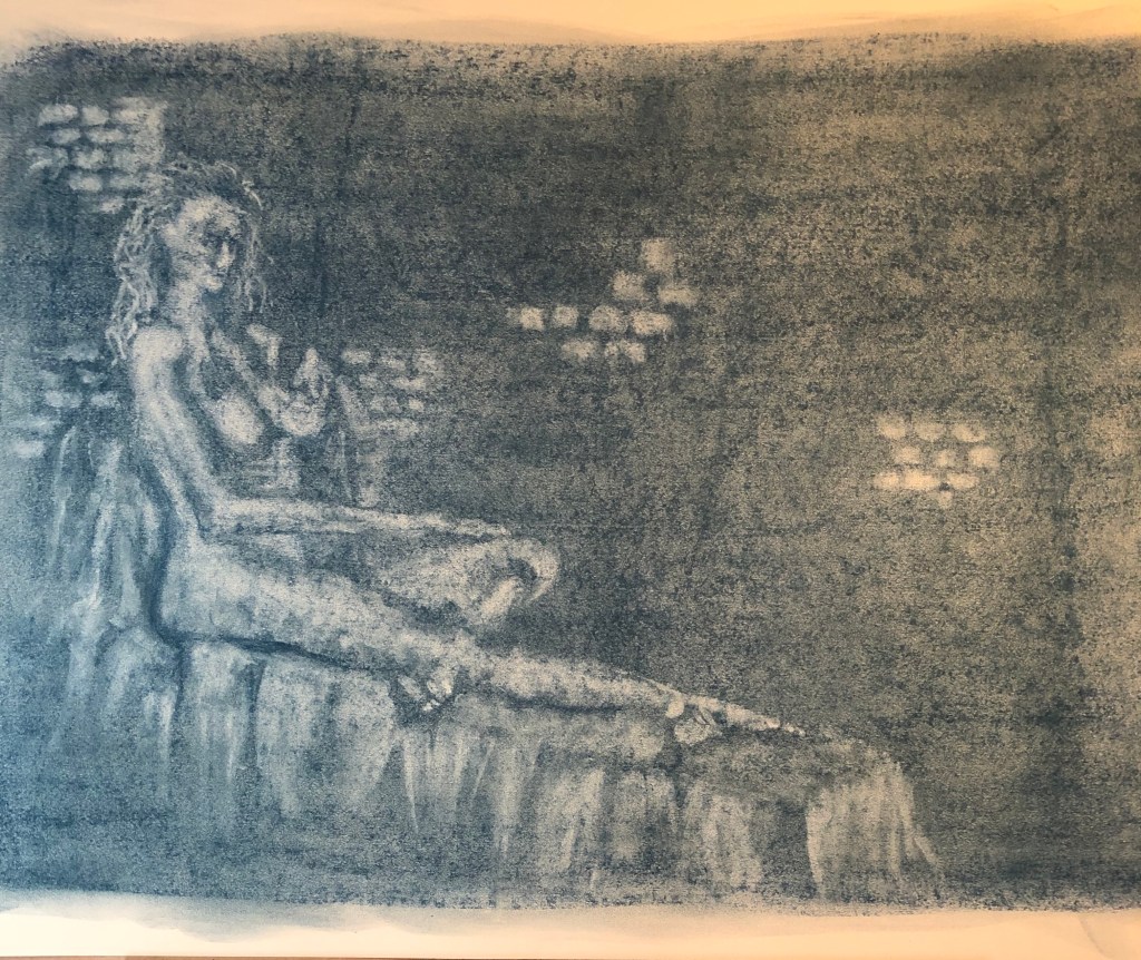
Assignment tone drawing: tutor liked image and technique. To improve, I need to lose the bricks which are making the image look flat and consider a graduated fading out of that top right hand corner, whilst at the same time darkening around the figure. Generally she said I have the light and mid tones, but need to work back in to emphasize the darks for bigger contrast. I WILL go back into the drawing and adjust as suggested.
I’ve now had a go at this – it was quite tricky fading out the top RH corner as I had already sprayed the drawing with fixative, so I was finding that trying to lift the graphite with a rubber was having the effect of burnishing rather than removing it; but then I found light sweeps over the surface with a rag was more effective. I worked into the shadows with more graphite, and do agree that the addition of more darks has added to the effect.
Assignment self-portrait: need to more specifically link this with my Escher research and include image. Tutor liked the composition but felt that the picture was a bit flat – she suggested that I bring it to life either by adding penwork in some places, or else adding colour washes, maybe to the area outside the mirror frame. I NEED to go in and develop this drawing as we had discussed, and also be clearer about linking my research. I have now gone back into my Assignment 4 blog post to make a clearer reference to my research.
After the discussion about adding colour washes to the “outside” bits of the drawing, I first of all worked into the large mirror frame using Colorex Tabac ink applied with the flat of a palette knife – this allowed me to indicate the grain of the dark wood. I had decided to apply colour to the bottom left (rose red carpet) and top right (creamy/yellowy/brown shadow), and tried to get the texture of the carpet first of all by dabbing ink on with a natural sponge. I wasn’t frankly terribly happy about the effect this produced and should have stopped there, but no, I repeated the technique in the top corner – this looked very strange and so I tried to limit the damage by making sweeping strokes with the sponge to look more like shadows – officially awful by now so I stopped. I completely see what the tutor had said about the drawing looking flat, but I really don’t like the way it has turned out. LESSON: don’t just plunge in if it matters – try experiments out first on a spare piece of paper!
Portrait from memory – tutor liked my quality of line, but said that clearly I was drawing features and some were not right – I must remember to think tone and shape rather than nose or mouth. To help with this, she suggested that I go online and find a set of images of heads showing a range of expressions (angry, sad, etc) and practise drawing these as a sketchbook exercise to build up my internal image bank (see also “sketch-a-day” notes above).
When drawing groups of people, remember to use negative spaces to help with size and scale
Hands and feet studies – I could link these to my Egon Schiele research – whenever you mention an artist, put in a picture
Drawing of bits of me – add a few bits of shading in key bits of negative space to add form
Drawing of reclining model – adding some tone around her will help to ground her
A helpful formula for writing reflectively:
What? (..have I looked at – describe)
So what? (what have I learned from this?)
Now what? (what will I do about it – how might I use it in my work?)
Sketchbook not seen obviously – suggestion is to make a blog post with any key sections – I think that with Part 5, I shall just try to be really methodical about putting pictures of my sketchbook on the blog as I go along, making it clear that this is what they are and why I have included them and what they have led to
Context – looking forward to Part 5 – have already made a start at looking at Robert Smithson and Richard Long – NEED TO:
Write up what I’ve found about them (include images!)
Just before I go through the individual criteria, I want to say how much I have enjoyed this Part of the Drawing 1 course; before having to tackle it, I would have moved heaven and earth to avoid having to draw a figure or face, but now having been made to do it, it has all been quite new to me and I have got so much out of it and learned such a lot.
Demonstration of technical and visual skills
My use of materials has been partly dominated by what I felt most comfortable with when using my left hand (being a natural strong right-hander) and by portability, as a large section of the work has been done out of my studio. Favourites have come out as Nitram charcoal (expensive but well worth the money), graphite (messy but fun) and drawing in natural ink dye using a bottle top dropper – very freeing.
Techniques: I have worked in line, tone (both by applying hatching and by removal of pre-applied medium) and a mixture of both. Drawings in line with minimal tone have dominated the quick pose sessions at my life group sessions, so I felt prepared for the large A1 line drawing (larger than I have drawn before – I am only 4 ft 11 in so it felt almost as big as me!) when I finally got to the assignment piece.
Observational skills: well, if they weren’t going to develop in this Part, they never would. I have looked and looked and looked again, trying to remember to forget what it was I was actually drawing and just think of it in terms of shape, form and tone.
Visual awareness, design and compositional skills: I was learning so much about drawing humans that I think this side of my work went onto the back burner a little until I got to the assignment pieces. I have been made to think however about when a whole body, part body or cropped part of body is appropriate to either fill a brief or to make an interesting image.
Quality of outcome
I have learned at a real rate in this Part and so at times my work reflects the learning which has gone on rather than a “finished” outcome – but I hope that, at this stage, this is partly a good thing. Hopefully I have been able to express my progress through this learning experience and my thoughts on it have come out via my blog and in my notes in my sketchbooks (I have a completely filled A3 book and broken into a second and a full A4 book – as well as loose sheets of bigger exercises and a hand-made A6 book for stealthy observations!).
Demonstration of creativity
Within the constraints with which I have worked during this unit, I do feel I have been experimental in my use of materials and my use of techniques. Having to use my left hand from scratch has been a learning curve in itself, but by now I am really enjoying working big and the freedom to be loose and sweeping where appropriate. I now need to apply some imagination and invention into the storage of large works of highly smudgeable art! Looking at my three assignment pieces, I am pleased with the development of my “voice” – I think it’s starting.
Context reflection
I was fortunate to be able to visit the London galleries in January 2020 and so look at a wealth of different artists’ approaches to the depiction of the human face and figure – not an area of art to which I’d paid too much close attention before, so good to have an injection of inspiration at an early stage. A couple of key texts – those by Chris Legaspi (Life Drawing for Artists, 2020, Quarto Publishing Group USA, Inc, Beverly USA) and George B. Bridgman (Bridgman’s Complete Guide to Drawing from Life, 1952, Sterling Publishing, New York/London), in particular – have supported my growing understanding of the nuts and bolts of anatomy and how to get started with the daunting task of representing a living, breathing human on a 2D surface. My learning log has been a key record; in the previous 3 Parts I learned a lot but it was by way of developing and adding to or changing aspects of art I had already tinkered with, but in this Part I have been learning pretty well from scratch, so writing stuff down has really helped to reinforce everything new.
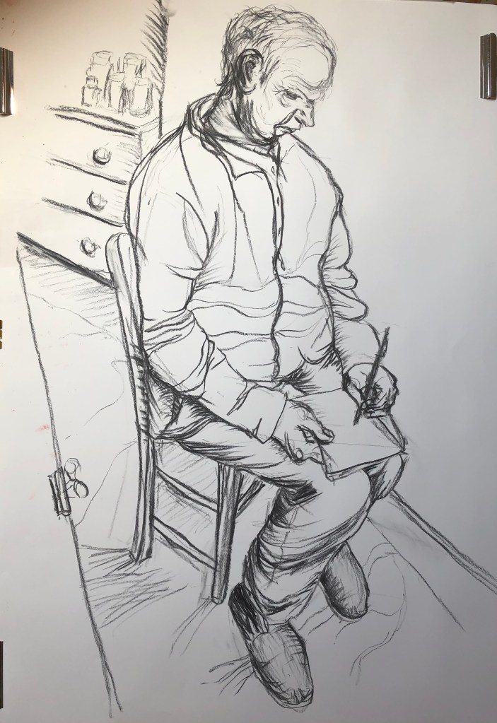
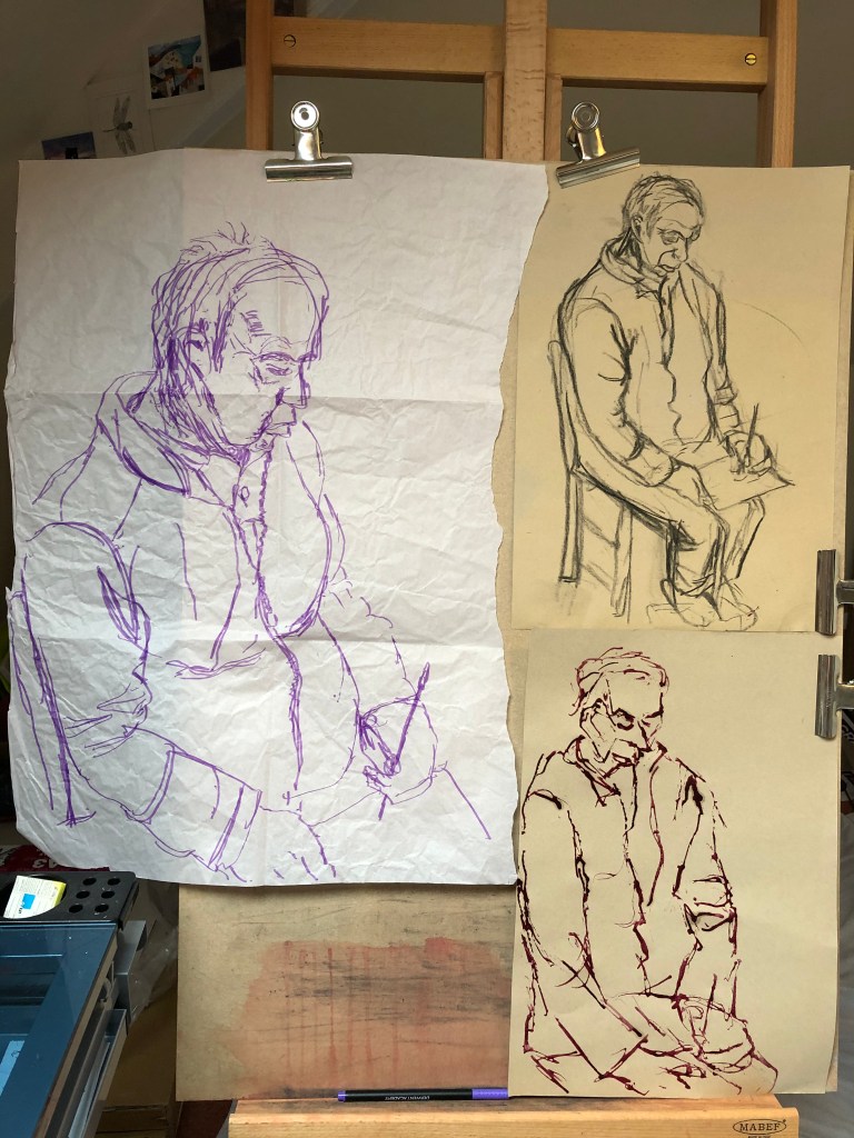
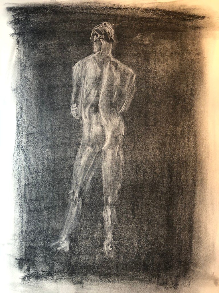
Figure study using line (A1) – Seated model in an upright chair
Working on A1 posed some issues for me, in that I could physically only cope with this by working at my easel, which had previously been lugged with some effort into my attic studio – so I decided a studio pose it had to be. My studio is snug but my husband had volunteered to be my model and he is a very neat and tidy sitter – he was very accommodating and sat perched on a small uncomfortable wooden chair for quite a while through my preliminary sketches and on into the main work. Taking a leaf out of David Hockney’s metaphorical book when he did portraits of his parents, I decided to give my husband something to do while he was sitting – some sudoku puzzles, which he loves – so that he could get involved in those and relax into his pose a little.
An A1 line drawing bellowed big sweeping charcoal marks to me, so that is what I turned to. The composition turned out to be quite a challenge for me as I was looking down and sideways on my husband who was right next to me, leading to a considerable degree of foreshortening, and much measuring was needed to get the proportions right.
I got the feel of the drawing using a few sketches (felt pen on packing paper, charcoal and natural ink dye applied with dropper on sugar paper), and I took a couple of photos for reference as well in case Tim got tired of sitting.
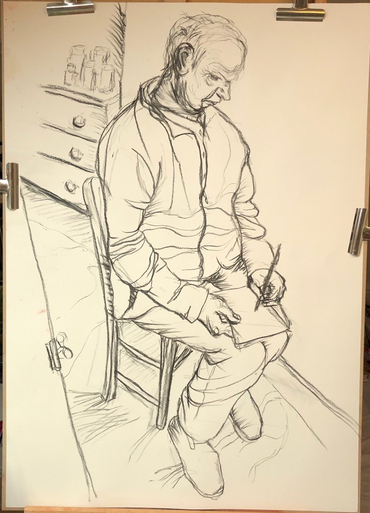
I started my main drawing on A1 heavy cartridge paper using Nitram charcoal; I have used this for most of my life drawing groups as I find it easy to hold and wield using my left hand, and it is forgiving of error as my fine motor control can be random. I have become very used to working through mistakes at the life group, and so I tried to do the same here and stay loose.
I was surprisingly pleased with the outcome – I have tried to use a range of marks, think I finally cracked the difficult composition and proportions, and it does actually look like Tim. He was wearing a chunky fleece which fell into many folds, but I think I have got these in the right places and have indicated them sufficiently rather than faithfully trying to represent each one.
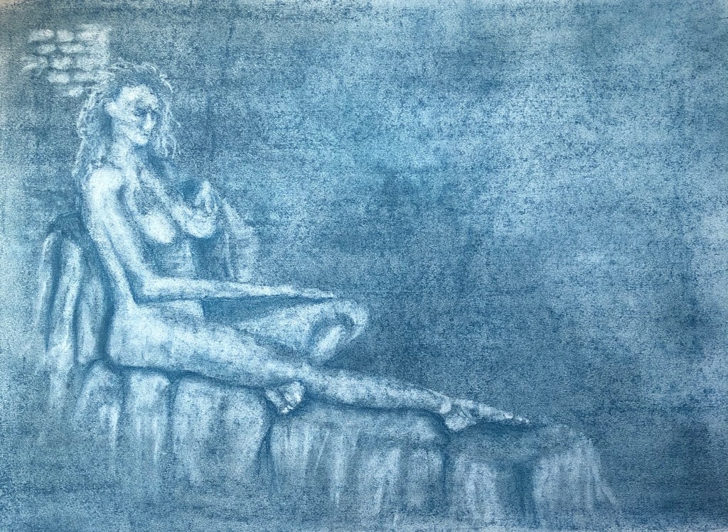
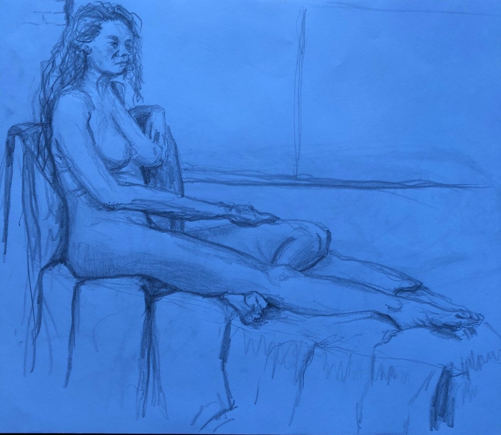
Figure study using tone (A1) – Reclining model
For the tone drawing, I was really keen to go back to a technique which I enjoyed back in Part 3, where I covered a page in charcoal and then drew into it with a putty rubber. This time however I had discovered, whilst tidying the studio a bit, my box of graphite chunks, so I played about with these and well as charcoal:
I loved Nina Mae Fowler’s charcoal drawings, for example her Luminary Drawings, some of which also appear to use a similar technique – see here : Charcoal on paper
29 x 44 cm, permanent collection of the National Portrait Gallery
In the meantime the coronavirus restrictions began to bite, art groups fell away, and I was keen to social distance due to my predisposition to lung illnesses. Hence, I decided to take for my assignment piece a sketch I had done at an earlier life class – it had been a longer pose where I felt I had included enough tone details in my original drawing to work up into something bigger.
This was my original sketch (see first A3 sketchbook); I photographed it under an LED light and the photo came out unexpectedly blue. I rather liked the blue, so I decided to use a blue graphite block to lay down my background, rubbing it well into the paper with the heel of my hand before starting to lift out with the putty rubber.
This is the complete image…
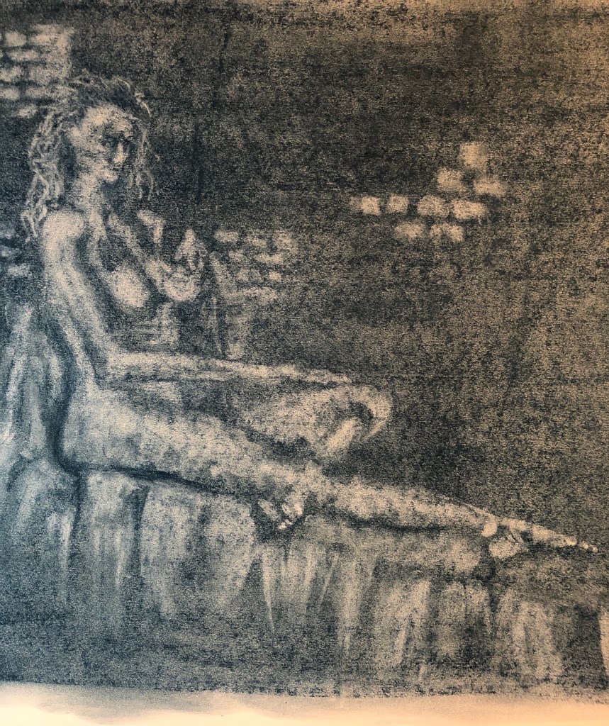
..and this is a slight close up focusing on the figure…..
I really enjoyed doing this drawing – there was much standing back and looking, then stepping in to apply the rubber, then stepping back to look again. I don’t think I placed her quite correctly, there is a lot of blank wall (which unfortunately was just blank brick wall) in the top right quarter, but I left it like that as I felt the dark quarter set off the lightness of the figure and support, which were lit by windows on the left. I was especially pleased with the feet, I think I have got the light and dark tones of both of them well.
A portrait or self-portrait combining line and tone (any size)
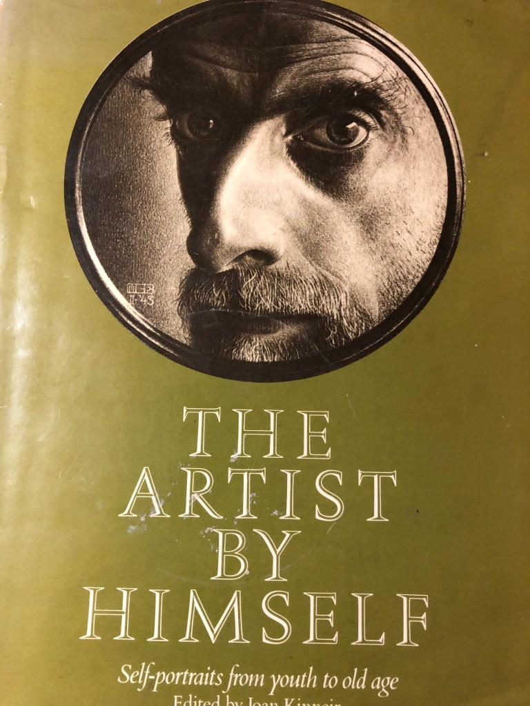
In my research on other artists’ approaches to both portraiture and self-portraiture (see separate blog posts) I had been attracted to cropped images, such as this one by Escher :
(Self-portrait in shaving mirror, 1943, “Scratch” drawing, brown lithographic crayon. Haags Gemeentemuseum, The Hague) – as seen in Joan Kinneir (ed), 1980, The Artist by Himself – self-portrait drawings from youth to old age, Granada Publishing Ltd, Herts and London.
Escher seemed quite taken with reflections of himself when drawing self-portraits – this one which I found reminds me of the self-portrait which I did in Part 2, when I was reflected in the metal dome of a lamp:
Still Life with Spherical Mirror
1934, Lithography print.
Also, when I tried my own self portrait in an earlier Exercise (see blog post), I tried an angled and cropped image, and thought it would be something I should like to try again in this task.
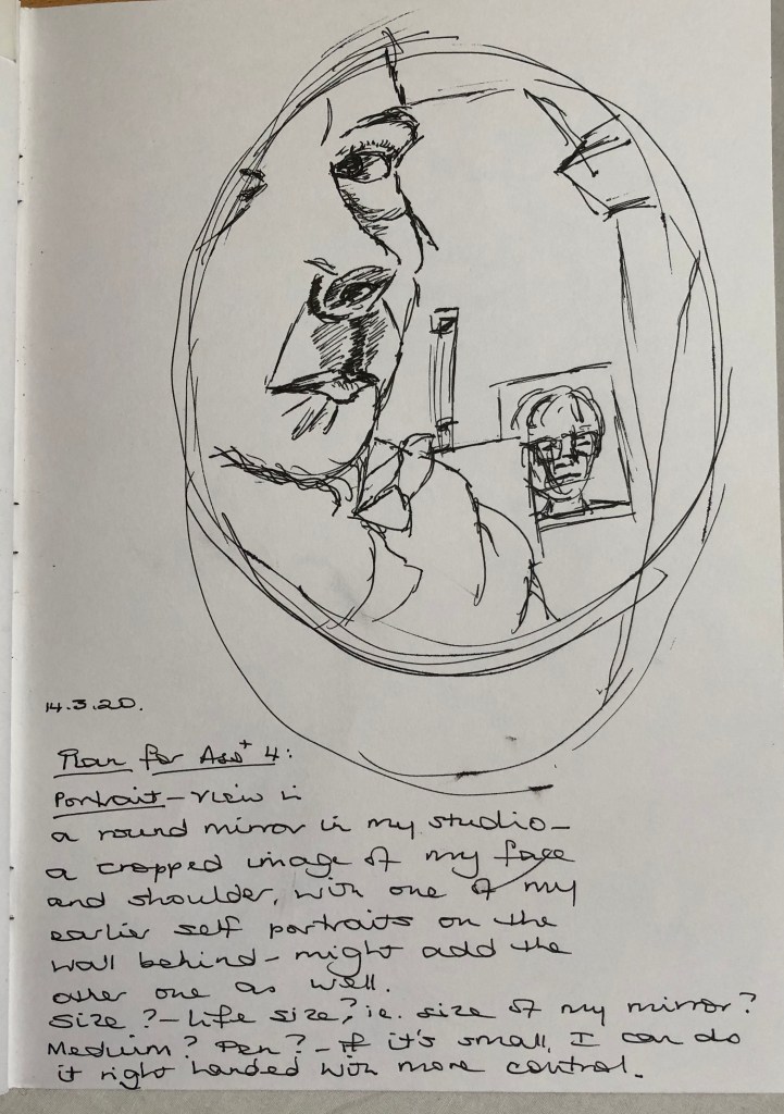
Based on the Escher drawing, I found a little shaving mirror and tried holding it up with one hand and drawing with the other….serendipitously I could also see one of my earlier self-portraits stuck up on the wall behind me, so included this as a double portrait. I did it on A4 with a drawing pen, thinking to roughly emulate the size of Escher’s portrait – it was OK but felt a bit cramped. Then I looked again at the terms of the assignment and saw that I had to demonstrate the proportion of the features in relation to shoulders and chest as well as head, so decided that this composition did not really meet the brief – but I learned that I needed to work a bit bigger, and also not with pen which is a bit unforgiving.
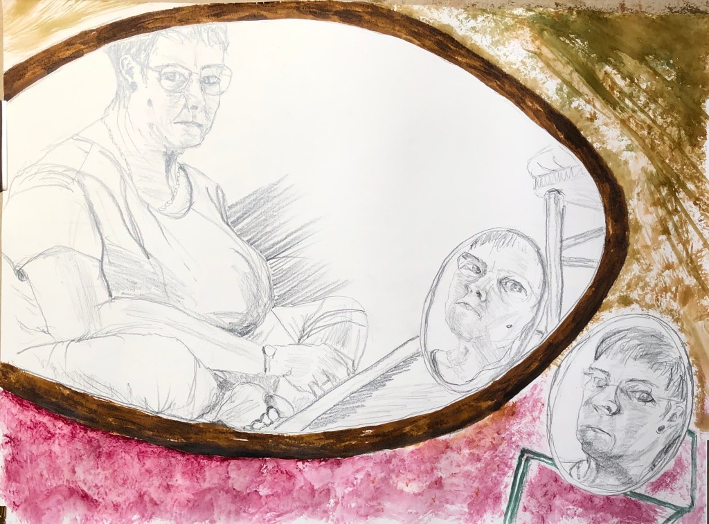
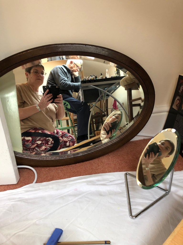
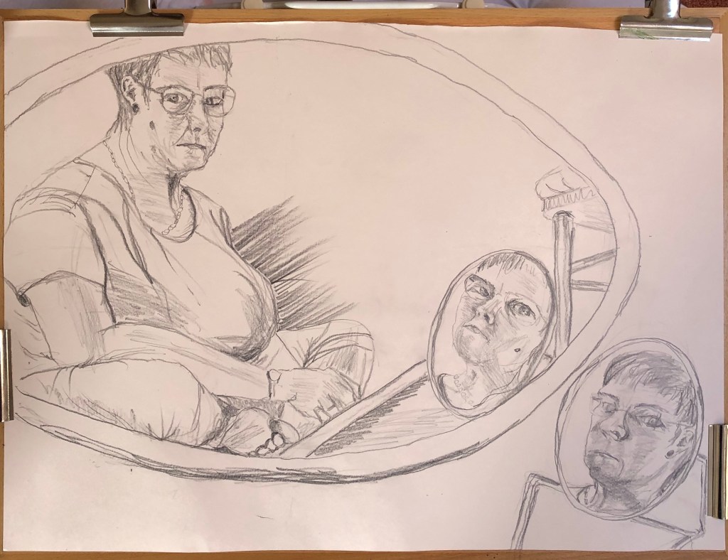
I decided that, if I was including more of myself than just face and head, I’d like the rest of me to be in an interesting position – I had enjoyed the self-portraits of Artemisia Gentileschi when she placed herself in unusual poses. In my studio I have a couple of old oval wood-framed mirrors which are there because we haven’t found a place for them anywhere else – I don’t have any hooks to hang them from in the studio (it’s on the to do list, along with a cork-board wall) so they live on the floor propped against the wall. I experimented with arrangements which included one of the oval mirrors, the little shaving mirror and an interesting position, and came up with sitting cross-legged on the floor drawing on a propped-up board on A2 – this is the set up:
(excuse my husband sitting at my work table in the background marking a maths paper – we were self-isolating in the attic from workpeople downstairs). With this arrangement I could see two direct reflections of myself at different angles (in the big mirror and the small one) and also the reflection of the small mirror in the big one – so, a self portrait from three different angles.
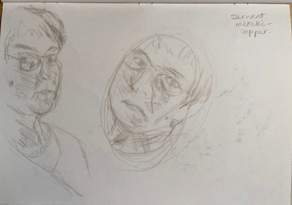
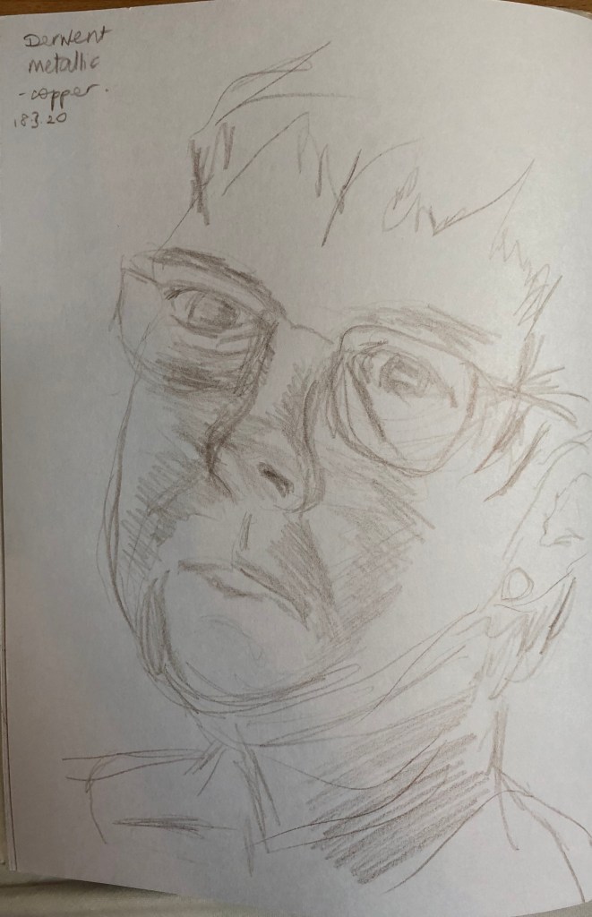
I tried the idea out by sketching the face as shown in each of the mirrors in my sketchbook in pencil:
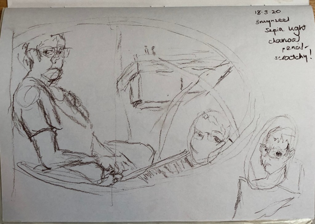
…and also the overall composition in my A4 sketchbook using a sepia charcoal pencil:
I started roughing the composition out lightly onto the A2 paper using a 4B pencil, which is the first thing which came to hand…..I would love to say that I dwelt on my medium for some time, but actually the 4B pencil felt fine so I stuck with it. I brought a lamp in and placed it on the floor to my right – I did try it out to see how it would look in the semi-dark, but my eyesight is not great and I just could not see things clearly enough for me to draw from – so my light sources were actually various on the day I drew the final version – I kept the lamp beside me on my right (not very strong); I have a skylight over my head to my right; and South-facing windows from the other attic room behind and to my left. The outcome of this is that the sides of the face are lit but the front of the face is more shadowed.
Well, I’m not sure how Artemisia did it – by the end I found I had “set” into a hunched forward-and-over position which I needed to reach the angled drawing board…shades of Yoda and Jabba the Hutt come to mind! Looking at it now, I do think overall I was this shape – I find I can always tell if it’s right if you go to draw a body part, and the other body parts which it meets up with are in roughly the right place.
I am pleased with bits – the main figure is the best, I think, because it was easier to see. Little details have gone well – the ear, the foot, the folds in the trousers around the knee. Other things are less good – eyes too close together in the main drawing, too far apart in the shaving mirror near me, best in the shaving mirror reflection – a bit like Goldilocks. Interestingly, I drew with my left hand, except for the shaving mirror image on the floor by me – without moving everything, I couldn’t really reach to draw this so switched to my right hand, and I think this is the weakest portrait of the three.
I hummed and ha-ed about how much background to include – it was very complicated and I thought I could lose the impact of the portraits, so I confined it to the mirror outlines, the chair and the drawing board – I think this works.
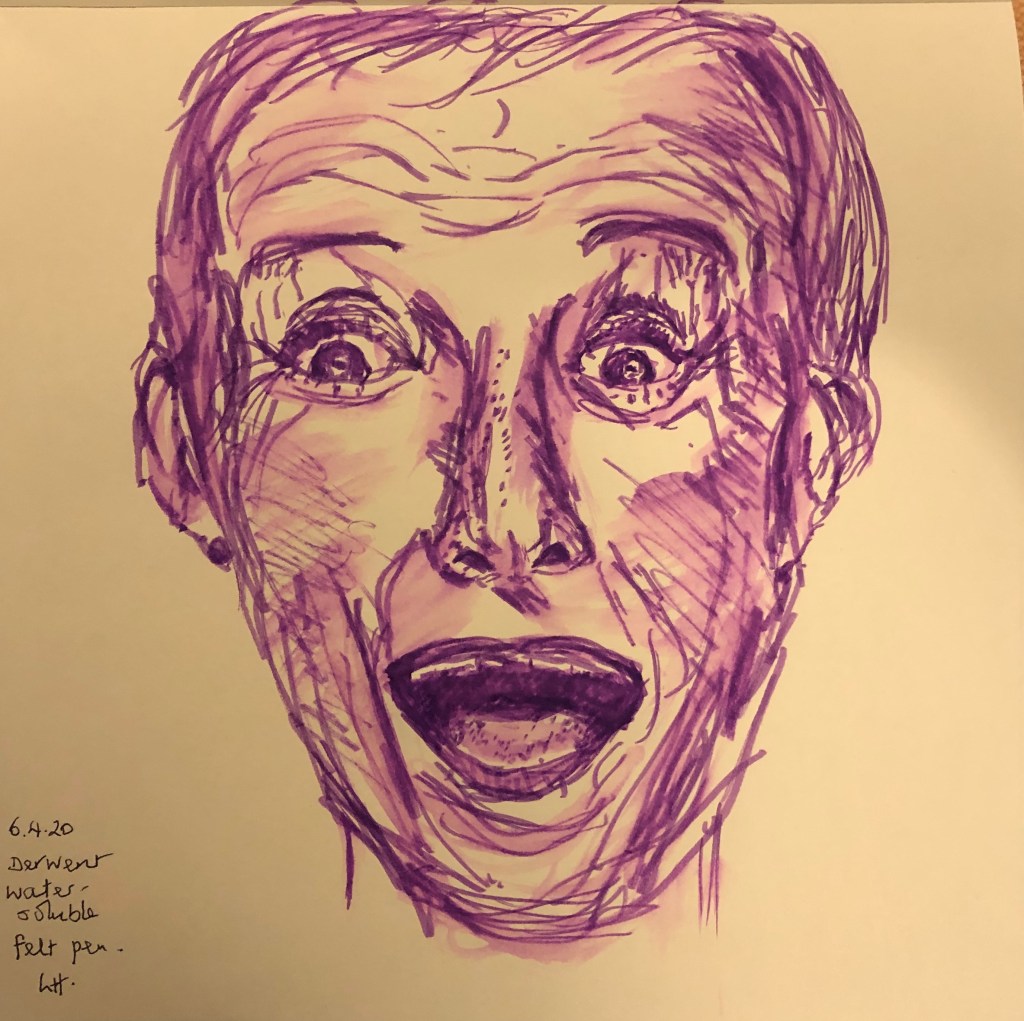
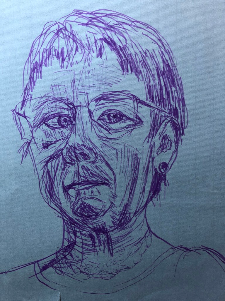
I had tried drawing self portraits before, years back – think everyone has a go at some time, don’t they? – but they were scary and severe efforts and I was determined to be a bit kinder to myself by trying to approach the exercise crabwise, almost creep up on it unawares, so to speak; so I chose an old battered piece of blue sugar paper from the bottom of the pile and a purple felt pen. I was drawing left-handed so knew there would be mistakes and a bit of a temptation to tinker – hence the choice of a support which was highly disposable and a medium which was fairly tinker-proof. What was going on the paper would be there, warts and all….oh dear….
I set myself up with a mirror propped slightly below my eye line and a little to my right – my memories of my previous full face attempts were not happy. I tried to relax and just go for it, letting the pen travel around the page so that nothing got too boxed in. I even left my glasses on, determined that I was going to rise to the challenge and not be fazed – if it was wrong, then that was ok.
Well, the outcome looked like someone, I think, although not me. Eyes definitely too close together, neck not wide enough. I showed the drawing to my husband and he agreed that it wasn’t quite me – I asked him to discount the cross eyes and the chicken neck and see if anything else was wrong, and he said he thought possibly the overall shape of the face. I left the drawing propped up somewhere and my husband did come back an hour or so later and said he had been looking at it again and he did think it was a bit like me after all (which was pleasing, although I hope he’s not referring to the cross eyes and the chicken neck…).
Getting out the battered blue paper reminded me though of all the more experimental stuff that I did in Part 3, so I decided to try a bit of that for my second self-portrait. I stuck down a piece of A3 paper at a skewed angle and laid down a background all over it in Conte crayon which I put on and then rubbed in with my hand. My art room has a fairly steeply pitched attic roof and I draw/paint underneath a wood framed Velux skylight; I didn’t want this to be a detailed background, so I chose the three colours of the wood (a yellow, a sienna and a dark brown) and laid them in stripes to indicate the Velux frame, then used a light grey for the sky outside and the white painted walls and ceiling. I propped up a mirror so that I had to look down and round into it, and drew myself using sienna Indian ink applied with a small flat brush.
The outcome is a little crazy-looking, and obviously the Velux background shows through the ink, but I didn’t mind that – I had to keep moving my head to see in the mirror, so I thought this sort of gave the idea that my head was the transient feature in the image, the background being fixed and therefore immutable.
It’s better – the nose is too wide and the right cheek (as you look at it) is too prominent – but I feel the odd angles and cropping give it energy and, better yet, my husband says that this one looks much more like me. On the basis of this, I’m thinking of trying for a similar cropped or skewed image for Assignment 4.