REVIEW OF PART 3
Demonstration of visual skills: Materials, techniques, observational skills, visual awareness, design and compositional skills:
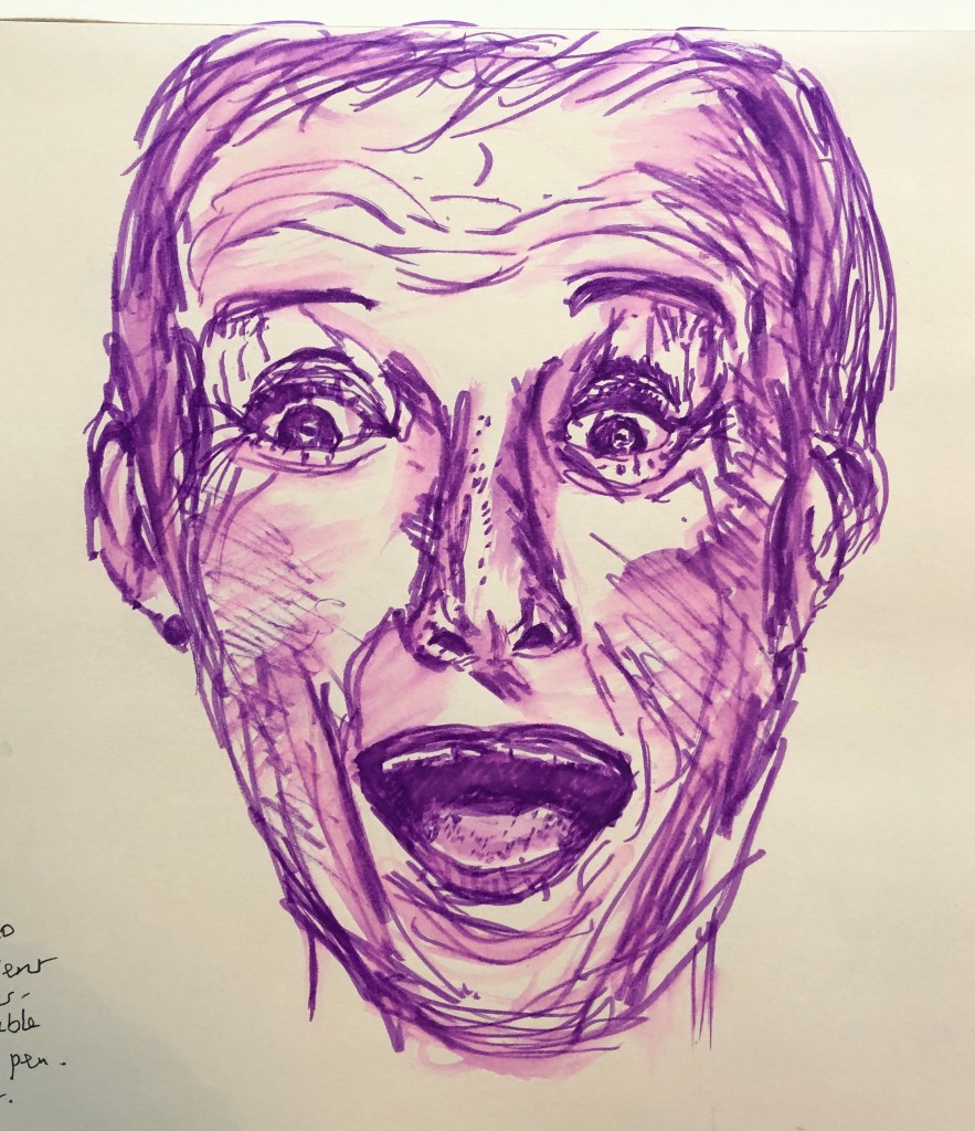
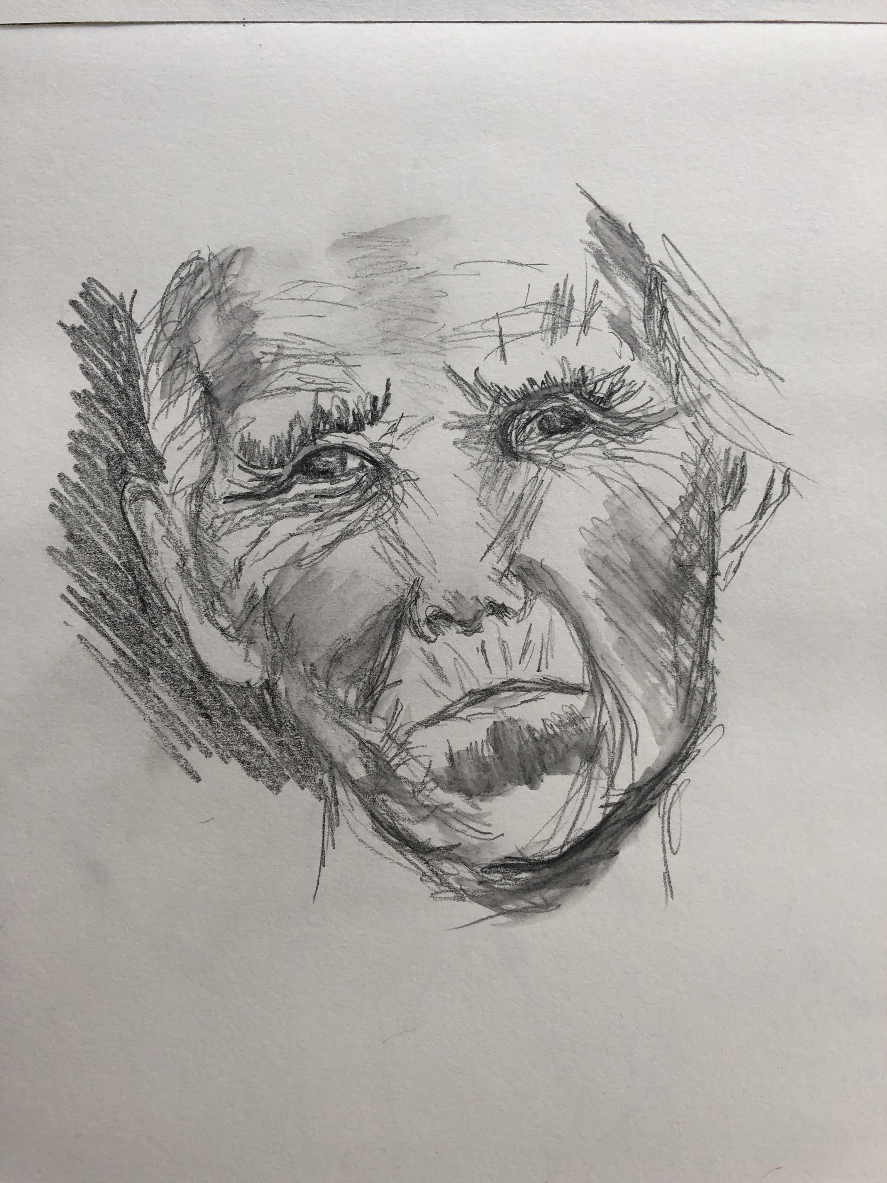
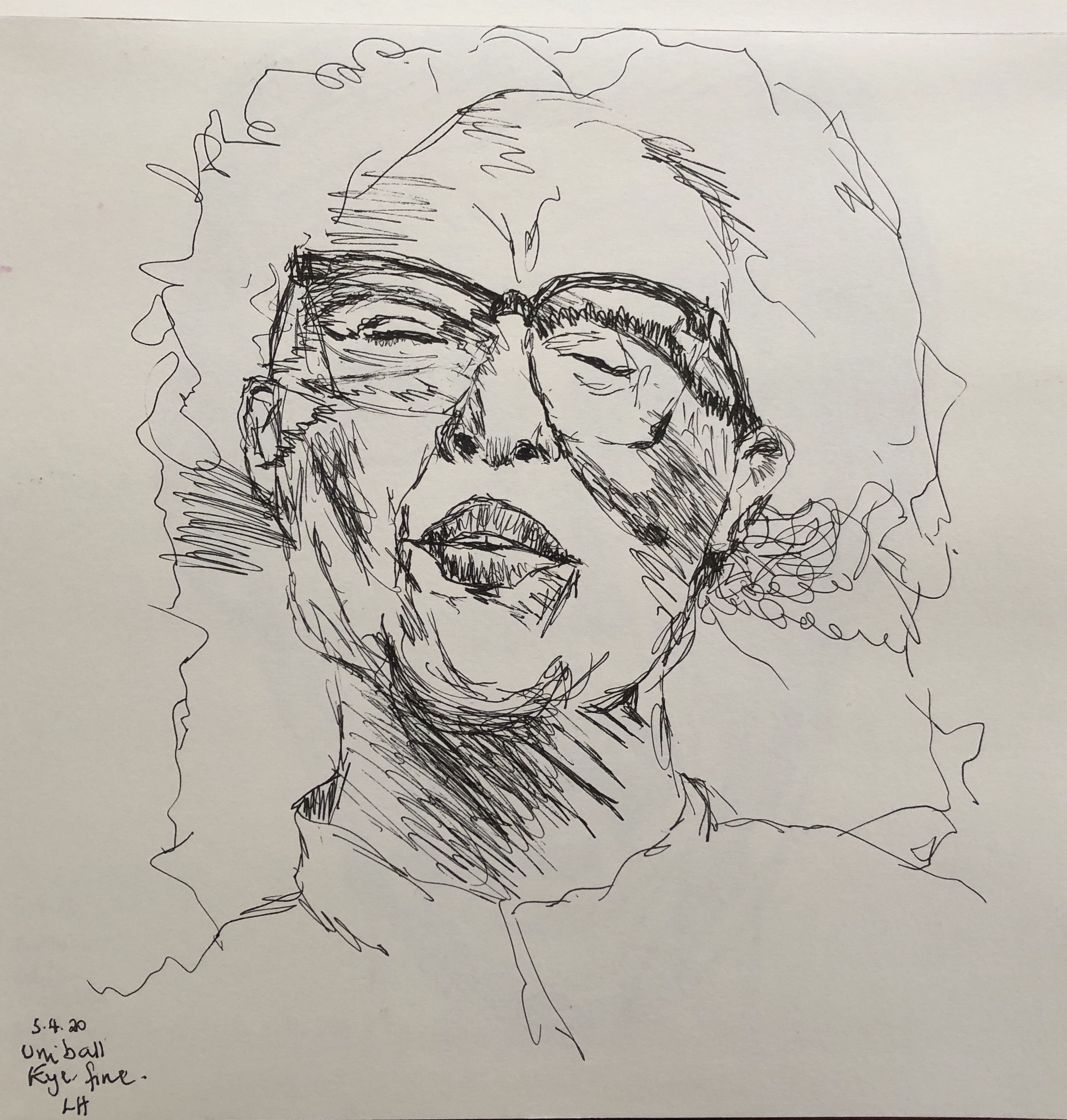
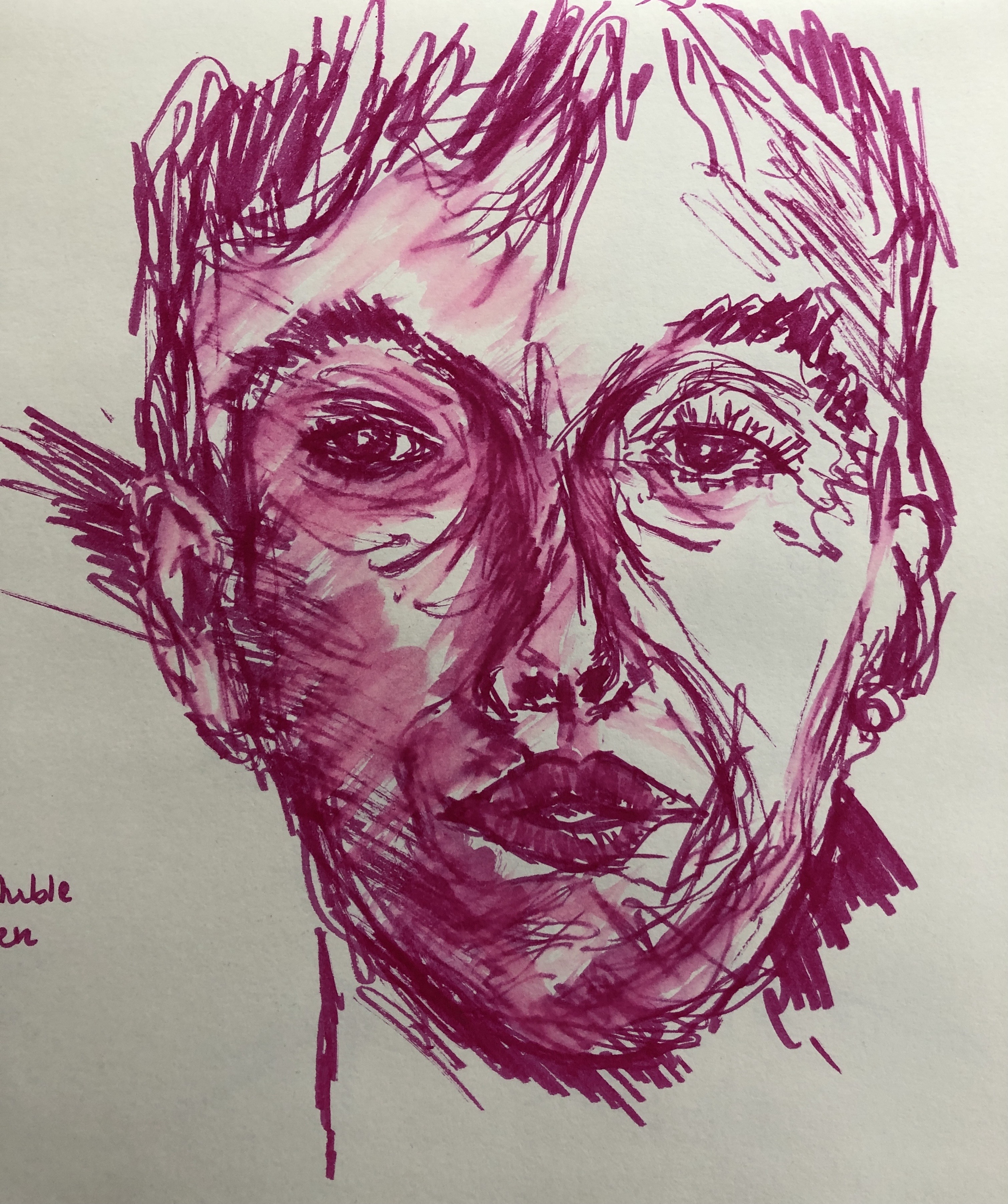
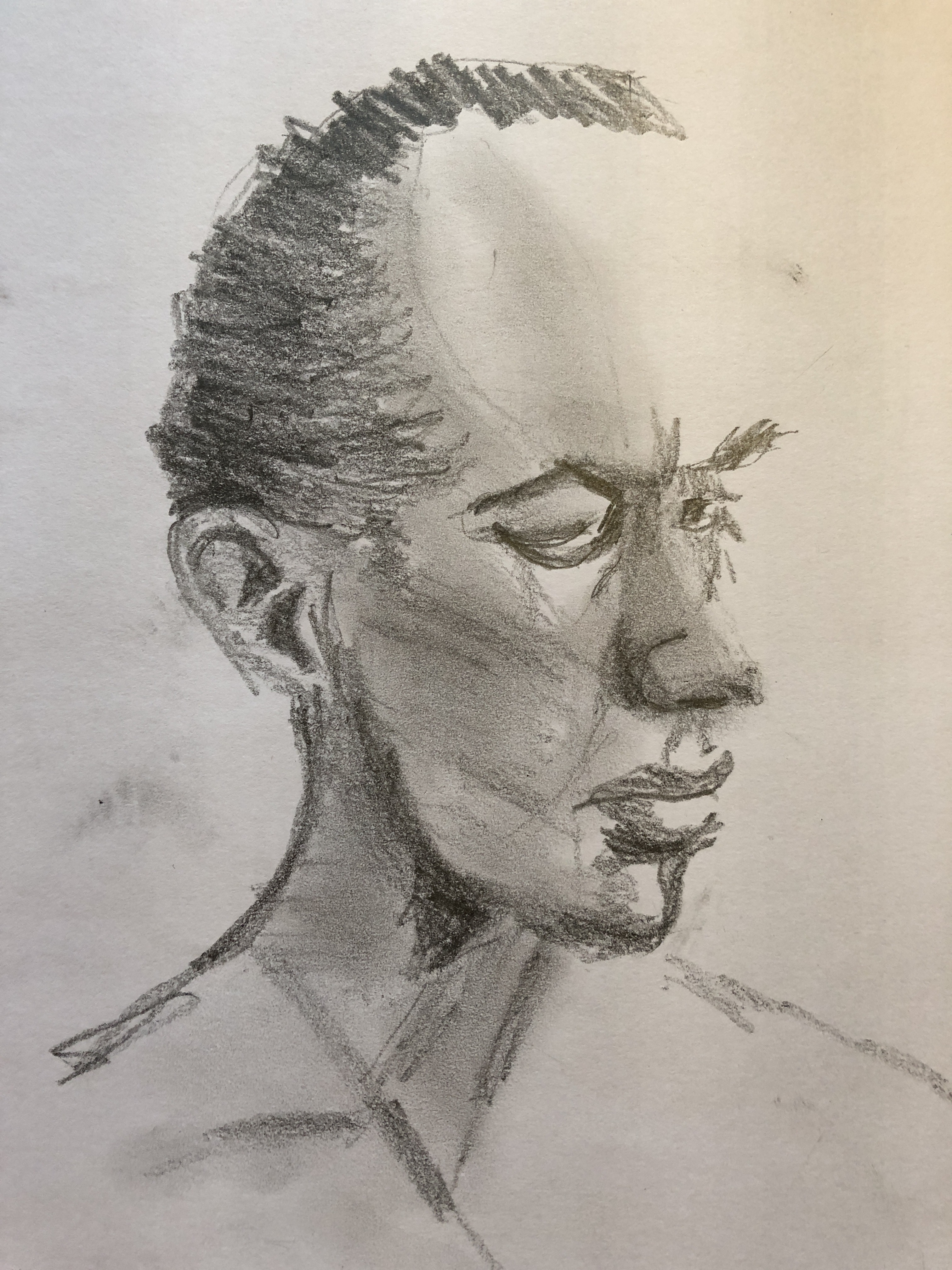
I have done quite a bit of drawing, both whole body and portraiture (particularly the latter) in this section of work. I have mainly worked with a sharpened 2B pencil and putty rubber in sketch books, and have tried to improve my understanding of the use of blocks of tone and shape.
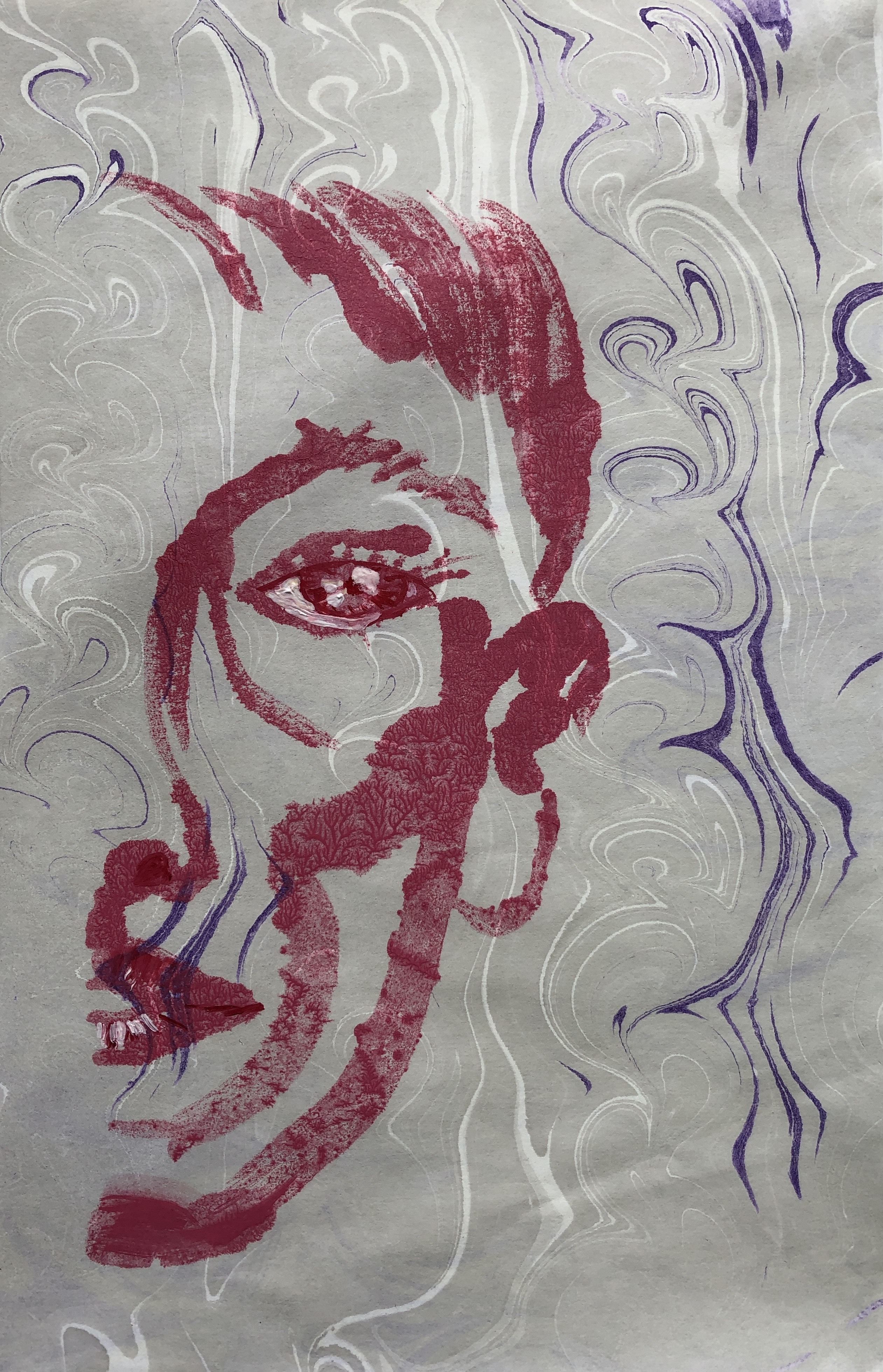
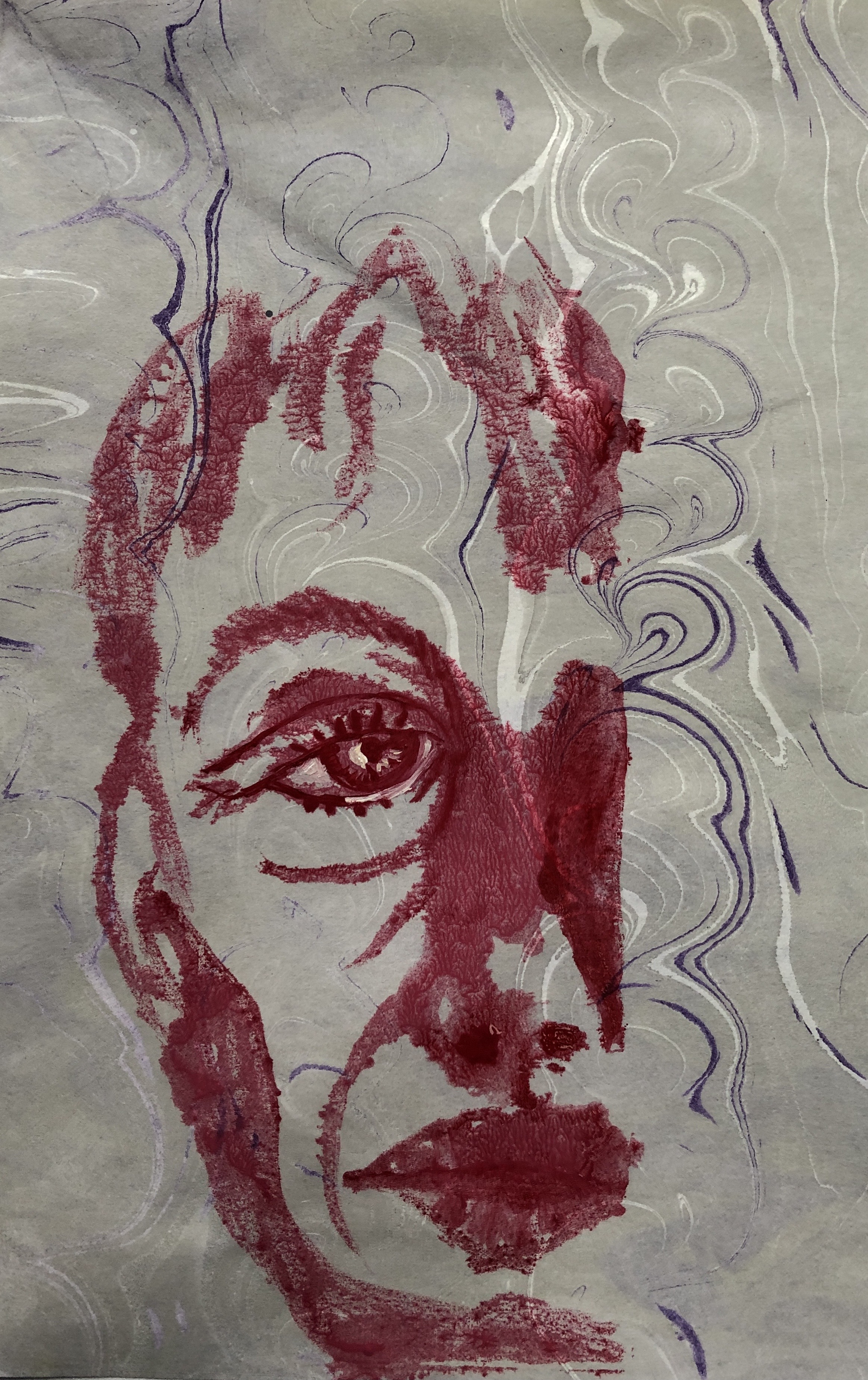
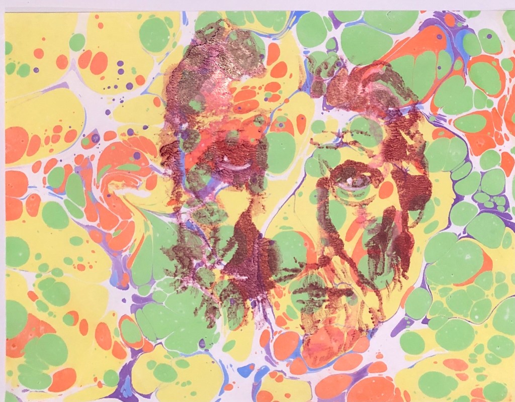
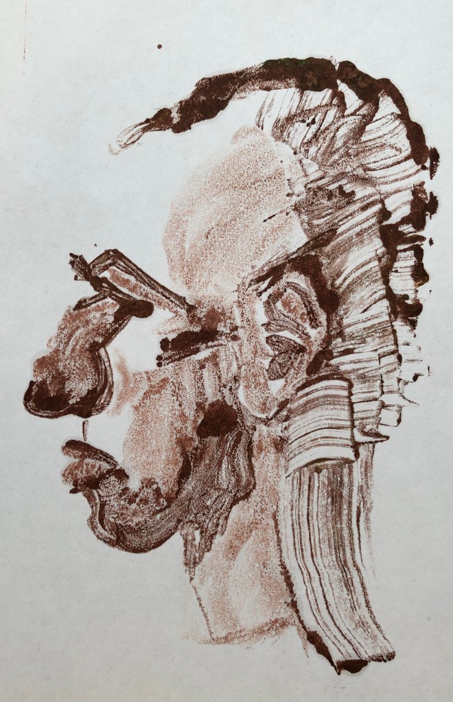
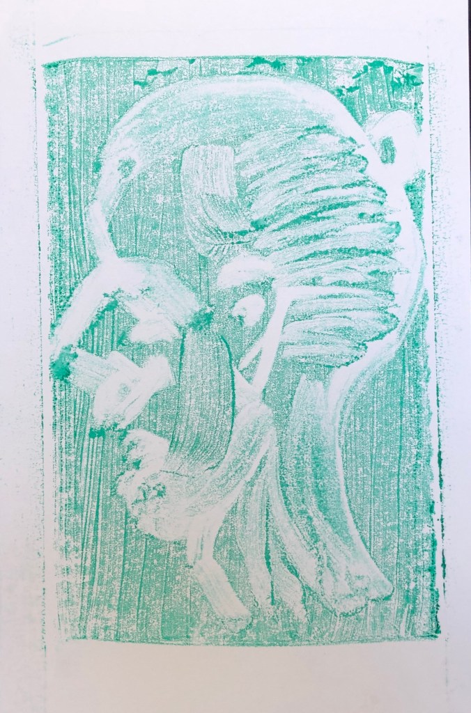
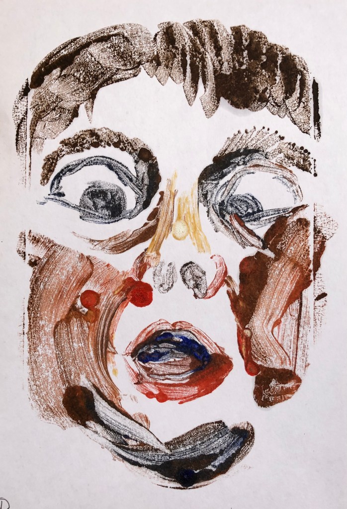
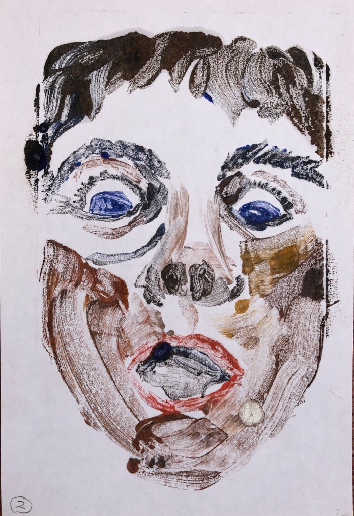
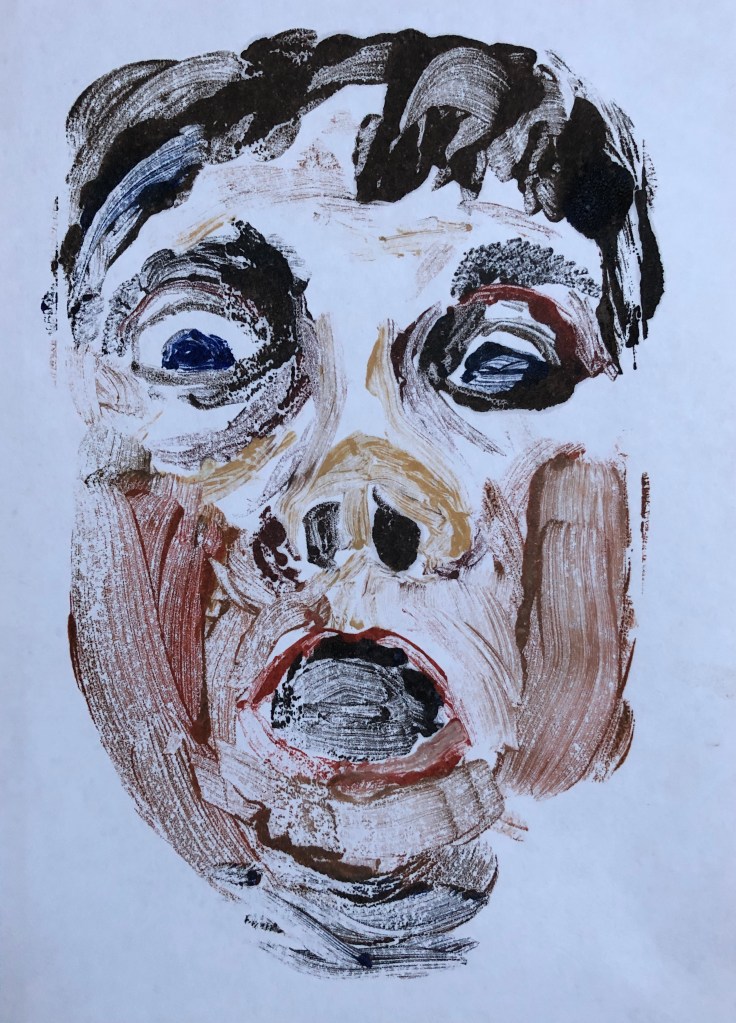
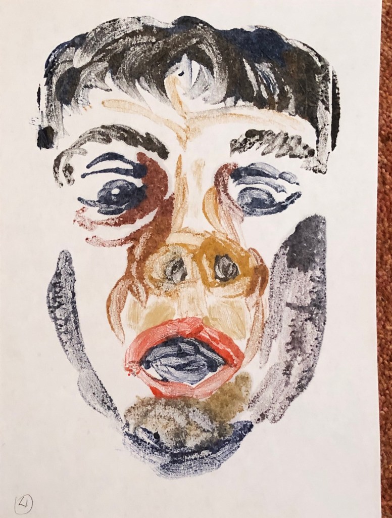
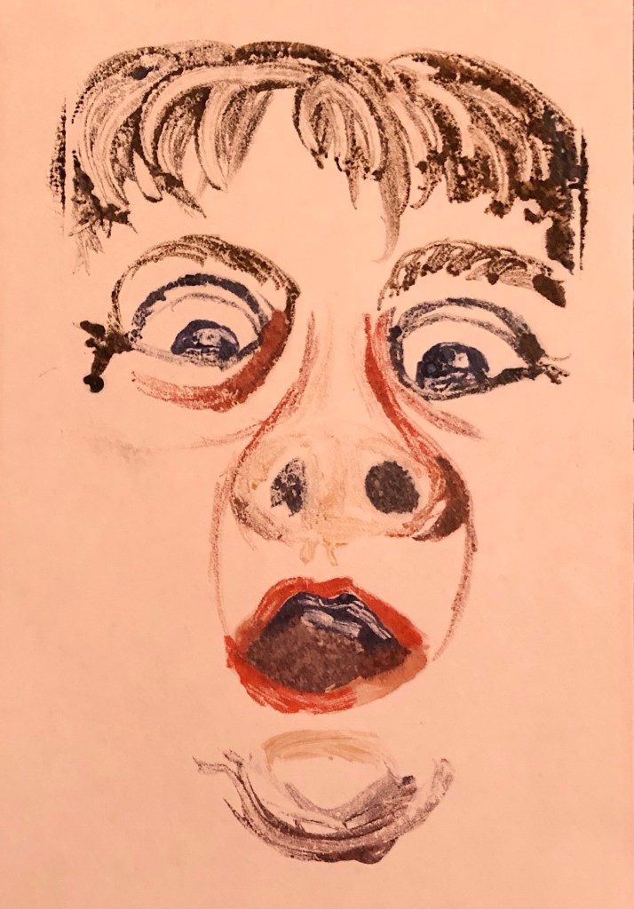
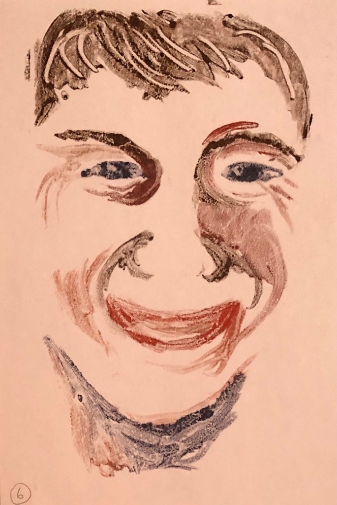
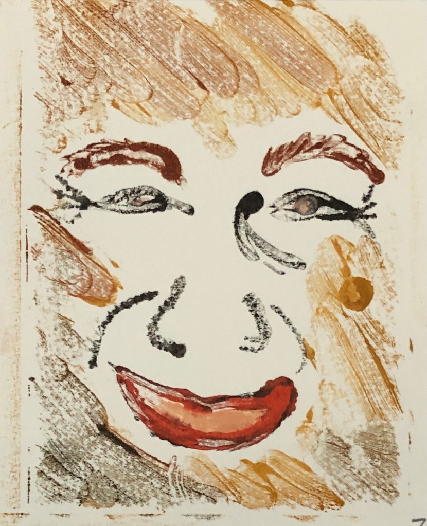
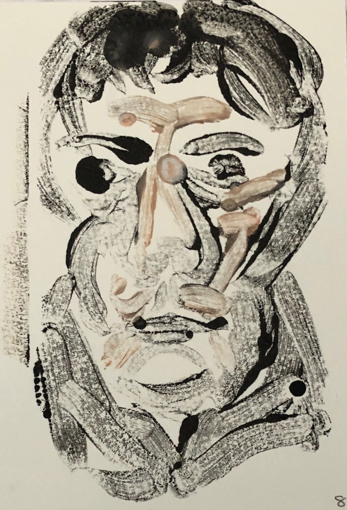
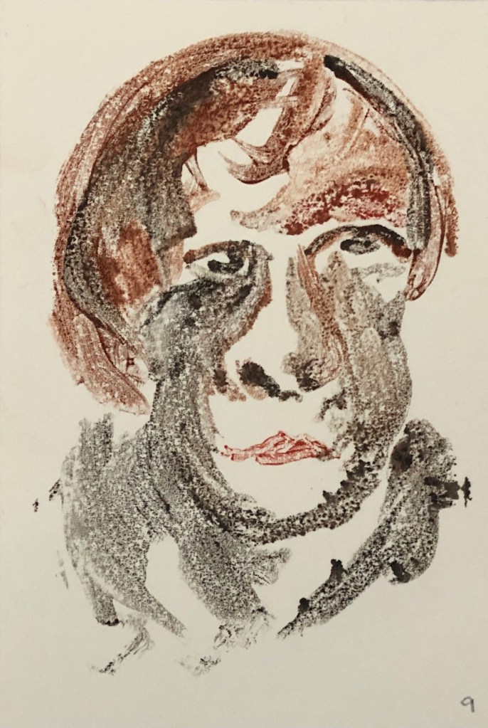
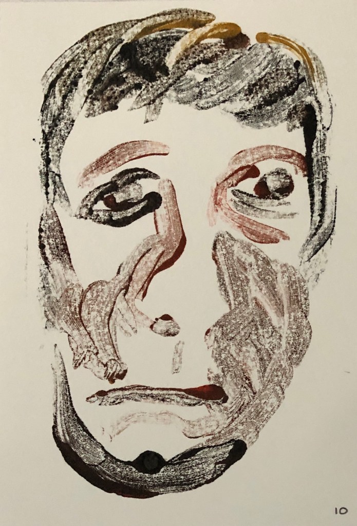
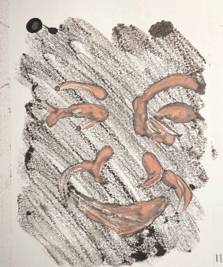
It was helpful to have a demonstration of the process of printing with oil paint in the course material as a lot of the instruction I found online or in books relates to a similar- yet-different process of rolling out printers’ ink and drawing into it. Learning was therefore a matter of trial and error, mixed with a bit of frustration, but I gradually began to appreciate the versatility of printing in this way, and the range of possibilities for developing the work. I eventually worked my way towards a method of combining two separate prints into one picture in a meaningful composition.
Quality of outcome: Content, application of knowledge, presentation of work in a coherent manner, discernment, conceptualisation of thoughts, communication of ideas:
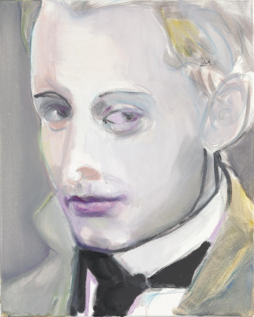
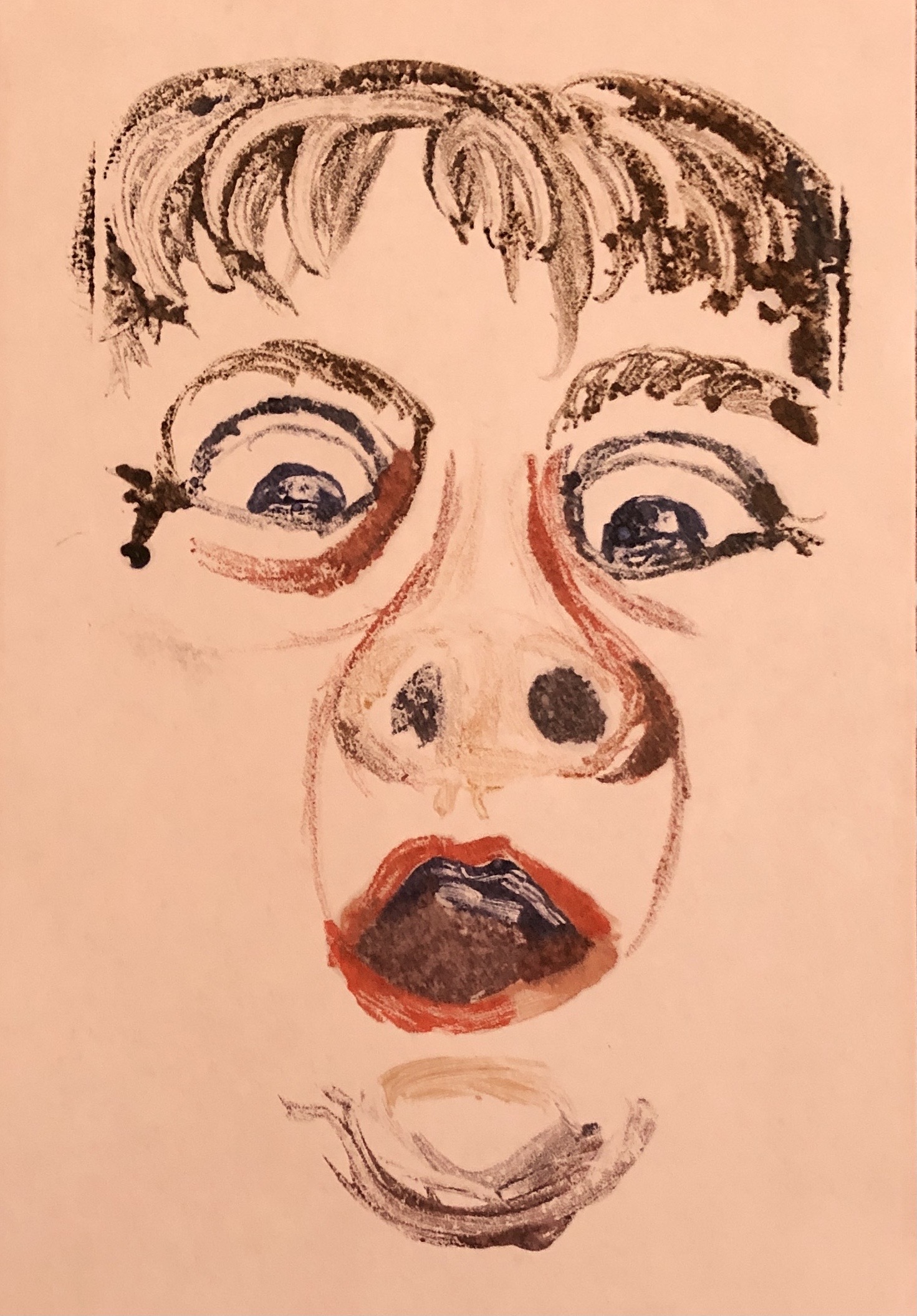
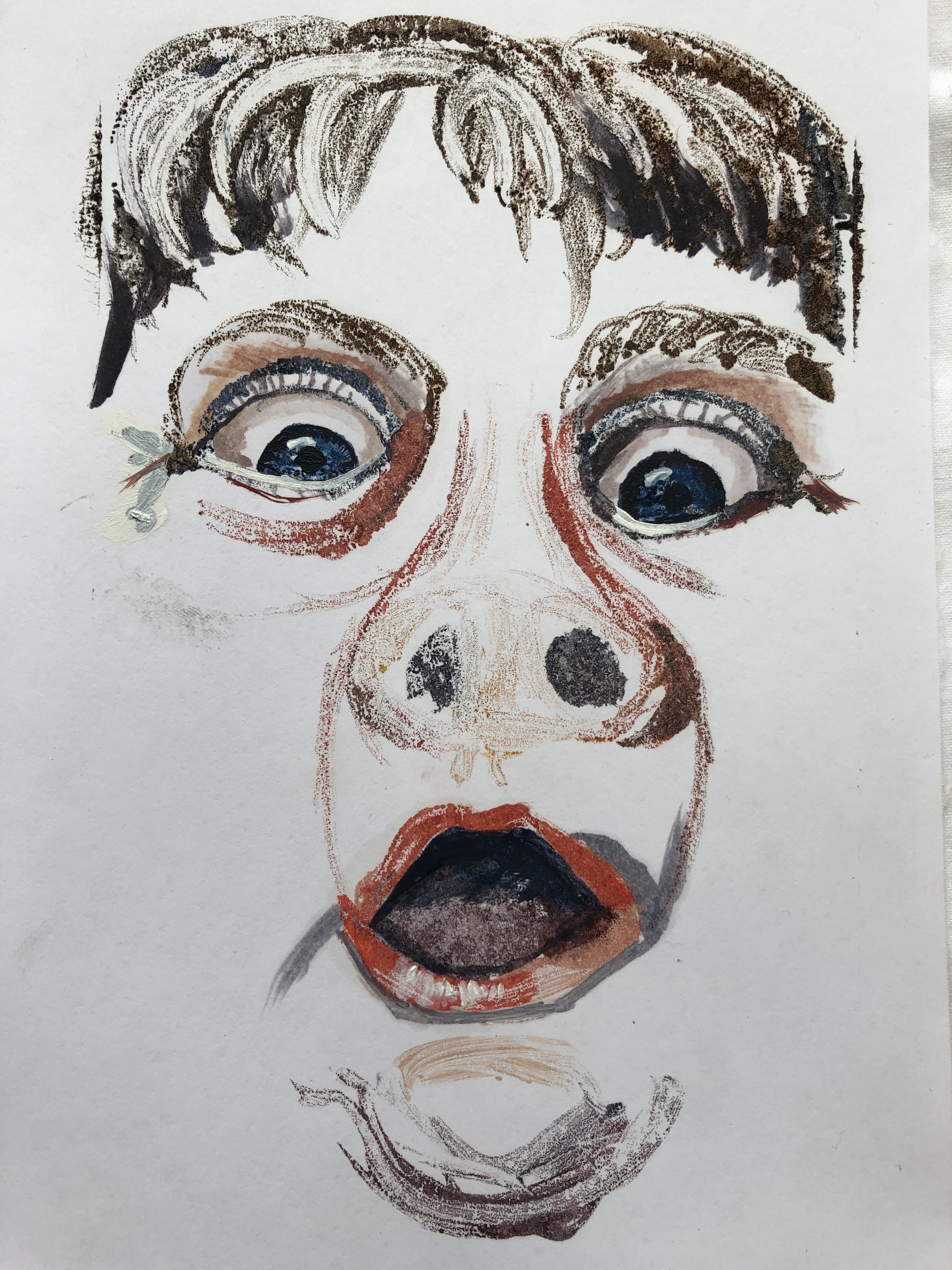
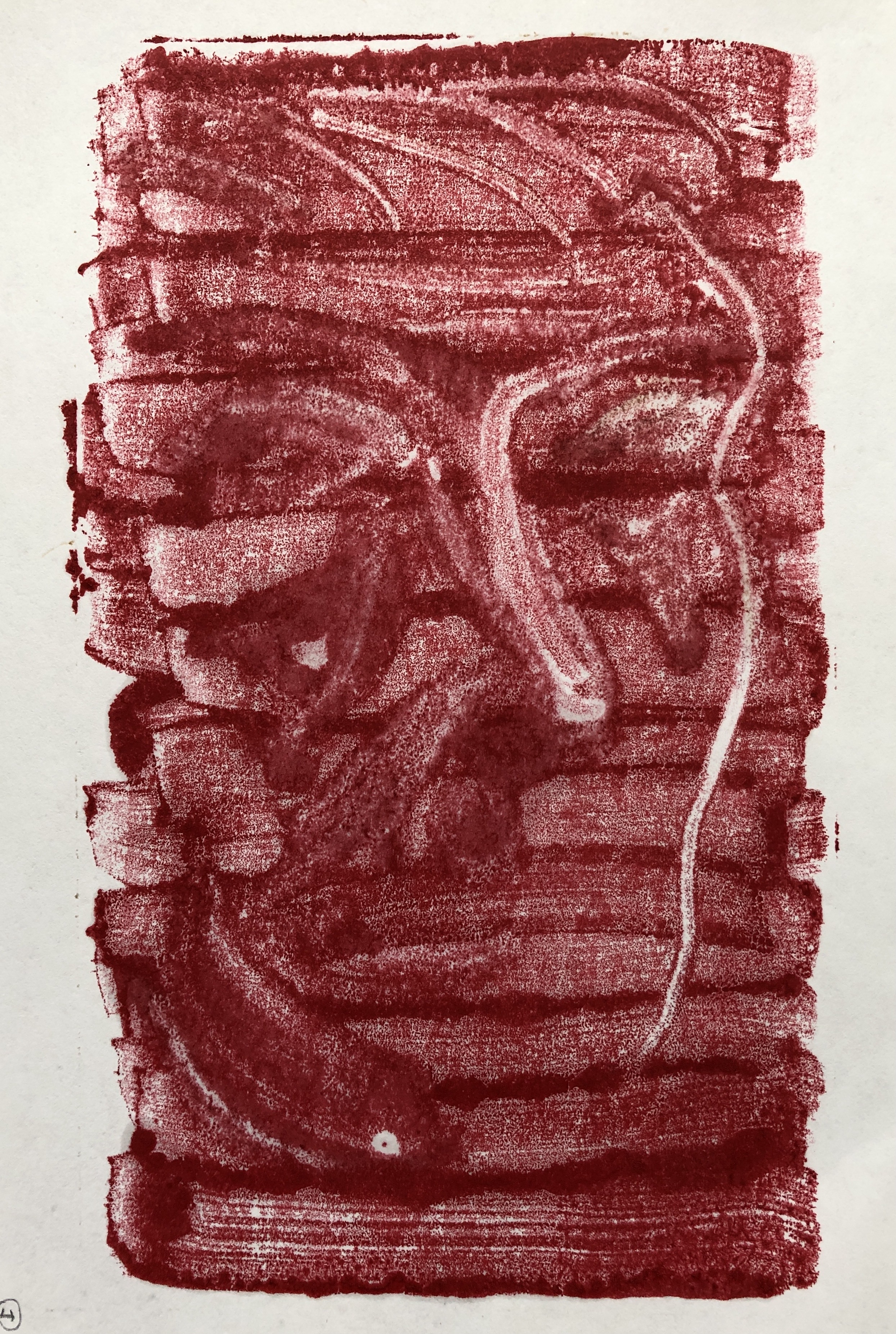
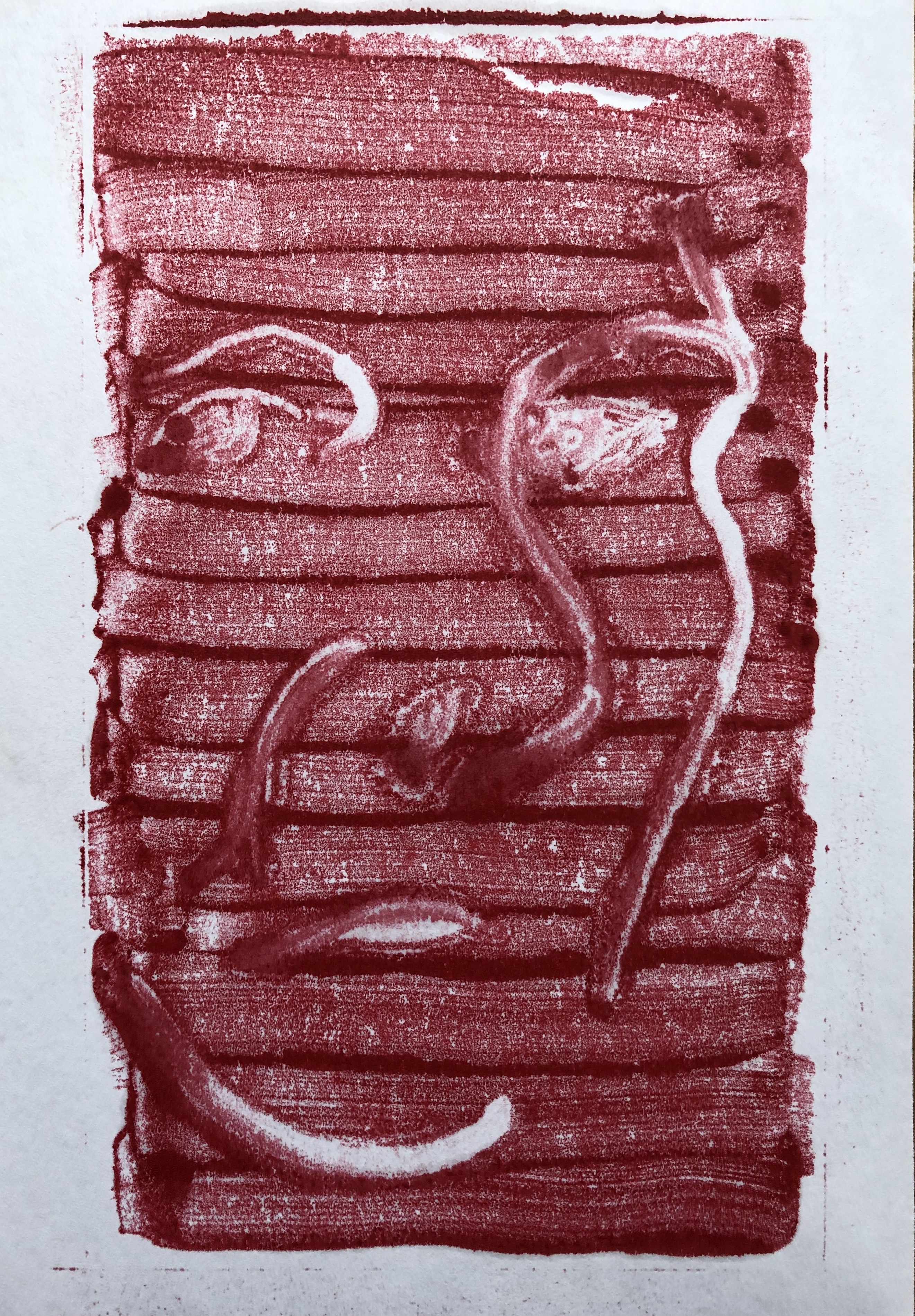
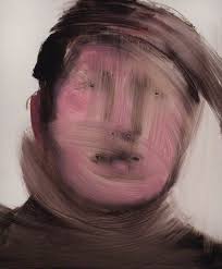
I loved the free gloopiness of the oil paint on the glass, but my initial experiments in adding paint to the print on paper resulted in images that were very clunky and solid. I found these unsatisfactory as, to me, the whole virtue of making a monoprint using oil paint in this way was the fact that the marks often were incomplete and the image rather fugitive, and I wanted to find a way of working that used these qualities, rather than just filling and blocking everything in which then made it more into something you could just have painted without the printing stage. The transparency of the print felt very suited to portraiture as a way of capturing mind rather than body, a quality I think Annie Kevans achieves in her paintings.
Demonstration of creativity: Imagination, experimentation, invention, development of a personal voice:
Before undertaking this review I collected all my prints together, put them in chronological order, and arranged them in an A3 folder. My final assignment pieces, when I had got to that stage, seemed to have materialised from nowhere – but going back to the start revealed a very clear path of trial, likes and dislikes, experimentation and development as I looked at different artists’ work and tried to incorporate bits of what they had done into my own process; I hope this is reflected in my learning log.
Context: Reflection, research, critical thinking (learning logs and essay):
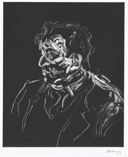
A number of artists set me thinking and working in particular ways. Looking at Maggi Hambling’s monotypes, which were just a few strokes in a void and yet were enough to depict a recognisable person, started me off thinking about painting a person “in essence”. Paul Wright’s gestural marks offered me a way to think about doing that. Marlene Dumas’ and Annie Kevans’ paintings both made me consider what you have to include and what can be safely excluded to make a clear portrait which also had an “otherness” to it. And Milton Avery’s penchant for making simple, calm prints in pleasing colour combinations really crystallised what I hoped to achieve by the time I reached my Assignment pieces. The current situation, living in a Covid lockdown, with so many people feeling that their mental health is deteriorating, made me think about minds in general, and how they often aren’t doing what we mean them to. I hope my Assignment work is a culmination of all that…..with a hint of a way to develop the process further in the future.
LOOKING FORWARD TO PART 5
This is not a decision set in stone; I am interested to see what Part 4 will have to offer, as I suspect that this might change my mind. However, I really enjoyed working in egg tempera back in Part 1 and should like to experiment with this further. I recently read an article about the work of Mary Anne Aytoun Ellis who paints in egg tempera, although in a very different way from the “classic” method, so I would choose her as a current artist. For an historic artist I might look at Leonora Carrington, who was very attracted to the medium, although I know she didn’t use it all the time. Another possibility is Piero della Francesca – we always have to go and look at his 1442 “The Baptism of Christ” whenever we go to the National Gallery, it is my husband’s all-time favourite painting.
As a backup alternative there would always be painting in enamels (a medium I also really enjoyed in Part 1), with Raqib Shaw as my current artist and Jackson Pollock as my historic artist.