WHAT?
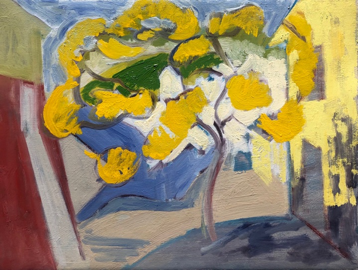
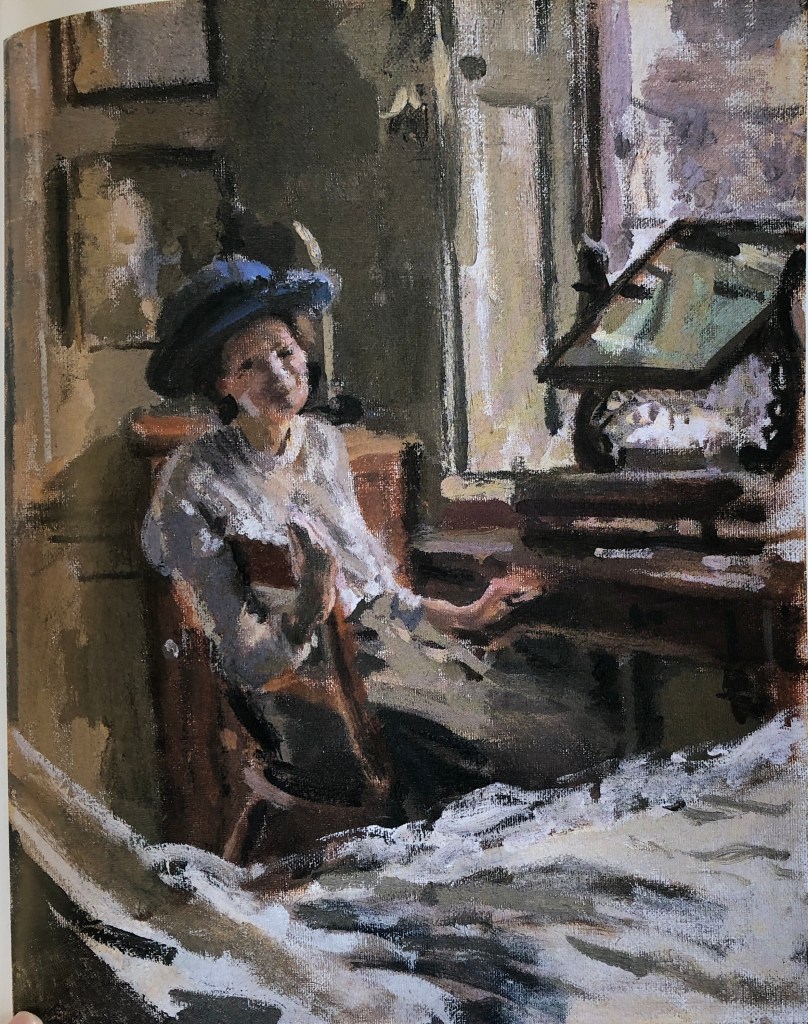
Tanya Wood and Alex Hanna were the two suggested artists whose work resonated most with me. Tanya’s detailed drawings are so closely observed; I looked at her work on her website, www.tanyawood.co.uk; her “Edges” series was my favourite, great tonal contrasts, and I also liked the way she often leaves much of a page blank. Alex Hanna’s work, as seen on www.alex-hanna.co.uk , shows such range, from his closely observed and “sharp” paintings of everyday things like curtains, to his loose, impasto, more abstract images.
In this Exercise, I was looking to:
- achieve something like Tanya’s tonal range, but also some of Alex’s gestural stroke making
- Use my water-mixable oils in a less frantic, more measured style (I watched a video by Raw Umber Studios recently advocating more thought with one’s brush-strokes)
- Try to use my long-handled brushes at their full length by standing back a bit when I’m painting
- Play around with gesso
SO WHAT?
My three items of rubbish I found in my studio; salvaged and repurposed items rather than throwaway – an empty CD case, an empty bath oil bottle, and an empty yoghurt pot.


First I prepared my canvases. I applied a coat of gesso to each, but mixed a tiny bit of oil paint into my gesso first (Cobalt blue, Lemon Yellow and Persian Rose). When the surface was covered, I immediately painted very thickly into it with the leftovers of the gesso in a rough outline of each item, so they looked like this:


(the rose canvas photo is a detail, didn’t show up well otherwise), and then as soon as the gesso felt dry to the touch I covered it with a dilute coat of titanium white.
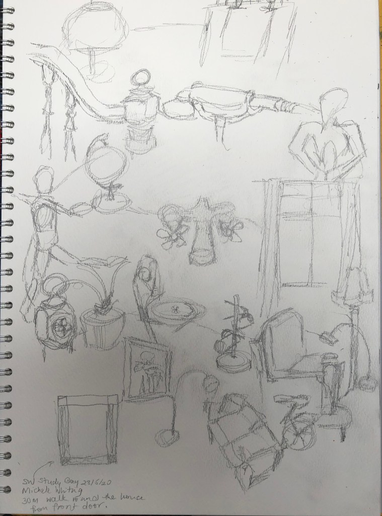
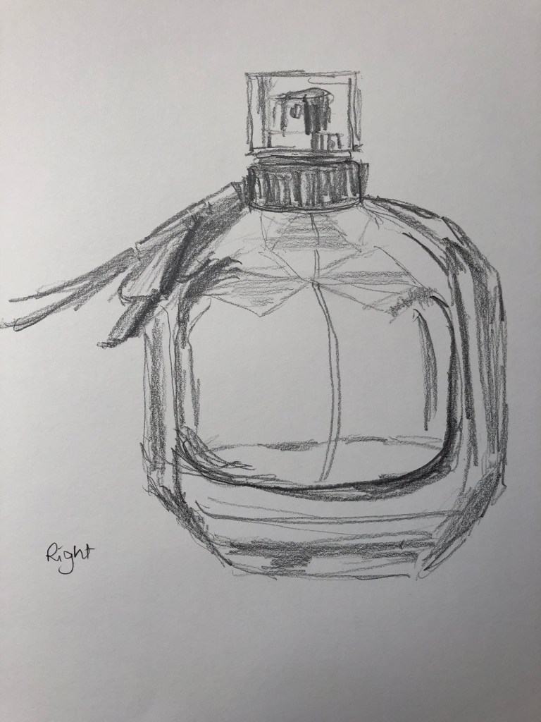
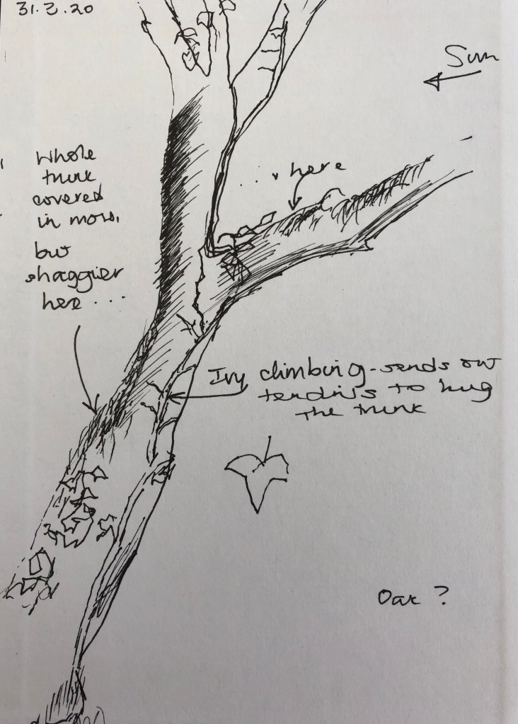
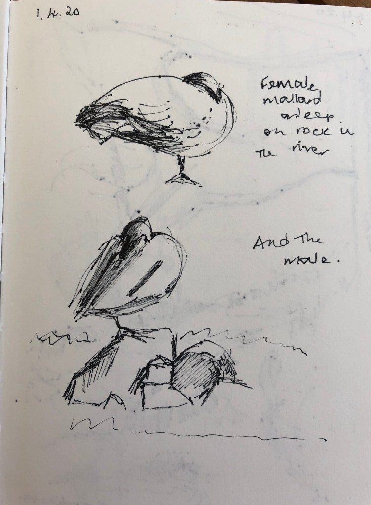
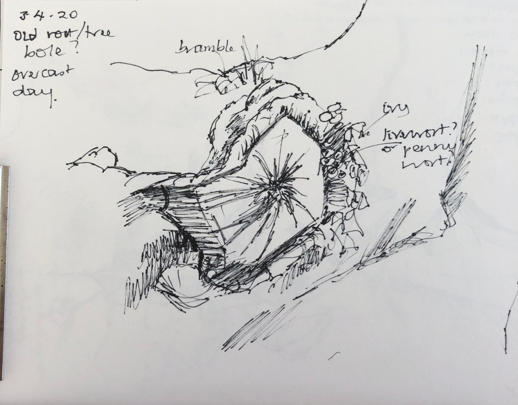
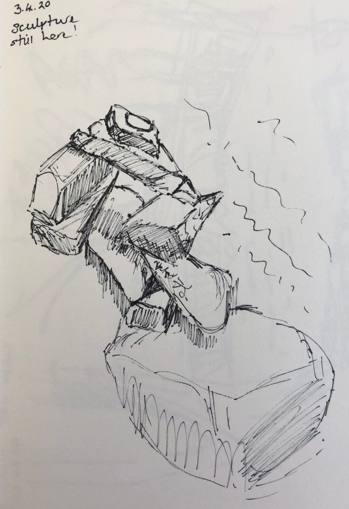
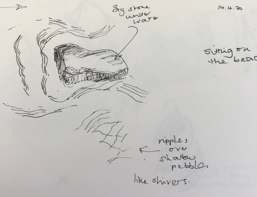
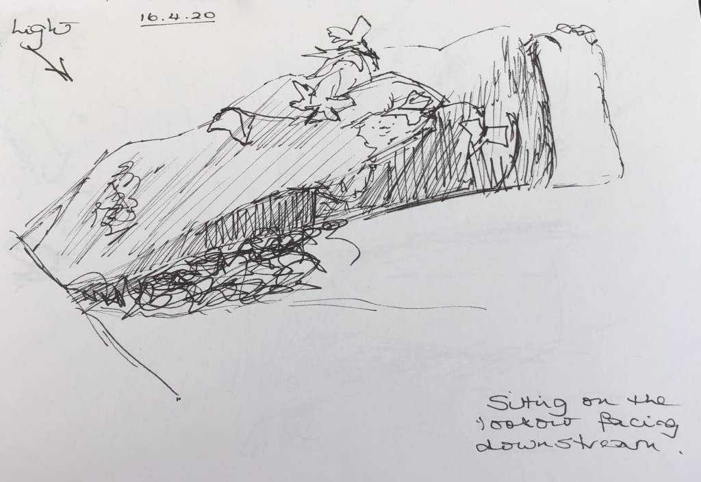
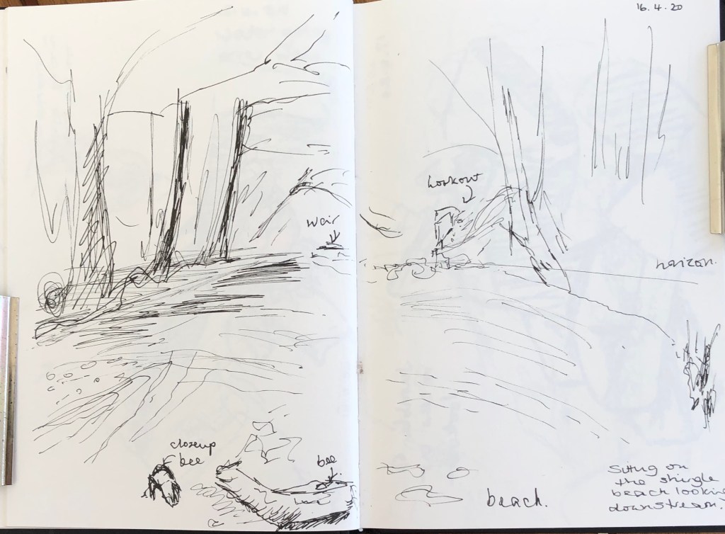
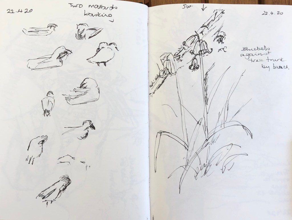
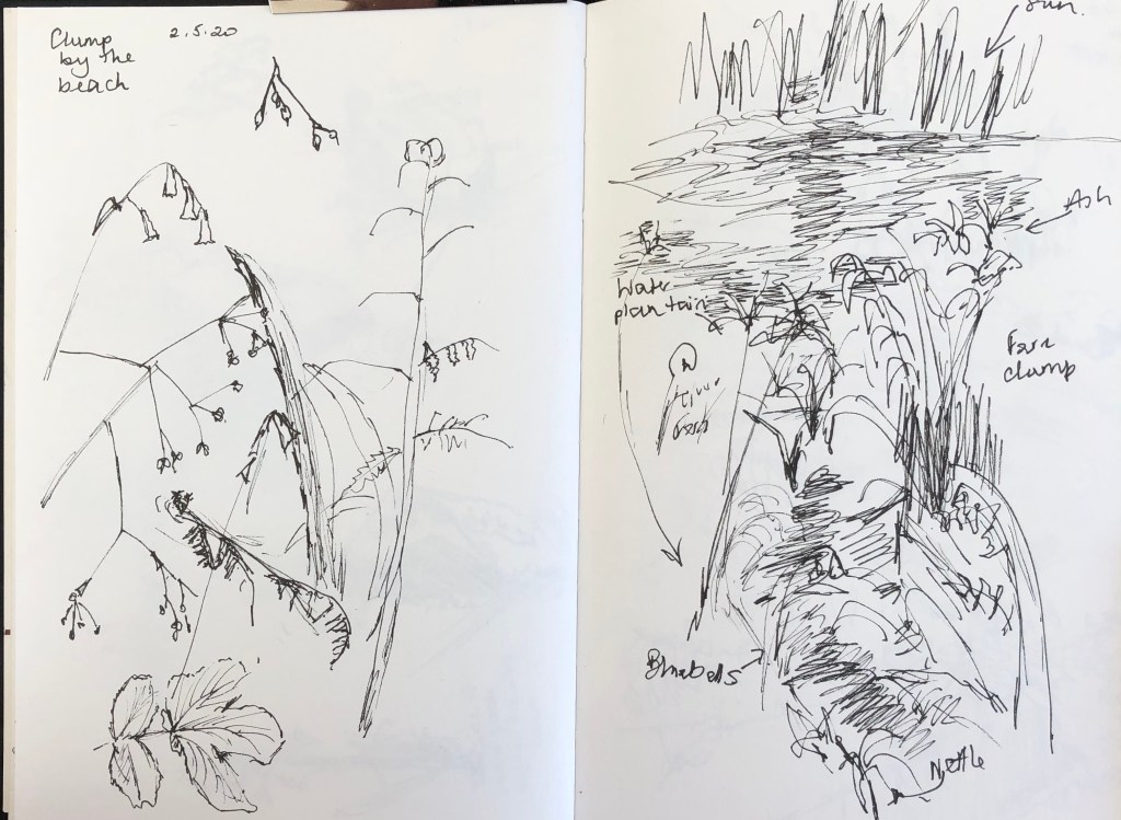
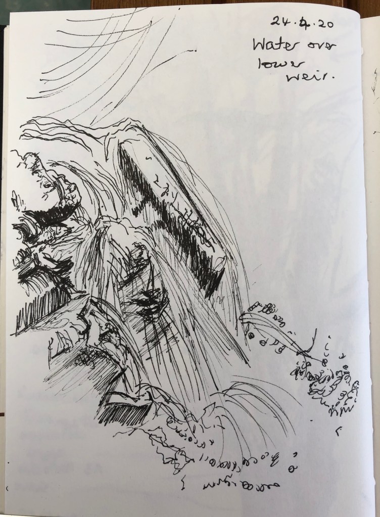
While that dried I made my sketches, using a 4B pencil:


I was going to use a limited palette of titanium white, ultramarine blue and raw umber for all three paintings; the colours I had used to prepare the canvases were fairly strident, even when covered with white, but I wanted something rather less obvious for my transparent items, and I also wanted the ultramarine to give me a wider tonal range than the cobalt might have offered.
I played around with my three colours (two colours plus white? Is white a colour?) before beginning, making myself a little colour card of possibilities:

I was pleased with the range of tones, and also with the olive-green I could mix, and the lush grey range. Beginning to see why, whenever you buy a “beginner’s” set of paints, they nearly always include these three!
Painting with a small long-handled filbert, I began to paint, starting with the bottle.
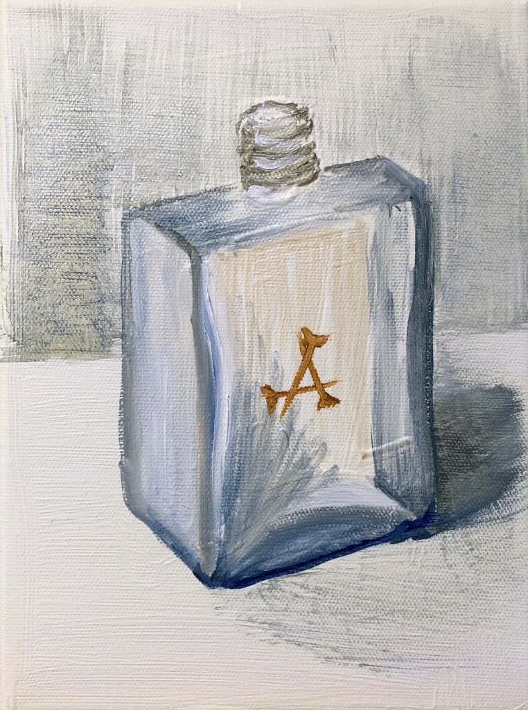
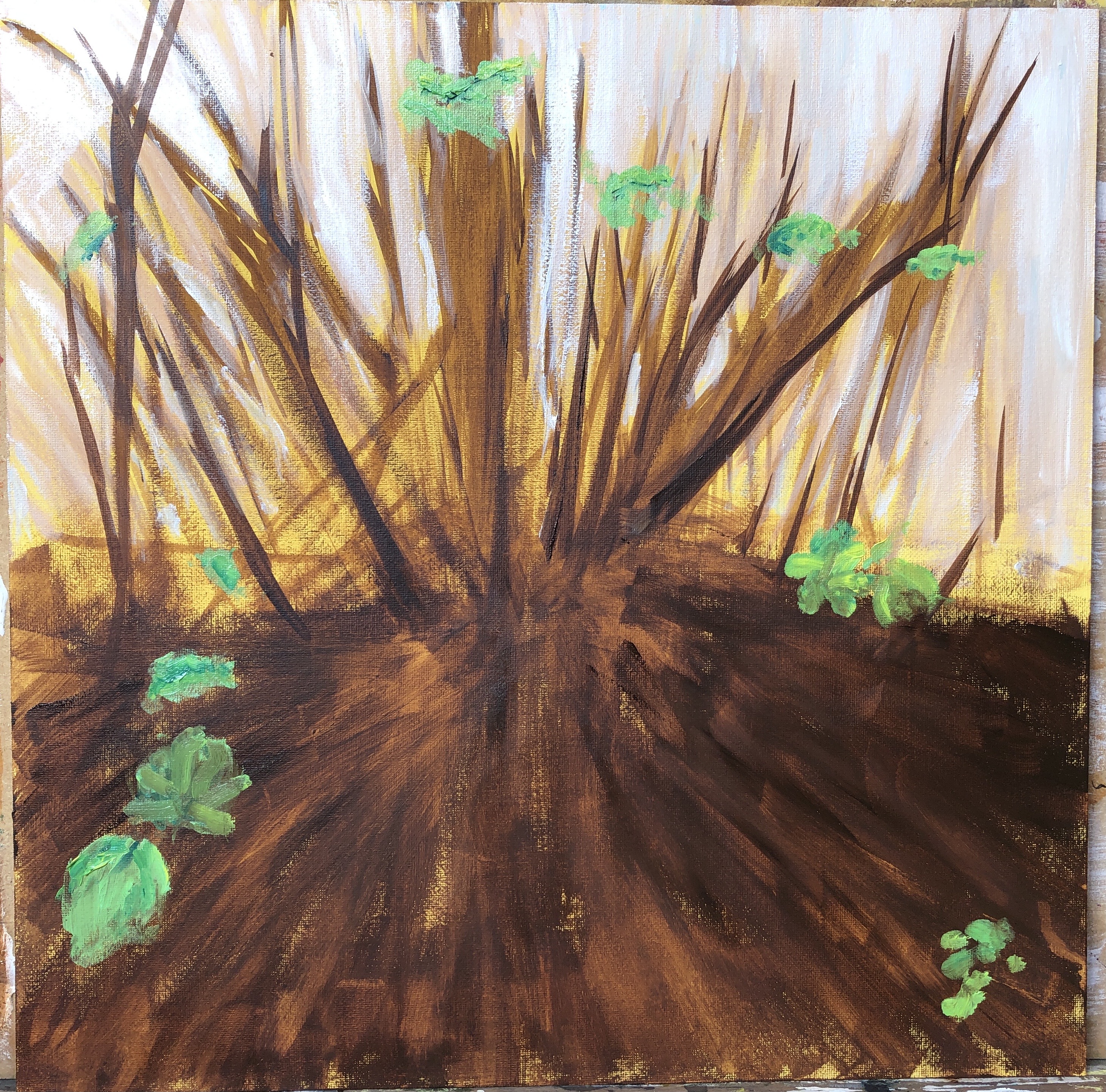
It was a lot to remember…stand back, use the length of the brush, careful gestural strokes – but I did find that the length of the brush actually made me slow down just to control it, and that I really enjoyed making long slow strokes, which I hadn’t really experienced before with my habit of being closer to the painting. I added the shadow, then decided to block in the background with some light strokes of a fan brush. I was grateful in the end for the yellow ground, which helped get the colour of the “inside” of the bottle.

Next the yoghurt pot. Again I worked with the filbert.
I felt slightly constrained by my gesso underpainting at first as I had made it fill the height of the canvas, but it did turn out useful in helping convey the internal curves. Because the image was so large in relation to the canvas, I decided to omit any background apart from the cast shadows. I’d chosen the rose underpainting for this, I had been worried it would dominate, but actually it just makes the painting feel a bit warmer.

Finally the CD box. I’d been putting this off because of the straight lines, which indeed proved tricky, so I decided to abandon any attempt at photorealism and go for an impression. I emphasised the shadow and added the final reflection with a swipe with the fan brush. Again I decided to leave out the background apart from the shadow – my streaky blue underpainting felt sufficient.
NOW WHAT?
Looking back to the factors I wanted to focus on in this exercise:
- I feel I did well with my tonal range in the bottle and the CD case, less so in the yoghurt pot; also I managed some gestural marks – some long curves in the pot and also slightly spiky shadows in the CD case, which I hope convey the rather brittle nature of the plastic.
- I worked hard at remembering deliberate strokes; had a few lapses into frantic, but better than I usually am.
- Using the long-handled brushes at their full length consistently did not come easily, but the only way to do it seemed to be to commit to the stroke; tentative strokes invariably went wrong.
- My coloured gesso underpaintings have largely contributed positively to the final images, although my attempts to create rough raised images were a bit hit and miss – helpful when I’d got the underpainting right, annoying when it was slightly out of place. Jury’s out on this.
Also, I enjoyed working with this particular limited palette combination – offers lots of possibilities – to be used again.