
For this exercise I used a metal coffee pot as suggested – ours has a slightly matt finish – and a ceramic bowl with a wide mouth – dark in colour- but with a strong glaze.
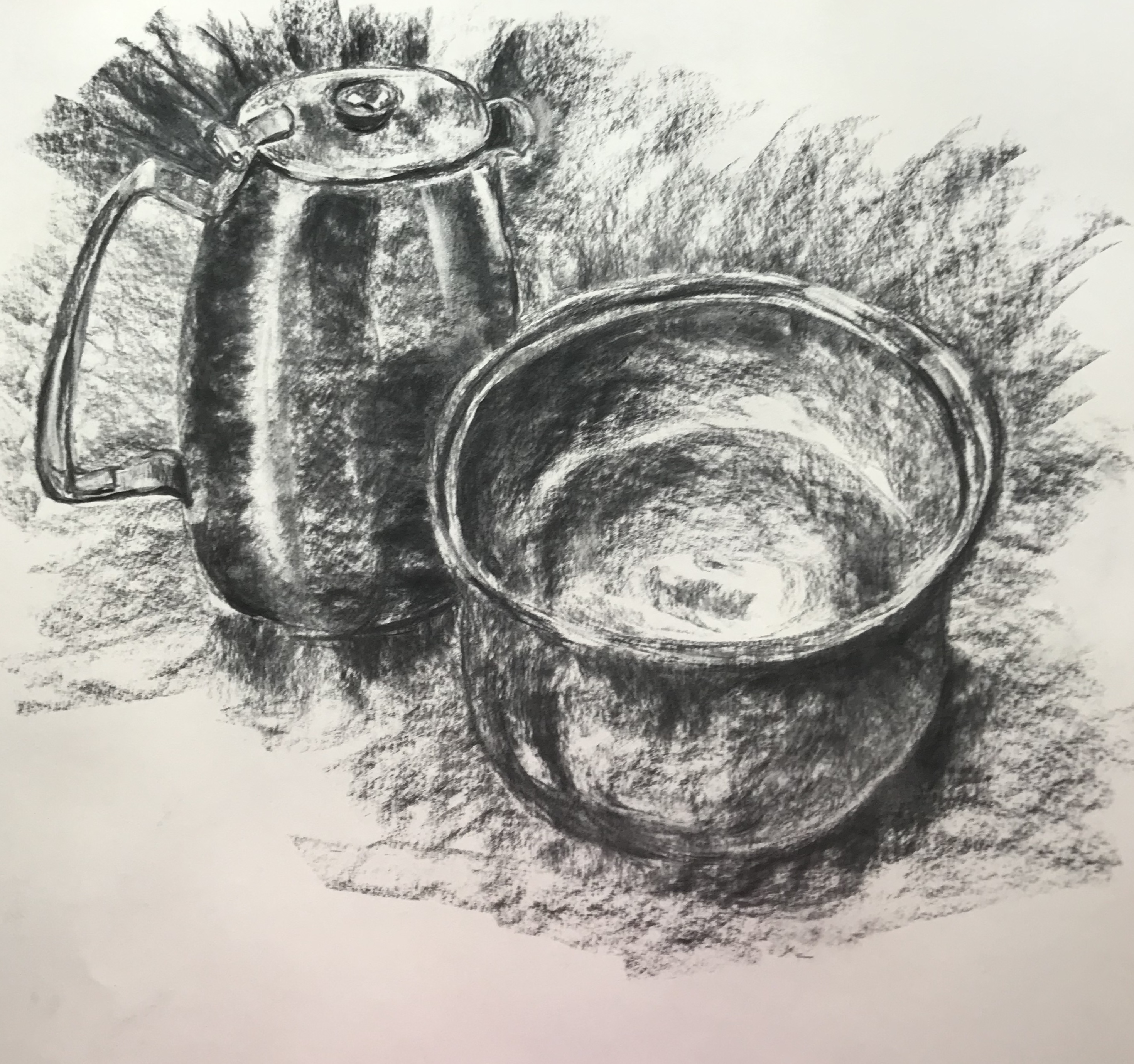
The strong light was from behind me. I did this drawing at art group and, due to constraints of space, the still life was very close to me, the bowl being closer, so I have ended up with some perspective issues, along with my struggles over ellipses, made more obvious because of the large size of the drawing. Someone in the group told me that they had been taught that, when drawing an elliptical object, the curve nearer to you “looks” flatter, and the curve further away “looks” curvier – he cited the example of the gunwales of a boat – intuitively I could see what he was saying, but didn’t try it out with the bowl since it was so close to me that I was practically on top of it.
I feel I have achieved some clear lights and darks, with a wide range of mid-tones. I have picked up the reflected light from the surface on the left side of the jug and the right underside of the bowl. It feels a fairly dynamic drawing, although I wonder if it is over-busy. In
Guptill, A.L. (1977).Rendering in Pencil. Watson-Guptill Publications, I found a bit of check list for assessing your final drawing, so I thought I would try his checks out on this drawing:
- Have you the correct degrees of sharpness and softness?Yes, I think I’ve done that.
- Is there too much dark one one side or part of the drawing, or does the whole hold together nicely? I’m quite pleased with the balance, I think it’s a coherent drawing.
- Have you succeeded in expressing space, depth, weight and texture? I think I have depth, although the space the objects occupy is not very clear. I think I have weight, but I’m not sure an onlooker would guess the texture of the bowl without being told.
- Have you practised economy of tone, or is the drawing confusing because of too many different values? I wonder if this is my issue with the “busy-ness” of the drawing? – or possibly it’s just the directional strokes I have used to show the relative tones of the background?
We were asked to do the drawing in charcoal, so I followed the brief, but I also wanted to try a similar drawing in stick-and-ink, which was the other medium I have really enjoyed using throughout this unit so far. So, different art group, same jug, different bowl….
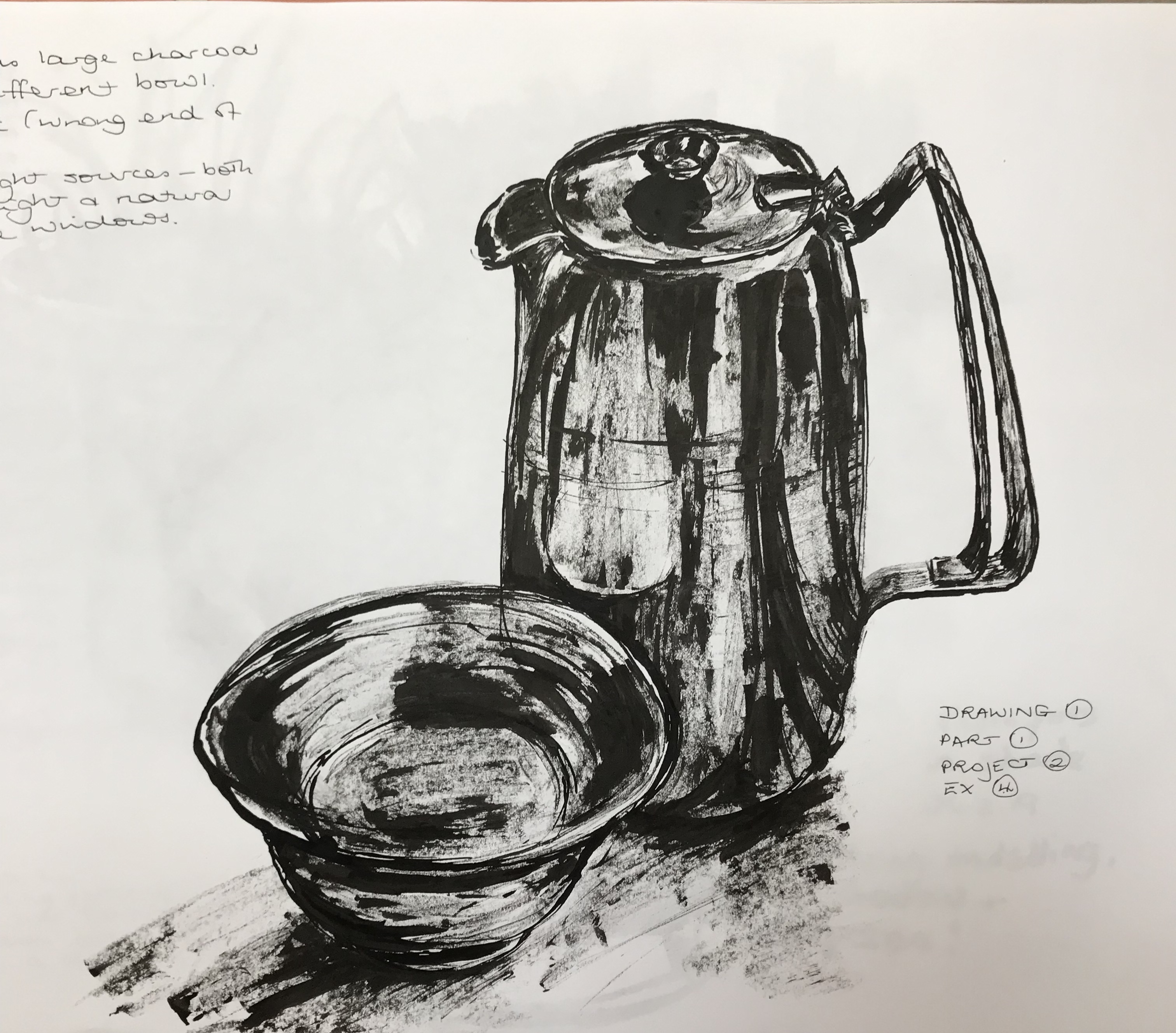
The light directions were various, with big floor-to-ceiling windows and overhead lights, so the shadows were a bit complicated, but I have focused on lights, darks, and the reflection of the bowl onto the jug. Actually, using this medium, I found it easier to have a simple progression of light-mid-dark (simply because ink dripping from the end of a stick is harder to finesse!), and tried not to over-complicate the drawing with too many background tones, just indicating the main areas of shadow, and I am fairly pleased with the outcome (even though I know I still need work with my selection of ellipse thicknesses).
I decided to experiment a little more with different backgrounds too.
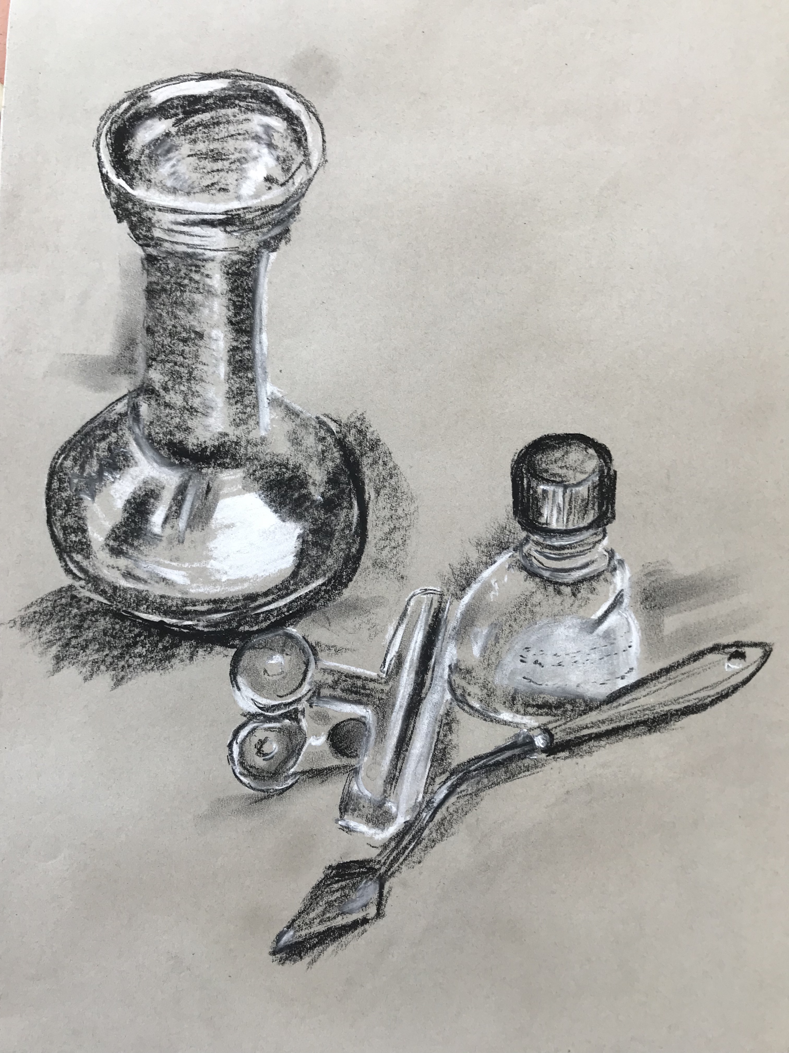
First was with a tan/grey piece of sugar paper, which I used as my mid-tone, adding white pastel for light tones and black pastel for dark tones.
It went against the grain at first not to try and add mid tones in!….but as I went on I got better at this, and I am fairly pleased with the result, except for the wonky knife. I experimented with the composition, trying to go for a triangular layout, which I think works if your eye enters the picture from the top, but less so if you enter from the bottom as the eye rather gets led along the knife and then off the right hand edge.
I then found an old piece of black sugar paper gleaned from a scrap store, so I tried a simplified triangular layout, this time with white pastel as before for light and ochre for mid tone, leaving the black paper for dark.
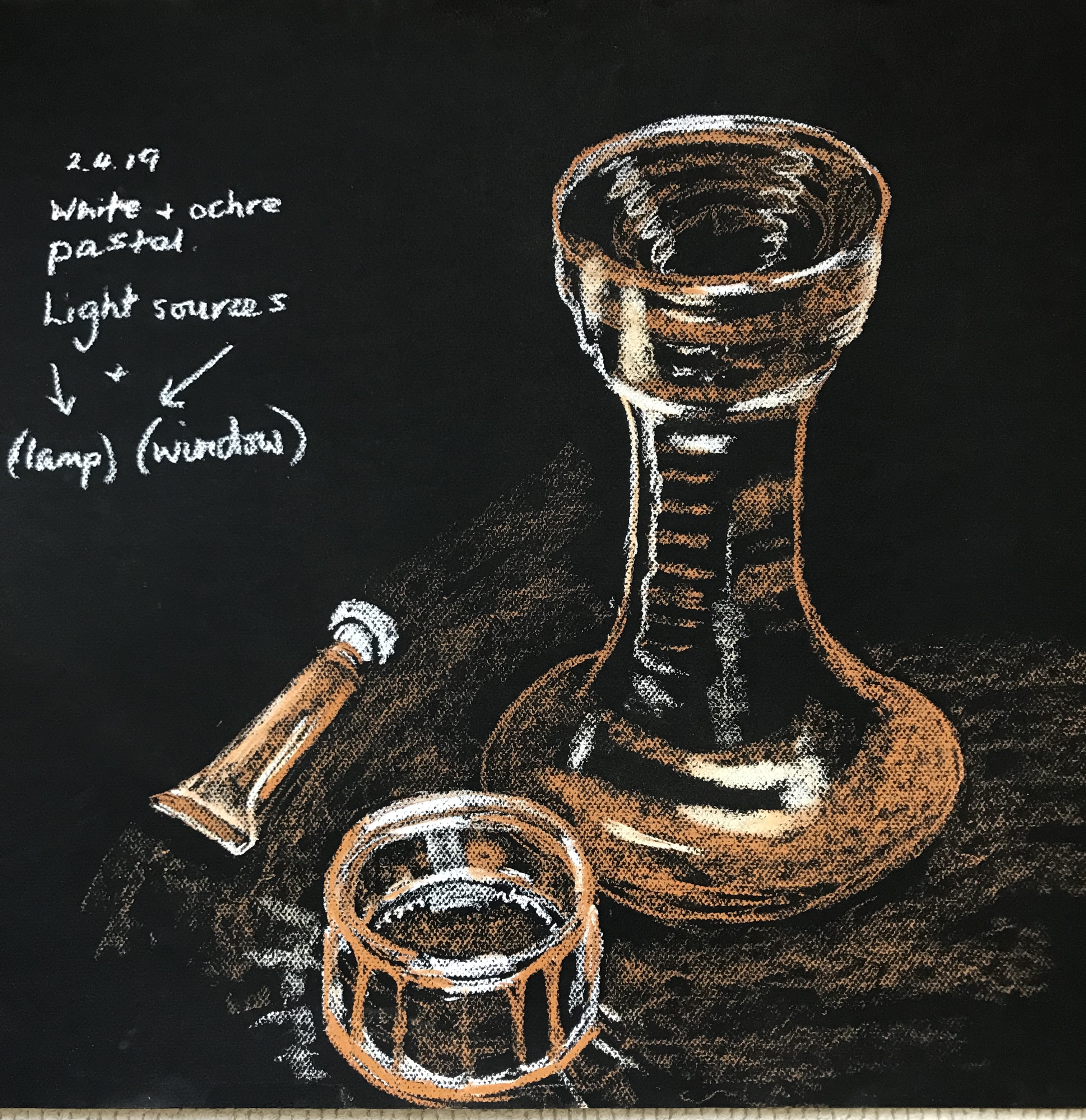
It took a bit of practice to get used to the idea of not being able to “put in” darks but to just leave them blank – hence the shadows cast by the objects on the support are perhaps not very clear, but I was pleased with the ceramic vase (which actually is black and ochre in real life, so it has ended up looking quite realistic.) The metal paint tube also went well – I had finally got the hang of leaving darks blank by the time I got to do the lid – and I think I’ve caught the structure of the glass bowl reasonably well, even though it is a bit skewed.
