

I have been an inveterate bibliophile since I was a child, and my husband will tell you that I cannot pass a bookshop without going in – hence our house is full of piles of books. I am also a lover of random teas, and a bit of a teapot collector. In fact, what better way to spend an afternoon than sitting in our garden room with some books and a brew…….
….so this seemed an obvious still life setup for me. I liked the curves and ellipses of the pots, contrasting with the rectilinear shapes of the books, and have tried to arrange it in a fairly pleasing triangular composition.
See what you think……
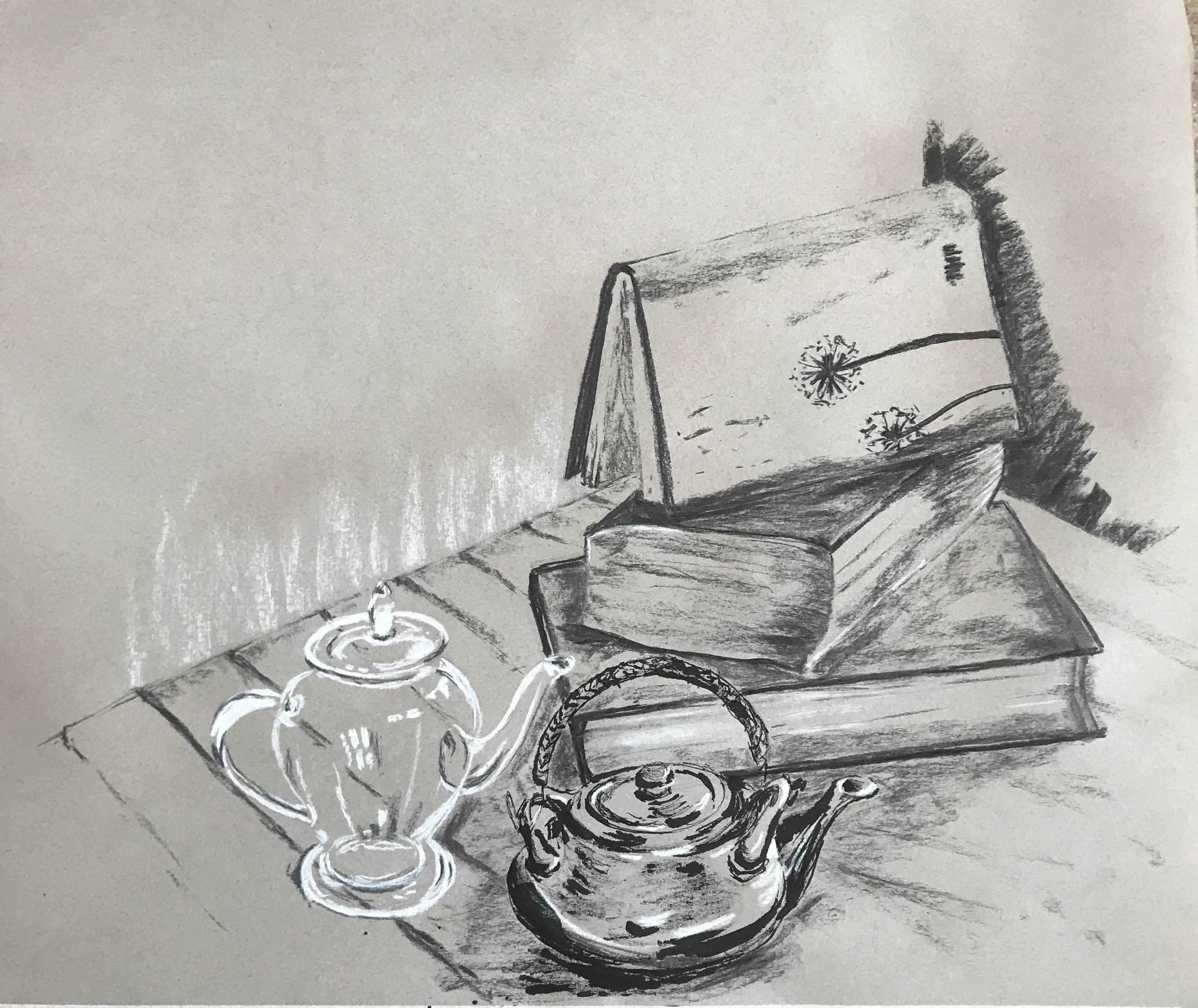
I tried to select my materials to match the different objects:
- My favourite ink and a stick for the oriental ceramic teapot, to give it solidity and to evoke ritualistic tea ceremonies/Chinese brush painting
- White and grey conte crayons for the rather fugitive and ghostly glass teapot
- Charcoal for the “wood-derived” objects – the books, the table and the shelves in the background
- I chose a mid-tone sugar paper as support to allow me to focus particularly on the lights and darks
So, how did it go?
Overall, I am pleased with the composition and think I have produced a fairly vibrant drawing.
I am particularly happy with the ceramic pot at the bottom foreground – I enjoyed this the most (maybe because I feel quite free using the ink and stick – it is such an unpredictable medium that I feel able to go with the flow and not panic at unexpected splodges and blots, just trying to weave them into the image).
I have done a bit of practice with the glass teapot and feel happier with its shape than I have hitherto; I am slightly concerned that it does look rather too ghostly and floating, but it gave very little shadow to anchor it down.
The pile of books – aarrgghh! – thought this would be the easy bit but it always seems to go slightly awry, I think I have a bit of an issue with perspective which will need work as the course progresses. I sprayed the drawing with fixative and put it on the floor to photograph it, when I immediately saw the angle of the right-hand corner of the bottom book was not right – I have tried to draw over it and improve it, but didn’t want to make too much of an issue with it as it would spoil the rest of the drawing.
I have just suggested the table, shelves and wall in the background to fix the objects in space, as obviously the books and pots were my focus. I’m never quite sure how much to put in, and will often just indicate tone contrasts between background and focus objects, rather than making the background too fussy and detracting from what I want the viewer to concentrate on.
