This has been overall a fun if slightly frustrating exercise; fun because it was quite free, and frustrating because, whenever I thought I had a bit of time for cloud drawing, it seemed to be either unremittingly sunny or else the sky was a uniform greyish-white accompanied by rain in varying degrees. Often I would see an interesting cloud formation when I was on the way somewhere – so there has been some shameless drawing from photos, both mine and those of others.
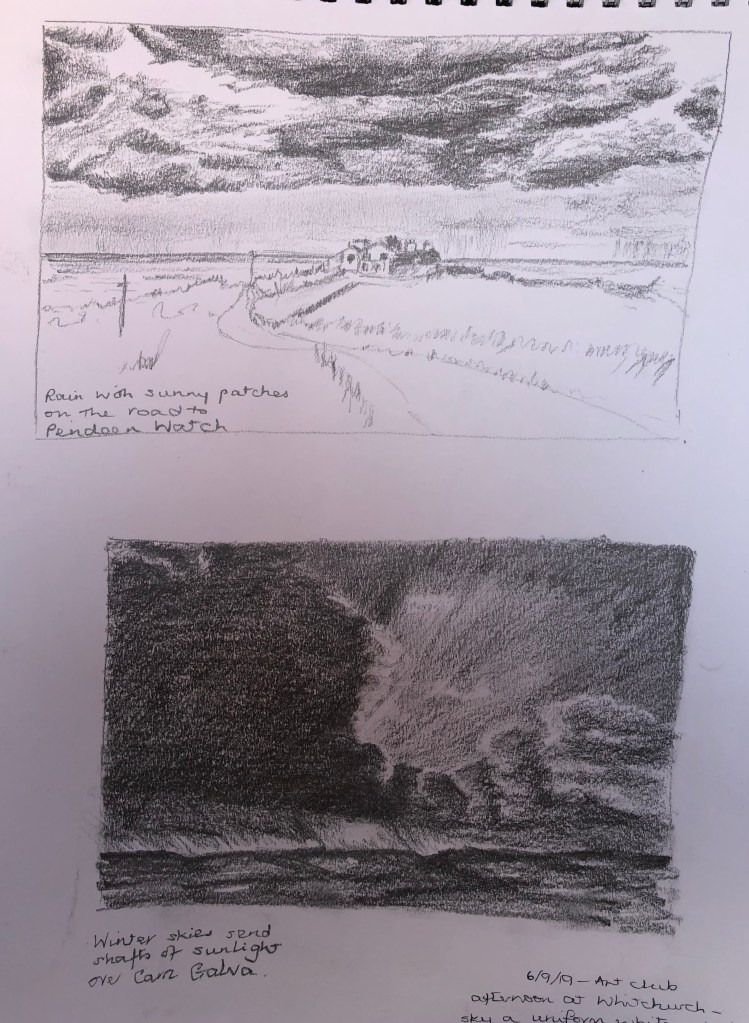
Dramatic stormy clouds (other than the uniformly grey variety) have come from books – but I have chosen images which exemplify real dramatic scenes which I have seen to have a go at: the lowering clouds which seem to process over you into the distance (where it is still raining), but lit by a sunny moment; and the massive evening stormy cloud passing away, allowing light from a setting sun to show around.
I did both of these with a chunky 2B pencil – this was generally fine for the task, although I did struggle to get the darkest darks quite as intense as I wanted.
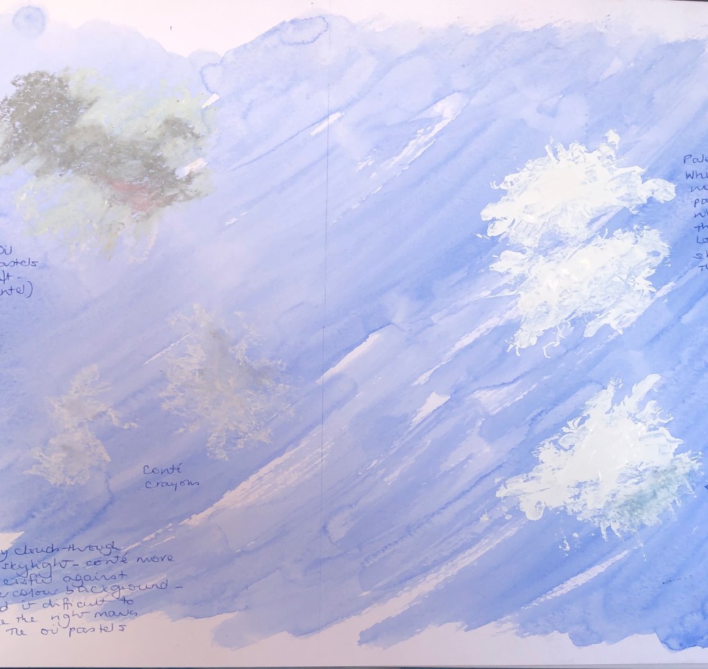
Wispy sunny-day clouds directly overhead have proven more of a challenge than you would have thought. These are generally darker towards the centre where the thickness is greatest. I had a go at using blue watercolour paint on a white ground to try and paint the cloud in as negative shapes, with variable success (see notes in A4 sketchbook). Then I experimented with different media over a blue watercolour wash (see here), where I found the most successful media were white and grey Conte crayons (lower left), and white gouache applied with a palette knife and my finger (right).
I was on the lookout for interesting composite cloud formations (as I had seen depicted in pictures by Alfred Munnings – see notes in A4 sketchbook and blogpost on a weekend in West Cornwall). These often seemed to appear towards late afternoon/evening – I snapped a couple of interesting skies and tried drawing them from my photos.
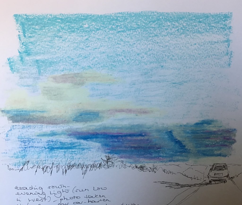
I was determined that oil pastels would be good for this rather dramatic sky taken from our car about to crest a hill. I tried an overlaying technique (loose darks first, then circular strokes with the white crayon – this linked with the Vila Celmins research, as this is the same stroke I used for my tree foliage – and then I repeated the circular strokes with a paper torchon). I became rather absorbed in the process rather than the outcome and the dark clouds on the right ended up a bit odd; but on the other hand I was quite pleased with the billowing quality of the lighter clouds on the left.
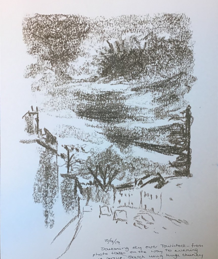
This was a quick 10-min sketch of a dramatic sky I saw as I walked through Tavistock to my art group meeting yesterday evening. The sketch is done with a huge chunky graphite stick which was new to me – great for big areas using the flat end, but also sharp edges for lines and emphasis. Enormously enjoyable!

 Sue J's blog