
It’s been rainy so I started out working up some of my existing sketches. I have been interested in the work of John Virtue which I found in my research (see blog noteson artists working in series in the landscape), so I had a go at working in black and white. I used two different media, charcoal with a putty rubber, and Chinese ink and brush, but I have tried to use expressive strokes with both.
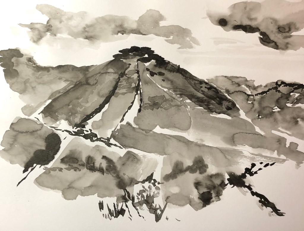
I re-worked two of my Dartmoor 360-degree views using the ink – tried to be very loose, working quickly using wide gestural strokes, suggesting rather than describing in detail. Both efforts look fairly awful close-up, but not bad from a distance, much more recognisable features.
I made the first effort too wet so it was a bit uncontrollable and I haven’t quite got the darks in the right place (e.g. the darks on the hill don’t match up with the darks under the clouds) so I tried to strike a bit of a balance in the second attempt – but looking back at it I think the drier foreground is the weakest feature. More practice needed! Once you start with this medium it seems to need to go very quickly, but I believe that is a consequence of my inexperience, and I need to think through each part of the painting before committing the ink.
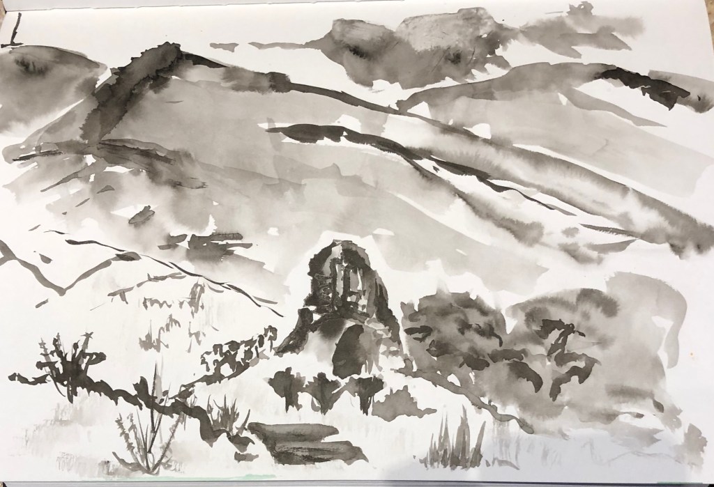
The composition of the first picture is Ok but not gripping – Pew Tor, my main focus, is bang in the middle, although it is on the upper-third-line, but I think it might have been better a bit lower and moved slightly off centre, with some better-planned dramatic clouds as a counterpoint. In the second picture, Vixen Tor (lower, mid-ground) and Kings Tor (distant left) I had intended as a kind of paired focus (one very upright, the other much more rounded), but I have got a bit muddled in the contrast between mid- and fore-ground, and definitely think I needed to give more space for the sky – the whole picture feels a bit squashed.

I had a go at drawing into a charcoal background using a putty rubber to work up two of my other sketches. The first was the interior of the mediterranean biome at the Eden Project – I had done a quick scribbly sketch of a cypress which caught my eye, so I tried to render it as a kind of “photo negative” image. I wanted the tree to dominate so I put it bang in the centre. The cypress itself was great fun and I could really use expressive strokes and swirls; I did it at an art group and was quite pleased with it until a fellow group member went by and said “I really like your waterfall.”
Back to the drawing board……
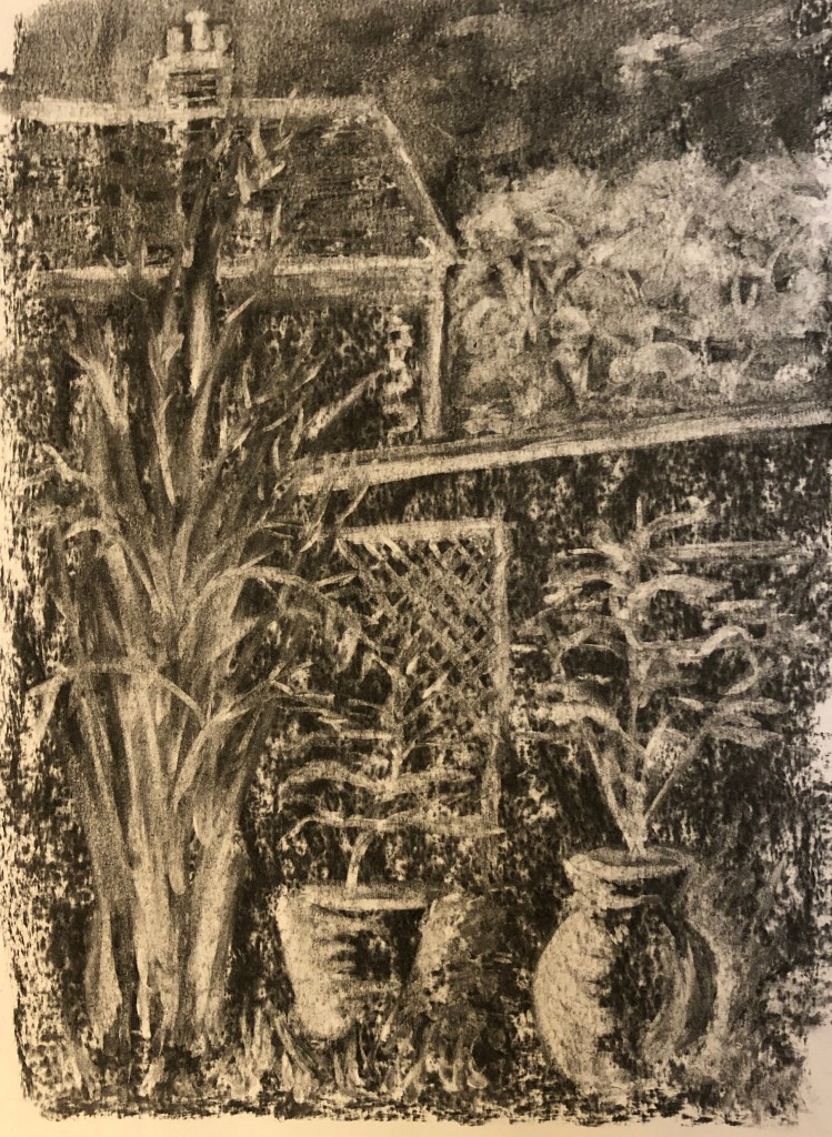
So I tried out the same technique with one of the views from the “garden” series of my 360-degree sets of sketches. I narrowed this one down to focus on the large pots and the bamboo at the end of the garden. I’m pleased with the pots and the trellis, but don’t think the bamboo is quite recognisable if you hadn’t been told what it was, and the neighbouring house (apart from the chimney which I like) looks a bit child-like – possibly the whole distant background would have been better off left much more undefined. I think it’s not missing an obvious foreground, though.It’s a really enjoyable technique – somehow drawing with a rubber is very freeing because if you do something wrong, you can easily replace the charcoal and carry on.
