
I am pausing in my investigation to try and draw thoughts together.
I haven’t at all followed my initial plan, which was to work through a stated list of artists, try out their work, and see what resonated with me as being the best way of achieving my goal, namely, to describe this stretch of the river in a drawing.
That’s not quite true – I started on the plan but was quickly diverted into a focus on particular key artists whose work I am finding most helpful – so I am deciding here to “park” experimenting with maps, diagrams and land art, and the artists associated with those. I am also “parking” Kurt Jackson, which is quite annoying as he is a favourite of mine and one I should like to come back to, perhaps in the Painting module – but I think I have more than enough to work with here and any extra would just confuse me more than I’m confused already.
So, which influences am I keeping?
It really comes down to four, although they are quite contradictory in style and somehow I need to resolve that conundrum. Lydia Halcrow and Tyga Helme have very been helpful to me on the path, but I am sticking with:
- Vija Celmins and David Hockney for water. This is a rather odd pairing, but they go together as helping me with my depiction of water, which has become (unexpectedly) a real fascination. Vija Celmins made me look at it carefully and try to analyse it in all its complexity. David Hockney is here because he led me into iPad drawings and the idea of layers. I freely confess that I cannot for the life of me understand how to make my iPad drawing app work as it’s supposed to, but I do get that it works on the principle of superimposing layers, which has made me really think about all the layers you have to consider when drawing water: the underlying rocks etc, which often you can’t see, but sometimes you can; the reflections on the water; the surface movements (with consequent impact on the reflections); and anything overhanging/above the water.
- Albrecht Durer for his amazingly detailed drawings using line and tone, which I am determined I will be able to emulate eventually if only I can look better.
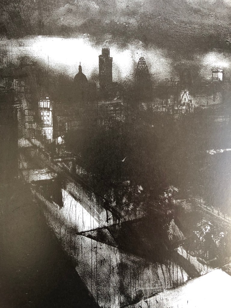
- John Virtue. His tessellations initially pulled me in – I have an infernally organising nature – and then I was astounded by his sudden jump to these huge free loose black and white paintings. I have been reading (in Paul Moorhouse, 2019, John Virtue, Albion Barn Publishing, Oxford and Ridinghouse, London) about his London pictures, which have moved on again, are often very dark and suddenly, as if a mist clears momentarily, includes very detailed snatches of drawing – such as this one, which is a section of Landscape No 710, 2003-4, black ink, shellac and emulsion on canvas, 305 x 610cm, Queensland Art Gallery.
So, somehow, I think I want to:
- Practise more drawing of water, which can be in quite an abstract way
- Practise more detailed drawings of landscape features
- Marry the two together somehow!
