
WHAT?
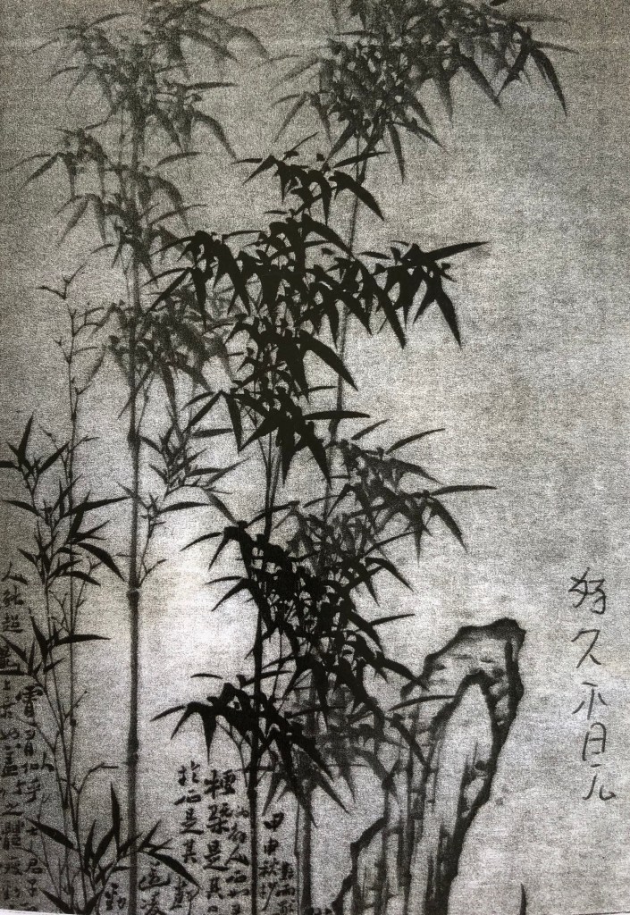
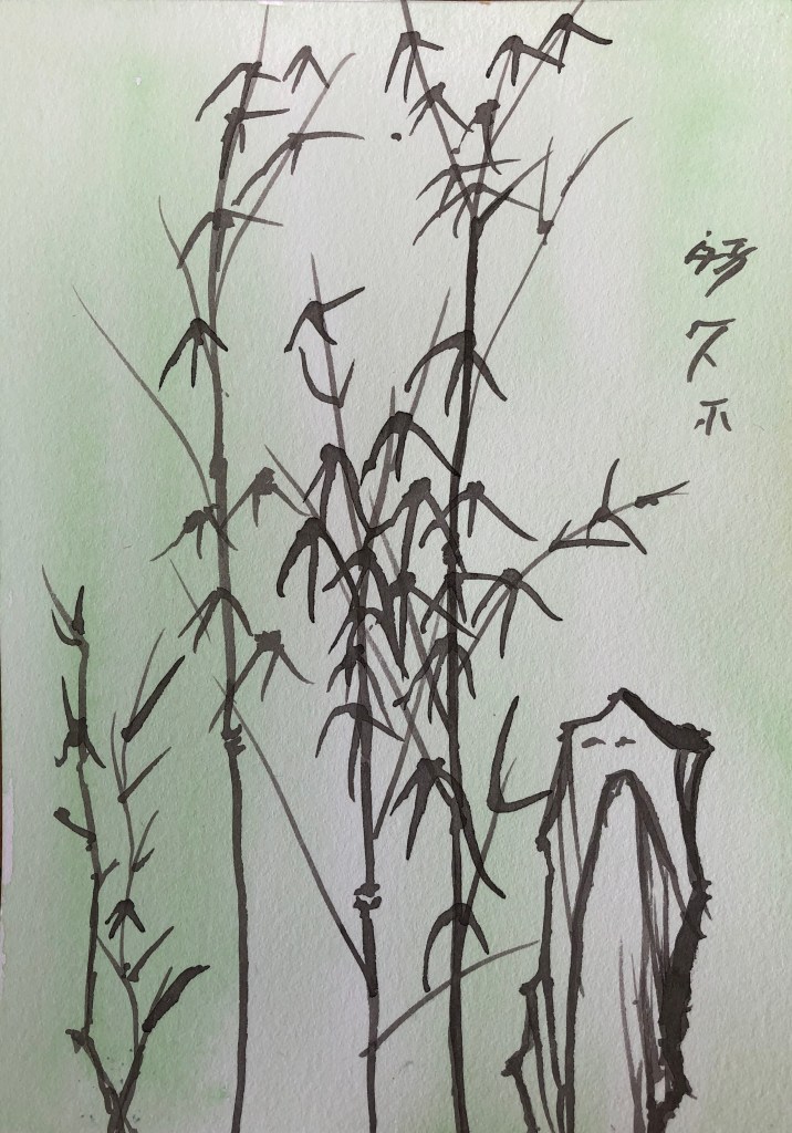
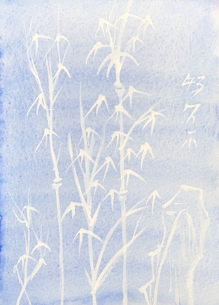
20 sheets HP watercolour paper prepared with various backgrounds as directed using fan brush to get even surface (except for the acrylic varnish, where I used a small hog flat as didn’t want to risk my fan brush). Found image selected to work on has been hoarded for years – bamboo with mountain background – person who sent it to me said “Everything in Chinese painting is symbolic….The painting of Bamboo is second only to landscape in prestige and is infinitely more important than the painting of birds or animals.”
SO WHAT?

- Thin perylene maroon watercolour paint applied using rigger to splodgy thin black ink background. I made the paint very (too) watery – hard to make it show up.

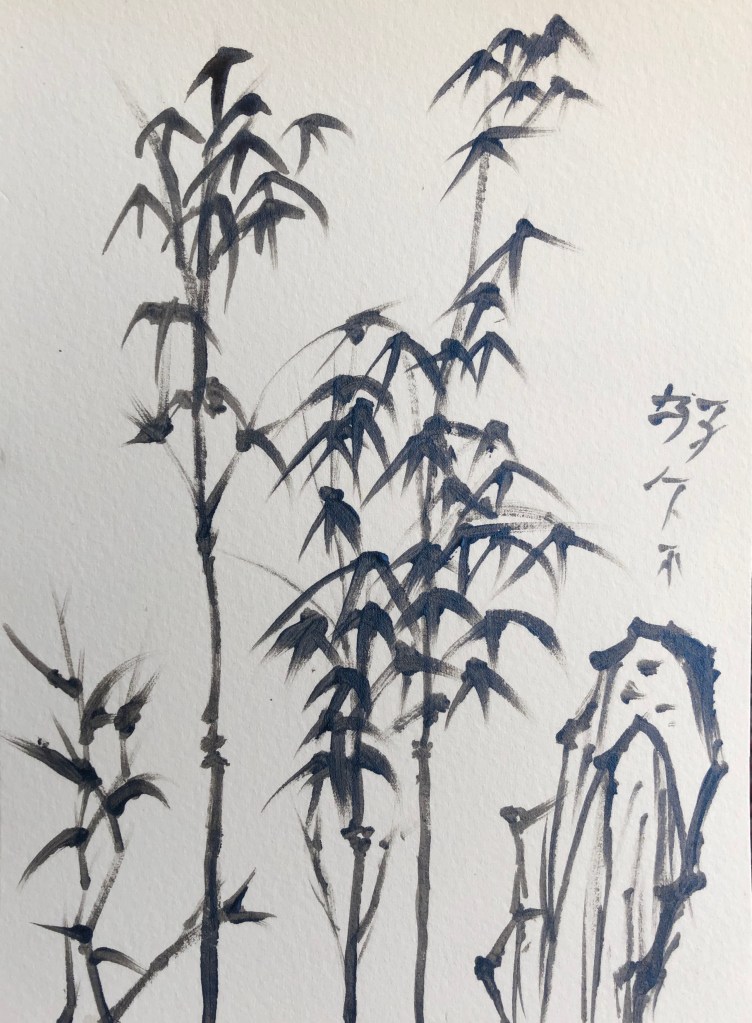
- Black egg tempera, only slightly dilute, on splodgy perylene maroon watercolour background, applied with rigger. Much more effective as far as clear line making concerned, also able to perfect my leaf-drawing action (press and flick)
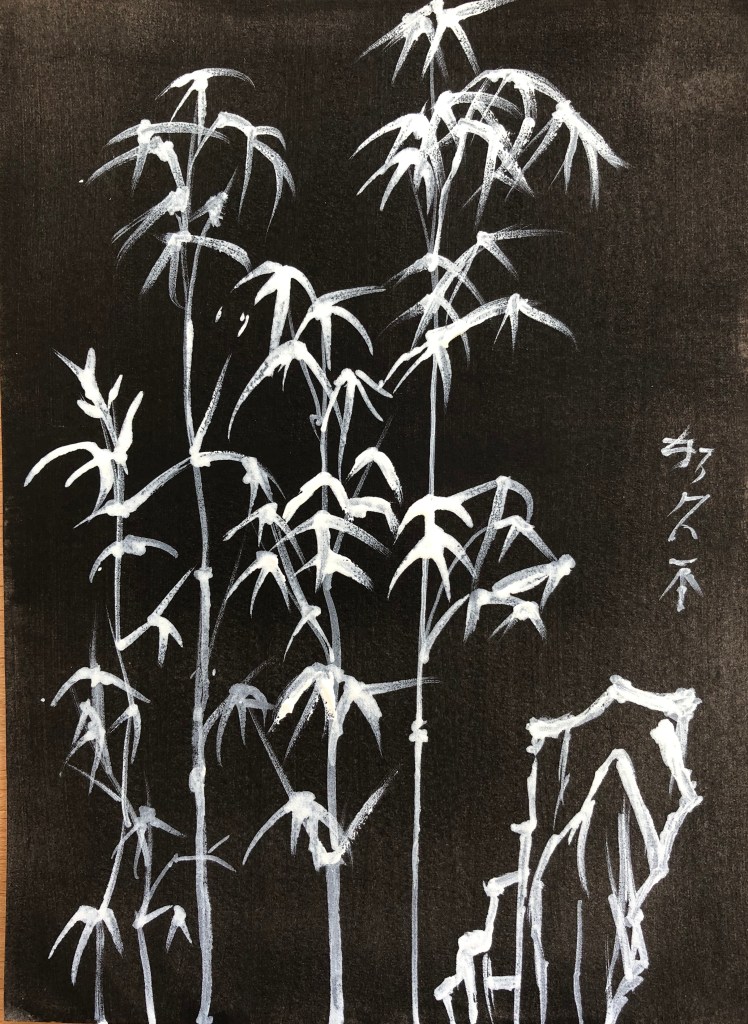
- White egg tempera, fairly neat, on black acrylic background, applied with rigger. Did this as a photo negative. Favourite so far.

- Acrylic satin varnish on black egg tempera, took a chance using the rigger to apply, gave it a good wash and seems fine. Image clearly visible even when light not directly shining on it, and very dramatic when it is!

5.Black Chinese ink on white gouache. Struggled a bit to get pointy ends on this surface, and if the brush was wetted with water then the marks spread out – as if the surface was absorbing them as the brush hit the paper. Less good combo.
- Blue iridescent acrylic on white watercolour. A weird one – very hard to spread the acrylic over the watercolour background, felt like painting dry-brush all the time, even though the rigger was wet – not sure if it’s because this acrylic paint very thick?
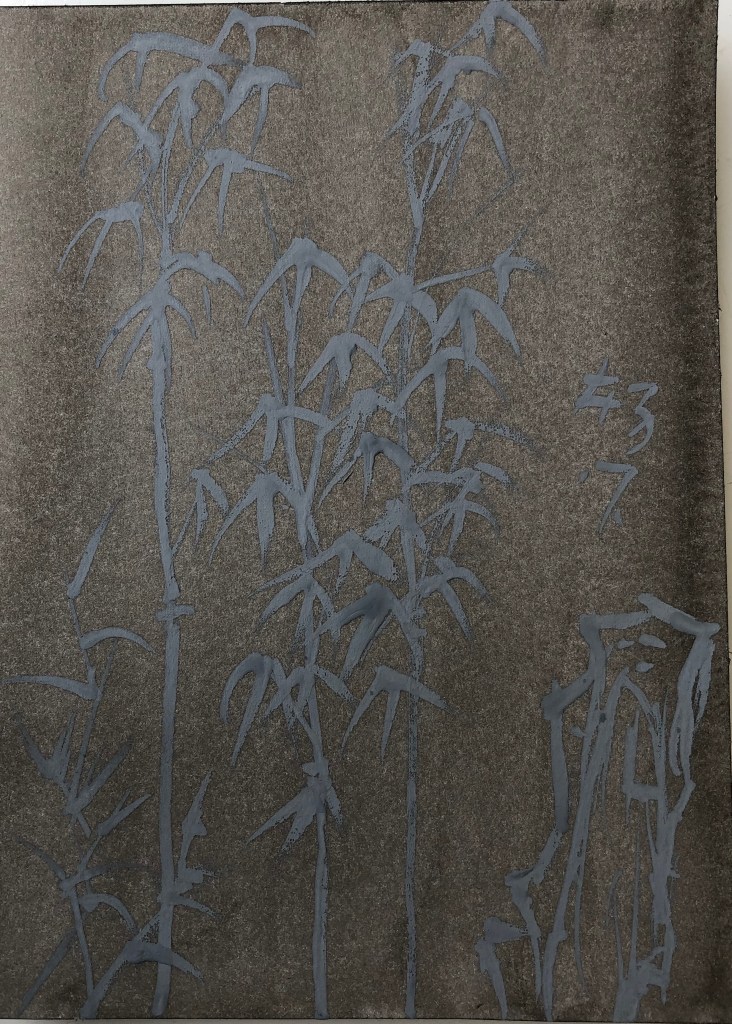
- Experimented with grey gouache on thin black ink. From an oblique angle it’s quite an effective contrast of light on dark, whereas straight on it looks quite flat.

- Well, this was weird – Pebeo high viscosity Buff Titanium acrylic on thin black ink. Any dilute acrylic marks just seemed to be absorbed into the inked paper and vanished- the only marks which I could keep clear were with neat acrylic, sometimes gone over several times. Paint colour creamy rather than white.

- White acrylic on very thin green gouache. A similar tendency (though not so bad) for dilute paint to be absorbed – only thick undiluted acrylic stood out – but hard to be accurate with thick paint using a rigger.
- Really thin white acrylic on thin gouache – this was too thin, had to ladle it on to make any impression at all. Clearly visible when wet, but virtually vanished when dry.

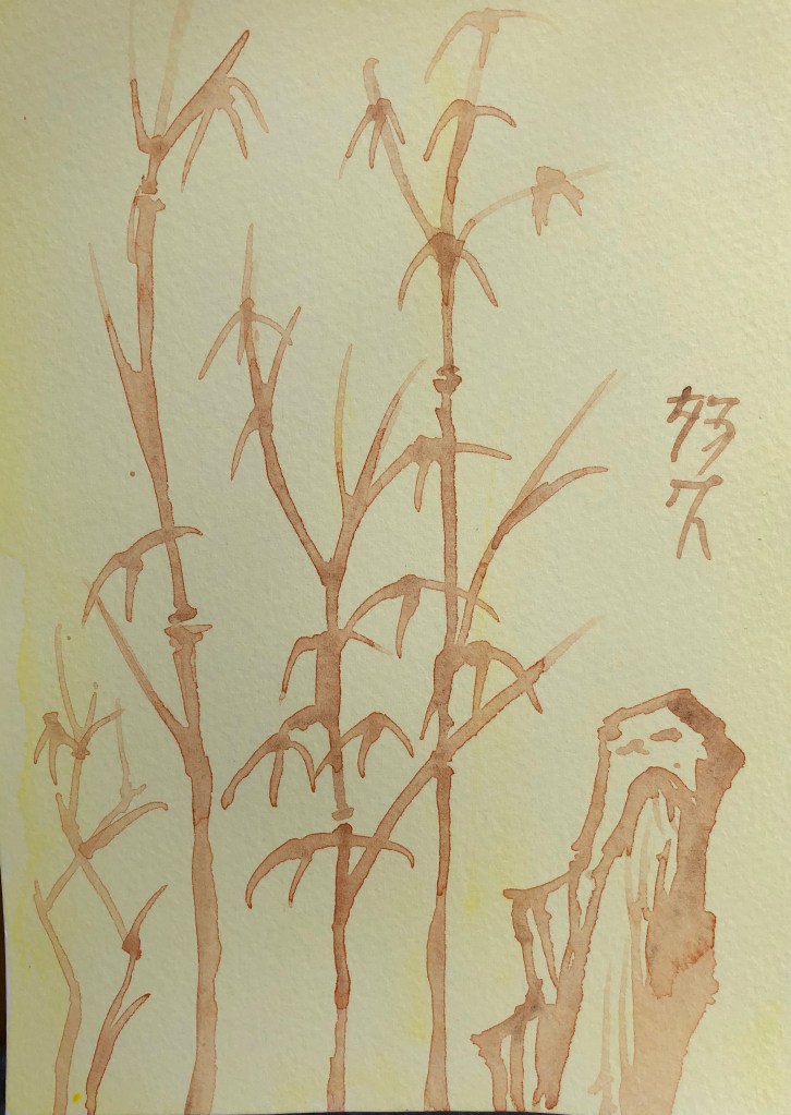
11. Thick watercolour (burnt sienna) over grey egg tempera. A pleasing combo – the egg tempera background offers enough resistance to the brush so that it doesn’t skid, without being a drag which makes making the mark you want difficult. Only downside is that the W/colour fades considerably as it dries – you’d need a few layers for it to really stand out.
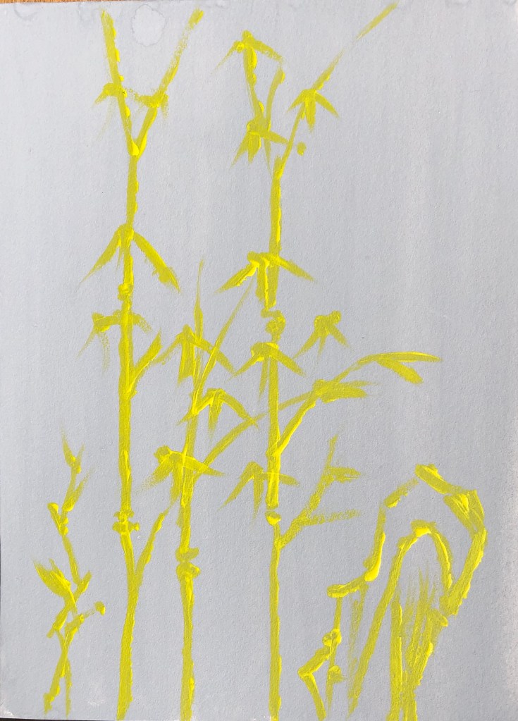
- Thick yellow high viscosity acrylic on grey gouache. This high visc acrylic really lives up to its name – tried using it with a damp rigger but it really didn’t want to be dragged – in the end dried the brush and just used the paint neat – gives an interesting uneven effect.
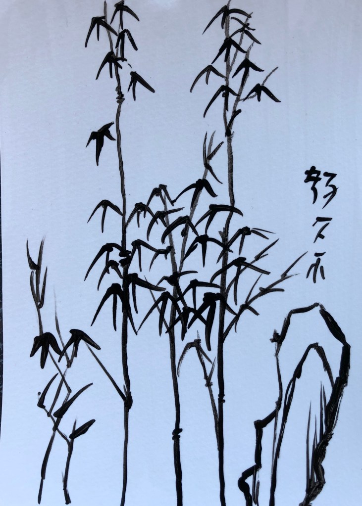
13. Thin black Chinese ink on thin watercolour – this went on and dried like a dream – an easy-to-use combo.
14. White egg tempera on very thin watercolour – I started off with some very thin egg tempera but could soon see that it was too watery to stand out, so I made it a bit thicker to get a good contrast.
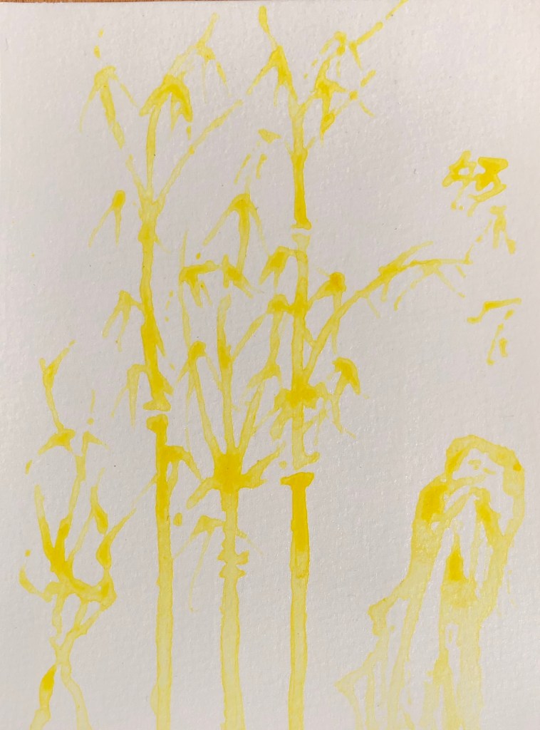
15. Thin burnt sienna watercolour over very thin primary yellow acrylic. Again, a surface offering a pleasing but not overbearing resistance to a runny paint. The watercolour fades but is still clearly visible and layers could be built up.
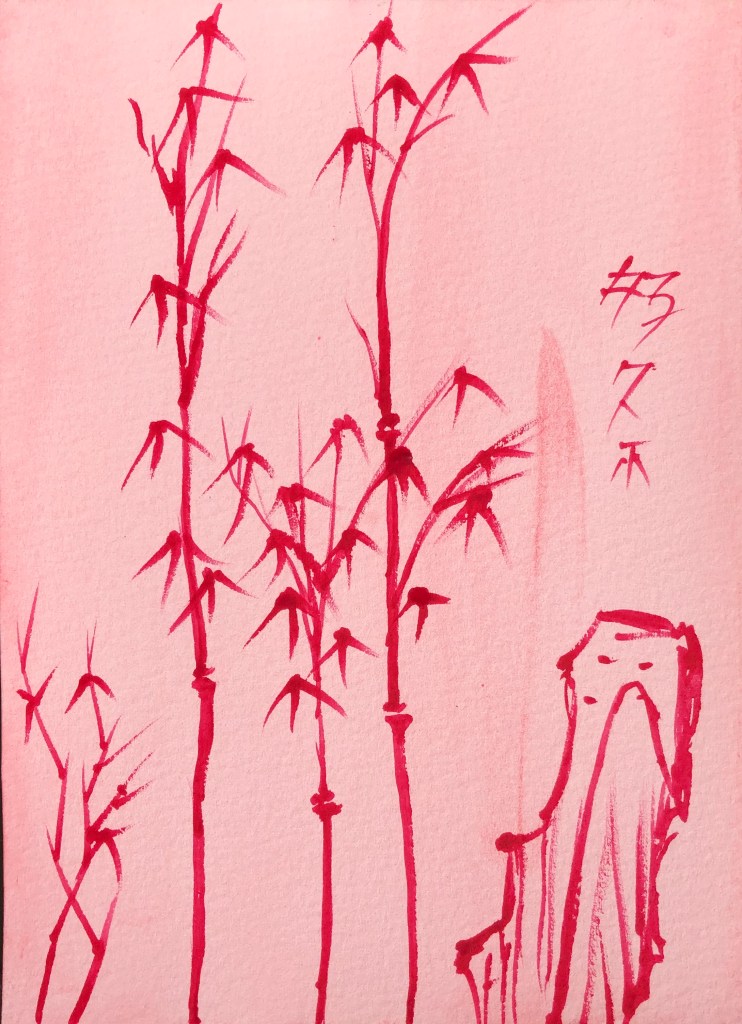
16. Thick permanent rose watercolour on very thin acrylic (cadmium red). This was a good combo, both in terms of applying medium to background – right amount of resistance yet flow – and also dark red on light red.

17. Thin black acrylic over watercolour splodges (ultramarine and Hooker’s green). This ran well – have learnt not to make it too dilute, so it flowed well over the surface and was clearly visible. The splodges work effectively as a background, making it look from a distance as if there is a load more plant material behind.

18. Thin black gouache on thin acrylic yellow splodges. Pleasing dramatic colour combo. The gouache gave strong coverage even though very dilute.
19. Black acrylic on varnish, applied with a damp rigger – the acrylic seemed to glide smoothly over the surface, only breaking up a little when the paint load was low. Satisfying smooth service to paint on. Interesting that the background looks blue in the photo but bright white in real life.
20. Very thin high viscosity yellow acrylic on varnish. The brush runs well when loaded but, when asked to make a thinner more delicate line, the paint starts to break and bobble into droplets on the surface – as expected from a shiny surface.
NOW WHAT?
I have learned that:
- If I am going to paint over a ground, particularly a chalky ground such as gouache, in acrylic, I need to make sure that the acrylic is thick enough not to disappear – although bits of “ghostliness” would be good for a mysterious image.
- Unexpectedly, painting on varnish is easier than I thought, and the paint doesn’t slide everywhere; also, painting with varnish on a dark surface shows up surprisingly well
- Ink and watercolour are good combinations (although I did know this already – but always good to have it confirmed!)
- The medium I have most enjoyed using, both as a background and a medium, has been the egg tempera – it provides a matt, very slightly resistant surface for painting onto, and it has produced effective images over a range of backgrounds.

