
WHAT?
To recap:
My review of my learning so far from this unit had brought me to this point:
Things which have been tackled and are developing (but always needing more…):
- Getting around tasks which don’t immediately appeal by finding a way to “get in from another angle”
- Loosening up and being up for experimenting
- Managing my impatience as a painter by managing my subject matter
- Favourite media: oil paint, household chalk paint and enamel paint.
- Favourite ground: egg tempera, ink
- Favourite tools: sticks and knives
- Favourite support: metal
- Becoming aware of curation and your work as art out in the world
Issues which keep coming up and need more work:
- Quality of mark making and brush strokes
- “Decisive and economic”
- Palette organisation and where to mix colours
- Tone generally, but in particular:
- Adding tone to drawing
- Possible confusion of tone and colour in painting
- Understanding the tonal range available
- Controlling my style – should I? How do I develop it?
Things which appealed at the time but which I appear to have mentally parked:
- A collection as being of quotes or ideas to investigate a subject – rather than just a load of actual “stuff”
Based on these, I made some decisions to tackle this assignment:
- I had liked painting collections of art materials before in this section – art is my “escape” from the Covid-obsessed world
- Apart from oils and inks,which are traditional painting media, I had enjoyed painting with the less common media of enamels and household paint
- The size required for the task (A1 or A2) felt a little too daunting for enamels, given that I had only worked in this medium for small pieces, so I chose to work with the household paint as my main painting medium
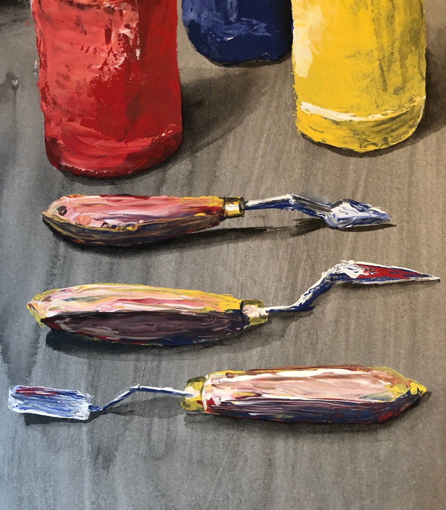
- I had just discovered painting with a palette knife – it is (to me) slightly unpredictable, and it is possible to apply the paint both thickly and thinly in a single stroke, which I found interesting, challenging, and wanted to do more of.
My main influence as far as composition was concerned was Lisa Milroy – her rather regimented still life layouts appealed to my need to organise. I selected a range of art materials and tools (in units of 3 for pattern-building) and played around with different layouts on a piece of black fabric, finding an arrangement which chimed with my sense of order and symmetry. I hung some more black fabric behind as a backdrop, and lit the scene from the top left hand side with a daylight lamp.
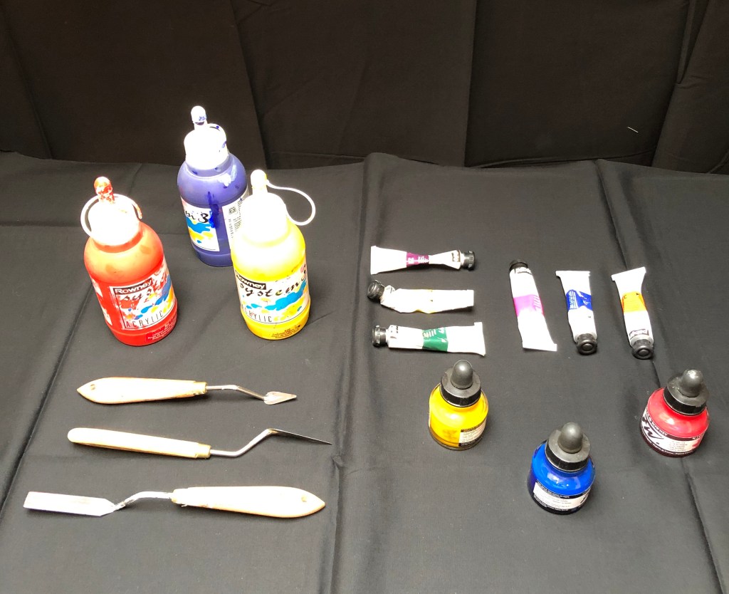
The lamp causes quite a bit of glare in the photograph which is not there in the original. Lisa paints her arrangements looking almost straight down on them, but I looked at them standing, as it were, at the bottom right of this picture, so that a couple of the items overlap slightly, which I felt added interest and stopped it all being too tidy.
My intention was to paint on a large sheet of hot pressed watercolour paper, somewhere between A2 and A1. The background was to be painted black – egg tempera for the backdrop, which gives a really good strong black, and dilute Chinese ink for the cloth on the table, to give a mid-tone. The main medium for painting would be Annie Sloan’s chalk household paint (red, yellow, blue and white) applied with a palette knife, and any necessary extra darks needed would be washes of ink (or, if I felt I wasn’t getting a dark enough dark, maybe a little egg tempera).
SO WHAT?
My preparatory work before painting included:
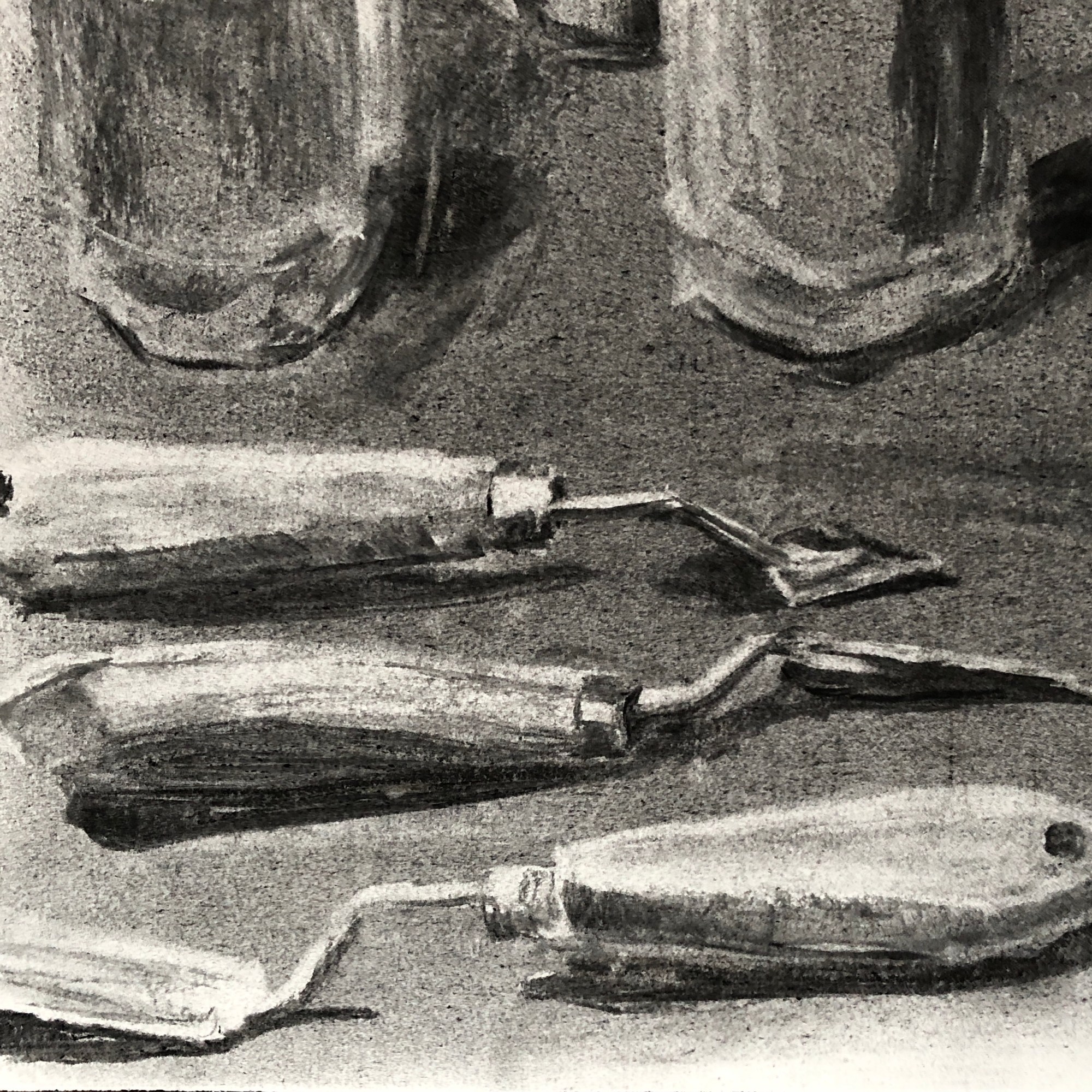
- Some continuous line drawing in pencil of a few of the paint tubes; I worked into these to add tone, as well as doing a couple of detailed studies of the caps which I was struggling to understand.

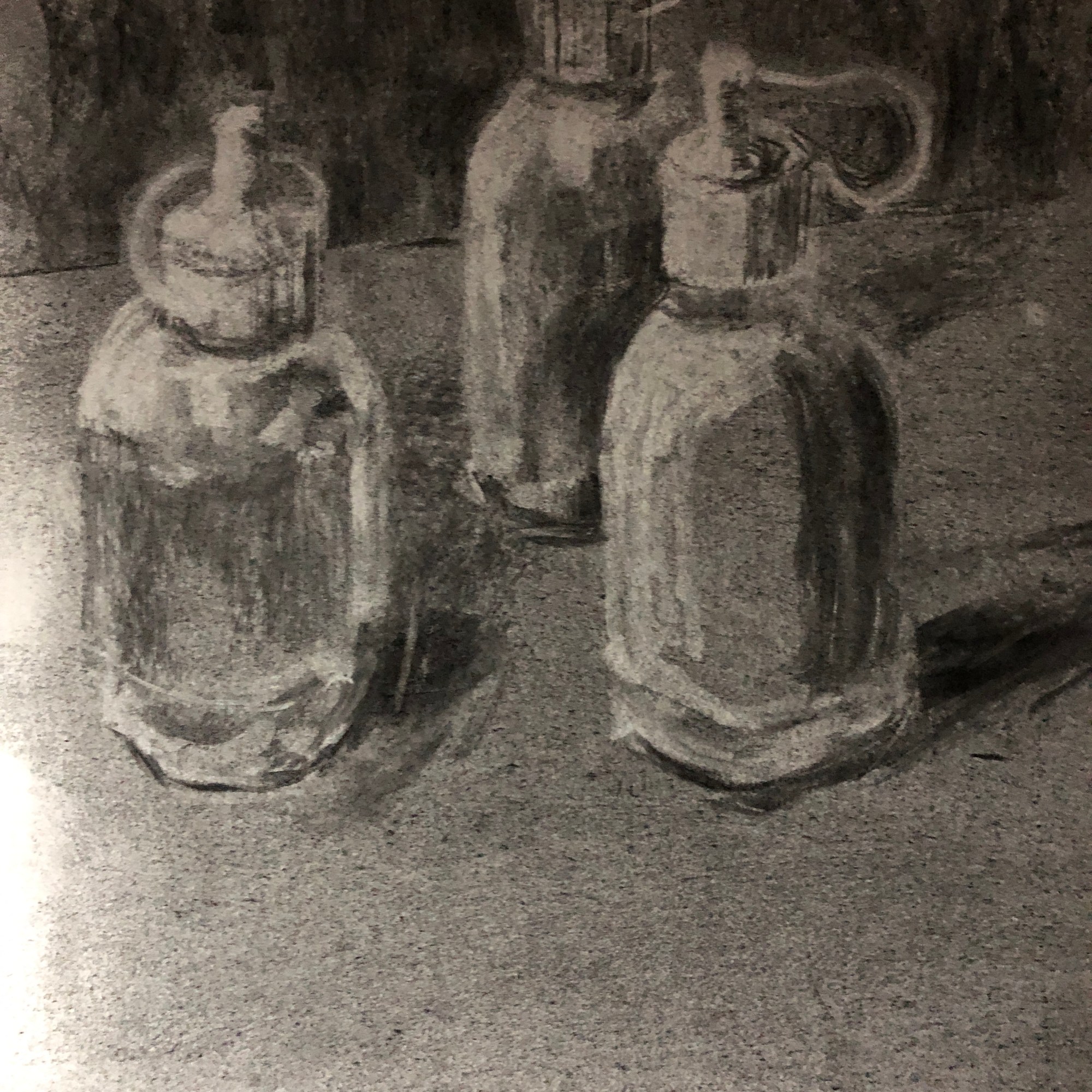
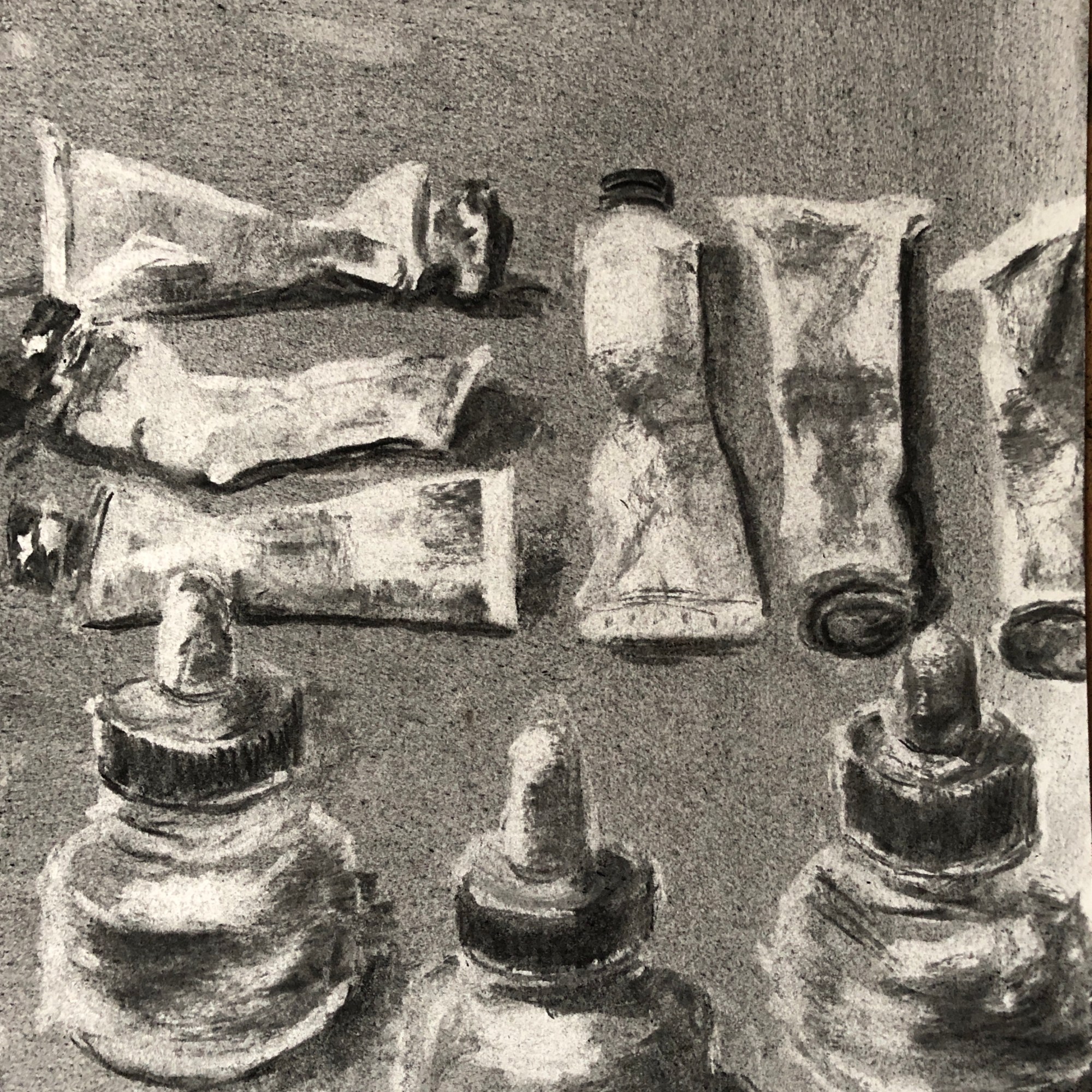
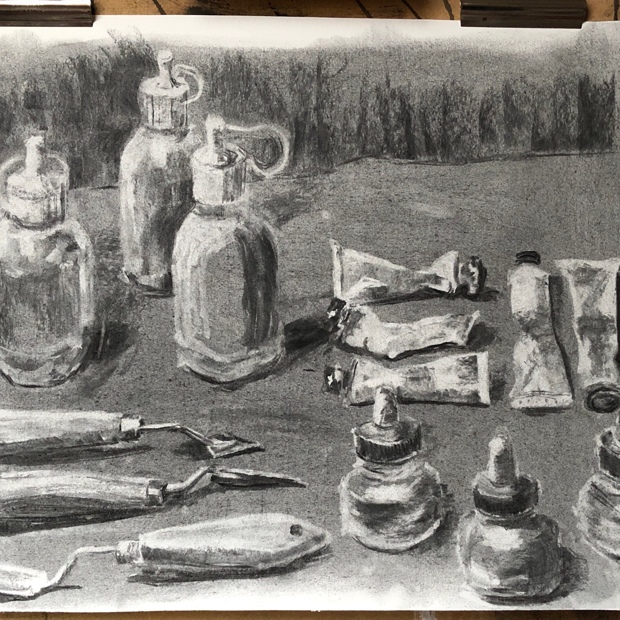
Having done this, I thought I needed a proper tonal drawing as a reference. I used willow charcoal and a putty rubber for this. I covered a sheet of paper with the charcoal and rubbed it into the surface with my hand – this created my mid-tone. Then I either lifted out with the rubber or drew in with the charcoal to make my lighter and darker tones.
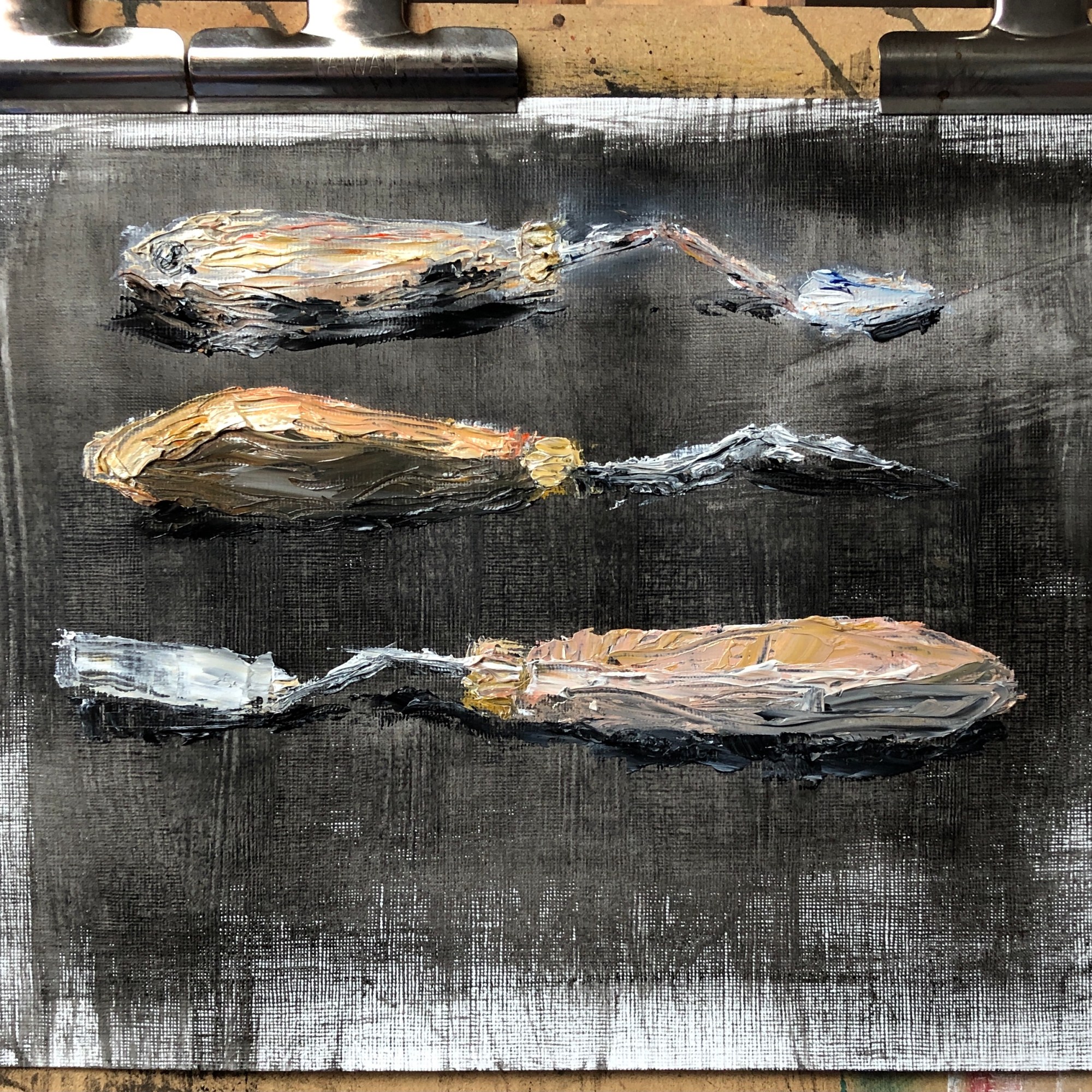
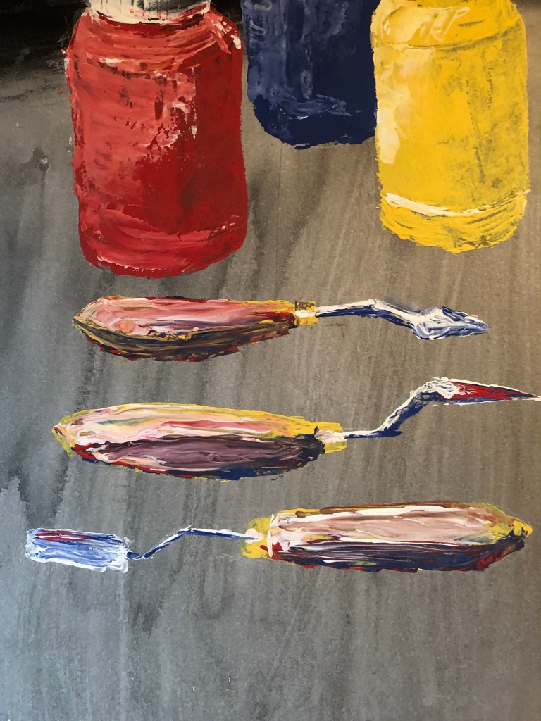
- A painting of this size would best be done vertically which would mean using my left hand (the amount of gestural movement being too much for my dominant, but previous broken and now too stiff, left shoulder) – so I felt I needed to practise using a palette knife with my left hand. Just as well, as I found it quite tricky! I did this painting of the palette knives, using a palette knife, with some oils left over on a palette.
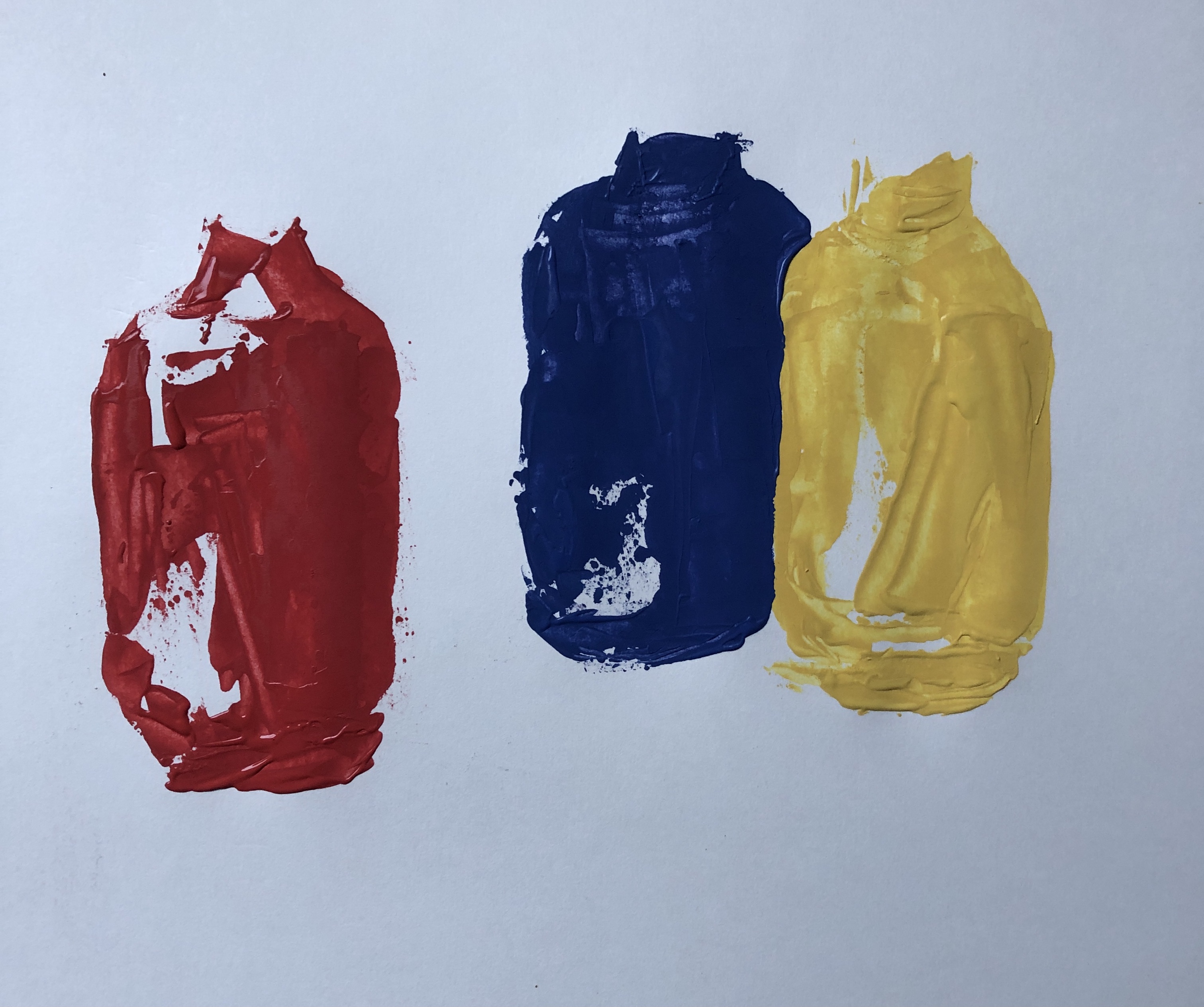
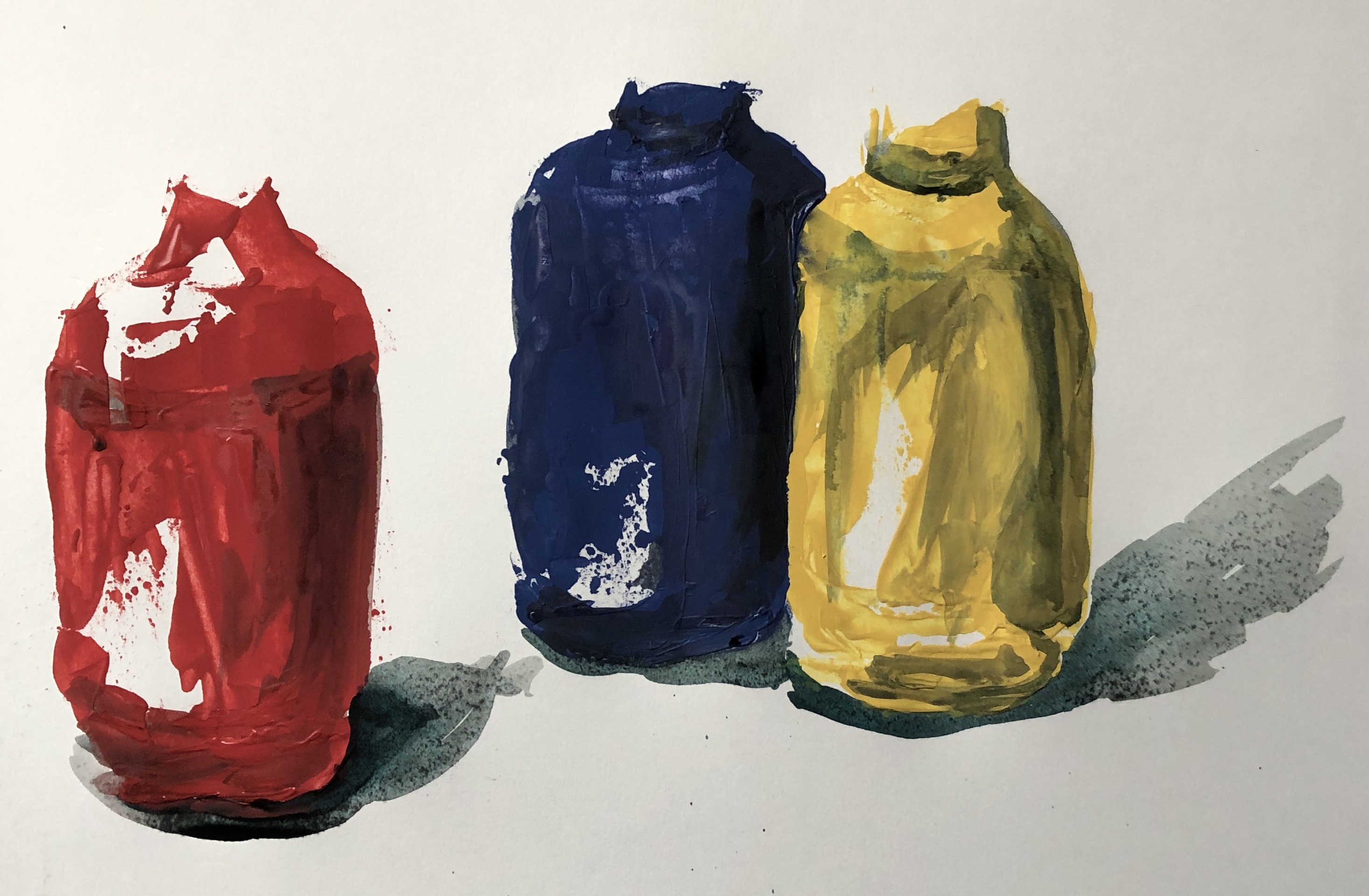
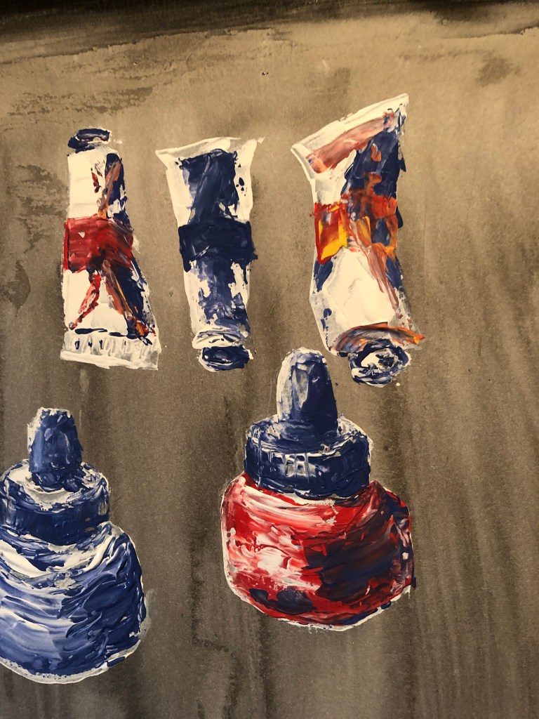
- Next, thinking about painting on a near vertical surface, I thought I should try experimenting again with the left-handed palette knife but this time using the Annie Sloan paints, which are significantly runnier than oil paint, to check they weren’t going to be unmanageable. I roughed out the three tall paint bottles, and found the household paint to be actually easier to control than the oils because they didn’t slip and slide so much. I also checked that overpainting with inks would allow for development of tone.
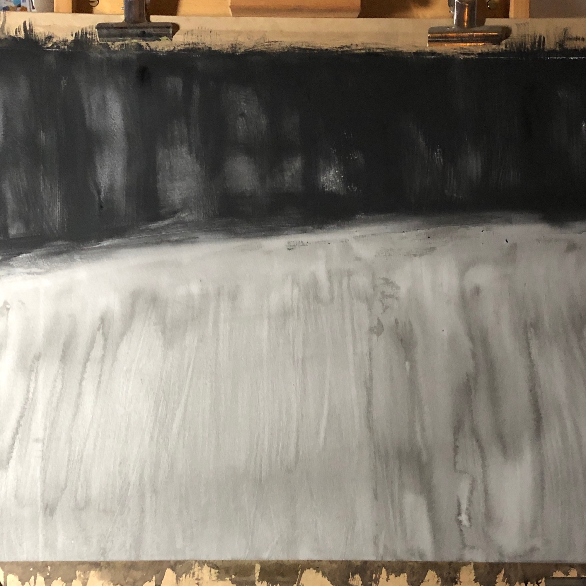
- I felt ready to make a start on the main painting. I soaked and stretched my sheet of hot pressed watercolour paper, allowing it to dry completely, before applying my background of black egg tempera (top) and dilute Chinese ink (bottom) with a very large watercolour brush (an SAA “Whopper”!). I kept the background fairly loose, not worrying about runs and streaks, although trying to get them directional – I am aware that the layout of my composition is quite controlled and regimented, so wanted to counteract this potential impression of over-organisation. Again I left the whole thing to dry.
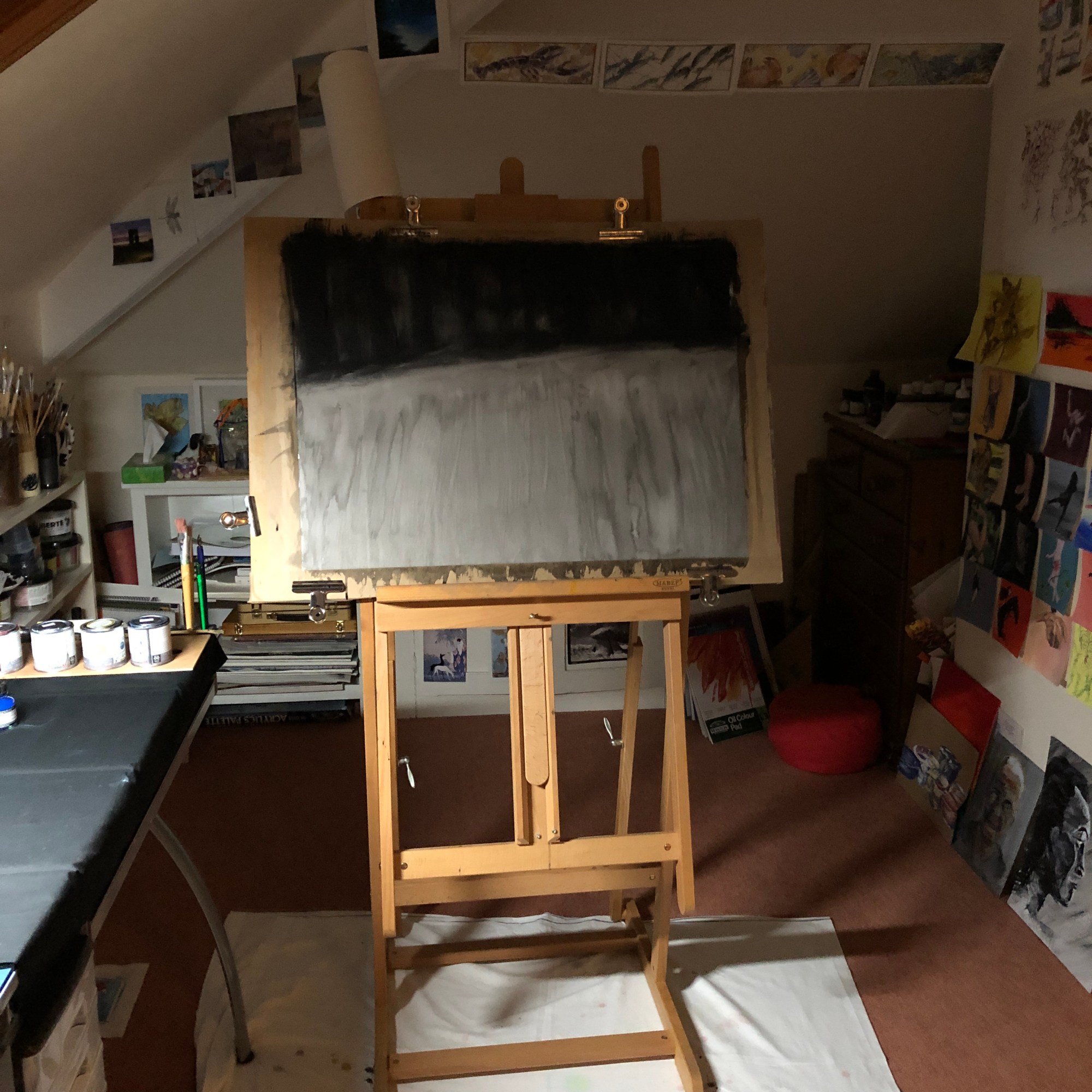
- And then I began! The paint dries quickly, sot takes no prisoners – not a lot of time for standing back and looking whilst painting an element, you just have to get in there and hope for the best; it is only when considering adapting your work to take account of tonal values that you have the chance to take more time. I looked often at the physical composition but also relied heavily on the tonal drawing for support. Here are some images of the work after the painting stage was complete:


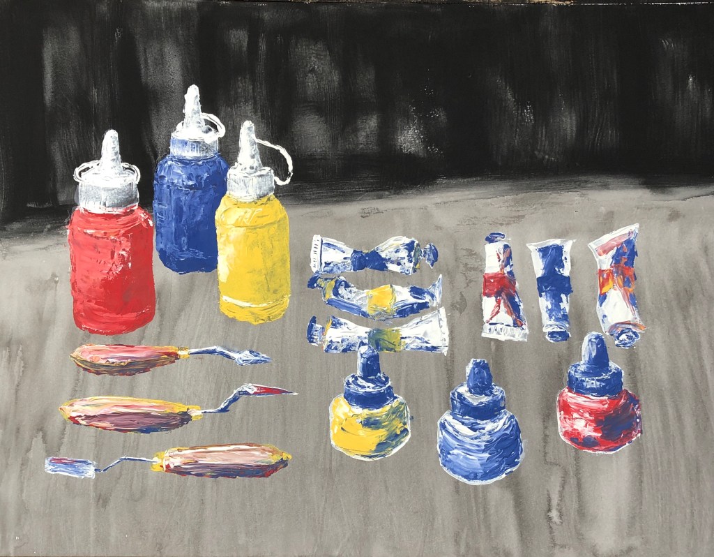
- My next task was to add the darker tones and shadows in black Chinese ink, using a sable brush. This ink does dry lighter than it looks, so in some places I needed several layers. I was prepared to use the darker egg tempera if necessary, but decided against it as the ink shadows blended seamlessly with the ink ground, making them look more natural.


NOW WHAT?

I feel the painting is a success because:
- I enjoyed painting it.
- Getting to grips with the palette knife was a real challenge and I have learned more about the marks which are possible by doing it (I confess that I struggled with the curved sweeping lines of the paint bottle top hinges and I turned to my ash twig for those).
- I thought hard about tone throughout and hope I have achieved enough of a range without the shadows being overbearing.
What could I have done differently?
- I chose to make the background loose and undefined so that it literally “melted into the background”, as I wanted the clear focus to be on the art equipment. However, once it was finished and I looked at it as a whole, I wondered if it might have been improved by a more uniformly dark black backdrop to give a strong chiaroscuro effect.
- I have fitted the collection neatly within the page; when I did my tonal drawing, however, I ran out of space a little and image just “fell off” the end of the page – looking back, I think this gave the picture a certain dynamism and perhaps I should have repeated it in the main painting.
