
WHAT?
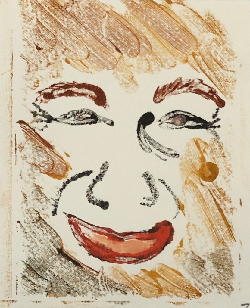
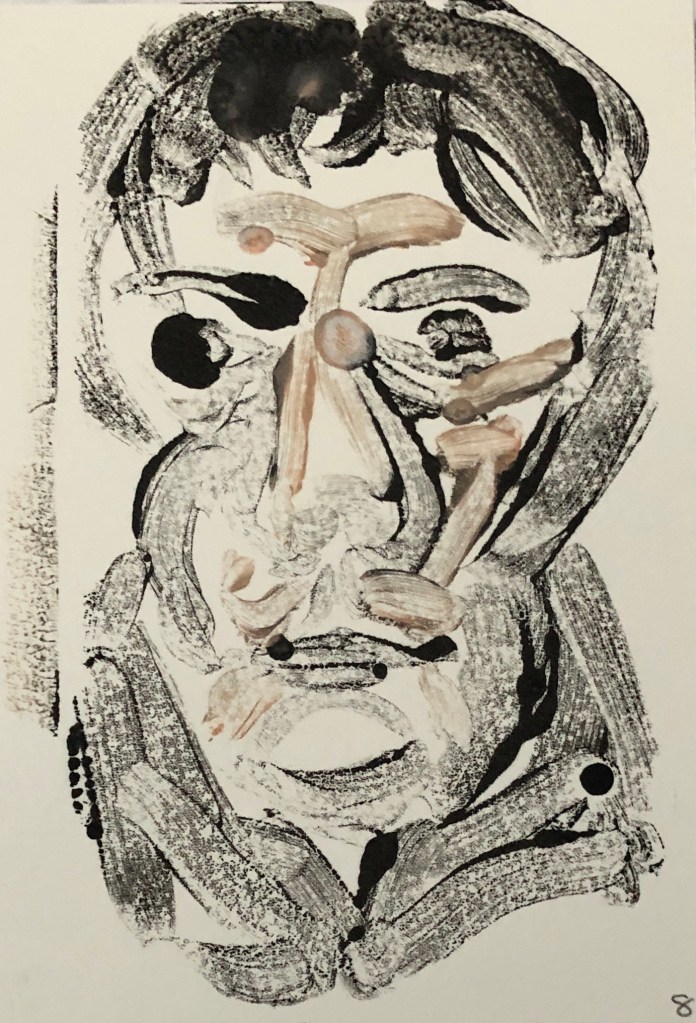
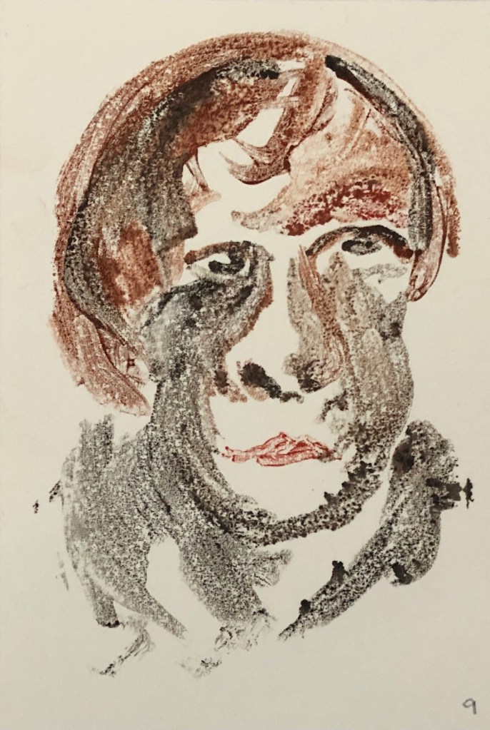
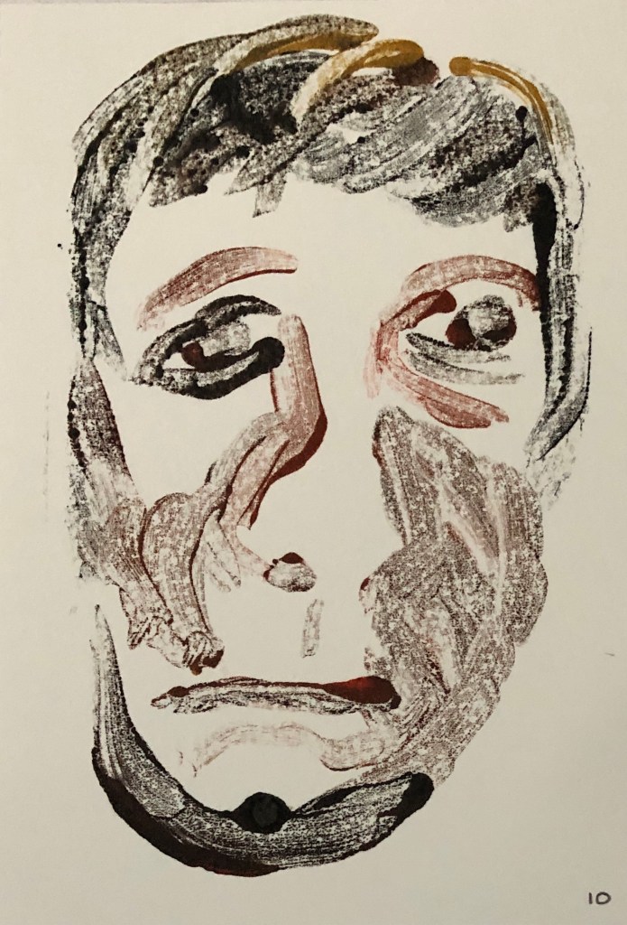
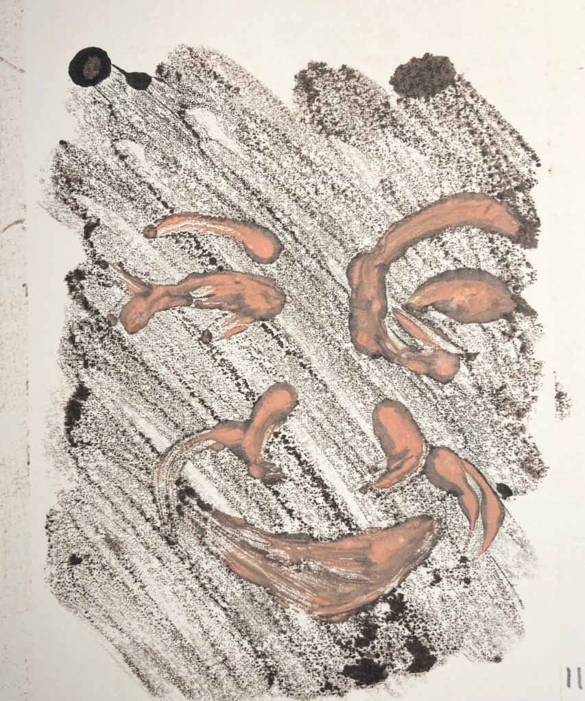
Using a selection of the ink drawings made in Exercise 1, oil paint with Zest-It solvent and a glass plate, I had a go at making some monoprint portraits. I had already had a go at making a few monoprints as part of the workshops led by Hayley Lock (see separate blog post), although these were slightly abstract plant designs.
SO WHAT?
I began printing onto cartridge paper and experimenting with different brushes, marks and thicknesses of paint. The first few were of the same image, before I moved on to another.
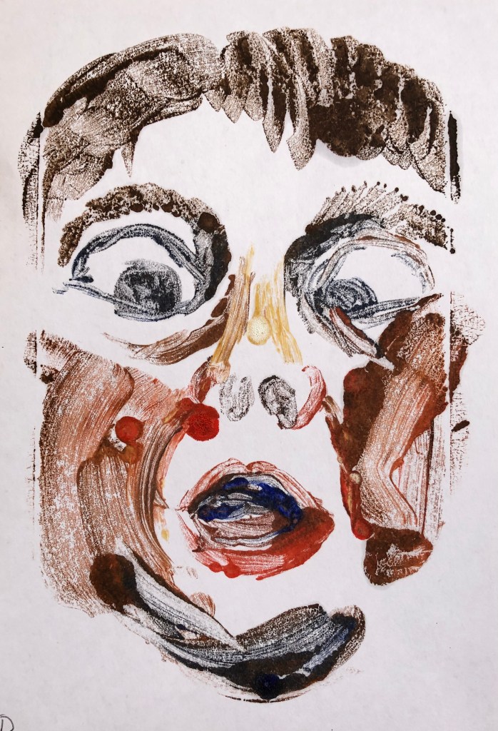
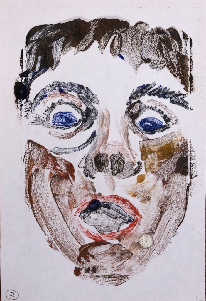
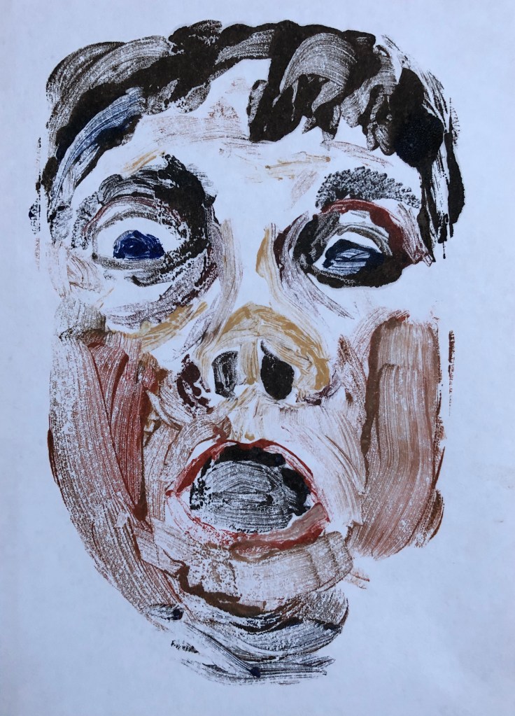
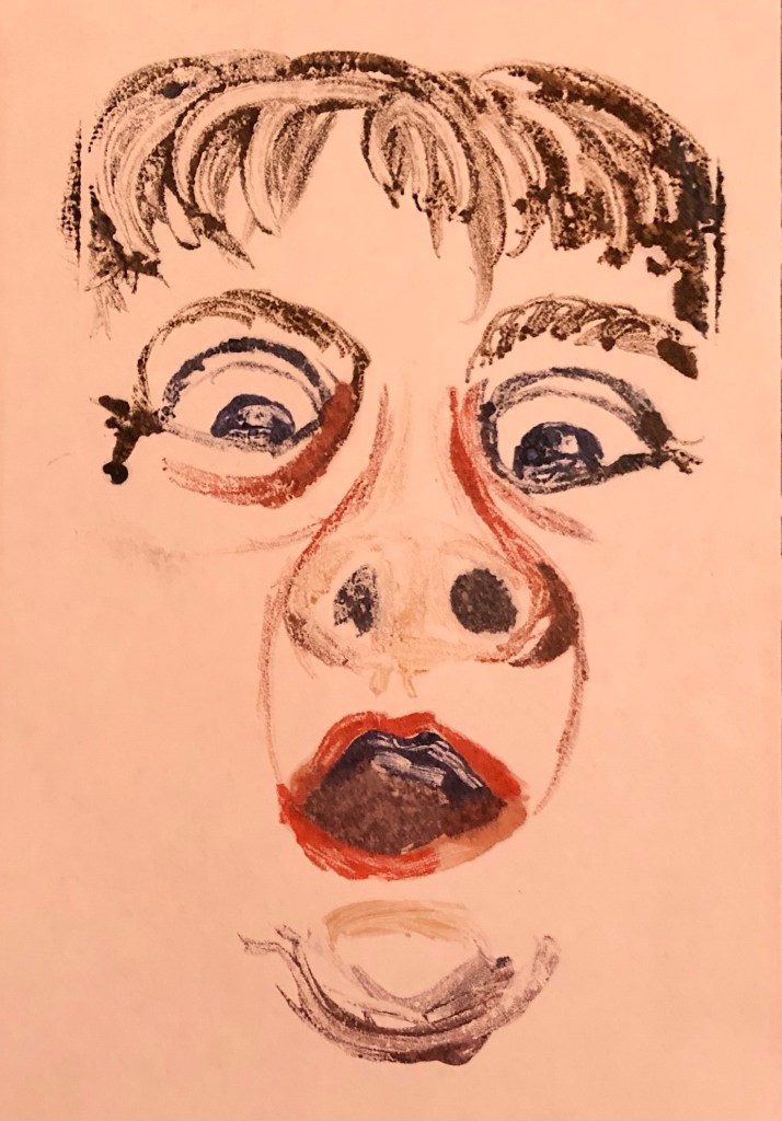
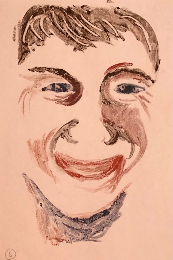
All the backgrounds were white, differences here being because of my working in a dark studio lit only by a skylight and a daylight lamp. I found I liked a combination of the size 2 soft filbert with a rigger best.
As part of my research I found a very useful article on the Jackson’s blog: “PAUL WRIGHT ON MONOTYPES”:
18th February 2016 by Lisa Takahashi
I really liked the energy of his pieces, for example:

Paul Wright: ‘Dealbreaker’ (3rd version) Monotype 40cm x 30cm 2015
and…..

Paul Wright: ‘Colour blind’ Monotype 40cm x 30cm 2015
His style of strong gestural marks is I think the way my work might want to go; he comments in the blog “Monotypes allow me to work fluidly and quickly, which very much suits my temperament”, which strikes a chord with me.
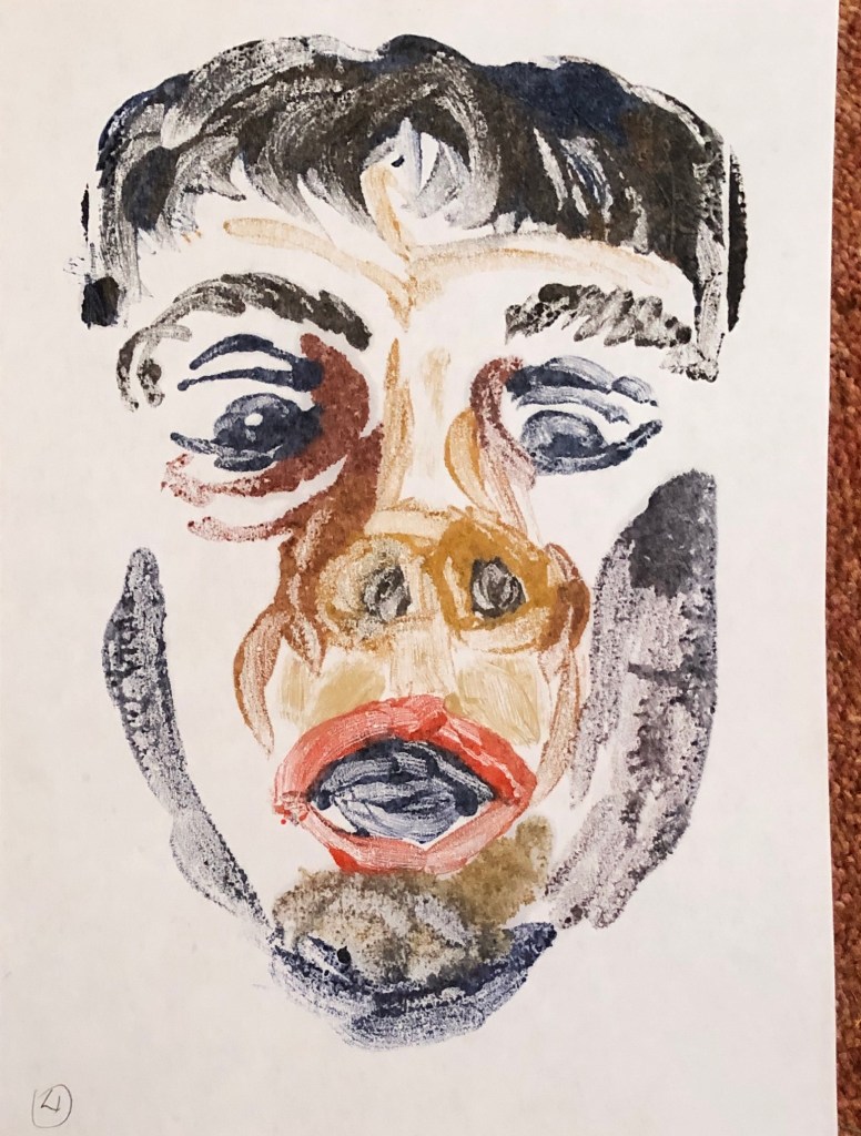
Having looked at this work I continued working on some of my other Ex. 1 drawings, experimenting with HP watercolour paper and continuing to play with paint thickness.
NOW WHAT?
I can’t say that I’ve worked my way to 5 images I am satisfied with, as I don’t feel satisfied with any of them; but I wanted to move on to working into the images so am going on to Exercise 3.
So far I’ve learned that:
- Thinner paint shows up the brushstrokes well but too thin makes the image vague and unclear
- Thick paint goes blobby, which can have a place, but generally looks like a mistake
- Tone is going to be really key to using this process effectively – I have to get better at seeing a face as areas of tone rather than eyes, nose etc……
