
WHAT?
As I have worked through this section, I have been particularly influenced by the work of various artists, in particular Marlene Dumas, Paul Wright, Maggi Hambling, Annie Kevans and Milton Avery (see earlier blog posts). As a result, I have developed a method of monoprinting which:
- Is ethereal in the sense that sections of the print fade at the edges and I have only chosen to paint into certain defined areas
- Is calm and meditative
- Has colours which are “harmonious” (see blog post on Milton Avery)
- Picks out key areas of the face to make a clear and believable portrait (especially eyes, mouth, and bone structure)
I did acquire the suggested additional reading, “Reappraising Drawing Past and Present, by Michael Craig Martin (1995, London: Hayward Gallery)”; I read the essay at the beginning of this section and was frankly a bit mystified as to why we were being asked to look at it at this point. However, I now totally get it – it is the characteristic features of monoprinting in oil which have allowed me to develop this style, where it is OK to have parts which look hazy and underprinted.
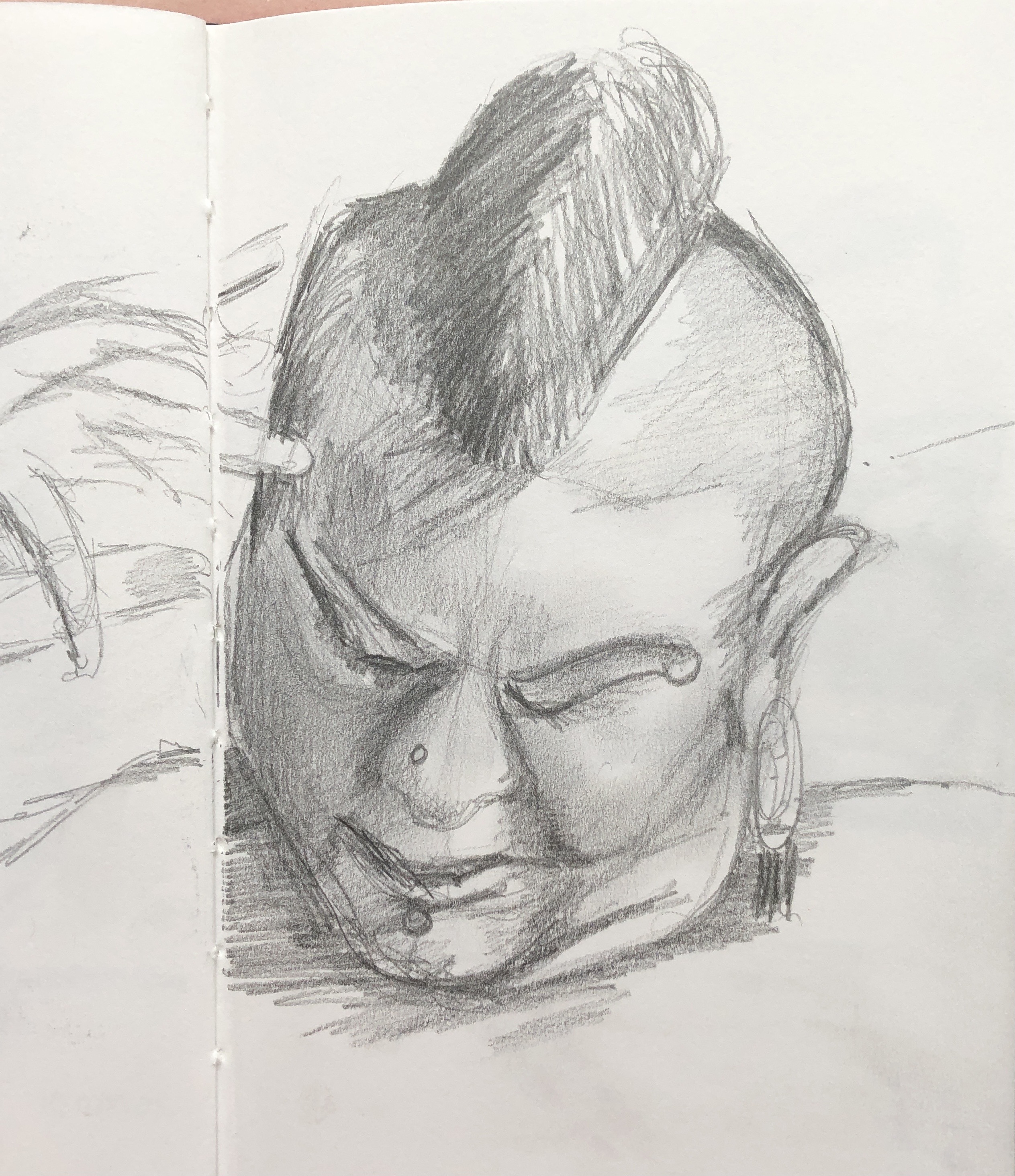
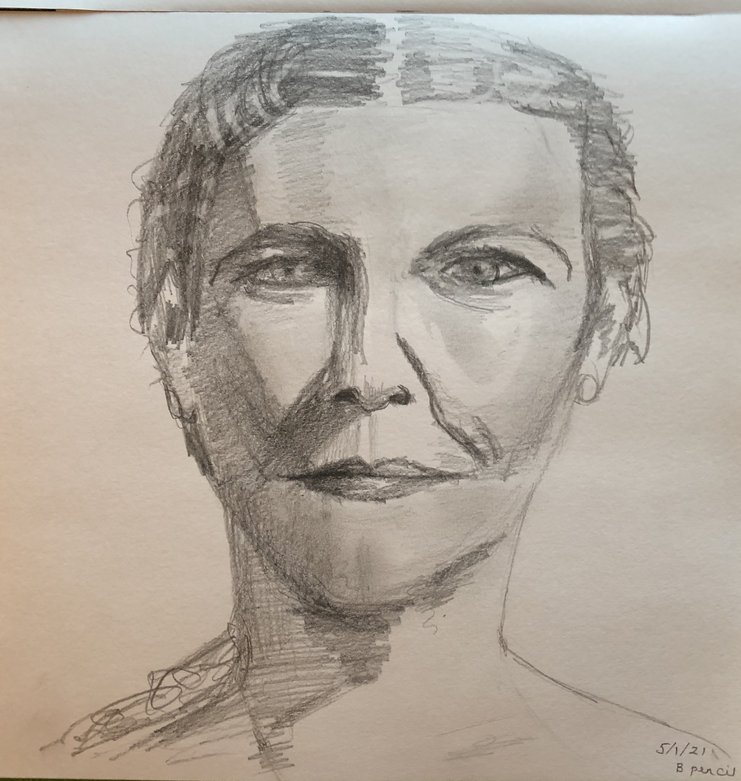
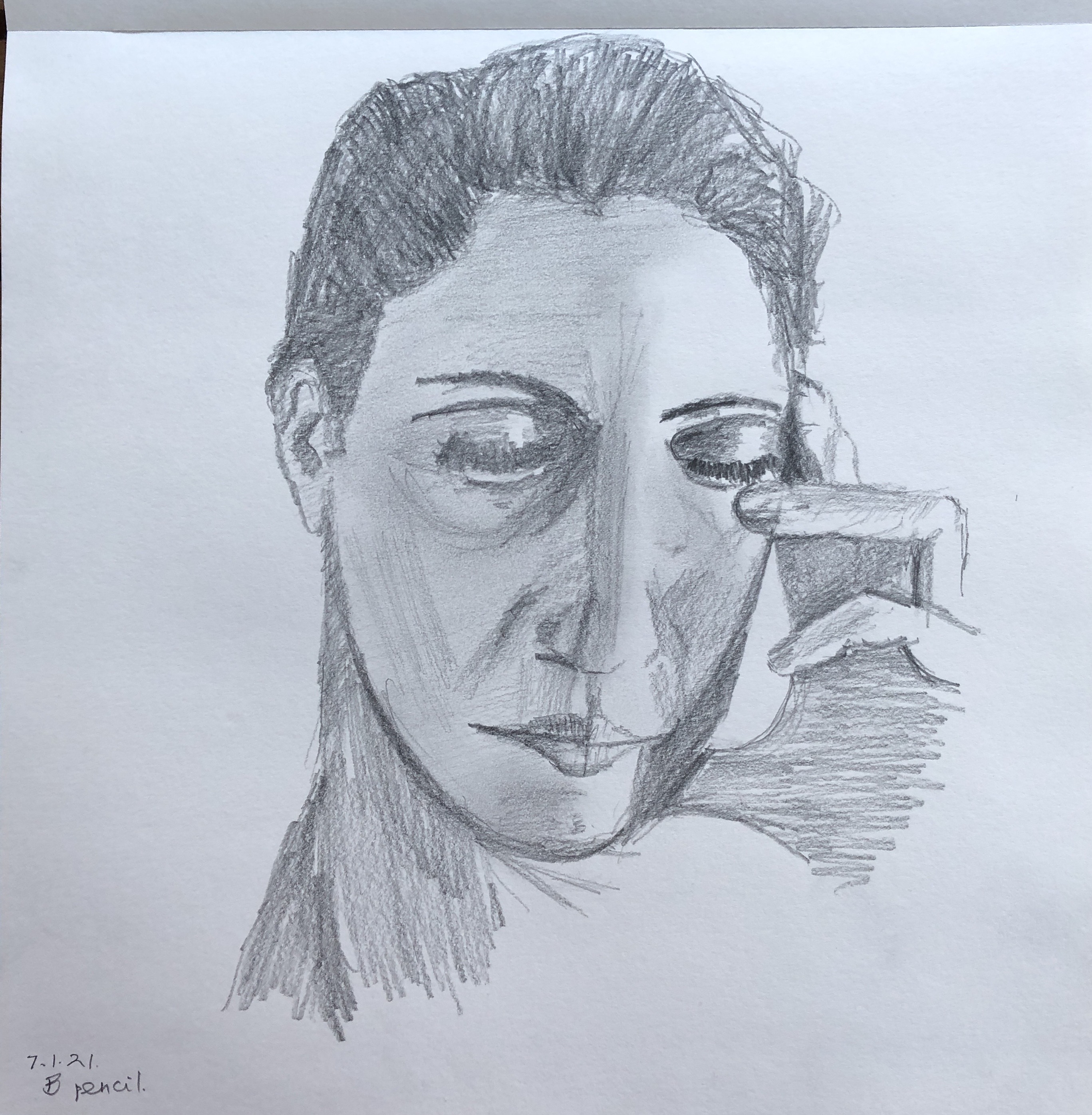
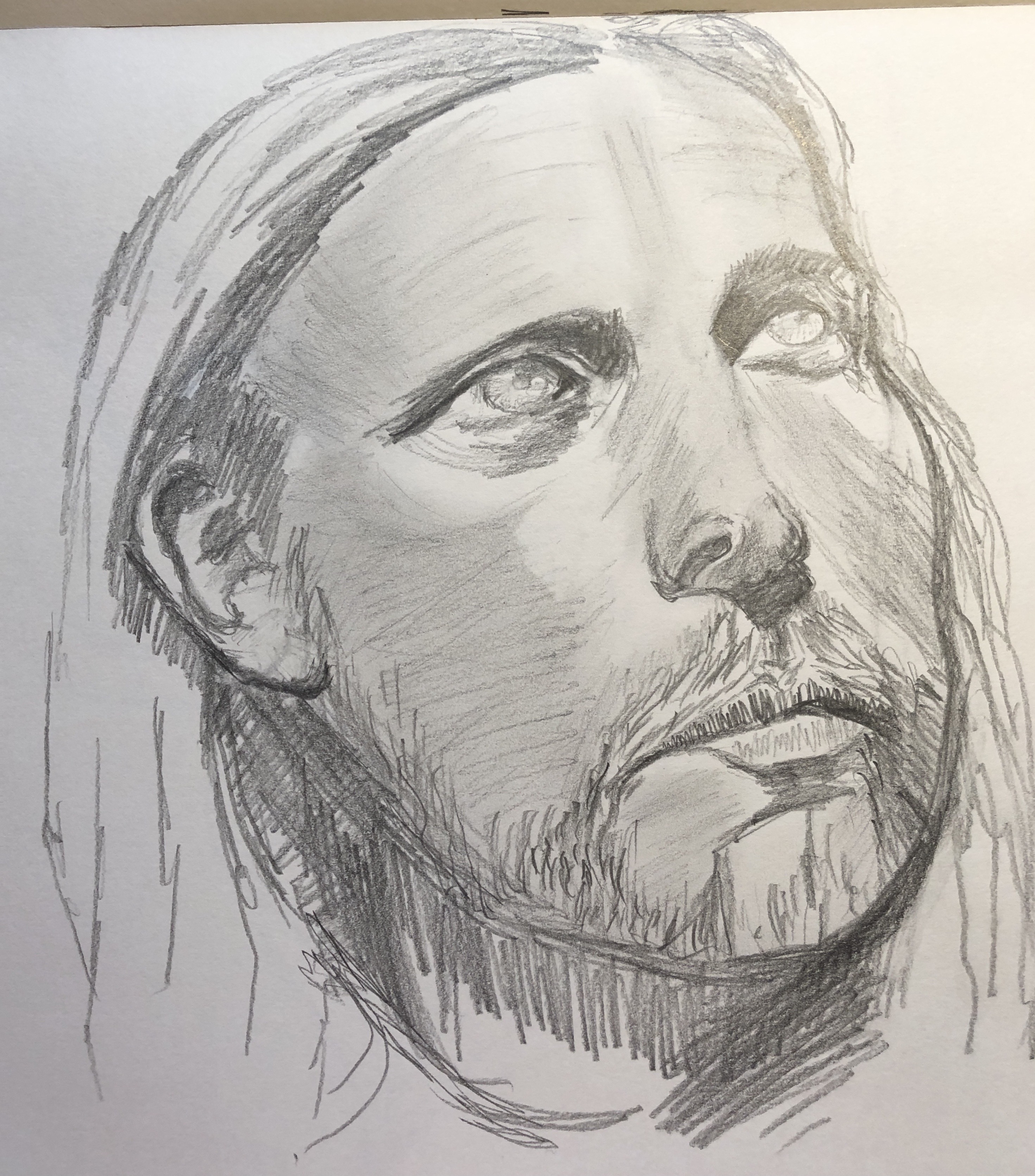
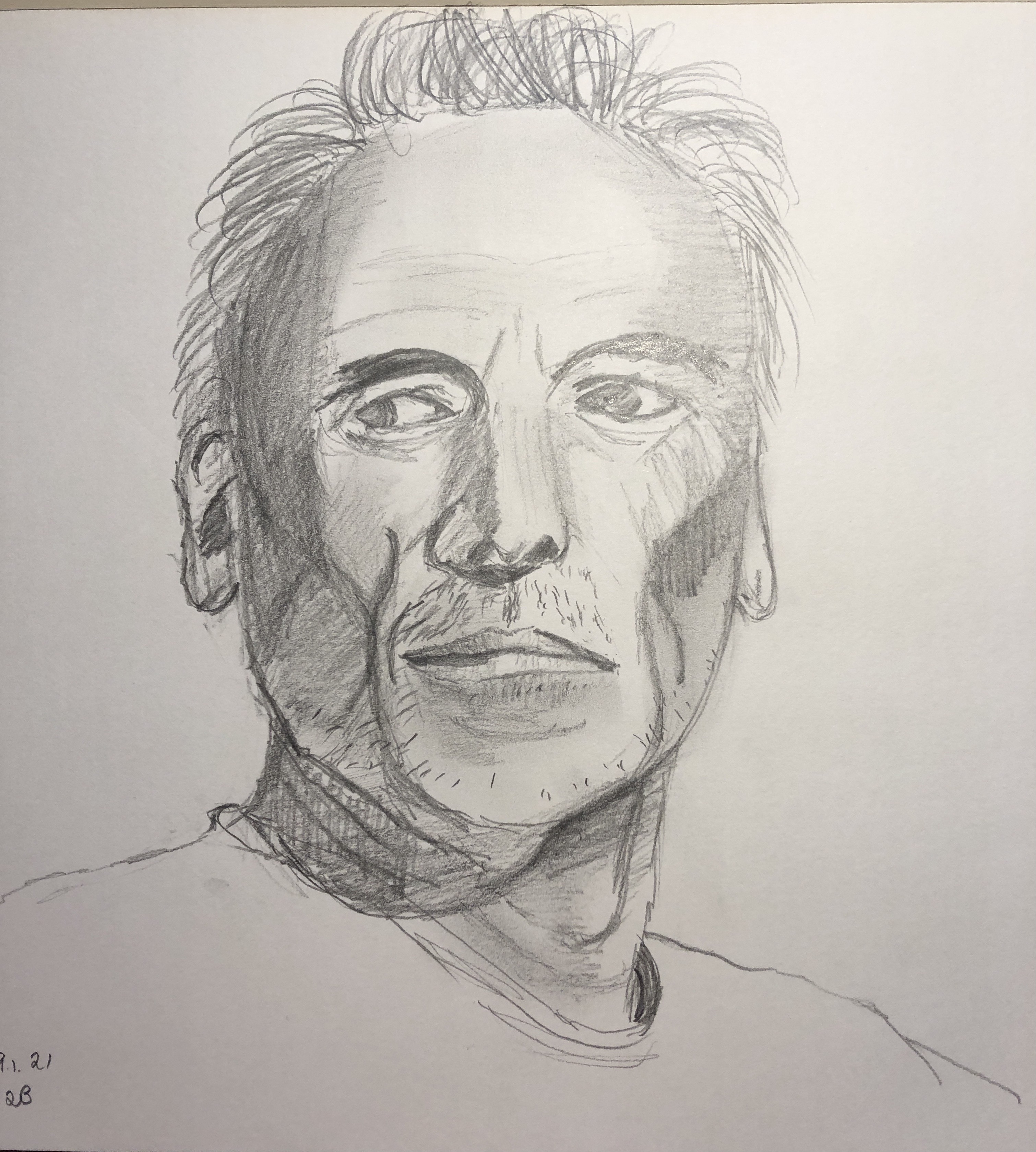
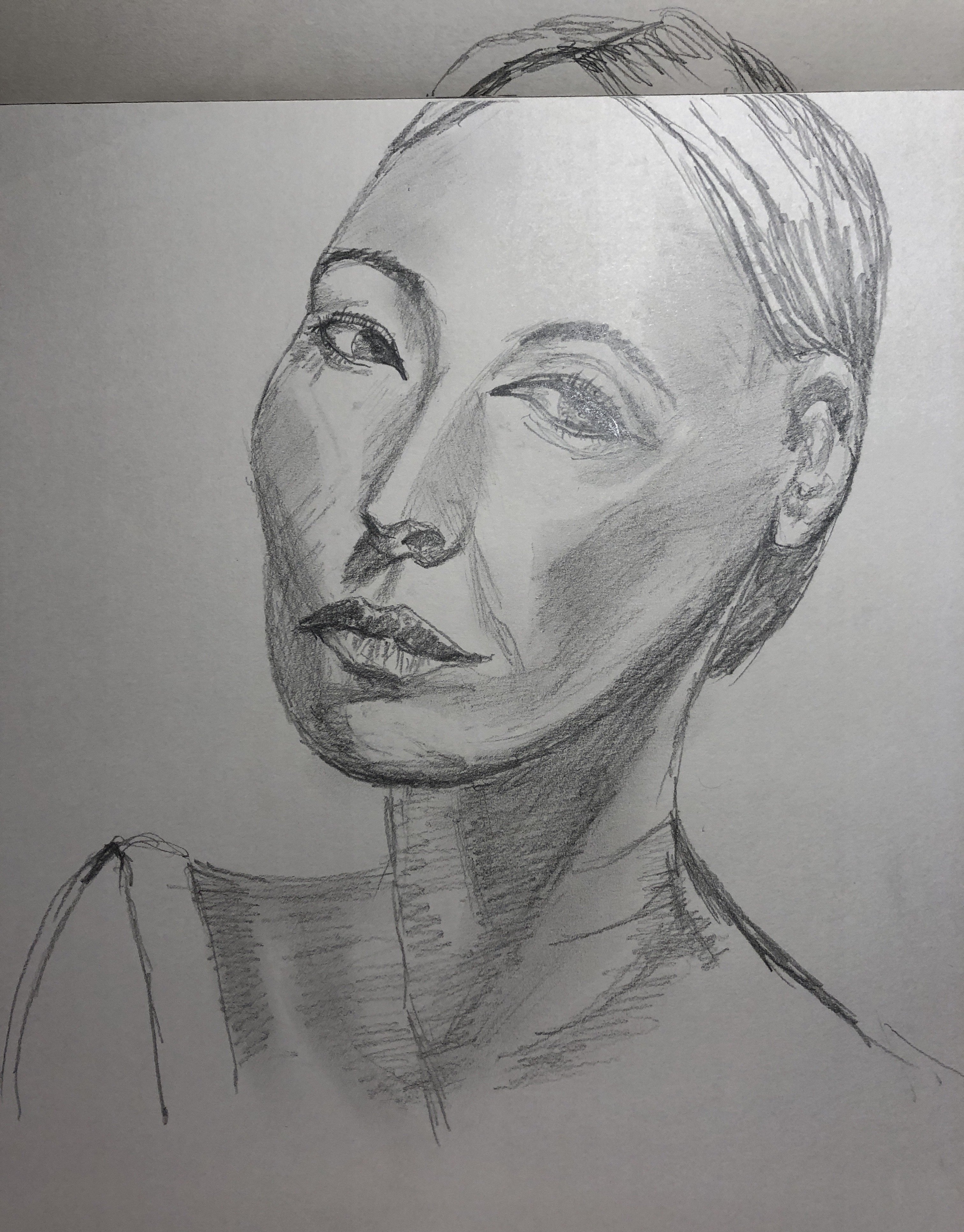
I have also been working on building my confidence with portraiture, using the resources available from Raw Umber Studios, and have been making portrait and full body drawings in 2B pencil, worked into with a putty rubber. I decided to use some of these portraits as my “base” images for the printing, rather than borrowing images from books or magazines, so that the work is completely my own.
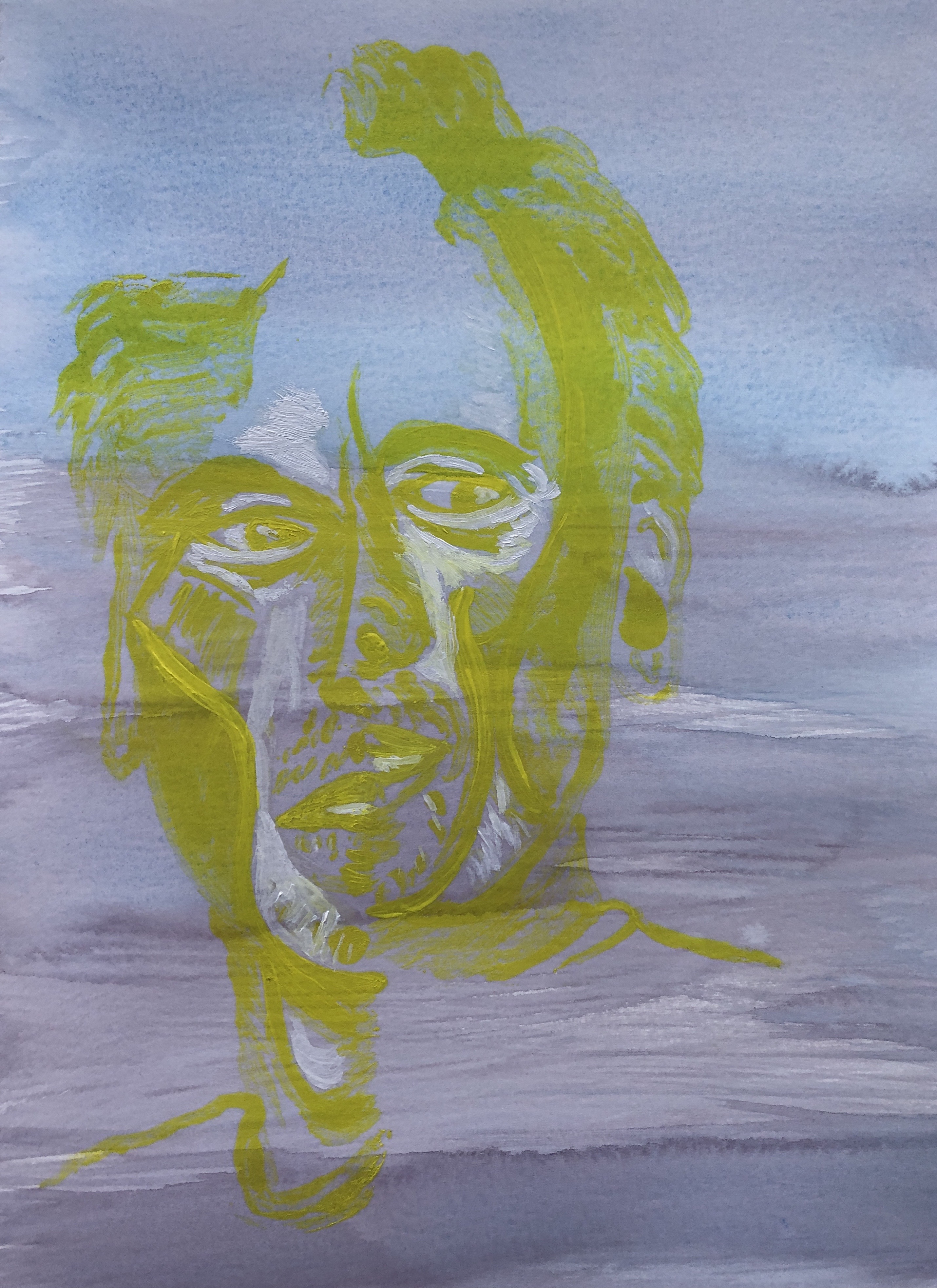
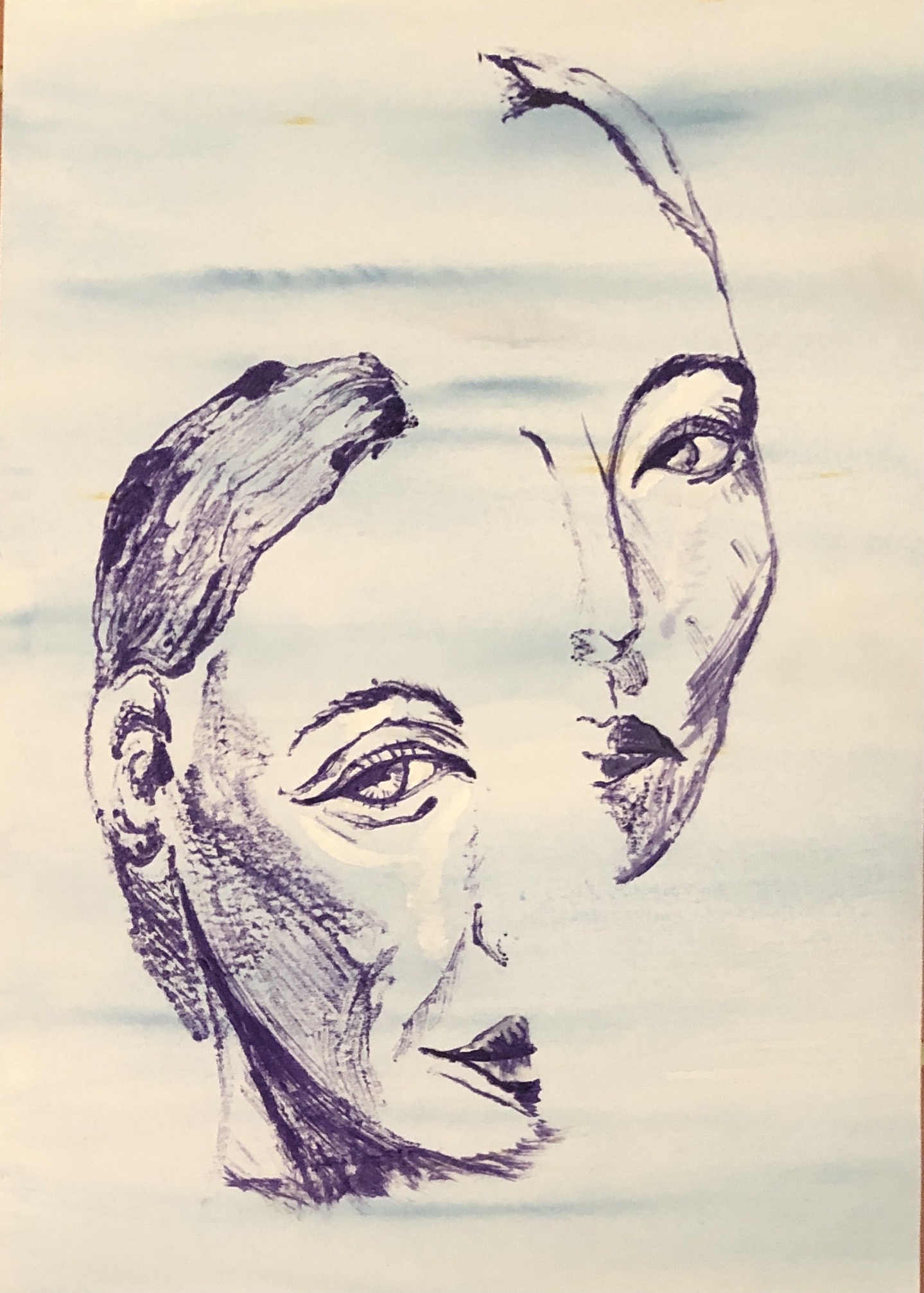
I had also wandered into a method of printing a face in two halves. I found it fun and wanted to continue with it, but took time out to think what the point of these images was. I try to keep COVID stress out of my work, as my art is my refuge from COVID, but I have heard and read from so many people that they find it difficult at the moment to concentrate on tasks and their mind is all over the place, that I think my images might convey a sense of this “wandering mind”. Also to me, who is a bit of a daydreamer at the best of times, the images feel as if they depict one half of me trying to focus on something, while the other half of my brain has drifted off out of the window into the wide blue yonder. I was going to entitle my assignment pieces “Daydreaming” – but my husband very wisely said that it would be better to leave the viewer to put their own interpretation on the pictures, and on reflection I think he is perfectly right.
SO WHAT?
After experimenting with supports and backgrounds (see earlier blog posts) I decided to work on HP watercolour paper. I wanted some colour in my background (to represent my “wide blue yonder”), but experience had taught me that this shouldn’t be so busy that it distracts from the print. Hence I covered some sheets with watercolour washes:
- Cerulean blue with streaks of Prussian blue
- Mix of cerulean and Prussian blues with some areas of perylene maroon
- Indian yellow with streaks of burnt sienna
I prepared three A3 sheets and then cut them in half, so each print is just under A4 (taking into account the edge strips where I had attached the paper to the board for stretching).
Image 1
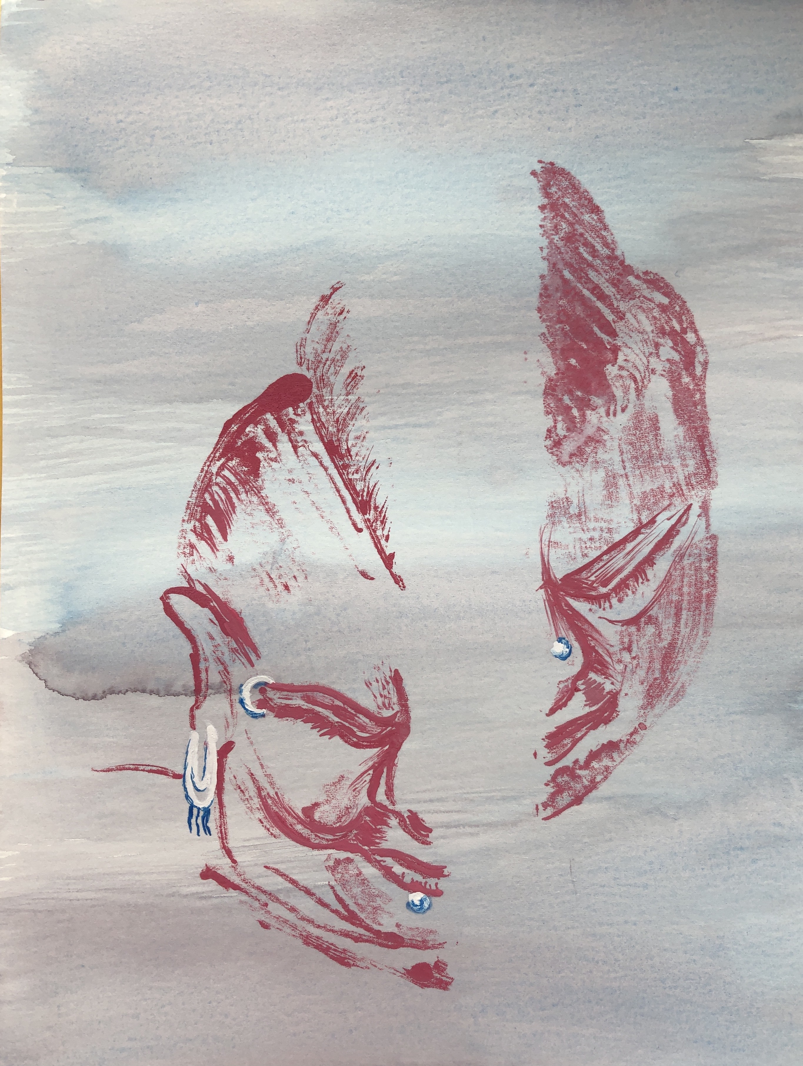
This was printed onto the blue/maroon mixture, and I chose crimson as the printing colour, with the jewelry picked out in cerulean and white once the print had been made. I used a feather to drag the shadow over the face whilst still on the plate, and drew in some of the fine lines on the plate for the hair.
Image 2
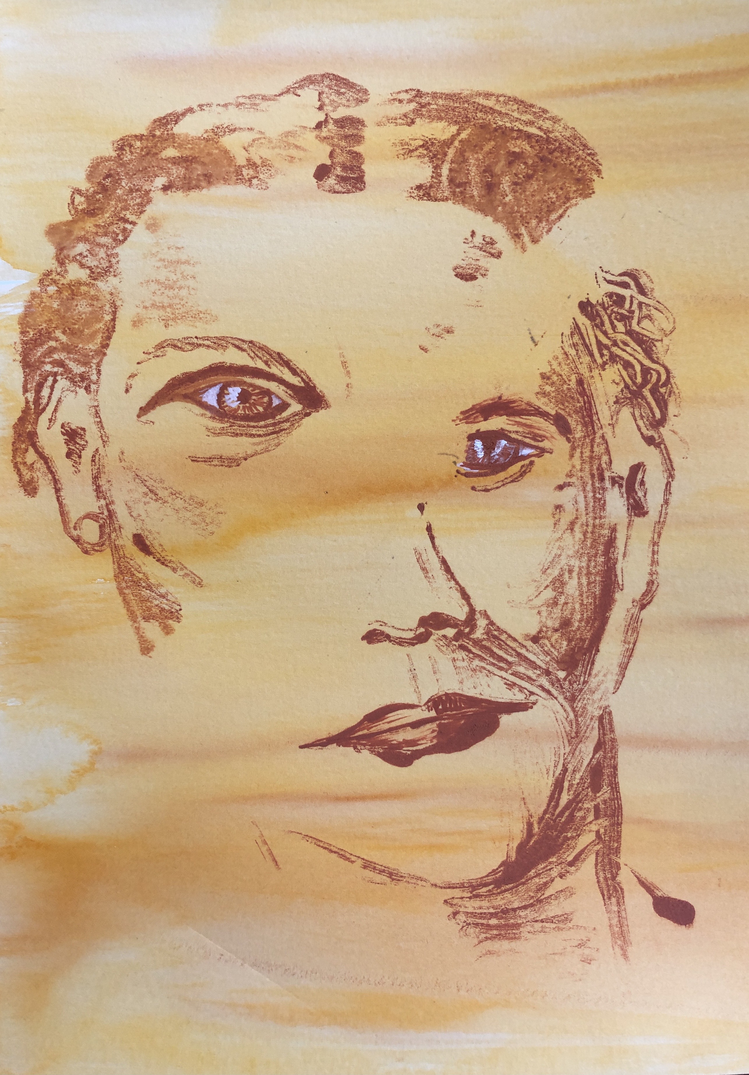
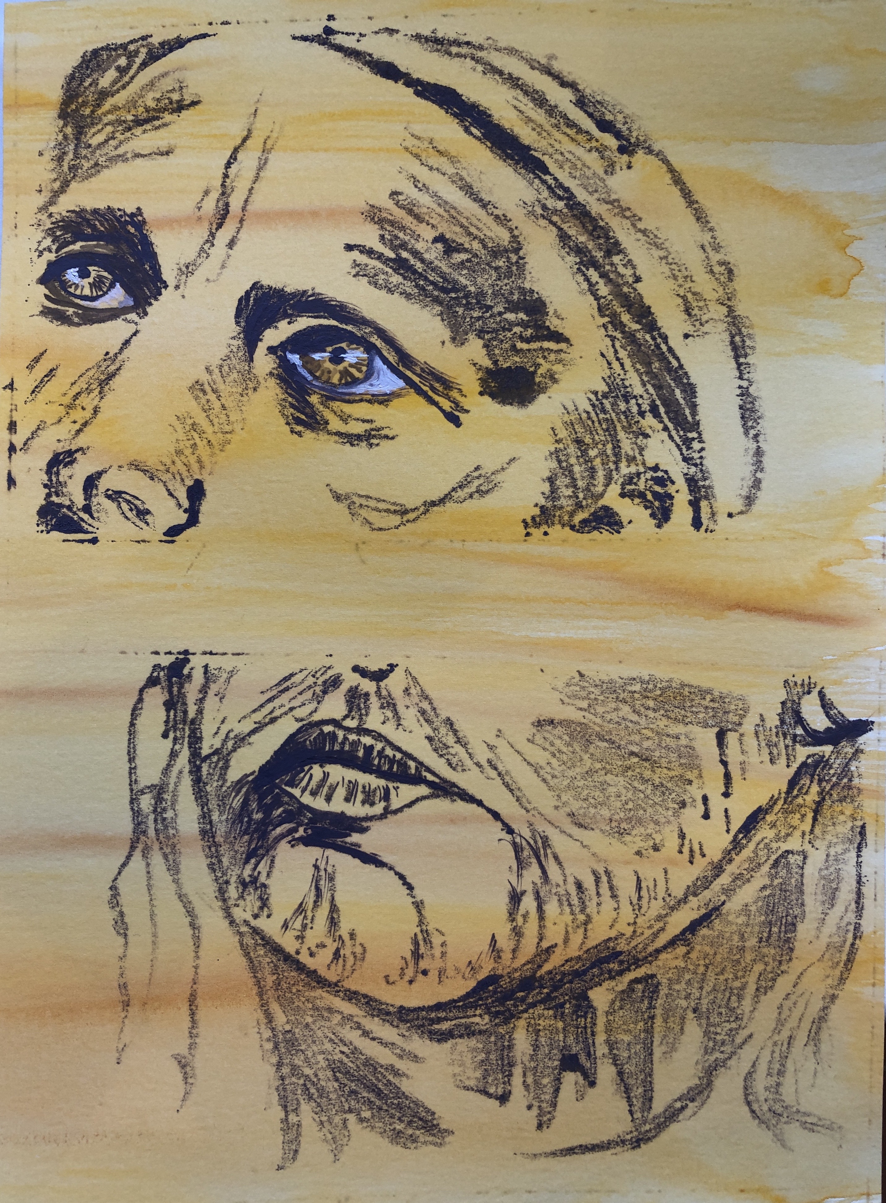
This was printed on the yellow/sienna paper. I wanted a strong deep orange to print with, which I mixed from yellow ochre and cadmium red with a touch of white. I made the texture of the hair with a cotton bud before printing, then worked into the eyes and mouth on the paper to define them.
Image 3
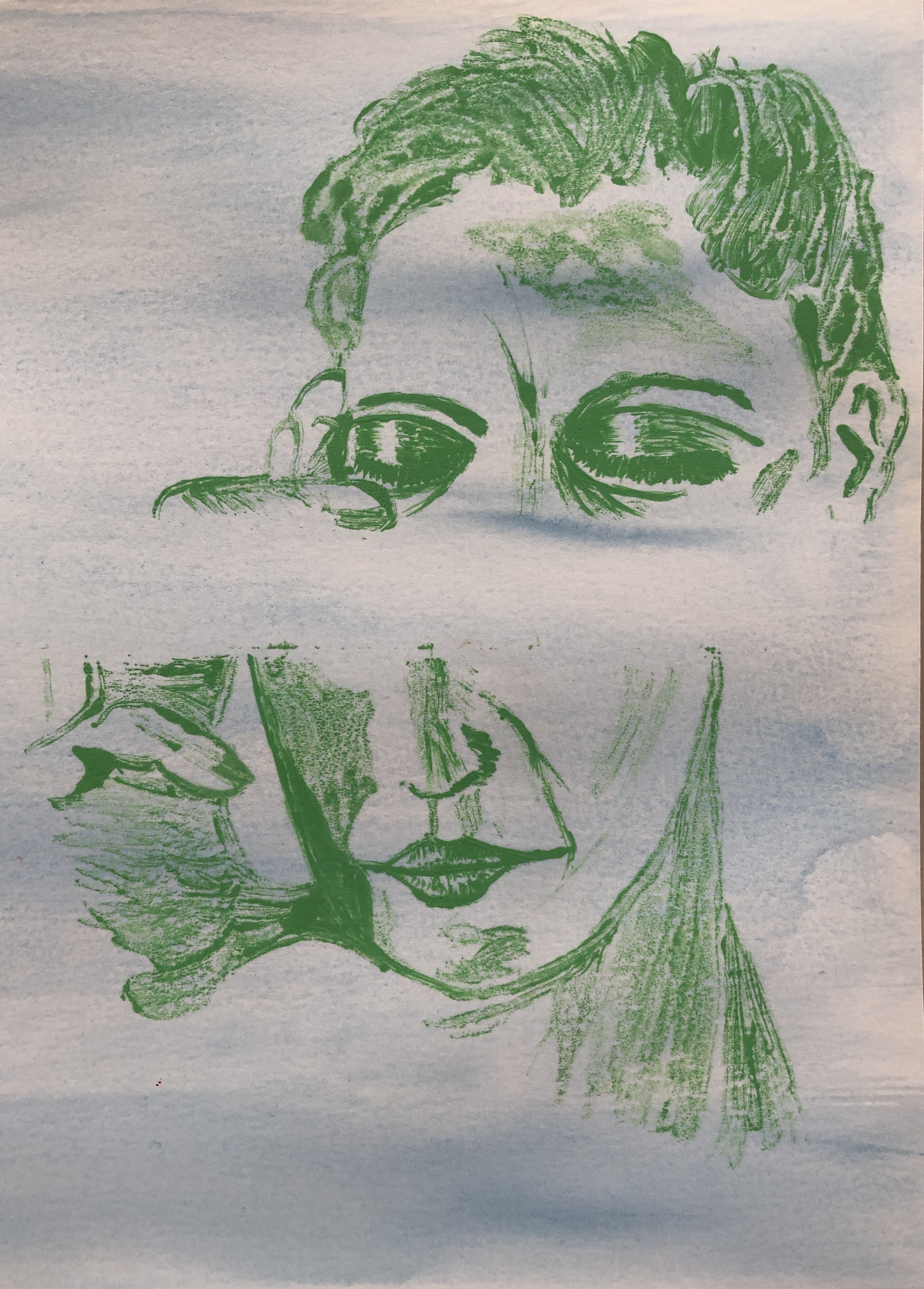
This was printed onto the cerulean blue; this is quite a green-ish blue and I was looking for colours to harmonise, so I chose emerald green with just a dash of white for the print. Again, I added texture to the hair with a bud whilst still on the plate. To further define the image once printed, I worked into the eyes and mouth, and just defined the shape of the strong shadow on the “hand” side.
Image 4
This was printed on the yellow/sienna paper. I thought I would experiment with a complementary colour for the print, so mixed up a purple using cerulean blue and cadmium red with a touch of white. Once printed, I worked into the eyes and mouth. My glass plate has tape around the edges and I found the paint was getting trapped along one edge in particular and was showing up on the print, so had to give this a good clean before moving onto the next print.
Image 5
This one turned out rather differently. It was printed onto the blue/maroon, and I had quite liked the way Image 4 with its complementary colours turned out, so tried printing this one using lemon yellow. I had also been trying to vary the position of the split between the two images and, as they had all been a fairly wide split so far, I thought I’d try something a bit closer, but just one higher and one lower. Two things happened – first, the yellow didn’t show up as strongly as I had hoped in the print so I had to paint into the eyes and those really strong contour lines of the face with thick yellow and also some white to make them stand out, and it makes for a rather ghostly effect . Also, the second print ended up very close to the first, just slightly higher, so the face is misaligned rather than completely split apart, and I suspect the viewer will have to look quite hard to work out what’s going on.
Image 6
This picture was printed on the cerulean blue paper (which looks a little washed out in this photo but is the same blue as Image 3 above). I thought this time I would try a dark blue on light blue, so I picked ultramarine violet for the printing paint. Once printed, I painted into the mouth and also the eyes, particularly clarifying those amazingly arched eyebrows.
Now I had six monoprints, from which I needed to make a selection of three. I was pleased with the way all of them had come out for differing reasons and so, finding the choice difficult, asked my husband, two adult children and granddaughter (11) for their favourite three. Interestingly, they all chose two the same (Image 1 and Image 6), with one vote each for the other four. So near and yet so far…
I had looked at the ways the artists suggested in the course text laid out their exhibition of collections of portraits. Luc Tuymans, Annie Kevans and Chantal Joffe have all gone for simple side-by-side arrangements on occasion, with either simple black or white frames or, in the case of CJ, no frame at all. If I were exhibiting these six prints I would arrange them lined up sequentially in the same way, probably each in matching white mount and very simple and minimal black frame. To get a bit of an idea of how this would look, I laid my prints out on a white sheet in groups of three to see if this helped me with my selection.


In order to present a representative sample of my work as my final submission for this Assignment, I have gone for this combination:

This was on the basis that it shows an example of each background and varied directions of split (vertical, horizontal and diagonal).
NOW WHAT?
- I feel that my portrait drawing has improved as I have progressed through this section – I am growing in confidence in drawing shapes and tones rather than “an eye” or “a nose” – but need to continue with regular practice to maintain and develop this skill. I remember, back in the day when we could go to live demonstrations, a portrait artist telling us that, to be any good, one needs to aim to do “a head a day”….so, a way to go yet.
- I have developed my own style of printing throughout this Part which I hope people will find interesting to look at. I think they fulfil my starting criteria of being:
- Ethereal and meditative
- Calm and harmonious, in that the relative colours of background and print are not “startling”
- Working as accurate portraits even without every little detail
- Arising from the characteristics of oil monotypes
- I very very nearly chose the “ghostly man”, Image 5, as my third picture in my final choice because he was unusual. I think that, if I were to develop this method of working further, this closely-printed pair of prints, resulting in a slightly distorted portrait which would present the viewer with a different type of puzzle to decode, would be the way to go. To do this with any accuracy would mean I would need to devise a more accurate method of knowing exactly where to place the paper onto the printing plate.
