
WHAT?

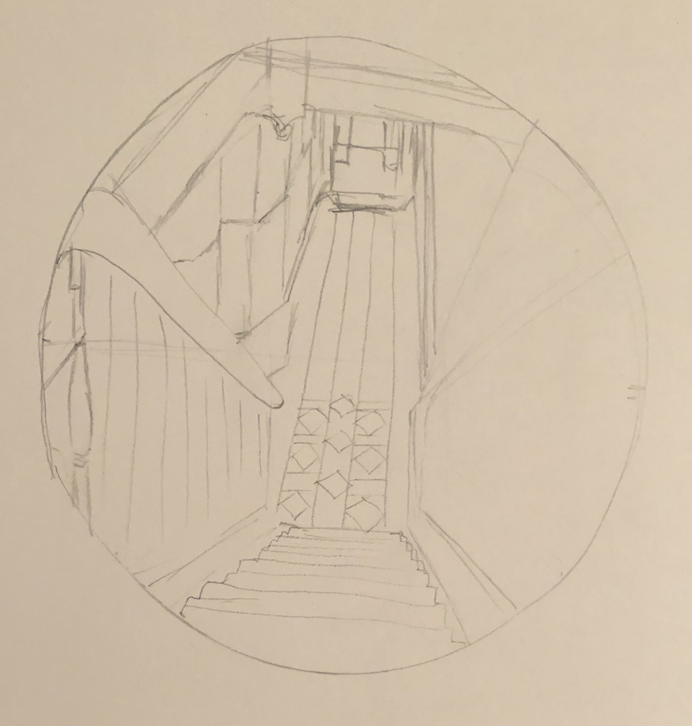
- Early on in my degree, looking at Interiors as part of the Drawing Skills unit, I tried to sketch the view down the stairs from the landing at the top of the first flight. I really struggled, couldn’t work out by the end even which way the lines went, and chalked it up to experience as something that was just too hard. Here it is.
However, my tutor, having looked through my entire sketchbook, picked out this dreadful drawing as the one that had the most potential. I didn’t try to do anything further with it at the time, but I’ve remembered it ever since, and now seemed like the time to have a go. So, the subject of the assignment will be the view down the stairs – partly to preserve the view for posterity, as it will likely soon be radically altered by the installation of a stair lift for my husband, who has suffered a series of strokes.
- An artist currently working in egg tempera, and whose work I admire, is Mary Anne Aytoun Ellis. She mainly, though not exclusively, paints landscapes, working at a range of scales. She works on paper which she mounts on board, mixes her own egg tempera, and often combines it with gesso, and ink or watercolour. This recent example, “Knot Garden”, egg tempera, gesso and watercolour on board, 18x25cm, shows the textured quality of her work:

I contacted her on Instagram, explaining my interest in her work and asking about her process; she replied that she uses gesso and egg tempera in an idiosyncratic way which she has evolved over the years. She often uses gesso in a very abstract way in the early stages of a piece, using large brushes, dripping and scratching into it when it’s wet or dry. She will sometimes pour egg tempera over it or mix pigment in to obtain unexpected effects and textures. She might also use the gesso to add highlights and detail, covering it with glazes of egg tempera or watercolour. She originally trained as a printmaker, but soon decided she wanted to make “…hybrid pictures that were a cross between drawings, paintings and print.” (See article in Artists and Illustrators, March 2021 edition). This method has taken her a long time to evolve, so I wasn’t going to try to emulate the whole thing straight off, but I did decide to incorporate the use of gesso into my assignment by way of experiment.
- Finally, following on from my response to my tutor feedback from Part 3, and in the spirit of Mary Anne Aytoun Ellis, I wanted to try incorporating and working into a monoprint in some part of the painting.
SO WHAT?
I began working from this photograph:

I decided to increase my chances of success by tackling just one flight of the stairs. I also made the decision to simplify the image by mentally losing all extraneous detail such as the table, coat stand, bikes etc, to give myself clear lines.
I made an initial sketch, and then refined this further into a scale drawing by abstracting the image a little into simple shapes and boxes with clear lines, mainly straight – just a few curves to break it up a bit and add interest. I decided to work at the size of a large sideplate (approx 22cm diameter):
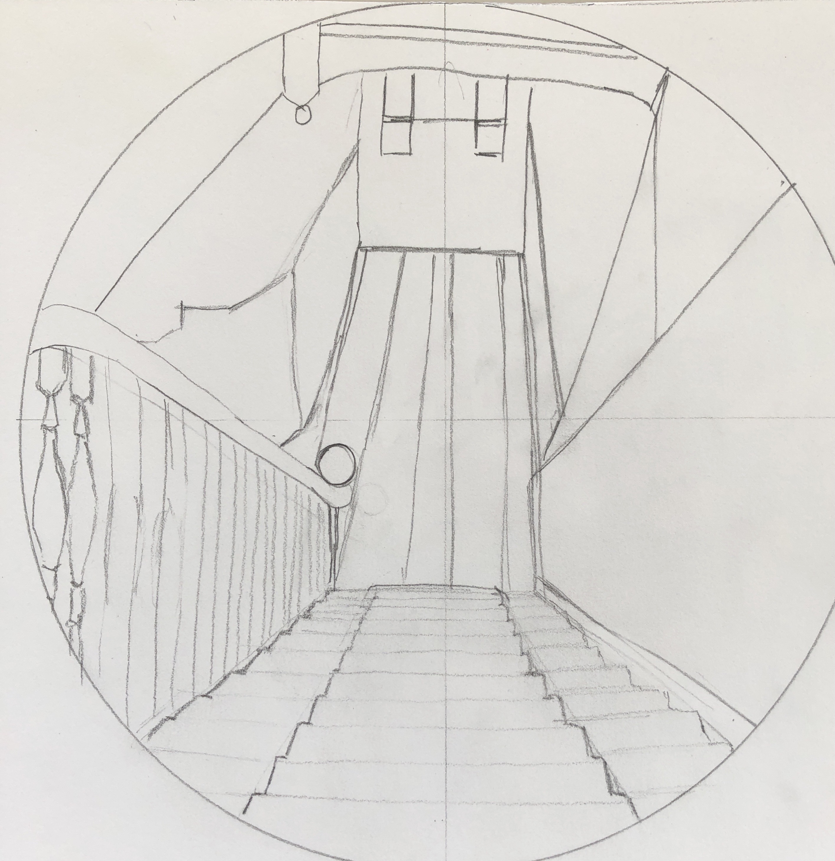
I wanted the focal point to be central, where the light hits the tiles down in the hallway.
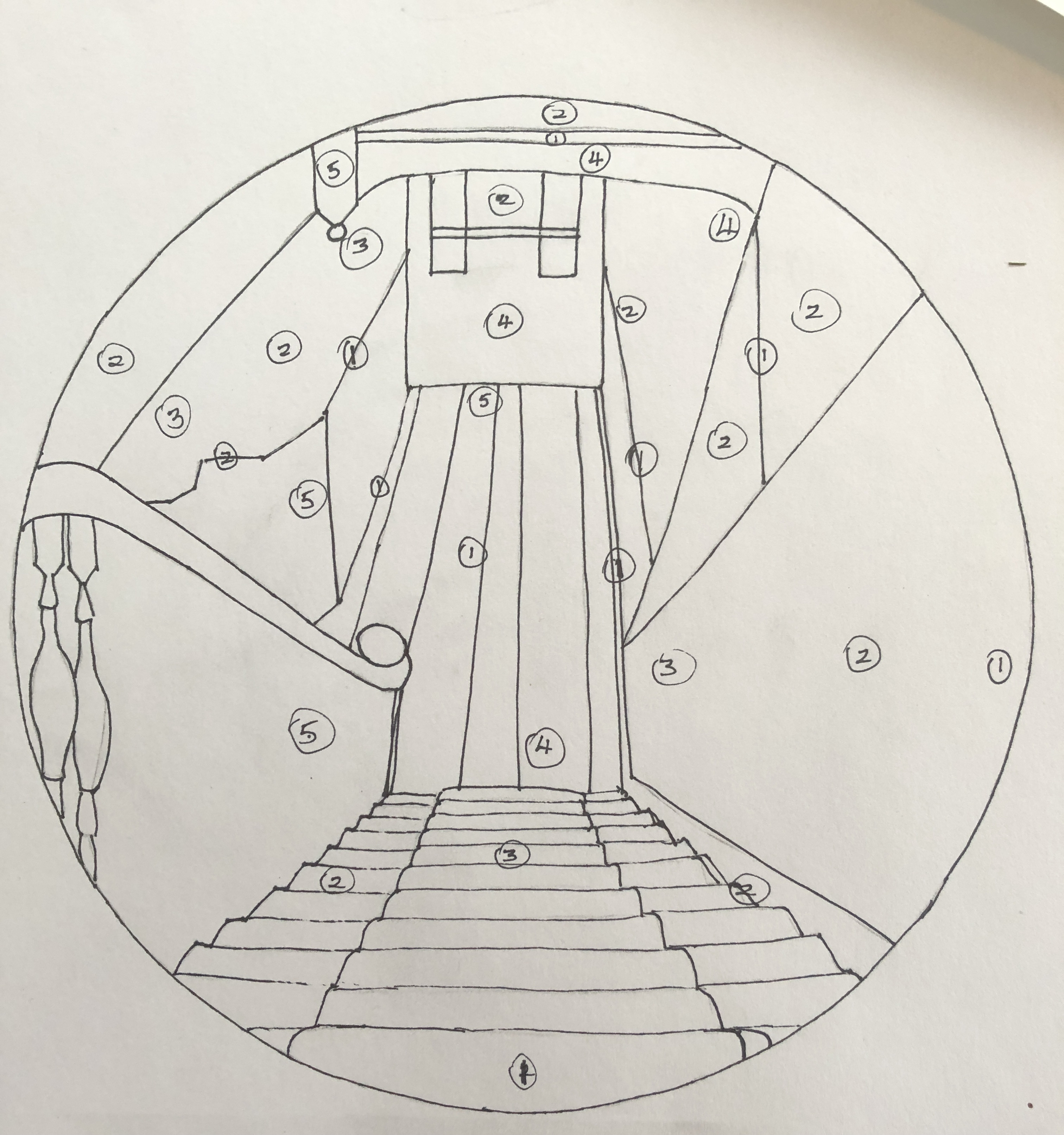
I did a tonal drawing; I found the tones quite hard to analyse, so made it basic by identifying 5 tones (from 1 being the lightest to 5 being the darkest), marking them in place, and then filling the drawing in with black Chinese ink, with a white Conte crayon for the lightest lines where needed:
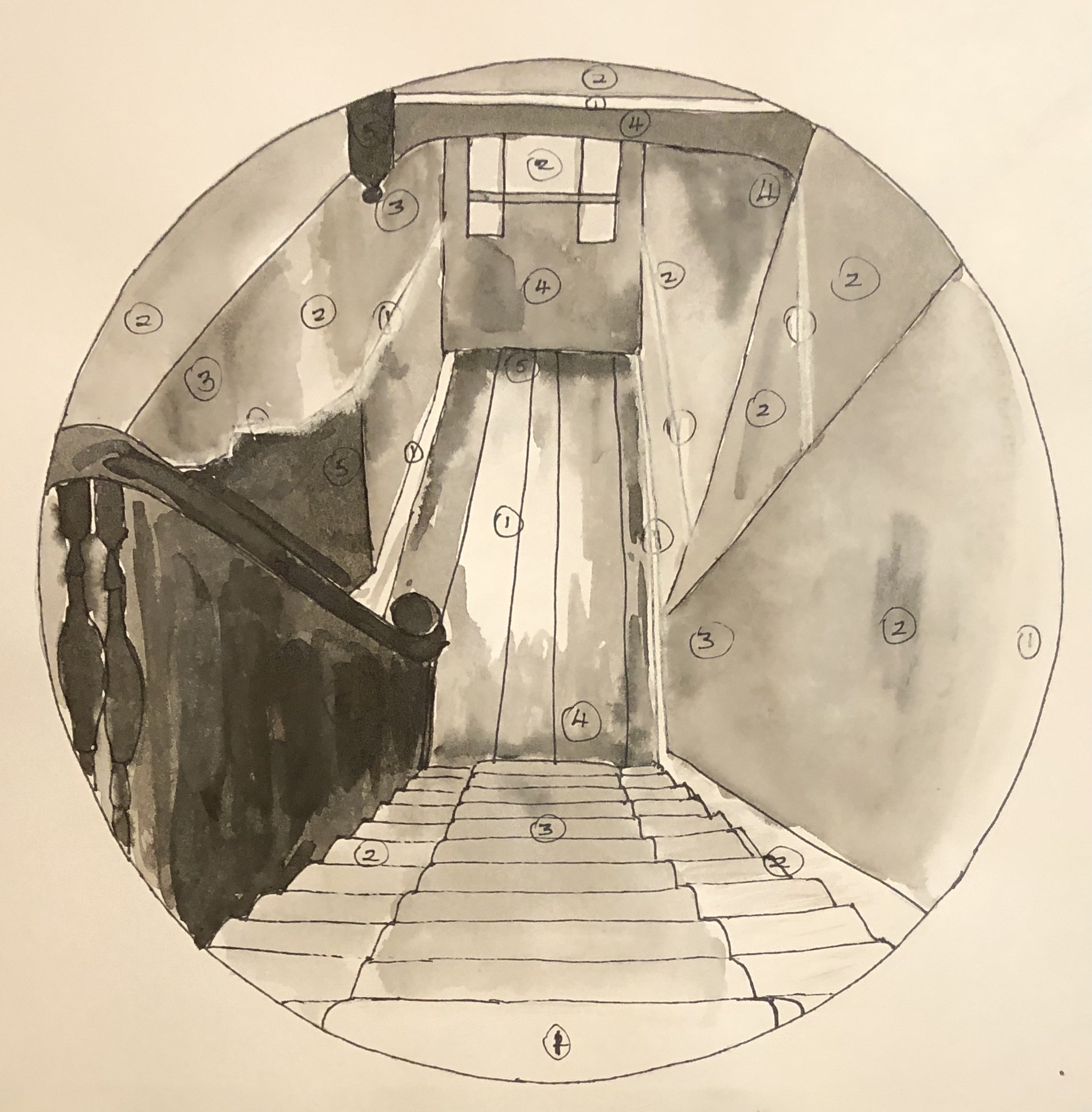
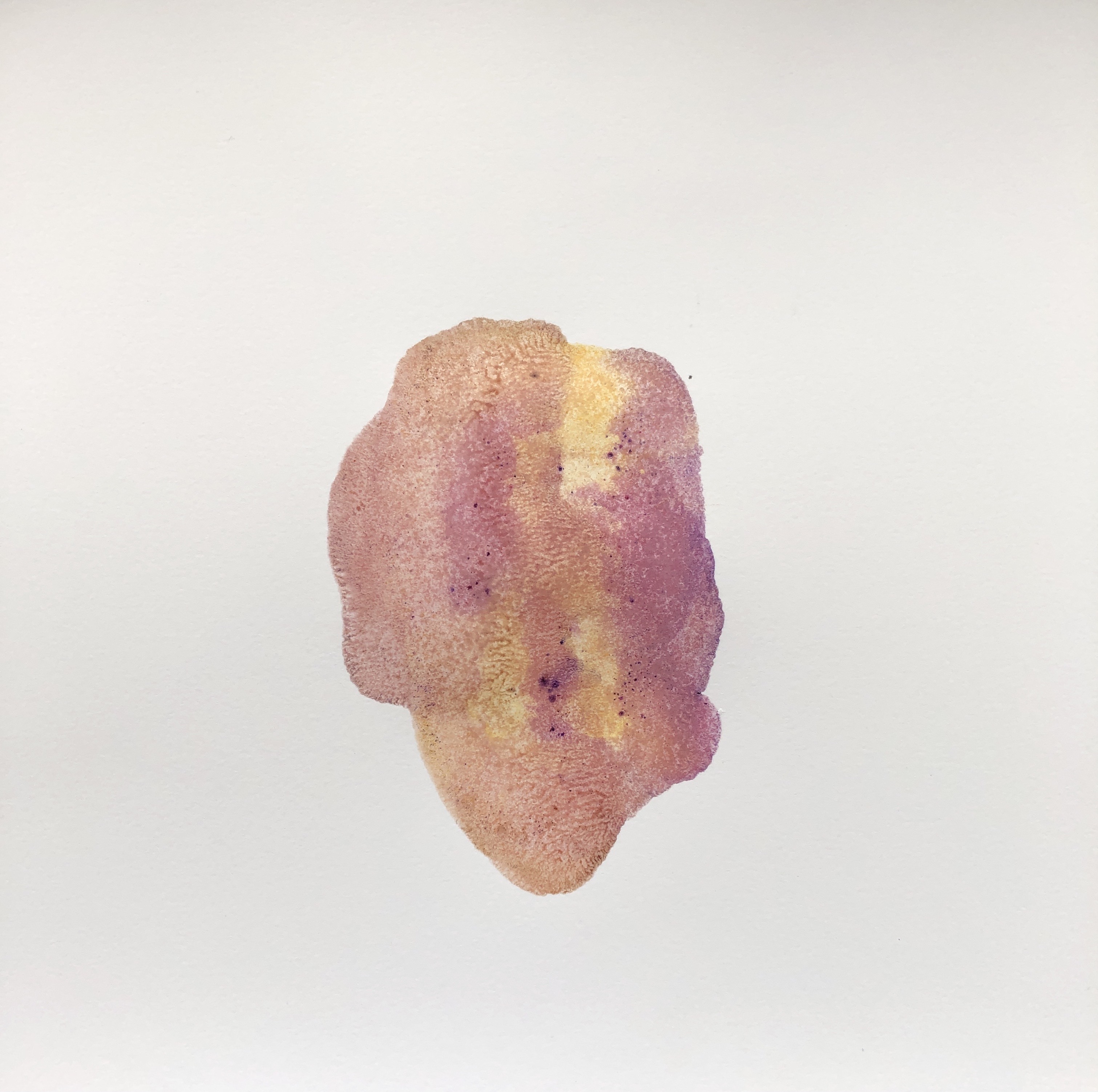
My next step was to experiment with the gesso. On a clean version of the drawing, I added some gesso to the stairs and the banisters, applying it with a paintbrush fairly freely, trying to get horizontal lines on the stairs and quite a curvy and bumpy texture on the banisters to indicate the posts going down. Once that was dry, I went over it in Chinese black ink to see the effect. Next I made a rough painting on another clean drawing to experiment with colour. I had looked at pairs of complementary colours in the Exercises, and picked yellow/purple to work with here as this pair gives the widest range of tones. I did my practice run with tube egg tempera; I mixed a purple from alizarin and cobalt blue, and also laid out Naples yellow, Titanium white and Ivory black.

I didn’t use the black in the painting, but tried adding some around the rim to see what the effect would be when I added a surround.

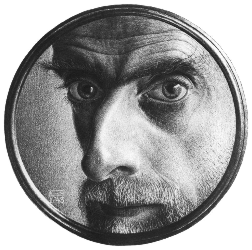
This actually reminded me of an Escher drawing I had looked at as part of my research in Drawing Skills:
M.C. Escher
Self Portrait II
1943
This made me think that my drawing of the stairs was rather like looking down a telescope the wrong way. I thought that the black surround was a bit heavy, and so resolved to make my surround a sort of metallic grey.
Now that I had my colour study, I worked from that and did not refer to the photograph again as I moved on to create the final version of the painting.
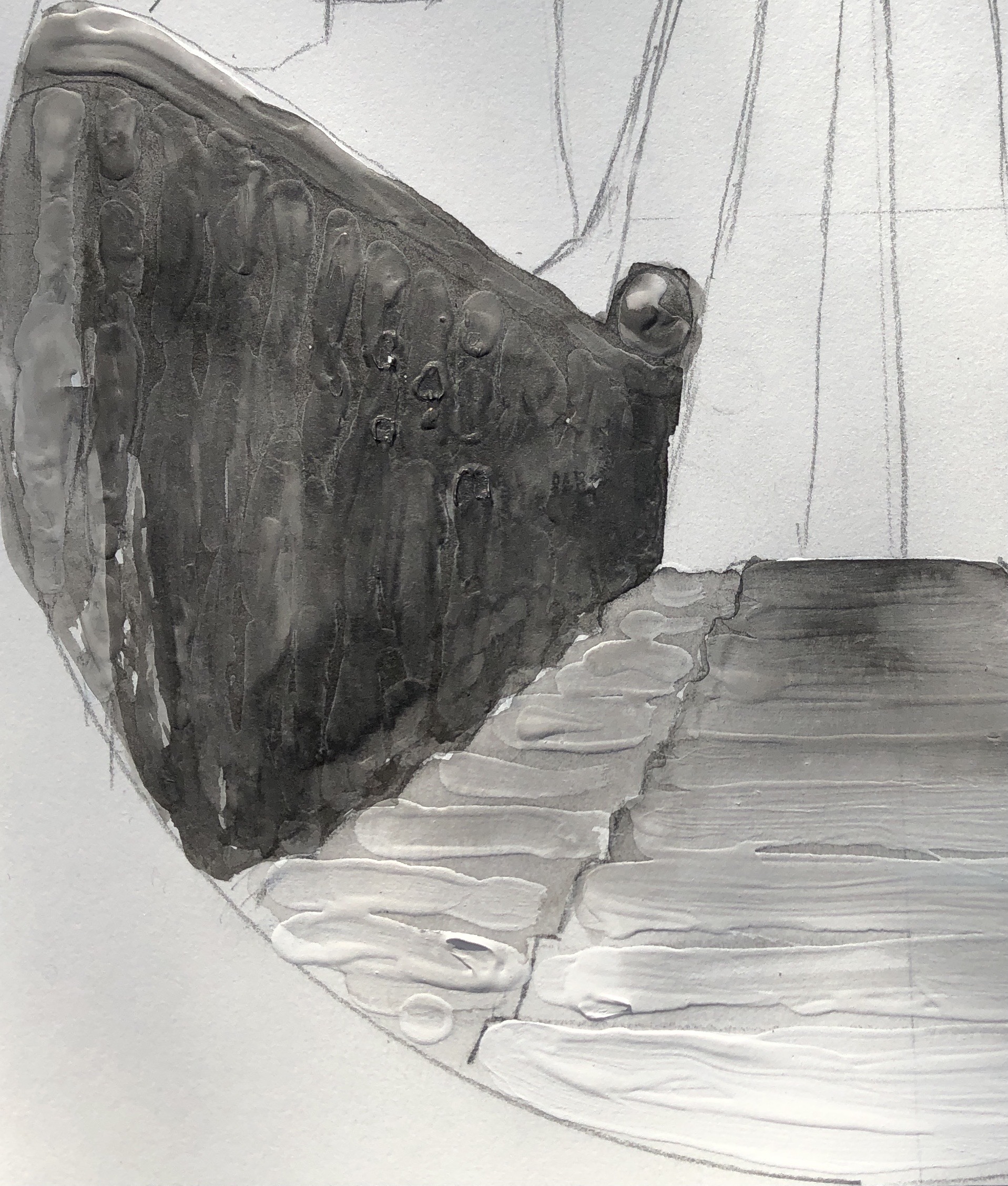
I worked on A3 HP watercolour paper, chosen because I had found this to be the best support in Part 3 for monoprinting. I wanted to begin with the monoprint, which would be the focal section of the painting, the floor tiles with the light on them; I picked this partly because I had found earlier in this section that monoprinting was a good way of reserving the white of the paper.
I made my own egg tempera, using Yellow and Purple shades of Brusho crystals as pigment. I made my paint fairly thick (only 3 droppers of white vinegar); the Yellow Brusho mixed in brilliantly, although the Purple crystals took quite a bit of stirring in. I had no white Brusho, and so decided to use the tube Titanium white egg tempera as it would only be needed in small quantities – my plan was to keep as much of the painting plain yellow or plain purple as possible, mixing grey/browns from a combination of these two as needed.
My first attempt at monoprinting with egg tempera was not a success – I put far too much on the plate, ending up with quite a dramatic splodge. Second attempt was better, and I decided to proceed with that:
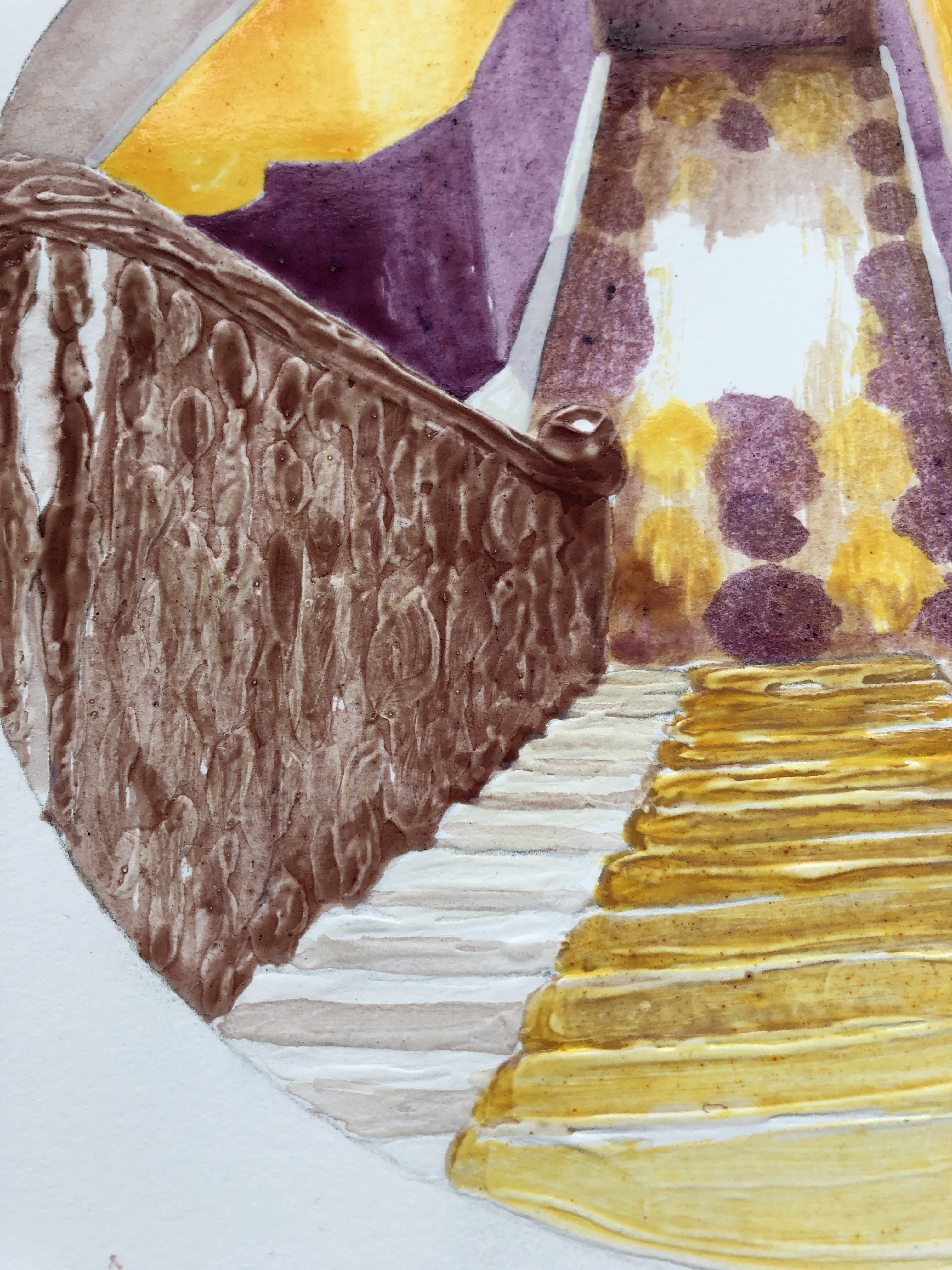
I filled in the drawing around the print, added my gesso to the steps and banisters and, once it was dry, I began the painting. I tried various brushes; the paint was very glossy and several brushes I tried ended up leaving too much of a “channel”, so in the end I did the whole thing with a rigger, using the point for finer details and the side for bigger areas. The paint dried quickly and it was easy to show differences in tone by leaving some areas with just one coat, whilst building up layers in other parts.
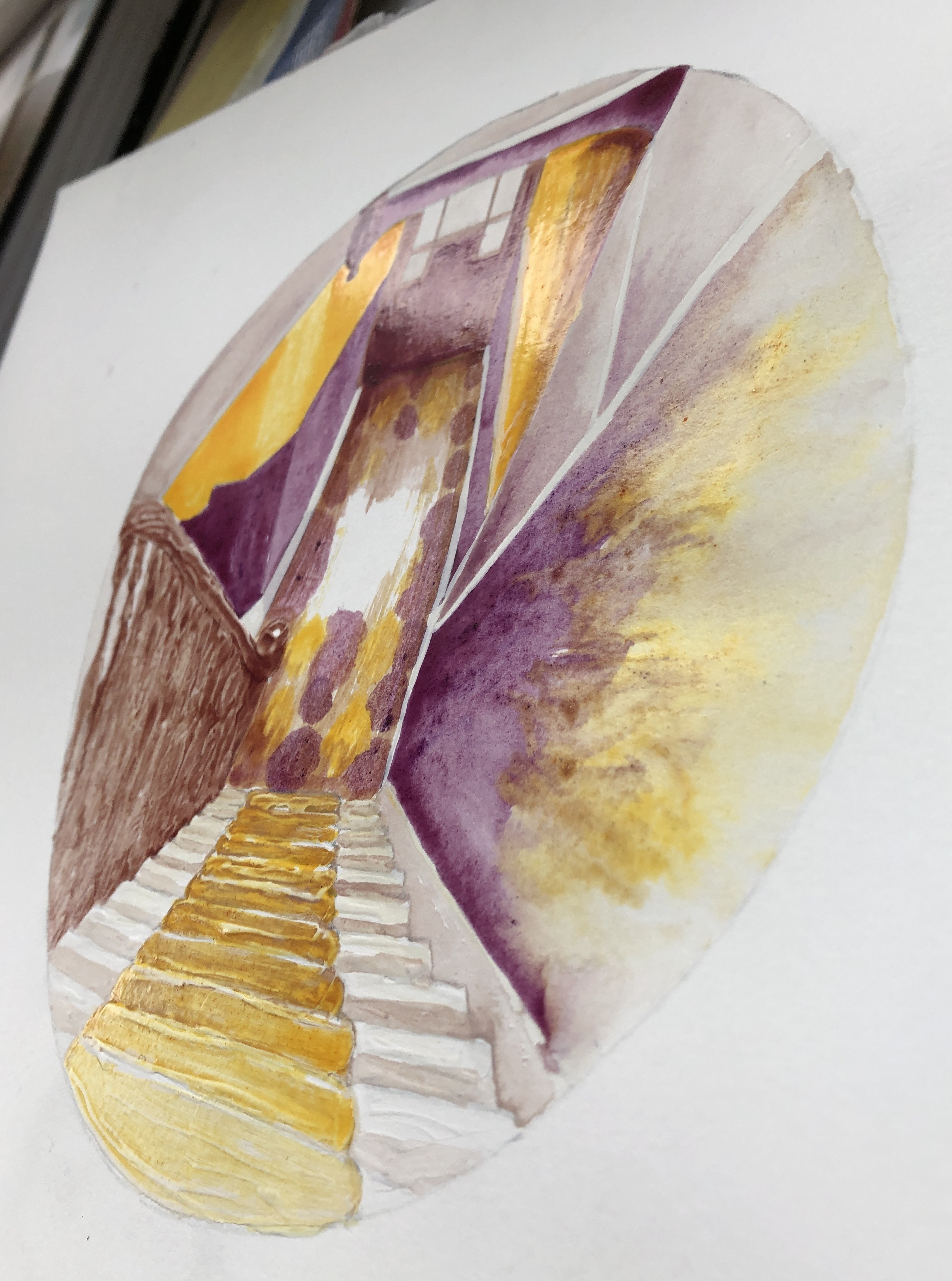
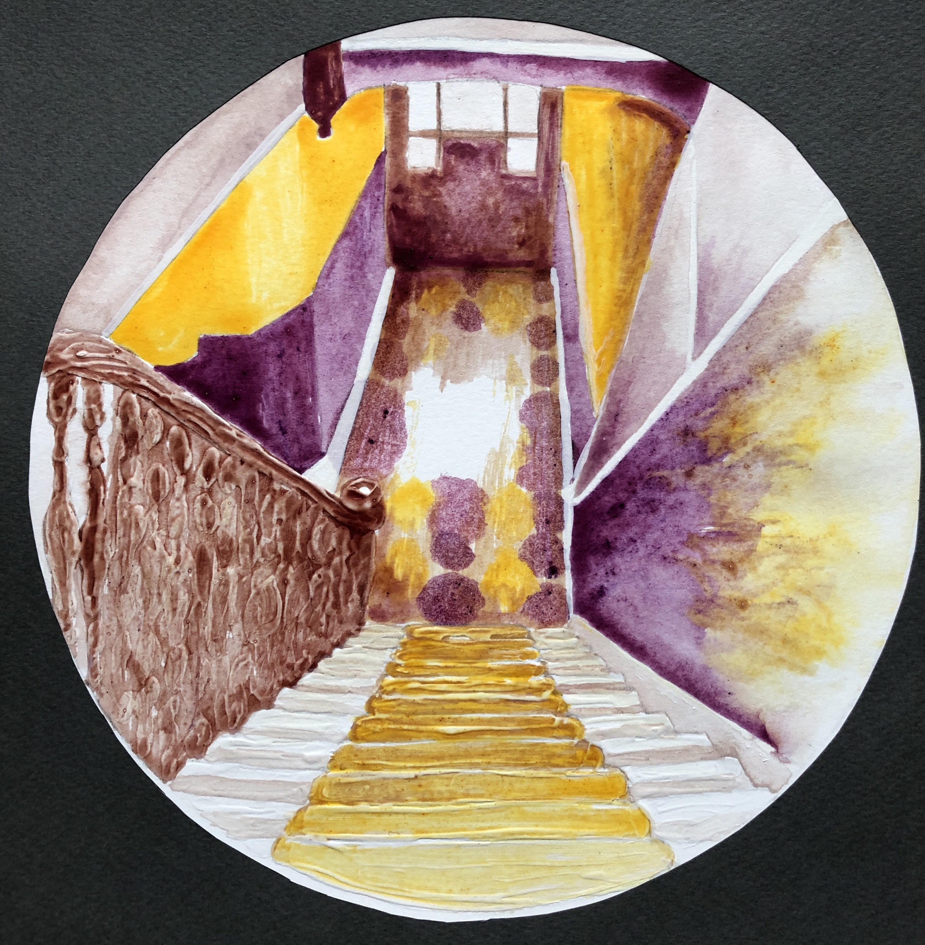
Here is the completed painting, with additional photos showing close-up details of the gesso effect and a side view showing the sheen of the dried paint – perfect, I thought, for that slight shininess you get when looking at an image through glass (such as the glass of a telescope lens).

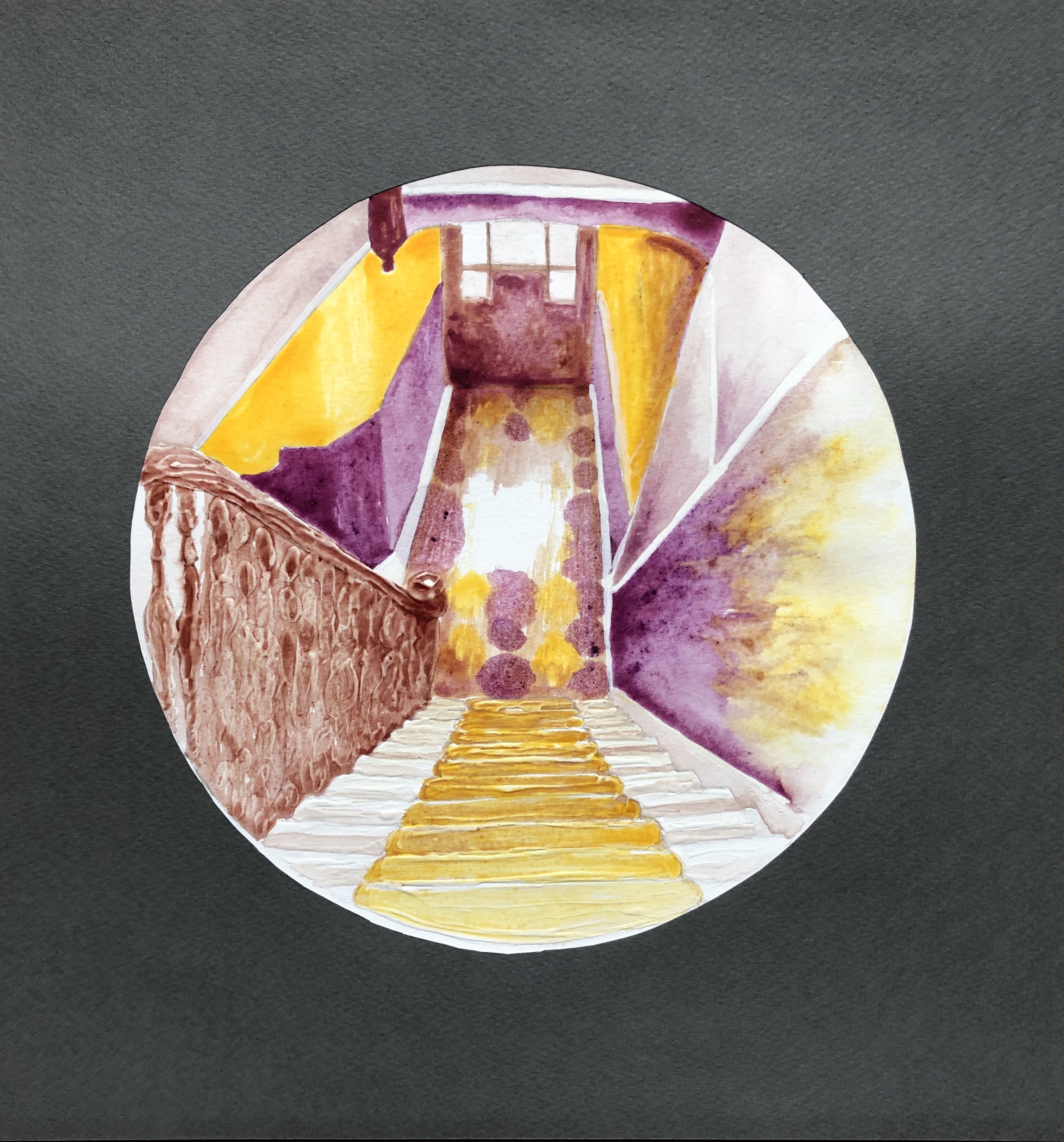
The final step was the surround, which I made from a dark grey sheet of pastel paper. Here is the final piece:
NOW WHAT?
I am pleased with the overall outcome because:
- I feel it is a strong composition, the simplified perspective takes the eye in and out of the middle as the different sectors are explored; also I feel I have learned from the online courses on abstraction I have attended with St. Ives School of Painting, and have been able to simplify a complex starting image into blocks and shapes, something with which I have always struggled.
- I am really enjoying exploring simplified palettes based around complementary colours, and I think I have chosen well with this pairing in this situation as it has allowed me to build up a range of tones.
- I have built the painting around a monoprint.
- I have experimented with gesso and enjoyed the effects I’ve achieved; I definitely want to use this more as I move forward.
- There is something very satisfying about making your own paint, even though it was hugely messy and everything I touch now seems covered with a slightly sticky monolayer of egg.
- I feel I’ve preserved our stairs for posterity, come what may!
If I were to think about changing how I did this:
- I would think about investing in some proper dried pigment if I were to continue to make my own paint; the Brusho did well as a first attempt but, whereas some colours mixed in well with the egg/vinegar base, others were more resistant and gave a slightly gritty texture.
- Home-made egg tempera is a very different beast from the ready-made tube variety, and I would need a lot more experimentation with brush selection and technique if I continued to use it.
