WHAT?
Five minutes down the road from my house is a weir on the River Tavy – a very favourite place and one to which I go whenever I need a bit of headspace – so it seemed the ideal spot to dwell upon a little for this exercise.
SO WHAT?
I began with the ink paintings – I used ink a lot in Drawing 1, I love it, and it always feels like my “coming home” medium. I used black Chinese ink, which always dries slightly greyer than it looks when wet, applied with a rigger, which is such a versatile brush for mark marking depending on whether you use the tip or the side. In the first couple of images I drew into the paintings with a dip pen, but decided this wasn’t necessary for the other three. I painted on beige multi-media paper, actually size A5.
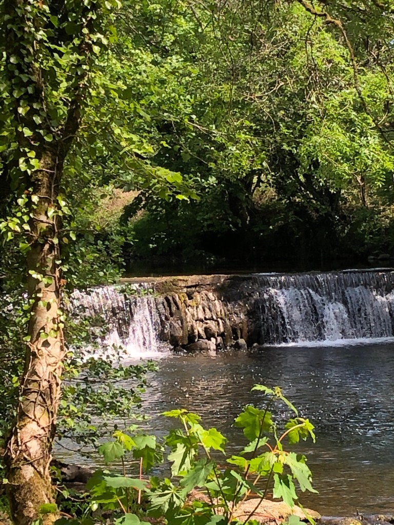
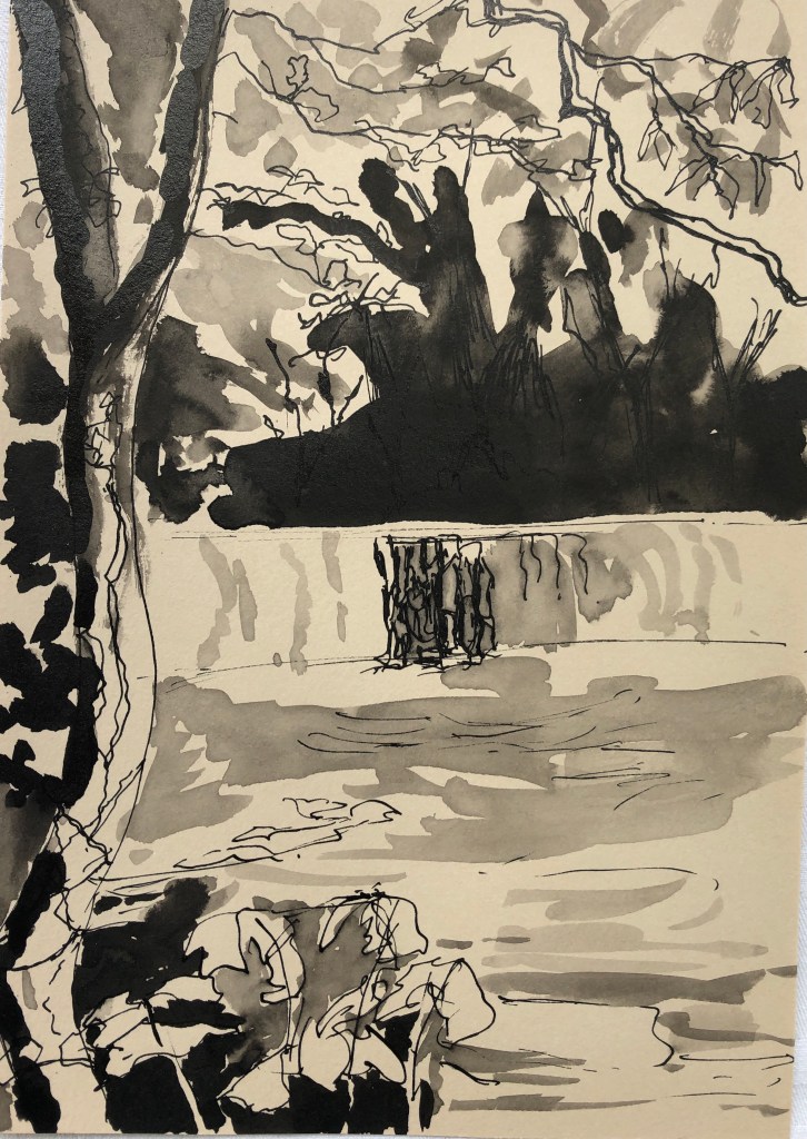
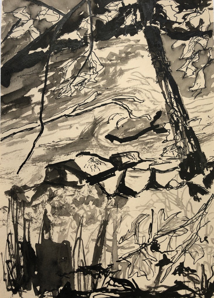
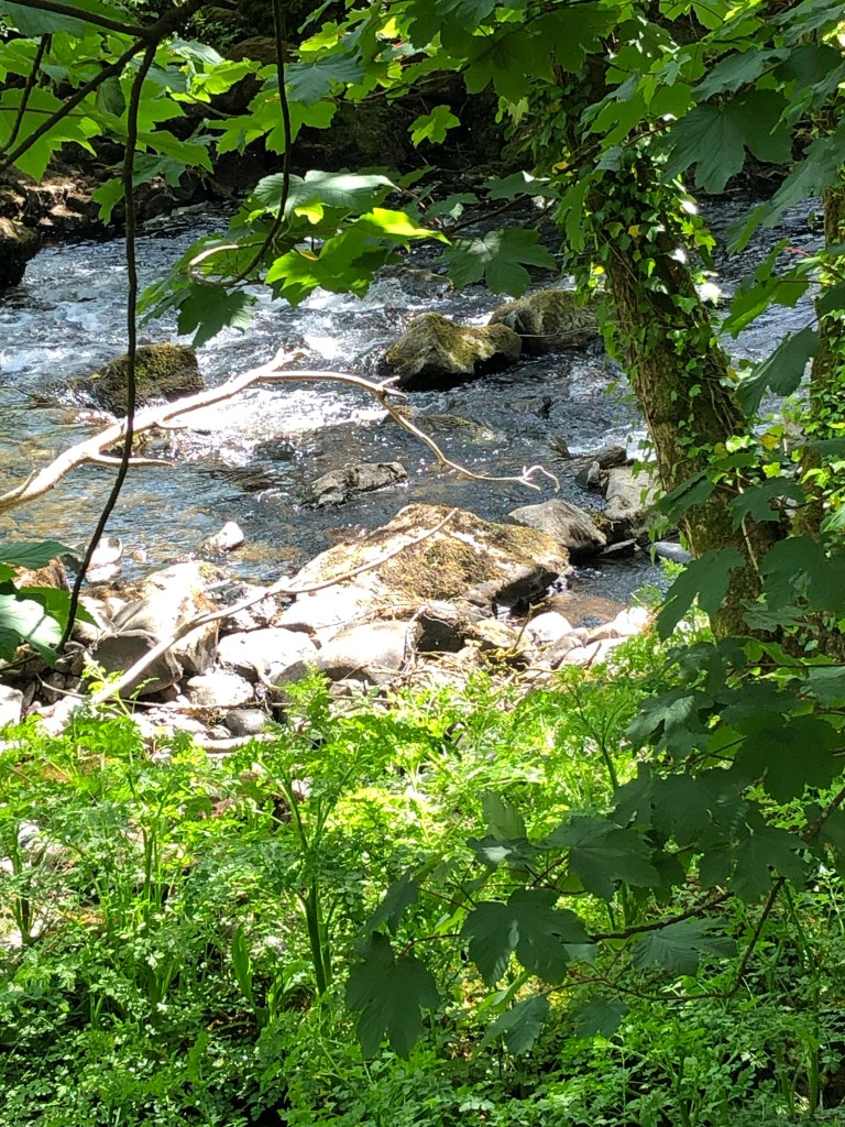
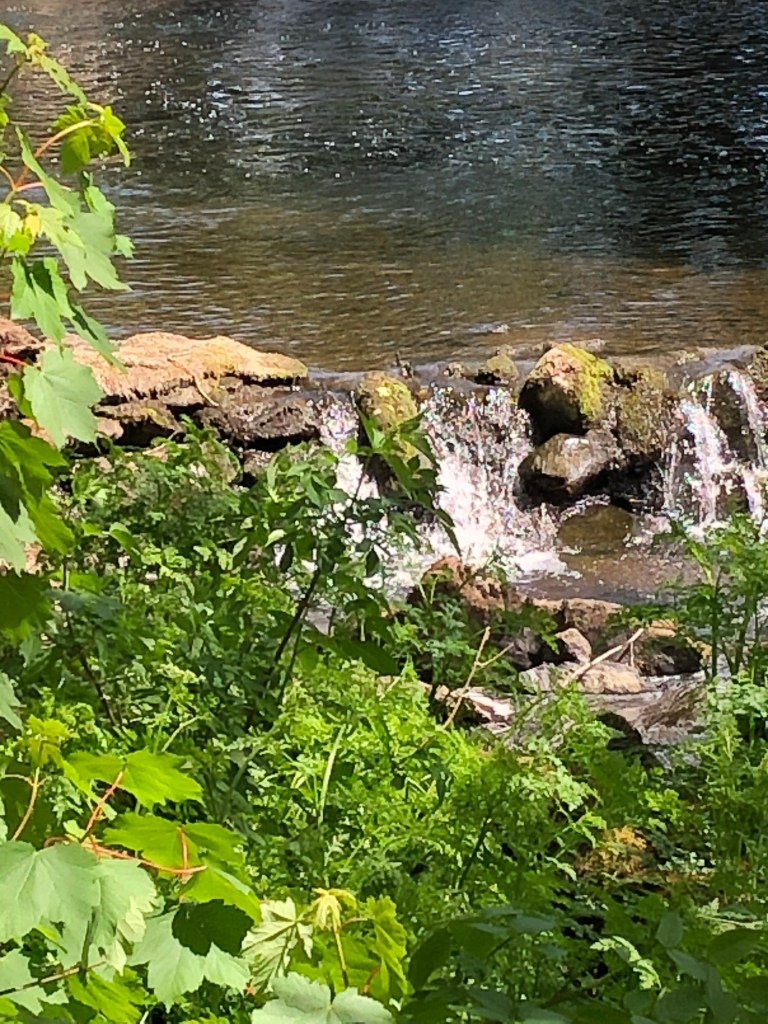


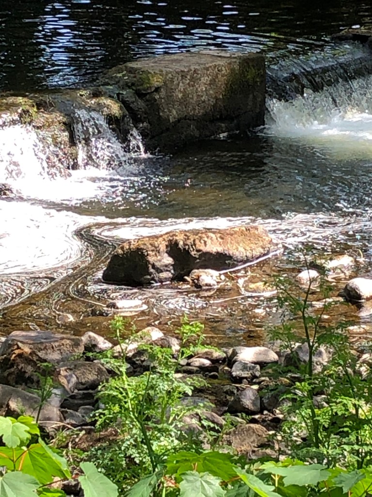
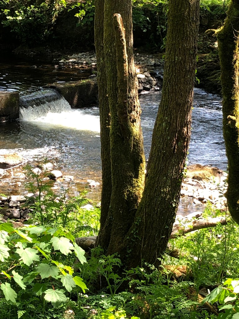

I loved painting these, found myself freeing up as I went through the series, and becoming gradually more relaxed about how to depict the foliage, which I was struggling with at the beginning (hence the pen).
I decided to paint the same images in watercolour on postcard-size HP watercolour paper, using a size 6 round and a rigger.
I chose a limited palette: warm sepia, ultramarine and quinacridone gold.
It’s been quite a while since I used my tube watercolours, probably not since I started the course – but I found myself at least a bit better at reserving my white areas.


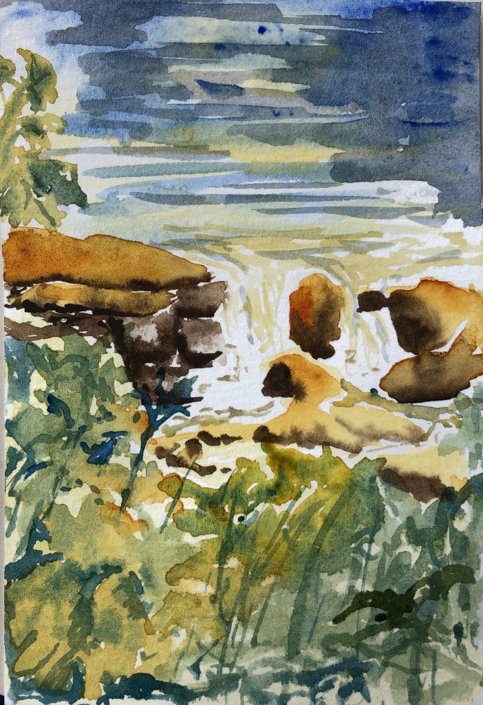
The first two feel a bit insipid, I prefer the last three, and I realise that’s because I remembered to get dashes of only slightly diluted quinacridone gold in each, which just lifts the image, being reddish-orange. I have painted the first two in more muted colours without adding my touch of zing!
Also my greens were either yellow-y or blue-y, I struggled to get that bright leaf green which would also have lifted the images a little.
NOW WHAT?
- I reminded myself of the enjoyment I get from drawing and painting with ink
- I have proved to myself the value of having just a touch of a bright, intense colour in a painting of fairly muted colours.

 Sue J's blog
Love your work!
LikeLike