I chose Elizabeth Peyton out of the other “messy” artists I had researched because of her use of colour and the apparent looseness of her brushstrokes.
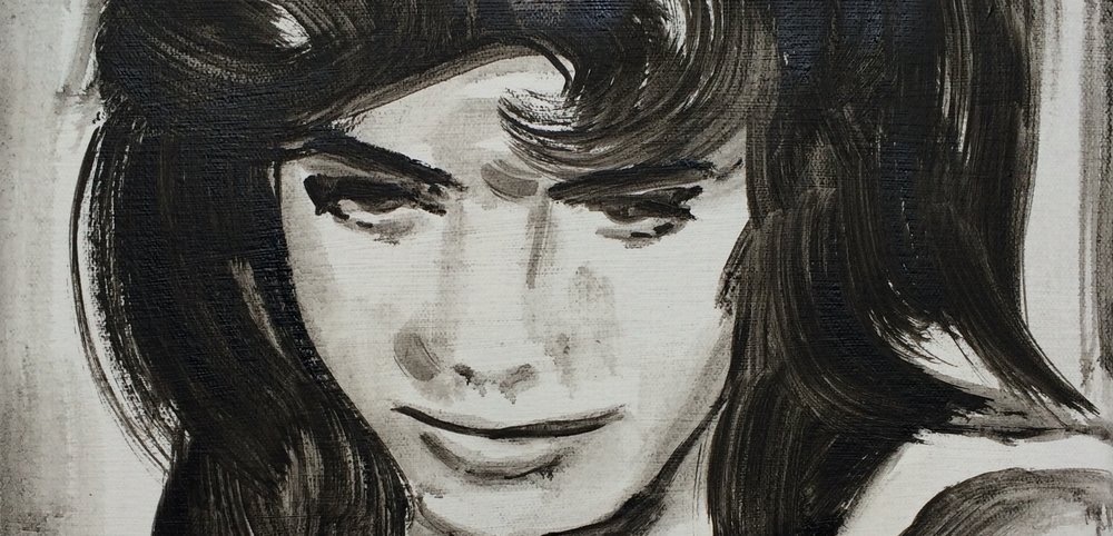
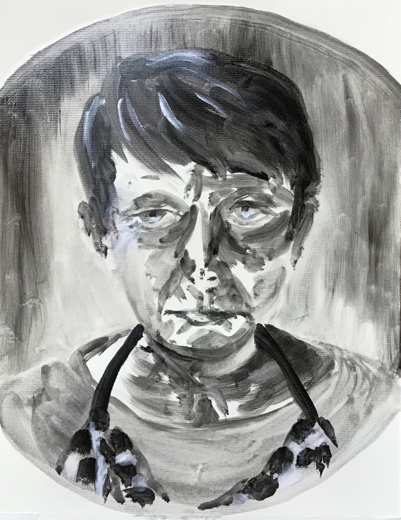
IMAGE 1
WHAT?
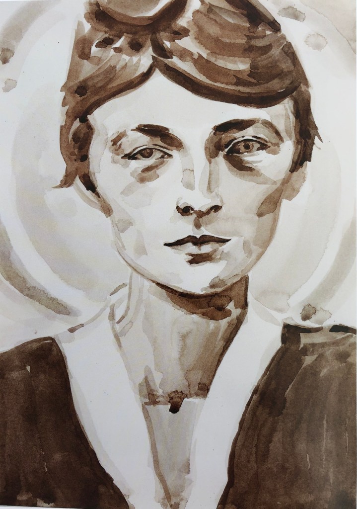
“Georgia O’Keefe (after Stieglitz 1917)”
2006
Watercolour on paper
14.25 x 10.25 in
Collection of JK Brown and Eric G. Diefenbach, New York
This painting makes me feel that I want to know the person who is the subject and want her to know me; she looks out at you demurely, politely but slightly disinterestedly, and you feel I suppose slightly defensive that this should be so. It reminds me of Alli Sharma’s work in style. The composition is cropped – she could have been “moved down” the page so that her whole head fitted in, but then you wouldn’t have got the nice prim blouse collar. The background has a circular shape which is left to the viewer to interpret but this keeps the eye moving around within the picture rather than wandering out. The brush strokes are large and directional, and the original looks like a sepia or raw umber. E.P. was painting at a time when figurative art was just coming back into fashion, and must have helped with her apparently simple yet evocative pictures of famous figures, whether of pop culture or historical, making them look like “ordinary”, real people.
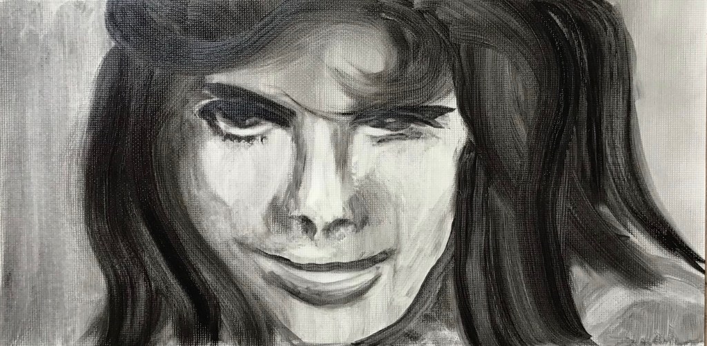
SO WHAT?
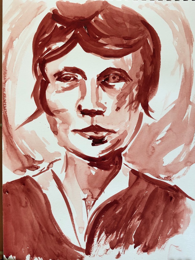
I decided to work in monochrome watercolour too, and at roughly the same size. I chose perylene maroon, a colour which I like and is a bit warmer that the original, and a size 8 sable. I wanted to copy the general image, without worrying about achieving an exact likeness – I felt I wanted to do this quickly, be in the moment, and see what happened. I feel I have achieved something of the looseness of her style, but without her precision – actually quite a tricky combination.
NOW WHAT?
I have learned:
- I enjoy working quickly and loosely like this, although the outcome does not always have the accuracy I might wish – but it would good for preliminary sketches of an image which eventually might need to be more exact and carefully constructed
- I never usually try monochrome (except black and white) but it does make for a very striking, eye-catching image
- I need to give thought to backgrounds as a way to keep the viewer looking
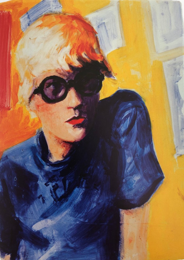
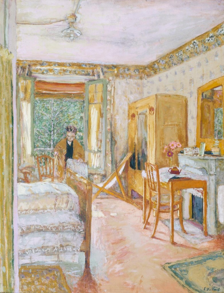
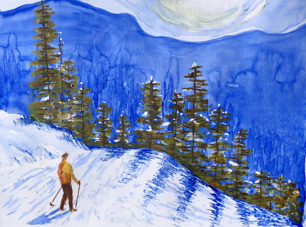
IMAGE 2

WHAT?
“David Hockney, Powis Terrace Bedroom”
1998
Oil on board
9.75 x 7 in
Kunstmuseum, Wolfsburg
I chose this image unashamedly because of its bright colours; lots of complementary contrasts between purple/yellow and blue/orange, with some zinging reds for good measure. Even though the subject figure looks quite serious, it feels like a happy painting. The figure more or less fills the page, but is offset from centre enough to see the things stuck on the wall behind, which continue that diagonal of his shoulders. It’s quite a small painting – you imagine the artist producing the board from her bag and saying to the sitter “Don’t move – that’s exactly the pose I want to capture!”
SO WHAT?
Again, I decided to work the same size as E.P., so I ruled that out in my multimedia sketchbook. I wanted to work quickly again to produce a rough copy, not concerning myself with likeness, but focusing more on exploring those colour combinations. I decided to work with gouache, a recent discovery for me – I like the slight chalkiness it has and the fact that you can overlay colours. I used a soft half-inch flat brush.
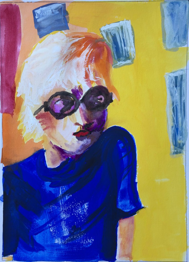
It was great fun to do, and I got some rough colour matches, although I think another layer of the background orange and yellow would have brought those out even more.
NOW WHAT?
I have learned:
- Bright colours really can be fun!
- As I have been experimenting with unfamiliar types of paint, I have enjoyed their differing textures. I now need to also consider their finish – the gouache is chalky, which “felt” good to me, but it gives a flat finish in comparison to E.P’s oil, which seems to retain and show the brush strokes in more detail.
- If I want a really strong depth of colour, I might need to try building up layers rather than relying on the first applied fairly thickly.