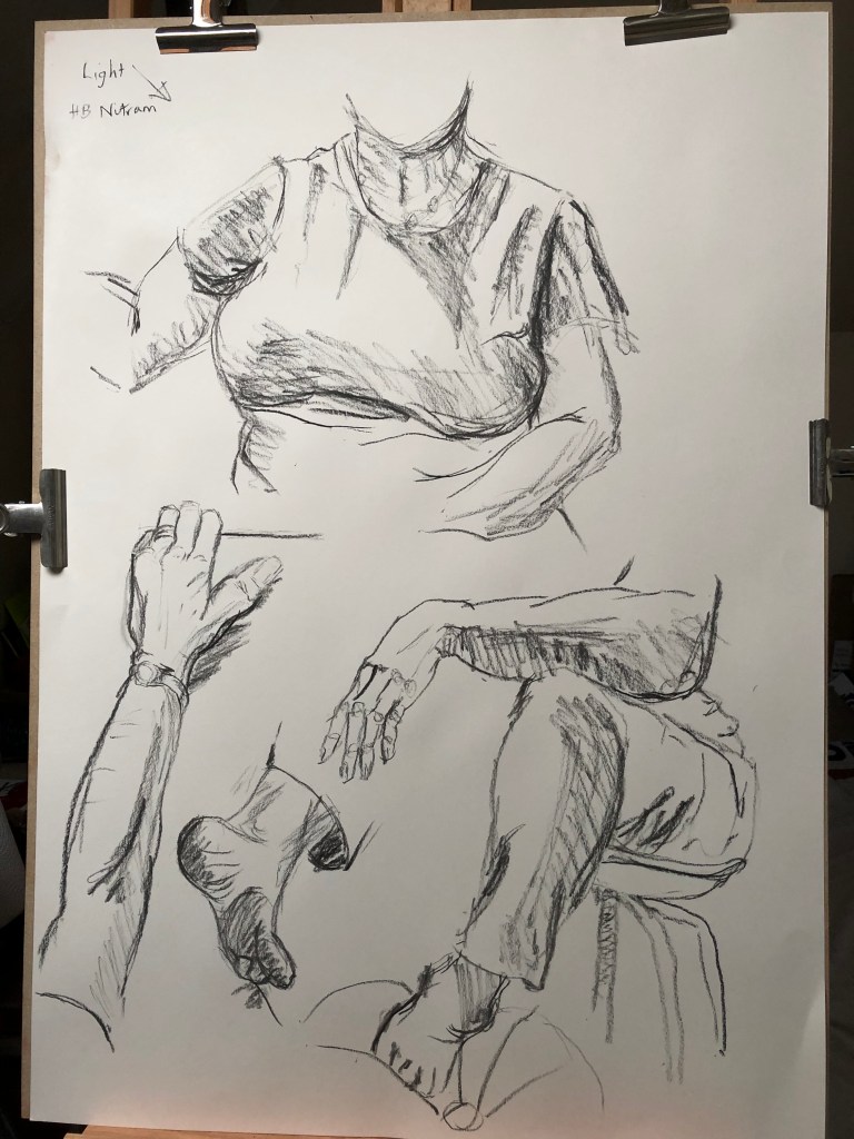
I find that, when I am working in the life drawing group, the things which I always put in as a block, and leave till last to define, are hands and feet. Hence, I decided it was high time I did a bit of practise with my own hands (a la Kathe Kollwitz – see my notes in A3 sketchbook)
I also tried some feet at odd angles (from photos – my feet always seem to be wrapped up warm in this atrocious weather – should have done this Part in the summer!).
Hopefully it is obvious that these are two different sets of feet from different photos….
In the first picture, as a bit of a sideshow, I tried marking in the knuckles and joints of the hand in order to try and get the correct relationships between the fingers; this is something Egon Schiele seems to exaggerate, and I can now see why – it certainly helps, even though it makes the hands look a bit ghostly and skeletal – A3 sketchbook.
I’ve also had a go at drawing bits of me reflected in a mirror – I was sitting at my easel drawing large and found it quite tricky whilst at the same time looking in a mirror which I had set up just to the right of my easel, facing slightly inwards – I was finding I had to have a good look, then turn and draw, then re-set myself and look at the next part and so on – seemed to produce the best results. It’s all quite loose and free, which I am enjoying.
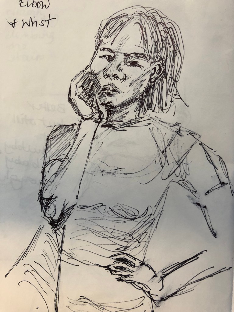
I feel as if I am writing this particular blog post up “out of time” – I have looked at all the parts of the body in various poses in the life drawing groups, and also in random poses in my sketchbooks (see e.g. elbow and wrist in my A6 handmade sketchbook) , without consciously assembling all the elbows in one place in the knees in another; this sounds as if I am being hugely “know it all – move on”, whereas I know I still have a vast amount of experience still to amass – just need to get on with doing that now.
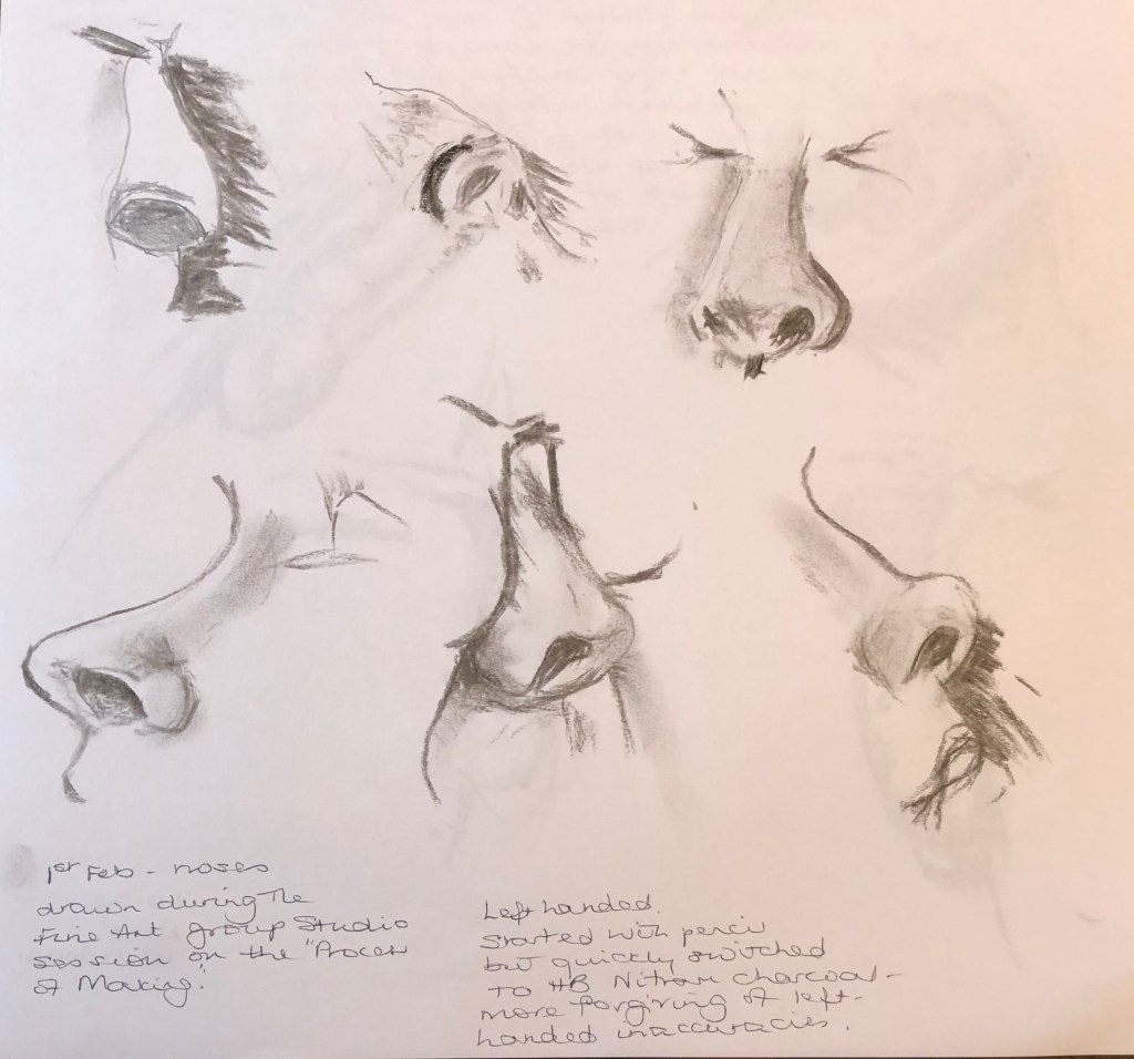
I began some of the individual feature studies during our Fine Art group Studio day (see separate blog post)…..tutor Caroline made an interesting remark when looking at a page of ears – she said that she was looking at each of the different ears and picturing the face which went with them – I hadn’t thought of it like this before.
So, noses, ears, eyes, mouths…….
They’re all rather weird when you look at them in isolation, so I sometimes put them into context just to get a sense of how one related to another.
I then used a couple of life drawing poses at different sessions to try assembling all the bits into whole heads. The first was a lady, and she was not quite facing square on, but level enough for all the features to be fairly regular. Overall proportions are not bad, but she has the appearance of a rather poorly matched assemblage of features from an Identikit parade – oh dear. I had been experimenting with styles of eyes drawn in self-portraits by well-known artists (see separate blog post on artists’ self portraits and my A4 sketchbook) and tried some of these out on this poor lady – her left eye was ok but the right just got blobbier the more I tried to alter it as it was much too big. The mouth and the nose are not quite aligned – I find mouths very hard – and her ears did stick out a little with her hair tucked behind, but I think I’ve made the visible ear a bit too dominant. On the plus side, I was pleased with the overall face shape and the bone structure.
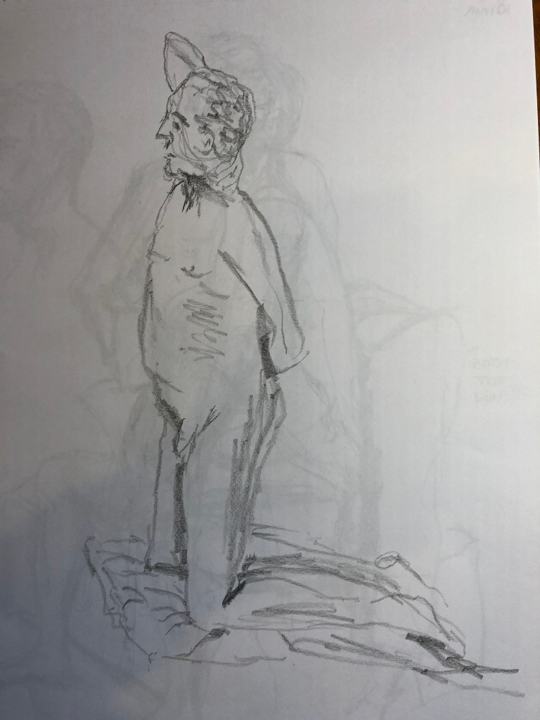
Next up was today’s effort – a gentleman who, because he was up on a stage and I was sitting down drawing, was slightly above me (at least, his head was), which I thought was interesting and has had some unusual effects – for example, I measured the ear position carefully, but it looks too high. The proportion is good I think and the head sits believably on the neck and shoulders. Frustratingly, however, it really doesn’t resemble the chap at all, and I’ve been trying to analyse what’s wrong; definitely the nose is the culprit, I think – I haven’t made it long enough (he did have quite a Roman nose), which has made the whole mouth and chin combo too big by comparison. Again, looking for positives, I am getting better at thinking about the underlying skull structure when placing the eye sockets, which I have hitherto found difficult.
Jackie is a local artist who runs many workshops on her mixed media method of working – see her work on www.drawntothevalley.co.uk.
She creates a textured background on board or canvas using leave, lichen, eggshells, tissue paper, seeds, old maps and newspaper articles, etc, which she glues onto the ground, seals edges with textured paste and then covers with gesso, often in several thin coats to make sure that this textured base is completely watertight. She then adds colour loosely in an fairly impressionistic style via acrylic inks which she spreads with a dropper and water spray of a wetted brush.
She likes to be quite free in her work and will sometimes change a picture completely if she sees a “better” image in it.
A completed picture of a Cornish hedge and laneWorks in progress!
We were quite a small group today which allowed us to have breakout groups of 3 or 4 people, enabling us to look at a range of work with very differing styles and to have a bit of a conversation. It was interesting the way Helen asked us to present our work initially without an explanation and just invited the others to say what they saw – this was easier in some cases than in others. Helen pointed out that, if you eventually put your work out into the wider world, it must stand on its own and speak for itself – you can’t always be there to speak for it. Everyone seems to be pushing the boundaries and trying to use either unusual materials, or more usual media but applied in a different way, so I am glad to be reminded of this – in my current Part 4 work on life drawing, it is very easy just to snatch up the standard charcoal stick by default.
In a discussion on whether a work is finished, it was helpful to hear that others had a similar experience to mine, of a tutor feeling that the final piece submitted for assignment was overworked and quicker, freer work was thought to be as good, if not preferable.
I have been relying somewhat on my local life drawing group for these sorts of exercise, and as I walk there and carry my kit, and only have one effective carrying arm while the broken shoulder fixes, the best I am managing is A3, I’m afraid.
I have done quite a bit of reading around the subject of structure (see sketchbooks for details of some of the books consulted, where I have done exercises to practise various aspects), so I am beginning to feel less boggled when confronted with a whole person to draw. My first offering here is a drawing of a very slender model to whom I have referred in other posts – she had a long body and a prominent bone structure throughout her torso which I did find quite fascinating (also, it was very helpful for the rookie artist); however, in this pose she has curled herself up so that this is less apparent. I have to say I was especially pleased with it as it is the first time I think I have tackled the facial features in some detail and actually managed to achieve a likeness. I also feel I have shown some foreshortening, the foot and legs obviously being closer to me than the head and raised arm. I tried to use the negative shape to get that diamond shape between her head, arm and shoulder, although not sure I have got this bang on.
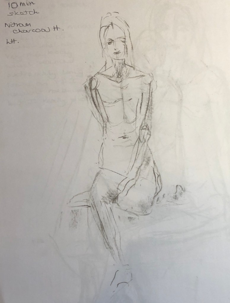
The next week we had another slender lady, but this time clothed in leggings and strappy top. She was perched on a stool on top of a box with her shoulders slightly hunched up, and trying to get those shoulders right caused me a bit of grief. Tone was also made more difficult by the fact that she was dressed all in black, so that really made me look. I am most pleased with her right arm and the way the hand curls up on the stool, and also her right leg leading down into the ankle – she had quite bony feet and I am happy with the shape. Another picture drawn in Nitram charcoal – I find that so easy to hold and forgiving of my left-handed inaccuracies – but will try a different medium for the third picture.
I should say, re-reading the exercise notes, that they suggest that preliminary sketches are made of the pose – in order to maximise my time on the longer drawings (obviously, in a class, time is limited and not under my direction) I have relied on my study of the model and lighting conditions via the various warm-up sketches – see A3 sketchbook.
Turned up at life drawing today equipped with my new favourite medium of choice – natural dye ink, applied with the dropper. The couple who run the class had decided that today’s long pose was going to be reclining – so I’m afraid for the purposes of this exercise that I’ve got two recliners plus a hybrid standing/sitting. Never mind.
Our lady today was possessed of chunky limbs and lots of curves, which made her interesting to draw. I started drawing with the dropper as a way of making me be freer and less angst-ridden about wrong marks – after all, as with other inks, once it’s there, it’s there, and I just have to live with it – and I am finding I am really enjoying it. Hitherto I have reserved it for quick sketches and line drawings though, so this is the first time I have tried it out on a longer drawing. I experimented today with varying the lines one can make using just a dropper, and can report that the range is not huge, although it is possible to make some thinner, lighter, somewhat spidery marks (quite good for hatching) when the dropper is close to being empty.
I am pleased with the proportion in the full figure, and feel I have established some form by way of hatching and shading, as well as including some background information. Best bits are the dimpled right elbow and the feet, which were quite tricky with a fairly blunt instrument! – but I feel I have caught their shape. The face went wrong fairly early on with an over-enthusiastic ink splodge, and I thought I had exhausted what could be achieved with the dropper without becoming over scribbled and overworked, so I spent the rest of the time on a head-and-upper-torso drawing to try and get a better likeness. In fairness, it doesn’t look quite like her, but it does look like somebody! – which I am calling an achievement.
How effective are my three figure drawings? I am pleased with bits of all of them. I am improving just by keeping on drawing, and am no longer slavishly always putting in my markers for “number of heads” to work out where all the bits of the body go – I am beginning to feel as if I know – although shoulders, elbows, hips and knees have probably taken over as my key markers – I think breaking my shoulder has made me keenly aware of the importance of this joint and its position almost in determining the whole pose – get the shoulders right and it will look like a figure, even though you might have the legs a bit too short or the feet a funny shape. I think the middle of the three full figures is the least lifelike – I was a bit thrown out by being confronted with an extremely slim person dressed in black – hope this won’t mean that in future I can only draw people with their clothes off………
From an online article by Jess Righthand, October 18, 2010, The Anatomy of Renaissance Art, www.smithsonianmag.com, it seems that anatomical science studies were the main source of inspiration for many artists. She says that artists such as Leonardo and Michaelangelo would watch physicians at work to learn the muscle and bone structure of the body in return for drawn illustrations for their medical texts; some, e.g. Titian, were allowed to participate in dissections in exchange for such illustrations.
*****************
Notes on TV programme:
The Beauty of Anatomy – BBC – shown Feb 2020
Galen – 2nd century- the 4 humours – these ideas were followed up to the Renaissance – importance to him is the relationship between organs – he liked to investigate and observe for himself.
French book made for Simon Vostre – 1498 – a book of hours including anatomical illustrations – connecting parts of the body with the planets, explaining when it was good to bleed patients.
Anatomy and theology were closely linked in the Middle Ages.
Fifteenth century in Italy – public dissections took place – Leonardo took anatomical art in a new direction – representing nature rationally. His drawings are now held at Windsor Castle. He tried to work out how the body worked from his close observation and accurate drawing. He claimed to have dissected 30 corpses by the end of his life.
In Florence, he dissected bodies in order to allow him to reassemble them as a perfect work of art.
*****************************
Contemporary artist Vanessa Ruiz has tried to take medical illustrations to the people. Her blog, www.streetanatomy.com, and her TEDMED YouTube video “The spellbinding art of human anatomy” bring anatomical art right up to date and showcases the work of street artists and tattooists, amongst others. Some of the “exploding” anatomical images, such as those of San Paulo illustrator Pedro Henrique Ferreira, feel a bit gross to me, but Michael Reedy’s work (e.g. La Guerre (2016), hat oak, watercolour, coloured pencil, acrylic paint, glitter, gouache and glow in the dark paint) is often humorous (as well as taking the prize for the most media incorporated into one painting, I should think).
**********************
In a recent talk at the Tavistock Group of Artists given by Colin Pethick on “La Belle Epoche” – see separate blog post – he referred us to the art of Henry Tonks, right at the end of the period being studied. Tonks was a surgeon and worked alongside Gillies in the reconstruction of faces of airmen and soldiers horrifically injured in the First World War – Tonks would record their faces in his art – see for example the Science Museum blog post (www.blog.sciencemuseum.org.uk) by Stephanie Millard of 23rd June 2016 entitled “Exposing the face of war”. One seems even more aware of the structures of the face when they are out of place, as graphically depicted by Tonks – art as message.
I sat one evening watch a bit of a draw-along video from the RA – helpfully entitled Life Drawing:Live! – which featured a highly agile male model. I had intended just to watch and learn for a while, but he swung straight in to such perfect poses for this exercise that I just had to grab my nearest sketchbook (A4) and pencil (2B) – yes, wherever you go in my house now, there are sketchbooks and drawing implements left lying about, which I am arguing is the mark of the true artist – and have a go. These were 2 minute poses moving on to 3 minute poses, and I really focused on getting the lines moving plus trying to maintain proportion by quickly indicating joints.
The drawing I am most pleased with is the second – I think I’ve got some good sweeping lines there which do convey a sense of movement. Actually, these were all rather more adventurous poses than we are graced with at our local life drawing group, and I enjoyed the challenge of trying to analyse them really quickly for key markers and get them on paper within a very limited timescale.
Then, in last week’s life group, we had a clothed female model, tall and willowy, and obviously a favourite of the group as they asked her straight away for a series of 2-minute “movement’ poses – which was ideal again for this exercise, although I was a bit caught out by the way she moved from one pose to the next without even time to turn over the page!!! – certainly focused the mind and the eyes.
I used an HB Nitram stick, and got more confident as I went along in actually making proper use of it towards the end and make bold sweeping marks. The first image is actually two poses (didn’t have time to turn the page) – well caught I think, but too faint and tentative. Second was better but out of proportion, legs too short.
I am pleased with the third – nice bold, committed marks and much better proportion – you can feel the movement in this one, I think.
These drawings come from my life drawing groups – they come from different sessions (and therefore with different models), as we generally only have one or two 10-minute poses per session – so they are not a sequence as such, although I have tried to show them here in date order to show progression – if any!
These two are of a male model, drawn in pencil. I did rather fear for him in the second pose as he went quite a deep shade of puce trying to hold it. Working left-handed still, I find it takes a while to hit my stride accuracy-wise; however, I am fairly pleased with the proportion with these, including the bit of foreshortening of the right forearm in the first pose, and have managed to indicate at least the darkest areas of tone.
This lady is a group member from a session where the model had not appeared and so we took turns at drawing each other for 10/15 min – clothed, naturally. I think I’ve given her rather a long neck in my efforts to show the slight slant of the front shoulder in the slumped pose she had chosen, but I think I’ve done rather better with the proportion of the legs – and again, have managed to get the darkest tones in. This was drawn with a 3B pencil.
The last two in this section are from a session with a very striking lady model – she was extremely slim and seemed to have a very long body, especially abdomen, as a result – I found her fascinating to draw as her bone structure was really clear.
Hard to get it all in in ten minutes! I was pleased with the first sketch in particular – I had done quite a bit of reading about marking in the major joints (shoulders, elbows, hips, knees) and I measured particularly carefully as her body looked so unusual to me, so I think in that first one I really “caught” her, bones and all, and still had time to add just a little bit of shading. It was I think my first go at using the H Nitram charcoal for a live drawing – this particular hard grade of the Nitram takes a bit of getting used to and I struggled rather with establishing the darks quickly; however, I think I achieved the tonal shading side of things better in the second sketch, which was a tricky pose to capture in 10 min.
Has there been a progression?- Yes, I think I’m gradually beginning to look automatically for key markers and measurements.
He gave an entertaining and highly knowledgeable illustrated lecture on La Belle Epoche, the period roughly between the 1890s and the end of the First World War – see my notes in A6 notebook 1. He had promised us that he would introduce us to painters we might not have come across before, and this was certainly true in my case, starting with Charles Durand who ran the Ecole des Beaux-Arts in Paris, which was the place to study portraiture at the time, and one of whose star pupils was Singer Sargent. He went on to talk about the way Sargent was the talk of the town but later became eclipsed by portrait painters with a loose, freer style who focused on the key parts of the painting and left other parts suggested by a well-chosen brush stroke rather than minutely depicted. He extolled the virtues of Jules Bastien-Lepage, pioneer of the square brush method, who taught James Guthrie (one of the Glasgow boys) and Stanhope Forbes of the Newlyn School. He sent us to look for the work of Cecilia Beaux The Amsterdam Joffers, Anders Zorn, Giovanni Boldin, Ilya Repin (especially – he did that wonderful portrait of Musorgsky just before he died, 1881, The State Tretyakov Gallery, Russia), Sir William Orpen, Sorolla (well, at least I knew about him!), and Henry Tonks…
He went on to talk about his experience as one of the contestants on Sky TV’s Portrait Painter of the Year programme – highly entertaining, and although he didn’t win his heat, he was pleased that the sitter selected his painting to keep.
Finally, he took general questions, amongst which was….so what do we need to do now to get our portraits current and noticed? He talked about how difficult this was, taking the example of Sargent who was initially feted and copied, but then people got fed up with his work because he didn’t come up with anything “new”. He said that the modern portrait painters didn’t try to just get a likeness, they tried to go past a superficial likeness, almost through it, to show more than was apparent on the outside. He himself, when painting, does virtually no underdrawing (although he might have done preparatory studies) – he just marks in the mid line and the eyeline and then tries to “find” the person in the paint. Interesting.
His final bit of advice: if you want to get good at portraiture, draw or paint a head a day without fail. Also interesting, although a little daunting.
Rather than drawing myself…. I watched a TV programme on BBC Four on Tuesday 4th Feb 2020 called Life Drawing, which was exactly what it said on the tin – they had live models in different poses for varied lengths of time, and audience was encouraged to join in – so I did (also bullied by husband into having a go, he really enjoyed it).
One of the poses was a bearded man lying flat out on the stage in a cruciform position, covered by a cloth, and the TV camera view was straight on, i.e. feet first. It was an extremely strange angle to draw from; nothing looked like anything (apart from the feet) and I found it very difficult, getting the chest too long, which made the shoulders wrong which meant the arms didn’t join on properly…..but it really brought home to me the absolute need to NOT make ANY assumptions, but to measure properly.
Andrea Mantegna’s 1480 painting The Lamentation of Christ, tempera, Pinacoteca di Brera, which shows the dead Christ laid out in a marble slab in a pose very similar to that of the gentleman depicted above looks equally weird, and John William Waterhouse’s Saint Eulalia, exhibited 1885, Tate, does a similar thing, except in this painting the lady is depicted head-on.