Painting 1 (UPM); Assignment 5 – preparation (3)

WHAT?

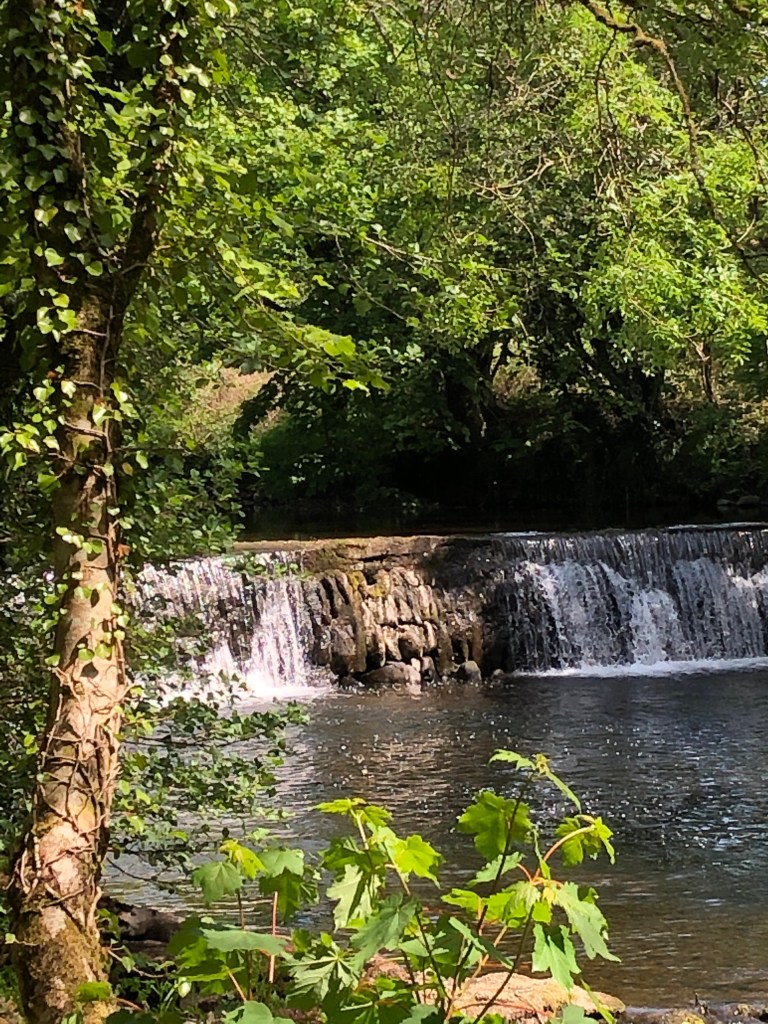
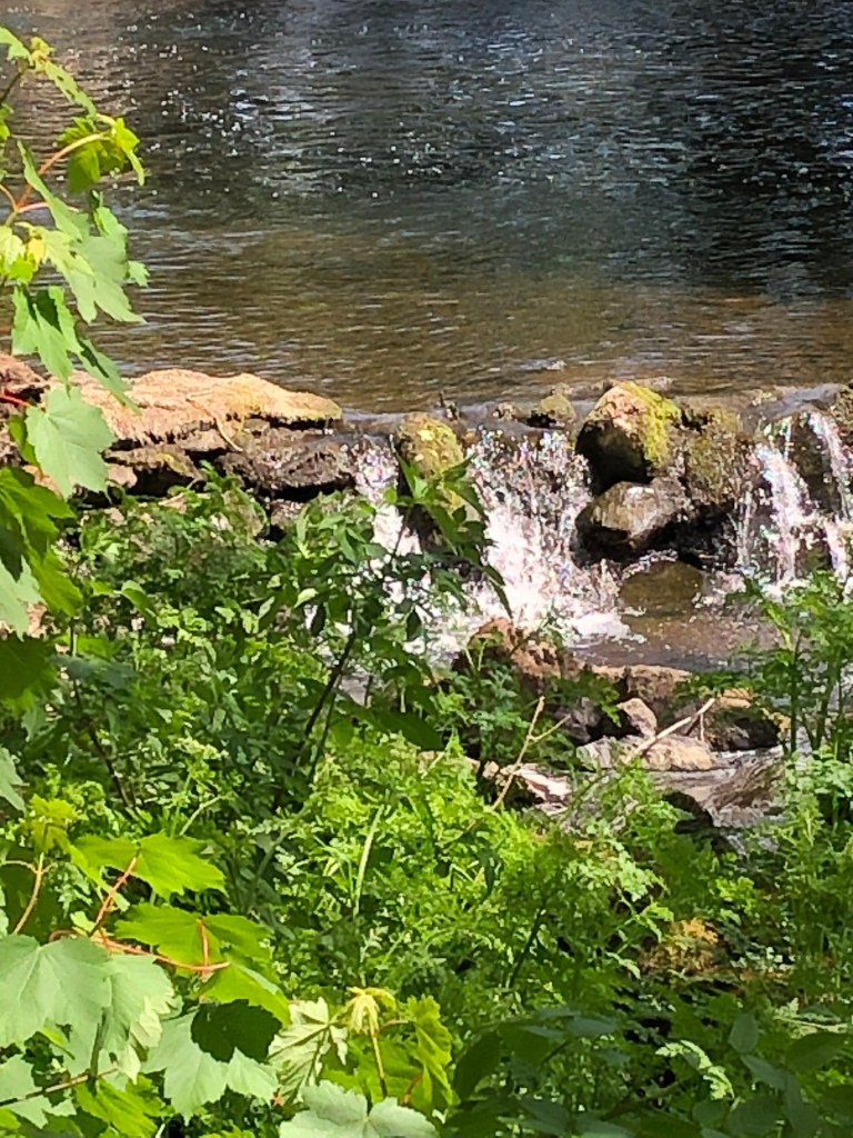
We have a walled garden with several trees growing along one side; we let this area grow fairly wild, and I love looking at the old stone wall under the trees. Here is a photo of one small section:

I liked the lichened trunk against the lichened wall, and decided to try to paint this using some of the techniques I tried in the online workshop I attended through OCA with Clare Wilson (see separate blog post in April 2021), although this time only using Cobra water-mixable oils.

SO WHAT?

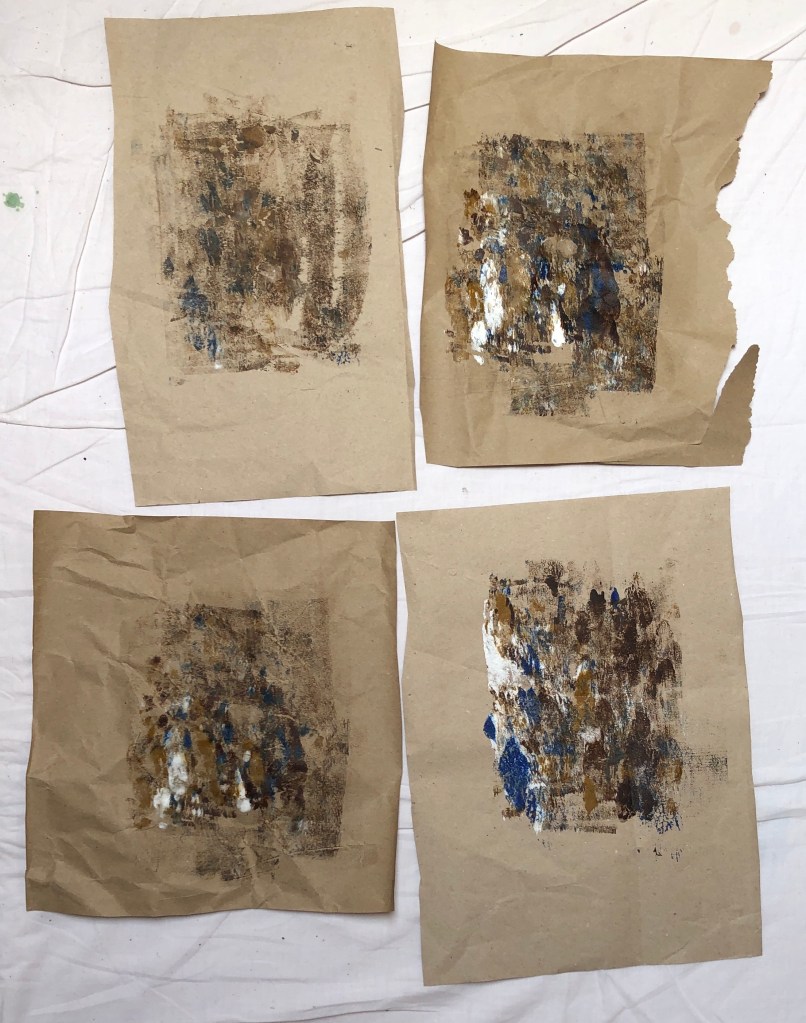
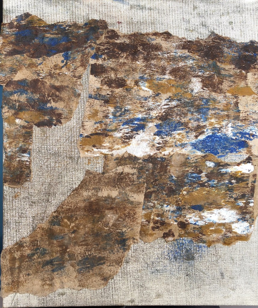
I chose a primed board first of all (24 x 30 cm). I wanted to use collage, and prepared some slightly creased packing paper from an Amazon parcel as the paper I would tear up. I put a couple of blobs of each colour of my chosen palette – raw sienna, burnt umber, cobalt blue and titanium white – onto a glass plate, rolled over them back and forth with a roller, and then printed onto the packing paper a few times, rubbing into the back with my fingers to add texture:

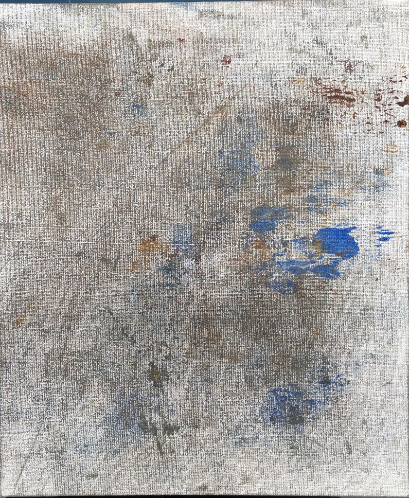
I then covered the white of the board by wiping off the remains of the paint on the roller:

First rookie error here – I tore up my sheets of collage paper into the shapes needed to indicate the stones of the wall, and then tried to stick them on with PVA glue. Somehow I thought, because the glue was water-mixable and the paint was water-mixable, that this would not be an issue. However, the packing paper, being unprimed, soaked up the oil and was very reluctant to adhere to the board. I left it overnight, but had to apply more glue the next day to achieve some sort of bond:

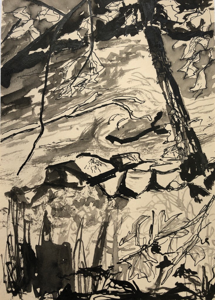
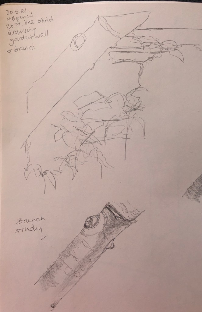
I thought I should leave it over another night in the hope it would set into some sort of workable surface, and used the time to do some sketchbook drawings – a blind continuous line drawing and some detailed studies:

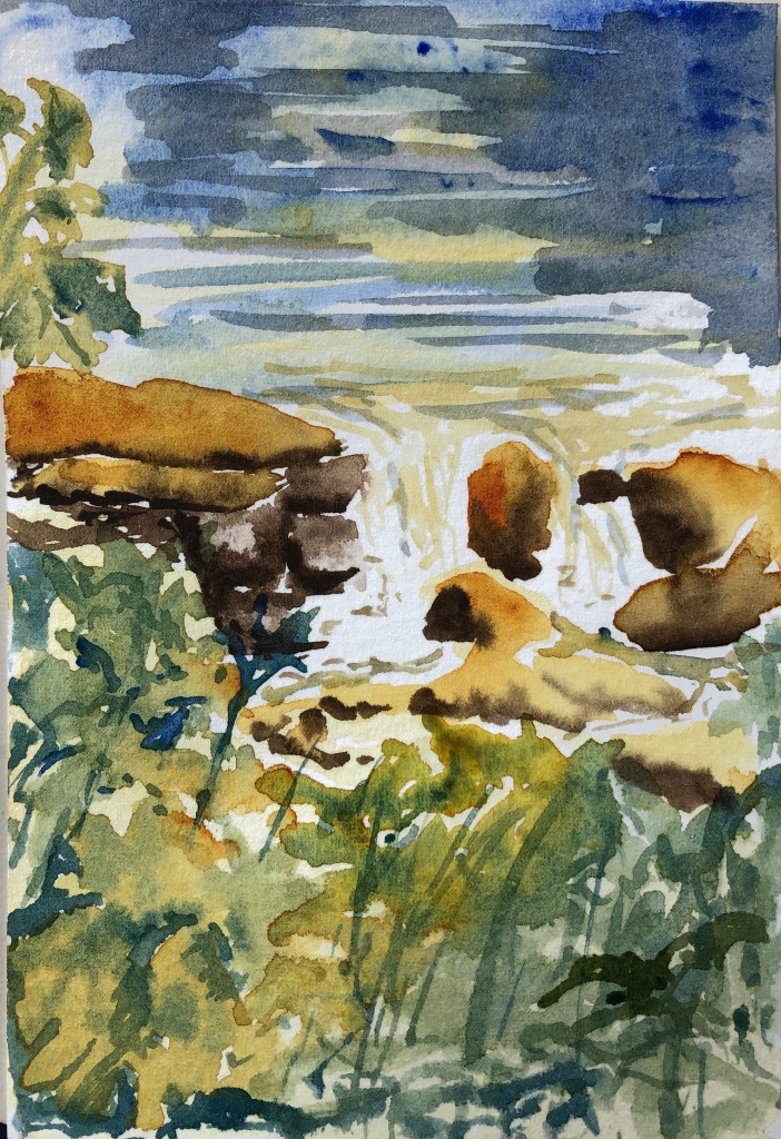
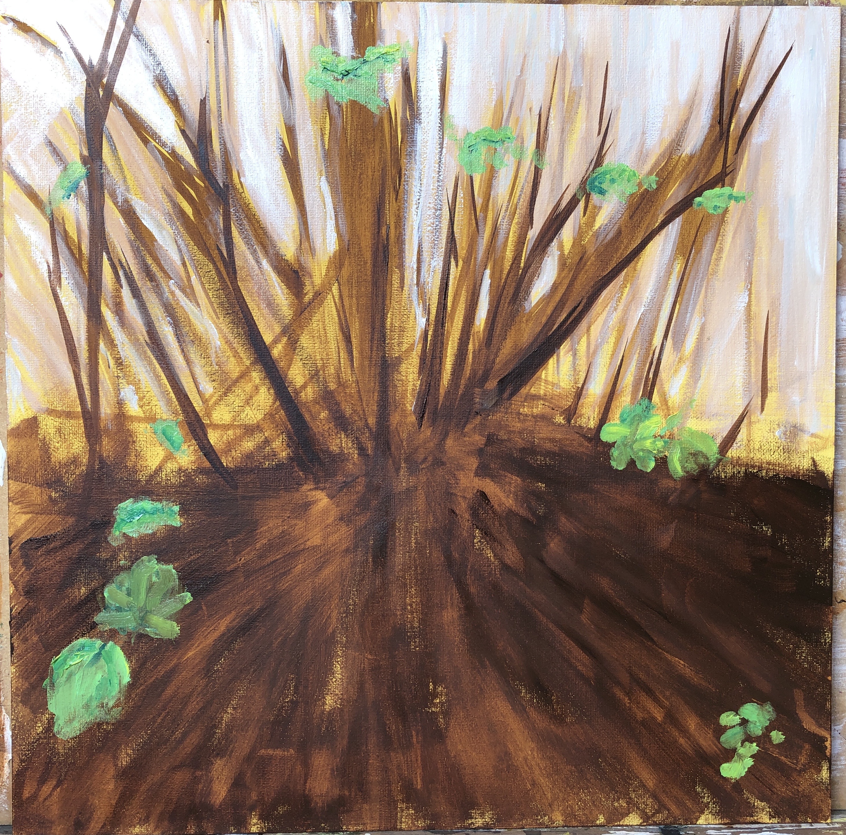
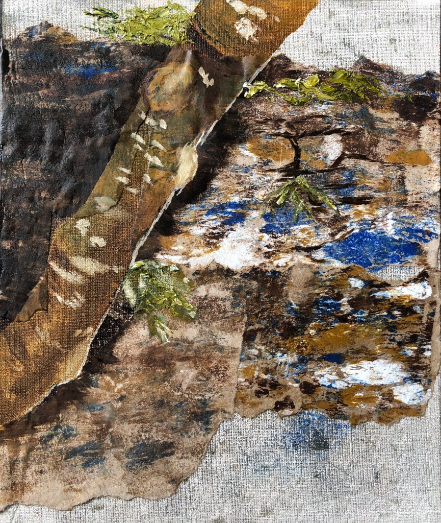
I wanted to go for a suggestion of tree and wall rather than a photo-realistic image. I began with the tree, blocking it in using a wide flat in dilute raw sienna, before working in some burnt umber and cobalt, finally adding a little white mixed with a touch of raw umber for the highlights at the edge of the trunk and the lichen. I darkened the shadow on the wall behind the tree with some umber/blue strokes applied with the edge then dragged with the flat of the brush, and added a couple of shadows under stones of the wall in one patch in the same mix, just as an indication.

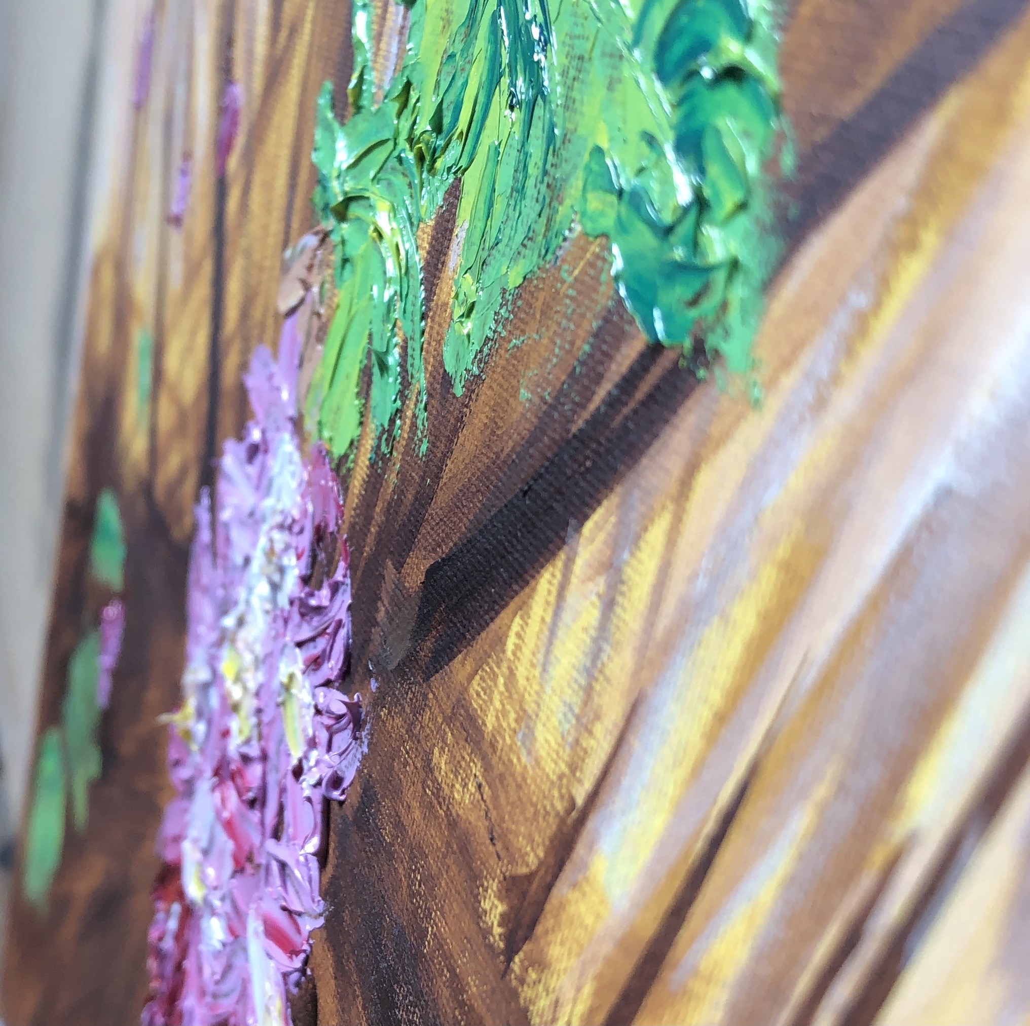
I came a bit unstuck with my indications of leaves. Due to time constraints I had made another rookie error – skipping the making of a colour card. As a result my green which I could mix with the sienna and the cobalt was a tad sludgy, and not improved with the addition of white (even sludgier). I decided to add another yellow to my palette – I thought my lemon yellow would be a bit garishly bright, so went for the Indian yellow; I mixed this with a little blue and white very loosely and just applied some streaks with the edge of a palette knife. I think this just lifted the painting a little, it would have tended to the unremittingly gloomy otherwise:

NOW WHAT?

  • This is clearly not an archival painting – the thin packing paper will succumb to the oil paint and start to disintegrate.
  • Despite this, I am glad I did the experiment – the printed collage made for an effective textured background to contrast with the painted-on tree trunk.
  • I am also glad I made the decision to add another yellow to my palette at the last minute, and to choose to apply this impasto with the knife to add yet another texture.
  • I do feel I have captured something of the secretive nature of this little corner of the garden, without letting it become too gloomy.

To repeat this technique, I would consider finding another thin paper (maybe a robust tissue paper? – I’d want something which would tear to give satisfyingly ragged edges) and coat it with a dilute layer of gesso before printing onto it, in the hope that this would stop the oil absorption and allow for better adhesion with the PVA.

Painting 1 (UPM); Assignment 5 preparation (2)

WHAT?

I wanted to try painting a flower in oils against a dark background. Our purple clematis was out against a shady trellis, so seemed perfect for this task. I decided to revert to my method of building up layers of dilute oil paint, rather than going with one big impasto bang.

SO WHAT?

Working with water-mixable paint (all Cobra except for the ultramarine) I chose titanium white, ultramarine and madder lake for the lilac-y purple, Indian yellow for the yellow streaks on the flowers as well as for the green leaves/stems, and burnt umber to secure my dark background. I made a colour card to test out some of the combinations:

Working on a 30 x 24cm primed board, I worked directionally and quickly with a very dilute semi-mix of the ultramarine and burnt umber, to denote the trellis as one looked up at it from below. It was so dilute that it soon began running down the board…….

…..but I mopped up the worst by scrubbing directionally into it with a rag:

I liked the mix of dark and light to mirror the lights and shadows of the trellis, so I put this aside for a couple of days till it was touch-dry.

Then I mixed my purple and, with a large filbert, began to apply thin dilute layers. I was concerned that the brush would pick up the dark paint from the base layer, but it didn’t. I continued gradually adding layers, sticking for now to my large filbert:

By this point I was finding the large filbert too clunky, so changed to my small filbert for the final layers:

I hadn’t quite decided what to do about stalks and leaves throughout the painting (and the ultramarine/Indian yellow mix was really luxuriant); however, I decided that less is more and to stop here – I often find I over-complicate an image at the final stages.

NOW WHAT?

  • The rough “trellis” background pleased me, it somehow felt “woody”; it has made the overall image fairly dark, but then it was a dark corner in real life.
  • I worked up several layers, mostly remembering to go from lean to fat, occasionally forgetting. Previous layers don’t always show through as much as I’d hoped, but that’s mainly because I needed the (opaque) white to achieve my lilac-y purple.
  • I watched on a video on YouTube (not noted down, poor practice), which said that with oils, especially the alla prima method, you were adding paint all the time which had already been mixed on the palette, rather than mixing on the canvas (because the underneath layers were still wet, leading to sludge), and I did find this to be largely true; however, I did experiment with putting a dab of colour on and then blending it into what was already there with the flat of a dry brush to get smooth gradations, and I think this was a valid technique.
  • I have gone from my stark purple/yellow contrasts in Assignment 4 to the converse – tiny tiny pops of yellow against the purple – I wonder if they are too small to be effective?

Overall, I was pleased with the way my starting palette choices performed for this painting, they enabled me to create a range of tones; possibly the umber/ultramarine combination was a little overbearing as mentioned above, but this was the first time I have used a rag seriously to create an effect (as opposed to removing small mistakes and picking up drips), so I am still content with it.

Painting 1 (UPM); Assignment 5 preparation (1)

WHAT?

I am trying a range of different techniques for this assignment, based on the work I have done so far. Here I wanted to look again at a slightly unfocused background painted in thinned oil paint, with a close up focus on the immediate foreground in thicker paint straight from the tube.

NOW WHAT?

My subject was a eucalyptus plant growing in a large terracotta pot on our patio. I am fascinated by the leaf arrangements of eucalyptus, and wanted this to be my focus.

My palette was titanium white, madder lake, ultramarine, lemon yellow and burnt umber.

I chose to work on a 30×30 primed board. I began with my method, from Ex 4, of putting down a ground of gesso mixed with a dash of oil paint; I began with a dash of lemon yellow, and added in a trace of burnt umber at the end.

Next, with thinned paint, I roughly indicated the corner of the patio table and some other patio plants, added some shadows with very thin madder/ ultramarine mix and a fan brush, and then brushed very lightly over the whole with a large dry flat.

Next I came to the eucalyptus, which I wanted to apply in thick paint using a palette knife. I roughed in the stems in a mix of lemon yellow/white, and then mixed my base leaf colour – I started with lemon yellow and ultramarine, knocked the brightness down with a tiny bit of its complementary colour, the madder, and then toned it down further with some of the white to give that slightly greyish-green. I applied this quite quickly with the knife; my intention being to get the paint on the board and then work into it. 

To be honest, I began to flounder here, torn between keeping the thick paint gestural, and yet feeling that the close foreground needed to be detailed (to contrast with the fuzzy soft-focus background), which I found tricky with the thick paint and the knife. I had painted the two more distant stems with a brush and less paint, so I repeated the trick of light stroking with the end of the large dry flat – frankly this went less well, I dragged too much paint, so I stopped. I tried to add fine details using my long-handled rigger, but my motor control was just not good enough, so I gave that up and swapped to a short sable. This got swamped by the paint so I reverted to the rigger, but held close up and my hand resting on a mahl stick. The outcome, I fear, was neither one thing nor the other – but I learned a lot.

NOW WHAT?

I think I rather expected to be able to immediately be able to create a convincing impasto – a bit like a cross between Frank Auerbach and Bob Ross. Turns out it’s not as easy as it looks…..clearly the hundreds of hours of practice is mandatory.

Also, the soft-focus background was too sparse, and rather unclear around the table leg. Would almost have been better to have no background at all and aim for a more botanical-style painting. As it is I have ended up with an uninteresting background and an unclear foreground, and it didn’t feel worth trying to rescue. Onwards and upwards.

Painting 1 (UPM); Part 5; Exercise 4

WHAT?

Tanya Wood and Alex Hanna were the two suggested artists whose work resonated most with me. Tanya’s detailed drawings are so closely observed; I looked at her work on her website, www.tanyawood.co.uk; her “Edges” series was my favourite, great tonal contrasts, and I also liked the way she often leaves much of a page blank. Alex Hanna’s work, as seen on www.alex-hanna.co.uk , shows such range, from his closely observed and “sharp” paintings of everyday things like curtains, to his loose, impasto, more abstract images.

In this Exercise, I was looking to:

  •  achieve something like Tanya’s tonal range, but also some of Alex’s gestural stroke making
  • Use my water-mixable oils in a less frantic, more measured style (I watched a video by Raw Umber Studios recently advocating more thought with one’s brush-strokes)
  • Try to use my long-handled brushes at their full length by standing back a bit when I’m painting
  • Play around with gesso

SO WHAT?

My three items of rubbish I found in my studio; salvaged and repurposed items rather than throwaway – an empty CD case, an empty bath oil bottle, and an empty yoghurt pot.

First I prepared my canvases. I applied a coat of gesso to each, but mixed a tiny bit of oil paint into my gesso first (Cobalt blue, Lemon Yellow and Persian Rose). When the surface was covered, I immediately painted very thickly into it with the leftovers of the gesso in a rough outline of each item, so they looked like this:

(the rose canvas photo is a detail, didn’t show up well otherwise), and then as soon as the gesso felt dry to the touch I covered it with a dilute coat of titanium white.

While that dried I made my sketches, using a 4B pencil:

I was going to use a limited palette of titanium white, ultramarine blue and raw umber for all three paintings; the colours I had used to prepare the canvases were fairly strident, even when covered with white, but I wanted something rather less obvious for my transparent items, and I also wanted the ultramarine to give me a wider tonal range than the cobalt might have offered.

I played around with my three colours (two colours plus white? Is white a colour?) before beginning, making myself a little colour card of possibilities:

I was pleased with the range of tones, and also with the olive-green I could mix, and the lush grey range. Beginning to see why, whenever you buy a “beginner’s” set of paints, they nearly always include these three!

Painting with a small long-handled filbert, I began to paint, starting with the bottle. 

It was a lot to remember…stand back, use the length of the brush, careful gestural strokes – but I did find that the length of the brush actually made me slow down just to control it, and that I really enjoyed making long slow strokes, which I hadn’t really experienced before with my habit of being closer to the painting. I added the shadow, then decided to block in the background with some light strokes of a fan brush. I was grateful in the end for the yellow ground, which helped get the colour of the “inside” of the bottle.

Next the yoghurt pot. Again I worked with the filbert.

I felt slightly constrained by my gesso underpainting at first as I had made it fill the height of the canvas, but it did turn out useful in helping convey the internal curves. Because the image was so large in relation to the canvas, I decided to omit any background apart from the cast shadows. I’d chosen the rose underpainting for this, I had been worried it would dominate, but actually it just makes the painting feel a bit warmer.

Finally the CD box. I’d been putting this off because of the straight lines, which indeed proved tricky, so I decided to abandon any attempt at photorealism and go for an impression. I emphasised the shadow and added the final reflection with a swipe with the fan brush. Again I decided to leave out the background apart from the shadow – my streaky blue underpainting felt sufficient.

NOW WHAT?

Looking back to the factors I wanted to focus on in this exercise:

  • I feel I did well with my tonal range in the bottle and the CD case, less so in the yoghurt pot; also I managed some gestural marks – some long curves in the pot and also slightly spiky shadows in the CD case, which I hope convey the rather brittle nature of the plastic.
  • I worked hard at remembering deliberate strokes; had a few lapses into frantic, but better than I usually am.
  • Using the long-handled brushes at their full length consistently did not come easily, but the only way to do it seemed to be to commit to the stroke; tentative strokes invariably went wrong.
  • My coloured gesso underpaintings have largely contributed positively to the final images, although my attempts to create rough raised images were a bit hit and miss – helpful when I’d got the underpainting right, annoying when it was slightly out of place. Jury’s out on this.

Also, I enjoyed working with this particular limited palette combination – offers lots of possibilities – to be used again.

Painting 1 (UPM); Part 5; Exercise 3

WHAT?

Having enjoyed painting with inks in Exercise 2, I kept my size 6 sable and my ink bottle (I had cleaned up the water dish, so no possibility of dilution) and just painted the desk of the bureau where I was sitting. It’s an old piece of furniture, lots of nooks and crannies, and all rather dark, partly because the wood is dark, and partly because it’s tucked away in a corner out of the sun. Lots of old bits of inky kitchen roll hanging around from exercise 2!

It made me consider my interior and where the sunlight falls through the day; it’s a North/South facing house, no windows facing West and East windows quite overhung by trees, so unless you are in a South facing window-ed room, our light is fairly even. So… up to the front South facing bedroom.

I had been looking at Bonnard’s paintings of interiors. Many of these paintings include an exterior view, usually incorporating light and gardens; however, even in his strict interiors, such as this:

Interior with flowers

Oil on canvas

he manages to get brightness and colour into what was probably in reality a dark corner with some fairly overbearing heavy furniture.

SO WHAT?

South-facing bedroom it is.

I went with watercolours again as suggested. Again I took a limited palette, but this time chose aureolin, a sunnier yellow as my main, along with ultramarine blue and warm sepia as before. I actually painted into my sketchbook, so on slightly cream cartridge paper, intending just a couple of dashes of bright orange for my bit of zing. 

I did some mixing of my three main colours on the page as my version of “colour cards”. I remember seeing an exhibition of the work of Otobong Nkanga at Tate St. Ives a couple of years ago, and noticed that she often put small blobs of the colours she used at the side of her paintings.

It’s tricky for me to guarantee that I’m in a particular place painting at a given time of day due to my caring responsibilities which are sometimes unpredictable, so I knew that this exercise wasn’t going to go exactly as written. I had intended to paint a bit of my dressing table which holds a carousel of beads (where the bright orange zing was going to go). However, after a quick sketch I decided this was too fussy, and instead painted a darker corner by the window. I mainly used the aureolin and sepia for this – it was a dreary, rainy afternoon – reserving my bright blue for my point of zing, as per Sickert’s “The Blue Hat” (see earlier blog post).

The next morning was not quite so dreary, and I omitted the chair and pile of clothes and just tried to compare the three walls and bit of curtain; the walls look different depending on their orientation, despite all being originally the same colour.

I felt I didn’t have it quite right, so decided to abandon the yellow and just make a monotone tonal sketch using the blue. I cheated a bit, by taking a photo of this corner and changing it to the mono setting, and saw immediately what my issue was – I knew that the curtain was a cream colour but hadn’t allowed for it looking darker because it was in shadow:

NOW WHAT?

I confess to feeling a bit fidgety about this exercise at the start; I didn’t particularly want to work in watercolour, was struggling to find much variation in light around the house in frankly miserable weather, and didn’t think I could manage the suggested timings.

However, I have learned/confirmed that going with the flow is OK and that what you first intended to do (paint in style of Bonnard) isn’t necessarily what you end up doing (paint in style of Sickert and investigate tones); this has been said to me before, but most recently in the OCA workshop in April 2021 with OCA tutor Clare Wilson. And I found that letting go and following my interests made me feel better about my work, even though the outcomes are a bit scrappy. 

Painting 1 (UPM); Part 5; Exercise 2

WHAT?

Five minutes down the road from my house is a weir on the River Tavy – a very favourite place and one to which I go whenever I need a bit of headspace – so it seemed the ideal spot to dwell upon a little for this exercise.

SO WHAT?

I began with the ink paintings – I used ink a lot in Drawing 1, I love it, and it always feels like my “coming home” medium. I used black Chinese ink, which always dries slightly greyer than it looks when wet, applied with a rigger, which is such a versatile brush for mark marking depending on whether you use the tip or the side. In the first couple of images I drew into the paintings with a dip pen, but decided this wasn’t necessary for the other three. I painted on beige multi-media paper, actually size A5.

I loved painting these, found myself freeing up as I went through the series, and becoming gradually more relaxed about how to depict the foliage, which I was struggling with at the beginning (hence the pen).

I decided to paint the same images in watercolour on postcard-size HP watercolour paper, using a size 6 round and a rigger.

I chose a limited palette: warm sepia, ultramarine and quinacridone gold.

It’s been quite a while since I used my tube watercolours, probably not since I started the course – but I found myself at least a bit better at reserving my white areas.

The first two feel a bit insipid, I prefer the last three, and I realise that’s because I remembered to get dashes of only slightly diluted quinacridone gold in each, which  just lifts the image, being reddish-orange. I have painted the first two in more muted colours without adding my touch of zing!

Also my greens were either yellow-y or blue-y, I struggled to get that bright leaf green which would also have lifted the images a little.

NOW WHAT?

  • I reminded myself of the enjoyment I get from drawing and painting with ink
  • I have proved to myself the value of having just a touch of a bright, intense colour in a painting of fairly muted colours.

Painting 1 (UPM); Part 5; Research – Maria Sibylla Merian

WHAT?

Maria was a German artist who lived 1647-1717. She was born into a family of printers and artists. She became fascinated with the portrayal of insect transformations, eventually travelling to Surinam with the younger of her two daughters. Here she painted plants and the insects associated with them, being the first to document this relationship. She worked on vellum in watercolour and gouache for each of her images. Here is an example of her painting:

“Banana Plant with Red and Purple Flower & Fruit”

1701-5

Watercolour and body colour with pen and grey ink on vellum

38.3 x 29.7 cm

British Museum, London

I wanted to have a go at working in her style, first by copying part of this image, then painting from a photograph of flowers in my garden.

SO WHAT?

I worked in my sketchbook on 150gsm cream cartridge paper, using Kuretake pan watercolours, to copy the lower part of the flower:

Next I wanted to paint from this photograph of tulips in Maria’s style, this time using Cobra water-mixable oils.

Having attended a recent Painting Dept Studio Group session where my tutor, who was leading the session, talked about her own use of dilute oils in the manner of watercolours, I was keen to give this a go.

I also wanted to use a limited palette, so my initial selection was titanium white, cobalt blue, lemon yellow and Indian yellow. I began working on a primed board with the two yellows; the Indian yellow is transparent and the lemon yellow semi-transparent, so I thought they would be good for building up layers.

As the layers developed, I decided to change my plan and make the entire painting in the yellows, leaving out the blue and white. This was inspired by two pieces of research:

  • I had watched a video mentioned in the Technician’s Workshop section of the Painting Dept webpages: www.drawmixpaint.com. I had intended to bring out the lightest highlights using white, but the video suggested that yellow was an alternative, so I decided to use fairly concentrated lemon yellow for this purpose.
  • I had attended a Zoom meeting, again from the Painting Dept, which was a “Film Club” session where we watched a video showing John Hoyland talking about his painting practice; he said (I paraphrase) that he basically paints in order to learn how to do it. I took this as inspiration to play around with my painting and experiment.

I photographed the painting as it developed, from the initial layer through to the finished product:

Here is the final version:

NOW WHAT?

I have learned:

  • That I should take John Hoyland’s advice and experiment more
  • I enjoyed working in this method of building up dilute layers and should like to do this more
  • Paying attention to the details of the paint characteristics on the tube paid off – the two yellows were transparent either wholly or partly, whereas the white was opaque and I think would have killed the luminescence of the painting stone dead – I probably should have tried it just to prove it to myself, but I’m afraid I was too attached to the final image.

The board I had picked out of the pile to use was not ideal as the surface was textured and quite dominant – I think the final image turned out to be strong enough to get away with it, but it has been a lesson to me to think more carefully about this aspect in future.

Painting 1 (UPM); Part 5; Exercise 1

WHAT?

I looked at Mimei Thompson’s work earlier in this course and was attracted to it; in the example given in the course materials, Weeds, there is something about her contrasts of streaky background colours and bold colours for the main focus of the painting which I wanted to try and emulate for the subject matter I have chosen.

SO WHAT?

My husband has recently been in hospital for 9 weeks; he’s a great gardener, so I would regularly take photos of our garden to send him. I have chosen one of these to have a go at; a pink flowering currant. I selected this one because I wanted the challenge of setting a focused central image against a blurry background.

I have decided to look at water-mixable oil paint applied alla prima for this part of the course, for two reasons:

  • I have been wanting to investigate it for some time
  • It is a medium which I can “drop” at a moment’s notice and return to some time later, which is a useful feature in my life at the moment

I am using Cobra water-mixable oils; Talens do a helpful series of introductory videos for this paint on YouTube, which I have watched right through – I’ve found out about the exact function of gesso, why it’s important to prime paper, the importance of reading all the little symbols and notes on a paint tube, and which paints to choose to mix a particular colour.

For this painting I worked on a square canvas board, 30×30 cm; the photo was rectangular, but I cropped it to square. I haven’t copied it exactly as I wanted to try out Mimei’s style; her plants in the picture mentioned above are not exactly realistic, but they are recognisable.

There are frequently some directional lines in her backgrounds, and for my painting I felt they needed to fan out from the centre. I began with burnt umber and white over my prepared background, which was a chalky yellow house paint from the Annie Sloan range. I chose a mellow yellow to make a warm background, as if the sun was shining from behind the bush, and also because the leaves of the plant are a yellow green. The yellow is actually much more egg-yolks than it appears in this photo! This background surface accepted my brown and white paint well, and I stroked these on, very diluted, with a short flat brush, building up the darkness of the brown in the lower half, particularly on the right. 

Next I experimented with my green mix. I chose lemon yellow mixed with a small amount of phthalo turquoise blue – the result was highly chromatic, and I had to tone it down with the addition of white and then more lemon yellow. Still not right – but at least I’ve learned what a strong colour the turquoise is.

My pinks were from the tube – madder lake and Persian rose – tempered with a little white where needed and a dash of lemon yellow. I wanted the main flowers to stand out, so applied them thickly with a palette knife.

As always, I got carried away,  the paint is really thick – “fat over lean” with a vengeance.

NOW WHAT?

Not my finest outcome, and nothing like Mimei Thompson; I suspect she works in layers.

The green is garish and I lost interest a bit in the background so it all looks very sparse. However, I’m pleased I did it because:

  • It has made me pick up the oil paints – I’ve had a bit of a block, struggling to get down to these exercises, and decided the only way to get past it was to run at something, which I did.
  • It has demonstrated the need for/value of colour cards (see blog post on advice from Anna and Fiona).
  • It has highlighted a need to do a lot more research into the alla prima method of working.

Painting 1 (UPM); Part 5; Workshop on 24.4.21 with OCA tutor Clare Wilson: “Investigating Place – On Ways of Interpreting Landscape”

WHAT?

This Zoom workshop lasted for two hours. A preparatory padlet created by Clare had been really helpful in giving signposts to various artists working in this field, one of whom was Tim Stoner, whose work I am going to look at more as part of my research for Part 5.

Clare began by describing her own practice – she works from sketches made in the landscape, but also from her experiences and memories of place, and creates abstract paintings created by building up oil paint glazes in layers. She gave some key tips:

  • Be open about what you respond to in a landscape – it might not be what you meant to focus on when you started.
  • The time you are not physically painting is vital – let things settle, get distance, see what’s revealed, and then go back in.
  • Quality of edge is very important in collage.
  • Contrast and emphasis are key in abstraction – create tension, think about soft and hard marks and space.
  • Landscape (and landscape abstraction) is a good way to get into colour in a subtle way, if you are finding colour difficult.

SO WHAT?

We each came armed with a photograph of a landscape important to us (mine was of a section of river just down the road:

We did several warm-up drawings in a combination of pencil and charcoal (such as continuous line drawings, blind drawings, two-handed drawings, making slow and quick marks), gradually progressing to larger drawings building in use of memories of the place, using extra media such as ink, focusing in on a part of the photo, and thinking about creating contrast by making differing weight and quality of marks.

Then we moved on to our final piece. Clare encouraged us to try monoprinting for this – she introduced us to a way of making marks on our monoprint by drawing into the back of our paper whilst it was on the plate with fingers, ends of brushes, or whatever came to hand. She also suggested we incorporate collage and then work into that.

I began making some monoprints in black gouache onto grey Amazon packing paper, which is fairly thin but robust, using the method Clare described. 

Once I had a few, I wiped off my perspex plate and my roller onto a sheet of cartridge paper.

I decided I preferred this as a base on which to work, so tore parts out of the packing paper monoprints and collaged them on. Then I worked into the whole with charcoal, pencil and white gouache. Here is my final outcome:

NOW WHAT?

I have to say I thought this workshop was a blast and I am pleased with my outcome, which does show contrast and emphasis, and has captured what I think of as the essence of the place.

 I have had a difficult time recently with my husband returning home from hospital after a stroke; he is now disabled and bed/wheelchair-bound so I have had to learn how to do basic things like move him, we have had an army of carers visiting, and in the middle of it all I am trying to co-ordinate building works as we have no downstairs washing facilities for him.

As a result of all this I have really struggled to make a start on Part 5. However, I am really excited about this use of monoprinting and collage, and feel I can now see a way into Part 5 by experimenting further with these, introducing colour mixing (which is my focus for this section) gently and in stages.

Painting 1 (UPM); Part 5; Research – Tim Stoner

WHAT?

I looked at Tim Stoner’s recent work on his website, www.timstoner.co.uk. I was particularly interested to look at his use of colour in the landscape, as ostensibly his work seems bright and colourful.

SO WHAT?

I chose to look at and compare a pair of paintings of Ronda in Spain, which is where the artist lives. The view in the two paintings seems virtually the same, and centred around one tree and its background, but the appearance of the two is very different. I am no expert on Spanish climate, but I imagined that this painting was of the tree in spring when it was covered in bright blossom:

Ronda

2017-18

Oil on canvas

48 x 60 cm

….whereas this one was done in the hot, dry summer when the blossom was over and perhaps the foliage was wilting a bit:

Ronda

2017-18

Oil on paper

48 x 60 cm

Working in my sketchbook, I roughed out the images side-by-side in 2B pencil to get the feel of the composition. Then I painted it using a small set of Koh-i-Noor watercolour pans. It proved almost impossible to match the colours exactly as the paints in this set are very bright, but trying to get an approximation was good for making me look.

The first painting was based around primary colours plus green and purple. The artist seems to use a lot of white, so the intensity of most of the colours are knocked back somewhat, leaving the bright yellow of the blossom, which I think is the pure colour, to stand out, especially against the darkened red and lightened blue. The darkest tones are bottom and left; the lighter tones upper and right.

The second painting is tonally quite different; the tones are much more even around the centre, with dark tones for the mountains and the left-hand buildings in shadow. The colours are generally based around pinks, oranges and blues, and are pastel-ish. There are pairs of complementary colours (orange/blue, red/green), but none of the colours is pure, so the contrasts are not so striking.

NOW WHAT?

  • In the context of this Part of UPM, it was interesting to see how this artist had approached the depiction of a part of his environment and achieved very different effects depending on light and conditions.
  • The artist has used warmer colours in the foreground and cooler colours in the background (a generalisation) to help establish depth; this is especially noticeable to me in the second painting where the tones (apart from the strong darks) are quite similar – I need to remember this as a tool.