WHAT?
As part of my feedback on Part 4, my tutor suggested I contact two other students (Anna and Fiona) more experienced in colour mixing than me currently, and ask them about their starting palettes.
SO WHAT?
Both were extraordinarily generous with their knowledge and their time, sharing blog post links and offering a huge amount of information; some nuggets are listed here:
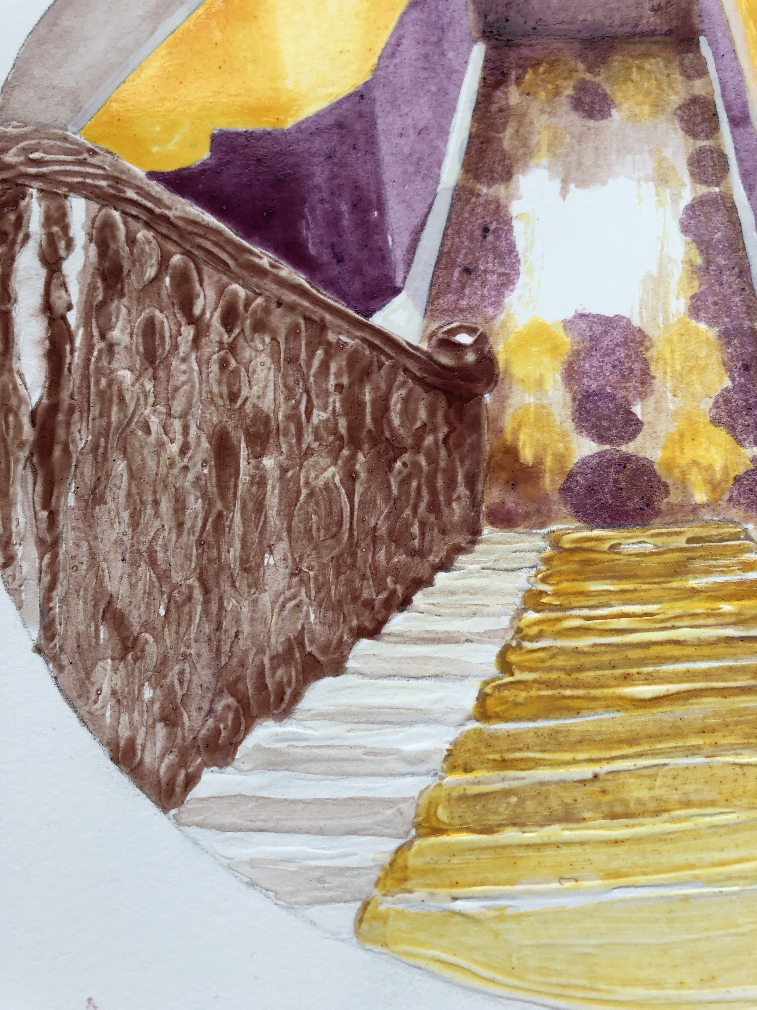
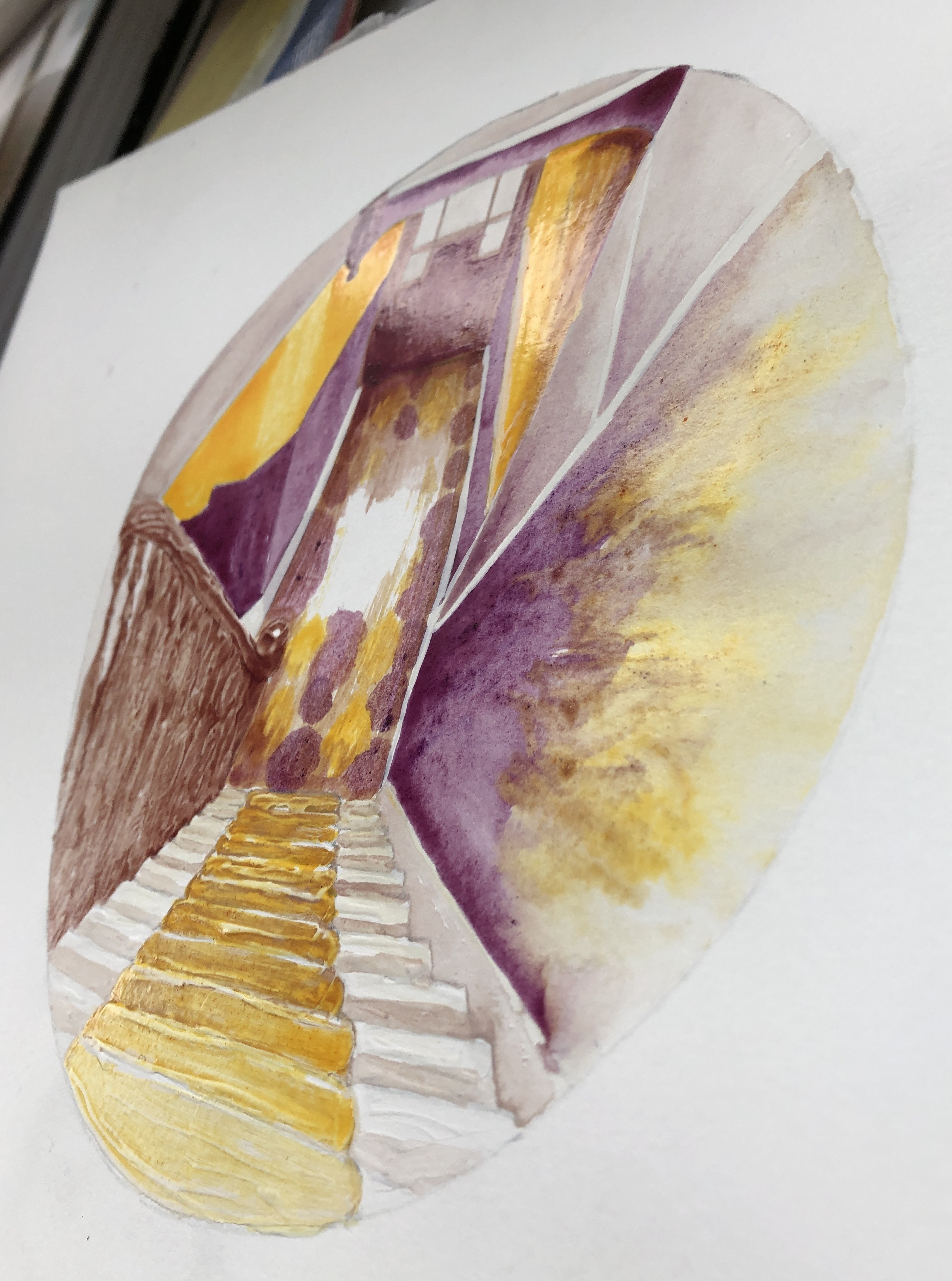
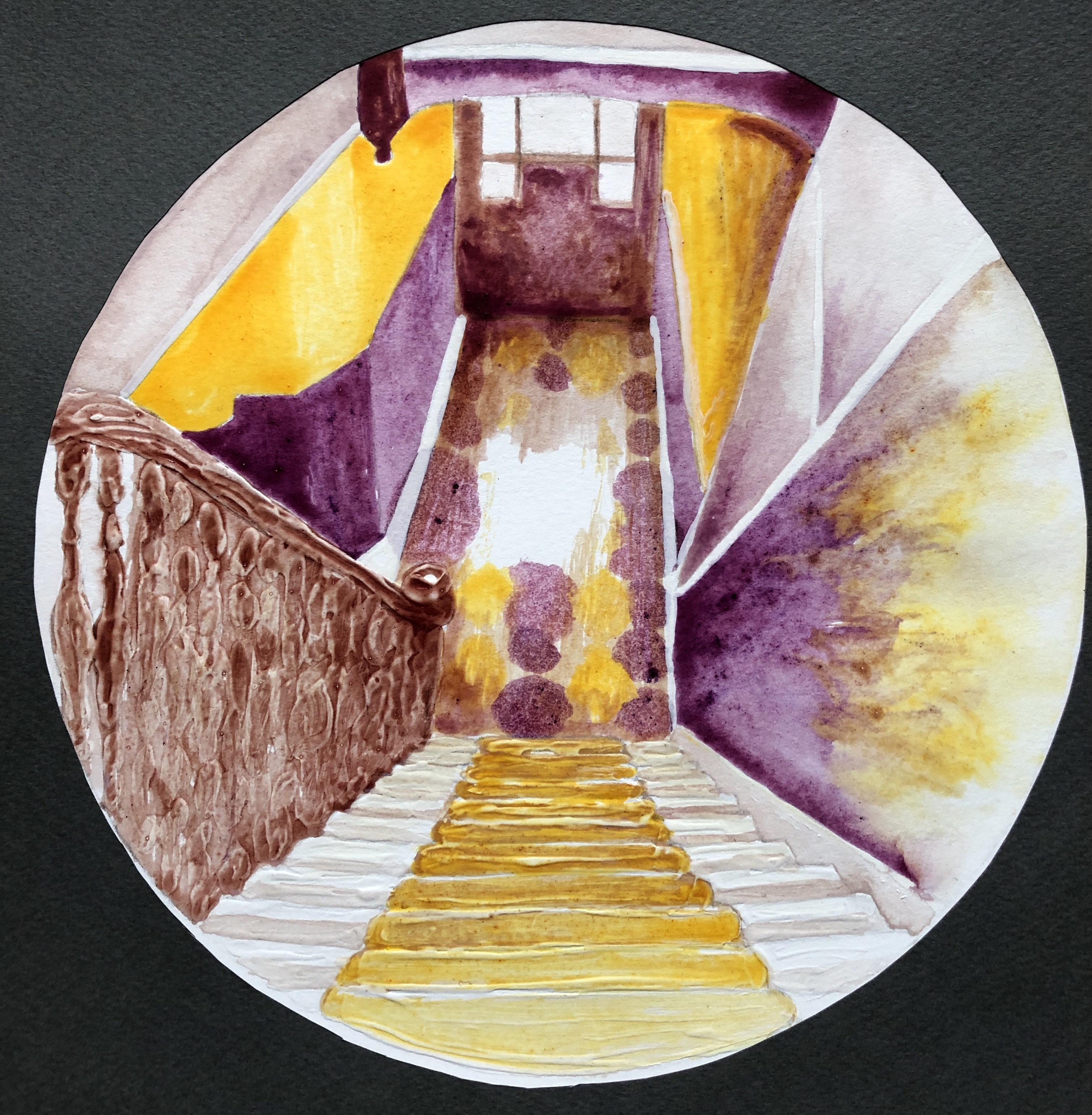
- “I like brighter palettes, so I often take Ultramarine Blue as my blue, Alizarin as red and Light Cadmium Yellow as yellow instead of Zorn’s muted colours. It is important not to overdo with bright colours. Bright colours look better when there are muted colours around them. For this you can use the same red, blue and yellow to get muted colours.
- For example, I take Light Cadmium Yellow and I paint a yellow daffodil. To make this yellow really bright, I do not put purple (Ultramarine and Alizarin mix) around this yellow. What I do instead is I add to my purple (which is a mix of Ultramarine and Alizarin) a bit of yellow (Light Cadmium Yellow) to make my purple duller (two opposite colour will give a grey but with a lovely tint – blueish grey, or pinkish grey, greenish grey and so on.) Purple in dull grey will be fighting for its survival as it is opposite to yellow (in daffodil).”
- Look at: youtube Quick Tip 275 Luminosity, the channel is In the Studio Art Instruction – when you watch, make your own demonstration with explanation on a piece of paper.
- “when you choose your set of blue, red and yellow to mix, you need to keep some things in mind.
- For example, Ultramarine blue has got a bit of redness (because it has got a blue pigment and a violet pigment in it). That’s why when you mix Ultramarine with yellow to get green, green is never bright but blueish. I think, what happens is the red in violet pigment makes orange when mixed with yellow, this orange is opposite to blue pigment. So we have two opposites which make grey when mixed.
- Sometimes, extra pigment in a colour helps create another colour.
- Have a look at the video “Paint Blue Without Blue Paint” on youtube by Cesar Cordova. He uses Green and Violet, I guess green kills red, and the blue is left…. But this video just shows how important it is to read pigments in a colour when mixing with another colour (they are written on a paint tube).”
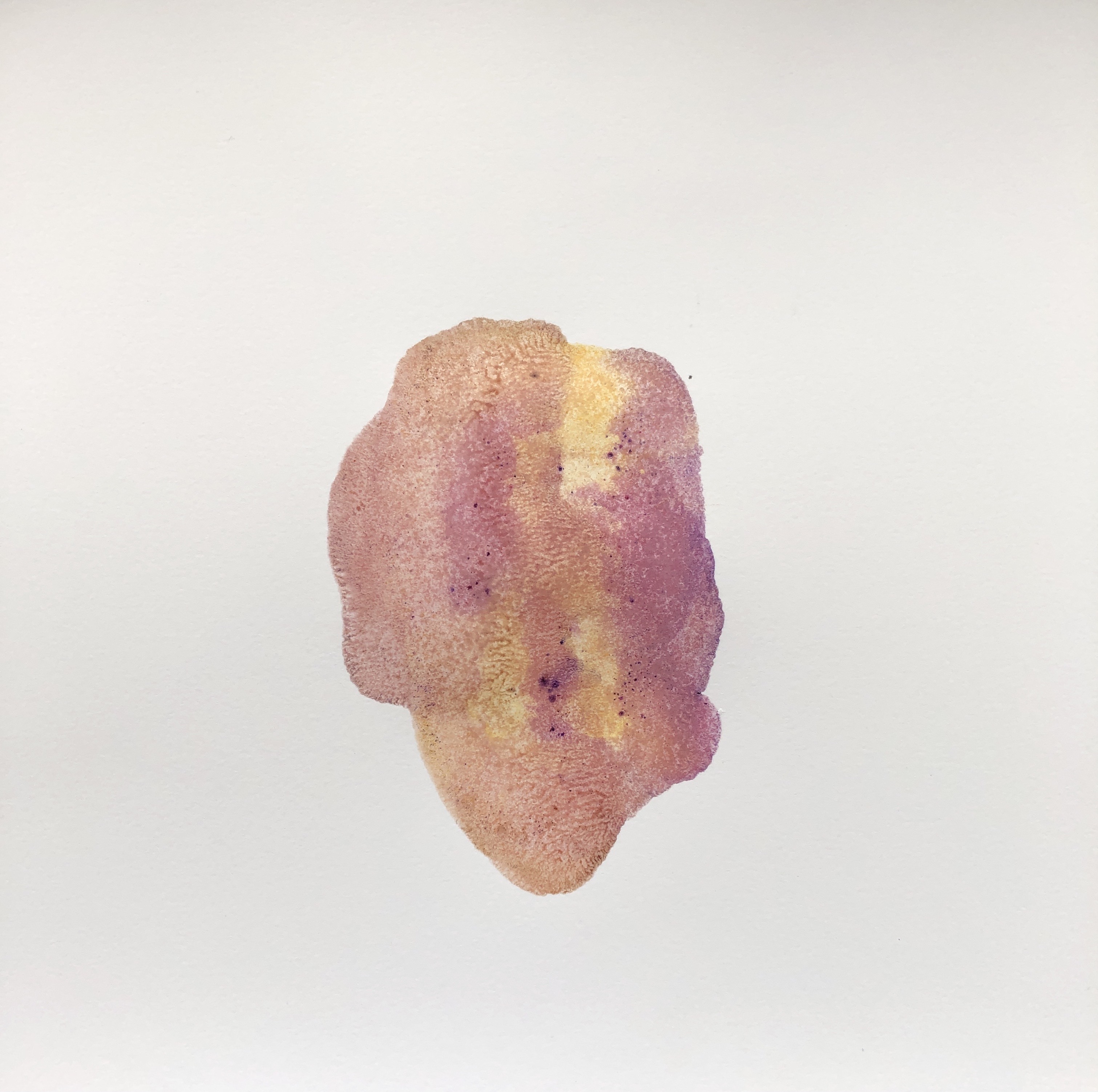
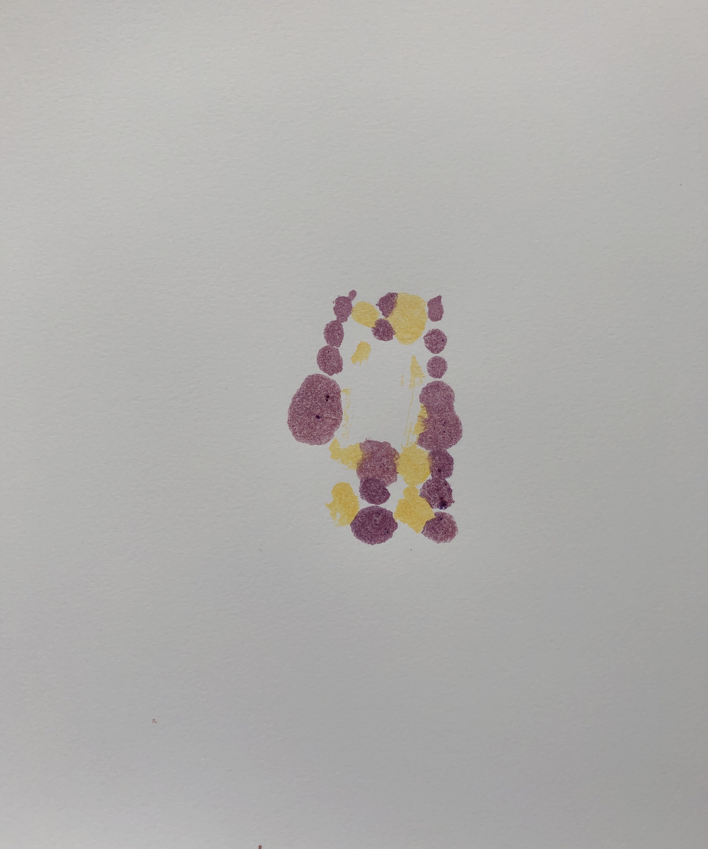
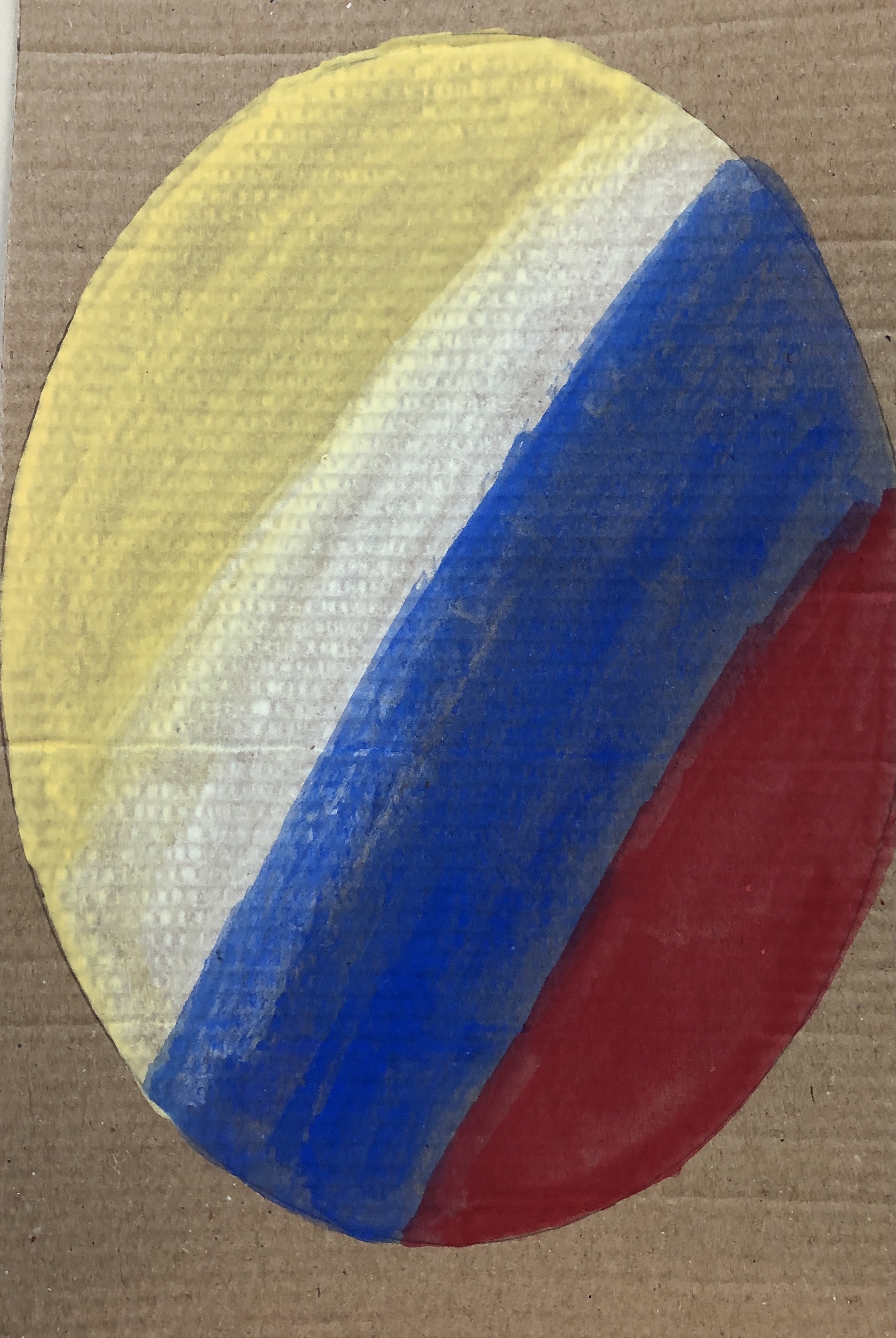
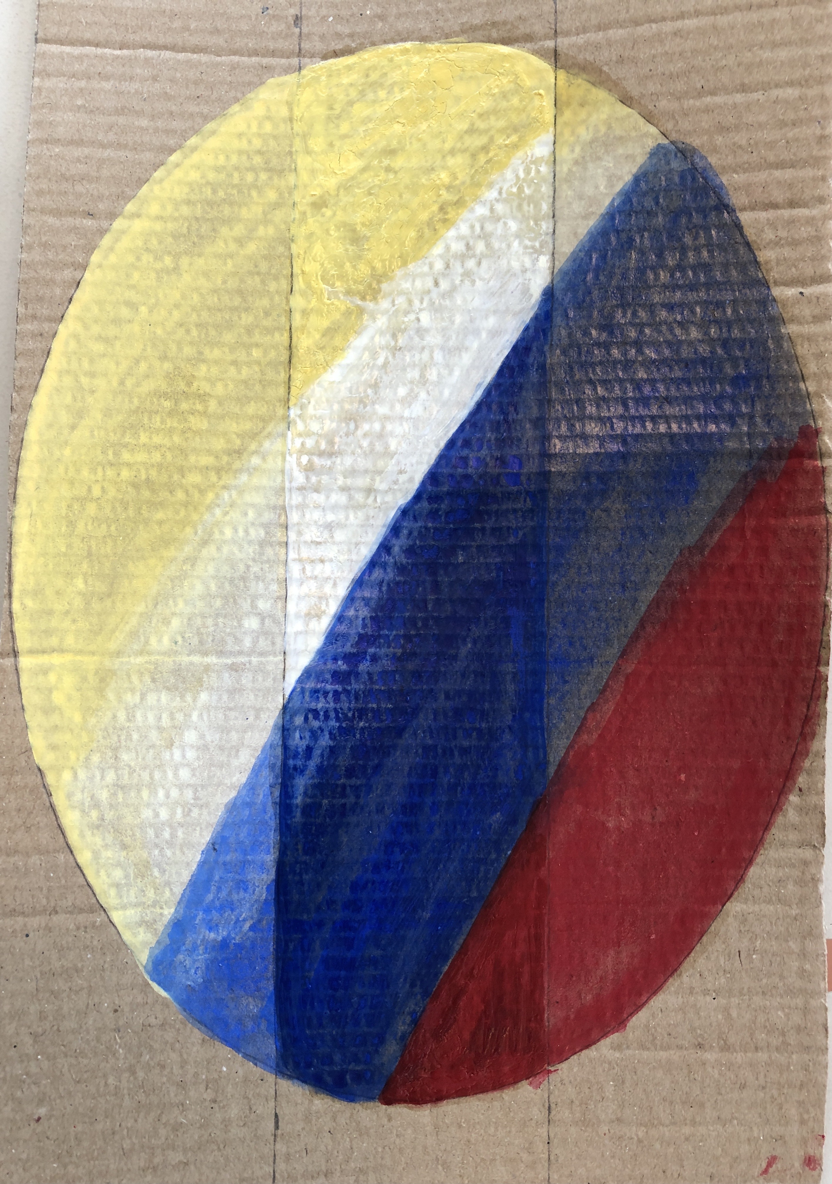
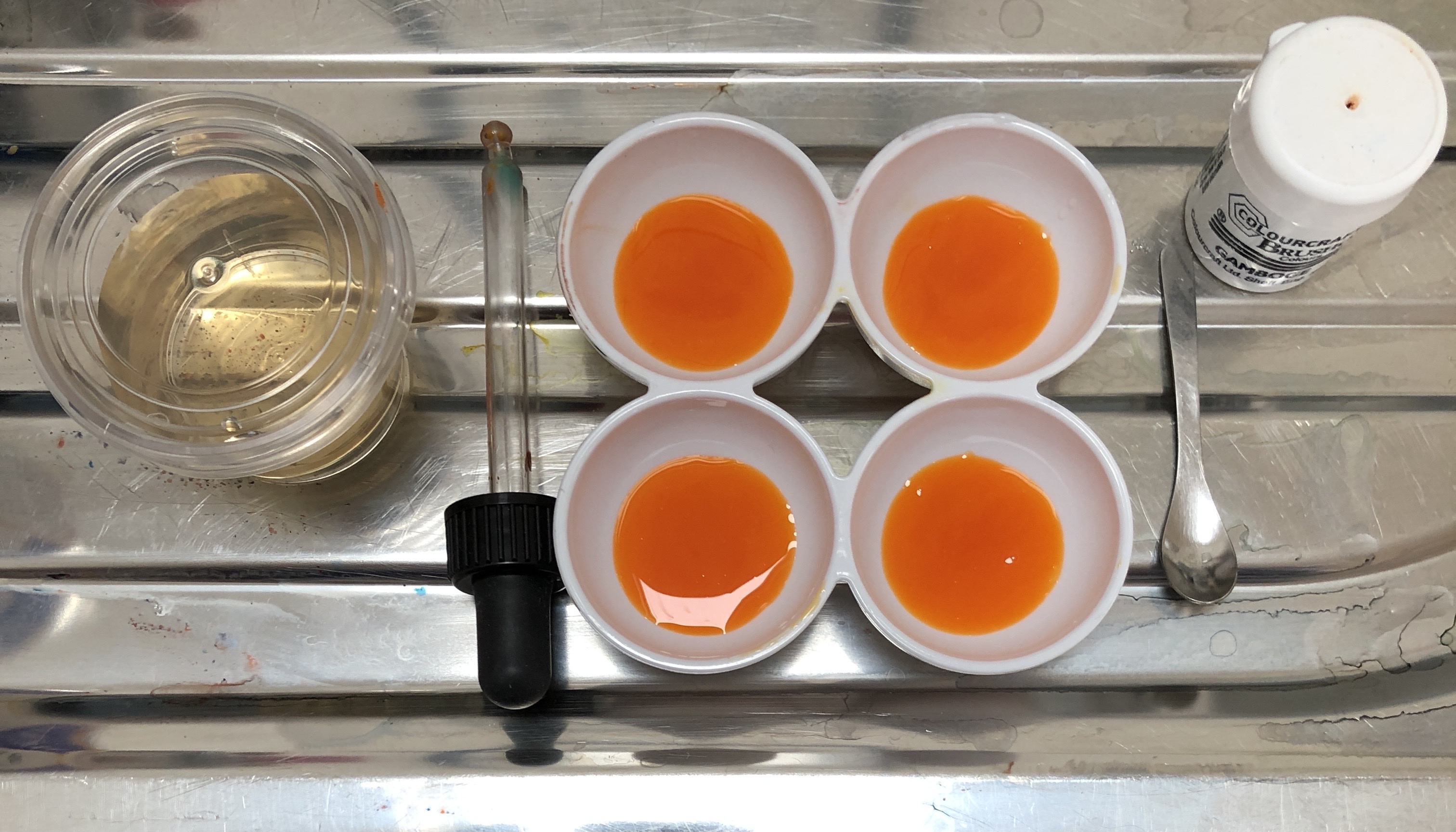
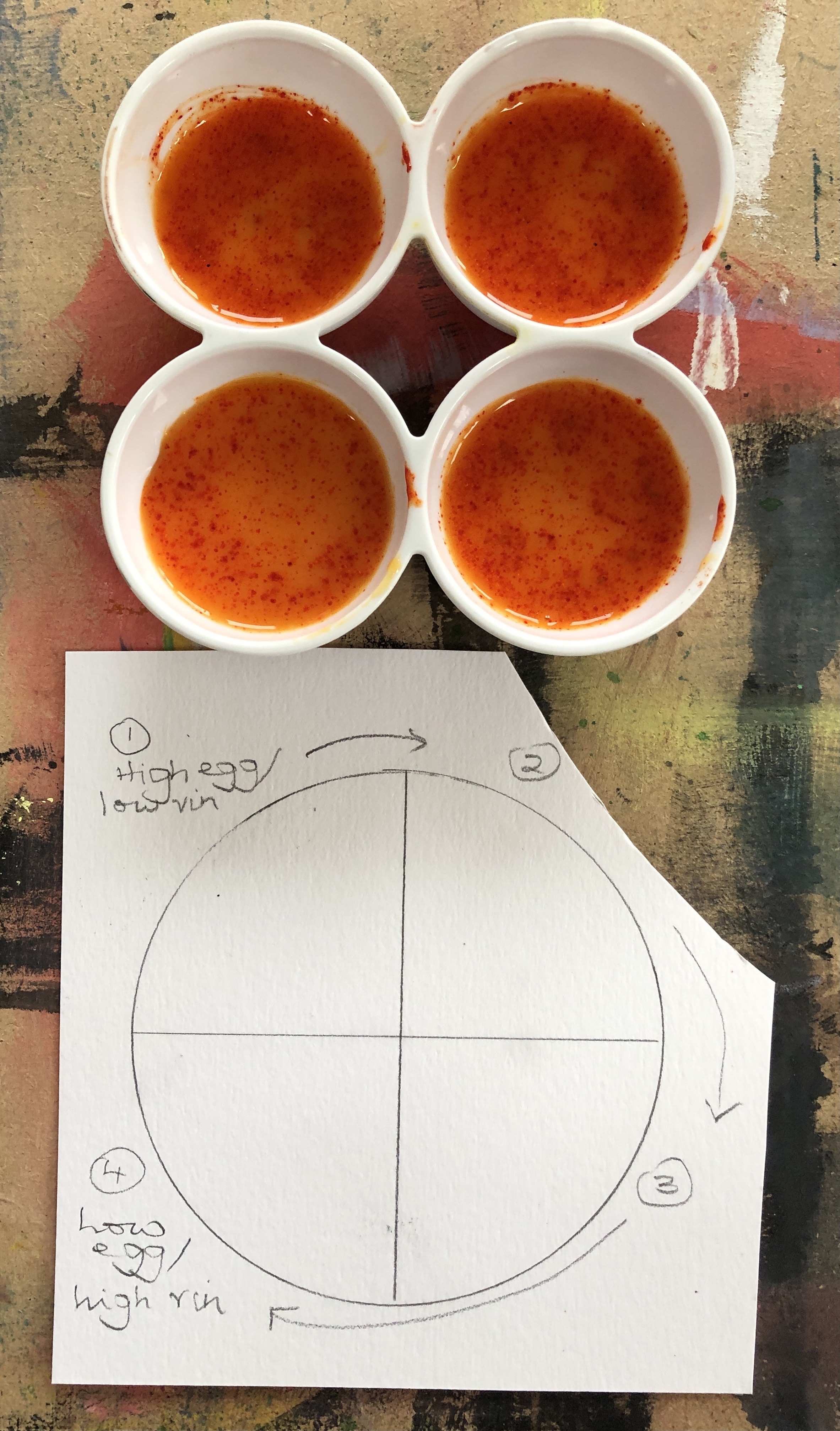
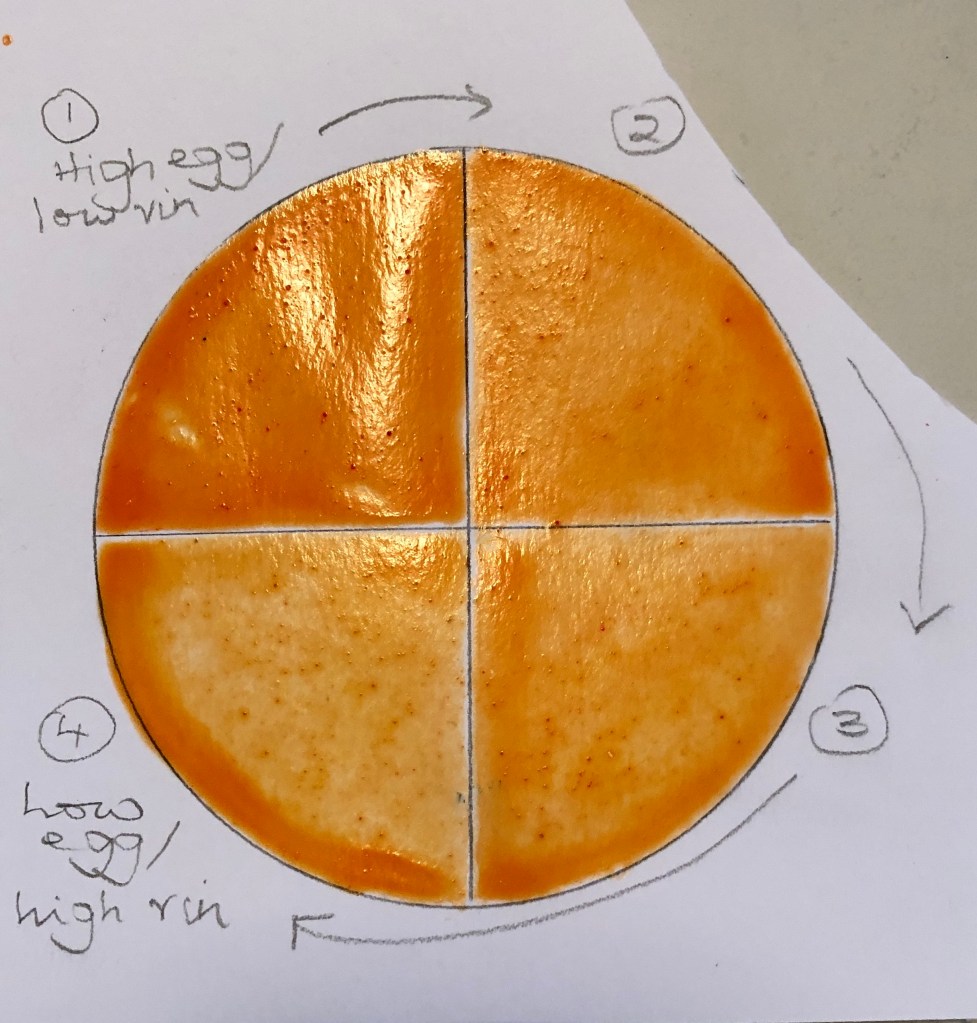
- “Try to find some time and make little pieces of paper and mix different sets of blue, green, yellow and any other combinations, (first write on the back what colour you are going to use, or you’ll quickly forget), a mix for a piece of paper. It may sound like a waste of time, but it will help you enormously. When I do an exercise, I do not need to guess what colours to mix, I just look at my prepared mixes and choose, I call them colour cards.”
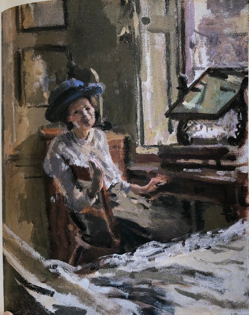
- Copy paintings of a favourite artist – not in detail, but to try and match the colours and learn from their palette (I have made a start on this with my look at Sickert – see separate blog post)
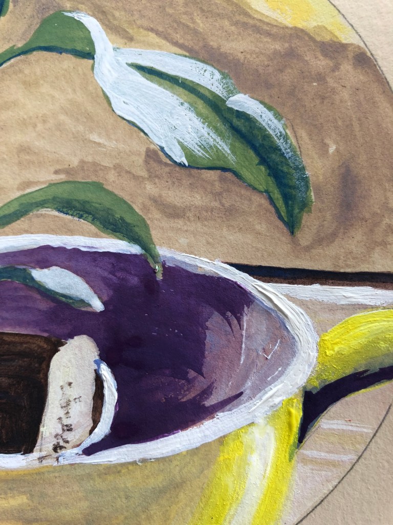
- “When you need to apply, for example, purple, try not to mix red and blue fully, but apply then so you can see some bits of blue and some bits of red paint on the canvas. Because then red and blue will mix to make purple in a viewer’s mind instead, and this always brings some life, more interesting.”
- “I normally start with a mix of red, blue and yellow like in Zorn’s palette, but eventually I add other colours which are brighter, just remembering that there should not be lots of bright colours, a little bit of bright next to muted colours. No very dark or very light, tonally many colours are close to each other.”
- Find a palette you like and stick with it for a while, but be on the lookout all the time for colour combinations you like.
- The colour wheel is always useful.
NOW WHAT?
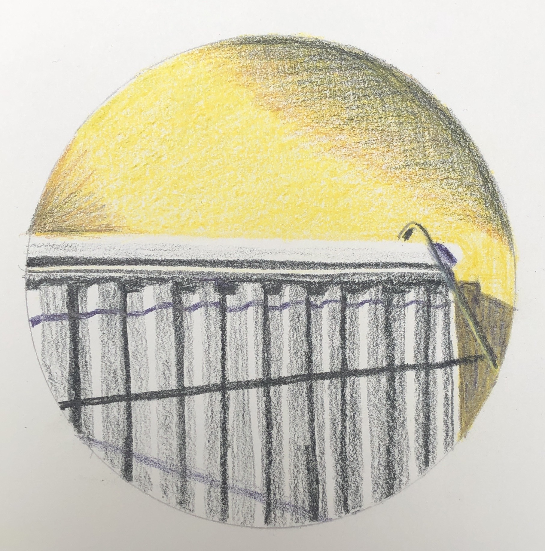
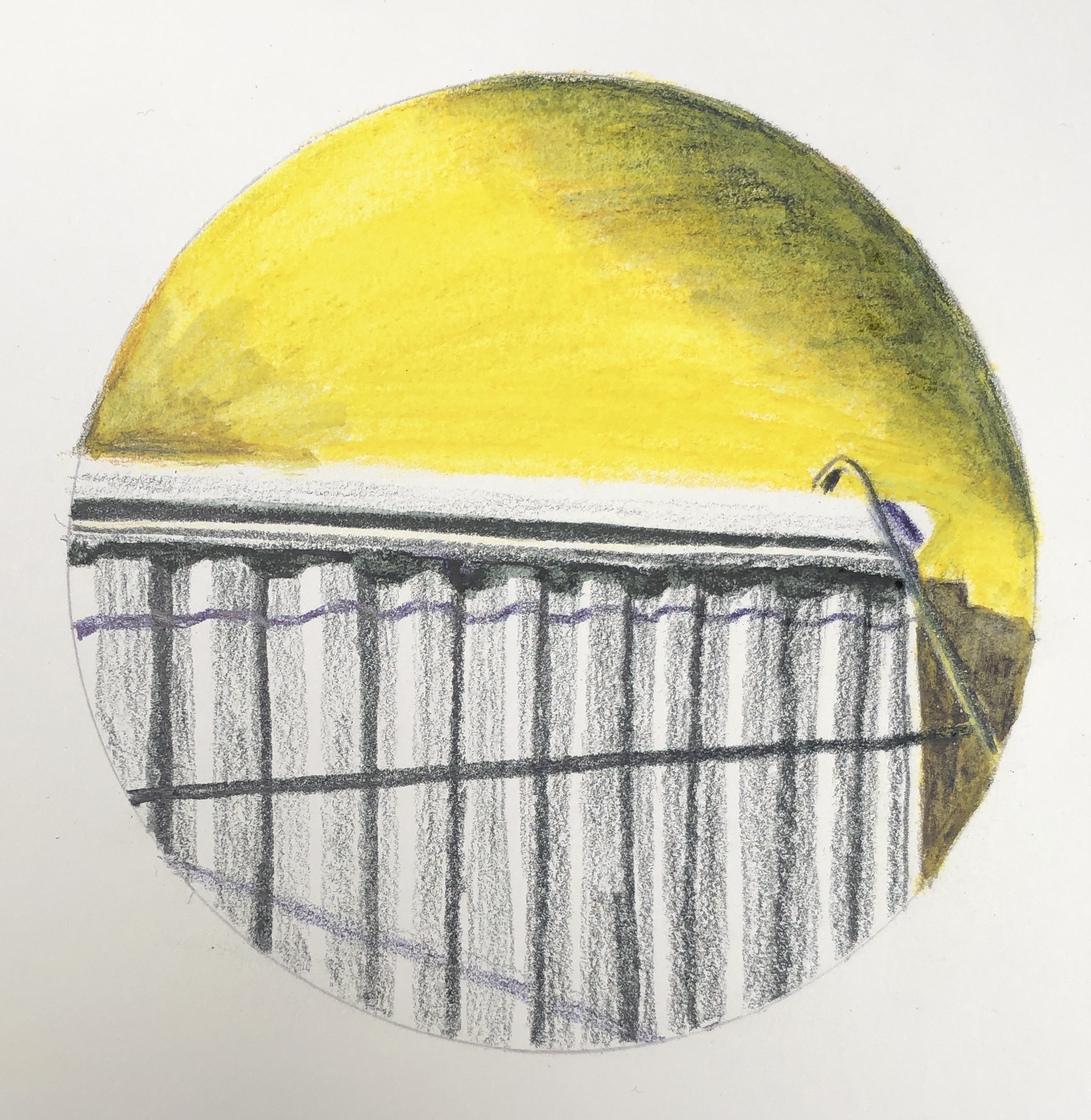
- The “bright colour shown off by a muted surround” principle, and how to go about it, is a clear thing I need to learn.
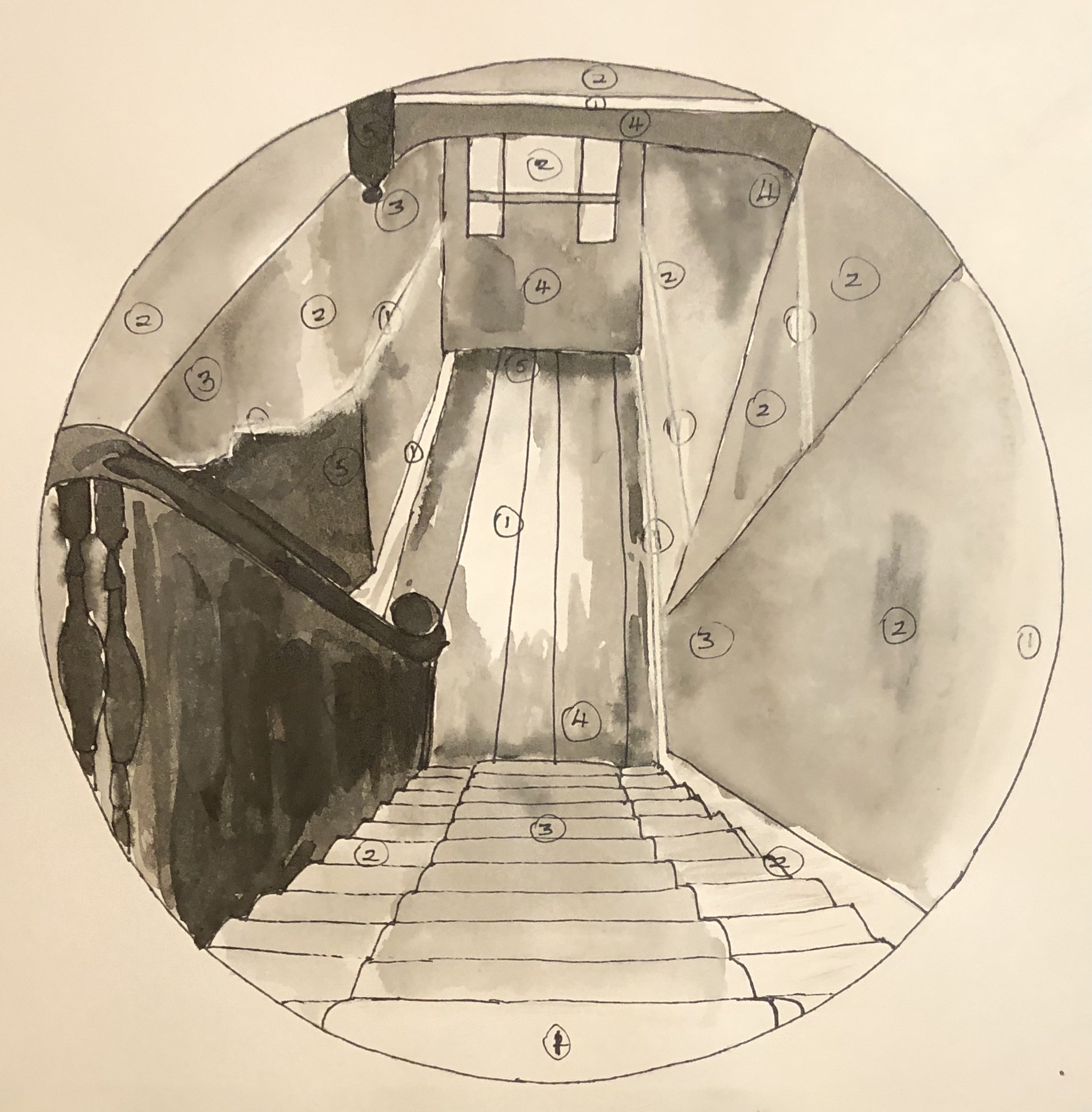
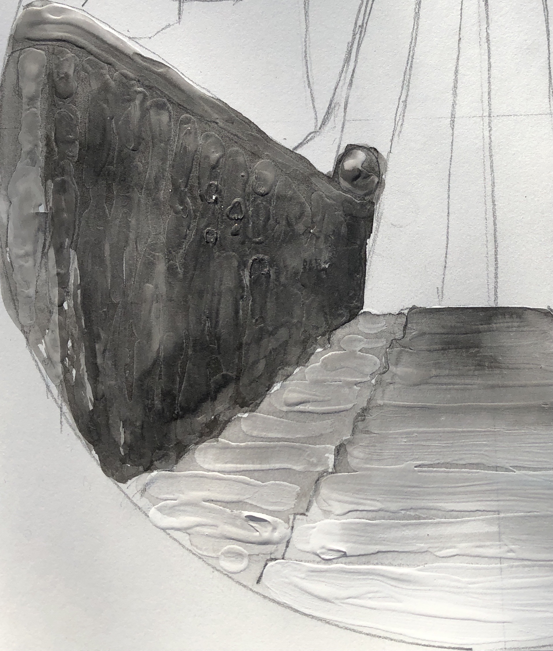
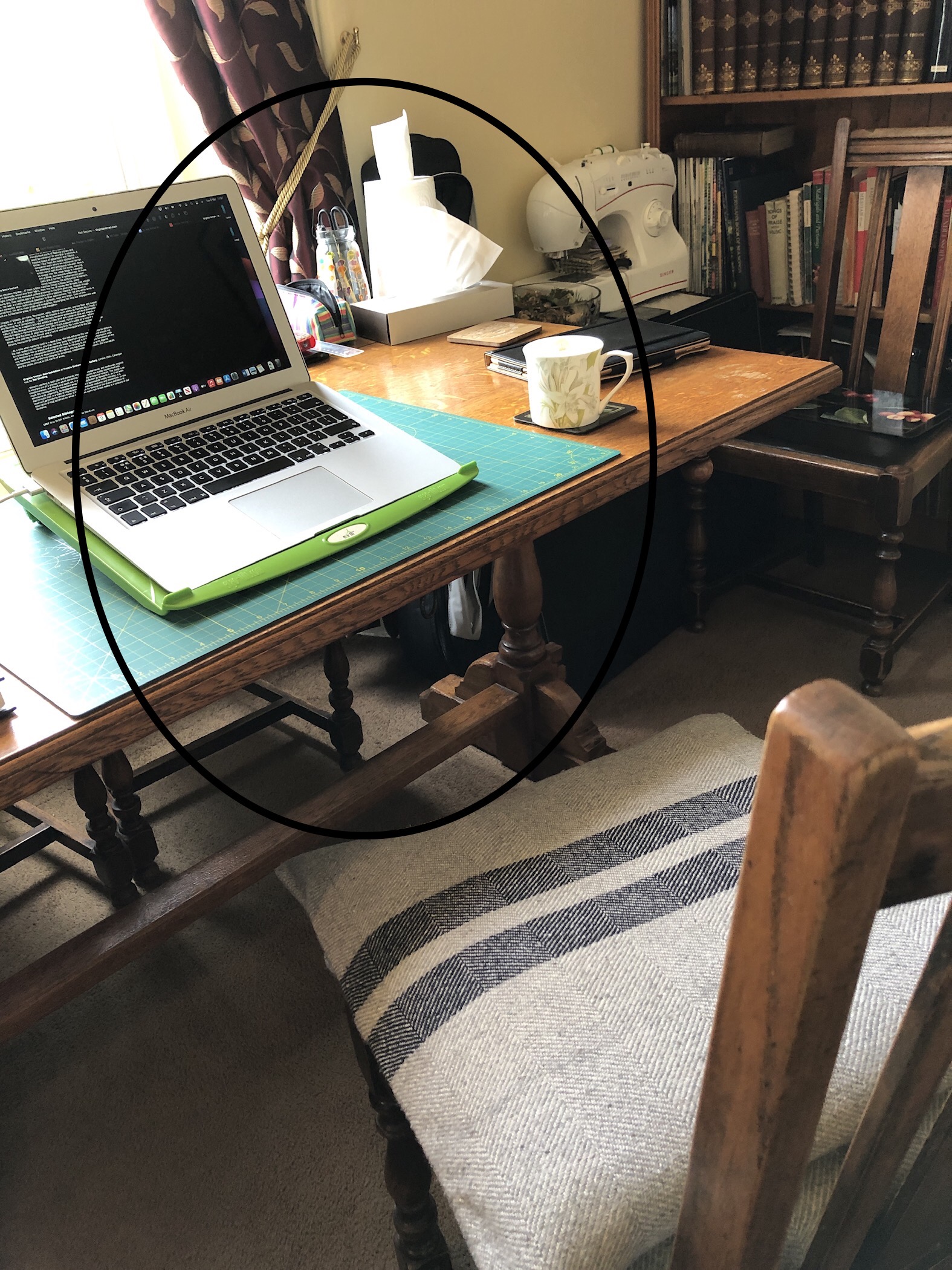
- My immediate situation (learning to live with and care for someone with a severe disability) is making embarking on a painting seem a bit epic at the moment; Fiona and Anna have reminded me that not everything needs to be a finished work – I can play around with things like colour cards, and jotting notes and colour patches in a sketchbook. I have rather lost sight of a working sketchbook; I have many around the house which I grab for Zooms etc, but it’s all random, whereas in Drawing 1 I really benefited from having a sketchbook that I worked through sequentially and could immediately lay my hand on what I wanted. So…..colour cards and an ongoing sketchbook.