WHAT?
I had wanted to look more at Winifred Nicholson’s work after learning about her understanding of colour in the St. Ives School of Painting course with Jill Eisele (see separate blog post). I was able to obtain the book of the exhibition of her work, “Winifred Nicholson – Liberation of Colour”, curated in 2016 by Jovan Nicholson, which was published by Philip Wilson Publishers, London. There I found the painting “Easter Monday”, c. 1950, oil on panel, Tullie House Museum and Art Gallery Trust, which I believe might have given Jill Eisele inspiration for the daffodil painting exercise we did.
I chose to look also in this blog post at Jacqueline Utley, to whom we were referred by the course materials for her jewel-like flower paintings, amongst others; I found information about her on her website, www.jacquelineutley.com
The two seemed to go together, not just because they painted flowers, but for their love of colour.
SO WHAT?
I began with Winifred Nicholson, who spent her working life studying colour and light. In “Liberation of Colour”, Jovan Nicholson says “The first thing I look for in a picture by Winifred is the colour she calls magenta pink, for this is almost invariably the key to the painting” – and he’s right, it’s almost invariably there, as Winifred thought of magenta violet as the colour on the spectrum as dark gives way to light.
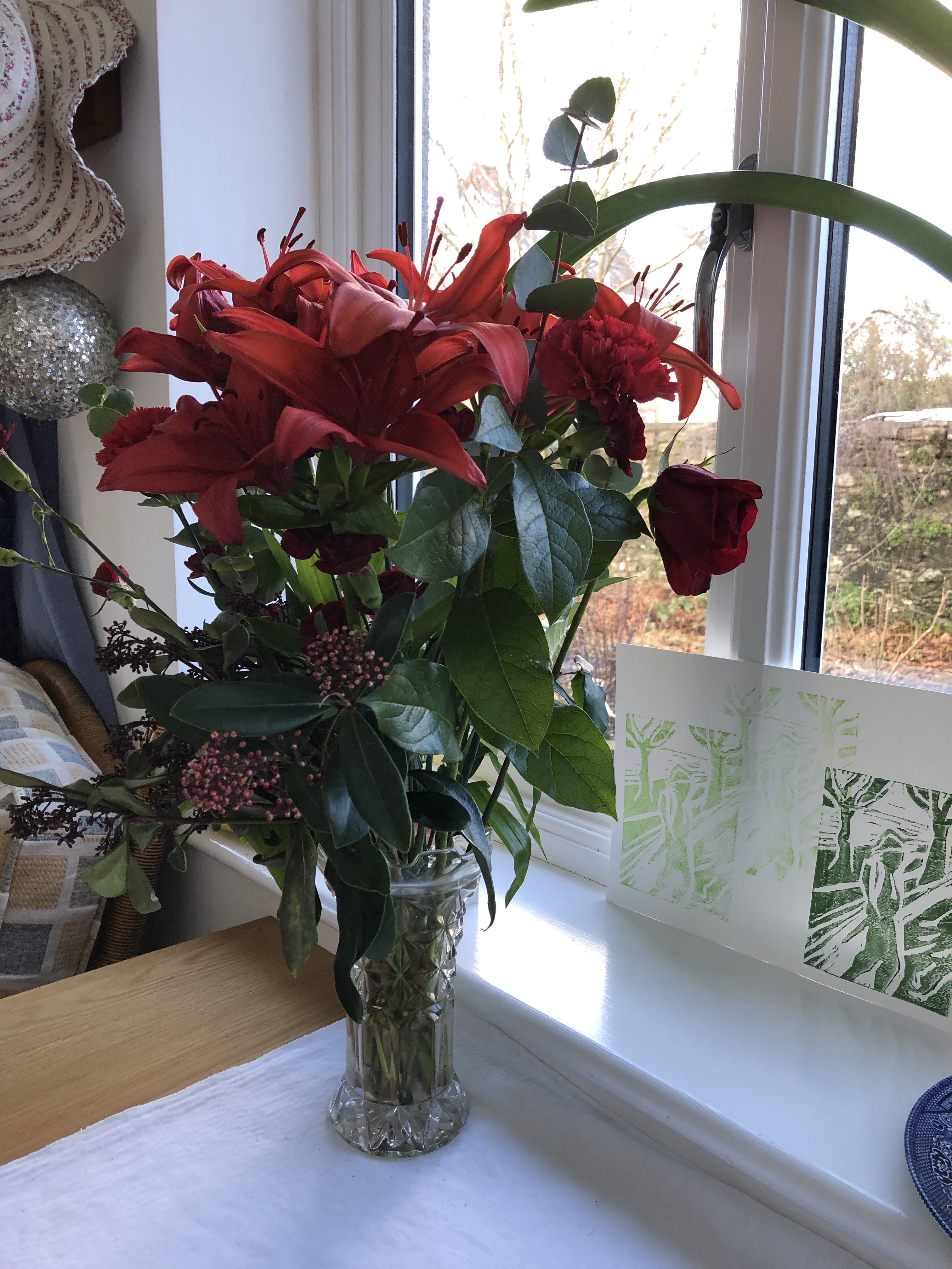
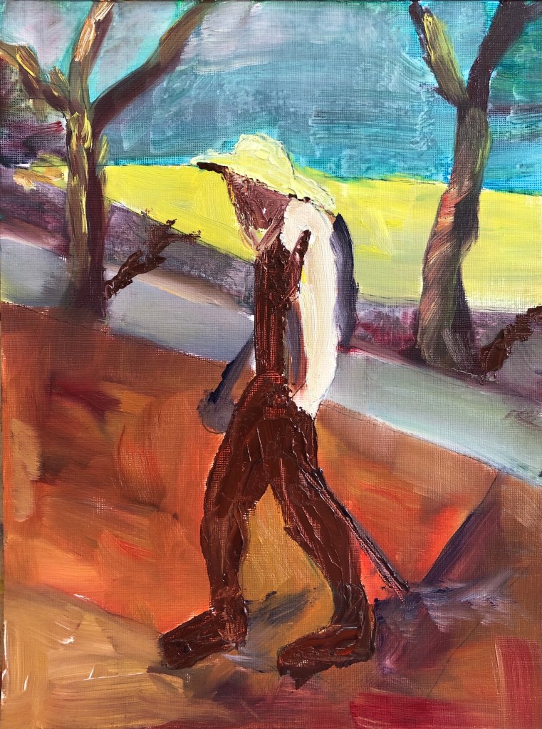
I’d been given some flowers which were just beginning to go over, so decided to capture them for posterity sitting on a windowsill, in a similar setting as that shown in Winifred’s painting:
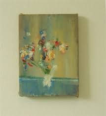
“Amaryllis”
1967
Oil on canvas
Abbot Hall Art Gallery, Lakeland Arts Trust
You have to hunt for the magenta pink, but it’s there, around the top of the vase and the edges of the shutter.
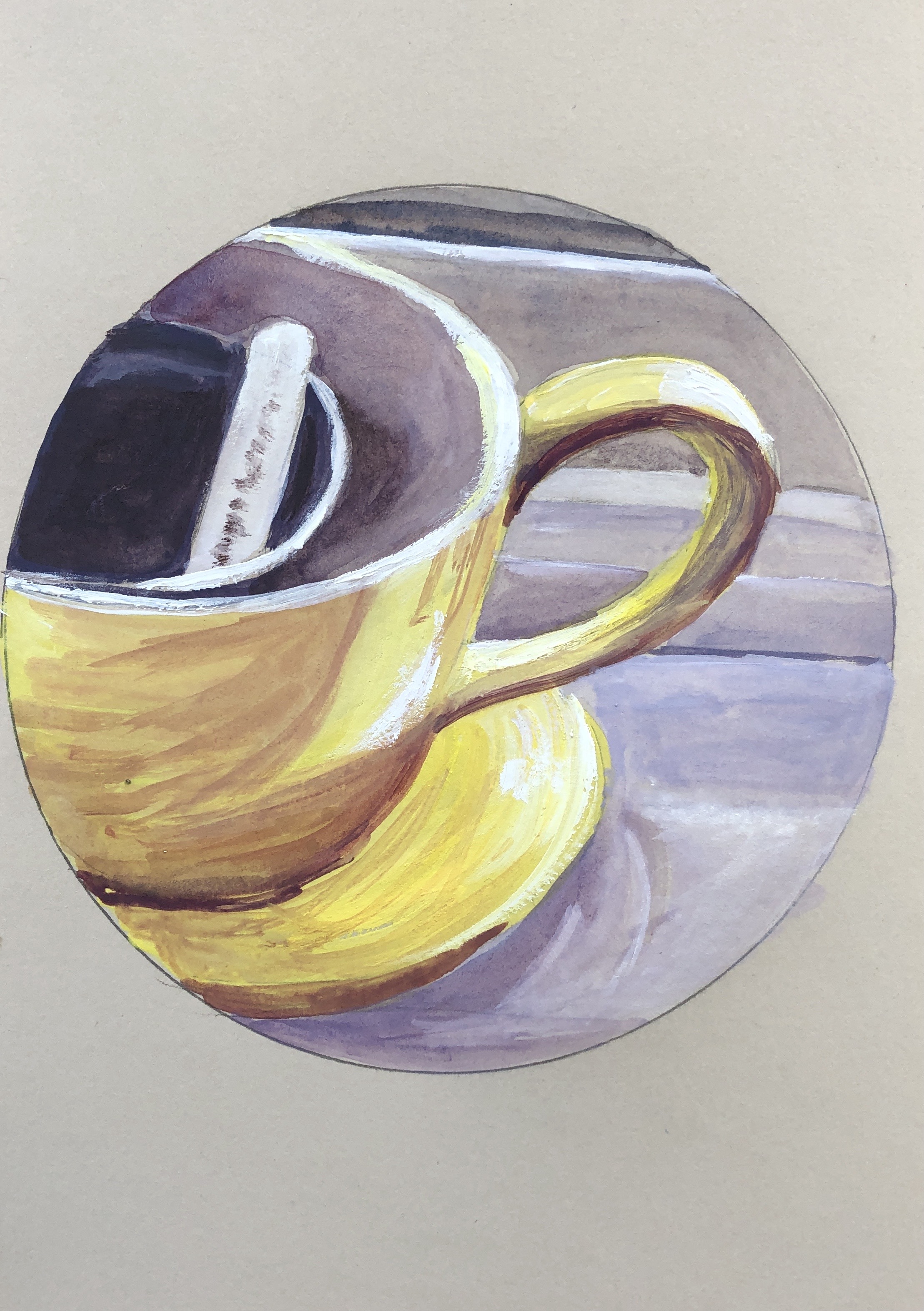
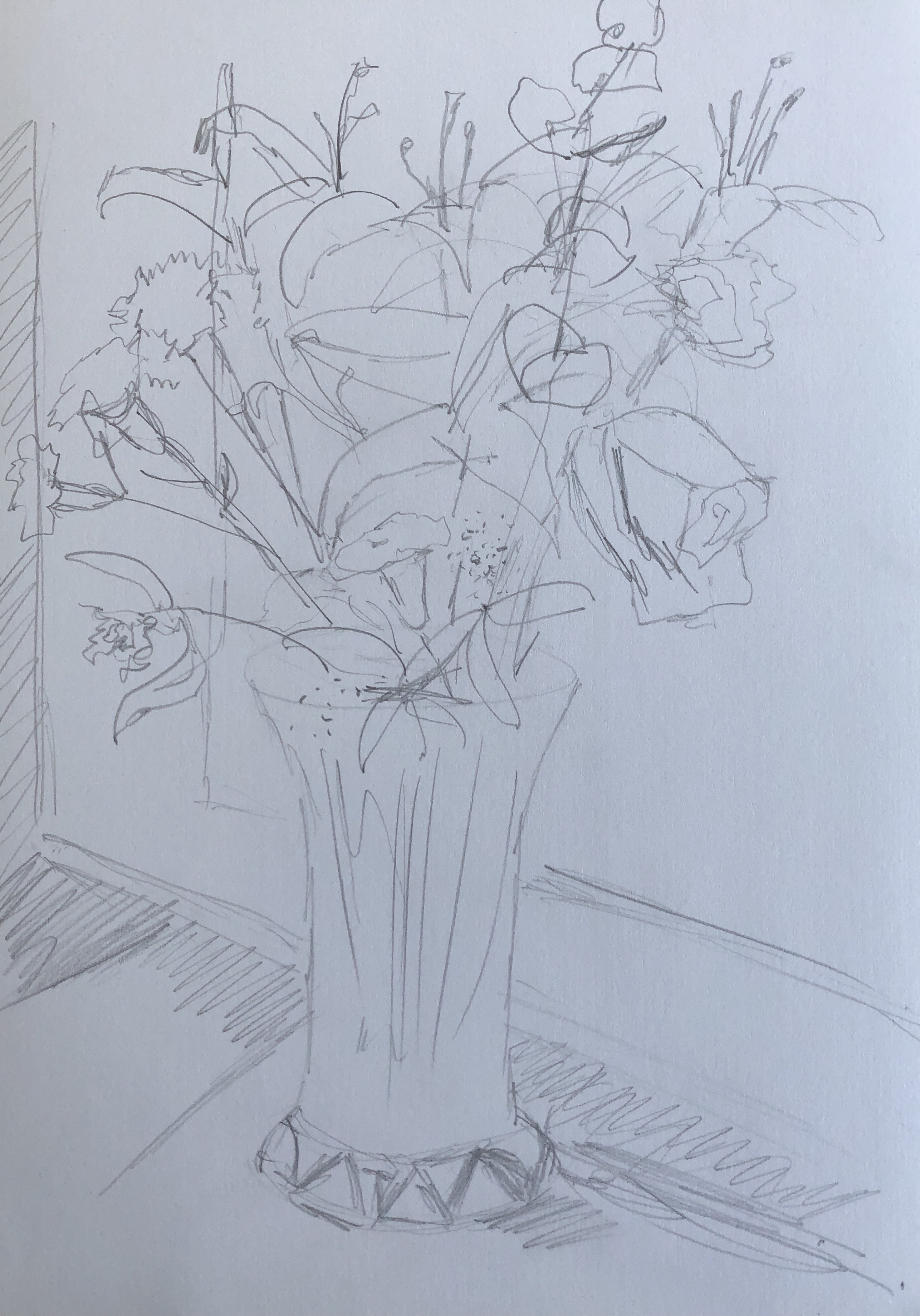
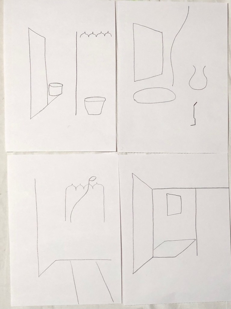
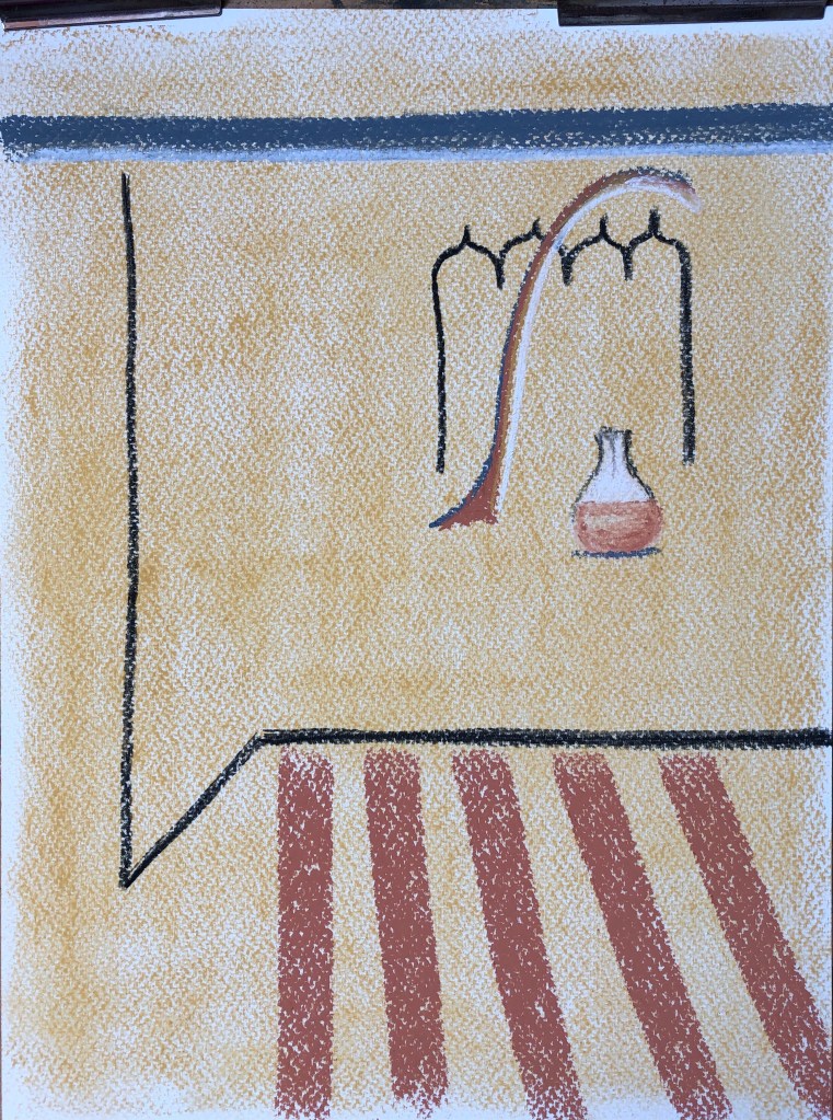
I did a quick sketch of the setup, trying to think as I did of what colours I would use where, as suggested by Jill Eisele. In her course we had looked at the pairs of complementary colours orange/blue and yellow/violet, so I wanted here to focus on the combination of red and green, whilst getting some of that yellow/violet combination (which I really enjoyed in the daffodil painting) into the background and sill. Here are the flowers in their original state, with my rough sketch:
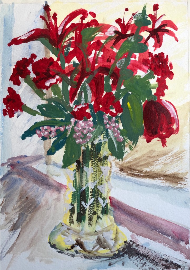
I worked on A4 NOT watercolour paper in egg tempera. I tried not to fuss about each leaf and petal, working quickly to catch the essence of each type of flower, as Winfred does. I also tried to indicate very roughly in white the design of the cut glass of the vase, as Winifred did in “Amaryllis”, above. Finally, I was determined to get my magenta pink in – a dash along the sill, and also centre stage with the little bobbly flowers (of whose name I am sadly ignorant), which I think pick out the yellow in the vase.
I have to say I’ve never gone in for drawing or painting flowers, knowing full well that I would get hopelessly bogged down in details right from the off…..but this way of painting them is great fun and allows me to focus on the colour and shape. Winifed said “My paint brush always gives a tremor of pleasure when I let it paint a flower.”
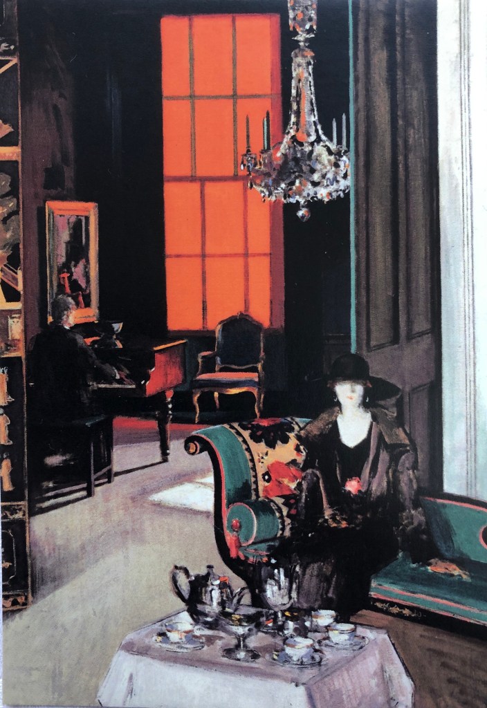
And so to Jacqueline Utley. Her website shows her recent paintings, many of which are of colourful interiors, large rooms containing small, slim people. I particularly enjoyed her paintings of flowers which are, indeed, jewel-like. For example:
“The bird flower vase”
2011
Oil on linen
18 x 13cm
The painting has a simple background – a vase on a table/shelf against a plain wall – but closer inspection shows that the background is painted in streaks of colour, many of which are then picked up, but more strongly, in the flowers, with those real pops of bright red to bring the whole thing to life. She does this with many of her paintings – rainbow chalky colours suddenly brought to life with just a touch or streak of brilliant red somewhere.
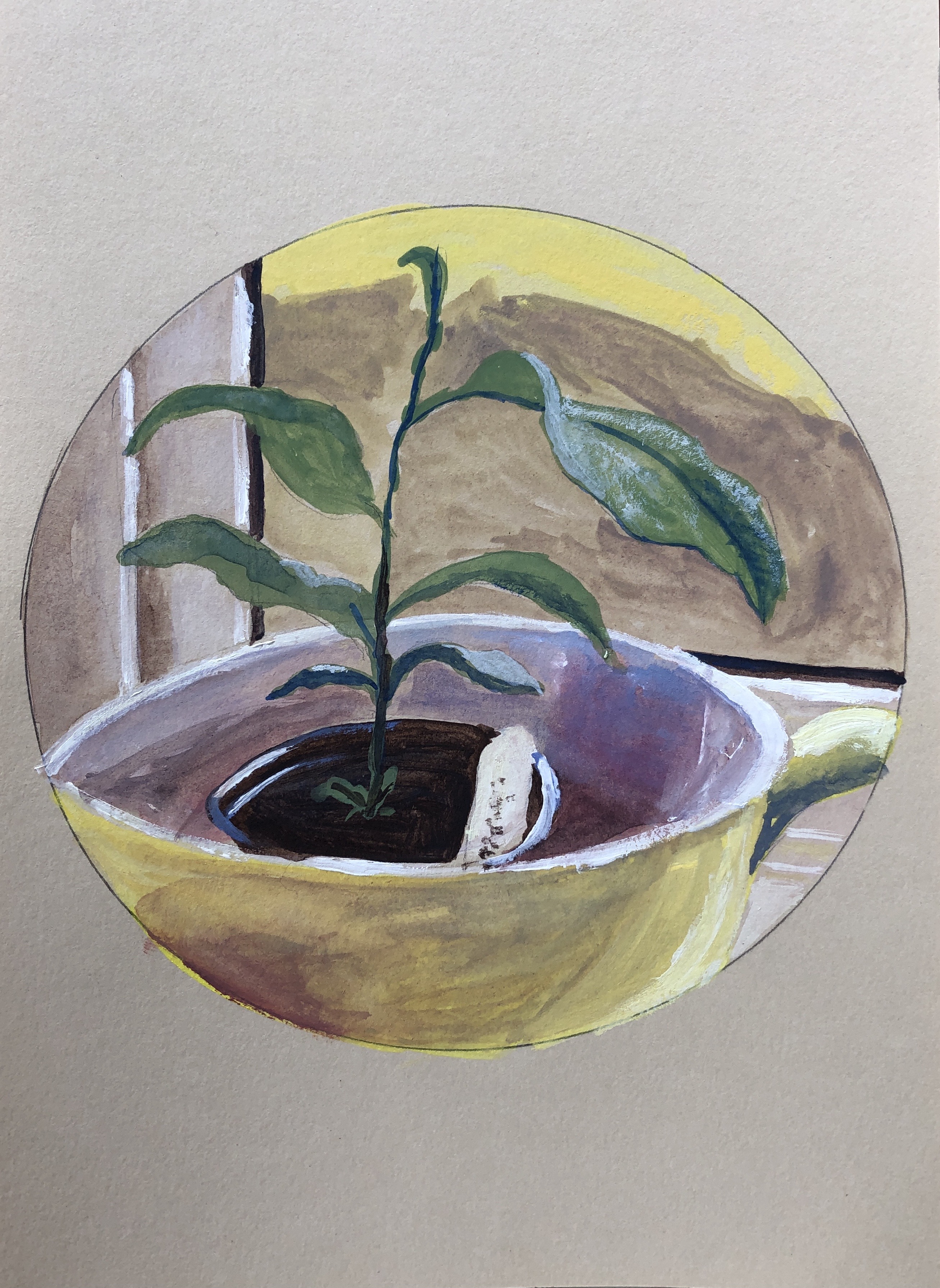
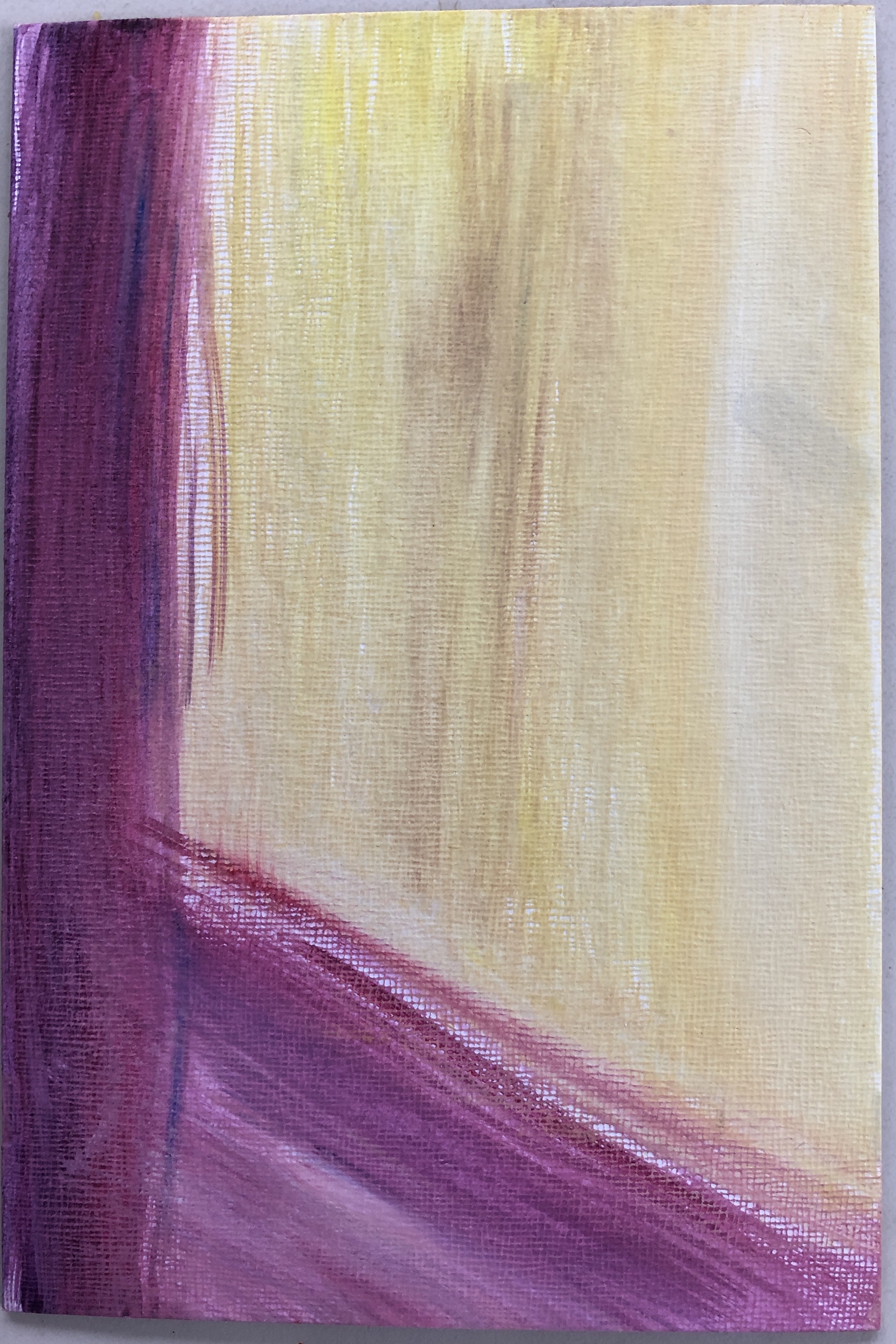
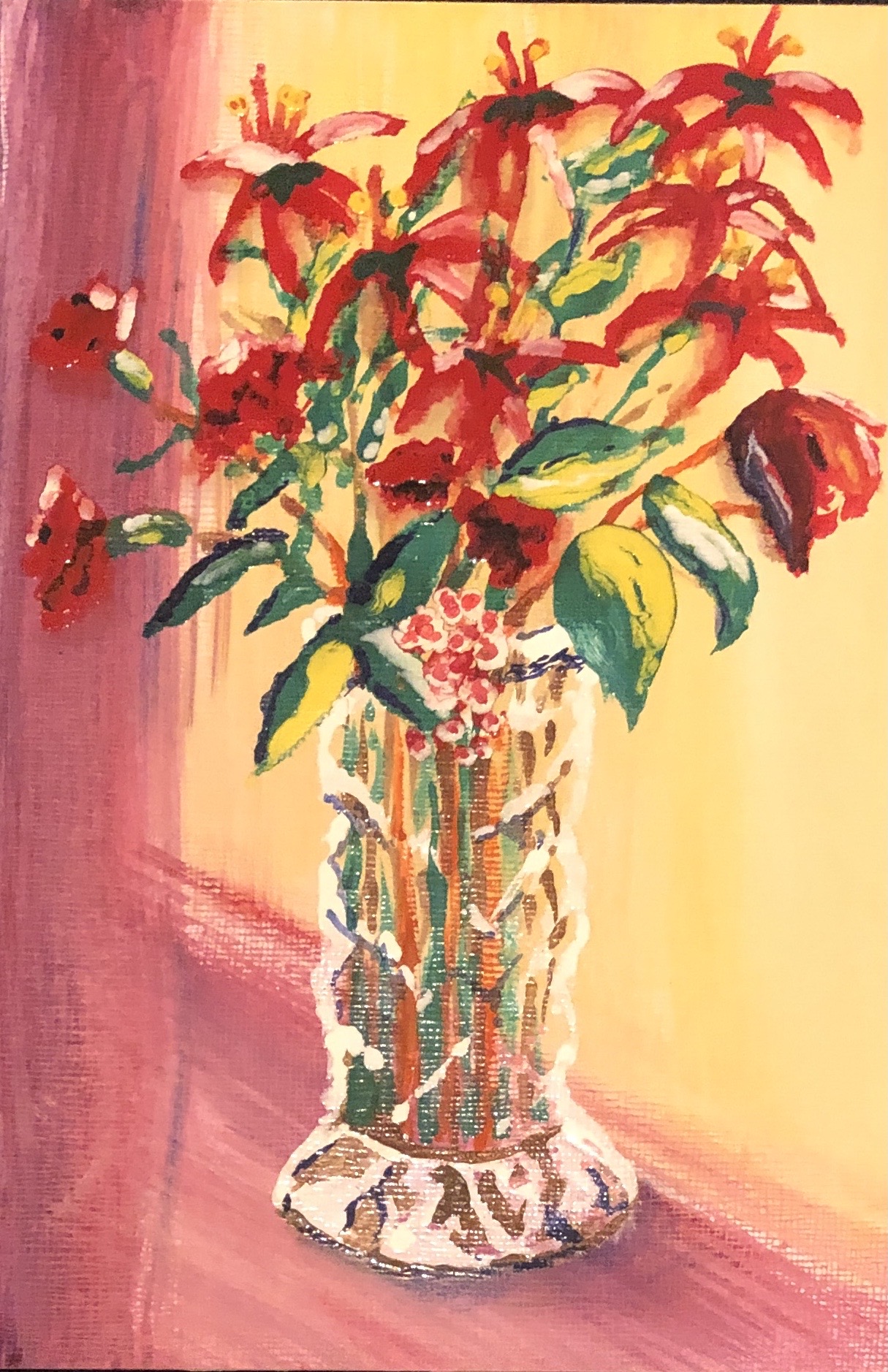
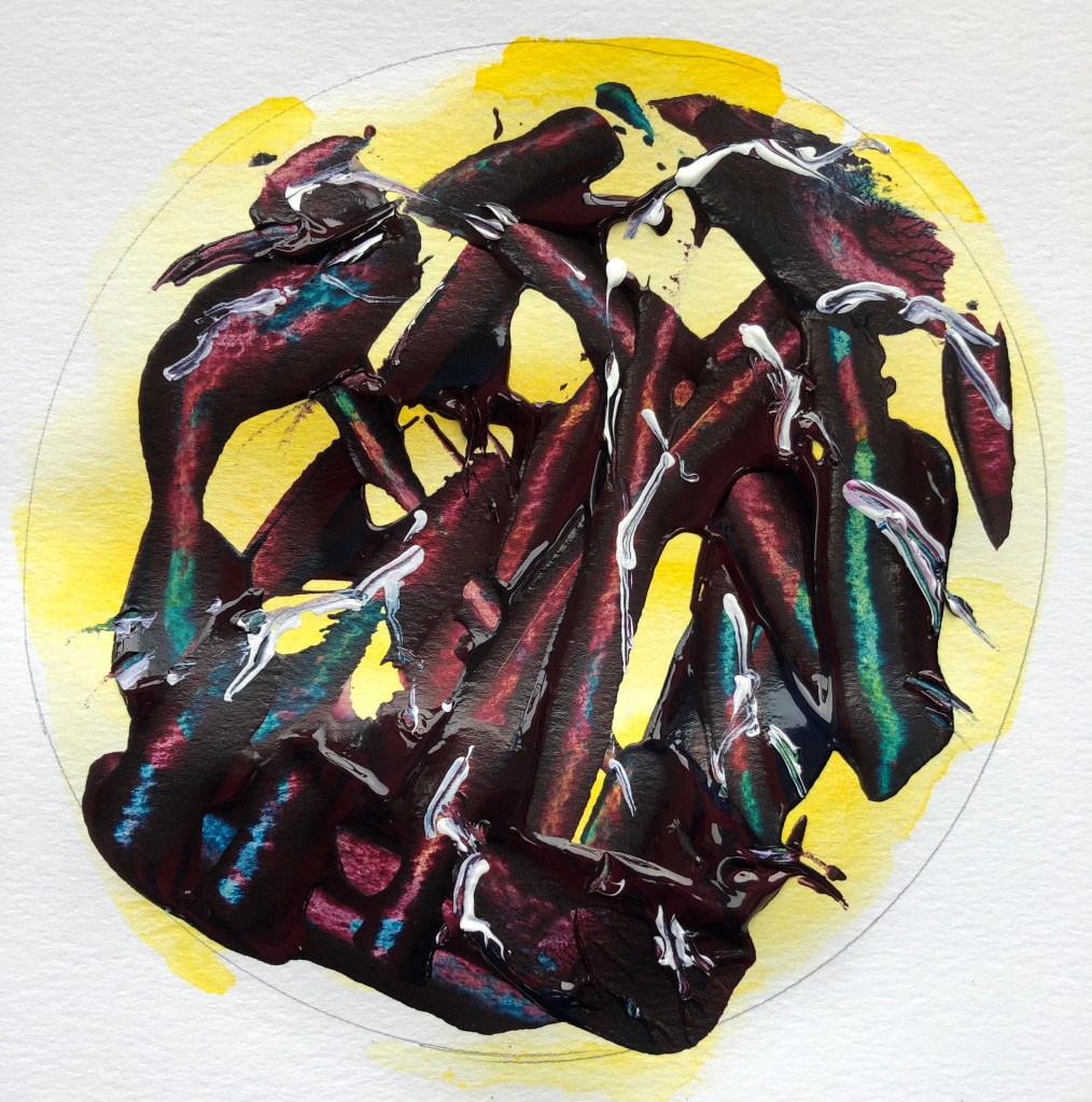
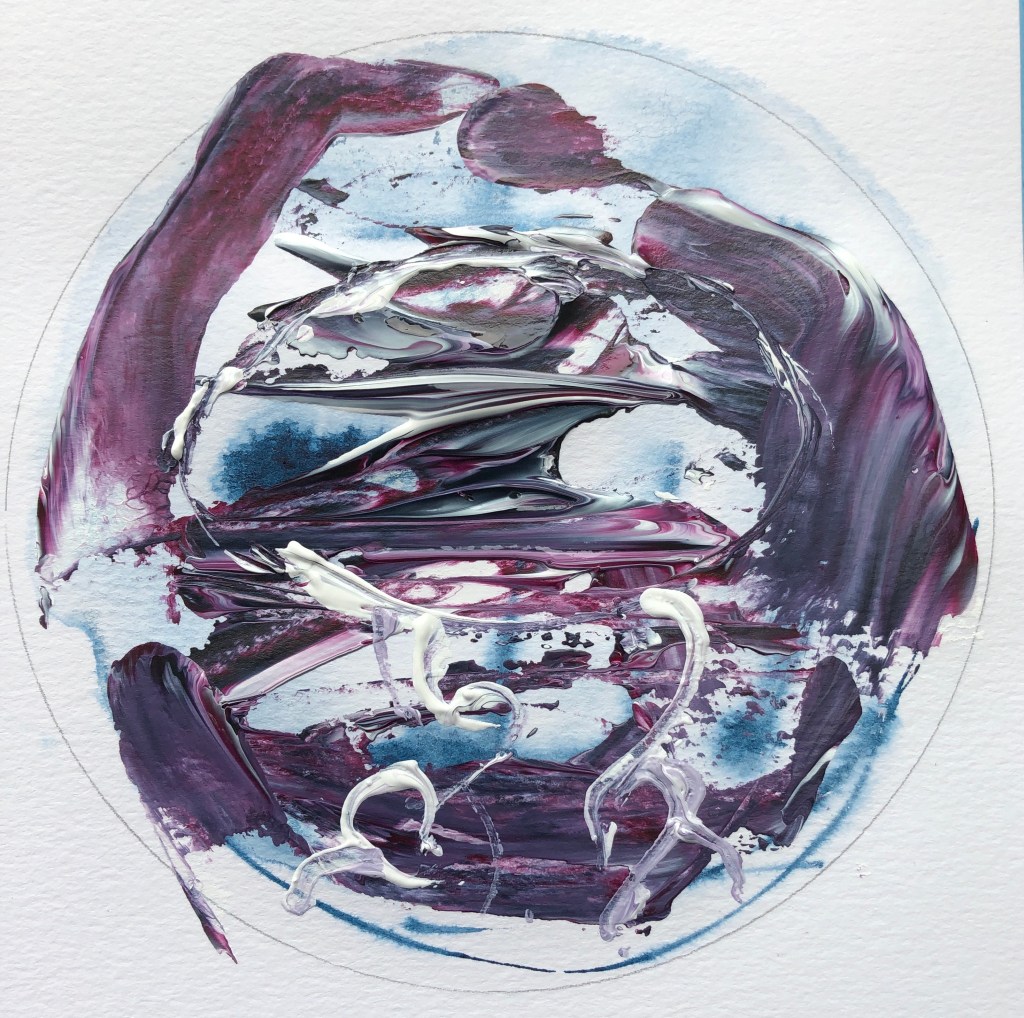
I wanted to try working on board with an egg tempera background, then adding the flowers and vase in enamel paint. Jacqueline’s painting is indeed small at 18 x 13cm, and the nearest I had was 22.5 x 15cm. Jill Eisele had suggested that, if you’ve really concentrated on thinking about colours whilst doing your preparatory sketch, you should be able to paint from memory; I wasn’t brave enough to try that the first time, above, but, having now done one version of the painting, I had a go at painting from memory here. Here is my egg tempera streaky background…….
…..and here is the painting completed with the enamel image:
Interesting to see the apparent difference between the colouration of the background in the two photos! – I think I took the first in bright sunlight, the second in interior light.
Well, not much like Jacqueline Utley…….but I have tried to use her way of picking up the background streaks where I could in a picture dominated by red and green.
NOW WHAT?
I have learned:
- The difference between “painting in the style of…X”, and looking carefully at key features of an artist’s style (here I have focused on colour) then trying one of those features out in your own paintings
- Painting flowers can be fun
- I have been a bit slap-happy with colour up to now, but am beginning to see glimpses of how it can work for me
Enamel seems so rich and shiny, it draws me in as a painter – but the egg tempera allows for a depth of colour which I want to learn more about.