Painting 1 (UPM); Part 3; Marbling!

WHAT?

For Christmas I was given a marbling kit by my publisher daughter. It is a serious kit and needed the study of the entire instruction manual and several YouTube videos, followed by a preparation day constructing the brushes, making the size and coating the paper with alum as a mordant before I could even start in with some paint!

I’m recording it here because the instructor describes each outcome as “a unique contact print” – sounds very like a monoprint to me.

SO WHAT?

The paint supplied was acrylic-based, and I started by working through the instructions to find out the types of outcomes possible – there are several classic named designs. Here are a few basic ones:

I went on to try more classic designs and also played about experimenting with some free marks, swirls and squiggles. The designs always look so faint on the surface of the size as very little paint is needed, and it’s always a moment of wonder to peel back the paper and see what’s revealed!

NOW WHAT?

  • Need to generate a bit more of that sense of excitement in peeling back the paper with my oil monotypes – so far have been a bit underwhelmed with my outcomes
  • Am going to try to use some of my free, less bright and busy marbling outcomes to print my oil monotypes onto so they form backgrounds – a monoprint on a monoprint, as it were

Painting 1 (UPM); Part 3; Exercise 2

WHAT?

Using a selection of the ink drawings made in Exercise 1, oil paint with Zest-It solvent and a glass plate, I had a go at making some monoprint portraits. I had already had a go at making a few monoprints as part of the workshops led by Hayley Lock (see separate blog post), although these were slightly abstract plant designs. 

SO WHAT?

I began printing onto cartridge paper and experimenting with different brushes, marks and thicknesses of paint. The first few were of the same image, before I moved on to another.

All the backgrounds were white, differences here being because of my working in a dark studio lit only by a skylight and a daylight lamp. I found I liked a combination of the size 2 soft filbert with a rigger best.

As part of my research I found a very useful article on the Jackson’s blog: “PAUL WRIGHT ON MONOTYPES”:

18th February 2016 by Lisa Takahashi 

I really liked the energy of his pieces, for example:

Paul Wright: ‘Dealbreaker’ (3rd version) Monotype 40cm x 30cm 2015

and…..

Paul Wright: ‘Colour blind’ Monotype 40cm x 30cm 2015

His style of strong gestural marks is I think the way my work might want to go; he comments in the blog “Monotypes allow me to work fluidly and quickly, which very much suits my temperament”, which strikes a chord with me.

Having looked at this work I continued working on some of my other Ex. 1 drawings, experimenting with HP watercolour paper and continuing to play with paint thickness.

NOW WHAT?

I can’t say that I’ve worked my way to 5 images I am satisfied with, as I don’t feel satisfied with any of them; but I wanted to move on to working into the images so am going on to Exercise 3.

So far I’ve learned that:

  • Thinner paint shows up the brushstrokes well but too thin makes the image vague and unclear
  • Thick paint goes blobby, which can have a place, but generally looks like a mistake
  • Tone is going to be really key to using this process effectively – I have to get better at seeing a face as areas of tone rather than eyes, nose etc……

Painting 1 (UPM); Part 3; Exercise 1

WHAT?

The brief was to paint 20 self-portraits, using ink, not more than 1 minute per painting.

SO WHAT?

I worked in Indian ink using a long-handled soft round brush (size 4), fitting two paintings onto a sheet of cartridge paper (so each being A5 – roughly the size of my glass plate for monoprinting). In the first two paintings the timer didn’t work so they are slightly over a minute; after that I stayed strictly to time. I varied the lighting (both level and direction), the position of the mirror, my facial expressions, and the painting hand, and therefore accuracy (depending on which hand was holding the mirror).

I found the exercise very challenging and tied myself in knots rather – by the time I’d got in position, set the timer, looked, got my brush loaded and made a mark I was already halfway through my time! I ended up trying to pick out one or two features, mainly the darkest ones, and tried to get those down.

NOW WHAT?

To be honest, my main takeaway from this exercise would be to organise myself better physically for a process so time-dependent and containing so many elements which needed to be in the right place to work effectively and never were – there was just too much arm-crossing, reaching, panicking, losing my place, and the long handled brush was a serious mistake, it was in the way of everything.

Painting 1 (UPM); Part 3; Zoom workshops with Hayley Lock – “The Garden of Earthly Delights”, Nov & Dec 2020

WHAT?

OCA tutor Hayley Lock led two Zoom workshops, a fortnight apart, focused on the triptych “ The Garden of Earthly Delights” by Hieronymus Bosch. In the first session we looked at the painting in some detail, and were also pointed towards other artists whose work featured gardens/plants/animals/the figure, looking in particular at aspects such as scale, colour, patterns and repeats.

We were placed in smaller groups and invited to work on a response to the presentation together for a while, and then continue with this in the gap between the sessions, communicating by Padlet.

SO WHAT?

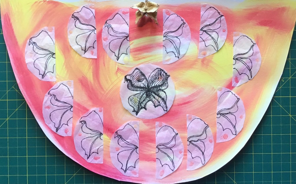
My initial “unthought-through” response in the group session using the shapes we had cut out within the session was to create a repeating pattern based on semi-circles.

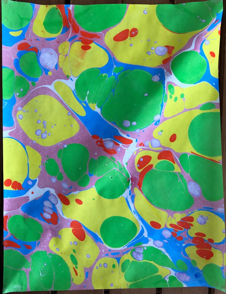
I wasn’t overwhelmed with that – the background was all wrong apart from anything – but I was inspired by the session. I went away to look at Ernst Haeckel’s 1904 book (my copy being a 2019 reprint by Prestel Verlaine of Munich, New York and London) “Art Forms in Nature”, who was one of the artists whose work had been recommended to us, and is a favourite of mine.
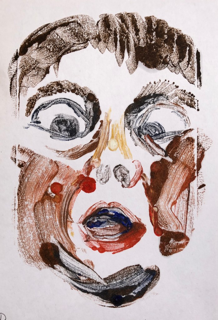
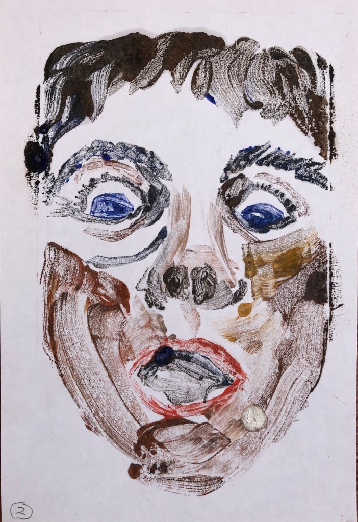
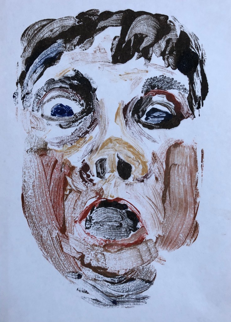
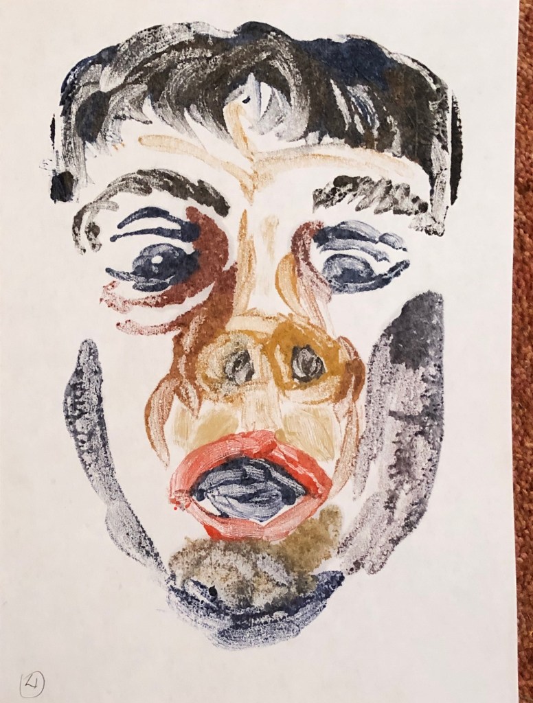
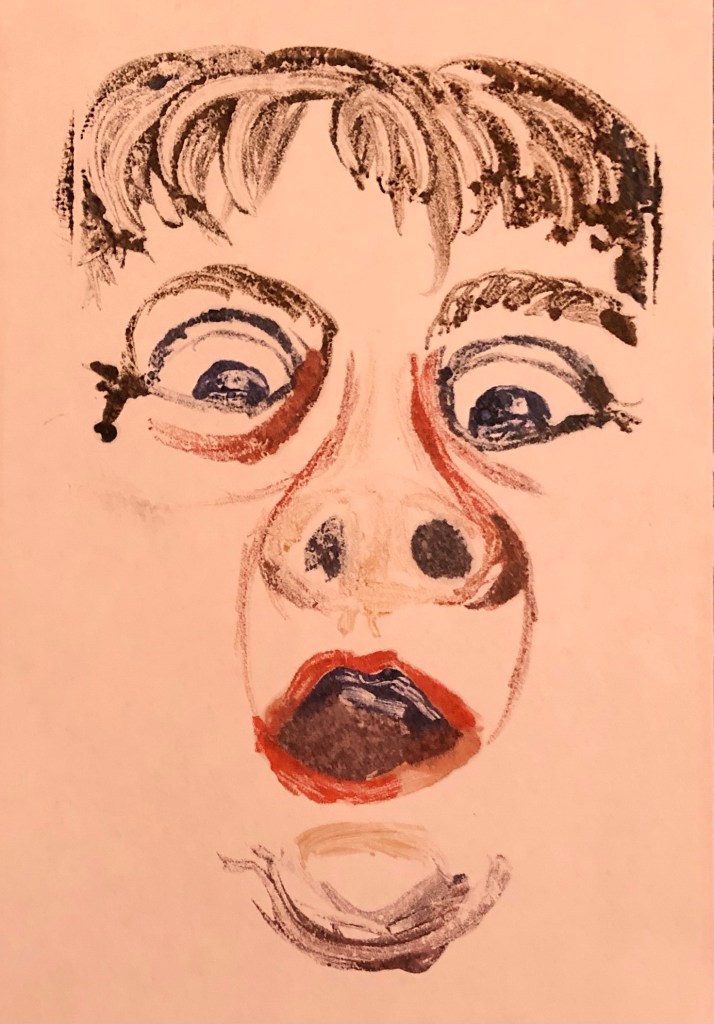
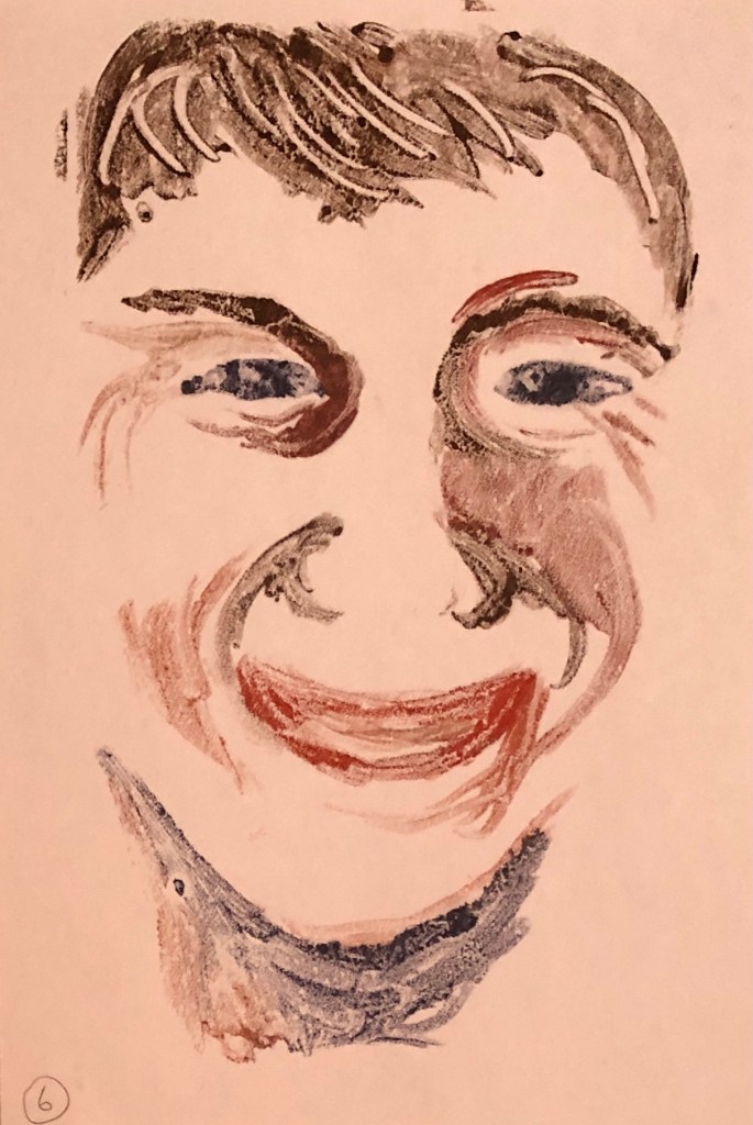
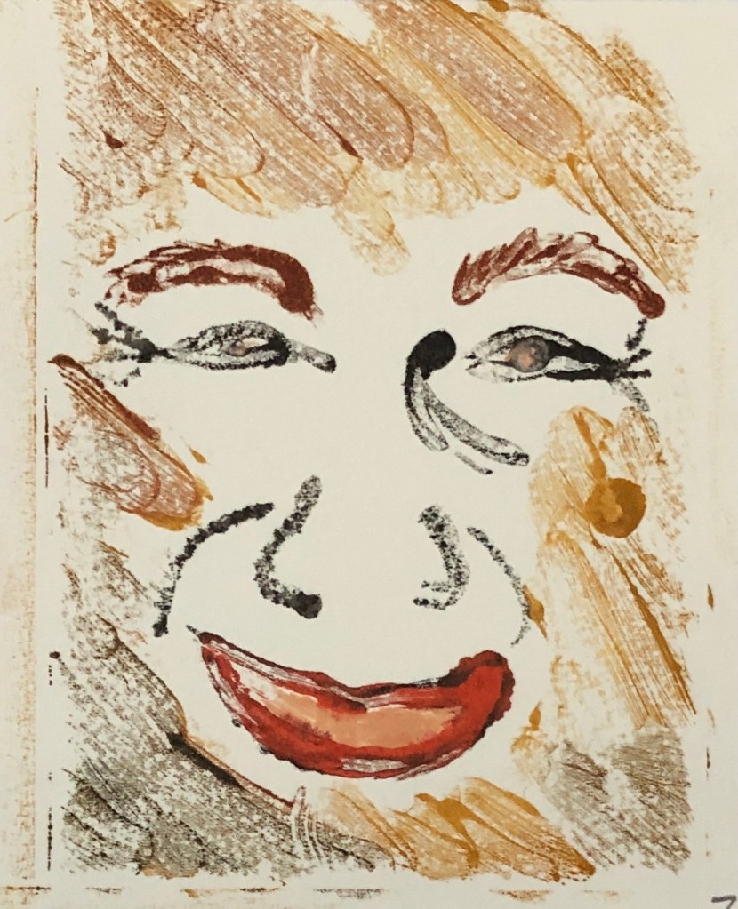
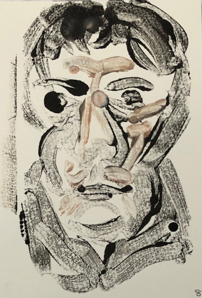
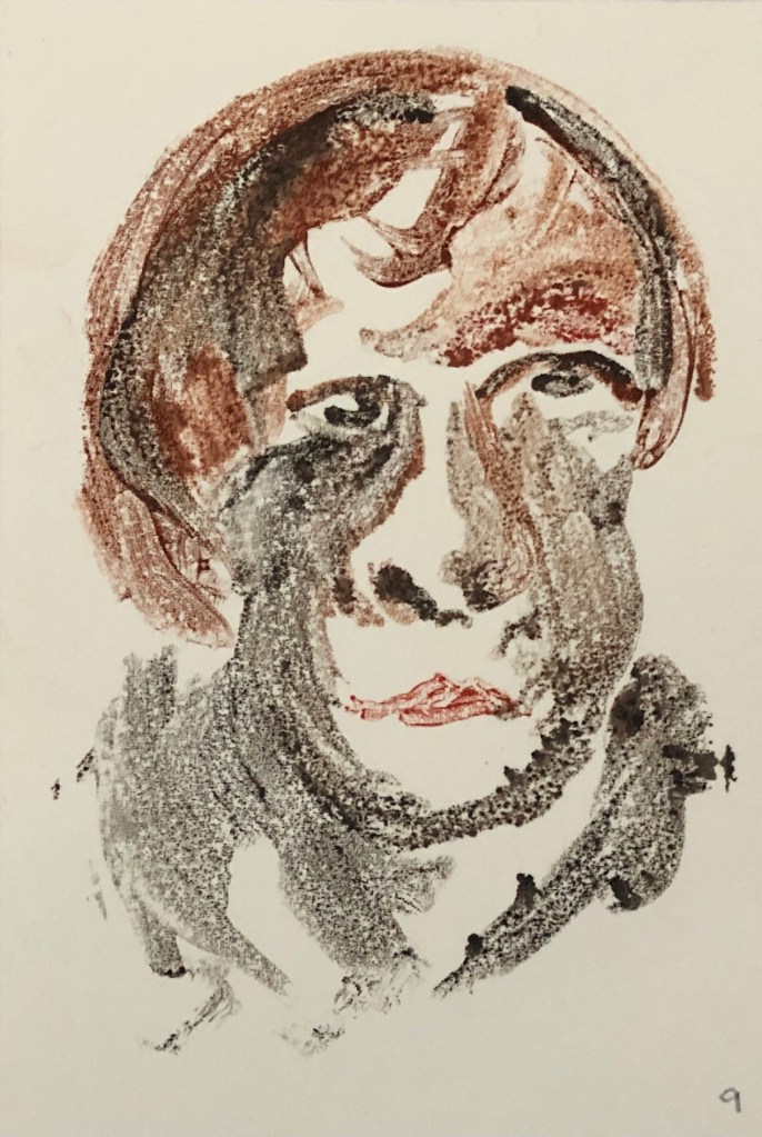
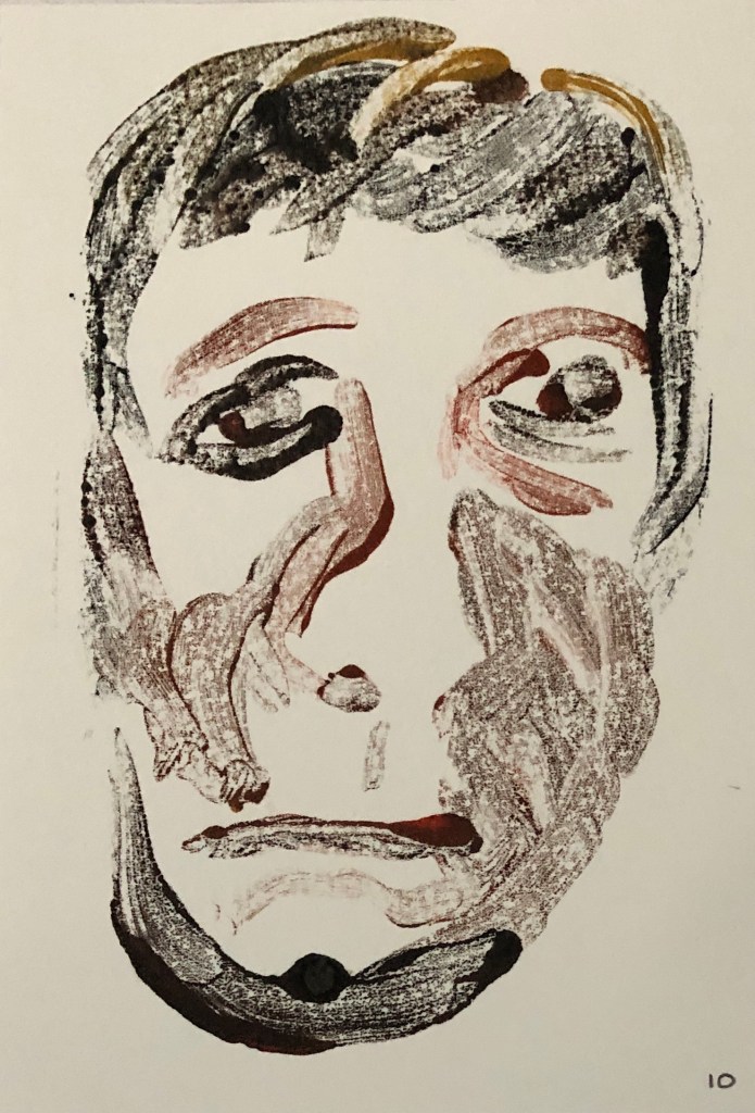
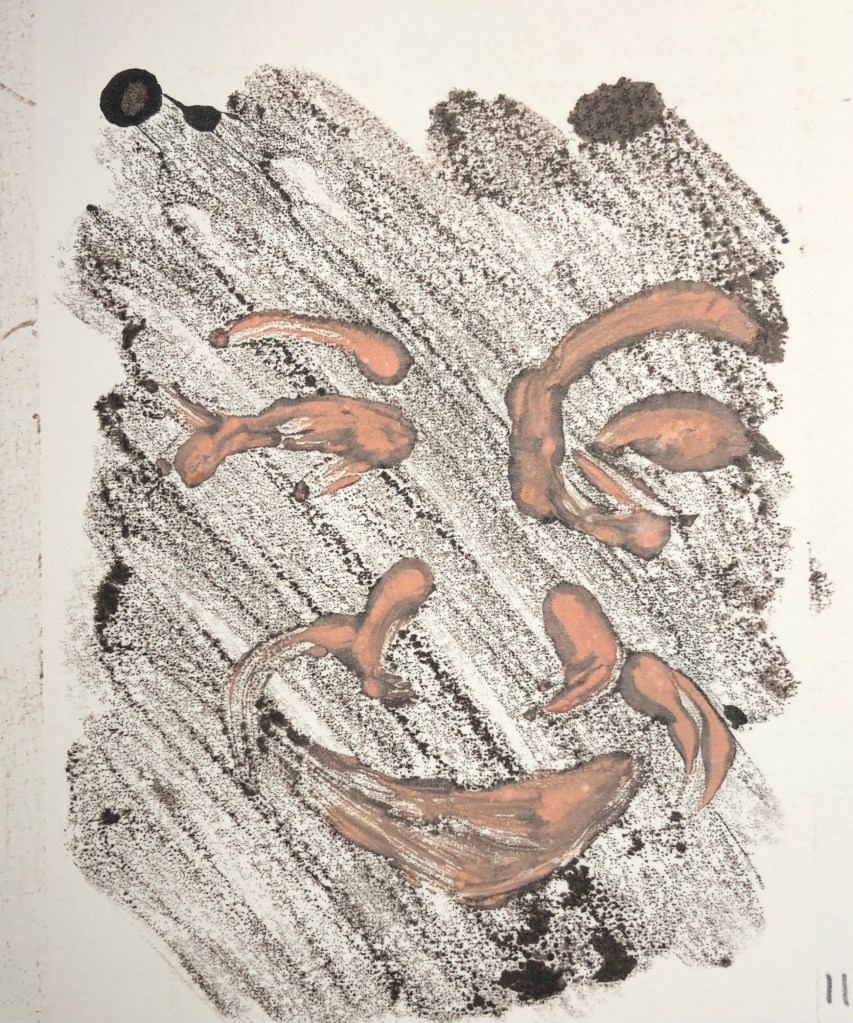
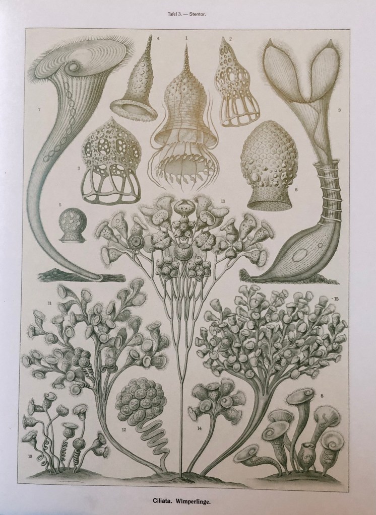
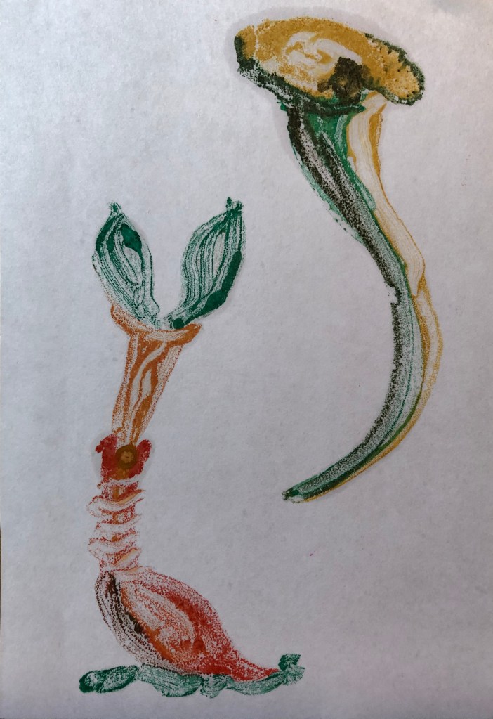
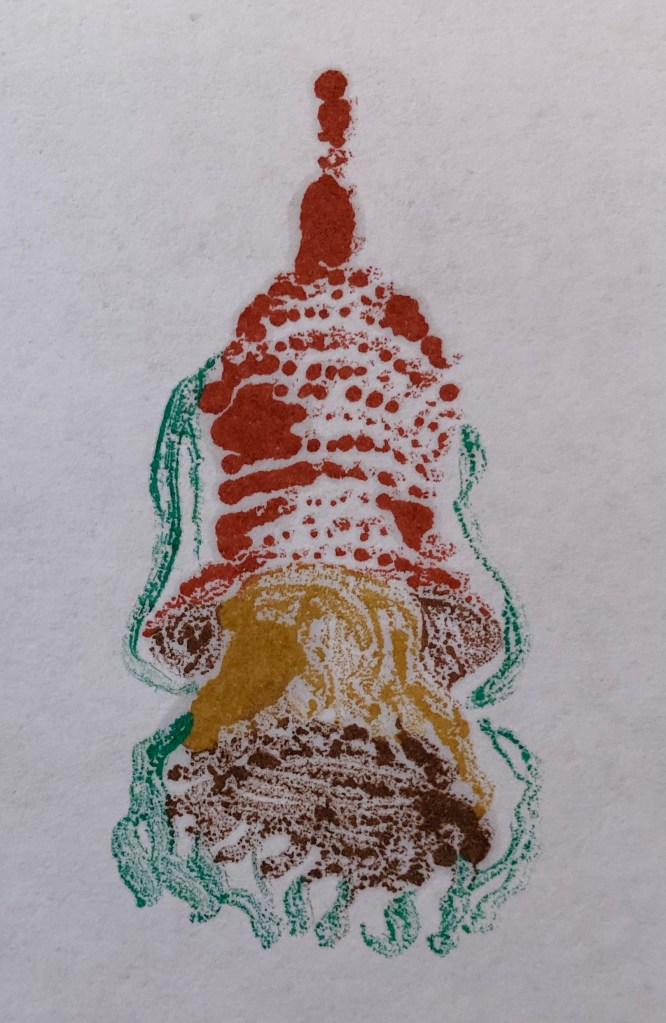
As I am just figuring out the process of monotype, I decided to have a go at some Bosch-like images to make prints of, inspired by the images on one particular page:

This was fun – didn’t really know what I was doing, used oil paint on glass with Zest-It solvent onto thin cartridge paper, trying different thicknesses of brush and varying marks. The process really does transfer the brushstrokes much better than I thought it would, and my attempts to add tone in the third image by having unbroken marks on one side and dotted marks on the other are at least a partial success – to be remembered……

I also thought the colour/pattern design aspect would lend itself to enamels, which I particularly enjoyed using in Part 2. I used Raqib Shaw’s method again of drawing some triangular diatoms (single celled organisms) from Haeckel, tracing them onto a small gessoed board which I had prepared with a matt black egg tempera ground, and drew over the tracing with gold acrylic liner. Once this was dry I filled in the diatoms with coloured enamels – I had no colour reference to work from, so just wanted the overall effect to be patterned, striking and shiny against the plain matt background. 

In the second session, the student groups took it in turns to show and talk about what we had done so far – my takeaway from this was the huge divergence in the artwork which resulted from a shared input.

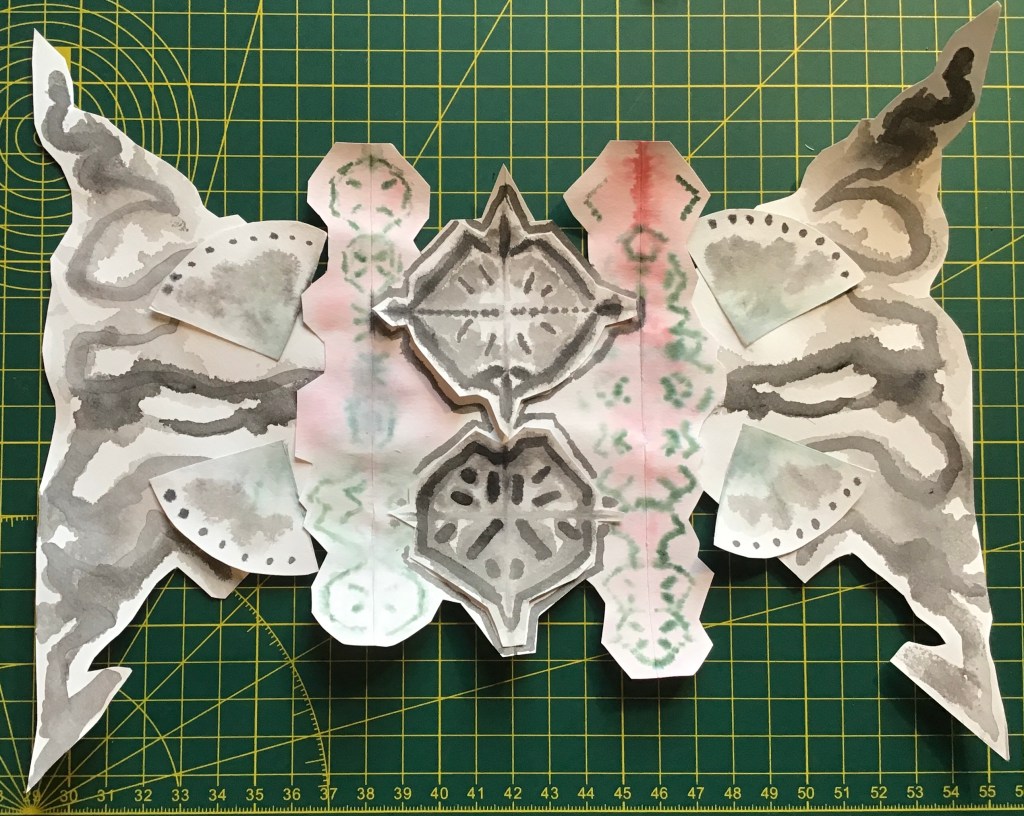
We then worked in the styles of Bruce Connor and Alexander Tovborg to create a potentially never-ending drawing based on gridded, folded squares and circles using the inkblot technique, cutting, joining, working into,  overlaying…..all based on careful observation of one natural thing and mark-making accordingly. Again, everyone’s was very different; I used two water-soluble felt pens, a lot of water  and, when these gave out, dilute black ink. Not sure what it was or where I was going with it, but it was fun.

As part of my background work on this topic, I had looked at www.botanicalmind.online and had been interested in the work of Philip Taaffe – see e.g.: (can’t seem to insert image, sorry)

Philip Taaffe, Lalibela Kabinett, 2008. © Philip Taaffe; Courtesy of the artist and Luhring Augustine, New York.

I suppose I envisaged the work I had produced as a result of these workshops to fit into a project a bit like this of Taaffe’s.

NOW WHAT?

A fanciful and a pragmatic takeaway:

  • Fanciful – I would have time to pursue and develop this investigation into natural forms and produce something in the style of Taaffe’s work – although making it my own
  • Pragmatic – To give myself permission to cut loose and play with form, design and pattern a little “just for fun”, even though it might not lead to anything finished.

Painting 1 (UPM); Part 3; Life drawing workshop on “Movement” with 2b or not 2B Collective, 9.12.20

WHAT?

This 2-hour life-drawing session was arranged through the OCA, the model being a dancer from Argentina. She was excellent, produced a huge variety of poses with little prompting, and was good at holding them. We had several 1-minute poses, then 2-minute poses, then some moving poses of varying lengths, finally landing up with two 15 min static poses.

SO WHAT?

The pace of the workshop was fast; I had chosen an HB drawing pencil to start with and stuck with it throughout, working in an A3 cartridge paper sketchbook. I filled many pages, but a selection are shown here:

I was very aware of my tutor’s comments about my life drawing being tentative, so I tried to make more definite marks and to do quite a bit of drawing without looking at the page much. The pace was challenging and I found the moving poses unusual but soon learned to look for a line or a curve that interested me rather than even attempting to capture the whole figure. I was glad I had done the earlier St. Ives workshop on Jenny Saville, as this made me quite OK with piling drawings one on top of the other.

NOW WHAT?

My takeaway from this: 

  • Look at the figure more 
  • Pick out lines/curves/gestures I like
  • Focus on depicting them definitely

Painting 1 (UPM); Part 2 – Reflections on tutor feedback

WHAT?

My tutor fed back to me in a very helpful discussion via Zoom on 30th November 2020, and also sent me a summary of the points by email.

SO WHAT?

Particular key features of the discussion I want to reflect on:

  • My assignment piece and preparatory work: I was glad she liked looking at it, which I guess is high praise to an artist. I too still find myself standing and staring at it – the chalk household paint does give a rather surreal effect which is increased by the black egg tempera background. I found the preparatory tone drawing with charcoal and putty rubber a really useful reference and will try this again in future work.
  • Tips: 
    • Important to give a viewer somewhere to rest in a painting – not something I’d thought about.
    • Beware of the term “loose” – it should imply fluid rather than chaotic marks – I think I can be a bit lazy with the distinction.
  • Figure and portraits:
    • My figure drawing is tentative. This has made me stop and think. I guess it is – I only started doing it because I was required to in Drawing 1, having studiously avoided it before through lack of confidence. Need more practice, clearly.
    • Use reference points in the background to help measure, and get your easel on an eyeline with your view
    • “You paint an awful lot of heads before you get to portraiture” – my job is to treat the head as a visual problem to solve
    • Consider painting in grisaille (greyscale, lightly) before going in with colour, and take the colour out again if it’s wrong

NOW WHAT?

  • Get in as much drawing (especially drawings of people) as I can to build confidence and experience
  • Remember the tonal charcoal drawing, it’s a useful problem solver
  • Work on understanding colour and what effect it has, rather than just grabbing the first tube that comes along

St. Ives School of Painting workshop – focus Edgar Degas – 5.12.20

WHAT?

Two hour session with artist Tom Rickman focusing on drawing in the style of Degas to capture movement and dance poses. Model Kerry was a professional dancer and was excellent in her execution of and knowledge of poses often captured by Degas. It was recommended that we work in willow charcoal with a putty rubber and work on cartridge paper, with a suggestion that we also try brown paper. Tom drew alongside us and we could follow the progress of his drawings in split screen.

SO WHAT?

First session was a group of 5 minute poses to allow us to warm up and get our “eye” in. We were urged to just try and get the main structure in and add little bits of tone.

I tried these on brown packing paper from an Amazon package; however, this was a bit too creased up for me to be accurate, so I decided to move on to cartridge paper for the next exercise.

For the next exercise I used two A2 sheets of off-white cartridge paper. Music was put on and the model was invited to dance, periodically pausing when she felt she was in a position which she could hold for a minute or two at most before continuing the dance. Our challenge was to try and capture the moving (practically speaking, the temporarily posed) figure. It was indeed a challenging task, I caught some gestures better than others – I found that getting the spatial relationship between an ear (where I could see it) and its nearer shoulder right seemed to help enormously.

We had a break then for a group look at some Degas drawings which Tom talked us through, and a Q&A session. Some comments of Tom’s which resonated:

  • these sketches are just frozen moments but show incredible movement
  • It is vital to think about the dynamics and weight distribution of the model
  • Think about the personality of the model and the narrative of the drawing (what story does the viewer tell themselves as they look?)
  • Life drawing is a good exercise to make you confront your demons as it can’t be fudged
  • Grids and other devices have their place, but you can’t beat getting stuck in making marks, then seeing things in the marks you make, developing them, looking hard and correcting mistakes (which you can do if you start off light and loose)

Our final session was 4 x 10-minute drawings of the model holding poses specifically drawn by Degas. I did these on cartridge paper, one each on its own sheet of A3. As we had slightly longer for these drawings, we were encouraged to look carefully and think a little more about measuring and making sure we had body parts in the right place by dropping a line.

NOW WHAT?

Takeaways for me:

  • Remember the ear/shoulder relationship which I found helpful in defining the pose
  • Think about what is happening with the body under the clothes and where the model’s weight is being taken
  • Tom made a comment about “treating charcoal like paint and pushing it around” – not something I’d thought about before, but I think maybe I should

Painting 1 (UPM); St. Ives School of Painting Zoom session 21.11.20

WHAT?

This was a two-hour session led by Greg Humphries from the St. Ives School of Painting. The focus was life drawing based on the work of Jenny Saville, with a clothed model. We were encouraged to work as large as possible, ideally in charcoal; however on this occasion circumstances dictated my working at A3 using a mix of 4B and 8B pencils plus an eraser. I started with my left hand but found the task itself very difficult, so moved to my right to help myself out.

SO WHAT?

The first half of the session looked at JS’s way of drawing over existing drawings. First activity was three consecutive three-minute poses, and it was suggested that we draw on top of the first drawing for the second and third. I found it really difficult to ignore the lines of the first drawing when making the second, and when making the third, I probably cheated by turning my page through 90 degrees.

The next activity was similar, but each of the three poses was 15 min; three seated poses, first looking left, second straight on, third looking right. It was here I changed to my dominant hand to give myself a chance. We were encouraged to erase any lines which we didn’t want or which were incorrect as we went along – it was stressed that, if we became aware of error or inaccuracy, we didn’t “fudge” it, but should erase it and get it right. Greg was very good at modelling the process of measuring, and showed how he actually drew his “plumbline” in and marked off points against it – it was helpful to see this done in words of one syllable so I could really follow the process.

In any gaps while the model rested or changed position, we were encouraged to go in with the rubber to edit out unwanted lines, or to emphasise any lines which we particularly liked.

The second half of the session looked at the issue of foreshortening, which JS uses to great effect. Again, the process of measuring was modelled, Greg stressing how key this is in this situation, and also showing that the plumbline doesn’t have to be vertical but can be diagonal.

We were encouraged to spend quite a bit of time basically measuring everything against everything to get the composition accurate, before building up the tones.

NOW WHAT?

I found this a challenging but highly instructional session – it’s good to be told about things like plumblines and the importance of measuring, and even better to be walked through it step by step and be able to work alongside.

Takeaway points:

  • Plumblines really do work and they don’t have to be vertical
  • When drawing a highly foreshortened figure (or anything) it’s vital to measure carefully first, double check it and then trust your measurements, as halfway through it will look weird, only coming together at the end.

Painting 1 (UPM); Drawing workshop with Sarah Jaffrey – “Rulebreakers” – 20.11.20

WHAT?

This was a 90 min Zoom session with Sarah, who wanted us to free ourselves of the need to make detailed, exact copies of the work of famous artists, but rather to use their work as a jumping off point to finding our own way of working – as she said, to finding our own handwriting style.

SO WHAT?

Throughout the drawing work today, I worked with my left, non-dominant hand using a 4B pencil.

We did several loosening-up exercises – often useful to do if you are blocked or haven’t worked for a while – blind drawings (based on work by Faith Ringgold), continuous line drawings (based on work by Gajin Fujita, who makes amazing images by cutting, reassembling, painting over with spray paint, his mother helping out and his brother adding gold leaf), mark-making from a very tightly cropped extract from an image (which turned out to be an extract from a Rembrandt etching).

We looked at mark-making masters, such as Rembrandt and Auerbach, as well as Goya, one of whose works was selected for us to try drawing upside down, focusing on the negative space:

We looked at work by Hokusai, who continues work across two framed spaces on opposing pages, and at Ithell Colquhoun’s experiments with automatism (drawing from out of your head) and superautomatism (refining drawings done from the imagination.

We had a go at Ekphrasis, which is the ancient Greek practice of describing an image only using words, using a drawing by Frances Macdonald as an example.

We also looked at Hadieh Shafie’s calligraphic paintings which use text as image, and a work by Minjung Kim which used burnt hanji (traditional Korean paper) arranged following perspectival lines to create a collaged image.

NOW WHAT?

An inspiring session with a great mix of ideas and references from known old masters right up to exciting present day artists using such a mix of practices.

My takeaways are:

  • This idea of “finding your handwriting” – I really like this handle, I’m going to hang onto it
  • Apparently the archival distinction between a print, a drawing and a painting: anything that needs “machinery” to make it is a print, and anything on paper (that’s not a print) is a drawing – the rest is painting! Who knew? So basically, no need to worry any more about how I categorise my work!

Painting 1 (UPM); National Gallery Zoom “Talk and Draw” session, 20.11.20

WHAT?

 This hour-long session (apparently attended by over 600 people around the world) focused on the 1912 painting by George Bellers (American) entitled “Men of the Docks”, part of the NG collection.

SO WHAT?

An informative summary was given of the artist’s training and the situation leading up to these gritty paintings done by a group of artists in New York at the start of the 20th century. We then moved on to a series of drawings:

  1. A blind continuous line drawing of the whole image in 2-and-a-half minutes:

  1. A five minute look at a cropped section of the image, focusing on the group of workers in the bottom right, thinking about shapes and direction of strokes to indicate form:

(c)  Finally, a longer session (probably about 20 min) to tackle the whole image; we were urged to work with light marks to place the different elements before increasing the strength of the marks to bring out form, identifying the lightest and darkest areas. I used a 4B pencil throughout.

NOW WHAT?

  • Actually trying to draw a whole detailed painting in 20 min was quite a challenge. It helped to have had some time at the start to mentally walk through the painting together, getting the main features in one’s head. 
  • I worked loosely, using my non-dominant hand and trying to hold the pencil partway down, which I often forget to do. This helped me to vary the amount of “press” I applied to my marks, but I still feel that my marks lack some variety and control.