WHAT?
These are all the development points I have identified in this Part:
30.9.20 (Cheryl Huntbach group Zoom)
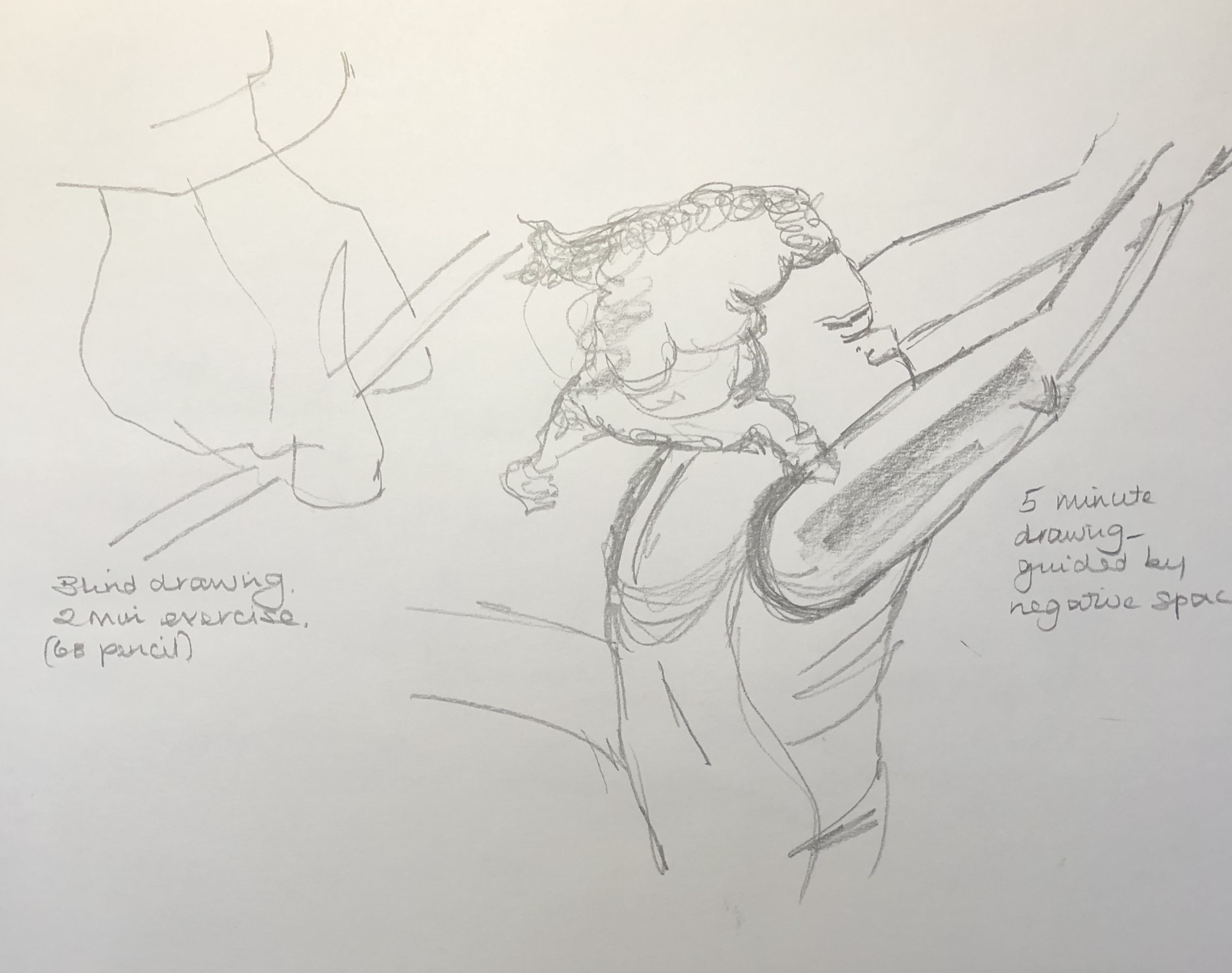
These videos and the discussion really chimed with me because:
- Of where I am in my studies, i.e. Painting 1 Part 2 – looking at collections and also at painting on more unusual materials e.g. copper – it has been motivating and also inspiring to see what is possible
- Looking forwards to another Zoom group meeting this weekend with OCA Tutor Bryan Eccleshall entitled “Contamination/Curation” – I have a little bit more insight into curation now, not really having considered it before
- Listening to Jo and David and their bubbling excitement when presented with this commission with all the myriad possibilities it presented to them artistically was hugely inspiring – I felt a bit like that after having visited the “Cranach the Elder” exhibition at Compton Verney earlier this year, so keen to build what I had seen into my work. It’s like being given a big box of new toys. It’s an emotion to hold onto and try to apply to tasks which don’t immediately appeal – find a way in and around the task to find an aspect that does grab the interest.
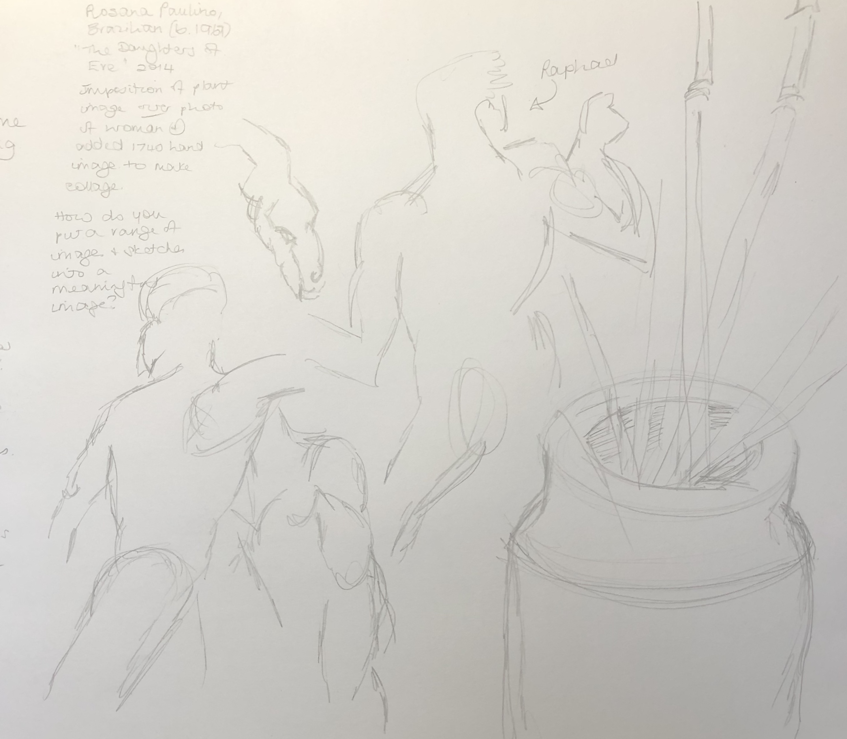
Research into collections and unusual materials
Magnificent Obsessions:
Tried to keep loose but directional marks and overlaid layers – gouache is really good for letting you do this quickly.
Likes:
- Some of the brushmarks, especially where I’ve managed to get the right weight and feathery-ness (usually brush quite dry, but not always)
To improve:
- Also some of the brushstrokes! – where I’ve got the brush too wet and then picked up too much paint, marks rather clunky.
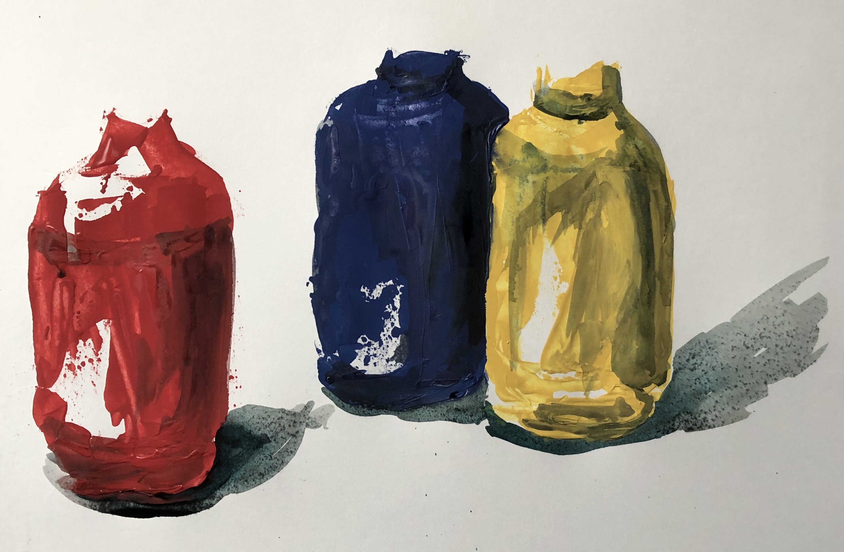
Lisa Milroy:
I have learned that:
- Painting with long-handled brushes is something I am going to have to work hard to get good at – my right arm (because of my previously broken shoulder) doesn’t have the freedom of movement, and my left hand/arm is just not used to wielding paintbrushes (although fine with charcoal!) and will need some training up.
- I enjoyed the loose mark-making possible with the oils, got really into the zone, and this is something I want to do more of.
Tabitha Moses:
I have learned that:
- a collection can be of quotes around an idea or situation – it doesn’t have to be of actual objects
- there is huge scope for investigation of a concept, eg. the effectiveness of a support as a threshold
Paul Westcombe:
I have learned….
- I’m potentially going to struggle with the “off-piste” aspects of this Part – it’s not apparently in my nature…or rather, it feels a bit like the sort of thing I would have done with the children back when I was teaching, and therefore not proper “Art”. Guess I need to loosen up a bit and let go – I did enjoy the eggs, so it can be done.
Cathay Lomax/Ali Sharma:
I have learned:
- Making up doodly out-of-my-head images is not a strength, I am better at painting “something” defined – my foliage and flowers are more folk art than fantastical Raqib Shaw.
- I should not dismiss supports other than paper/board/canvas as too difficult to try painting on.
Julian Walker:
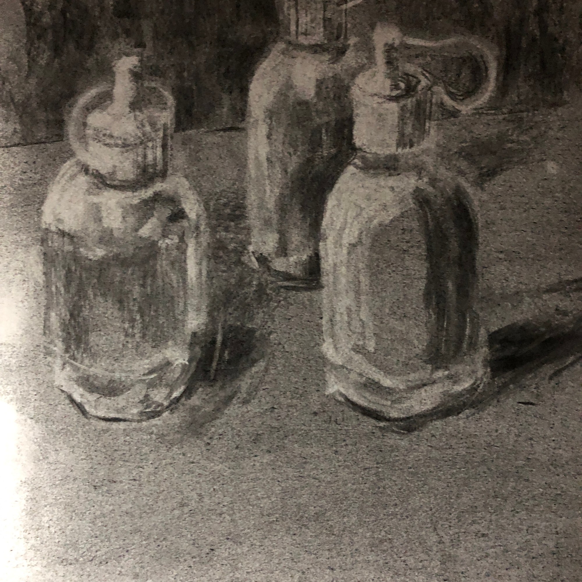
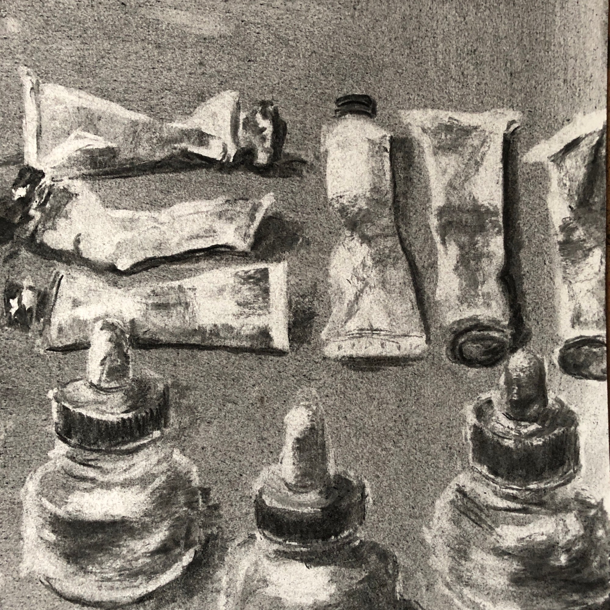
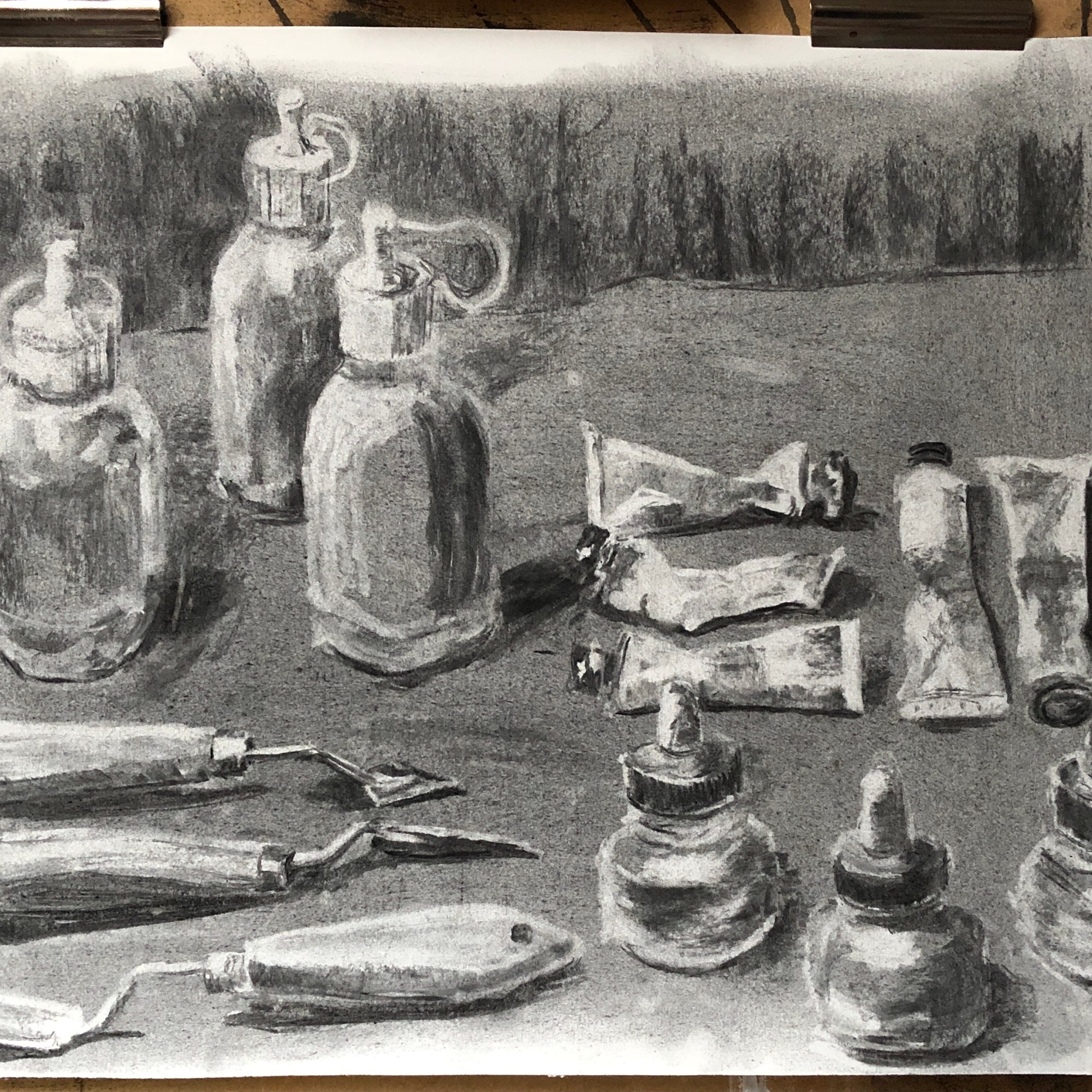
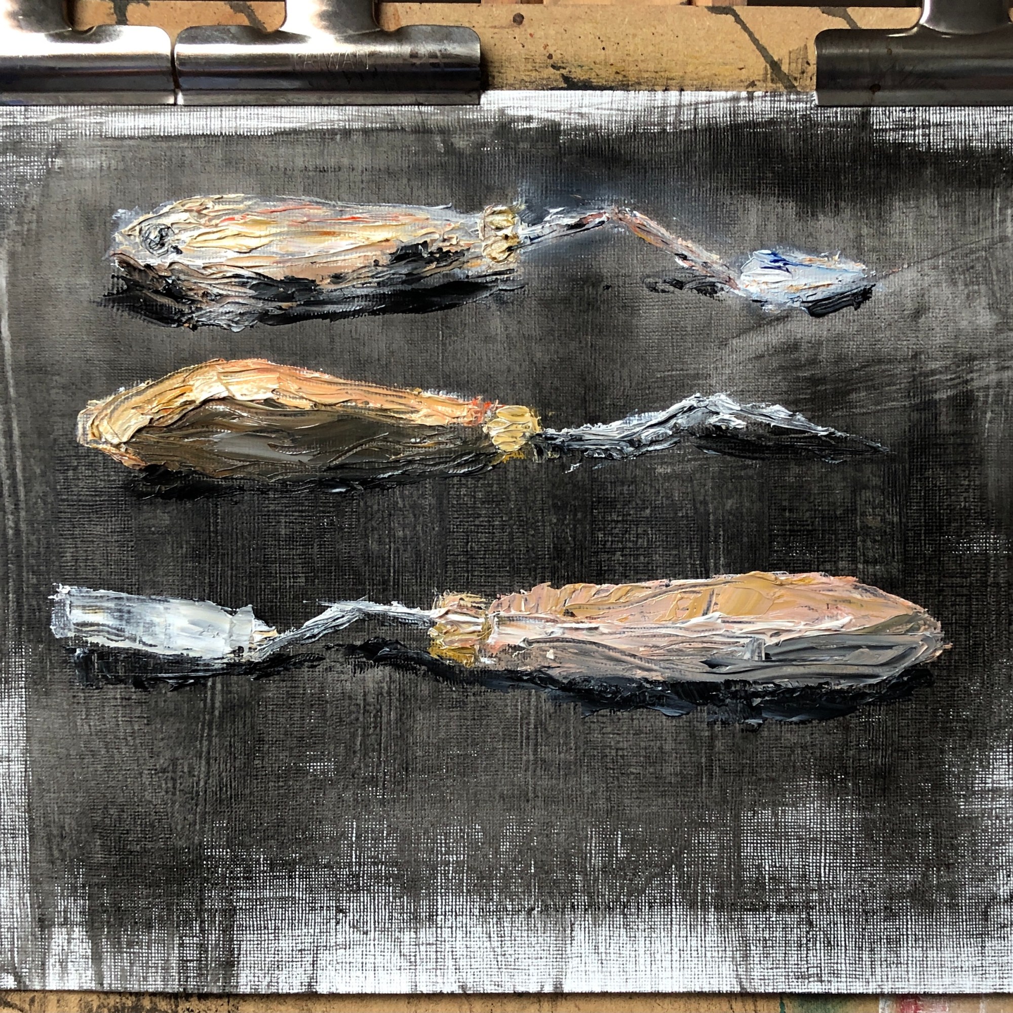
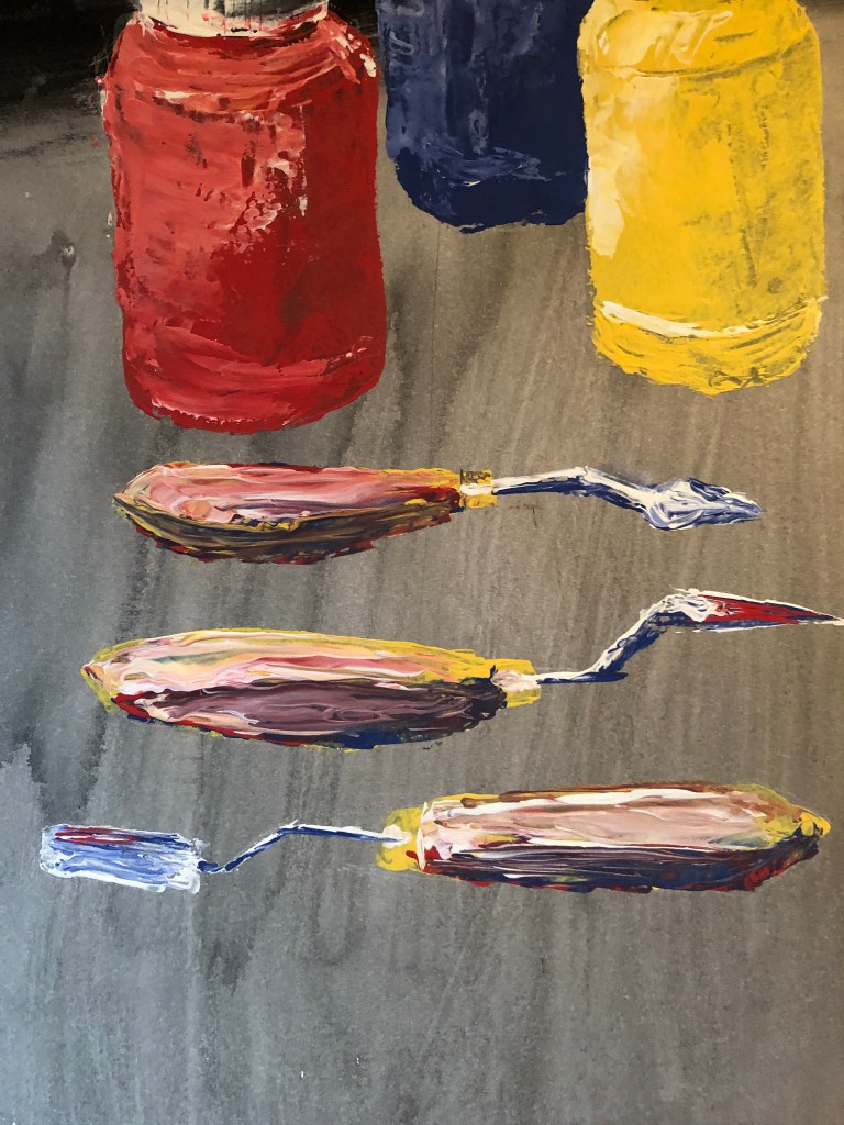
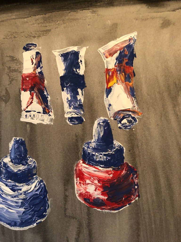
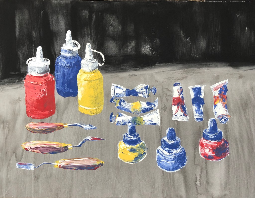
- This whole “grid” mentality is interesting…I am a very organised person and it is second nature to me to arrange things tidily in grids…..so the making of grids from collections of things is going to be my ideal…..but on the other hand, I am rather an impatient painter, and am aware that I can be a bit “right, done that, what’s next?”. Painting a few things as a collection in a grid should be fine (e.g. the paint tubes and bottles in the Lisa Milroy section, above)…but will I become a bit frustrated with a bigger collection in one picture? I thought back to the 20-piece work I did for Assignment 1, but my interest was maintained throughout that by the fact that each individual picture was very different. Self-knowledge can sometimes be an unsettling thing….
David Dipre:
- I’m gradually getting into the idea of painting on non-traditional supports – am starting to look around my studio and think “Hmm….wonder what it would be like to paint on that…..”
- I have been trying to make paintings being decisive and economic following my feedback from Assignment 1. “Decisive” is going well and I am feeling bolder about making bold marks. “Economic” is going less well, for two reasons:
- In trying to loosen up my mark-making I have got into a “go for it” trance-like mode, when I’m in the moment and almost instinctive rather than thoughtful – it all has to happen now
- I’m aware of the above and I have tried to make myself pause, step back and take note, when I’ve completed the image if not before – but when I’ve done so I’ve found a “decisive” mark which I don’t like, and am then in a dilemma as to whether to let it stand as honest and authentic, or sort it out, which is when I fall to tweaking and fiddling and trying to wipe bits out and the thing becomes a bit of a mess and decidedly un-economic.
Not quite sure how to sort this out…more practice…?
Lee Edwards:
- Well, painting as small as this certainly makes for decisive and economic mark making!
- The enamel paint has a solid opacity to it which I find pleasing – it’s a bit like liquid gouache or runny acrylic. I have bought a small and quite random selection of matt, gloss and metallic finishes, so will be interested to play more and see if I can tell the difference once the Zest-It cleaner arrives.
- The paint is quite smelly which might prove an issue for me personally due to my asthma; however, I have been attracted to the enamel paint pictures by Raqib Shaw who does get some very vibrant effects, and I hope to be able to achieve something working towards his style (if much less detailed and intricate!).
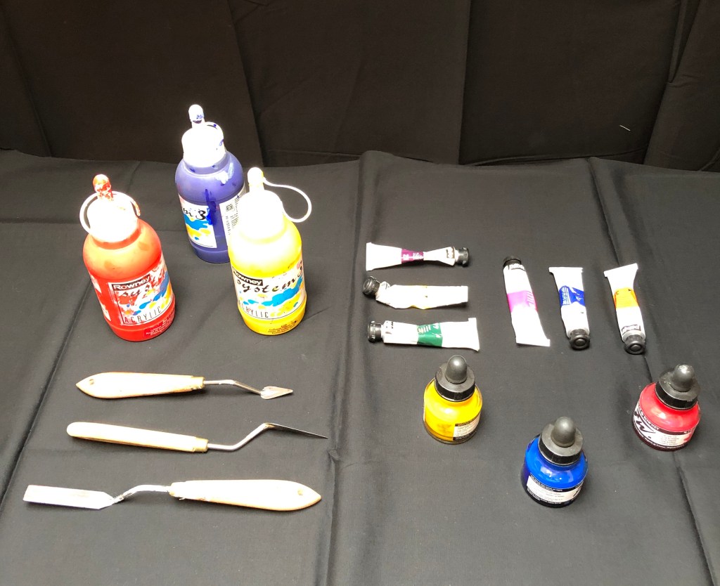
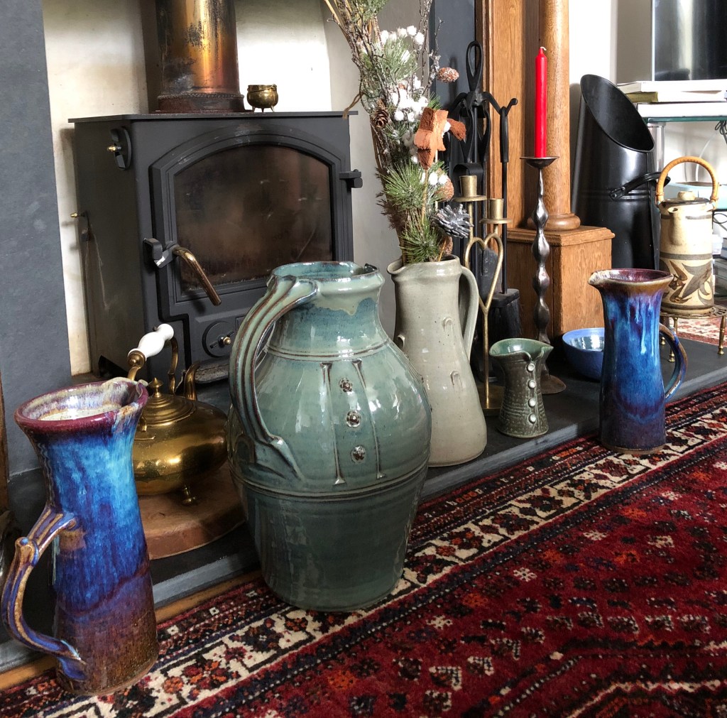
Some collections of my own
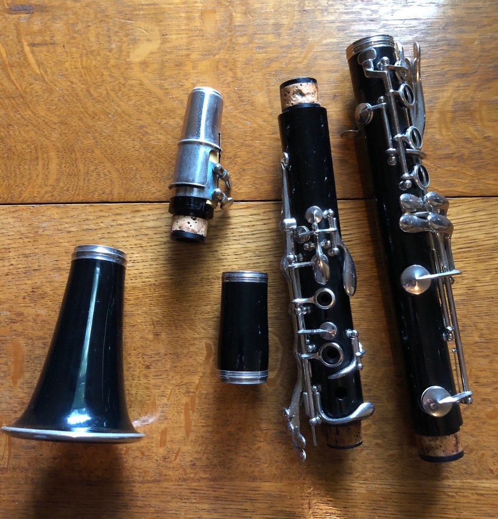
I’m looking forward to using some of these images in the exercises , as well as the collections discussed in my research blog (especially the “bottles of ink” and the “things to paint”). I might choose to rearrange some, or to select a few from each collection, depending on the task; and obviously, with an arranged collection, you have more control over the background.
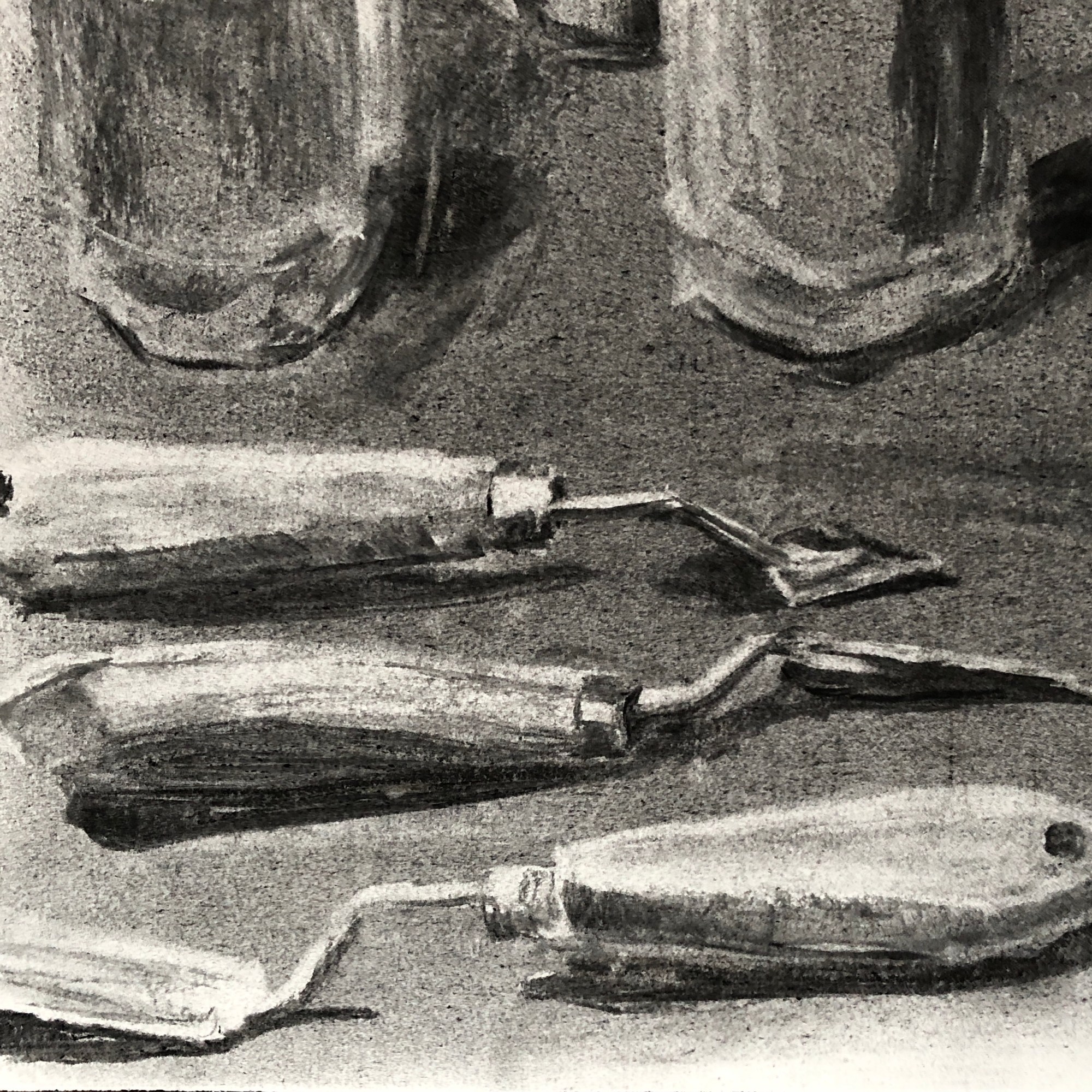
I’ve tried to pick a favourite collection from the selection above, purely as an image, and I can’t – although the one I’m most looking forward to having a go at painting is the parts of a clarinet (probably the most fiddly, so I’m going to go with a lot of implication to avoid tying myself in knots).
Following up on action points from Assignment 1 feedback
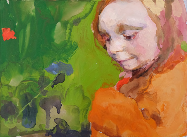
Zorn palette; Frank Auerbach portrait:
I learned a lot there!
- If you’re going to paint solely from a drawing, then get the drawing right!!
- And then, trust your drawing – I can see bits where I haven’t (e.g. the darkness of the hair on the left)
- If a painting’s going wrong, trust your gut to put it right, but DON’T FIDDLE
- I have been decisive in places, but I’ve not always been economic
- The Zorn palette definitely works for portraits
- I am better at being decisive with my left hand because I have to concentrate on each mark as I worry I lack the control over a long handled brush; when I’m unsure of what I’m painting, I kept catching myself reverting to the right hand and moving the hand nearer the ferrule, and that’s where I fiddled.
More experiments with unusual materials and supports
I’m pleased to find I’m beginning to enjoy and embrace the experimental.
I’d like to try more of the following:
- When using thick paint, apply it with tools other than brushes – maybe more credit card marks, also palette knives.
- I’m interested in Raqib Shaw’s method of working and would like to play around more with the enamel paints.
After doing the above experiments, I had a good go at cleaning my palettes. The acrylic one wasn’t too bad as I’d kept it in one of those “stay-damp” boxes, but getting the partially-dried oil off the other, glass, palette was a bit of a nightmare; so I’ve learned that thrift is OK to a point, but I would be better thinking about how much I’m actually going to need before I squeeze paint from a tube.
More work on formative feedback from Assignment 1
Maggi Hambling work:
I have found that:
- Mindful of some tonal inaccuracies/omissions in my earlier Frank Auerbach drawing which translated into corresponding inaccuracies in tone in the painting, I have learned to think more about this issue – which I did find easier here when drawing with ink.
- If I want to do much more work with acrylic I need a whole lot more practice at dealing with the speed at which it dries, which took me aback a little. I could cover up my errors when they were “within” the image easily enough, but I wasn’t quite sure what to do about errors I had made right on the edges, which seemed to dry in seconds before I could wipe them off.
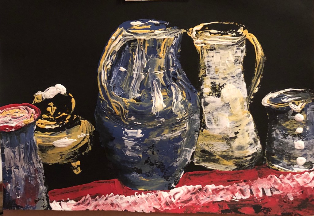
Exercise 2.1
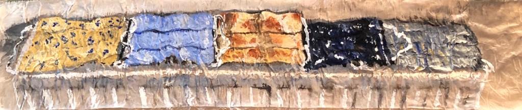
Household paint:
- This is definitely something I would repeat – for the enjoyment of being able to “dollop” paint with a thickish brush and a knife, and also for the feel of the paint and the little bit of extra texture it provides, which would be appropriate to certain types of subject matter – I think it really worked here
- The exercise has made me reflect on the issues of form and background. I struggled to make a really dark dark (best I could achieve is blue, then red, then blue – but the paint is opaque so it’s difficult to get a dark by building layers). As a result the painting is possibly a little flat. I wondered then about introducing a dark background so that this would bring the crockery forward and stop it floating. However, I’ve propped it up on a shelf and been living with it for a day or so, and the contrast between the board background and the chalky paint makes the crockery stand out separately anyway (hard to see on a photo, clearer in actuality, the paint sort of shimmers above the card), so I decided to stop where I was. I know it’s only a practice piece on a bit of bent board, but I rather like it!
Tea:
This experiment, and the previous one, is really bringing home to me the importance of having a decent range of tones to work with; or rather, to taking the time before you start to understand the range which you have, particularly if it is small, and making sure you are clear about your middle tone – I think I have used my darkest tone as a mid tone and then been frustrated that I had nowhere to go with it.
Humbrol enamel and acrylic liner:
- Interestingly, form and background have come to prominence again as consideration here. Even without indicating shadows, the half-finished one looks more realistic (perhaps because it matches the white background of the photo); adding the blue background has, to me, turned the picture into a more fantastical image where form is not required or necessarily desired.
- I really enjoy using these enamel paints (a sucker for shiny things), even though following Shaw’s method is quite time-consuming – it leads to work of a jewel-like quality. I should like to experiment more with these paints to see what other effects can be achieved when they are used more freely.
Zoom workshops with Dr. Bryan Eccleshall – Contamination/curation
I learned a huge amount over these two sessions and the intervening work. Four big takeaways:
- I have never considered curation before, but this is an aspect of an exhibition I shall pay attention to in future
- First time I have collaborated with a group like this – it’s not so scary; you have to let go of any niggles about lack of contribution from some members and assume they have life/work issues which prevent them; be positive and affirmative
- Doing things because they look good is a good enough reason
- You have to have confidence that your work will survive in the world
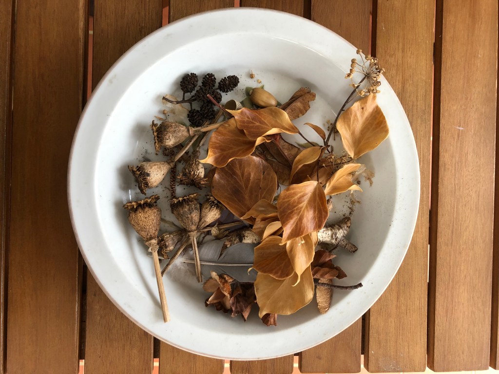
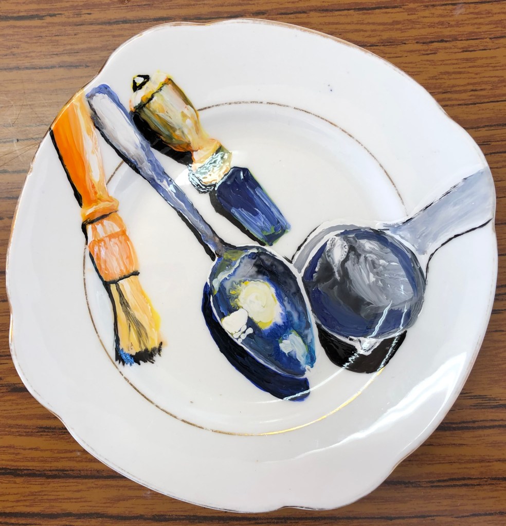
Exercise 2.3
I began the 3D work back with my research with some despondency, thinking it felt rather like messing around and was somewhat of a waste of time when I needed to be getting on to the serious stuff. However I’ve discovered, particularly with the recent trompe l’oeil plate piece and my egg box of eggs (which formed a key part of a collaborative exhibition pitch – see blog post on Contamination/Curation) that it can (a) be fun, and (b) lead to an eye-catching finished piece.
Exercise 2.2
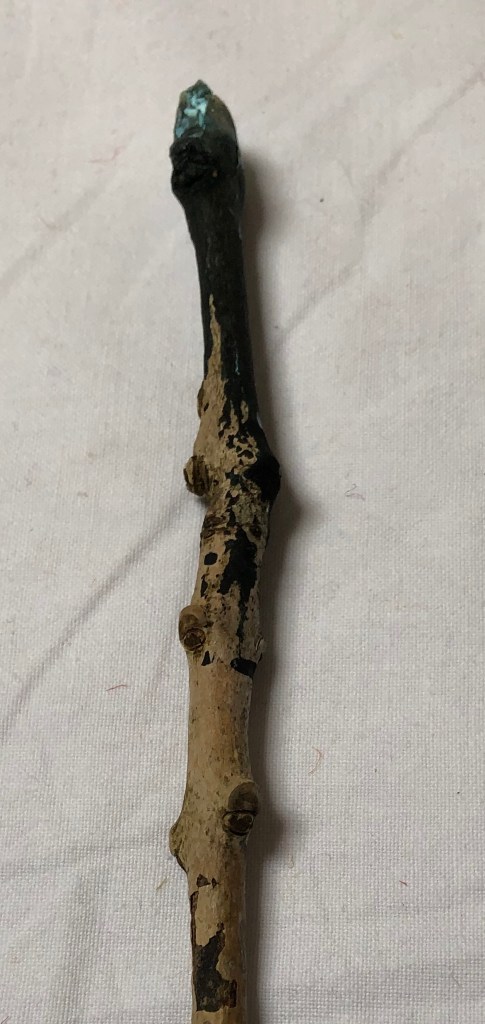
- I had really enjoyed using ink and a stick in Drawing 1, so it felt good to revisit this.
- I am not sure whether this has ended up being a line drawing or a line painting and, indeed, exactly what the difference is.
- Nevertheless, I feel the outcome has a vibrant, shimmering quality and I hope that any clarinettists out there would recognise it.
- I am not sure how I would improve it – I could have spent more time wearing the end of the twig down to a more reliable point to make for a slightly more controlled image, but I think the very roughness and unpredictably is the key (pardon pun) to the success of the image – the whole point of a clarinet is that it works off a varying column of vibrating air, and I think I’ve got the outside vibrating as well as the inside.
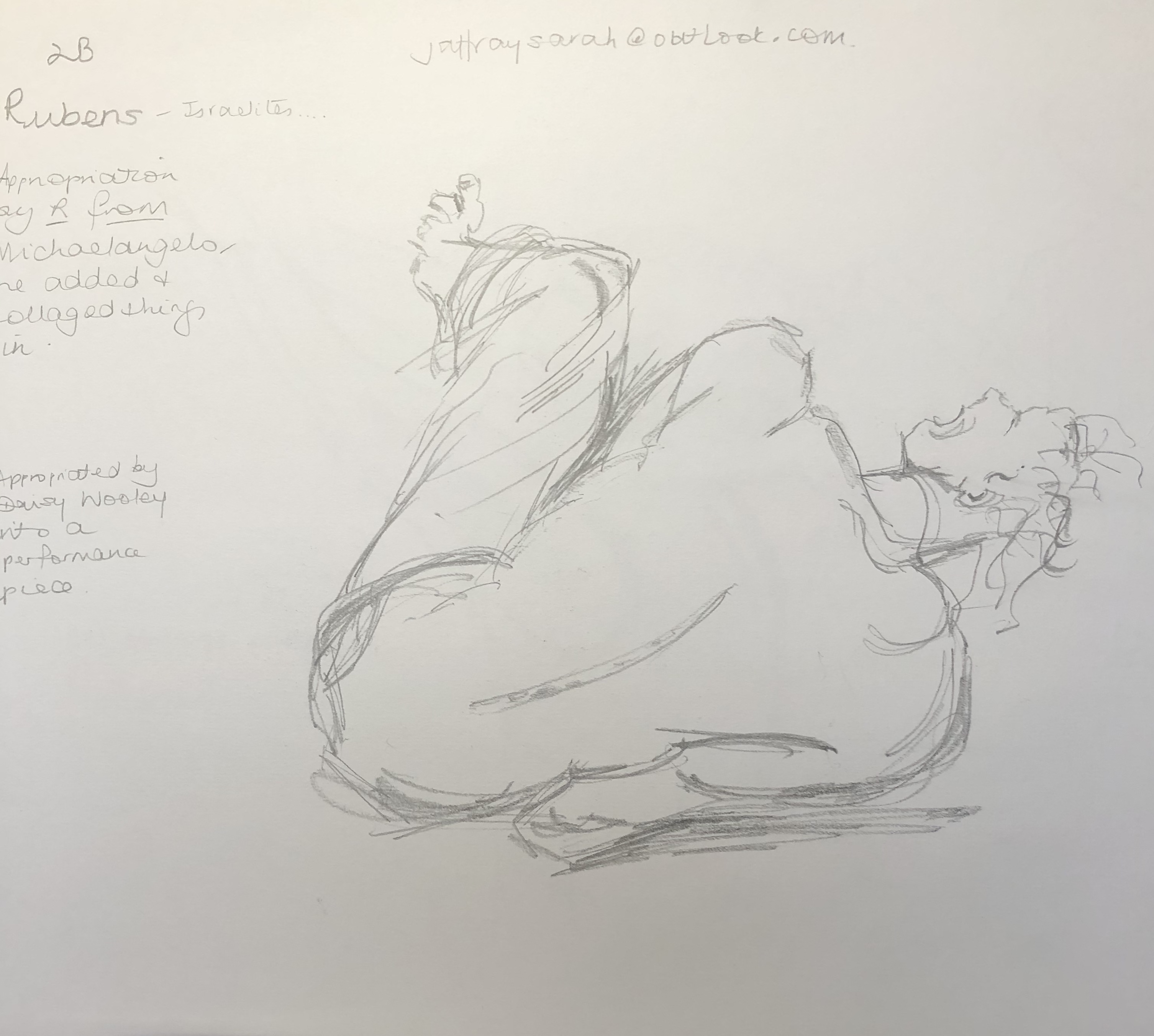
Zoom drawing workshop with Sarah Jaffrey
- This talk reinforced the idea that there’s nothing new under the sun, but it’s what you do with/change/combine/interpret what’s in front of you that makes your work different from everyone else’s.
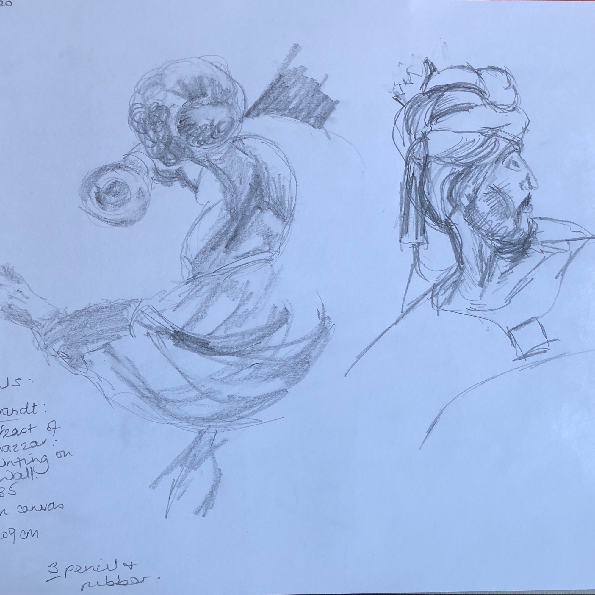
- I’d like to do more drawing from existing paintings, something I haven’t done much of hitherto, to try and build my visual vocabulary.
Exercise 4
Household paint on egg tempera:
- I enjoy the freedom of working loosely with this paint – it has a nice feel.
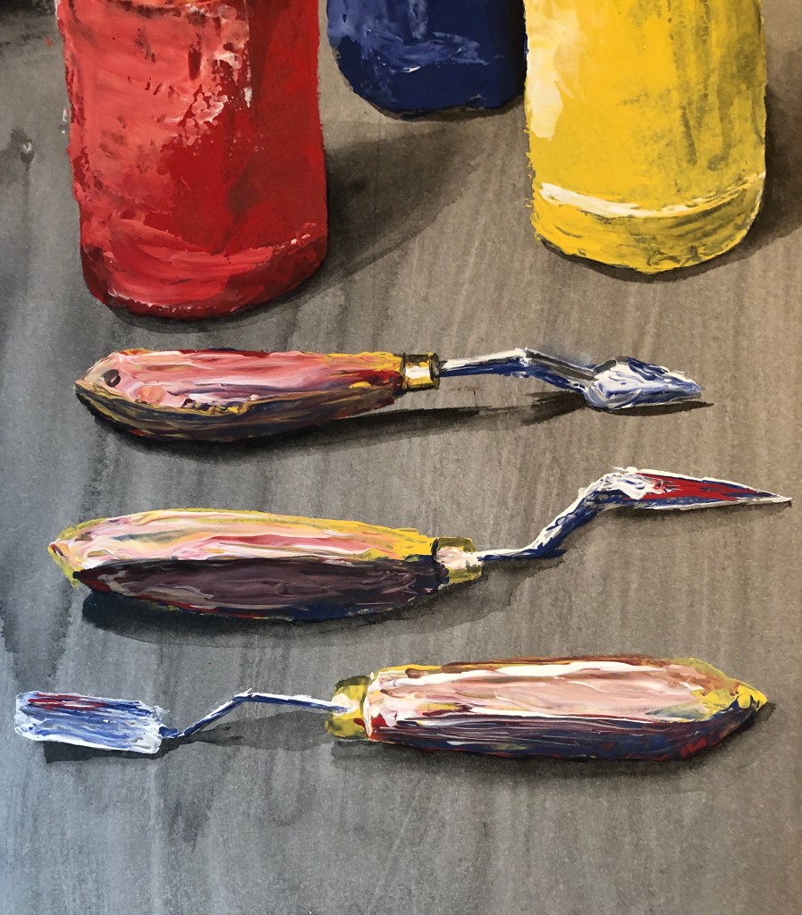
- I also really enjoyed using the palette knife, both to apply and drag paint, and to cut through the layers to make marks; clearly a huge range of marks is possible, and I am only at the start of my explorations of its use.
- The chalky finish of this paint does still make the image quite flat, but I find it is open to tonal tweaking by overlaying with ink.
Ink on acrylic:
- I managed to rescue the image around the bits of tone (both light and dark) which I had managed to establish before my painting implement died on me – but in so doing, it has become more of a drawing, although I am confusing myself by worrying about this distinction between drawing and painting.
- Again this was an experimental piece in a “I wonder what would happen if….” frame of mind – it wasn’t a success, but I don’t think that matters particularly – experimentation is good for the soul
- I do think that, having made the decision to commit to moving into pen, I could have worked harder at establishing a better tonal contrast between the poppy heads and the background (I confess I’d lost interest in it a bit by then)
Acrylic on varnish/general:
Looking back over the paintings I’ve done in this Exercise, I’ve dealt with the issue of tone with varying degrees of success; I think it’s still something I need to work at mastering, and need to have at the forefront of my mind when tackling my assignment.
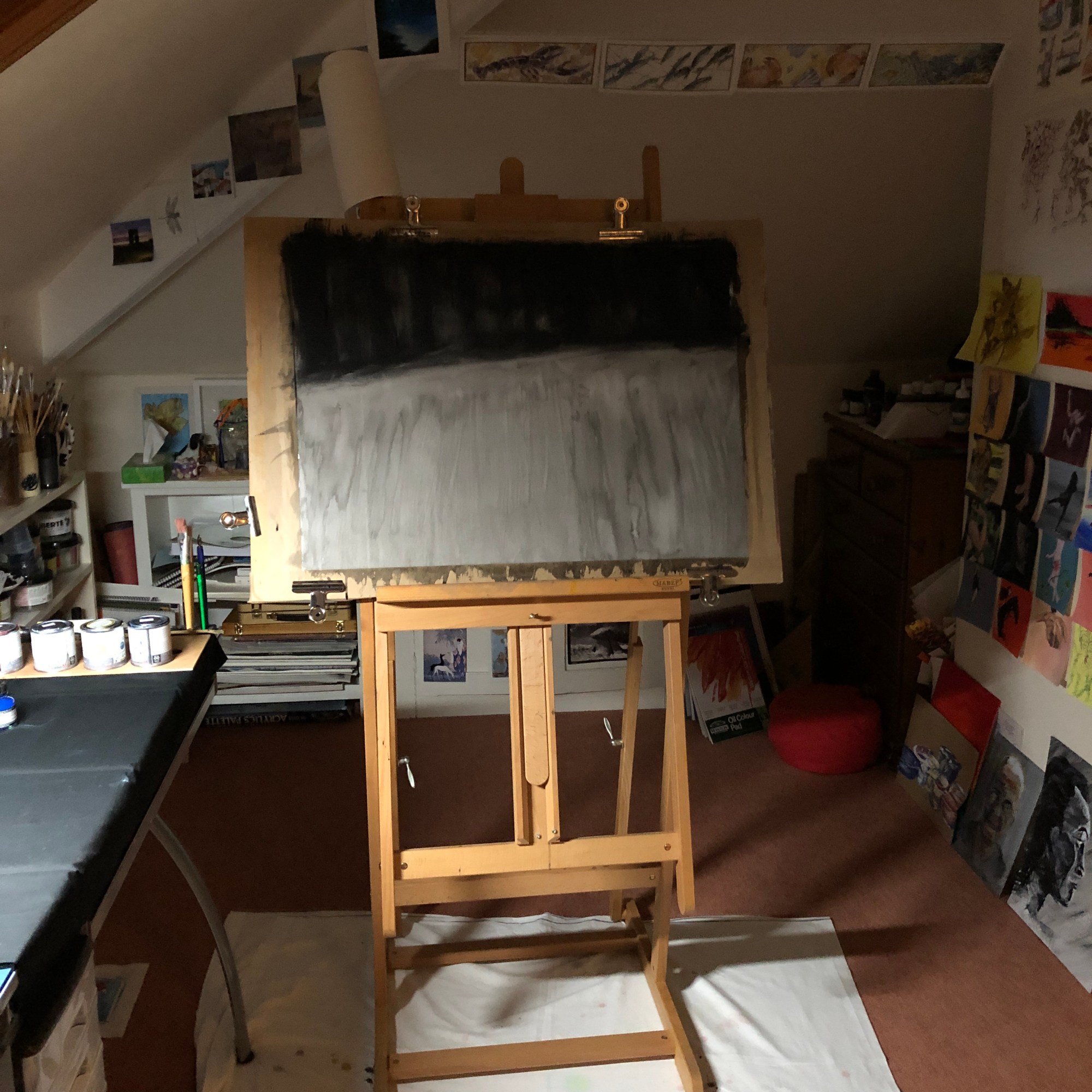
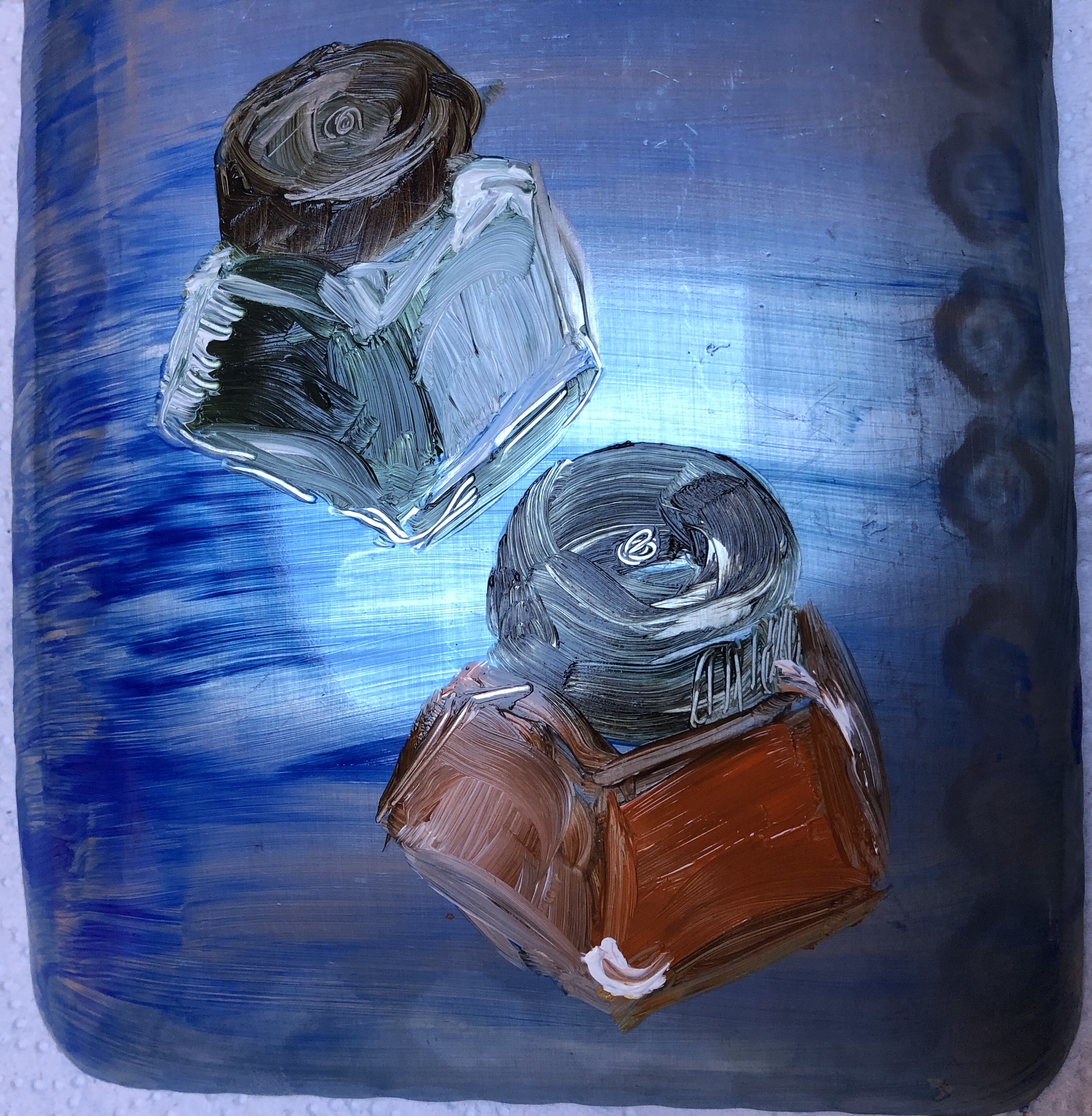
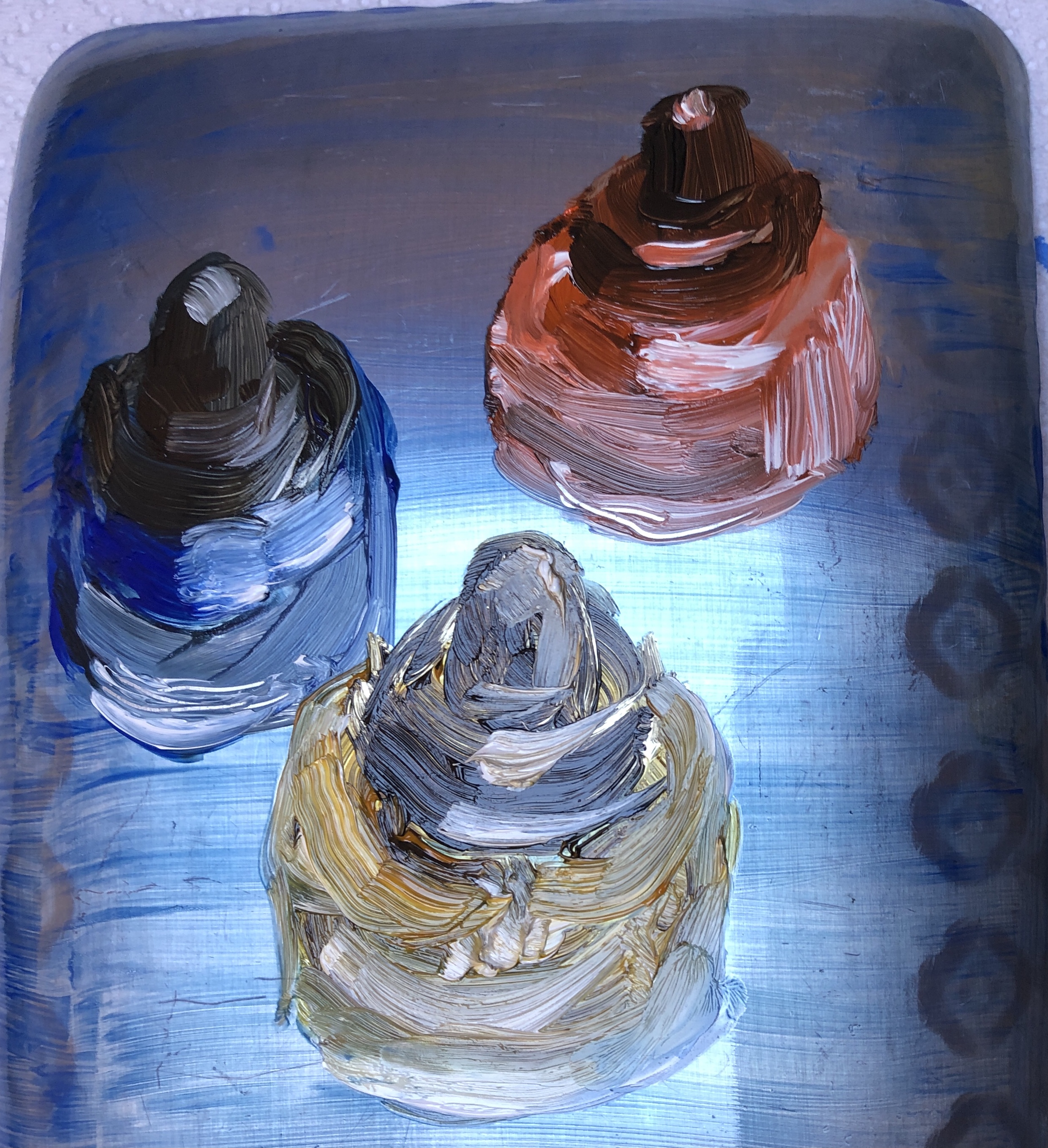
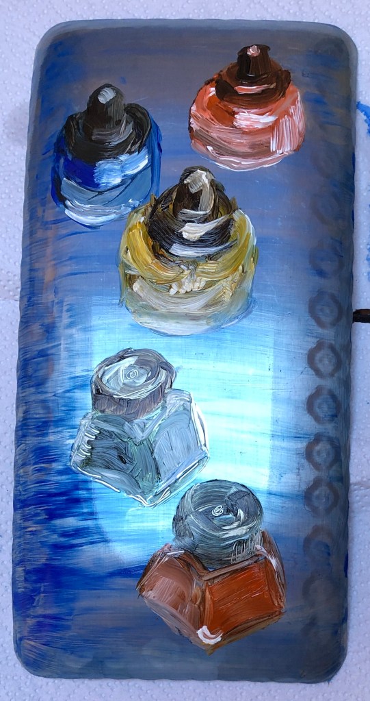
Painting on a metal/mirrored surface
I have found that:
- I really like working with oils because of the feel of them and the way I can move them around
- I have developed quite a loose style, with a lot of my colour mixing taking place on the picture surface, but must retain an awareness of tone, and not become confused between tone and colour
- I also really enjoyed working on the aluminium surface – something I think I should like to pursue in the next unit
- I am going to retain this palette layout for a while and see how well it works for me. I wonder if I need to slow down a little to make the most of the palette as a tool, rather than just something to hold the paint temporarily.
SO WHAT & NOW WHAT?
Reading back over this list and reviewing Part 2 so far has allowed me to group learning into three categories:
Things which have been tackled and are developing (but always needing more…):
- Getting around tasks which don’t immediately appeal by finding a way to “get in from another angle”
- Loosening up and being up for experimenting
- Managing my impatience as a painter by managing my subject matter
- Favourite media: oil paint, household chalk paint and enamel paint.
- Favourite ground: egg tempera, ink
- Favourite tools: sticks and knives
- Favourite support: metal
- Becoming aware of curation and your work as art out in the world
Issues which keep coming up and need more work:
- Quality of mark making and brush strokes
- “Decisive and economic”
- Palette organisation and where to mix colours
- Tone generally, but in particular:
- Possible confusion of tone and colour in painting
- Understanding the tonal range available
- Controlling my style – should I? How do I develop it?
Things which appealed at the time but which I appear to have mentally parked:
- A collection as being of quotes or ideas to investigate a subject – rather than just a load of actual “stuff”