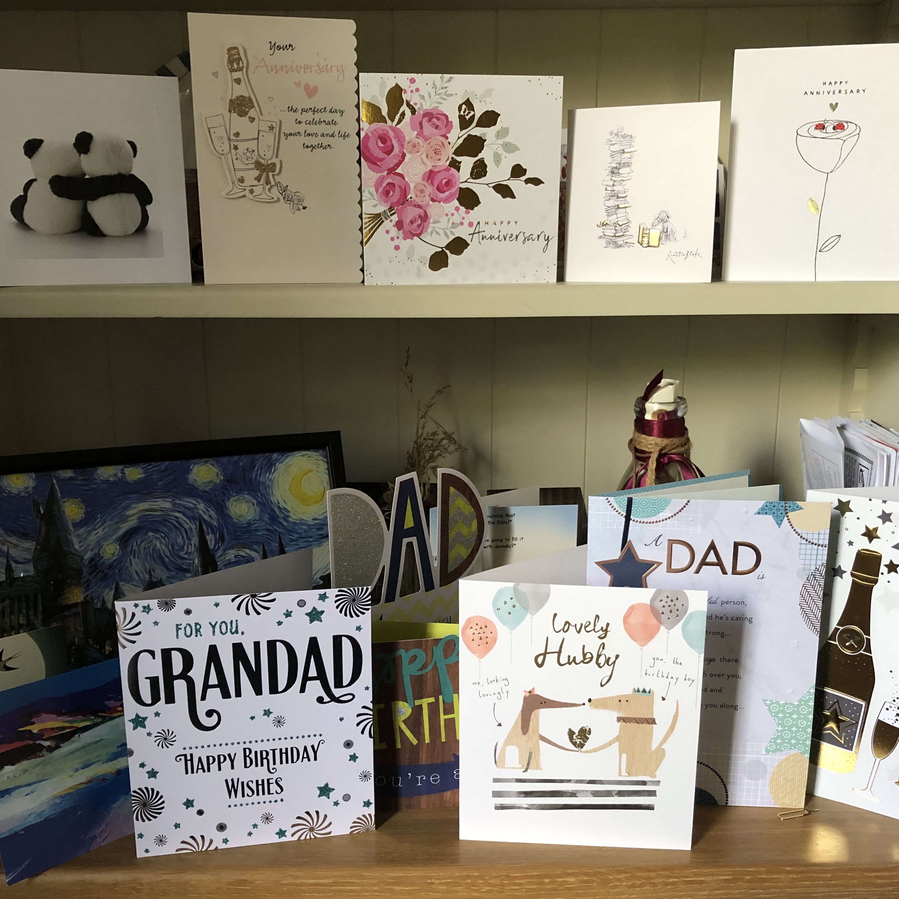
This workshop was open to OCA students of all disciplines, and ran over two Zoom sessions, with a curation task in between. We each had to attend prepared with two works which we regarded as finished.
The project was to work together in small groups to think how we could show our work together in a way that made sense and was interesting, and come up with a group proposal to make a 5-min professional pitch to a gallery manager for an exhibition.
Curation is a creative act – so think about how these things are going out into the world, and how they are affected by their neighbours (contamination). We could look for commonality, points of difference, or a point of view.
SO WHAT?
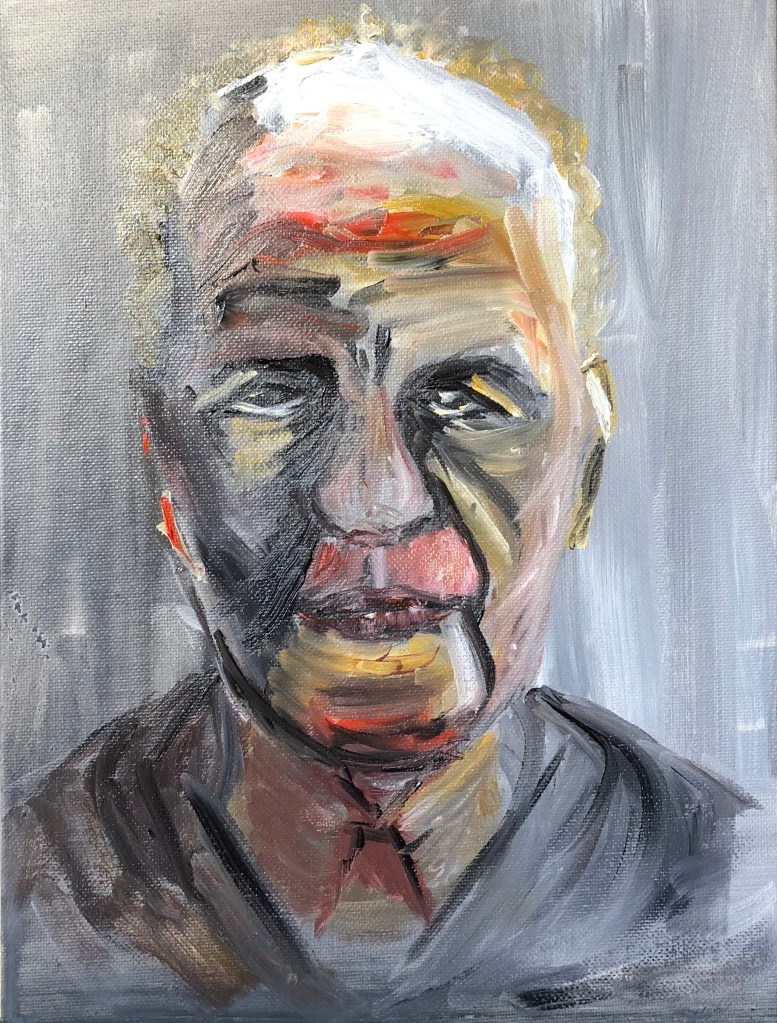
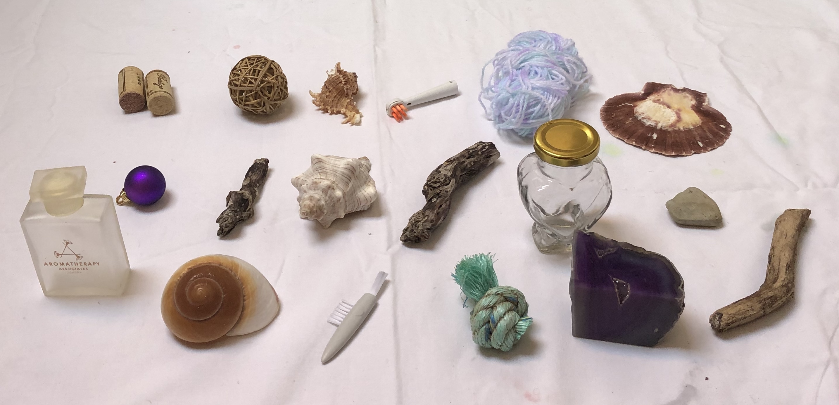
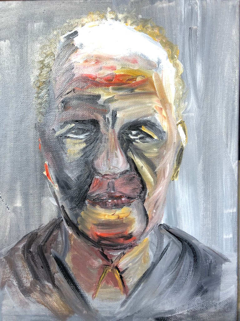
Being unsure of what we might be required to do, I chose two very different pieces – my portrait of Frank Auerbach and my painting of eggs on an eggbox in egg tempera.
We each had to show our works to our group, and then decide how to curate them.
My group- mates were:
Annalisa, a second-year student in drawing; her pieces were text-based, one about reading between the lines, and the other about how text could be changed by physical actions
Kathy, a first-year student on the same Painting module as me – her works were part of a series of self-portraits, investigating how the persona you show is often very different from how you think and feel inside
Thomas, a first-year photography student who put in a self portrait melded from his different personas, and also a video which he had submitted as an assignment on his reaction to the Covid lockdown
I felt my “eggbox” piece was a bit too frivolous and offered to change it, but fortunately they were keen to keep it in; discussion eventually took our theme round to “Vaccine”, and
vaccines are based on eggs – so, far from being out on a limb, my eggbox became a central point of the whole exhibition.
We collaborated via padlet, putting up our work and ideas, eventually coming up with a proposed exhibition layout. We had a separate group Zoom meeting to agree details and divide up jobs; I drew an exhibition plan and researched “Vaccine” in different languages, Kathy prepared an exhibition booklet and text, and Annalisa prepared a Powerpoint. We were ready to go!
On the day, all seven groups had prepared digital “pitches”, each with a different style and emphasis. Much useful discussion about curation, digital “nous” and other points from Bryan and others…..
Bryan: “Doing things because they look good is a good enough reason.”
Ours was a “constellation frame” in curation terms – we had made a frame of each artwork to stand or fall alone
Bringing a bit of theatre into an exhibition is no bad thing
You have to have confidence that your work will survive in the world
Causing some disorientation in the mind of the viewer is fine!
“Yes, and….” and “Yes and what if….?” are really good ways of collaborating; you surrender your work as raw material to the greater work
Be careful about including sound in an exhibition as it can be heard all over the exhibition unless you provide headphones or the gallery has sound cones
It was really useful to share skillsets and especially digital knowhow: three things for me in particular:
www.flipsnack.com – makes booklets – free unless you want to export pdf – maybe useful for submitting work for assessment?
OTTER – free – you speak and it transcribes
Stuff can be moved from a padlet into a Powerpoint and then exported into a video which you can upload to Vimeo for playing
It’s good to have images on a press release – make sure you state very clearly what your work IS, not just waffling about what it’s about
Episodic framing is another way to curate – over time
Using quotes from other people can be very effective IF it is done with subtlety
Subliminality of words flashing up too quickly to read them all can be a good tool
One group pitched a virtual exhibition based on cabinet of curiosities and Marcel Duchamps’ exhibition in a suitcase – Bryan suggested that, in this world where the blockbuster exhibition is on hold, could develop this idea so that you hire a suitcase of art to have in your house for, say, a month, keep any you want to buy and send the rest back.
NOW WHAT?
I learned a huge amount over these two sessions and the intervening work. Four big takeaways:
I am new to curation, but this is an aspect of an exhibition I shall pay attention to in future
First time I have collaborated with a group like this – it’s not so scary; you have to let go of any niggles about lack of contribution from some members and assume they have life/work issues which prevent them; be positive and affirmative
Doing things because they look good is a good enough reason
You have to have confidence that your work will survive in the world
Household paint (Annie Sloan) on a piece of packing card from an Amazon parcel.
SO WHAT?
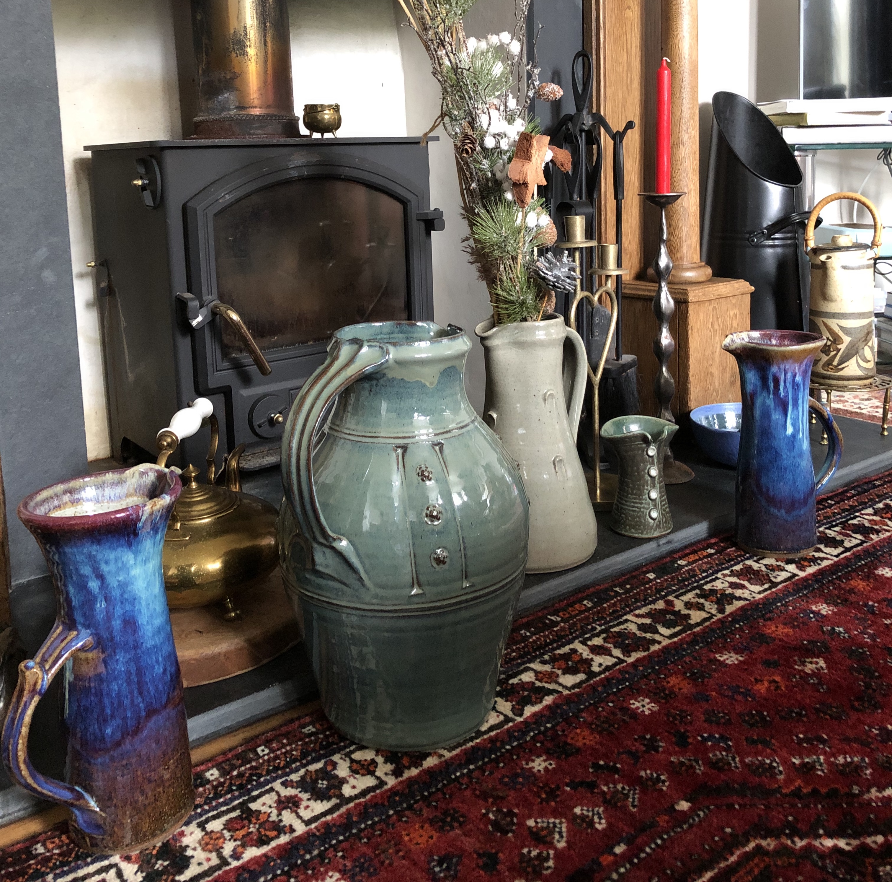
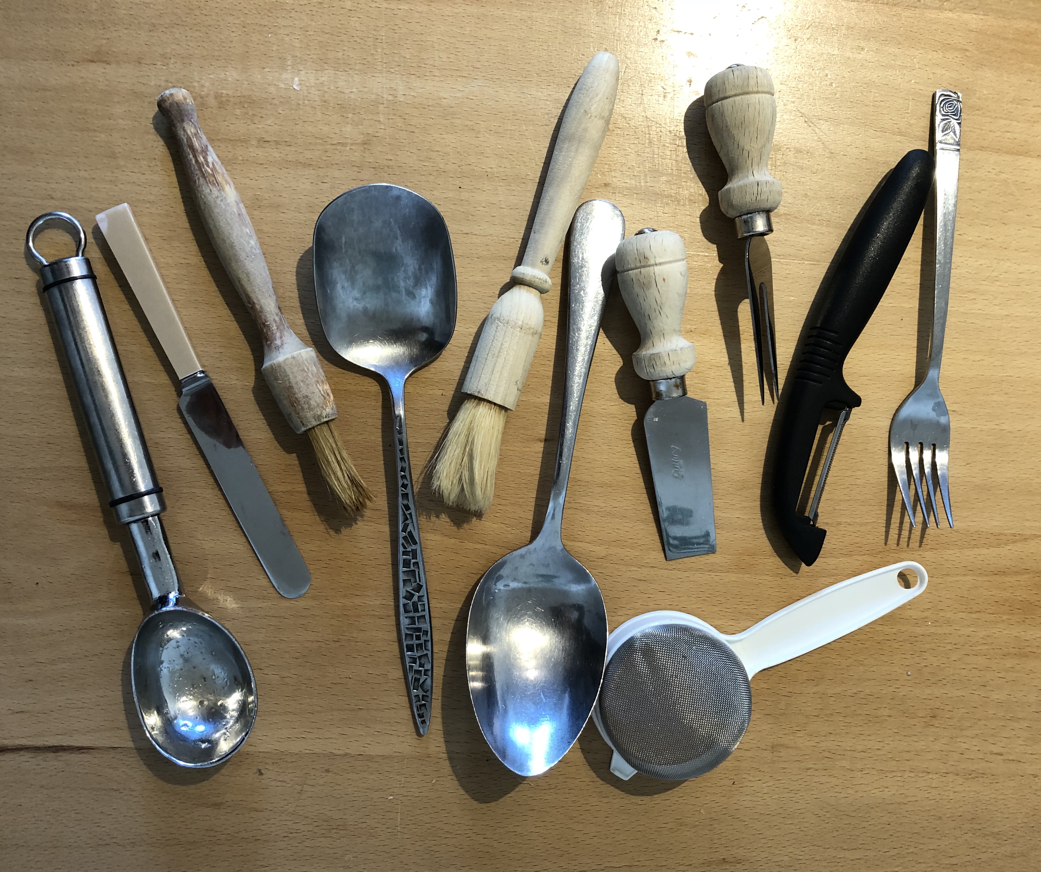
I had four small tins of her chalk paint – Napoleonic Blue, Old White, Emperor’s Silk (a crimsony red) and Tilton (bit like Naples yellow). I chose a detail from the bottom shelf of this picture, left-hand end; the collection of china and pottery bowls with the metal colander behind. I thought the slightly clay-y nature of the paint would be good for depicting clay-y products.
I started off working with a size 6 bristle filbert; however, I was using an ordinary round-ended cutlery knife to get the lids off the paint tins, and I soon found that this knife was actually as good/better at applying the paint to achieve smooth surfaces and thin lines – so ended up using a combination of both tools, with a bit of fingertip thrown in.
Because I was using nice, gloopy, non-”expensive art” paint and a rough bit of bendy and corrugated-in-places card, I had enormous fun slapping the paint on, getting myself in a fine mess in the process. All colour mixing took place on the painting surface and that generally seemed to work fine – my only issue was my inability to mix a real “dark” for the dark shadows. I thought I’d let it all dry and then consider putting in the dark darks with an ink wash….but in the end, I liked its raw quality, so left it as it is.
NOW WHAT?
This is definitely something I would repeat – for the enjoyment of being able to “dollop” paint with a thickish brush and a knife, and also for the feel of the paint and the little bit of extra texture it provides, which would be appropriate to certain types of subject matter – I think it really worked here
The exercise has made me reflect on the issues of form and background. I struggled to make a really dark dark (best I could achieve is blue, then red, then blue – but the paint is opaque so it’s difficult to get a dark by building layers). As a result the painting is possibly a little flat. I wondered then about introducing a dark background so that this would bring the crockery forward and stop it floating. However, I’ve propped it up on a shelf and been living with it for a day or so, and the contrast between the board background and the chalky paint makes the crockery stand out separately anyway (hard to see on a photo, clearer in actuality, the paint sort of shimmers above the card), so I decided to stop where I was. I know it’s only a practice piece on a bit of bent board, but I rather like it!
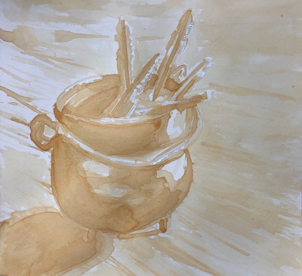
Tea (substituted for coffee) on a square of off-white cartridge paper (approx 18 x 18cm), with a few highlights in white acrylic.
SO WHAT?
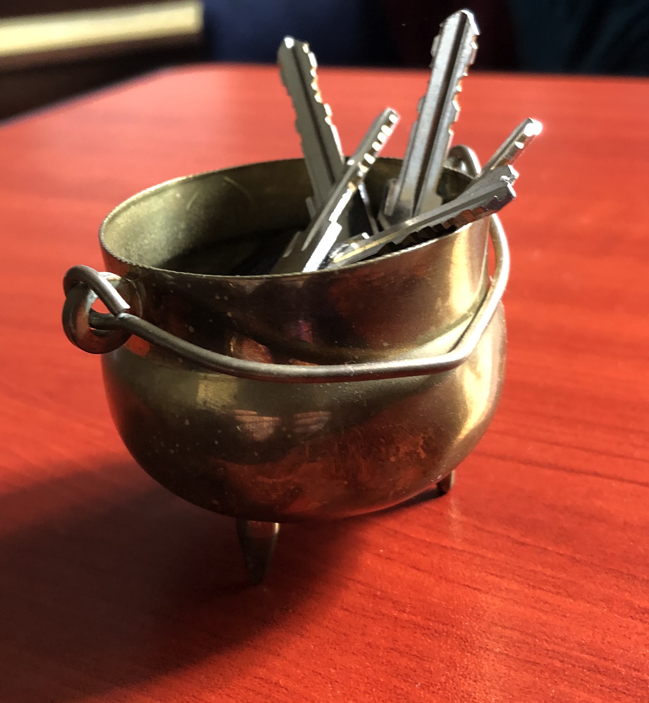
I had a go at painting a collection of keys in a pot on a wooden table, using a size 3 rigger, with this photograph as reference material.
Even having prepared my medium with 3 tea bags in a small quantity of water and leaving it to steep for three days, I realised as soon as I applied the first brushstroke that this was going to need to be built up in several layers as the marks were fairly faint. I had chosen a light creamy support as I thought that might help bring out the warmth of the original, but I’m not sure it has helped, the tea is quite an acidic brown. In the end, finding myself a bit confused by the colours, I made my reference image monotone on my iPad and worked from that, finding it easier to pick out the tones.
After many layers, which had to be left to dry each time otherwise the tea just pooled in the cockles of the paper, I seemed to be struggling to get any darker, so I decided to use a few dabs of white acrylic to pull out the highlights on the keys, the rim edges and the top of the handle.
Not the most satisfying painting I’ve done….
NOW WHAT?
This experiment, and the previous one, is really bringing home to me the importance of having a decent range of tones to work with; or rather, to taking the time before you start to understand the range which you have, particularly if it is small, and making sure you are clear about your middle tone – I think I have used my darkest tone as a mid tone and then been frustrated that I had nowhere to go with it.
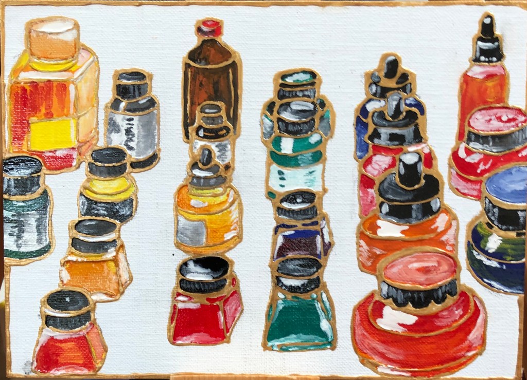
Humbrol enamel paint, plus some Zest-It solvent, and gold acrylic liner, on white prepared board, 18 x 13 cm.
SO WHAT?
Consequent upon my previous experiment with enamel paint on a CD inspired by the work of Raqib Shaw (see earlier blog post), I decided to try to apply his method to my collection of ink bottles. I used this photograph as reference.
I worked quite small as I find the method quite time-consuming since the work is detailed. I did a pencil sketch onto the board, then drew over it in gold acrylic liner squeezed from a tube. When this was dry, I applied the enamel paint using a small craft brush. I did the bottles first, experimenting with dilution of the paint with Zest-It; however I found the most “bottle-y” effect was achieved with the paint fairly neat and thick.
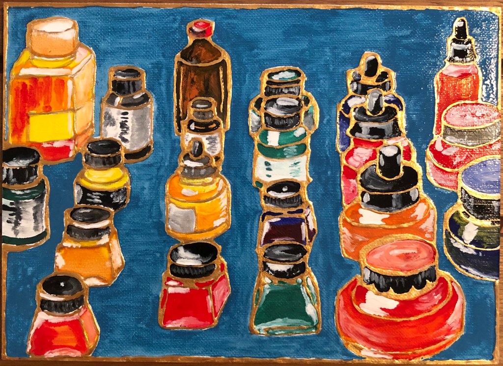
I took a photo when all the bottles were painted and debated whether to paint in the background at all (having learned this time to put an acrylic liner boundary round the edge of the board); however, having chickened out of adding a background in the household paint picture (see above), I thought I should go for it here. I went for a Raqib-style turquoise gloss background, but this time applied it in equal measure with the solvent and, although not perfect, this has served to lessen the prominence of the brushstrokes which I found tricky in the CD painting. The whole thing has a rather design-like quality so I decided not to worry about adding shadows – I was OK with it being basically flat but shiny!
It’s quite hard to photograph as, wherever I put it, the light reflects off it somewhere.
NOW WHAT?
Interestingly, form and background have come to prominence again as consideration here. Even without indicating shadows, the half-finished one looks more realistic (perhaps because it matches the white background of the photo); adding the blue background has, to me, turned the picture into a more fantastical image where form is not required or necessarily desired.
I really enjoy using these enamel paints (a sucker for shiny things), even though following Shaw’s method is quite time-consuming – it leads to work of a jewel-like quality. I should like to experiment more with these paints to see what other effects can be achieved when they are used more freely.
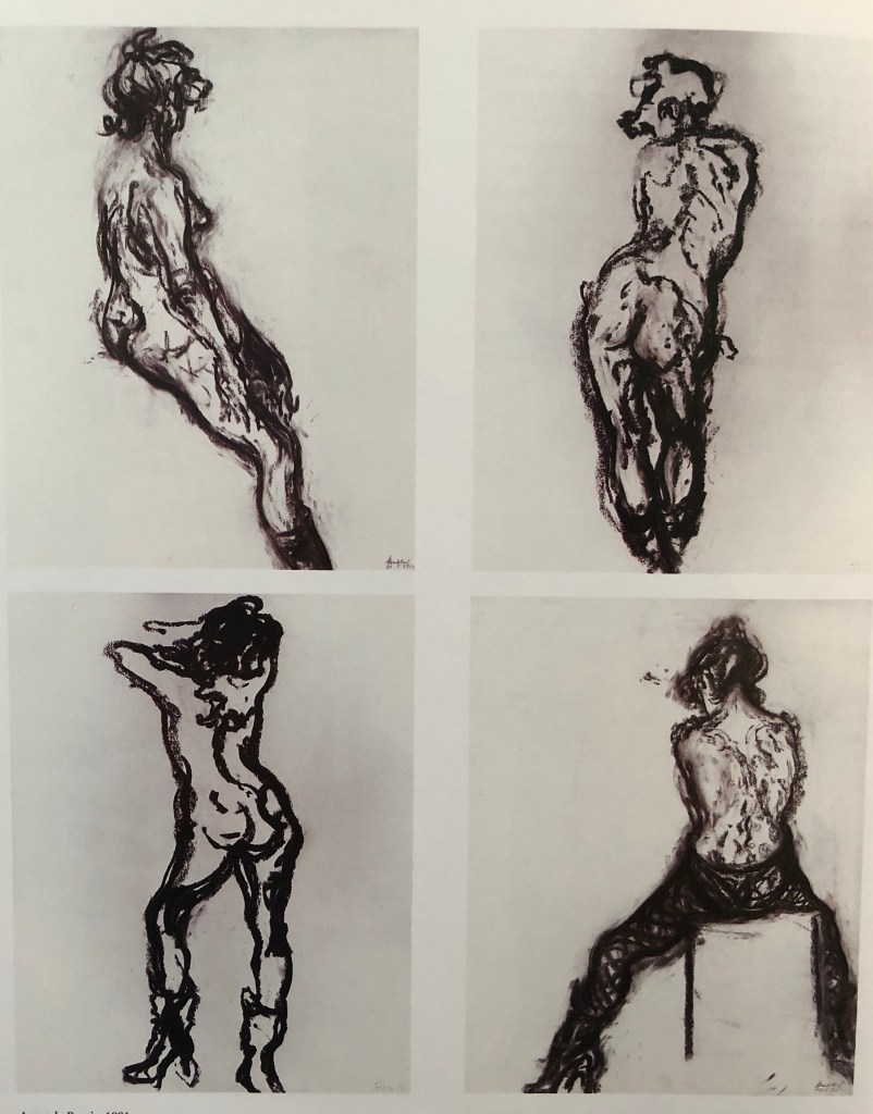
I had a good browse through Andrew Lambirth’s 2006 book “Maggi Hambling The Works and conversations with Andrew Lambirth”, Unicorn Press, London. Maggi has a very free drawing style, as can be seen in:
“Large Head of Stephen”
1993
Ink on paper
152.4 x 101.6 cm
And…
“Amanda Barrie”
1991
Four studies from life
Charcoal on paper
Each 60.7 x 48.3 cm
I was particularly interested in the way she seems to drag a partially dried brush in her ink drawing of Stephen Fry to get her wider-yet-lighter lines. She made this drawing (among others) in preparation for painting a portrait of Fry.
SO WHAT?
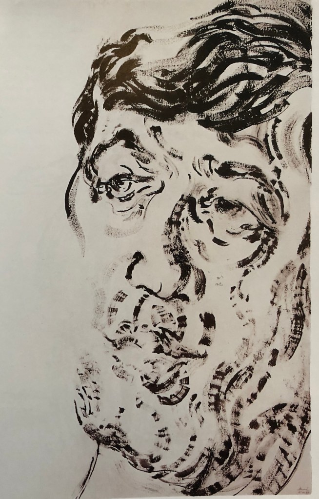
I decided to work in Chinese black ink and a long-handled size 4 short bright throughout a life drawing class, trying to replicate Maggi’s free style of mark making, hoping that one would be clear enough to paint from. I also tried to use my left (non-dominant hand) throughout to try and improve my facility with a brush with that hand.
Some results as follows:
I feel my brush strokes have mainly been decisive (and Maggi is, if nothing else, a great role model for decisive mark making), and I soon got the hang of her dry-brush drag for lighter marks.
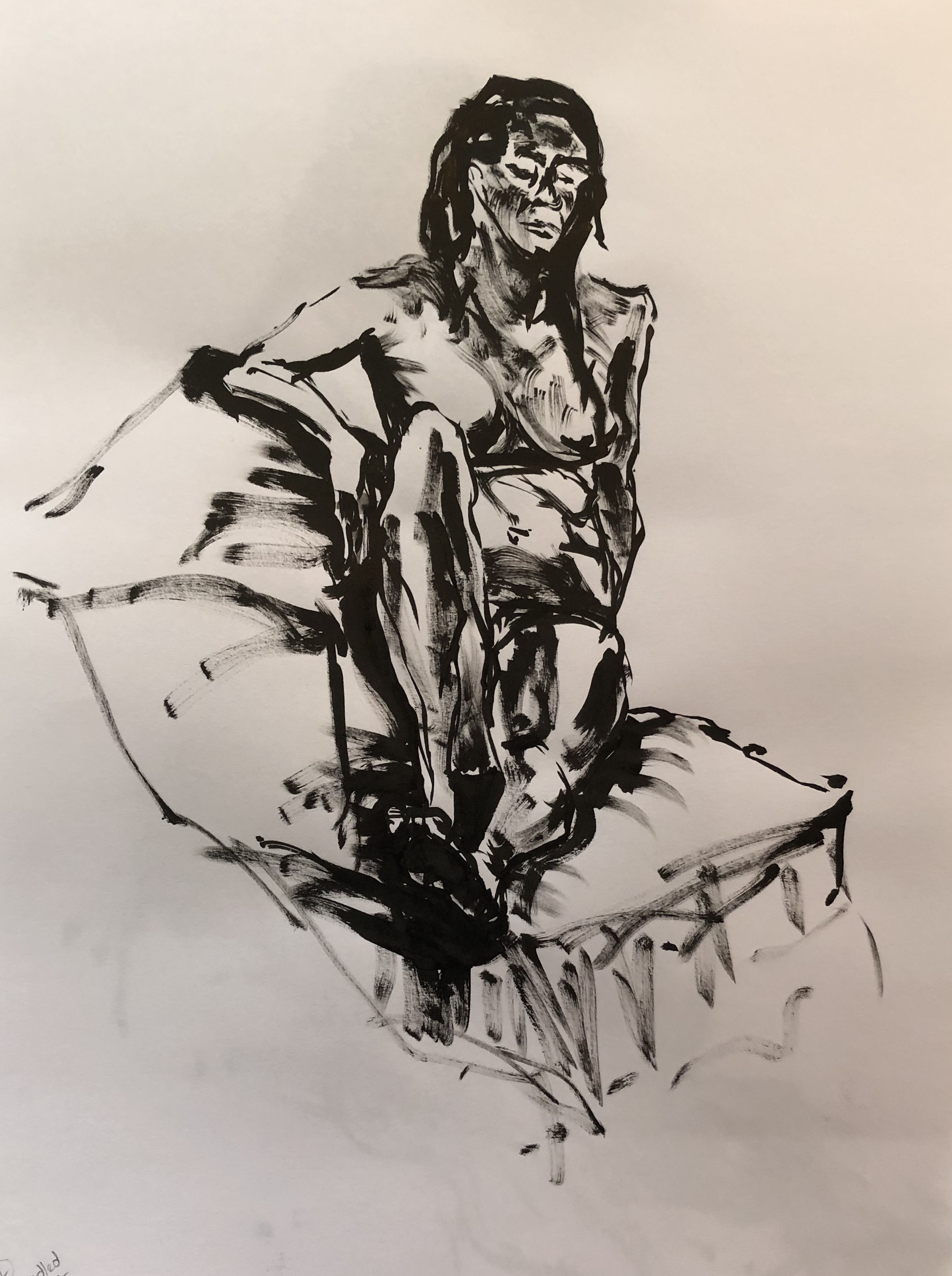
I fell into the trap of being uneconomic at first – so hard in a life drawing group when someone says “10 minutes left for this pose” – so you think you have to add something to your drawing in that time) – so decided to use some extra time from the second long pose to try a drawing of the model’s face, which I knew I hadn’t got right in the main figure drawing. The face was quite shadowed but with key areas lit up by a lamp.
I decided to use this drawing of just the head to take forward to a painting.
I had two things to try out in this painting: a tube of Jackson’s “Scorched Earth” black acrylic (supposed to be made from the ash of Iraqi fields burned by the militia), and a long handled sword liner brush.
I laid down a quick background on a piece of gessoed board, using loose strokes with flat brush and the black Scorched Earth acrylic mixed roughly with some titanium white Cryla acrylic. This dried in minutes, and I did the whole of the rest of the painting using the sword liner (and my left hand).
I worked quickly, marking in the lightest areas with plain white and the darkest with undiluted black. Then it was a question of filling in the mid tones. The sword liner was great for the wavy, expressive lines (as per Maggi), although I did struggle a bit with accuracy of detail.
I think the outcome is dramatic, although I think I lost some definition of marks in my mid tone areas as a result of just the fun of playing with the sword liner, and also have lost some of the character of the original – this feels more like a generic person than a particular woman.
On the plus side, I have managed to retain some of Maggi’s freedom of mark making.
NOW WHAT?
I have found that:
Mindful of some tonal inaccuracies/omissions in my earlier Frank Auerbach drawing which translated into corresponding inaccuracies in tone in the painting, I have learned to think more about this issue – which I did find easier here when drawing with ink.
If I want to do much more work with acrylic I need a whole lot more practice at dealing with the speed at which it dries, which took me aback a little. I could cover up my errors when they were “within” the image easily enough, but I wasn’t quite sure what to do about errors I had made right on the edges, which seemed to dry in seconds before I could wipe them off.
Turning out a cupboard, found an old box of unused CD ROM blanks which seemed ripe for experimentation as a support – I wanted to find out what materials the surface would accept.
AND…
I have been reading more about Raqib Shaw’s work with enamel paint, and wanted to see if I could replicate his method.
AND…
We have been away for a few days to Dunster in North Somerset. There is a National Trust Castle there which we visited, and I was very struck with the “Leather room” – a room completely hung with what initially looked like tapestries telling the story of Anthony and Cleopatra, but they turned out to be paintings on large leather panels done with oil paint in the late seventeenth century – sections of the painting were done separately and then the panels are joined and hung. These are rare in this country and came originally from the Netherlands where (according to the room steward), this was a very popular and widespread technique. Who knew? Need to have a go…..
SO WHAT?
CD ROMs:
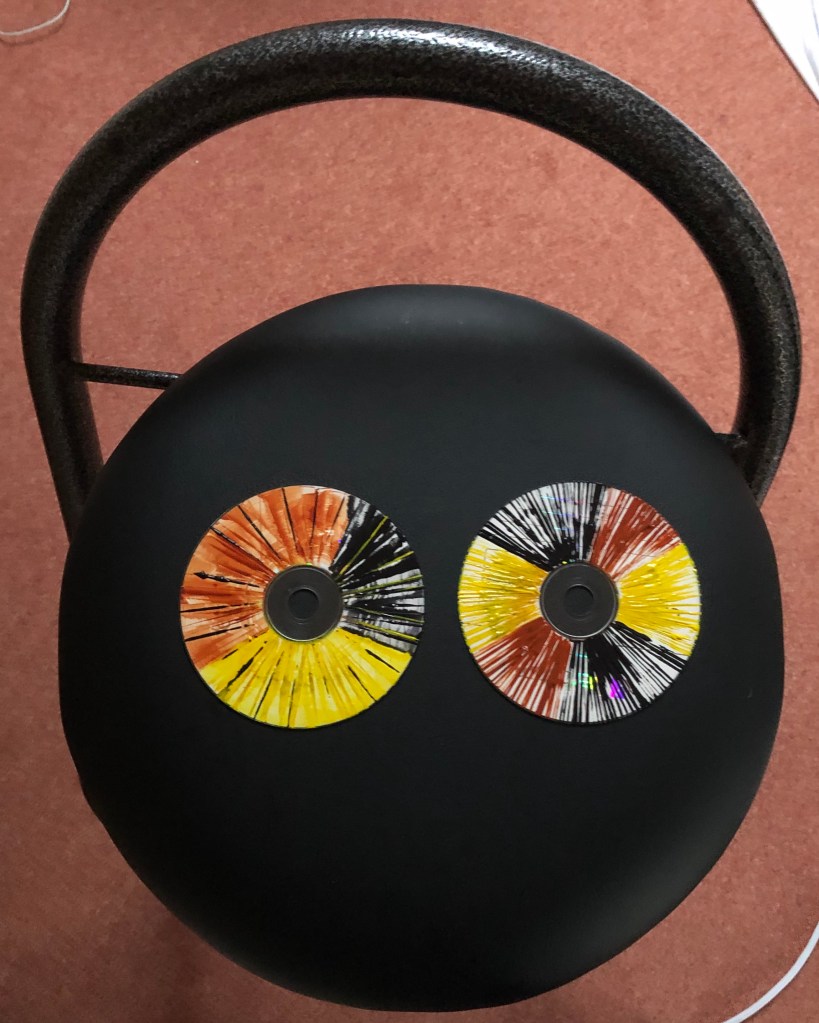
Acrylic paint seems to stick to most things, and this proved to be the case with the CD surface. I had some dollops of paint left over from a Zorn palette painting, so experimented to see what marks I could make by applying the paint thickly with the edge of a credit card – fun, satisfying, something to experiment with more on a bigger surface (I got a bit caught up turning my CDs into a pair of unmatched eyes for a stool “bug”).
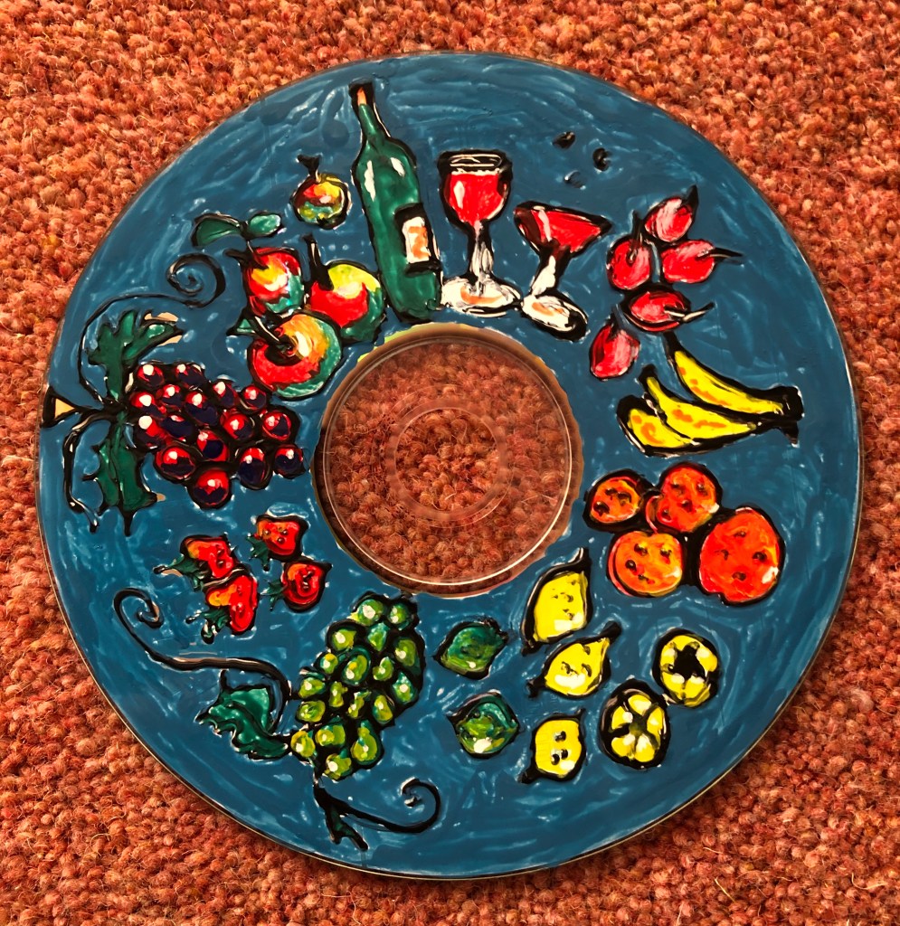
Next, I had been reading about Raqib Shaw’s method of working with enamel paint in Patrick Elliott (2018) “Raqib Shaw; Reinventing the Old Masters”, National Galleries of Scotland, Edinburgh – apparently he does elaborate preparatory drawings, projects them onto his support, draws out the design using an acrylic liner, then fills in the areas cordoned off by the liner with the enamel paint; he comments that the paints don’t mix terribly well, but he uses porcupine quills to sort of swirl them together within a little drawn cell.
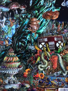
This example is a detail from his “Self-portrait as an Opium Smoker (A Midsummer Night’s Dream), 2016, acrylic liner and enamel on birch wood, 102 x 133cm, Private collection.
Lots of Shaw’s paintings contain cornucopia-type areas of food and drink, so I drew freehand some fruit and wine around the CD using a black glass paint liner – a technique in itself as you have to maintain exactly the right pressure on the tube as you’re drawing so you don’t get blobs or bald patches. Once it had dried, I painted into the drawings then added a blue background, a favourite colour of Shaw’s. I am using Humbrol enamel paints – the colours are vibrant, they don’t mix brilliantly (as Shaw commented) but you can overlay them a bit and blend edges with the tip of a brush. The paint adheres to the CD surface, although you do get a few skiddy areas if you don’t dry the Zest-It cleaner off the brush well. Only disappointment was the background, which I could not seem to apply evenly; I think Shaw drops the paint into the cells and lets it spread, which I wasn’t able to do here as I hadn’t applied liner to the outside of my CD…thus proving that shortcuts don’t always work.
…and finally, the oil on leather experiment:
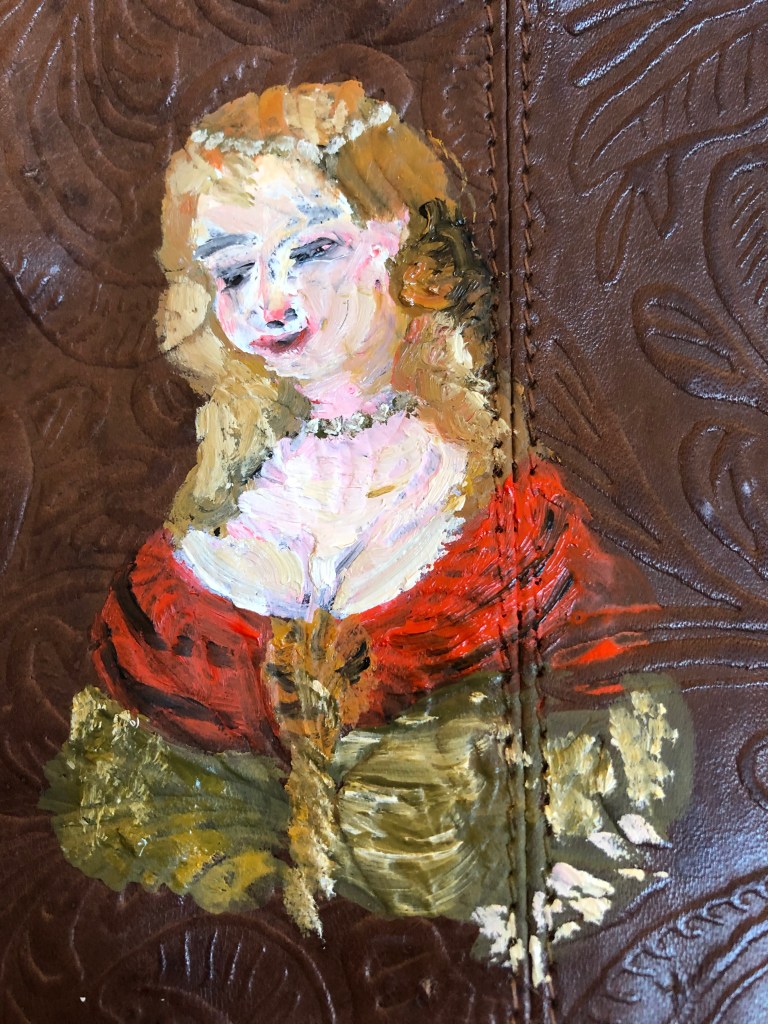
Tried using up some water-mixable oils from a Zorn palette I had made a few days ago – they were still malleable, although admittedly a little clumpy in places. I used a size 4 round brush onto the back of the handbag I’d used to experiment with acrylics (see Research blog post). I worked from a postcard of the Dunster Anthony and Cleopatra leather paintings, just trying to get head and shoulders of one of the figures (the image shown here is a detail).
The oil paint was not as easy to apply to the surface as the acrylics; when I used it slightly diluted with water it slid all over the place, so I tried to keep it as “neat” as I could, and even so it felt as if it were moving about a little whenever I tried to build up layers – so it’s ended up fairly pasted on!
I’m not sure how much of my difficulty was caused by the fact that my paint had already started the drying process, and how much was caused by using water-mixable oils (which I prefer because of my asthma) – obviously leather is treated to repel water, and I wonder if I would have had a different experience with completely oil-based paint. Also, there is the possibility that the bag is not actual leather but a faux substitute, so might not react the same. Again, there is the possibility that the Dunster paintings had some sort of ground applied (gesso or similar) to help the paint “take”, although this wasn’t apparent and wasn’t mentioned by the chap who described the process to me. Finally, I wonder if I should have tried using a smaller brush – but it took a bit of oomph to “push” the paint onto the leather and get it to stay there – so possibly, rather than using a smaller round, I would have been better off using a bristle brush and going for impression rather than detail.
NOW WHAT?
I’m pleased to find I’m beginning to enjoy and embrace the experimental.
I’d like to try more of the following:
When using thick paint, apply it with tools other than brushes – maybe more credit card marks, also palette knives.
I’m interested in Raqib Shaw’s method of working and would like to play around more with the enamel paints.
After doing the above experiments, I had a good go at cleaning my palettes. The acrylic one wasn’t too bad as I’d kept it in one of those “stay-damp” boxes, but getting the partially-dried oil off the other, glass, palette was a bit of a nightmare; so I’ve learned that thrift is OK to a point, but I would be better thinking about how much I’m actually going to need before I squeeze paint from a tube.
I read the recommended blog post on the Zorn palette, and also found a series of 4 articles on it in the Artists & Illustrators Magazine (beginning with the Summer 2020 palette) by Ann Witheridge of London Fine Art Studios.
SO WHAT?
I experimented with colour mixing as suggested in the articles by making a colour chart using egg tempera and these colours: Zinc White, Ivory Black, Naples Yellow and Alizarin Crimson. I started with the raw colour at the top of each column then added white each time as I progressed. This particular combination was good for flesh colours; the browns ended up quite purply and a picture needing a lot of blues would need to substitute the black for a blue, as mentioned in the article.
NOW WHAT?
I shall try using the Zorn palette for some paintings.
I wanted to look at the preparatory drawings by some of the painters my tutor suggested. Purpose was threefold:
Read about and observe their drawing style in terms of line and tone
Try some drawings using something like their style
Make a painting from my drawing, as suggested by my tutor
Factors to remember:
Use different tools and gestures
Focus on tone
Remember: “decisive and economic”
SO WHAT?
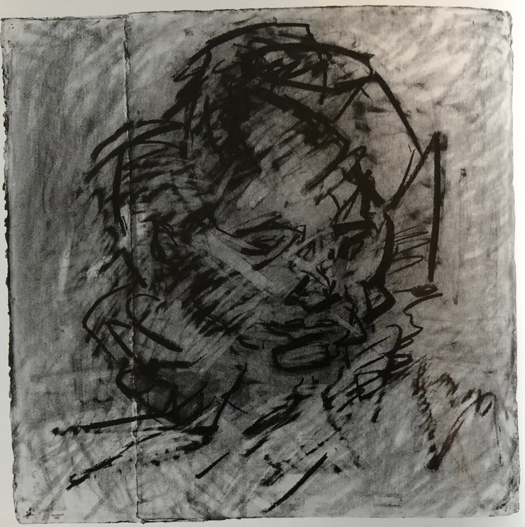
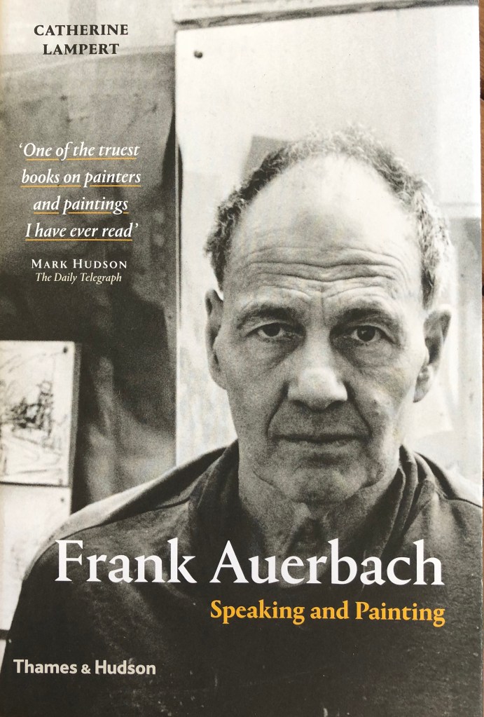
I looked at drawings by Frank Auerbach; for example, this one of the author of a recently-acquired book about his life and work: Lampert, Catherine, 2015, “Frank Auerbach, Speaking and Painting”. Thames & Hudson, London.
“Head of Catherine Lampert”
1985
Charcoal and chalk on paper
76.2 x 76.2 cm
Private collection
He seems to go over the drawing again and again, adding and then removing, as if trying to get the essence of the sitter into his head.
I had a go on paper, using a Conte crayon grey roughly shaded background and willow charcoal to draw with, plus a putty rubber to remove.
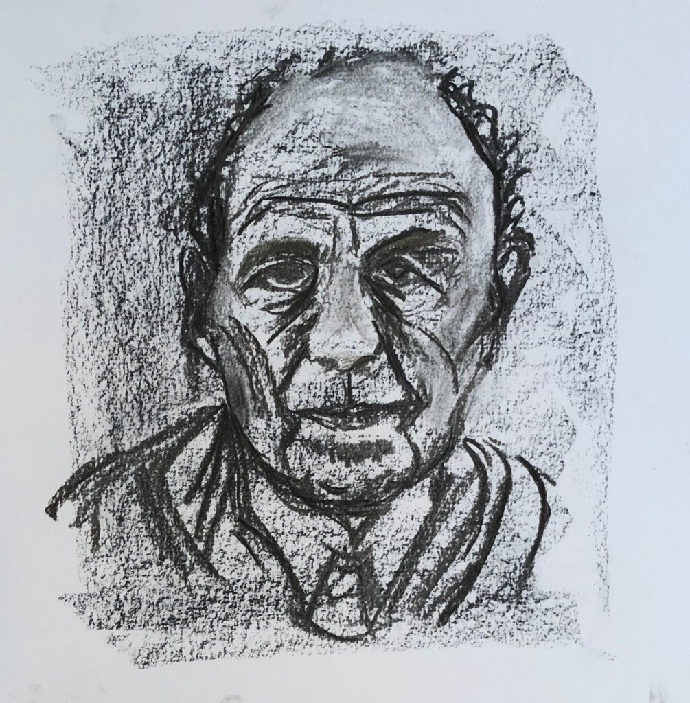
Even though mine is quite scribbly, it’s still “neat” by comparison. It’s the photograph of Auerbach from the front cover of the book.
My next step was to try and paint solely from my drawing – I’ve only rarely done this before, usually having photographic backup or the actual object in front of me, so thought this would be a good test of my drawing/looking.
Also, even though the book cover was in black and white, I wanted to add some colour and use my Zorn palette.
And I wanted to give my new oil long-handled brushes an outing, but this time using them with my left (non-dominant) hand to develop control.
I laid out my Zorn palette, light to dark, with water mixable oils: Titanium white, yellow ochre, cadmium red, black.
Using black and white and a dilute mix, I laid a loose ground onto primed board using broad vertical and horizontal strokes.
The painting of the figure was done using undiluted paint. I worked quickly, trying to make marks decisive – it went well for a while until I came to the mouth, which is where my portraits often fall apart, and this was the case here. The trouble in fact was with my drawing – I had not indicated the tones around the mouth correctly, but when I tried to paint them in accordance with the drawing, I could see it wasn’t right and fell to tinkering to try and make it better. When I came downstairs again and looked at the book cover, I could see immediately what my issue was.
NOW WHAT?
I learned a lot there!
If you’re going to paint solely from a drawing, then get the drawing right!!
And then, trust your drawing – I can see bits where I haven’t (e.g. the darkness of the hair on the left)
If a painting’s going wrong, trust your gut to put it right, but DON’T FIDDLE
I have been decisive in places, but I’ve not always been economic
The Zorn palette definitely works for portraits
I am better at being decisive with my left hand because I have to concentrate on each mark as I worry I lack the control over a long handled brush; when I’m unsure of what I’m painting, I kept catching myself reverting to the right hand and moving the hand nearer the ferrule, and that’s where I fiddled.
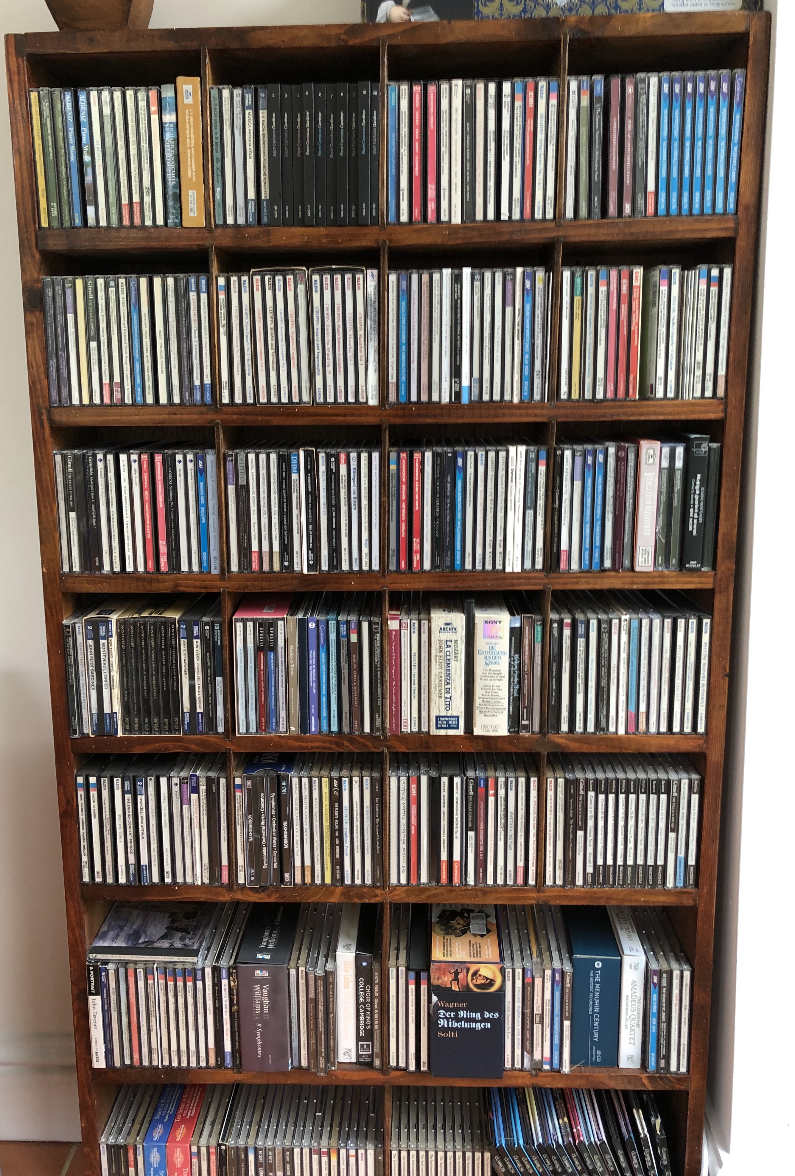
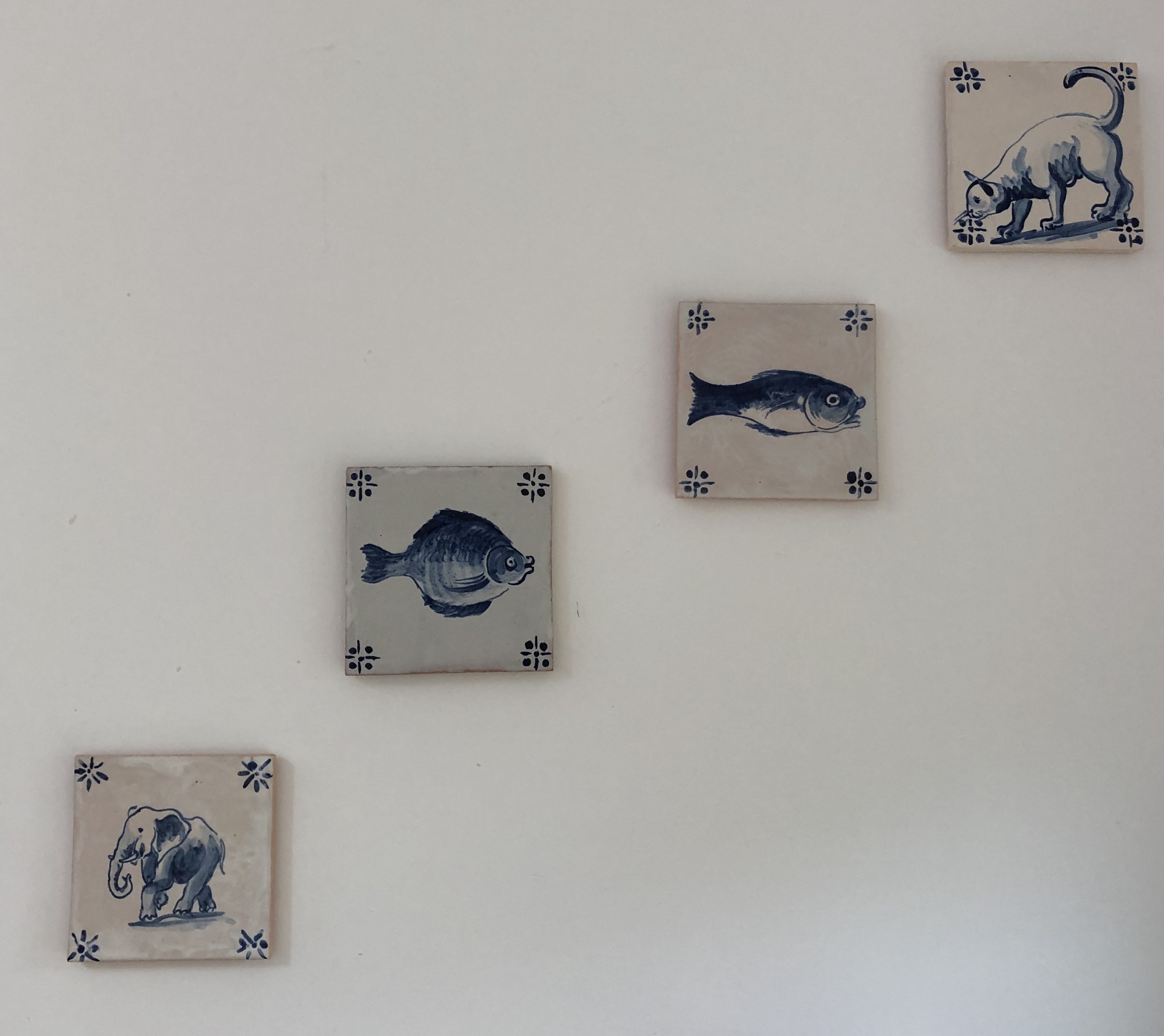
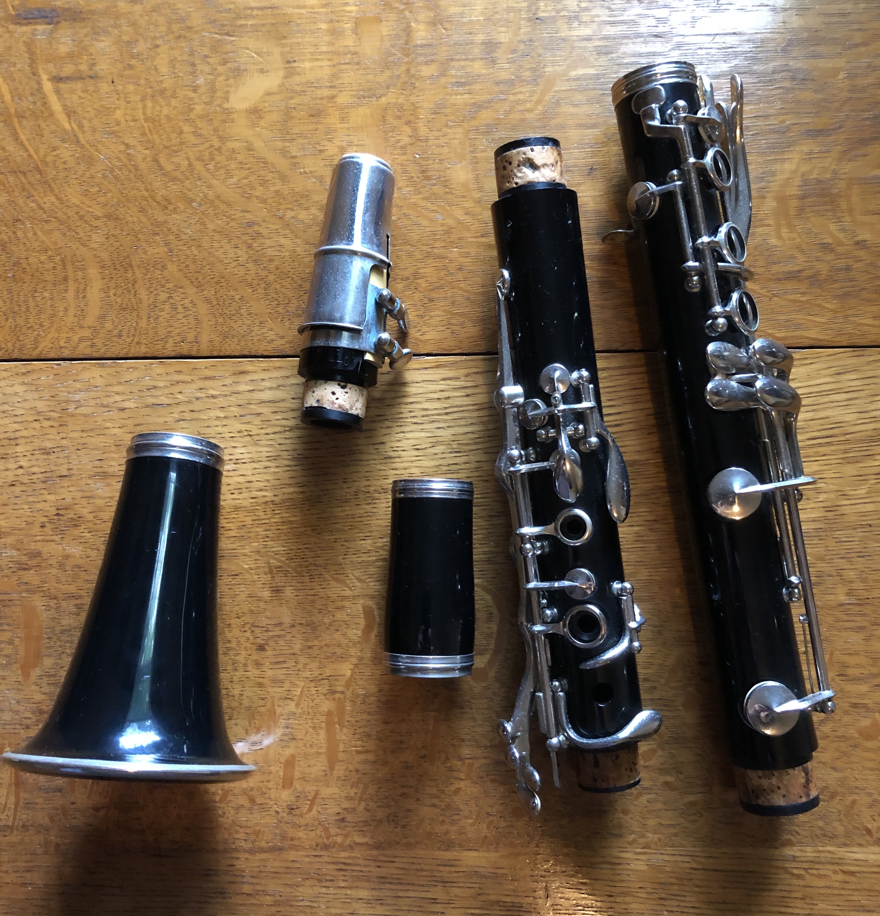
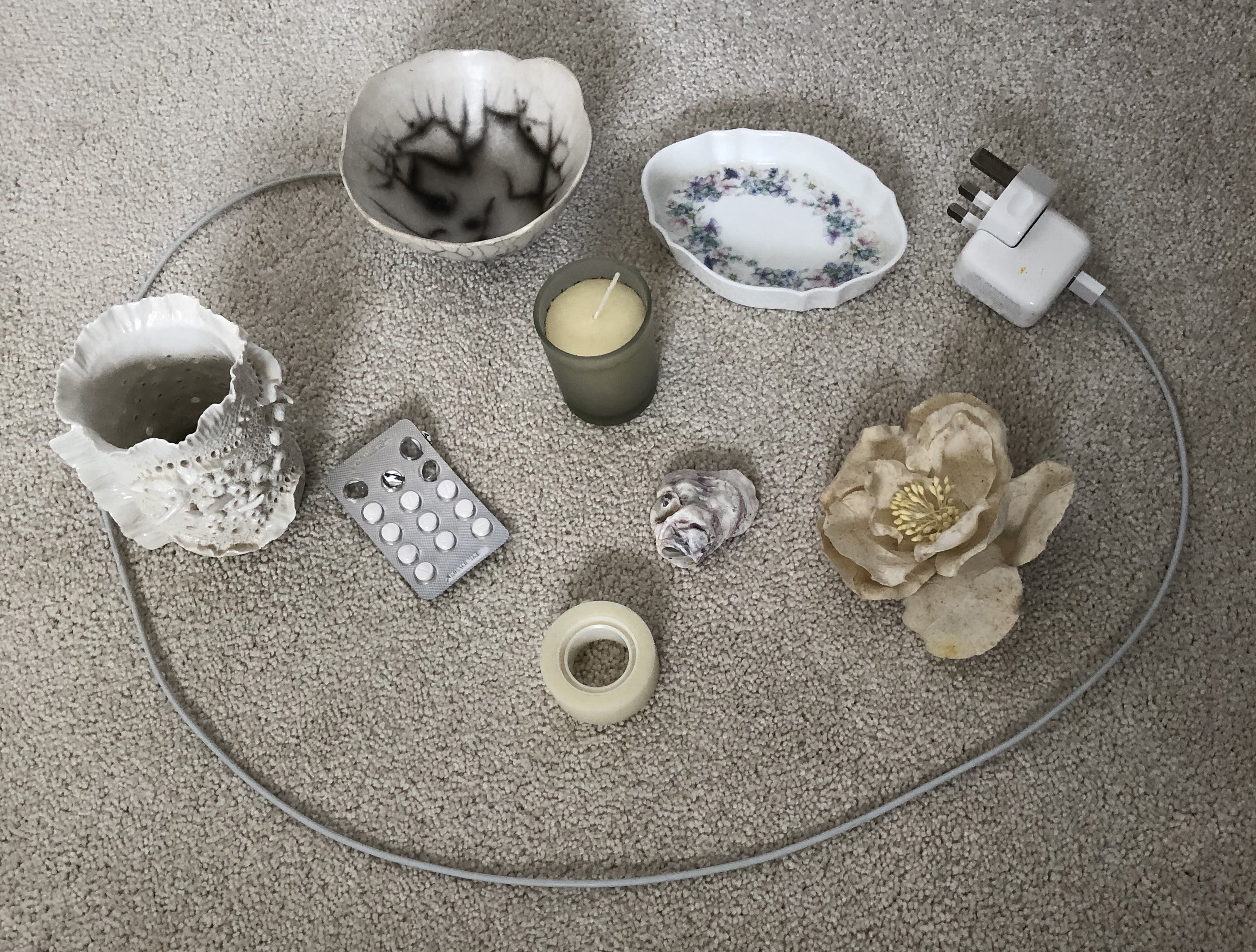
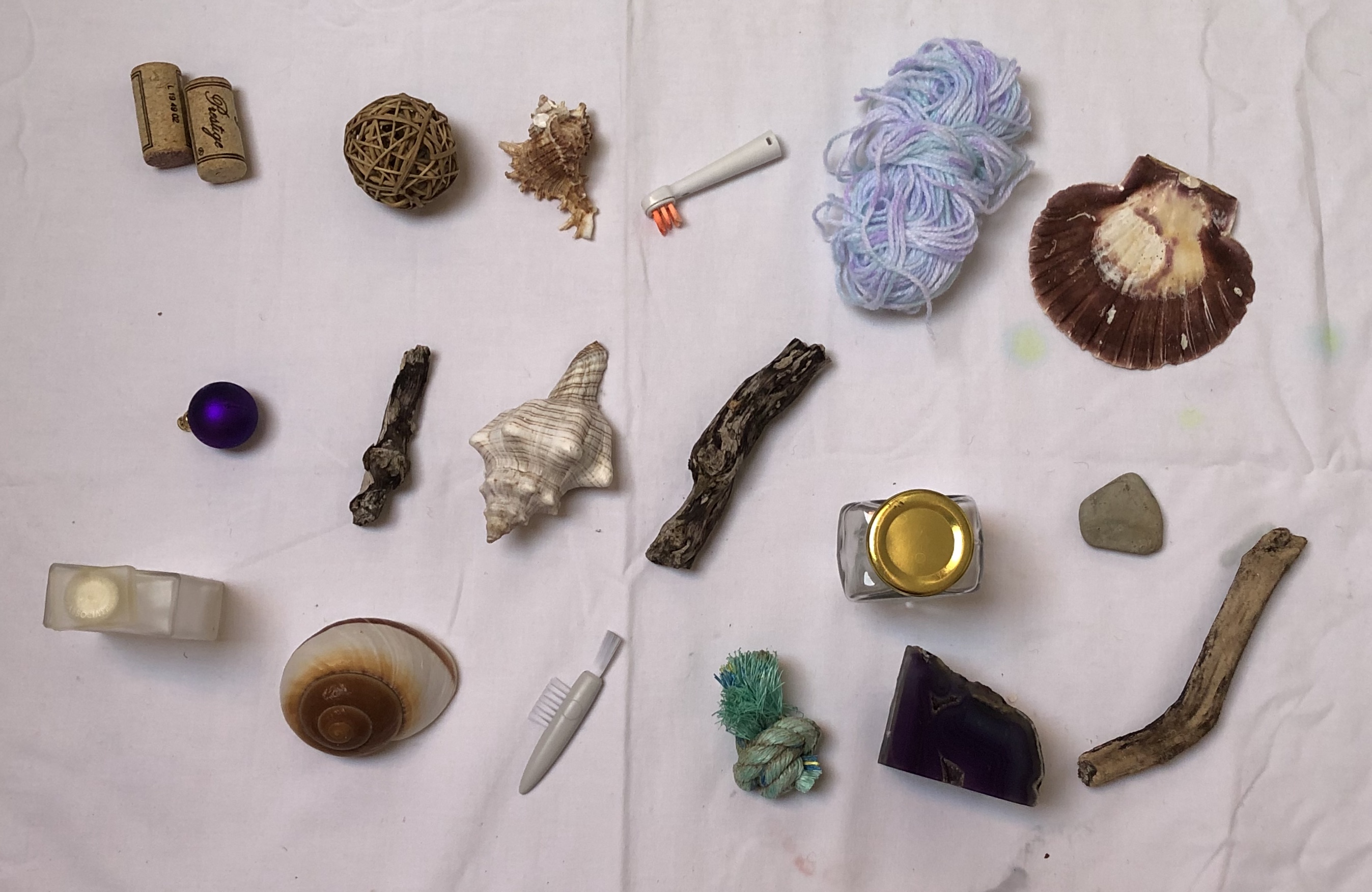
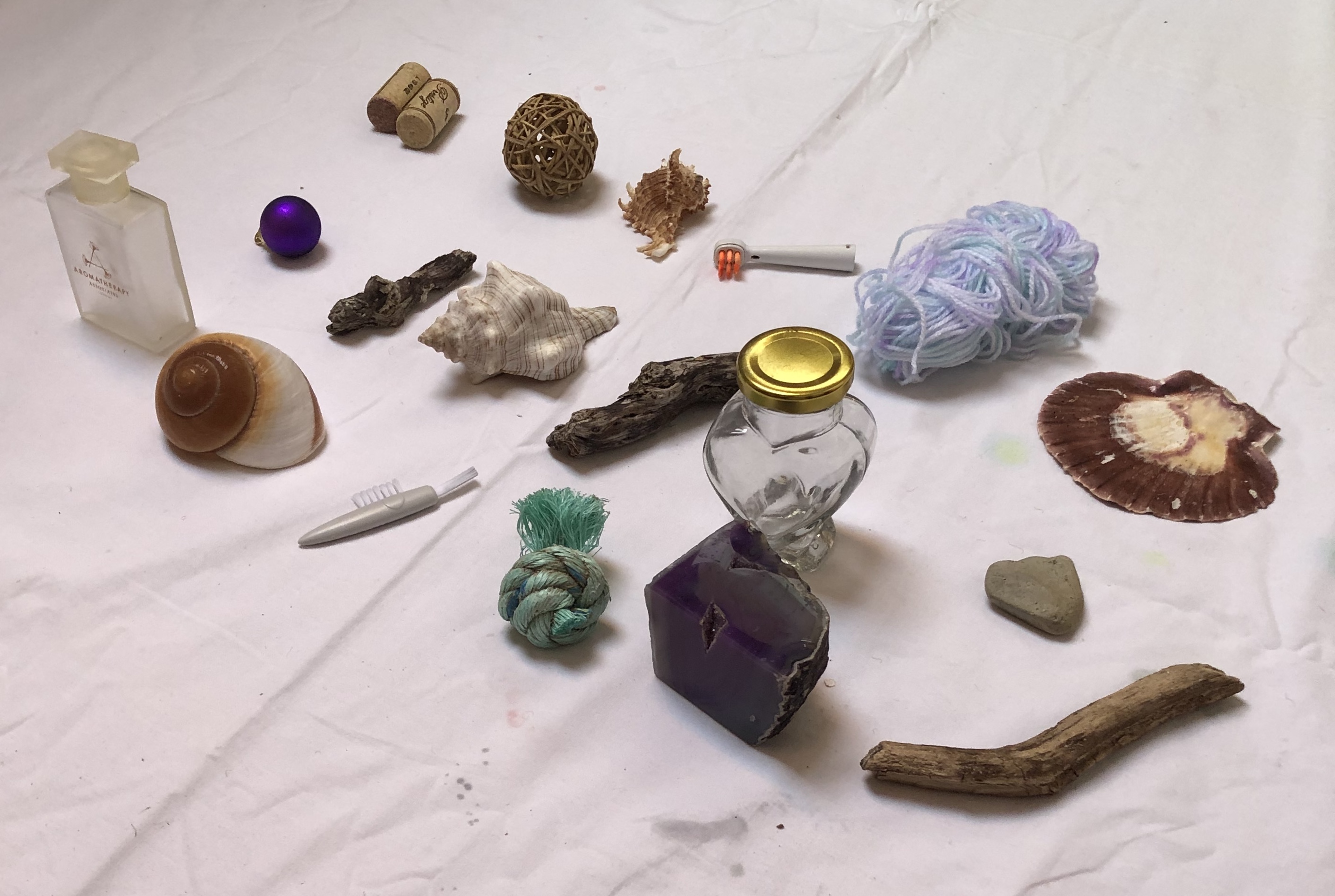
Once I had taken on board the fact that collections can be formal but also might be informal, I began to see them everywhere in the house. Many of the pictures which follow are of these “found” collections.
SO WHAT?
I have photographed a number of collections from around the house; some have “staged” backgrounds but the majority are on/in the vicinity of their existing locations.
NOW WHAT?
I’m looking forward to using some of these images in the exercises , as well as the collections discussed in my research blog (especially the “bottles of ink” and the “things to paint”). I might choose to rearrange some, or to select a few from each collection, depending on the task; and obviously, with an arranged collection, you have more control over the background.
I’ve tried to pick a favourite collection from the selection above, purely as an image, and I can’t – although the one I’m most looking forward to having a go at painting is the parts of a clarinet (probably the most fiddly, so I’m going to go with a lot of implication to avoid tying myself in knots).
Having looked up and read the suggested essays by Benjamin and Freud (see course materials for reference), I came across details of an exhibition at the Barbican Centre, London, 12th Feb – 25th May 2015: “Magnificent Obsessions – The Artist as Collector”, curated by Lydia Lee.
SO WHAT?
Lilias Wigan, reviewing the exhibition for the 3rd March, 2015 edition of Country Life magazine, said it looked at three questions:
– “how has the practice of collecting aided artists’ researches
– How has it inspired artistic progression
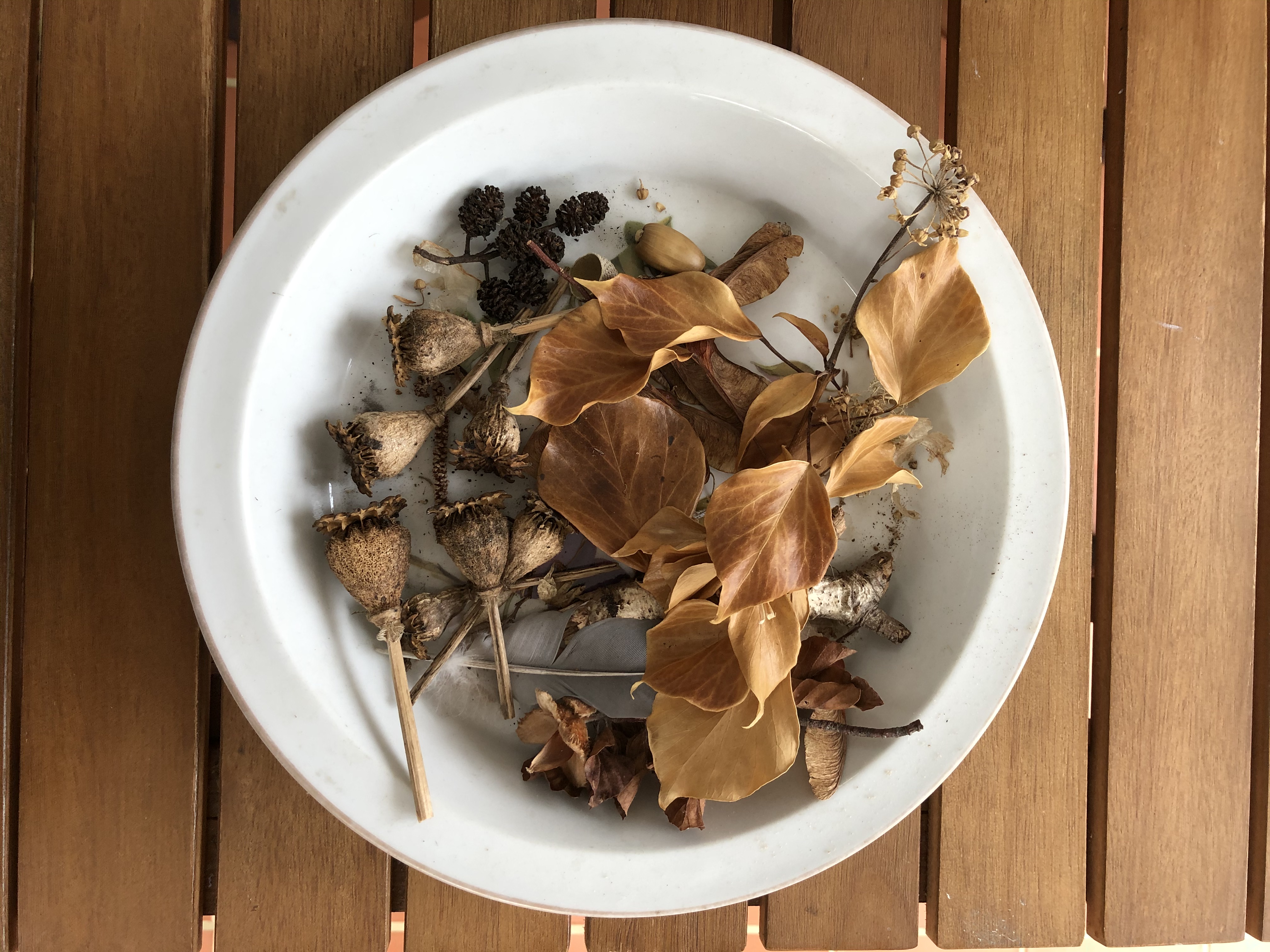
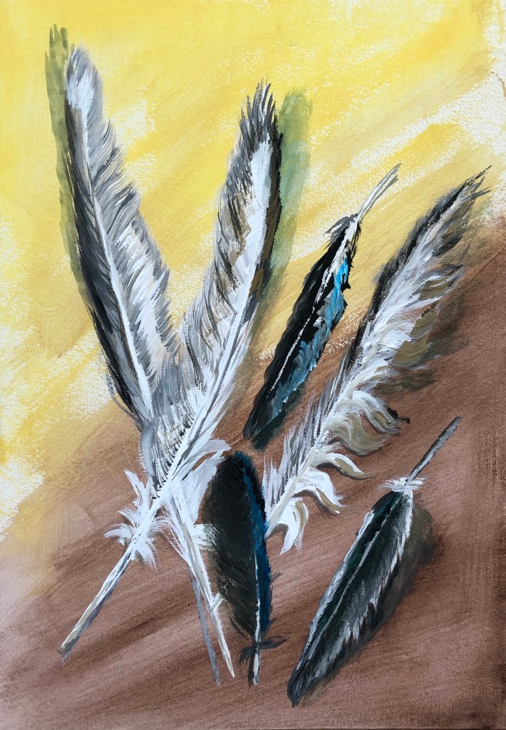
– How have artists assimilated their collecting into their own work?”The exhibition ranged from carefully assembled presentations, such as Edmund de Waal’s netsuke, made into artworks in their own right, through to Andy Warhol’s obsessive collections of unappreciated objects; apparently he shopped every day. The reviewer says “…each room has its own character as an opening into the psychology of a particular artist’s collecting obsession.”Reviewer Iranzu Baker (www.iranzubaker.com) was struck by Sol Lewitt’s 1980 work Autobiography, in which the artist documented his entire flat in black and white photographs, even down to the plugs. Baker remarks on the unbounded curiosity about the world around them which is revealed by these collections.Reading the articles and the reviews about this exhibition has made me reflect on my own collecting habits. Books are my main one – in my view, no house is complete without floor to ceiling books, dating back I think to my bookish only-childhood spent in the library, and maybe also to my Mum’s gradual blindness – books were her passion too, and the biggest loss that she mourned as her sight went. So, writing implements and notebooks, also. So I may not have to shop every day like Andy Warhol, but I cannot pass a bookshop, stationers or art shop without going in and buying something.I’m also a sucker for natural objects – sticks, shells, leaves, acorns – which sit around in plates and bowls until they disintegrate; and I can’t pass by a feather without harvesting it. People talk about feathers as gifts from angels etc, which really doesn’t chime with me – I think I collect them because my best friend at school (now a historian) would always turn any feather she acquired into a quill and used it to write with (she still does), so I suppose I have thought from childhood that feathers, despite their fragility, were useful and should be hoarded against a future need to write something down.
NOW WHAT?
All this made me dig out my vase of feathers and paint some of them. I had a stretched A3 sheet with an egg tempera ground (Naples yellow and Vandyke brown – recently acquired and wanted to see what they were like) sitting around. I chose to work in gouache – limited palette of permanent white, lamp black, neutral grey, raw umber and cyan. I started with size 2 rigger and fan brush, but they were too small for what I wanted – so did the vast majority of the painting in a half-inch soft flat.
Light coming from all ways – picture windows beside and behind, big skylights above – so shadow position a bit random, depending on the way the feathers were leaning on the table.
Tried to keep loose but directional marks and overlaid layers – gouache is really good for letting you do this quickly.
Likes: – Some of the brushmarks, especially where I’ve managed to get the right weight and feathery-ness (usually brush quite dry, but not always)
To improve: – Also some of the brushstrokes! – where I’ve got the brush too wet and then picked up too much paint, marks rather clunky.
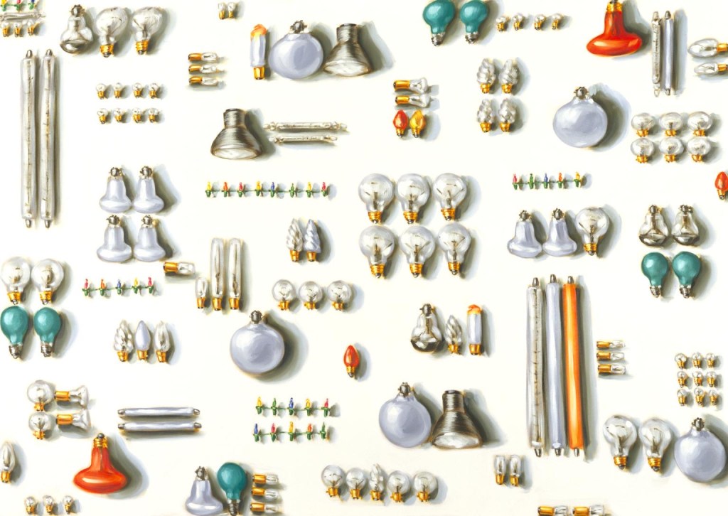
Lisa Milroy I found some of her paintings of collections. Objects like shoes didn’t interest me so I wasn’t immediately pulled in to those paintings, but I liked her grid layouts, the way she introduces very slight variations in placing to “make you look” – almost like those “spot the difference” puzzles – and especially this one:
“Light Bulbs”, 1988 Oil on canvas 203 x 285 cm Tate collection
Light bulbs don’t really interest me either…so I think I was drawn to this because:
– I do like round things.
– The variety of orientationsand groupings made the image something you had to decode, presenting the viewer with a challenge to get their teeth into.
SO WHAT?
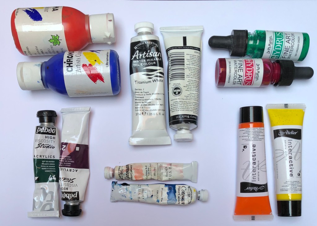
Having recently acquired a set of long handled oil brushes, I made myself a small grid of paints, varying the shape of container and the orientation, as Lisa had, yet keeping the neatness and control of the organisation. I broke out some Cobra water-mixable oils (white, lemon yellow, burnt umber, cobalt blue and pyrrole red), and set off, painting on A4 oil paper so that my images were roughly life size (as Lisa sometimes paints).
NOW WHAT?I have learned that:
– Painting with long-handled brushes is something I am going to have to work hard to get good at – my right arm (because of my previously broken shoulder) doesn’t have the freedom of movement, and my left hand/arm is just not used to wielding paintbrushes (although fine with charcoal!) and will need some training up.
– I enjoyed the loose mark-making possible with the oils, got really into the zone, and this is something I want to do more of.
Lisa’s grid arrangements (see above) reminded me of a Zoom workshop through one of the OCA’s regional groups which I attended, led by OCA tutor Neil Musson “Building the unfamiliar with the unfamiliar in unfamiliar times”, 13.6.20. He talked about KNOLLING – sorting and arranging like objects in a grid, and gave us some examples from his own work and that of other artists – Motoi Yamamoto’s salt patterns, Cornelia Parker’s “Thirty Pieces ofSilver”, 1988-9, silver and copper wire, Tate Collection, and the sculptures of Tony Cragg, e.g.“Cumulus” , 1998 Glass 265 x 120 x 120 cm Tate collection
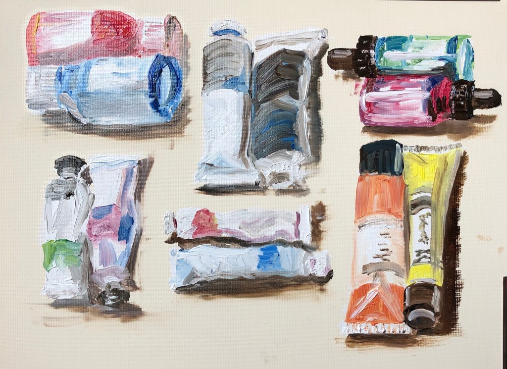
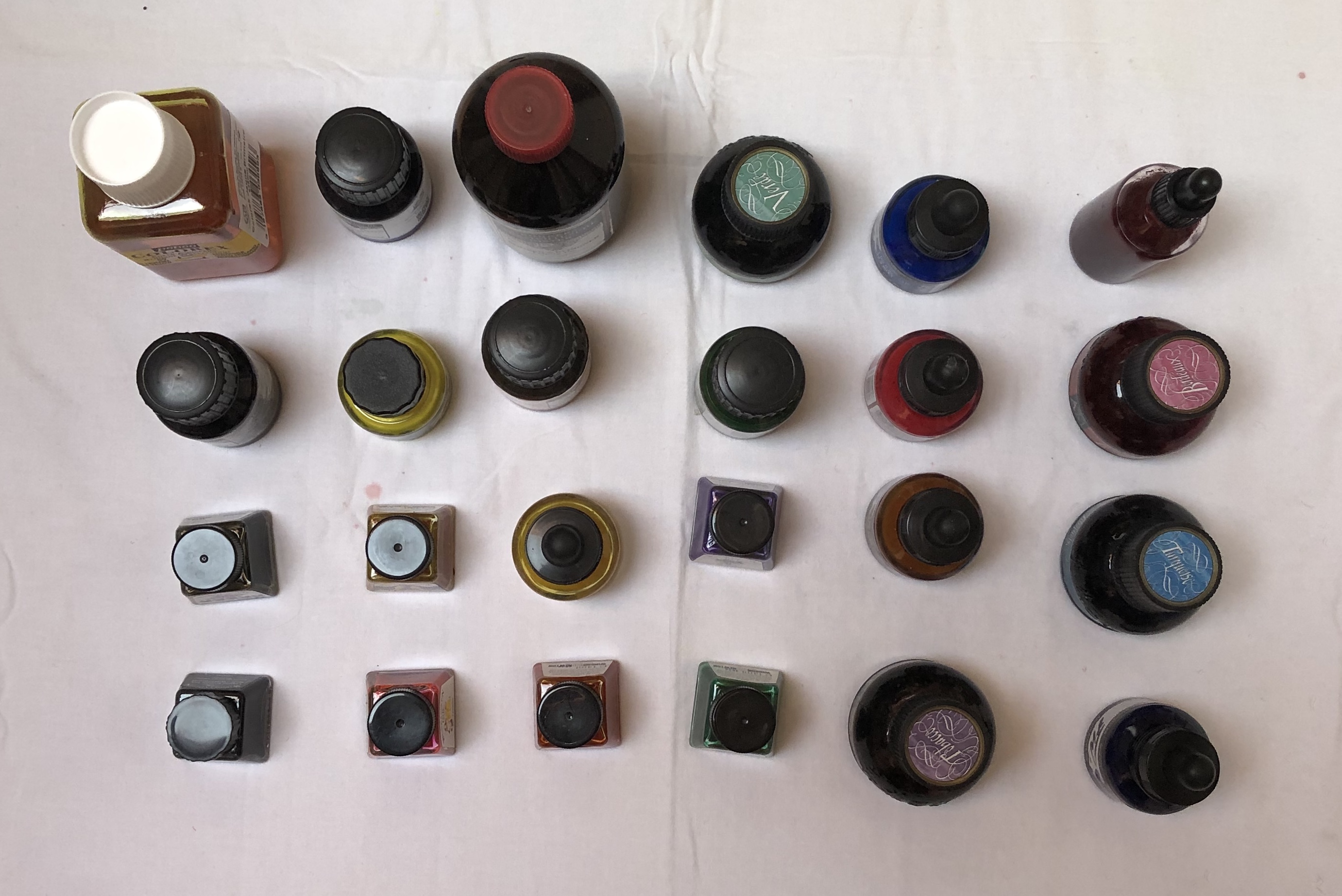
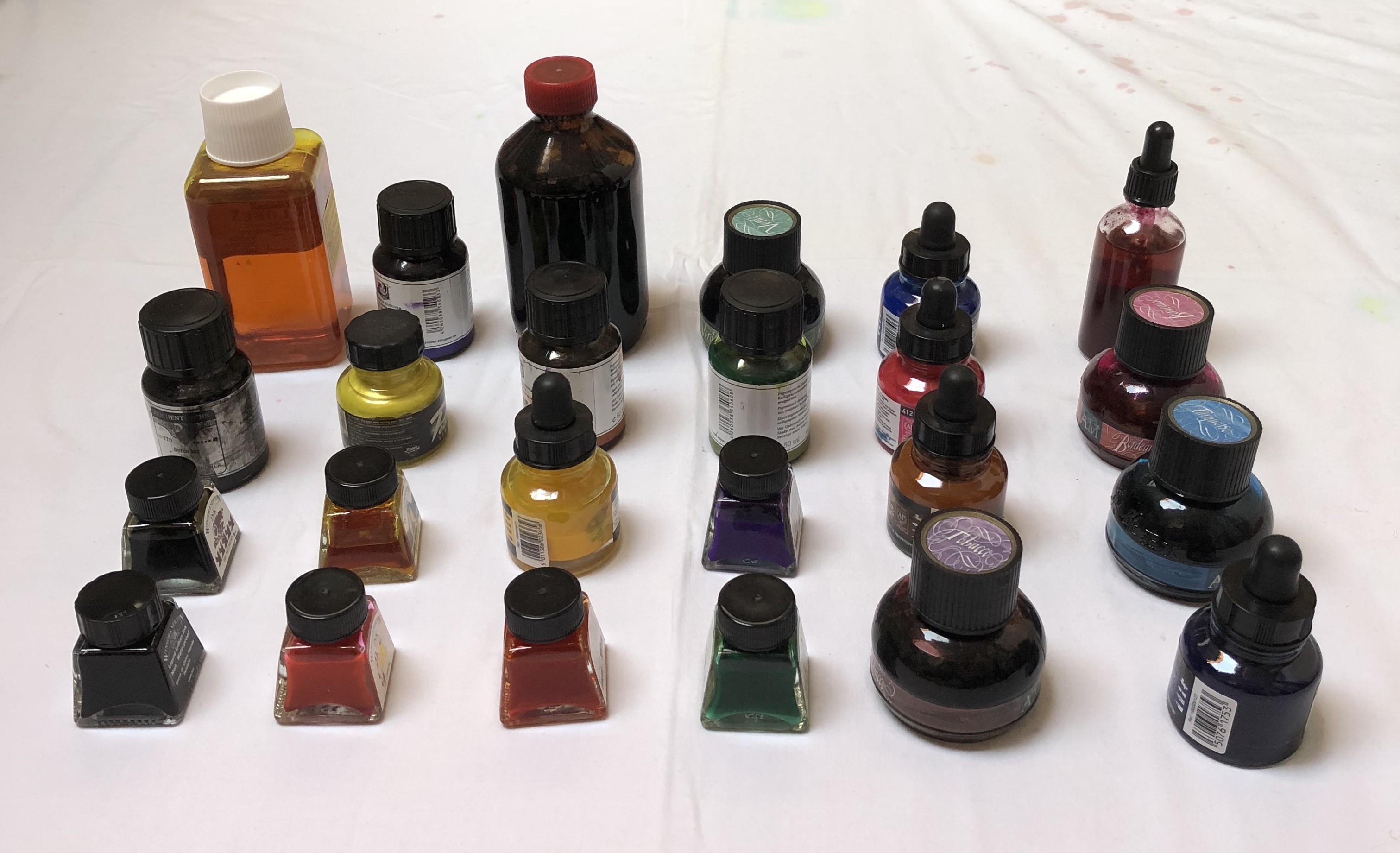
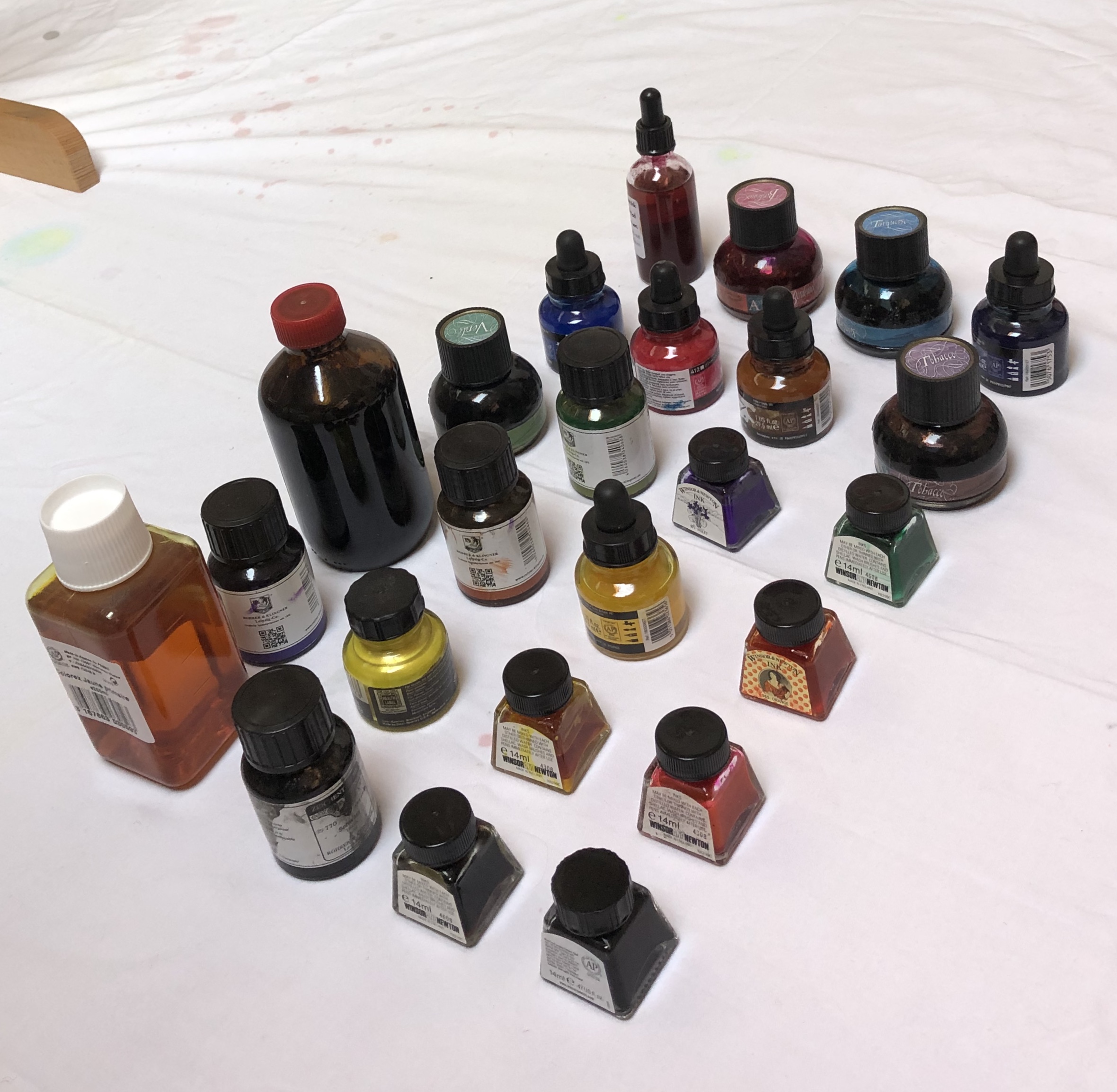
SO WHAT?I made a grid arrangement of bottles of ink on a white surface and photographed them from different angles:
NOW WHAT?
I intend to use these images as part of my reference material for the Exercises in Part 2.
**************************************************************************************** WHAT? I looked at the work of Tabitha Moses, particularly on her own website, www.tabithamoses.co.uk. Her collections are of sometimes unusual objects – article by Alex Michon (quoted on the above website) describes her as “a rag and bone archivist of the peripheral.” Her work often relates to her own experiences, either personal or her professional research.
SO WHAT?
Having been for a rather painful blood test this morning resulting in several punctures of the skin, I was interested in her section of work looking at the skin as a threshold, which derived from her discussions with eczema and psoriasis sufferers.
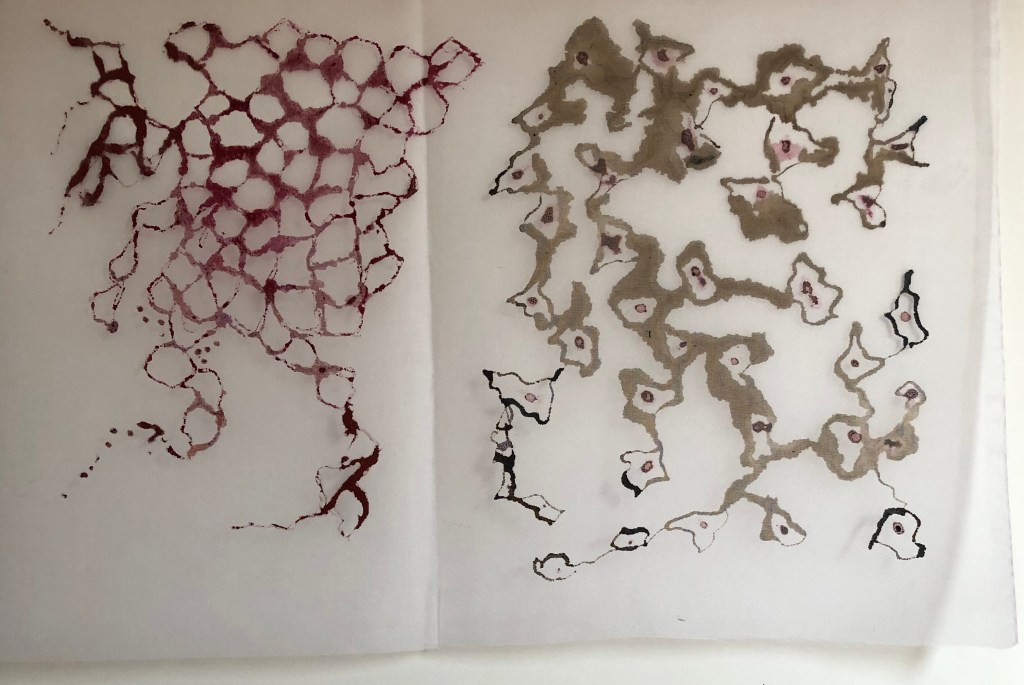
After studying “itchy and prickly painful”, 2012, calico, sawdust, blackout fabric, plastic, thread, entomology pins from her Threshold: The sublime skin series (see website), I decided to use a piece of silk as a threshold and explore painting on to it with various media. The silk was loosely taped onto a glass table.
– Dr Ph Martin’s liquid watercolour, Indian Red, applied with the bottle stopper, gave a lovely blood-like gloopy appearance when applied – very satisfying. It sat on the surface for a while, gradually seeping in and spreading and eventually drying looking disappointingly less dramatic
– FW acrylic ink, sepia, again applied with the dropper, began to penetrate the surface straight away, quickly spreading – it only “blobbed” and retained clear lines where the silk was not touching the table
– Handmade natural dye pigment ink (Cochineal Red), dropped into the shapes drawn with the sepia acrylic, above, behaved very differently – it seemed repelled by the silk surface, I couldn’t draw with it, it just sat on the surface in droplets. Ithas only soaked in in a couple of places (where I think the acrylic solvent has undermined it), and has dried to an unappealing yet very convincing resemblance to clots of dried blood. Nice.
NOW WHAT?I have learned that: – a collection can be of quotes around an idea or situation – it doesn’t have tobe of actual objects – there is huge scope for investigation of a concept, eg. the effectiveness of asupport as a threshold
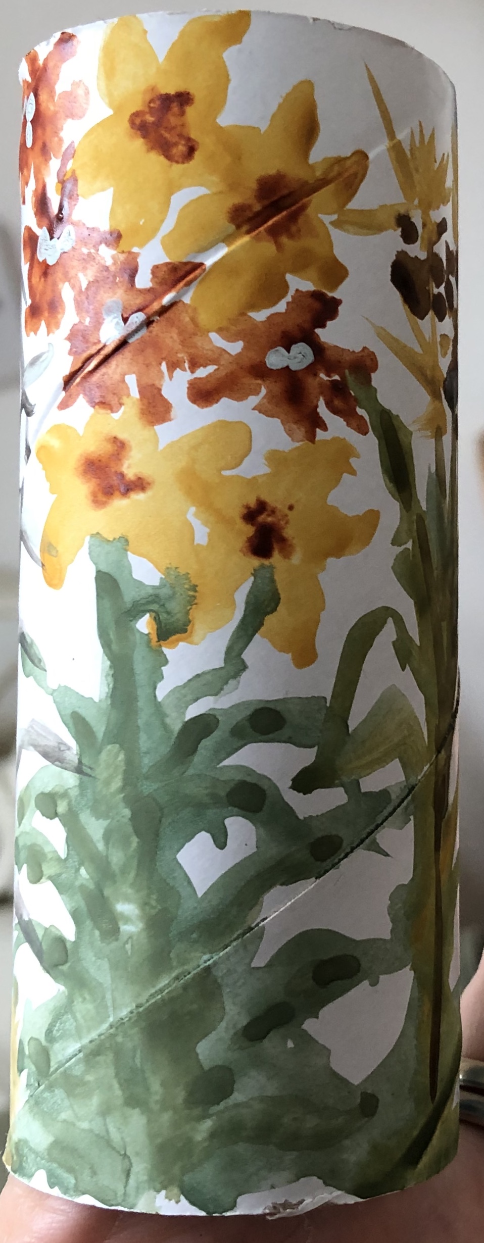
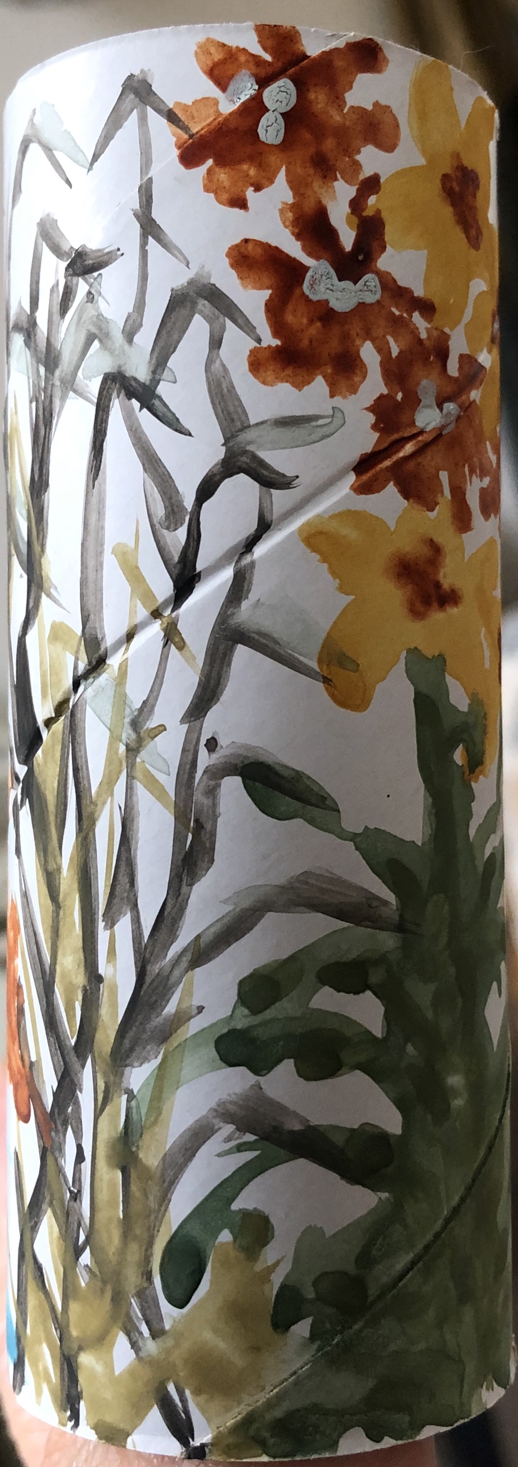
I looked at the work of Paul Westcombe on www.paulwestcombe.com and also on www.saatchigallery.com. His ideas are inventive – to create a work of art on something usually considered “throwaway” like a paper cup or a ticket, i.e. to give a value to something otherwise valueless (although the saatchi gallery suggests that this is actually not the significance and his work is simply a demonstration of his compulsive need to draw) – and the pieces are colourful and inviting to the initial glance, although his subject matter did not appeal to me close up.
SO WHAT?
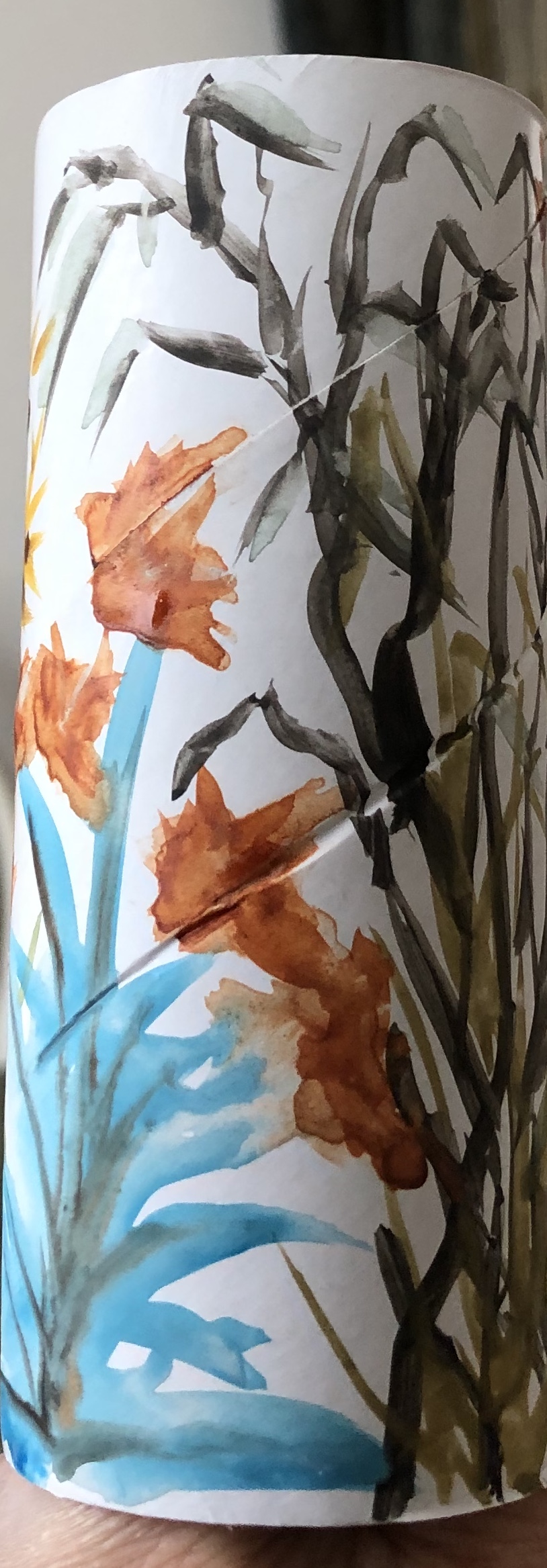
Wasn’t quite sure how to respond to this apart from the obvious – only had a cardboard roll to hand, so tried a quick design on that of plants in the garden with leftover gouache paint in my palette plus raw sienna and burnt sienna watercolour.
My design was very adaptable to that tricky part of painting round a cylinder, i.e. meeting up with where you started – and hats off to Paul W, he was doing figures telling a story of sorts on a truncated cone, so he must have developed a technique for dealing with that.
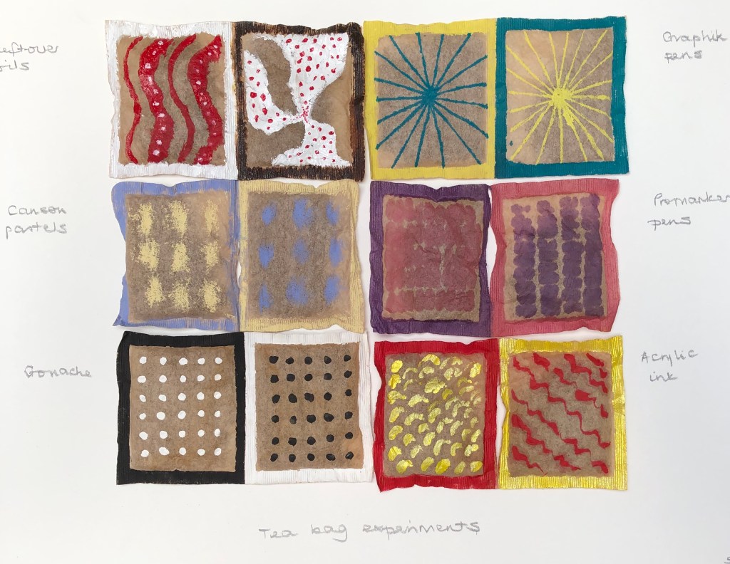
Also had some old dried used teabags (still containing tea) so tried a design on those (using various media – oil paint, Promarkers, Graphix pens, soft pastels, gouache and acrylic ink)….but felt I was playing around with random detritus because I had to.
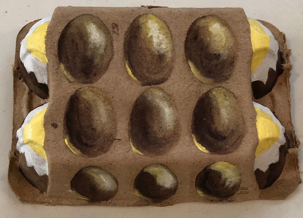
Had a bit of a breakthrough with an empty eggbox though which I was just about to put out for recycling – decided to paint eggs on it – using egg tempera (what else?!) using white, Naples yellow and Vandyke Brown. It is rather surreal (my husband says it’s “a bit Dali”…not sure if that’s good or not), but I was pleased with my eggs which are reasonably 3D – it is displayed on my shelf.
NOW WHAT?
I have learned…. – I’m potentially going to struggle with the “off-piste” aspects of this Part – it’s not apparently in my nature…or rather, it feels a bit like the sort of thing I would have done with the children back when I was teaching, and therefore not proper “Art”. Guess I need to loosen up a bit and let go – I did enjoy the eggs, so it can be done.
I looked up the Ornament exhibition held at the Transition Gallery in Huntergather, London, Oct-Nov 2013, and found examples of painting on handbags by various artists, including Cathy Lomax and Alli Sharma.
They have all painted to the theme of handbags as part of female adornment, whereas I decided just to experiment to see if I could actually physically paint on a handbag, and how this might be done.
SO WHAT?
After a recent sort-out we had a few bags which were designated for Oxfam – including one small leather/leather effect handbag (not sure which) – so this was my experimental support. The surface had a kind of raised floral chasing, so I decided to try and create some fantastical and shiny flora, in the style of Raqib Shaw (not following the existing chasing). I picked acrylics for robustness when dry, choosing some old Chroma acrylics as they were fairly liquid – this way I thought I would be able to apply them easily undiluted. I wasn’t sure if I needed to prepare the surface with gesso or something beforehand, so just went straight in and tried applying the paint so see if it would stick; and it did. It sunk into the surface a little but not too badly, retaining most of its wet colour.
Pleased with this, I thought I would go the whole Raqib-Shaw-hog and add sparkle – the gold acrylic ink stood out much better than the silver watercolour silk ink I tried, but even that showed up reasonably, although better when applied over the top of the dried acrylic paint.
NOW WHAT?
I have learned:
– Making up doodly out-of-my-head images is not a strength, I am better at painting “something” defined – my foliage and flowers are more folk art than fantastical Raqib Shaw.
– I should not dismiss supports other than paper/board/canvas as too difficult to try painting on.
Julian Walker has made some interesting collections. I thought his: Detail from Collection: Acts of Faith by Julian Walker(Series: Living with medical science), 2003object, Hand-carved pills, glass and board Medicine Now (Permanent exhibition) 2015-16 Wellcome Collection, Londonwas fascinating – he has taken all sorts of pills and carved into them the part of the body they are intended to fix (based on a
medieval doctrine that the efficiency of a medicine depended on how closely its shape resembled that of the ailing body part). Appealed to me, as the taker of many pills!
I also enjoyed his site-specific collections, such as this example: Collection: Norwich Street A site-specific installation for the offices of Macfarlanes,
10, Norwich Street, London EC4 Joint First Prize-winner in the 2002 Art & Work Awards
He has taken ordinary everyday objects and turned them into a work of art by his meticulous
arrangement.
SO WHAT?
I laid out in a grid and photographed some objects from my drawer of bits which I fondly imagined I would use as props for drawing or painting one day. To make it more Julian Walker-ish, I would (a) give the relative placements more thought (as to what went beside/above/under what) and (b) consider something to make each component individual as well as part of a whole, e.g. a label with place of finding, or a quotation from a poem….possibilities are endless
NOW WHAT?
– This whole “grid” mentality is interesting…I am a very organised person and it is second nature to me to arrange things tidily in grids…..so the making of grids from collections of things is going to be my ideal…..but on the other hand, I am rather an impatient painter, and am aware that I can be a bit “right, done that, what’s next?”. Painting a few things as a collection in a grid should be fine (e.g. the paint tubes and bottles in the Lisa Milroy section, above)…but will I become a bit frustrated with a bigger collection in one picture? I thought back to the 20-piece work I did for Assignment 1, but my interest was maintained throughout that by the fact that each individual picture was very different. Self-knowledge can sometimes be an unsettling thing….
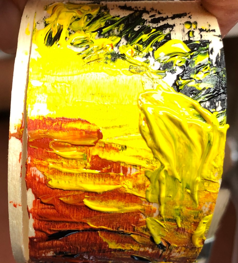
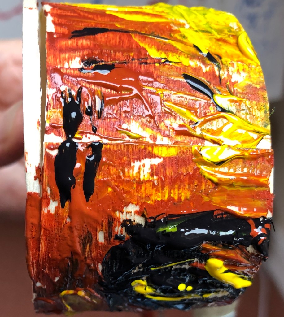
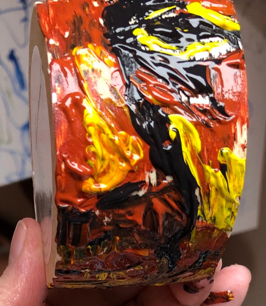
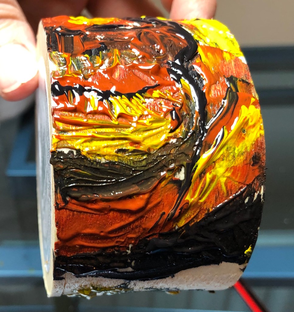
I looked at several of David Dipre’s paintings online, particularly on www.saatchiart.com. His favourite subjects are portraits, including self-portraits, with heavy impasto brushstrokes.
SO WHAT?
I had been studying the work of Frank Auerbach and, as part of my practice reflecting on my tutor’s feedback on Assignment 1, I had tried an oil portrait of Auerbach painted only from a drawing (see separate blog post).
I decided to use this painting as a basis for a new painting in the style of David Dipre. My support was a small thin wooden pot (previously used to hold a Camembert), and I wanted to paint the right-hand side of the face (as you look at it) onto the side of the pot so that you had to turn it to get the full image.
I used acrylic paint in a limited palette of three colours (roughly based on the Zorn palette work I had also been doing as part of my “feedback” action points) – Payne’s Grey, Burnt Sienna and Cadmium Yellow. Using a springy palette knife I applied the paint thickly and quickly, going more for an impression than a faithful representation.
This is the start – top of the head and hair, moving down to forehead wrinkles…..
down to eyebrows and mid-brow furrows…
…..eye and nose….
…..mouth and chin – you can just see the start of the hair at the top of the head starting again at the bottom.
Some bits went well:
– Enormous fun
– Eye and nose
– Overall placement, i.e. it filled the space and was reasonably wellproportioned ….and some less well:
– Mouth and chin
– Green hair (grey and yellow mix)
NOW WHAT?
– I’m gradually getting into the idea of painting on non-traditional supports – am starting to look around my studio and think “Hmm….wonder what it would be like to paint on that…..”
– I have been trying to make paintings being decisive and economic following my feedback from Assignment 1. “Decisive” is going well and I am feeling bolder about making bold marks. “Economic” is going less well, for two reasons:
– In trying to loosen up my mark-making I have got into a “go for it” trance-like mode, when I’m in the moment and almost instinctive rather than thoughtful – it all has to happen now
– I’m aware of the above and I have tried to make myself pause, step back and take note, when I’ve completed the image if not before – but when I’ve done so I’ve found a “decisive” mark which I don’t like, and am then in a dilemma as to whether to let it stand as honest and authentic, or sort it out, which is when I fall to tweaking and fiddling and trying to wipe bits out and the thing becomes a bit of a mess and decidedly un-economic.Not quite sure how to sort this out…more practice…? ******************************************************************************
WHAT?
Lee Edwards’ work is quite wide ranging, but I particularly enjoyed his little figures emerging from wood, e.g.“Fades to memory”
2011 Oil on oak 18 x 15 x 2 cm seen on his website, www.leeedwardsart.co.uk
I like the way he has used the pattern of the support as part of the image, almost as though his figure were conjured up like a genie from under the surface.
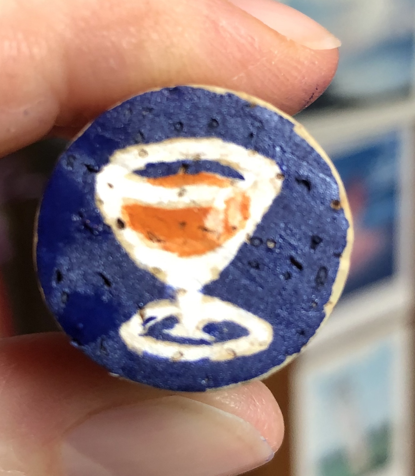
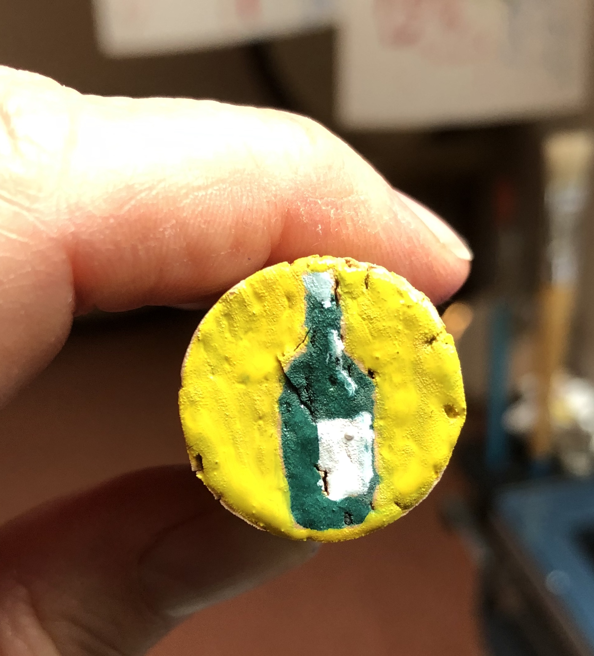
SO WHAT?
Seems a bit of a trite connection, and I do want to try painting using wood like this for a support later, but for now I had just received a few tiny pots of Humbrol enamel paint – so was looking for a tiny project to try them out. An interesting cork from a wine bottle was my support, and I applied my paints using a rigger. The paint sticks well to the surface, but really doesn’t do well mixing with water and I got my brush into rather a mess and had to find some turps, which I hate, at the back of a cupboard to get it clean (I have ordered some Zest-It as I enjoyed the vibrant colours of the paint and want to experiment with it more).
NOW WHAT?
– Well, painting as small as this certainly makes for decisive and economic mark making! – The enamel paint has a solid opacity to it
which I find pleasing – it’s a bit like liquid gouache or runny acrylic. I have bought a small and quite random selection of matt, gloss and metallic finishes, so will be interested to play more and see if I can tell the difference once the Zest-It cleaner arrives.
– The paint is quite smelly which might prove an issue for me personally due to my asthma; however, I have been attracted to the enamel paint pictures by Raqib Shaw who does get some very vibrant effects, and I hope to be able to achieve something working towards his style (if much less detailed and intricate!).
As a stimulus for this Zoom discussion, the third in a series led by Cheryl on practice-led research, she asked us to watch two videos and look at the work of Jo Whittle and David Orme; they had been asked by the Harley Gallery to collaborate on an exhibition based on the Portland Collection and estate. To prepare for this, they were allowed access to the Collection and also taken around parts of the estate not usually open to the public, which included several tunnels in varying states of repair. Jo produced a huge number of varying works, including paintings, sculptures and ceramics, in response to this stimulus, inventing her own imaginary world called Do><ia (an anagram of a void) ; David also responded through collage, making what he called “souvenirs from an imaginary space”, and he also framed Jo’s work and curated everything they had produced into a coherent exhibition. It is called “Between Islands”, and is still showing at the Gallery until November; Cheryl has already been once and intends to go again. The videos can be seen on https://www.harleygallery.co.uk/exhibition/between-islands-at-the-harley-gallery-nottinghamshire/
SO WHAT?
Discussion was interesting – the exhibition, it’s premise and the two artists’ responses to the brief offered much material for us to talk about, and each had taken different things from it, depending on their own interests and the point they had reached in their studies. Some points arising which chimed with me:
Cheryl said she had chosen this subject matter as practice-led research with a multilayered interdisciplinary approach, involving collaboration and curation; I don’t think she could have found a better example
Jo Whittle’s approach to the task gave us ideas for what we could do if we are a bit stuck in our practice, e.g. trying something different such as mapping or free writing, which might help to solidify our ideas and move them on – sometimes just a phrase is enough to set you on a new track
The framing of Jo’s paintings by David was revelatory – she had really thought about the function of a frame as part of the work rather than an annoying add-on at the end; they had used lush fabrics with drapes and little lips at the bottom of the painting to invite you to step into her world, e.g. a large velvet frame to set off the light from a painting on copper plate
Her small-scale paintings make people look – they intrigue and draw you in – adds intimacy
Different atmospheres that can be created in a landscape painting by deciding whether to include figures, or exclude them, or hint at their having been there but just left (we looked at the paintings of Anita Ree)
We could consider recording and documenting our work and curating is as we are making it, particularly in this age of digital assessment
We can think about responding to collections locally ourselves
NOW WHAT?
These videos and the discussion really chimed with me because:
Of where I am in my studies, i.e. Painting 1 Part 2 – looking at collections and also at painting on more unusual materials e.g. copper – it has been motivating and also inspiring to see what is possible
Looking forwards to another Zoom group meeting this weekend with OCA Tutor Bryan Eccleshall entitled “Contamination/Curation” – I have a little bit more insight into curation now, not really having considered it before
Listening to Jo and David and their bubbling excitement when presented with this commission with all the myriad possibilities it presented to them artistically was hugely inspiring – I felt a bit like that after having visited the “Cranach the Elder” exhibition at Compton Verney earlier this year, so keen to build what I had seen into my work. It’s like being given a big box of new toys. It’s an emotion to hold onto and try to apply to tasks which don’t immediately appeal – find a way in and around the task to find an aspect that does grab the interest.
Really glad my tutor found the images to be a coherent whole
I can see what my tutor means by saying I could have pushed aspects like tools, gestures and grounds further – I did get a bit buried in working in the original artists’ styles and lost sight a bit of the main focus of my learning – although I think I did learn a lot from trying all those styles (just possibly not what I was supposed to be learning!)
Feedback on assignment….
Demonstration of technical and visual skills
Quality of outcome
Demonstration of creativity
NEXT ASSIGNMENT: note to self – make own work, not derived from other artists – use what I learn from them to create something completely my own
Sketchbooks….
Demonstration of technical and visual skills
Demonstration of creativity
I need to get some tone into my continuous line drawings, which are MUCH better when I keep them loose and flowing and don’t fall into my fussier default of broken scribbly lines
In other words, have confidence in my observation – look carefully, make bold clear lines – decisiveand economic are the watchwords
Interesting that tutor recommends “research into painters’ drawings” (my italics) – I have so far in Drawing 1 done drawings as ends in themselves and not really thought in terms of drawing for painting
I will practise drawing, adding tone, and lifting out with a rubber so that I can see how to be decisive and economic with my brushstrokes
Need as a bit of a priority to look at colour mixing – will follow up guidance given. My experience thus far, prior to Part 1, was with watercolour, and a lot of mixing on the paper by dropping colours in – I do need a system to help me be more organised using a palette.
Tutor makes the point that I am not consistent in looking back to my learning points and using them….I was aware of this as a problem in Drawing 1 where I would hop from thing to thing; have tried to get better and follow things through, but obviously haven’t achieved this sufficiently.
SO, IMMEDIATE ACTIONS:
Look back over my evaluations to understand what I haven’t taken forward enough
We went to see the exhibition of Barnett Freedman’s work. I hadn’t known about him before, and was interested to learn about his background as an East End Jewish immigrant – I grew up in the East End (Cockney born and bred) and knew many people with similar stories, energy and drive.
SO WHAT?
The gallery’s emphasis seemed to be on his posters and book covers, familiar to many of a certain age. I was more interested in:
The process of lithography, which I hadn’t understood before but which he had seen a niche and made his own – incredibly time-consuming and involved, it seemed to me, but he had it down to a fine art.
His pop-up see-through scenes, which no-one else seemed to look at, but I found fascinating in their detail and his working out of the perspective.
His war work – he was appointed official war artist. For this he shed his stylised figures and painted individuals realistically – my favourite was a huge painting showing everyone who worked in a particular factory, by name, from the directors down to the ladies doing the lowliest jobs – each one named and obviously carefully observed.
They also had a great book shop – treated myself to books on Cezanne, Frank Auerbach and Maggi Hambling; Cezanne and Hambling being old favourites, and Auerbach because I had seen one of his works in the standing collection at the gallery, a nude lying on/sliding off a couch (didn’t note the details!!!), where the paint was so incredibly thick as to be sculptural – couldn’t take my eyes off it, just amazed it hadn’t all slid off the canvas under its own weight …so I need to learn a bit more about him.
NOW WHAT?
On the basis of what I’ve seen, I need to:
Get better at observing faces and the small differences from “standard” that make them into the likeness of an individual, not just a generic face (Freedman and Hambling both do this so well) – practise!!!