Drawing 1; Part 5; Response to Formative feedback

Overall Comments

  • I appreciate my tutor’s “well done” for keeping going with the course after breaking my shoulder. I agree with her analysis of the effects of this accident on my art, which has been to make me more free and experimental, and less fixated on everything being neat and perfect.
  • Looking forward to assessment I can appreciate that I need to think hard about how I demonstrate that I have met the assessment criteria; I need to be much more overtly reflective, critical and analytical about what I have done. Less narrative, more critique!!

Feedback on assignment
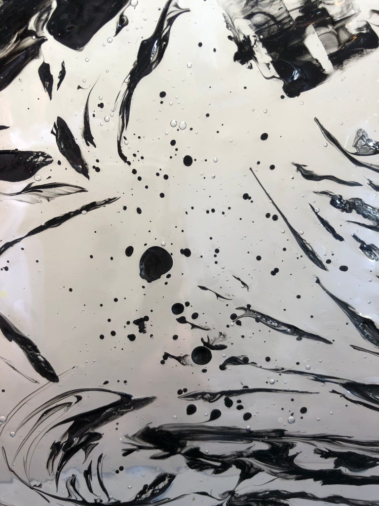
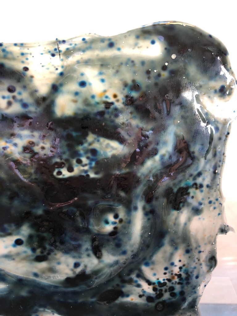
Final piece:

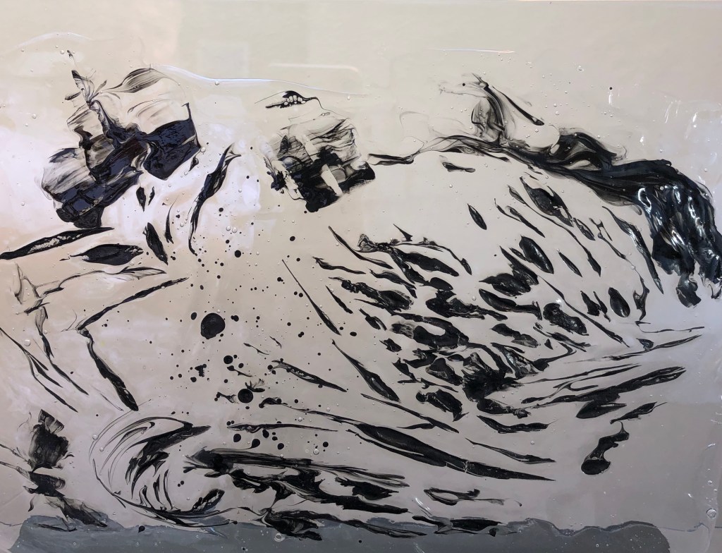
  • I was relieved that my tutor agreed that my final outcome constituted a drawing!
  • I have re-drafted my blog post about the assignment to be clearer about my working choices and the reasons for them, including explanations of how my research fed into my work

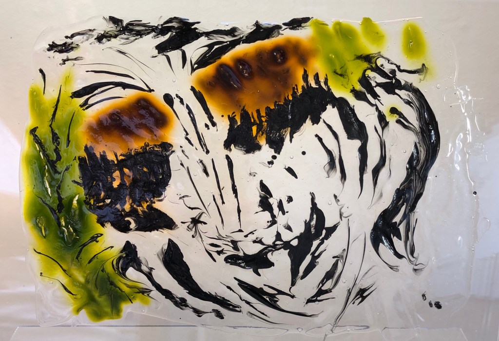
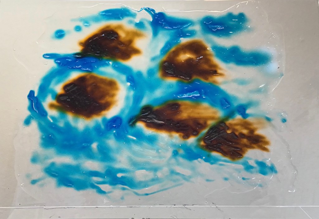
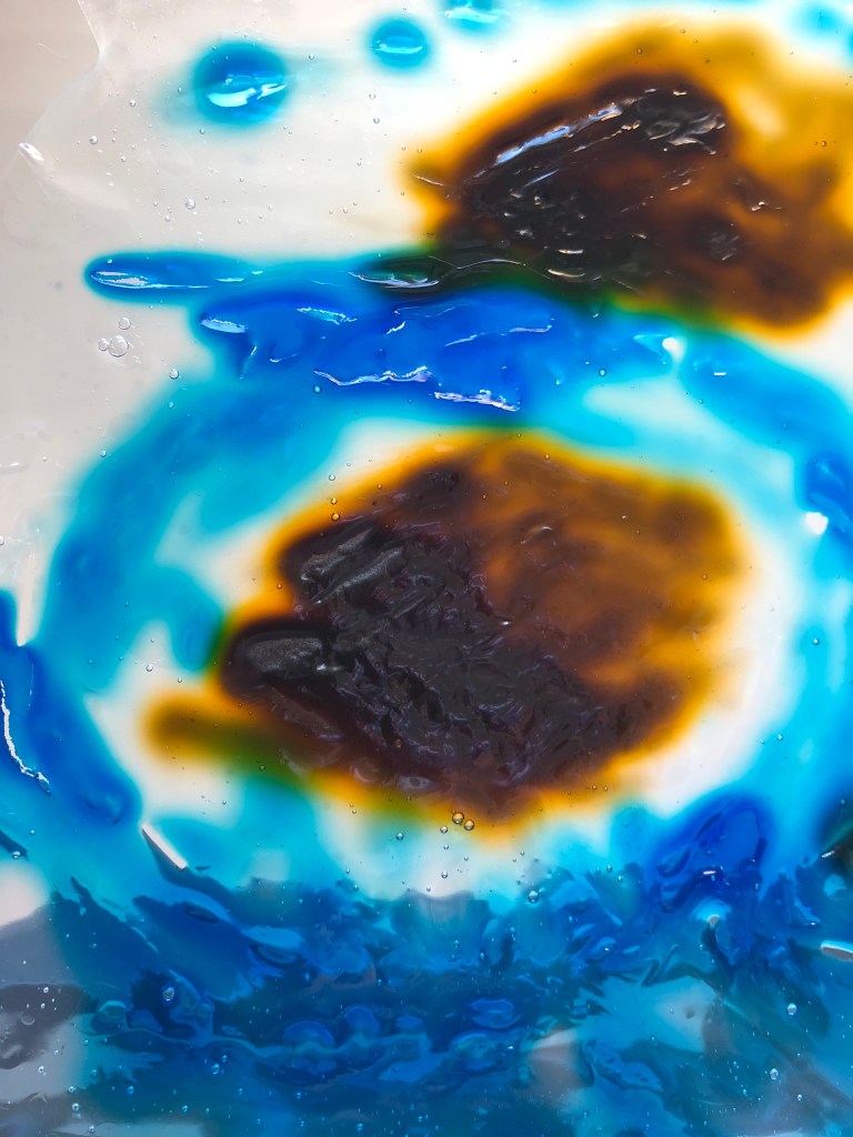
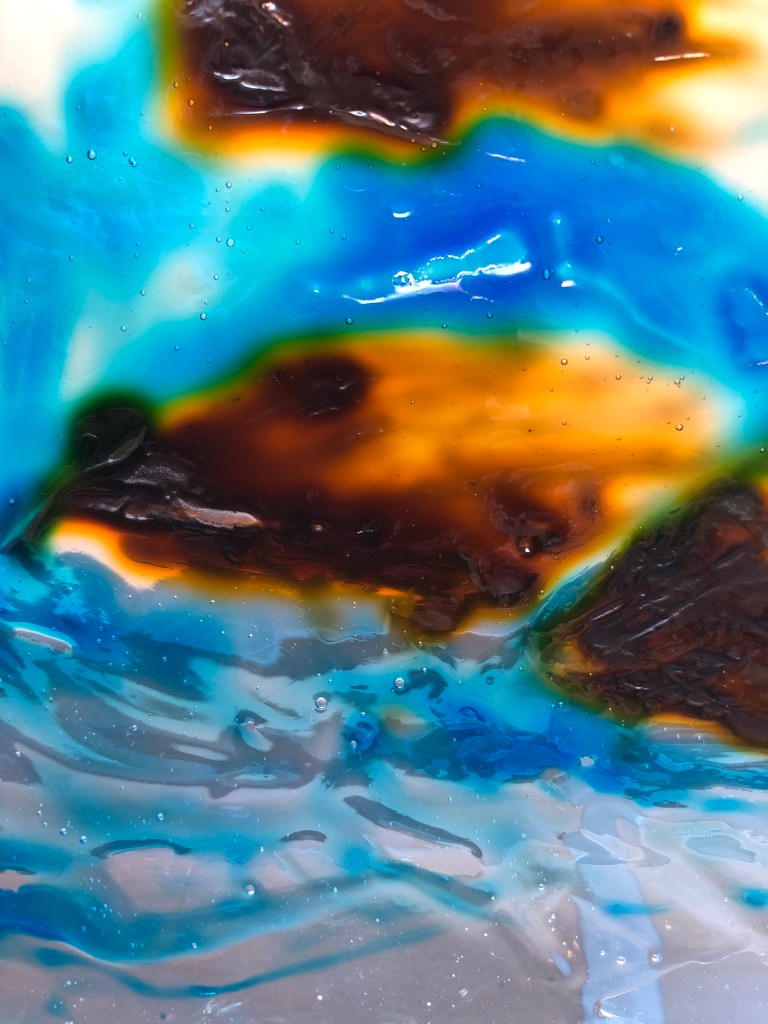
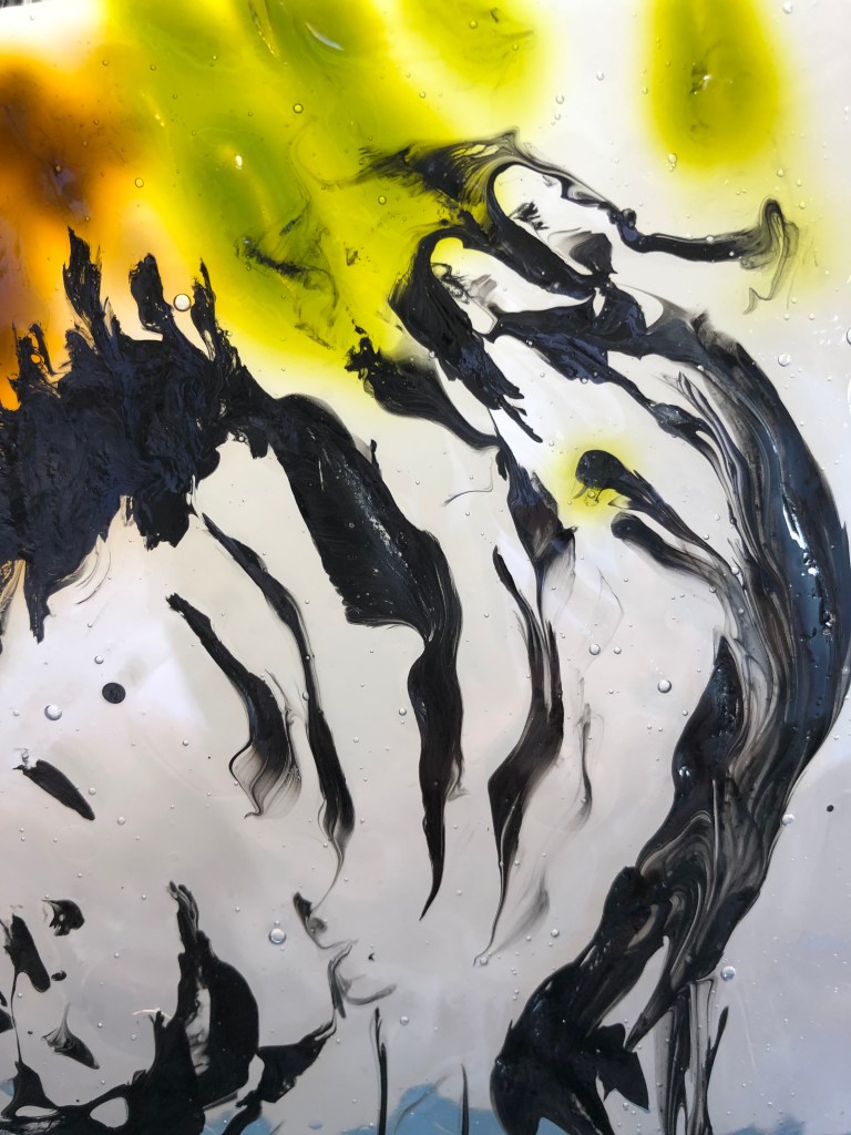
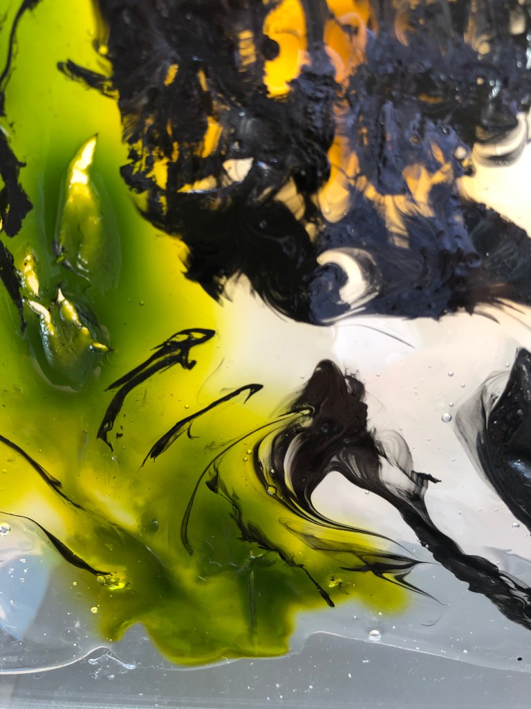
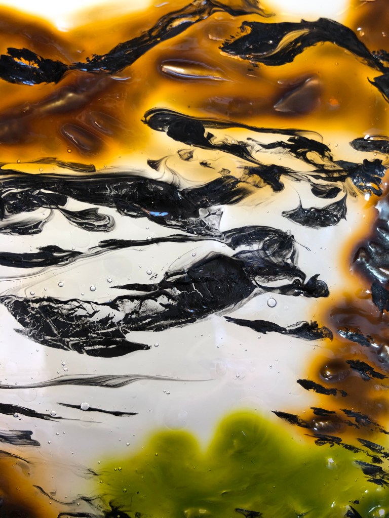
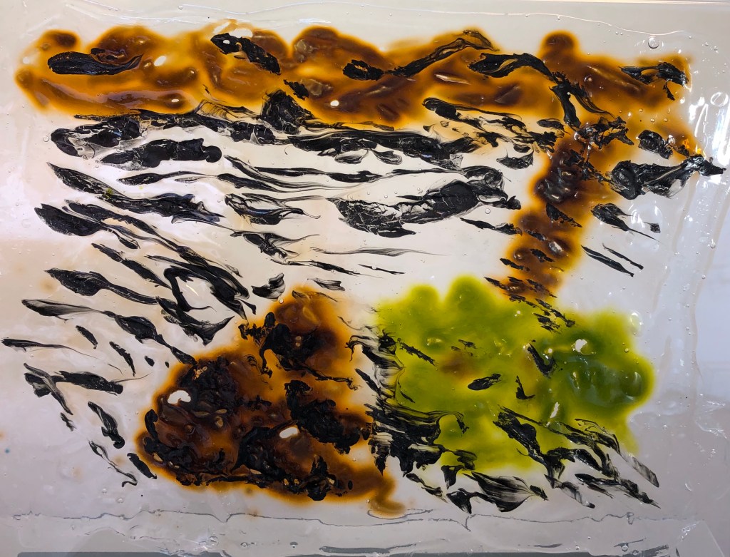
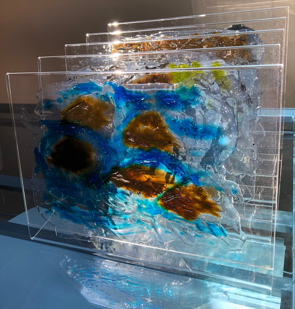
Virtue inspired piece:

  • Again, I have rewritten my blog post, explaining my choices and reasons and linking more clearly to my research. 

Sketchbooks

  • I have updated my blog post to make it clear that all the drawings were made on site, and to explain my annotations
  • I have to say that, when doing on-site drawings, I haven’t been posing myself questions, but rather just making jottings about, light, colour, etc – this is something I need to develop in the future
  • The techniques developed for my final piece are not included in my sketchbook – in future, I must remember to make a record of my process rather than just photographing the final results.

Research

  • In my revised blog posts I have tried to do better at explaining how my research into my various artists has specifically fed into my final pieces, rather than just taking this as read.
  • I can see the point about shorter, more focused blog posts about an artist – have to confess I got completely buried in all aspects of John Virtue’s work, although in the end I have not used them all

Learning Logs or Blogs/Critical Essays

Artist statement:

  • My first draft was absolutely a statement of intent as I had no idea where the investigation would end up. I have now redrafted the statement to talk more about the final work and what I want the viewer to see, and a little less about how I got there, and the statement is a little more concise as a result.

Reflections

  • This aspect of my work is the biggest take-away for me. I think that, up until now, I have used my blog more as a diary of my work and my learning; it has been very chatty and contains the wrong balance of narrative to analysis. From the very beginning of my next unit, I shall know to be much more reflective and specifically critical, making sure I say clearly what will evidence the learning outcomes – so that it becomes more of a log of my learning and less an amiably rambling letter
  • I had a go at using the what?so what?now what format. It felt a bit forced at first, but my tutor has helpfully given me some examples to work through using some existing blog posts, and I feel that light is dawning, and I am beginning to see how this will support my reflective practice in future – I hope some evidence of this can be seen in my revised blog posts.

Suggested reading/viewing

My tutor has suggested looking up some different reflective models, to see if they would help me.

I found a useful article:

“Reflective Writing: Taking time to invest in your work” on Explore#WeAreOCA, by Ryan Holiday, posted on 4/6/20, which included an adaptation of the Gibbs Reflection model into a Review/Action model. The article also contains a helpful link to a padlet which includes, amongst other things, the slides for Zoom lecture which had been delivered in Feb 2020 on this subject. This had a rolling diagram of a “plan – act – observe – reflect – revised plan…” model which rings bells for me from teacher planning meetings of a previous life.

I did go through a stage in my blog of setting myself action points, and I think I did act upon them, but what was lacking was making time for a formal review.

I think I am beginning to get my head around the Rolfe “What? So what? Now what?” model and, if I can train myself up to use the “now what” to reflect back on my “what”, then this will serve me well as a future structure for my blog posts.

Pointers

I really need now to give some serious thought to the learning outcomes and assessment criteria and look carefully at all my work throughout Drawing 1 to select pieces which show what I have achieved, and to show in my written extracts that I have reflected clearly and effectively.

Drawing 1; Part 5; Artist’s statement

Using drawing to answer the question: “What is this river?”

During the coronavirus restrictions, my husband and I have been taking our daily walk in a small local wood running along the bank of the River Tavy, one of the fastest rivers in England. The wood forms part of an abandoned railway line, hence it is straight and flat – but it’s also tranquil and little frequented. 

I have been looking at the work of Professor Jem Southam who tried, by photographing the River Exe, to answer the question “What is a river?”. He soon decided it seemed “an impossible task…a quagmire of a problem…”*. I agreed, and so have limited my investigation to this one stretch of the Tavy. I wanted to find a way to capture the essence of this river in drawing.

Much like Jem Southam, I was not sure at the outset what form my final work would take, although I had some initial idea of a series of drawings. I knew I wanted to work mainly with ink, and to immerse myself in pushing the medium to see what could be achieved. I also wanted to develop my use of line and gesture to convey texture and form and to experiment with temporary marks.

The walk offered many distractions – damselflies, dippers, ducklings…. – but it became clear that the essentials of the river involved the water, banks and river-bed. Like Vija Celmins with her Ocean** drawings, I  found myself fascinated by the water and its movement, wondering how to depict its infinite variation. I experimented with ways of conveying its character, both representational and also more abstract, doing many ink sketches on-site. 

John Virtue, and David Hockney with his iPad drawings, had both recorded a landscape (and in Virtue’s case, a repeated walk***) through tessellated images, and I decided that a tessellated series might allow me to depict both the horizontal layering down through the water from the surface, with its reflections and movement patterns, to the river bed, but also the vertical layering experienced as one walked alongside the river and observed its different moods.

I needed a transparent support to be able to put this layering idea into practice, and experiments led me to do a series of drawings with ink, using a palette knife, into wet Mod Podge glue. The glue takes the ink, does its own thing with it, and sets to a transparent sheet with the ink embedded inside. I mounted the drawings individually on vertical perspex stands, tessellated one behind the next, so they can be looked through, and the viewer gets the feeling of passing through one drawing to the next, as if they were walking along the river. 

A liquid medium into a liquid support to depict a liquid – the essence of the river.

*Jem Southam, ‘What is a River?’, unpublished essay, 2011, unpaginated

**Vija Celmins, “Ocean”, 1975, Tate

***John Virtue, “Landscape No.10”, ink, shellac, pencil and charcoal on paper, private, UK

(476 words plus references)

Drawing 1; Part 5; Assignment 5; an outcome for my Vija Celmins/David Hockney work and a final outcome for my investigation

WHAT?

To recap where my investigation into a way of capturing the essence of a stretch of the River Tavy in drawing had led me:

Four key artists led me down four paths – 

  •  Vija Celmins, with her fascinating Ocean pictures (see separate blog post), had made me really, really look at the movement of water. I instantly became so hooked on this that I knew this had to be a major part of my outcome. She also liked to take a medium and push it to its limits; I had originally started out thinking I should like to go back to using ink amongst other media, but this medium became my focus and I knew this had to be in my outcome. So, an ink drawing of water…
  •   Albrecht Durer, whose forensic observation skills are to die for, along with his ability to produce an atmospheric and evocative image using black line; I knew I wanted to do some of this.
  •  John Virtue, who had evolved a method of working peculiar to himself, moving from large tessellations of small, tight ink drawings to huge semi-abstract ink drawings with wide expressive gestures, whilst still incorporating small sections of detail. Both these styles appealed to me – small careful drawing I wanted to improve (see Durer), but I also wanted gestural marks to be more of a feature of my work.
  •   David Hockney slightly surprised me by being here, but has ended up being central to my outcome. The section of his work which I have seen (Pompidou Centre, Paris – see blog post) and been attracted to is his iPad drawings and his way of presenting images in tessellated sections. I wanted to do this (tessellated sections) in my outcome although I wasn’t sure how. In the meantime I tried some iPad drawings for myself and became rather fixated on the concept of drawings done in translucent layers; it struck me more and more that this is what a river is – you move down through layers (river bed/water/surface/reflections on surface/movement of surface) but also along through layers as the river comes at you in different “chunks” as you walk beside it – a clear bit, a slow bit, rapids, an overhung bit…….

I ended up pairing the influences of John Virtue and Albrecht Durer in one outcome – see separate blog post on this.

In the meantime, after puzzling over my tessellated sections of translucent layers, I hit on something which I used to use at school back when I was an infant teacher – glitter in PVA.

SO WHAT?

I laid out rough rectangles of Mod Podge glue, which is thick, white, opaque and gloopy, onto multi-punch pockets using a large palette knife. Straight away, I drew into the wet glue using inks applied with a small palette knife  (enabling a wide range of strokes depending on whether one uses the edge, the point or the flat face) – effectively going back to my old preferred medium of ink-and-a-stick from the early days of the course. I drew areas of water representing different parts of the river, quite quickly; bold application seemed best, as any attempt to work on marks once applied just stirred the ink into the glue and made it homogenous, which was not what I wanted. 

  • This was the first drawing: broad, curving strokes with the flat of the knife, which I emphasised by judicial sprays of water to make it flow, adding a few specks of black Brusho to create sparkles. In this drawing I was hoping that the movement of the ink across the liquid medium would give the effect of the slowly circling water (I had experimented with this earlier when I looked at Alison Churchill’s work on moving water – www.alisonchurchill.uk). I wanted it to “pull” the viewer into the drawing in a slightly hypnotic way.

  • This was my second drawing: I tried to establish the dark faces of the weir rocks using bold dabs with the flat of the knife, then used the side of the knife to draw the movement of the water as it came through the gap, using flicking marks to show how the water fell. Here I was working on varying my marks, as I had done in my work on Durer.

  • In my third drawing I used a variety of strokes and flicks, mainly with the edge and point of the knife, to demonstrate a range of small movements of the water surface; I also used the flat of the knife in a dragging motion for a wider section of flatter, stiller water near the top. I wanted to have one drawing which was completely devoted to the depiction of the water surface with no distractions, as this was what had initially caught my attention. Even though the marks are deliberate, they are quite loose, as I had practised when looking at John Virtue’s work; but they have been carefully observed over a long period (see notes on Vija Celmins)
  • The fourth drawing was, I think the least successful. I used wide curving strokes with the flat of the knife across the top to depict a tangle of tree roots along the far bank, which was effective. I then tried to put in some protruding rocks in the foreground and show the reflection of a tree, broken up slightly by ripples, and for this I drew with the edge of the knife using parallel close horizontal stokes; however, the glue seems to have taken these and merged them into a mass, so that the reflection of the tree looks very solid and frankly rather child-like, which I didn’t want. However, bits of it had worked, so I decided to include it as it was the one piece which was dedicated to reflections.
  • Having observed the fact that the coloured (Colorex) inks I was using seemed to spread far more than the black Indian ink, I tried to allow for this in my final drawing of the mini-rapids, by trying to be careful to preserve some areas of white around the rocks to indicate bubbles as I drew the blue ink through the glue with wide, gestural strokes.  I think this was a more effective technique with this particular ink; it harked back to my experiments with wax crayon resist earlier in my investigation, where my focus had been to preserve the white areas.

It was interesting to watch the effect of time on the drawings, as the fluid glue had its own part to play in subtly changing the marks I had made before it started to set. All the drawings were done from memory, based on the many sketches I had done and hours of close observation I had spent.  

I carefully peeled my drawings from their multi-punch pockets and then had to decide how I would present them. I particularly wanted them to be displayed as a vertical sequence, as if one was walking along the river bank and happened upon each scene in turn, as I very much wanted this outcome to replicate my walking experience. I thought about somehow suspending or mounting them, which seemed easier, although the mount would have to be completely transparent; in the end I applied each to its own clear Perspex vertical stand (these are simple restaurant menu stands from Amazon); thus each was a drawing on its own, but I (or the viewer) could also move the drawings around in combinations, one in front of the other, to convey the idea of layers. Tessellated sections, as I had wanted, but rather different to what I had first envisaged.

Below are some photos of individual drawings, combinations and close ups; I have also made a short film to show the final piece as it is hard to appreciate from still photos,  and will send the link separately.

NOW WHAT?

  • My aim was to find some way to convey the “essence” of the river, and I personally feel that I have done that – a fellow-student said to me recently in an online group meeting, “You are the first viewer of and reactor to your work”, and I have taken this as my benchmark to know whether/when I had reached my goal.
  •  I also wanted to give the viewer a sense of walking along the river and almost “passing through” my drawings, one after the other.
  • The individual drawings have taken on a life of their own; they are not quite as I first drew them, as I had chosen to essentially draw with a traditional liquid medium into a non-traditional liquid support; but I was ready to try letting go and embracing the outcome.
  • I have created a series of drawings which combine coherently to give the viewer a sense of the separateness-and-yet-one-ness of a place
  • I have drawn on my research into the work of both historic and contemporary artists and shown elements of their styles in my drawings
  • If I repeated this method of working in future, I would take photographs as I went along to document to process so the viewer could compare the initial marks to the final outcome
  • I feel I have pushed at the edges of what “drawing” is by my use of a liquid non-traditional support and the production of a deliberately layered outcome