Feedback was given by my tutor via Google Meet discussion on 12/4/21.
SO WHAT?
In a very helpful discussion, several points emerged:
My thoughtful attitude to my work, and reflections on how one’s mood and circumstances affect one’s work, were appreciated
There are several useful short films and videos in the Resources section of the Painting OCALearn pages (look in “Technician’s workshop” for colour mixing videos)
My use of complementary colours for the assignment piece was a little “out there”, although I could explain my reasoning for the choice. My tutor suggested that I investigate using such pairings mixed with other colours, so that my use is more judicious and subtle. Also, consider not hitting every edge, but make some transitions looser. These contrasts will bring out the sharpness where you need it and makes it striking, rather than having it everywhere.
Use of texture via gesso underpainting was effective.
Look for the book “Formulas for Painters” by Robert Massey
My analysis of and use of other painters’ work is good
Going forward, I am going to focus on colour mixing. My tutor uses a cool palette of rose madder, cobalt blue, and lemon yellow, white, black, burnt umber and raw umber/sienna.
Experiment with limited palettes, and try to understand what a colour would break apart to be. Consider making a painting of one colour, e.g. yellow, i.e. the opposite of complementaries, and investigate closer colour relationships.
PRACTISE!! STARE!!
My practise of doing a tonal preparatory painting really helps
Contact other artists and ask about their starting palettes.
NOW WHAT?
I am pleased we have identified investigations into colour as my focus for Part 5, as I do feel that my practice would benefit from this.
Demonstration of visual skills: Materials, techniques, observational skills, visual awareness, design and compositional skills.
I had not painted in a round format before beginning this section. On a practical level a tondo needs a little extra preparation before starting, just in terms of getting a round/oval support; however, I found the advantages outweigh this – every painting I did felt as though I was turning a spotlight onto something, even something as mundane as a sink containing rubber gloves. It seemed to make the ordinary and familiar into something a bit special, encouraging the viewer to stop and take that extra second to pay attention. The technique of moving the template card over an image to find the right composition was really useful and stopped me from over-complicating my images by trying to cram too much detail in.
I have also had great fun playing with paint; at the beginning of this Part I was not quite sure whether to go for enamel paint or egg tempera; however I opted for the latter early on and have learned to mix my paint from its raw ingredients, which has made a material very different from the ready-made versions one can purchase.
Quality of outcome: Content, application of knowledge, presentation of work in a coherent manner, discernment, conceptualisation of thoughts, communication of ideas.
From this Part I have gained an understanding of unconsidered corners of my house as they might appear to an outsider, and what that outsider might infer about the house dweller (i.e. me) – for example, the series of paintings of my sink and draining board might tell the viewer that I paint; I collect natural objects such as feathers; that I like to keep things reasonably clean and tidy. My tutor in Drawing Skills 1 suggested I read Shirley Turkle’s 2007 book “Evocative Objects”, Massachusetts Institute of Technology, USA, which was a series of essays wherein people described the importance of particular objects to them; I think this Part has shown me that nearly everything, particularly when in its habitual environment, has a story to tell, and it is the job of the artist to tell that story in paint.
Demonstration of creativity: Imagination, experimentation, invention, development of a personal voice.
I think my assignment piece is an example of this; fairly early on in Drawing 1 I had experimented with a sketch of an interior view which frankly was beyond me at the time and I really struggled to analyse it. However, my tutor at the time saw potential in it and so I returned to the sketch and have reworked and adapted it, bringing an increased skill level and better understanding of perspective and composition to bear in order to create what I hope is a coherent and effective painting.
Context: Reflection, research, critical thinking (learning logs and essay).
I found artists such as Tori Day, Jacqueline Utley and Winifred Nicholson particularly influential. Tori’s focus on small corners of a domestic interior, presented often in isolation to emphasise their importance, resonated with me and encouraged me to look more closely at my own domestic environment. Jacqueline Utley’s colours just zing by virtue of her careful contrast of muted and bright; Winifred Nicholson’s use of colour is also very deliberate, and I loved her way of constructing a narrative around what can at first glance look just like a picture of some flowers in a vase until you take in and consider the background and placement of the vase.
I also took a short online course on colour with Jill Eisele through the St. Ives School of Painting (see blog post) in which, amongst other things, she looked at the possibility of painting with a limited palette based around pairs of complementary colours, and I have used this in some of the Exercises in this Part and in my final assignment.
Quite a bit of this Part of the course has been studied whilst living alone, my husband having suffered a disabling stroke and having been in hospital for many weeks now. I have found this has affected my approach to my work: my study has been a real life-saver as far as distracting me is concerned and I have been disposed to approach it positively, finding the need to come to terms with the unfamiliarity of painting in the round interesting and diverting; also, being alone in a house makes one look at it differently and be more reflective, almost treasuring, about it, which I hope has come through in my painting.
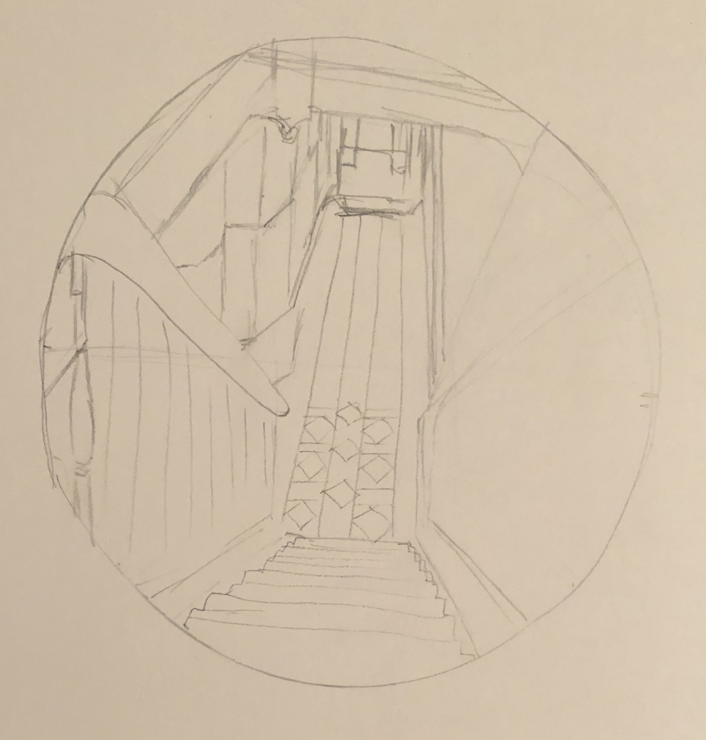
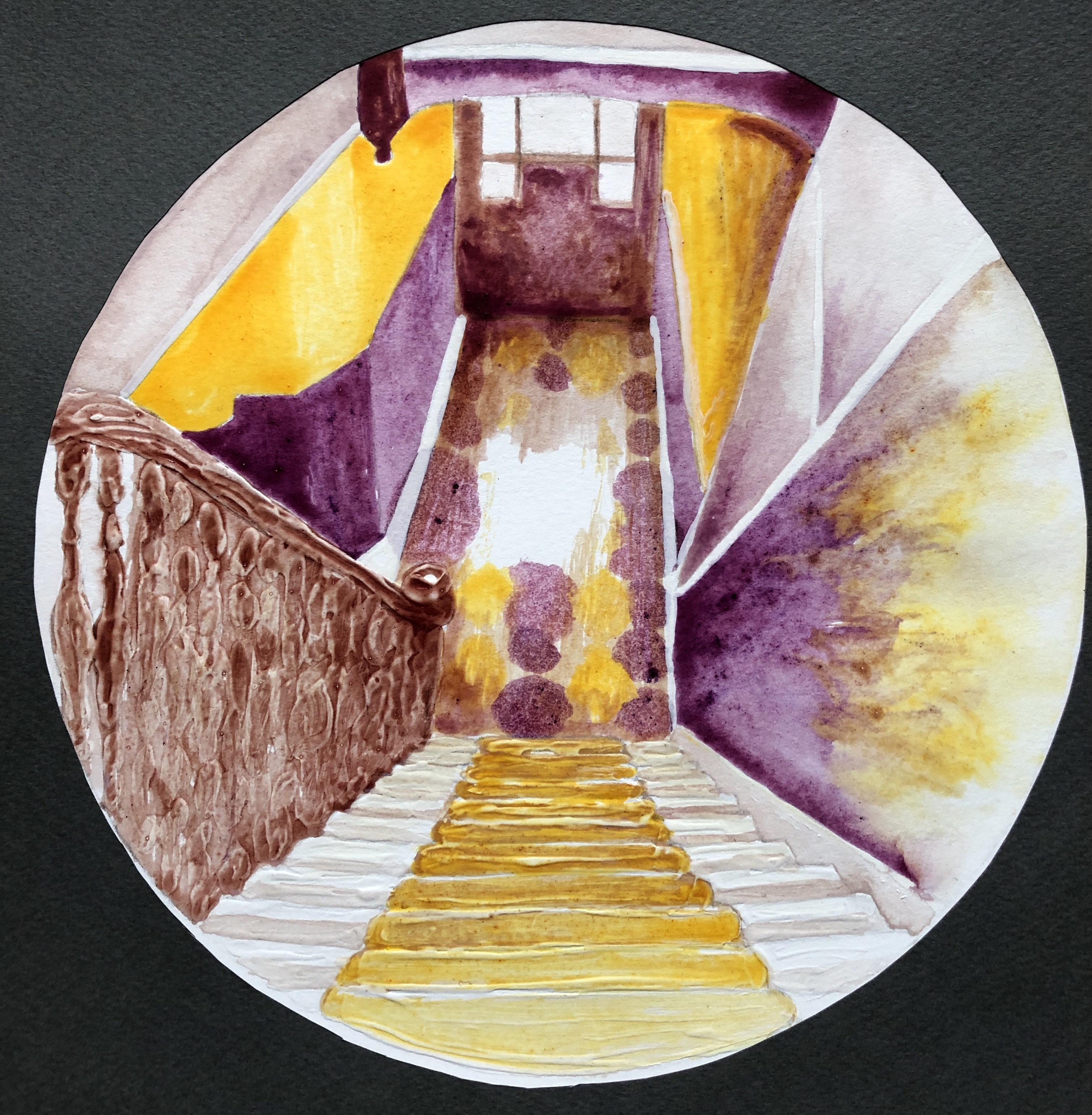
Early on in my degree, looking at Interiors as part of the Drawing Skills unit, I tried to sketch the view down the stairs from the landing at the top of the first flight. I really struggled, couldn’t work out by the end even which way the lines went, and chalked it up to experience as something that was just too hard. Here it is.
However, my tutor, having looked through my entire sketchbook, picked out this dreadful drawing as the one that had the most potential. I didn’t try to do anything further with it at the time, but I’ve remembered it ever since, and now seemed like the time to have a go. So, the subject of the assignment will be the view down the stairs – partly to preserve the view for posterity, as it will likely soon be radically altered by the installation of a stair lift for my husband, who has suffered a series of strokes.
An artist currently working in egg tempera, and whose work I admire, is Mary Anne Aytoun Ellis. She mainly, though not exclusively, paints landscapes, working at a range of scales. She works on paper which she mounts on board, mixes her own egg tempera, and often combines it with gesso, and ink or watercolour. This recent example, “Knot Garden”, egg tempera, gesso and watercolour on board, 18x25cm, shows the textured quality of her work:
I contacted her on Instagram, explaining my interest in her work and asking about her process; she replied that she uses gesso and egg tempera in an idiosyncratic way which she has evolved over the years. She often uses gesso in a very abstract way in the early stages of a piece, using large brushes, dripping and scratching into it when it’s wet or dry. She will sometimes pour egg tempera over it or mix pigment in to obtain unexpected effects and textures. She might also use the gesso to add highlights and detail, covering it with glazes of egg tempera or watercolour. She originally trained as a printmaker, but soon decided she wanted to make “…hybrid pictures that were a cross between drawings, paintings and print.” (See article in Artists and Illustrators, March 2021 edition). This method has taken her a long time to evolve, so I wasn’t going to try to emulate the whole thing straight off, but I did decide to incorporate the use of gesso into my assignment by way of experiment.
Finally, following on from my response to my tutor feedback from Part 3, and in the spirit of Mary Anne Aytoun Ellis, I wanted to try incorporating and working into a monoprint in some part of the painting.
SO WHAT?
I began working from this photograph:
I decided to increase my chances of success by tackling just one flight of the stairs. I also made the decision to simplify the image by mentally losing all extraneous detail such as the table, coat stand, bikes etc, to give myself clear lines.
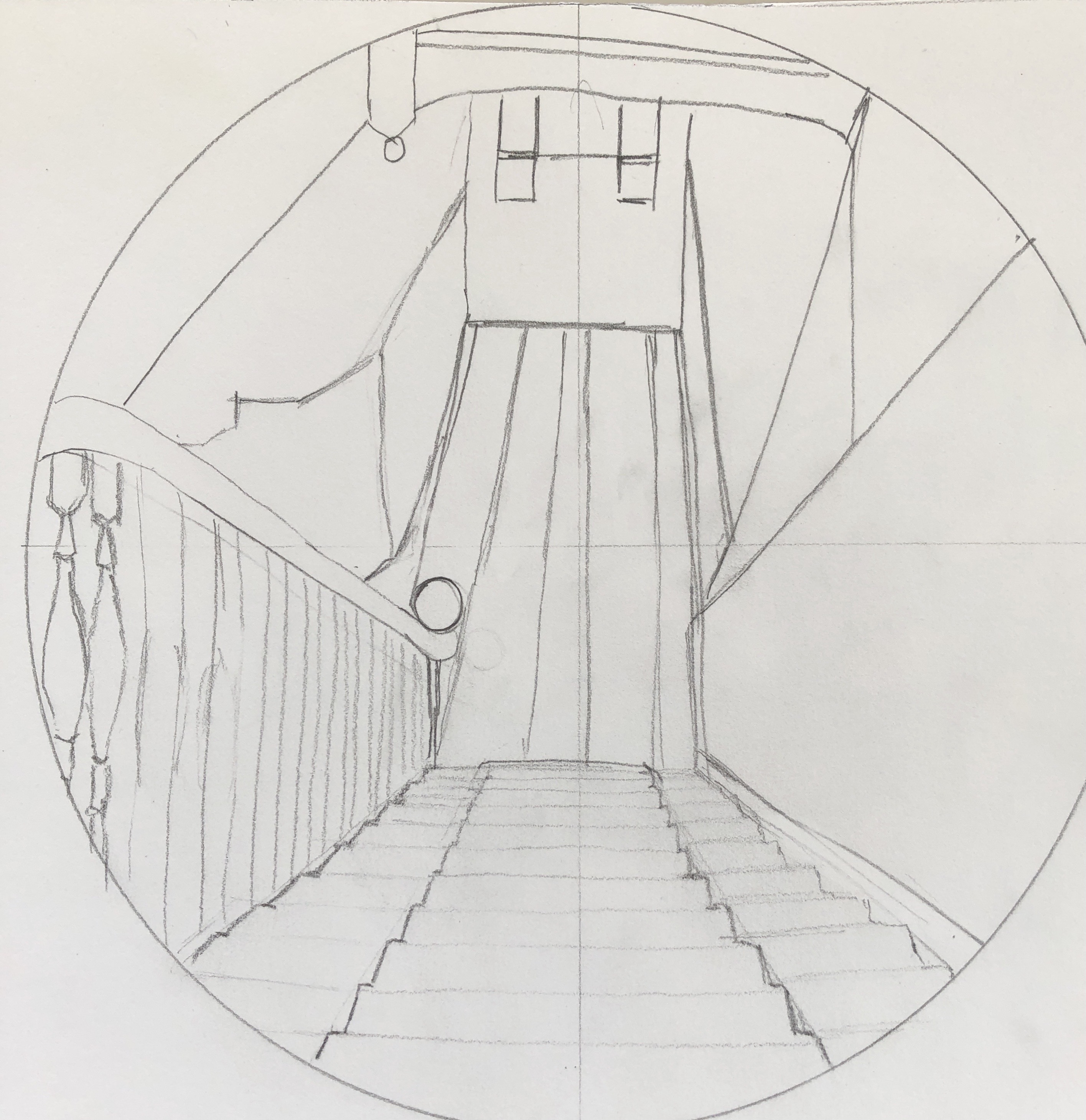
I made an initial sketch, and then refined this further into a scale drawing by abstracting the image a little into simple shapes and boxes with clear lines, mainly straight – just a few curves to break it up a bit and add interest. I decided to work at the size of a large sideplate (approx 22cm diameter):
I wanted the focal point to be central, where the light hits the tiles down in the hallway.
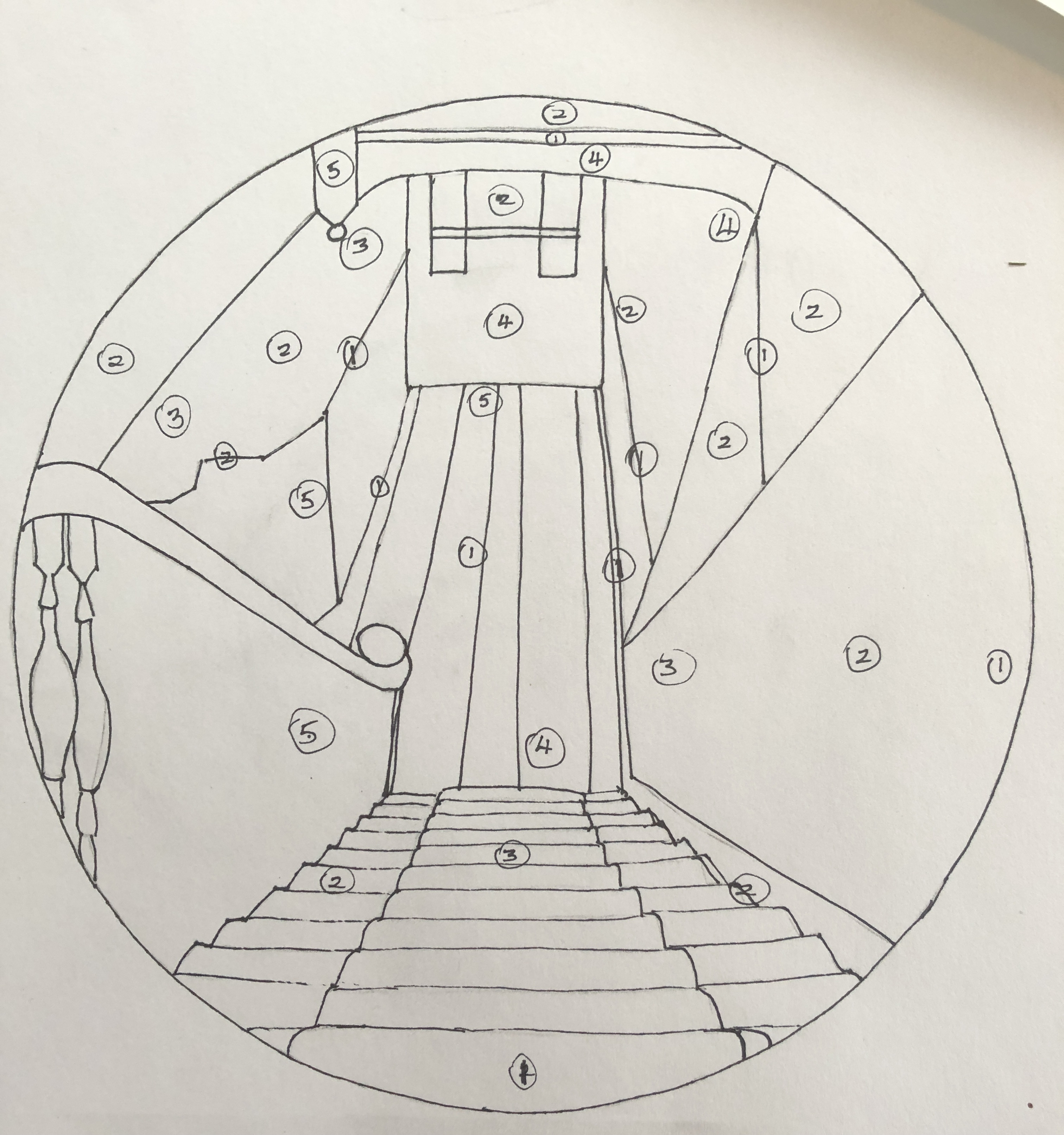
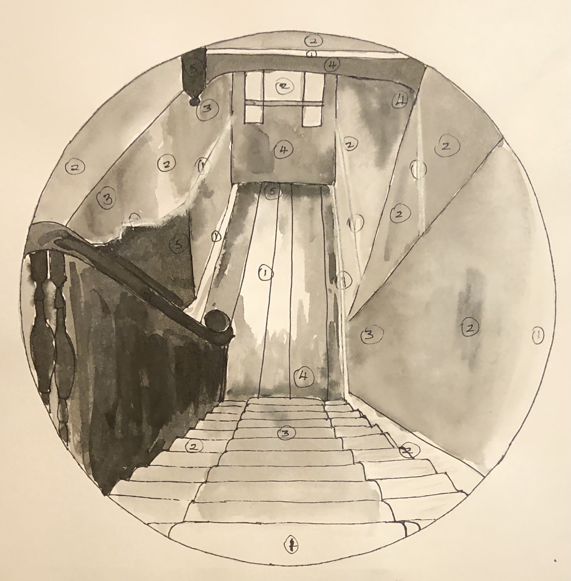
I did a tonal drawing; I found the tones quite hard to analyse, so made it basic by identifying 5 tones (from 1 being the lightest to 5 being the darkest), marking them in place, and then filling the drawing in with black Chinese ink, with a white Conte crayon for the lightest lines where needed:
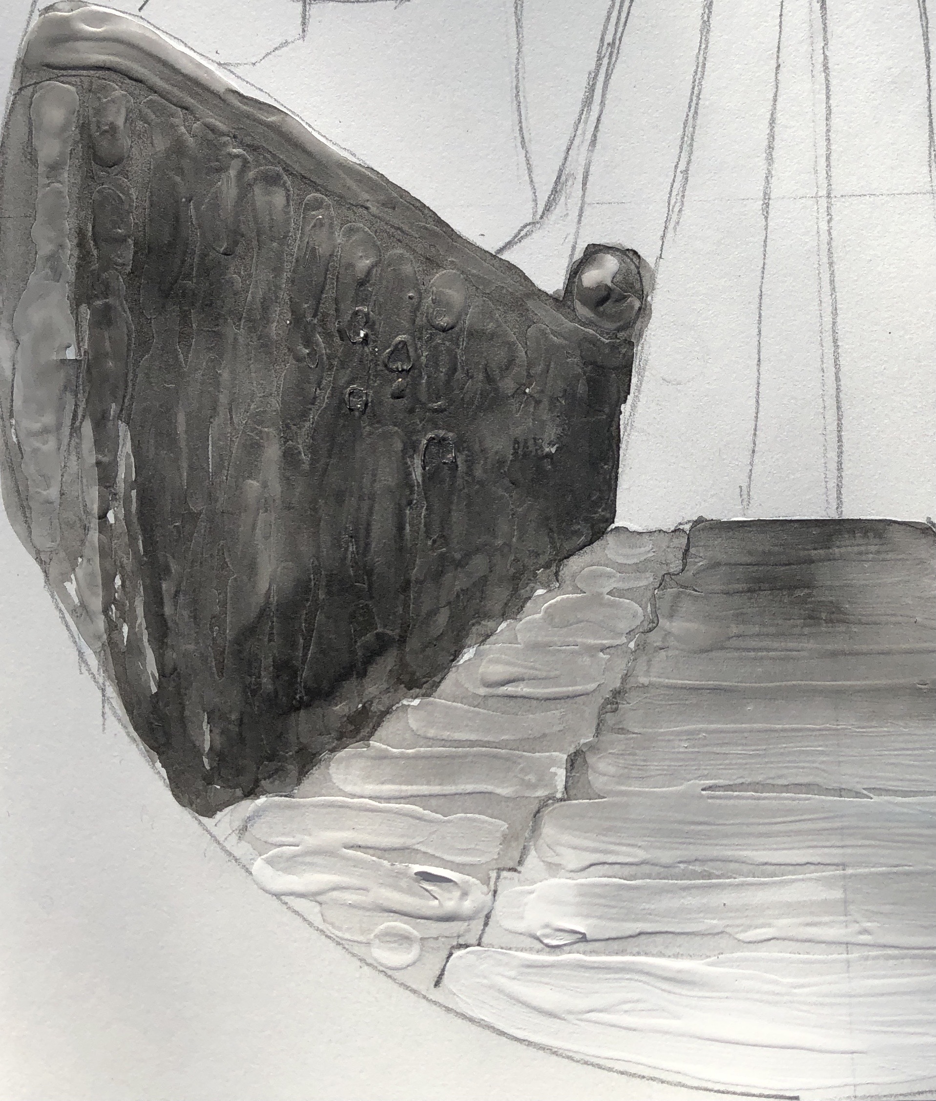
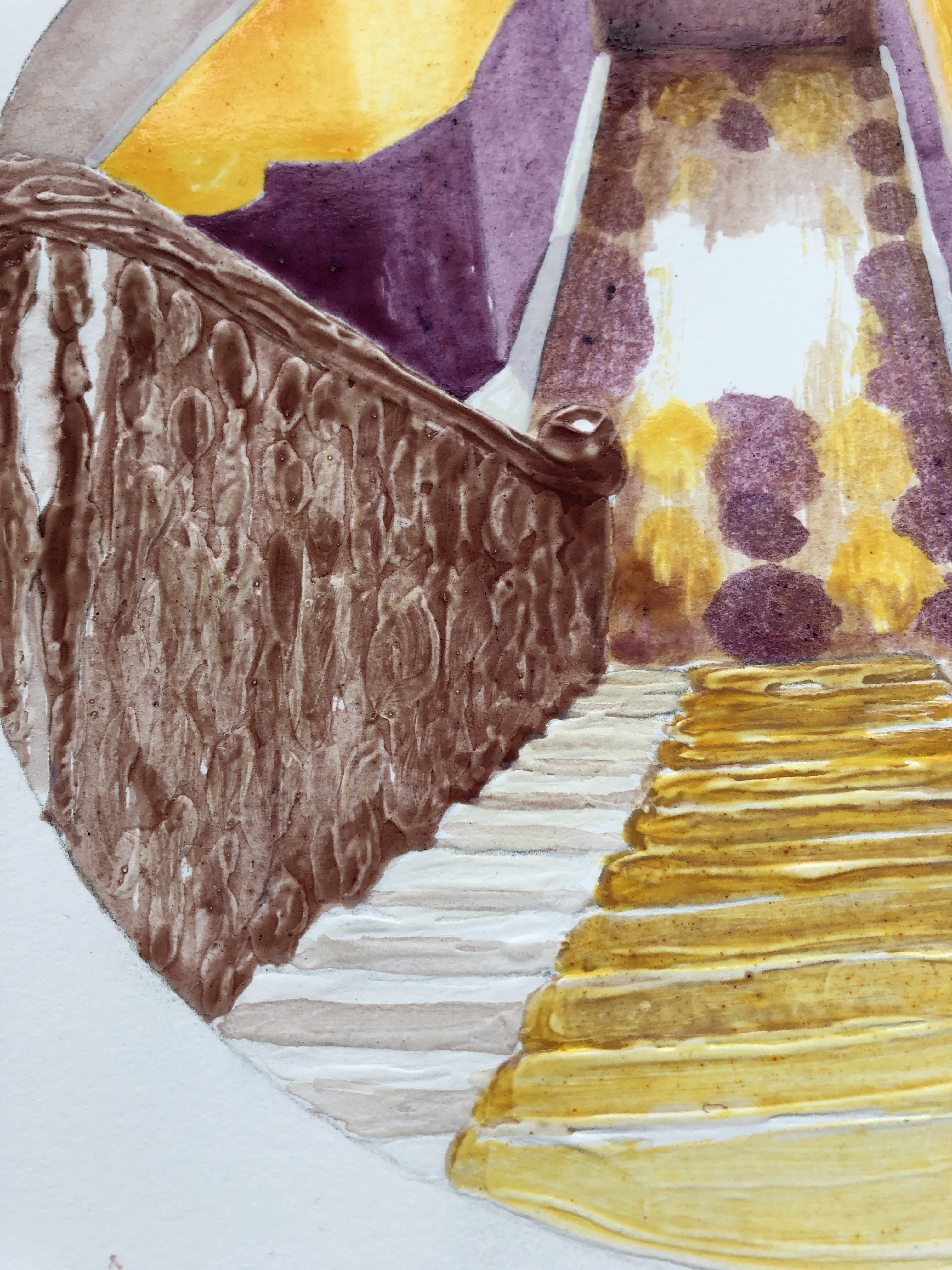
My next step was to experiment with the gesso. On a clean version of the drawing, I added some gesso to the stairs and the banisters, applying it with a paintbrush fairly freely, trying to get horizontal lines on the stairs and quite a curvy and bumpy texture on the banisters to indicate the posts going down. Once that was dry, I went over it in Chinese black ink to see the effect. Next I made a rough painting on another clean drawing to experiment with colour. I had looked at pairs of complementary colours in the Exercises, and picked yellow/purple to work with here as this pair gives the widest range of tones. I did my practice run with tube egg tempera; I mixed a purple from alizarin and cobalt blue, and also laid out Naples yellow, Titanium white and Ivory black.
I didn’t use the black in the painting, but tried adding some around the rim to see what the effect would be when I added a surround.
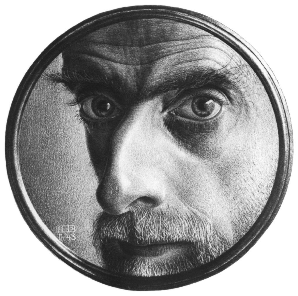
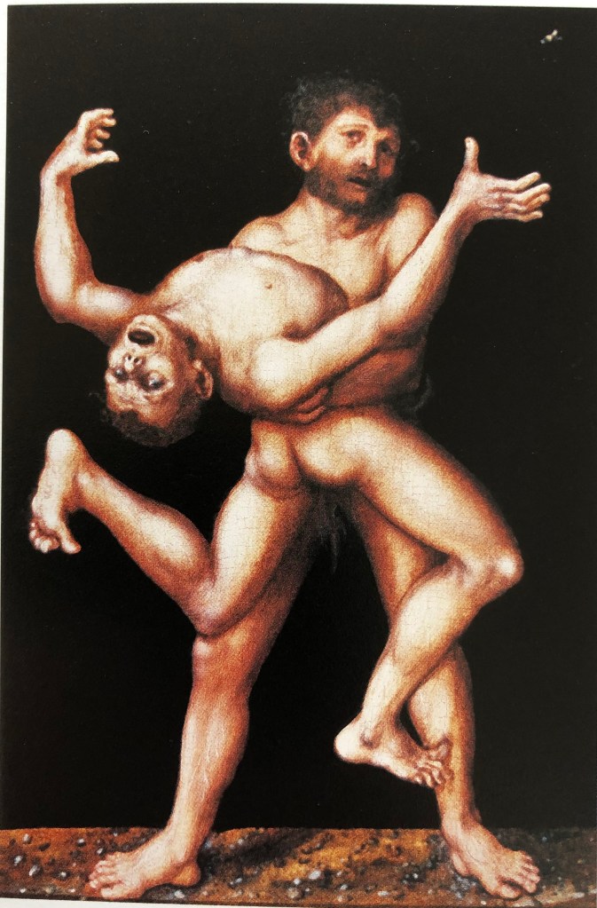
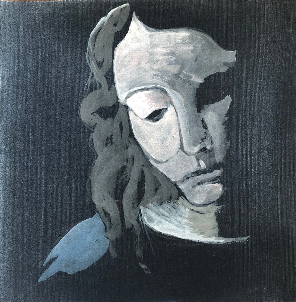
This actually reminded me of an Escher drawing I had looked at as part of my research in Drawing Skills:
M.C. Escher
Self Portrait II
1943
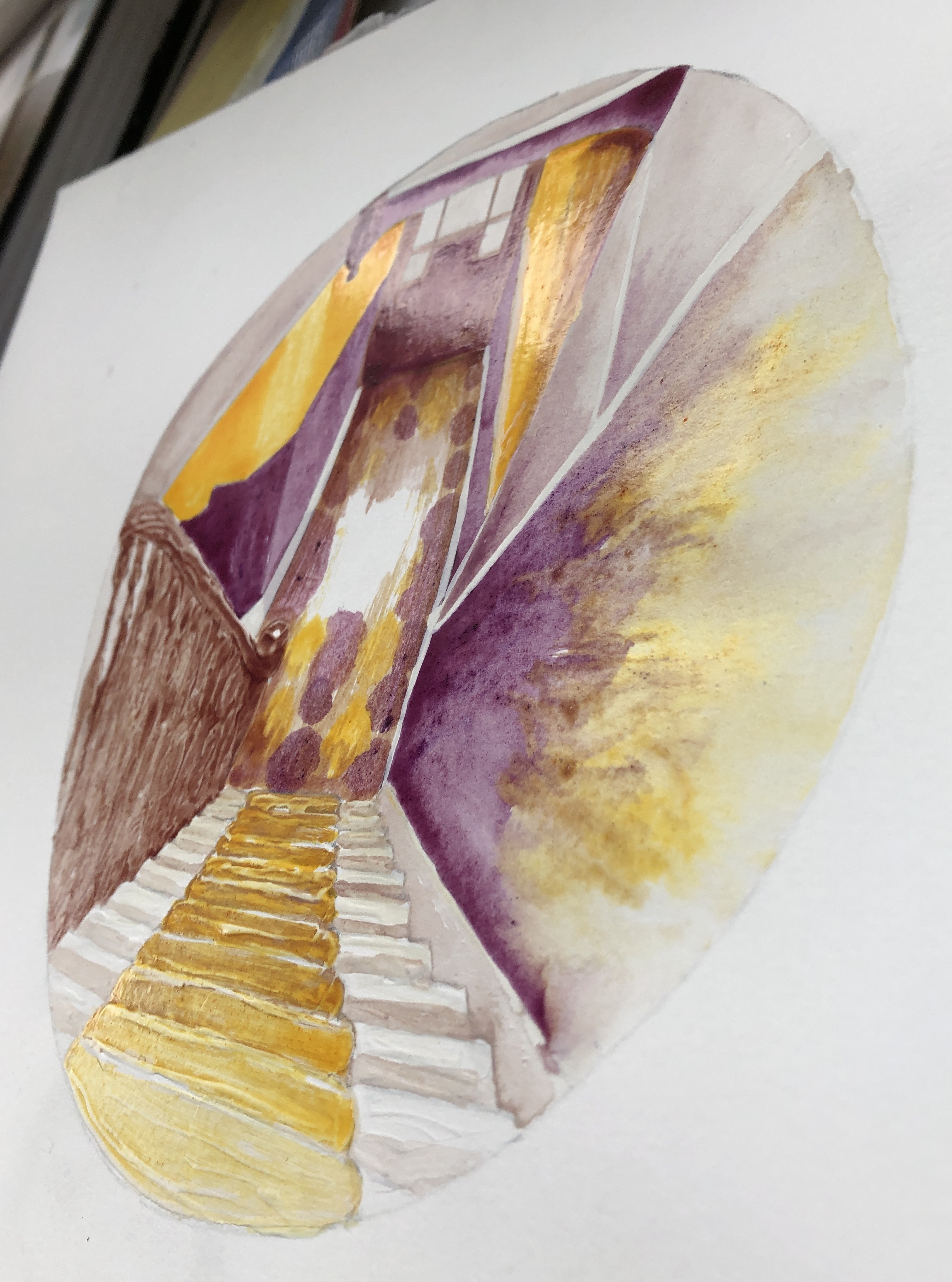
This made me think that my drawing of the stairs was rather like looking down a telescope the wrong way. I thought that the black surround was a bit heavy, and so resolved to make my surround a sort of metallic grey.
Now that I had my colour study, I worked from that and did not refer to the photograph again as I moved on to create the final version of the painting.
I worked on A3 HP watercolour paper, chosen because I had found this to be the best support in Part 3 for monoprinting. I wanted to begin with the monoprint, which would be the focal section of the painting, the floor tiles with the light on them; I picked this partly because I had found earlier in this section that monoprinting was a good way of reserving the white of the paper.
I made my own egg tempera, using Yellow and Purple shades of Brusho crystals as pigment. I made my paint fairly thick (only 3 droppers of white vinegar); the Yellow Brusho mixed in brilliantly, although the Purple crystals took quite a bit of stirring in. I had no white Brusho, and so decided to use the tube Titanium white egg tempera as it would only be needed in small quantities – my plan was to keep as much of the painting plain yellow or plain purple as possible, mixing grey/browns from a combination of these two as needed.
My first attempt at monoprinting with egg tempera was not a success – I put far too much on the plate, ending up with quite a dramatic splodge. Second attempt was better, and I decided to proceed with that:
I filled in the drawing around the print, added my gesso to the steps and banisters and, once it was dry, I began the painting. I tried various brushes; the paint was very glossy and several brushes I tried ended up leaving too much of a “channel”, so in the end I did the whole thing with a rigger, using the point for finer details and the side for bigger areas. The paint dried quickly and it was easy to show differences in tone by leaving some areas with just one coat, whilst building up layers in other parts.
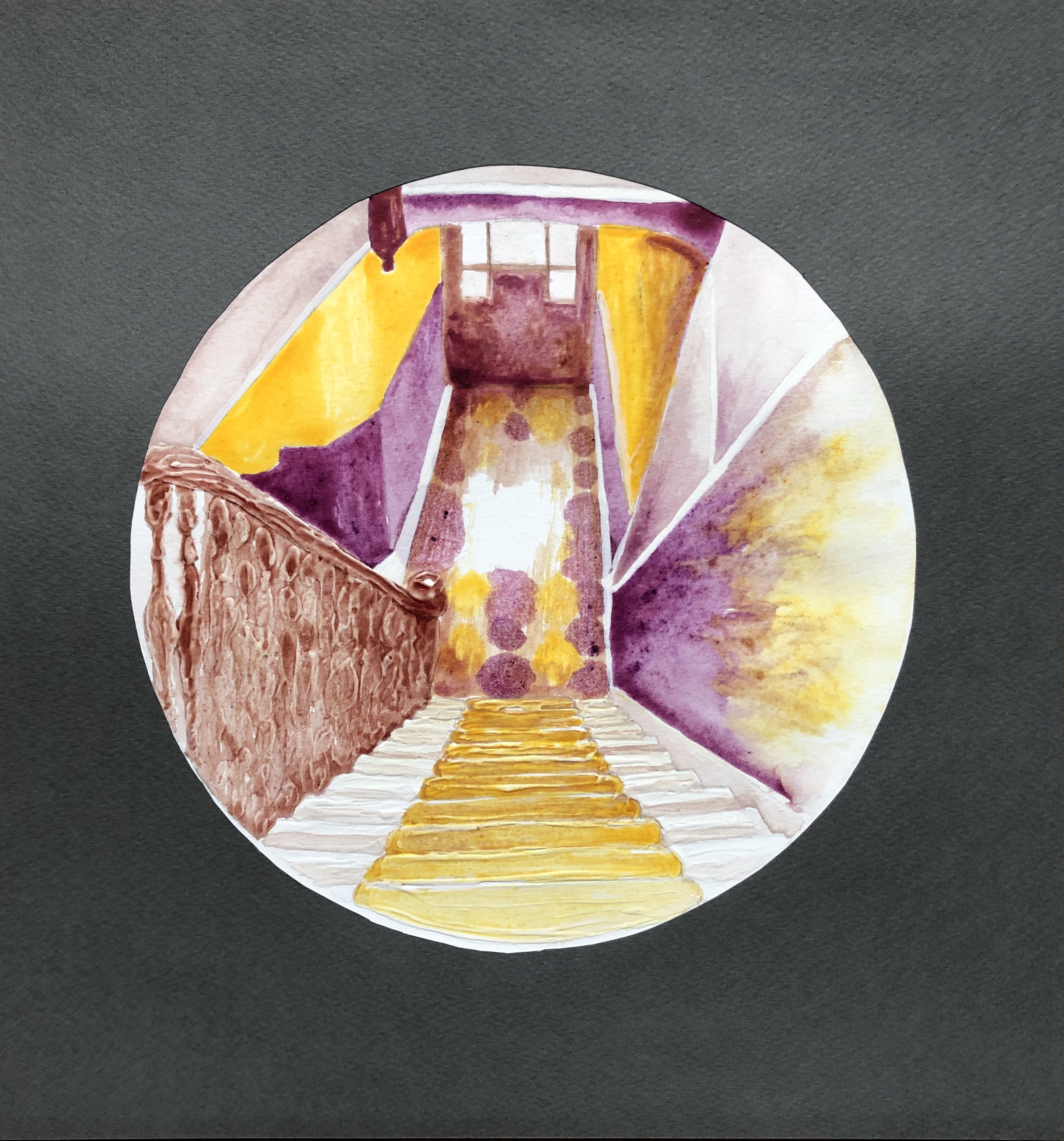
Here is the completed painting, with additional photos showing close-up details of the gesso effect and a side view showing the sheen of the dried paint – perfect, I thought, for that slight shininess you get when looking at an image through glass (such as the glass of a telescope lens).
The final step was the surround, which I made from a dark grey sheet of pastel paper. Here is the final piece:
NOW WHAT?
I am pleased with the overall outcome because:
I feel it is a strong composition, the simplified perspective takes the eye in and out of the middle as the different sectors are explored; also I feel I have learned from the online courses on abstraction I have attended with St. Ives School of Painting, and have been able to simplify a complex starting image into blocks and shapes, something with which I have always struggled.
I am really enjoying exploring simplified palettes based around complementary colours, and I think I have chosen well with this pairing in this situation as it has allowed me to build up a range of tones.
I have built the painting around a monoprint.
I have experimented with gesso and enjoyed the effects I’ve achieved; I definitely want to use this more as I move forward.
There is something very satisfying about making your own paint, even though it was hugely messy and everything I touch now seems covered with a slightly sticky monolayer of egg.
I feel I’ve preserved our stairs for posterity, come what may!
If I were to think about changing how I did this:
I would think about investing in some proper dried pigment if I were to continue to make my own paint; the Brusho did well as a first attempt but, whereas some colours mixed in well with the egg/vinegar base, others were more resistant and gave a slightly gritty texture.
Home-made egg tempera is a very different beast from the ready-made tube variety, and I would need a lot more experimentation with brush selection and technique if I continued to use it.
I was really glad that my tutor saw an improvement in my life and portrait drawing
I feel I fell into a “line of enquiry” early on in the section which led to a particular set of outcomes; I am pleased with these outcomes, which filled the brief in an interesting way, but I think that, by pursuing this line, I missed out on an alternative set of monoprinting experiences. I found all the resources which my tutor supplied with my feedback both interesting and informative. As a result I have bought some more simple equipment as suggested and have been playing around some more with printing; I have made some lino prints and experimented, using acrylics, with ghost printing and adding more liquid and paint…
…and I have made loose abstract monoprints with the remnants of my rolled-out plate which I have then used as a ground for life drawing:
My tutor suggests that I could have made greater investment in colour. I felt anyway that my colour knowledge is not a strength, and have enrolled on a short course on colour with the St. Ives School of Painting, led by Jill Eisele (see separate blog post on “Hearts and Minds”).
NOW WHAT?
I feel I want to continue to explore printing, and as a result of my tutor’s interesting comment about taking it back into painting, I should like to try to do exactly that and incorporate some printing into my tondo paintings.
I need to practise using what I am learning in the ‘Hearts and Minds” course about colour.
I need to look ahead to Part 5 and firm up on my essay ideas.
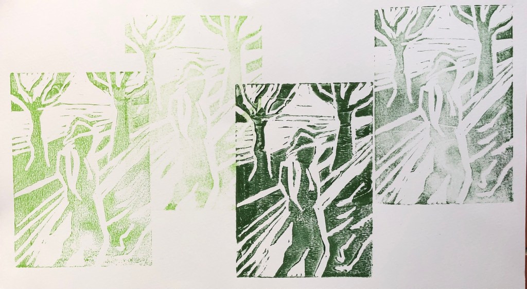
As I have worked through this section, I have been particularly influenced by the work of various artists, in particular Marlene Dumas, Paul Wright, Maggi Hambling, Annie Kevans and Milton Avery (see earlier blog posts). As a result, I have developed a method of monoprinting which:
Is ethereal in the sense that sections of the print fade at the edges and I have only chosen to paint into certain defined areas
Is calm and meditative
Has colours which are “harmonious” (see blog post on Milton Avery)
Picks out key areas of the face to make a clear and believable portrait (especially eyes, mouth, and bone structure)
I did acquire the suggested additional reading, “Reappraising Drawing Past and Present, by Michael Craig Martin (1995, London: Hayward Gallery)”; I read the essay at the beginning of this section and was frankly a bit mystified as to why we were being asked to look at it at this point. However, I now totally get it – it is the characteristic features of monoprinting in oil which have allowed me to develop this style, where it is OK to have parts which look hazy and underprinted.
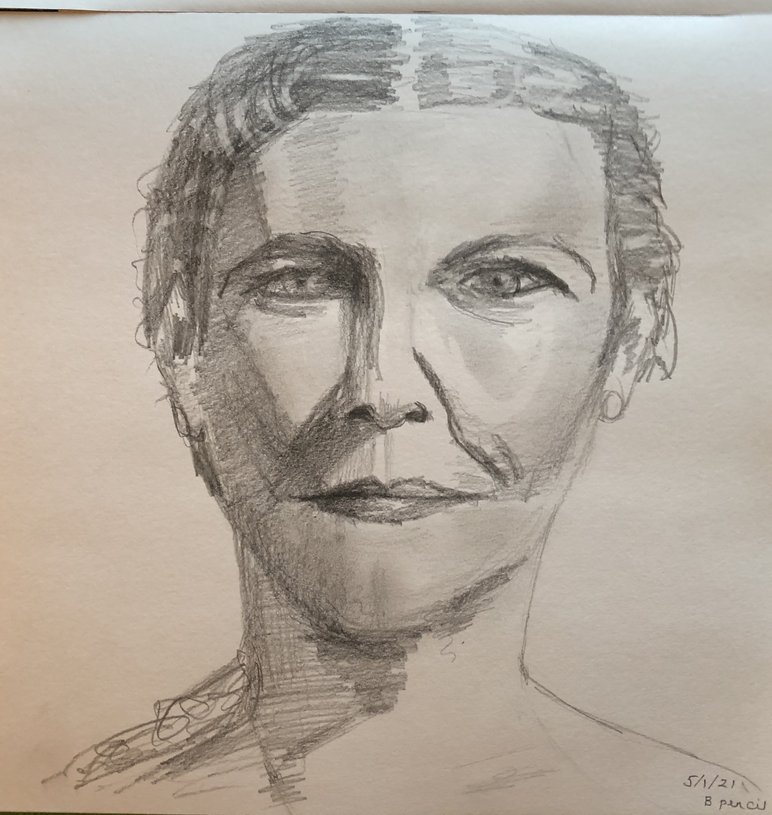
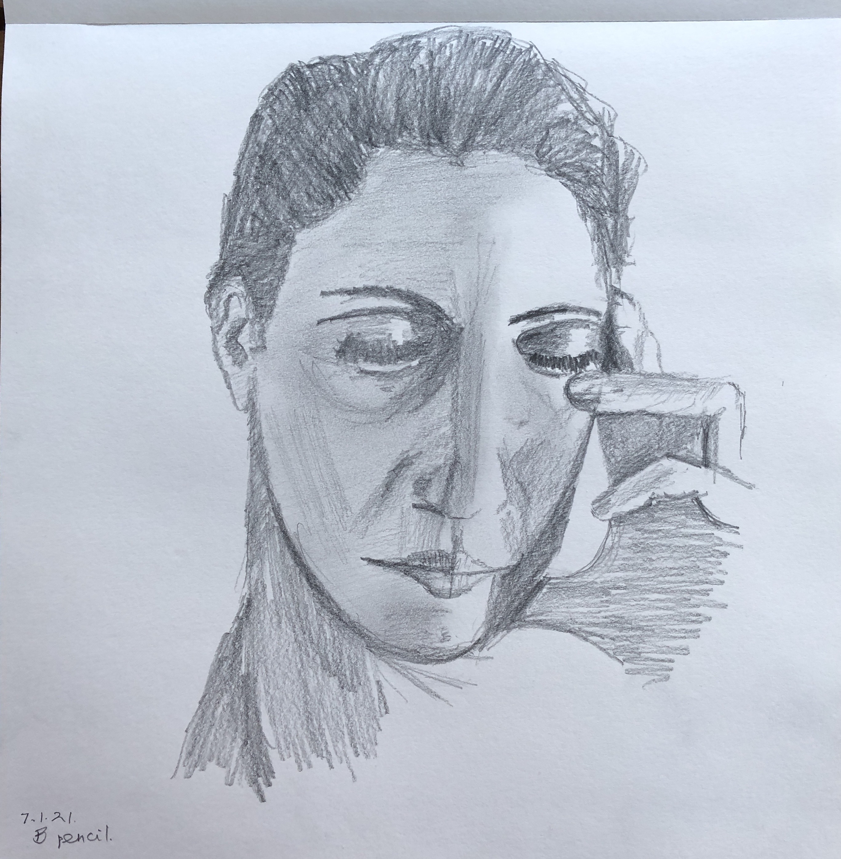
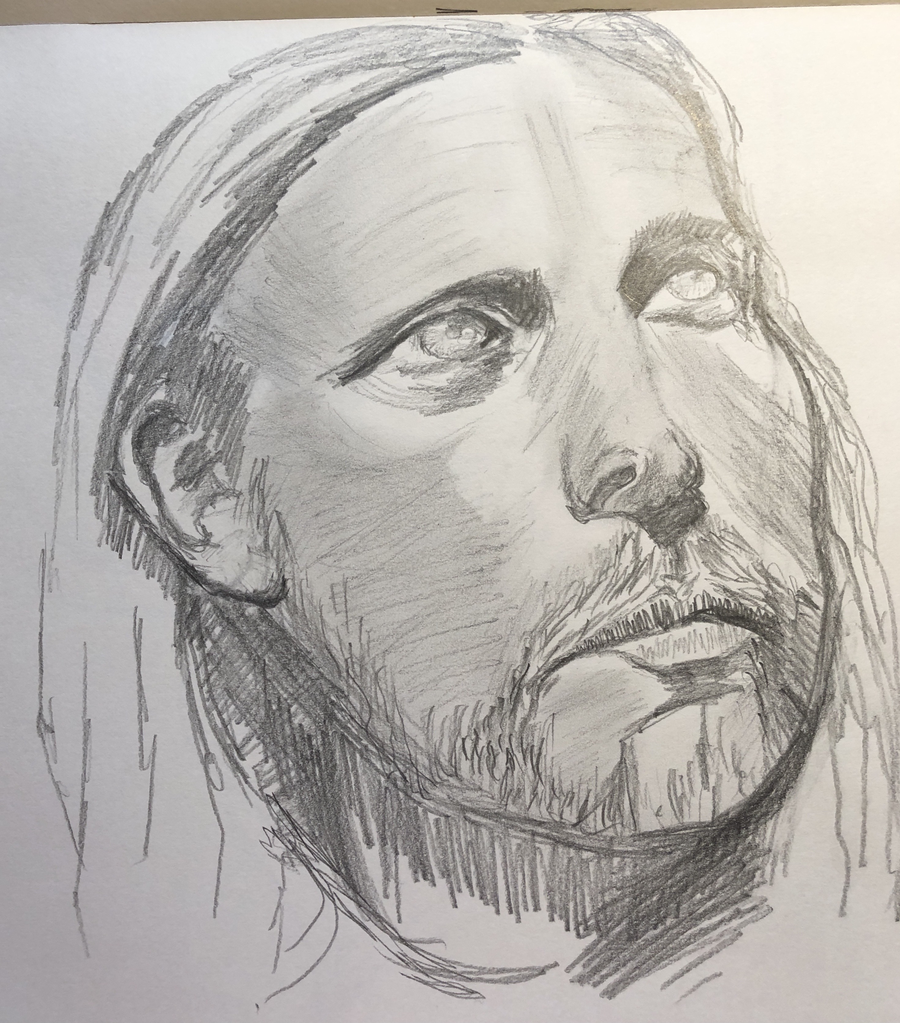
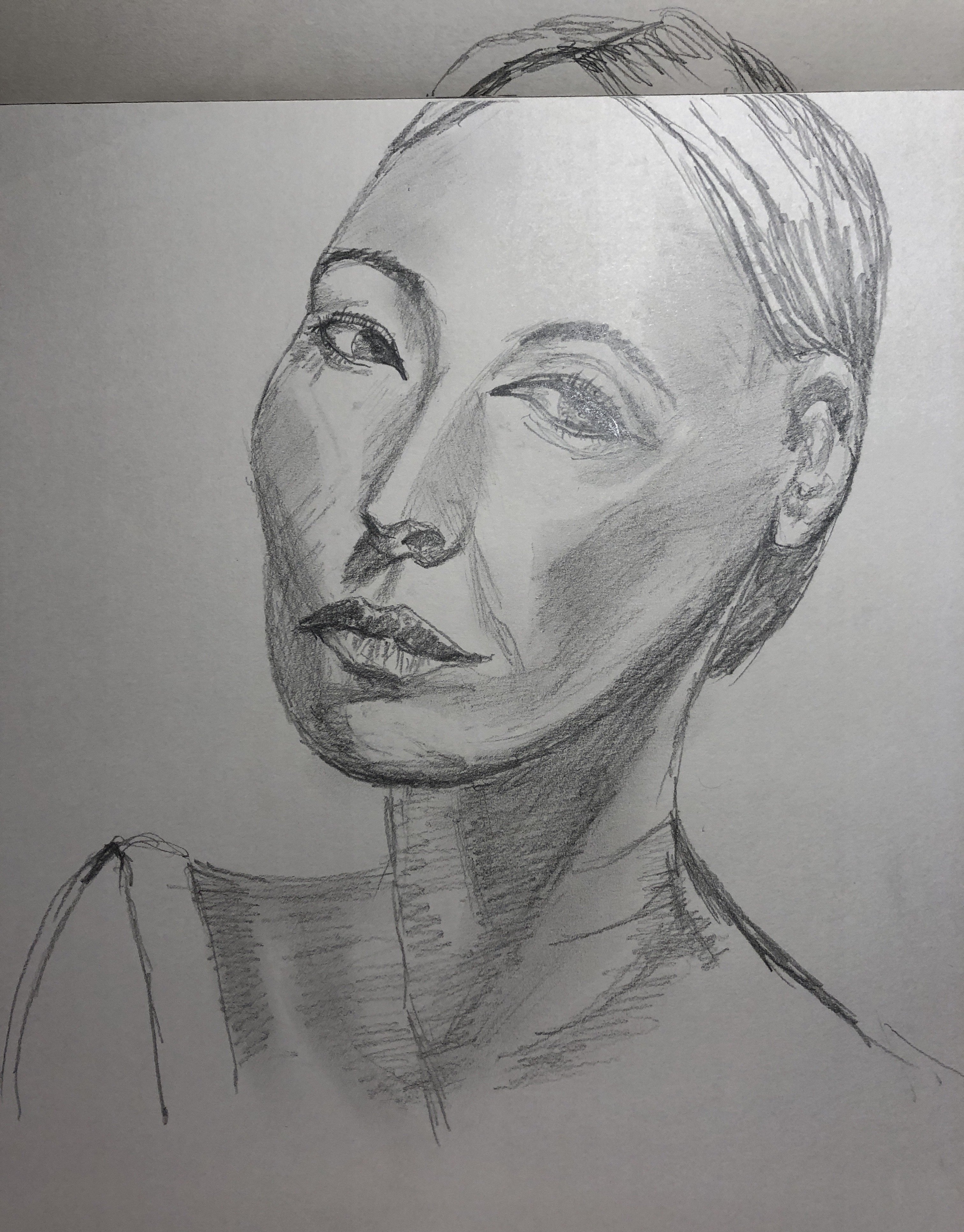
I have also been working on building my confidence with portraiture, using the resources available from Raw Umber Studios, and have been making portrait and full body drawings in 2B pencil, worked into with a putty rubber. I decided to use some of these portraits as my “base” images for the printing, rather than borrowing images from books or magazines, so that the work is completely my own.
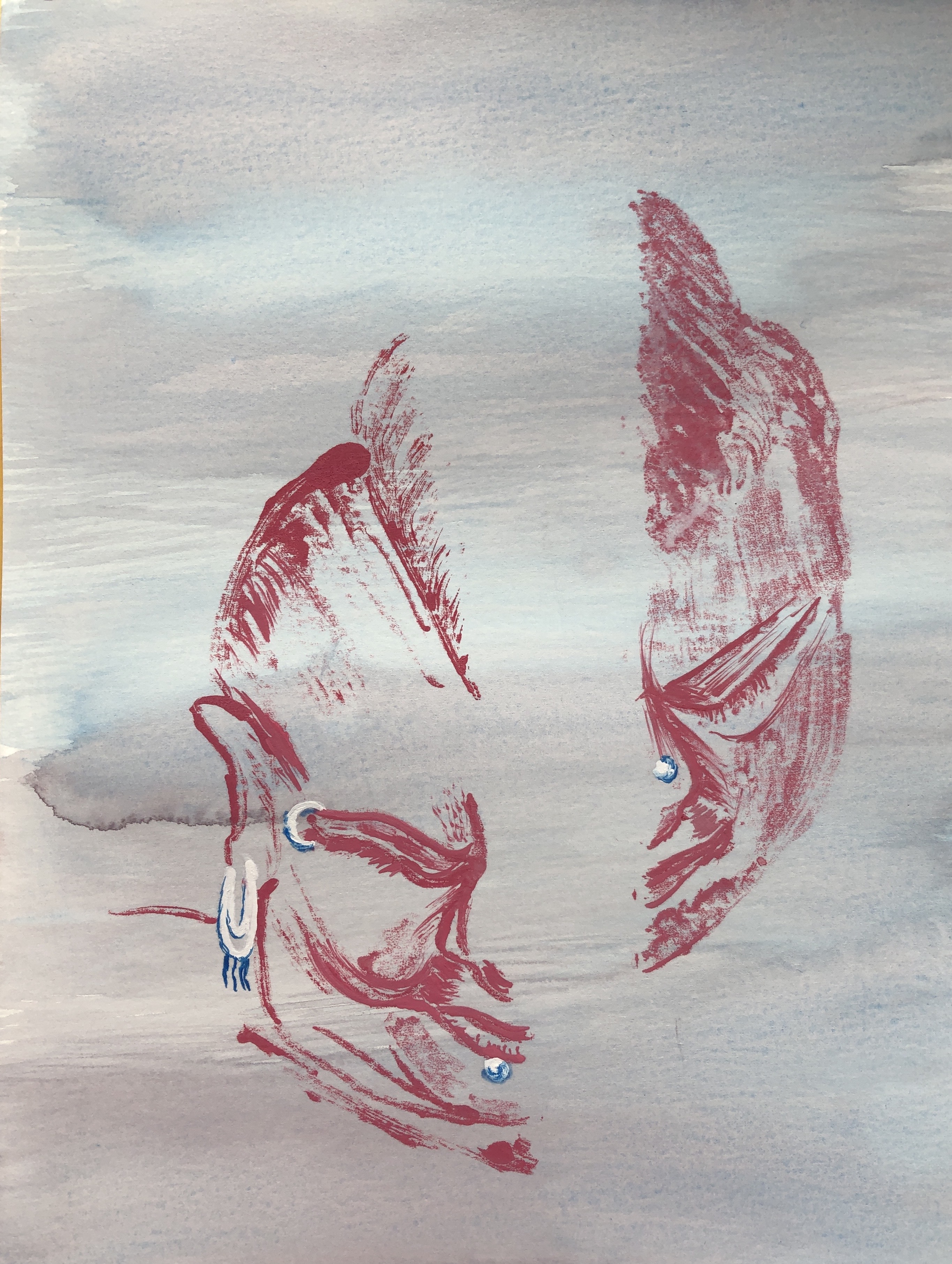
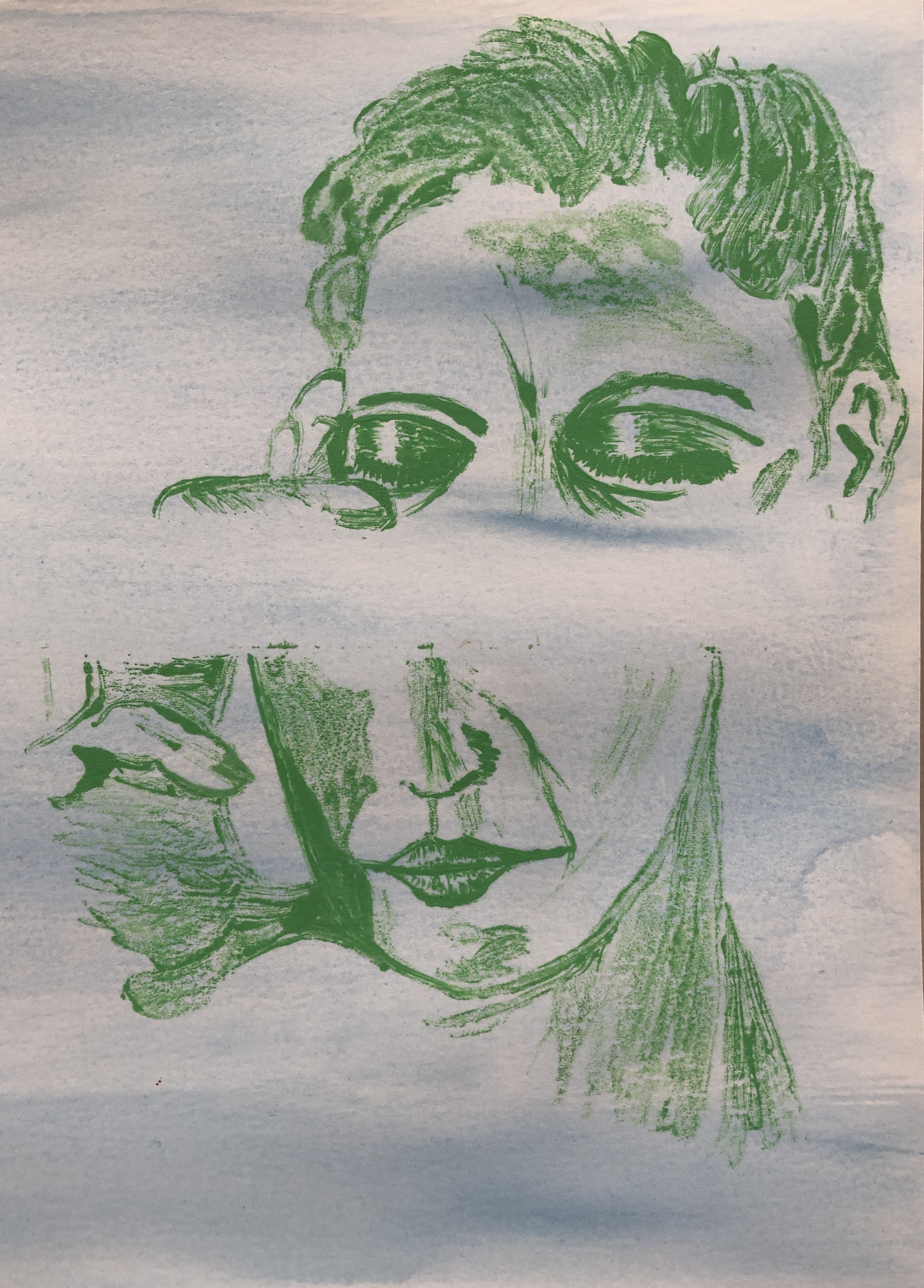
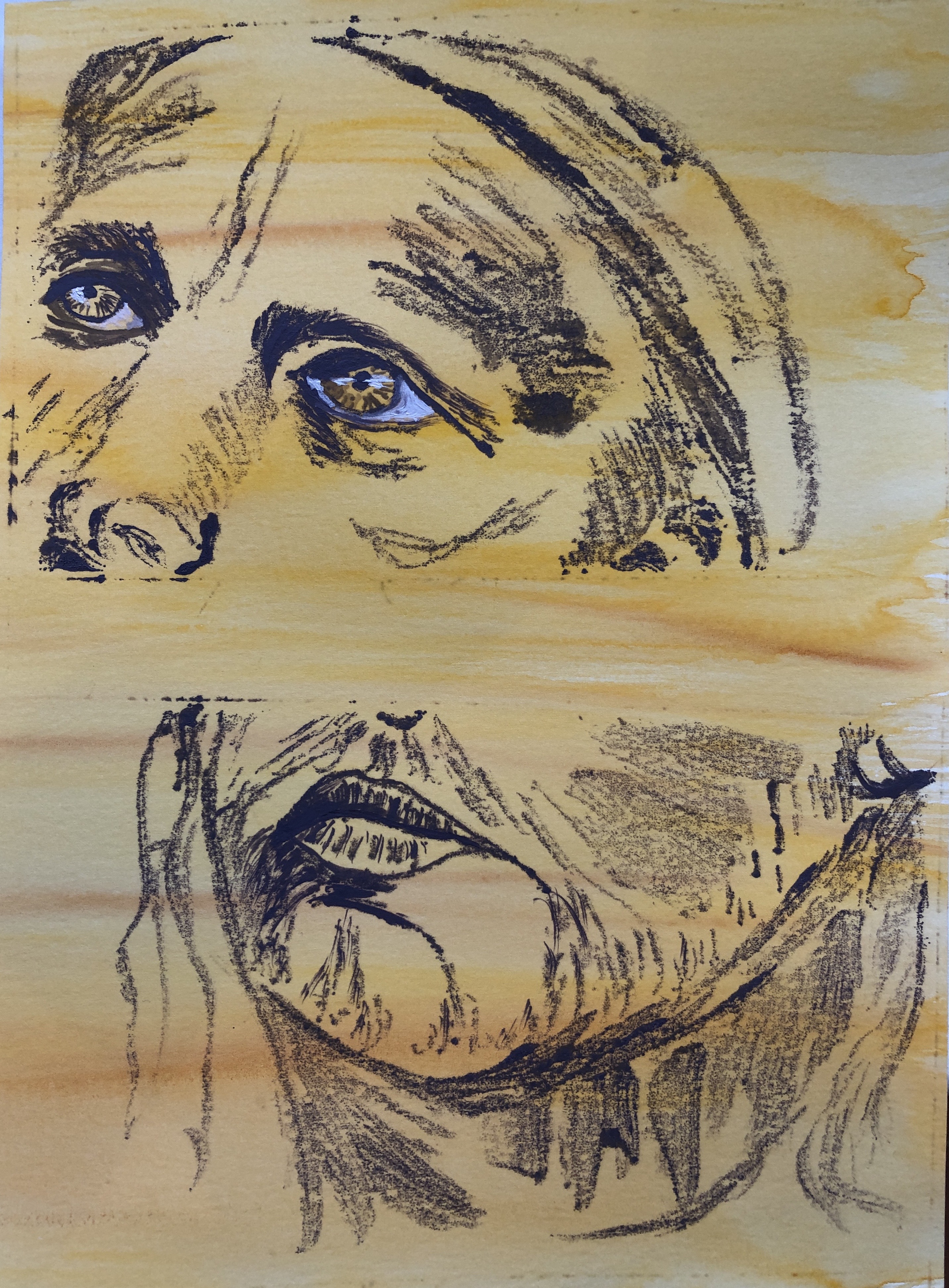
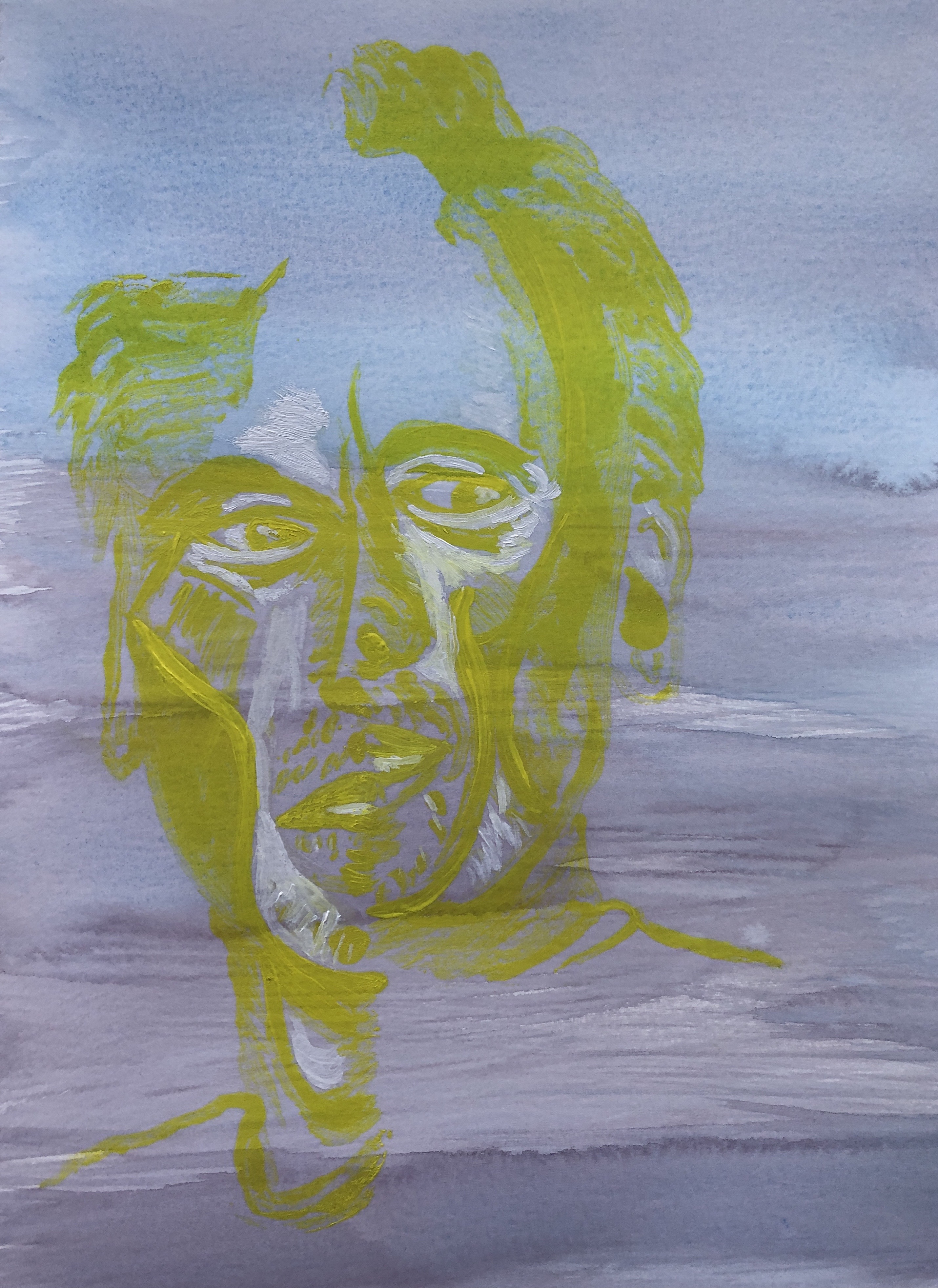
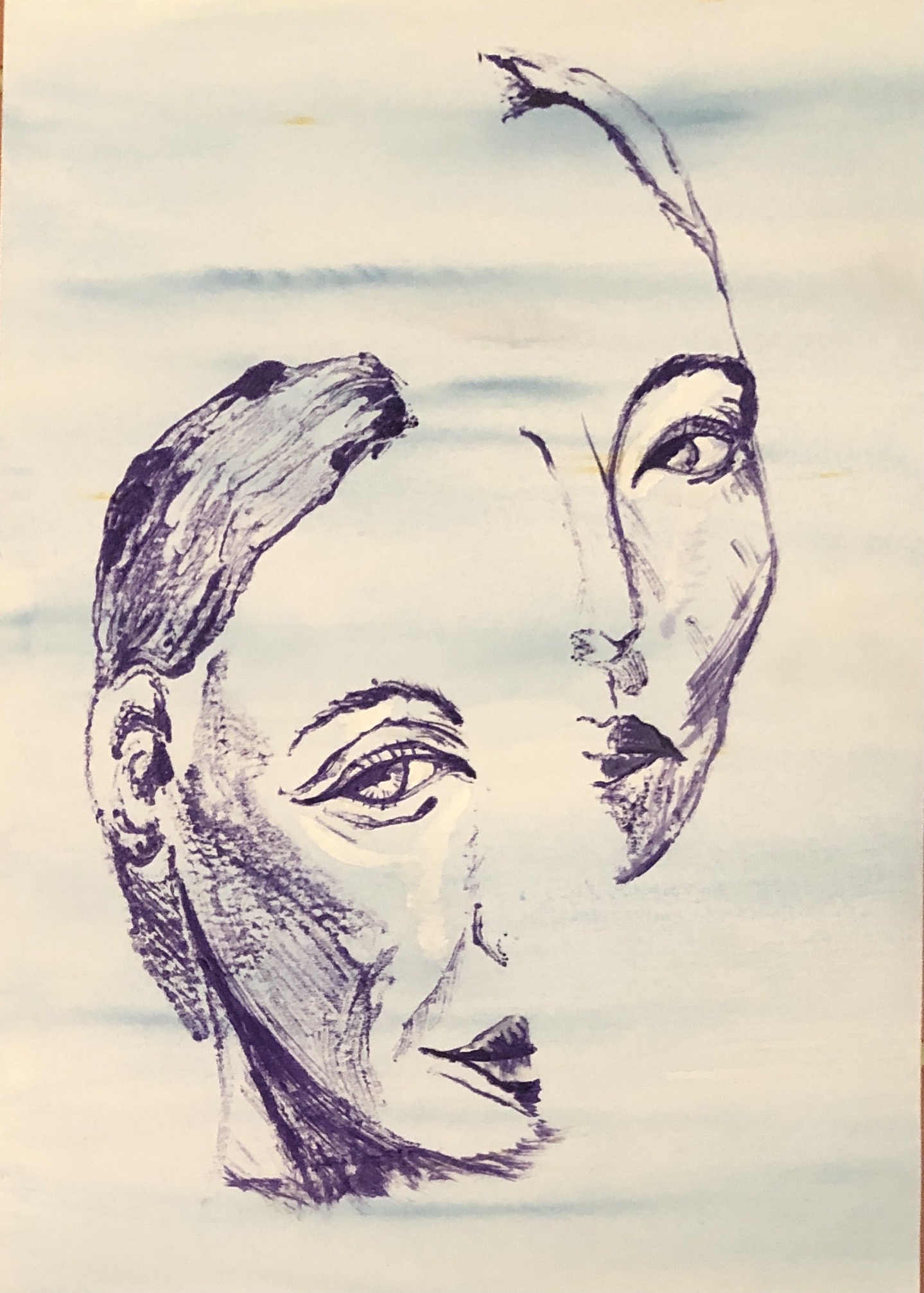
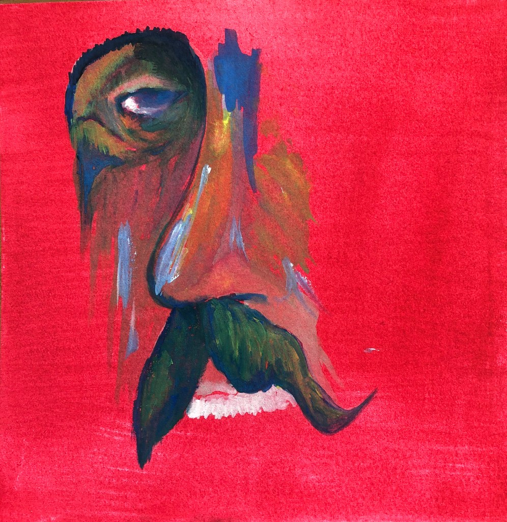
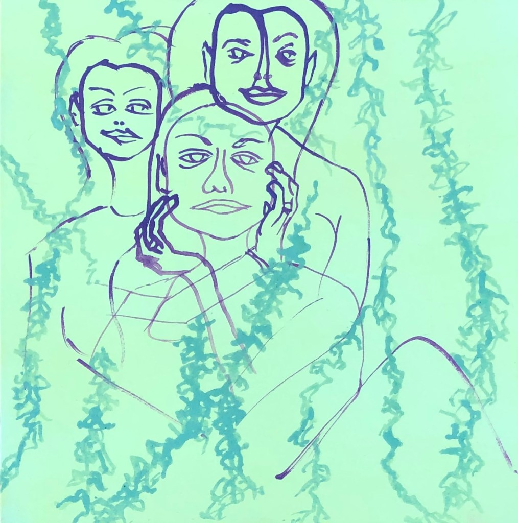
I had also wandered into a method of printing a face in two halves. I found it fun and wanted to continue with it, but took time out to think what the point of these images was. I try to keep COVID stress out of my work, as my art is my refuge from COVID, but I have heard and read from so many people that they find it difficult at the moment to concentrate on tasks and their mind is all over the place, that I think my images might convey a sense of this “wandering mind”. Also to me, who is a bit of a daydreamer at the best of times, the images feel as if they depict one half of me trying to focus on something, while the other half of my brain has drifted off out of the window into the wide blue yonder. I was going to entitle my assignment pieces “Daydreaming” – but my husband very wisely said that it would be better to leave the viewer to put their own interpretation on the pictures, and on reflection I think he is perfectly right.
SO WHAT?
After experimenting with supports and backgrounds (see earlier blog posts) I decided to work on HP watercolour paper. I wanted some colour in my background (to represent my “wide blue yonder”), but experience had taught me that this shouldn’t be so busy that it distracts from the print. Hence I covered some sheets with watercolour washes:
Cerulean blue with streaks of Prussian blue
Mix of cerulean and Prussian blues with some areas of perylene maroon
Indian yellow with streaks of burnt sienna
I prepared three A3 sheets and then cut them in half, so each print is just under A4 (taking into account the edge strips where I had attached the paper to the board for stretching).
Image 1
This was printed onto the blue/maroon mixture, and I chose crimson as the printing colour, with the jewelry picked out in cerulean and white once the print had been made. I used a feather to drag the shadow over the face whilst still on the plate, and drew in some of the fine lines on the plate for the hair.
Image 2
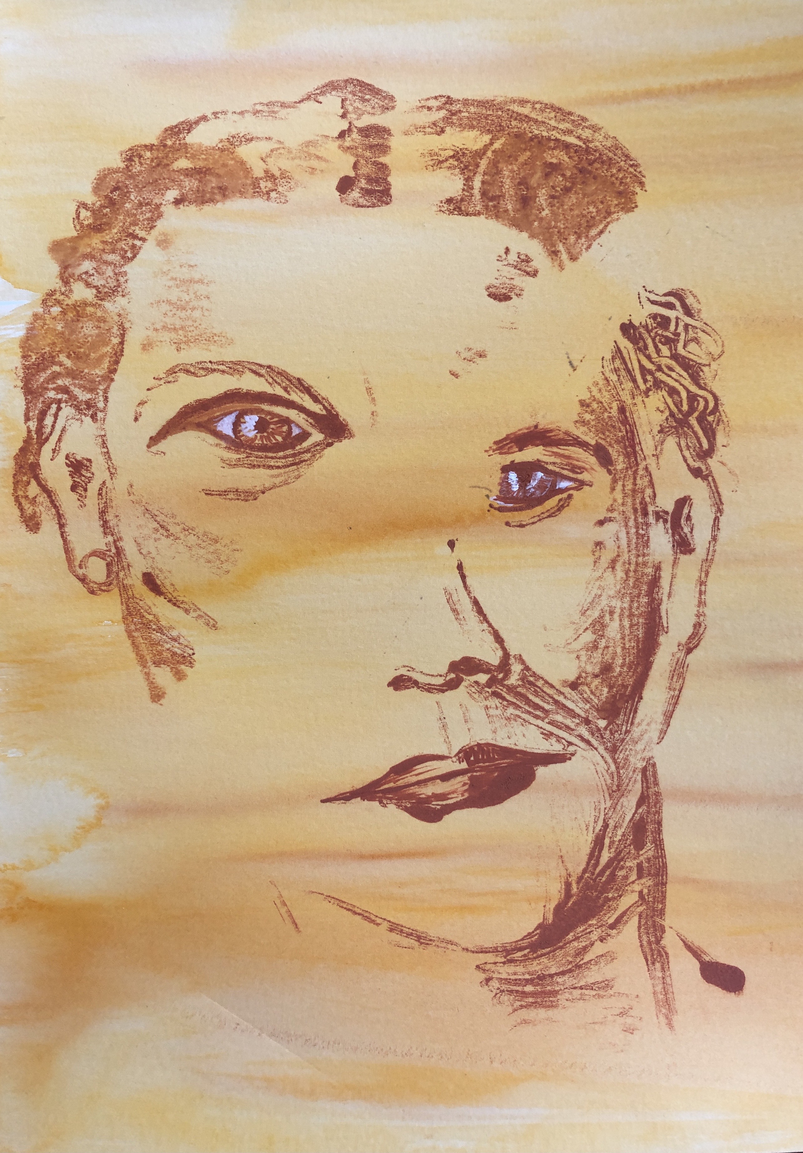
This was printed on the yellow/sienna paper. I wanted a strong deep orange to print with, which I mixed from yellow ochre and cadmium red with a touch of white. I made the texture of the hair with a cotton bud before printing, then worked into the eyes and mouth on the paper to define them.
Image 3
This was printed onto the cerulean blue; this is quite a green-ish blue and I was looking for colours to harmonise, so I chose emerald green with just a dash of white for the print. Again, I added texture to the hair with a bud whilst still on the plate. To further define the image once printed, I worked into the eyes and mouth, and just defined the shape of the strong shadow on the “hand” side.
Image 4
This was printed on the yellow/sienna paper. I thought I would experiment with a complementary colour for the print, so mixed up a purple using cerulean blue and cadmium red with a touch of white. Once printed, I worked into the eyes and mouth. My glass plate has tape around the edges and I found the paint was getting trapped along one edge in particular and was showing up on the print, so had to give this a good clean before moving onto the next print.
Image 5
This one turned out rather differently. It was printed onto the blue/maroon, and I had quite liked the way Image 4 with its complementary colours turned out, so tried printing this one using lemon yellow. I had also been trying to vary the position of the split between the two images and, as they had all been a fairly wide split so far, I thought I’d try something a bit closer, but just one higher and one lower. Two things happened – first, the yellow didn’t show up as strongly as I had hoped in the print so I had to paint into the eyes and those really strong contour lines of the face with thick yellow and also some white to make them stand out, and it makes for a rather ghostly effect . Also, the second print ended up very close to the first, just slightly higher, so the face is misaligned rather than completely split apart, and I suspect the viewer will have to look quite hard to work out what’s going on.
Image 6
This picture was printed on the cerulean blue paper (which looks a little washed out in this photo but is the same blue as Image 3 above). I thought this time I would try a dark blue on light blue, so I picked ultramarine violet for the printing paint. Once printed, I painted into the mouth and also the eyes, particularly clarifying those amazingly arched eyebrows.
Now I had six monoprints, from which I needed to make a selection of three. I was pleased with the way all of them had come out for differing reasons and so, finding the choice difficult, asked my husband, two adult children and granddaughter (11) for their favourite three. Interestingly, they all chose two the same (Image 1 and Image 6), with one vote each for the other four. So near and yet so far…
I had looked at the ways the artists suggested in the course text laid out their exhibition of collections of portraits. Luc Tuymans, Annie Kevans and Chantal Joffe have all gone for simple side-by-side arrangements on occasion, with either simple black or white frames or, in the case of CJ, no frame at all. If I were exhibiting these six prints I would arrange them lined up sequentially in the same way, probably each in matching white mount and very simple and minimal black frame. To get a bit of an idea of how this would look, I laid my prints out on a white sheet in groups of three to see if this helped me with my selection.
In order to present a representative sample of my work as my final submission for this Assignment, I have gone for this combination:
This was on the basis that it shows an example of each background and varied directions of split (vertical, horizontal and diagonal).
NOW WHAT?
I feel that my portrait drawing has improved as I have progressed through this section – I am growing in confidence in drawing shapes and tones rather than “an eye” or “a nose” – but need to continue with regular practice to maintain and develop this skill. I remember, back in the day when we could go to live demonstrations, a portrait artist telling us that, to be any good, one needs to aim to do “a head a day”….so, a way to go yet.
I have developed my own style of printing throughout this Part which I hope people will find interesting to look at. I think they fulfil my starting criteria of being:
Ethereal and meditative
Calm and harmonious, in that the relative colours of background and print are not “startling”
Working as accurate portraits even without every little detail
Arising from the characteristics of oil monotypes
I very very nearly chose the “ghostly man”, Image 5, as my third picture in my final choice because he was unusual. I think that, if I were to develop this method of working further, this closely-printed pair of prints, resulting in a slightly distorted portrait which would present the viewer with a different type of puzzle to decode, would be the way to go. To do this with any accuracy would mean I would need to devise a more accurate method of knowing exactly where to place the paper onto the printing plate.
My tutor fed back to me in a very helpful discussion via Zoom on 30th November 2020, and also sent me a summary of the points by email.
SO WHAT?
Particular key features of the discussion I want to reflect on:
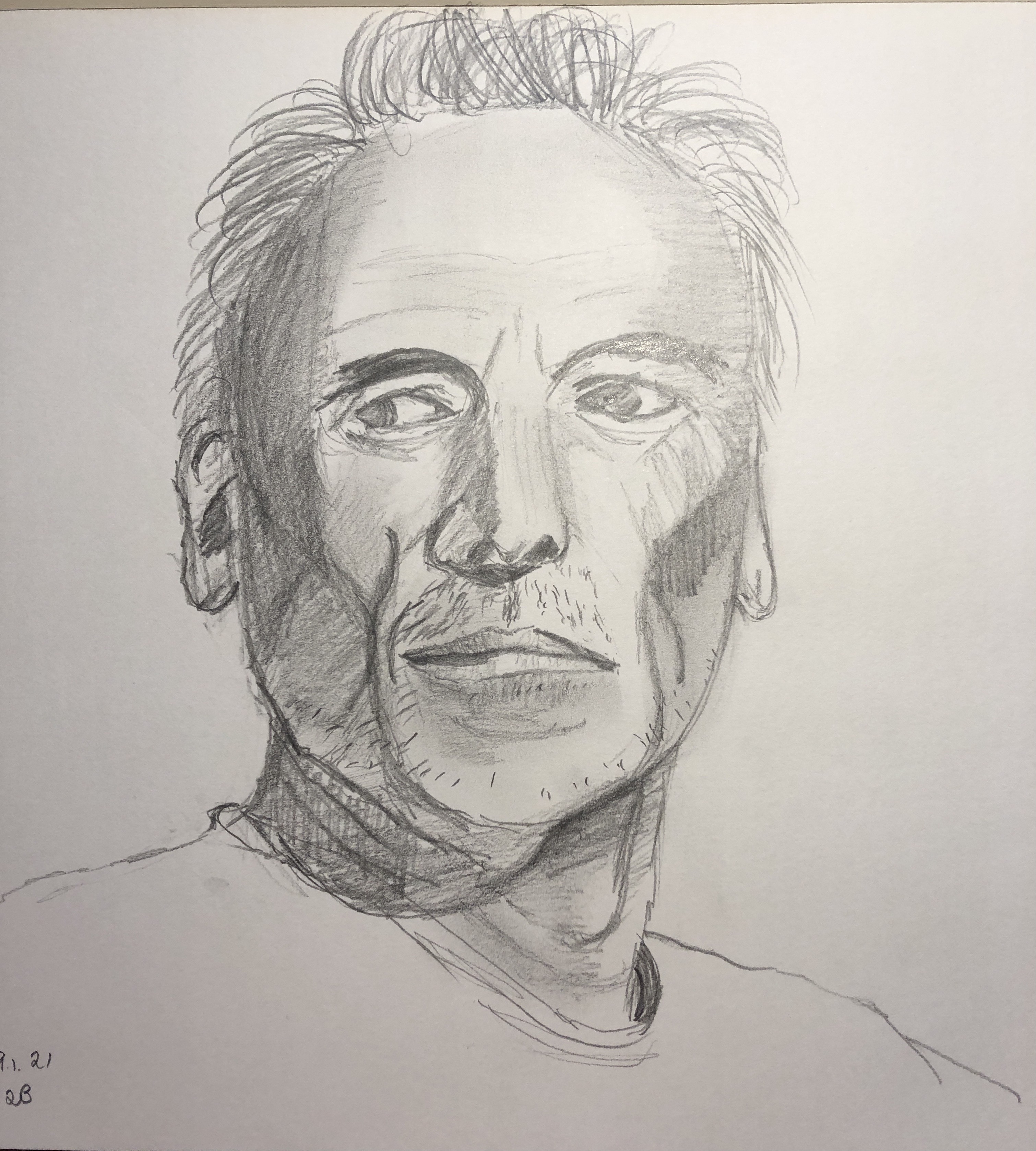
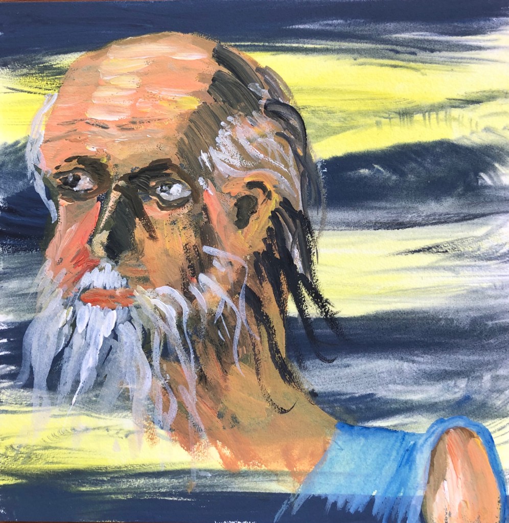
My assignment piece and preparatory work: I was glad she liked looking at it, which I guess is high praise to an artist. I too still find myself standing and staring at it – the chalk household paint does give a rather surreal effect which is increased by the black egg tempera background. I found the preparatory tone drawing with charcoal and putty rubber a really useful reference and will try this again in future work.
Tips:
Important to give a viewer somewhere to rest in a painting – not something I’d thought about.
Beware of the term “loose” – it should imply fluid rather than chaotic marks – I think I can be a bit lazy with the distinction.
Figure and portraits:
My figure drawing is tentative. This has made me stop and think. I guess it is – I only started doing it because I was required to in Drawing 1, having studiously avoided it before through lack of confidence. Need more practice, clearly.
Use reference points in the background to help measure, and get your easel on an eyeline with your view
“You paint an awful lot of heads before you get to portraiture” – my job is to treat the head as a visual problem to solve
Consider painting in grisaille (greyscale, lightly) before going in with colour, and take the colour out again if it’s wrong
NOW WHAT?
Get in as much drawing (especially drawings of people) as I can to build confidence and experience
Remember the tonal charcoal drawing, it’s a useful problem solver
Work on understanding colour and what effect it has, rather than just grabbing the first tube that comes along
My review of my learning so far from this unit had brought me to this point:
Things which have been tackled and are developing (but always needing more…):
Getting around tasks which don’t immediately appeal by finding a way to “get in from another angle”
Loosening up and being up for experimenting
Managing my impatience as a painter by managing my subject matter
Favourite media: oil paint, household chalk paint and enamel paint.
Favourite ground: egg tempera, ink
Favourite tools: sticks and knives
Favourite support: metal
Becoming aware of curation and your work as art out in the world
Issues which keep coming up and need more work:
Quality of mark making and brush strokes
“Decisive and economic”
Palette organisation and where to mix colours
Tone generally, but in particular:
Adding tone to drawing
Possible confusion of tone and colour in painting
Understanding the tonal range available
Controlling my style – should I? How do I develop it?
Things which appealed at the time but which I appear to have mentally parked:
A collection as being of quotes or ideas to investigate a subject – rather than just a load of actual “stuff”
Based on these, I made some decisions to tackle this assignment:
I had liked painting collections of art materials before in this section – art is my “escape” from the Covid-obsessed world
Apart from oils and inks,which are traditional painting media, I had enjoyed painting with the less common media of enamels and household paint
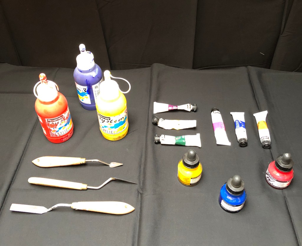
The size required for the task (A1 or A2) felt a little too daunting for enamels, given that I had only worked in this medium for small pieces, so I chose to work with the household paint as my main painting medium
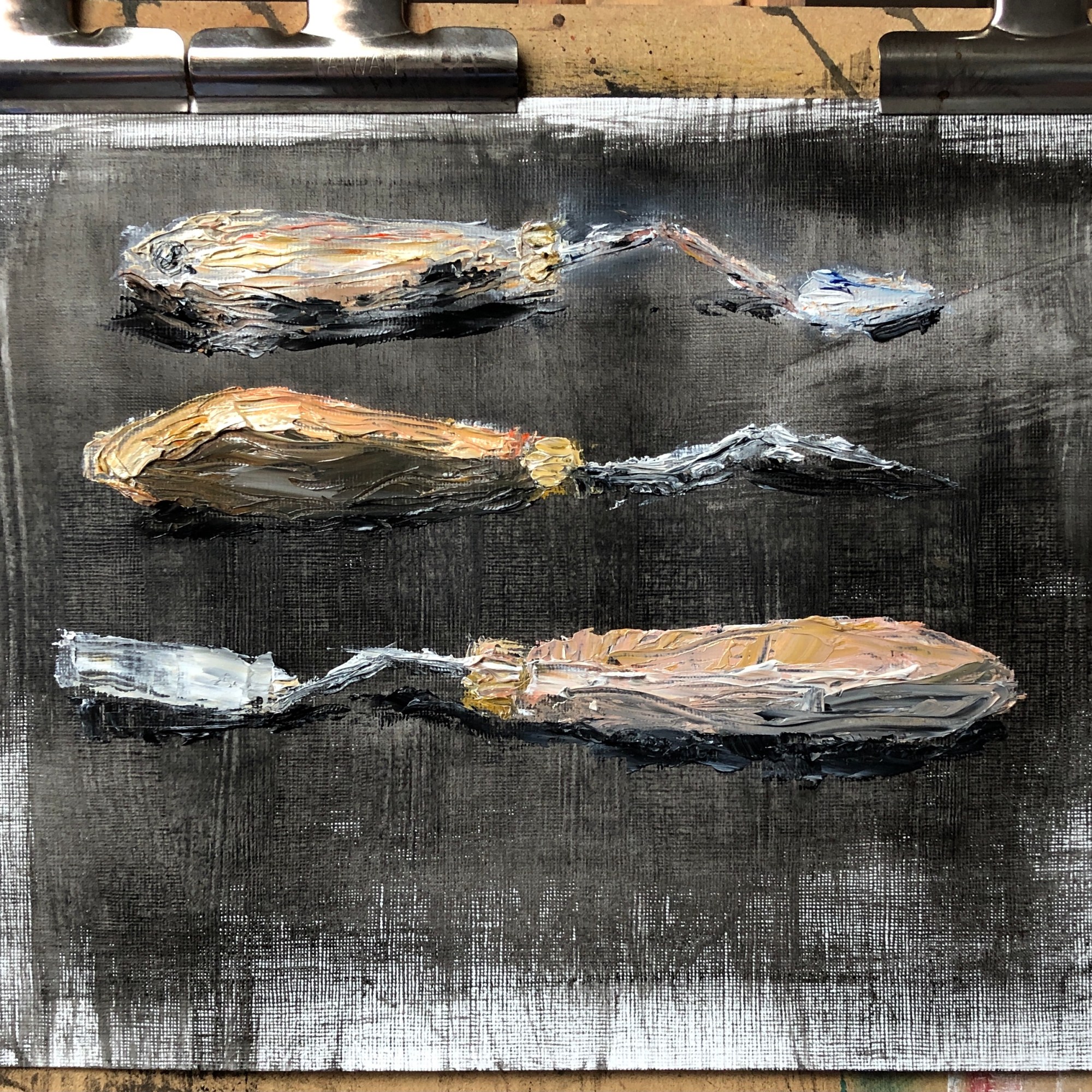
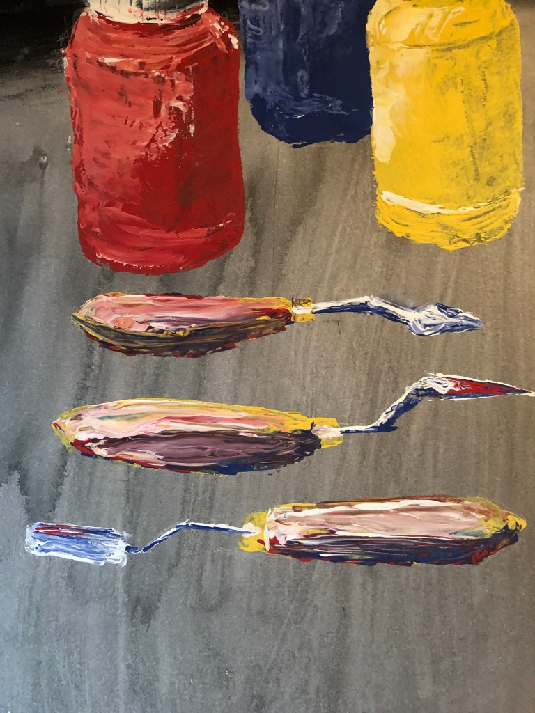
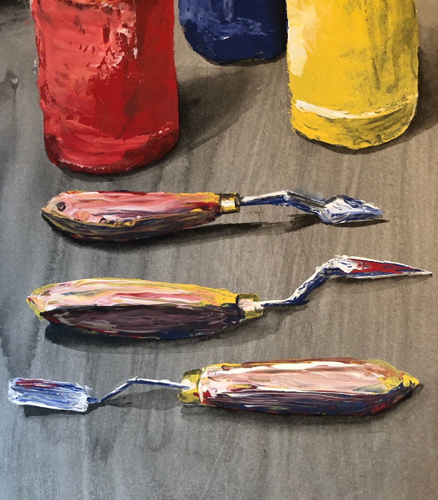
I had just discovered painting with a palette knife – it is (to me) slightly unpredictable, and it is possible to apply the paint both thickly and thinly in a single stroke, which I found interesting, challenging, and wanted to do more of.
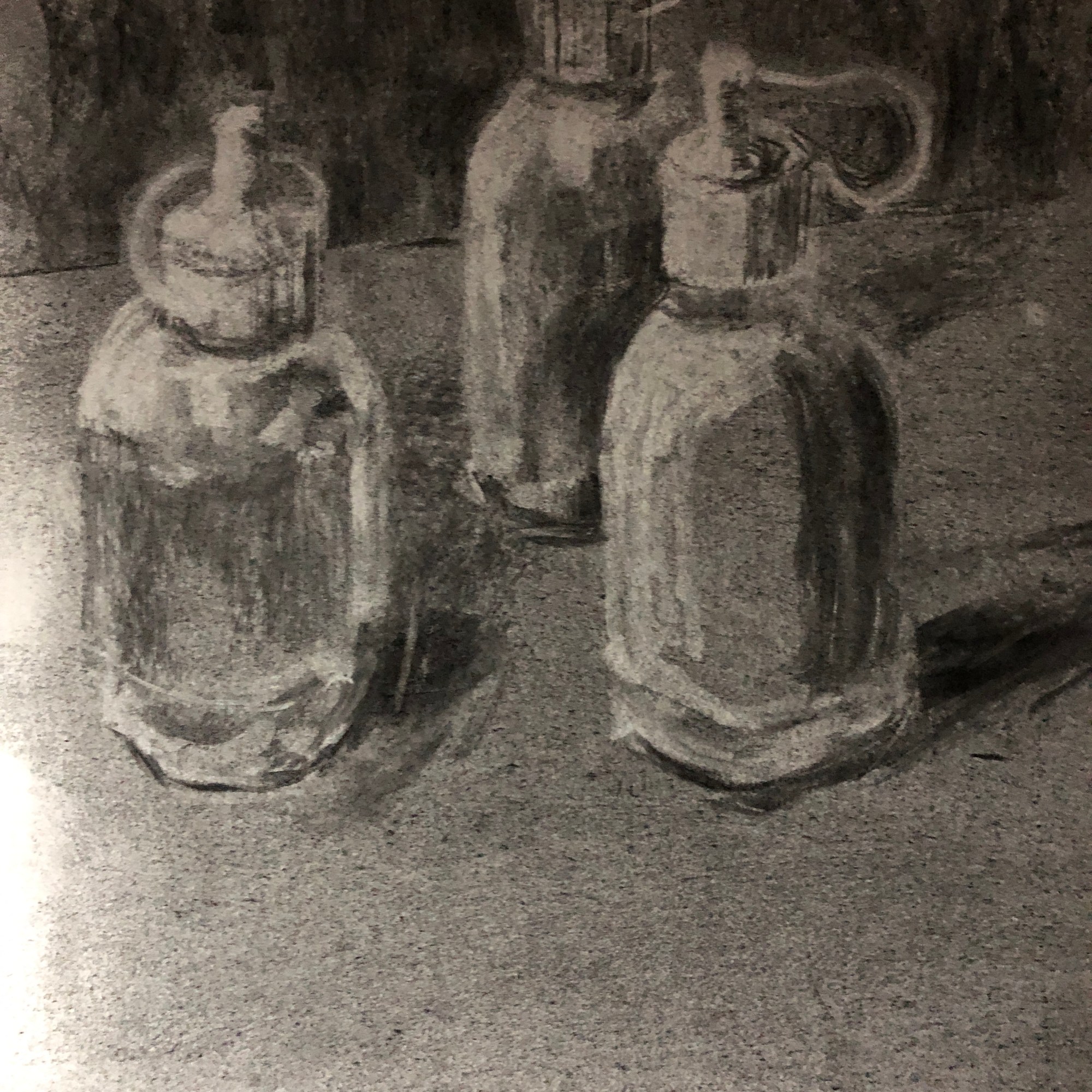
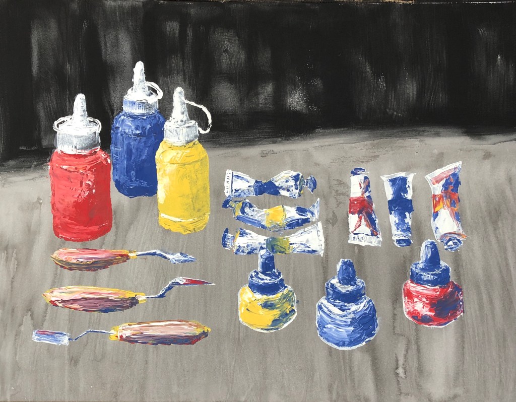
My main influence as far as composition was concerned was Lisa Milroy – her rather regimented still life layouts appealed to my need to organise. I selected a range of art materials and tools (in units of 3 for pattern-building) and played around with different layouts on a piece of black fabric, finding an arrangement which chimed with my sense of order and symmetry. I hung some more black fabric behind as a backdrop, and lit the scene from the top left hand side with a daylight lamp.
The lamp causes quite a bit of glare in the photograph which is not there in the original. Lisa paints her arrangements looking almost straight down on them, but I looked at them standing, as it were, at the bottom right of this picture, so that a couple of the items overlap slightly, which I felt added interest and stopped it all being too tidy.
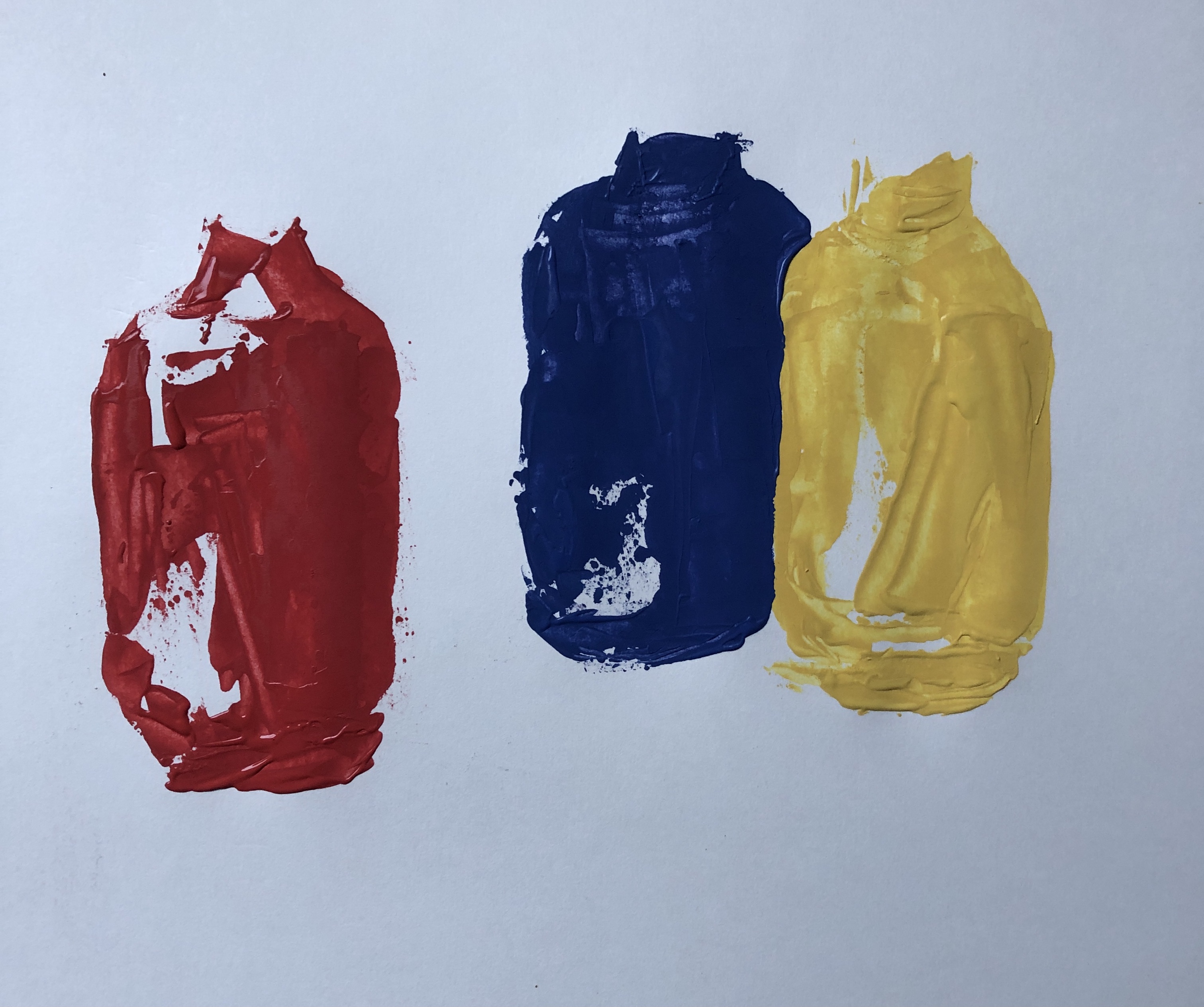
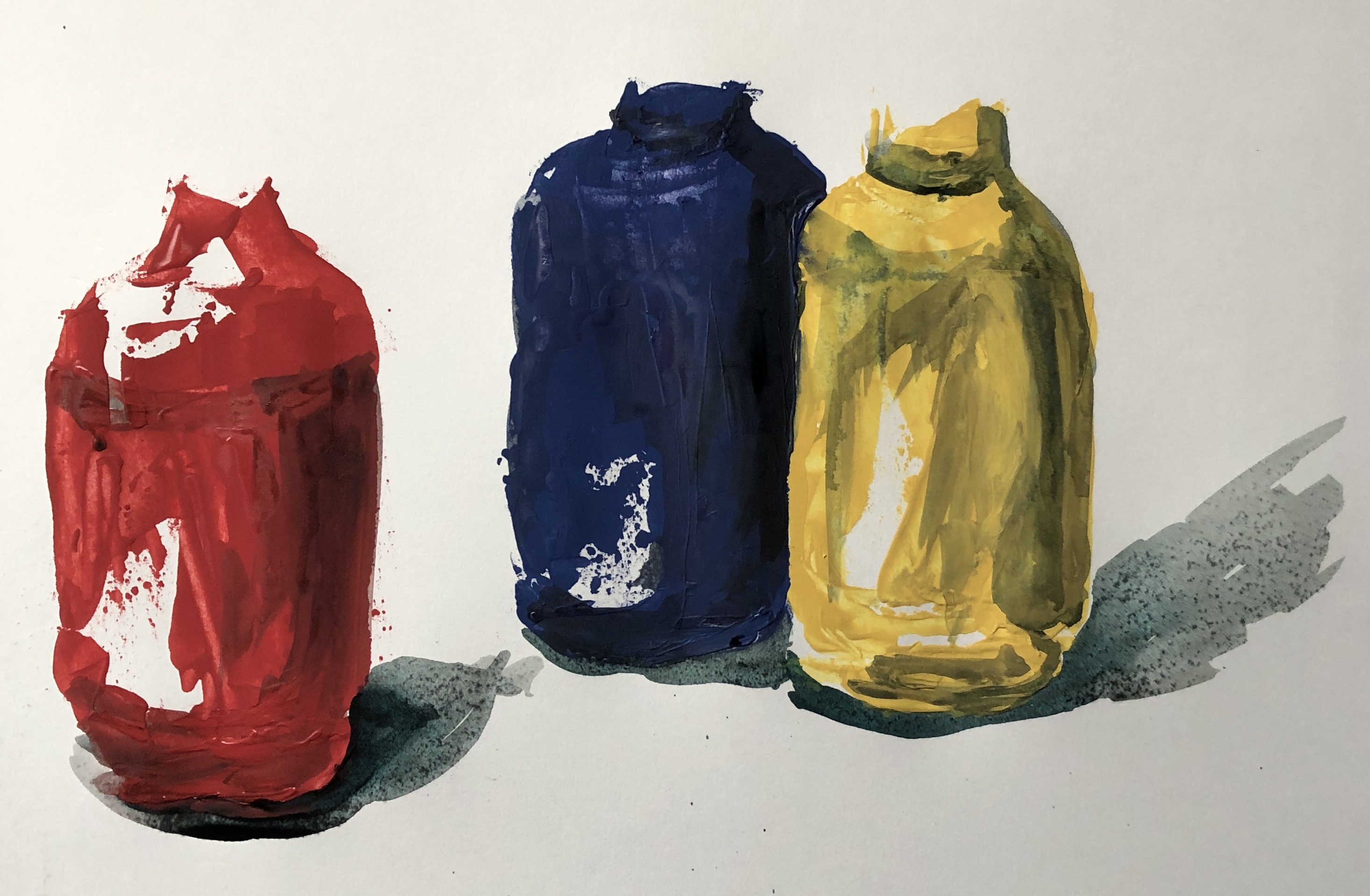
My intention was to paint on a large sheet of hot pressed watercolour paper, somewhere between A2 and A1. The background was to be painted black – egg tempera for the backdrop, which gives a really good strong black, and dilute Chinese ink for the cloth on the table, to give a mid-tone. The main medium for painting would be Annie Sloan’s chalk household paint (red, yellow, blue and white) applied with a palette knife, and any necessary extra darks needed would be washes of ink (or, if I felt I wasn’t getting a dark enough dark, maybe a little egg tempera).
SO WHAT?
My preparatory work before painting included:
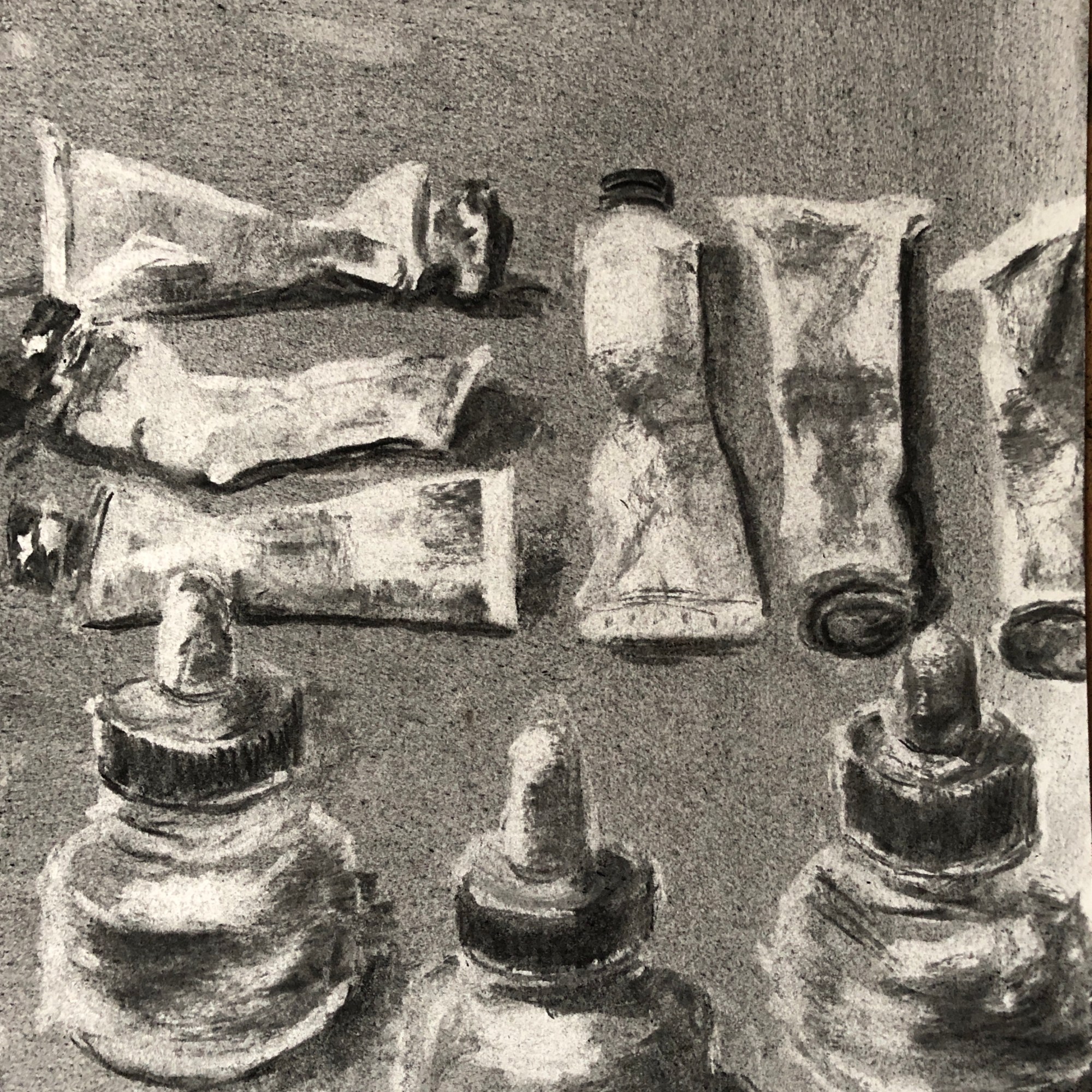
Some continuous line drawing in pencil of a few of the paint tubes; I worked into these to add tone, as well as doing a couple of detailed studies of the caps which I was struggling to understand.
Having done this, I thought I needed a proper tonal drawing as a reference. I used willow charcoal and a putty rubber for this. I covered a sheet of paper with the charcoal and rubbed it into the surface with my hand – this created my mid-tone. Then I either lifted out with the rubber or drew in with the charcoal to make my lighter and darker tones.
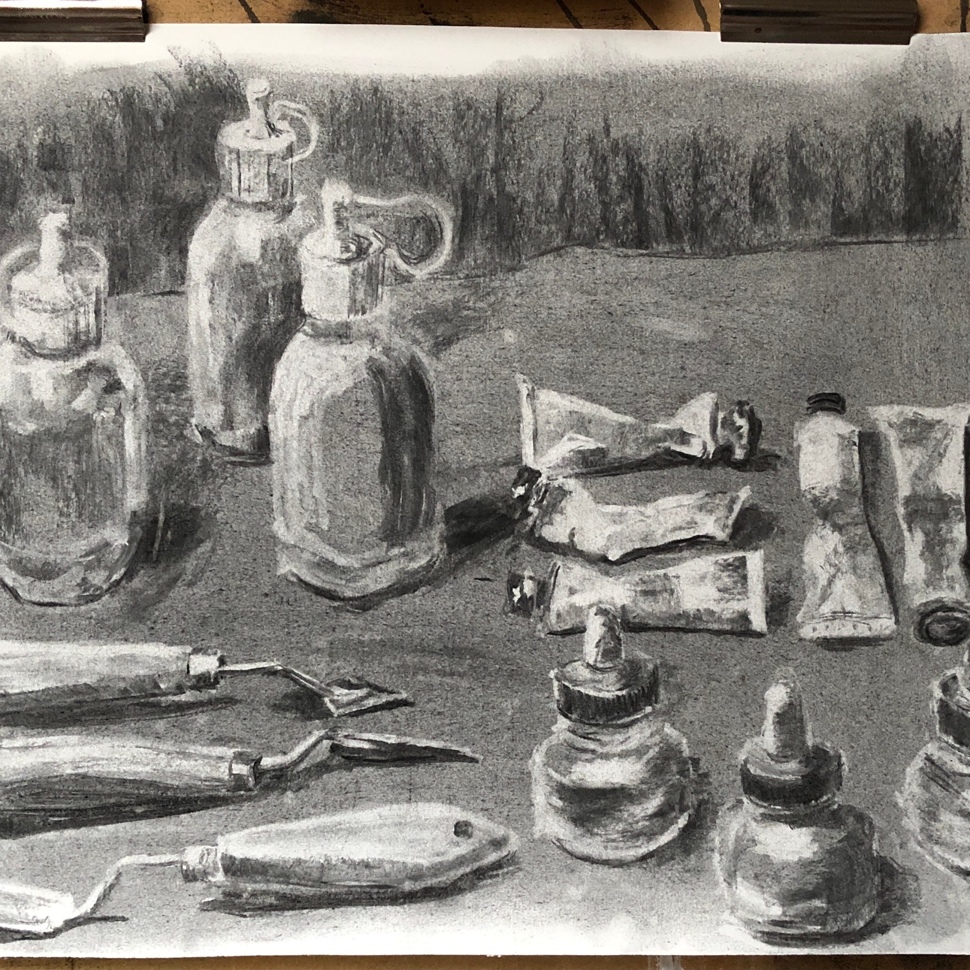
A painting of this size would best be done vertically which would mean using my left hand (the amount of gestural movement being too much for my dominant, but previous broken and now too stiff, left shoulder) – so I felt I needed to practise using a palette knife with my left hand. Just as well, as I found it quite tricky! I did this painting of the palette knives, using a palette knife, with some oils left over on a palette.
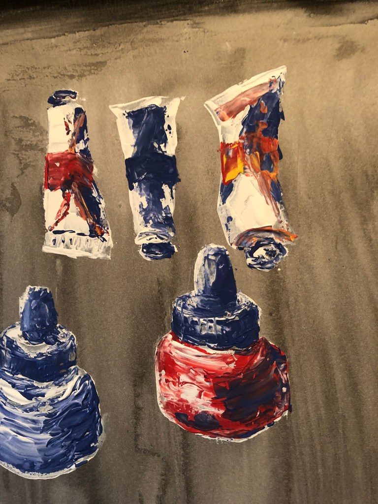
Next, thinking about painting on a near vertical surface, I thought I should try experimenting again with the left-handed palette knife but this time using the Annie Sloan paints, which are significantly runnier than oil paint, to check they weren’t going to be unmanageable. I roughed out the three tall paint bottles, and found the household paint to be actually easier to control than the oils because they didn’t slip and slide so much. I also checked that overpainting with inks would allow for development of tone.
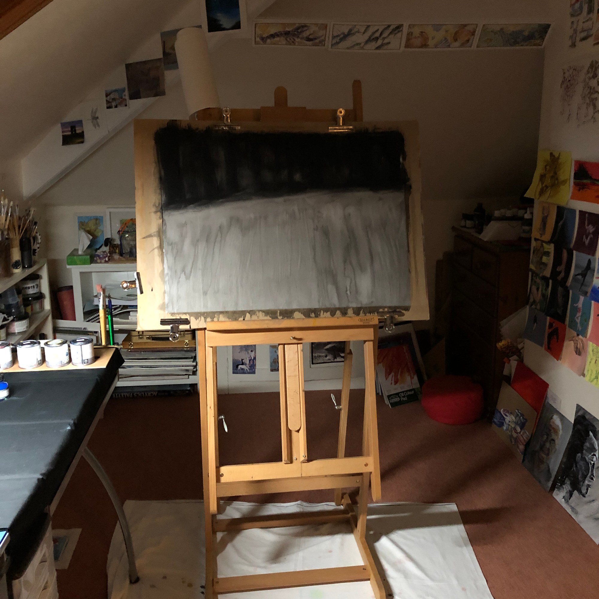
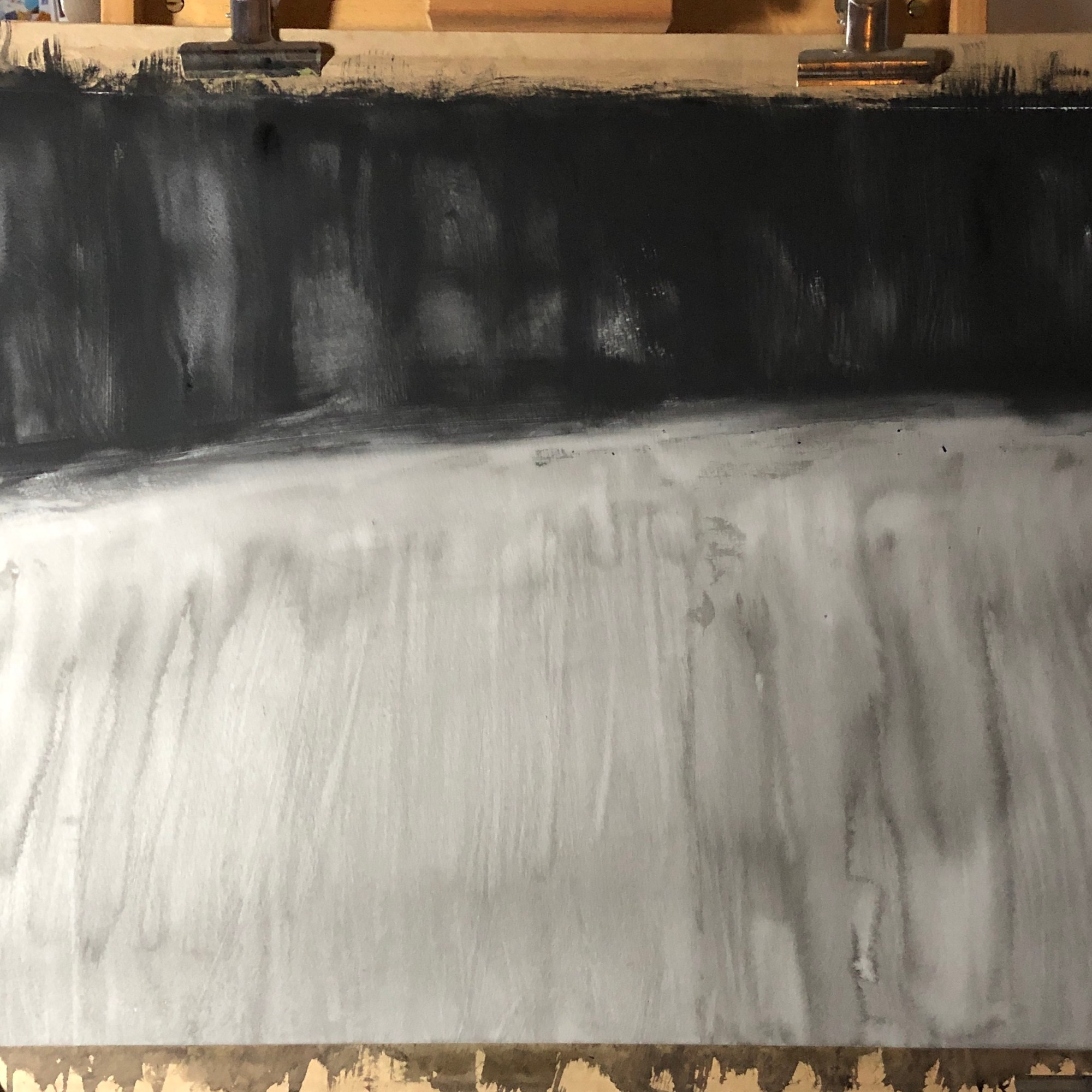
I felt ready to make a start on the main painting. I soaked and stretched my sheet of hot pressed watercolour paper, allowing it to dry completely, before applying my background of black egg tempera (top) and dilute Chinese ink (bottom) with a very large watercolour brush (an SAA “Whopper”!). I kept the background fairly loose, not worrying about runs and streaks, although trying to get them directional – I am aware that the layout of my composition is quite controlled and regimented, so wanted to counteract this potential impression of over-organisation. Again I left the whole thing to dry.
And then I began! The paint dries quickly, sot takes no prisoners – not a lot of time for standing back and looking whilst painting an element, you just have to get in there and hope for the best; it is only when considering adapting your work to take account of tonal values that you have the chance to take more time. I looked often at the physical composition but also relied heavily on the tonal drawing for support. Here are some images of the work after the painting stage was complete:
My next task was to add the darker tones and shadows in black Chinese ink, using a sable brush. This ink does dry lighter than it looks, so in some places I needed several layers. I was prepared to use the darker egg tempera if necessary, but decided against it as the ink shadows blended seamlessly with the ink ground, making them look more natural.
NOW WHAT?
I feel the painting is a success because:
I enjoyed painting it.
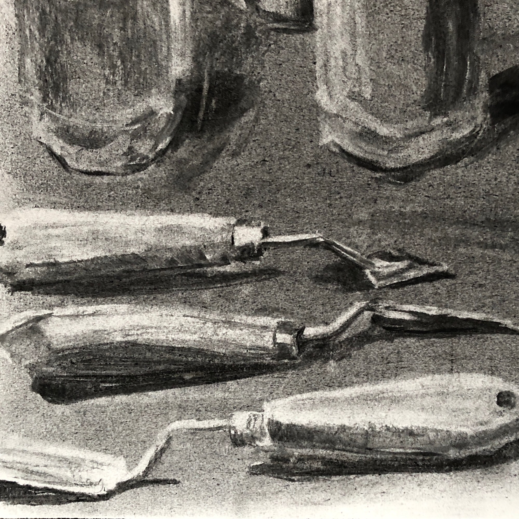
Getting to grips with the palette knife was a real challenge and I have learned more about the marks which are possible by doing it (I confess that I struggled with the curved sweeping lines of the paint bottle top hinges and I turned to my ash twig for those).
I thought hard about tone throughout and hope I have achieved enough of a range without the shadows being overbearing.
What could I have done differently?
I chose to make the background loose and undefined so that it literally “melted into the background”, as I wanted the clear focus to be on the art equipment. However, once it was finished and I looked at it as a whole, I wondered if it might have been improved by a more uniformly dark black backdrop to give a strong chiaroscuro effect.
I have fitted the collection neatly within the page; when I did my tonal drawing, however, I ran out of space a little and image just “fell off” the end of the page – looking back, I think this gave the picture a certain dynamism and perhaps I should have repeated it in the main painting.
Demonstration of visual skills: Materials, techniques, observational skills, visual awareness, design and compositional skills.
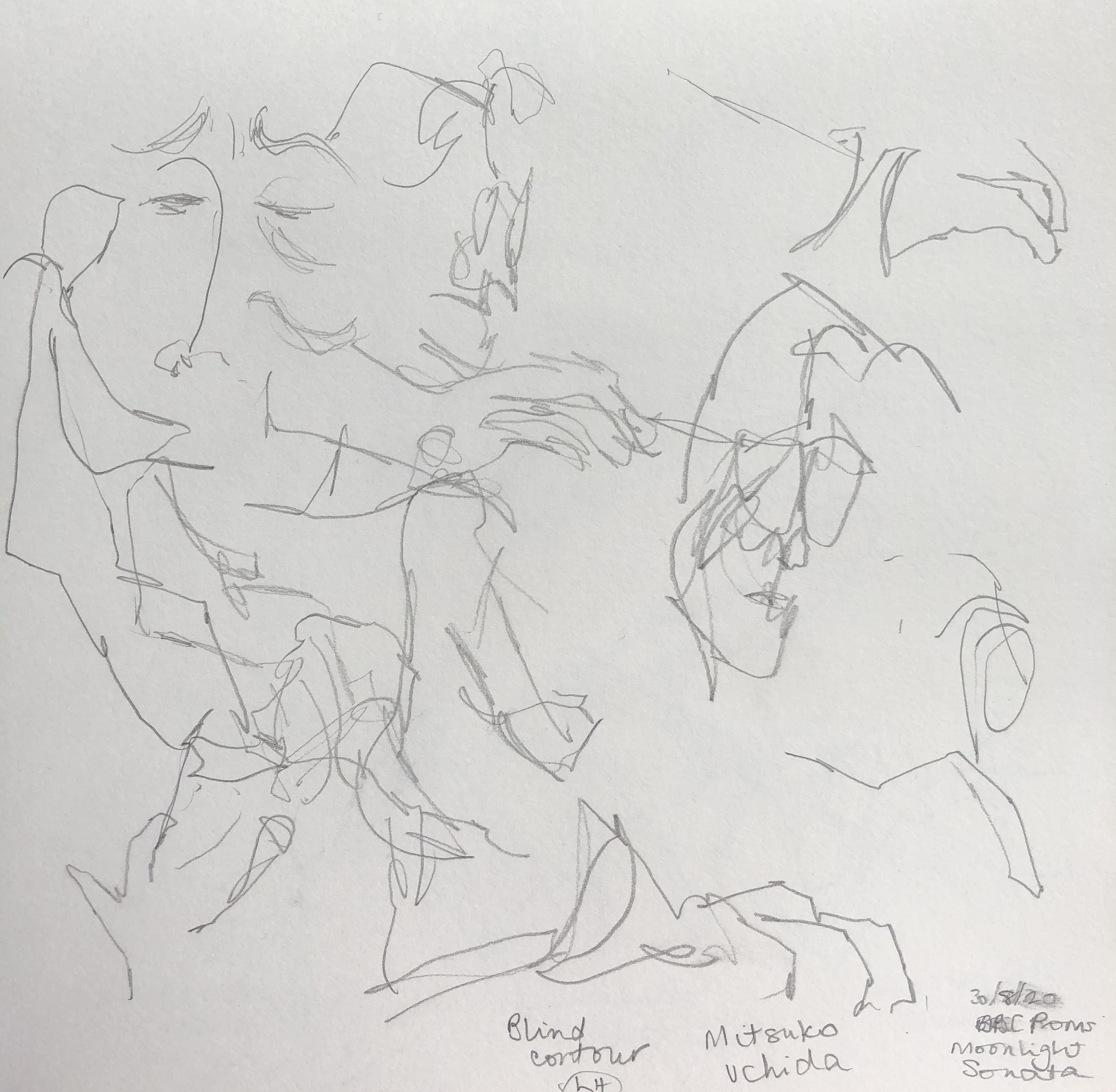
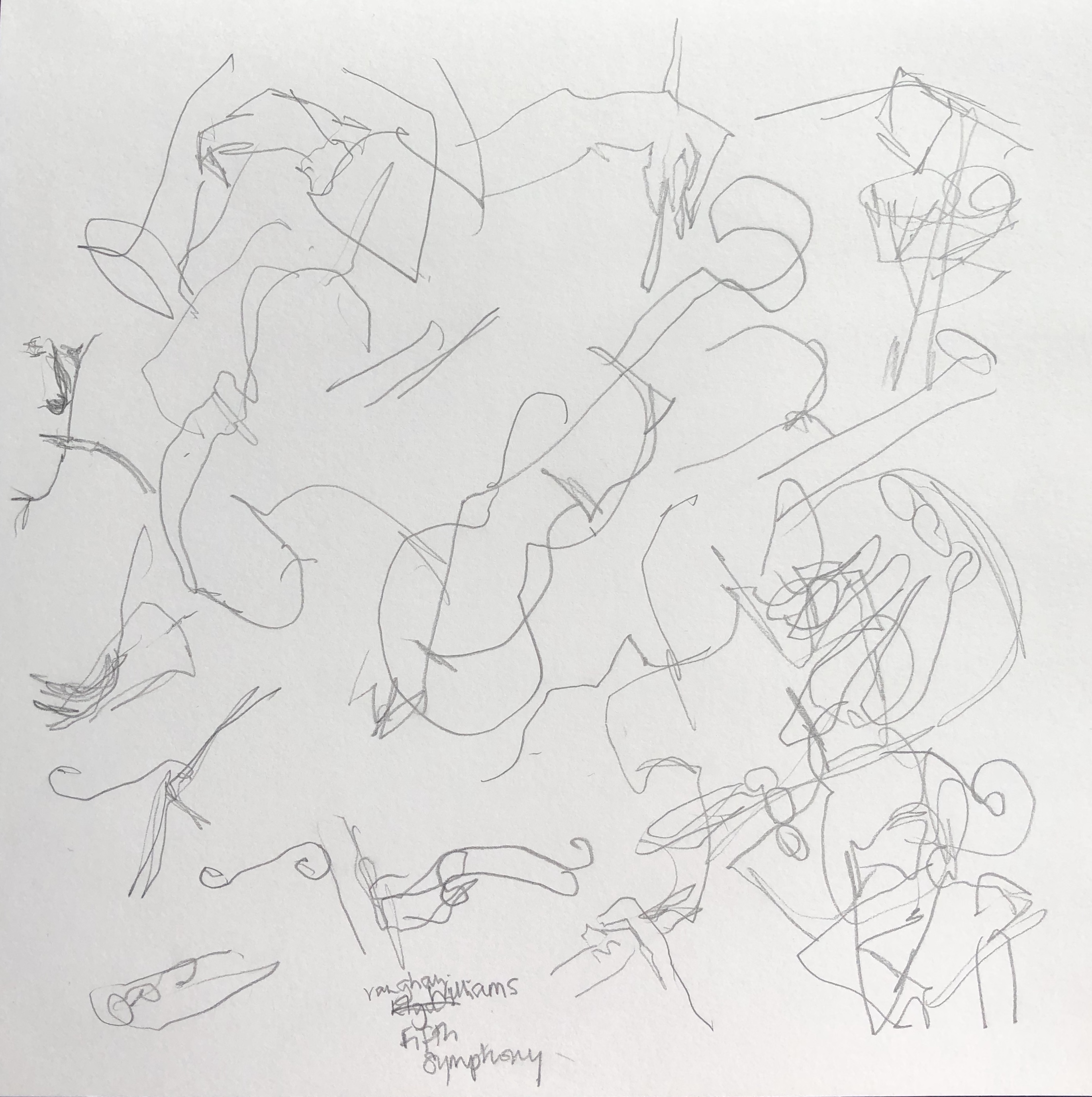
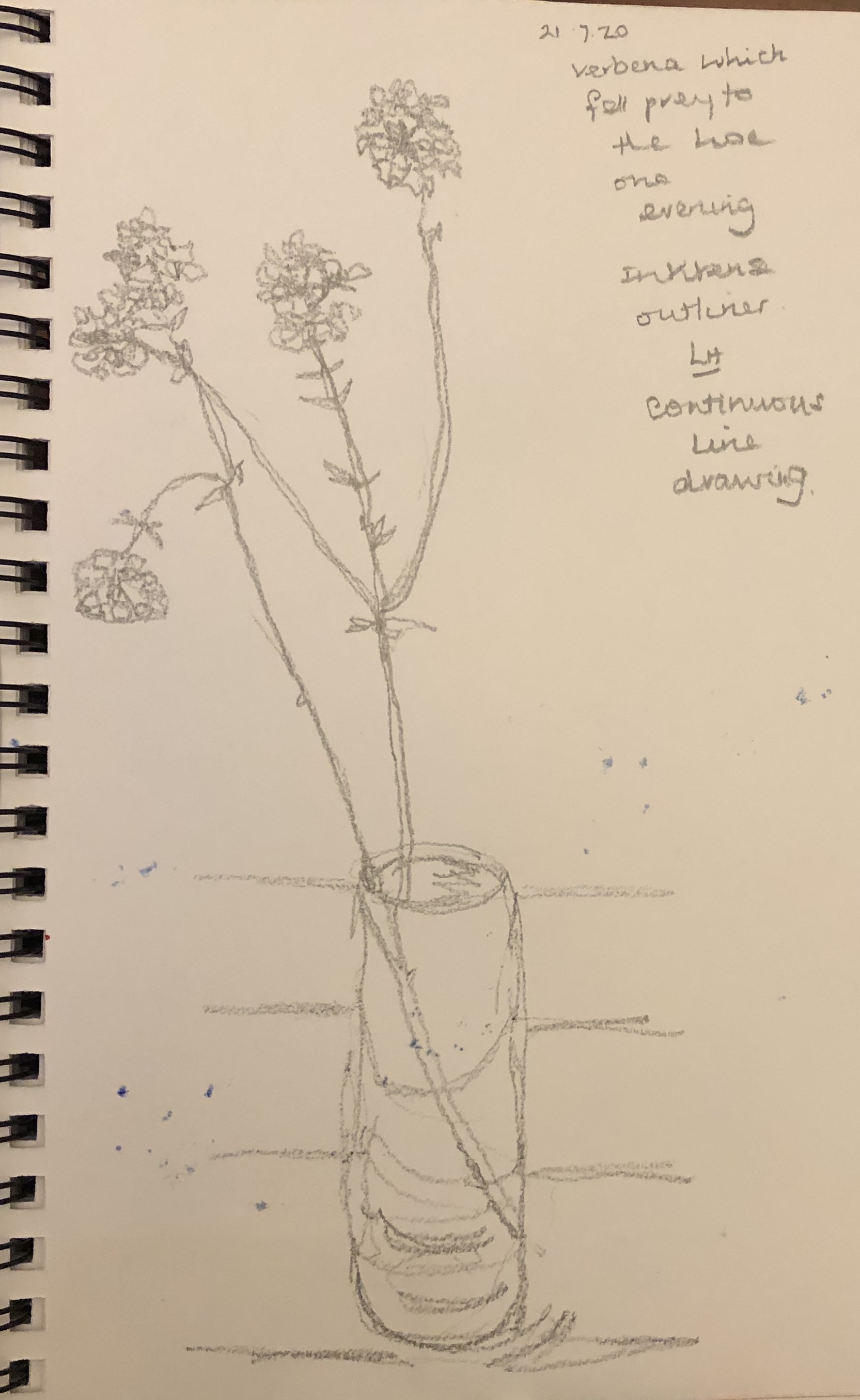
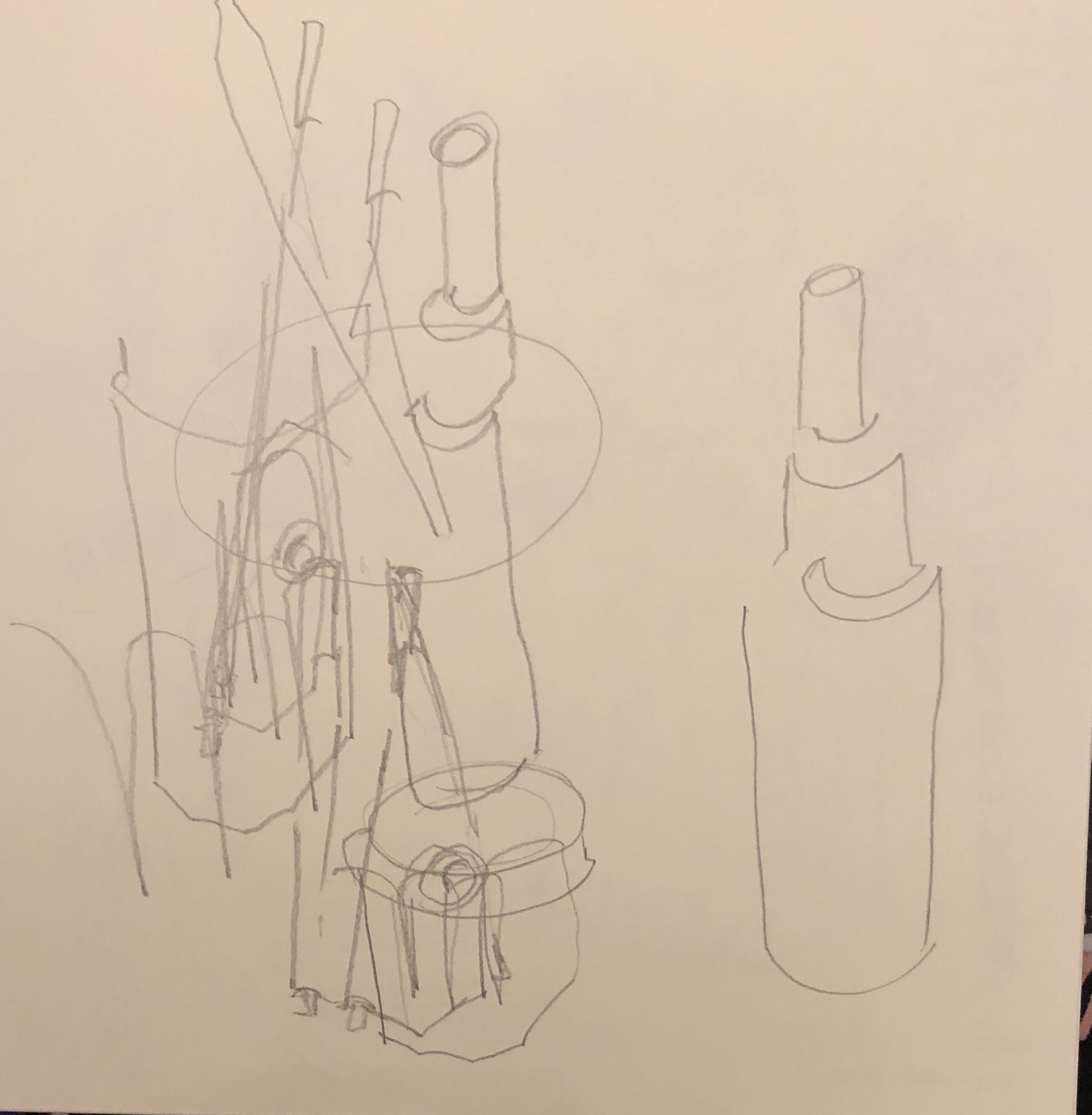
I have been using continuous line drawing (often blind, sometimes not) regularly through this section as a way to hone my observational skills (see some sketchbook examples below), and of course, it was one of the key determinants in my composition selection for my assignment pieces (see video of the supporting work for my assignment). I have found the course notes, together with information online and in books, helpful in using the different media, and have been introduced to all the most common media in the course of the various exercises; I picked an unfamiliar medium, egg tempera, to work with for my assignment piece so that I could explore its properties and capabilities.
Quality of outcome: Content, application of knowledge, presentation of work in a coherent manner, discernment, conceptualisation of thoughts, communication of ideas
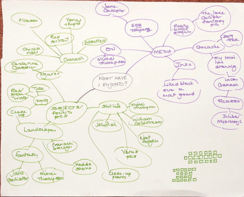
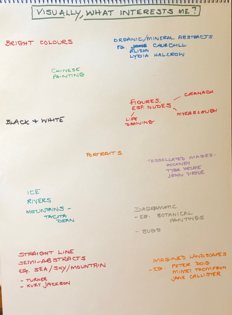
I am interested in people and the depiction of people; the former is a lifelong interest, the latter only developed since tackling Part 4 of Drawing 1, where I had to get over my fear of portraying people and get on with it – only to find, to my surprise, that I finally understood why so many artists have devoted themselves to portraiture and life drawing – I have found it compelling, even though I have had a massive amount to learn. I feel I am playing catch-up with this aspect of my art now, which is why I chose to investigate the work of various artists whose work depicting figures and faces I had collected as found images for this Part and for my assignment. I hope that my series of characters holds together as a single work as well as individual pieces, and shows my enthusiasm for the breadth of this aspect of art, and the wide variety of my research and reading. I tried listing and mind-mapping my way towards the decisions about the assignment – at the moment I am finding this writing down a useful tool just to express some basic thoughts for my subconscious to swill around until it eventually throws a finished idea out.
Demonstration of creativity: Imagination, experimentation, invention, development of a personal voice.
I found my sketchbook work invaluable when planning out the paintings for my assignment (see sketchbook video) – sometimes I had picked a found image and knew exactly what I wanted to do with it; but much more frequently I used my sketchbook to experiment with my found image, using blind continuous drawing, thumbnails and tonal drawings, in order to make decisions about image, ground and composition, sometimes discovering that what I had thought I was going to do turned out to be superseded by a much better idea.
• Context: Reflection, research, critical thinking (learning logs and essay).
I have used found images and looked at artists’ work from 700AD to the present day during the course of this Part, both in my research work and in particular for my assignment piece. I have greatly enjoyed depiction of the human form, but I am not wedded to this (not wanting to write myself out of still life, landscape and abstraction just yet) and, although I have tinkered and experimented with a wide range of styles, I do not yet feel that my own voice is emerging (apart from a fondness for bright, vibrant colours, apparently). All of the styles I have tried have been appealing on some level, although part of this is just the excitement of doing something unfamiliar.
I have enjoyed the challenge of working small. Thinking about both ends of the scale is not something I have grappled with too much before, and in Drawing 1 the drive was always to get bigger and more expressive – so the requirement to work small and in quantity in this Part has been fun. It is actually very convenient – you can set it up anywhere, almost no space is needed, and finish a piece quite quickly which gives a satisfactory sense of achievement (until you calculate how many more pieces are still needed to complete the work). Having said this, when I came to Part 5 of Drawing 1, I was very attracted to tessellated images such as those of John Virtue and Tyga Helme – so this was not a completely new thing to me. However, having been pushed by the end of Drawing 1 up to A1 and beyond, I am finding myself hankering to flex my muscles on something larger than 6 x6 in, even if just for a little while.
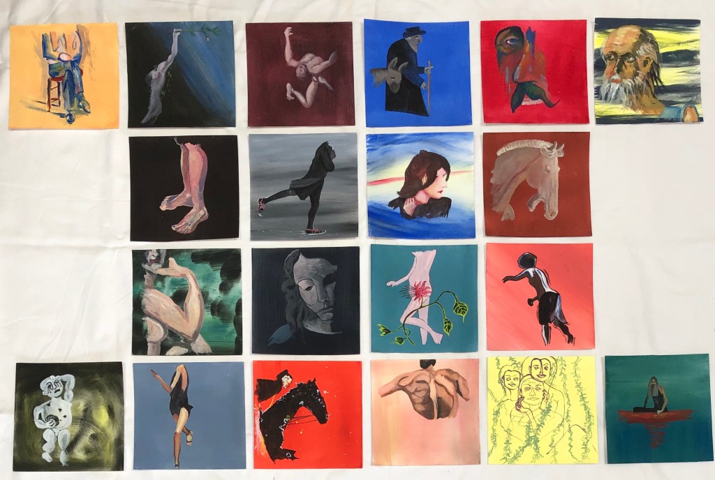
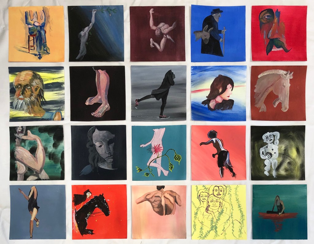
I spent a good while trying to decide the subject matter of my series of 20 paintings:
looking through a collection of found images I had started making at the start of this unit
making a mind map of material which had interested me throughout this part
making a list of subject matter I was drawn to
looking at the series of work by the artists recommended in the materials – of these I was most drawn to Roxy Walsh – I looked at her series called “The Lady Watercolourist at Home” (see www.roxywalsh.com), where each painting was the same size and in watercolour, but the subject matter differed in each.
Reflecting on my (alarmingly wide) range of “likes”, I thought back to a series of work by Viv Owens, an artist recommended to me during Drawing 1 by my then tutor, Rachel Forster – this series was a set of images of portraits drawn on square paper and arranged in a grid, and set me looking for found images of people (see Vivowen.wordpress.com).
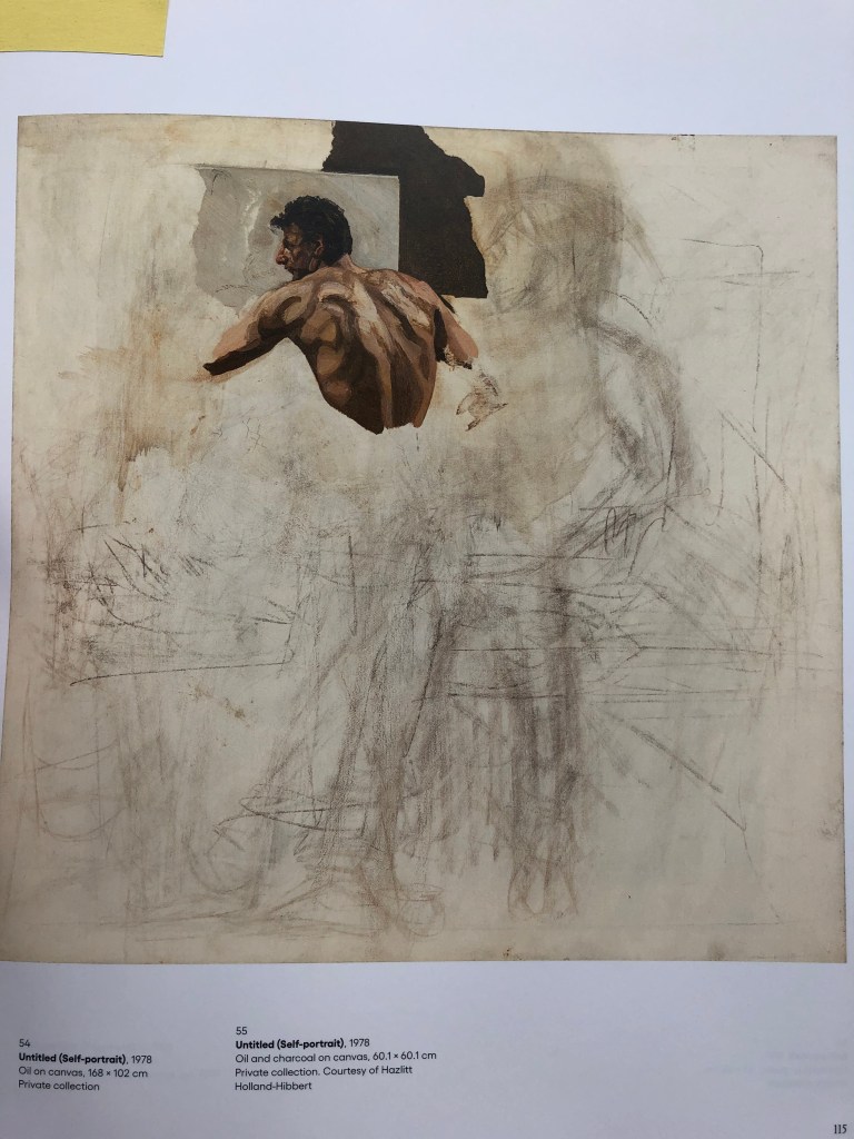
I decided to create a series of images of people I had encountered during this Part. One found image I selected – Lucian Freud’s “Untitled (Self-portrait)”, 1978, oil and charcoal on canvas, 60.1 x 60.1 cm, private collection – I had seen at the Royal Academy exhibition in January 2020, and it is striking because the majority of the canvas is blank (with evidence of an underpainting which has been covered) and only part of the figure, fully formed, looms out of this blankness. This made me decide to do something similar and only use part of the figure each time.
In Exercise 3 I enjoyed just painting lines and feeling their quality, so I decided to identify which “bit” of my figure to do each time by doing a set of blind continuous pencil drawings and choosing the part with the lines I liked drawing best. My sketchbook of pencil drawings, scale thumbnails, notes and ink tonal drawings can be seen in a separate video.
Now to choose my medium and ground. I had liked the depth of colour I found in the egg tempera work in earlier exercises, as well as its texture, so I decided to use this for both ground and medium. I had a Sennelier set of five tubes – ultramarine blue, alizarin crimson, lemon yellow, titanium white and ivory black – and it was my hope that using this restricted palette would help to unite the pieces into a series. For each painting I wetted the paper and then laid the ground colour on thickly and sweepingly with a fan brush (my favourite part), and then worked up the images in layers and small brushstrokes using a size 2 rigger and a size 6 round sable.
My aims were to:
Create a series which felt coherent
Learn about the use of egg tempera, a relatively new medium to me
Learn a little about other artists’ painting styles by replicating some of their work (without getting hung up on making exact copies)
SO WHAT?
IMAGE 1
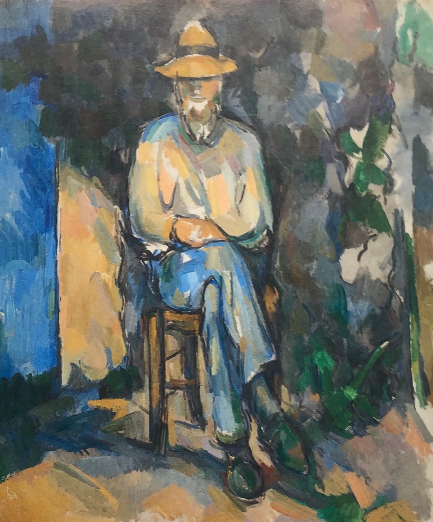
Paul Cezanne
“The Gardener Vallier”
C. 1906
Oil on canvas
65.4 x 54.9 cm
Tate
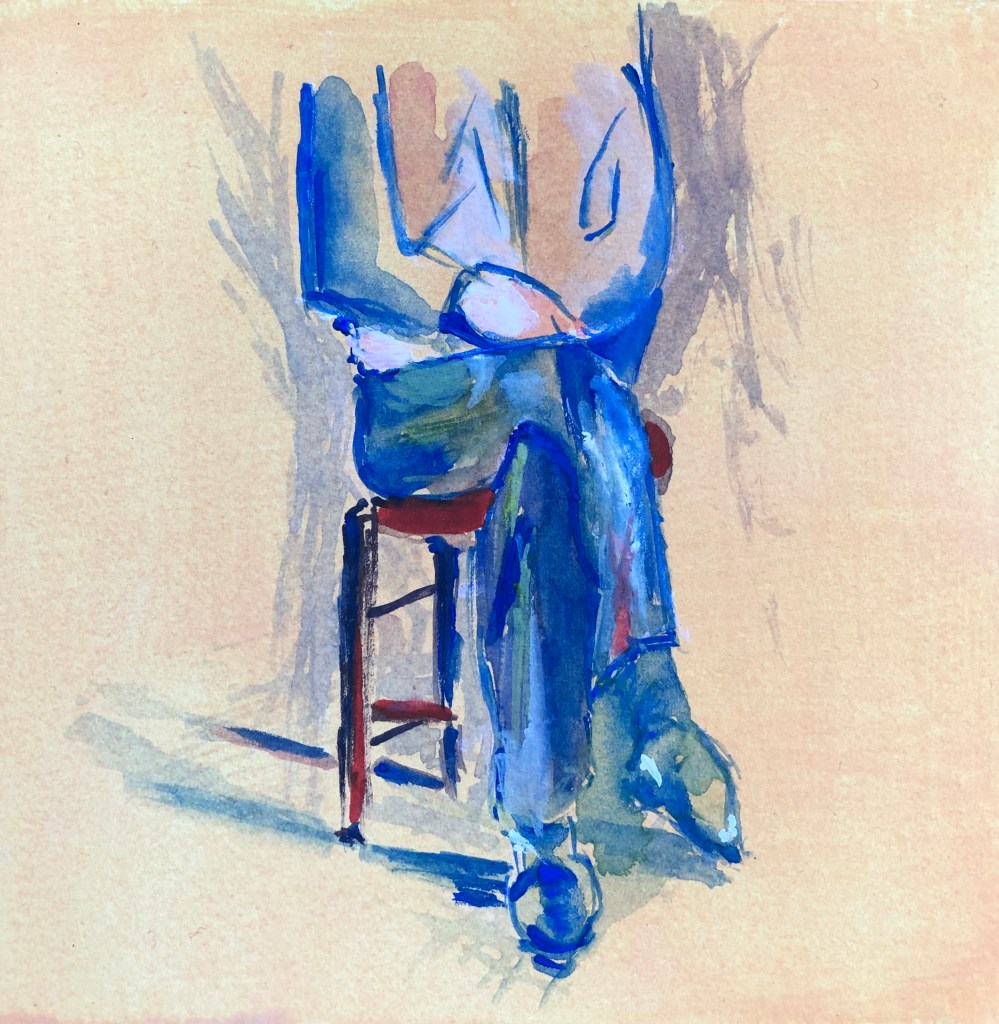
Cezanne is a favourite of mine – I like his loose areas of colour and his colour choices – here, attracted by the blue/orange. The section I chose was because of the sweeping lines of the legs.
This is my version.
The background is actually more vibrant than it appears in the photograph – a chalky yellowy-orange very like the gardener’s jumper in the original; I think the camera has seen the chalk but not the yellow!
I liked the contrast between the straight lines of the chair and the curves of the legs. I omitted most other background, as it is my intention that the focus of all the paintings will be on the figure.
IMAGE 2
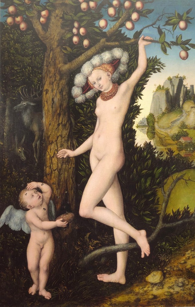
Lucas Cranach the Elder
“Cupid Complaining to Venus”
1526-7
Oil on panel
82.1 x 55.8 cm
National Gallery
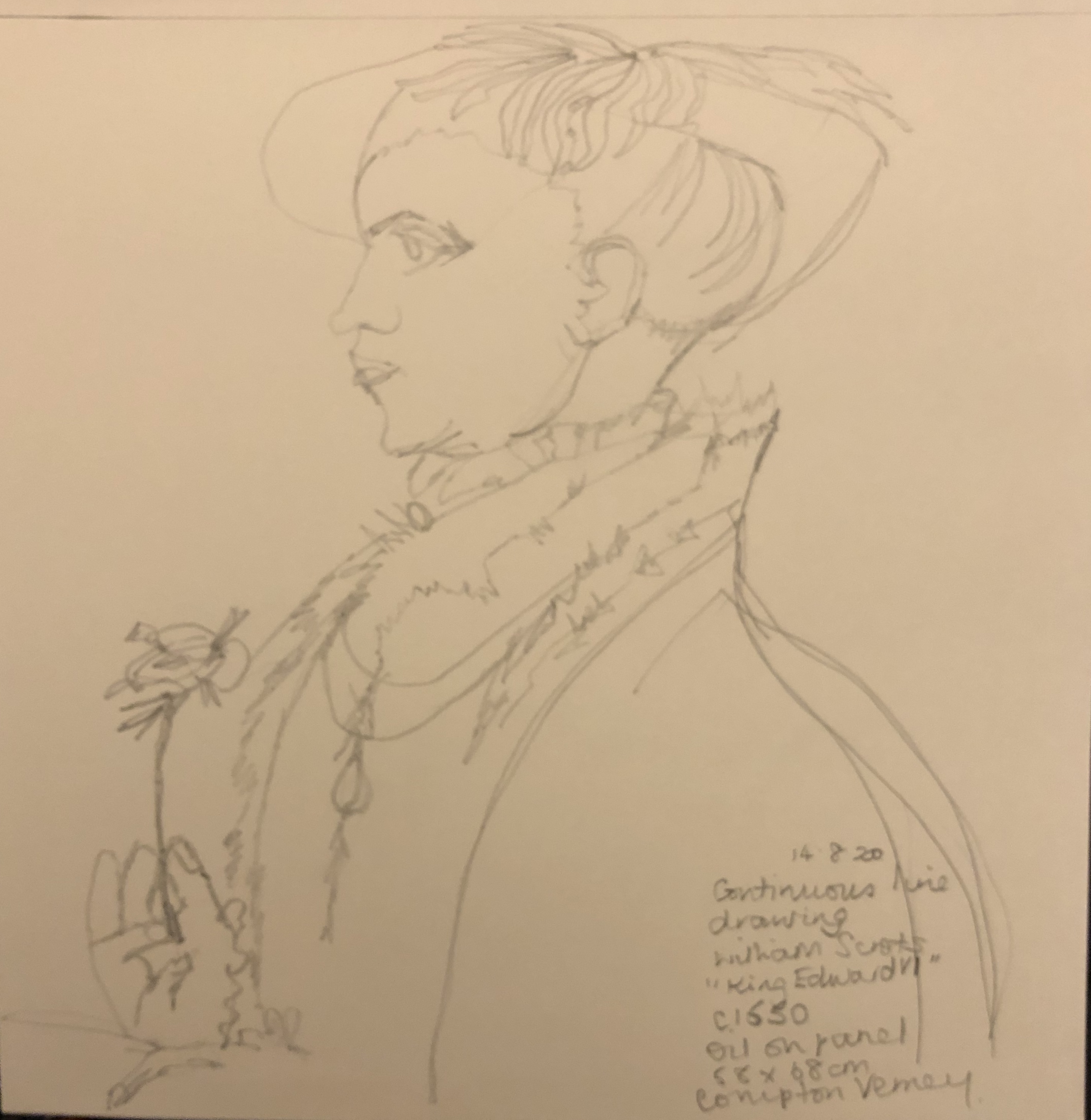
We were so excited to go to our first exhibition since lockdown. Compton Verney is a small gallery and this exhibition (on Cranach and then artists inspired by his work – see separate blog post) was a perfect size to take in for a first trip. I must confess to having been completely ignorant of Cranach’s work before attending – but I bet I’d pick him out in a crowd now. This image and its derivatives will feature several times in this series.
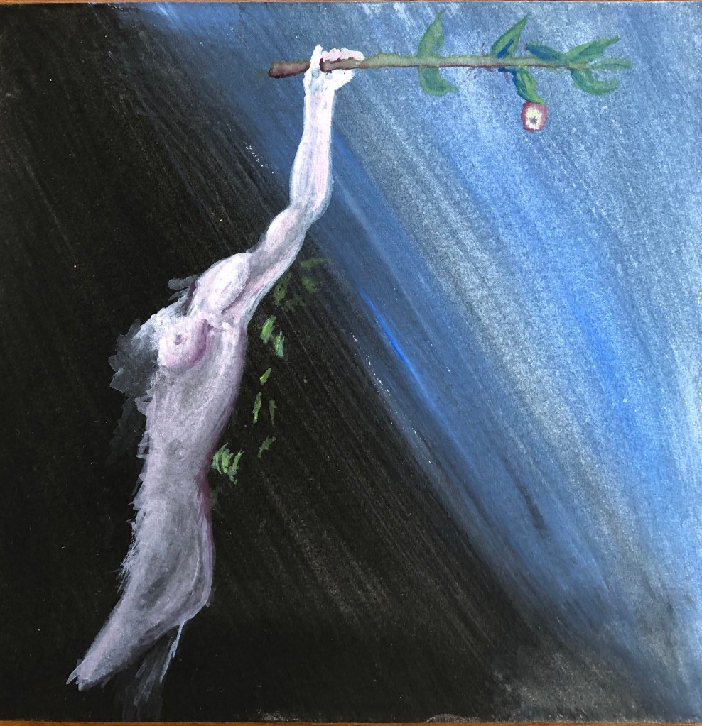
This is my version.
I was particularly taken with that line from her hand all the way down to her leg, so that was the section I chose. I chose a graduated ground, from black to light blue. The figure is off-centre, roughly on a vertical third, as I liked the idea of the curved diagonal meeting the straight horizontal branch with its one tempting apple. I included just a few leaves behind the figure to “place” her in front of a bush (otherwise I thought it might look as if she was hanging from the branch), although looking back at the image now I’m not sure these were necessary, and possibly look slightly out of place.
IMAGE 3
Lucas Cranach the Elder
“Hercules and Antaeus”
C 1530
Oil on panel
26.5 x 17.5 cm
Compton Verney
Another selection from the Cranach exhibition at Compton Verney – the original is actually really small for such a “big” subject matter. It has Cranach’s characteristic dark background and the main protagonist standing on a stony surface.
This is my version.
I decided that I didn’t want the background to be completely black – when you look at Cranach’s the black background has a reddish tinge to it – so I went for a mix of black and red. I was drawn to the figure of the giant with all those mirrored curves, so I chose him. It’s a strange pose, and takes a bit of getting your head around, but I hope I have captured some of the dynamism of the original. I originally meant to include Hercules’ arms, which are supporting the giant, but decided (having learnt from the extraneous leaves in my Image 2 painting that it wasn’t always necessary for a painting to be spelled out) that having him look as if he is in free fall adds to the sense of movement.
IMAGE 4
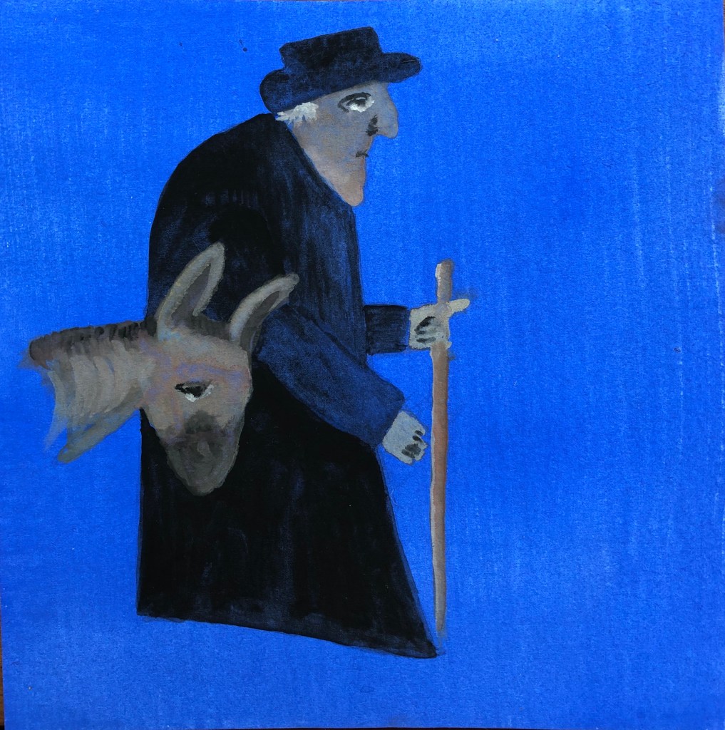
George Smart
“Old Man and Donkey”
1833
Collage on paper
37 x 31 cm
Compton Verney
This rather whimsical collage from Compton Verney caught my eye – it’s of an old postman doing his rounds. I’m struggling to say why it appealed to me, and have decided that it is the patient and slightly resigned expression on the faces of both man and beast, captured in the same handful of simple marks.
This is my version. I moved the donkey over as it was those expressions that I really wanted to try and catch. I originally intended to include some simplified elements of the background scene but then changed my mind and painted a simple mid-blue ground (rather startlingly blue in the photograph, the original being not quite so overwhelming). Not sure I’ve got the mirroring of the expressions exactly right – such a small difference of the flick of a brush can change the old man into a kindly old Moses and the donkey into looking distinctly woebegone!
IMAGE 5
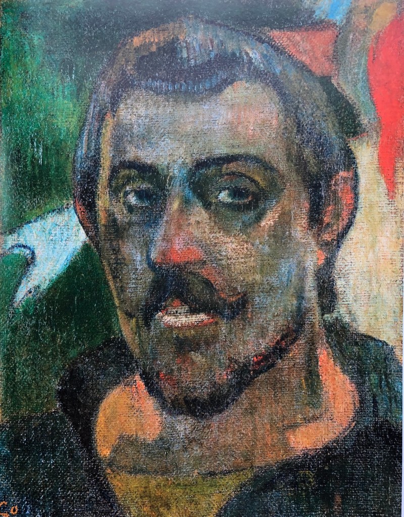
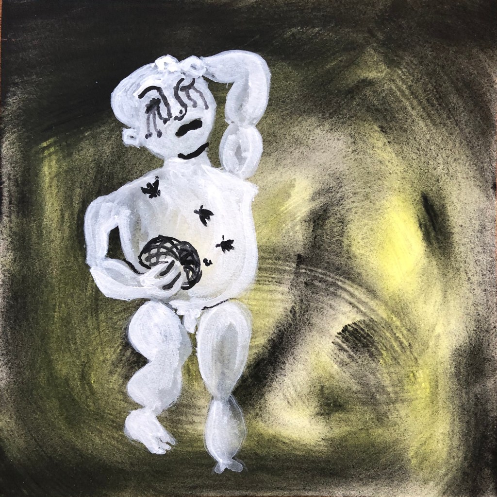
Paul Gaugin
“Self portrait”
1889-90
Oil on canvas
46 x 38 cm
The Pushkin State Museum of Fine Arts, Moscow
This is a reminder of a visit in January 2020 to the National Gallery to see the exhibition of Gaugin portraits. He painted a number of self-portraits, often dressed up as some character or other, but I liked this one for its straightforwardness. Like Cezanne, he often goes for pairs of complementary colours, and it was the huge range of colours in this image which made me choose it for this series.
This is my version.
The original seemed to have a reddish-orange underpainting, so I went for a glowing red background. I had been attracted by a pair of adjoining “2”s – the first a sweep of brow to nose and the other, on its side, the shape of the moustache – so that’s the part I chose. I feel I managed to come near the wide range of colours he uses and am pleased with the vibrancy of the piece, although (not that it matters) I don’t think I’ve quite got a likeness as I’ve made the eye too small.
IMAGE 6
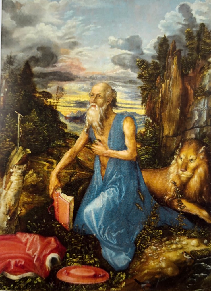
Albrecht Durer
“Saint Jerome”
C 1496
Oil on pearwood
23.1 x.17.4 cm
National Gallery
No series is complete without some reference to Durer. They had some of his prints, comparing them with Cranach’s, at Compton Verney as part of the exhibition, and I found this painting in the book I bought there. We have an etching of Durer’s Saint Jerome, along with his lion, in our study, so I always look out for him.
This is my version.
I had been drawn by the yellow of the sunset combined with the reflected ovals of the head and shoulder, so chose this section. I experimented with a more patterned background to reflect the sky I had liked – then panicked a little when I had to paint lighter colours over it. This pushed me to really experiment with the paint, applying it in small strokes but with more gesture and energy, and quite a bit thicker. Fortunately it worked and the head emerges from the background quite forcibly, I think, although I found I hadn’t left enough space to get the shoulder rounded as I had originally planned.
IMAGE 7
Ishbel Myerscough
“Untitled (Woman)”
1994
Oil on canvas
Flowers Gallery, New York & London
This painting, and one other, was at the Compton Verney exhibition in the section of “painters inspired by Lucas Cranach the Elder”. Ishbel has taken Cranach’s motif of a nude against a plain dark background but, whereas his ladies were beautiful in an idealised way, stretched-out to emphasise their womanly curves, she has painted her nude subjects exactly as they are, warts and all – they are very striking, and no less beautiful for being highly realistic.
This is my version.
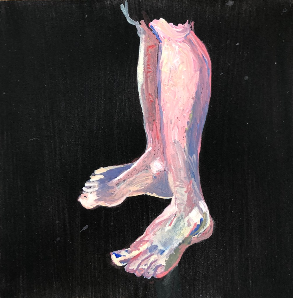
I was drawn to the legs and feet: they are angled to plant the figure very firmly, I liked the curves, and, frankly, you can never draw (or paint) enough feet, they are the part of figure drawing (along with mouths) which I always find hardest.
The outcome is a bit Francis Bacon, looking slightly more like raw meat than legs and feet, but I really enjoyed building up the layers and putting in the highlights and shadows – I felt quite free about almost going over the top with my darks and lights.
IMAGE 8
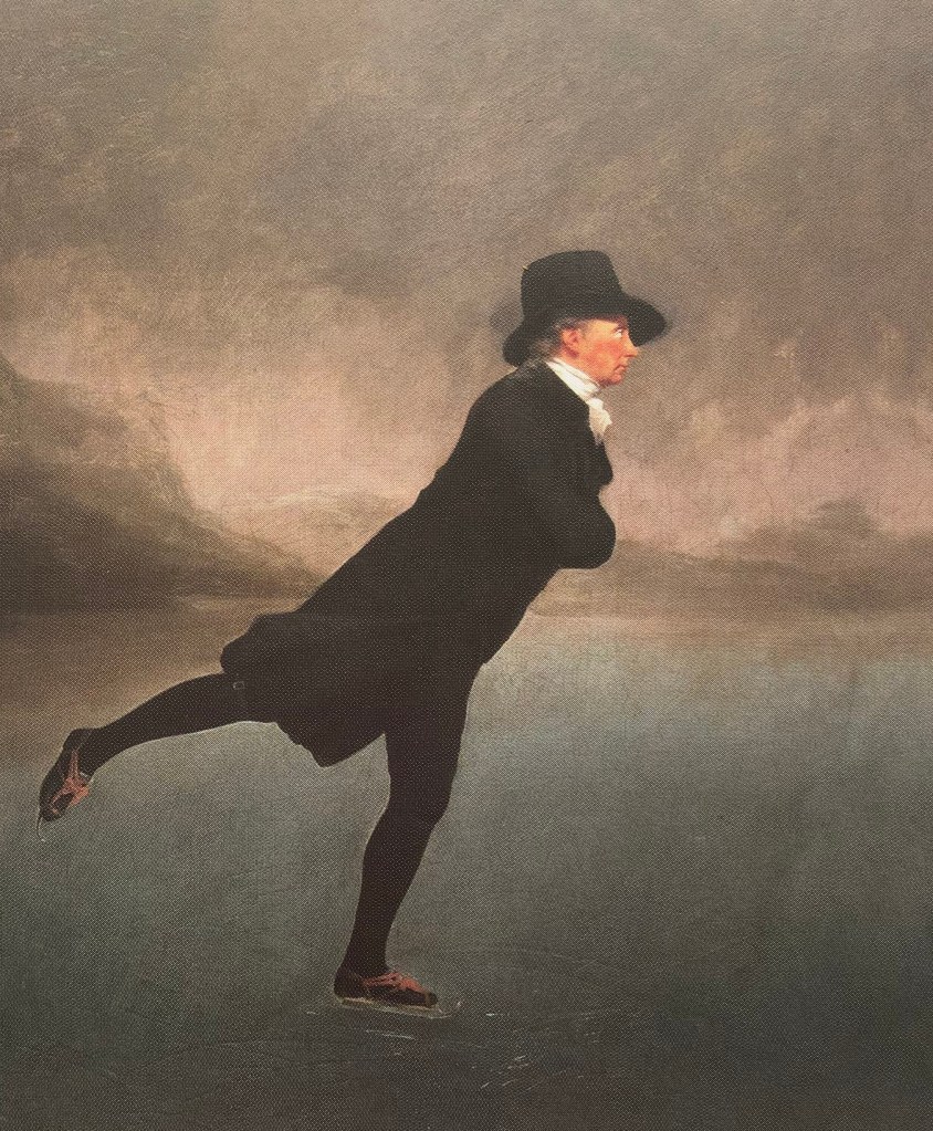
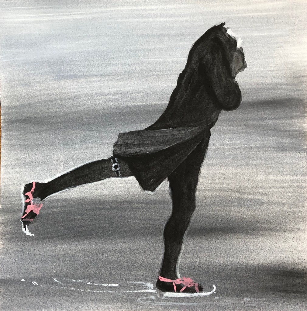
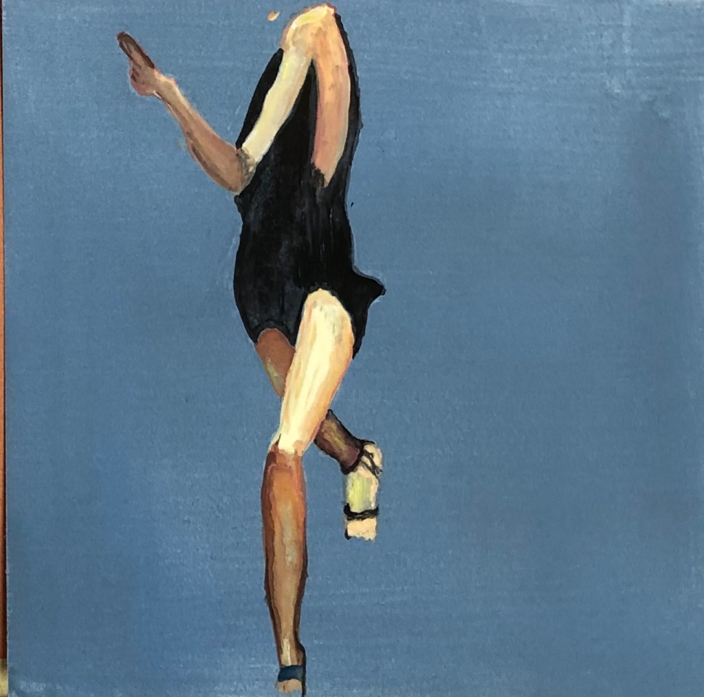
Henry Raeburn
“The Skating Minister”
c1790
Oil on canvas
76 x 64 cm
National Museums of Scotland
We saw this painting a couple of years ago in Edinburgh – the subject shows such poise and confidence – had to have him as a found image in any series of characters.
This is my version.
I liked the lines, shoulder to foot, down both the front and back, so they both needed to go in. I think I’ve got the lines, although not the correct angle of the overall figure, he is too upright – I did the inked tonal drawing in my sketchbook better (see video).
The background is a warm-ish grey, graduated from light to dark as you move down – could have got it a tiny bit darker right at the bottom to show up the skates better.
IMAGE 9
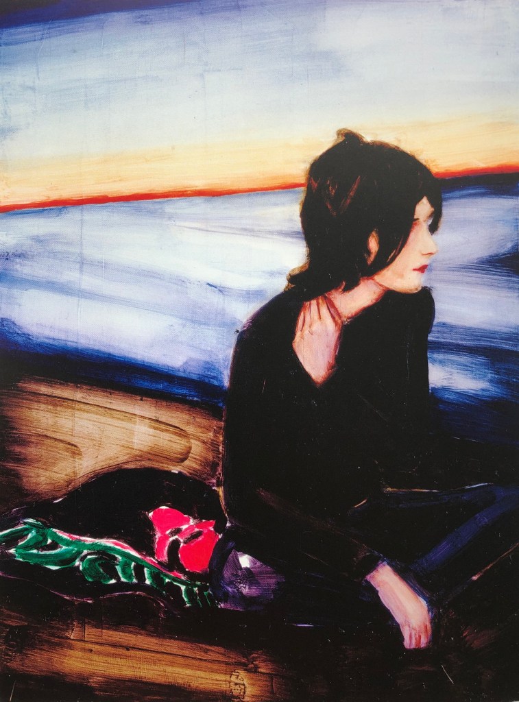
Elizabeth Peyton
“September (Ben)”
2001
Oil on board
30.8 x 23.2 cm
Private collection
Elizabeth Peyton was one of the artists I researched at the start of this Part. She manages to say a lot with a few well-placed brushmarks – something I could do well to learn from – so I picked this rather contemplative chap staring out over the water.
This is my version.
I was attracted by the repeated rhomboid shape of the face, the ear and the hand, so decided to try that section. I replicated the background very roughly with areas of blue, light yellow and a streak of red, although in my painting this red streak feels de trop and I should have painted over it. I have got the mirroring shapes enough, although the hand is too small. I failed somewhat with Elizabeth’s lesson of “less is more” by overworking the neck, which has doggedly remained the wrong shape and colour – in the end I left it, as I felt it was coming to dominate the whole painting. I managed to keep the face and hair much more lightly worked, and it shows to advantage beside the epic neck.
IMAGE 10
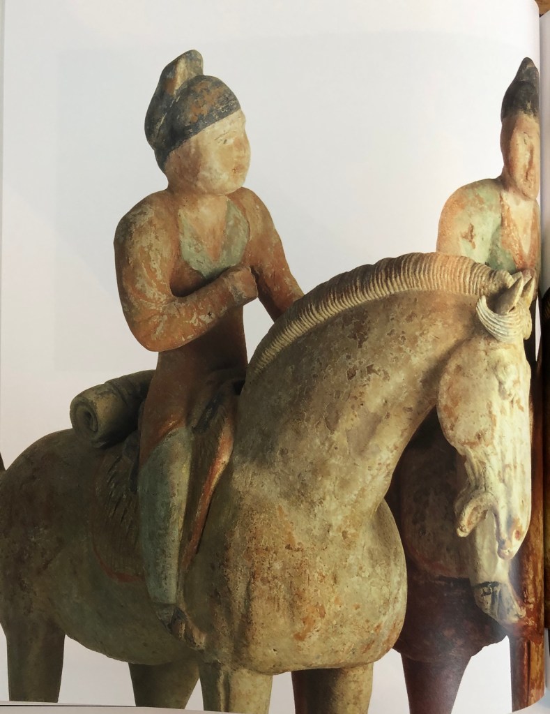
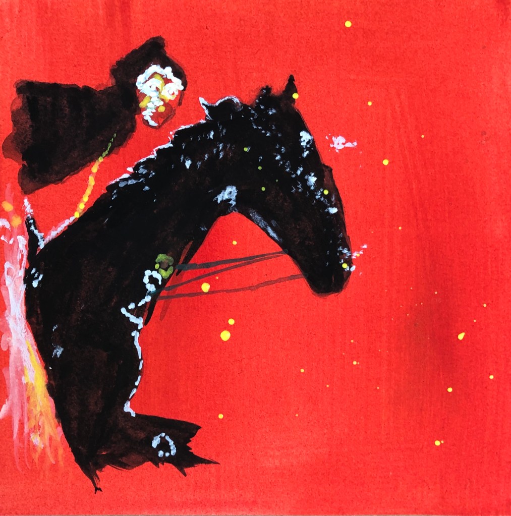
“Set of twelve painted equestrian figures”
c. AD 700-800
Tang Dynasty
Pottery, each 48.5 cm high
Compton Verney
Compton Verney has a small but dramatic Oriental section, the doorway to that room being guarded by two rather fierce looking Samurai statues.
I chose this horse and rider for Exercise 4 and was pleased with my outcome – so it seemed that this pairing needed to be revisited for this project.
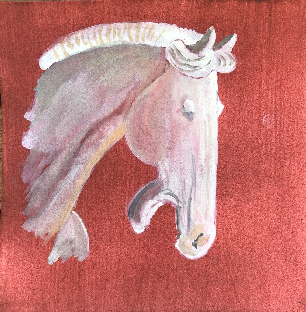
This is my version.
I had intended the horseman to be my character but, as I was doing my blind continuous line drawings, the horse kept pulling on my attention with that dramatic vertical head, until I gave in and decided that he had more character than his rider and so merited inclusion in his place.
The horse and rider behind him have quite a terracotta feel so I went for that colour as a ground. As I was building up my layers there came a point where I had to decide whether to add more or to stop – so I stopped. Hopefully he looks solid-and-yet-fading (he’s very old); this wasn’t what I was originally going for, but I suddenly came to a point where I looked at the image and thought – that’s it.
IMAGE 11
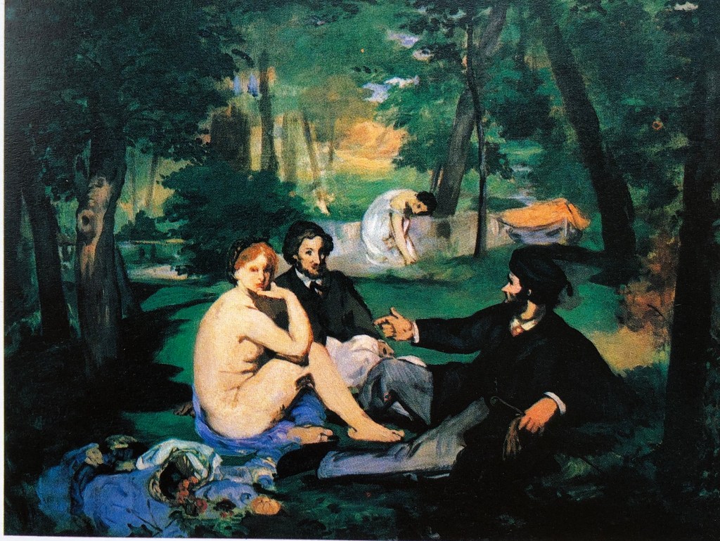
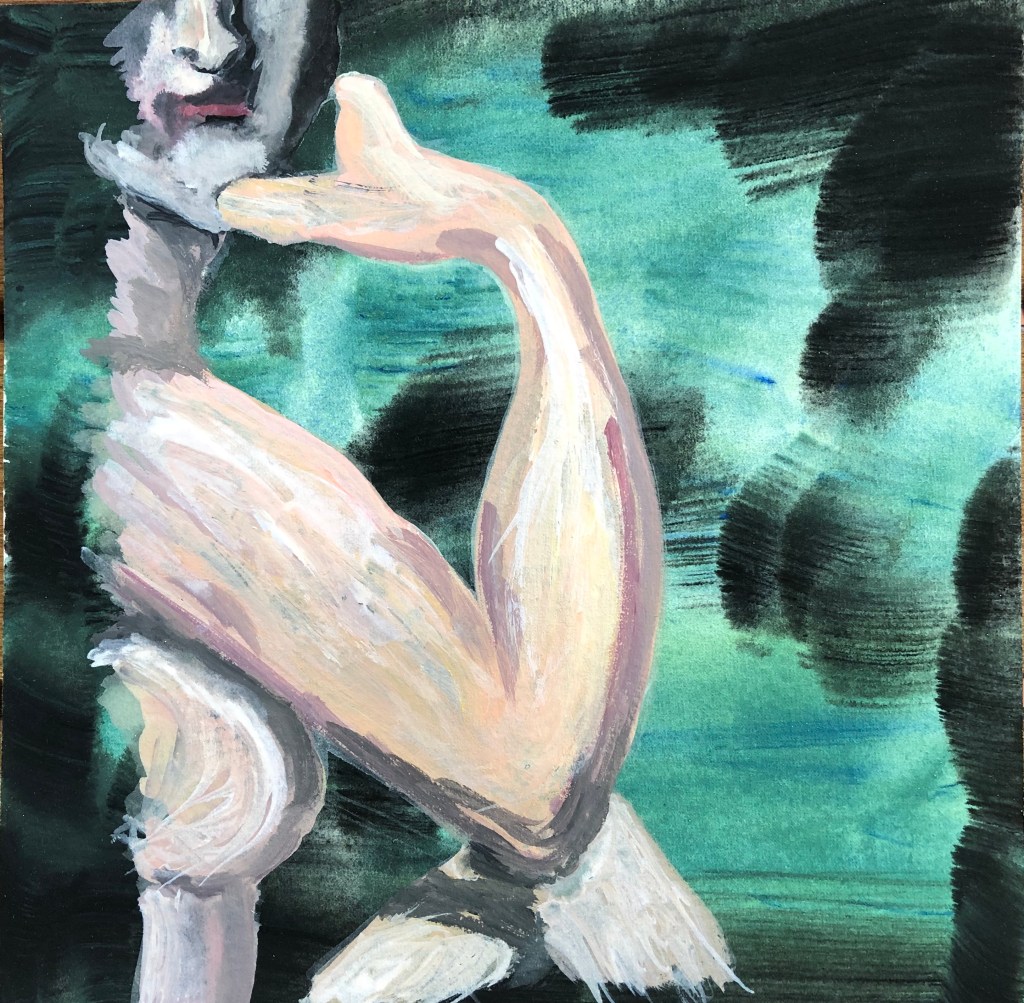
Edouard Manet
“Dejeuner sur l’herbe” – early version
1863
Oil on canvas
Final version was 205 x 264.5 cm
Courtauld Institute Galleries
I had come across this whilst looking at one of the “essential reading” books for the course: Waldemar Januszczak, 1980. “Techniques of the World’s Great Painters”. Chartwell Books, Inc, New Jersey.
I preferred this version to the final finished one, which is much more polished with all the fine detail – this felt much more rough and ready and you could follow the artist’s brushstrokes.
This is my version.
I was always going to have that insouciant shoulder in, and I was attracted, for the purposes of identifying a section, to the negative shapes between elbow and leg, elbow and chin, and hand and chin. I have tried to use the artist’s loose brushstrokes, both in the ground and in the figure. The dual colouring of the ground was, in retrospect, a mistake, it is too bold and detracts from the figure – it would have been better to have made it one or other of the colours. I think the arm and body went well and show that gestural quality of mark making; the leg does do that but is too small, and I could not resist overworking the face so that is all wrong – again, I think I did much better in the tonal ink drawing in my sketchbook (see video).
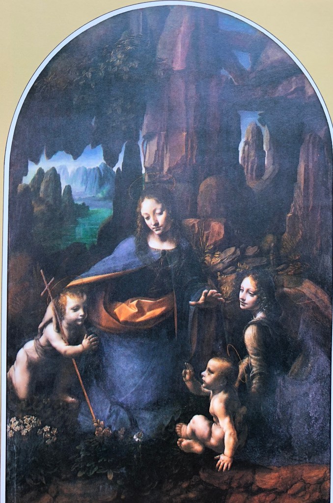
IMAGE 12
Leonardo da Vinci
“The Virgin of the Rocks”
C 1508
Oil on wood
189.5 x 120 cm
National Gallery
Again, I found this image in the essential reading (see reference in “Image 11”, above).
I particularly chose it because of the rocky entrance to the cave in the background, which reminded me of Mimei Thompson’s work, which I had researched earlier in this part and had liked.
This is my version.
I was originally going for the child on the left as I found his pose interesting, but kept being drawn back to the Virgin’s face – which is the idea of the painting, I suppose! – particularly the line of that lit side going down to the curve of her dress. I chose an indigo ground to reflect the shadowy rocks behind her, with some fairly strong vertical strokes. Again, much like the painting of the Chinese horse, I was building up layers and suddenly got the feeling that I needed to stop; the image was quite ethereal which seemed to suit the character of the subject, so I just built up the bits where the light would strike and then left it.
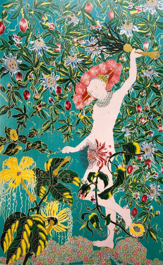
IMAGE 13
Raqib Shaw
“After Lucas Cranach the Elder”
2001
Oil, acrylic, enamel and glitter on board
166 x 104 cm
Central St. Martin’s College of Art and Design, London
Needless to say, Raqib Shaw’s work was included in the exhibition at Compton Verney as part of the group of artists who had been influenced by Lucas Cranach the Elder. He had taken just Venus, not Cupid, as an essentially flat image, and placed her in an exuberant garden of luxuriant, not to mention slightly sinister, plants.
This is my version.
I was interested in the lines around the hips and legs, so made this my main focus. The choice of background colour was easy. I just indicated the rather malevolent foliage – it would have been easy to get carried away with this and lose the central image. My only issue with this painting is that I haven’t quite managed to achieve an even coating of paint over the body – I wonder if I should have let the paint dry more before adding the next layer.
IMAGE 14
Peter Doig
‘Paragon”
2006
Colour digital print (oil on linen)
92 x 115.5 cm
Private collection
Peter Doig was one of the artists I was asked to research at the start of this Part. I liked his work as it looks simple at first glance but then seems to have lots of hidden layers. This seemed a joyful image of a game of cricket on a beach (albeit equipped only with a bat but no ball or wickets), and he has some interesting complementary colour contrasts going on (orange/blue, red/green). I picked it for my series as I was listening to the test match commentary on the radio whilst painting.
This is my version.
I chose this player because of the lovely line which runs down his back from the top of his head to the tip of his shorts. I made the ground an orangey-red graduated diagonally, light bottom left to dark top right. There were so many directional lines/patches in the original which again belied its simplicity, and I tried to get those. I feel this painting is a success – it’s striking, I’ve got the sense of movement whilst keeping clean lines and echoing the simple look.
IMAGE 15
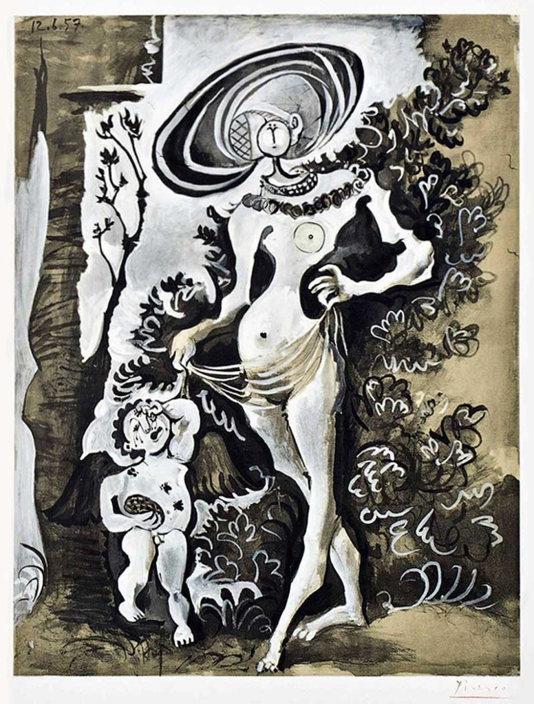
Pablo Picasso
“Venus et L’Amour d’apres Lucas Cranach L’Ancien”
1957
Colour lithograph on Arches wove watercolour paper
This again was in the Compton Verney exhibition in the gallery of “artists influenced by Lucas Cranach the Elder”. Picasso goes against Cranach by breaking the contours of Venus into sharp, unexpected angles. He has an interesting interpretation of her head and hat which I did think was going to be my choice when I was drawing, before I found curves on the figure of Cupid and decided to go for him instead.
This is my version.
I have to say this is my least favourite of the pictures. The background is too all over the place and I would have done better, still using the yellow and a tinge of black, but as a uniform layer. Also, I didn’t personally like the subject matter of a crying child – although it provided me with a puzzle trying to get all those interlocking ovoid body parts right – which I think I have mainly done. But I felt that he belonged in this series and was rather missing out to multiple representations of Venus.
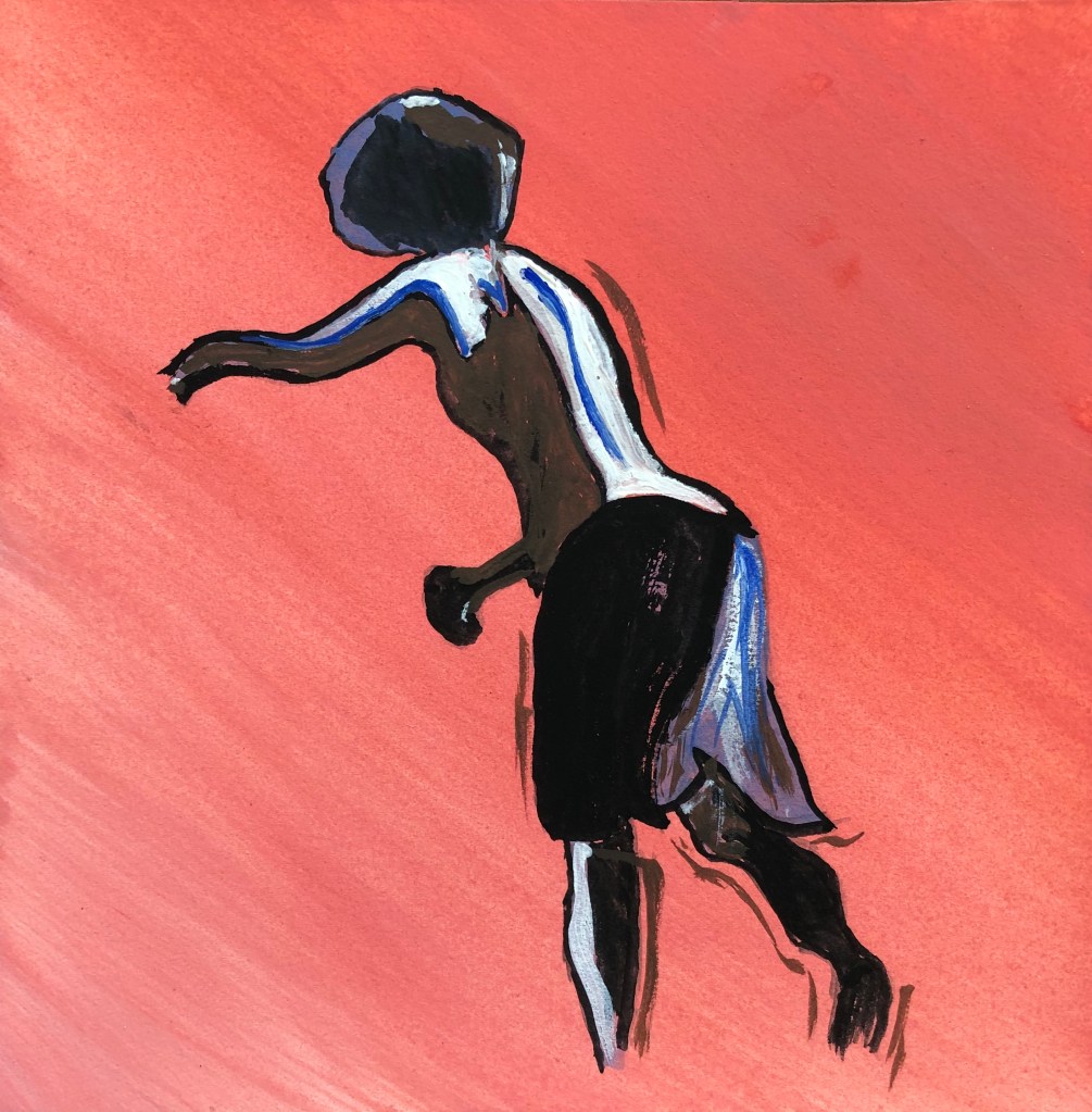
This is another artist I researched at the beginning of this Part. I was interested in this image at least in part because of the title which doesn’t seem to fit the image (surely she is not walking but running); also I listened to a really interesting interview with her on the Art Newspaper’s podcast “A brush with….” which went out on 19th August 2020, and which encouraged me to go back to her work and look at it afresh.
This is my version.
I liked the contrasting perspective of her legs and the way the line of the front leg was mirrored by the arm – so I needed to get nearly the whole length of her body in – quite a challenge on a 6 inch square piece of paper. I haven’t got the line of the front of her body quite right but don’t think this matters as there is still a sense of movement. I learned my lesson from the Picasso and resisted the temptation to break the ground into sections, keeping it plain instead.
I researched this artist earlier on in Part 1. I found his images very strange, ghostly and otherworldly, but they do pull you in, and he does like a bright colour, as do I.
This is my version.
Flushed with success at horse-drawing after the Chinese horseman, I decided after some drawing practice that I could include horse and rider in this picture – it’s together that they provide the drama, and their shapes mirror each other. I resisted the temptation to go wild with colours in the ground, sticking to a vibrant red to contrast with the black figures. I included details on the figures, but minimal detail of the surroundings – it’s different from the original, but I believe it works.
IMAGE 18
Lucian Freud
“Untitled (Self-portrait)”
1978
Oil and charcoal on canvas
60.1 x 60.1 cm
Private collection
This was the inspiration for my “part of the figure” idea – it’s such a striking image when you see it up close, and seems so strange that he paints creating perfectly formed sections.
This is my version.
This background is not completely plain – I wanted to give the impression of a work in progress going on underneath, and I think in this case the variegated ground works without dominating the painting. The photo looks a bit “brighter” than the original for some reason – this highlights the fact that I don’t think I have got the balance of lights and darks quite right – was very aware of my tendency to overfiddle.
IMAGE 19
Gary Hume
“Water Painting”
1999
Enamel paint on aluminium panel
300.5 x 244 cm
Seen in: Tony Godfrey (2009), “Painting Today”
Phaidon Press Ltd, London (one of our essential reading texts)
Another of the artists whose work I looked at at the start of this Part. It looked a bit like a continuous line drawing, and I chose it really because I thought it would challenge me to draw faces with one clear line, rather than my usual scribbly style.
This is my version.
Interestingly, another strange camera effect, as my original is a fairly violent bright yellow rather than green – I know lemon yellow is at the cool end of the yellows, so am guessing the camera has caught and emphasised the coolness so that it tumbles into green? This really did challenge me to draw the figures with a clear line, so I didn’t look at the original when painting (having practised already in my sketchbook in pencil and pen) but just went for it, having pre-mixed the paint (whereas in the other paintings I had been mixing on the go, sometimes on the paper). I have learned that drawing clear lines in this exposed way with a rigger goes much better once the initial paint load of the brush has been discharged.
IMAGE 20
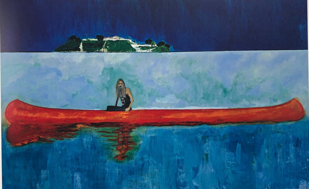
Peter Doig
“One Hundred Years Ago (Carrere)”
2001
Oil on canvas
240 x 360 cm
Seen in the recommended text “Painting Today”
(see reference in Image 19, above)
This was a typical Peter Doig painting to me – looks so simple at first glance, until you start thinking about it – why is this rather odd hippy-type chap floating around in the middle of nowhere in an epically large canoe and no visible means of propulsion? Peter Doig is the only artist to be in the series twice, but his images and characters are so varied that this felt within my self-appointed rules as not being repetitive.
This is my version.
Interestingly, as well as being the only duplicated artist in the series, this is the only time I have painted the figure entire, truncating only his canoe (so he now looks rather as though he’s sinking). It was that negative space triangle between arm and body that drew me in, but then I had to relate the other arm to it, and he has such an interesting head that I couldn’t think what to leave out. I am quite pleased with the graduated ground going light to dark as it goes down, but also switches part-way from horizontal to vertical strokes – I felt some subtlety was needed to be in keeping with the artist.
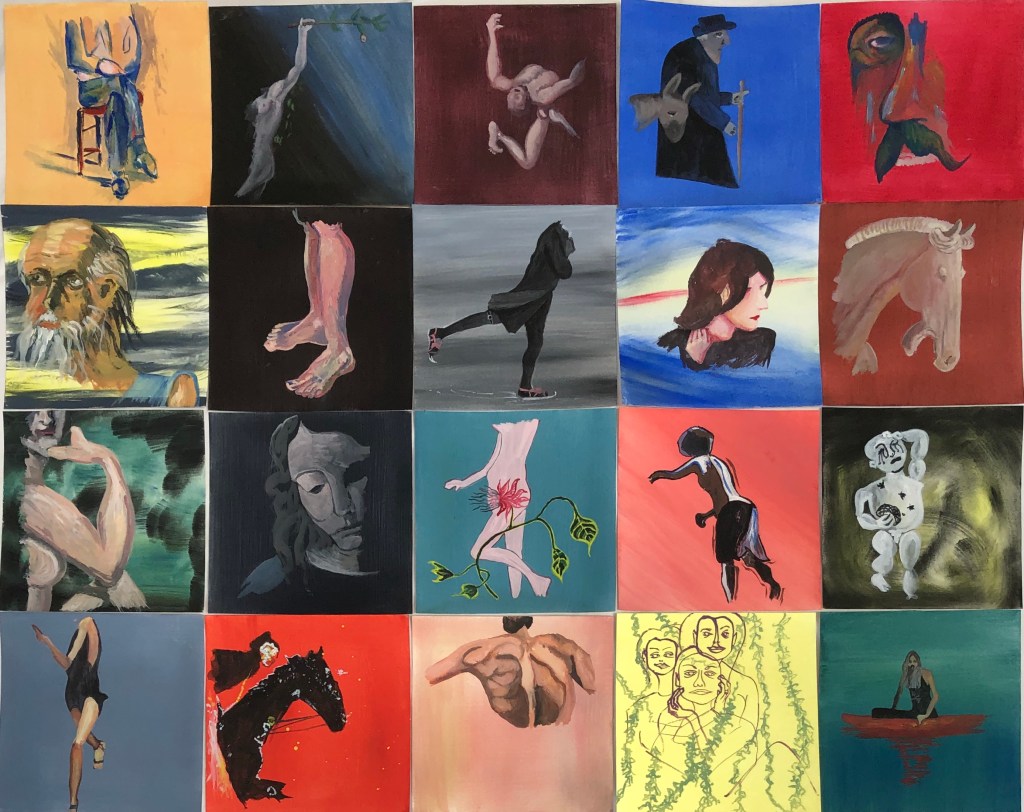
PRESENTATION OF THE SERIES
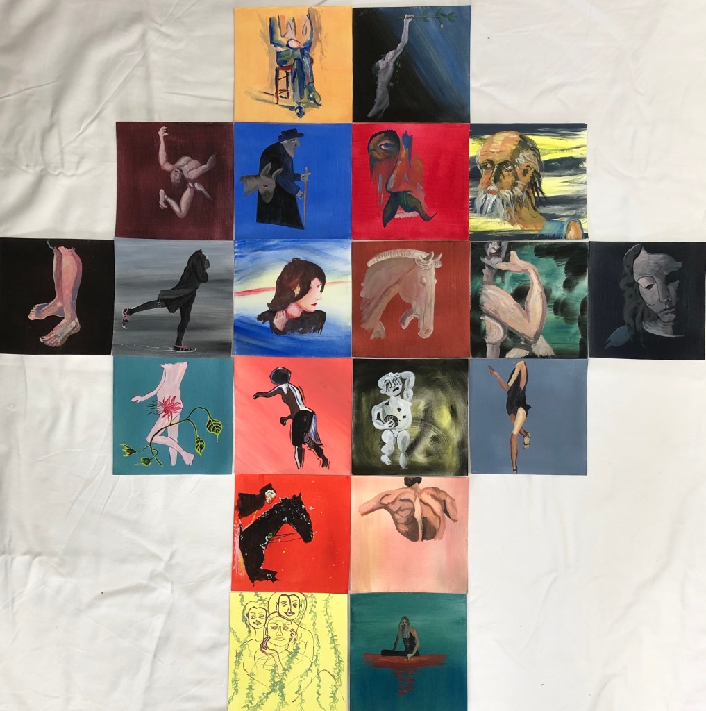
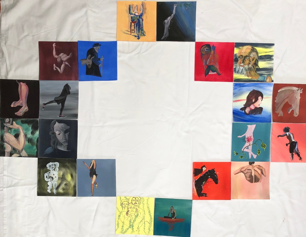
I tried various layouts….
…….a grid with no spaces in between…
…a grid with spaces in between…
…and various other mathematical permutations and combinations:
These latter efforts did feel like fiddling for fiddling’s sake, there being no valid reason for presenting them other than as a block; the only decision then was to have spaces between or not. I came down in favour of yes and then consulted my family (without telling them my choice) and all of them picked the block with the spaces between – this way the pictures are all close together, so the eye can flick between them to compare and contrast, but each just has that little private space of its own to allow it to stand out and be considered on its own merits.
NOW WHAT?
I started out with three aims, and should like to reflect back on them here.
Create a series which felt coherent
I feel I have mainly succeeded. The images and styles are very different, and are chosen because of my personal learning journey, but they:
Are all the same size
All have a clear ground on which the figure was placed
Are all images of parts of figures
Are all created using the same medium
Are all created using the same limited palette of three primary colours plus black and white
I have made the most of my palette of colours, often using them in a very intense form, at other times more muted. Each painting is different and uses something of the style of the original artist, but my way of painting a simple background and then placing the figure onto it has created a series which is vibrant and clearly belongs together. I did consider ordering the pictures by date, or by colour…but this would be false as the paintings were not chosen for age or colour – they are a record of my learning, which was not ordered, but jumped around and wove back on itself, and I think my final presentation reflects this.
If I were to do this again I think that, to increase the coherence of the piece, I would simplify the one or two experimentally “wild” backgrounds and have them all either homogeneous or very subtly graduated.
Learn about the use of egg tempera, a relatively new medium to me
I have really enjoyed learning about this medium, my previous experience, prior to this course, being with watercolour. Hence my panic when I got to Durer’s St. Jerome with its rather strident background – but I found that, by applying the medium with a little “brio”, I could have the background only showing through where I wanted it, and not where I didn’t. The paint can be used very thinly and built up, or very robustly, as with the grounds. The paint I bought, made by Sennelier, has a good level of pigment, and some really vibrant colours can be achieved.
Taking the use of this paint on:
Of course, my experience of it is only in small paintings on paper – I now need to experiment with it on different supports (canvas, board, etc) and at larger sizes.
Learn a little about other artists’ painting styles by replicating some of their work (without getting hung up on making exact copies)
I have learned:
How hard all these artists must look at their subject matter
Detailed images are obviously closely observed, but those who apparently simplify and almost abstract must, it seems to me, almost look harder because they need to understand their subject matter but then think how to represent it (rather than just showing it as it is) so it is recognisable
Looking, thinking and then carefully placing a well-judged line is much more effective than a load of tinkering about!
Going forward with this: my preparatory drawings have shown me the beauty of a simple line, which all of these artists have demonstrated. To progress, I need to carry on with the continuous line drawing, preferably blind, so that I improve my confidence in the production of images which I (and hopefully others, too) find pleasing.
I appreciate my tutor’s “well done” for keeping going with the course after breaking my shoulder. I agree with her analysis of the effects of this accident on my art, which has been to make me more free and experimental, and less fixated on everything being neat and perfect.
Looking forward to assessment I can appreciate that I need to think hard about how I demonstrate that I have met the assessment criteria; I need to be much more overtly reflective, critical and analytical about what I have done. Less narrative, more critique!!
Feedback on assignment
Final piece:
I was relieved that my tutor agreed that my final outcome constituted a drawing!
I have re-drafted my blog post about the assignment to be clearer about my working choices and the reasons for them, including explanations of how my research fed into my work
Virtue inspired piece:
Again, I have rewritten my blog post, explaining my choices and reasons and linking more clearly to my research.
Sketchbooks
I have updated my blog post to make it clear that all the drawings were made on site, and to explain my annotations
I have to say that, when doing on-site drawings, I haven’t been posing myself questions, but rather just making jottings about, light, colour, etc – this is something I need to develop in the future
The techniques developed for my final piece are not included in my sketchbook – in future, I must remember to make a record of my process rather than just photographing the final results.
Research
In my revised blog posts I have tried to do better at explaining how my research into my various artists has specifically fed into my final pieces, rather than just taking this as read.
I can see the point about shorter, more focused blog posts about an artist – have to confess I got completely buried in all aspects of John Virtue’s work, although in the end I have not used them all
Learning Logs or Blogs/Critical Essays
Artist statement:
My first draft was absolutely a statement of intent as I had no idea where the investigation would end up. I have now redrafted the statement to talk more about the final work and what I want the viewer to see, and a little less about how I got there, and the statement is a little more concise as a result.
Reflections
This aspect of my work is the biggest take-away for me. I think that, up until now, I have used my blog more as a diary of my work and my learning; it has been very chatty and contains the wrong balance of narrative to analysis. From the very beginning of my next unit, I shall know to be much more reflective and specifically critical, making sure I say clearly what will evidence the learning outcomes – so that it becomes more of a log of my learning and less an amiably rambling letter
I had a go at using the what?so what?now what format. It felt a bit forced at first, but my tutor has helpfully given me some examples to work through using some existing blog posts, and I feel that light is dawning, and I am beginning to see how this will support my reflective practice in future – I hope some evidence of this can be seen in my revised blog posts.
Suggested reading/viewing
My tutor has suggested looking up some different reflective models, to see if they would help me.
I found a useful article:
“Reflective Writing: Taking time to invest in your work” on Explore#WeAreOCA, by Ryan Holiday, posted on 4/6/20, which included an adaptation of the Gibbs Reflection model into a Review/Action model. The article also contains a helpful link to a padlet which includes, amongst other things, the slides for Zoom lecture which had been delivered in Feb 2020 on this subject. This had a rolling diagram of a “plan – act – observe – reflect – revised plan…” model which rings bells for me from teacher planning meetings of a previous life.
I did go through a stage in my blog of setting myself action points, and I think I did act upon them, but what was lacking was making time for a formal review.
I think I am beginning to get my head around the Rolfe “What? So what? Now what?” model and, if I can train myself up to use the “now what” to reflect back on my “what”, then this will serve me well as a future structure for my blog posts.
Pointers
I really need now to give some serious thought to the learning outcomes and assessment criteria and look carefully at all my work throughout Drawing 1 to select pieces which show what I have achieved, and to show in my written extracts that I have reflected clearly and effectively.