Using drawing to answer the question: “What is this river?”
During the coronavirus restrictions, my husband and I have been taking our daily walk in a small local wood running along the bank of the River Tavy, one of the fastest rivers in England. The wood forms part of an abandoned railway line, hence it is straight and flat – but it’s also tranquil and little frequented.
I have been looking at the work of Professor Jem Southam who tried, by photographing the River Exe, to answer the question “What is a river?”. He soon decided it seemed “an impossible task…a quagmire of a problem…”*. I agreed, and so have limited my investigation to this one stretch of the Tavy. I wanted to find a way to capture the essence of this river in drawing.
Much like Jem Southam, I was not sure at the outset what form my final work would take, although I had some initial idea of a series of drawings. I knew I wanted to work mainly with ink, and to immerse myself in pushing the medium to see what could be achieved. I also wanted to develop my use of line and gesture to convey texture and form and to experiment with temporary marks.
The walk offered many distractions – damselflies, dippers, ducklings…. – but it became clear that the essentials of the river involved the water, banks and river-bed. Like Vija Celmins with her Ocean** drawings, I found myself fascinated by the water and its movement, wondering how to depict its infinite variation. I experimented with ways of conveying its character, both representational and also more abstract, doing many ink sketches on-site.
John Virtue, and David Hockney with his iPad drawings, had both recorded a landscape (and in Virtue’s case, a repeated walk***) through tessellated images, and I decided that a tessellated series might allow me to depict both the horizontal layering down through the water from the surface, with its reflections and movement patterns, to the river bed, but also the vertical layering experienced as one walked alongside the river and observed its different moods.
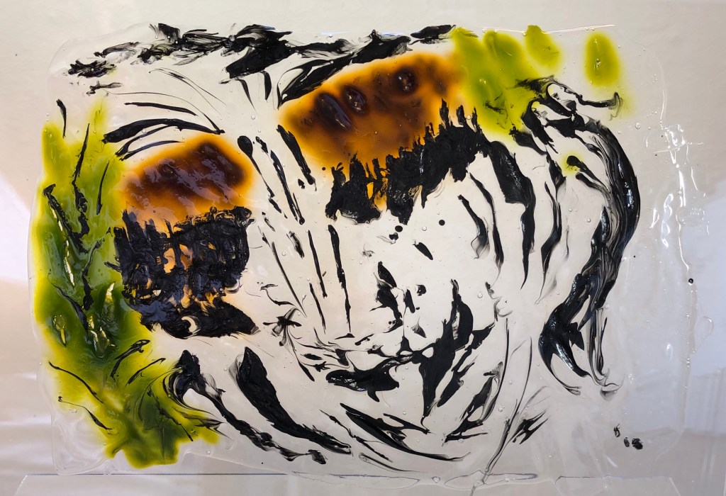
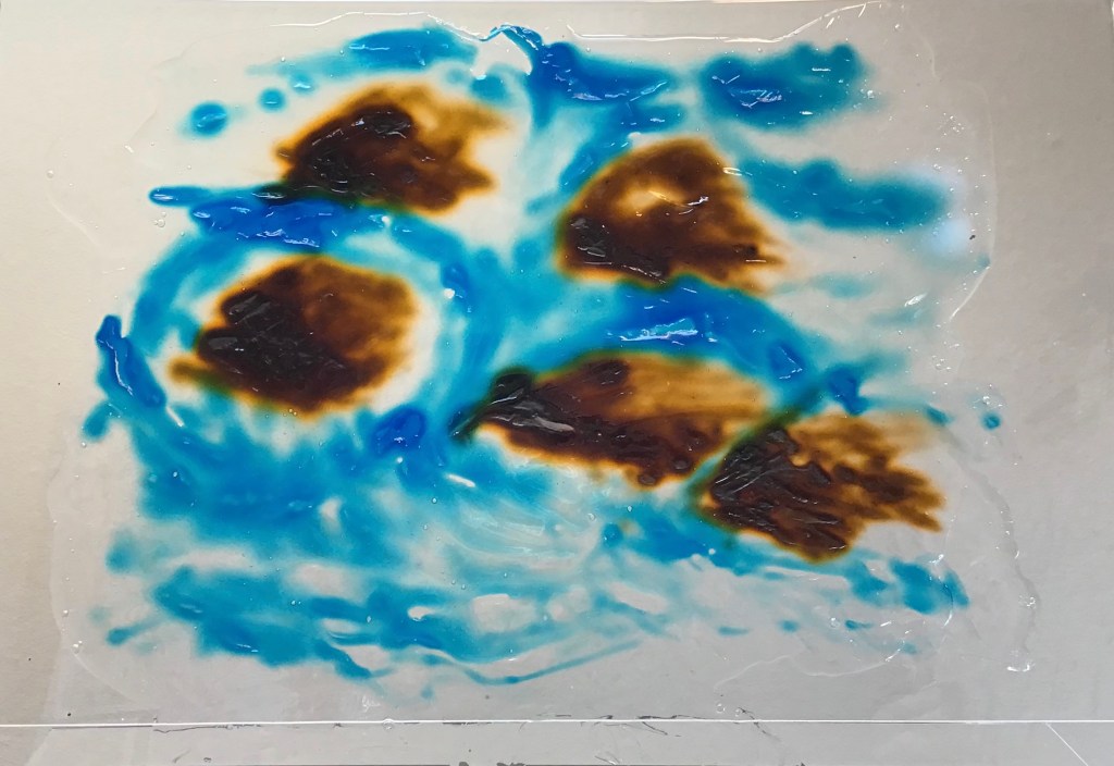
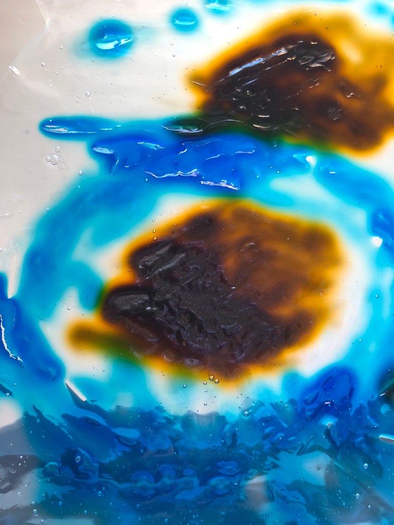
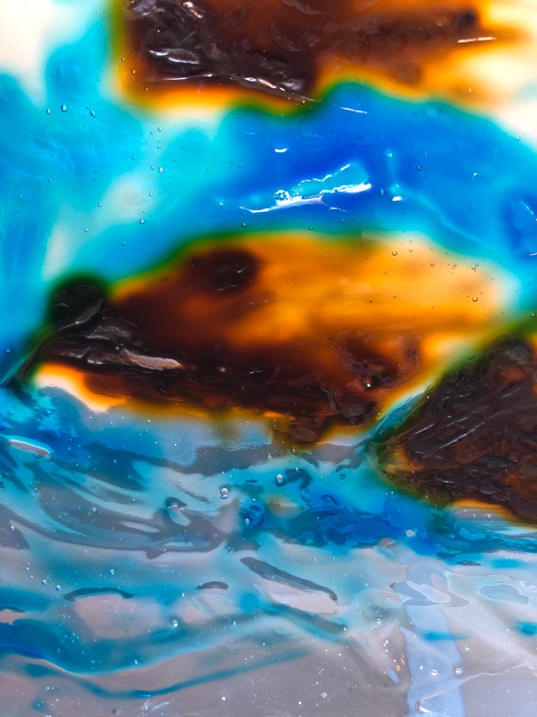
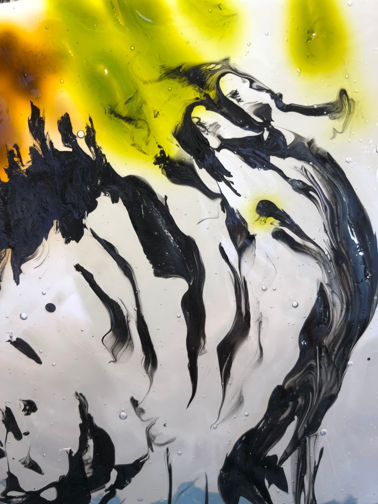
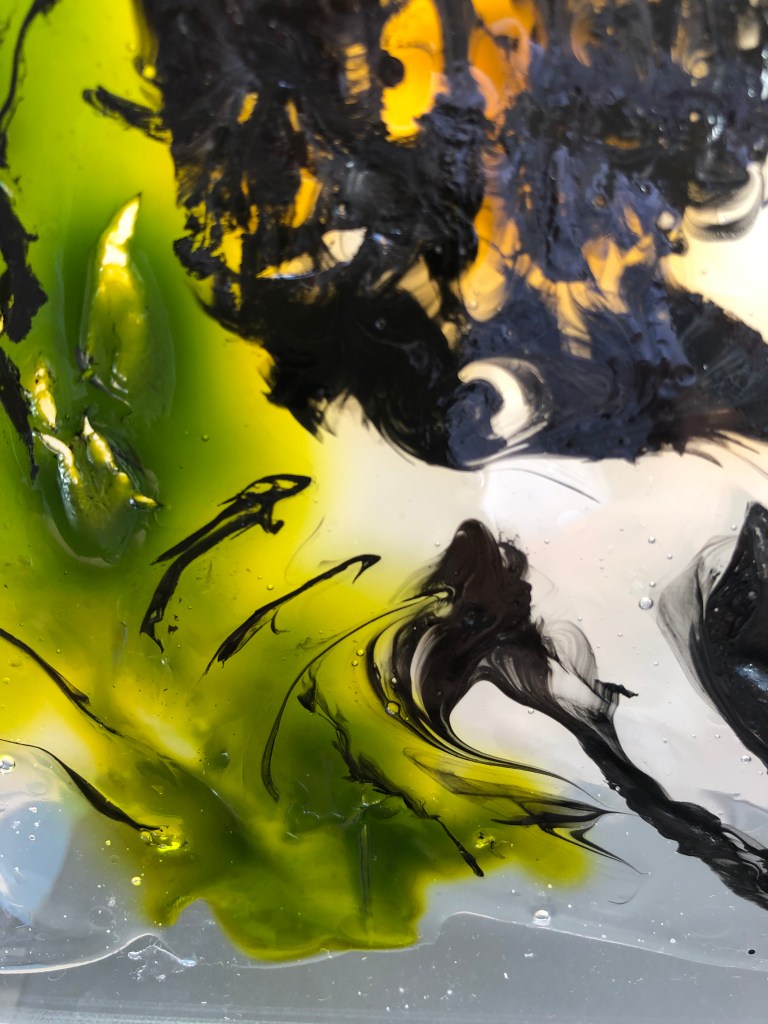
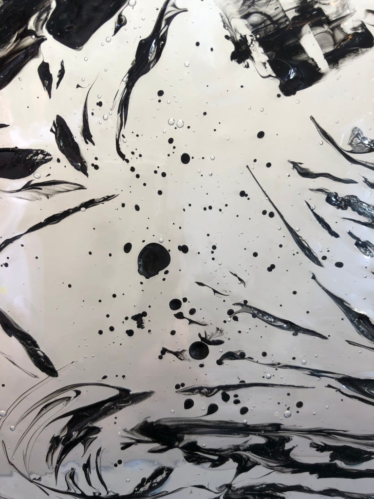
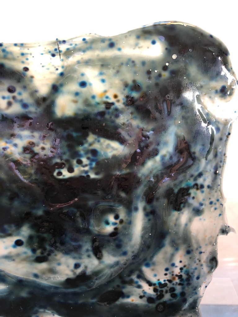
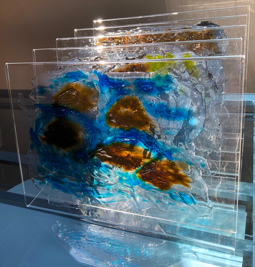
I needed a transparent support to be able to put this layering idea into practice, and experiments led me to do a series of drawings with ink, using a palette knife, into wet Mod Podge glue. The glue takes the ink, does its own thing with it, and sets to a transparent sheet with the ink embedded inside. I mounted the drawings individually on vertical perspex stands, tessellated one behind the next, so they can be looked through, and the viewer gets the feeling of passing through one drawing to the next, as if they were walking along the river.
A liquid medium into a liquid support to depict a liquid – the essence of the river.
*Jem Southam, ‘What is a River?’, unpublished essay, 2011, unpaginated
**Vija Celmins, “Ocean”, 1975, Tate
***John Virtue, “Landscape No.10”, ink, shellac, pencil and charcoal on paper, private, UK
To recap where my investigation into a way of capturing the essence of a stretch of the River Tavy in drawing had led me:
Four key artists led me down four paths –
Vija Celmins, with her fascinating Ocean pictures (see separate blog post), had made me really, really look at the movement of water. I instantly became so hooked on this that I knew this had to be a major part of my outcome. She also liked to take a medium and push it to its limits; I had originally started out thinking I should like to go back to using ink amongst other media, but this medium became my focus and I knew this had to be in my outcome. So, an ink drawing of water…
Albrecht Durer, whose forensic observation skills are to die for, along with his ability to produce an atmospheric and evocative image using black line; I knew I wanted to do some of this.
John Virtue, who had evolved a method of working peculiar to himself, moving from large tessellations of small, tight ink drawings to huge semi-abstract ink drawings with wide expressive gestures, whilst still incorporating small sections of detail. Both these styles appealed to me – small careful drawing I wanted to improve (see Durer), but I also wanted gestural marks to be more of a feature of my work.
David Hockney slightly surprised me by being here, but has ended up being central to my outcome. The section of his work which I have seen (Pompidou Centre, Paris – see blog post) and been attracted to is his iPad drawings and his way of presenting images in tessellated sections. I wanted to do this (tessellated sections) in my outcome although I wasn’t sure how. In the meantime I tried some iPad drawings for myself and became rather fixated on the concept of drawings done in translucent layers; it struck me more and more that this is what a river is – you move down through layers (river bed/water/surface/reflections on surface/movement of surface) but also along through layers as the river comes at you in different “chunks” as you walk beside it – a clear bit, a slow bit, rapids, an overhung bit…….
I ended up pairing the influences of John Virtue and Albrecht Durer in one outcome – see separate blog post on this.
In the meantime, after puzzling over my tessellated sections of translucent layers, I hit on something which I used to use at school back when I was an infant teacher – glitter in PVA.
SO WHAT?
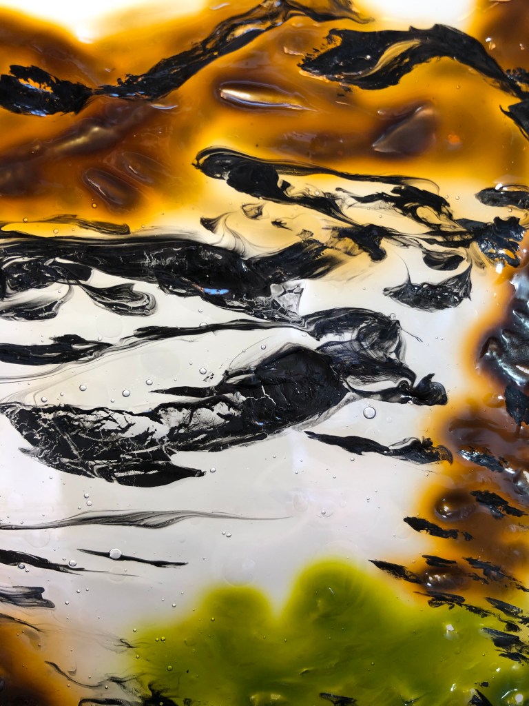
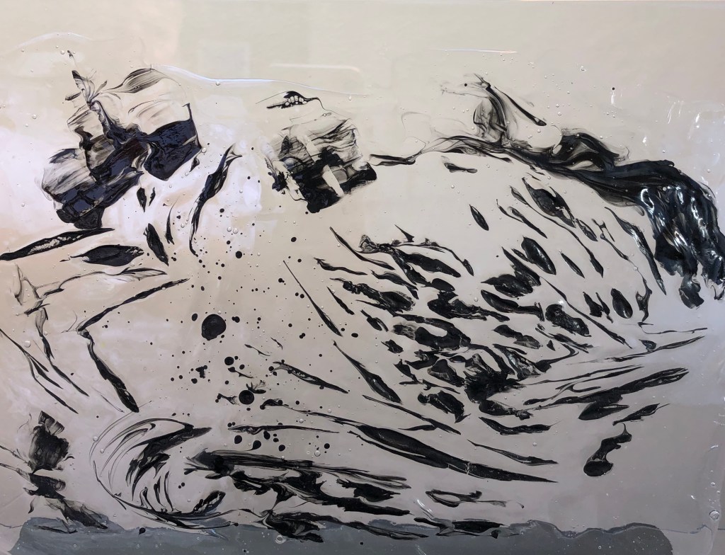
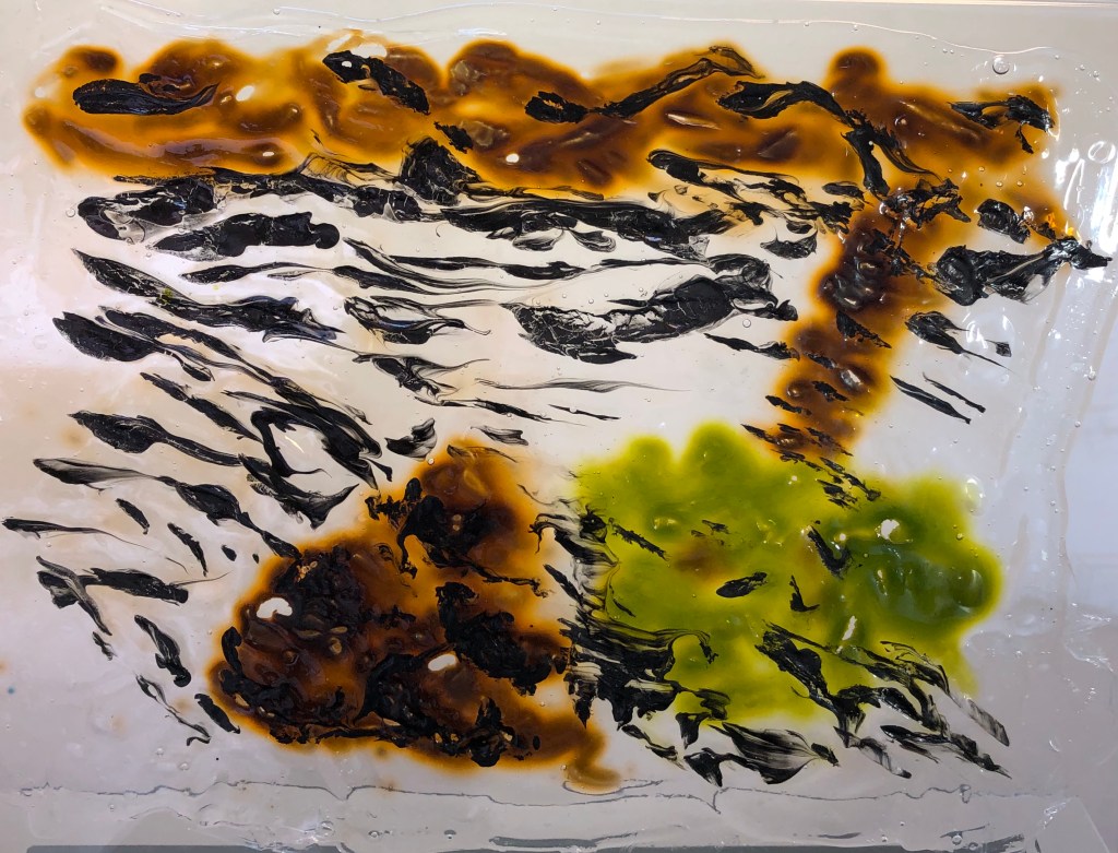
I laid out rough rectangles of Mod Podge glue, which is thick, white, opaque and gloopy, onto multi-punch pockets using a large palette knife. Straight away, I drew into the wet glue using inks applied with a small palette knife (enabling a wide range of strokes depending on whether one uses the edge, the point or the flat face) – effectively going back to my old preferred medium of ink-and-a-stick from the early days of the course. I drew areas of water representing different parts of the river, quite quickly; bold application seemed best, as any attempt to work on marks once applied just stirred the ink into the glue and made it homogenous, which was not what I wanted.
This was the first drawing: broad, curving strokes with the flat of the knife, which I emphasised by judicial sprays of water to make it flow, adding a few specks of black Brusho to create sparkles. In this drawing I was hoping that the movement of the ink across the liquid medium would give the effect of the slowly circling water (I had experimented with this earlier when I looked at Alison Churchill’s work on moving water – www.alisonchurchill.uk). I wanted it to “pull” the viewer into the drawing in a slightly hypnotic way.
This was my second drawing: I tried to establish the dark faces of the weir rocks using bold dabs with the flat of the knife, then used the side of the knife to draw the movement of the water as it came through the gap, using flicking marks to show how the water fell. Here I was working on varying my marks, as I had done in my work on Durer.
In my third drawing I used a variety of strokes and flicks, mainly with the edge and point of the knife, to demonstrate a range of small movements of the water surface; I also used the flat of the knife in a dragging motion for a wider section of flatter, stiller water near the top. I wanted to have one drawing which was completely devoted to the depiction of the water surface with no distractions, as this was what had initially caught my attention. Even though the marks are deliberate, they are quite loose, as I had practised when looking at John Virtue’s work; but they have been carefully observed over a long period (see notes on Vija Celmins)
The fourth drawing was, I think the least successful. I used wide curving strokes with the flat of the knife across the top to depict a tangle of tree roots along the far bank, which was effective. I then tried to put in some protruding rocks in the foreground and show the reflection of a tree, broken up slightly by ripples, and for this I drew with the edge of the knife using parallel close horizontal stokes; however, the glue seems to have taken these and merged them into a mass, so that the reflection of the tree looks very solid and frankly rather child-like, which I didn’t want. However, bits of it had worked, so I decided to include it as it was the one piece which was dedicated to reflections.
Having observed the fact that the coloured (Colorex) inks I was using seemed to spread far more than the black Indian ink, I tried to allow for this in my final drawing of the mini-rapids, by trying to be careful to preserve some areas of white around the rocks to indicate bubbles as I drew the blue ink through the glue with wide, gestural strokes. I think this was a more effective technique with this particular ink; it harked back to my experiments with wax crayon resist earlier in my investigation, where my focus had been to preserve the white areas.
It was interesting to watch the effect of time on the drawings, as the fluid glue had its own part to play in subtly changing the marks I had made before it started to set. All the drawings were done from memory, based on the many sketches I had done and hours of close observation I had spent.
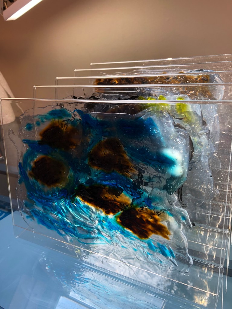
I carefully peeled my drawings from their multi-punch pockets and then had to decide how I would present them. I particularly wanted them to be displayed as a vertical sequence, as if one was walking along the river bank and happened upon each scene in turn, as I very much wanted this outcome to replicate my walking experience. I thought about somehow suspending or mounting them, which seemed easier, although the mount would have to be completely transparent; in the end I applied each to its own clear Perspex vertical stand (these are simple restaurant menu stands from Amazon); thus each was a drawing on its own, but I (or the viewer) could also move the drawings around in combinations, one in front of the other, to convey the idea of layers. Tessellated sections, as I had wanted, but rather different to what I had first envisaged.
Below are some photos of individual drawings, combinations and close ups; I have also made a short film to show the final piece as it is hard to appreciate from still photos, and will send the link separately.
NOW WHAT?
My aim was to find some way to convey the “essence” of the river, and I personally feel that I have done that – a fellow-student said to me recently in an online group meeting, “You are the first viewer of and reactor to your work”, and I have taken this as my benchmark to know whether/when I had reached my goal.
I also wanted to give the viewer a sense of walking along the river and almost “passing through” my drawings, one after the other.
The individual drawings have taken on a life of their own; they are not quite as I first drew them, as I had chosen to essentially draw with a traditional liquid medium into a non-traditional liquid support; but I was ready to try letting go and embracing the outcome.
I have created a series of drawings which combine coherently to give the viewer a sense of the separateness-and-yet-one-ness of a place
I have drawn on my research into the work of both historic and contemporary artists and shown elements of their styles in my drawings
If I repeated this method of working in future, I would take photographs as I went along to document to process so the viewer could compare the initial marks to the final outcome
I feel I have pushed at the edges of what “drawing” is by my use of a liquid non-traditional support and the production of a deliberately layered outcome
My initial notes made at the Zoom meeting are in this format; the additional extra comments made after the written feedback are in italics like this.
Appreciate overall comment recognising the effort I have made to overcome the problems caused by the compound fracture of the shoulder of my dominant right arm at the beginning of this Part – and how it’s ended up being of benefit
Make sure that you sell what you are doing by making clear links in your written work between the research and your drawings
Research on the face – good comments, but need to include images so that the reader can easily compare and contrast; I NEED to go back through this blog post and add in some images – DONE
Make sure you acknowledge your sources, including referencing for internet images, and relate this specifically to your work
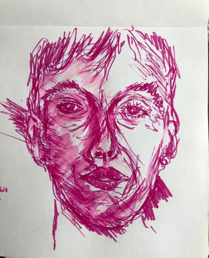
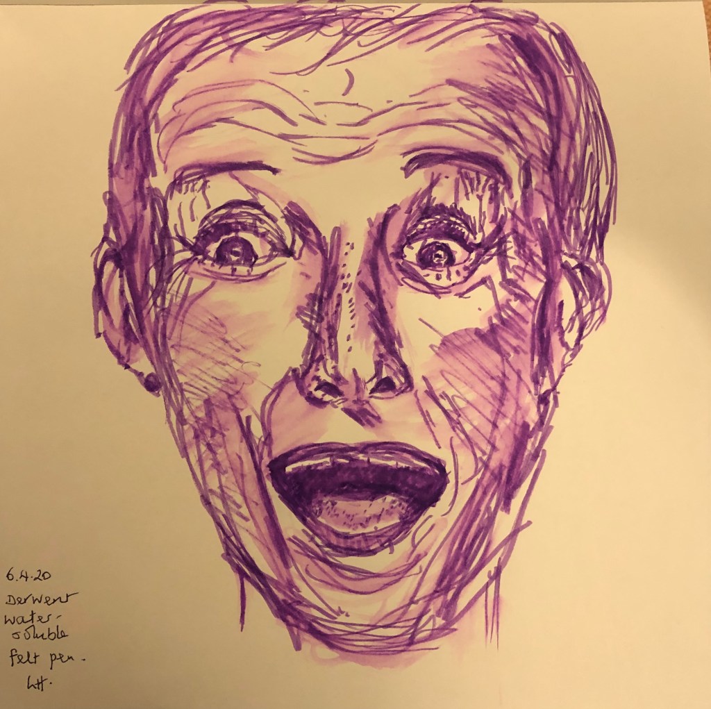
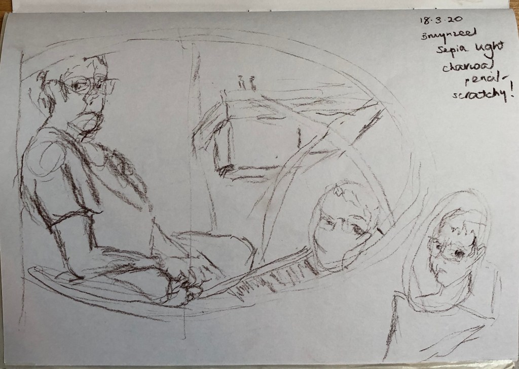
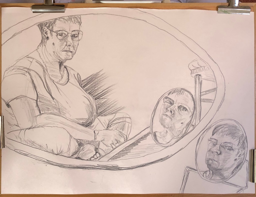
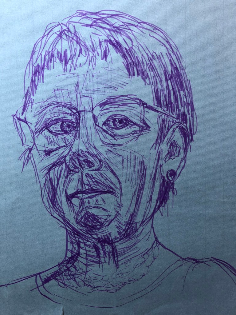
Purple pen self-portrait – tutor really liked this, she felt that it contained more marks than I usually include, which help to build form
“Studio window” self-portrait: composition was interesting, tutor has played around with the image and wonders if a square format would be good – she referred me to a local artist to her, Viv Owens – I have looked at her Facebook and WordPress pages – her record of daily drawings is impressive, and her paintings are striking not just because of the shape, but also her use of colour in backgrounds …..see notes below about the assignment pieces
Tutor asked why I didn’t use pen more – I used to, but I think at the moment I have fallen into a habit of using an easy and forgiving medium for my left hand – but actually, thinking about this, my right arm is probably never going to regain the range of movement it once had, so I ought to get out of my dependency on charcoal for everything, and experiment with some different media. Tutor reminded me to use different thicknesses of fineliner, and to use my scribbly style to scribble tones and shapes, not thinking of them as a nose or an eye. Tutor has sent me some helpful examples of her work – some of
them are like the Maggi Hambling drawing of her mother that I liked (see blog on research of portraits) – see examples of tutor’s drawings here – and the fact that they are not necessarily showing the whole face does not in any way make them feel unfinished. Taking this forward:
I am going to try and do a face/head drawing a day, or as near as I can, and see if I can build this skill of looking at shape and tone rather than features – watch this space!
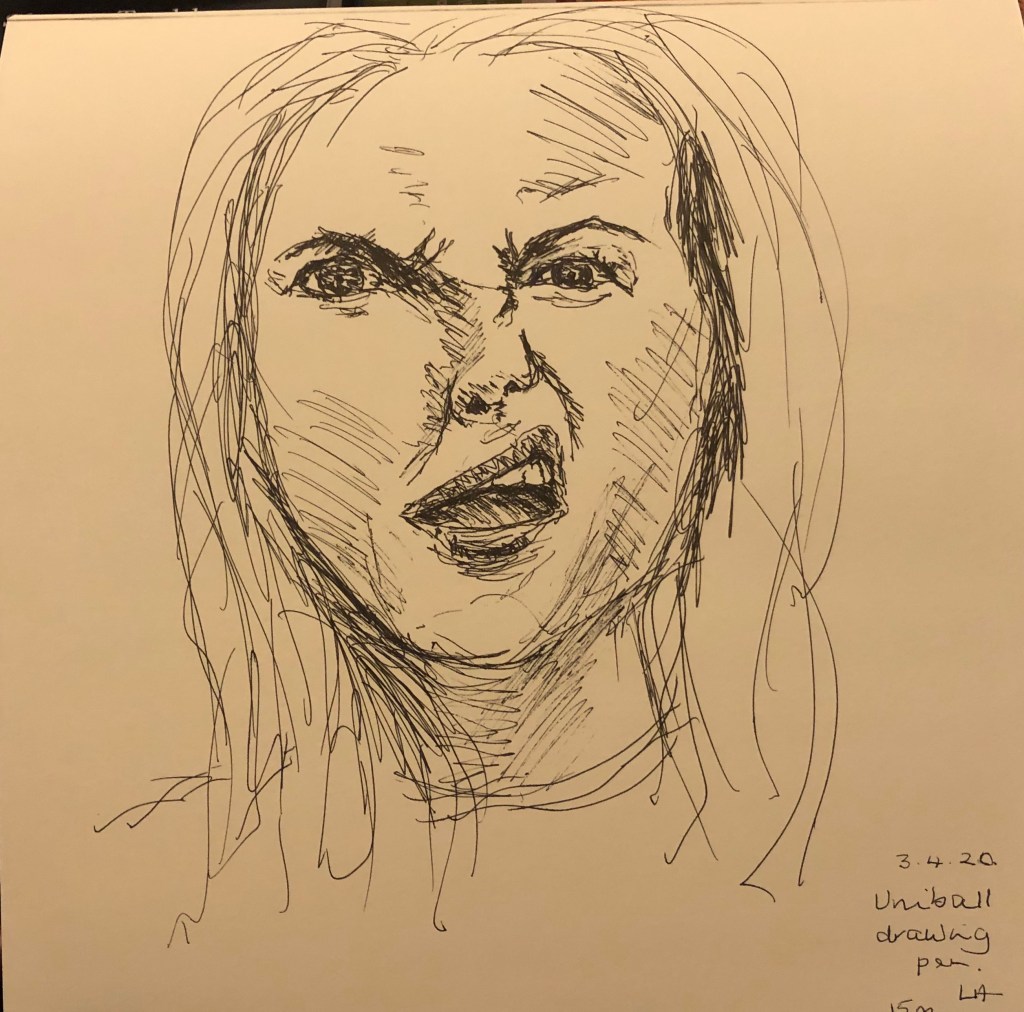
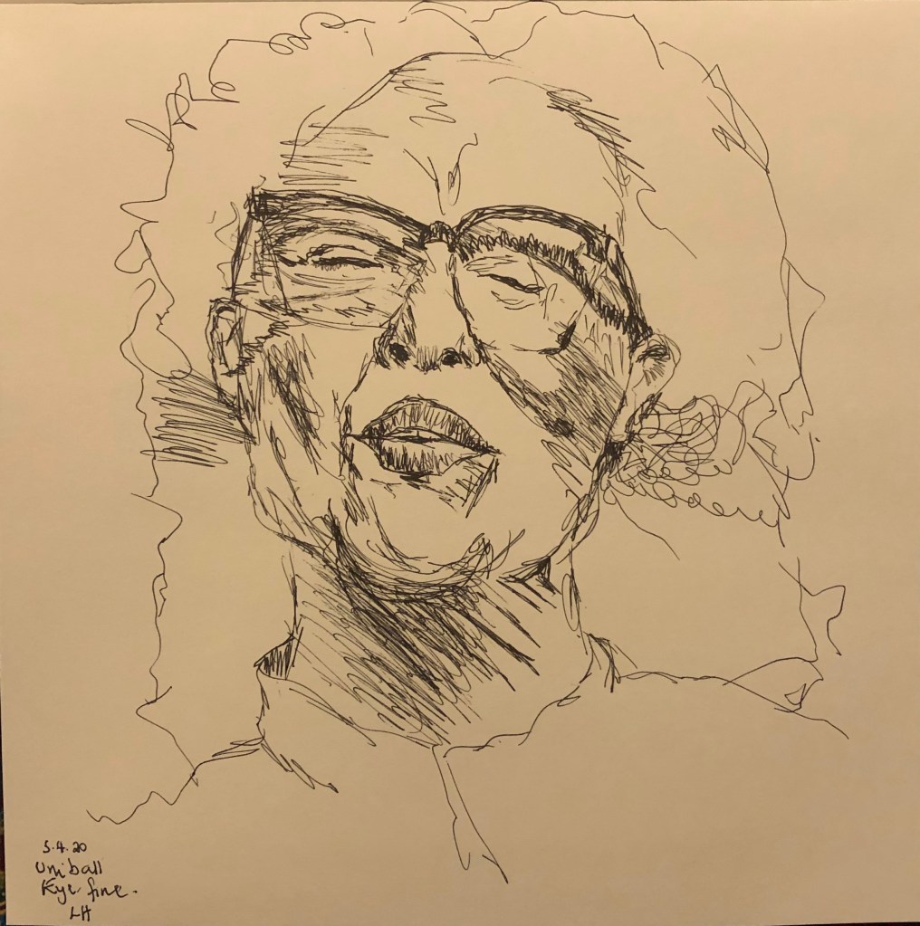
I am also going to try and include drawings of a range of different expressions in order to start addressing the point about identity and my first area for development – I have started this – I have allocated a square sketchbook to it (like Viv Owens’ work, to see what I think about this) – here are some of the first efforts:
Assignment line drawing: work a little more into the leg, feet and shoulder – they don’t feel rounded; glad Tutor found this a creative angle – I had really had to think and measure hard to tackle the
foreshortening. I WILL go back into the drawing to add more form to the parts mentioned – have been in and worked into it a bit, particularly into the lower parts
Assignment tone drawing: tutor liked image and technique. To improve, I need to lose the bricks which are making the image look flat and consider a graduated fading out of that top right hand corner, whilst at the same time darkening around the figure. Generally she said I have the light and mid tones, but need to work back in to emphasize the darks for bigger contrast. I WILL go back into the drawing and adjust as suggested.
I’ve now had a go at this – it was quite tricky fading out the top RH corner as I had already sprayed the drawing with fixative, so I was finding that trying to lift the graphite with a rubber was having the effect of burnishing rather than removing it; but then I found light sweeps over the surface with a rag was more effective. I worked into the shadows with more graphite, and do agree that the addition of more darks has added to the effect.
Assignment self-portrait: need to more specifically link this with my Escher research and include image. Tutor liked the composition but felt that the picture was a bit flat – she suggested that I bring it to life either by adding penwork in some places, or else adding colour washes, maybe to the area outside the mirror frame. I NEED to go in and develop this drawing as we had discussed, and also be clearer about linking my research. I have now gone back into my Assignment 4 blog post to make a clearer reference to my research.
After the discussion about adding colour washes to the “outside” bits of the drawing, I first of all worked into the large mirror frame using Colorex Tabac ink applied with the flat of a palette knife – this allowed me to indicate the grain of the dark wood. I had decided to apply colour to the bottom left (rose red carpet) and top right (creamy/yellowy/brown shadow), and tried to get the texture of the carpet first of all by dabbing ink on with a natural sponge. I wasn’t frankly terribly happy about the effect this produced and should have stopped there, but no, I repeated the technique in the top corner – this looked very strange and so I tried to limit the damage by making sweeping strokes with the sponge to look more like shadows – officially awful by now so I stopped. I completely see what the tutor had said about the drawing looking flat, but I really don’t like the way it has turned out. LESSON: don’t just plunge in if it matters – try experiments out first on a spare piece of paper!
Portrait from memory – tutor liked my quality of line, but said that clearly I was drawing features and some were not right – I must remember to think tone and shape rather than nose or mouth. To help with this, she suggested that I go online and find a set of images of heads showing a range of expressions (angry, sad, etc) and practise drawing these as a sketchbook exercise to build up my internal image bank (see also “sketch-a-day” notes above).
When drawing groups of people, remember to use negative spaces to help with size and scale
Hands and feet studies – I could link these to my Egon Schiele research – whenever you mention an artist, put in a picture
Drawing of bits of me – add a few bits of shading in key bits of negative space to add form
Drawing of reclining model – adding some tone around her will help to ground her
A helpful formula for writing reflectively:
What? (..have I looked at – describe)
So what? (what have I learned from this?)
Now what? (what will I do about it – how might I use it in my work?)
Sketchbook not seen obviously – suggestion is to make a blog post with any key sections – I think that with Part 5, I shall just try to be really methodical about putting pictures of my sketchbook on the blog as I go along, making it clear that this is what they are and why I have included them and what they have led to
Context – looking forward to Part 5 – have already made a start at looking at Robert Smithson and Richard Long – NEED TO:
Write up what I’ve found about them (include images!)
Just before I go through the individual criteria, I want to say how much I have enjoyed this Part of the Drawing 1 course; before having to tackle it, I would have moved heaven and earth to avoid having to draw a figure or face, but now having been made to do it, it has all been quite new to me and I have got so much out of it and learned such a lot.
Demonstration of technical and visual skills
My use of materials has been partly dominated by what I felt most comfortable with when using my left hand (being a natural strong right-hander) and by portability, as a large section of the work has been done out of my studio. Favourites have come out as Nitram charcoal (expensive but well worth the money), graphite (messy but fun) and drawing in natural ink dye using a bottle top dropper – very freeing.
Techniques: I have worked in line, tone (both by applying hatching and by removal of pre-applied medium) and a mixture of both. Drawings in line with minimal tone have dominated the quick pose sessions at my life group sessions, so I felt prepared for the large A1 line drawing (larger than I have drawn before – I am only 4 ft 11 in so it felt almost as big as me!) when I finally got to the assignment piece.
Observational skills: well, if they weren’t going to develop in this Part, they never would. I have looked and looked and looked again, trying to remember to forget what it was I was actually drawing and just think of it in terms of shape, form and tone.
Visual awareness, design and compositional skills: I was learning so much about drawing humans that I think this side of my work went onto the back burner a little until I got to the assignment pieces. I have been made to think however about when a whole body, part body or cropped part of body is appropriate to either fill a brief or to make an interesting image.
Quality of outcome
I have learned at a real rate in this Part and so at times my work reflects the learning which has gone on rather than a “finished” outcome – but I hope that, at this stage, this is partly a good thing. Hopefully I have been able to express my progress through this learning experience and my thoughts on it have come out via my blog and in my notes in my sketchbooks (I have a completely filled A3 book and broken into a second and a full A4 book – as well as loose sheets of bigger exercises and a hand-made A6 book for stealthy observations!).
Demonstration of creativity
Within the constraints with which I have worked during this unit, I do feel I have been experimental in my use of materials and my use of techniques. Having to use my left hand from scratch has been a learning curve in itself, but by now I am really enjoying working big and the freedom to be loose and sweeping where appropriate. I now need to apply some imagination and invention into the storage of large works of highly smudgeable art! Looking at my three assignment pieces, I am pleased with the development of my “voice” – I think it’s starting.
Context reflection
I was fortunate to be able to visit the London galleries in January 2020 and so look at a wealth of different artists’ approaches to the depiction of the human face and figure – not an area of art to which I’d paid too much close attention before, so good to have an injection of inspiration at an early stage. A couple of key texts – those by Chris Legaspi (Life Drawing for Artists, 2020, Quarto Publishing Group USA, Inc, Beverly USA) and George B. Bridgman (Bridgman’s Complete Guide to Drawing from Life, 1952, Sterling Publishing, New York/London), in particular – have supported my growing understanding of the nuts and bolts of anatomy and how to get started with the daunting task of representing a living, breathing human on a 2D surface. My learning log has been a key record; in the previous 3 Parts I learned a lot but it was by way of developing and adding to or changing aspects of art I had already tinkered with, but in this Part I have been learning pretty well from scratch, so writing stuff down has really helped to reinforce everything new.
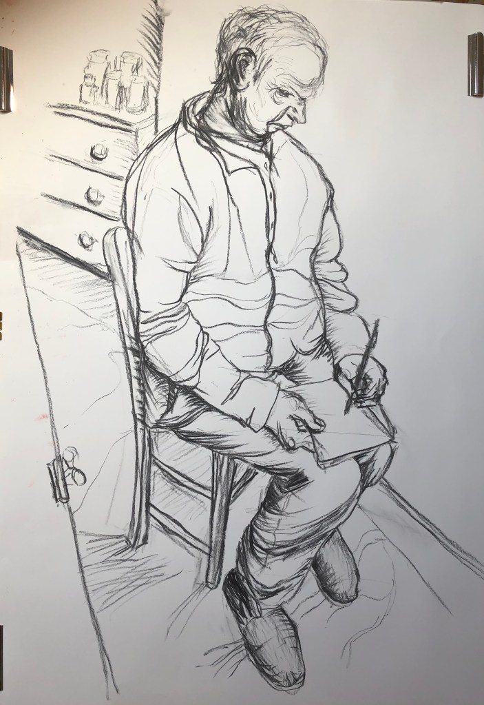
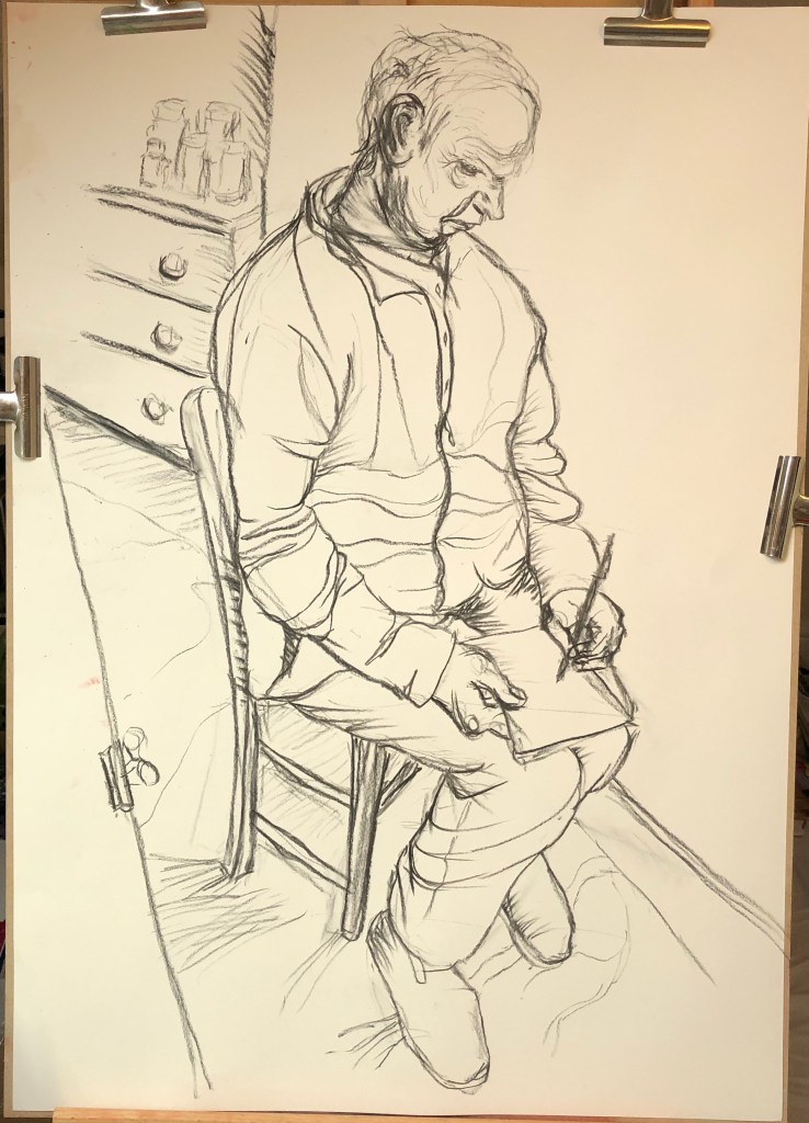
Figure study using line (A1) – Seated model in an upright chair
Working on A1 posed some issues for me, in that I could physically only cope with this by working at my easel, which had previously been lugged with some effort into my attic studio – so I decided a studio pose it had to be. My studio is snug but my husband had volunteered to be my model and he is a very neat and tidy sitter – he was very accommodating and sat perched on a small uncomfortable wooden chair for quite a while through my preliminary sketches and on into the main work. Taking a leaf out of David Hockney’s metaphorical book when he did portraits of his parents, I decided to give my husband something to do while he was sitting – some sudoku puzzles, which he loves – so that he could get involved in those and relax into his pose a little.
An A1 line drawing bellowed big sweeping charcoal marks to me, so that is what I turned to. The composition turned out to be quite a challenge for me as I was looking down and sideways on my husband who was right next to me, leading to a considerable degree of foreshortening, and much measuring was needed to get the proportions right.
I got the feel of the drawing using a few sketches (felt pen on packing paper, charcoal and natural ink dye applied with dropper on sugar paper), and I took a couple of photos for reference as well in case Tim got tired of sitting.
I started my main drawing on A1 heavy cartridge paper using Nitram charcoal; I have used this for most of my life drawing groups as I find it easy to hold and wield using my left hand, and it is forgiving of error as my fine motor control can be random. I have become very used to working through mistakes at the life group, and so I tried to do the same here and stay loose.
I was surprisingly pleased with the outcome – I have tried to use a range of marks, think I finally cracked the difficult composition and proportions, and it does actually look like Tim. He was wearing a chunky fleece which fell into many folds, but I think I have got these in the right places and have indicated them sufficiently rather than faithfully trying to represent each one.
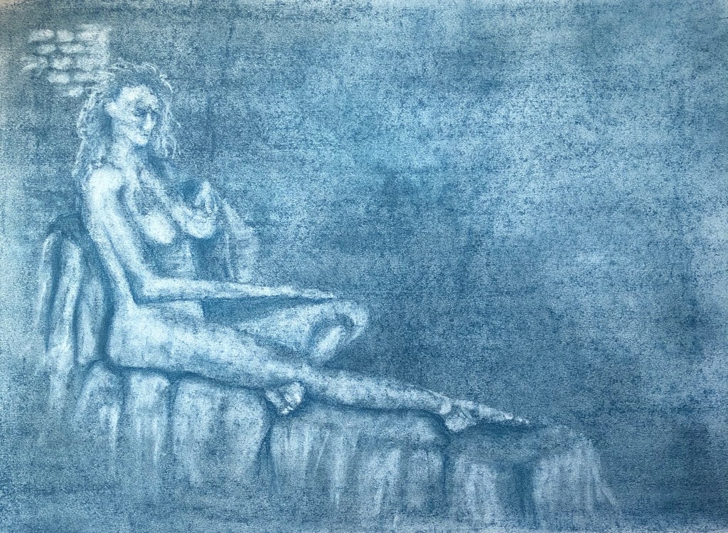
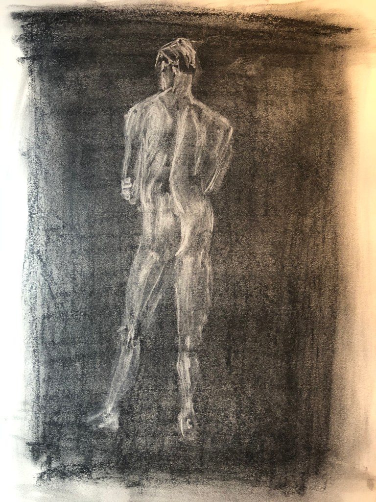
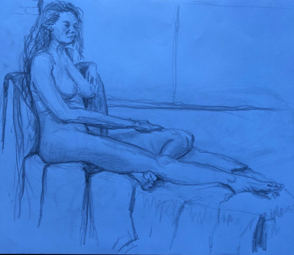
Figure study using tone (A1) – Reclining model
For the tone drawing, I was really keen to go back to a technique which I enjoyed back in Part 3, where I covered a page in charcoal and then drew into it with a putty rubber. This time however I had discovered, whilst tidying the studio a bit, my box of graphite chunks, so I played about with these and well as charcoal:
I loved Nina Mae Fowler’s charcoal drawings, for example her Luminary Drawings, some of which also appear to use a similar technique – see here : Charcoal on paper
29 x 44 cm, permanent collection of the National Portrait Gallery
In the meantime the coronavirus restrictions began to bite, art groups fell away, and I was keen to social distance due to my predisposition to lung illnesses. Hence, I decided to take for my assignment piece a sketch I had done at an earlier life class – it had been a longer pose where I felt I had included enough tone details in my original drawing to work up into something bigger.
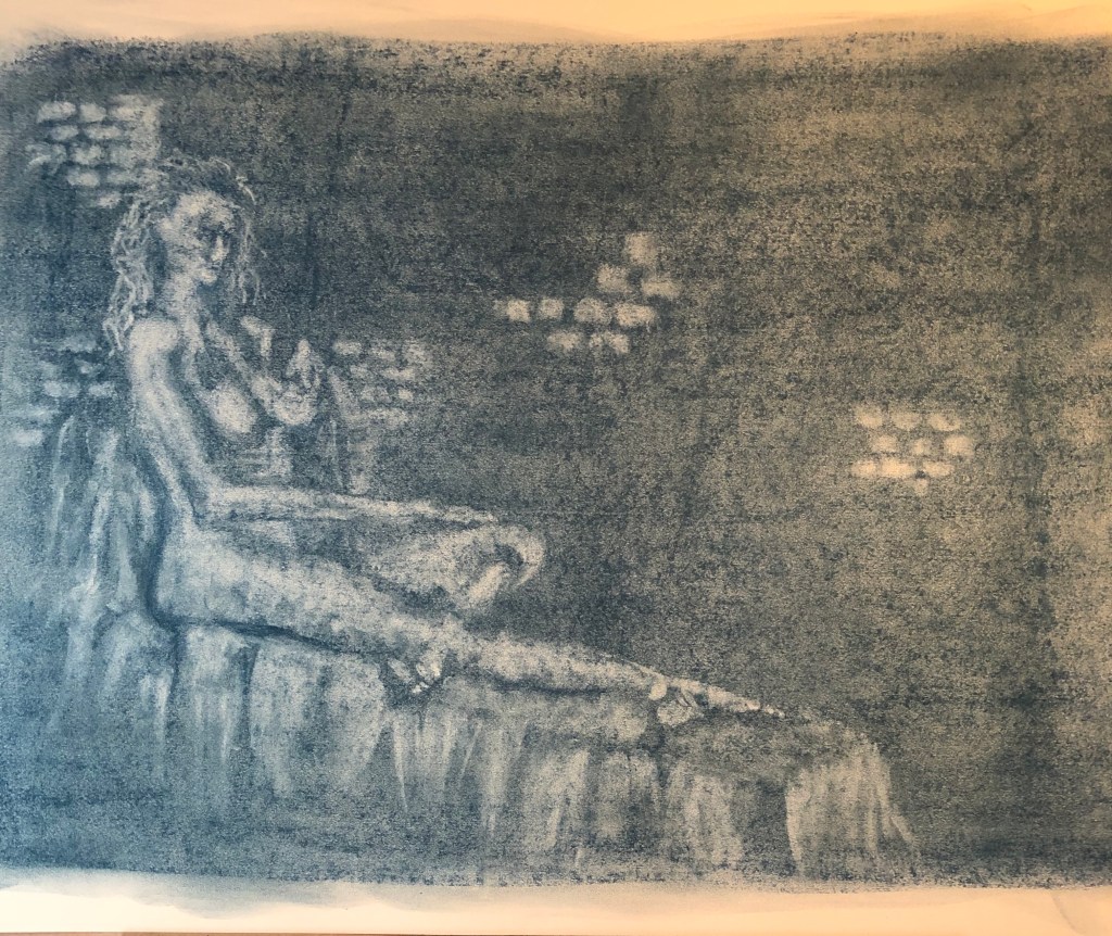
This was my original sketch (see first A3 sketchbook); I photographed it under an LED light and the photo came out unexpectedly blue. I rather liked the blue, so I decided to use a blue graphite block to lay down my background, rubbing it well into the paper with the heel of my hand before starting to lift out with the putty rubber.
This is the complete image…
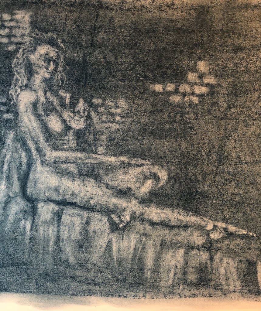
..and this is a slight close up focusing on the figure…..
I really enjoyed doing this drawing – there was much standing back and looking, then stepping in to apply the rubber, then stepping back to look again. I don’t think I placed her quite correctly, there is a lot of blank wall (which unfortunately was just blank brick wall) in the top right quarter, but I left it like that as I felt the dark quarter set off the lightness of the figure and support, which were lit by windows on the left. I was especially pleased with the feet, I think I have got the light and dark tones of both of them well.
A portrait or self-portrait combining line and tone (any size)
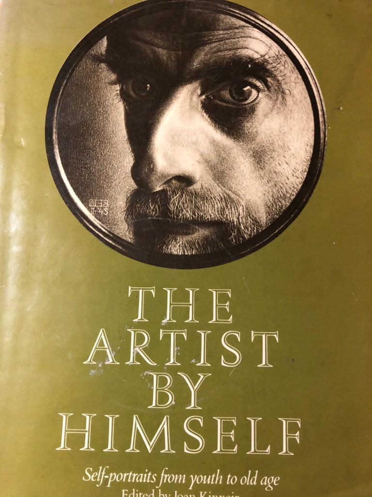
In my research on other artists’ approaches to both portraiture and self-portraiture (see separate blog posts) I had been attracted to cropped images, such as this one by Escher :
(Self-portrait in shaving mirror, 1943, “Scratch” drawing, brown lithographic crayon. Haags Gemeentemuseum, The Hague) – as seen in Joan Kinneir (ed), 1980, The Artist by Himself – self-portrait drawings from youth to old age, Granada Publishing Ltd, Herts and London.
Escher seemed quite taken with reflections of himself when drawing self-portraits – this one which I found reminds me of the self-portrait which I did in Part 2, when I was reflected in the metal dome of a lamp:
Still Life with Spherical Mirror
1934, Lithography print.
Also, when I tried my own self portrait in an earlier Exercise (see blog post), I tried an angled and cropped image, and thought it would be something I should like to try again in this task.
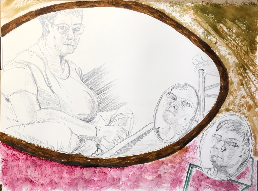
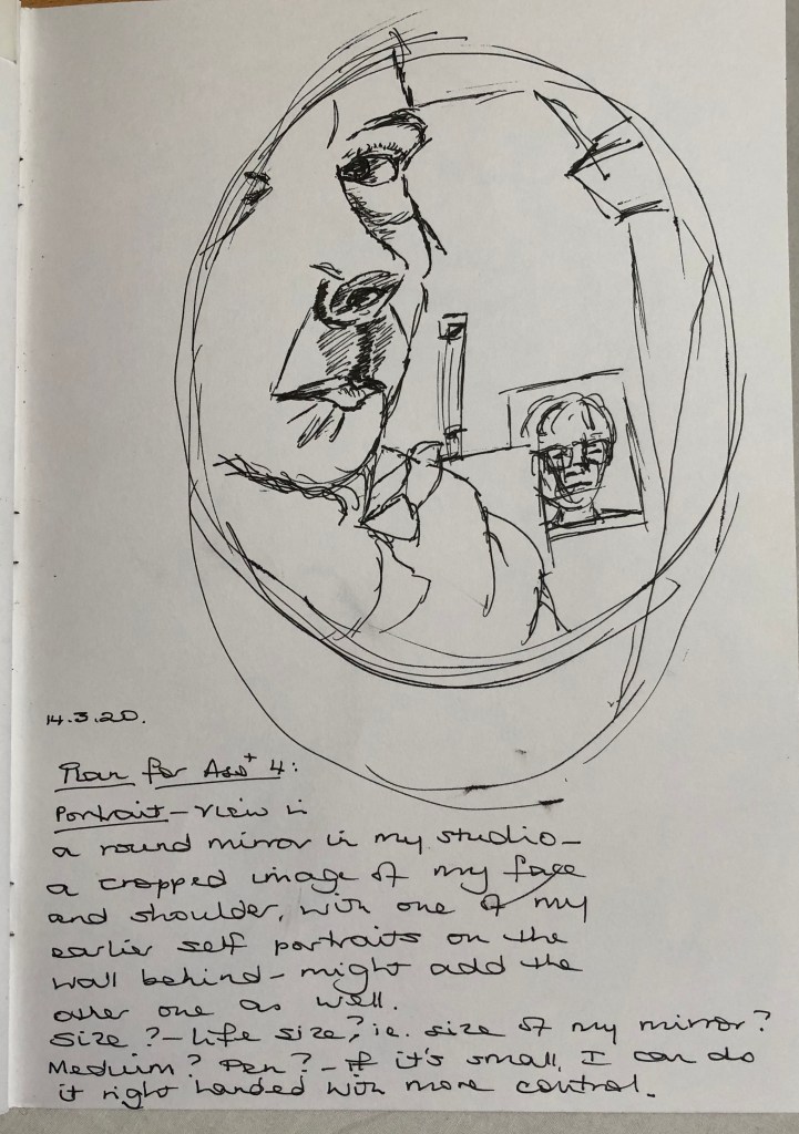
Based on the Escher drawing, I found a little shaving mirror and tried holding it up with one hand and drawing with the other….serendipitously I could also see one of my earlier self-portraits stuck up on the wall behind me, so included this as a double portrait. I did it on A4 with a drawing pen, thinking to roughly emulate the size of Escher’s portrait – it was OK but felt a bit cramped. Then I looked again at the terms of the assignment and saw that I had to demonstrate the proportion of the features in relation to shoulders and chest as well as head, so decided that this composition did not really meet the brief – but I learned that I needed to work a bit bigger, and also not with pen which is a bit unforgiving.
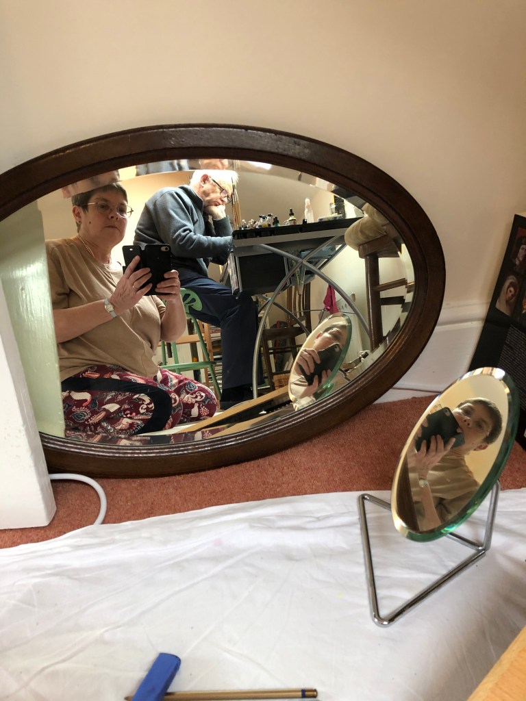
I decided that, if I was including more of myself than just face and head, I’d like the rest of me to be in an interesting position – I had enjoyed the self-portraits of Artemisia Gentileschi when she placed herself in unusual poses. In my studio I have a couple of old oval wood-framed mirrors which are there because we haven’t found a place for them anywhere else – I don’t have any hooks to hang them from in the studio (it’s on the to do list, along with a cork-board wall) so they live on the floor propped against the wall. I experimented with arrangements which included one of the oval mirrors, the little shaving mirror and an interesting position, and came up with sitting cross-legged on the floor drawing on a propped-up board on A2 – this is the set up:
(excuse my husband sitting at my work table in the background marking a maths paper – we were self-isolating in the attic from workpeople downstairs). With this arrangement I could see two direct reflections of myself at different angles (in the big mirror and the small one) and also the reflection of the small mirror in the big one – so, a self portrait from three different angles.
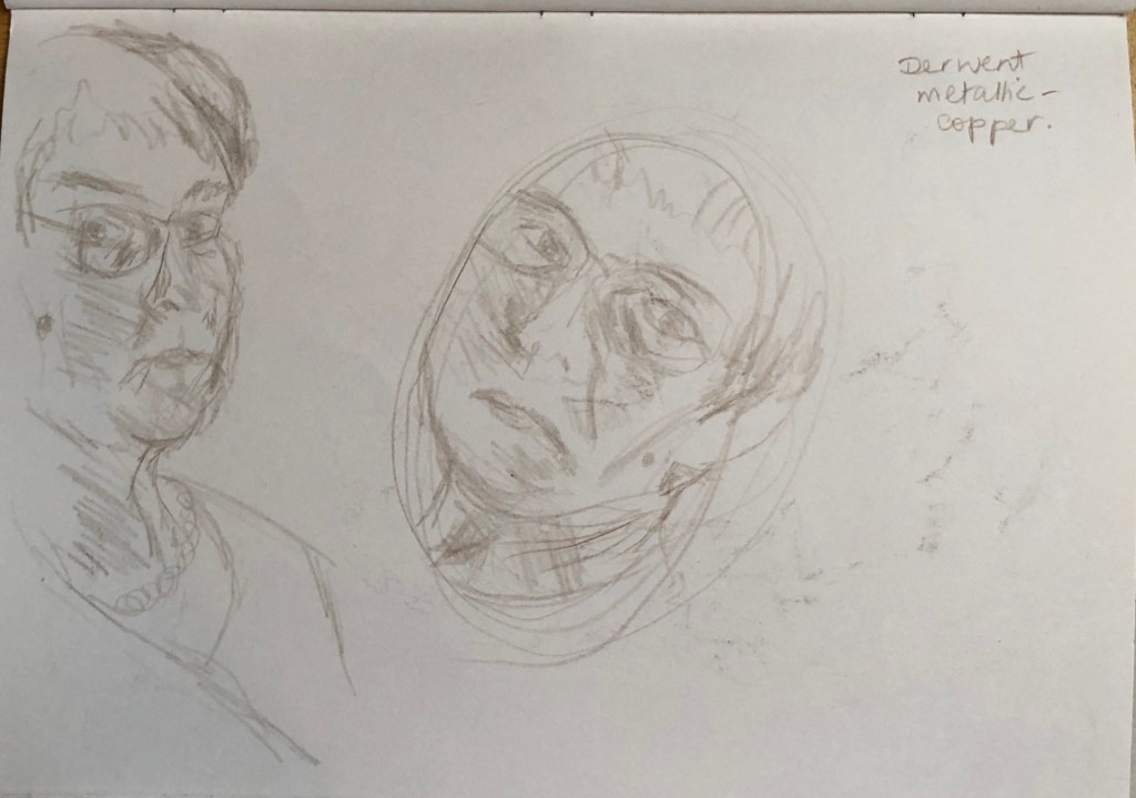
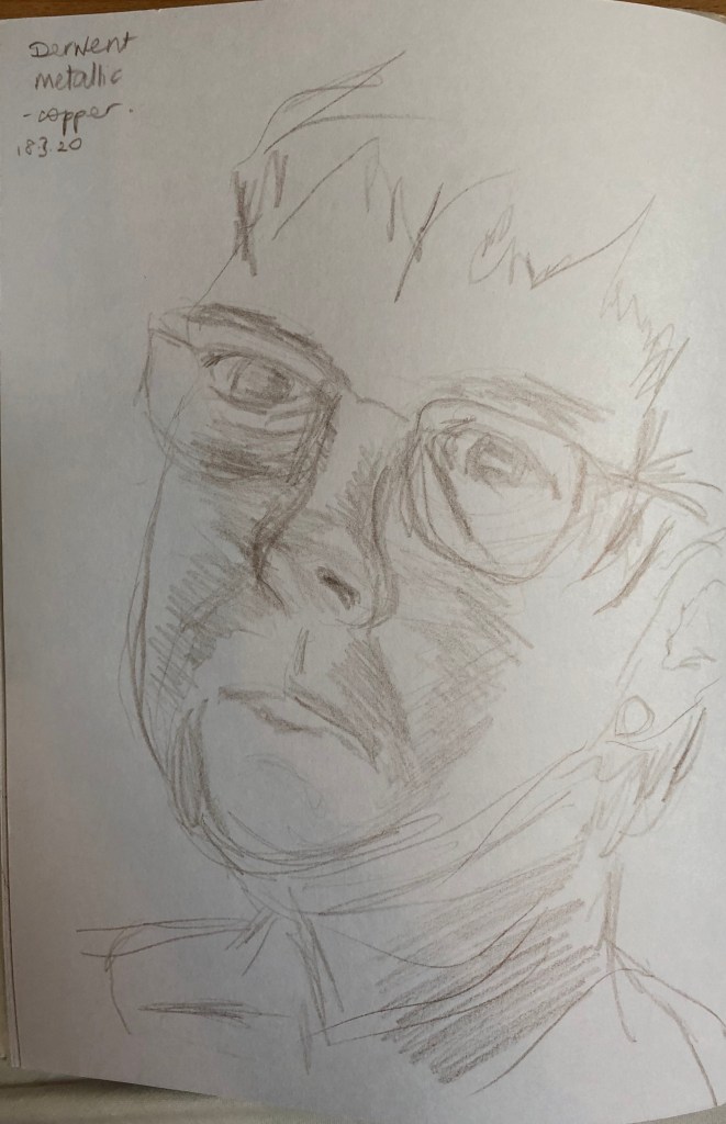
I tried the idea out by sketching the face as shown in each of the mirrors in my sketchbook in pencil:
…and also the overall composition in my A4 sketchbook using a sepia charcoal pencil:
I started roughing the composition out lightly onto the A2 paper using a 4B pencil, which is the first thing which came to hand…..I would love to say that I dwelt on my medium for some time, but actually the 4B pencil felt fine so I stuck with it. I brought a lamp in and placed it on the floor to my right – I did try it out to see how it would look in the semi-dark, but my eyesight is not great and I just could not see things clearly enough for me to draw from – so my light sources were actually various on the day I drew the final version – I kept the lamp beside me on my right (not very strong); I have a skylight over my head to my right; and South-facing windows from the other attic room behind and to my left. The outcome of this is that the sides of the face are lit but the front of the face is more shadowed.
Well, I’m not sure how Artemisia did it – by the end I found I had “set” into a hunched forward-and-over position which I needed to reach the angled drawing board…shades of Yoda and Jabba the Hutt come to mind! Looking at it now, I do think overall I was this shape – I find I can always tell if it’s right if you go to draw a body part, and the other body parts which it meets up with are in roughly the right place.
I am pleased with bits – the main figure is the best, I think, because it was easier to see. Little details have gone well – the ear, the foot, the folds in the trousers around the knee. Other things are less good – eyes too close together in the main drawing, too far apart in the shaving mirror near me, best in the shaving mirror reflection – a bit like Goldilocks. Interestingly, I drew with my left hand, except for the shaving mirror image on the floor by me – without moving everything, I couldn’t really reach to draw this so switched to my right hand, and I think this is the weakest portrait of the three.
I hummed and ha-ed about how much background to include – it was very complicated and I thought I could lose the impact of the portraits, so I confined it to the mirror outlines, the chair and the drawing board – I think this works.
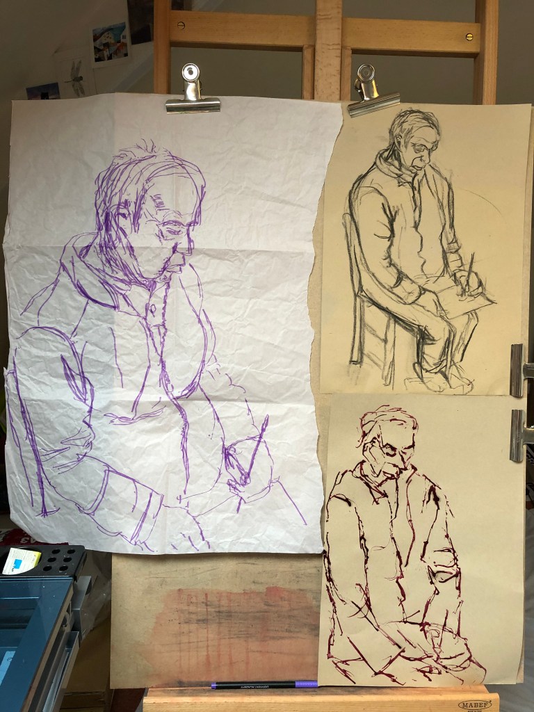
I had tried drawing self portraits before, years back – think everyone has a go at some time, don’t they? – but they were scary and severe efforts and I was determined to be a bit kinder to myself by trying to approach the exercise crabwise, almost creep up on it unawares, so to speak; so I chose an old battered piece of blue sugar paper from the bottom of the pile and a purple felt pen. I was drawing left-handed so knew there would be mistakes and a bit of a temptation to tinker – hence the choice of a support which was highly disposable and a medium which was fairly tinker-proof. What was going on the paper would be there, warts and all….oh dear….
I set myself up with a mirror propped slightly below my eye line and a little to my right – my memories of my previous full face attempts were not happy. I tried to relax and just go for it, letting the pen travel around the page so that nothing got too boxed in. I even left my glasses on, determined that I was going to rise to the challenge and not be fazed – if it was wrong, then that was ok.
Well, the outcome looked like someone, I think, although not me. Eyes definitely too close together, neck not wide enough. I showed the drawing to my husband and he agreed that it wasn’t quite me – I asked him to discount the cross eyes and the chicken neck and see if anything else was wrong, and he said he thought possibly the overall shape of the face. I left the drawing propped up somewhere and my husband did come back an hour or so later and said he had been looking at it again and he did think it was a bit like me after all (which was pleasing, although I hope he’s not referring to the cross eyes and the chicken neck…).
Getting out the battered blue paper reminded me though of all the more experimental stuff that I did in Part 3, so I decided to try a bit of that for my second self-portrait. I stuck down a piece of A3 paper at a skewed angle and laid down a background all over it in Conte crayon which I put on and then rubbed in with my hand. My art room has a fairly steeply pitched attic roof and I draw/paint underneath a wood framed Velux skylight; I didn’t want this to be a detailed background, so I chose the three colours of the wood (a yellow, a sienna and a dark brown) and laid them in stripes to indicate the Velux frame, then used a light grey for the sky outside and the white painted walls and ceiling. I propped up a mirror so that I had to look down and round into it, and drew myself using sienna Indian ink applied with a small flat brush.
The outcome is a little crazy-looking, and obviously the Velux background shows through the ink, but I didn’t mind that – I had to keep moving my head to see in the mirror, so I thought this sort of gave the idea that my head was the transient feature in the image, the background being fixed and therefore immutable.
It’s better – the nose is too wide and the right cheek (as you look at it) is too prominent – but I feel the odd angles and cropping give it energy and, better yet, my husband says that this one looks much more like me. On the basis of this, I’m thinking of trying for a similar cropped or skewed image for Assignment 4.
Overall comments: I was very pleased with this – the first time I felt I had constructed a proper body of work rather than an assemblage of exercises.
I do intend to try and complete the final assignment piece once either my right hand is sufficiently back in action to tackle bigger drawings, or my developing left-handed drawing becomes more confident in tackling straight lines.
Feedback on assignment: my Tutor’s comments have directed me to think more carefully about the final layout and presentation of my drawings; I have sketched out a plan of how the four drawings will fit together, assembling them around an ornate compass needle showing the compass points from my house – serendipitously, they are pretty well North, South, East and West. They possibly won’t be complete rectangles – I have an idea of cropping the pieces of paper before mounting them onto the background piece.
Sketchbooks: I was pleased that my Tutor liked my use of a home-made sketchbook and I am hoping to do more of this – this was a simple home-made example in concertina format, and I cannot believe now that I missed out on the possibilities this offered for a continuous drawing or set of drawings. I have investigated Canaletto’s drawings on the Royal Collection Trust website, www.rct.uk; it was interesting to read that, as well as doing sketches in situ as preparatory work for paintings, he also did many pen drawings intended to stand alone as finished pieces. I was also tickled to read that some pin holes are found in his drawings, indicating that he had used the pin-and-string method to work out perspective – what’s good enough for Canaletto is good enough for me! In his Grand Canal drawings from the 1720s, he created his compositions from 25 successive pages of a sketchbook (I seem to remember that John Virtue did something similar), and my action point here therefore would be to think about using this sort of continuity in the future.
I am really enjoying now using my sketchbook as a resource in which I can try things out and use the successes for reference in the future (and maybe even the things which initially seem like failures – one drawing’s “failure” might work really well in a different context).
My remark about whether a picture needs a foreground made sense to me at the time, particularly in relation to a drawing of the end of the garden where there was nothing much except grass in the foreground. However, I have thought about my Tutor’s comments and I now totally get what she means about having something in the foreground to establish depth and perspective – the result of a bit of a lightbulb moment when I happened to see this image in a magazine: John Everett Millais, Dew-Drenched Furze, 1889-90, oil on canvas, Tate Britain.The extraordinary depth of the painting is established by those few wisps of grass right in the foreground. Thank you, Rachel and Millais!
Research: I am beginning to enjoy research and to look forward to this aspect of the course as a way of finding out what I might try next (or, what I really don’t like the look of). I probably still don’t do enough work on comparing artists’ work (rather looking at each as a stand-alone) – I can see how this might be valuable, and will try to do it more often.
Learning log: It is tempting sometimes to gallop through the practical work and exercises without stopping to think – they feel like the “fun” bits – but taking time out to stop and reflect in the blog is helping to embed what I’m learning and to structure my next steps.
I have experimented more with the materials I had said I wanted to improve – notably charcoal, Conte crayons and inks. I have given some thought to my support, as suggested by my tutor, and have started working on coloured grounds (paint, charcoal, pastel, newspaper and gesso). Compositional skills still need to enter my consciousness a bit more, but I am feeling much more confident with perspective and feel I have some quick-check tools to support me.
Quality of outcome
Although I was unable to physically complete my Assignment 3 piece in time due to injury, I am pleased that I had worked out what I hope is a clear and coherent plan for it which was based on my learning throughout this part. Something to work on for the future, I think, would be pulling out the salient points and not including every detail – I have tried it in bits, but know I need to do it much more.
Demonstration of creativity
Having taken “developing expressivity” as my target for this Part, I feel I have given myself permission to let rip a bit (within the limits of being a Capricorn) and to follow areas and try little experiments which were interesting to me, whether or not on the tick-list of exercises. Having said that, I have really enjoyed this Part, I felt it was well-constructed and I can’t pass a window, a tree, a cloud or a corner now without immediately thinking how I would draw it.
Context reflection
I have found the suggested research in this Part much more helpful and less scattergun (or maybe that has just been down to my approach to it). I have tried to follow up on and develop points and ideas I have mentioned in my blog, and am starting to feel that it is ok to use parts of another artist’s ideas or examples without having to sign up hook, line and sinker.
I need to preface these notes with an explanation:
Three days ago I tripped over a kerb (rushing to a local art exhibition, annoyingly) and landed on my shoulder – was taken to hospital by ambulance, and it turns out that I have a complex multiple fracture. It’s very painful, so I am on morphine for it, and I am waiting for an operation to see if it can be fixed or, if not, to replace it. It’s my right arm and, wouldn’t you know I am very strongly right-handed, am finding it very difficult to do anything with my left – it is taking hours to type this!
In view of all this, I have decided to submit my Part 3 work to my tutor (I had already completed all of it apart from the last two exercises in Project 5) along with my plan and such preliminary work as I had done prior to the injury, and hope that this might prove enough.
Preliminary work
Thinking that I would need to spend quite a while in situ doing drawings in a cold wet November, I did a set of rapid, rough A3 sketches in pen from windows in my house, all showing buildings, tree etc, as well as allowing for the demonstration of linear, angular or aerial perspective
Sketch 1 was looking down from the attic window of our 3-storey house at the road, a small group of houses across the way, and a hill with trees behind – all flanked by gable roofs . Sorry – my daughter took the photos of the sketches for me, not the way I usually take them and I can’t turn them – so this needs to go round a quarter left.
Sketch 2 was the view from our first floor bay window looking down on next-door’s porch roof and driveway, across to next door’s bay window and then on down a windy road which forks then disappears into trees
Sketch 3 is looking out from a different first floor window into our garden, onto the garden wall, down a side road with a lane off, making a z-shape – again, the photo needs to turn a quarter left.
The final sketch is from the ground floor study window – the view (of the houses opposite and along and background woods) is nicely framed by the dark garden wall and shrubs, trees at the side and looping right overhead, with central focus of a much-pruned beech.
Plan
After attending the South West group meeting, listening to speakers there, reflecting on Lydia Halcrow’s work (see separate blog post), thinking about series pictures (e.g. John Virtue, David Hockney) I decided not to choose just one of these sketches to work up for the assignment, but to present them all as a tessellated group. Lydia, John Virtue and some of the photography students at the meetings were all trying to represent a journey as a series of images; I thought of mine as offering a series of potential setting-off points, depending on which image you chose to jump into – a bit like the beginning of JRR Tolkein’s The Hobbit, where Bilbo Baggins was promised an adventure by just stepping onto the road outside his door, the particular adventure being determined by which way he chose to turn.
I intended to work up each image on A3 so that, when assembled, the total would be the required size. I was going to simplify each image quite considerably (as I had done in Project 5 in a set of drawings of the Church – see sketchbooks) and intended to work quite loosely on pastel paper with some pieces of gesso-coated newspaper – in the style of the church example here.
My medium would be mainly inks (applied with both brush and pen), plus some charcoal and Conte crayons – not necessarily monotone, but a limited palette of 2 or 3 colours at most.
Formal typed feedback from my tutor was only received on 27th October 2019, so these notes need to be read alongside those I made in August about our Meet talk on 23.8.19. I will only comment on remarks which are different from/additional to those already discussed.
Feedback on Assignment: I have indeed reworked my original in a different medium, making it larger and looser – more expressive I hope. The only suggestion I didn’t completely take up was to take part of the composition off the page; rather, I decided to take it right to the edge of the page, which I felt injected some energy.
Drawing down the stairs defeated me last time, but now that I have gained a more confidence from working through Part 3, Project 4 on Perspective, I am thinking in terms of a landscape composition looking down from the attic window of my house.
I have experimented throughout Part 3 with different backgrounds and supports – with various degrees of success – see e.g. blog notes on Part 3, Project 5, Ex 1.
Research: I must continue to include more of my reflections and analysis.
Learning log: Maintain balance between thoughts leading to a work, and reflection thereon.
Suggested reading: I’ve just managed to obtain a copy of Turkle, S. (2011) Evocative Objects: Things We Think With. London. MIT Press – just need to make time to read it now….
Reflections specifically on points for next assignment (tutor’s comments in italics):
Pointers for the next assignment
● Reflect on this feedback in your learning log – herewith.
● Keep developing how you are using your sketchbook and learning log – it is lovely that these are starting to link together well but this can always we stronger. Have tried throughout Part 3 to specify these links – guess this is the slight downside of an online log rather than a written one – you need a whole different piece of kit to write this, rather than a scribble in a book, so it’s not always automatic.
● Trust your judgement – don’ let yourself fall back to things you feel safe doing, if you have a bold idea go for it. Well, in my head I’ve tried to go for things a bit more in Part 3 – will be interested to see what my tutor thinks!