Drawing 1; Part 4; Project 3 – Form; Exercise 1 – Basic shapes

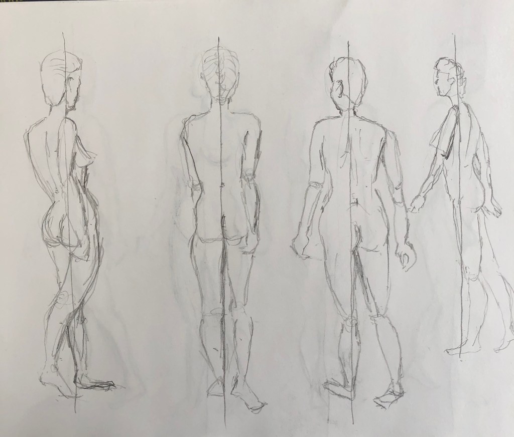
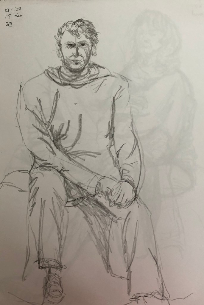
I used a set of photographs of a chap in the classical pose of “Thinker” taken from different angles to draw from – I went for a side pose, a back pose and a frontal pose.

I had some Nitram charcoal sticks as a birthday present so was eager to try them out – decided to start with the hardest H stick – this allows for quite a range of darkness from a thin faint line to something quite dark and heavy – seemed ideal for this exercise.

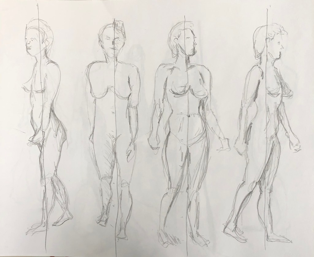
I used the head as the main measuring tool, working on the assumption that this was approx one-eighth of the total height of the body. I placed the building blocks of the body using simple shapes drawn very lightly, and then went over the lines to add appropriate dinks and curves before adding some shading to try and establish the 3-D nature of the figures.

I am quite pleased with the proportion of the first figure (side view), although I think he has ended up being the least “solid”. The second drawing (back view) was very interesting to draw, I don’t think I’ve tried a back yet and feel the shading is in the correct places but could stand being stronger to make the contrast of the slightly twisted-away side. I struggled a bit with the angle of the arm, but am pleased with the foreshortened left thigh, even though it was weird to draw.

The third drawing is face-on and probably the most complicated as far as the placement of the limbs was concerned. The foreshortening of the thighs again needed a lot of careful observation and is going to need much practice.

Drawing 1; Part 4; Project 3 – Form; Exercise 3 – Stance

For this exercise I used a book of photographs of nudes intended for artists (Harwood, J (ed), 1989, Illustrator’s Reference Manual – Nudes, Bloomsbury, London); this particular book, which I borrowed from the West Devon Group of Artists today, contains photos of both men and women in various poses, and each pose is “shot” from 8 positions – as if you had walked around the model and stopped 8 times to take a photo.

I chose a straightforward standing position to work from, and managed to draw all 8 poses within the art group session – so, allowing for stops to chat, about 10 min or just over per pose. I am still using my left hand, which is my non-dominant hand, and today I worked in my A3 sketchbook using  a 5B pencil. I worked sitting down, which doesn’t allow for the application of the same pressure as a standing drawing as it is less of a “whole arm” movement but is more restricted to the forearm.

I concentrated on the whole body rather than the face, but used the length of the head as a measuring unit to mark in where the rest of the parts should fall – I have been working on the basis of the head being one-eighth of the whole. I also tried to draw in the rough basic shapes first before refining them by adding bumps and wiggles and I didn’t erase any marks which weren’t quite right.

When I had finished each sketch I tried to mark in the line of balance, starting at the head and going straight down – I was pleased that most of the lines of balance were fairly close to where they should have been.

Drawing 1; Part 4; Project 1 – Fabric and form; Exercise 2 – Emphasising form with cloth

Today at the life drawing class in Tavistock, our model unaccountably failed to appear, and so we took turns drawing each other; and, since it was a cold and blustery day, serendipitously, nearly everyone was wearing a baggy jumper and/or trousers. A day made in heaven specifically for this exercise, I thought….

I am still unable to tackle life drawing with my dominant right hand, so am sticking with the left, using big expressive strokes and my trusty 3B pencil. I am gradually growing in confidence with life drawing, thanks to:

  • This now being my fourth session
  • My trip to London for a whistle-stop tour of as many exhibitions featuring portraits/people as my brain could accommodate (see separate blog post)
  • Reading a book acquired on voyage – Legaspi, Chris (2020), Life Drawing for Artists, Quarto Publishing Group USA Inc. – only partway through it, but it has confirmed that my big sweeping strokes are a useful thing, and made me understand the structure of a life drawing class and the point of all the different-length poses.

We did quite a few drawings today which can be seen in my A3 sketchbook, but I have photographed three to talk about here. 

This gentleman had a big chunky fleece-type jumper and he adopted a helpful slouchy pose clutching his coffee mug which let the jumper fall into lots of folds. All the poses today were about 15/20 min as none of us are professional models so didn’t want to tackle anything unduly long or awkward and difficult to maintain, but this gave me time to get the overall structure of the figure in, practise placing the “crosshairs” on the face 

(a term acquired from my book – basically identifying the horizontal and vertical mid lines), and then concentrated on the folds of the jumper and how they gave definition to the torso and arms.

My next attempt was a slightly older lady who again had a baggy jumper, this time with the sleeves rolled up, and who also sported some fairly loose trousers which bunched up in some places and hung or flowed in others. I focused on the midpoint where she had tucked her right arm and hand between her knees – so I began with that hand and worked my way outwards. The direction of the creases does add a three-dimensional quality to a flat drawing. I am also trying to sketch in just a few folds from the cloth on which the models sit – just a few fold lines hopefully give structure to the seat and make more sense of the sitting position.

My third drawing to be discussed here is of a younger man wearing a chunky hoodie and thick jeans. I was lucky to have him facing full on for this sketch so hoped to use long bold lines for the folds in order to give structure to the whole form – I wanted to get the whole body as all the other poses today had been three-quarters on to me.

I think I have managed to catch something of his bulk; I think my attempts this time at depicting his “perch” have been slightly muddling with the trousers confused with the fall of the backcloth – but I was pleased with the way I had caught his right leg which was facing me straight on, foreshortening the thigh to virtually nothing..

Drawing 1; Part 4 – The Figure and the Head; Project 1 – Fabric and form; Exercise 1 – Drawing fabric using line and tone

Well, this was a bit of a challenge for my left-handed drawing – but I decided to embrace the advice I was given at the recent Zoom critique session, to loosen up and see what other things could be achieved with the non-dominant hand. I threw a bath towel in a heap on a stool and started in…

First up was the 15 min line drawing, which I decided to render in my trusty HB pencil. This was always going to be a struggle as I am finding it difficult to place and control lines with accuracy – and so it proved. However, sweeping lines are easiest for me – drawing with the whole arm almost, rather than hand, wrist and forearm, and so the outline is reasonably representative of the towel. I found it more difficult to represent all the inner folds, as much because it was tricky keeping track of them as it was drawing them with control.

Afraid this is also a fairly duff photo as the work on the reverse of the page shows through – however, after 15 min work, I think the viewer might just about grasp that it’s a drawing of some piled-up fabric.

Next was the 15 min tone drawing – I went for charcoal pencils for this as it gave me more flexibility to use the pencils on their side for wide sweeps of tone and blending.

I think this is more successful (as in, more recognisable), although I found myself going back and marking in some lines just to try and keep track of where I was.

I found the big sweeps and folds easier to represent and to make 3D than the really convoluted overlapping folds in the middle, which are a bit of a jumble and the surfaces are hard to follow.

Moving on to the 5 min studies of small areas of the fabric, I felt the need to work (a) bigger, and (b) on paper that wasn’t white, so I opted for a sheet of fawn/grey sugar paper. I’m afraid that, because of the whole left-handed drawing thing, I worked the boxes from right to left, so they are numbered slightly counter-intuitively. My plan was to work in Conte crayons and charcoal, putting in the darks with the black, and the lights with the grey/white crayons.

I tried this out with the first three (moving top right through to top left), but I found it hard to get any sort of likeness, and was despairing slightly of being able to get the hang of this.

Moving down, I decided to simplify by really focusing in on just one fold, and also just used charcoal. This was much more successful and whilst by no means the finished article, these lower three look much more 3D and also more representative of the “feel” of the towelling fabric.

Much work still to do, though, I feel…

Drawing 1; Part 4; Research point – my thoughts on and reactions to life drawing

Well, I had already started on the second research point about the history of the nude, so have been made to confront issues that, in my naivety, I hadn’t really recognised before – see blog post on that research. So I’m going to keep this blog post as a document of my own personal feelings and reactions to drawing people – an aspect of art that I had always shied away from.

Last week I attended my first life session with a local group. The booked model had phoned in unwell that morning and replacements could not be found; hence we agreed to do a few 15 min sketches of members (all clothed) and then, as I have a broken shoulder and am struggling to draw left-handed, I volunteered to sit for a longer session after coffee. The experiences of being on opposite sides of the drawing board were quite different:

  • Sketching class members (strangers or passing acquaintances) was surprisingly forensic – initial qualms about rendering the sitter in a politely flattering light were dispelled once I discovered that we didn’t really go round and look at each others’ work, and I was soon blocking in heavy jowls, bags under the eyes, rolls of fat and double chins with the best of them. You soon lose yourself in the moment and it is as if it is only you and the model in the room; you are locked in a joint endeavour. Being compelled to work left-handed is, I think, going to be at least partially beneficial –  I am unable to produce a reliably accurate line, so am being forced to look for shapes and blocks of tone.
  • Acting as model (clothed) made me focus straight away on comfort, especially that of my smashed shoulder, so I was quick to establish myself in a slouchy but supportive position which I felt I would be able to maintain – unlike the class members who had preceded me who all adopted a smart, straight-backed, pull-your-stomach-in pose, gazing heroically into the far distance. And, once they are all drawing, you forget about them completely; it is like entering a wide empty hall in your mind with many doors – you can push against one door and start thinking about x, then return to the hall, enter another door and start thinking about y – whilst all the time leaving a small part of your brain in charge of remembering to check that you are still looking at the same spot on the floor whilst remaining relaxed and not forming a rictus-like stare. Time flew by and the agreed 40-min limit came way before I anticipated. I was tempted into glancing at the drawing of the group organiser (a local artist called Scott Russell – see his page on www.cargocollective.com) – he had gone for a portrait rather than full body, and I did think he had ‘caught’ my likeness – gratifying, although bringing home to roost the chubby cheeks (no, I’m sure they’re not jowls) I seem to have grown of late…
  • In this week’s life class we had a proper nude model, a young-ish lady whom the group had not hired before. She was, however, clearly experienced in the job, and generated her own poses without being asked (although she was happy to adjust them slightly if asked). She did three shorter poses and then two extended poses, one lying flat and head hanging slightly backwards, the other a sitting/reclining position. Her professional matter-of-fact manner made it feel not at all weird to be drawing her – it felt like a job of work for all of us. She did not obviously go round and look at our pictures of her, but when I said to her after the first of the longer poses “Gosh, that was really difficult ,” she came over to look at my drawing and remarked that I had had a very tricky angle to cope with – so I wonder if she draws herself.
  • Well, over the last few days there has been a huge string of arguments on the oca dr4drs email about life drawing classes and the sexual exploitation of models – going on to denigrate artists such as Schiele (whose drawing style I had found very compelling for its use of line), along with Gaugin and Freud, both of whose exhibitions I had been looking forward to seeing early in the New Year. So when I turned up this week at life drawing to find we had a male nude model, I paid particular attention both to my reactions and to his attitude. Ours is a mixed class. Our model was obviously experienced, like last week’s lady, suggesting his own poses and yet being open to slight moderations as requested by class members. He was happy to come round and chat in-between times, covering up in the breaks, and staying afterwards to join us for a glass of mulled wine (last session before Christmas). I observed my own reaction – at first slightly self-conscious because of my own self-awareness – but in no time at all one is totally absorbed in trying to render the pose, as everyone else seemed to be. Certainly, for me, the problem of getting the human form down on paper is the thing, and it seems to be so for the other members of the class, although of course you can’t tell what is going on in people’s heads, and are never going to be able to legislate for that – but there was nothing overtly sexual about any of it. The model was paid, was stressing his availability to come back another time, and appeared relaxed and comfortable with the situation throughout.

Notes on fine art group critique session on Zoom with tutor Helen Rousseau, 18.12.19

This took place between 6-8.50 pm  – there were 6 students plus Helen the tutor. After introductions and explanations of the working of the software, we had a “quick” reaction to each others’ work, followed by more in-depth critique, first with a partner and then the group as a whole.

My piece was this 15 min sketch from a recent life drawing class. I am currently labouring under the handicap of a broken right shoulder (yes, I’m right-handed, wouldn’t you know…) so am having to draw, very inaccurately, with my left hand. 

Immediate responses to the “quick” showing were:

  • Solid strength mood
  • Balanced
  • Perched, roughness
  • Uncomfortable
  • Both subjects solid
  • Strong position

An interesting and helpful discussion among the group followed my showing of my work (presented by my work partner for the evening, Felicity): if one lets go of – is freed from – the possibility/necessity of getting a drawing “right”, as I am having to do – where can you go? What other representations are there? What actually is right? – what other things can one convey apart from photographic accuracy? I confirmed that the experience is certainly making me observe much better, in order to give myself the best chance, and I am almost being forced to look much more in terms of shapes and their relation to one another. This conversation very much reflects a comment from my own tutor in response to my plight, who said she frequently advises students to work for a while with their non-dominant hand for these same reasons.

Other people’s work was diverse and we were all at very different points along the pathway, which afforded those further along to give the benefit of some nuts and bolts advice to those less advanced. We had a sculpture, a set of drawings, a large drawing telling a story, a still life and a portrait. Points for me to come out of these other discussions:

  • It can be helpful to work on several versions of a subject at the same time, allowing one to compare/contrast
  • Look for work of these artists, admired by other group members:
    • Jenny Saville (have done so – reminiscent of Freud?)
    • Maria Lassnig (have done so by looking at report of retrospective in 2016 at Tate Liverpool – apparently this was linked with work by Francis Bacon, and I can see why)
  • A defining characteristic of a fine art student is the ability to be critical (not quite sure how well I have achieved that by my slightly throwaway remarks above – must try harder).

Other points:

Need to install Chrome on laptop in hope of making Zoom work – it didn’t like Safari.

Drawing 1; Part 3 – Expanse Tavistock Group of Artists demonstration – 12.11.19 – Emma Carter

Emma Carter-Bromfield is a South Devon artist working in acrylics and oils – see her website, www.emmasisland.com.

I took notes on her demonstration (see hardback A4 sketchbook) and don’t propose to regurgitate them here. What struck me about her painting was her freedom alongside her apparent enjoyment, almost need, to do it. As with several other painters I have experienced recently (e.g. Rob Dudley, John Virtue, see blog posts) she is aiming to capture the spirit and essence of a part of the world she loves, rather than trying to represent a particular fixed view.

This was as far as she got in the time available – quite something given the size of the canvas – enough to provide real inspiration.

Drawing 1; Part 3 – Expanse; Project 5 – Townscapes; Research point

John Virtue

I found a helpful book – Saumarez Smith, C. (2005), John Virtue, London Paintings, National Gallery Company, London. Saumarez Smith, the Director of the NG, talks therein about how he would often go and chat to Virtue during the latter’s tenure as Associate Artist, describing him as “…painting every day in dialogue with his heroes from the past; in particular, Constable and Turner, black-and-white photographs of whose works he keeps on the walls of his studios.” He goes on to describe how Virtue would sketch from the top of Somerset House and the NG buildings (…”leaning against the dome…”). I have thought I should like to try drawing from high up – one does it out on the wilds all the time, e.g. on Dartmoor, but less so where buildings are involved. I did try drawing the view down the stairs in my house with slightly disastrous effect (although my tutor kindly assured me it was worth persisting), and am now eyeing up the view through our attic window as a possibility for Assignment 3….

What is the appeal of John Virtue’s art?

  • Saumarez Smith says he produces a gestalt view, drawing straight onto the canvas, based on a multitude of drawings done in situ so that the final version is indeed greater than the sum of its partsIn addition, he thinks that the London rendered by Virtue is “…an intense visualisation of the remembered experience of particular buildings, of their visual relationship to one another……in other words…..its abstract, visual pattern.”
  • Saumarez Smith goes on to say: “It is big art, deeply imaginative…”.   I am beginning to think that, eventually, that is what I’d want someone to say about my art – I’ve not hitherto classed myself as imaginative, quite the reverse, but it is what I aspire to.

In another book I found, (Michael Hue-Williams Fine Art, 1999, John Virtue, LA Louver, Venice, California) which relate to his series of paintings of the Exe estuary over the period March 1997-January 1999, twelve of his sketches are included from his numerous sketchbooks which held over 5000 sketches! – that’s a lot of sketches, I clearly need to get out and sketching more. Most of them just look like squiggles and scribble (fine for my style, then), but he is clearly trying to remind himself of a moment rather than something more figuratively observational.

   _________________________________________________________

I have also been drawn to the work of Julie Mehretu – I like the marks which are almost figurative but not quite, the map-like quality of many of her pictures, and the way she layers her work. She too mentions JMW Turner as an influence, as well as abstract artists such as Kandinsky, but she has taken these influences and turned them into something all her own, e.g. Transcending: The New International 2003, ink and acrylic on canvas, seen in Chapter 9 of Stout, K., 2014, Contemporary Drawing from the 1960s to Now, Tate Publishing. I also watched several videos of her talking about her approach on www.art21.org.   _____________________________________________________

Drawing 1; Part 3 – Expanse; Project 5 – Urban Landscape; Exercise 2 – Study of a townscape using line

 I had done lots of drawings of the parish Church, both in my little home-made sketchbook and my A3 sketchbook, so wanted to make this the focal point of this study. We walk into town most days and, as you get into the high street, this is the view we see, with the Church just visible at the distant curve in the road.

I drew this into the last double page in my home-made sketchbook with a Uniball drawing pen. It’s funny how you only see all the glaring mistakes once you think you’ve finished and have taken the photo – the perspective error of the awning on the far left of the drawing really jumps out at me, and I realise I have omitted to complete the string of fairy lights at the top of the drawing leading from the Tavistock Inn across the road to the buildings on the other side. (Interestingly, I went to a workshop yesterday led by a local artist, Rob Dudley – see blog notes on this elsewhere – he and his wife are both well-known artists, writing often in the Artists and Illustrators Magazine amongst others. They have an agreed practice in their house, which is to prop any supposedly finished artwork up on their bookcase in the lounge, and then live with it for a few days, which he says is just perfect for helping to spot all the little imperfections – think I might need to start doing something similar…).

Generally, I am fairly pleased with the drawing; it’s a bit cramped, but then it’s a bit of a cramped, foreshortened view. Apart from the one glaring error I was reasonably happy with the perspective – I have taken the window arches of the Church as my eyeline, and have been doing bits of crafty angle checking using the edge of the page from my file.

What would I do differently another time?

  • Definitely not try to do a small detailed drawing with the focus right on the fold of a double page!
  • Decide when to stop – what I mean by this is that, I had decided I had finished, then at the last minute threw in details of the furthest building of the left – it is scrappy and is the bit that’s gone wrong.

Drawing 1; Part 3 – Expanse; Project 5 – Townscapes; Exercise 1 – Sketchbook of townscape drawings

I know I didn’t need to take this title literally, but…..it just so happened that, at one of our art groups, we had a workshop on making our own concertina books – so I decided to use my newly-minted product to take round and about sketching in town; it was really light, and not too conspicuous when sitting in cafes etc. I wanted to kill two birds with one stone and see if Conte crayons and charcoal were “fixed” to the page by covering them with a watercolour wash, so that one could then draw over them – so I did exactly that, scribbled randomly on all the pages and covered the scribblings with a wash before taking the book out sketching.

Results? – frankly, mixed. First of all, both the Conte crayons and the charcoal were partially fixed down with the watercolour – good to know. What I did learn was some random scribbles are better than others to draw over – horizontal lines and gentle curves (although beware curvy words – they bring their own baggage) better than strong uprights as a general rule – so, uprights ONLY if you know they’re specifically going to help a particular sketch. Also, the first time I went out I only had a biro (which I usually quite like drawing with) – but this wasn’t beefy enough to make itself felt over the underdrawing/painting – see dress shop drawing above. Second time – took a drawing pen – much better and clearer results – see church here.

I did a few sketches of the church from various angles, including from photos (it started to rain…). I especially liked the view of the tower from below, and tried quite a detailed drawing in pen…

I liked the drama of this, so I decided to use it to experiment with a different support – a sheet of newspaper painted over roughly with gesso and left overnight to dry. The newspaper was from travel supplement, and I had chosen this page as it already carried photos of large buildings; so I tried to leave gaps in the gesso here and there to see if the photos coming through would help or hinder the drawing.

I drew very quickly, simplifying the image considerably – first with tabac ink applied with a brush for the main shapes, then drawing in to this (very) wet ink straight away with a black drawing pen. The effect of this was interesting (including tearing the paper in several places) but I persisted to make sure I had strong darks where I wanted them. I think the result is quite powerful.