Painting 1 (UPM); Part 3; Investigations into supports

WHAT?

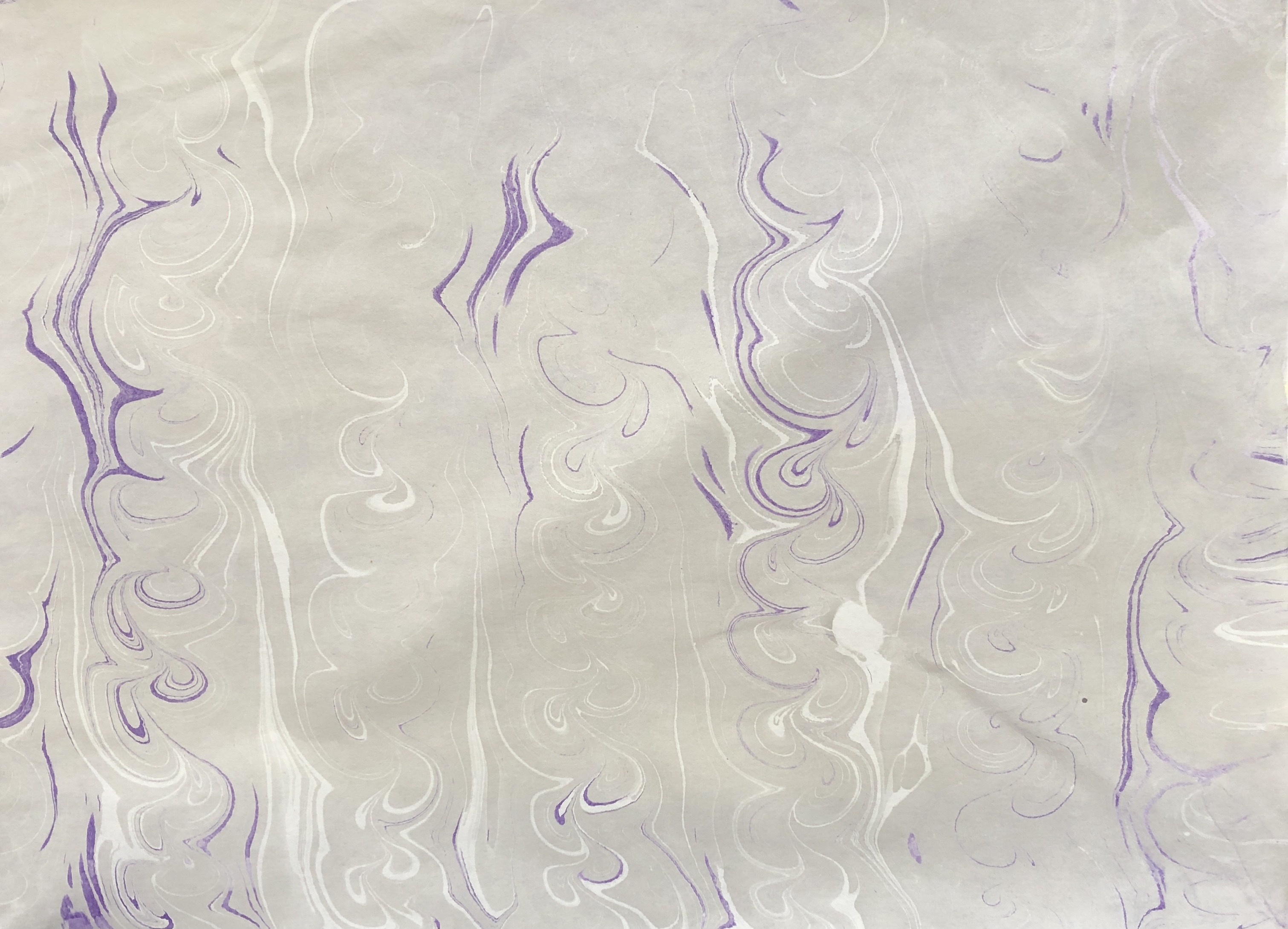
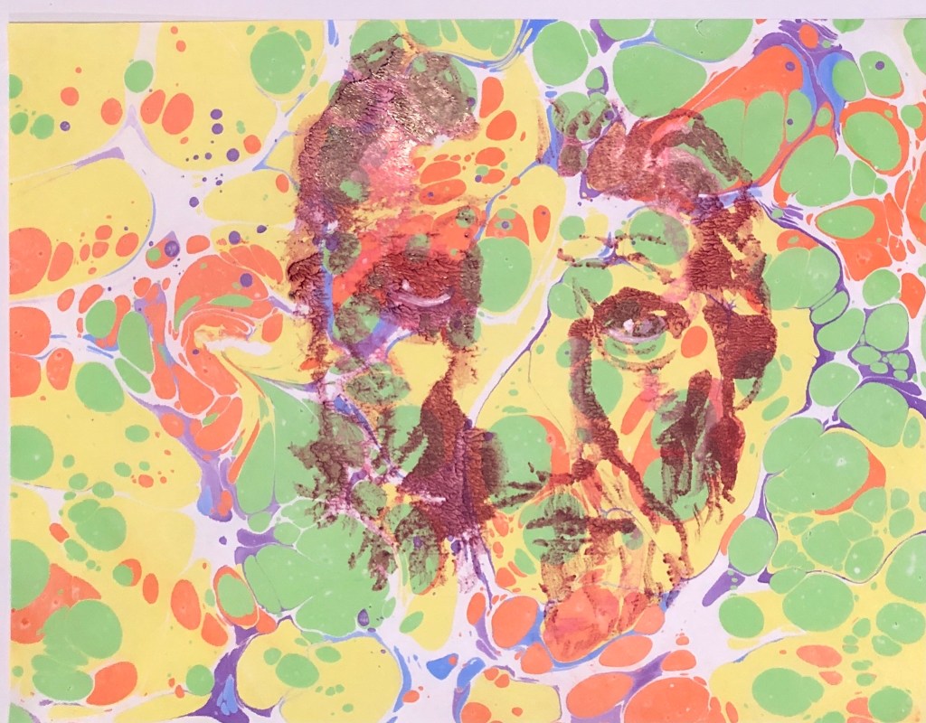
Having lit on the idea of having “floating” heads, or parts of heads, on a background which might be blank or coloured or patterned, I need to look at the right support for this. I have tried marbled paper, which does not hold the paint terribly well. I have hitherto mainly worked on plain basic sketchbook-weight cartridge paper which has taken prints well, but I don’t feel it will be robust enough to take a background and then a print on top; hence the need for an investigation into alternative supports.

SO WHAT?

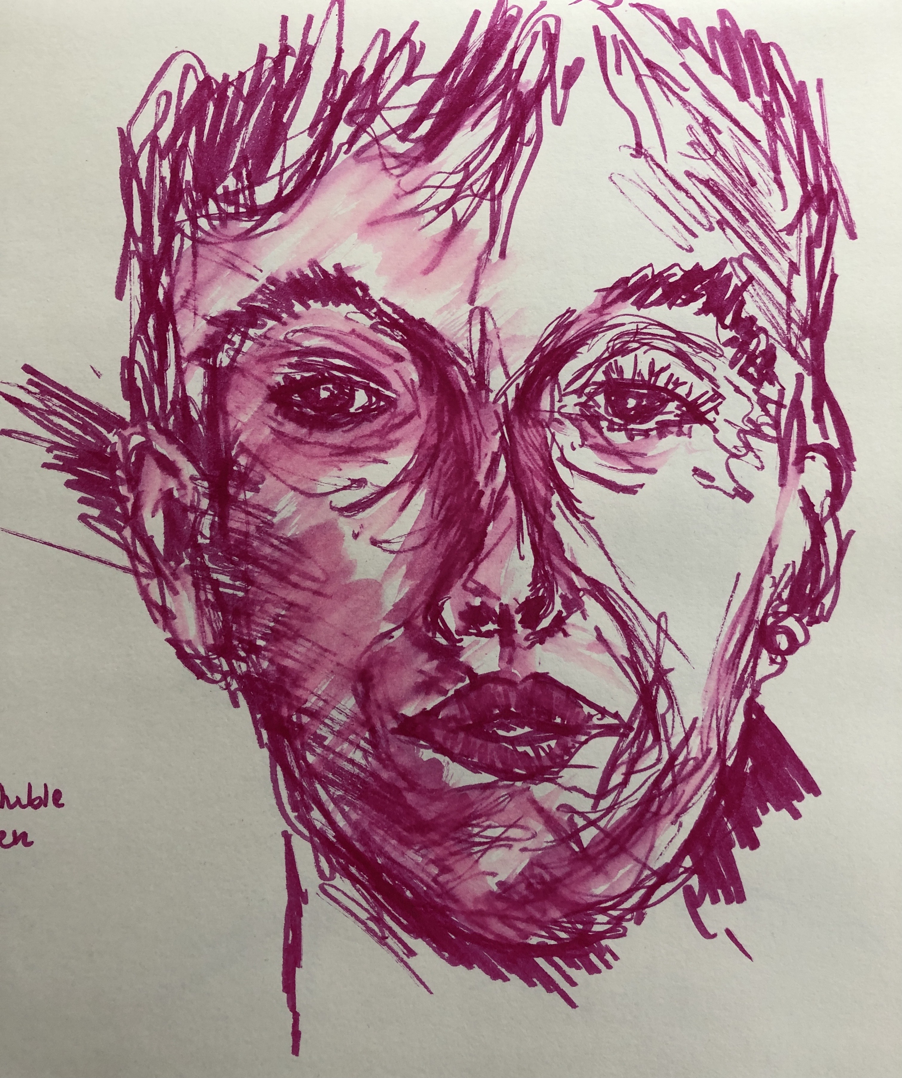
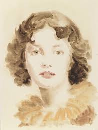
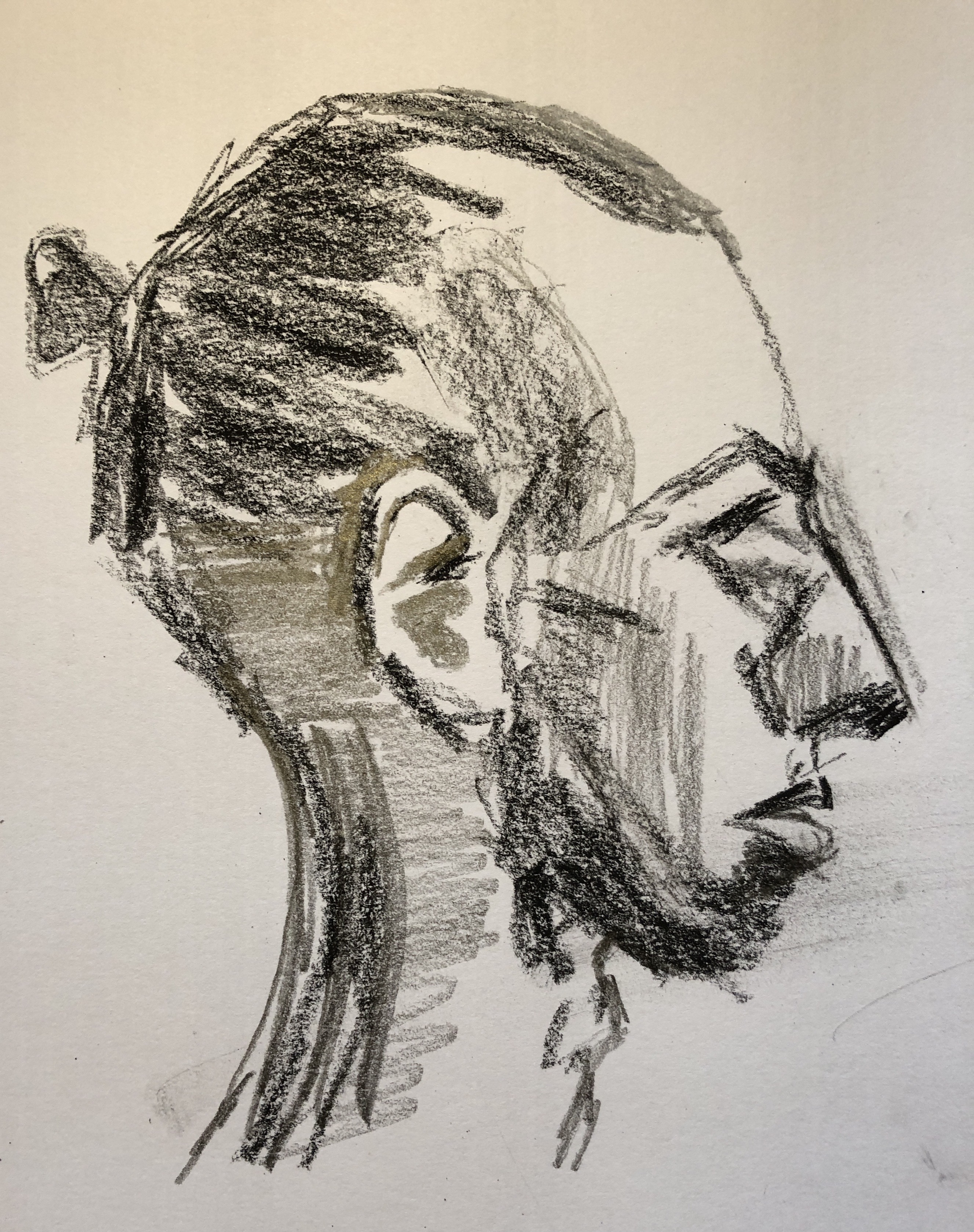
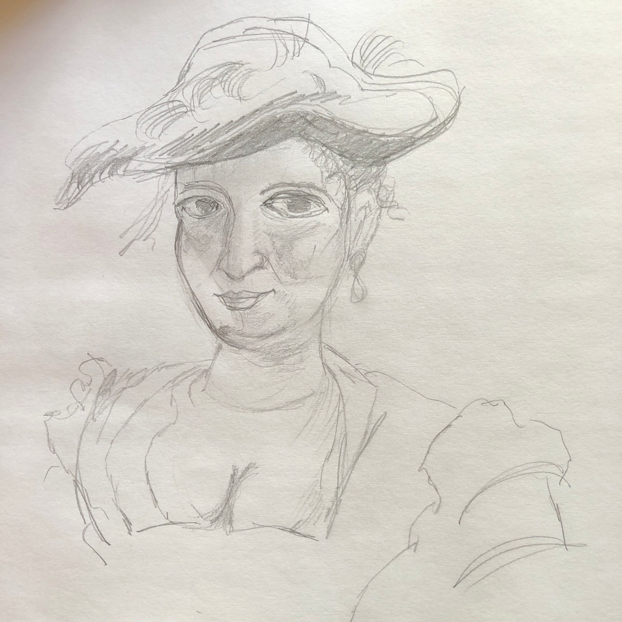
I took another felt-tip pen sketch from Drawing 1 as my “base” drawing – this again is too large for my glass printing plate so I have to select part of the image to work with in each print.

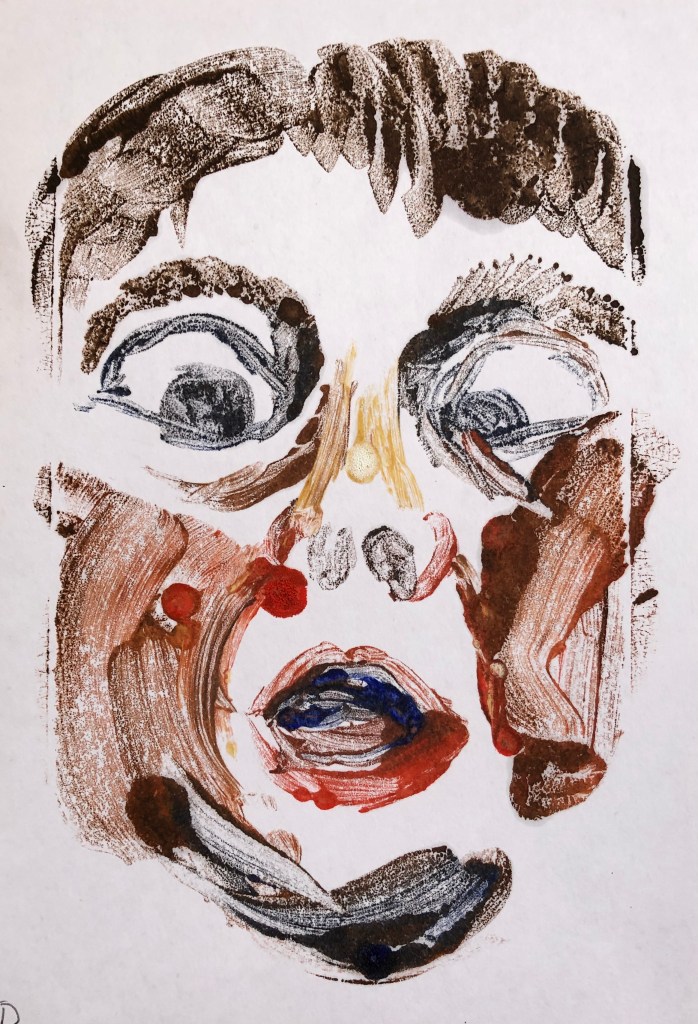
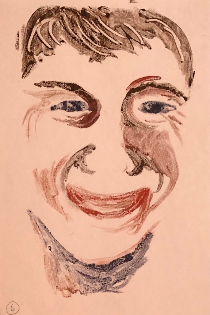
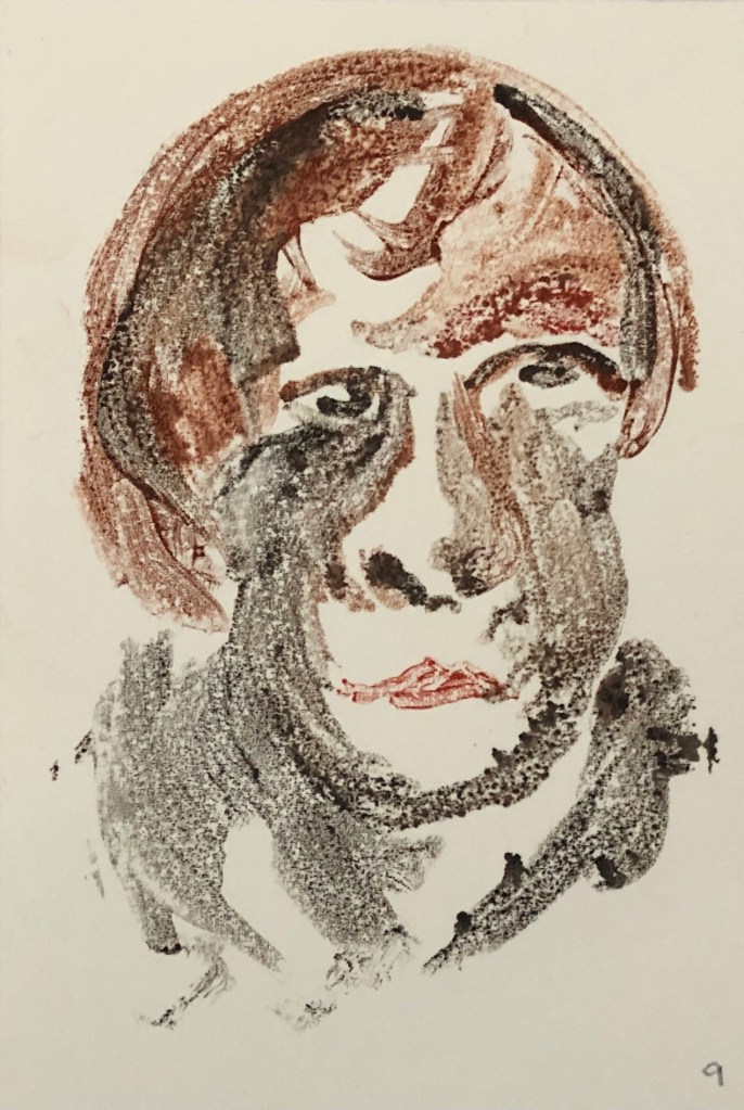
First up was some thicker cream-coloured cartridge loose paper. I laid down a thin watercolour wash, rough sky-and-cloud images, as background to test the uptake of oil paint over the watercolour. Then I mentally divided the base image into three parts and made three prints onto my test sheet. Each time I tidied the image on the glass with my cotton bud (having done all the painting onto the glass with a rigger), printed it, and then painted into the print on the paper, adding definition to eyes, sometimes nose, and mouth.

I found the oil paint sometimes skidded slightly on the places where the watercolour was thicker, but generally the print “took” well.

The trickiest part was working out where on the page to place it down on the glass, and I found that the easiest way was to work it out by looking through the glass from the back.

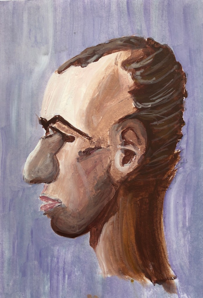
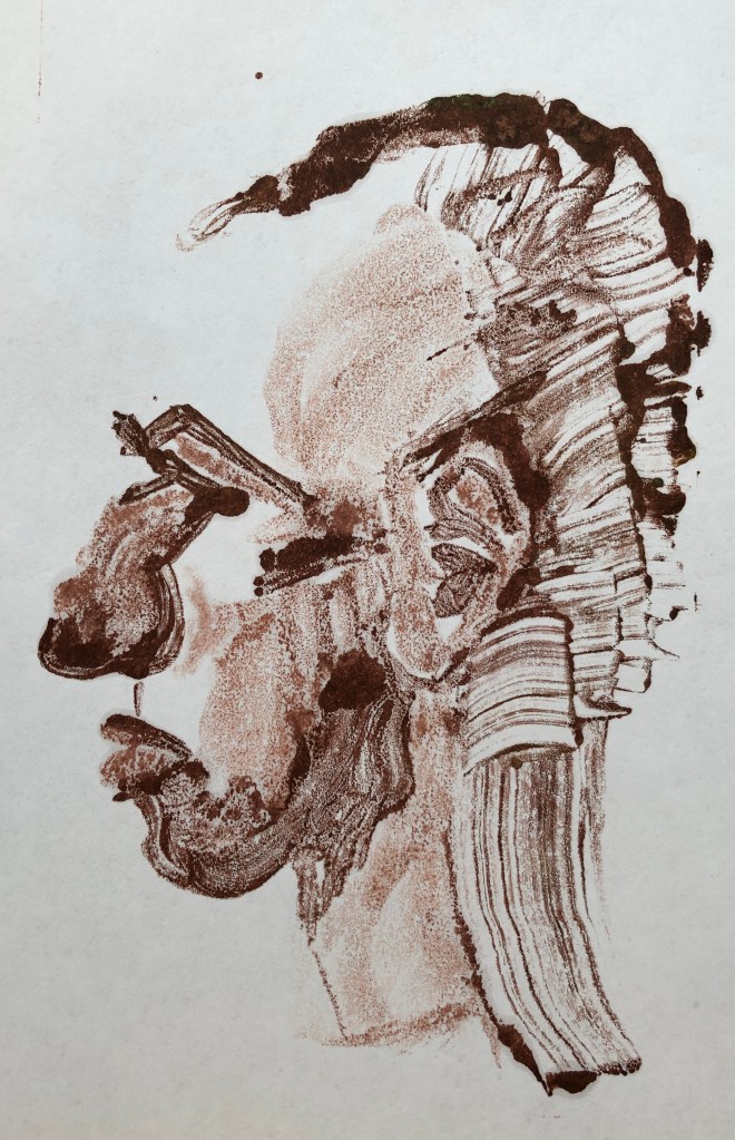
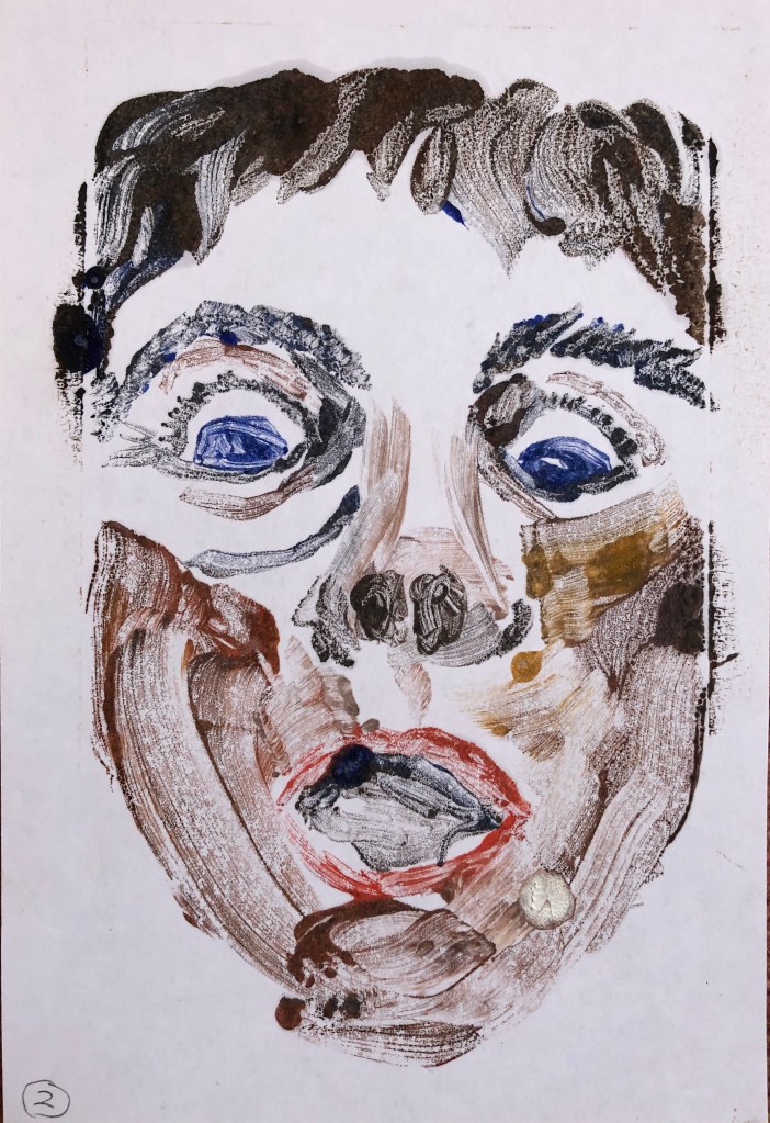
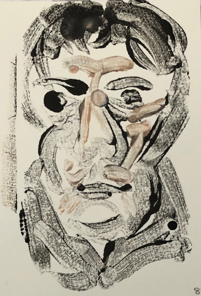
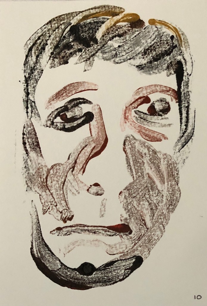
Next up was some thick paper, almost card, which I had bought in Part 2 under the guise of a vegan leather substitute (I had been thinking of trying to paint on leather).

This is a mid-tone tan colour, so this time I tried taking the blank paper as my mid-tone and just making the print with some darker brown (made by mixing crimson and emerald green) for key dark tones, and white for a few important light tones.

The paper took the print very accurately and I rather liked this dark-mid-light tone clarity. Again, I worked into the eye a little to make this a focal point.

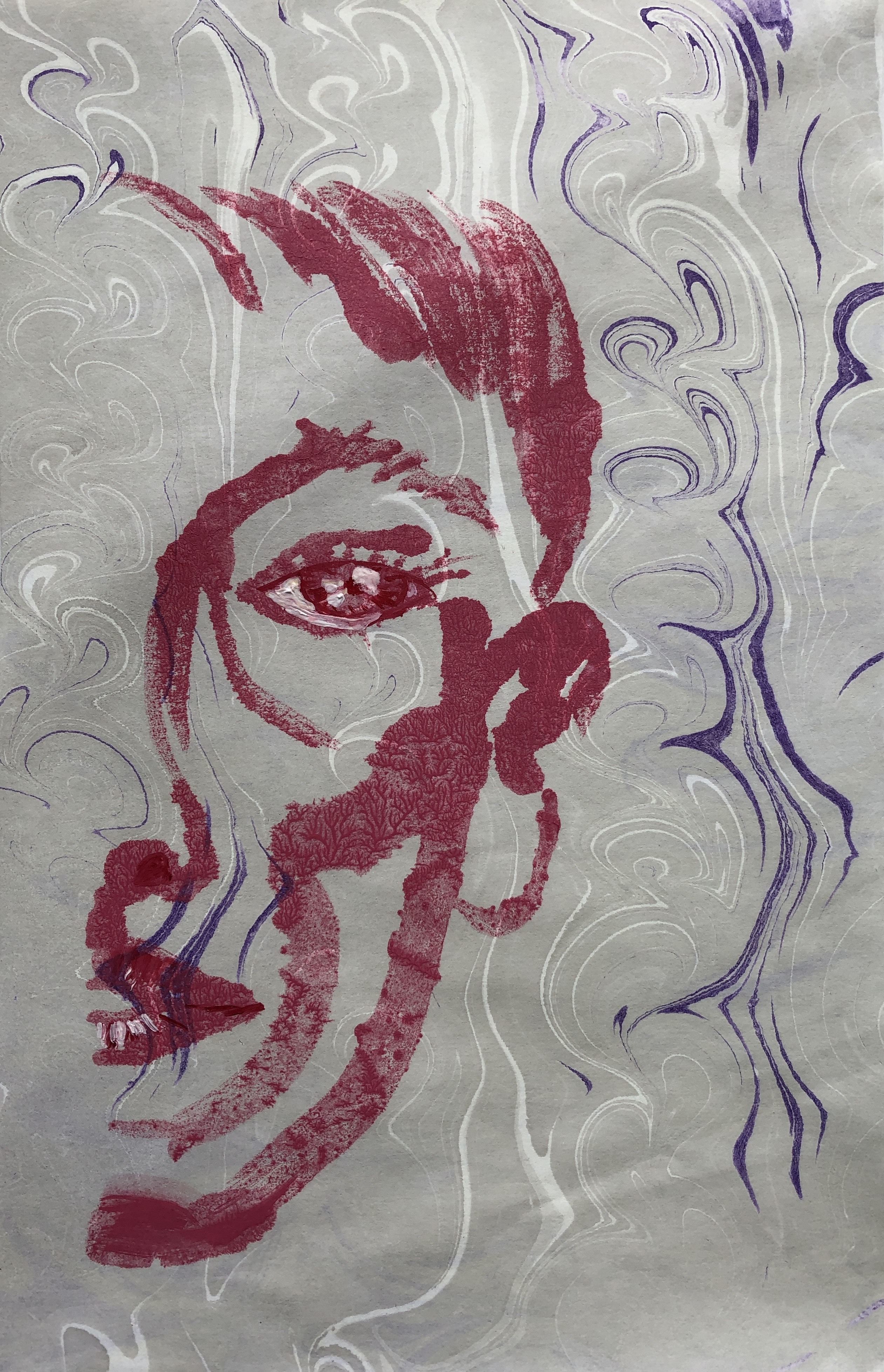
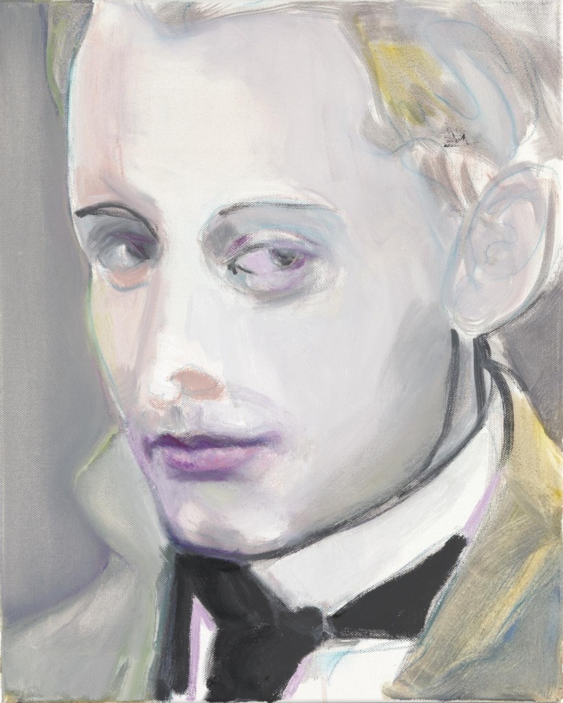
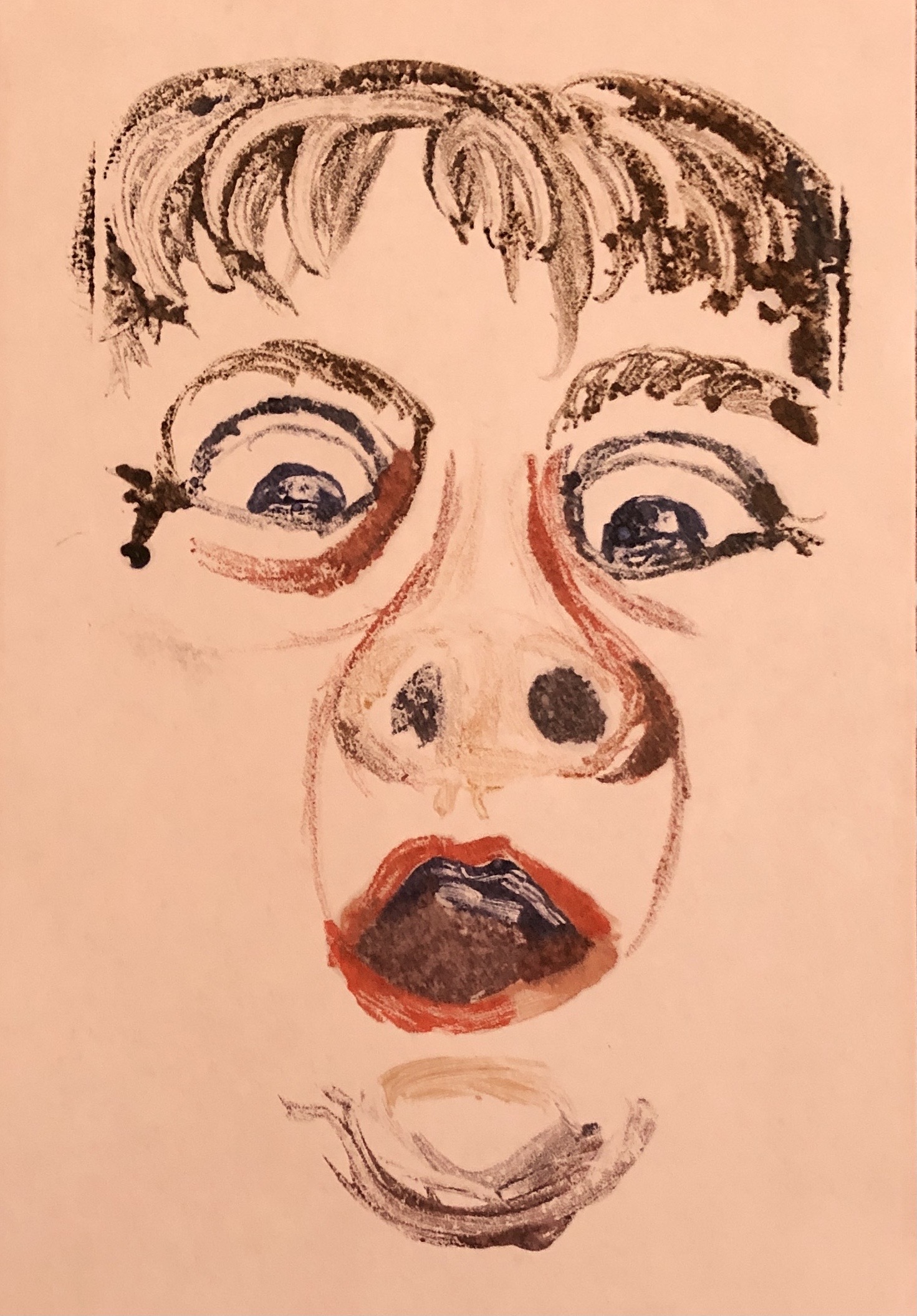
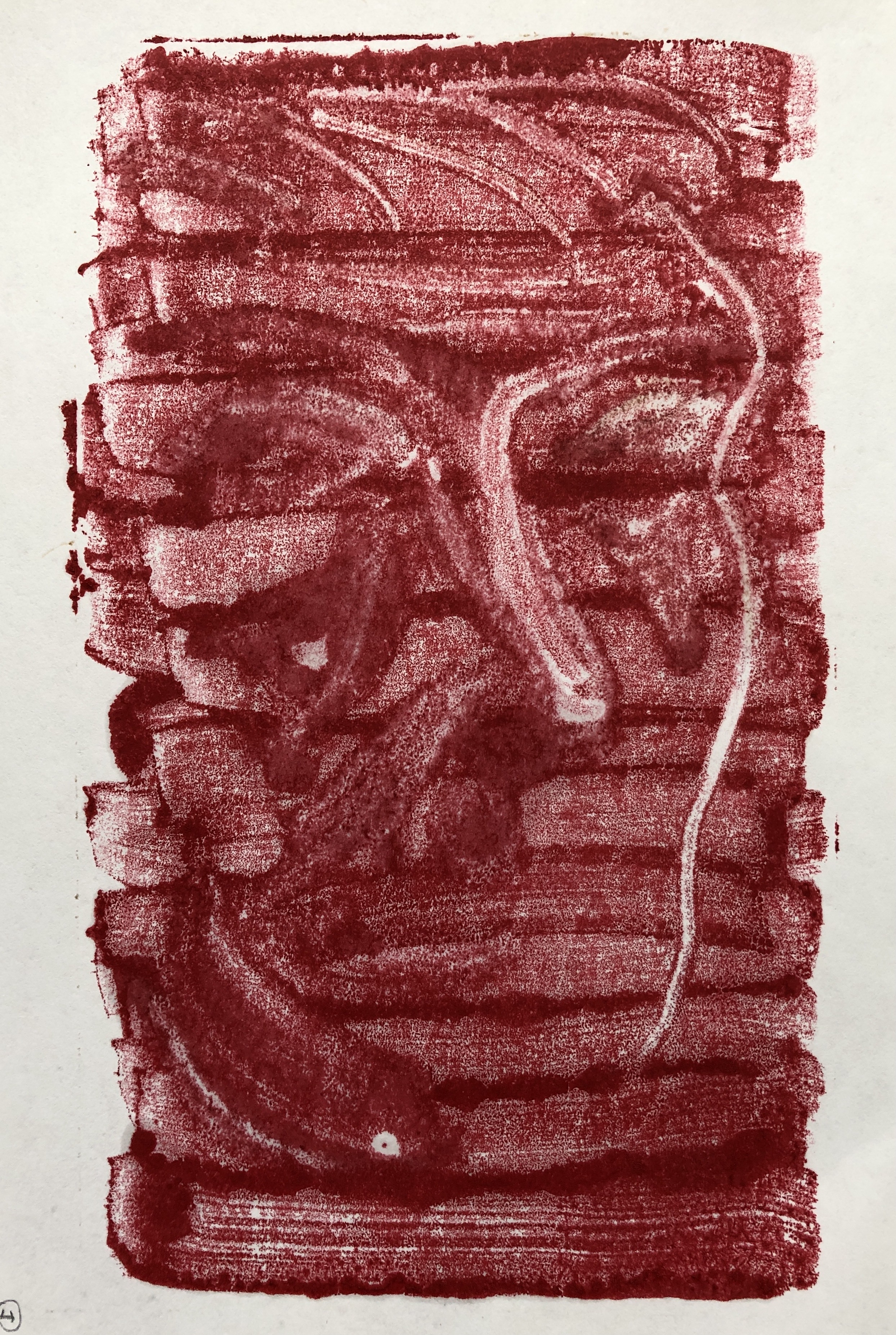
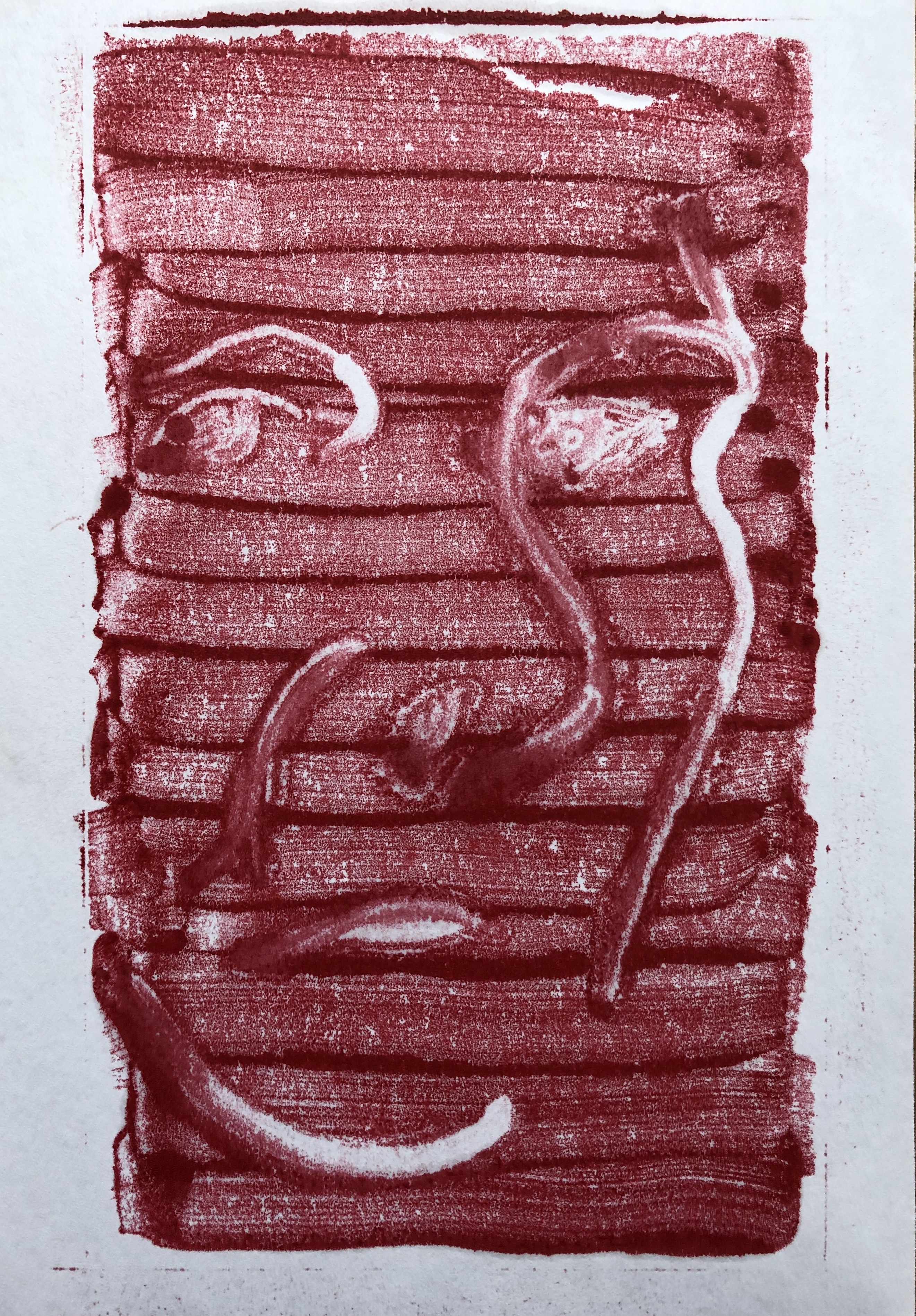
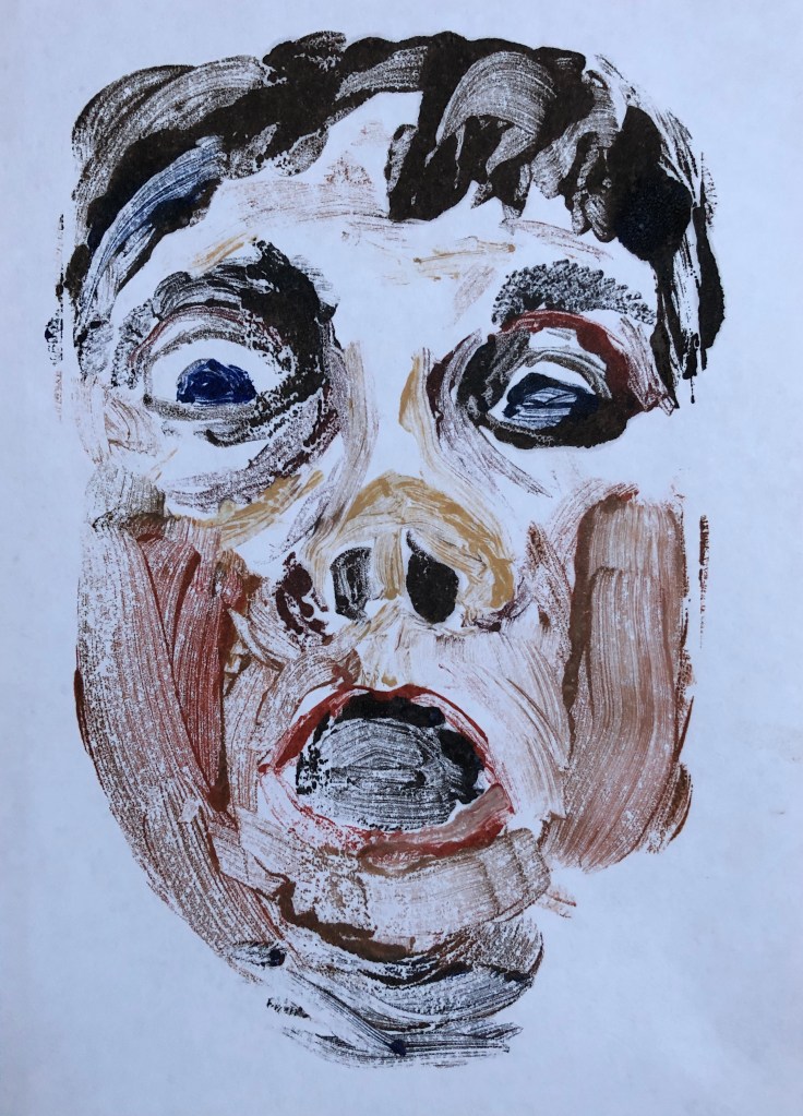
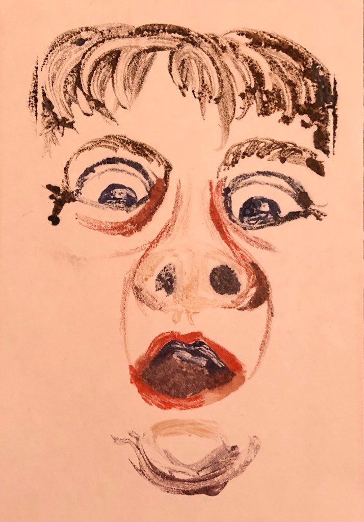
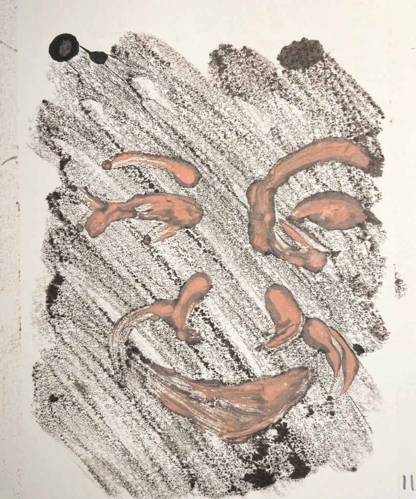
My third support to try was HP watercolour paper. I stretched an A3 sheet and then gave it a light mid-tone background, aiming for somewhere between the slightly busy sky of my first experiment and the plain brown of my second; so I gave it several coats of a dilute watercolour wash of raw sienna and a dash of warm sepia, applied with a fan brush, and enlivened with a few horizontal streaks of perylene maroon into the wet washes. I wanted to pick a “harmonious” oil colour for the print and decided on cerulean blue, with some white highlights and pink (crimson/white) shading.

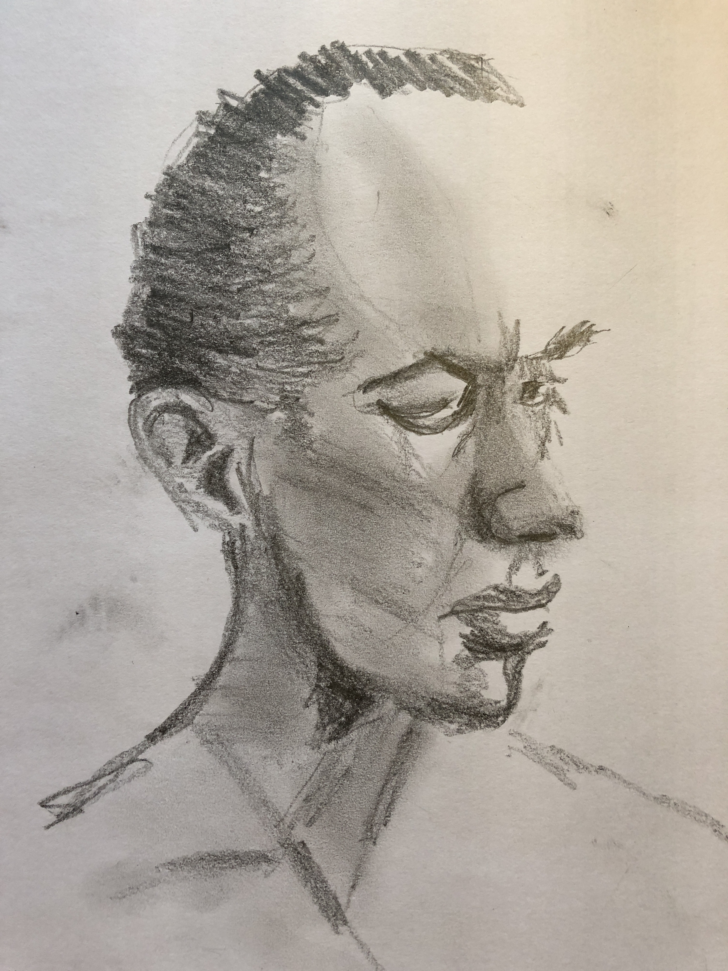
For my reference images I also chose a different couple of sketches from Drawing 1 by way of variety.

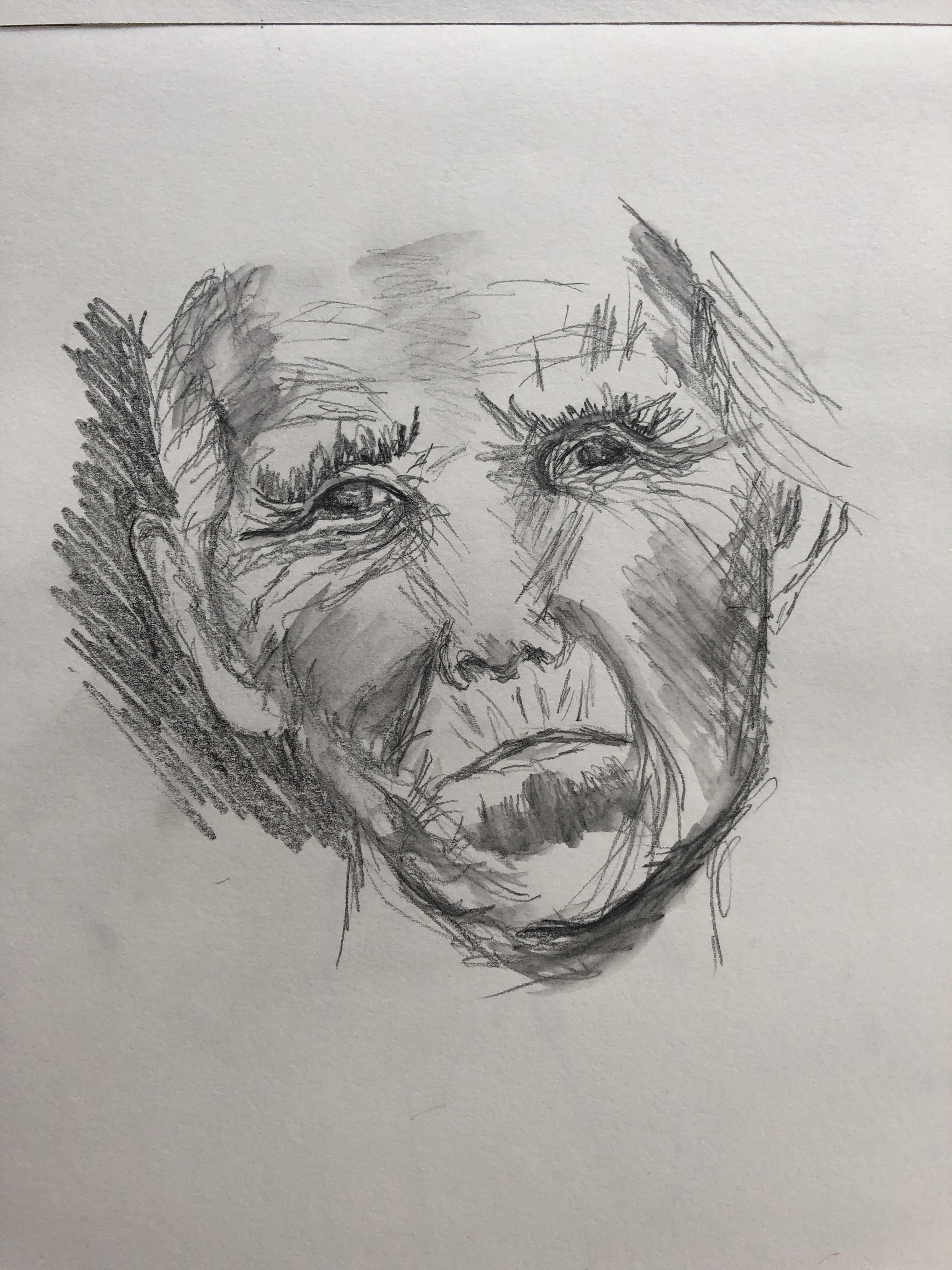
I repeated my design of split, separated halves of each face. I started with my very old lady. Each time I went through my process of painting onto the glass, tidying any wayward or over-thick marks which might splodge with my cotton bud on the glass, printing the image and then working into it on paper with a rigger to add definition to specific parts, especially the eyes.

This paper seems to soak up the paint like a sponge in an instant, particularly where I had it diluted with quite a bit of solvent. Interestingly, the blue printed much better than the bits of white – almost none of the white seemed to transfer over, and I had to add it in on the paper. The fact that the paper was already covered by a layer of watercolour wash did not seem to affect its absorbency; something which I had found to be a bit of a limiting factor on the thick cartridge paper.

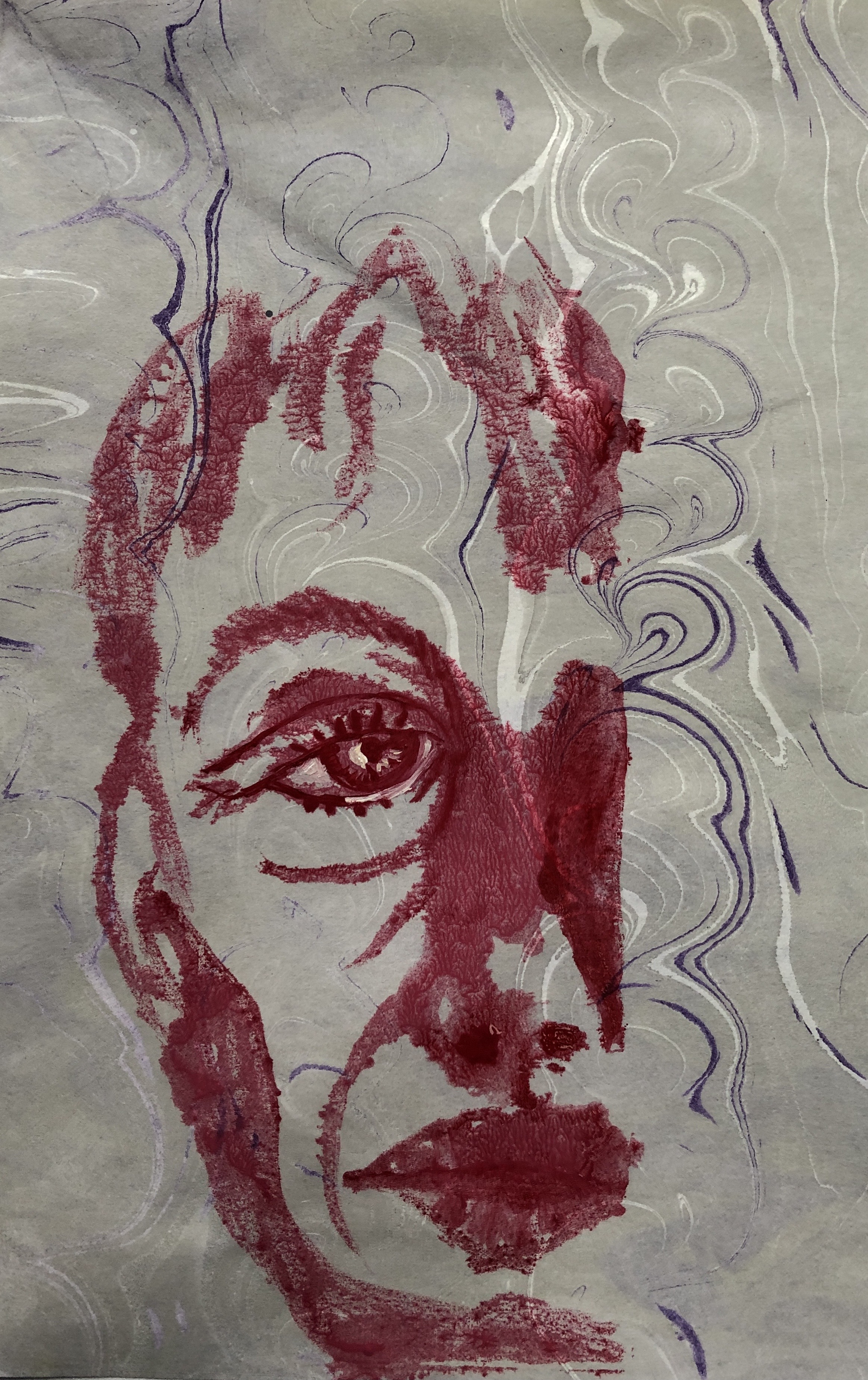
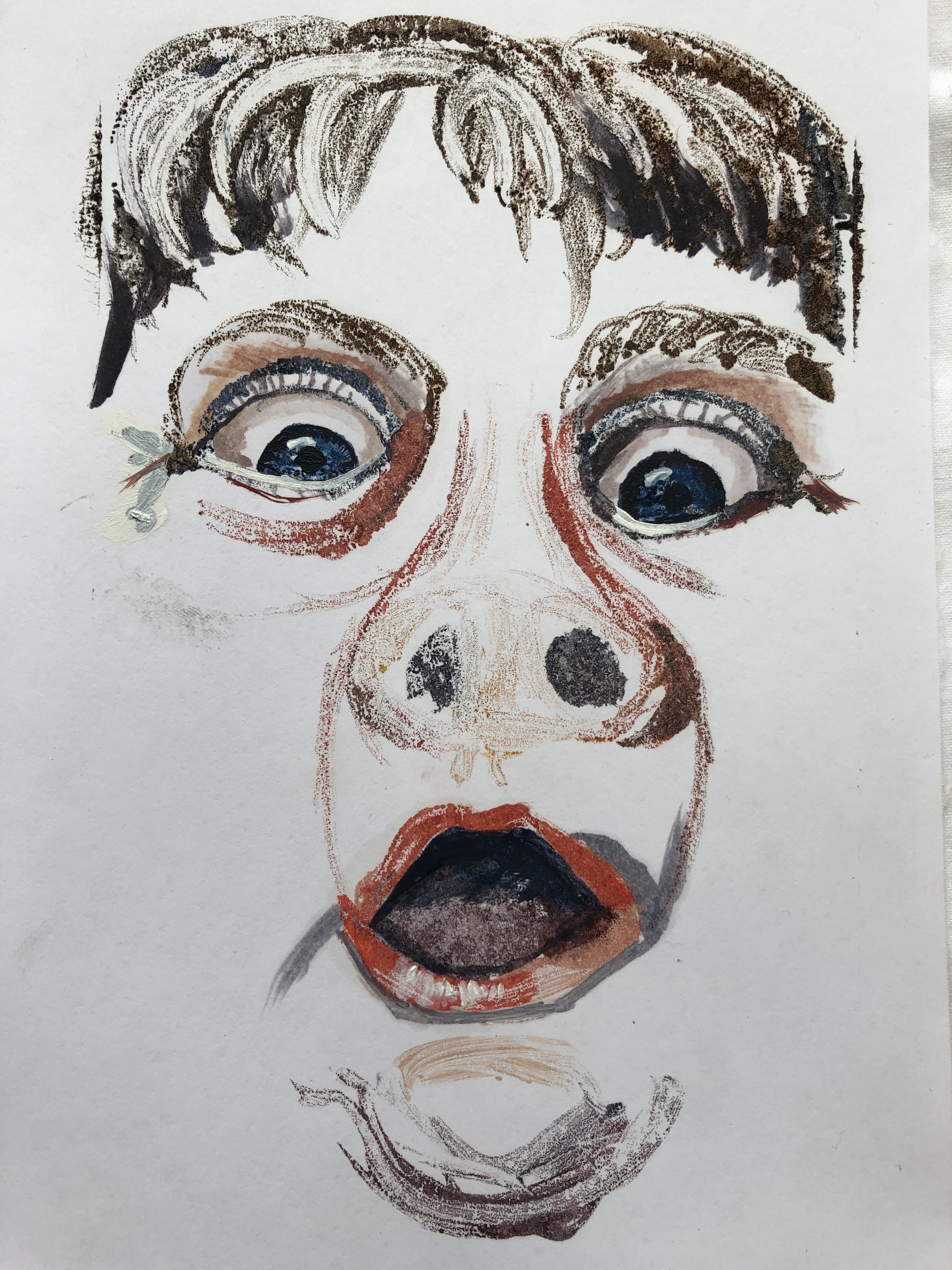
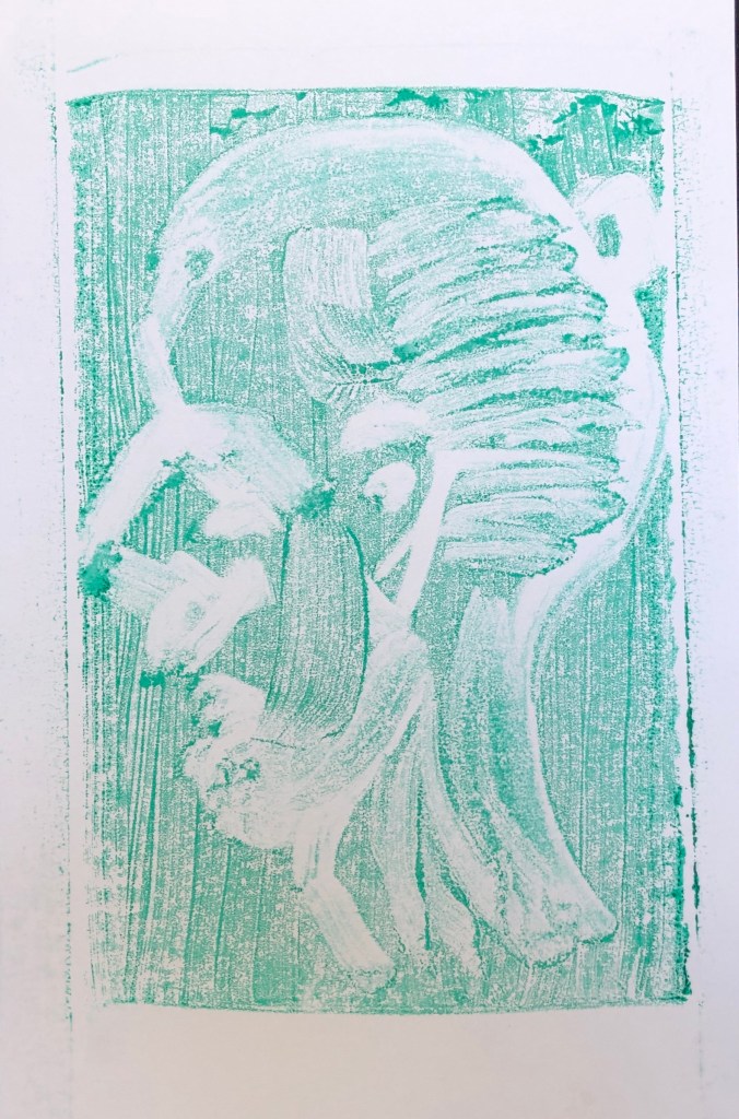
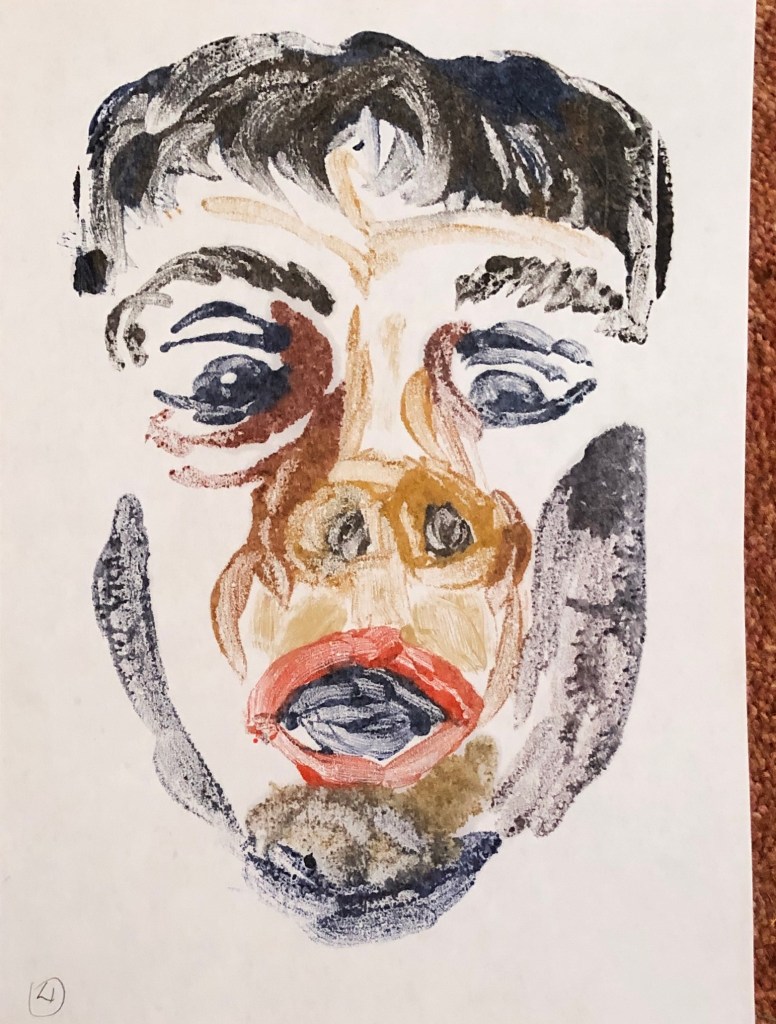
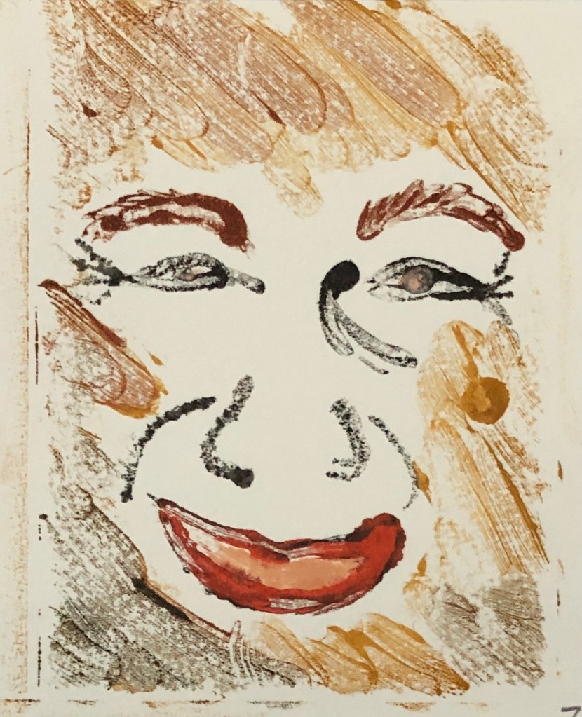
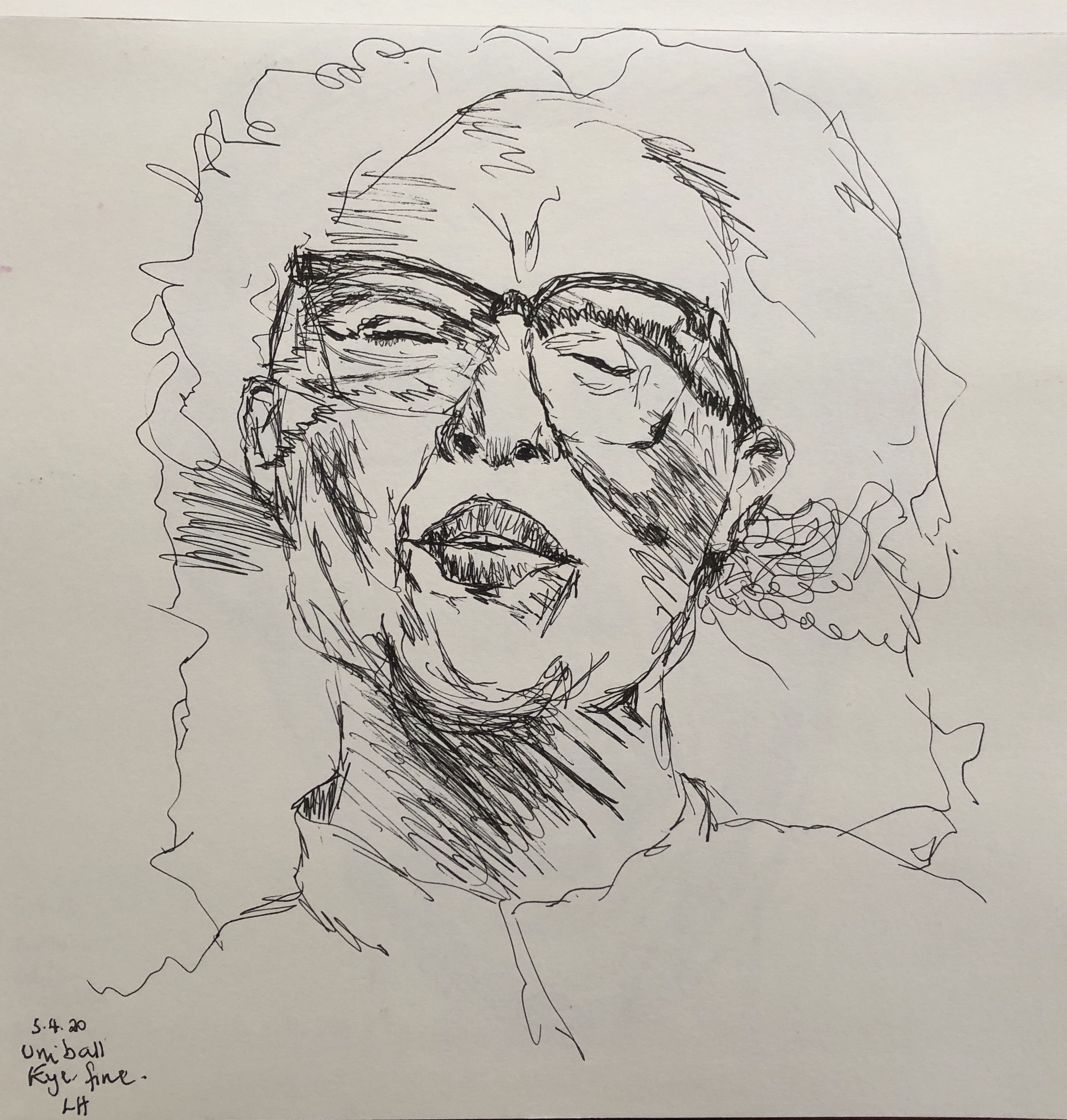
Next was my smiling lady – chose her because of the challenge of her glasses, her big hair, and her closed eyes. This time I only printed the blue, deciding to add the white direct onto the print on one side, and experimenting with a pinkish wash for shading on the other. The closed eyes made me look for other features to work into and define on the print – I tried to clarify what was glasses, shadow and nose around the eye area, and also made the structure of her collar stand out a little.

NOW WHAT?

  • I have happened on this method of working, printing only part of a face and then working into it, rather serendipitously, but I like it and want to pursue it as I move into my Assignment
  • HP watercolour paper with a watercolour wash is the way forward as a support for my prints

Painting 1 (UPM); Part 3; Research – Milton Avery

WHAT?

I became interested in Milton Avery’s monotypes as a result of finding this image on the front cover of a book from the Metropolitan Museum of Art (Milton Avery, “Myself in a Blue Beret”, 1950).

A biography on the Smithsonian American Art Museum site (www.americanart.si.edu) described his strength in life drawing and portraiture (as well as his friendship with Barnett Newman, whose work we saw at the Pallant House Gallery in Chichester last year – see separate blog post). It went on to explain how, after a heart attack which restricted his ability to work, he turned to monotypes which affected his painting style and caused him to eliminate extraneous detail from his work and he began focusing on the harmony of the overall picture. The article suggests that his poor health meant that “…the harmonious colours and perfect clam of his painting reflect his wish to eliminate everything in his art – as in his life – that was not absolutely necessary.”

SO WHAT?

I was attracted by the idea of simplicity (as in Annie Kevans work, see separate blog post) and calm, and also wanted to explore the “harmonious colour” side of Avery’s work.

I decided to try to print onto some of my “freestyle” marbling sheets (see earlier blog post) which were not too busy.

This was my marbled paper, and I decided to work from this quick sketch which I had done in felt pen back in Drawing 1. The sketch was quite big, too big for my glass plate, so I cut my marbled paper in half and printed half of the face on each piece:

I focused on main darks, major bone structures, eyes and mouth, and I painted into each eye and mouth to give them more definition. When I put them to dry, serendipitously side-by-side, it occurred to me that I could make an image of the whole face, but floatingly disjointed, one one sheet.

I therefore chose another of my more random marbled sheets, and another felt pen sketch from Drawing 1, to have a go at this.

I made the image in two halves as before, tidying them up before printing with the cotton bud on the glass, and then, once they were printed I painted into the eyes to give them more definition.

I really liked this effect, I find it makes one’s eyes move back and forth to match up parts of the face.

However, the marbling paper has had to be treated with alum as a mordant, and then has a layer of acrylic paint printed onto it to make the marbled effect, so the oil paint of the print image can slide about a bit (as seen in this close-up). It makes a sort of seaweed-y mark, which is interesting, but makes it difficult to get a clearly printed image.

NOW WHAT?

  • I really like this “floating head” idea, which fits with the ethereal quality I was attracted to in the work of Marlene Dumas and Annie Kevans, and I should like to explore it more
  • However, I am not sure that marbled paper is the right support as it does not absorb the oil paint well, so I am going to explore some other options.

Painting 1(UPM); Part 3; Exercise 4

WHAT?

I decided to build some of my research into this exercise. For each print from Ex 2 and 3 which I choose to paint into, I will try and work in the style of one of the artists whose work I have been studying.

SO WHAT?

Lord Alfred Douglas (Bosie) 2016 Marlene Dumas born 1953 Presented by an anonymous donor 2018 http://www.tate.org.uk/art/work/T14922

I began with the work of Marlene Dumas. Her paintings have a ghostly effect; one that I particularly liked was her 2016 oil painting, Lord Alfred Douglas (Bosie), which to me has caught the character of the man (that I’d formed an impression of from previous reading, at least) with some judicious use of dark and light and her pastel-y choice of colours along with black and white.

I chose to work into this print; it felt a little undefined but with clear lights and darks.

 I mixed the few colours I used with quite a bit of white to achieve that pastel-y effect, apart from the dark brown for the hair and darkest shadows. I had also made the print on ordinary cartridge paper, which has been my preferred support for these prints as far as maximum paint transference goes, so I mixed the paint with quite a bit of Zest-It solvent to add to the slightly blurry effect. 

I think I have partially succeeded in the colour scheme, but my work is not quite a shimmery and loosely defined as Marlene’s. I think I was partly led by the original model here, who appeared a rather definite and “strong” personality. I did try to go for some of the “echo-y” shadow type marks that she uses (e.g. hers round the cheek, mine round the mouth), but don’t think I have quite pulled it off.

Next I went back to Paul Wright and had another look at his 2015 monotype “Colour blind”.

I chose this monotype to work into:

and used for a bit of extra reference this photo which roughly replicates my expression when I did my Ex 1 painting from which the monotype was made.

After having a good look at Paul’s painting, noticing his variety of colours and line direction (predominantly going down, but by no means exclusively), I had a go. I mentally adopted his title to mine and just let rip wherever I thought the photo gave me even half a chance of interpreting a shadow as bright green, etc. Having had a bit of a frenzy of painting, I stepped back and looked, then tried to modify and adapt colour to make the tones a bit more believable – but when it all started to go to mud, I stopped.

Unusual but clunky and overworked is I think the best that can be said.

However, I do like the idea of being free in the interpretation of colour…something to experiment with more, maybe.

Next I turned to the work of Annie Kevans. She has the amazing ability to capture a likeness and convey a mood in just a few brushstrokes and without a background to give clues – which I envy – she must be so good at looking as many of her brushstrokes are quite wide, just perfectly placed. This example, a portrait of “Louise Elisabeth Vigee Le Brun”, found on her website, www.anniekevans.com, is taken from her body of work for her 2014 exhibition about women artists entitled The History of Art.

Looking carefully at her work, she pays particular attention to the eyes and, to a lesser extent the mouth, to catch a likeness. I chose one of my “surprised, viewed from beneath” prints from Ex 1 & 2, and decided to work just into these features, using a rigger. I noticed that Annie also does simple single light shadow lines in places around a feature to give it form (a bit like Marlene Dumas, above), so I added a couple of these around the eyes and mouth. Also, because I couldn’t resist fiddling, I worked a few dark lines into the underside of the hair; but otherwise I left the print as it was.

This was more of a success, although some of my “added shadow” lines are too dark and so lack Annie’s subtlety.

NOW WHAT?

Looking back, I found it interesting that the work of the three artists I chose to consider in this exercise all demonstrate some similar qualities:

  • Subtlety
  • Careful observation, so that key elements (eyes, mouth, proportion and bone structure) are correct and these underpin the image
  • A certain elusive “here and yet not here” quality

I think my own work currently is rather different, very solid, but I should like to work towards developing this more subtle and elusive style.

Painting 1 (UPM); Part 3; Exercise 3

WHAT?

  1. This blog post follows on from the previous post relating to Henry Tonks and Yuko Nasu, where I began making experiments into drawing into the image on the plate using cotton buds.
  2. Here I wanted to continue this by using a range of other tools for drawing into the image, as well as refining my cotton bud technique. I also want to move on from using my Ex 1 paintings as base images as I don’t feel they are giving me enough information to allow me to progress.
  3. I also looked at some monotype prints on the Bridgeman Education site, and was drawn to some by Maggie Hambling, for example her “​Norman Rosenthal”​, 1992 (monotype), Private Collection. I want to try some prints in this style.

SO WHAT?
1 & 2. Having signed up for membership to ​Raw Umber​, which makes available images and videos for life drawing, I chose to try one of the techniques suggested there. I made quick sketches of a model’s head and shoulders in two different poses using charcoal 3B pencil and a thick 2B pencil, trying to look just at shapes and tone, blocking in the biggest dark shapes first, and trying not to think of them as eyes, hair, etc. It was hard not to add lines but the artist commentating gave some helpful tips, including the fact that not every shape needs to be a “geometrical” shape (triangle, rectangle, etc) but can be completely irregular – just a splodge shape, or the “shape of a fish-hook” – she recommended giving the shapes these names to distract oneself from thinking of it as an eye, an ear, etc. I found this really helpful advice.

I worked on the first image as a base to experiment with tools. The brown colour was generated by a combination of emerald green, crimson and yellow ochre, and the paint was initially applied with a half-inch soft flat and a rigger. First, I used the cotton bud (with my dip-wipe-apply) technique to tidy and define lighter areas. Then I experimented with part of an old cut-up credit card to drag the paint of the neck to make it look more like a curved surface. This was fun but a little hard to control.

Next I tried actually applying some of the paint (hair and neck) with the card, and tidying it up with the cotton bud. Makes some interesting effects in the contrast between the card-applied versus brush-applied paint.

I particularly wanted to get his top-knot in, so in the last of this trio of prints I moved the plate over. I also added some pure crimson and yellow ochre to define the facial shadows and the ear, drawing into the ear in particular with my cotton bud and using the crimson very dilute, applied with big sweeps of the side of the rigger. Finally, the hair; I left the paint quite thick just behind the ear where it is really dark, to utilise the blobby effect you get when printing with thick paint, and I used the corner of a piece of kitchen roll dipped in solvent to try and get a more controlled moulding of the hair as it is pulled back into the topknot.

3. My Maggi Hambling-style monoprints.
First attempts revealed two things: first, it is really hard to get an even background to work into and, second, I couldn’t really see the image I was using for reference through the paint layer; so, you are basically into free mark making.


I drew a generic facial outline with a cotton bud; first attempt was before I had perfected my cotton bud rule, second was clearer, but still the background dominated the image.

I didn’t want to let this technique go quite yet – am guessing that MH used printer’s ink with a roller, neither of which I had. I tried applying the paint with a size 6 soft flat and then stroking it back and forth and up and down with the flat side of the brush, which gave a slightly less dominant striped background, and then worked into it with a cotton pad dipped in solvent to make the image. Again, some interesting directional marks possible, though detail unclear.

Finally a bit of inspiration struck, and I tried smoothing out the paint surface on the glass with the soft edge of a feather – best yet. I then tried lifting out paint using the quill end of the feather dipped in solvent to make the image and really liked the delicate quality of the outcome.

NOW WHAT?

  • I feel I have grown in confidence with my portrait drawing by focusing on tone and shape – much more practice needed, though
  • I have found some useful tools for working into the paint while it is on the glass before printing – favourites are:
    • Cotton bud in solvent
    • Small piece of card
    • Quill end of a feather

Painting 1 (UPM); Part 3; Research – Henry Tonks and Yuko Nasu

WHAT?

Read an interesting article on the Science Museum blog on 23rd June 2016 by

Stephanie Millard entitled “Exposing the Face of War”, which described how the artist Henry Tonks worked alongside an ENT surgeon called Harold Gillies in carrying out (Gillies) and documenting (Tonks) pioneering plastic surgery on WW1 soldiers who had suffered devastating facial injuries. An example of that work is shown here, taken from the Museum’s Wounded exhibition; the sketch was done in pastel, and is © The Royal College of Surgeons of England.

Several others can be seen on www.gilliesarchives.org.uk under “The Tonks Pastels”.

Having looked at these images, I went on to look at the work of Yuko Nasu, particularly on her website, www.imaginaryportrait.com; here is “Lucas” from her Imaginary Portrait series, shown at the ZiZi Gallery in London in 2007.

Her pulling of the paint to distort an image is very characteristic of her work, and she often does this around the eyes, the hair and the face edges.

SO WHAT?

Leading up to Exercise 3, I chose one of the 1-minute portraits from Ex 1 and, using some new Jackson’s oil paints which arrived over Christmas, played around with images painted on the glass.

For the first attempt I was just getting used to the paint and the way it diluted with the Zest-It, trying to gauge how much to put in, etc, so I just tried removing paint with a cotton bud. Limited success – but I learned that, once some paint has been removed with the cotton bud, unless you do something about it, it will go straight back down on the glass wherever you next touch the cotton bud. Also, dragging paint with the bud works up to a point, but then some of the dragged paint gets deposited where you might not want it – so direction of drag is important.

For my second attempt, to try to deal with the problems encountered above, I tried dipping the cotton bud in solvent. Much learning went on here about dropping too much solvent onto the glass as it makes the paint go in lots of directions you don’t necessarily want (see e.g. the mouth).

For my third attempt I wanted to try some directional wiping with a bit of kitchen roll dipped in a little bit of solvent, as I understand Yuko Nasu does to obtain her distorted images.  This went OK inasmuch as I did manage to pull the paint around directionally – however, my dragging was a little wild and the actual shape of the face is quite distorted; I suppose I should have seen this and wiped that part off the plate before printing, but it didn’t look quite so weird on the plate as it did on the print.

NOW WHAT?

Lots of learning here:

  • Cotton bud technique: dip the bud in solvent – wipe excess solvent/paint off – apply to plate. Repeat!
  • Wiping with a bit of rag/kitchen roll:
    • If it has solvent on, be aware that it can take quite a bit of paint off the plate and leave your image faint in places
    • It”s fun, but you can’t quite see what you’re doing in the same way as you can removing paint with a bud or brush, so be prepared to adjust
  • I’m realising that the reversal of the image is making the outcome rather unpredictable for me; I hadn’t realised that reversing an image would make it “look” quite so different. Something to get used to with practice, I suppose. Might try looking at the plate from the back before printing to see if this helps me decide what needs adjusting.

Painting 1 (UPM); Part 3; Marbling!

WHAT?

For Christmas I was given a marbling kit by my publisher daughter. It is a serious kit and needed the study of the entire instruction manual and several YouTube videos, followed by a preparation day constructing the brushes, making the size and coating the paper with alum as a mordant before I could even start in with some paint!

I’m recording it here because the instructor describes each outcome as “a unique contact print” – sounds very like a monoprint to me.

SO WHAT?

The paint supplied was acrylic-based, and I started by working through the instructions to find out the types of outcomes possible – there are several classic named designs. Here are a few basic ones:

I went on to try more classic designs and also played about experimenting with some free marks, swirls and squiggles. The designs always look so faint on the surface of the size as very little paint is needed, and it’s always a moment of wonder to peel back the paper and see what’s revealed!

NOW WHAT?

  • Need to generate a bit more of that sense of excitement in peeling back the paper with my oil monotypes – so far have been a bit underwhelmed with my outcomes
  • Am going to try to use some of my free, less bright and busy marbling outcomes to print my oil monotypes onto so they form backgrounds – a monoprint on a monoprint, as it were

Painting 1 (UPM); Part 3; Exercise 2

WHAT?

Using a selection of the ink drawings made in Exercise 1, oil paint with Zest-It solvent and a glass plate, I had a go at making some monoprint portraits. I had already had a go at making a few monoprints as part of the workshops led by Hayley Lock (see separate blog post), although these were slightly abstract plant designs. 

SO WHAT?

I began printing onto cartridge paper and experimenting with different brushes, marks and thicknesses of paint. The first few were of the same image, before I moved on to another.

All the backgrounds were white, differences here being because of my working in a dark studio lit only by a skylight and a daylight lamp. I found I liked a combination of the size 2 soft filbert with a rigger best.

As part of my research I found a very useful article on the Jackson’s blog: “PAUL WRIGHT ON MONOTYPES”:

18th February 2016 by Lisa Takahashi 

I really liked the energy of his pieces, for example:

Paul Wright: ‘Dealbreaker’ (3rd version) Monotype 40cm x 30cm 2015

and…..

Paul Wright: ‘Colour blind’ Monotype 40cm x 30cm 2015

His style of strong gestural marks is I think the way my work might want to go; he comments in the blog “Monotypes allow me to work fluidly and quickly, which very much suits my temperament”, which strikes a chord with me.

Having looked at this work I continued working on some of my other Ex. 1 drawings, experimenting with HP watercolour paper and continuing to play with paint thickness.

NOW WHAT?

I can’t say that I’ve worked my way to 5 images I am satisfied with, as I don’t feel satisfied with any of them; but I wanted to move on to working into the images so am going on to Exercise 3.

So far I’ve learned that:

  • Thinner paint shows up the brushstrokes well but too thin makes the image vague and unclear
  • Thick paint goes blobby, which can have a place, but generally looks like a mistake
  • Tone is going to be really key to using this process effectively – I have to get better at seeing a face as areas of tone rather than eyes, nose etc……

Painting 1 (UPM); Part 3; Exercise 1

WHAT?

The brief was to paint 20 self-portraits, using ink, not more than 1 minute per painting.

SO WHAT?

I worked in Indian ink using a long-handled soft round brush (size 4), fitting two paintings onto a sheet of cartridge paper (so each being A5 – roughly the size of my glass plate for monoprinting). In the first two paintings the timer didn’t work so they are slightly over a minute; after that I stayed strictly to time. I varied the lighting (both level and direction), the position of the mirror, my facial expressions, and the painting hand, and therefore accuracy (depending on which hand was holding the mirror).

I found the exercise very challenging and tied myself in knots rather – by the time I’d got in position, set the timer, looked, got my brush loaded and made a mark I was already halfway through my time! I ended up trying to pick out one or two features, mainly the darkest ones, and tried to get those down.

NOW WHAT?

To be honest, my main takeaway from this exercise would be to organise myself better physically for a process so time-dependent and containing so many elements which needed to be in the right place to work effectively and never were – there was just too much arm-crossing, reaching, panicking, losing my place, and the long handled brush was a serious mistake, it was in the way of everything.

Painting 1 (UPM); Experimenting with acrylics and retarder

WHAT?

I bought a set of Liquitex muted colours in the Jackson’s sale; also, separately, had bought a bottle of acrylic retarder (Golden) after watching a video on the difference between solvent, retarder, flow enhancer and surfactant – and I wanted to experiment with both of them.

SO WHAT?

I played around on a sheet of A3 mixed media paper using brushes (mainly a soft half-inch flat) and a round-ended palette knife. I only used a small amount of paint each time and added a blob of the retarder which I mixed into the paint on the palette using a cocktail stick.

I had started amassing material for a forthcoming workshop by Hayley Lock (OCA tutor) on H Bosch’s “Garden of Earthly Delights”, and had found a book on plants ordered by colour (Dr R Bayton and R Sneesby, 2019, RHS Colour Companion. Octopus Publishing Group Ltd, London) which I used as a prompt, without copying any images in detail – some were stylised and, by the end, some were invented.

NOW WHAT?

  • Loved the colours; it said on the box that the idea was to mix them with white to make pastel colours, but I’m not a great lover of pastel colours so I wanted to use them “raw”. Favourites were turquoise (which I love anyway) and the grey, which has a strong mauve element to it. To be used again!
  • Not sure how much retarding the retarder did, I used the paint pretty quickly as I’d only poured small amounts; certainly any scraps left unused on the palette after, say, 10 min were fairly dry. More experimenting needed.

Painting 1 (UPM); Review of Part Two

General comments about curation and collections:

As well as working through the notes and painting a wide variety of collections, my understanding of this aspect of this Part has been greatly extended by:

  • Zoom workshop with Cheryl Huntbach (see blog post) which covered the generation of a mass of work by Jo Whittle from a particular stimulus, and then the curation of this mass of work into a coherent exhibition by David Orme; from this I shared the excitement of creation from an explosion of ideas based upon a site, and also thought, probably for the first time, of the skill of the curator as the “explainer” or interpreter of that work to the viewer.
  • Zoom workshops with Bryan Eccleshall (see blog post) in which I both took a part in the act of curation, and also observed how others, faced with a disparate selection of artworks, had tackled the question of how to present them to the viewer.
  • Zoom workshop with Sarah Jaffrey (see blog post), where we had the discussion about how what each person (with their differing experience, knowledge and ideas) brings to a work/group of works will be enough to make it unique.

Review against assessment criteria:

  • Demonstration of visual skills: Materials, techniques, observational skills, visual awareness, design and compositional skills.

My assignment in Part 1 was founded upon continuous line drawing; I have done less in this Part as I have been so taken up in exploring different media, and have often painted a rough “underdrawing” before working into it, or else been bold and just gone straight in. My main drawing work has been 

  • in response to the feedback from assignment 1
  • Life drawing (sadly now suspended in lockdown)
  • In response to the drawing workshop from Sarah Jaffrey, where I am continuing with continuous line drawing (not blind) in response to existing works and then drawing into them to add tone – e.g. 

I have been selective so far in the collections I have painted, often cropping a large collection or choosing small bits within it to make something which was:

  • Coherent within itself
  • Interesting colour-wise, e.g. harmonious as in the poppy seed heads, or vibrant as in the bowls, which were basically the primary colours, or made use of complementary colours, as in the clarinet parts
  • Manageable

I have worked on a wide range of supports (paper, various packaging materials, board, cork, metal, leather, china and toilet paper being some that spring to mind), and also used a variety of painting media (ink – Indian, Chinese and acrylic, watercolour, tea, acrylics, varnish, egg tempera, oils and enamels). One learns more with every painting, and I am beginning to feel able to make more informed choices about my materials depending on the task in hand – but much more experimentation and refining of technique is needed.

  • Quality of outcome: Content, application of knowledge, presentation of work in a coherent manner, discernment, conceptualisation of thoughts, communication of ideas.

It has been interesting to look back at the collections I have chosen to paint; some I photographed but had no interest in painting, e.g. the socks (clothes don’t “grab” me at all), and other things like the books I thought would be one of my first choices (I am an obsessive bookworm) – and yet I haven’t picked them. So my choices haven’t just been about me and the portrayal of my personality through my collections (see initial research blog post).

I seem to have chosen a mix of:

  • Collections which I knew I would find tricky to paint – e.g. the clarinet parts (I chose a stick to paint them with as I knew this would make me be loose and gestural and not get bogged down in detail)
  • Collections which “matched” their support or materials, e.g. the eggs on the eggbox in egg tempera, the cutlery on the china plate in enamel, the tubes of paint in oils – i.e. they told some sort of story
  • Collections which I found visually pleasing, either because of colour or form e.g. the china bowls and the pots and kettle; the feathers; the bottles of ink, painted  in enamels and in oils, both of which have brought out their inherent shine.


Demonstration of creativity: Imagination, experimentation, invention, development of a personal voice.

I haven’t kept a specific sketchbook for this Part – most of the work has been hands-on and experimental (for me!), and so my thoughts have been amassed in my learning log.

Part 1 felt like a unified whole to me; Part 2 has felt more disparate as there were so many things to get into – unusual materials was one, collections another, curation and all the online workshop stuff yet another, and then trying to follow through on the feedback from assignment 1… So I feel as if I’ve learned bits about a million different things, all of which I’d like to take forward somehow if only there were more of me/an infinite amount of time (bit like the big bang theory…the actual theory, not the series).

I’ve pulled out my learning/action points (my “Now What?s”) right through the Part, and tried to draw some threads together in preparation for my assignment (see separate blog post); I’ll reflect on them and try to bring out some of the key bits of learning as at least a jumping off point for a conversation with my tutor.

Context: Reflection, research, critical thinking (learning logs and essay).

I have looked at a range of artists, both contemporary and historic. I have had a go at working in the style of several (see research blog post), and have picked some, e.g  Raqib Shaw, to study in more detail, researching his technique and having a go at painting using his methods. 

I have found that my painting style varies between the meticulous (like Shaw) and the  wild and expressive (like Hambling – and Auerbach to a lesser extent). My tutor recommended that I look, among other artists, at Laura Lancaster, which I have; she uses big strokes (painting much larger than I can anyway, as I have a very small attic studio), and says that she is able to work so loosely because of the amount of preparatory drawing she has done which has really familiarised her with her subject.  I think there’s a lesson for me here – I have an issue with tone and colour, and I think much more preparatory drawing would enable me to continue with my loose style (which I enjoy) without getting the tone wrong (which frustrates me).