Of all the “black and white” artists I looked at, I chose to study Alli Sharma in more detail because of her subject matter and her expressive gestural brushstrokes.
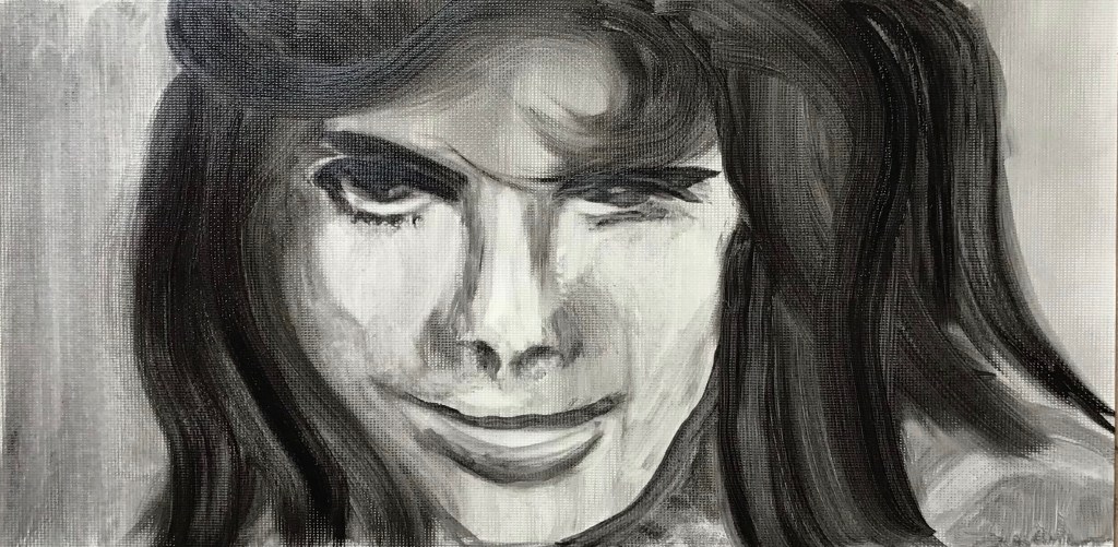
IMAGE 1
WHAT?
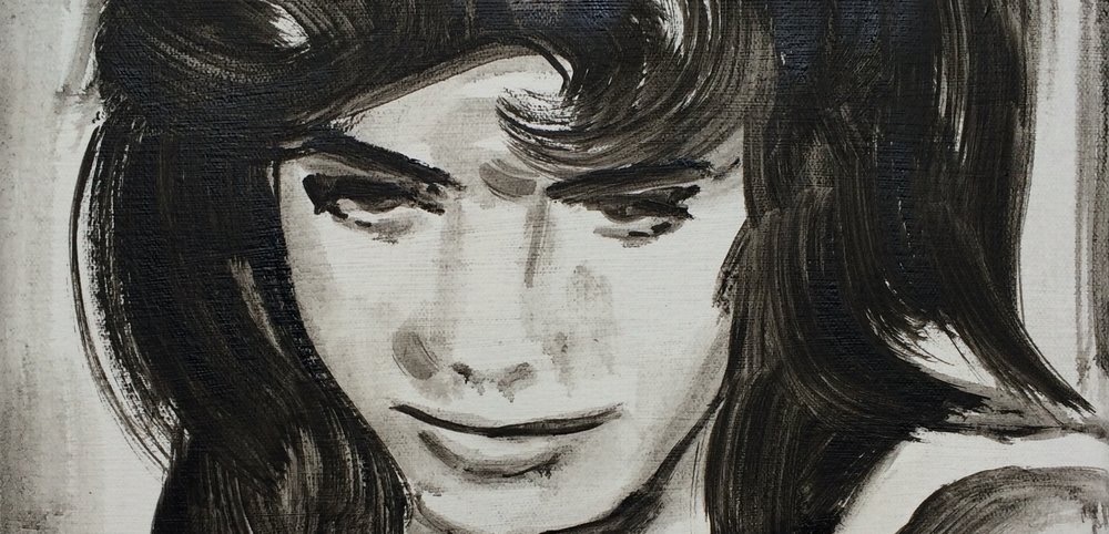
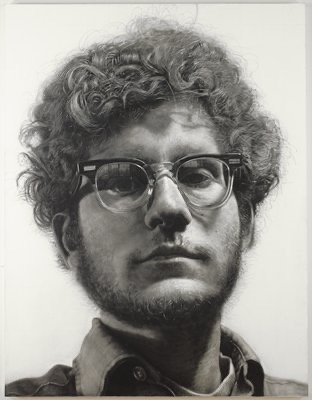
“Billie Whitelaw, Charlie Bubbles (1967)”
2012
Oil on canvas
50 x 50 cm
This image is a detail on the front page of Alli’s website, www.allisharma.com. I felt drawn to it because of the pensive expression of the subject – neither happy nor sad, you wonder what she’s thinking about. It’s interesting that she has originally painted it in square format, but has chosen this section to front her website – this cropping is effective as you feel it cuts to the chase. Your eyes are drawn straight to hers, depicted dramatically with heavy dark strokes. I wasn’t sure whether she had left the white of the face as white canvas or had painted them in over a background thin wash – I suspect the former. I read in her Artist Statement on www.axisweb.org that one of the themes on which she chose to paint was”…the women of 1950s social realist cinema…” – I feel she has succeeded here in her mission to “…transform the overlooked into substantial painterly icons.”
SO WHAT?
Painting in oil in black and white is new to me, so I tried to copy this image onto oil paper in the same proportions as the original. I had found some water-mixable linseed oil so tried using this to thin the paint for light washes, rather than water; the feel was better as the paint mixed with the oil more readily, and I found then that if I had made marks in the wrong place I could lift them using a brush slightly damped with water. I tried painting with my non-dominant hand, standing well back from the easel, to improve the steadiness of my mark-marking – just needed to switch to the right hand for the details under the eyes; I used a large hog filbert to encourage me not to fiddle, but did cheat with a soft size 4 flat for the under-eye bit and the light in the eyes. I most enjoyed the big sweeps of undiluted black to create the hair.
NOW WHAT?
- I prefer using the linseed oil to water as a thinner, although it does seem to increase the drying time.
- I made the lights of the face by my “damp brush lifting” technique, which was messy – I should have left these areas white when putting down my initial wash.
- My uneven eyebrows have given her a calculating rather than thoughtful expression…..even though it’s loose and gestural, details matter….but…
- Big black swirls of paint are huge fun!
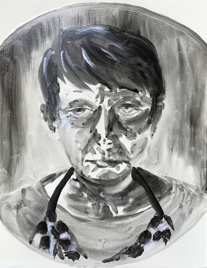
IMAGE 2
WHAT?

“Ingrid 3 (A Kind of Loving)”
2014
Oil on canvas
50 x 40 cm
Seen on http://www.allisharma.com
Not sure how this makes me feel – knowing that it’s taken from an old film again, I suppose it makes me feel interested to know what the subject is doing – she seems to be looking down at some task. The head and shoulders pretty well fill the space, with the same gestural marks and suggested loose background. The dabs depicting the hair and the pattern on the blouse are directional; the controlled detail is again in the eyes, nose, mouth and the edges of the collar.
SO WHAT?
I was quite taken with the hair and the patterned blouse so wanted to have a go – decided this time to try a self-portrait using a round shaving mirror balanced on the top of my easel. I used oils on oil paper, diluting again with linseed oil and just occasionally water, and relied mainly again on my hog filbert to try to stop me fiddling. I chose to truncate the composition to focus on the head and shoulders, as in the painting by Alli above.This time, instead of putting a light background over the whole thing, I put a very light outline on the page to indicate the figure, and put the background around that, varying the tone to indicate shadowy areas. I also decided to experiment at the end with a tiny bit of added white on my lit wrinkles (laughter lines!), eye highlights, grey hairs and checked apron.
NOW WHAT?
- The composition is very central but I think it works, as does the loose background with directional strokes differentiating the image from the edge of the mirror.
- Much better leaving the light areas unpainted rather than trying to lift paint out
- The directional dabs to make the checked pattern worked well to convey a hanging and therefore twisted fabric
- I tried to be bold and directional with the facial features, but it looks clunky and overworked – perhaps I should have changed to a smaller brush. I think rather that my issue is that Alli has been much more sparing with the details she includes on the face – an absolute bare minimum. I need to remember I don’t need to include everything – the viewer knows what a face looks like and will fill in the gaps.