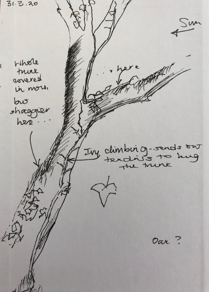
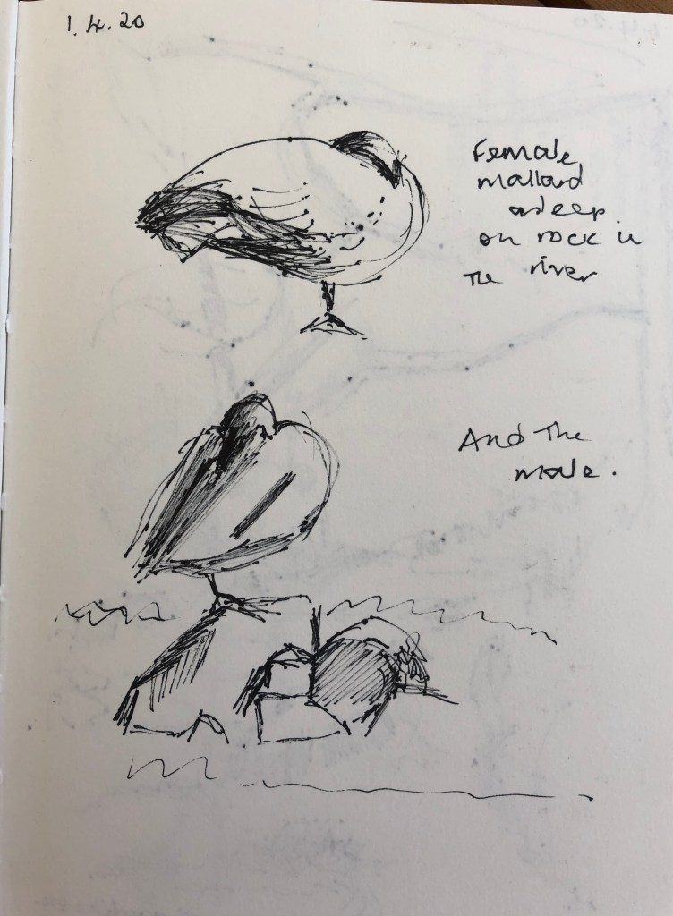
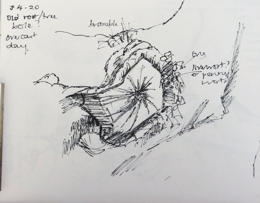
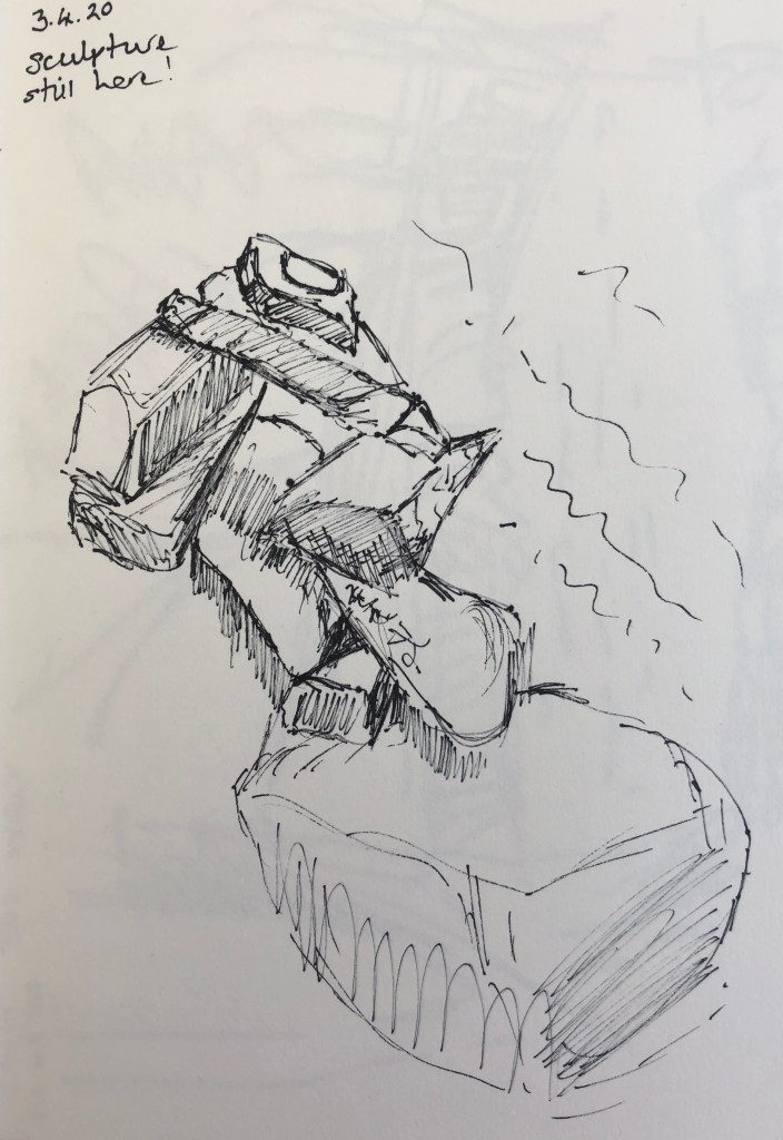
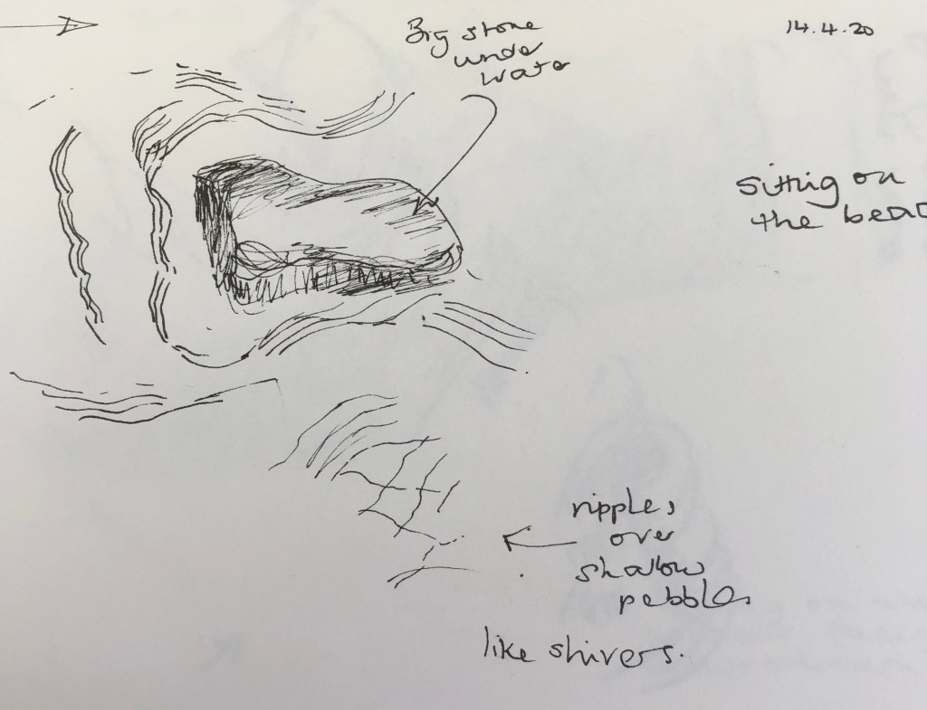
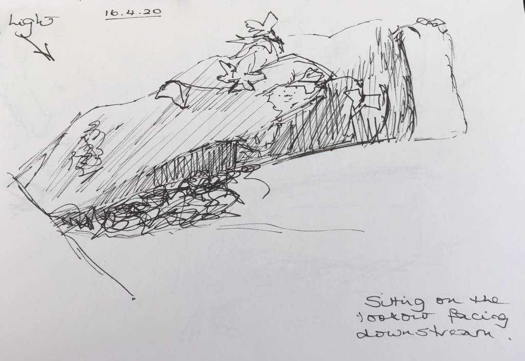
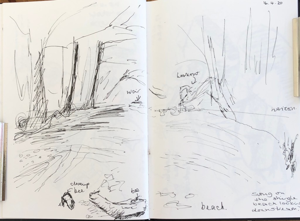
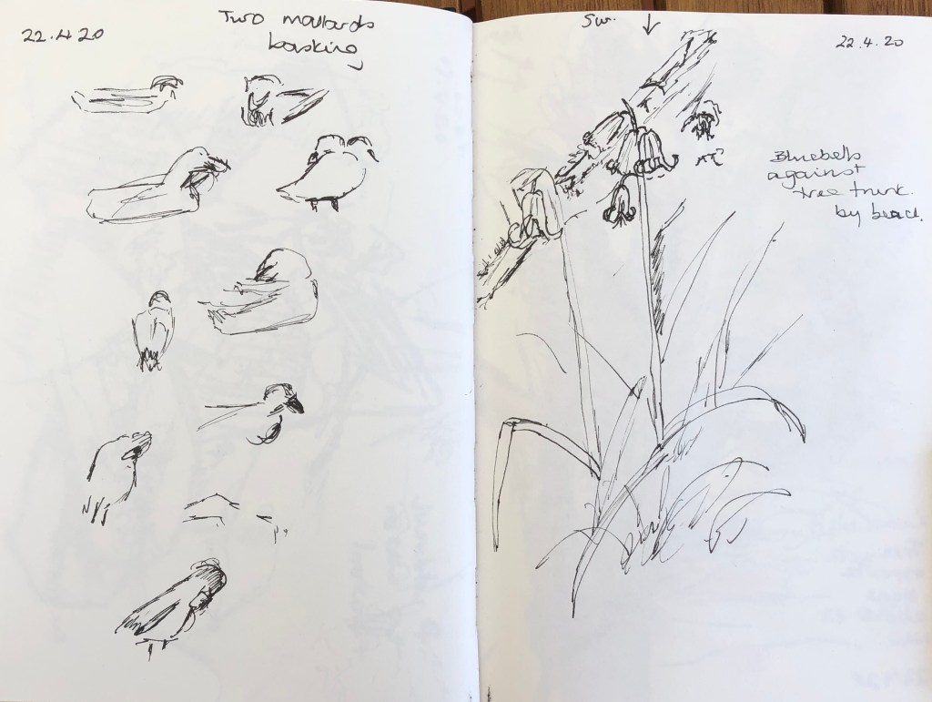
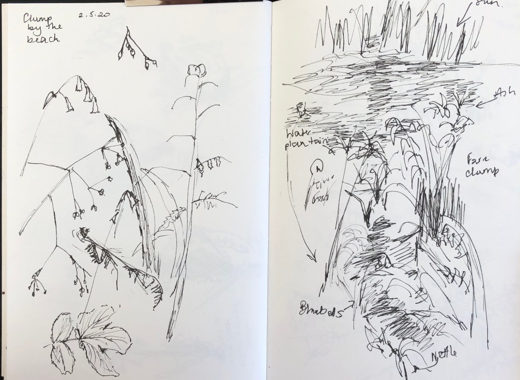
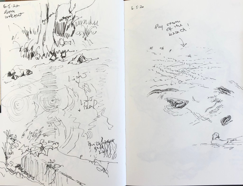
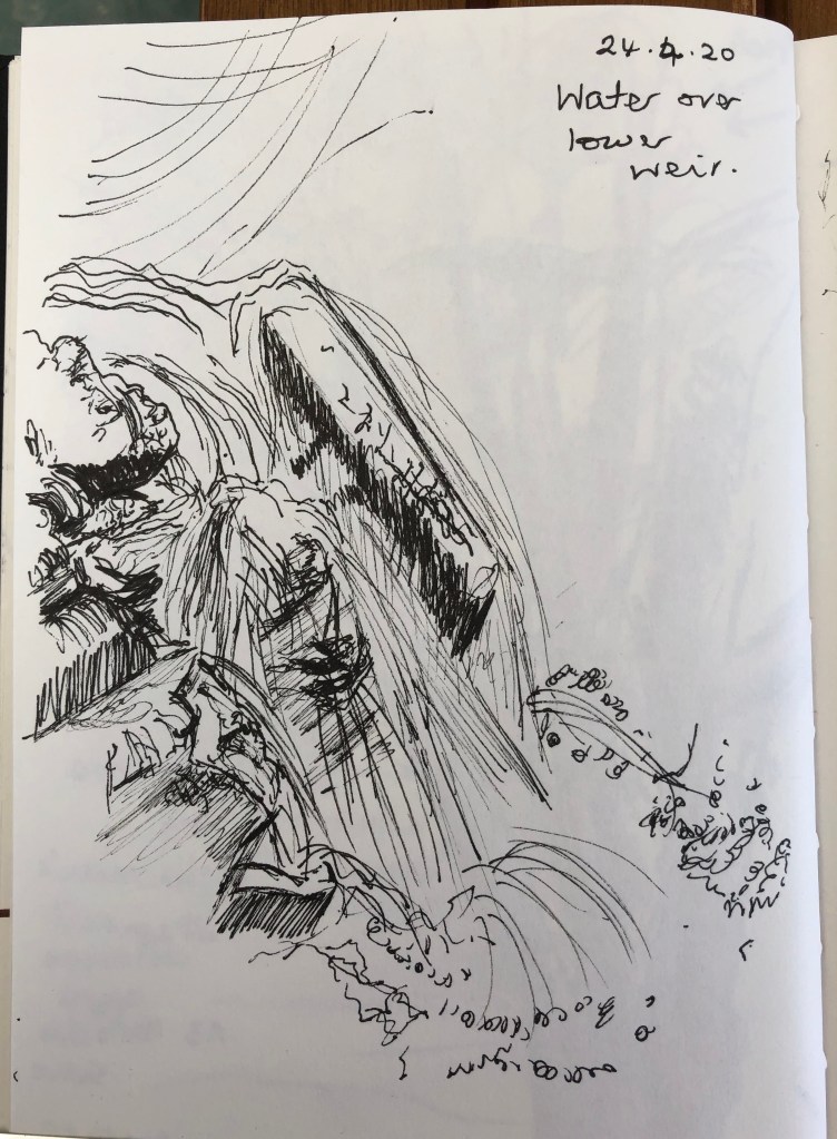
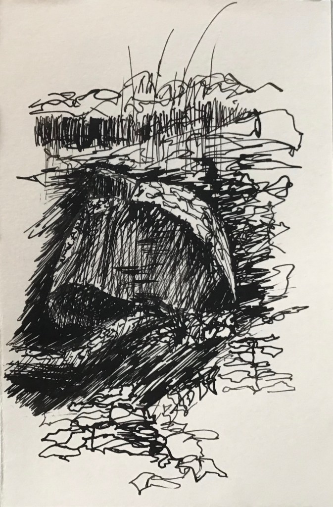
Several extracts have been included in earlier blog posts, so this is a flavour of other on-site sketches done in my A5 Seawhite sketchbook, using drawing pens, which I took on the walk for most visits.
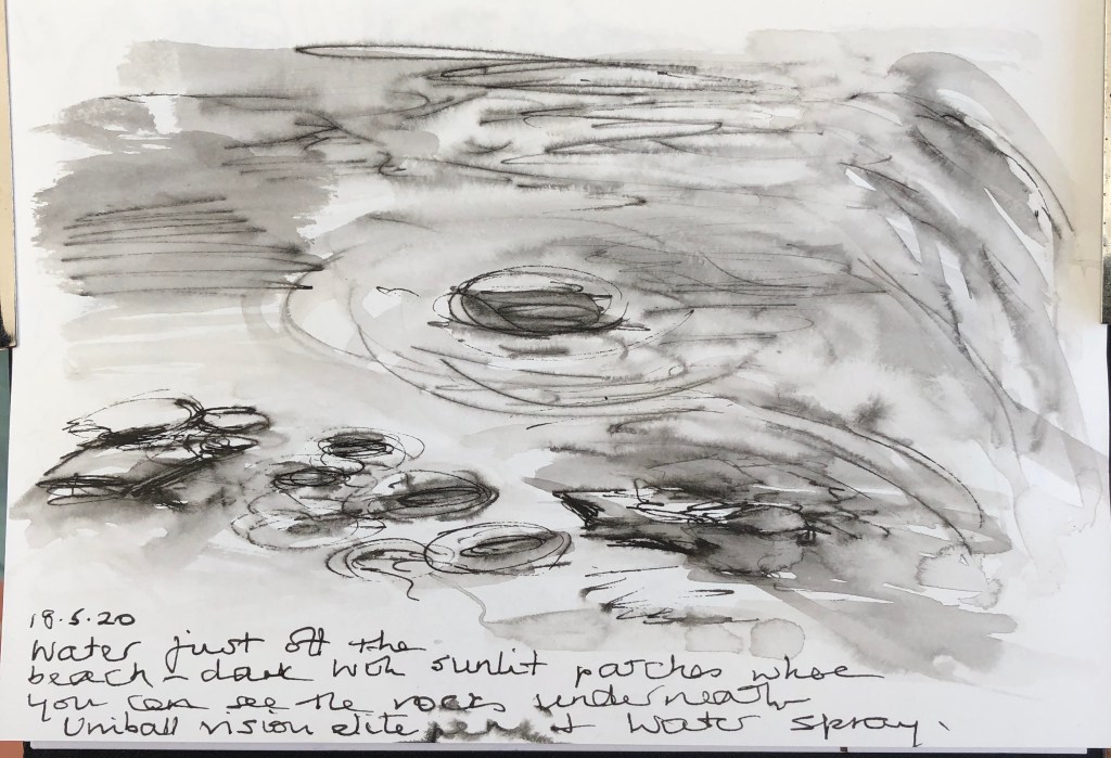
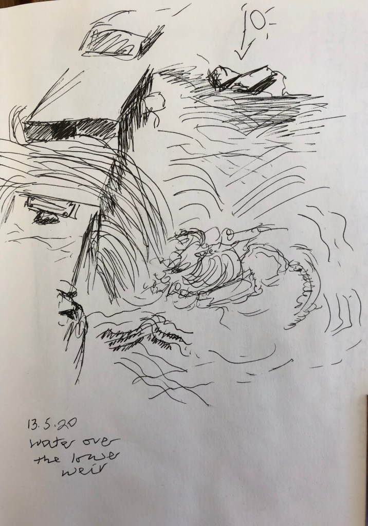
All of these sketches were done on-site; some were quick jottings and just a few lines and marks to remind me of a moment; others are more developed, with annotations of light direction, things seen but not drawn, and so on. The focus of most of the drawings (particularly the later ones when I had decided what the subject-matter of my outcome was to be) was on river-bank trees and flora, water movement and reflections, and the structure of rocks protruding from the river bed.
This was very much an on-the-spot record-keeping sketchbook; more experimental work was done at home in a larger watercolour book, the contents of which are included in earlier blog posts.
Further to my last blog post trying to pin down where I was going with this investigation…….
…I had decided to take my series of 8 detailed black and white drawings, in the style of Durer’s etchings (which I had produced by making rapid on-site sketches and then working into them in black ink with shellac following the method of John Virtue) and to tessellate them in a cross arrangement – also in the style of John Virtue (see e.g. his Landscape No. 75, 1987-89, black ink, shellac, gouache, pencil and charcoal on paper, laid on board. Private collection, London).
I had tried several other layouts, but this one I found the most balanced (symmetry appeals to me), and the pictures still describe the sweep of a view from top left to bottom right.
SO WHAT?
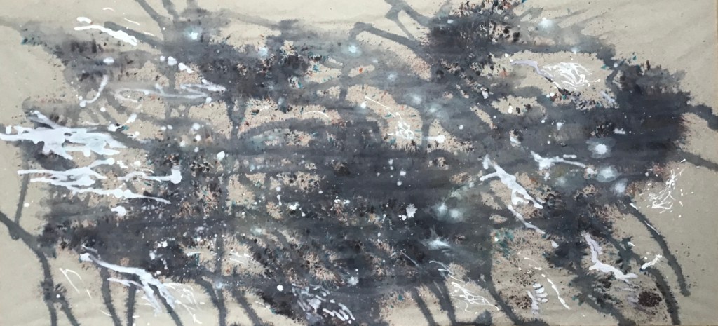
I tried them against a blank support, which is what John Virtue does – his look very stark, as did mine, and very “stand alone”, whereas I wanted mine to be part of a larger composition where I could show (a) that these drawings were part of a larger whole, and (b) a contrast between my tight, careful lines and looser, more flowing lines. I made a very rapidly-executed design of moving water, drawing just with the dropper of an indigo FW acrylic ink bottle and a water spray, freely mark-making to convey river water in some of its various moods. Virtue’s later work shows large gestural Zen-like strokes, and this was how I felt whilst doing it. For this part of the work I didn’t copy anything, just worked from memory of all the earlier observations and sketches I had done to guide the marks. Once this was dry, I mounted my tessellation in the centre.
NOW WHAT?
My husband describes the outcome as “very interesting – a lot to look at”. I feel that sums it up – I was very much in two minds when I laid the drawings on the background before sticking – was it too busy? A bit incongruous having black drawings on a blue background?
Having lived with it for a few days and considered it, I am satisfied that it:
Combines elements of the styles of both John Virtue and Albrecht Durer
Shows different methods of using my chosen medium
Incorporates tight right-handed drawings with my new-found large, free and expressive left-handed drawings!
Makes the viewer work and move around the picture to assimilate everything contained within – it has the eye jumping from the free marks to the tight drawings and back over and over
As far as subject matter is concerned, it combines the features of the river I had picked out as defining the essence of the river – water, bank and bed – and hence goes some way towards answering my initial question – “What is this river?”
Quite a bit of reflecting has gone on as a result of a flurry of group discussion sessions. I feel I have been blundering around somewhat, largely because of my very wide initial question which sent me off in myriad different directions. Thinking has now gone as follows:
– I have really come down to being able to define what I actually want my question to be: how can I depict the essence of the river water in a drawing/series of drawings?
– This slight obsession I have (from looking at the Hockney iPad drawings – see separate blog posts) about the various layers of the river (river bed – water- reflections on surface – movement of surface – things on/over the surface) has to inform my final outcome.
– My first potential solution to this was some sort of collage-type image, where I would do a loose, fairly abstract depiction of the movement of the water in the style of John Virtue, and overlay it in parts with small detailed vignettes, in the style of Albrecht Durer; these would in part be cut out in water-drop shapes from my drawings resulting from the Tyga Herme exercise (see separate blog post) and arranged in a semi-tessellated pattern. This would combine my two strands which I had been following: loose semi-abstract work versus detailed representational work.
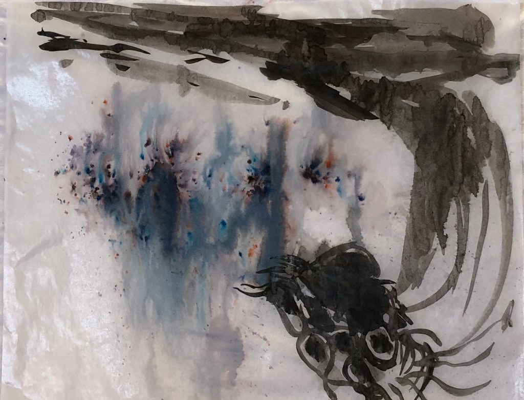
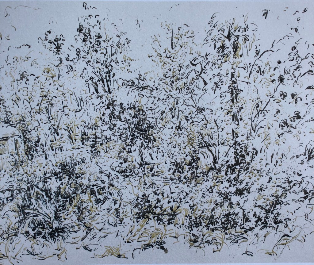
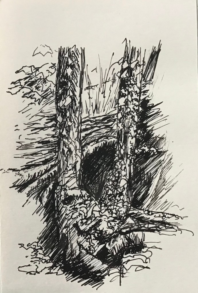
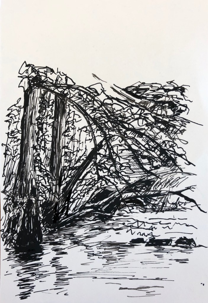
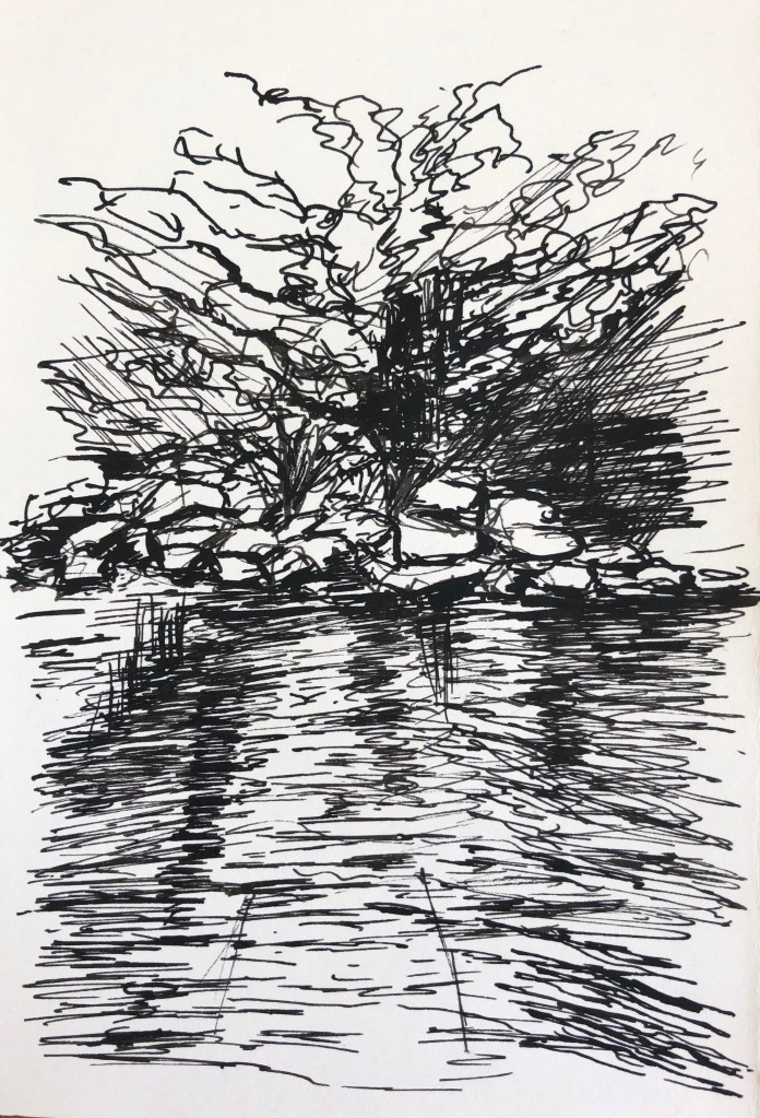
– Something was still niggling though. We sat the other day in the sun on a tiny island in the river (we went for a picnic lunch under the trees), and I did a couple of ink drawings:
…the first being a shady section of river right in front of us..
.
and the second was the river coming through a rocky section in full sun about ten yards to the left. Both just use FW acrylic inks in sepia and indigo applied with the stopper, spread about with a water pen and spray and drawn into with a black ink drawing pen. They are very different, which reinforced to me the differing characters of the river just over the space of a few yards; one is about dappled light and sometimes seeing the river bed, while the other is all action and surface.
This set me thinking about my layers again, and finding some way of showing this ever changing and sometimes transparent aspect of the water.
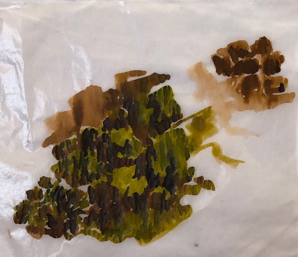
I took a couple of scrap pieces of glassine and drew on them with ink; on one I did some “river bed” marks,
and on the other some “surface” marks. It was a quick experiment and I was fairly free with the ink, which I put on with a Chinese brush – fortunately I had stuck the edges of the glassine down as it buckled up considerably and made the images very blurry, although they did settle down a bit once dry. My idea was to overlay the “river bed” sheet with the “surface” sheet and see if the idea of layers could be achieved. Mixed results…..
……when one sheet was just placed over the other like this the effect was not very clear (left).
However, when the two sheets were overlaid and held up to the light, the effect of layering was much clearer (below right).
I felt I was onto something here, although glassine wasn’t the right support. More thinking needed…
In the light of all the above, I decided that I wouldn’t cut up the Durer-style Tyga Helme exercise drawings after all, but would do what I had originally intended to do with them, which was to make them into a John Virtue-ish tessellation
I tried out various possible layouts, as John Virtue had done,
and decided that I liked them best in the cross – they run in a sweep from top row left to bottom row right. My plan is therefore to experiment with a background (I’m thinking either plain white so as not to detract from the drawings, or maybe a light streaky indigo wash to suggest river) on which to mount the drawings. Watch this space.
And I’ve also been thinking about PVA glue as a support for my transparent layers…another space to watch.
This was an interesting discussion – Dan had provided a lot of stimulus material for us to look at and load up our thoughts and own resources onto a padlet beforehand, which is becoming increasingly useful now I am beginning to get the hang of it. The subject matter was evocative, the resources quite “out there” and thought provoking…..but in the end we talked largely about our processes and how to frame a good question – which I don’t think any of us particularly expected, but was interesting and helpful in a completely different way.
Points arising:
Dan started off by explaining his setting of the task and his framing of questions to start us thinking; this type of activity is very useful for research. Coming up with a good question can be key to help you apply for things, e.g. finding for a research fellowship at a university (Dan did this). It’s a good way to pull together information, ideas different, media and disciplines, e.g. writing, performance.
The assemblage of information which as a group we had generated on the padlet is a way of showing different kinds of knowledge,
Looking at people’s work digitally throws up questions of scale which we can either play with or fight with – it will affect how people read the work. In a sequence of images, one leads into an expectation of what the next will be like (which may be quite wrong!)
A quote from Roman Signer: “Incredible things happen in a moment.”
When coming up with a question for research, it’s good to have a wide one, but then you can then break it down into sub questions to explore – so, in a dissertation, this might form subheadings – e.g., in my case, I might be exploring particular media or portraying a particular aspect of the river (e.g. my thing about layers). Ask yourself; “What will this project ask?” By asking questions you are embracing the fact that you don’t yet know – to give yourself a genuine journey of discovery.
Collage – cutting things up and then moving them around – a very useful artistic device.
Choosing something that gives you a constraint – e.g. I’m only going to use a 2B pencil – can lead to some very creative work.
It can also be a good idea when framing your question to list the things that you will not do.
This was very kindly opened out to other groups by the Thames Valley group – I was interested in what Holly (see SW group hangout blog entry) had said about photography so thought I would turn up to this Zoom meeting and see what I could learn.
Very interesting and chatty lady. Brief notes:
Her text books: “Langford’s Basic Photography” and “Behind the Image” (research into photography)
She is taking part in a project called “Women in photo” run by a group called Fast Forward
Fiction is her inspiration. She derives ideas from the work of Cartier-Bresson and De Guerre.
A photo goes at a speed of 1/125 of a second – the eye can’t see this, so the image captured in a photo is not something you would “see”
Historically, photos began to be staged rather than “real”, see e.g. Edward Curtis and Dorothea Langer, and the question of paying the subjects was very controversial at the start, although it happens a lot now
One of her students used Old Master images, e.g. Vermeer, as inspiration for his own work, and he would try to set up staged poses to produce a similar scene
She collects bits of texts and photographs and then marries them together – she tried taking photos to specifically illustrate a piece of text but this didn’t work for her. She says that, if you choose to add text, it should be not too direct, not an afterthought, and as important as the image – so need to give thought to layout, typography, etc.
She shared with us the making of a piece called “My Mother’s Cupboards, My Father’s Words”. Her father’s words were actually quite abusive – she was very open with us in talking about the family’s experiences of living with her father and their various reactions to him, which was quite moving
Nice small group (me, Holly and Ruth) so time for some good discussion.
Holly is doing photography and has a landscape project where she has to produce a group or series of a dozen photos evoking the sublime – she has some lovely circular images which she is going to crop and make them look like planets by making them into vignettes. She said something interesting about photography as a discipline as against fine art – artists start with nothing and add stuff to make an image, whereas photographers start with loads of information and remove stuff to make an image. She had put up a draft of her artist’s statement explaining that she was going for round images as if someone was looking at a picture of a landscape through a magnifying glass, which rather chimed with my thoughts about putting some of my smaller drawings into my bigger drawings.
Ruth was doing illustration and had an exercise to do making comparisons between a portrait and a caricature (both of which she had to generate). We talked about life drawing and a website – lineofaction.com – was recommended (I did have a quick look but couldn’t immediately find it…?)
I talked about my current project and the way I have two strands to my work, the loose and large abstract representations and the small tight detailed illustrations. We talked about how to combine these – Holly suggested putting the abstract within a detailed drawing, or vice versa. She mentioned another student, Jane Coxhill, who is also looking at depicting water, so I have emailed her and am awaiting a reply.
…..and here’s his Large Piece of Turf, 1503, watercolour and gouache on paper, Albertina, Vienna, Austria….
…and my personal favourite, St Jerome in his study, 1514, engraving, also in the British Museum; we have a print of this on our study wall (by way of encouragement).
What I love about Durer’s drawings is the minute observation that he has obviously made, his use of light and dark, and the detail he includes, including conveying differing textures by varying his marks. When I first looked at his work in an earlier Part of this unit I said I wanted to look at his work more closely, so glad I finally got here!
So What?
I wanted to have a go at using ink lines carefully, with varying thicknesses and types of mark, to make a controlled and closely observed drawing. I eventually want to be able to apply such precise mark-making to my drawings of the river and its banks so that I can capture specific details in a highly representational drawing, possibly with a view to contrasting this with looser, more flowing marks depicting the moving water.
Now What?
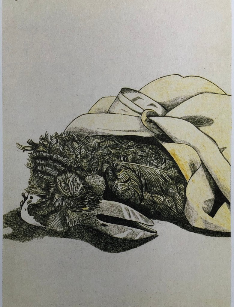
The subject of my attempt, rather weirdly, was a dead owl (we think) which appeared by the side of the path one day – insides had been totally removed by something, guessing fox, so all that was left was the inside of the exterior, if that makes sense, and disorganised feathers, plus a beak visible. I had a really good look but didn’t want to pick it up or bring it home (having enough trouble avoiding one type of bug without accruing others) so took some close-up photos to draw from – and the carcass was gone next day – am assuming the fox thought there was something else to be had from it.
I had a go using a mixture of sepia and black Faber-Castell Pitt drawing pens of varying thicknesses on A3 cream cartridge paper; my aim was to use the sepia to suggest the actual colouring of the bird whilst bringing in the black to help me build form.
I think the outcome makes a striking image – although it was one of those things that you only want to do a bit at a time before you start going cross-eyed – and have learned that a bird like this has an amazing number of different types of feather. It challenged me to develop my range of mark-making to depict these textures and also to create form, and I think the thick black lines work well to ground the carcass.
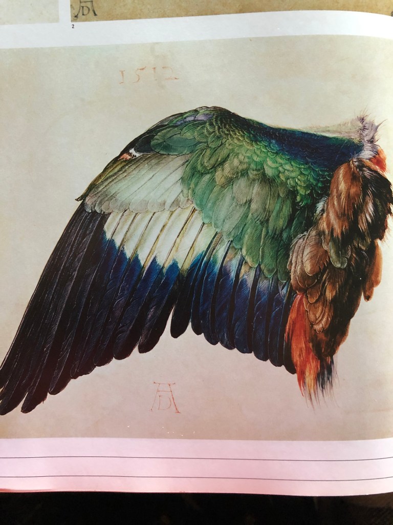
Fascinating as it was to draw, I did wonder if I was being just a little strange to be drawn to such a thing….but was comforted by Durer’s drawing of a detached bird’s wing – Wing of a Roller, 1512, watercolour and gouache on vellum. Albertina, Vienna, Austria….
I think this is even more weird than mine, as at least mine was cleanly eaten, not rotted! – the book does refer to the drawing as a “…compelling, disquieting image…”, due in part to the angle of the bird’s head combined with the “..carefully, intensely observed lines..”
I think that my style of drawing resembles the Freud work more than the Durer but, having completed a complex piece like this, I now feel more prepared to tackle other highly detailed drawings of the river and its environs with the same level of close observation and an expanded toolkit of marks.
In one of my new favourite books, Royal Drawing School (int. Julian Bell), 2019, Ways of Drawing, Thames & Hudson, London, there is a suggestion for an exercise from Tyga Helme. I decided to give it a go for three reasons:
I was drawn to her style, which is a bit scrappy and scribbly, rather like mine – see this example, Behind Knole, 2015, ink on paper
The exercise sounded as if it would get me past the problem of being slightly overwhelmed by the amount of stuff in a view that there is to draw
It had the potential to generate drawings which I could tessellate (as per John Virtue and Lydia Halcrow)
She suggests that you take a stack of 8 x 8cm squares of paper to a scene you would like to draw from. You take the first square, look at one thing in the view which catches your eye, draw it (she suggests for 3 min, but I wanted to really make myself home in on key features so I only allowed myself 90 sec), then turn over to the next page, draw the next thing that catches your eye, and so on. She says that, at the end you can put them together and be able to see “..where your eye naturally travelled and what you reacted to.” Her example in the book looks thus: (Tyga Helme, untitled, 2014, ink on paper).
The idea is just to be present and totally focused on your looking and mark making without worrying about what the finished piece will be.
SO WHAT?
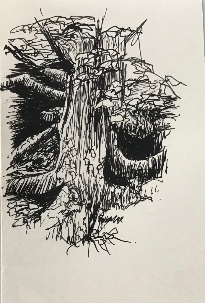
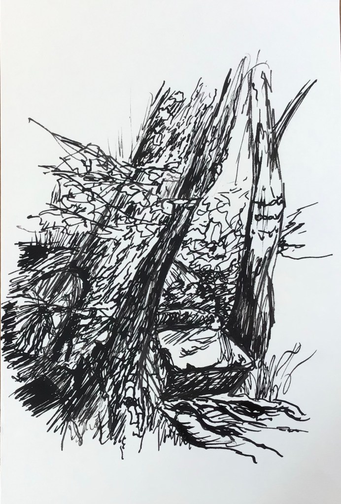
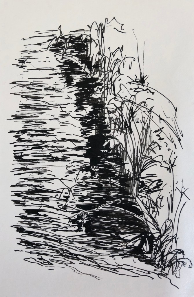
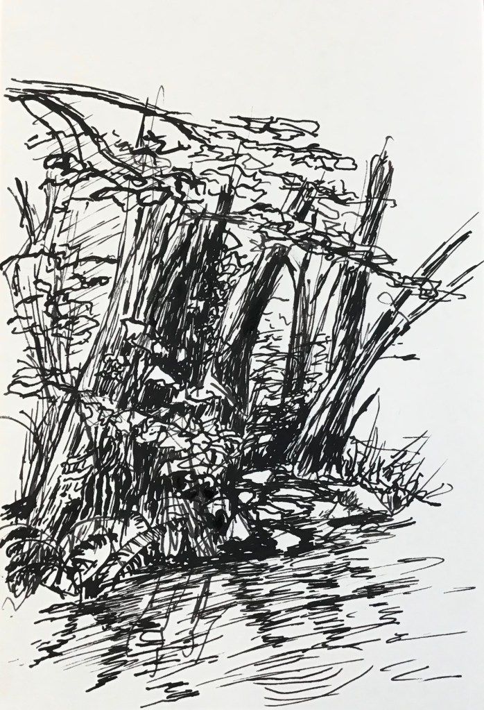
I had a go on the little shingle beach in the river, looking along the facing bank which has quite dramatic trees with exposed roots down to the water, and looked in a clockwise sweep past a shoal of rocks in the middle of the river and up the nearer bank. Here are my rapid sketches in order:
A couple are very sketchy and I had to look twice to work out what they were when I got them home!!
However, John Virtue used to make really scrappy sketches on location and then come home and draw into them with ink, and so I emulated his method, drawing into my sketches with a dip pen and black Indian ink with shellac from photo references which I had made to back up my drawings, but always keeping my focus on the landscape feature which had originally caught my eye.
I have enjoyed doing these drawings, trying to look with a forensic eye as demonstrated by Albrecht Durer (see separate blog post) and to use different types and weights of mark to convey tone and a sense of depth.
Also this is an excellent exercise for those like me who need a bit of structure in order to decide what to draw first! – it gives me permission to pick something without worrying that I might be leaving all the other stuff out.
NOW WHAT?
I feel much more confident about going out and drawing in the landscape without dithering – just pick the first thing which catches my eye – there is a reason why this is so, and I need to respond to that.
I now have a series of drawings which I can consider tessellating (see John Virtue blog) into a coherent composition; I should like to incorporate this if possible within a larger, more abstract drawing of the river water in order to contrast this controlled range of marks with more fluid and gestural marks.
I am pausing in my investigation to try and draw thoughts together.
I haven’t at all followed my initial plan, which was to work through a stated list of artists, try out their work, and see what resonated with me as being the best way of achieving my goal, namely, to describe this stretch of the river in a drawing.
That’s not quite true – I started on the plan but was quickly diverted into a focus on particular key artists whose work I am finding most helpful – so I am deciding here to “park” experimenting with maps, diagrams and land art, and the artists associated with those. I am also “parking” Kurt Jackson, which is quite annoying as he is a favourite of mine and one I should like to come back to, perhaps in the Painting module – but I think I have more than enough to work with here and any extra would just confuse me more than I’m confused already.
So, which influences am I keeping?
It really comes down to four, although they are quite contradictory in style and somehow I need to resolve that conundrum. Lydia Halcrow and Tyga Helme have very been helpful to me on the path, but I am sticking with:
Vija Celmins and David Hockney for water. This is a rather odd pairing, but they go together as helping me with my depiction of water, which has become (unexpectedly) a real fascination. Vija Celmins made me look at it carefully and try to analyse it in all its complexity. David Hockney is here because he led me into iPad drawings and the idea of layers. I freely confess that I cannot for the life of me understand how to make my iPad drawing app work as it’s supposed to, but I do get that it works on the principle of superimposing layers, which has made me really think about all the layers you have to consider when drawing water: the underlying rocks etc, which often you can’t see, but sometimes you can; the reflections on the water; the surface movements (with consequent impact on the reflections); and anything overhanging/above the water.
Albrecht Durer for his amazingly detailed drawings using line and tone, which I am determined I will be able to emulate eventually if only I can look better.
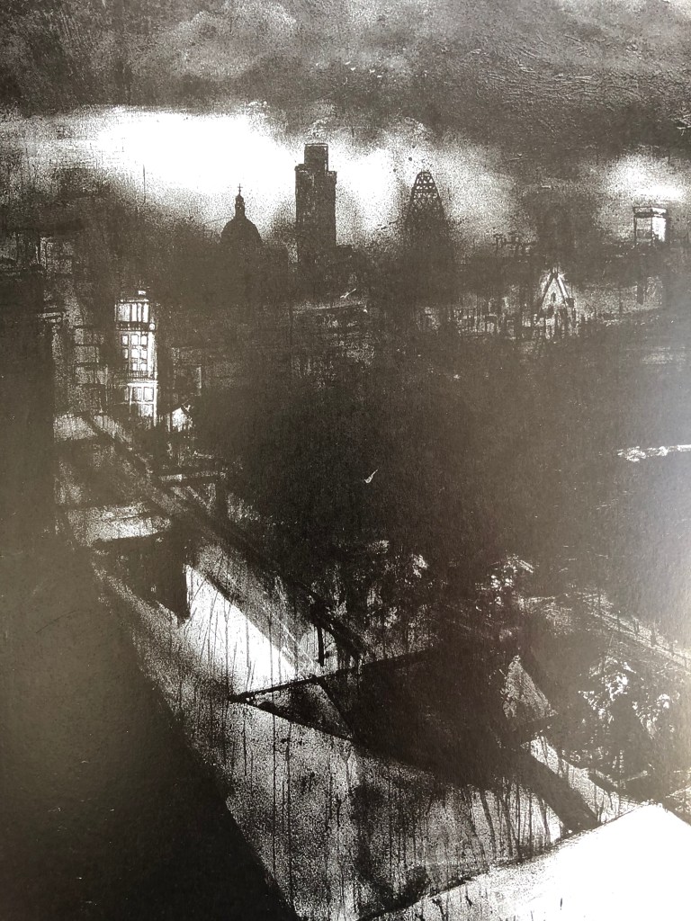
John Virtue. His tessellations initially pulled me in – I have an infernally organising nature – and then I was astounded by his sudden jump to these huge free loose black and white paintings. I have been reading (in Paul Moorhouse, 2019, John Virtue, Albion Barn Publishing, Oxford and Ridinghouse, London) about his London pictures, which have moved on again, are often very dark and suddenly, as if a mist clears momentarily, includes very detailed snatches of drawing – such as this one, which is a section of Landscape No 710, 2003-4, black ink, shellac and emulsion on canvas, 305 x 610cm, Queensland Art Gallery.
So, somehow, I think I want to:
Practise more drawing of water, which can be in quite an abstract way
Practise more detailed drawings of landscape features
There were twelve of us – we would normally have divided into groups of 3 or 4, but Helen suggested that, just this once, we split into larger groups of 6 so that we had a chance to look at a wider range of work, even though it meant we didn’t get quite so long talking about each.
I showed three of my pieces:
(this was shown as a short video progressing L to R)
The larger horizontal abstract was a loose representation of water I had made after our Group Studio day and looking at Alison Churchill’s website (www.alisonchurchill.uk) – see that blog post. I had also been working on an exercise suggested by Tyga Helme (see separate blog post) where I did a series of quick sketches along a portion of riverbank, then took them home and drew into them, as done by John Virtue – see also separate blog post – the example I’ve shown here is the fifth sketch.
Feedback without prior explanation was positive – some really engaged with the abstract, and some picked out the details in the small drawing – and all were, I think, slightly mystified by the series.
I explained what they were looking at, and then explained my dilemma about working towards a possible final piece, thinking I might perhaps do one big semi-abstract of the moving water and then collage tessellations of small drawings onto it to show different points along its course and convey the essence of the river. Feedback:
I should try it out in sketchbooks or wherever – experiment!
I am the first viewer of and reactor to my work – does it convey the essence of the river to me??
Consider recording it as a video – moving images of my drawings – you only see parts of the whole as you walk, so it could be the same with showing the images – could start to see working with online functions, as we are having to at the moment, as being something positive to use rather than being a problem to overcome.
Food for thought.
Fascinating as always to see others’ work, especially those who are doing something that I know I will be moving onto – Felicity and Karen were both working on the requirement to produce a series of work, which I feel I’m also doing here; and Alexandra was using watercolours for the painting unit, which I hadn’t seen anyone else do before.
David had produced a padlet, onto which I and some others had pre-loaded their work so it was easy to see – something to continue in future group meetings.