Just back from lovely St. Ives in Cornwall where we stayed for a couple of days to celebrate our anniversary.
Weather was mixed, sometimes glorious and sometimes pouring, but got some lovely photos from our hotel which I am considering for foreground-midground-background analysis at some stage.
We had a very arty time; some notes here, and see also those in myA4 and A3 sketchbooks.
Tate St. Ives was showing an exhibition of the work of Otobong Nkanga, called “From where I stand”; it’s been on since 21st Sept and will be there until 5th Jan 2020. I read the gallery’s introductory information leaflet over a cup of coffee upon arrival and decided that this was going to be the sort of rather worthy-yet-preachy sort of thing that I wasn’t going to enjoy – so I was delighted to find that I was absolutely wrong….her basic theme was on the taking of minerals from the ground and people’s consumption of those minerals and the effect thereof, but:
She works in a huge diverse range of media – performance, woven textiles, drawing, photography, video and audio, installation…..
The size and scale of her work – the new wing at Tate St. Ives is pretty big, but her work filled it
Her interest in mapping and representing complex interrelationships and connections between people and the land in map-like diagrams was something which appealed to me (being a bit of a map nerd myself) – her pictures really clearly laid out all aspects of a complicated, and global, issue, and presented them for the viewer to reflect on and draw their own conclusions, rather than attempting to impose the artist’s opinions
Her clean lines and neatness and attention to detail also appealed to my tidy nature
I loved her use of bright clear colours – it was interesting the way she had blobs of all the colours she used in the corner of a picture, almost as if recording her palette for posterity
************
We mountaineered up Stennack Hill in torrential rain to the Leach Pottery– erstwhile home of the potters Bernard Leach and Shoji Hamada, their work being continued today by many visiting and resident potters. Quality and style of pottery as wide as ever; was struck by a display about a local lady potter – shame on me, I was sure I would remember her correct name but can’t quite, it was something like Sarah Davidson (oh dear) – anyway, she says that all her designs are based on her drawings, and that even though sometimes it looks as if a design is coming out of her head, she finds she can invariably trace it back to an earlier drawing in one of her sketchbooks – they had a couple of examples of her sketchbooks there, which looked as if they had been constantly carried around in her pocket, they were very battered and absolutely stuffed with reference material – a role model if ever I saw one.
*************
The Penwith Gallery was having its 70th Anniversary Exhibition (5th October – 2nd November) – an old pilchard factory has been converted into a beautiful space, surprisingly large and well-lit. A wide range of paintings, ceramics and sculpture was there to wander amongst, but I found three contemporary artists, all of differing styles, whose work I liked, and whose styles were very clearly developed:
Sally Spens: she had a set of etchings on display relating to the Venice Biennale, where she had observed corners, gateways and so on – but she had a series of moon jar designs which I loved – the shape of moon jars has always appealed to me, and her oriental designs were very pleasing – she obviously draws carefully with clean lines. On her website,www.sallyspens.com, she says: “Drawing has always been central to my practice, both as a textile designer and as a painter/printmaker. It is important to me that the images are handmade, and originate from my drawings and experience. “
Mary Ann Green: I found a card of hers, a picture called “In the Silent Fold of the Land” – it’s a landscape with not much obviously going on, but she has made it interesting by shading some parts in detail and others not at all, and by introducing little bits of colour into what is overall a black and white drawing. I looked her up and found that she is a member of the St Ives Society of Artists; many of her other pictures include this same folded hillside motif.
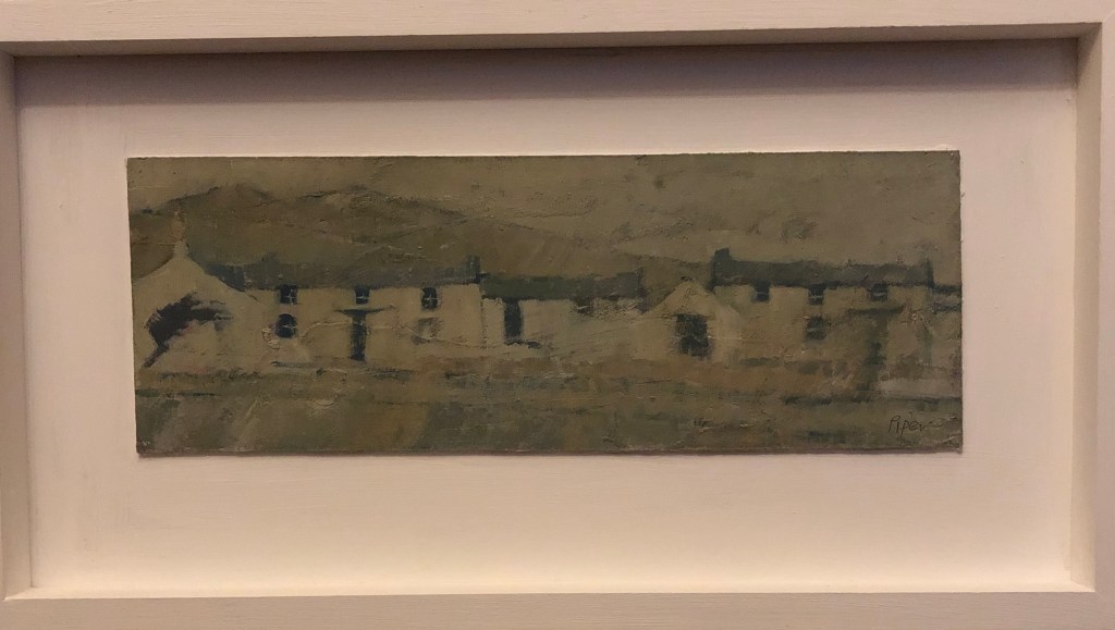
John Piper, a member of the Penwith Society, also has a motif that appears many times in his work – little rows of Cornish cottages, battered by wind and weather, hunkering into the landscape, absolutely characteristic of West Penwith, the far end of Cornwall. He paints in oil and we liked one of his paintings so much that we bought it! This is “Soft Carn”, and is painted in oils on board. First time I’ve ever owned a painting with a sealed provenance before! Its tones are muted but if you look at it carefully you find little patches of bright pinks and blues – and the view is of an area very close to my heart.
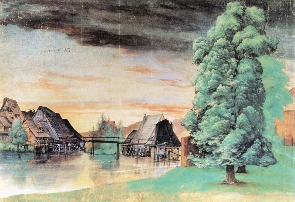
In Silver & Smith, 2011, The Essential Durer, University of Pennsylvania Press, reference is made to how central drawing was to Durer’s practice, and how he would draw every day regardless of the other work in which he was currently engaged, and this must have supported the accuracy and detail of his etching and engraving work in particular. His drawing materials were wide-ranging; basically all the materials we have been encouraged to use in the course so far with the exception, interestingly, of red chalk, which he is not known to have employed. It is said that his choice of drawing medium was always suited to the subject and that for natural subjects including landscapes he would use a brush (allowing for wide sweeps) and watercolour and body colour. His breadth of choice of subject matter is very wide, and no doubt partially dictated by the religious upheavals and scientific blossoming of this day, but apart from his print work he is also known for his watercolour landscapes including weather effects such as The Willow Mill:
Albrecht Dürer, The Willow Mill, 1498 or after 1506, watercolour, bodycolour, pen and ink on paper, 25.3 x 36.7 cm. , Bibliotheque Nationale, Paris
I particularly liked this one for it’s sky and it’s foreground tree, both of which I feel I am “working towards” being able to produce.
However, a lot of his landscape work in his etchings and engravings seems to be as the background to a foreground human event, either real or imagined; I watched a video on YouTube about the etching: Durer, 1518; Landscape with Cannonput up by the Clark Art Institute, Williamstown, Massachusetts, in which a huge amount of background landscape detail is put into a scene populated by numerous figures as well as said cannon.
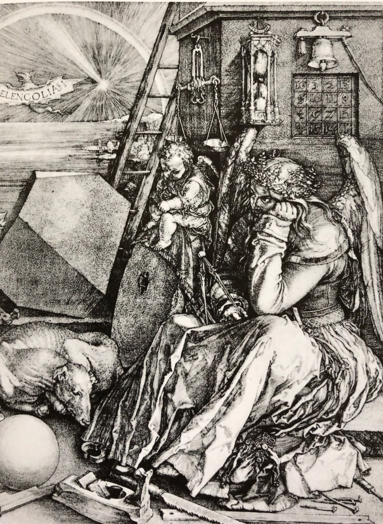
I was fascinated also by the engraving: Durer, 1514; Melancolia I which, as pointed out by Hockney & Gayford in their 2016 work A History of Pictures, Thames and Hudson, contains a massive amount of hatching detail – just look, for example, at that calendar on the rear wall!
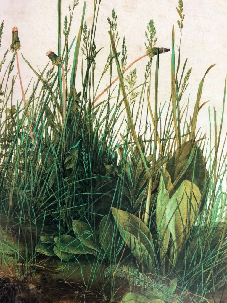
I was also attracted to Durer’s 1503 work, The Large Piece of Turf, watercolour and gouache on paper, Grafische Sammlung Albertina, Vienna – so fresh, looks as if it were painted yesterday. According to de Botton & Armstrong, Art as Therapy, Phaidon, “..Durer hoped that, having looked at his work, one would head outside and do what he had originally done: to look with great care and devotion at some significant aspect of the natural world.”
Well, it’s done it for me.
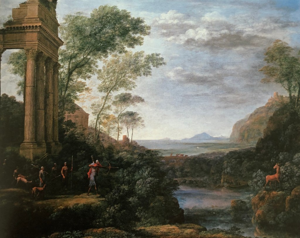
Claude Lorrain
Claude became famous for his works evoking “nostalgic beauty” (E.H. Gombrich, 1988, The Story of Art, Phaidon). He likes, as de Botton & Armstrong (see above) suggest, “…glimpsing a horizon through a cluster of trees,,,” – and his trees are certainly very lifelike. Gombrich says “It was Claude who first opened people’s eyes to the sublime beauty of nature, and for nearly a century after his death travellers used to judge a piece of real scenery against his standards. According to Franny Moyle, 2016 in The Extraordinary Life and Momentous Times of JMW Turner, Penguin, Turner was exposed to Claude’s print works as a child and, as an adult and already established artist he showed that he admired Claude’s work and tried to emulate something of his grand style.
Hockney and Grayling (see above) point out the beauty of Claude’s composition, saying that his paintings were very theatrical: “His placing of trees or architecture on the right and left and the deep space in the middle is very much like a set behind a proscenium arch” – an example seen here in Claude’s 1682 painting, Landscape with Ascanius shooting the stag of Sylvia, oil on canvas, Ashmolean Museum.
I think this last remark chimes with me – I can appreciate the complete virtuosity of Claude’s rendition of trees, clouds and the like, but his paintings overall don’t particularly appeal to me as they feel very posed. I also have a horrible feeling that, if I sat down to paint “a landscape”, my initial attempts at composition would be very similar – something I must bear in mind.
In an online article by Jeanette Winterson from The Guardian, 13th June 2013 it quotes Lowry as saying: ““It would be about four o’clock and perhaps there was some peculiar condition of the atmosphere or something. But as I got to the top of the steps I saw the Acme Mill; a great square red block with the cottages running in rows right up to it – and suddenly I knew what I had to paint.” She describes him as “popular, but unfashionable – a deadly combination in the art world”, but she finds the rather repetitive nature of his paintings fascinating, showing what happens to people when they have to deal day-in-day-out with repetitive machines. I found her article brought him to life a bit for me and made me see the point of his flat paintings (she urges us to look for the flash of colour in the flowers in an upstairs window as a sign that the humans are secretly fighting back against the machines) – but I’m not sure that I would want to paint in his style.
George Shaw
I hadn’t come across George Shaw before, and I can see that, in a way, he is the natural successor of Lowry. My initial reactions to his landscape paintings were, I suppose, surprise – he paints realistically, yet why does he paint the landscapes he chooses? Apparently he paints in Humbrol modelling paint, which gives his pictures a modelled sheen – almost as if he were trying to preserve the crashingly mundane scenes around him for posterity, as images to be valued because they represented his life and environment exactly as he saw it. I found an interesting review of his exhibition at the Holborne Museum in Bath written by Johnathan Jones published in the Guardian on 7th February 2019 , very much trying to set Shaw as a product of the dreadful Brexit times we are all going through. This extract caught my eye:
“Yet his meditation on what the art historian Nikolaus Pevsner called “the Englishness of English art”goes deeper than that. Shaw revisits the landscape art of Gainsboroughand Constable that is so often taken as quintessentially British, or English. He haunts the same kinds of woodlands they did and shares their eye for nature; the trees in his paintings have such vivid personalities they can stand in for the absent people. Blossoming in spring or bereft in winter with black finger-like branches twisting against the sky, they are witnesses to his state of mind.
And what a troubled state of mind it is. John Constablesaid he was inspired to paint by his “boyhood scenes”, and so is Shaw. But while Constable grew up in the Suffolk countryside that his paintings immortalise, Shaw grew up in the 1970s and 80s on Tile Hill estate on the outskirts of Coventry. This is the place he obsessively paints. He depicts the house where he lived as a child, a tree he could see out of his window, and woods close to the houses. Tile Hill was designed as a pastoral blend of nature and modern planning. As it has decayed before Shaw’s eyes, it has become a monstrous landscape of disillusion and betrayal.”
In an extract from a statement by Shaw in 2002 I found on www.tate.org.uk, when he was talking about his series of pictures called “The Passion”, he said:
“I started to make these paintings out of a kind of mourning for the person I used to be: an enthusiastic, passionate teenager who read art books and novels and poems and biographies and watched films and TV and listened to music and dreamed. They are paintings of places that were familiar to me in my childhood and adolescence, places in which I found myself alone and thoughtful. They are places in which I forgot things. … I paint the paintings of all the times and all the thoughts I lack the language to describe.”
Many of his paintings do have that kind of “bemoaning lost youth” initial feel. However, many of his works seem to me to have a light corner or patch of sunshine somewhere or other which possibly points to a more cheerful, less morbidly fatalistic view of life….(just like Lowry with his flowers in the window)?
Sarah Woodfine
Sarah was another contemporary artist whose work I hadn’t come across before. I read a brief biography of her on the Wimbledon College of Arts website (www.arts.ac.uk). It talks about her “heavy and precise” pencil drawing, which combines with her chosen subject matter to “explore imaginary worlds that sit between the familiar and fantastical.”
A picture of hers which I was particularly drawn to (pun!!!) showed a black background with a full moon in one corner and a small caravan in front of what might be fence posts, or might be a stone circle – I can’t immediately find the name or reference for this – but it is a very striking image constructed out of a white circle, a whitish caravan and a few white lines, from which one could develop all sorts of stories.
I did like the recent work she had done using pencil on paper and a range of materials such as steel, perspex and MDF (see details of this work on the Danielle Arnaud gallery website, www.daniellearnaud.com), e.g. Untitled (Branch) II 2015 pencil on roll of Saunders Waterford paper, steel and perspex, apparently incorporating the careful looking and recording advocated by Albrecht Durer and Vija Celmins.
TAKE AWAY POINTS:
The artists that I most relate to from those I have looked at here are Albrecht Durer and Sarah Woodfine; some of their work I find rather fantastical and weird, but their look-see-record ethos (which chimes in also with Vija Celmins’ approach) is to be developed
From my rather unexpectedly adverse reaction to Claude (which I did have beforereading Hockney and Gayford, honestly…), I need to think more carefully about compositions other than the traditional which first present themselves
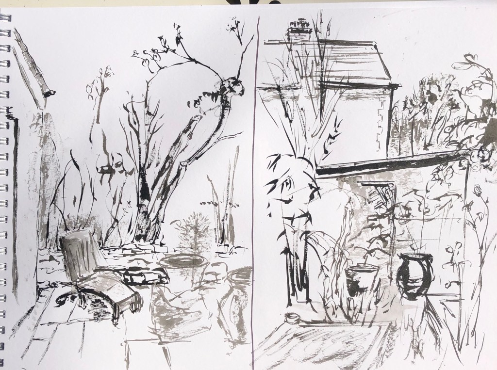
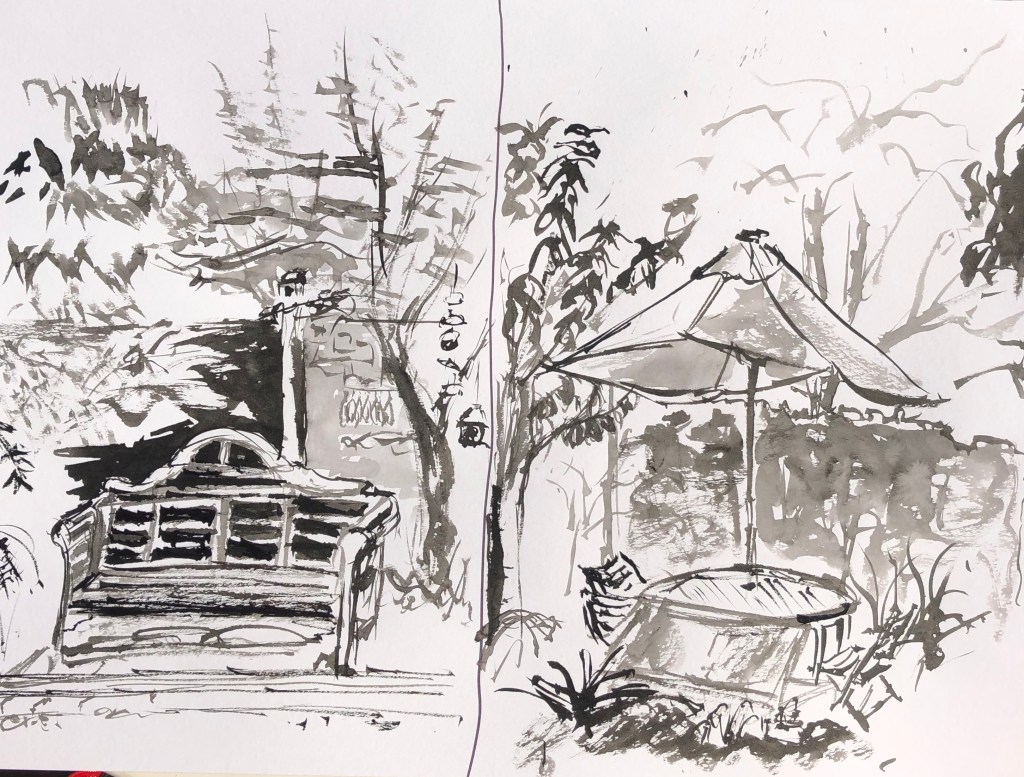
I started off with a distinctly unexpansive landscape, but one where I could sit comfortably at a table and chair – my back walled garden. It was a lovely sunny afternoon but shadows are stronger as the sun gets that little bit lower towards the end of September and the garden really is enclosed all the way round by walls and hedges except for one path through, so I felt that a bold medium was called for; I chose Chinese brush and ink. These are the views from West, North, East and South.
I actually went so far as to put the timer on 15 min each time on my phone – this did focus the mind and banished dithering but has led to some fairly wild brush strokes – expressive, certainly, but not always very clear. What I did enjoy was trying to find characteristic quick brush strokes to suggest the leaves of the different trees – bamboo (surprise!), cherry and maple came out the best, I think.
I have noticed, looking back at these drawings now as photographs, that my focal points have been distant (the old stumpy hazel in the first picture, although this wasn’t actually very far away, it just blocks the real distant view) or middle distant (the vase, the bench and the umbrella) – I have never chosen anything in the foreground and, indeed, I’ve made a fairly sketchy job of indicating the near ground, if I’ve done it at all. Not sure if this matters, but it’s an observation…..
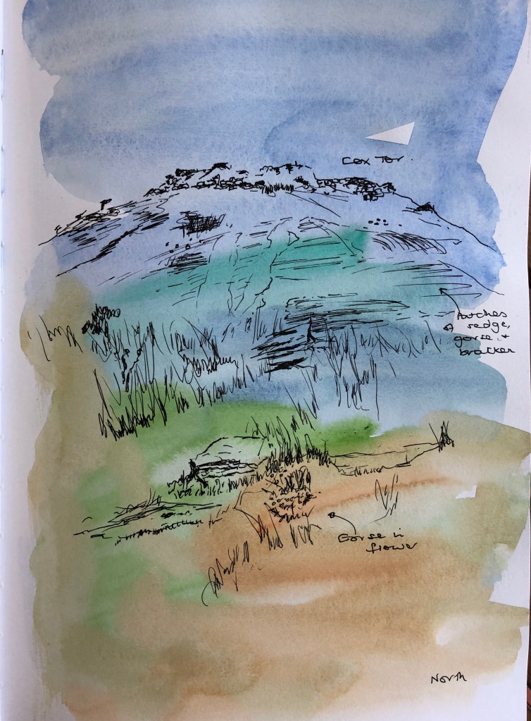
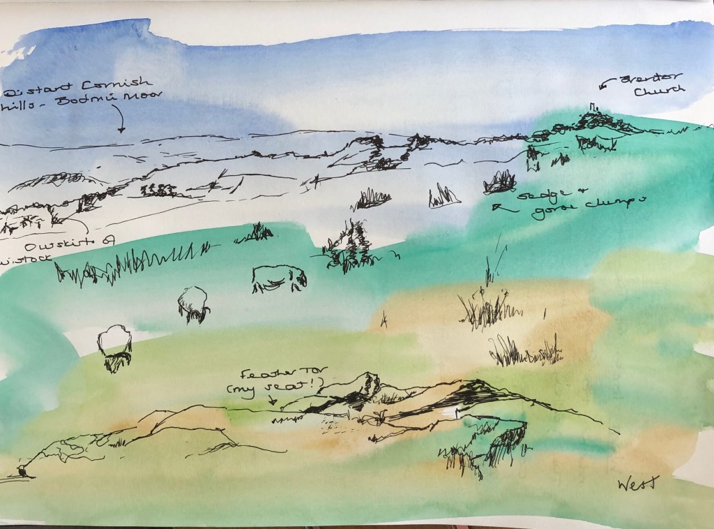
Yesterday looked like being a glorious day so my husband and I headed off up the road onto the edge of Dartmoor. We have a favourite place to sit about 10 min walk from the car park which offers panoramic views, so seemed perfect for this exercise – it is called Feather Tor, but we call it Bench Tor as it is a much-loved resting place before striding off deeper onto the moor. My husband duly strode whilst I set myself up to draw. Unfortunately, what was a glorious sunny day in Tavistock turned out to be the same on Feather Tor with the addition of a ferocious easterly wind so that everything had to be clutched in an iron grip – the joys of plein air.
I had prepared four pages in my sketchbook with a very loose watercolour wash of the characteristic colours of the moor – blue sky (sometimes), shades of green and brown. There is the grey of the granite as well but this is specific to the placement of the rocks and, as I didn’t want to limit myself to making the sketch fit the colours of the background, I didn’t include this. Sometimes the drawing serendipitously matched the background (e.g. the first picture), but in others it didn’t – I was pleased that this didn’t bother me too much; when I first started out on the course, it would have freaked me out slightly as not being perfect! – so some progress is being made….
I had taken a range of materials up with me but, in view of the howling gale, decided to stick with an unfussy drawing pen which I could keep hold of. I wondered if it would show up sufficiently against the background, but I think it does. I also set myself a timer and changed views every 15 min on the dot – partly to avoid hypothermia, it has to be said.
The landscape invites one to choose distant tors as a focal point, which I did in the first and third drawings; my focus in the second sketch was Vixen Tor which was more mid-ground, and in the final sketch I took Feather Tor, where I was sitting (hence very much foreground) as my focus. I had taken a viewfinder up with me intending to try it out – but because of the windy conditions I basically needed to sit on all my possessions apart from sketchbook in one hand and pen in the other.
Sheep abound on this part of the moor; they are very curious animals. When I started drawing they were some distance away; however, by the time I got to the fourth drawing they had sneaked so close as to be right in front of me – ostensibly ignoring me and cropping the turf but secretly, I think, hoping to eat anything that blew away whenever I moved.
What have I learned from this exercise? I’m not sure – I feel I already understood how a view can change just by turning a little. What would be more interesting would be to repeat a view in different weather conditions, and possibly without the bright and cheery background colouration, but just black and white – this would capture the same view but in different moods and lights (and allow me to work more on my developing library of clouds structures!)
I watched the video a few times – at first I didn’t quite “get” her, having not come across her work before – she reminded me the first time of Bridget Riley and her meticulous line drawings – but actually the more I watched, the more I thought that this was completely wrong, and Vija is more someone who looks at something for a long time and then takes great care to record what she sees; even though the viewer may take her image in “in a flash”, she hopes that they will then consider it at length and think about what it means. She interestingly makes a contrast between “drawing” and “using pencil and paper as my medium”, which chimed with a biography of JMW Turner I had been reading (Moyle, Franny, 2016: The Extraordinary Life and Momentous Times of JMW Turner. Penguin) in which the old definition of works classified as “drawings” included watercolour paintings – so I guess that Vija is saying that she is creating works with pencil and paper which might be considered as paintings? – anyway, obviously a fine line (pun!) and not something to get bogged down with, I think.
She describes the point of her detailed drawing/painting of an object as “…not to mimic it but to show an attention span and thoroughness…”, going on to say that she presents images (which she calls “little areas”) for people to pass by or stop and look at. I’m not quite sure why, but this resonated with me today when I had done a drawing of a rose my husband had brought in from the garden; it was quite a detailed pencil drawing, I was pleased with it, but even more pleased today (two days later) when I moved the vase and all the petals fell off – I felt as if I had shown that rose the same attention span and thoroughness as Vija does, and that was somehow a good thing as it was preserved in a different way.
I also found another video and a lot of information about Vija’s life and work on the Tate website (www.tate.org.uk) where she talks more about the time she takes to create a careful image; she says, “I’d like you to be able to scrutinise it and relive the making of it” – and one very much does with the Ocean Surface pictures in particular, I think.
It all seems quite a meditative process for her. I tried to get into this same zone with my cloud drawings – it seemed a bit of a dichotomy at first as I felt pressured to work quickly because the cloud either wasn’t there for long, or it was changing, or I was moving….but I have found myself now staring at clouds quite a bit, not necessarily when drawing them (just as well the neighbours think I’m a bit eccentric anyway…..) and am coming to understand that they follow their own rules and patterns which can be studied, learned and then applied at will to create new clouds from the imagination. This is quite a big thing for me – I have never been any good at drawing from my imagination, probably because I have only recently got into the mindset of looking as an artist – so to find something I might be able to make a real fist of drawing realistically out of my head gives one quite a kick.
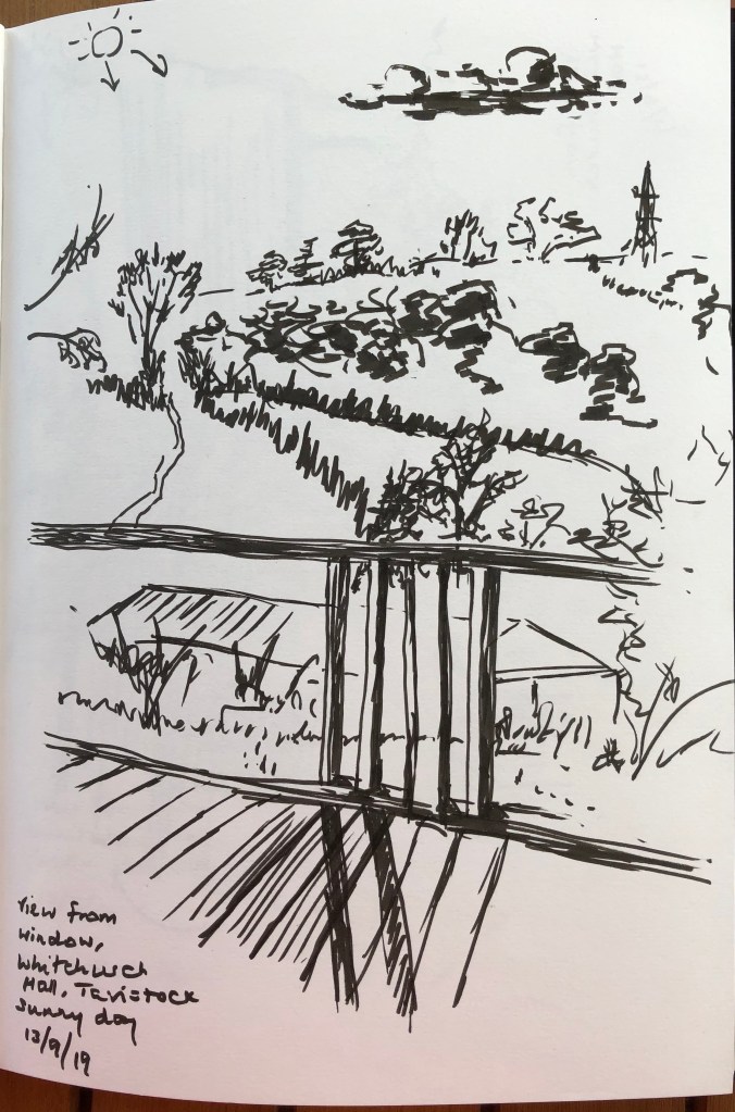
This was not so much a walk as a Friday afternoon session at Whitchurch art group. The hall we use is set on the edge of the village and has windows on four sides – I thought this would be perfect for trying to get all four pictures done in one 2-hour afternoon session (allowing time for tea, chats and looking at each others’ work).
I started off with this view through the fence (foreground), over someone’s garden with greenhouse (midground) and away to the distant hills. I decided to work throughout this exercise in a fat Pitt drawing pen, the idea being that I wouldn’t get too bogged down with fiddly details. The pen was good for expressive sweeping marks, lovely scribbly hedges and dark patches for the “negative space” part of the trees; less good for the detail of the fence – but I think I’ve got enough of that in to convey the fact that it’s a fence casting shadows, so OK. Notice that I’m also trying to work my clouds in!
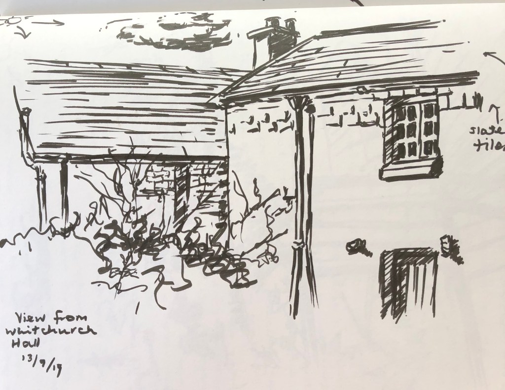
My next view was from the opposite direction, which was basically one half of a slate-hung cottage with an older stone building behind and a hedge in front. I have tried to note here the shadows (e.g. of the drainpipe on the wall) and the various textures, as well as get to grips with the perspective (i.e. lines leaning the right way).
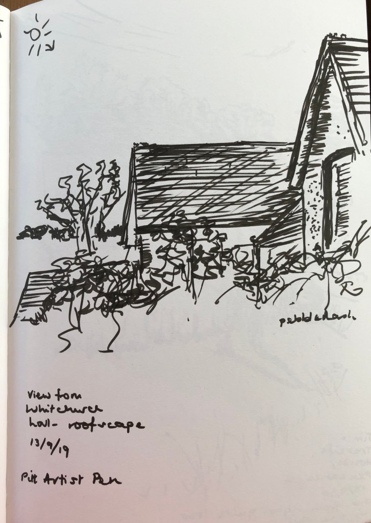
The next view was effectively between both of the earlier views – I wanted to get the “procession” of roofs in. Again, I looked to notice tone (shadows) and make quick notes about the surface texture.
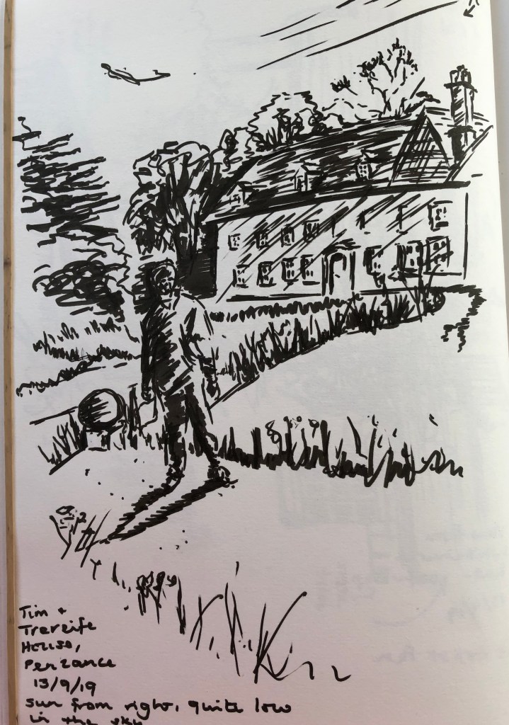
I went to the windows on the far side of the building; these have shrubs/trees growing right outside them, and I had hoped to be able to see the view behind through the foliage – but not to be, I’m afraid. So I turned to a photo on my phone of a recent stay at a rather crumbling but characterful old stately home near Penzance just which had started offering B&B as a means of paying its way – we stayed there recently, and I took a photo of my husband in the gardens in front of the house in late afternoon light – strong, dark shadows. The brush pen was great for the really dark darks, but a bit clumpy for mid- and light shadows so I think some of the bits of detail I did put in have become slightly unclear.
TAKE AWAY POINTS:
I enjoyed the fast sketching – need to do lots more to get better at going “big picture” and getting down the main details
I need to remember to step away part-way through a drawing and look at perspective – I am getting better, and slightly more confident, at seeing which way the lines lean when near to the horizontal (something I have struggled with and am still not 100% accurate), but I haven’t got that tapering into the distance, e.g. the house in the 4th drawing doesn’t taper, and I can see that clear as day now from my photo of it – need to get better at seeing it at the time!
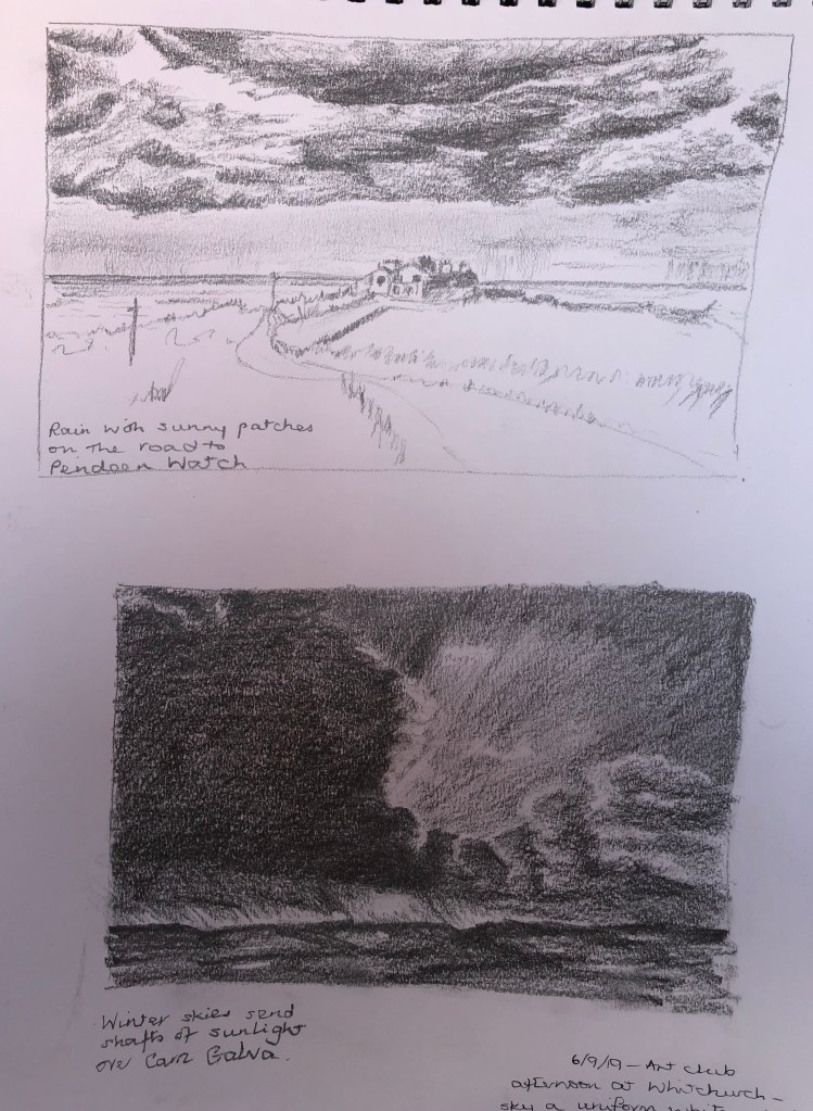
This has been overall a fun if slightly frustrating exercise; fun because it was quite free, and frustrating because, whenever I thought I had a bit of time for cloud drawing, it seemed to be either unremittingly sunny or else the sky was a uniform greyish-white accompanied by rain in varying degrees. Often I would see an interesting cloud formation when I was on the way somewhere – so there has been some shameless drawing from photos, both mine and those of others.
Dramatic stormy clouds (other than the uniformly grey variety) have come from books – but I have chosen images which exemplify real dramatic scenes which I have seen to have a go at: the lowering clouds which seem to process over you into the distance (where it is still raining), but lit by a sunny moment; and the massive evening stormy cloud passing away, allowing light from a setting sun to show around.
I did both of these with a chunky 2B pencil – this was generally fine for the task, although I did struggle to get the darkest darks quite as intense as I wanted.
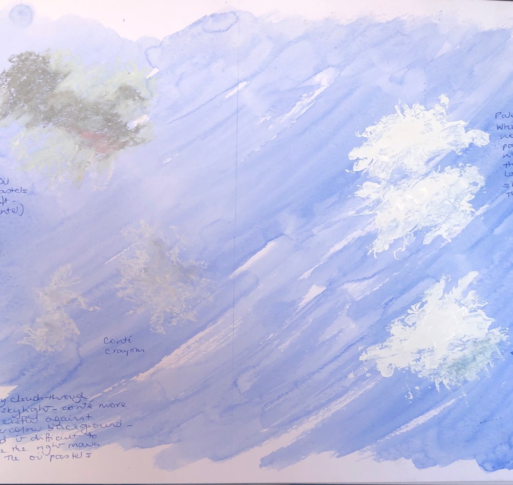
Wispy sunny-day clouds directly overhead have proven more of a challenge than you would have thought. These are generally darker towards the centre where the thickness is greatest. I had a go at using blue watercolour paint on a white ground to try and paint the cloud in as negative shapes, with variable success (see notes in A4 sketchbook). Then I experimented with different media over a blue watercolour wash (see here), where I found the most successful media were white and grey Conte crayons (lower left), and white gouache applied with a palette knife and my finger (right).
I was on the lookout for interesting composite cloud formations (as I had seen depicted in pictures by Alfred Munnings – see notes in A4 sketchbook and blogpost on a weekend in West Cornwall). These often seemed to appear towards late afternoon/evening – I snapped a couple of interesting skies and tried drawing them from my photos.
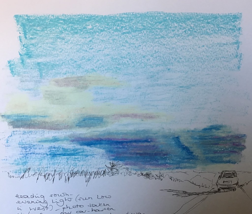
I was determined that oil pastels would be good for this rather dramatic sky taken from our car about to crest a hill. I tried an overlaying technique (loose darks first, then circular strokes with the white crayon – this linked with the Vila Celmins research, as this is the same stroke I used for my tree foliage – and then I repeated the circular strokes with a paper torchon). I became rather absorbed in the process rather than the outcome and the dark clouds on the right ended up a bit odd; but on the other hand I was quite pleased with the billowing quality of the lighter clouds on the left.
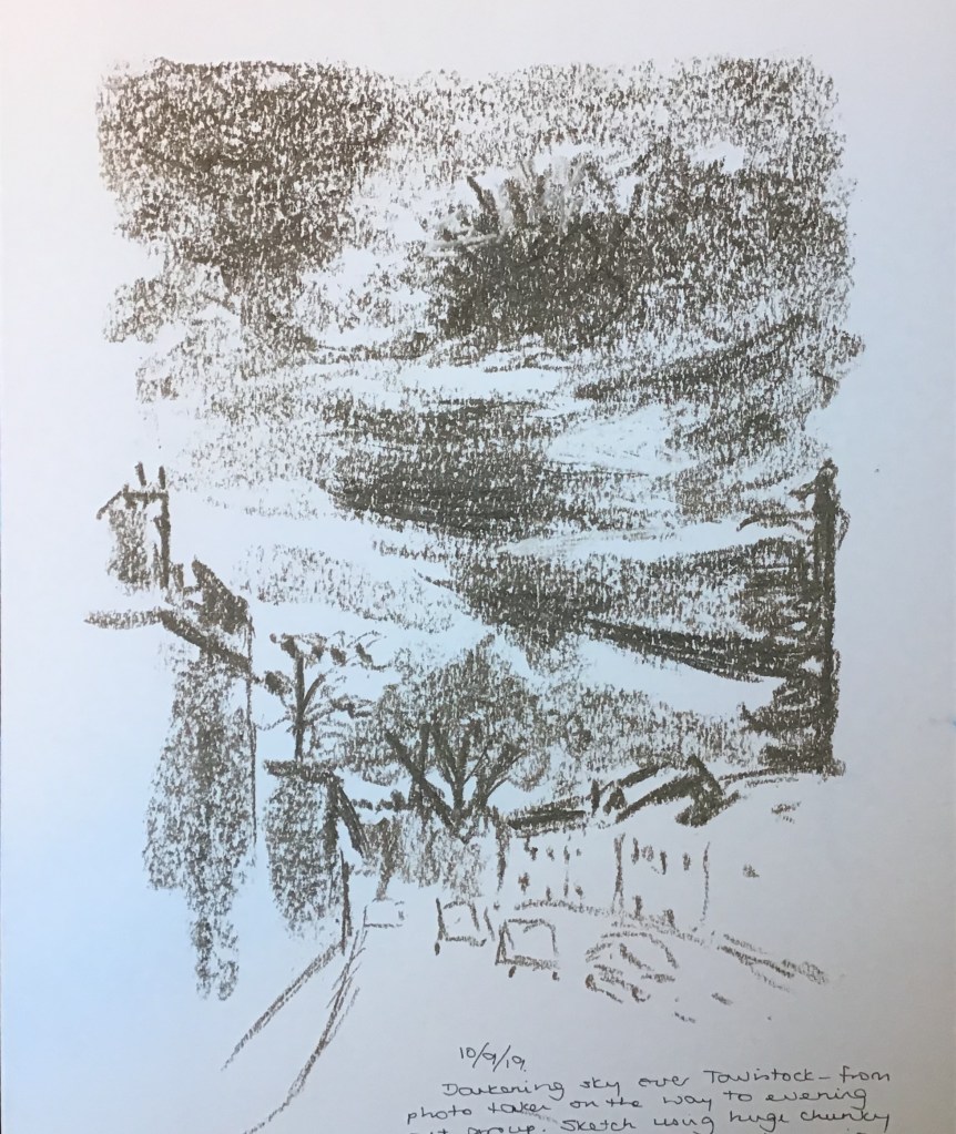
This was a quick 10-min sketch of a dramatic sky I saw as I walked through Tavistock to my art group meeting yesterday evening. The sketch is done with a huge chunky graphite stick which was new to me – great for big areas using the flat end, but also sharp edges for lines and emphasis. Enormously enjoyable!
This week, at this term’s opening meeting of the Tavistock Group of Artists, one of our members (Ian Pethers RMS, SBA) gave a quick talk and demonstration on the basics of perspective. Key things for me to remember from this:
“Art does not follow rules, rules follow art” (although it is good to know the rules, so you know what you are disregarding!)
The horizon moves with the viewer – if two people are looking at a view, their horizons will be different (unless they are of identical height)
He demonstrated using pen on a board which had a pin through the middle to which a string was attached – the pin was the vanishing point, around which he constructed an entire street scene using the string as a guide to the angle of the lines – brilliantly simple, works for my brain! He pointed out how things change as they become more distant, eg it’s not far before you can’t see the actual window glass, only the facing edge of the window recess.
Drawing e.g. tiles on a floor using guide lines – these will be fractionally curved as they near the viewer, due to the movement of the head/eyes
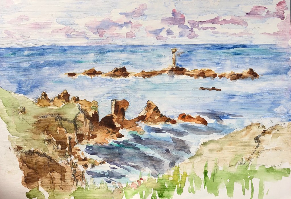
We (my husband and I) went and stayed outside Penzance last weekend to take part in an event jointly organised by the Newlyn School of Art and the National Trust – we were trying to set a world record for the number of people painting along a stretch of footpath between Sennen and Land’s End – see photo of extract from the Daily Telegraph. We were each given a board to paint on, and this was backed in fluorescent pink; a drone went back and forward along the path, which we had to hold over our head as the drone approached – a very unusual method of counting!
It was a lovely day, with a brisk wind to blow one’s board all over the place and lots of scudding clouds in a blue sky – not to mention a choice all along the coast of stunning views, although naturally I chose to try the Longships Lighthouse at Land’s End.
The surface of the board had been primed so this made for a very interesting watercolour painting experience – this was the medium I had brought for ease of carrying but, of course, the paint sat on the surface rather than being absorbed, leading to some rather unpredictable but fascinating effects. We had a great time! – here is my effort (note the clouds) and my husband holding up our paintings:
Whilst down there we managed some other arty activities, notably:
Visit to Penlee Art Gallery in Penzance to see an exhibition of the work of Alfred Munnings and his contemporaries done whilst in Cornwall, mainly centred around the Lamorna group. I made some sketches of the way these artists had tackled the representation of clouds in their paintings – see notes in my hardback A4 sketchbook.
Visit to the Kurt Jackson Foundation in St Just-in-Penwith to see his most recent exhibition based around Frenchman’s Creek. This was a real study in how to paint the same place over and over, and yet create a very different image every time due to variations in viewpoint, weather, time of day, tide, etc. A real chance to observe one professional artist’s methods of rendering massed trees and clouds, and also a study in the careful use of small areas of bright light to lift a picture – see again my A4 hardback sketchbook.
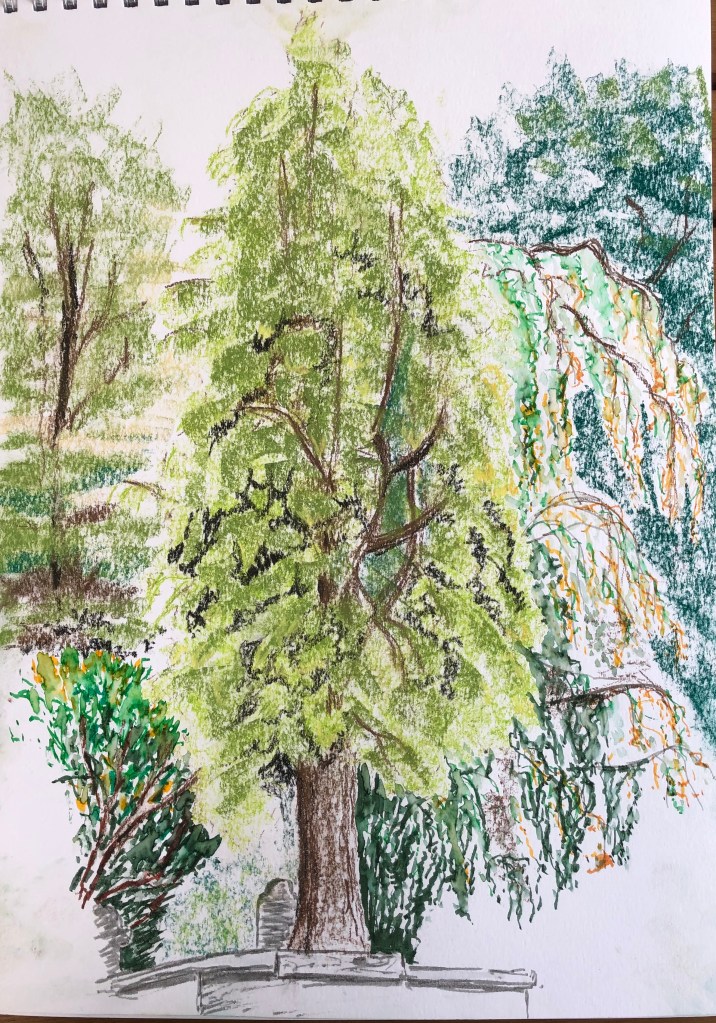
Along the road from us is an old Victorian cemetery – it stopped being used years ago and is now a blue-plaqued monument – but it has lovely old trees, some huge, largely untended, interspersed with rambling grassy paths and crumbling headstones, statues and mausolea. It is caught between the road and a steep embankment of the old railway line, so everything seems close-packed and tumbling over itself. Seemed like a good place to draw trees!
I set off with my large sketchbook, pencils, Conte crayons and water-soluble pens. No-one is ever in the cemetery so it was a bit creepy wandering around, and I was greeted joyfully by a black cat who became my constant companion. I eventually found a small clearing dominated by a fir tree and, behind it, a massive weeping birch. The sun was behind them so their edges seemed to be lit up – doesn’t show up terribly well in the photo which I took to try and capture the light, but the effect was much more marked to the naked eye, particularly as the sunlight trickled through the birch branches and leaves.
I settled down against the boundary wall, ably assisted by my feline friend who kept climbing over me, trying to get into my rucksack before finally deciding to use it as a bed, and batting at my sketchpad – this is my excuse for some rather random “jogged” lines.
The fir and the big background trees (which I think are sycamore) lent themselves to big gestural sweeps with the side of a broken Conte crayon, before working in the light/dark contrasts. The weeping birch and the laurel to the left of the fir tree seemed better represented by the water-soluble pens, which were good for the trailing curtains of branches of the birch and the strong individual shapes of the laurel leaves.
The overall effect feels much more lively than the sedate and elegant original. However, I think I have managed to catch the character of the different trees through my choice of media and the different marks that these encourage.
Reflections overall:
Techniques used to distinguish trees – think I have covered this above, particularly the differing mark-making and the choice of medium
Conveying mass of foliage and spaces between – the fir and background trees were depicted with big wristy sweeps with the side of a crayon. The birch and the laurel were drawn with pen; long trailing marks for the birch, short punchy marks for the laurel – then some water brushed over both in places.
Light on different parts of the tree:
The fir was light around the edges in many places (I left these fairly airy) with some heavy shadows which I tried to indicate using negative drawing – didn’t do this everywhere, just enough to give the viewer the idea of how it went
The birch I found tricky – the light shining through it, especially towards the top, made it look quite ethereal, and I tried suggesting this by leaving spaces. I have to admit it looks slightly odd; but I did look carefully and really couldn’t see the dark background between branches due to the intensity of the reflected light from the myriad leaves – so maybe I should have found a different way of representing all those leaves (watercolour and much thinner pen? – not sure, feel this might quickly become overworked…hmmm..)
The laurel was almost universally dark apart from tiny patches of sunlight reflected off odd leaves – I have tried to indicate this using colour (yellow)
Have I selected and simplified? I think in this drawing I have been forced to by the sheer weight of foliage – I’ve manages to look at patterns in the foliage without getting hung up on each individual leaf.
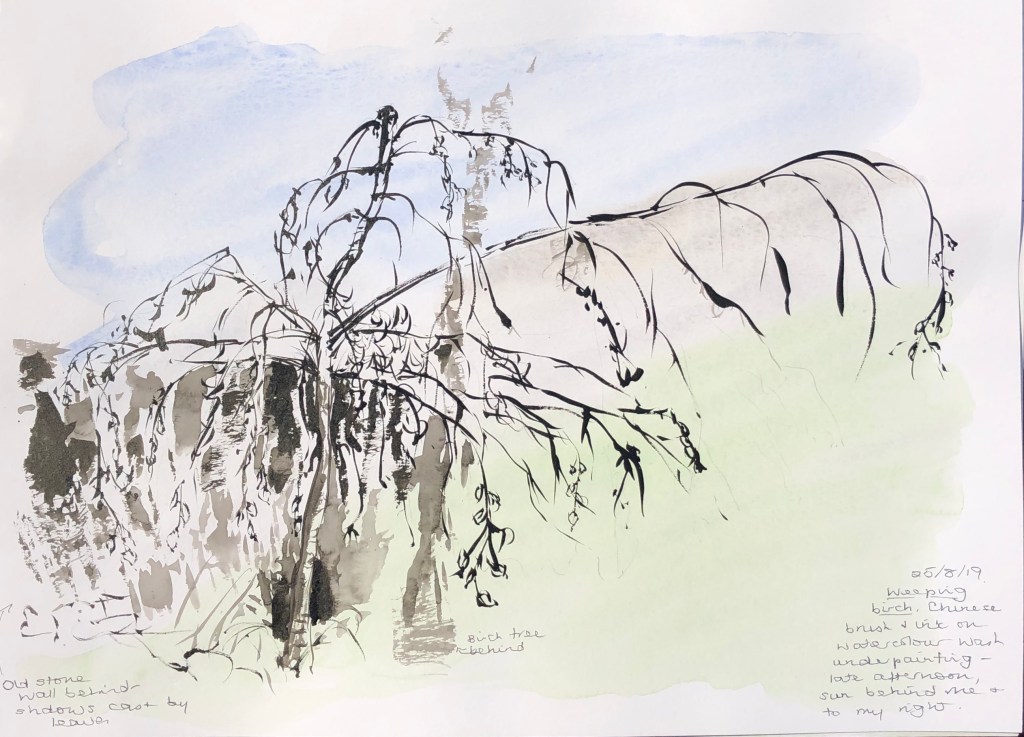
I want to try using the Chinese brushes and ink more, so I decided to have a go at a weeping birch tree in my garden. This little tree is surrounded by maple and beech trees which have overshadowed and squashed it rather until the only way it could grow was out over the path, which it has in fact now done very markedly. We cut back some of the beech and maple around it this summer, removing one of the beeches altogether, so the little birch now stands in a bit of space and has thrived as a result, even though it is still wider than it is high because of its previous fight for light. My husband is threatening to trim the branches that overhang the path now, so thought I had better catch the shape for posterity!
My tutor suggested that I thought more about my support in this Part, so I laid down a light coloured wash underneath the drawing before starting in with the brush and ink.
I think I have captured the unusually extreme shape of the tree well, and the Chinese brush was the perfect tool for those lovely elegant sweeping branches; the leaves were trickier, so I have just suggested their shape at the ends of a couple of the branches. I think I spoilt it slightly by trying to fill in a bit of the contrasting dark of the wall and shadow behind – possibly a different medium was called for there – and I definitely think the wash could have been a little more intense – it is literally wishy-washy. Live and learn.
I also tried a small study of a section of mossy trunk of the apple tree outside our morning room window, which I stare at every day.
Again, I used the Chinese brush and ink, trying to follow the mantra I acquired from D.N. Naylor, 2016; Drawing Masterclass – Trees; Search Press Ltd, of SHAPE → FORM → TEXTURE; I am still terrible at getting sucked into fiddly details very early on which then throws the whole of the rest of the drawing out of kilter, so I am trying to hold this little formula in my head.
I’m getting better at controlling the darkness of the ink, and the point of a Chinese brush is absolutely lovely to draw with when you need a delicate line – but I’m still not always getting there, still quite thick and blobby sometimes, must remember not to have so much ink/water in the brush.