Drawing 1; Part 5; John Virtue

What and So What?

John Virtue was an artist unknown to me before I started this course; however, as soon as I was directed to look at his work, it struck a chord with me. I liked his black-and-white images – no muddying of the waters with colour – and the organised core of me enjoyed his earlier tessellated works (which satisfy my innate need to prepare grids and charts) as well as his later, looser drawings with their repetitive quality born from his repeated study of the same area.

Unable to get to the university library during lockdown to find the books I had taken out on him before, an internet trawl revealed a new retrospective of his work – Paul Moorhouse, (2019), John Virtue, Albion RidingHouse, Oxford and London – and so I treated myself to a copy. It is a weighty tome but I have been fascinated reading it, and it contains a large number of reproductions of his artwork, which are otherwise tricky to track down online. The book follows his life and work in chronological order, looking at how he worked to develop and grow a style, or styles, which are his own. Any quotes which follow are from this book.

His method of working is almost ritualistic and it is based on repeated regular walks in/to a particular site – “These repeated walks, and indeed the wider progression from one place to another, underpin his artistic development.” He walks, he looks, he sketches, and brings his sketches back to work into and work from; however, these sketches are often unrecognizable, scribbly, and are intended more to remind him of a moment or experience than as an actual topographical record, and it is that experience which he aims to record in his completed works – “So it’s about being in a place, about movement within the place. The landscape presents me with a foundation…a structure, and that structure allows me to take all kinds of liberties to get some actuality.”

In his early work he would walk a particular location, sketching as he went, then would work into these sketches at home with pen and line, creating dense images. He started pinning these up on the wall until it eventually occurred to him to arrange them into a grid, which was a bit of a Eureka! moment for him – “Instead of a single view, a completely different evocation of the subject evolved. This presented the same motif from different positions. As the eye traverses a surface of different images, there is a sense of moving around and through space, as if seeing a particular place from successive positions. Experiencing the works in that way echoed the walks….”

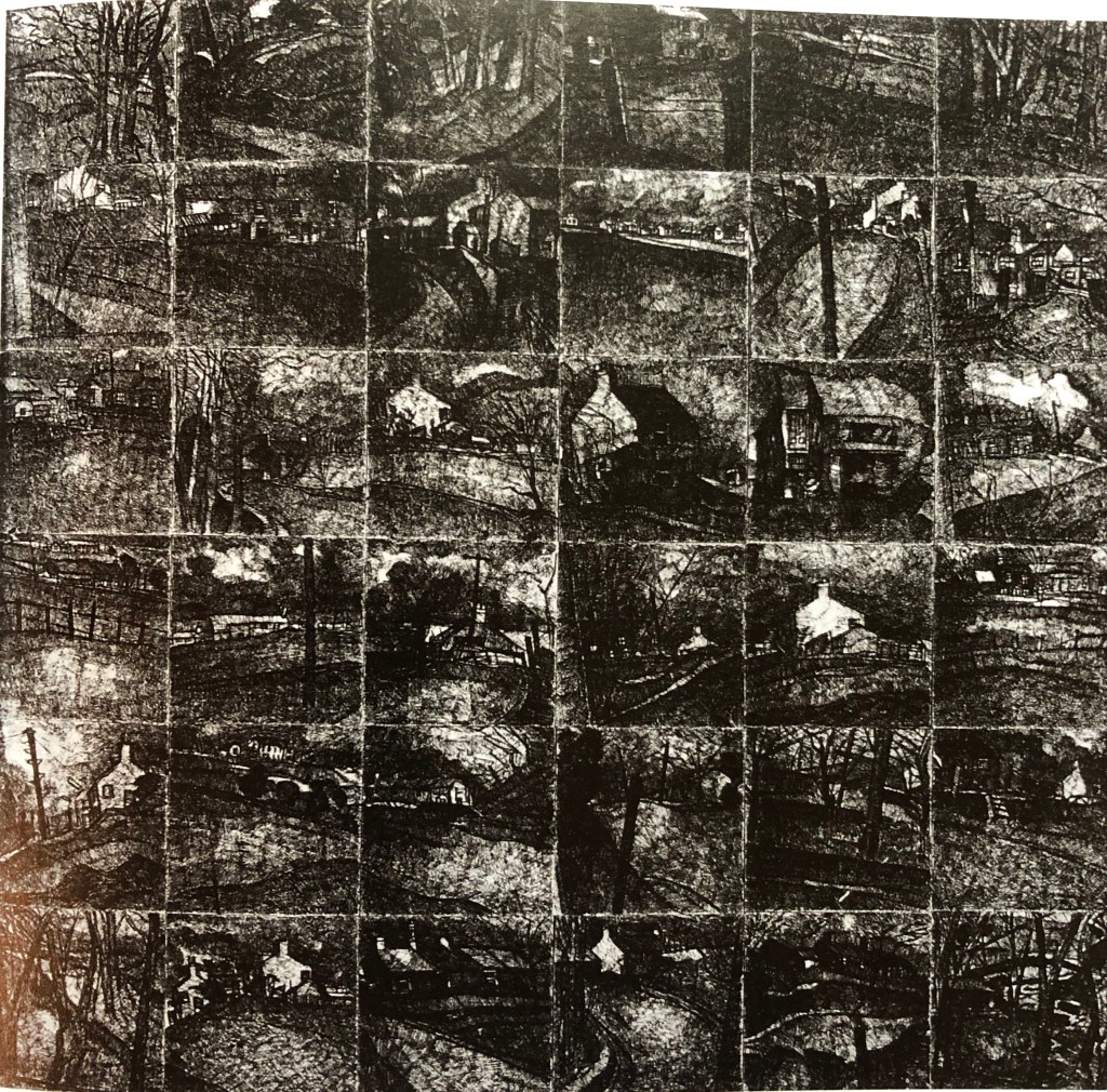
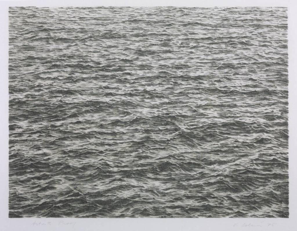
This example is Landscape No 10, 1982-83, black ink, shellac, pencil and charcoal on acid-free paper, laid on board, 110x110cm. Private collection, UK.

It depicts his walk at Green Haworth, which was the first site depicted in his new method.

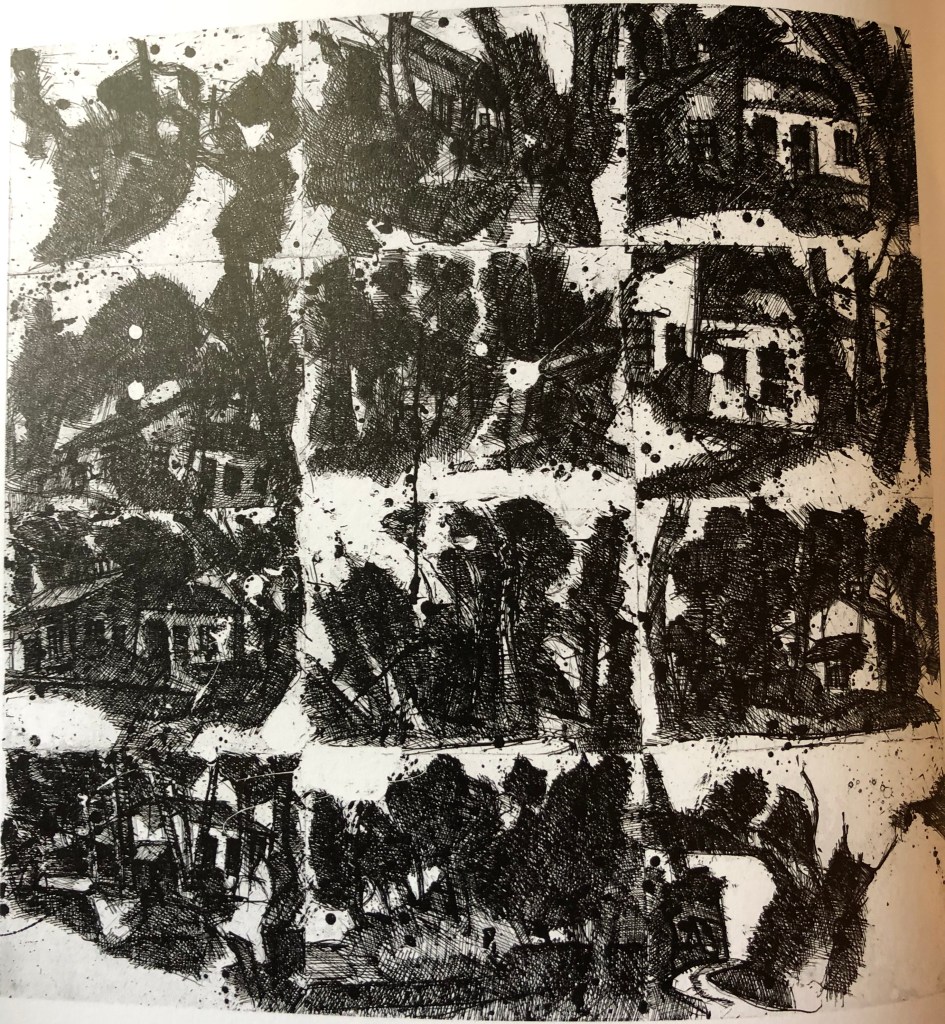
He then moved to South Tawton in Devon and began another series of walks, experimenting with his grids and layouts in different configurations and sometimes dropping or dribbling white gouache over the drawings. A few become less frantically dark, such as this example, Landscape No. 133, 1990-91, black ink, shellac, acrylic, emulsion, gouache, pencil and charcoal on acid-free paper, laid on board, 98 x 97cm, private.

Subsequently he moved to Exeter and began to walk the Exe estuary, where he could often walk without meeting a soul – but he is still not walking for contemplative pleasure – “Wherever he is based, the ritual that he establishes provides a structure that focuses his experiences. It wrests the flux of passing time into an order and, through drawings made at regular intervals during the course of the walks, a succession of transient moments can be arrested and preserved.”

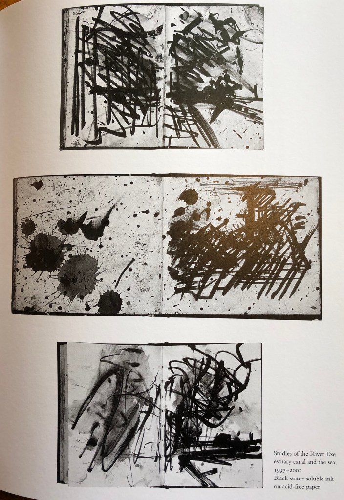
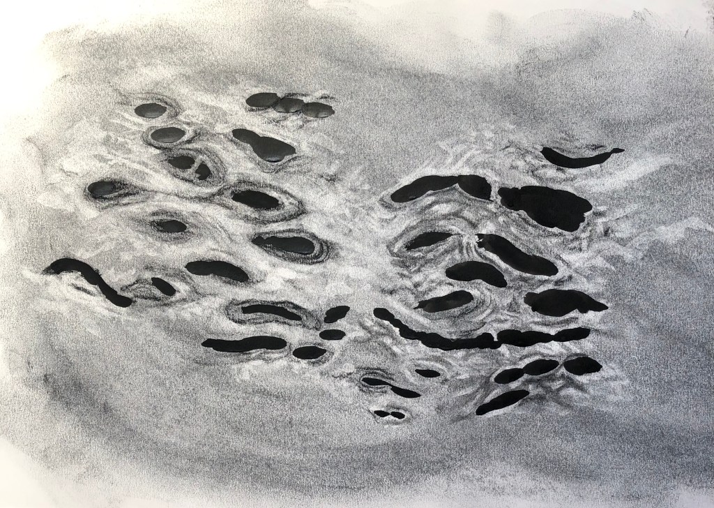
These extracts from his sketchbooks – Studies of the River Exe estuary canal and sea, 1997-2002, black water-soluble ink on acid free paper – give an idea of the sorts of marks he was making (and give me hope that my more scribbly pages in my own sketchbook are not completely out of the way).


It was here that his method of working changed – he still amassed huge quantities of drawings, but used them to try and create a single image, usually large and now on canvas, that encompasses these experiences.

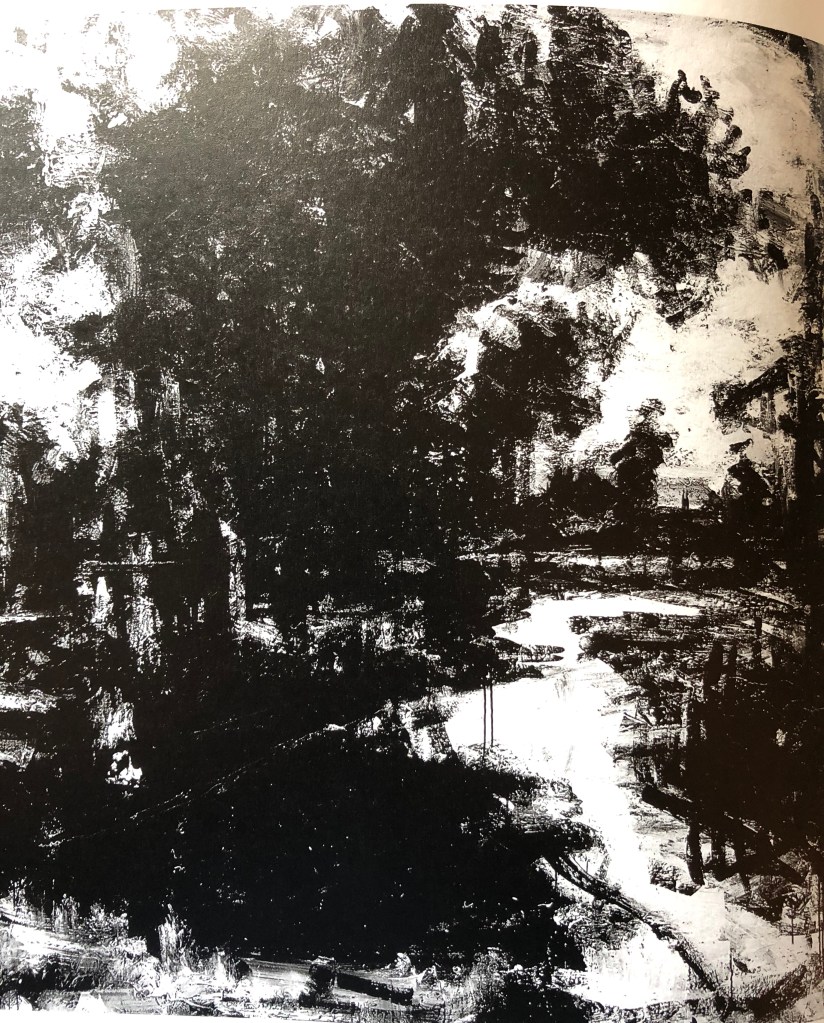
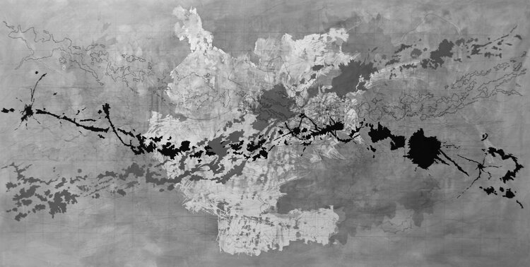
Many of them are hard to read at first and look almost abstract – but he always includes the church tower – often extremely small – but this one part of the picture seems to pull the rest into focus and make it understandable. One of the more figurative examples is Landscape No. 657, 2002, black ink, shellac, acrylic and emulsion on canvas, 183 x 183cm. Private collection, USA.

Virtue moved on to create other series, notably a group of London drawings which were the outcome of his time as Associate Artist with the National Gallery; his routine continued, but his walk now had to start at 6 a.m. to avoid the rush hour!

Now What?

Hopefully what’s gone before has given an idea of my enthusiasm for John Virtue’s work. There are two strands that I want to have a go at developing – the large and loose ink drawings, and the tessellated presentation, to see if either of these is where I want to go for a final outcome to this investigation.

Large and loose ink drawings:

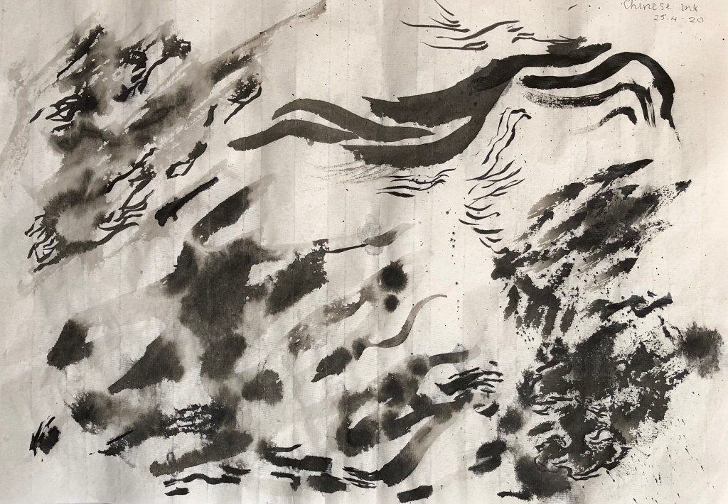
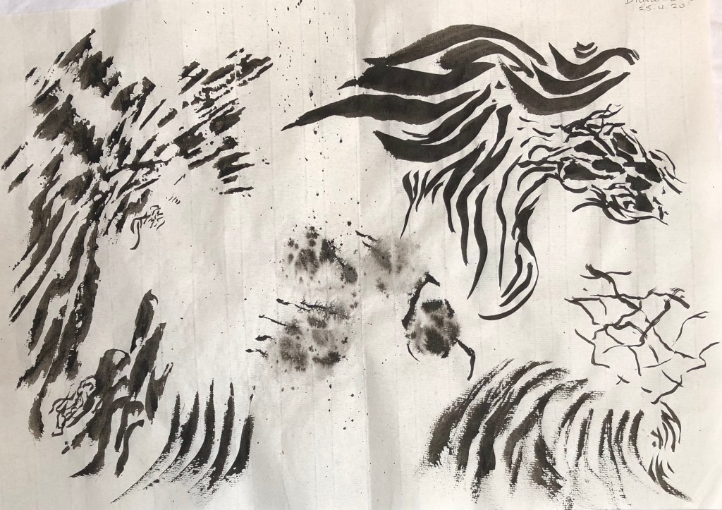
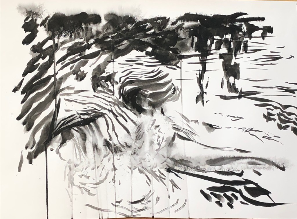
I started this off with the Fine Art Group studio day on 25.4.20 (for details of which, see separate blog post), but just include first effort here for the sake of completeness:

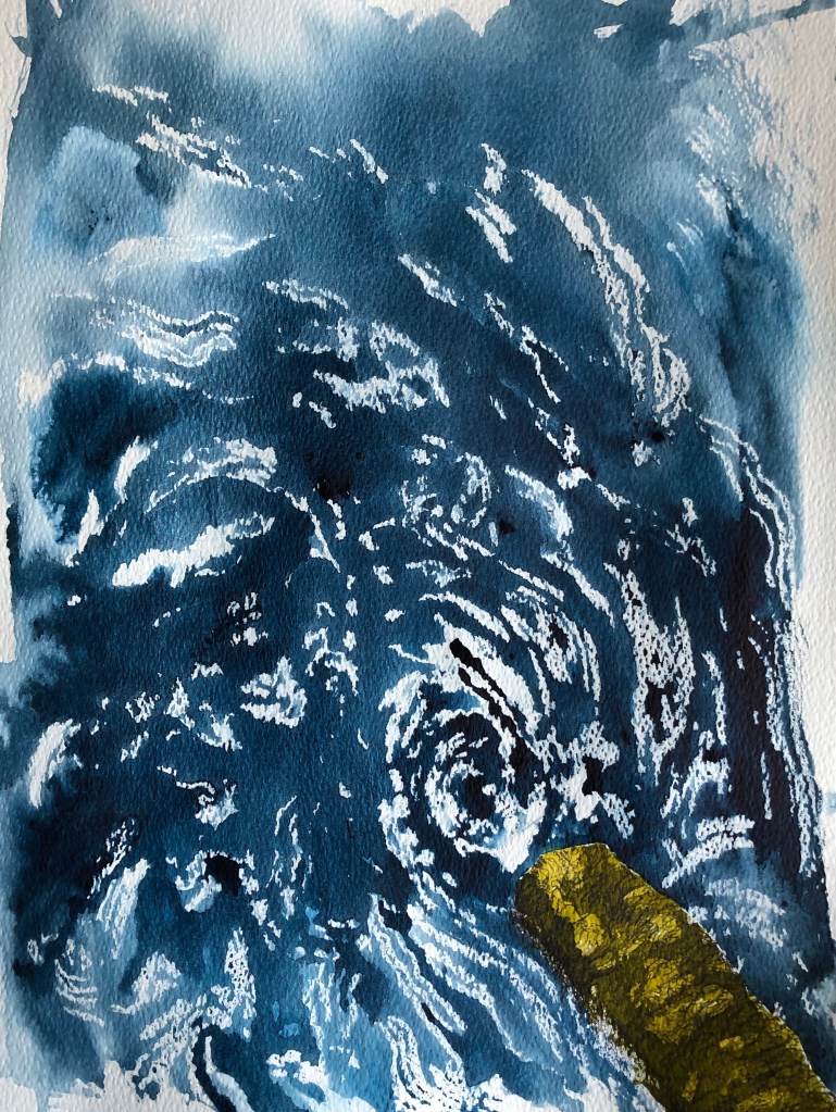
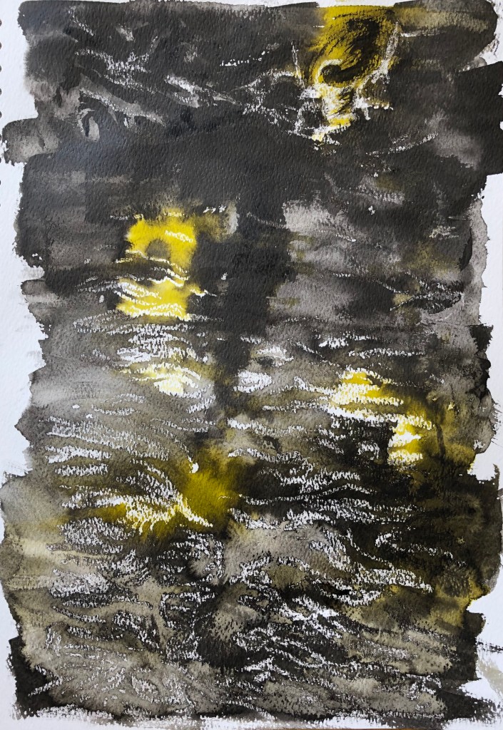
This was drawn without a particular reference point in mind, but was derived from my experiences walking along our little stretch of the Tavy, staring at and sketching the movements of the river which, because of the time we usually walk (and a regular time of day for walking was one of Virtue’s key ritual aspects), is usually backed by a dark bank and reflections, the sun coming more or less straight into our eyes from across the water.

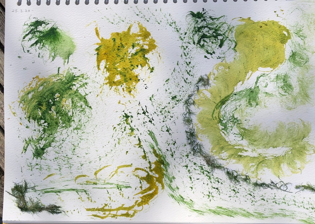
I extended this experimentation further by dropping black Brusho into water dribbled and sprayed onto thin packing paper (see also the reference to Alison Churchill’s work in the Studio day blog post); once the water and Brusho had been applied, I picked up the board and moved it around to encourage the direction of particular dribbles. I also thought I would try dropping white ink in from a Derwent Graphix marker but this proved a little unreliable and was also tearing the thin paper, so I moved to dilute white gouache for my dribbling and swirling.

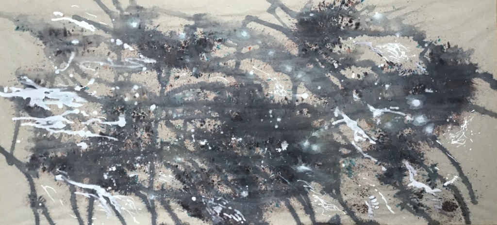
The effects are interesting….it definitely looks like fluid movement, and the white dropped into wet has given the impression of those sunlit sparkles you get on particular peaks or troughs. To be experimented with more, I think….

Tessellation:

I’ve had one go at this so far. I made a series of 2 min rough sketches (my husband helpfully timed me) with a sepia Pitt drawing pen in my A5 sketchbook as we walked. Frugal habits run deep and I had not thought to put them on separate pages so that I could tessellate them – doh! – so I drew myself a grid on A3 rough watercolour paper and copied the sketches into the grid – same pen. John Virtue worked into his with black line, but I decided instead to try ink washes in a limited set of colours – Pebeo Colorex Green Gold and a little FW blue acrylic ink – I wanted them to harmonise with each other as part of the same set. I have various places where I stop and draw (as per John Virtue) – from top left to bottom right, the weir, the lookout, the pylon, the beach, the fishermen’s steps, the bridge, the leat, the tributaries and the salmon leap.

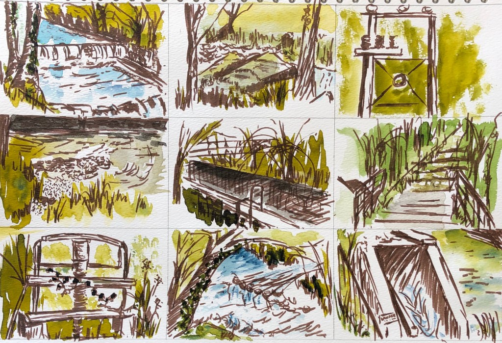
I think they are effective as a group, although I just drew them in as they came in my book, and so didn’t try moving them around to see which was the optimum visual arrangement – something to experiment with. Somehow the colour makes them look more like a group of individual drawings rather than parts of a whole, as in Virtue’s homogenised black-and-white …so plenty of things to try out.

Drawing 1, Part 5 – Vija Celmins and Lydia Halcrow

Vija Celmins – What and So What?

I can remember being directed to look at Vija Celmins’ work part way through this course, and being fascinated by her drawings of repetitive features such as waves, spiders’ webs and the night sky.

This is Web #1, drawn in 1999 in paper using charcoal (Tate and National Galleries of Scotland). Apparently she used a textured paper, covered it with layers of charcoal to build up depth in the background, and using a card frame around the outside so that the edges are neat but slightly feathered. Then she started removing the charcoal, first with her hands and breath, and then various types of eraser. The composition is made dramatic by being cropped. Astounding delicacy and patience!

Ocean 1975 Vija Celmins born 1938 Purchased with assistance from the American Fund for the Tate Gallery, courtesy of the Judith Rothschild Foundation 1999 http://www.tate.org.uk/art/work/P78336

This is her 1975 work, Ocean – it is a lithograph created from a pencil drawing (Tate Collection). She says: “I see drawing as thinking, evidence of getting from one place to another. One draws to define one thing from another … I tend to take very small increments and steps in changing. An example was that I had been working with the pencil and I began to see that the graphite itself had a certain life to it. So I did a series of images of oceans and deserts using different grades of graphite and pushing each one to its limit. I learned a lot about the possibilities of expressiveness in graphite by doing this…… It’s almost as if I was exploring the blackness of the pencil along with the image that went with it.” 

(Quoted in Drawing as Thinking, [pp.1-2] exhibition brochure, Anthony d’Offay Gallery, London 1999) 

I stare and stare at this picture and cannot imagine how she has kept her place in the image. To her it is a meditation on the qualities of her drawing medium, and yet she has managed to create the illusion of depth and perspective in an image containing nothing but moving water by making her far waves shallower, lighter and closer together..

Vija – Now What?

I was initially drawn to study the river by all the “pretty” and engaging features – the birds, flowers, trees, etc – but when all is said and done, a river is made of water, and each time I have gone I have become increasingly gripped by the movements of the water and the need to try and somehow capture them on paper. The more you look, the more you see, and the river is different at different points, depths and weathers.

Jutting out from the bank just below the weir there is what looks like a concrete post fallen over into the river – hard to tell as it is virtually entirely covered by moss now – but on one particular day the water was hitting it just right to send little curlicue eddies peeling off the top corner. I wanted to capture this in ink, so I drew the swirls and eddies onto an A3 sheet of watercolour paper using a clear wax crayon – after a while this felt quite Vija-ish as far as keeping track of where I was was concerned, as it was difficult to see the marks I’d made without constantly holding it up to the light. I then wetted the paper with water and dropped Daler Rowney FW indigo acrylic ink into it, tilting the page around to ensure coverage. I left the place for the post clear by keeping it dry, then drew it in afterwards with a waterproof drawing pen and washed over it with green-gold Colorex ink. I was pleased by the way the indigo ink spread unevenly, giving lighter and darker areas; the down side to this was that, in a few places, I think the ink has covered over the wax, but enough is left clear to give the impression I was after.

 I might try this technique again and see if brushing the ink in rather than just letting it do its own thing will preserve more of the wax markings. And yes, I did try this – and the answer is, it varies with how much ink you add and how many times you go over the wax marks. I tried drawing a bit of the river which often looks really dark under the bank because it is in deep shade from the bank and overhanging trees, particularly when the sunlight coming from behind it is strong; there is just a bit of the bank in the background, also very dark and made up almost entirely of twisted tree roots. As before, I drew my lights with the wax and covered the page with water, then brushed in black Indian ink and just a little green-gold Colorex ink. I lifted some bits with kitchen paper where I felt it was over-dark, and added another layer of black at the water’s edge. This has ended up as one of those drawings which looks better the further away you stand (and no, Glasgow is too far)! My husband said it was “very Kurt Jackson” – of whom, more elsewhere.

  Further up the river, just after some small rapids, the water is deeper and it ripples out fan-like and criss-crosses to make some fascinating mesh-like patterns. I decided to try and capture this surface pattern using willow charcoal and charcoal pencil. Onto a cut-off sheet of cartridge paper I laid down swirling layers of the willow charcoal, rubbing them into the surface of the paper with the heel of my hand to give a grey mid-ground. Then I tried to add the dark and light pattern by drawing in with a charcoal pencil and lifting out with a putty rubber. Something wasn’t right, and I realised that the darks weren’t dark enough – under the trees, where I had been observing the water, the dark bits of water were literally black and unreflecting – so I added strokes and blobs of black Indian ink with a small brush.

The black was a bit startling and at first I thought I’d blown it, but I carried on working in and around so I ended up with four tones – light where I’d lifted with the rubber, grey where the ground was untouched, dark grey where I’d added the charcoal pencil and then black ink. This exercise has really made me look and analyse what I’m seeing – very useful – and I have thought more about the properties and qualities of my media, as advocated by Vija.

Lydia Halcrow – What and So What?

I met Lydia at an OCA SW Group session where she was the guest tutor in November 2019. She explained her work and her working methods – I was fascinated both by those, and her presentation of her work, and have obtained her permission to include here some images from her website, www.lydiahalcrow.com.

In this first example, she has used material collected from a walk which she does repeatedly in order to create a record of these walks. When she was talking about artists who had influenced her she referred to John Virtue (see my separate blog post on his work), and this can be seen here in the use of black and white to create images, along with the tessellated presentation of a series of images.

Ground Texture Recordings (October 2019 walks on the Taw) Installation view

I was also drawn to her section of work called “Experiential maps” which she creates by collecting a range of information and samples of a walk through a place and assembling them into an image – “Each walk gathers fragments of information about the place, from textures to spills to shapes underfoot. Coming together they form maps that chart my experiences of walking in each place.”

Even though I know it’s made from a record of spills, which are potentially yucky, I really love this as an image – makes me think of those photographs you see of Japanese cherry blossom against the sky….Lydia has taken something a bit gross and made an arresting image out of it. Hopefully I can do something similar with less gross starting material…?

Spills Map - Walking the City (300 x 150cm) Mixed Media on Canvas

Spills Map – Walking the City (300 x 150cm) Mixed Media on Canvas

As well as these, I enjoyed reading Lydia’s recent article on #WeAreOCA – “Slow observation – Time and slowing down to notice in Creative Arts” – posted 28/3/20 – and the articles and extracts to which she refers – I have to say I was really sad and even sent the Rebecca Solnit “Finding Time” article out to my family as a bit of food for thought in lockdown – hey, once a teacher, always a teacher…..

Lydia – Now what?

I have found that, walking the same walk day after day as my husband and I have been over the past few weeks, we notice something different every day, whether it be a different butterfly, a leaf which has unfurled, or a rock which has been partially uncovered by the dropping of the river (hasn’t rained here for quite a bit now). Gilbert White in his Natural History of Selborne (1789) – my copy was edited in 2013 and published by OUP – argues that, if you really want to understand the natural history of a place, you need to visit it every day and look – and I would extend this and say that, if you want to know the essence of a place, you have to do the same.

I am fascinated by lichens, which abound in the wood. I know you’re not meant to pick them, but you are allowed to collect them if they’ve fallen, which serendipitously some had on old branches, so I brought some home. I wanted to experiment with some Beard lichen, to see if I could actually draw Beard lichen using the very same lichen – Lydia creates some of her images with material collected on her walks.

It actually turned out trickier than I thought as the paint and ink I used didn’t really get absorbed in the same way as, say, paint on a brush, so the marks were quite blobby, but I had a play to see what I could do with it. Light touch was best, and the ideal part for actually drawing were the tiny stem and branches – yes they are tiny, and I didn’t even realise they were there at first, but they’re surprisingly sturdy and resilient.

Next, I had a go at drawing a small rock sculpture on the little beach halfway up the river, which I had made every day right on the water’s edge, and was remaking every day if it had been disturbed by other walkers (or more likely their dogs), wild animals, or changes in the river flow. In Part 1 of the course my favourite medium had been ink and a stick, so I took a suitable stick home from the woods, cracked out the ink (Daler Rowney acrylic ink, Blue, and Pebeo Colorex ink, Tabac) and had a go. I was really surprised at the variety of colour I could conjure up with just these two inks in differing quantities, and greatly enjoyed being back at work with a stick – as a drawing tool it takes some beating, it offers such a range of marks depending on how you hold it and which part you use.

I think it was from this early drawing, one of the first I made once I had decided to study the river, that my interest started to grow in finding ways of depicting the water – see my work included in Vija’s section, above, and this is developing…..see next my blog post on the Fine Art Group studio day, 25.4.20.

Drawing 1; Part 5; Fine Art Group Studio Zoom session 25.4.20 with Caroline Wright, tutor

These are such interesting sessions, everyone doing very different work and at all points along the spectrum of the course. A four-hour long session like today’s is especially useful, as it makes you show up, settle down and crack on because you know you have to have something to talk about at the end! Today’s group was a good balance of personalities, all supportive of one another.

With a view to getting to know my medium better (see blog post on Vija Celmins) I thought I would explore two different inks, both black – one is Chinese painting ink, and the other Jackson’s Indian ink, which I believe I read was mixed with shellac (interesting because of my interest in John Virtue – see separate blog post about him). It was the first time I had used my Chinese brushes since before I broke my shoulder back last November, so I chose the largest and decided to introduce my left hand to that too.

I started off on A4 rice paper, just a sheet of marks with each ink, first Chinese then Indian, exploring the range of “watery” marks available – of which there are myriad – my favourites being rolling a part-dry brush. I tried spraying both with water, and also dropping ink onto wetted paper; the marks are different, each has a place, but on this paper I thought spraying onto the ink gave more watery effects. Both were moveable when wet but, when they were dry, the marks were static. When they dried, the Jackson’s Indian ink was darker than the Chinese ink.

I had applied these inks to paper flat on the desk; next I wanted to try and be bold in my application, and to use a near-vertical surface. I wanted to try something a bit John Virtue-y and loose. I used an A2 piece of cartridge paper, sprayed some water along the top and in random spots elsewhere, got a good brush load of Indian ink and dropped it in along the top. Some of it ran straight down, but I didn’t really mind that – I started pulling the ink around as it dripped, sprayed into it a bit more…….

Recognisable (well, to me anyway, having spent hours now staring at water!) areas of pattern began to emerge, enough for me to be able to tell a story of areas of flow, areas of swirl, reflections of trees and areas of meander, and I added more marks in until I felt I had something which looked like a section of river. Very freeing and enjoyable, although the end effect is not really like John Virtue, I don’t think, apart from being loose and black and white. Not that that matters, but I shall persist.

Caroline had suggested that I had a look at www.alisonchurchill.uk, which I took the opportunity to do while the last drawing was drying. And I found a kindred spirit! – this artist too has been mesmerised by the patterns in the water and has tried all sorts of ways to depict them. One caught my eye:

“Paper is absorbent and captures the energy of the water at the moment it hits the surface.  Pastel dust makes what was an invisible mark visible. ” (Alison from her website – see image, right)

Well, I wasn’t sure about coming up with pastel dust on the spot, but I did have a pot of black Brusho and also some olive green, which I thought might do. I taped an A2 piece of cartridge paper flat on my horizontal work table, threw handfuls of water over it directionally, applied sprinkles of mostly black Brusho with just a tiny bit of olive green near the bottom, and watched. Quite magical, with reservations. From the photo on the website, Alison’s paper looks quite thin whereas mine is fairly thick – also, mine was quite resistant to absorbing the water, which tended rather to cockle the paper and sit in puddles. However, the overall effect was quite water-representative. I couldn’t resist tinkering (otherwise it didn’t feel as if I’d made a drawing – what is a drawing?? – need to give that a lot more thought if I’m going to go down this line!), so I used my Chinese brush just to pull out some of the puddled colour and make some ripple marks.

I do rather like it as an image, and it was generally favourably received by the group – someone said that it had a lot of energy, and they had read the white areas as foam on the water. I think I’d like to try it again but on different paper – could go down the pre-stretched watercolour paper route, or cheap packaging paper salvaged from deliveries…..

Drawing 1, Part 5 – David Hockney

What and So What?

I saw a retrospective of David Hockney’s work about 3 years ago at the Pompidou Centre in Paris. I hadn’t known too much about his work, other than being able to pick out the really well-known motifs such as swimming pools, such as his 1972 painting, Portrait of an Artist (Pool with Two Figures), acrylic on canvas, private collection, which I thought was interesting because of his observation and depiction of moving water, a thing I had always found difficult. The colours on this and much of his other “famous” work are bright and zingy, and so I remember being quite surprised at the muted palette of his very early pictures. However, what really caught my eye were the large tessellated images, both paintings on canvas and iPad as well as video camera synchronised film clips.

I watched an interview with David Hockney on a film called “EXHIBITION ON SCREEN: David Hockney RA” by Seventh Art Productions which was published by the Royal Academy on 15th April 2020, and in which he talks about the creation of some of these latter works for the RA’s 2012 Exhibition, “A Bigger Picture”. He had been invited to fill the RA’s Main Galleries with a series of works depicting his native Yorkshire. Part of the film showed the galleries and the way the pictures were presented, and again I was struck by a series of paintings filling one wall as a tessellated grid – the 2004 series Midsummer, East Yorkshire  – see film, 12:58 in, and  https://thedavidhockneyfoundation.org/series/midsummer-east-yorkshire. The pictures were all different, but the overall effect was striking and drew the viewer in to look closer. He discussed the importance of careful observation and finding a way to make marks and develop a language to express what you see.

He also talked about his use of the iPad as a drawing tool , which he used to draw a series of pictures to depict The Arrival of Spring in Woldgate, East Yorkshire, 2011(see 25th February, right) – the great gain, he says, is speed, although you lose resistance, but the range of marks you can make is huge.

Now what?

Two aspects of all this interest me – the presentation of a set of images in tessellated form, and the use of the iPad for drawing.

In my river study I have become fascinated by the observation of the multitude of moods of the water and the patterns it makes, dependant upon the ambient light, the depth of the water, the presence of obstacles and the rate of flow – I can see the depiction of all this becoming a major strand of my investigation. With this in mind, I have begun experimenting with an app called Sketchbook on my iPad, trying to get to know some of its features and trying out its suitability for this task. I am making a pdf booklet in Pages to assemble all the iPad images I create and explain the effects and tools used in each case (if I can find out how to link it to the blog I will, otherwise will submit it as a separate document),  but here are four:

I can already see, just by trying to tessellate these four images here, that the selection of what goes where is going to be a skill in itself…..

Drawing 1, Part 5 – Reflection and choice of personal project

  • Review

I enjoyed looking back over Drawing 1 so far –  I feel as if I’ve come a long way from the rather uncertain artist who started out. Quite a few obstacles have had to be overcome; I was hospitalised for nearly a month with collapsed lungs part-way through Part 2, broke my right shoulder towards the end of Part 3, and was self-isolating because of the Coronavirus pandemic as I submitted Part 4. Crumbs. Yet, here I am, still going and looking forward to tackling Part 5.

Now that hindsight has given me an overview of this unit, certain things have stood out for me as I looked back over the assignments, which I should like to pick up on and tackle in Part 5:

Assignment 1 – I realised that I hadn’t got the point at all of research and wasn’t really using it in my work; also I don’t think, looking back, that I quite got the point of looking at gesture, texture and non-permanent mark making. 

Assignment 2 – I needed to actively consider things like background and support and experiment more; my big takeaway messages were to trust my judgement, and be expressive!

Assignment 3 – this is where I have a hiatus – I broke the shoulder of my dominant hand having planned out but not executed my assignment. My left hand was initially pretty useless and barely up to holding a pencil sensibly, let alone executing straight lines for buildings, accurate curves for roads, etc, and so I made the decision to park this assignment and, after a break to allow myself to get to the stage that I could do basic things like standing and sitting without the help of someone else, I started to begin the long road of training up my left hand by making a start on the more forgiving curves and squiggles promised by Part 4. One extra thing arose from my tutor feedback, which was the possibility of exploring series of sketches, as seen in the work of Canaletto and John Virtue.

Assignment 4 – I need to really focus on making clear links between areas of my work – research leading into practical work – in my learning log and sketchbook. I have also, as a result of training up the left hand, become rather limited in the media I am confident using, and I should like at this stage to become more adventurous and to revisit the wider range with which I had experimented earlier in the course. I am also going to try and use my tutor’s writing formula (what – so what – now what) more consciously to stop me rambling!

  • Choosing my personal project

I had loved Part 4 and, in different times, would almost certainly have chosen something human figure-related for this project. However, lockdown makes this quite a challenge, so I decided to look back to Part 3 and revisit the Outdoors. I also wanted to pick up on the aspects of Part 1 which I felt I had grasped only tenuously.

Whilst we are in lockdown (which will probably go on quite a while for us as I am vulnerable because of my respiratory condition and my husband is over 70) we have been using our daily exercise allocation to walk through a small private wood just down the road from us which borders the River Tavy, one of the fastest-flowing rivers in England. We have grown to know this section of the river very well. It currently belongs to a private school which let out the fishing rights – hence we see the detritus of schoolchildren plus a few fishermen’s ladders. It has various notable features – a weir with a salmon leap, a small beach and a little island which we can clamber over to when the river level is low. Before being owned to the school, the wood carried the railway, now defunct, as well as being the start of a leat (fed by river water) which ran past our house into Tavistock to serve the local foundry (now chic apartments) – so there are historic, transport and industrial aspects to consider. And the flora and fauna, including a huge range of birds and insects (including what look like the world’s biggest pond skaters) are a delight every day.

A complex site then, which would no doubt repay years of study. Whilst researching some Land artists (about which, see separate blog post), I came across an investigation by the photographer Prof Jem Southam, who tried to express the answer to the question “What is a river?”  in photographs (see Nicholas Alfrey, Stephen Daniels and Joy Sleeman, ‘To the End of the Earth: Art and Environment: Art & Environment’ in Tate Papers, no. 17 Spring 2012, https://www.tate.org.uk/research/publications/tate-papers/17/to-the-ends-of-the-earth-art-and-environment). He soon decided that this was an endless task, as I can quite see. However, I should shamelessly like to borrow his idea but refine the question. I am required to come out of this at the end with a final drawing; so I should like to investigate the methods of various established and emerging artists working in this field in order to find an effective way of expressing the answer to the question “What is this river?” in drawing.

Working method

It will be very easy to go in a million different ways with this and end up hopelessly sidetracked, so my working method must have clear focus and direction.

 I have decided that I particularly want to continue working in graphite and charcoal, but that I also want to go back to using inks – I loved using ink-and-a-stick in Part 1, and also using Chinese brushes in Part 3. I shall use drawing pens for most of my on-site sketching; I might also have time to familiarise myself with “virtual” ink in the form of iPad drawing programmes, as used by David Hockney. A lot of my work might be monochromatic, but I should also like to explore the effect of washes of limited palette. I want to look again at line, form, gesture and texture and how best to use these to convey an idea. 

I have identified a group of artists whose methods will be helpful to study and emulate, to see which work for me in enabling me to come to an expressive yet definitive answer to my question. My artists are:

(i) Land artists and those who create art which is sometimes transient within the environment, such as Robert Smithson, Richard Long, Christo & Jeanne-Claude, Andy Goldsworthy and Naomi Incledon

(ii) Vija Celmins for her work on mark making and her depictions of moving water, in parallel with Lydia Halcrow for her work on “collecting fragments of information about a place…..coming together they form maps that chart my experiences of walking in each place.”

(iii) David Nash for his inclusion of mapwork

(iv) Otobong Nkanga for her bodies of work incorporating a wide range of differing media, including diagrams

(v) John Virtue for his serial sketches which he used both to inform a large finished piece in ink, and also which he assembled in tessellated form as a finished work 

(vi) Kurt Jackson for his studies of particular animals or sites over time

(vii) Albrecht Durer for his detailed and meticulous observational drawings

(viii) David Hockney for his presentation of images in tessellated form, and for his innovative use of iPad drawing technology

(ix) Amy Shelton for her presentation of information in tessellated form, including direct use of natural flora

Drawing 1; Fine Art online group Zoom meeting with Dan Robinson on 23rd March 2020 – Art, Fiction and Place

A variety of useful points came up, some of particular relevance to me now at the start of Part 5 – these are in bold:

  • As we are not currently allowed to send our actual sketchbooks to our tutors due to the coronavirus restrictions, we can video a “walk-through of our sketchbooks and send that to our tutor, either by email or uploaded to the blog.
  • We could also video ourselves with particular artworks, e.g. A1 drawings, to give a sense of scale or particular physical qualities
  • New assessment guidelines are coming out, and digital assessment is highly likely
  • It is important anyway to develop our skills in creating digital images of our work as that is what happens in the real world (e.g. submitting entries for competitions)
  • I explained my idea for Part 5 of an investigation into ways of documenting my responses to a particular location through drawing – Dan referred me right back to the beginning of Part 1 and suggested that I consider the “temporary drawings” exercise, which might lead me to consider the question “What is drawing?”
  • Could I consider using some text extracts in my drawing, e.g. as part of a collage? (see Eduardo Recife)
  • Suggested artists to look at in connection with other people’s projects:
    • Xavier de Maistre’s “A Journey Round my Room” – an example of a jumping-off point for the imagination
    • Jo Spence and Terry Dennett
    • Helen Chadwick – Wreaths to Pleasure
    • Marina Abramovic
    • oca.padlet.org/stefanart/gkea8d4uaa87
  • Dan or someone in uni will send out details of Global Earth Day activities – or it will be on the blog – it’s a collaborative event