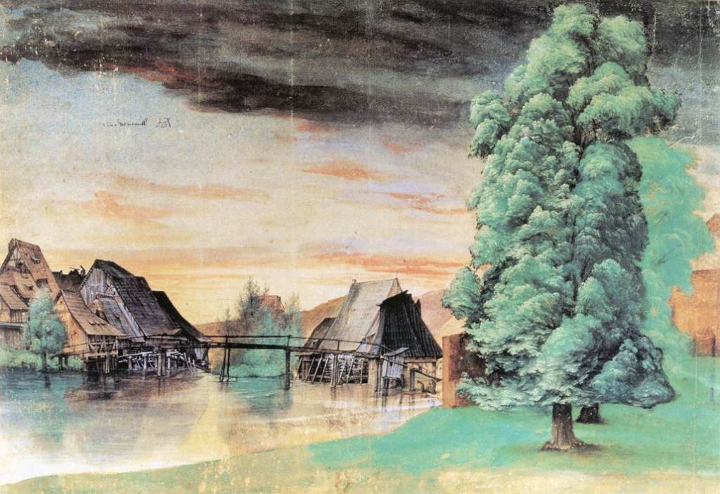
In Silver & Smith, 2011, The Essential Durer, University of Pennsylvania Press, reference is made to how central drawing was to Durer’s practice, and how he would draw every day regardless of the other work in which he was currently engaged, and this must have supported the accuracy and detail of his etching and engraving work in particular. His drawing materials were wide-ranging; basically all the materials we have been encouraged to use in the course so far with the exception, interestingly, of red chalk, which he is not known to have employed. It is said that his choice of drawing medium was always suited to the subject and that for natural subjects including landscapes he would use a brush (allowing for wide sweeps) and watercolour and body colour. His breadth of choice of subject matter is very wide, and no doubt partially dictated by the religious upheavals and scientific blossoming of this day, but apart from his print work he is also known for his watercolour landscapes including weather effects such as The Willow Mill:
Albrecht Dürer, The Willow Mill, 1498 or after 1506, watercolour, bodycolour, pen and ink on paper, 25.3 x 36.7 cm. , Bibliotheque Nationale, Paris
I particularly liked this one for it’s sky and it’s foreground tree, both of which I feel I am “working towards” being able to produce.
However, a lot of his landscape work in his etchings and engravings seems to be as the background to a foreground human event, either real or imagined; I watched a video on YouTube about the etching: Durer, 1518; Landscape with Cannonput up by the Clark Art Institute, Williamstown, Massachusetts, in which a huge amount of background landscape detail is put into a scene populated by numerous figures as well as said cannon.
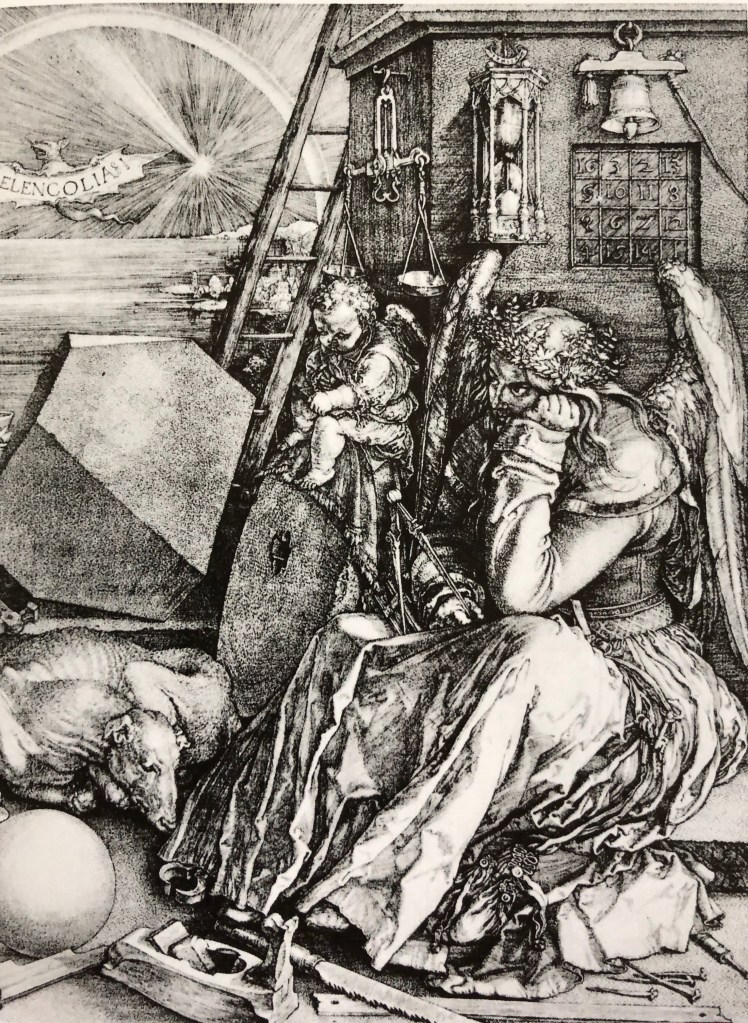
I was fascinated also by the engraving: Durer, 1514; Melancolia I which, as pointed out by Hockney & Gayford in their 2016 work A History of Pictures, Thames and Hudson, contains a massive amount of hatching detail – just look, for example, at that calendar on the rear wall!
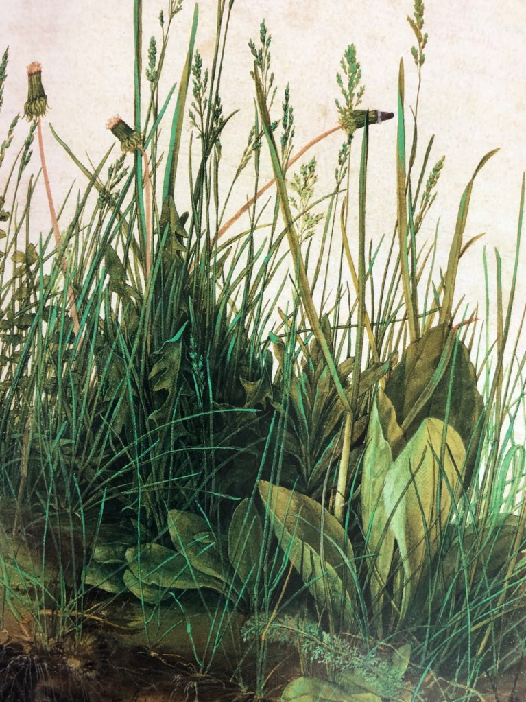
I was also attracted to Durer’s 1503 work, The Large Piece of Turf, watercolour and gouache on paper, Grafische Sammlung Albertina, Vienna – so fresh, looks as if it were painted yesterday. According to de Botton & Armstrong, Art as Therapy, Phaidon, “..Durer hoped that, having looked at his work, one would head outside and do what he had originally done: to look with great care and devotion at some significant aspect of the natural world.”
Well, it’s done it for me.
Claude Lorrain
Claude became famous for his works evoking “nostalgic beauty” (E.H. Gombrich, 1988, The Story of Art, Phaidon). He likes, as de Botton & Armstrong (see above) suggest, “…glimpsing a horizon through a cluster of trees,,,” – and his trees are certainly very lifelike. Gombrich says “It was Claude who first opened people’s eyes to the sublime beauty of nature, and for nearly a century after his death travellers used to judge a piece of real scenery against his standards. According to Franny Moyle, 2016 in The Extraordinary Life and Momentous Times of JMW Turner, Penguin, Turner was exposed to Claude’s print works as a child and, as an adult and already established artist he showed that he admired Claude’s work and tried to emulate something of his grand style.
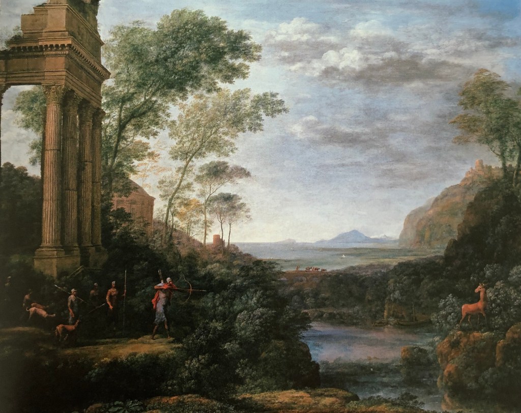
Hockney and Grayling (see above) point out the beauty of Claude’s composition, saying that his paintings were very theatrical: “His placing of trees or architecture on the right and left and the deep space in the middle is very much like a set behind a proscenium arch” – an example seen here in Claude’s 1682 painting, Landscape with Ascanius shooting the stag of Sylvia, oil on canvas, Ashmolean Museum.
I think this last remark chimes with me – I can appreciate the complete virtuosity of Claude’s rendition of trees, clouds and the like, but his paintings overall don’t particularly appeal to me as they feel very posed. I also have a horrible feeling that, if I sat down to paint “a landscape”, my initial attempts at composition would be very similar – something I must bear in mind.
In an online article by Jeanette Winterson from The Guardian, 13th June 2013 it quotes Lowry as saying: ““It would be about four o’clock and perhaps there was some peculiar condition of the atmosphere or something. But as I got to the top of the steps I saw the Acme Mill; a great square red block with the cottages running in rows right up to it – and suddenly I knew what I had to paint.” She describes him as “popular, but unfashionable – a deadly combination in the art world”, but she finds the rather repetitive nature of his paintings fascinating, showing what happens to people when they have to deal day-in-day-out with repetitive machines. I found her article brought him to life a bit for me and made me see the point of his flat paintings (she urges us to look for the flash of colour in the flowers in an upstairs window as a sign that the humans are secretly fighting back against the machines) – but I’m not sure that I would want to paint in his style.
George Shaw
I hadn’t come across George Shaw before, and I can see that, in a way, he is the natural successor of Lowry. My initial reactions to his landscape paintings were, I suppose, surprise – he paints realistically, yet why does he paint the landscapes he chooses? Apparently he paints in Humbrol modelling paint, which gives his pictures a modelled sheen – almost as if he were trying to preserve the crashingly mundane scenes around him for posterity, as images to be valued because they represented his life and environment exactly as he saw it. I found an interesting review of his exhibition at the Holborne Museum in Bath written by Johnathan Jones published in the Guardian on 7th February 2019 , very much trying to set Shaw as a product of the dreadful Brexit times we are all going through. This extract caught my eye:
“Yet his meditation on what the art historian Nikolaus Pevsner called “the Englishness of English art”goes deeper than that. Shaw revisits the landscape art of Gainsboroughand Constable that is so often taken as quintessentially British, or English. He haunts the same kinds of woodlands they did and shares their eye for nature; the trees in his paintings have such vivid personalities they can stand in for the absent people. Blossoming in spring or bereft in winter with black finger-like branches twisting against the sky, they are witnesses to his state of mind.
And what a troubled state of mind it is. John Constablesaid he was inspired to paint by his “boyhood scenes”, and so is Shaw. But while Constable grew up in the Suffolk countryside that his paintings immortalise, Shaw grew up in the 1970s and 80s on Tile Hill estate on the outskirts of Coventry. This is the place he obsessively paints. He depicts the house where he lived as a child, a tree he could see out of his window, and woods close to the houses. Tile Hill was designed as a pastoral blend of nature and modern planning. As it has decayed before Shaw’s eyes, it has become a monstrous landscape of disillusion and betrayal.”
In an extract from a statement by Shaw in 2002 I found on www.tate.org.uk, when he was talking about his series of pictures called “The Passion”, he said:
“I started to make these paintings out of a kind of mourning for the person I used to be: an enthusiastic, passionate teenager who read art books and novels and poems and biographies and watched films and TV and listened to music and dreamed. They are paintings of places that were familiar to me in my childhood and adolescence, places in which I found myself alone and thoughtful. They are places in which I forgot things. … I paint the paintings of all the times and all the thoughts I lack the language to describe.”
Many of his paintings do have that kind of “bemoaning lost youth” initial feel. However, many of his works seem to me to have a light corner or patch of sunshine somewhere or other which possibly points to a more cheerful, less morbidly fatalistic view of life….(just like Lowry with his flowers in the window)?
Sarah Woodfine
Sarah was another contemporary artist whose work I hadn’t come across before. I read a brief biography of her on the Wimbledon College of Arts website (www.arts.ac.uk). It talks about her “heavy and precise” pencil drawing, which combines with her chosen subject matter to “explore imaginary worlds that sit between the familiar and fantastical.”
A picture of hers which I was particularly drawn to (pun!!!) showed a black background with a full moon in one corner and a small caravan in front of what might be fence posts, or might be a stone circle – I can’t immediately find the name or reference for this – but it is a very striking image constructed out of a white circle, a whitish caravan and a few white lines, from which one could develop all sorts of stories.
I did like the recent work she had done using pencil on paper and a range of materials such as steel, perspex and MDF (see details of this work on the Danielle Arnaud gallery website, www.daniellearnaud.com), e.g. Untitled (Branch) II 2015 pencil on roll of Saunders Waterford paper, steel and perspex, apparently incorporating the careful looking and recording advocated by Albrecht Durer and Vija Celmins.
TAKE AWAY POINTS:
The artists that I most relate to from those I have looked at here are Albrecht Durer and Sarah Woodfine; some of their work I find rather fantastical and weird, but their look-see-record ethos (which chimes in also with Vija Celmins’ approach) is to be developed
From my rather unexpectedly adverse reaction to Claude (which I did have beforereading Hockney and Gayford, honestly…), I need to think more carefully about compositions other than the traditional which first present themselves
I watched the video a few times – at first I didn’t quite “get” her, having not come across her work before – she reminded me the first time of Bridget Riley and her meticulous line drawings – but actually the more I watched, the more I thought that this was completely wrong, and Vija is more someone who looks at something for a long time and then takes great care to record what she sees; even though the viewer may take her image in “in a flash”, she hopes that they will then consider it at length and think about what it means. She interestingly makes a contrast between “drawing” and “using pencil and paper as my medium”, which chimed with a biography of JMW Turner I had been reading (Moyle, Franny, 2016: The Extraordinary Life and Momentous Times of JMW Turner. Penguin) in which the old definition of works classified as “drawings” included watercolour paintings – so I guess that Vija is saying that she is creating works with pencil and paper which might be considered as paintings? – anyway, obviously a fine line (pun!) and not something to get bogged down with, I think.
She describes the point of her detailed drawing/painting of an object as “…not to mimic it but to show an attention span and thoroughness…”, going on to say that she presents images (which she calls “little areas”) for people to pass by or stop and look at. I’m not quite sure why, but this resonated with me today when I had done a drawing of a rose my husband had brought in from the garden; it was quite a detailed pencil drawing, I was pleased with it, but even more pleased today (two days later) when I moved the vase and all the petals fell off – I felt as if I had shown that rose the same attention span and thoroughness as Vija does, and that was somehow a good thing as it was preserved in a different way.
I also found another video and a lot of information about Vija’s life and work on the Tate website (www.tate.org.uk) where she talks more about the time she takes to create a careful image; she says, “I’d like you to be able to scrutinise it and relive the making of it” – and one very much does with the Ocean Surface pictures in particular, I think.
It all seems quite a meditative process for her. I tried to get into this same zone with my cloud drawings – it seemed a bit of a dichotomy at first as I felt pressured to work quickly because the cloud either wasn’t there for long, or it was changing, or I was moving….but I have found myself now staring at clouds quite a bit, not necessarily when drawing them (just as well the neighbours think I’m a bit eccentric anyway…..) and am coming to understand that they follow their own rules and patterns which can be studied, learned and then applied at will to create new clouds from the imagination. This is quite a big thing for me – I have never been any good at drawing from my imagination, probably because I have only recently got into the mindset of looking as an artist – so to find something I might be able to make a real fist of drawing realistically out of my head gives one quite a kick.
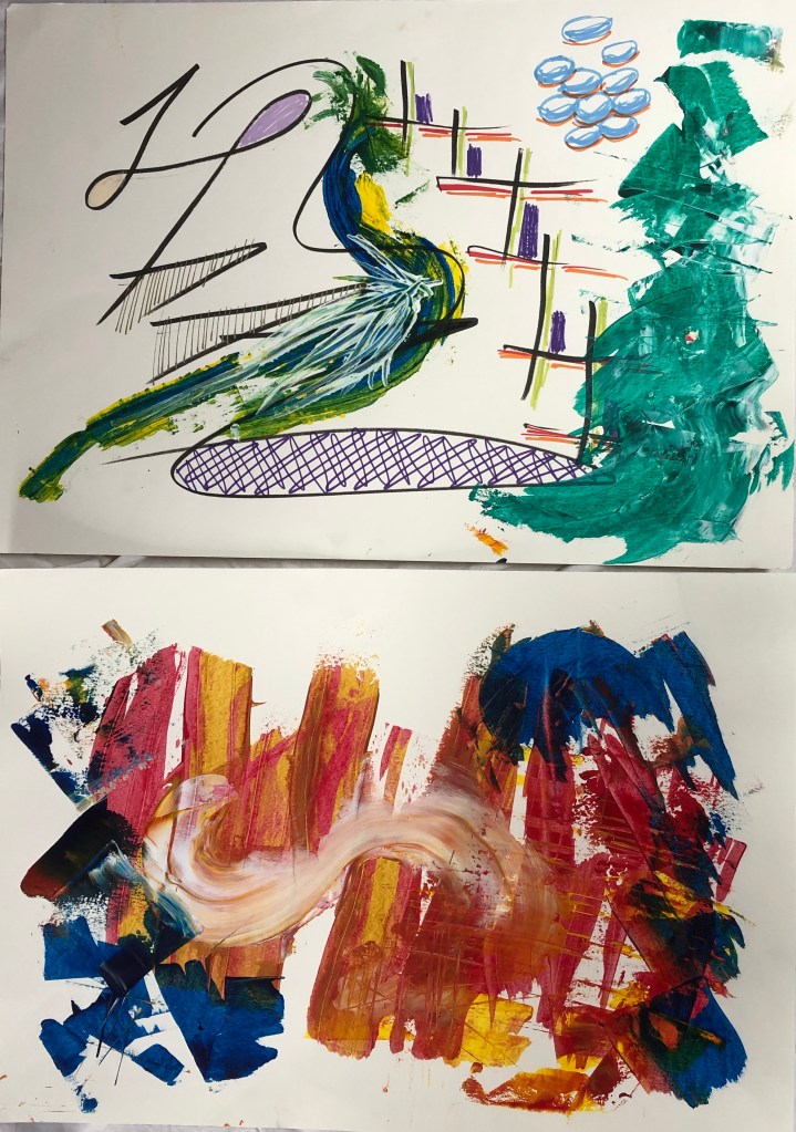
On Monday evening this week, I went to a workshop at Tavistock Group of Artists, on the subject of Abstract Art. I should point out that this was the second, and practical, session on the subject led by Martin Bush, a local artist (www.martinbush.co.uk); he had given a talk on Abstract Art at an earlier session which I couldn’t attend as I had been in hospital.
He demonstrated his method, no doubt simplified, for us all to have a go at. He encouraged us to warm up with some mark-making, urging us to loosen up and channel our inner 6-year-old (see my A4 sketchbook), and then to transfer some of these marks we liked into paint – acrylics are his chosen medium and are what we tried out. He works large, applying the paint direct to the paper from the tube, and then dragging and swirling it with tools such as credit cards and plasterers’ scrapers.
I started off with some acrylic pens lent to me by my neighbour, but was soon accused of reverting to drawing (!) so went for it…first swirl looked a bit like a peacock so I again reverted and tried to add marks to make it look more like a peacock. Eventually a credit card was placed in my hand and a new piece of paper placed before me and I started again, getting into the swirling and streaking. It was fun, but I wasn’t sure where I was going with it.
Martin clearly enjoys doing this and is not at all precious about his work; when asked how he knows which way is up when he has finished a piece, he gave the impression that he didn’t really care which way up a client hung his work so long as they paid for it. He was very open that he specifically look for saleable areas in his canvases, and is happy to cut them up or discard them if he doesn’t think someone will buy them.
TAKE-AWAY POINT:
It is I suppose very easy to seem judgemental, art for art’s sake and all that, and one must credit Martin with being completely honest and upfront about his motivation – and he clearly really enjoys his technique. I have no understanding of Abstract Art and, whilst I didn’t gain much from this session, it was really interesting to see what other members at the session had done with the same input; I had pretty much copied his method and metaphorically shrugged as if to say, well that was quite fun but I’ve done it, what’s next – whereas others had been inspired to branch out, take bits of what he said and use it in different ways – true creatives. I am just starting to dip my toes into innovation, but too easily lapse into being led – I need to take bits that interest ME and develop them, without worrying about straying from the path.
*******************
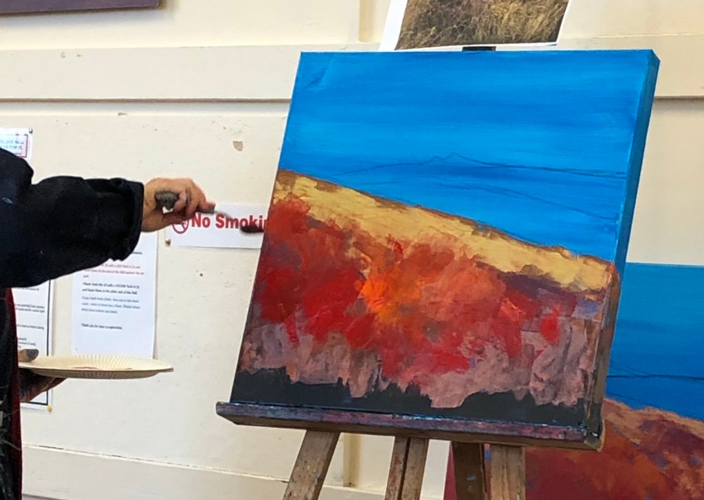
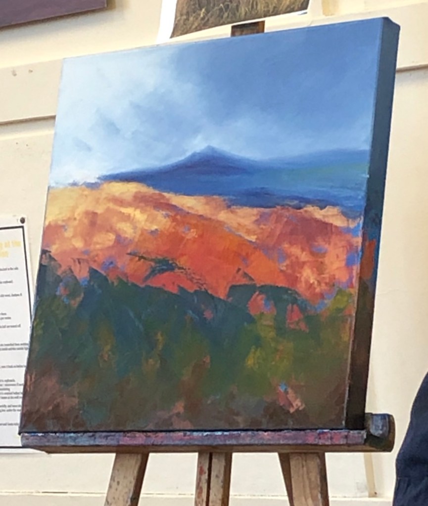
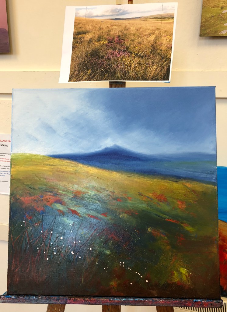
This morning I went to a demonstration at the West Devon Group of Artists on Dartmoor Landscapes; this was led by another local artist, Laure Bury (www.laurebury.com), who works in acrylics and oils. What follows is a transcription of my handwritten notes, then my reflections.
Important to get out on the moor before thinking about painting; use all the senses to experience it, bring back bits, take photos for use back in the studio as guidelines for shape e.g. of tors
Often uses a black gesso background, but today is putting down a blue acrylic background
Divides her canvas fairly exactly into thirds when placing main features
Thinks carefully about composition, making sure there is room for the sky to be “something”, for her tor background, and for the foreground, which is her main focus and which she likes to be vibrant
She uses mainly palette knives to paint with
She paints around the sides of the canvas (so that it isn’t essential that it’s framed) and paints the base in black gesso. Paint the sides as you go along – you might not be able to re-make exactly the same mix otherwise
Don’t try and control everything, or your painting will look laboured
Walk away if you start to get tired – come back to it another time rather than spoil it
Always spends time on the base layer, which is always acrylic
Doing a course at the Newlyn School of Art – this has supported her in changing her subject matter (to birds), and to go back to using brushes sometimes, which she hasn’t really done for ten years
Occasionally uses textured media – the sand medium is good for the granite rocks of Dartmoor
Moves from acrylics to oils for the top layers – likes the freedom to be able to walk away and come back to the painting the next day
Repeats the rough design of her base layer but in oils, although leaving some of the acrylic showing through
Uses some metallic paints – these are more expensive, but you only need a little so it goes a long way
Indanthrene blue (Winsor & Newton) – very good for Devon skies
Comes up with a real “story” for her sky – “….brooding over here…the rain back here….lighter over here…”
She sells more now online than in galleries, especially through a website called artfinder, where she has sold 38 paintings
Be true to yourself and what you like painting. Enjoy what you are doing – if you are led by what sells you get stuck in a trap
After the sky, tackles the horizon and background, sometimes blending in the wet paint from the sky so you can’t see exactly where the rain ends and the land begins. Does this bit with a brush – uses both flats and rounds
Generally uses clear varnish rather than gloss (occasionally uses matt). Need to wait 9 months before you can varnish it
Continues with the same colours from the sky and background into the foreground
Usually works on several paintings at a time – helps to keep them fresh
Foreground – leave bits of base colour showing through
Likes cadmium yellow pale hue and lemon yellow. Tends to mix her greens rather than use pre-made greens
Uses small pointed palette knife to scratch into the foreground to indicate grasses
Heather and gorse applied with old toothbrushes – puts the painting on the ground and flicks
Keep walking away and revisiting to decide exactly how much of your base layer you need to cover. Less is more – you can always add (although odd splashes you don’t want can be removed with a cotton bud)
Laure obviously loves her painting and gets this enthusiasm over to others. She was honest about feeling a bit stuck in her art and seeking help to move on, e.g. wanting to paint birds but not knowing how to make the leap and going on the Newlyn course to help her over this. Despite all this, she is obviously aware of her market and, whilst not being as overt about selling her work for ready cash as Martin was, she is very ready to talk about it and her website invites commissions.
TAKE AWAY POINTS:
Be true to yourself and what you like painting; Laure said that, when she moved to Devon from Mexico via Spain she was advised many times to tone down the vibrancy and bright colours of her work – but she has stuck with it because that is her love, and others are now seeing it too. This is very much the point that my tutor Rachel was making to me – I shouldn’t be ruled by a subject, but should make the subject fit my style.
I talked to Laure about the clouds and how easily she had created them out of her head when I have (I thought) been grafting away with little success – she laughed and told me it comes from years of practice. I think I become a bit discouraged when I can’t do something first time, whereas what I need to do is stick with something which hasn’t worked, analyse what hasn’t worked and try out different things to improve it.
This week, at this term’s opening meeting of the Tavistock Group of Artists, one of our members (Ian Pethers RMS, SBA) gave a quick talk and demonstration on the basics of perspective. Key things for me to remember from this:
“Art does not follow rules, rules follow art” (although it is good to know the rules, so you know what you are disregarding!)
The horizon moves with the viewer – if two people are looking at a view, their horizons will be different (unless they are of identical height)
He demonstrated using pen on a board which had a pin through the middle to which a string was attached – the pin was the vanishing point, around which he constructed an entire street scene using the string as a guide to the angle of the lines – brilliantly simple, works for my brain! He pointed out how things change as they become more distant, eg it’s not far before you can’t see the actual window glass, only the facing edge of the window recess.
Drawing e.g. tiles on a floor using guide lines – these will be fractionally curved as they near the viewer, due to the movement of the head/eyes
Waddington Galleries, London and The Saatchi Gallery, London
Not sure I’m reading this one right, but it was one that I liked because his use of the fruit shadow twice makes me think that someone is going to walk through the yellow door, thinking it’s all OK because they can see the shadow of the fruit and yes, there it is – but then suddenly the second darker shadow jumps out behind them, as if it’s been lying in wait.
Yes, I know I should take more water with it…..
Gary Hume – Four feet in the Garden
1995
Glass paint on aluminium
Arts Council Collection, South Bank Centre, London
This one appealed to me as it reminds me of one of those “optical illusion” pictures – is it a picture of feet, or is it a picture of two old crones with long noses and warty chins facing each other?
Not sure it’s something I’d immediately be tempted to have a go at myself, although admittedly the image does draw you in and make you take a good look at it and ponder.
Gary Hume – The Flowered Hat
2002
Gloss paint on aluminium
The artist and Jay Jopling/White Cube, London
This one, however, is something which did appeal to me as a style which I might think about trying to develop. It’s called “The Flowered Hat”, but to me it also looks like a flower arrangement on a white tablecloth with long lacy curtains behind.
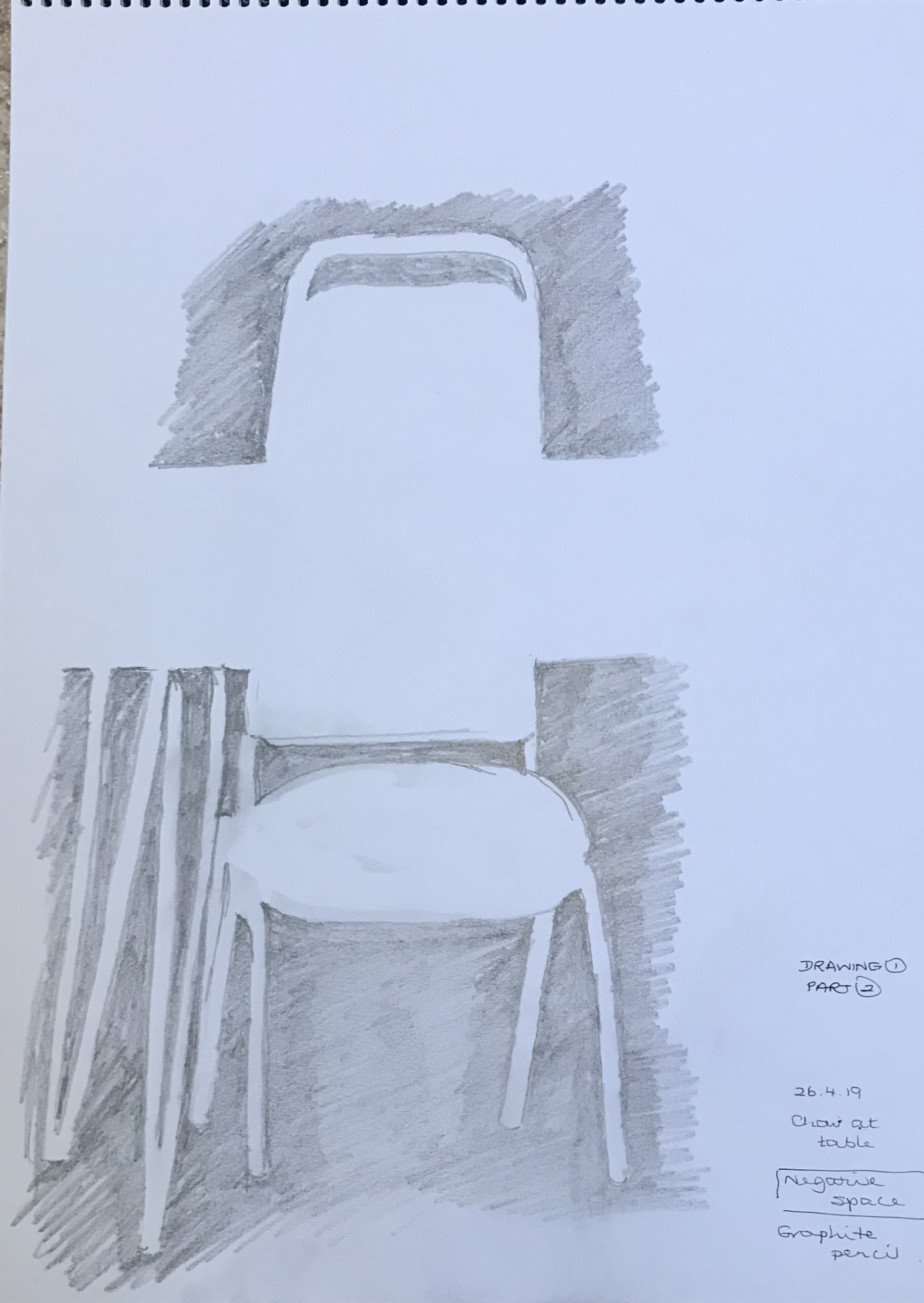
At this point I thought I ought to try and get my head around negative space. As always, I went in at the deep end and thought I would try a negative space version of Van Gogh’s Sunflowers, thinking to do something a bit Flowered Hat-y. Needless to say, I found it really difficult to look at the spaces rather than the flowers, but actually the complex subject broke the negative spaces down into small manageable bits so that, although the proportion is out in places, the overall effect is recognisable, I think, although I was so traumatised by the concentration needed that I didn’t get anywhere near adapting it to be Hume-like. Instead, I tried something a whole lot easier – a chair and table – more within my capabilities. Quit while you’re ahead.
Negative space is something I’m struggling to get to grips with example-wise; a lot of the things I have found have been in old printed posters (e.g. those by William Nicholson and James Pryde, who signed themselves J&W Beggarstaff after the name they had seen on an old sack – see article in my cuttings folder about the recent exhibition of their work at the Fitzwilliam Museum, Cambridge, May-August 2019), or in work like linocuts (see e.g. article by Rosemary Waugh on the work of Paul Catherall as seen in Artists & Illustrators magazine, November 2018, pg. 56-9).
I thought this image (by Kinska from My Opera House exhibition, 4th July-22nd September 2019 at Now Gallery, taken from Aesthetica Magazine, June/July 2019, issue 89, www.aestheticamagazine.com) showed how clever our brains are at interpreting minimal images (the black on the right clearly being intended as her hair, whereas the black on the right is just space); but then I looked at a similar (but different) image by her from the pages about her exhibition on www.nowgallery.co.uk, where this wasn’t the case and the space on both sides of her face look like hair just by being a slightly different shape…..clearly our brains are very nuanced and bring a lot of extraneous knowledge to their interpretation of images!
But there is hope for me yet on my understanding and use of negative space – it’s gradually seeping into my psyche. The other day I was down by the River Tavy with the granddaughter – she was busy skimming stones, falling in the water, etc while I thought I’d do a really quick scribbled sketch of the view down the river. It was late afternoon/early evening and the sun was shining down through the leaves, making some really bright, almost gleaming, whilst other bits of the view were in dark shadow. I was struggling to depict this when I had my eureka moment – just scribble in the dark shadowy negative spaces! And it worked (see above)…even if very scribbly…but at least I can see what I meant….
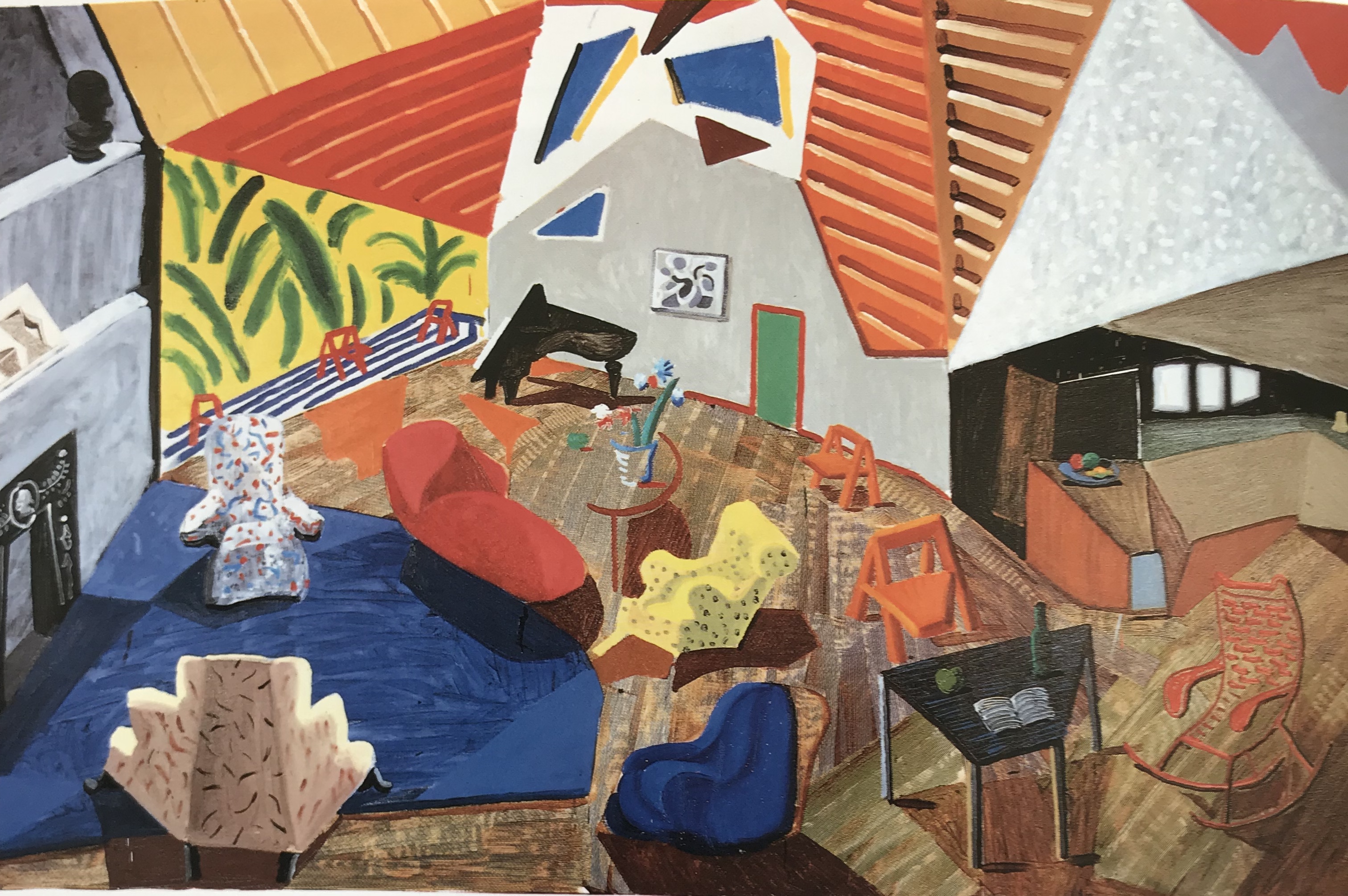
The Anthony Green image to which I was directed in the text is lovely, hugely detailed and would be a brilliant, highly-personal birthday gift. It captures the room perfectly – you feel that you are being parachuted in through the opening ceiling, a bit like Thunderbird 2. It reminds me of the Hockney and the Picasso images which I looked at in the research into the history of still life at the start of this Part, except that, despite the bright colours which initially give you the impression of something almost child-like, this has been carefully thought through – if all the flaps and folds were pushed back into place correctly, you feel you would have a perfectly assembled room with the correct proportion and perspective. Impressive. Way beyond me at the moment, but…….
In my sketchbook I have scrapbooked some images of pictures, including some photographs, (see flagged pages in A3 scrapbook for annotations) which have made me look towards my Assignment in two respects:
Overall composition and importance of viewpoint…..hitherto I have thought a bit about composition and very little about viewpoint, which is part of the reason why I haven’t really grappled very well with perspective, as I’ve tended to draw things which are right there on the table in front of me. I am beginning to appreciate the differences which a high and low viewpoint can bring (quite apart from anything, they are often exaggerating the perspective and making it easier for me to see and draw).I have gone off-message slightly in my research into and collection of images as I find that, as I have gone through Exercise 1, I have been drawn to windows and, particularly, open doors; this started as a bit of an exercise in getting the perspective correct (which is still frankly a bit hit and miss), but has led me on to an interest in the “possibilities” offered by doors and windows, both composition-wise (diagonals etc) and also asking-a-question/telling-a-story-wise. Hence my image collection became increasingly skewed in this direction, and I should like to explore it more as I go through this project and final Assignment.
First impression: Dutch still life paintings (and I feel as if I have looked at hundreds now) are sumptuous, glorious and (if you have looked at as many as I have) simply completely over the top. The colours zing, the detail is almost photographic in quality, and the sheer quantity of riches on show is overwhelming.
Dutch trade was booming in the 16th and 17th centuries, bringing wealth and, on its heels, consumer goods, whether food (they seemed very big on hunted game and fruit), china, glass- and silver-ware, fabrics, jewellery and so on.This abundance was seemingly celebrated in painting; traders were saying “look at all this stuff I have, which you can have too (at a price)”, and consumers were saying “I can afford to buy all this amazing stuff – and what’s more, I can have a really good artist paint it for me too (at a price).” For the bulk of paintings had hitherto been “improving” in some way – telling a moral or historical tale, often religious.
Berger, H. (2011). Caterpillage; Reflections on Seventeenth-Century Dutch Still Life Painting. Fordham University Presswent deeper than this. The prologue sets out the main thrust of the arguments to be found in the book; that is to say, that the “vanitas”, or “main moral message”, as I understand it, of a still life painting (common with the 17th C Dutch, since they had a great deal of wealth and therefore things, which Schama (1987), The Embarrassment of Riches, University of California Press, suggested was a moral burden which had to be acknowledged and expiated in some way) is not the whole story – it might be a sideshow, or it might hold a deep dark message.
One of the early specialist exponents of the still life was Frans Snyders (1579-1657), who so excelled in painting fish and game that he was frequently sought out by other artists to work in collaboration with them – an example of this is a work by Peter Paul Rubens and Snyders, (Prometheus Bound, ca 1611-1612, completed by 1618, oil on canvas, Philadelphia Museum of Art), where Rubens painted the figure of Prometheus and the background, whilst Snyders painted the eagle; his ink and wash Study for and Eaglecan be found in the British Museum, London. However, an essay I found suggests that Synders’s focus on his subject matter had a subtext, as you will see from the following quotation:
“A Profusion of Dead Animals: Autocritique in Seventeenth-Century Flemish Gamepieces
Is Part Of
Journal for Early Modern Cultural Studies, 2016, Vol.16(1), pp.50-77
Description
This essay suggests a way of reading the monumental still lifes of game painted by Frans Snyders and others in the first half of the seventeenth century. Previous scholarship has shown that these works assert the owner’s status, either as a nobleman with the privilege to hunt or as a merchant aspiring to nobility with the wealth that enabled him to buy the painting. In either case, the dead animals in the paintings serve as trophies, killed and displayed not for use, but as signs of privilege. Nonetheless, Snyders’s works show that he was also aware of the arguments against hunting made by More, Erasmus, Montaigne, and others in the sixteenth century. Thus, while Snyders developed the conventions of this distinctive genre, he also distanced himself from the excessive killing it records. Such paintings represent an “autocritique”—a critique of the ideology of the form from within the form itself. In its conclusion, the article contrasts these still lifes of game, characteristic of the predominantly Catholic and aristocratic south, with smaller breakfast scenes, a form which developed later in reaction to the game still lifes and was characteristic of the largely Protestant northern Netherlands.”
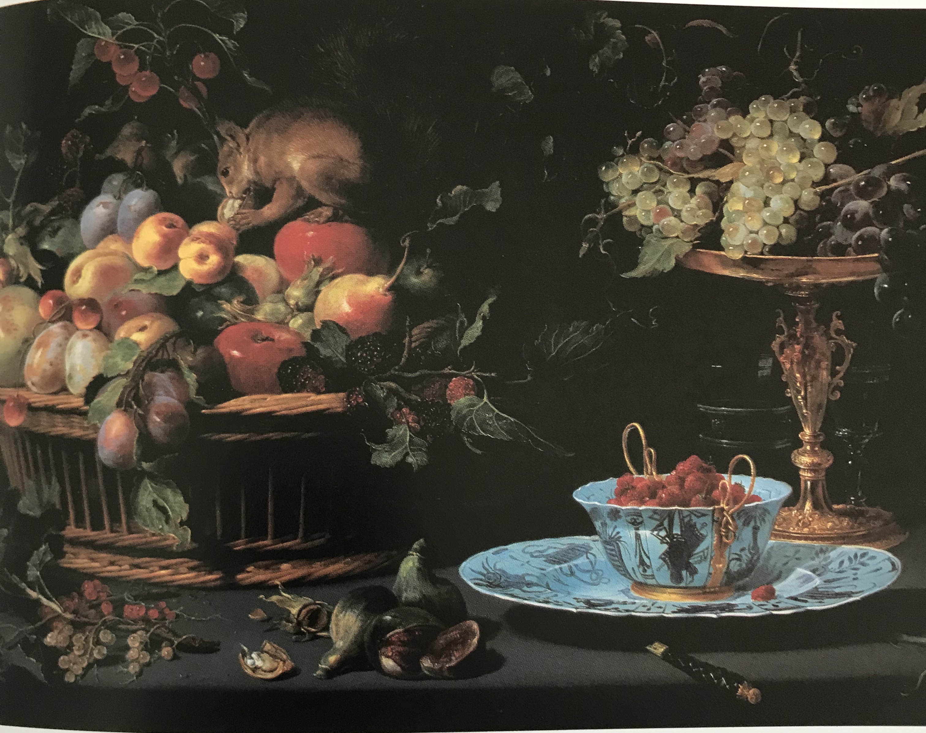
One of Snyders’s more appealing pictures I found to be Fruit Still Life with Squirrel (1616), oil on copper, Boston Museum of Fine Arts – here the animal interest is alive and being quite mischievous. It is one of the many “tabletop” pictures of the time, but I think I liked it because of the off-centre layout of the objects, there is almost nothing but darkness in the very centre of the picture at all, but the objects are placed so that the eye wanders around from thing to thing without ever wanting to leave the picture – and the light on those green grapes is just fabulous.
Collaboration was quite common at that time – another still-life specialist with whom Rubens worked was Jan Brueghel the Elder; for example, in Madonna and Child Surrounded by a Flower Garland and Putti, oil on panel, ca 1617-20, Munich, Bayerische Staatsgemaldesammlungen, Rubens painted the central Madonna and Child, surrounded by an enormous garland painted by Brueghel, which was itself surrounded by numerous very plump putti executed by Rubens. Brueghel’s floral compositions, both opulent and more modest (see above, Flowers in a Glass Vase,oil on panel, Private Collection) show lively yet delicate use of colour, very close observational skills, great botanical knowledge, and even include little insects. I have to say I am not a huge fan of big blowsy flower paintings, but I can appreciate the skill, knowledge and observation that has gone into creating them; they just feel rather static to me – I enjoy much more something like Van Gogh’s sunflowers, where perhaps more work has to be done by the viewer to conjure up a mental picture of an actual sunflower – but perhaps this is a lesson for me not to go into too much painstaking detail, which I do know I am prone to….hmm….
Another leading figure in the first wave of Flemish still-life painters was Osias Beert (1580-1624). Sutton, Peter.C in The Age of Rubens, (1993). Museum of Fine Arts, Bostoncomments on his “..sure, powerful draughtsmanship, complemented by the use of strong chiaroscuro…” – as seen in Still Life with Oysters and Sweetmeats, ca 1610, oil on canvas, private collection.
Carrying the torch after 1640, according to Sutton, came Jan Davidsz de Heem, who “developed lavish still life on a truly grand scale” – see for example the collaborative work with David Teniers the Younger, Kitchen Interior, 1643, oil on panel, Los Angeles County Museum of Art, in which all the still life elements are painted by de Heem.
And of course there is Jan Vermeer van Delft (1632-75), whose paintings, according to Gombrich, E.H. (1984). The Story of Art. Phaidon “…are really still lifes with human beings.” A good example of this is The Kitchen Maid, 1660. Amsterdam, Rijksmuseum, which I have been lucky enough to be able to see in situ. You really do feel as if you can pick that bread up and eat it; and the painting of the basketry! I found the following quote about how it is painted:
“The Milkmaid
1658-60
Oil on canvas
Rijkmuseum, Amsterdam
“Vermeer painted a marvellous still life on the table: at the back is the two-handled earthenware bowl into which the milk is being poured; next to it are several crispy rolls, a blue tablecloth hanging in folds, a glazed pitcher and a basket of bread….An x-ray analysis of the paintwork reveals that the bread was painted in three layers. The lower one is a thick coat of lead white, over which Vermeer painted a thin reddish glaze through which particles of the original white protrude. On top of this the artist added highlights of whitish-yellow paint.”
Bailey, Martin (1995). Vermeer, Phaidon Press Ltd.”
I find it interesting that, in this case, the level of detail draws me in, whereas I brushed it off as “too much” in the flower paintings. Maybe it is just down to what subject matter actually appeals to the individual? – bread obviously appeals to me (oh dear) whereas I can take or leave massed flowers (possibly due to chronic hayfever). Seriously though, perhaps it is down to the artist’s style – Vermeer’s still has that hint of “suggestion” – you have to work at it just a bit, whereas the complete perfection of Brueghel’s flowers literally left the viewer with nothing to do.
Spanish still life
I learned quite a lot from Jordan, W.B. & Cherry, P (1995). Spanish Still Life from Velazquez to Goya. National Gallery Publications, London. They say that still life, as a genre, emerged fairly simultaneously in northern Italy, Spain and the Low Countries, all areas which at the time were effectively dominated by the Spanish Crown. I found this comment really chimed: “In these pictures, we confront one of the key purposes of all painting. The objects shown are usually of little inherent value….There is no story, often not even a symbolic significance. Yet the paintings make us slow down, look carefully at a walnut, a jug or a parsnip, make us realise that we had never truly looked at one before, and acknowledge how astonishing they are.”
They go on to discuss the origins and themes of still life, which I think are useful to summarise:
The Challenge of Antiquity: still life had existed in classical antiquity, and this was a new Renaissance revival of the ancient genre. In ancient times a high premium was set on the imitation of the natural world and now (in the late sixteenth century) and onwards, artists strove to paint still lifes “with a high degree of illusionism” – an example being Caravaggio’s Basket of Fruit (1595), oil on canvas. Milan, Pinacoteca Ambrosiana.
Grotesque painting: ancient fresco decorations had been found in the grottoes on the site of Emperor Nero’s Golden House in Rome, which led to a modern revival of the style, known as “grotesque” paintings, and these quickly caught on and became very fashionable.
The World of Nature: the 16th century saw a minor explosion in all types of exploration and scientific observation and research, and painters who reflected this (including the example of Brueghel) were demonstrating “scientific naturalism”.
Food for Thought – The Symbolic Dimension: this depiction of the natural world in all its glory allowed people to reflect on the power of God, Maker of all things.
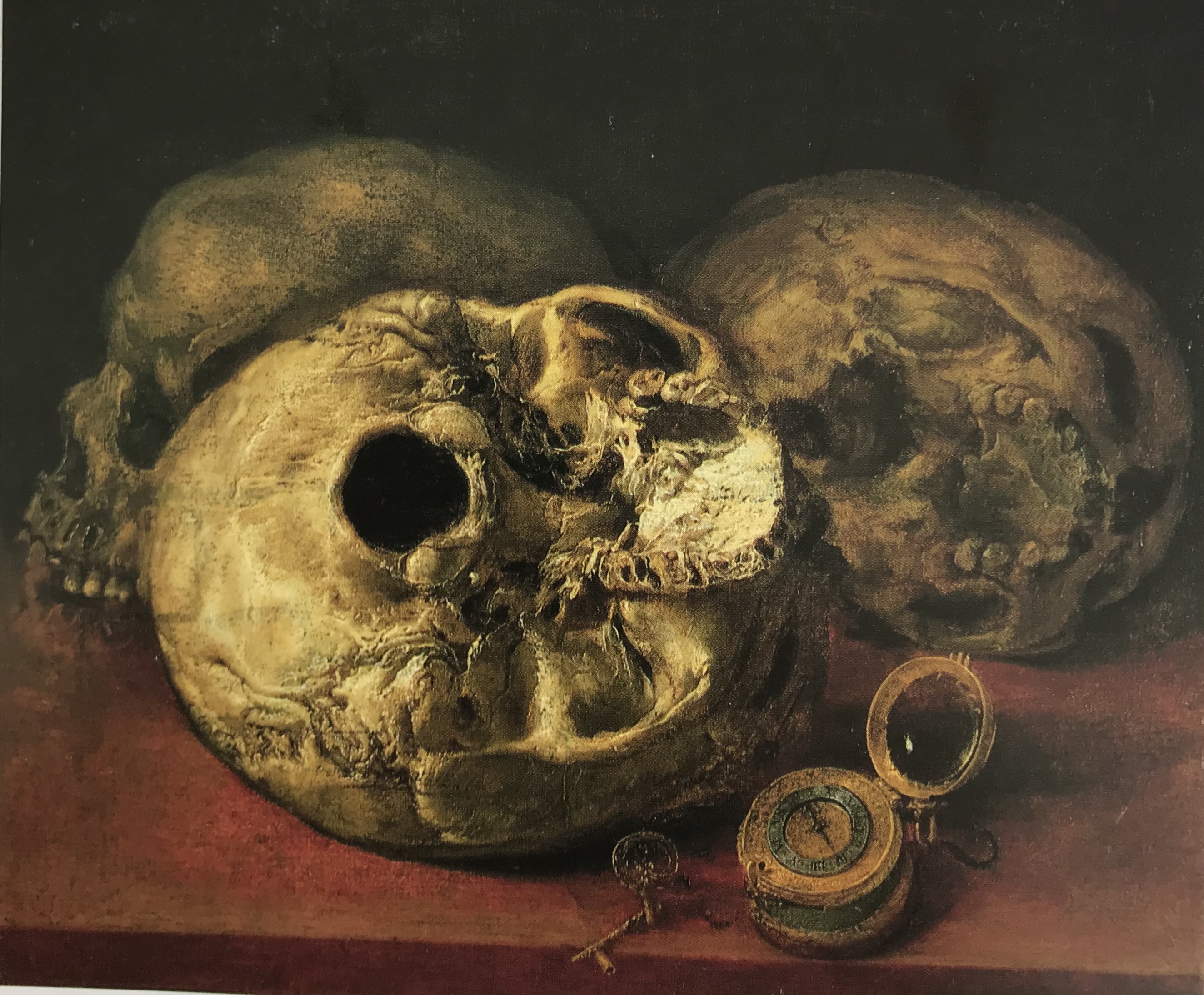
The Vanitas still life: some paintings included items carrying a profound message about the transience of life – for example, hour-glasses marking the passage of time, much-used quills and books signify human knowledge. A fairly clear, if grisly, example of this is seen in Antonio de Pereda’s Vanitas, 1640. Oil on canvas. Zaragoza, Museo des Belles Artes.
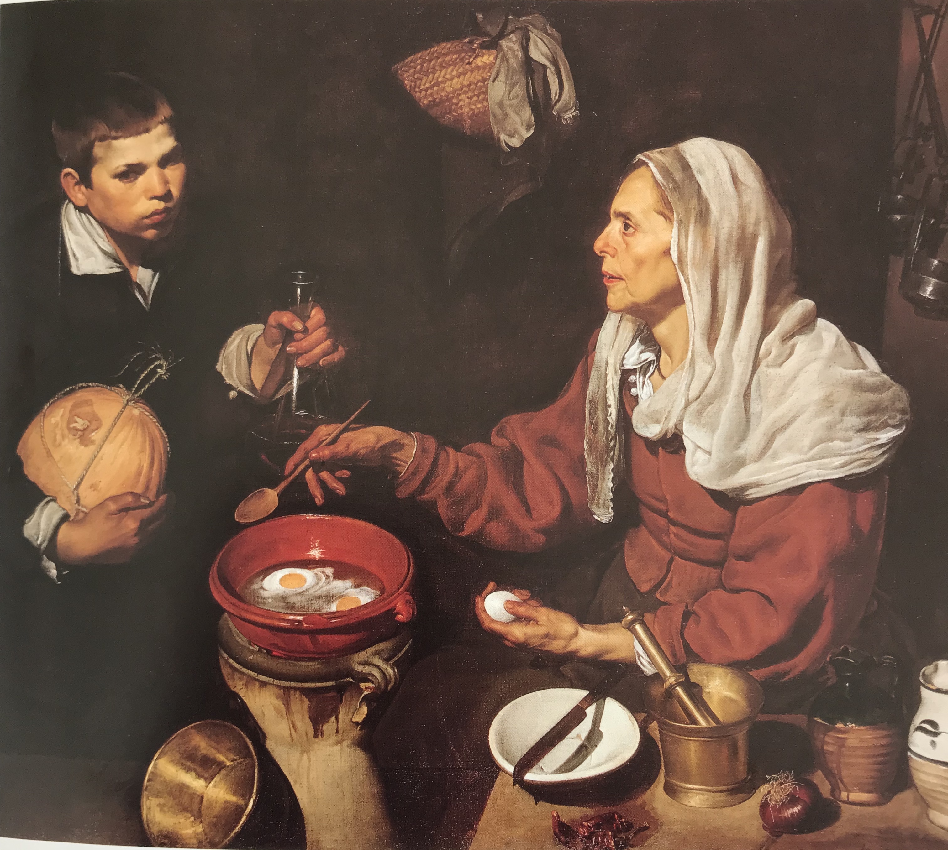
Diego Velazquez (1599-1660) became well-known for the accuracy of his still life elements – An Old Woman Cooking Eggs, 1618. Oil on canvas. Edinburgh, The National Gallery of Scotland is another painting that I have been fortunate to see myself, and I can remember (oddly) being struck in particular by the accuracy of the shadow of the knife in the white dish and what careful observation that must have entailed. Will I ever be patient enough to do that?
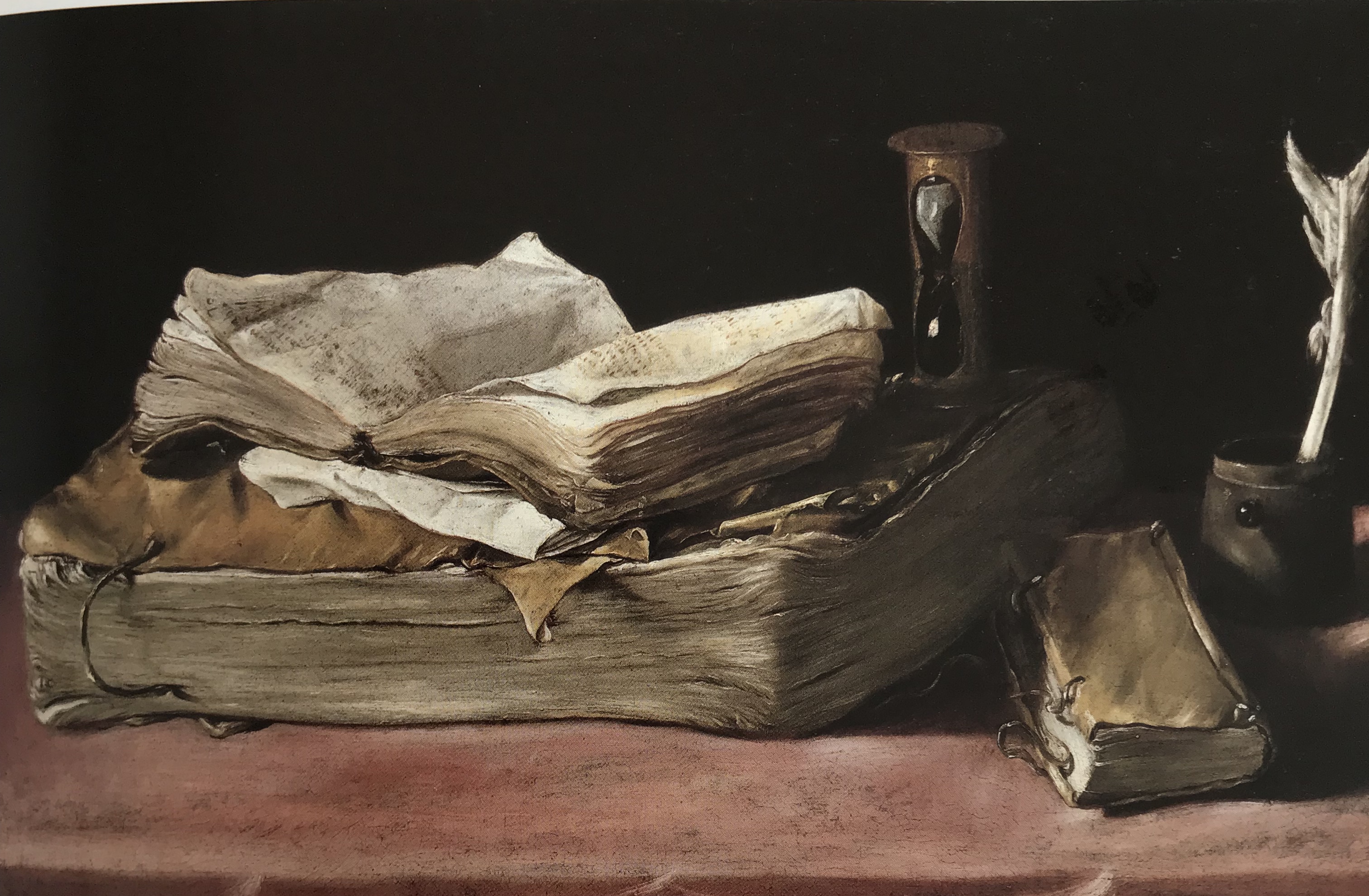
Attempts have apparently been made to attribute this vanitas painting to Velazquez, but unsuccessfully, and it remains unattributed. It is Still Life with Books and an Hour-glass, c. 1640. Oil on canvas. Berlin, Staatliche Museen, Gemaldegalerie.Quite apart from the obvious vanitasmessage about the vanity of learning and the passage of time, I really like it just as a picture of lovely old books – the composition is simple yet I think it is well-balanced with enough contrasts of shape and size to make it interesting. I sort of went for something like this in my first assignment piece – but can see I have some way to go!
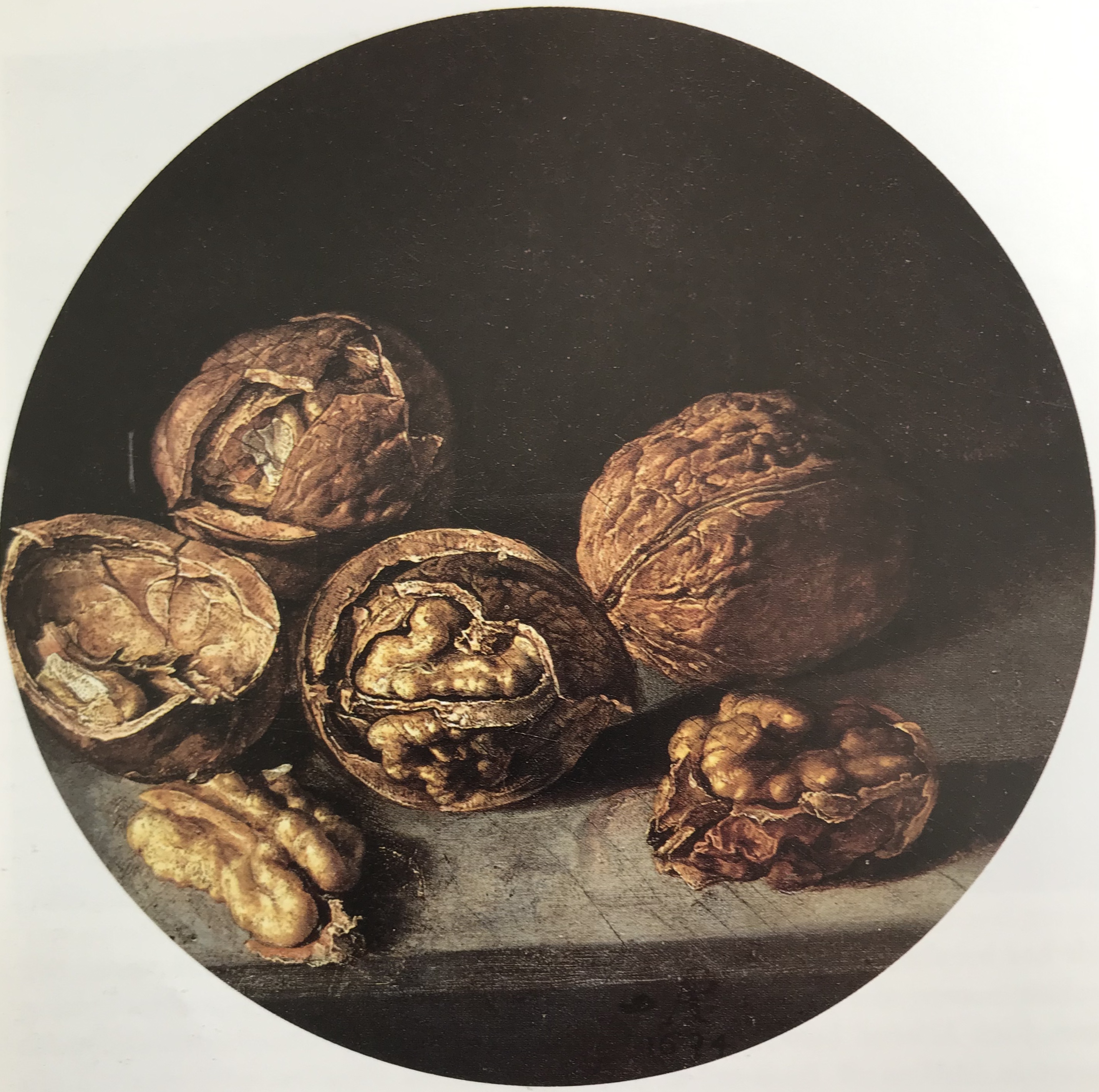
I was really drawn also to Antonio de Pereda’s (1611-78) Still Life with Walnuts, 1634, oil on panel. Spain, private collection. The circular format brings focus to the subject matter (“almost like a magnifying glass”), and the papery texture of the inside of the walnut shell has been so cleverly observed and evoked by tiny little marks and dots. Magic.
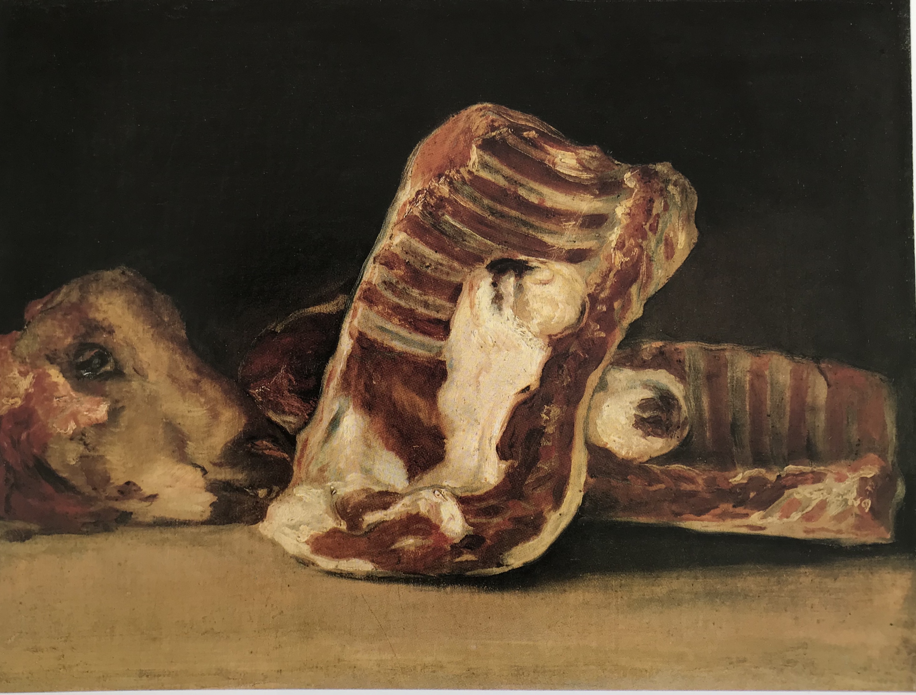
Jordan and Cherry go on through a range of painters, ending with Fransisco de Goya, (1746-1828). Goya was not particularly known for his still lifes, in fact, he didn’t apparently paint any till he was over 60, and all but one feature dead animals: “Not the courtly game of a hunter’s trophy, nor the meat on a butcher’s stall, nor the dead beasts traditionally symbolising life’s brevity or Nature’s bounty – but animals that have been slaughtered, from whom life has been violently torn…”. Quite. Apparently in this painting: Still Life with Pieces of Rib, Loin and a Head of Mutton, 1808-12. Oil on canvas. Paris, Musee du Louvre , Goya has signed his name, “as though in blood” in tiny red letters under the sheep’s head. Nice…not a subject which would ever appeal to me.
Paul Cezanne (1839-1906)
I have found Lloyd, Christopher (2015). Paul Cezanne – Drawings and Watercolours.Thames and Hudson very useful; particularly encouraging was the introduction, where he says “The practice of drawing was for Cezanne a vital and life-affirming aspect of his overall approach to art, revealing him as deeply committed to devising a process for comprehending and recording the world as he saw it as objectively as possible.”
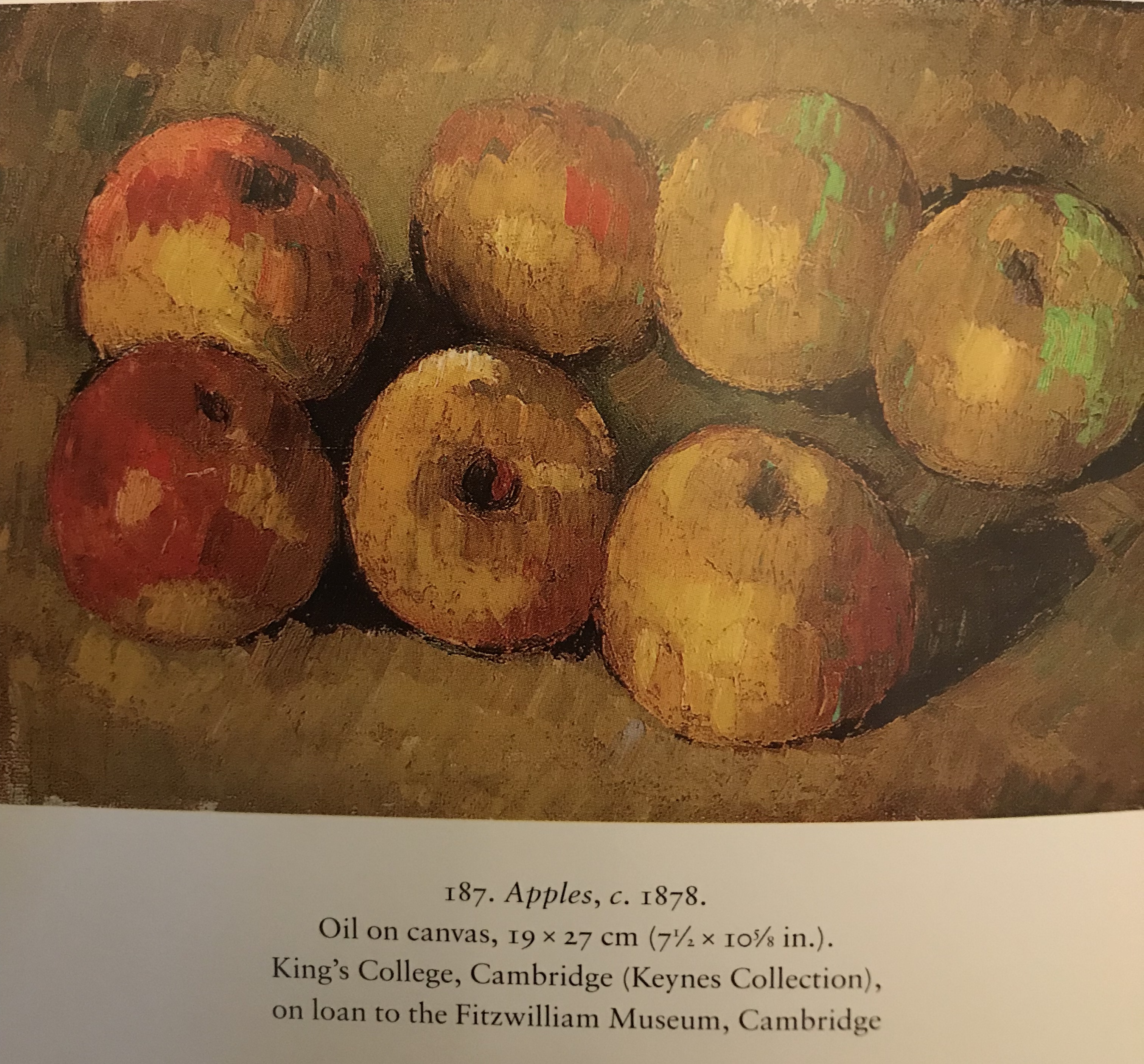
Cezanne believed that the artist experienced certain “sensations” when observing a scene and it was the artist’s job to record this as accurately as he could. He devised a way of doing this using carefully placed brushstrokes of pure colour. He is of course famous for his painting of apples – “With an apple I want to astonish Paris”
Cezanne was apparently influenced by Chardin who was celebrated in France, and there was a revival of interest in Spanish painting in Paris in the mid-nineteenth century when the works of Velazquez and Goya were much studied. Cezanne however began to distance himself from his immediate predecessors and his Impressionist contemporaries, seeking to go “beyond mere representation and engage with the materiality of the objects themselves..” – it was all very personal to him. He said to Gasquet: “People don’t think of a sugar bowl as having a face, a soul. You have to know how to catch them, how to win them over….When I’m outlining the skin of a lovely peach with soft touches of paint, or a sad old apple, I catch a glimpse of the reflections they exchange…the same love of the sun, the same recollection of the dew…”
Wassily Kandinsky said (in On the Spiritual in Art, (1912)): “Cezanne made a living thing out of a teacup or rather in a teacup he realised the existence of something alive.”
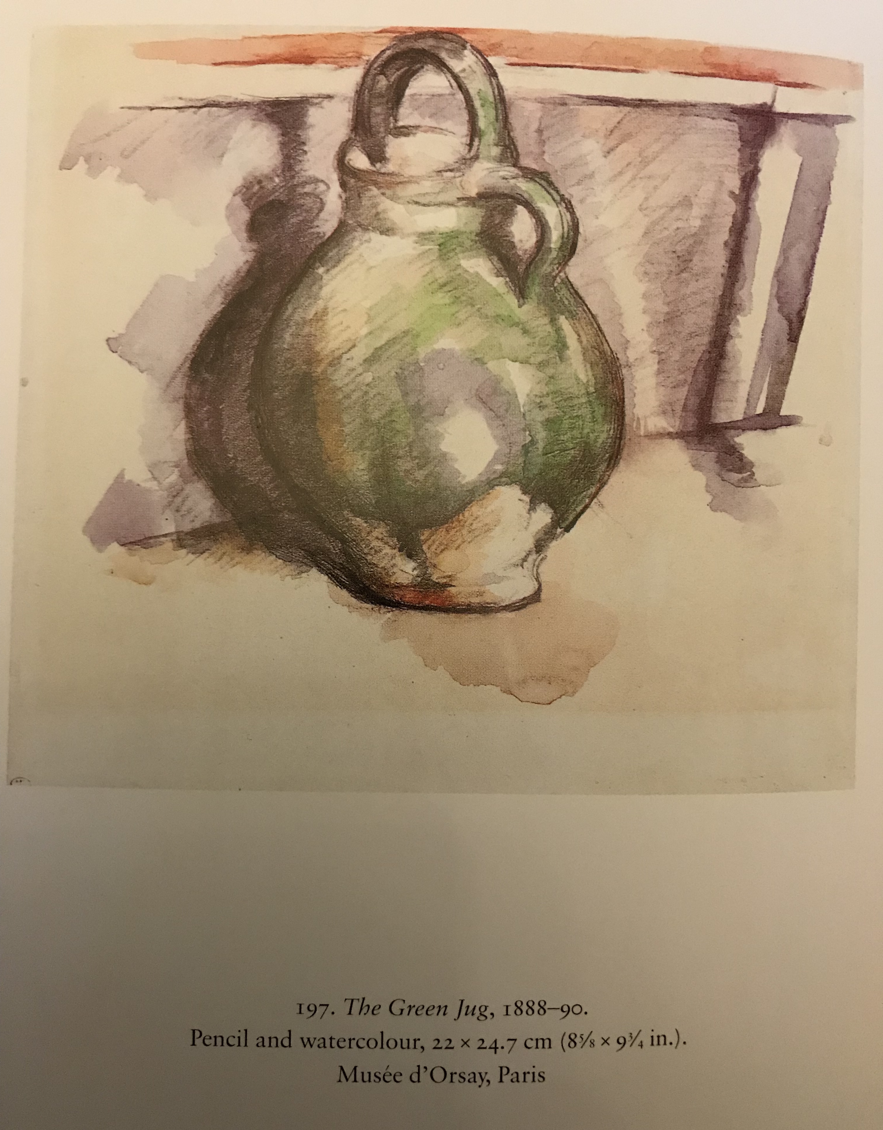
Cezanne liked to feature local products in his work; in The Green Jug he draws the jug simply and clearly with strong shadow to emphasise its solidity; Lloyd suggests that the puddle underneath (which doesn’t match up with the light direction indicated by the main shadow) is actually not meant to be a shadow, but an indicator of the contents of the jug.
Lloyd goes on to suggest that, when arranging a composition, Cezanne would use unlikely viewpoints, juxtapositions and angles so that the viewer is initially confused and their attention has to become more fully engaged. This is something to which I need to give more thought – my compositions are currently arranged “in relation to themselves” as it were – i.e. I think about what goes next to what – but I don’t think enough about where the whole thing is in space.
A discussion is quoted in Paris between an elderly Pissarro and the young Matisse at the end of the 1890s, when the senior painter said “Cezanne is not an impressionist because all his life he has been painting the same picture”. Lloyd suggests that this comment “does not of course refer to the subject matter since he was immensely versatile, but, rather, to the inexorability of the artist’s attempt to portray what was in his line of vision with the greatest possible accuracy.”
In effect. Cezanne’s contribution was to reduce the importance of the subject matter and “establish the autonomy of the picture itself.”
Pablo Picasso (1881-1973)
Picasso, along with Braque, took still life into Cubism, which he did not regard in any way as abstraction, arguing that he was an uber-realist:”…plus royaliste que le roi” – it was not, he argued, realistic to portray one aspect of an object from only one point of view, but instead one should be depicting all the possible aspects of an object from every point of view.
Jars and Lemon, 1907, oil on canvas. Albertina, Vienna, Batliner Collection
This was quite an early example and was in fact bought by Clive and Vanessa Bell – apparently Duncan Grant was very taken with it and referenced it several times in his own work.
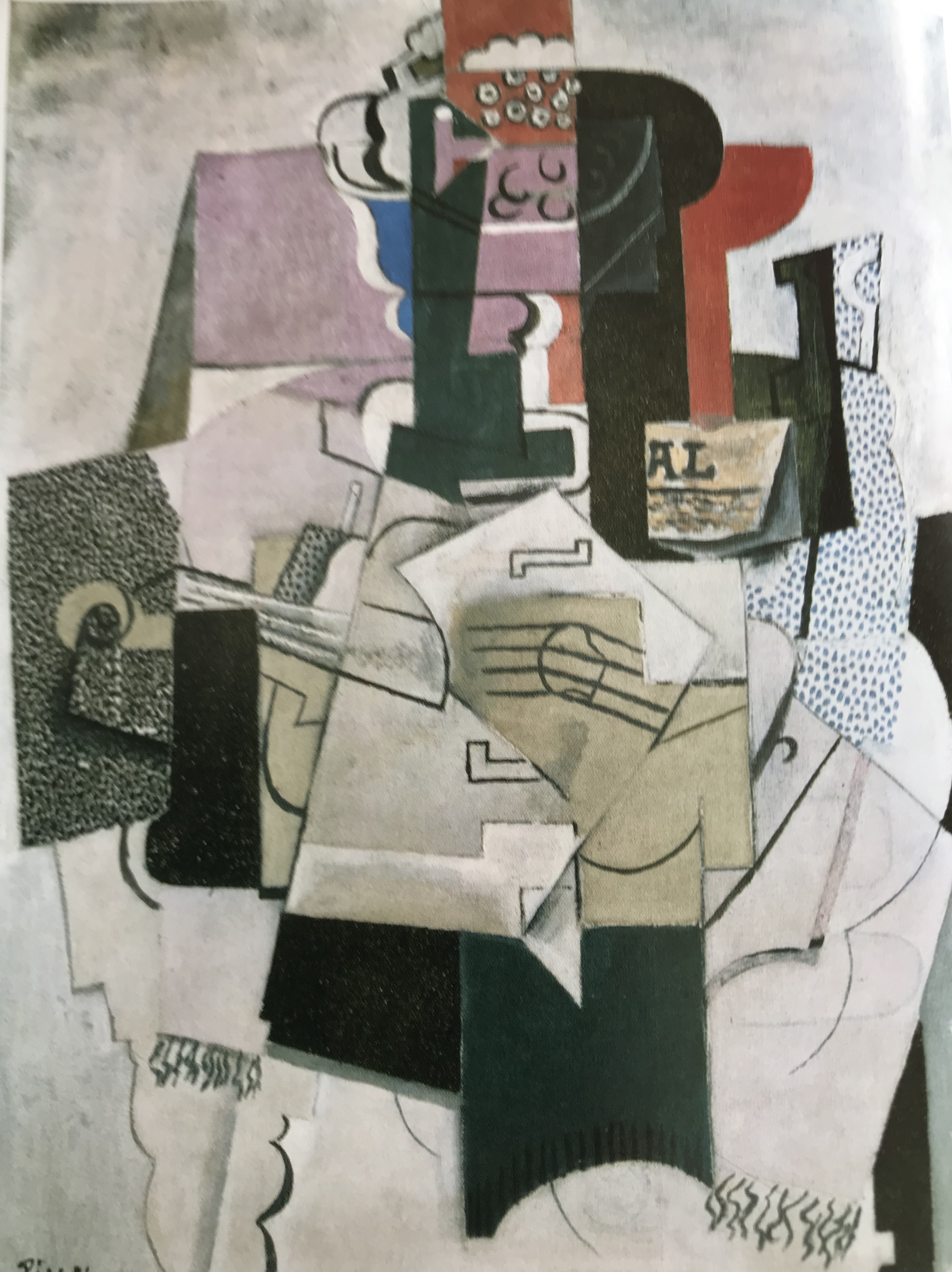
Bowl of Fruit, Violin and Bottle, 1914, oil on canvas. Tate, lent by National Gallery.
Picasso developed his style (along with Braque – see below) to introduce several flat overlapping planes, looking to me like a range of square/rectangular papers and post-it notes piled up ready to be made into a collage But not quite there yet). Musical instruments and bottles seem to feature heavily! Many artists were influenced by this, e.g. Ben Nicholson’s first forays into abstract working, which are very rectilinear; Nicholson also adopted
Picasso’s habit of scratching line into the painted surface to reveal the ground underneath, as seen in 1933 (musical instruments), oil on board. Kettle’s Yard, University of Cambridge.
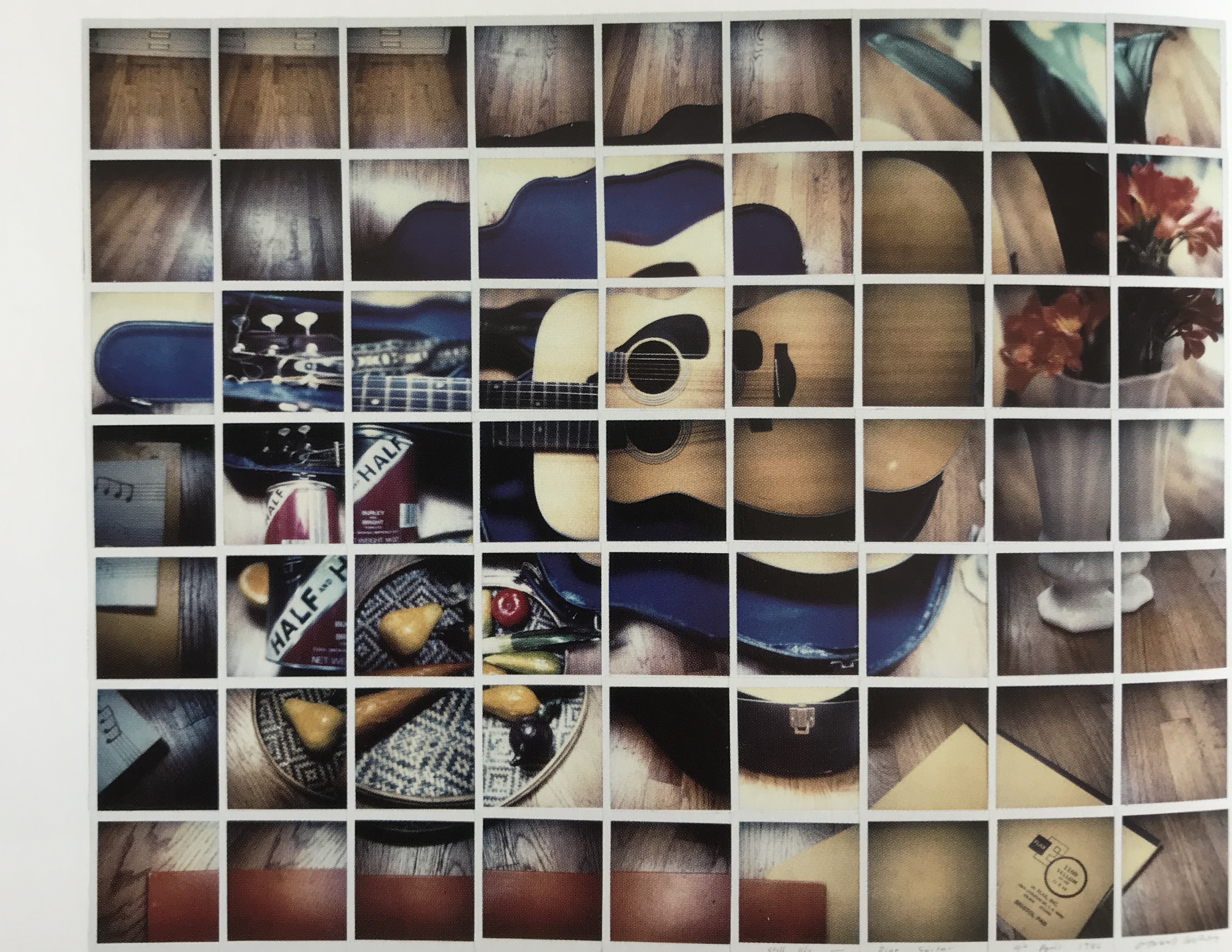
David Hockney, Still-Life Blue Guitar, 1982, Composite Polaroid. Collection of artist.
Hockney had been very excited by Cubism and used a Polaroid camera to be able to represent a subject from various viewpoints and also as it changed over a short period of time.
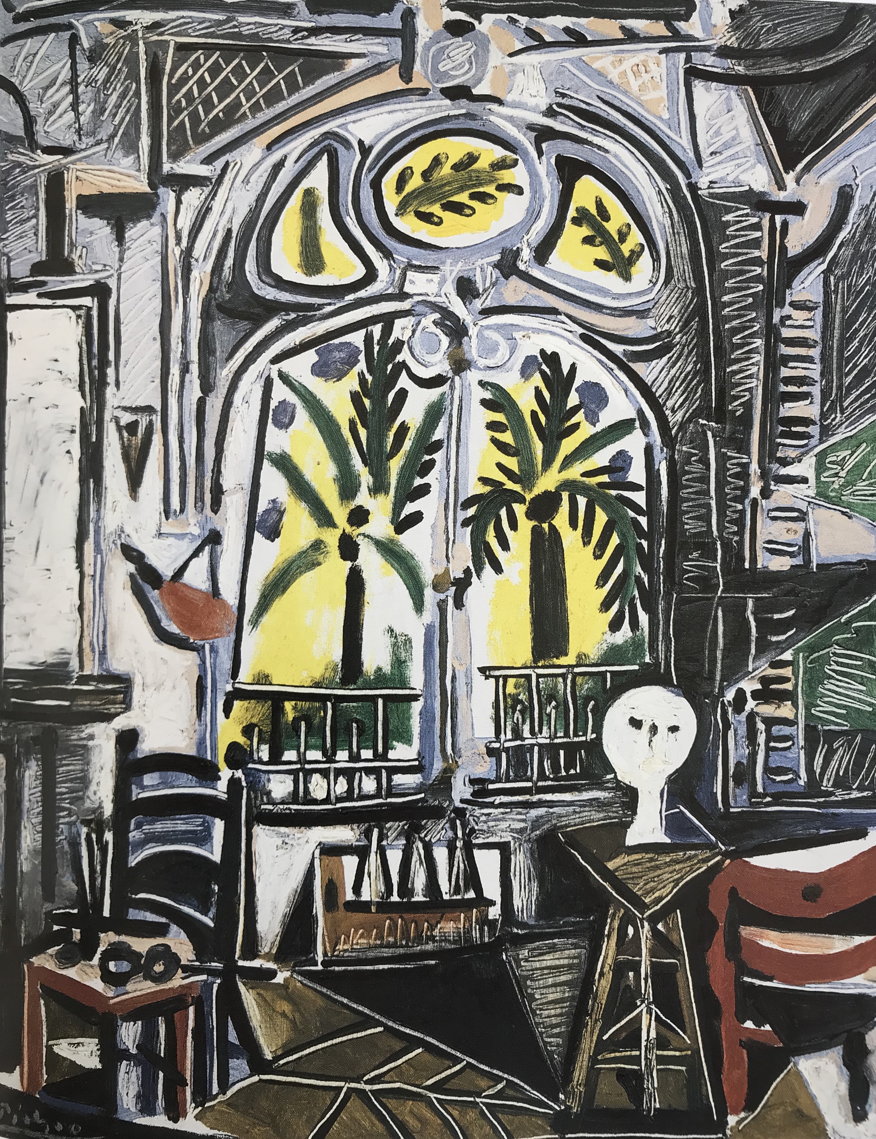
The Studio, 1955,oil on canvas. Tate.
As time went on Picasso’s still life style seemed to mellow and become a little more representative. A picture which I particularly liked is one of a series he did of his work space – still with some odd orientations and dodgy perspective – but that might be the way I’m going if I can’t sort out my own issues with perspective! Something to look back at when I get on to the section about drawing corners of my living space. Simple clear colours, including adjoining complementaries in an enlivening but not in-your-face way, evoking a light, open yet quirky place which would invite one to go and work.
In researching Picasso and his influence on other artists I’ve found the following text very helpful: Beechey & Stephens, (2012) Picasso and Modern British Art. Tate Publishing.
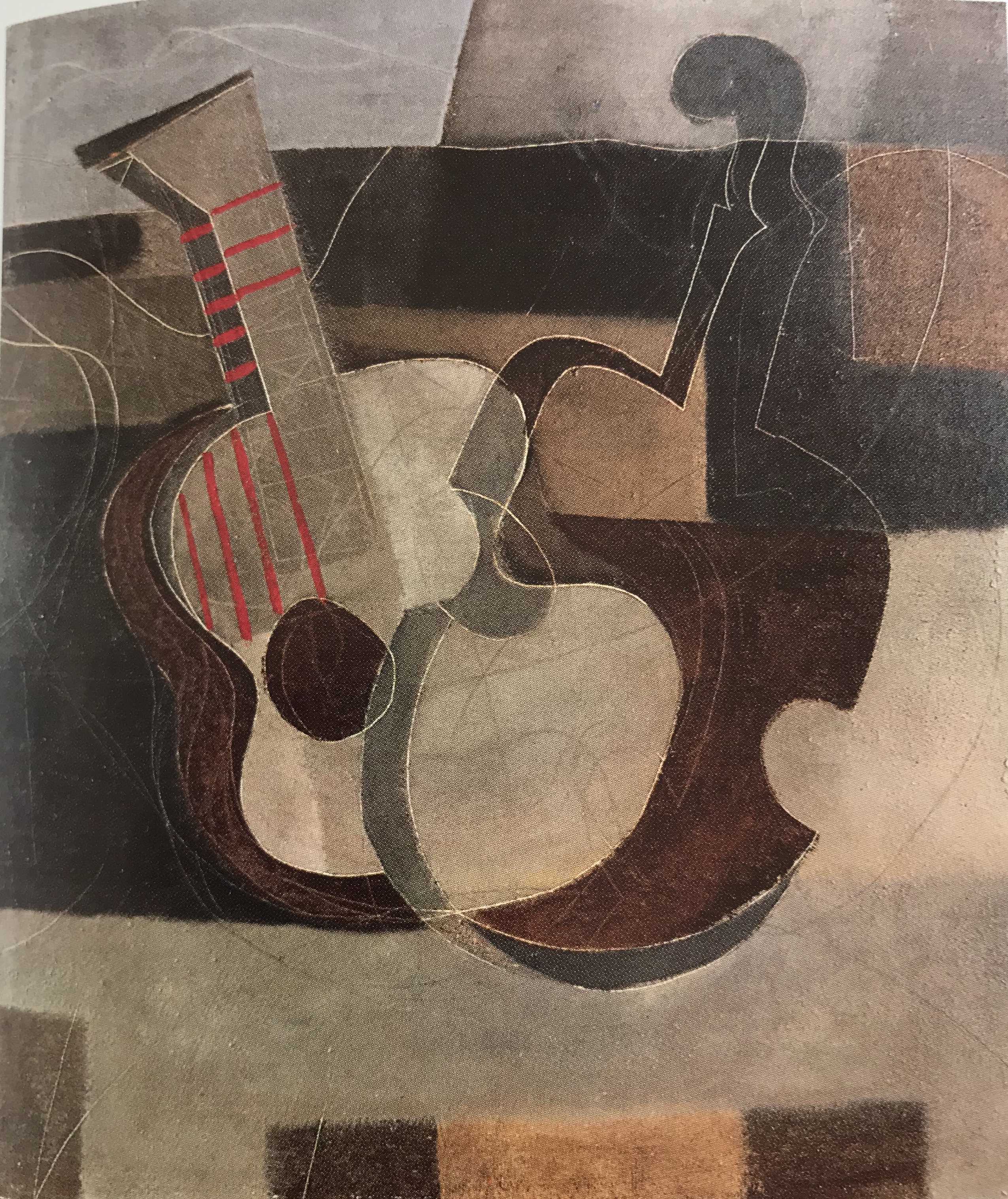
Georges Braque (1882-1963)
Braque and Picasso created Cubism together after they met in 1907. Cameo/Abrams, (1997), Great Modern Masters – Braque. Harry N. Abrams, Inc.credits Braque with the majority of the innovations which Cubism introduced, such as the inclusion of printed letters, the use of pigments blended with sand, and the paper sculpture, although he borrowed the papiers colles technique from Picasso. The book contrasts the styles of the two men, suggesting that Picasso was more of a close observer of the world and stark recorder of what he saw, whereas Braque took pleasure in creating elegant designs from his observed objects. I can see the point they are trying to make with this – Pitcher, Bottle and Lemon, 1909, oil on canvas. Stedelijk Museum, Amsterdam – it is very reminiscent still of Cezanne, but feels a slightly more “polished” finish than Picasso’s Jars and Lemon (see above).
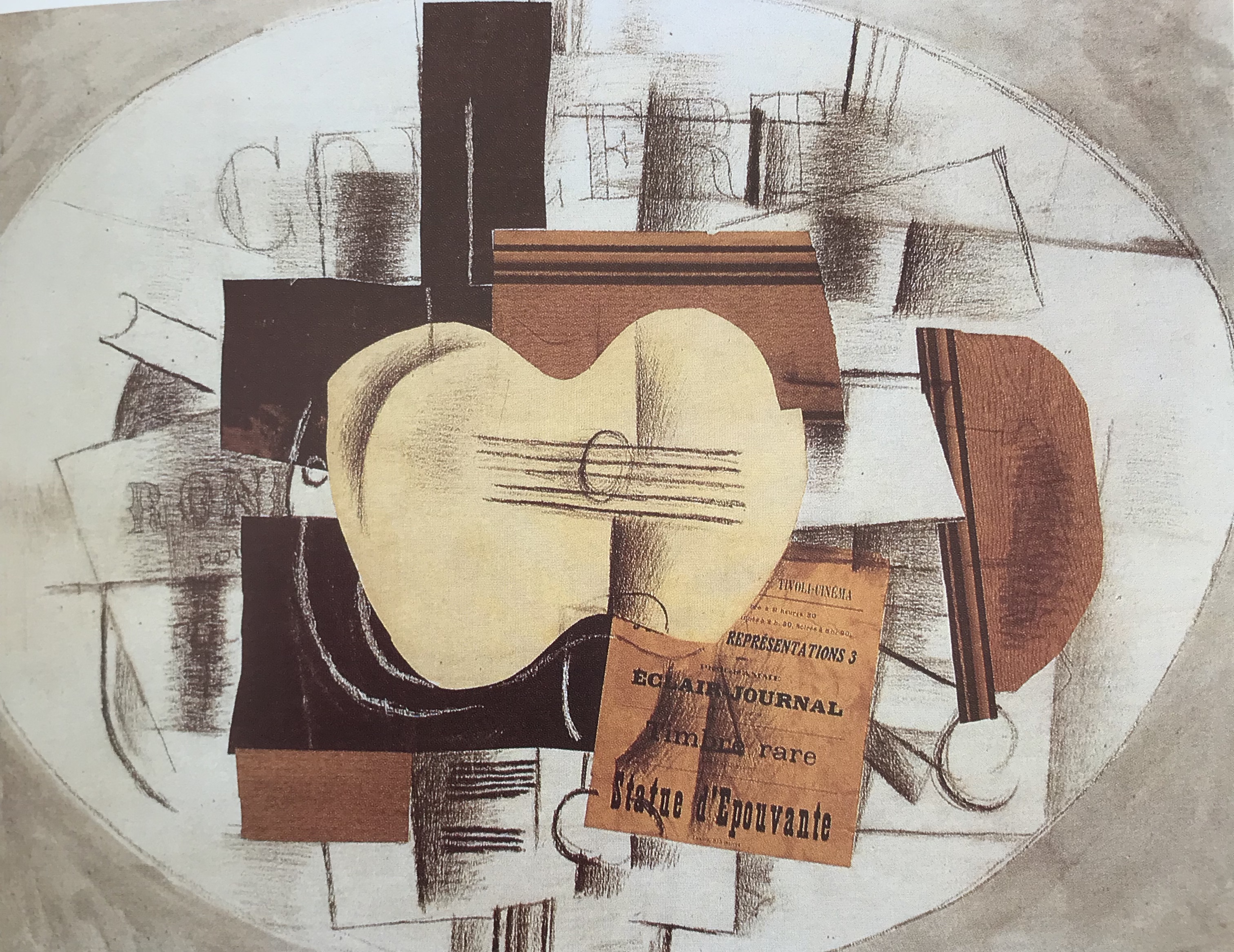
Guitar and Program: “Statue d’Epouvante”, 1913, charcoal, gouache and pasted paper. Private collection. – an example of Braque’s papiers colles, again looks to me slightly more “arranged” and organised than Picasso’s Bowl of Fruit, Violin and Bottle.
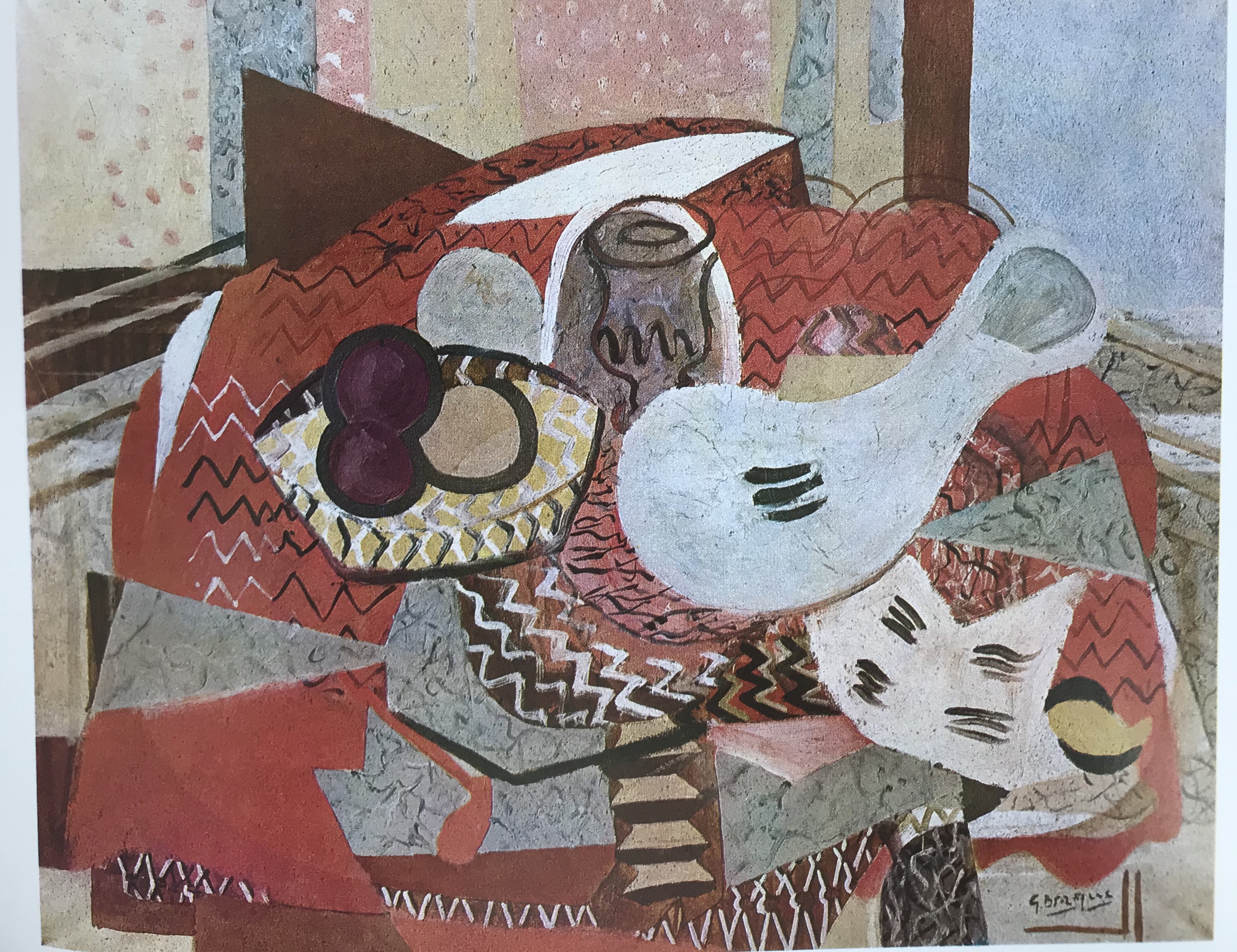
In his later work Braque went in a bit more for brighter colours than seen in his earlier, more restrained palettes – an example being Still Life with Red Tablecloth, 1934, oil on canvas. Private collection, Paris.
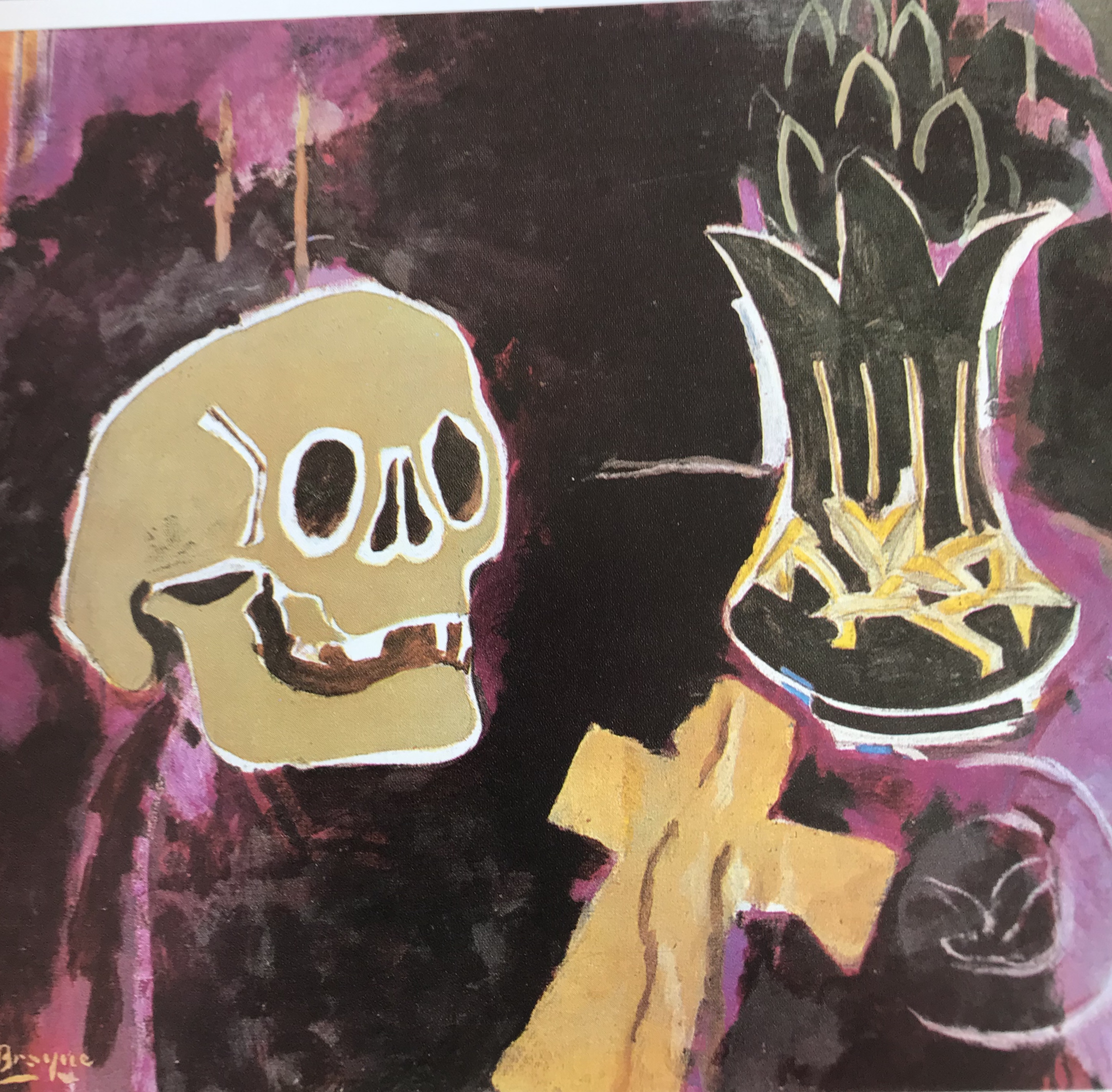
Initially these were done in a fairly playful sort of way, but the horrors of the Second World War imposed a darker side and a Vanitasseries, which included Still Life with Skull, 1941-5, oil on canvas. Private collection.
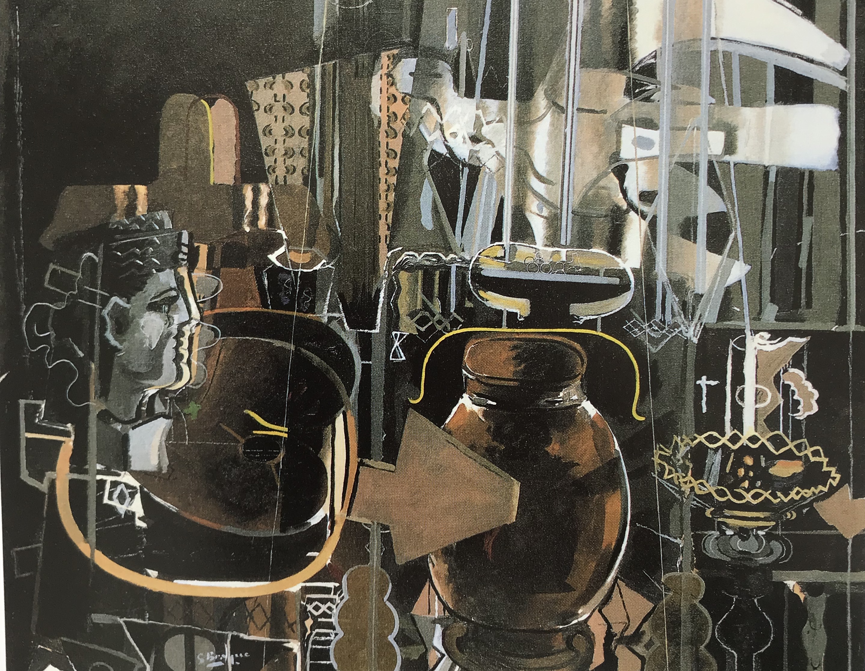
Later again, as with Picasso, Braque embarked on a series of pictures of his studio, which occupied him for several years. These are quite dark, still “arranged” but in a witches’ cave sort of way – very different to Picasso’s light airy spaces. He evokes a place I’d like to explore – it looks a bit like Hogwarts’ Room of Requirement – but not necessarily somewhere I’d like to sit and work! Again, one to revisit when I get on to drawing corners of my own house.
Moving on to contemporary still life
A big mid-twentieth century movement, originating in New York and London, was Pop Art, which was rooted in the urban environment and generally took as subjects the objects of the day. It had a quirky, often “comic strip” appearance, and it moved on from Cezanne’s idea of taking an object, such as an apple, to analyse, but instead chose things which would not hitherto have been thought of as suitable objects for such a study, e.g. Warhol’s picture of Green Coca-Cola Bottles, 1962,oil on canvas, Whitney Museum of American Art, New York;Simon Wilson (in David Britt, Modern Art (1989), Bulfinch Press) suggests that Warhol’s habit of repeating his objects does not make the pictures meaningless but rather (as with Cezanne’s apples) reduces the images to the status of elements in a composition, so that the viewer’s attention is directed away from the images and moves onto thinking about what the artist has actually done with it.
Harking back to Picasso’s and Braque’s interest in later life in depicting their familiar work spaces, I was interested in David Hockney’s move in the 1980s into depicting familiar spaces empty of people – e.g. Large Interior, Los Angeles, 1988, oil, paper and ink on canvas, Collection of artist; as they did, he seems to have employed unusual perspective and multiple viewpoints (either that, or its a rather strange room!).
A perusal of TRACEY, (2007): drawing now- between the lines of contemporary art. I.B. Tauris shows 21st Century artists using quite a mixture of styles and materials; Javier Cambre uses the traditional drawing materials of graphite and paper but for cartoon-ish drawings, often with text; Angela Eames likes to come bang up-to-date by inkjet printing on canvas; Cornelia Parker seems to make a feature of her choice of material which appears almost as important as the image produced, e.g. charcoal/sulphur/saltpetre, soil excavated from beneath the Leaning Tower of Pisa, and ink made from dissolving a video tape (confiscated by HM Customs and Excise) in solvent.
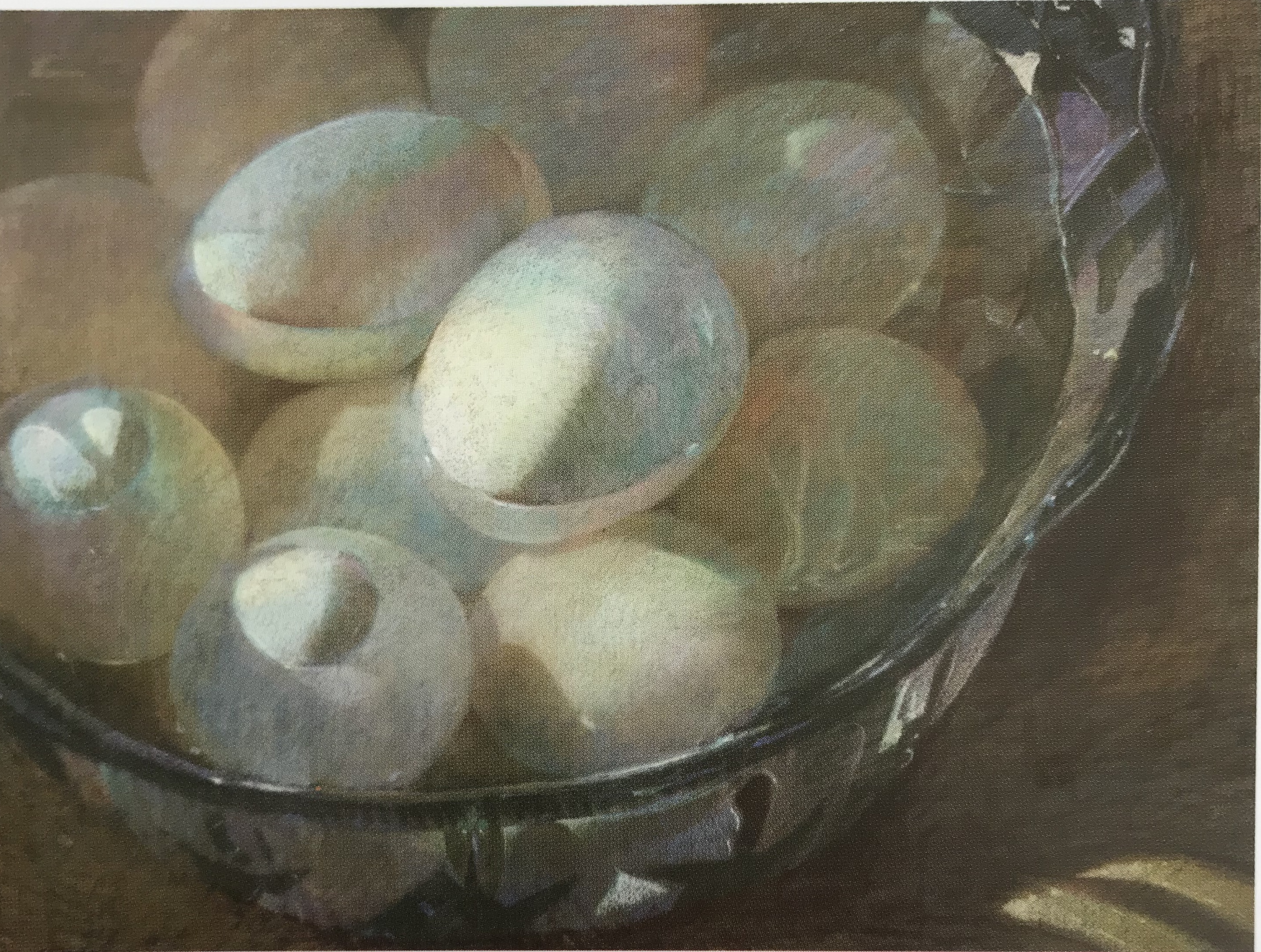
The old subjects keep going though. Harking back to Velazquez’s old woman with the eggs, I was struck by this image: Eggs Underwater (2007), pastel (seen in Tyrrell K, 2015: Sketching 365.Apple), by an American artist, Sally Strand, who is in the Hall of Fame of the Pastel Society of America (see her website at http://www.sallystrand.com). It’s a simple subject, but she has looked so very carefully at the light, her choice of colours is extraordinarily evocative, the cropped composition seems to make the whole thing more intense, and it is an object lesson to me in NOT ignoring the background.
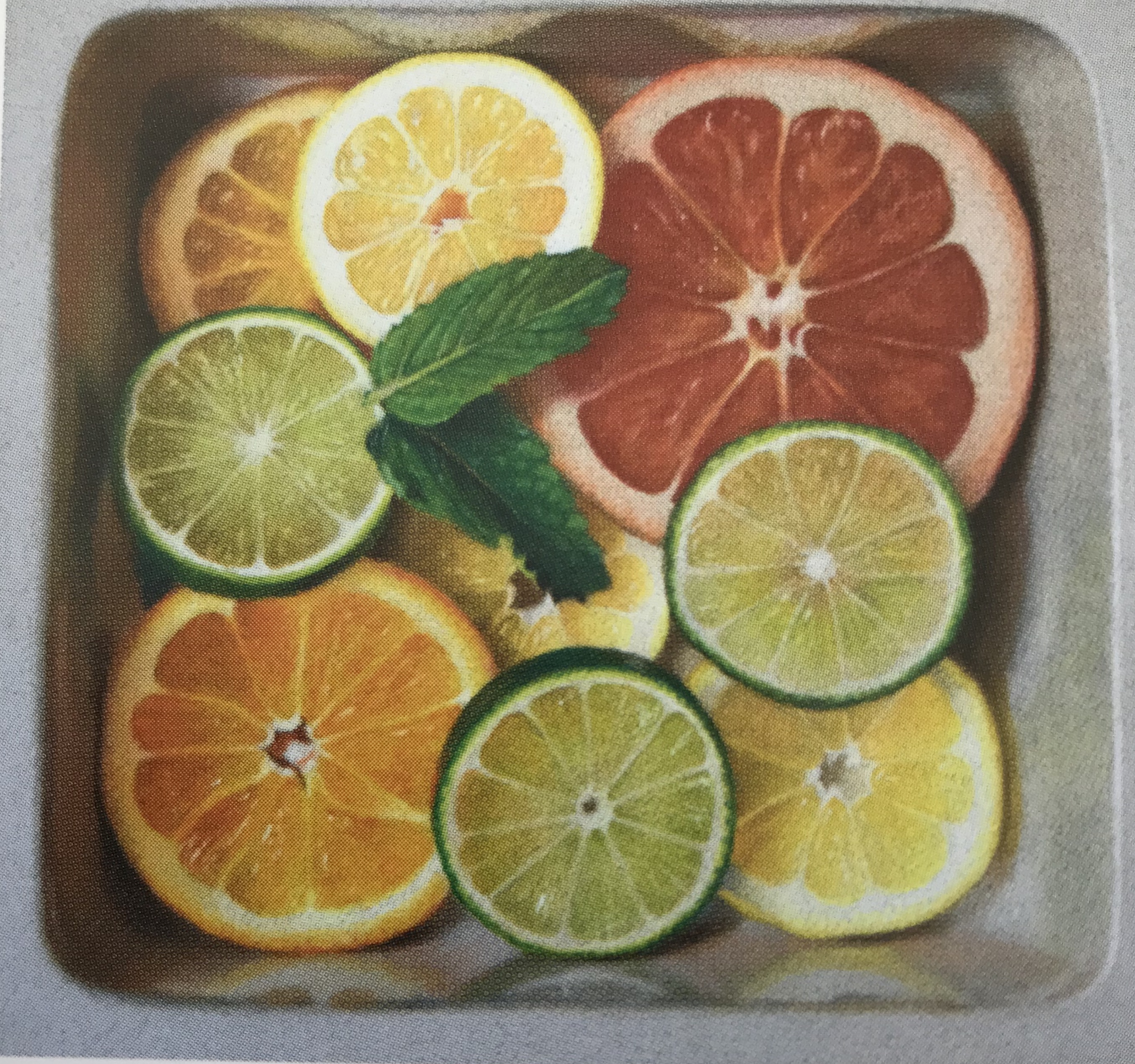
Fruit is also an ever-present motif – I enjoyed this picture of sliced citrus fruit by another American artist, Nicole Caulfield – Citrus (2012), coloured pencil. Private collection. Again, the careful observation appealed to me, as did the symmetry, which I know is not everyone’s bag, but here it seems to make the image satisfyingly balanced, perhaps because the symmetry is diagonal rather than vertical/horizontal.
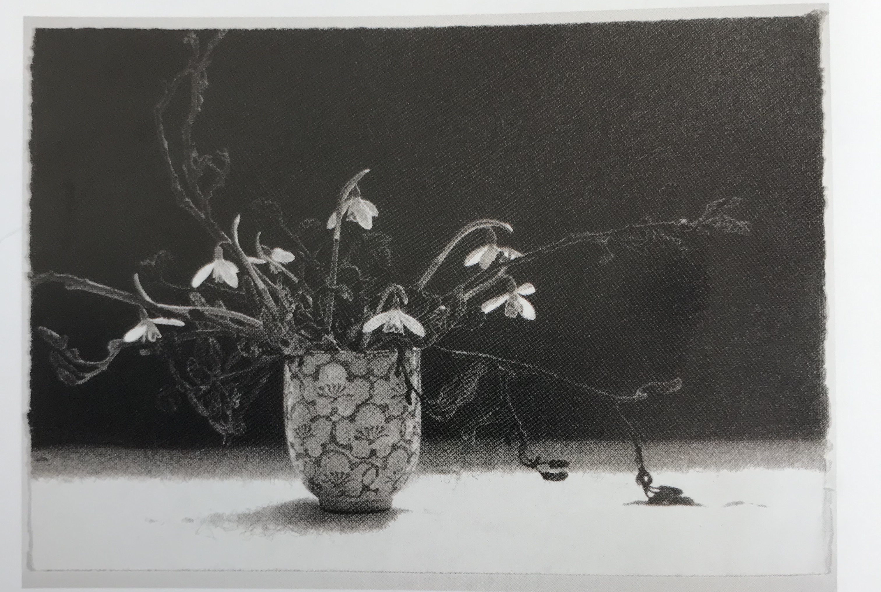
Looking forward to the work in this unit on monochrome, I have been very attracted by the drawings of Sarah Gillespie, a Devon artist and Academician of the RWA. An example is Out of the Wood, a charcoal drawing on Arches watercolour paper (seen on www.sarahgillespie.co.uk). A simple subject, traditional drawing materials, basically a vase of flowers with a very dark background and contrasting lighter foreground, harking right back to the 17th Century Dutch and Spanish still lifes!
“How tone is made is determined by what the tone is for in the drawing, what materials are being used, and…what the artist wants to communicate. What tone communicates is different from what line communicates. Line indicates the shape of something, the edge between form and space, the movement of a form, or even movement itself. Tone tells us about lightness or darkness, weightlessness or heaviness, and dullness or shine. It can tell us depth in space or it can be space itself. Line and tone are often worked together in drawing, but each can also stand alone…” – Davidson, M. Contemporary Drawing – Key Concepts and techniques.(2011) Watson-Guptill Publications.
Odilon Redon is obviously a master at the use of tone for so much more than just an indication of solidity, texture and properties as described above; he draws you into a picture and makes you wonder, particularly, about his darks and what might be concealed within – usually unsettlingly- see blog article on Redon.
Other artists use tone for a range of atmospheric effects. Honore Daumier, in his pen drawing Four Lawyers, circa 1867-70, The Art Institute of Chicago, could presumably have left it at a plain drawing, but has chosen to add tone via washes; obviously this adds solidity and 3D-ness to the figures, but to me it also imparts a certain air of weighty pomposity to the gentlemen, almost as if Daumier is having a bit of a laugh at their expense.
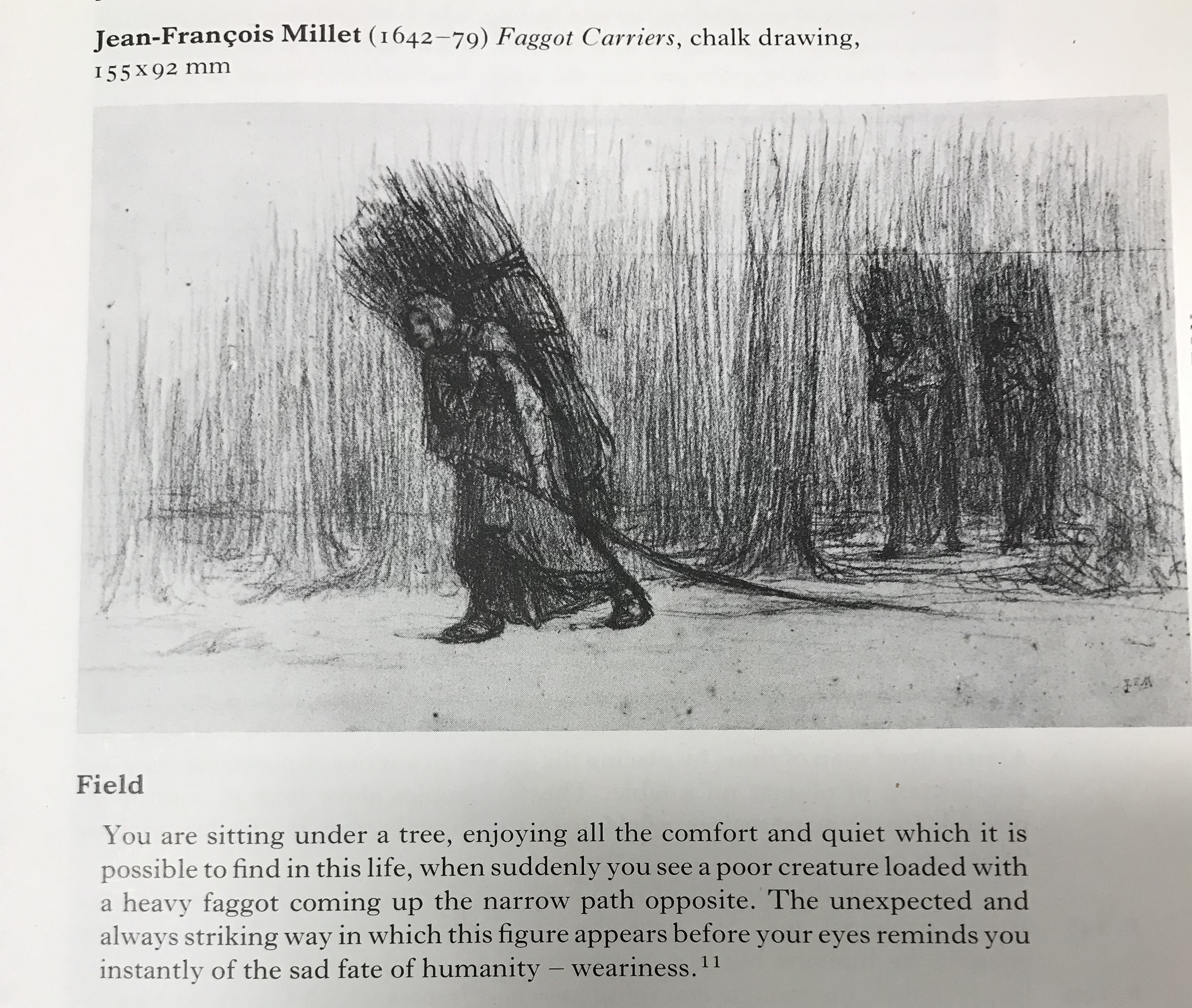
The quote below from Millet (taken from Rawson, P. (1979) Seeing through Drawing, BBC) sums up the feeling about the figures which is generated by their dark tone against their surroundings:
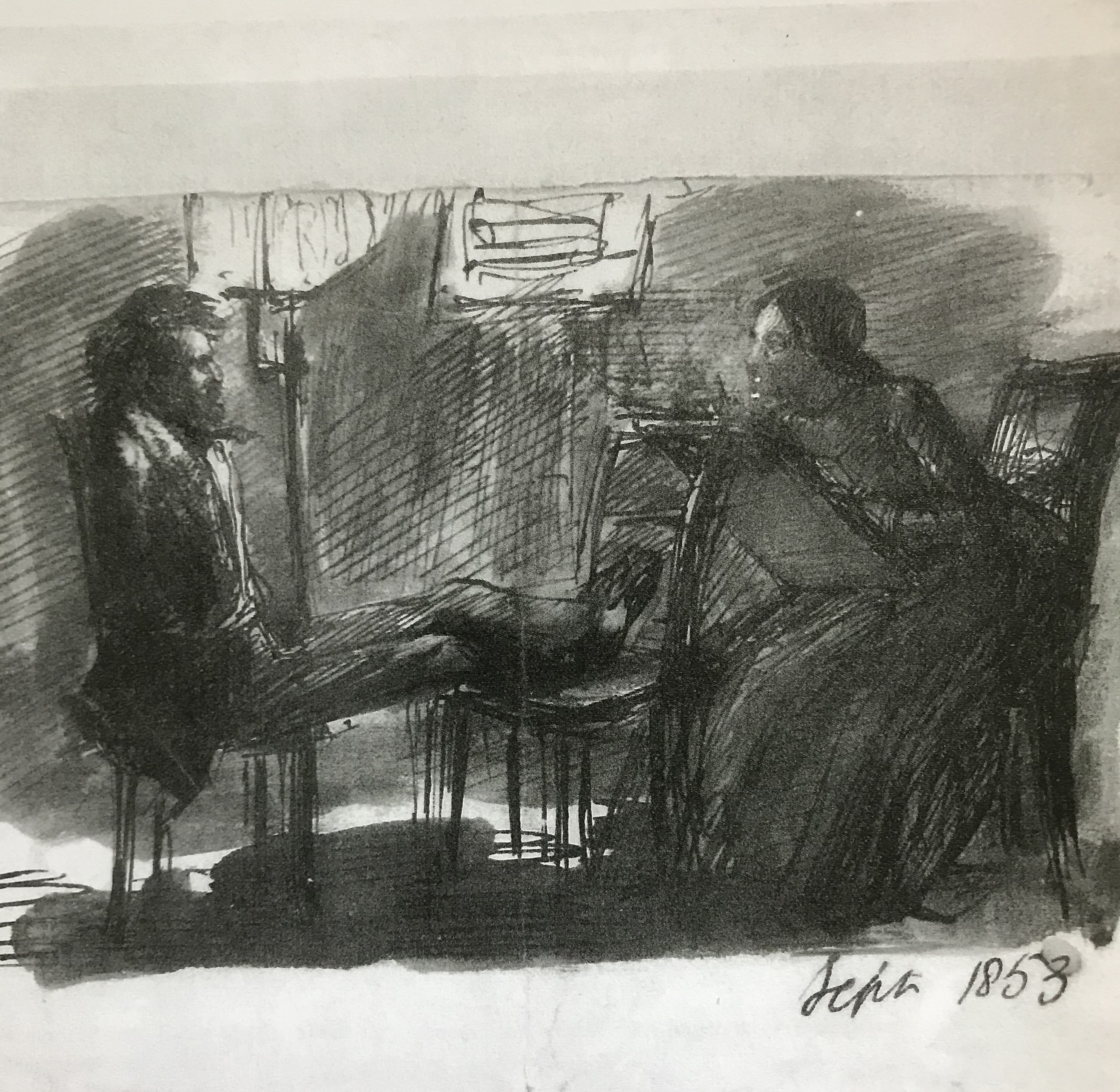
Dante Gabriel Rossetti’s Rossetti Sitting to Miss Siddal, 1853, Birmingham Museum and Art Gallery, a pen and ink drawing apparently shaded with his finger, depicts Rossetti sitting whilst Lizzie Siddal draws him. The darkness of the drawing, along with the energy of the lines, suggests to me an intense and slightly controlling relationship between the two.
There are also numerous paintings using chiaroscuro, meaning light-dark, which throw the figures almost into your lap with dramatic and often emotional effect – for examples,Leonardo da Vinci’s The Virgin of the Rocks, 1491-2&9 and 1506-8,S. Francesco Altarpiece, Milan…
Leonardo da Vinci, 1452 – 1519
The Virgin with the Infant Saint John the Baptist adoring the Christ Child accompanied by an Angel (‘The Virgin of the Rocks’)
about 1491/2-9 and 1506-8
Oil on poplar, thinned and cradled, 189.5 x 120 cm
Bought, 1880
NG1093
This painting is part of the group: ‘Panels from the S. Francesco Altarpiece, Milan’ (NG1093; NG1661-NG1662)
https://www.nationalgallery.org.uk/paintings/NG1093
…and Caravaggio’s Salome Receives the Head of John the Baptist, 1609-10, National Gallery
Michelangelo Merisi da Caravaggio, 1571 – 1610
Salome receives the Head of John the Baptist
about 1609-10
Oil on canvas, 91.5 x 106.7 cm
Bought, 1970
NG6389
https://www.nationalgallery.org.uk/paintings/NG6389
What does this all mean for me and my art? At the moment I am struggling enough with the use of tone to simply depict a fairly realistic 3D image of an object – but I do see the potential for its use to convey so much more as my style emerges. I need to learn to start thinking about what I mean my picture to convey APART from just the image of an object which is in front of me – as has been suggested to me in the very first exercise in the course, about using gesture to convey feeling – tone of course can do this too.
“(b Bordeaux, 20 Apr. 1840; d Paris, 6 July 1916).
French painter, draughtsman, and printmaker, one of the outstanding figures of Symbolism. He led a retiring life, first in his native Bordeaux, then from 1870 in Paris, and until he was in his fifties he worked almost exclusively in black and white—in charcoal drawings and lithographs. In these he developed a highly distinctive repertoire of weird subjects— strange amoeboid creatures, insects, and plants with human heads and so on, influenced by the writings of Edgar Allen Poe. He remained virtually unknown to the public until the publication of J. K. Huysmans’s celebrated novel A rebours in 1884: the book’s hero, a disenchanted aristocrat who lives in a private world of perverse delights, collects Redon’s drawings, and with his mention in this classic expression of decadence, Redon too became a figurehead of the movement.
During the 1890s he turned to painting and revealed remarkable powers as a colourist that had previously lain dormant. Much of his early life had been unhappy, but after undergoing a religious crisis in the early 1890s and a serious illness in 1894–5, he was transformed into a much more buoyant and cheerful personality, expressing himself in radiant colours in visionary subjects, flower paintings, and mythological scenes (the Chariot of Apollo was one of his favourite themes). He showed equal facility in oils and pastel and after 1900 he carried out a number of large decorative schemes. His flower pieces, in particular, were much admired by Matisse, and the Surrealists regarded Redon as one of their precursors. By the end of his life he was a distinguished figure, although still a very private person.”
I have looked at a range of work by Redon, consulting in particular:
Bridgeman Education Library
Odilon Redon (1985), Galerie des Beaux-Arts (all in French!! – which has considerably tested my recall of schoolgirl French from over 40 years ago…)
Leeman, F (undated?): Odilon Redon and Emile Bernard – Masterpieces from the Andries Bonger Collection. Van Gogh Museum, Amsterdam; Wanders Publishers, Zwolle
His earlier work in particular shows very strong tonal contrasts, often placing a figure in half-light, before a dark shaded area adjacent to a bright feature, e.g.
Landscape, two figures, c.1880-1881, Van Gogh Museum, Amsterdam
La foret enchantee, 1870
Bordeaux, Musee des Beaux-Arts
The effect of the dark background in both these pictures imparts a slightly sinister feel – one is made to wonder what is hiding in the shadows.
He also did several pictures which seemed to be looking through a window, with a dark sombre interior contrasted with what seems a dazzling exterior – as if the gloom inside is in tension with the bright hope of the exterior. He also sets people against a window, making it appear as if they are ghostly, trapped in some way inside.
Le Jour, 1891
Paris, Bibliotheque Nationale, Cabinet des Estampes
The thinker at the window, drawing in the style of Goya, 1878
Van Gogh Museum, Amsterdam
A review in Nineteenth-Century French Studies, Vol 42, Nos 1 & 2, Fall-Winter 2013-14 of an article by Dario Gamboni: The Brush and the Pen: Odilon Redon and Literature, draws attention to a remark by Gamboni about an unconscious slip in Redon’s early writings, where he puts “peine ombre” (meaning “sorrow shadow”) where he meant “penombre” (meaning twilight or darkness), and suggests that this slip reveals Redon’s painful associations with the shadows in his earlier works.
I made a small slideshow on the Bridgeman Education library with a couple more examples of the points above, plus one of his later flower paintings – even here he often uses dramatic contrasts in tone – this one has a very dark background, making the light tones of the yellow flowers positively “zing” with excitement. I made it public, so am hoping it can be seen at:
Slideshow created on March 25th at 6:15pm
Bridgeman Education Slideshow: Redon’s use of tone
A Pitcher of Flowers Redon, Odilon (1840-1916)
Primitive Man, 1872 (charcoal, black chalk, stumping, wiping & erasing, with white & ochre gouache on paper)
Scott Russell has worked as an artist in Tavistock for several years; he runs a number of life drawing classes which colleagues at the art group have attended and recommended. His work can be seen at https://cargo-collective.com/scottrussell/About-Scott-Russell.
He began by demonstrating how to tackle a life picture in oils, but members were free to use any media they like, and of course, I chose drawing. He gave several useful tips on (a) oil painting, and (b) placement within the drawing of features and body parts (e.g. corner of mouth leads up to centre of eye) – see notes in A3 sketchbook for this.
Two particular things apart from that that I wanted to record here:
(i) Scott is someone who likes to get over the fear of a blank page by big, sweeping movements, and has some words of advice about freeing up:
Failure is a part of the process
Let the viewer do some work – makes it more interesting for them
Relax and paint how you want to paint
Push yourself – surprise yourself – discover
Look back at the subject for clues all the time – it’s like a detective game
(ii) Talking to another member, they recommended watching and working through RA online life drawing classes – NEED TO DO!