I hunted around my studio to find some objects/materials with which to apply paint. I worked in water-mixable oils on oil-prepared paper, using mainly lemon yellow and cobalt blue (a combination which I thought would be helpful to me in distinguishing layering from blending), with just the end of some burnt umber which was already on my palette.
SO WHAT?
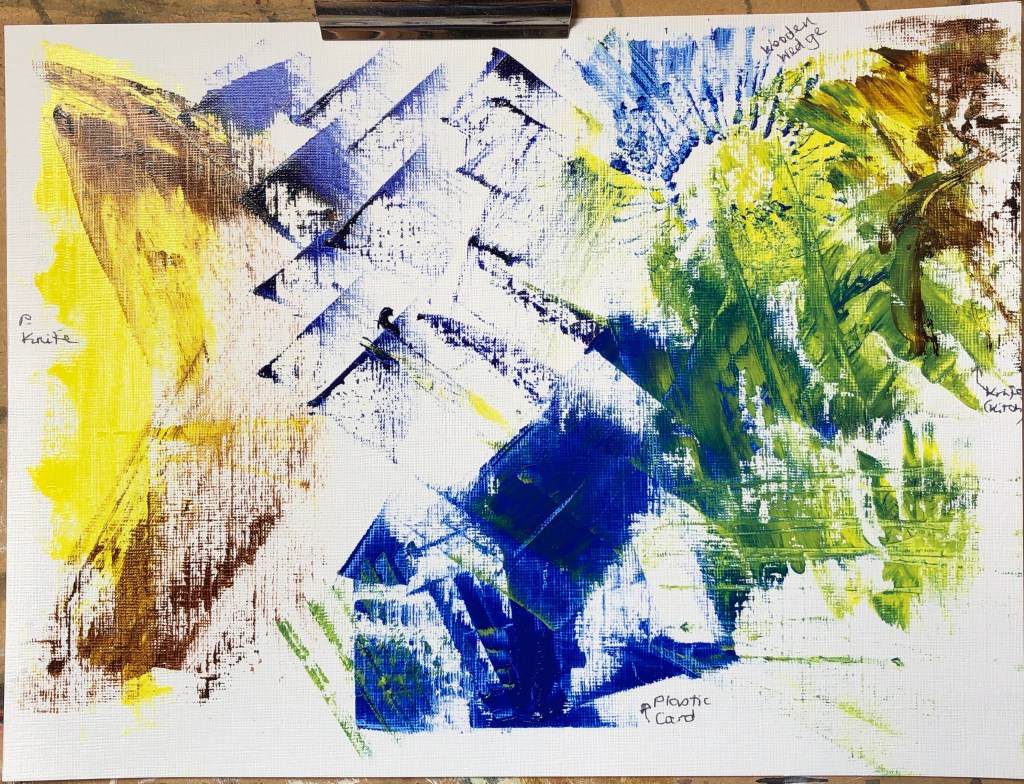
On this first sheet I experimented with a painting knife, a credit card, a wooden wedge and an ordinary rounded kitchen knife. I had previously thought of knives as a way of applying paint quite thickly, and was surprised by just how thin a paint layer can actually be achieved. I looked at layering and blending – I did find the painting knife the best for laying flat layers on top of each other, although I had fun making marks with the wooden wedge.
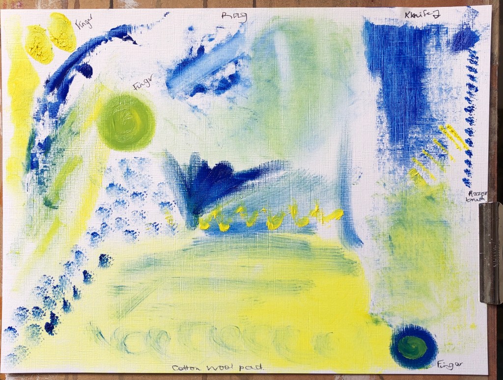
Next I used a combination of a rag, my fingers, a cotton wool pad and an old shaver cleaning brush. The latter was useful for mark-making on top of an existing paint layer, but the other three were more effective at blending. The rag and pad really allowed for some thin initial layers of paint, but adding further layers on top was tricky without blending occurring. It was hard to get accurate edges – the best for this was a finger, although you’ve got to be careful how much paint you use; too much and it stands up from the paper when you take your finger away – great if you want texture, but not otherwise.
NOW WHAT?
The most useful learning I did here was finding out about applying really thin layers – up to now, if I wanted a thin layer, I’ve been using dilute paint, whereas now I see that a rag with undiluted paint will do as well for a first layer, and dragged knives are good for subsequent layers with minimal blending.
I have decided to work with oil paints, partly because I need to learn more about them, and partly because I sometimes have to break off work suddenly in my role as full-time carer, and oils stay wet whereas acrylics dry up on me.
To begin with I have two sets of brushes and paints, one upstairs in the attic and one downstairs. I appreciate I shall need to mix them at some point.
SO WHAT?
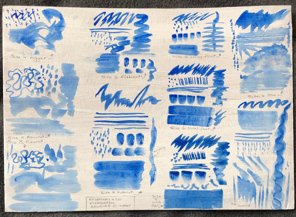
I made a range of marks with my upstairs paints, which are Cobra water-mixable oils, and my brushes, which are a set of alla prima brushes from Rosemary & Co, quite soft bristles. I worked on a bit of cardboard which had previously been coated back and front with gesso. My paint was diluted (with water) and I found that it ran overmuch on this surface and made some marks indistinct, so I did a few more with undiluted paint on oil-prepared paper:
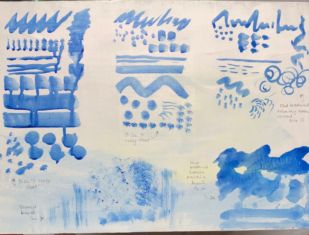
I also tried my downstairs set, mainly bristle flats, rounds and filberts, using Jackson’s oil colours, just slightly diluted with Zest-It, on oil-prepared paper:
I found that:
Most brushes were capable of a range of marks
The flats give a slightly crisper, cleaner edge
The sword and the fan allow for special effects
The numbers on the brushes seem peculiar to the range – for example, a size 10 in one range is much bigger than a size 12 in another
Possibly one gets what one pays for – for example, my more expensive hog flat gave a crisper, better defined mark, and was much easier to clean at the end, than my cheap brush.
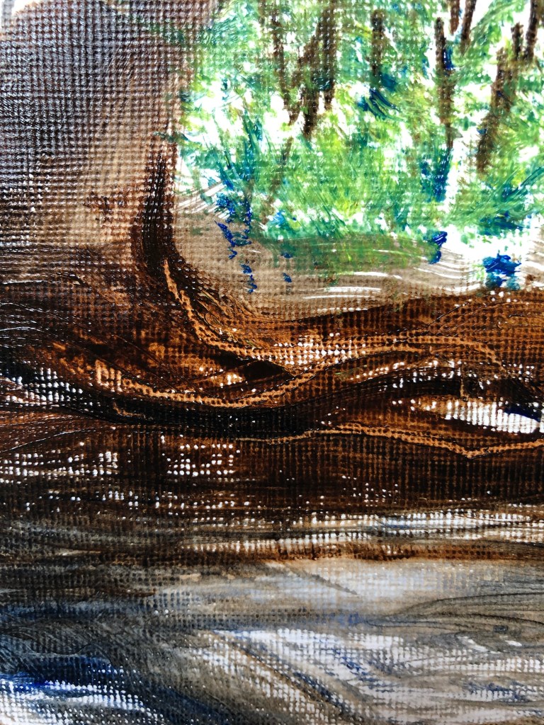
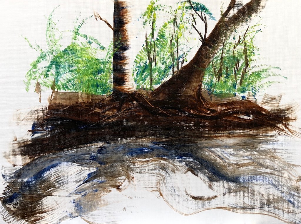
Next I painted a landscape from memory, a much loved (and much-drawn) section of riverbank on the River Tavy just down the road from our house.
I used my Cobra water-mixable oils (burnt umber and ultramarine for the darks, cobalt blue and lemon yellow for the greens) and three brushes:
A size 8 flat for the trees and bank
A sword for the tree roots in the bank (also drawn into with the solid end of the brush for highlights), and parts of the water
A fan for the foliage and parts of the water.
I worked onto prepared oil paper, size A4. In my memory, the sunlight shone from behind and to the right of the trees:
I really enjoyed the precision of the flat and the dragging marks possible with it. I was a bit “jabby” with the fan but I can see that, with practice, it has potential to be useful for layers of foliage, and also for colour mixing on the surface (I picked up bits of separate yellow and blue). The sword also has promise for those narrow-wide-narrow flowing marks, a bit like italic script, but I need to work more at learning how to handle it for less random effects.
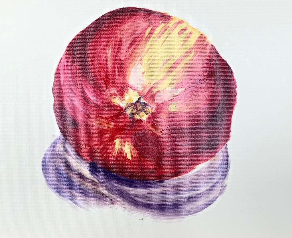
Finally, I set up an apple on a white sheet of paper to explore using my large size 8 Winsor & Newton hog filbert. The lamp was directly overhead but I was sitting in a conservatory and, even though it was a very overcast and rainy day, there were multiple shadows. I made a quick biro sketch in my sketchbook, then set to work painting on oil-prepared paper using Jackson’s oils diluted with Zest-It. My small palette consisted of crimson, yellow ochre and ultramarine violet.
I discovered two main things:
Getting a clean edge with the filbert was not easy – my apple has become quite distorted in my efforts to tidy up the edges!
The paint that is carried along by the brush as one makes a stroke gets “dumped” at the end when you take the brush off the paper – to be considered carefully.
NOW WHAT?
The exercise immediately sent me back to a book I had recently acquired: Auping, M, Elderfield, J & Sontag, S (1995), Howard Hodgkin Paintings, Thames & Hudson Ltd, London. Close scrutiny of his later works allowed me to pick out many of the marks I had made in the first part of the exercise and to “work backwards” through his paintings to identify how he had constructed them.
This also reminded me of a remark made by my previous tutor: “A brushstroke has a beginning, a middle and an end”. I could identify this in Hodgkin’s paintings. In my landscape, I could see that the most effective marks were those where I had thought about the beginning and end (having previously been someone who just “goes for” a painting, and ends up with a lot of unresolved middles as a result). The beginnings and ends of the strokes became clearer to me as very different beasts when painting the apple with the large filbert. So, my way forward: don’t just go for it, stop and think about all parts of each stroke. Should be quite meditative if I can pull it off.
Very useful conversation around sketchbook use, which I had been struggling to build into my practice in Painting, having found it invaluable in Drawing. Suggestions:
Exploration of composition
Studying qualities of lighting – could be almost diagrammatic – to help inform my choices
If using oils, can still work in the sketchbook, use cling film or cellophane to separate pages
Could work on pieces of card for exploratory work, once dry put it in sketchbook and annotate with notes and reflections
Try working in series – cropping, playing around – lots of exploratory, provisional work
Always carry a sketchbook, even if you just use it to mark make- this way you build up a vocabulary of marks
Allow yourself to be drawn to things and just record that, maybe with what you think attracts you, e.g. texture or colour incidence.
Be a visual and material magpie!
Also, by getting back into using a sketchbook, it helps to re-establish your practice and commitment after a break.
Tutor also recommended taking part in online workshops and group meetings.
A helpful feedback session and a wide-ranging discussion online. Key points noted below, in no particular order except as they arose.
SO WHAT?
“Gate” painting is really exciting – gives the impression that I enjoyed painting it. However, the light green final layer is spatially confusing.
“Tree on the wall” painting – light in the photo was very even, so quite impressive that I managed something not a flat mess. Very experimental.
“Purple flowers” – add a blue to take the darks to a near black
Priming – a moveable feast, not everyone does it. Need to find a canvas to suit me – ranges from rough fabric right through to fine linen, and this determines how the paint flows across the canvas, e.g. linen feels very silky, bit like a non-stick frying pan, plus you can see the weave; consider investing in some test samples. Also consider the weight of a big canvas. Sizing (with rabbit or fish skin glue) doesn’t make the canvas impermeable, but will stiffen and tighten it. Some people then prime in white, e.g. with gesso or acrylic, others use colour. My tutor doesn’t prime, but uses an underpainting – consider asking other tutors how they prime their canvases? Good canvas suppliers are Atlantis and Cornelisson, also worth checking out Jackson’s; also need pairs of stretcher bars and a staple gun. Canvas is expensive though, so consider using boards and linen. Working large on canvas has a particular quality that connects with history. However, if you choose to use a lot of gesso, it’s not worth using canvas, might as well use board.
Trust your own instincts – let the goal guide you.
National Gallery technical bulletin is good for methods and materials.
Essay – NEEDS WORK!! Referencing (Author, date) needs to go directly after any quotations, facts, etc – it’s not enough to just put a list at the end. The list at the end is then a referencing list – a bibliography is different and includes all the things you have read around the subject, even if you don’t actually use them in the essay. I will fail a plagiarism test without these references within the text – so BEWARE!
Book recommendation: “On not knowing how artists think”.
Paint handling – I suddenly go very thick, and this would be better if I was working much bigger. Oil paint dries from the back, so a canvas without primer will dry quicker (so goodness knows how long mine will take!). A brush mark has a beginning, a middle and an end, and painting as thickly as I have means I am not leaving the stroke with any elegance. If I want to do this, consider using a clean brush to carve in. Could also put a blob of paint down and then draw it out with a clean brush. Blue paper rolls are good for cleaning, and mix with a palette knife. Have more paint on your brush than you need so your brush doesn’t leave a mark.
In Exercise 2, the ink paintings were lovely and tonally varied, but the watercolours lost the drama and precision of the darker colours. I did have a go at taking one of the ink paintings and rendering it in a different combination of watercolours (burnt umber, ultramarine, light red and cadmium yellow) to try and get those darks:
(watercolour; watercolour saved as monochrome; original ink painting).
I think I have got my darks darker, but in focusing on that I have inadvertently lost some of my lights. Having painted in oils for a while, I found myself treating the watercolour paints in the same manner and have lost some of their translucency as a result – hence the rather “solid” finish. So much to think about!
Curation – this was fine, a nice idea, says something about me. Thinking about unusual curation is definitely something to take forward.
NOW WHAT?
I feel as though I’ve learned loads about painting, especially using water mixable oils, but still am at the very beginning of my learning journey. It’s easy to get overwhelmed, but my way forward is to
do my research
pick people’s brains
don’t drown
choose a thing and work through it so at the end I can say “I know about…x…and I have ways to use it” and then move on to the next thing.
I made the decision to work in water mixable oil paints for this Part and to learn about their properties and nature, and wanted my assignment work to reflect this.
I re-read Woolf, V. (1925) Mrs Dalloway right at the start of this Part, and was struck by this passage: “The hall of the house was cool as a vault. Mrs. Dalloway raised her hand to her eyes, and, as the maid shut the door to, and she heard the swish of Lucy’s skirts, she felt like a nun who has left the world and feels fold round her the familiar veils and the response to old devotions. The cook whistled in the kitchen. She heard the click of the typewriter. It was her life, and, bending her head over the hall table, she bowed beneath the influence, felt blessed and purified…”.
I began by intending to show my house in this spirit. However I found that, each time I chose an image to paint it was of the garden or the exterior of the house – and I believe that’s because I’m not actually loving my house much just at the moment – it’s all upside down, furniture out of place, full of builders, gasmen, carers, physiotherapists, plumbers, hospital beds, wheelchairs and commodes….so my art has shown me that, in fact, I feel the exact opposite to Mrs Dalloway about my own environment.
SO WHAT?
So, the images are all of the garden and exterior. I have experimented with various techniques using the water-mixable oils (see other blog posts in this assignment section) and have selected all except for the first, the eucalyptus, which I felt turned out to be unattractive to look at and tonally uninteresting.
Having selected my paintings, I turned to James Putnam’s Art and Artifact: The Museum as Medium (2nd edition, 2009, London: Thames & Hudson). I was drawn to the Wunderkammer idea (pages 10-12) and in particular the curation of the following (in this order):
Louise Lawler (Pollock and Tureen, 1984) – page 98
Joao Penalva (The Ormsson Collection, 1997) – page 89
Nikolaus Lang (To the Gotte Brothers and Sisters, 1973/4) – page 83
Mark Dion Cabinet of Curiosities for the Wexner Center for the Arts, 1997) – page 74
I decided to curate my paintings on bookshelves, much in the style of Mark Dion, surrounded by other objects which bore no particular relation to them.
I played about with the arrangement, going for a fairly cluttered effect so that the viewer almost “happened” upon the paintings in the course of exploring the whole image. I have left the piles of books still tied up in string as an indication of the continuing disorder in the house – I’ve deliberately gone for a higgledy-piggledy effect to reflect the state of the house (not to mention my mental state in trying to deal with it all).
NOW WHAT?
I learned a lot about using water-mixable oils through this Part:
How to get to grips with the possibilities and limitations of the particular colours I have by making colour cards
How to build up very dilute layers (learned as a possibility from my tutor)
Impasto is not as easy as it looks
Filberts are my current favourite brushes
Oil does not get on well with PVA glue (even though water-mixable)
I have experimented with the use of gesso as part of a painting (which I learned from Mary Anne Aytoun-Ellis) and would like to develop this further.
I have tried hard to improve my colour choices, working with limited palettes and with somewhat muted colours with pops of bright pure colour (as learned from, amongst others, Sickert) and more subtle use of complementaries.
I enjoyed considering the curation of my work, researching all the possibilities and making my mini-Wunderkammer, which greatly suited my “collecting” nature. I have not particularly thought before about making paintings that go together (except when making series) and it has been beneficial to be asked to consider that.
Finally, I have learned about self-analysis via painting; what the organising brain wants to do is not always the way the creative heart decides to go. Not quite sure why I was surprised by this, but I was.
I wanted to experiment further with a way of pulling together my “gesso first painting layer” method with my “building up dilute layers” method. I also wanted to make a companion piece to the “door knob” painting – it felt as though it should be part of a pair. I chose a composition of muted colours so I could look at Sickert’s method of putting in a pop of pure colour to bring an image to life.
SO WHAT?
An initial drawing was key here, both to sort out the perspective, and also to analyse the tones of the number plate. I drew with an HB pencil on a sheet of A4 printing paper, which was all I had to hand at the time.
I chose a matching canvas size to the “doorknob” painting, and also decided that I would replicate the technique of not taking the coloured part of the painting to the edges. This time, though, I did cover the edges with a thin layer of plain gesso, before mixing in a dash of burnt umber and roughing out the bare bones of the image in a thicker layer of gesso.
Once that was dry, I worked with a small filbert on the number plate in layers of dilute oil paint using a mixture of burnt umber and ultramarine. Towards the end I added a touch of titanium white to get my greys.
After leaving that to dry a little overnight, I indicated the colours of the stones. I had decided to add Indian yellow to my palette as the best yellow to create the gold on the plate, and I added this now to the umber/ultramarine mix to get the greenish stone, and to burnt umber on its own to get the browner stone. I worked into the stones with finger tips to get that splodgy effect, and also the edge of a palette knife to scratch out the streaks. I ran some dilute yellow around the number plate in places to get that faded grey/gold colour, before finally adding my pops of pure Indian yellow with a rigger to bring it all to life.
NOW WHAT?
I think the use of my gesso method is still valid in this type of image; it is not as obvious as it was in the “gate” painting, but it still shows up here, especially in the numbers, and was useful in helping to “catch hold” of the final application of pure colour.
I feel I have progressed in my use of complementary colours here, using them more subtly (a bluey grey with an orangy-yellow), with just a dash of pure colour at the end.
I also feel that I have progressed over this Part in my consideration of the colours I choose for my palette, rather than just grabbing the first one. Making colour cards (as suggested by Anna, another student) has really helped and I am going to keep all the ones I have made as a reference for the future – they are ensuring that I begin to understand the possibilities (and limitations) of the particular paints I possess.
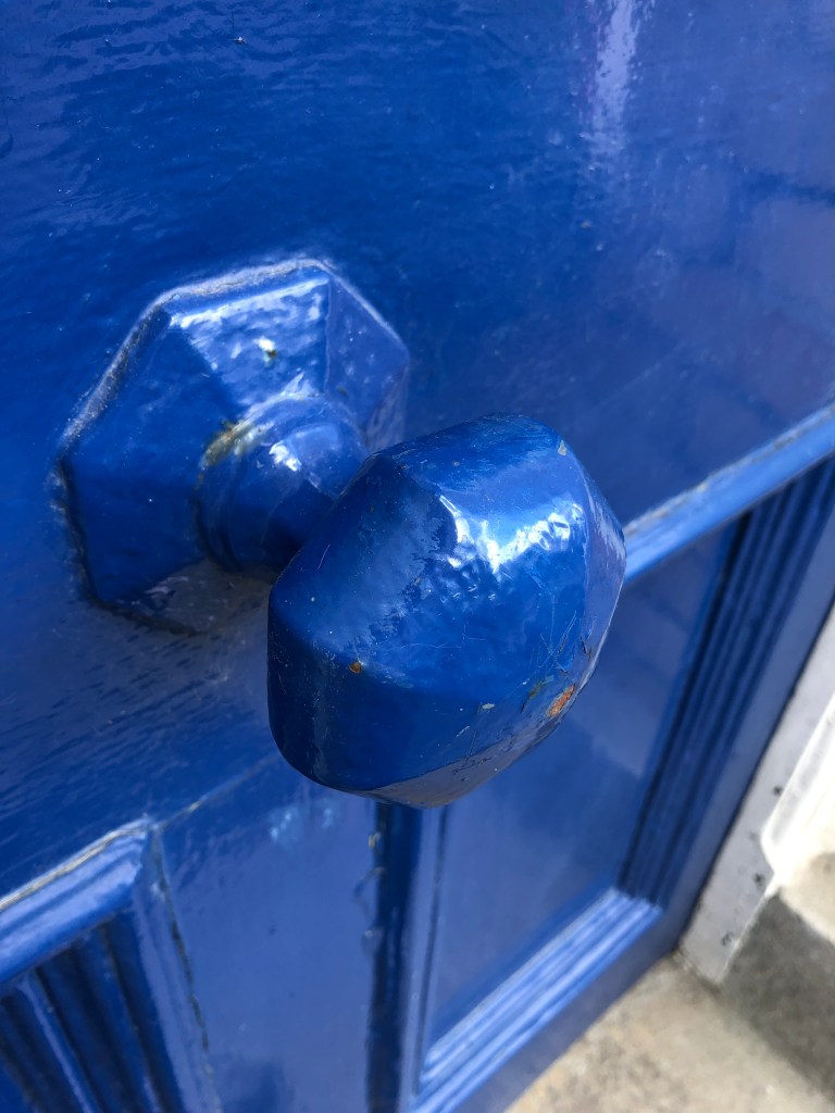
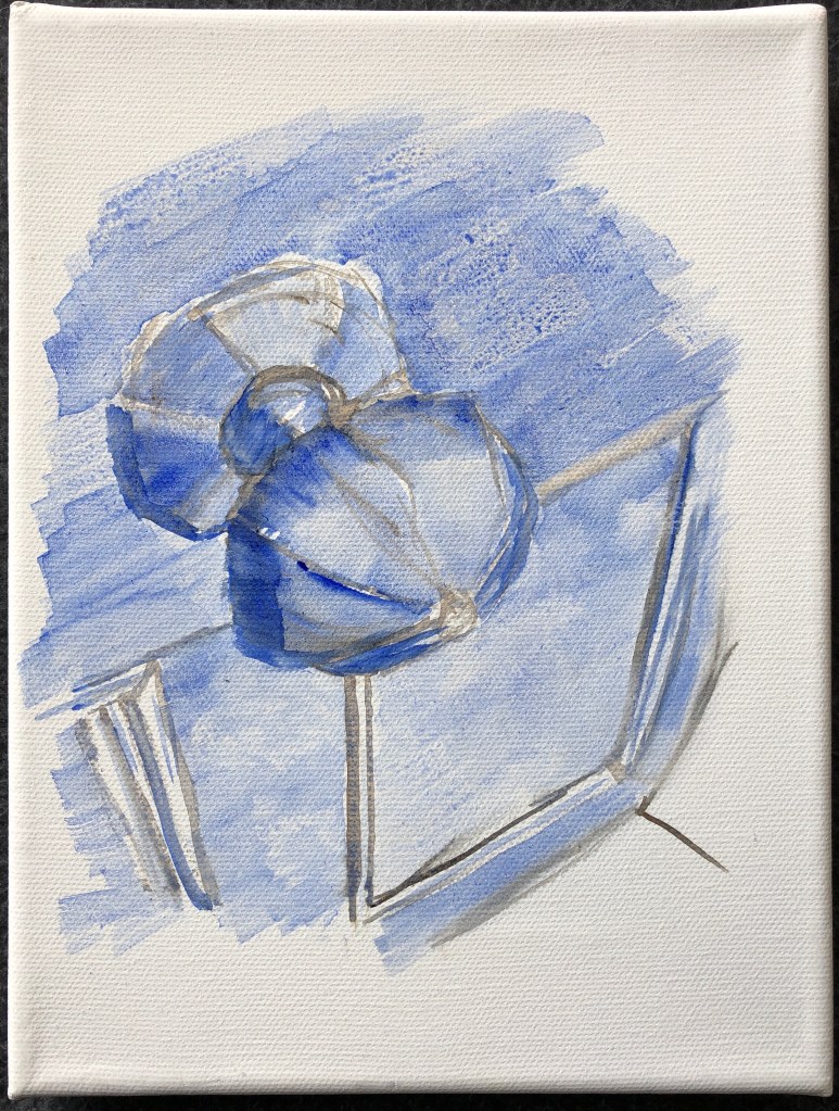
I wanted to try another painting on a white background, building up very dilute layers of oil as if it were watercolour – as I had tried with some tulips from my garden in one of the Exercises. Having enjoyed painting my front gate most recently, I thought I’d have a go at my front doorknob:
SO WHAT?
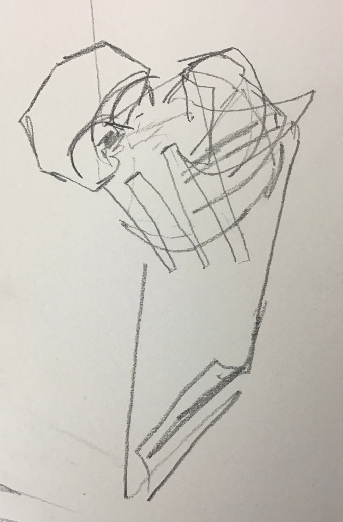
The perspective, as well as the construction of the doorknob, were going to cause me some issues here; I began with a blind continuous line drawing as is my practice, and this was a real mess, so I made a detailed pencil drawing to nail perspective, construction and tone.
I decided to work from my pencil drawing without further reference to my photo or the doorknob itself. I laid myself out a simple palette of ultramarine blue, burnt umber and titanium white (although in the end I didn’t use the latter at all).
Working on an 18 x 24cm canvas again, I made the decision to divert from my drawing slightly by leaving the edges of the painting undefined. I mixed a very watery dilution of burnt umber and lightly marked in some structural lines and edges to guide me with a large flat brush, and put in some blue washes to define some key tones, then left it overnight to dry.
The next time I swapped to my large filbert and began to add more dilute oil washes to build up the image. I reached a point where I felt I was losing the definition of the structure of the knob, and here I stood back and took stock. The painting still retained its watercolour-y feel, and my burnt umber underpainting still showed through. I had hit a problem which doesn’t often happen to me – to decide whether to stop here or go on; usually it’s either obvious to me that more is needed, or I feel the picture is enough (or I’ve lost the will to live with it) and so I stop. Here though, a clear decision was needed:
to leave the painting as it is, like a watercolour, or
to let it dry for a few hours and work on it more so it became more clearly an oil painting.
I chose the former, partly because I liked the watercolour effect, and also because I was afraid I would start to blur the structure further unless I abandoned my big filbert.
NOW WHAT?
Despite loving the free-gesso-sploshing style I enjoyed in my last painting of the garden gate, I feel there is also space in my practice for this sort of carefully constructed work which is built up over time using dilute layers.
I am beginning to really appreciate the possibilities for mark-making of a filbert.
A tonal drawing remains so valuable, especially in this type of image, which is to all intents and purposes monochrome.
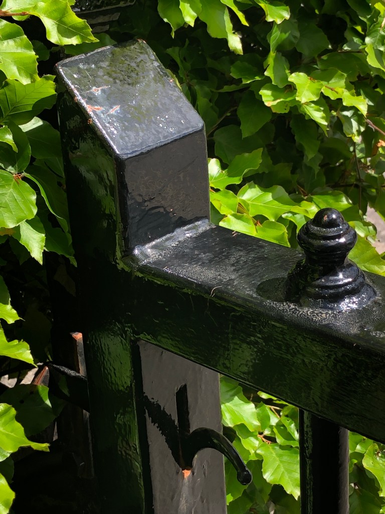
As part of my research into the work of Mary-Anne Aytoun Ellis (see earlier blog posts, e.g. Assignment 4), I had been interested in her use of gesso as an integral part of the work, not just as a base layer. I wanted to work on this, and found a leafy, textured corner of the garden by my front gate which I thought could be dramatic with its light/dark contrasts.
SO WHAT?
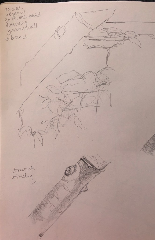
Never having really studied my garden gate in any detail before, and wanting this painting to feel quite free, I made sure to get in some sketches first, both continuous line and tonal:
I began by using the technique I had developed in one of the Exercises; mixing a small amount of oil paint into the gesso before applying it to the canvas, and then putting it on thickly with gestural marks to mirror the positions and textures of the eventual image.
I used my “greens” chart (see blog post “preparation (4)”) to select my mix ofyellow and blue, choosing ultramarine blue and lemon yellow, and I added burnt umber and titanium white to my palette. I was painting a small cormer of the garden, and chose a small canvas to indicate this – 18 x 24cm.
Once this was dry, I began applying paint using a large flat brush, trying not to fiddle with details but just indicate roughly where things would go. I put the darks in first (ultramarine/burnt umber mix) in a watery mix, and left these overnight so the painting was dry to the touch.
Next, this time using a large filbert, I firmed up the detail of the gate using a couple of layers (where needed) of dilute paint, and loosely added the darker area of foliage.
Again, I left this to dry a bit overnight before adding the final layer of a pretty thick partial mix of the existing green with some more lemon yellow. I did add a few dabs of titanium white on the leaves in a couple of places, but found they killed the painting, so blended them in.
NOW WHAT?
I have always struggled to paint a mass of leaves, and I think that this gesso technique is one way of achieving the effect; in particular, in this painting, I wanted the gate to be the focus and the foliage just to be indicated, and I think this has worked.
I really enjoyed the bold strokes with the larger brushes – I am a bit of a fiddler – so I am going to try and use the bigger brushes more.
Even though this is basically a browny-greeny image, I think that this time (as was not the case with the eucalyptus painting I tried in “…preparation (1)”), I have managed enough tonal contrast to make it lively and interesting.
Because my greens are causing me a bit of an issue, I took a bit of time out to try and understand my water-mixable oils a little better.
SO WHAT?
I made a sample chart of my three blues (ultramarine, cobalt and phthalo turquoise) across the top and my three yellows (raw sienna, Indian yellow and lemon yellow) down the side, so I could look at the effect of mixing each in turn. I also added a bit of titanium white so I could judge its effect on each mixture, as well as each “neat” paint. I applied the paints undiluted.
NOW WHAT?
I am going to stick this up on my easel to help inform my palette choices in future, depending on the sort of green I’ll want.
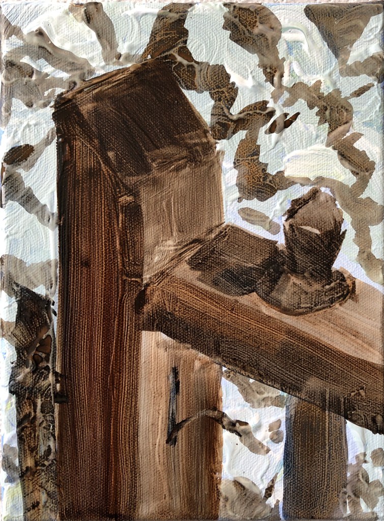
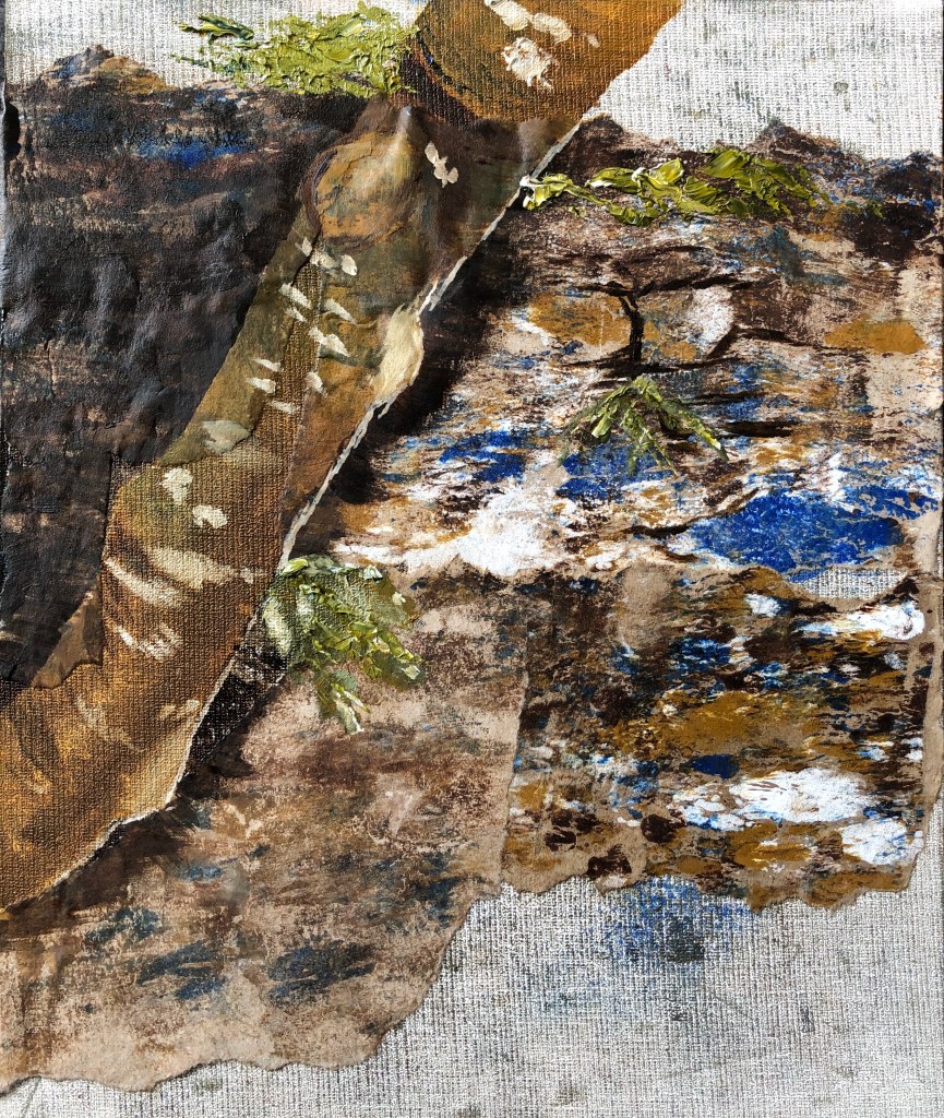
We have a walled garden with several trees growing along one side; we let this area grow fairly wild, and I love looking at the old stone wall under the trees. Here is a photo of one small section:
I liked the lichened trunk against the lichened wall, and decided to try to paint this using some of the techniques I tried in the online workshop I attended through OCA with Clare Wilson (see separate blog post in April 2021), although this time only using Cobra water-mixable oils.
SO WHAT?
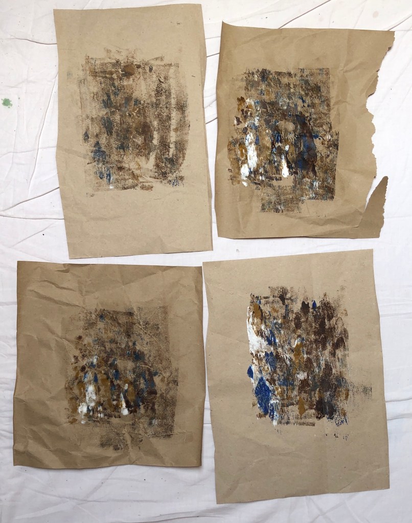
I chose a primed board first of all (24 x 30 cm). I wanted to use collage, and prepared some slightly creased packing paper from an Amazon parcel as the paper I would tear up. I put a couple of blobs of each colour of my chosen palette – raw sienna, burnt umber, cobalt blue and titanium white – onto a glass plate, rolled over them back and forth with a roller, and then printed onto the packing paper a few times, rubbing into the back with my fingers to add texture:
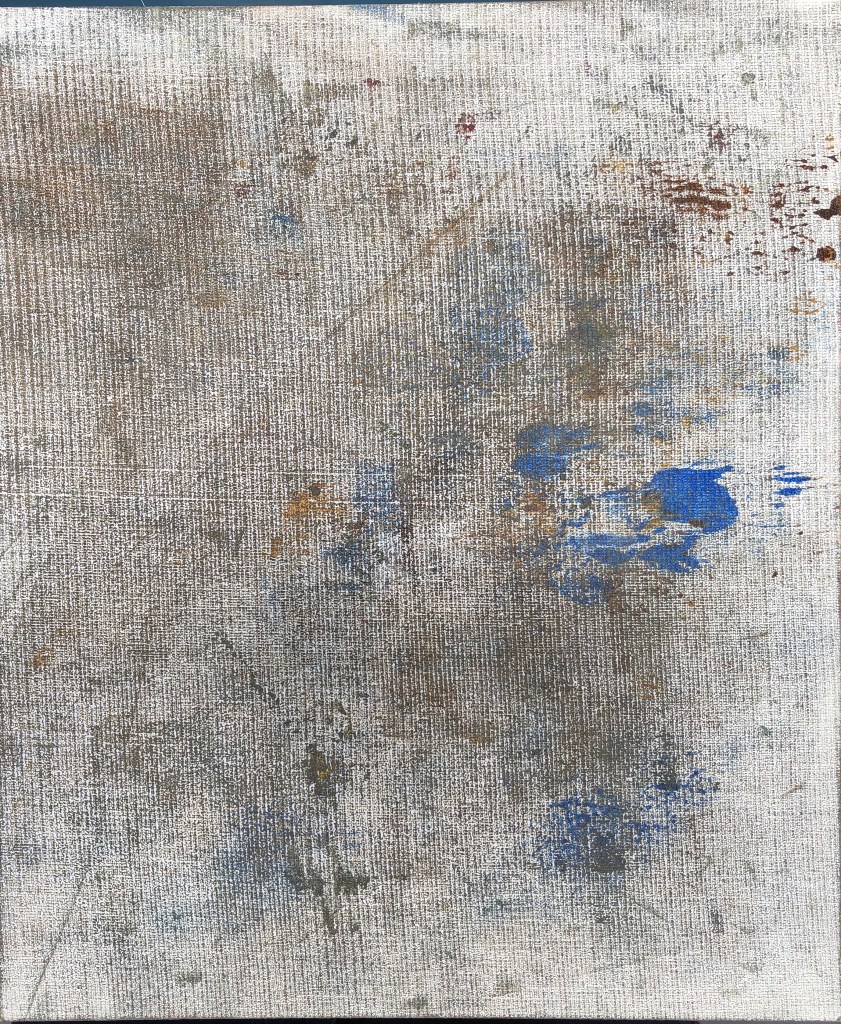
I then covered the white of the board by wiping off the remains of the paint on the roller:
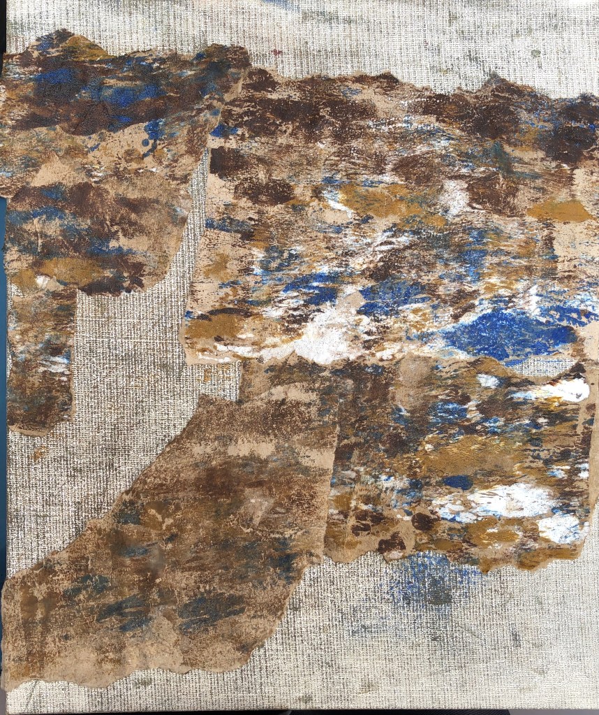
First rookie error here – I tore up my sheets of collage paper into the shapes needed to indicate the stones of the wall, and then tried to stick them on with PVA glue. Somehow I thought, because the glue was water-mixable and the paint was water-mixable, that this would not be an issue. However, the packing paper, being unprimed, soaked up the oil and was very reluctant to adhere to the board. I left it overnight, but had to apply more glue the next day to achieve some sort of bond:
I thought I should leave it over another night in the hope it would set into some sort of workable surface, and used the time to do some sketchbook drawings – a blind continuous line drawing and some detailed studies:
I wanted to go for a suggestion of tree and wall rather than a photo-realistic image. I began with the tree, blocking it in using a wide flat in dilute raw sienna, before working in some burnt umber and cobalt, finally adding a little white mixed with a touch of raw umber for the highlights at the edge of the trunk and the lichen. I darkened the shadow on the wall behind the tree with some umber/blue strokes applied with the edge then dragged with the flat of the brush, and added a couple of shadows under stones of the wall in one patch in the same mix, just as an indication.
I came a bit unstuck with my indications of leaves. Due to time constraints I had made another rookie error – skipping the making of a colour card. As a result my green which I could mix with the sienna and the cobalt was a tad sludgy, and not improved with the addition of white (even sludgier). I decided to add another yellow to my palette – I thought my lemon yellow would be a bit garishly bright, so went for the Indian yellow; I mixed this with a little blue and white very loosely and just applied some streaks with the edge of a palette knife. I think this just lifted the painting a little, it would have tended to the unremittingly gloomy otherwise:
NOW WHAT?
This is clearly not an archival painting – the thin packing paper will succumb to the oil paint and start to disintegrate.
Despite this, I am glad I did the experiment – the printed collage made for an effective textured background to contrast with the painted-on tree trunk.
I am also glad I made the decision to add another yellow to my palette at the last minute, and to choose to apply this impasto with the knife to add yet another texture.
I do feel I have captured something of the secretive nature of this little corner of the garden, without letting it become too gloomy.
To repeat this technique, I would consider finding another thin paper (maybe a robust tissue paper? – I’d want something which would tear to give satisfyingly ragged edges) and coat it with a dilute layer of gesso before printing onto it, in the hope that this would stop the oil absorption and allow for better adhesion with the PVA.