WHAT?
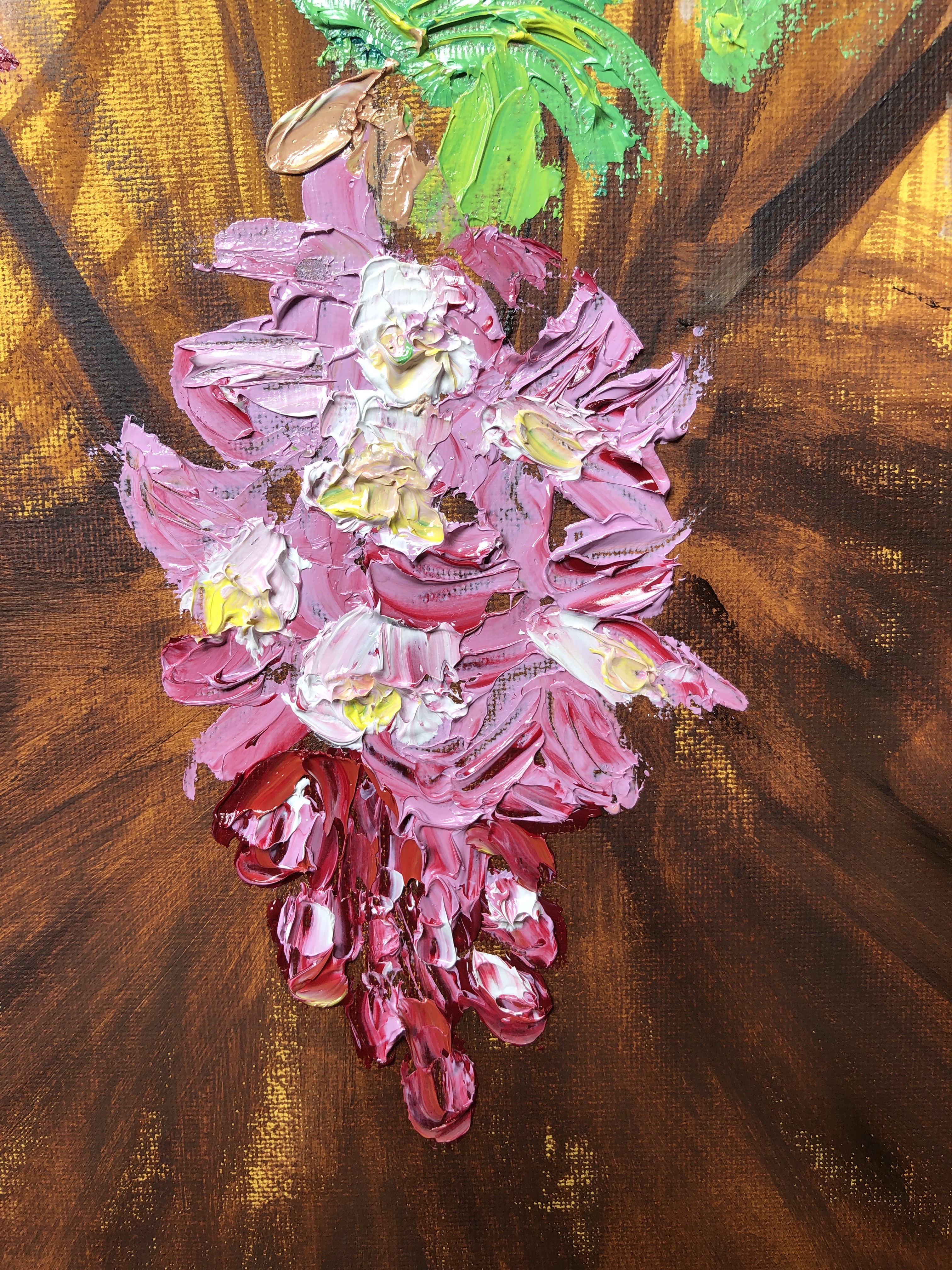
I wanted to try painting a flower in oils against a dark background. Our purple clematis was out against a shady trellis, so seemed perfect for this task. I decided to revert to my method of building up layers of dilute oil paint, rather than going with one big impasto bang.
SO WHAT?
Working with water-mixable paint (all Cobra except for the ultramarine) I chose titanium white, ultramarine and madder lake for the lilac-y purple, Indian yellow for the yellow streaks on the flowers as well as for the green leaves/stems, and burnt umber to secure my dark background. I made a colour card to test out some of the combinations:

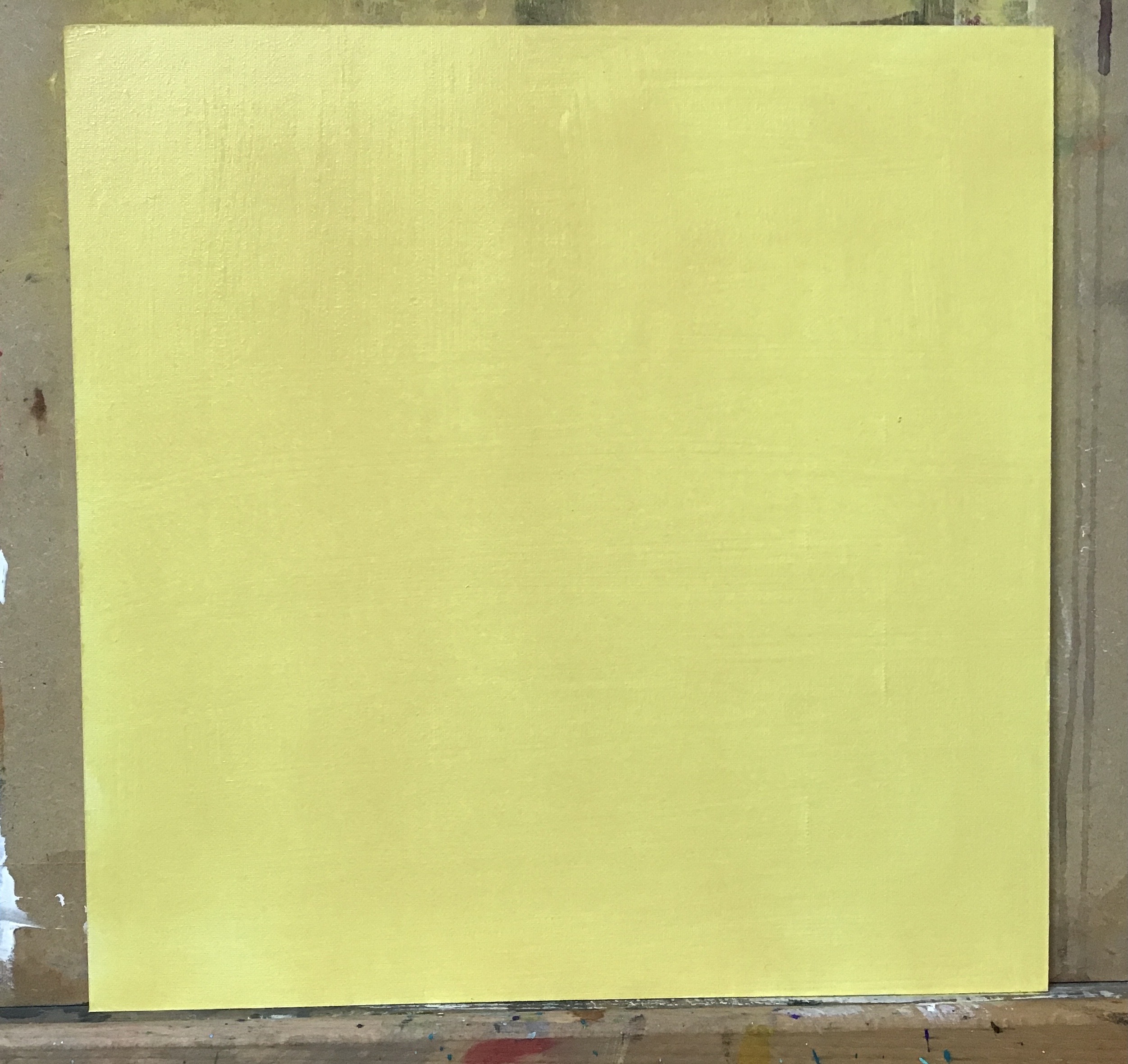
Working on a 30 x 24cm primed board, I worked directionally and quickly with a very dilute semi-mix of the ultramarine and burnt umber, to denote the trellis as one looked up at it from below. It was so dilute that it soon began running down the board…….

…..but I mopped up the worst by scrubbing directionally into it with a rag:

I liked the mix of dark and light to mirror the lights and shadows of the trellis, so I put this aside for a couple of days till it was touch-dry.
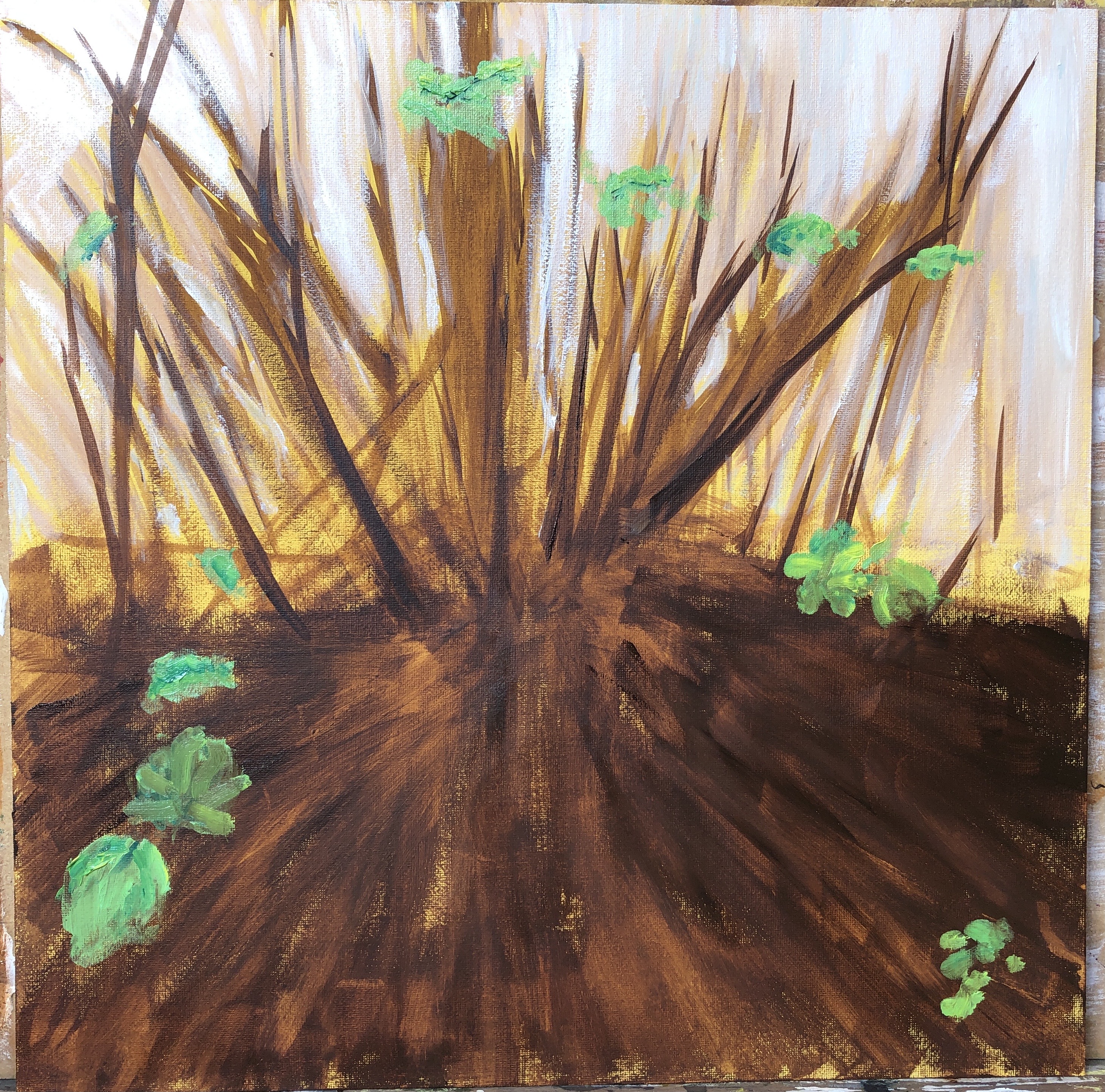
Then I mixed my purple and, with a large filbert, began to apply thin dilute layers. I was concerned that the brush would pick up the dark paint from the base layer, but it didn’t. I continued gradually adding layers, sticking for now to my large filbert:


By this point I was finding the large filbert too clunky, so changed to my small filbert for the final layers:

I hadn’t quite decided what to do about stalks and leaves throughout the painting (and the ultramarine/Indian yellow mix was really luxuriant); however, I decided that less is more and to stop here – I often find I over-complicate an image at the final stages.
NOW WHAT?
- The rough “trellis” background pleased me, it somehow felt “woody”; it has made the overall image fairly dark, but then it was a dark corner in real life.
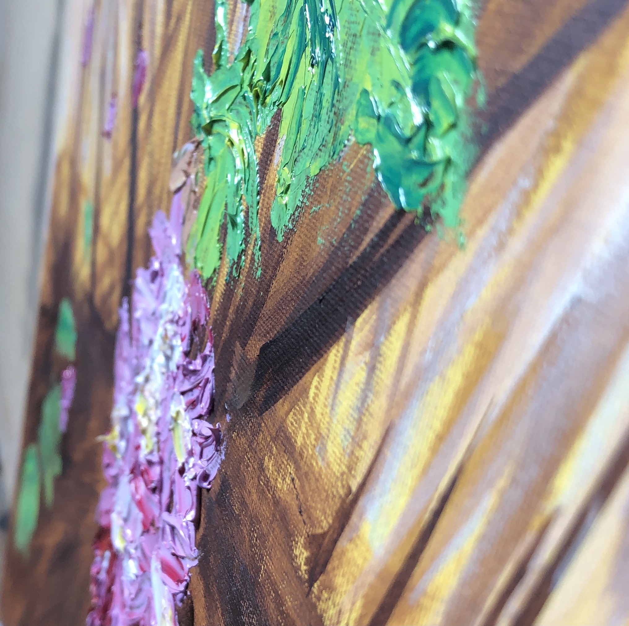
- I worked up several layers, mostly remembering to go from lean to fat, occasionally forgetting. Previous layers don’t always show through as much as I’d hoped, but that’s mainly because I needed the (opaque) white to achieve my lilac-y purple.
- I watched on a video on YouTube (not noted down, poor practice), which said that with oils, especially the alla prima method, you were adding paint all the time which had already been mixed on the palette, rather than mixing on the canvas (because the underneath layers were still wet, leading to sludge), and I did find this to be largely true; however, I did experiment with putting a dab of colour on and then blending it into what was already there with the flat of a dry brush to get smooth gradations, and I think this was a valid technique.
- I have gone from my stark purple/yellow contrasts in Assignment 4 to the converse – tiny tiny pops of yellow against the purple – I wonder if they are too small to be effective?
Overall, I was pleased with the way my starting palette choices performed for this painting, they enabled me to create a range of tones; possibly the umber/ultramarine combination was a little overbearing as mentioned above, but this was the first time I have used a rag seriously to create an effect (as opposed to removing small mistakes and picking up drips), so I am still content with it.