I chose to look at Sickert as I had a sense that enjoyed his paintings, but without knowing too much detail about him. I started off by watching a really interesting TV programme which I found on BOB called “Sickert vs Sargent”
(https://www.bbc.co.uk/iplayer/episode/p025lrcy/arena-six-days-in-september); this brought out a side of Sickert, his interest in the music hall, of which I hadn’t been aware; but more interestingly, it showed the interior of a house in which he painted many of his atmospheric paintings of people, mainly women, in/on/around beds.
I also treated myself to a book of his paintings: Baron, W and Shone, R (eds)(1992), Sickert Paintings, Royal Academy of Arts, London; Van Gogh Museum, Amsterdam; Yale University Press, London & New Haven.
SO WHAT?
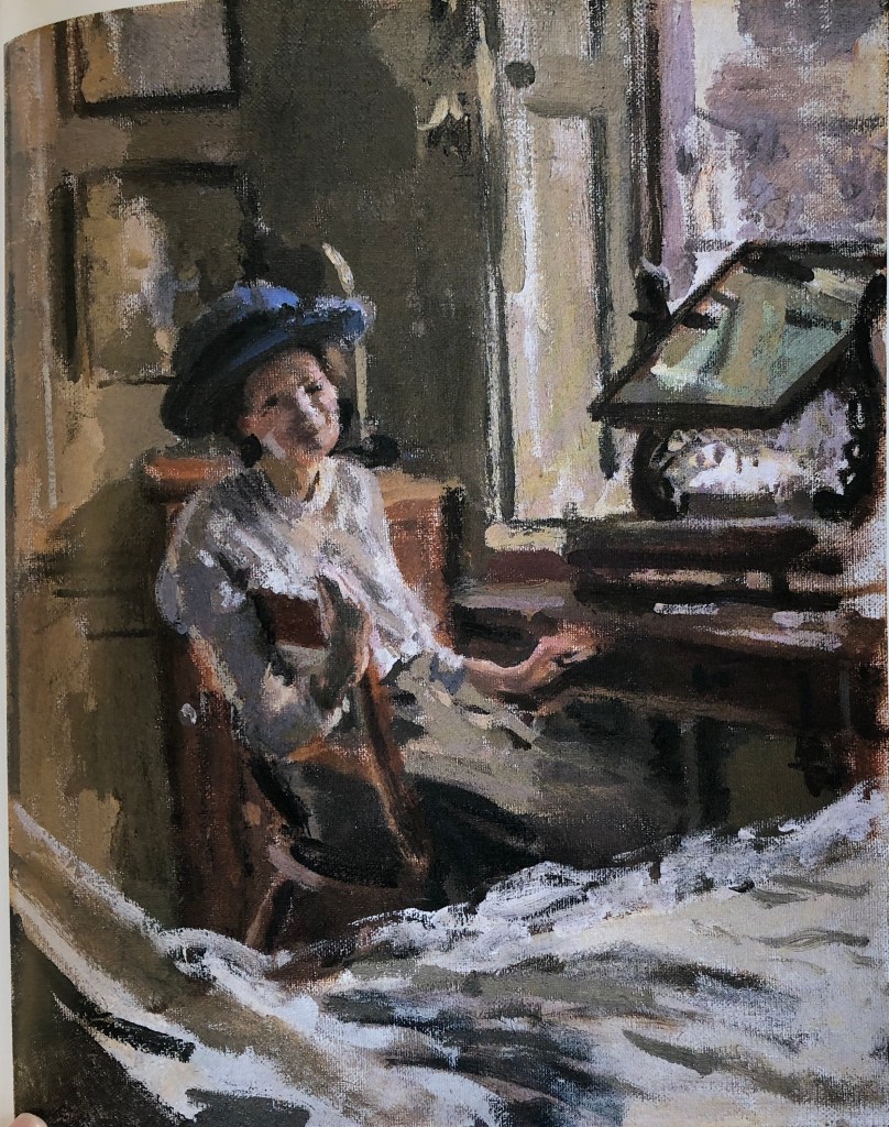
I chose a painting of an interior to work from:
The Blue Hat
C. 1912-13
50.7 x 40.6 cm
Manchester City Art Galleries
My intention was, not to copy the picture as such, but to study the colours of the setting. Sickert seemed very fond of what I think of as “background” colours – sludgy greens, browns, ochres, purples – and I wanted to see if I could mix them.
I started with a palette of titanium white, burnt umber, pyrrole red, cobalt blue and lemon yellow. I found I could mix a near approximation to the sludgy green and the violet-y purple, but couldn’t get near the ochre-y colour – my lemon yellow was just too chromatic.
I adjusted my palette somewhat, retaining the pyrrole red, the titanium white and the raw umber, but substituting ultramarine blue for the cobalt, and Indian yellow for the lemon. I just focused on mixing the colours, first with white, and then with each other, to try and achieve a better match to Sickert’s colours.
The result was much more successful….the ochre and the sludgy green were bang on, I could make the characteristic purple and, interestingly, I could also make the pinkish-tinged grey which he uses so much.
NOW WHAT?
I learned that:
Some colours are very hard to mix from a given red/blue/yellow choice – you can come close, but it’s hard to be exact – so experiment, get to know the starting colours you have, and think about what you will want to achieve before making choices.
The dominance of colours, ie the amount you need to use, is also something to get to grips with before setting off; for example, in my second palette above, the ultramarine dominated the pyrrole red, which in turn dominated the Indian yellow.
The addition of white seems to almost “subtract” from a colour.
Sickert had a characteristic set of mixed colours which he used over and over, particularly for his interiors, although they appear in his music hall pictures too; they are “understated” colours, colours which one’s eye initially passes over, but this means that when he does put a pure colour in (such as the blue of the hat) it really jumps out.
Demonstration of visual skills: Materials, techniques, observational skills, visual awareness, design and compositional skills.
I had not painted in a round format before beginning this section. On a practical level a tondo needs a little extra preparation before starting, just in terms of getting a round/oval support; however, I found the advantages outweigh this – every painting I did felt as though I was turning a spotlight onto something, even something as mundane as a sink containing rubber gloves. It seemed to make the ordinary and familiar into something a bit special, encouraging the viewer to stop and take that extra second to pay attention. The technique of moving the template card over an image to find the right composition was really useful and stopped me from over-complicating my images by trying to cram too much detail in.
I have also had great fun playing with paint; at the beginning of this Part I was not quite sure whether to go for enamel paint or egg tempera; however I opted for the latter early on and have learned to mix my paint from its raw ingredients, which has made a material very different from the ready-made versions one can purchase.
Quality of outcome: Content, application of knowledge, presentation of work in a coherent manner, discernment, conceptualisation of thoughts, communication of ideas.
From this Part I have gained an understanding of unconsidered corners of my house as they might appear to an outsider, and what that outsider might infer about the house dweller (i.e. me) – for example, the series of paintings of my sink and draining board might tell the viewer that I paint; I collect natural objects such as feathers; that I like to keep things reasonably clean and tidy. My tutor in Drawing Skills 1 suggested I read Shirley Turkle’s 2007 book “Evocative Objects”, Massachusetts Institute of Technology, USA, which was a series of essays wherein people described the importance of particular objects to them; I think this Part has shown me that nearly everything, particularly when in its habitual environment, has a story to tell, and it is the job of the artist to tell that story in paint.
Demonstration of creativity: Imagination, experimentation, invention, development of a personal voice.
I think my assignment piece is an example of this; fairly early on in Drawing 1 I had experimented with a sketch of an interior view which frankly was beyond me at the time and I really struggled to analyse it. However, my tutor at the time saw potential in it and so I returned to the sketch and have reworked and adapted it, bringing an increased skill level and better understanding of perspective and composition to bear in order to create what I hope is a coherent and effective painting.
Context: Reflection, research, critical thinking (learning logs and essay).
I found artists such as Tori Day, Jacqueline Utley and Winifred Nicholson particularly influential. Tori’s focus on small corners of a domestic interior, presented often in isolation to emphasise their importance, resonated with me and encouraged me to look more closely at my own domestic environment. Jacqueline Utley’s colours just zing by virtue of her careful contrast of muted and bright; Winifred Nicholson’s use of colour is also very deliberate, and I loved her way of constructing a narrative around what can at first glance look just like a picture of some flowers in a vase until you take in and consider the background and placement of the vase.
I also took a short online course on colour with Jill Eisele through the St. Ives School of Painting (see blog post) in which, amongst other things, she looked at the possibility of painting with a limited palette based around pairs of complementary colours, and I have used this in some of the Exercises in this Part and in my final assignment.
Quite a bit of this Part of the course has been studied whilst living alone, my husband having suffered a disabling stroke and having been in hospital for many weeks now. I have found this has affected my approach to my work: my study has been a real life-saver as far as distracting me is concerned and I have been disposed to approach it positively, finding the need to come to terms with the unfamiliarity of painting in the round interesting and diverting; also, being alone in a house makes one look at it differently and be more reflective, almost treasuring, about it, which I hope has come through in my painting.
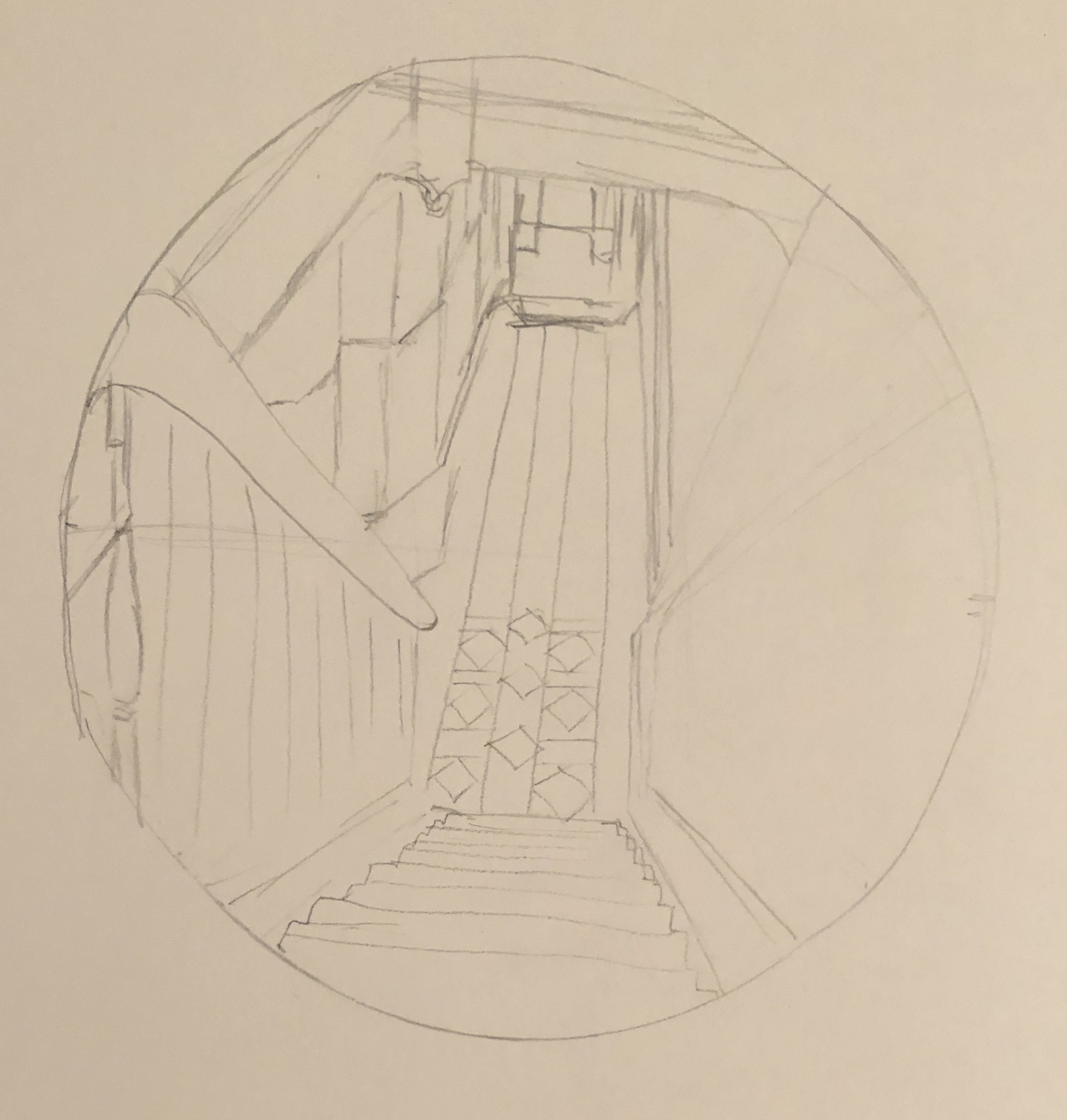
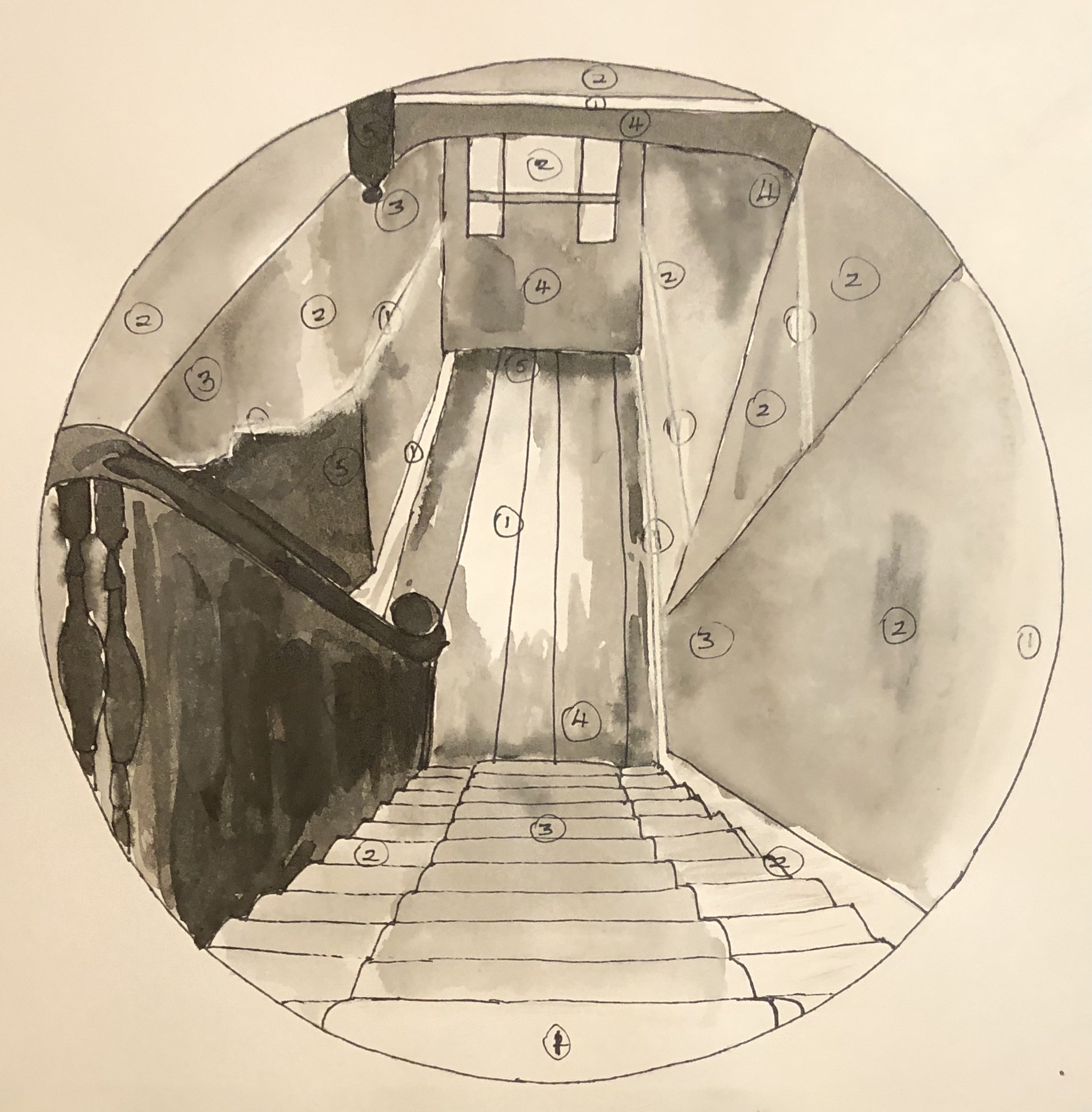
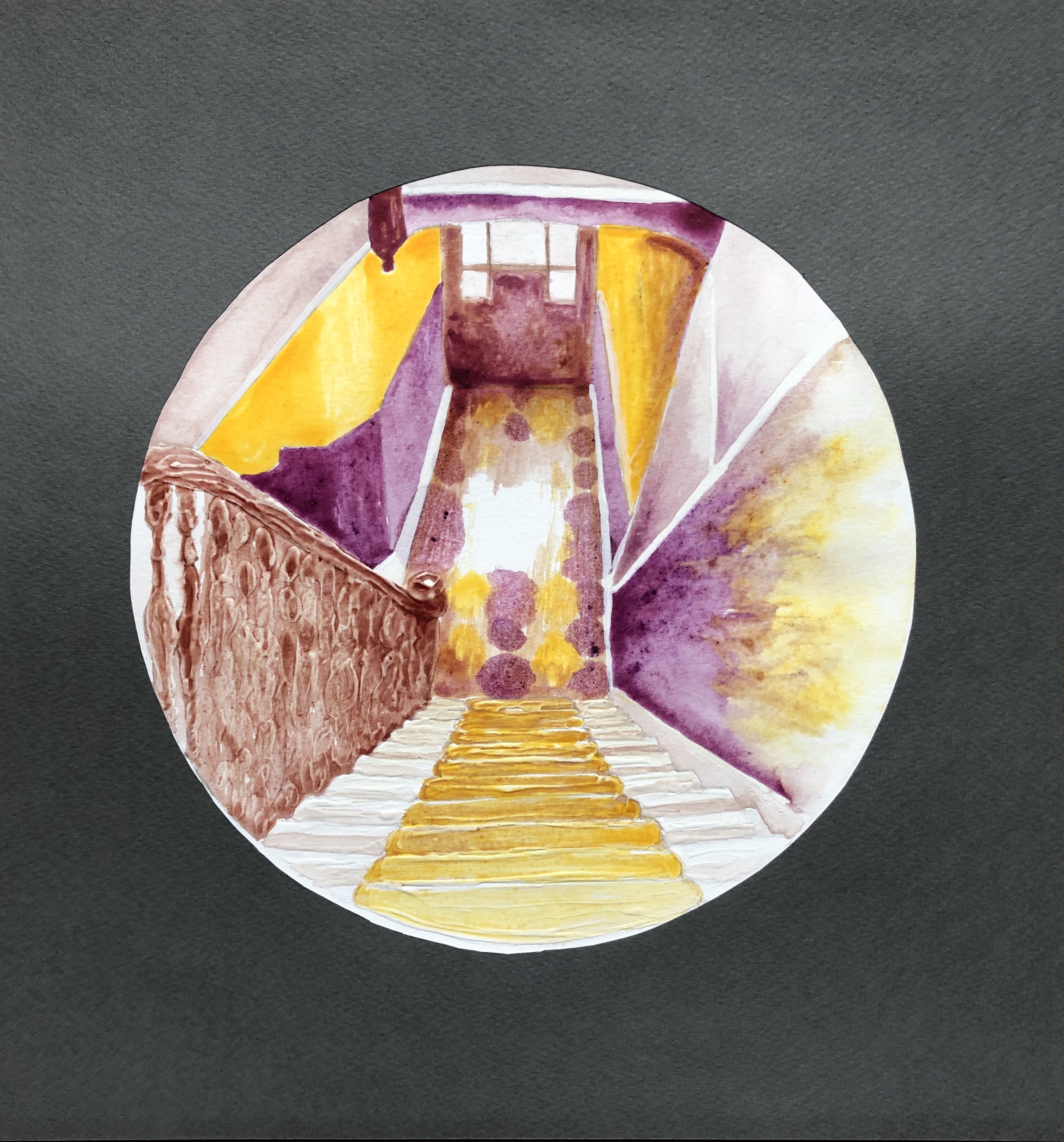
Early on in my degree, looking at Interiors as part of the Drawing Skills unit, I tried to sketch the view down the stairs from the landing at the top of the first flight. I really struggled, couldn’t work out by the end even which way the lines went, and chalked it up to experience as something that was just too hard. Here it is.
However, my tutor, having looked through my entire sketchbook, picked out this dreadful drawing as the one that had the most potential. I didn’t try to do anything further with it at the time, but I’ve remembered it ever since, and now seemed like the time to have a go. So, the subject of the assignment will be the view down the stairs – partly to preserve the view for posterity, as it will likely soon be radically altered by the installation of a stair lift for my husband, who has suffered a series of strokes.
An artist currently working in egg tempera, and whose work I admire, is Mary Anne Aytoun Ellis. She mainly, though not exclusively, paints landscapes, working at a range of scales. She works on paper which she mounts on board, mixes her own egg tempera, and often combines it with gesso, and ink or watercolour. This recent example, “Knot Garden”, egg tempera, gesso and watercolour on board, 18x25cm, shows the textured quality of her work:
I contacted her on Instagram, explaining my interest in her work and asking about her process; she replied that she uses gesso and egg tempera in an idiosyncratic way which she has evolved over the years. She often uses gesso in a very abstract way in the early stages of a piece, using large brushes, dripping and scratching into it when it’s wet or dry. She will sometimes pour egg tempera over it or mix pigment in to obtain unexpected effects and textures. She might also use the gesso to add highlights and detail, covering it with glazes of egg tempera or watercolour. She originally trained as a printmaker, but soon decided she wanted to make “…hybrid pictures that were a cross between drawings, paintings and print.” (See article in Artists and Illustrators, March 2021 edition). This method has taken her a long time to evolve, so I wasn’t going to try to emulate the whole thing straight off, but I did decide to incorporate the use of gesso into my assignment by way of experiment.
Finally, following on from my response to my tutor feedback from Part 3, and in the spirit of Mary Anne Aytoun Ellis, I wanted to try incorporating and working into a monoprint in some part of the painting.
SO WHAT?
I began working from this photograph:
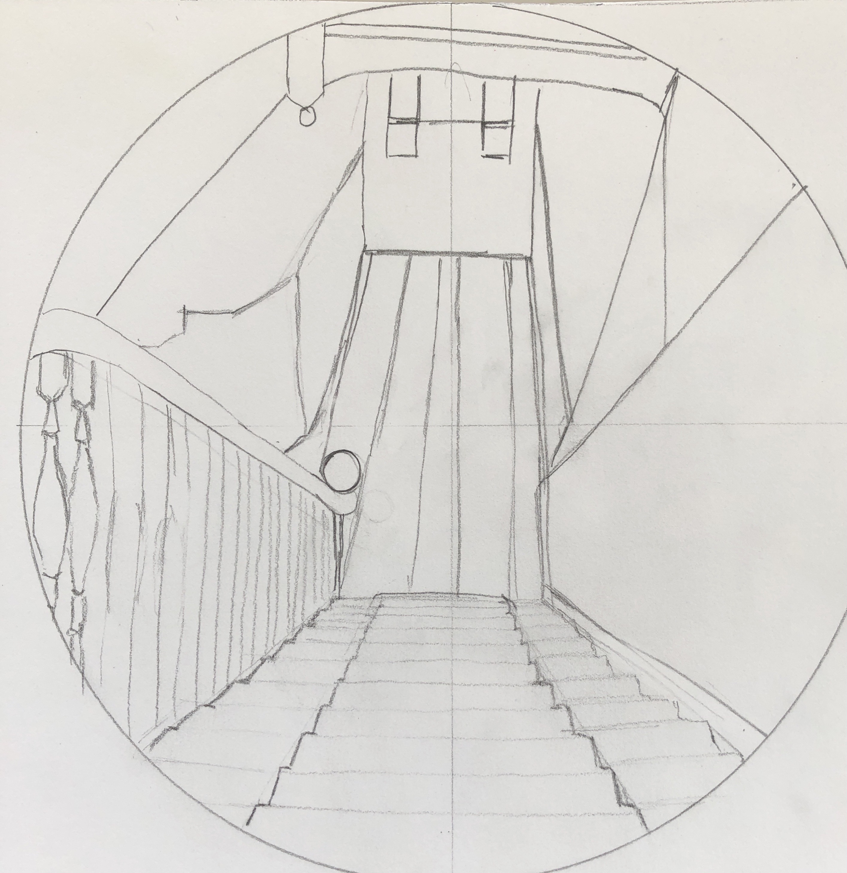
I decided to increase my chances of success by tackling just one flight of the stairs. I also made the decision to simplify the image by mentally losing all extraneous detail such as the table, coat stand, bikes etc, to give myself clear lines.
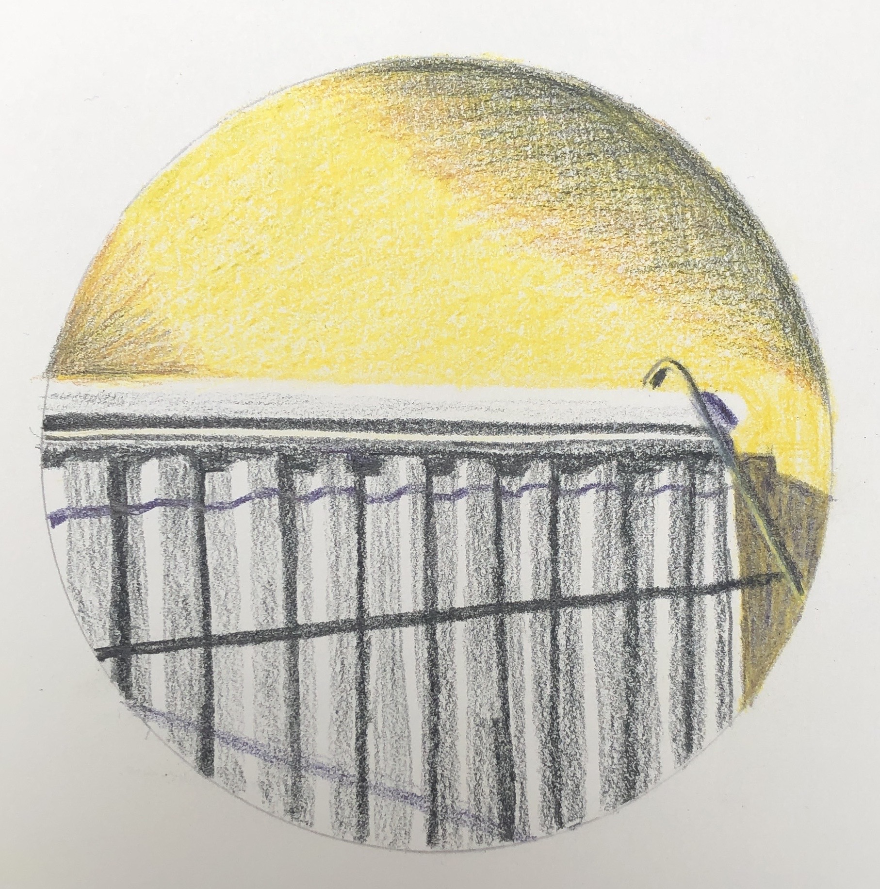
I made an initial sketch, and then refined this further into a scale drawing by abstracting the image a little into simple shapes and boxes with clear lines, mainly straight – just a few curves to break it up a bit and add interest. I decided to work at the size of a large sideplate (approx 22cm diameter):
I wanted the focal point to be central, where the light hits the tiles down in the hallway.
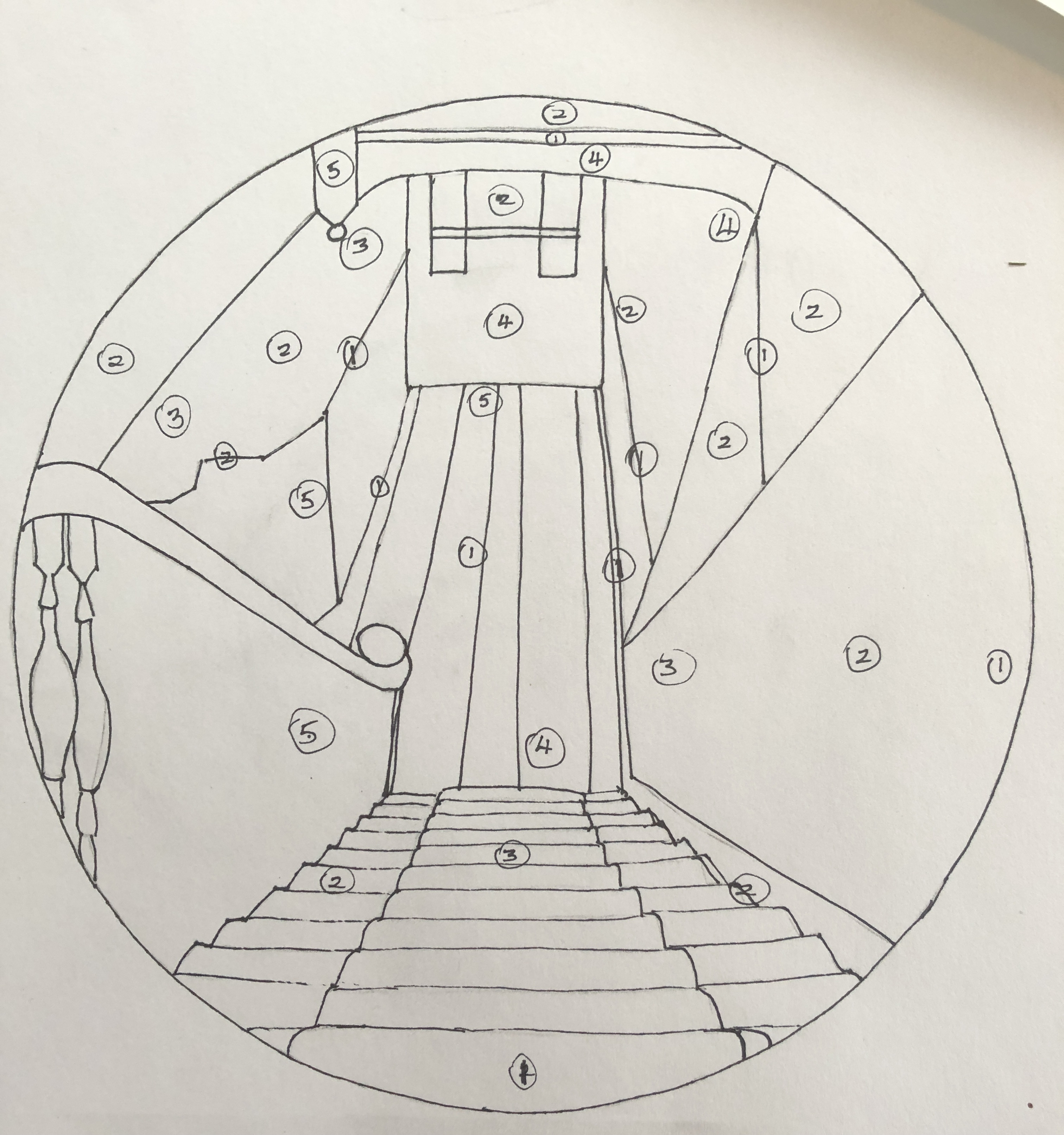
I did a tonal drawing; I found the tones quite hard to analyse, so made it basic by identifying 5 tones (from 1 being the lightest to 5 being the darkest), marking them in place, and then filling the drawing in with black Chinese ink, with a white Conte crayon for the lightest lines where needed:
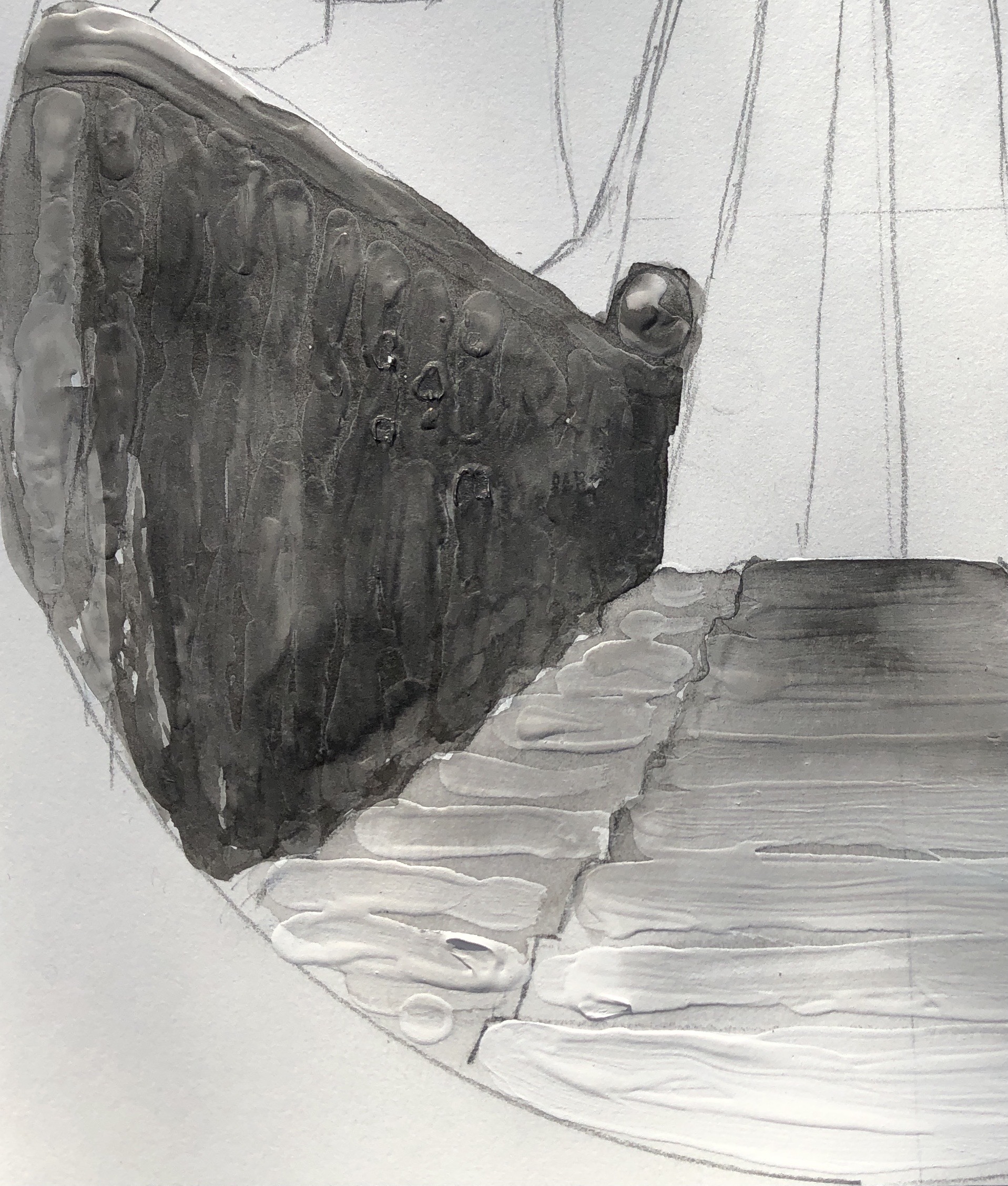
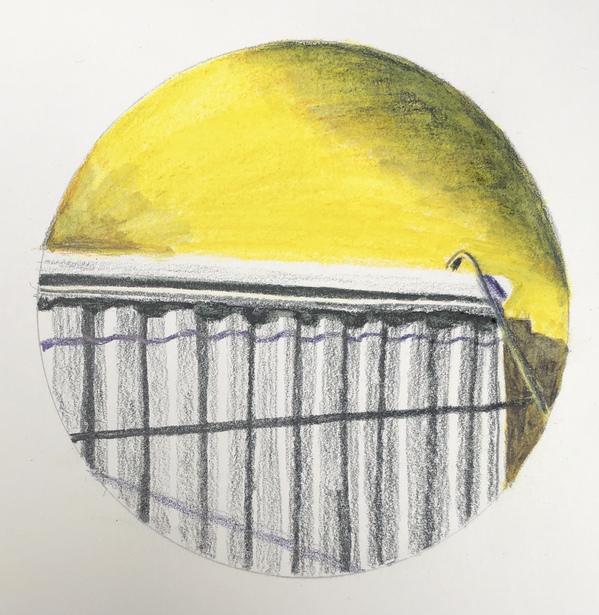
My next step was to experiment with the gesso. On a clean version of the drawing, I added some gesso to the stairs and the banisters, applying it with a paintbrush fairly freely, trying to get horizontal lines on the stairs and quite a curvy and bumpy texture on the banisters to indicate the posts going down. Once that was dry, I went over it in Chinese black ink to see the effect. Next I made a rough painting on another clean drawing to experiment with colour. I had looked at pairs of complementary colours in the Exercises, and picked yellow/purple to work with here as this pair gives the widest range of tones. I did my practice run with tube egg tempera; I mixed a purple from alizarin and cobalt blue, and also laid out Naples yellow, Titanium white and Ivory black.
I didn’t use the black in the painting, but tried adding some around the rim to see what the effect would be when I added a surround.
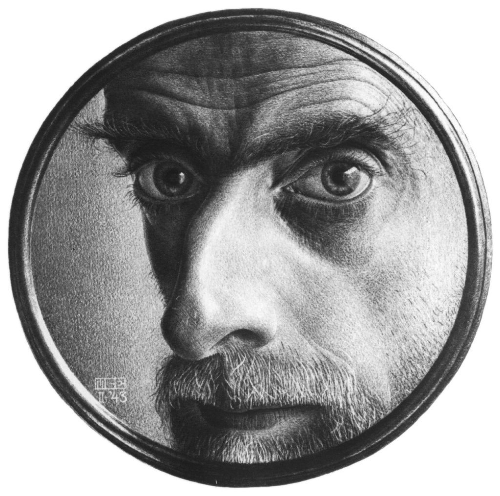
This actually reminded me of an Escher drawing I had looked at as part of my research in Drawing Skills:
M.C. Escher
Self Portrait II
1943
This made me think that my drawing of the stairs was rather like looking down a telescope the wrong way. I thought that the black surround was a bit heavy, and so resolved to make my surround a sort of metallic grey.
Now that I had my colour study, I worked from that and did not refer to the photograph again as I moved on to create the final version of the painting.
I worked on A3 HP watercolour paper, chosen because I had found this to be the best support in Part 3 for monoprinting. I wanted to begin with the monoprint, which would be the focal section of the painting, the floor tiles with the light on them; I picked this partly because I had found earlier in this section that monoprinting was a good way of reserving the white of the paper.
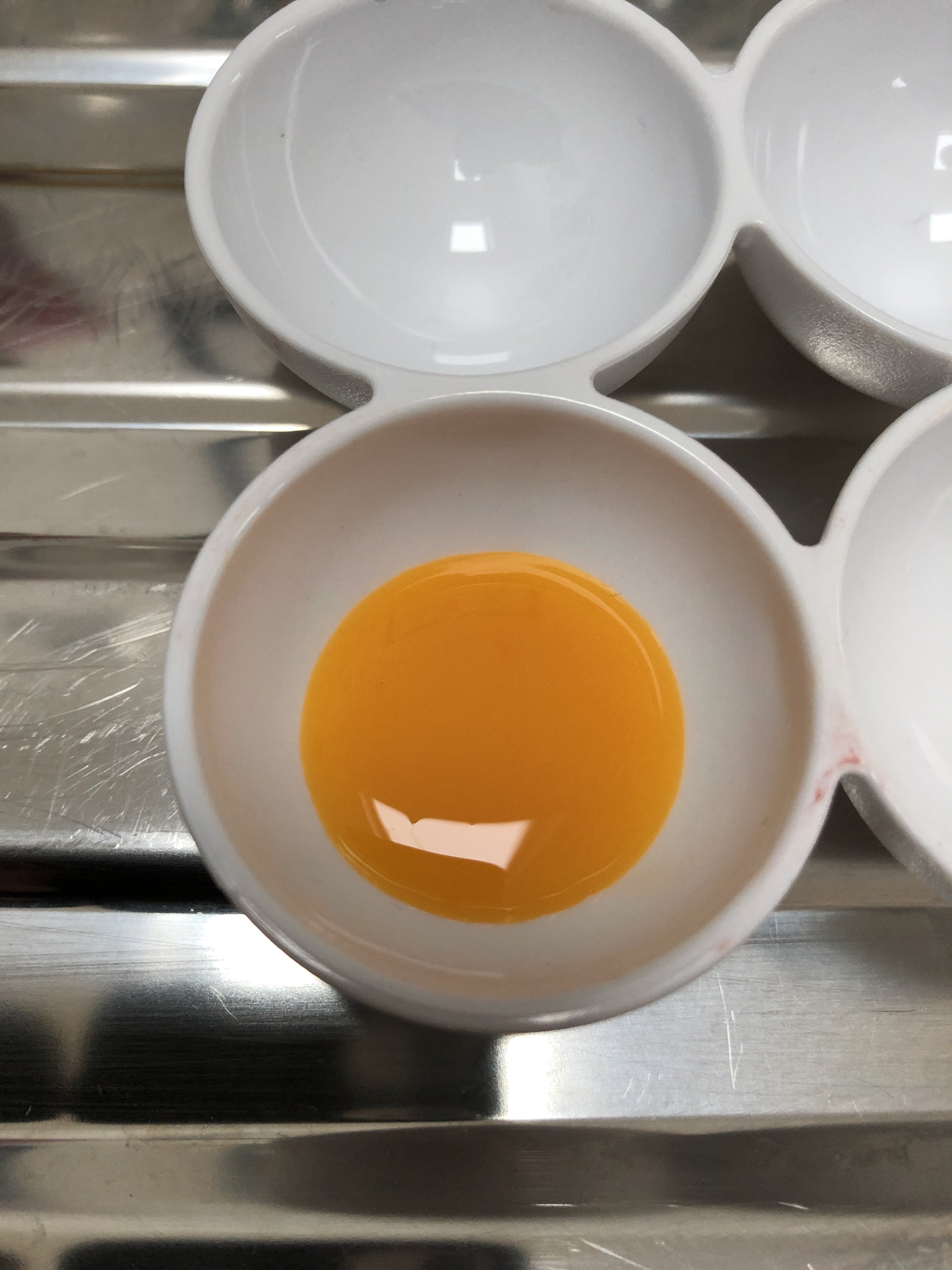
I made my own egg tempera, using Yellow and Purple shades of Brusho crystals as pigment. I made my paint fairly thick (only 3 droppers of white vinegar); the Yellow Brusho mixed in brilliantly, although the Purple crystals took quite a bit of stirring in. I had no white Brusho, and so decided to use the tube Titanium white egg tempera as it would only be needed in small quantities – my plan was to keep as much of the painting plain yellow or plain purple as possible, mixing grey/browns from a combination of these two as needed.
My first attempt at monoprinting with egg tempera was not a success – I put far too much on the plate, ending up with quite a dramatic splodge. Second attempt was better, and I decided to proceed with that:
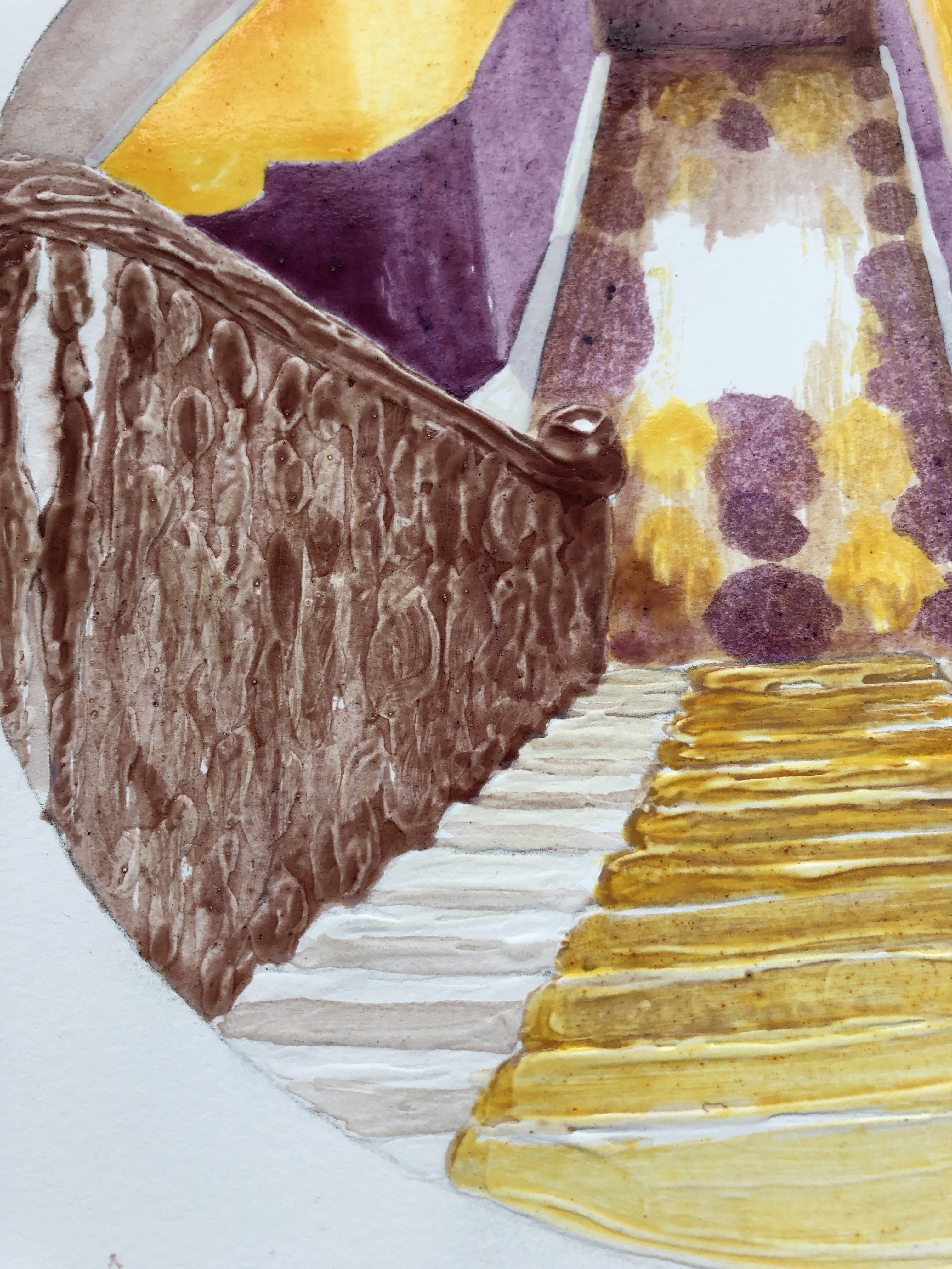
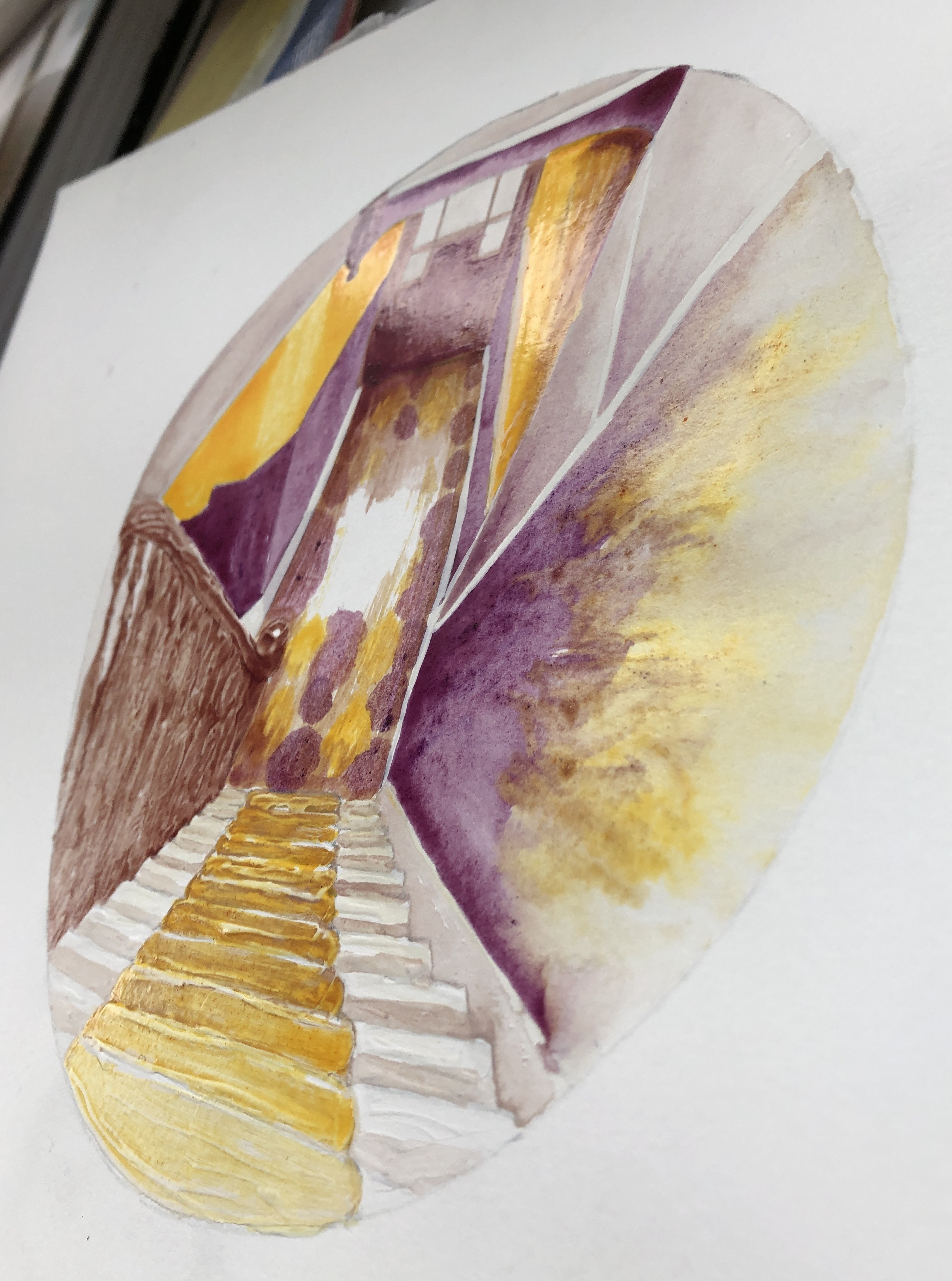
I filled in the drawing around the print, added my gesso to the steps and banisters and, once it was dry, I began the painting. I tried various brushes; the paint was very glossy and several brushes I tried ended up leaving too much of a “channel”, so in the end I did the whole thing with a rigger, using the point for finer details and the side for bigger areas. The paint dried quickly and it was easy to show differences in tone by leaving some areas with just one coat, whilst building up layers in other parts.
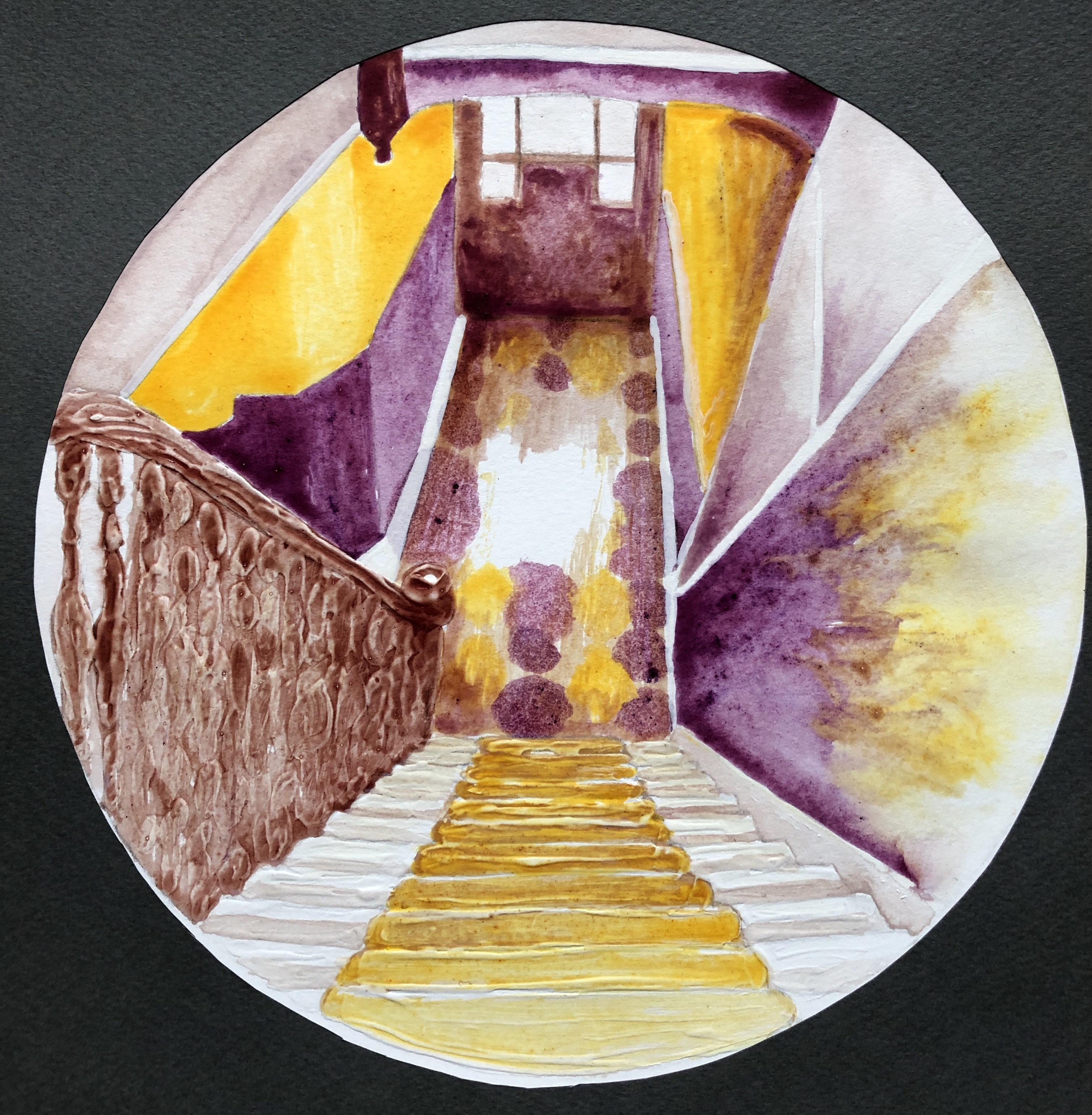
Here is the completed painting, with additional photos showing close-up details of the gesso effect and a side view showing the sheen of the dried paint – perfect, I thought, for that slight shininess you get when looking at an image through glass (such as the glass of a telescope lens).
The final step was the surround, which I made from a dark grey sheet of pastel paper. Here is the final piece:
NOW WHAT?
I am pleased with the overall outcome because:
I feel it is a strong composition, the simplified perspective takes the eye in and out of the middle as the different sectors are explored; also I feel I have learned from the online courses on abstraction I have attended with St. Ives School of Painting, and have been able to simplify a complex starting image into blocks and shapes, something with which I have always struggled.
I am really enjoying exploring simplified palettes based around complementary colours, and I think I have chosen well with this pairing in this situation as it has allowed me to build up a range of tones.
I have built the painting around a monoprint.
I have experimented with gesso and enjoyed the effects I’ve achieved; I definitely want to use this more as I move forward.
There is something very satisfying about making your own paint, even though it was hugely messy and everything I touch now seems covered with a slightly sticky monolayer of egg.
I feel I’ve preserved our stairs for posterity, come what may!
If I were to think about changing how I did this:
I would think about investing in some proper dried pigment if I were to continue to make my own paint; the Brusho did well as a first attempt but, whereas some colours mixed in well with the egg/vinegar base, others were more resistant and gave a slightly gritty texture.
Home-made egg tempera is a very different beast from the ready-made tube variety, and I would need a lot more experimentation with brush selection and technique if I continued to use it.
I looked at Henny Acloque’s paintings on her website, www.hennyacloque.com. The thing which struck me about her work is the juxtaposition of brightly coloured figures, sometimes cartoon-ish, against sombre backgrounds, often “classical” background landscapes – Durer came to mind. I read an extract from a catalogue of her work compiled by the Contemporary Art Society (www.contemporaryartsociety.org) which described her use of “meticulously layered pigment and varnish”, and I decided to see if I could achieve anything similar in terms of vibrancy of colour within this exercise.
SO WHAT?
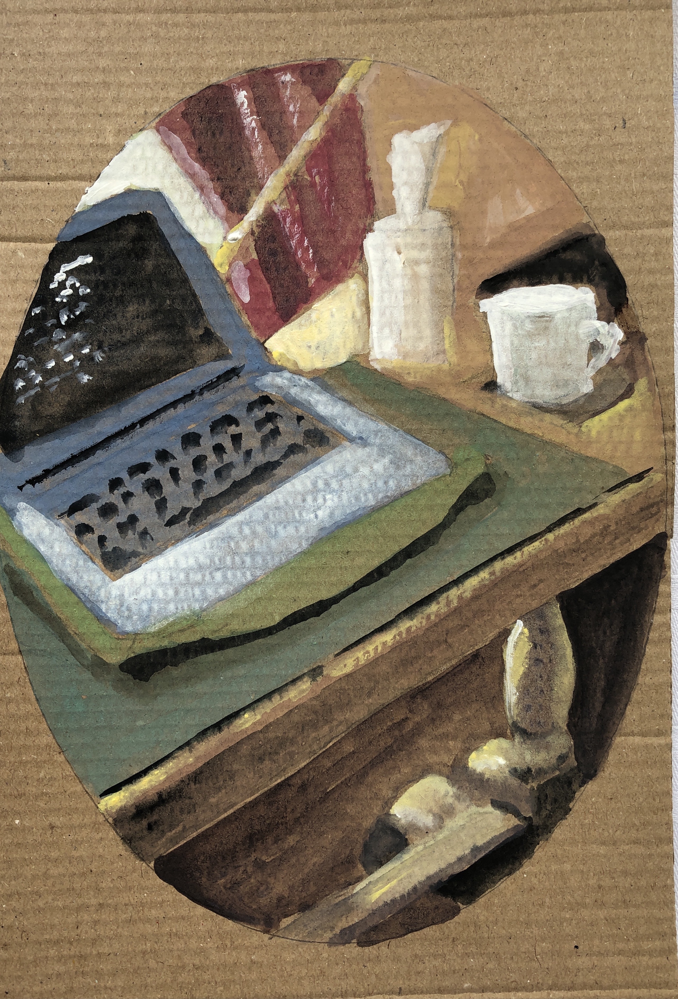
I began working on a piece of brown packing card using egg tempera, and created a very rough image for the purposes of experimentation, derived from this original photograph:
I left the paint to dry for about 3 hours; running my fingers over it, it felt perfectly dry to me. I ruled the painting into three sections – the first I was going to keep unvarnished for comparison, the second I was going to varnish, and the third I was going to varnish, then paint onto, and then varnish again.
This turned out to be a bit of a disaster – as soon as I started to apply the acrylic varnish with a brush, it dragged streaks of the paint with it – as can be seen by the middle section, here. I left the varnish to dry, then painted into the right-hand third section again, to try and increase the intensity of the colour. This time I left the paint to dry overnight before varnishing this third section – but it still picked up streaks of the colour and moved it around – see the close-up photo below:
An interesting experiment – the colour is definitely more luminous (as one would probably expect by adding another coat), and the way the varnish has picked it up and drifted it around has made it quite ethereal and shimmery, as something would look in bright sunlight – but clearly nothing like the effects Henny achieves.
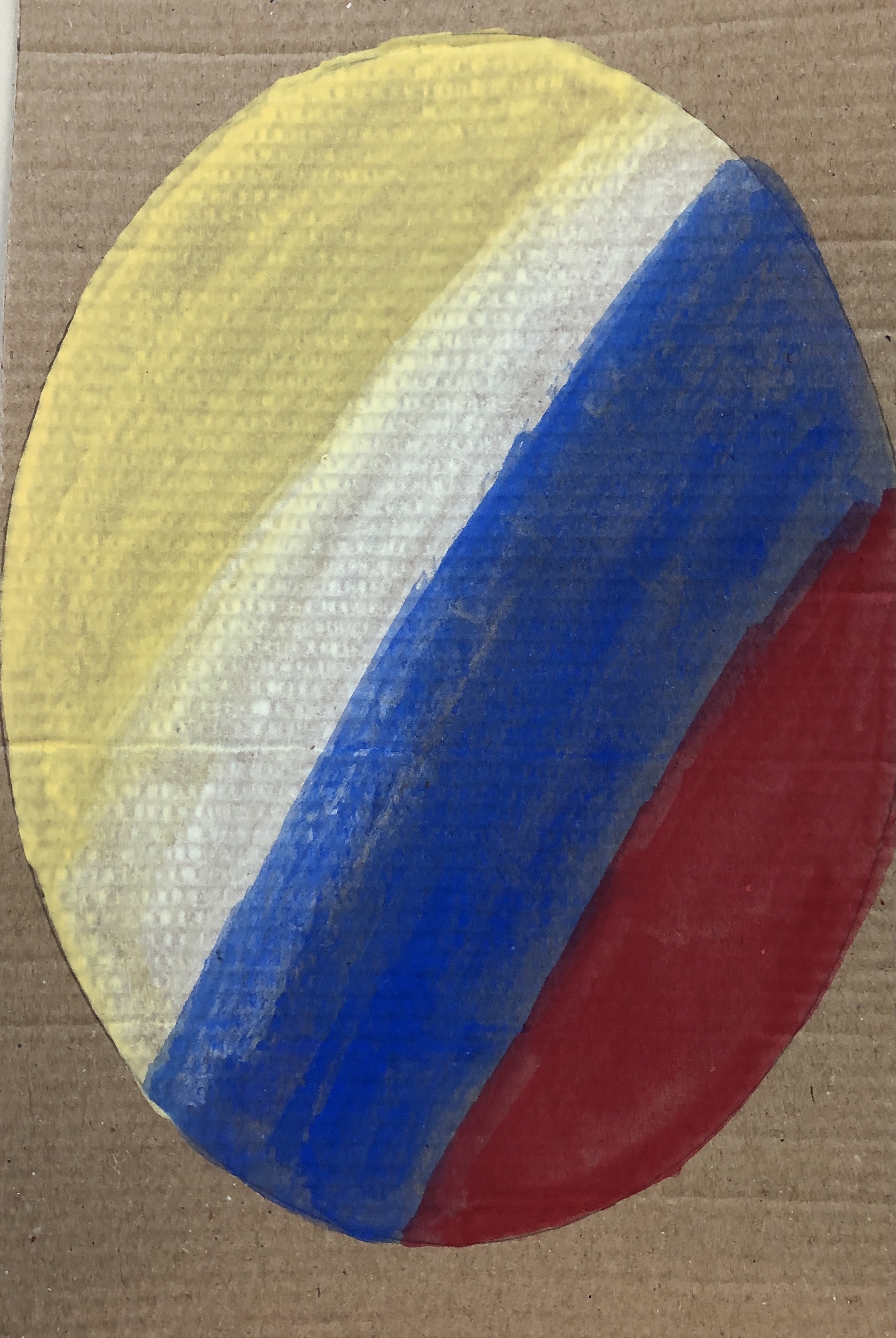
I decided to try again – this time just a straightforward design in primary colours and white on the same board, again using egg tempera. This time I left the first coat to dry for 72 hours before adding any varnish. It seemed to have dried and the varnish was easy to apply, although still with a small amount of paint drag. Because of the design which I had made without thinking it through, I now changed my arrangement – so:
Left section= just paint
Right section = paint and varnish
Mid section = paint, varnish, paint, varnish
Here is a “before and after”:
I left the second layer of paint in the mid-section to dry for 96 hours – but as soon as I began to apply the varnish, it began to drag the paint all over the place. Obviously, the first paint layer must have partly soaked into the packing card, which helped it appear to be dry, whereas the second layer, sitting on the first coat of varnish, had nowhere to go and would need longer than 96 hours to dry properly.
NOW WHAT?
I have learned that:
if you are going to use varnish, you need patience
On reflection, I wonder if it is a property of the egg acting as binder for the pigment – is it that it doesn’t hold the pigment as strongly as some component of the varnish? Seems unlikely though, as Old Master egg tempera paintings have lasted centuries – I do think I’ve just not left the paint surface for long enough before applying the varnish
Which would then imply that using this technique (layers of paint and varnish) to obtain jewel-like colours would mean that a painting might take weeks, or months, to complete. Hmmm.
This was a two-hour online session of life drawing with a live model, based around the work of Matisse. Alice had arranged for a patterned and striped setting, and the model had a vibrantly striped dressing gown throughout.
SO WHAT?
We were encouraged to work with a stick from the garden (I picked a couple up in the woods on my walk this morning) and black ink on cartridge paper. Alice suggested each time before beginning that you run your hand over the blank page, mentally placing the main features of the drawing, and that you start with the point of greatest interest to you.
She explained that the way the shapes break up the various patterns defines the space – so perspective is not such a focus, you can still explain to the viewer where things are in relation to each other; but it’s important, if you’re going to use pattern for this, to follow the pattern through so it’s clear what is behind/in front of what.
NOW WHAT?
It’s easy to forget how much fun you can have with ink and a stick! – although this was a very concentrated session.
I am guilty in my life drawing of focusing on the figure to the virtual exclusion of the clothing, background and setting – but today I have learned a different way of drawing a figure, by focusing almost completely on pattern. It feels quite risky! – but that’s down to the unfamiliarity.
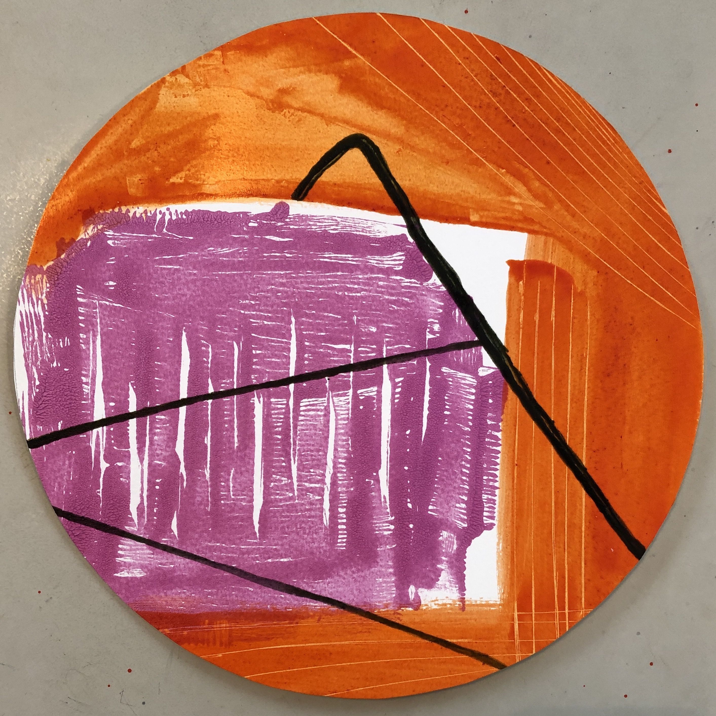
I took my series of 5 tondos painted with fluid egg tempera, and added thicker paint to see how this changed the image; I did this using the same “bought” egg tempera I had used in the originals.
However, I then also wanted to experiment more with mixing my own egg tempera and observing the effect of the proportions of the mix on the behaviour of the resulting paint.
SO WHAT?
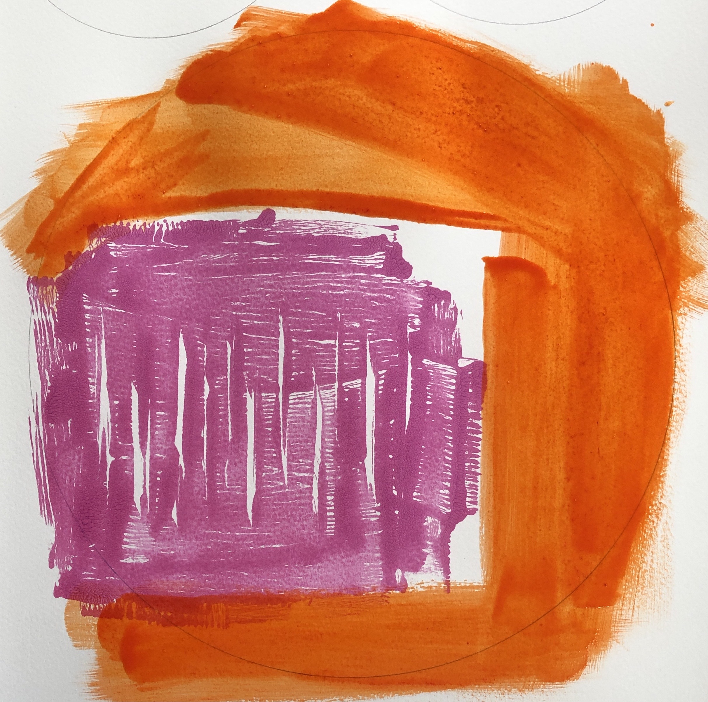
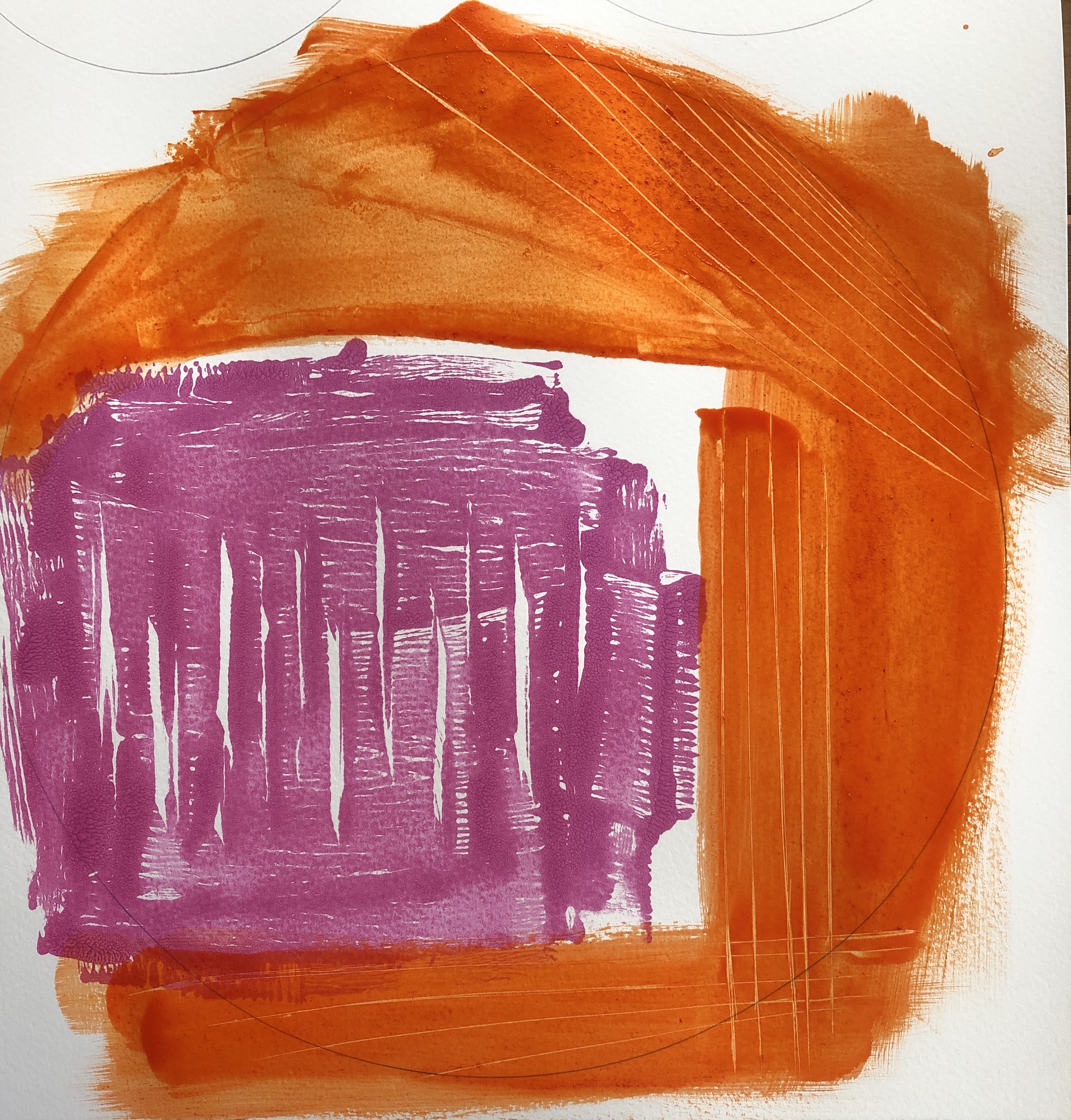
I began by adding thicker paint to my existing series. I made a decision at the beginning to thicken the white in the lightest places, and also to add more of the complementary colours (a) where the colour was brightest/darkest; (b) where the complementaries adjoined.
The first two of the series had a dominant yellow/purple colourway (showing original/with addition of thick paint/close up with thick paint in each case):
The other three paintings in the series had a blue/orange dominant colourway:
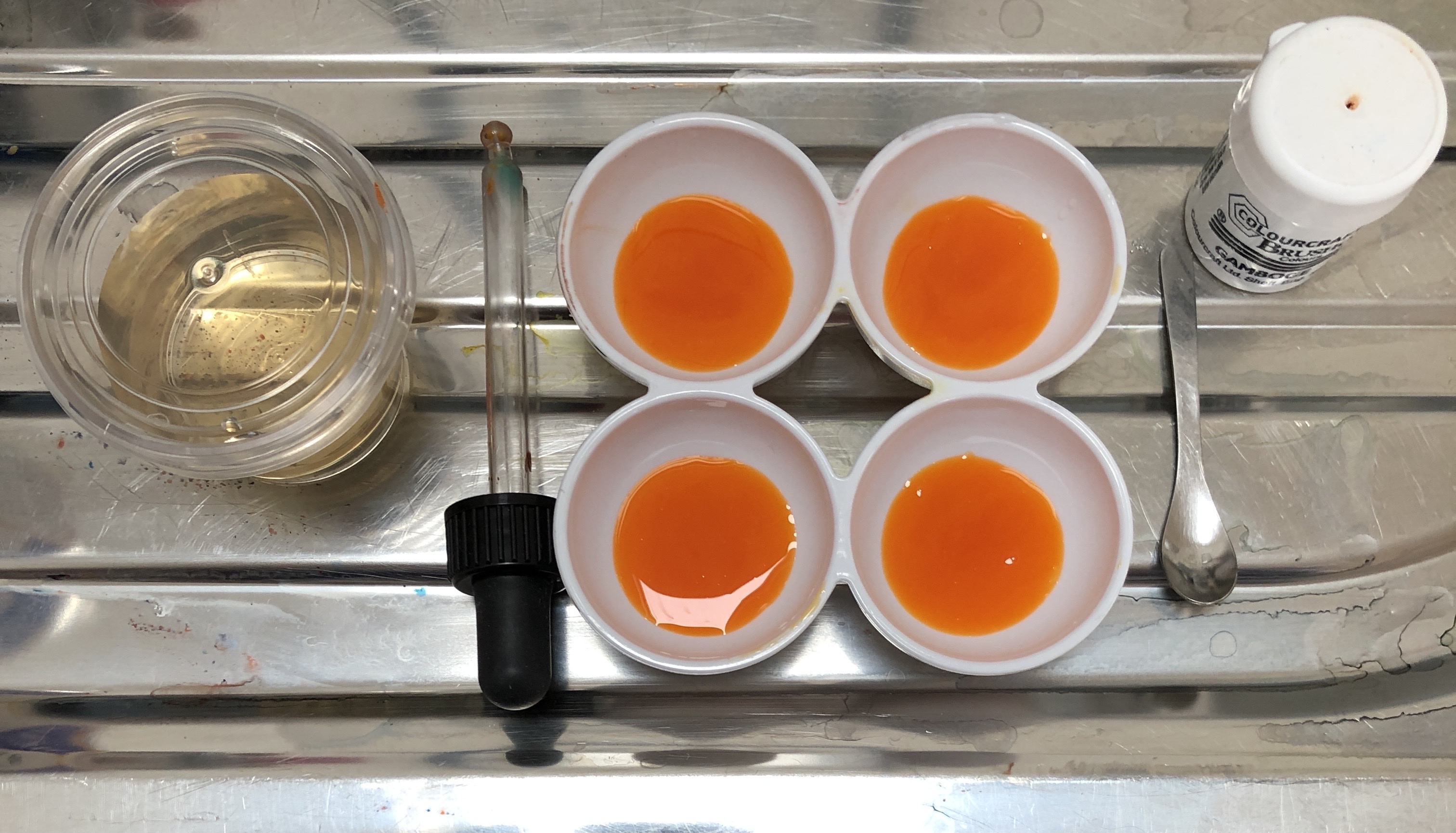
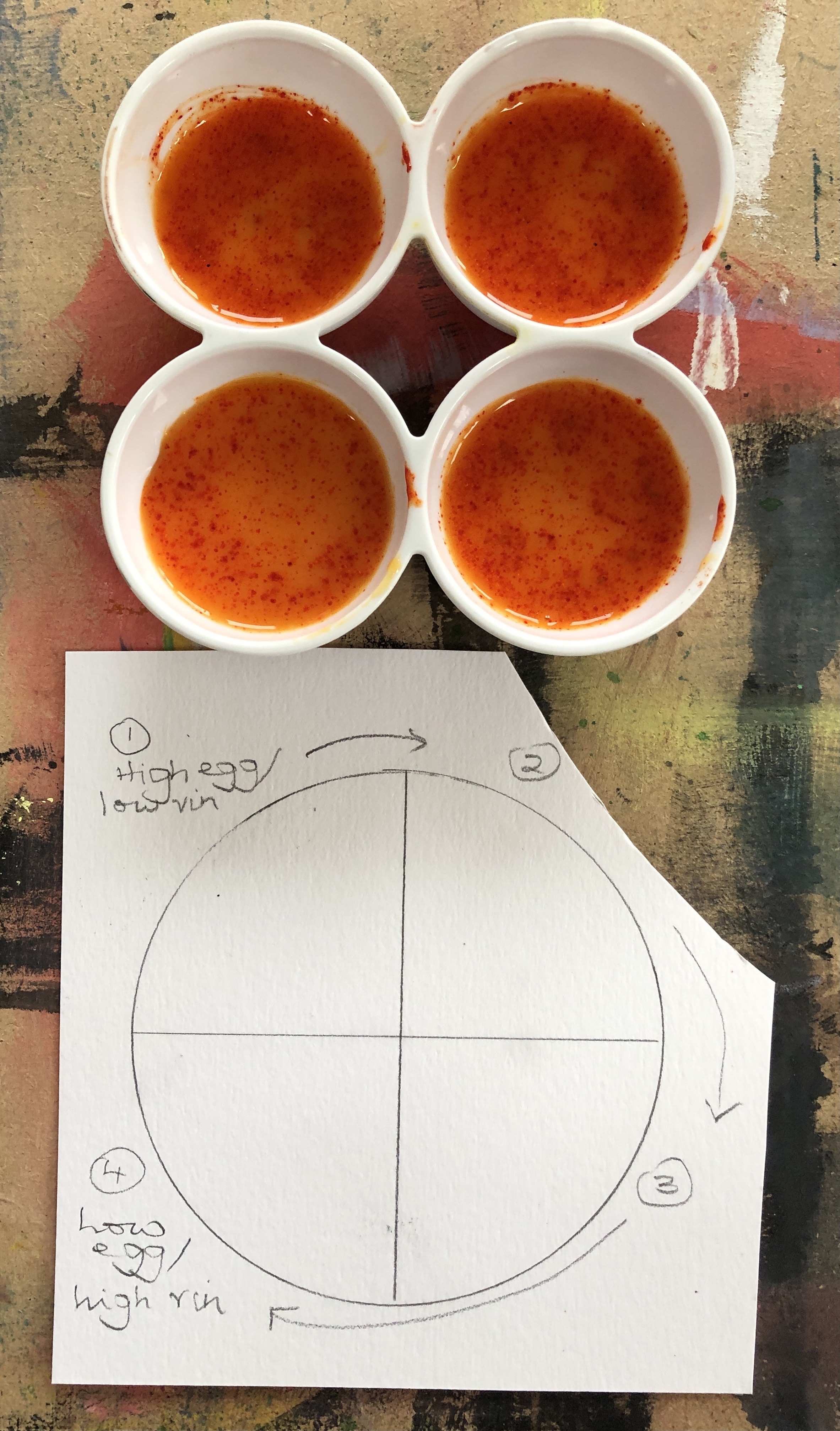
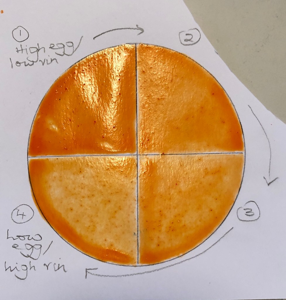
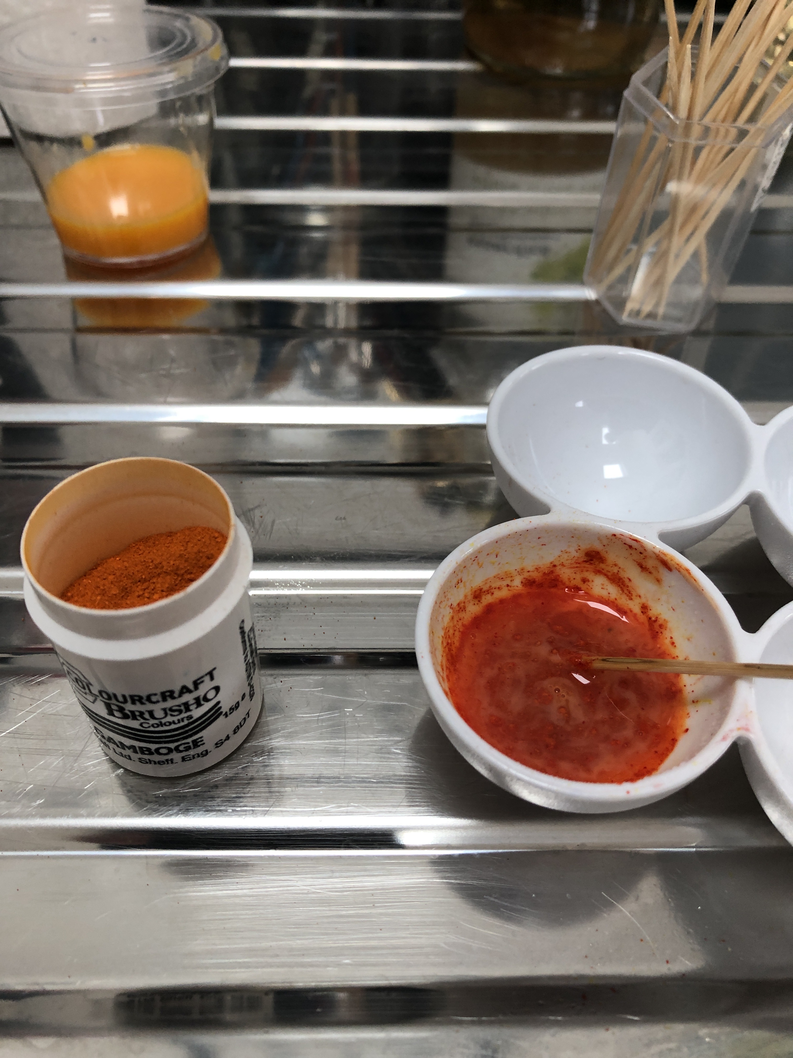
Next I wanted to have a go at making thick and thin egg tempera for myself. I divided an egg yolk as equally as I could into four mixing wells. I then added white vinegar to each, but in a structured way – the first well received two droppers-full, the next well received four, the next six and the last eight droppers-full. I mixed each carefully and then added the same amount of pigment (I used the gamboge Brusho again). This time I added no water, mixing each well in turn with a rigger and then painting a quadrant of a circle in turn. Here is my equipment and my outcome:
This photograph was taken after the paint had had a chance to dry overnight. All of the quadrants retain a sheen; however the first quadrant (top left) also retained its shape and coverage (you can see the marks left when I accidentally dropped my brush handle into it). As the proportion of vinegar has increased, the paint became very runny so that, by the fourth quadrant, a large amount of it had pooled at the edge.
NOW WHAT?
I have learned:
A mix of fluid and thick paint allows for the development of one of the key characteristics of egg tempera – the ability to build a strong depth of colour in some places.
Adding thick paint to certain parts of a thin first layer allows one to really draw attention to something (in the case of my series above, it was the brightest lights and the complementary pairings of colour) – although it is possible to overdo this and be heavy-handed.
Creating the consistency of egg tempera paint that you want takes care, and I am erring on the side of a higher yolk/vinegar ratio for preference.
I looked at Virginia Verran’s work on her website (www.virginiaverran.com). I’m finding it difficult to put her style into words – there is a strong (apparent) element of narrative in her work, although I am struggling to break the code. She often includes curved shapes, and seems to join different aspects of the image up with broken lines (straight or curved). Everything appears very precise and thought-through.
This exercise asks for three coloured pencil drawings of interiors. I wanted to look at several things here:
Think about incorporating some aspects of VV’s style
Develop a photorealistic image into a more abstract one
Experiment with making egg tempera from scratch
Experiment with incorporating a monoprint into a painting
SO WHAT?
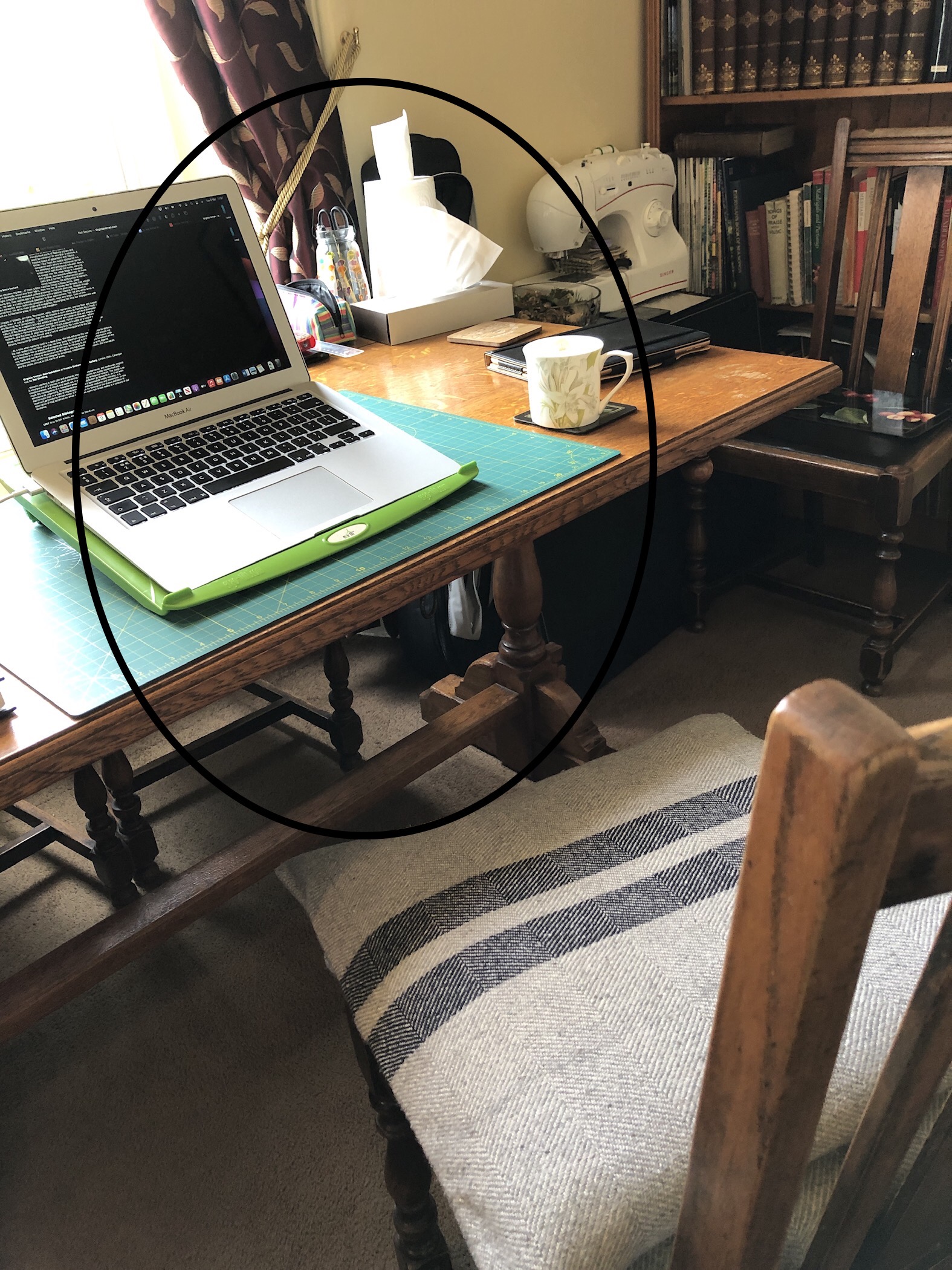
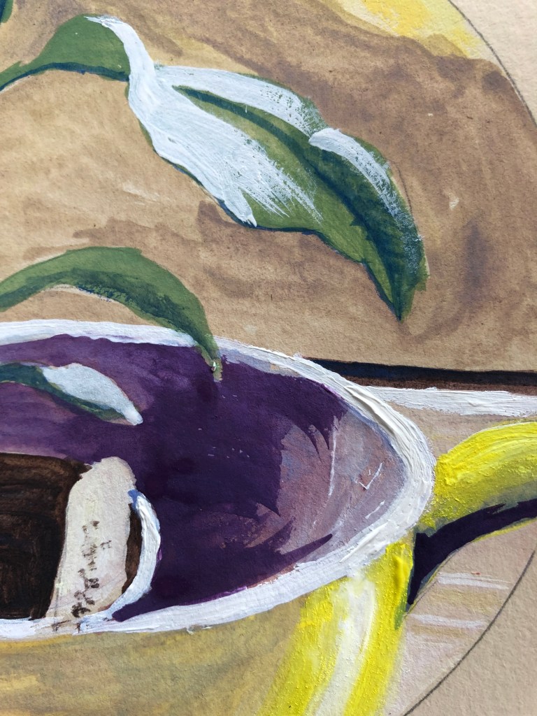
I began with a photo of the corner of a radiator and airer in my bedroom – I was attracted to this by a section of bright sun and darker shadow:
Drawing 1 was done on white card in Inktense pencils which are water soluble; here is the drawing dry, and after the addition of water to the wall area:
I used Drawing 1 as the basis for my further drawings. Drawing 2 was done using layers of ordinary coloured pencil and Derwent metallic pencils, with the addition of a Uniball black drawing pen. I included the lines and patterns which had interested me from Drawing 1:
Drawing 3 was done in Inktense pencils (yellow and violet), wetted and blended, and then drawn into with a black Pitt brush pen and a purple Promarker. I tried to incorporate VV’s broken lines here, and I can see that they do catch the eye and make the viewer follow them and wonder what they’re for. I think this composition, with its strong lines and areas of strong colour, keeps the eye circulating round and round the image.
I then wanted to go on and use some of the motifs from these images to explore some home-made egg-tempera. I found an easy-to-follow “recipe” on the Artists and Illustrators magazine’s website. Simplifying, I:
Separated the yolk from the white and kept the former
Mixed it with a little white wine vinegar, which apparently stabilises it. The article said the ratio of yolk to vinegar affects the final consistency and appearance of the paint, so I plumped for just a small amount of vinegar to get a rich and glossy finish.
Mix in the pigment. I didn’t have any proper pigment, so I used some Brusho powder with a few sprays of water to help it mix in.
The mixing was something I had to persist with, encouraging it with a couple more sprays of water, but the outcome was hugely rich. Here is a bit of my yolk/vinegar mix, and the mix with the addition of the Brusho (in this case, gamboge):
I started off mixing with a cocktail stick, but this is not enough, you’ve really got to get in there with a brush.
Working on A3 HP watercolour paper, I rolled out some violet/blue metallic acrylic paint on a glass sheet, made a rough design of lines in it with the edge of a palette knife to give a hint of the light parts of the radiator, and monoprinted that onto my paper.
I have to say that this was not really my idea of what constituted violet/blue, looking much more like magenta/pink, but I decided to go with it.
Next, using a fan brush, I added the gamboge egg tempera. Again (having intended a yellow/purple contrast), the gamboge was pretty well orange, so my colour scheme was shot to pieces – but this was completely made up for by the paint – it was so beautifully gloopy – luscious is the only word I can think of that does it justice. I became rather lost just in the sensation of stroking it onto the paper with the fan brush, and all ideas of design temporarily went out of the window. I discovered that it would hold its shape, so began to mark stripes into it with the edge of a palette knife.
Next, I mixed up some black egg tempera and painted in the black lines, before letting it all dry and cutting it out. The gamboge retained its glorious colour, only fading slightly as it dried where it was thinnest, and it also retained its oily sheen (as I had been promised in the instructions!).
NOW WHAT?
Well, that was a lot of learning.
Referring back to the 4 aims I started out with (see WHAT? above):
I tried out the “broken lines joining aspects of the image” feature of Virginia Verran’s work; this was interesting because I found that my eye followed a broken line almost more than a complete line – like those footpath symbols on OS maps – strange but true, and worth remembering.
I started with a photorealistic pencil drawing and have gradually abstracted it; I think that my abstraction is quite naive at the moment, not something I’ve done much of, but I’m Interested in it and want to try more.
I loved making the egg tempera – a little bit of a cookery/chemistry/alchemy experiment, but I am going to try more of it and explore the different finishes engendered by tinkering with the yolk/vinegar mix.
I think (apart from the colours) that incorporating the monotype has potential – makes for different finishes within the same image, and it was also a really easy way of reserving the bits of white on the paper.
This was a two-hour life session with a model from Brooklyn holding (excellently) a wide range of poses which allowed us to move from 1 min poses, to 2 min, etc, ending with three 15 min poses.
SO WHAT?
I worked in an A3 sketchbook; some of the pages already had random designs on them in acrylic paint where I had cleaned off my roller after some printing. I had also on this day been playing around making egg tempera; I had a small amount of black paint left and I knew that it was not recommended to keep this for use from day to day, so I diluted it with a lot of water in a jar and used it as ink, applied with a rigger.
A great, very concentrated session with an experienced model able to offer a huge range of poses – thank you 2Bornot2B and OCA!
NOW WHAT?
I now know that, if you dilute egg tempera enough, you get an effective ink
Drawing with a brush stops you fiddling and makes you commit
Tori Day’s work, as seen on her website, www.toridayart.co.uk, appealed to me for it’s apparent simplicity; a bit like Jacqueline Utley’s flower paintings, Tori takes a household object, placed on a table or shelf against a plain background, and makes it into a satisfying and “sufficient” work – for example,
“Turkish Coffee (ii)”
2020
Oil on panel
13 x 18 cm
I also liked the way that, although many of her objects are placed centrally within the painting, a few (such as this example) are not, indeed are even truncated, and when looking at the series, which she has laid out as thumbnails on her website, it adds interest – I could imagine them being displayed in a gallery like that.
I am going to continue working in egg tempera for this series. I have worked looking through a viewfinder before, but the idea of taking a photo and then laying the viewfinder over the photo is something I have not tried, so I am going to experiment with this using my iPad – it’s certainly a lot easier than trying to hold a viewfinder up in the same place for any length of time.
SO WHAT?
The photos will all be taken in one room of my house, looking at what’s on shelves and surfaces.
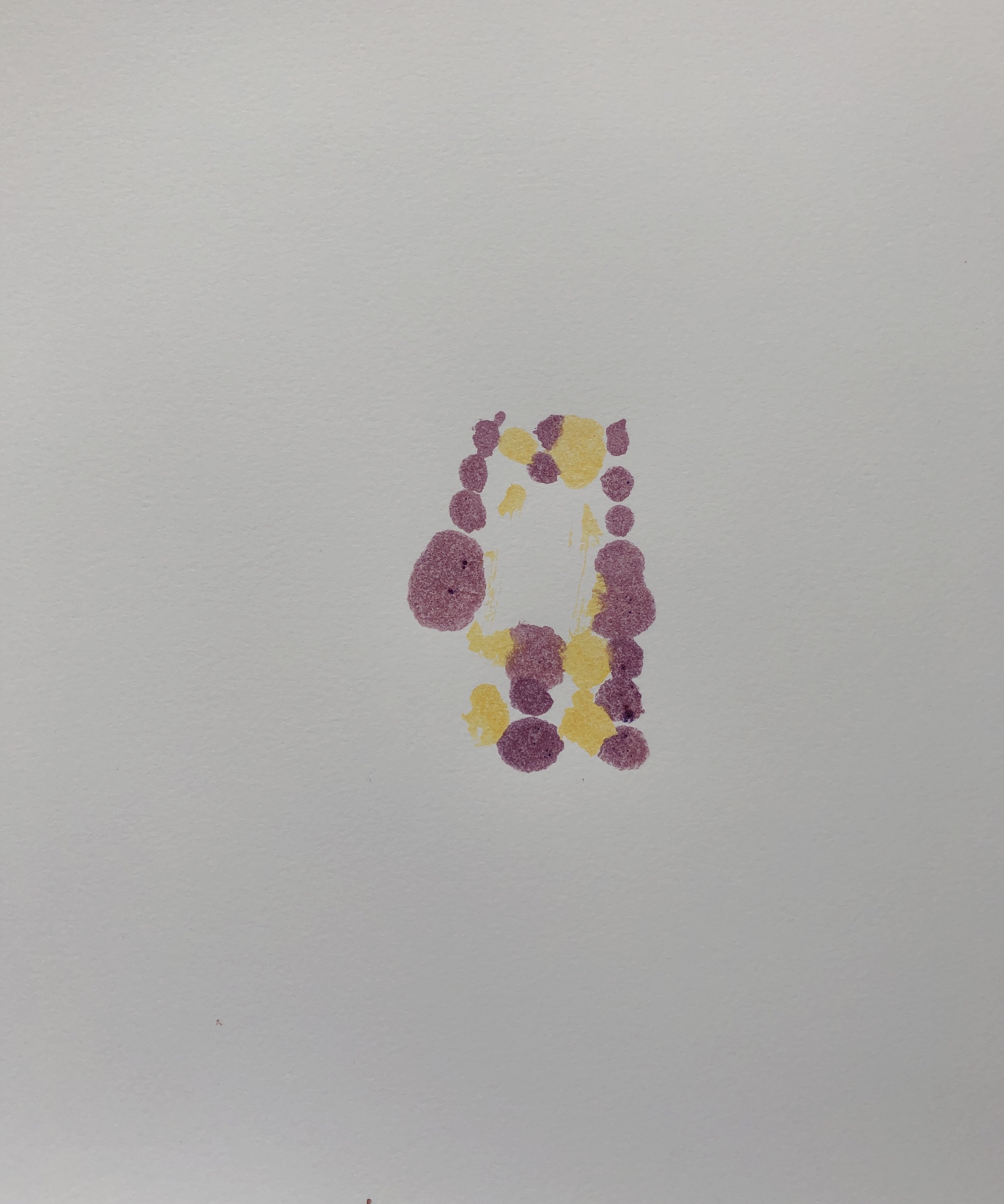
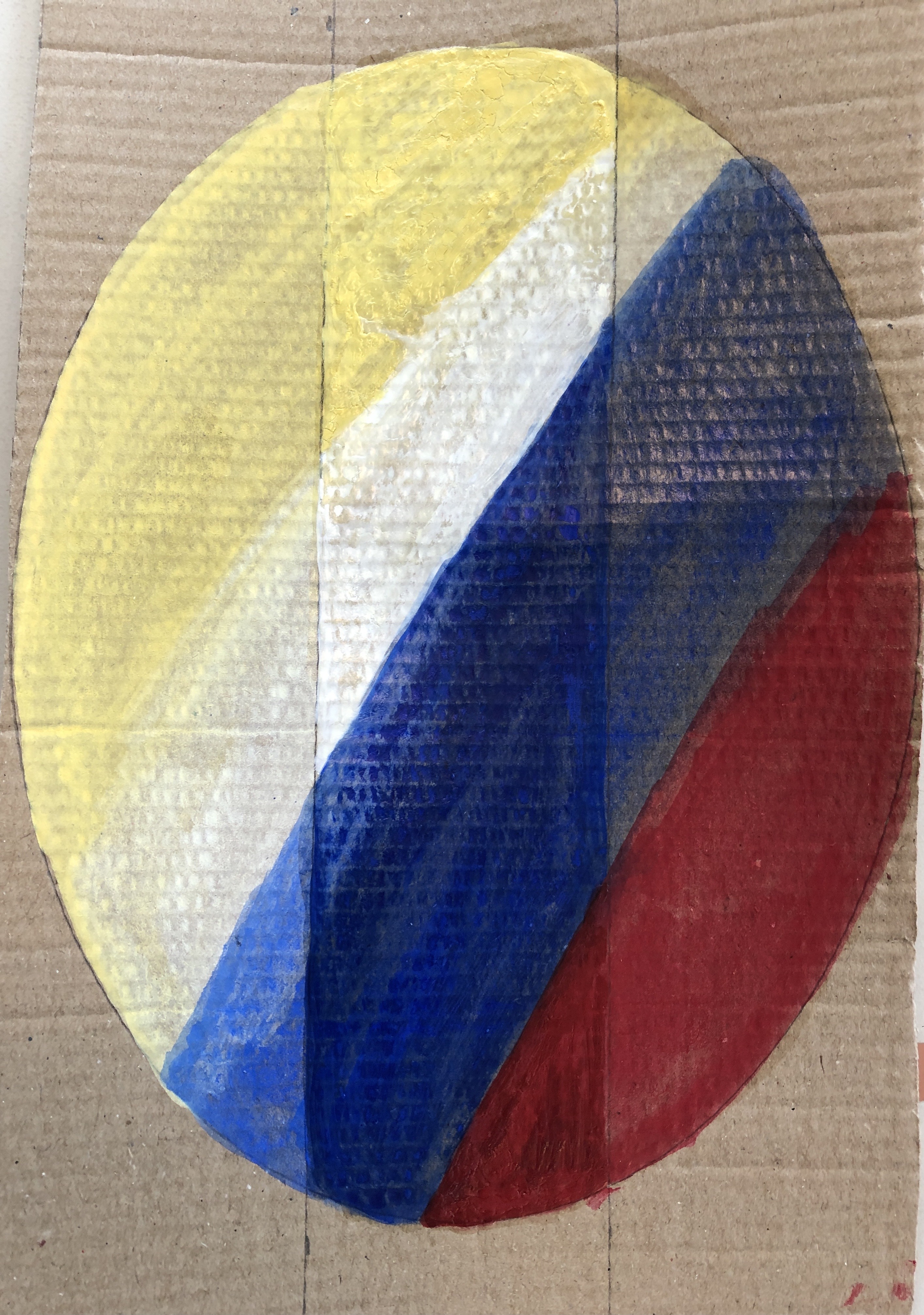
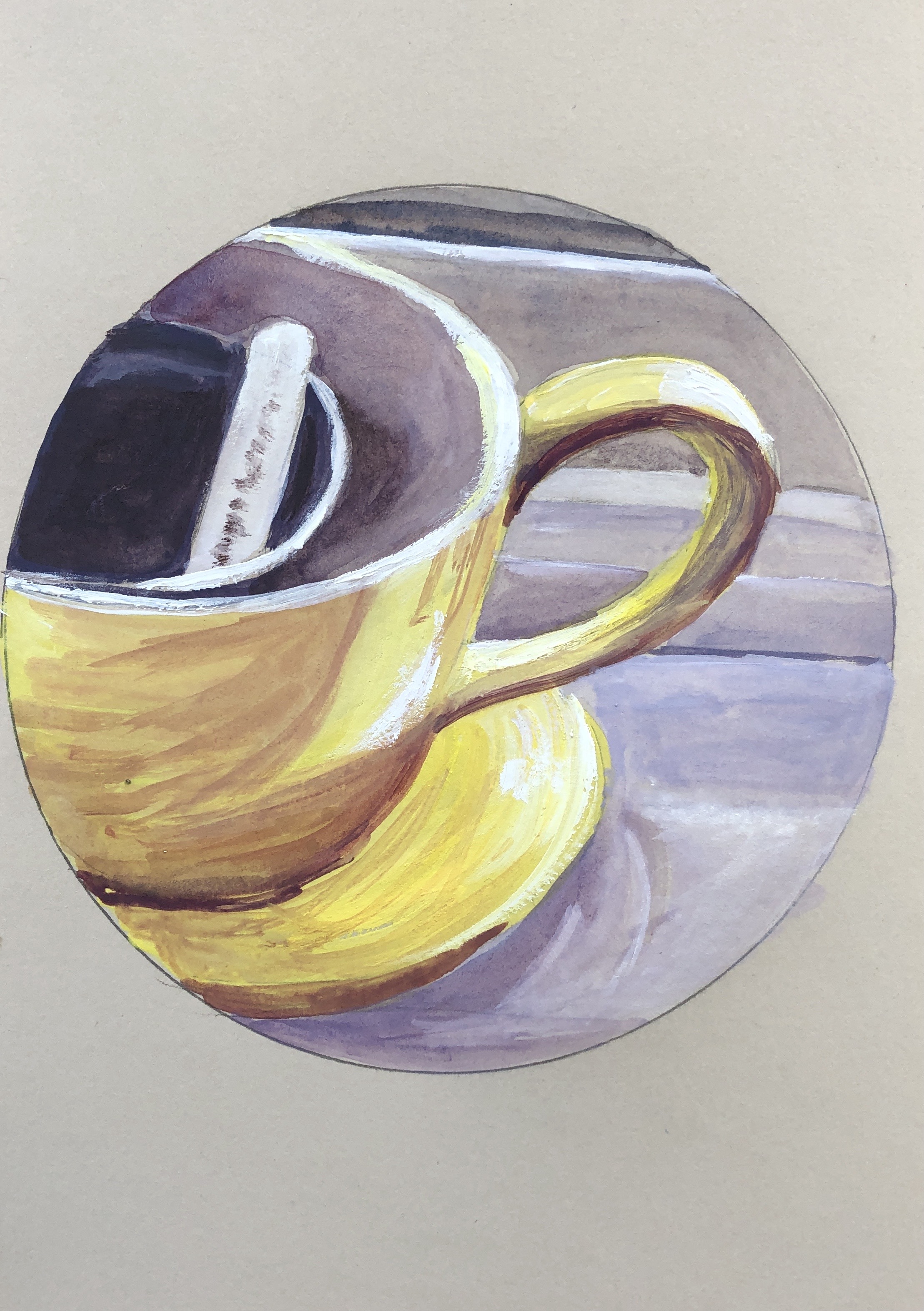
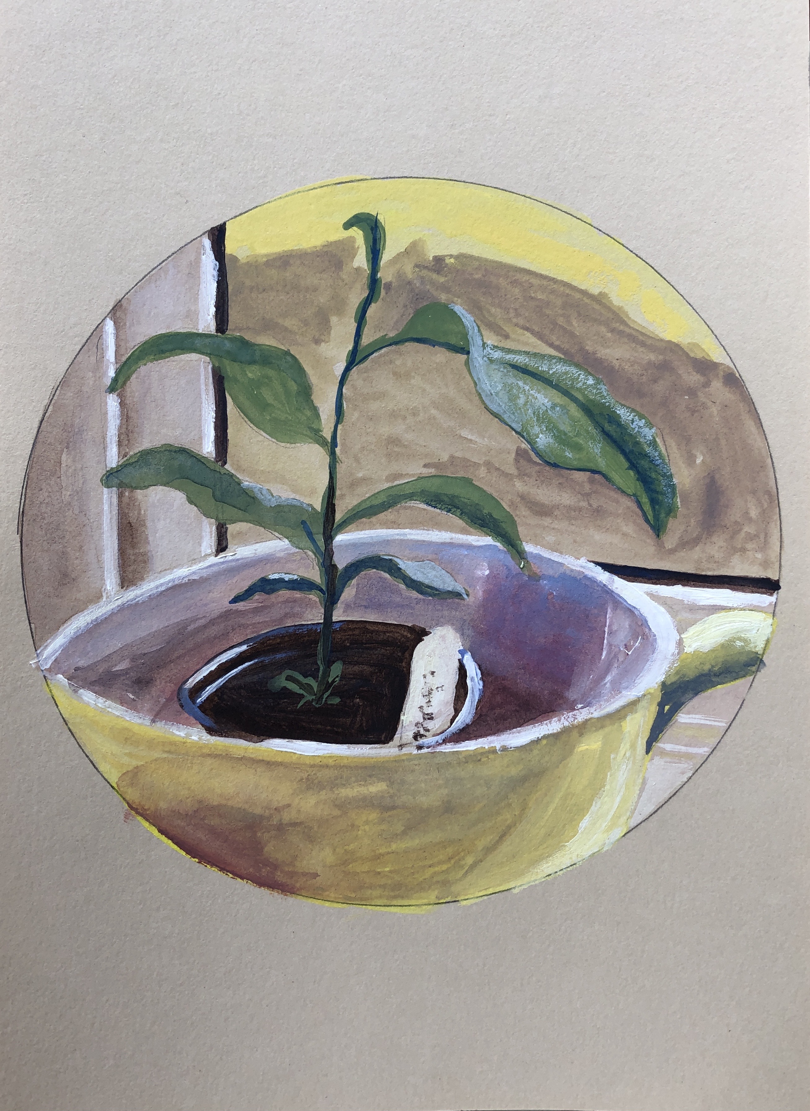
The first two are truncated paintings of the same plant holder on a windowsill, painted from this photo, just moving the viewfinder around. I worked with a dominant yellow/purple theme.
The purple was alizarin mixed with a dash of cobalt blue, and the yellows were a construction of lemon yellow overlaid with Naples yellow and then greys mixed from yellow and purple, sometimes with a touch of extra cobalt blue.
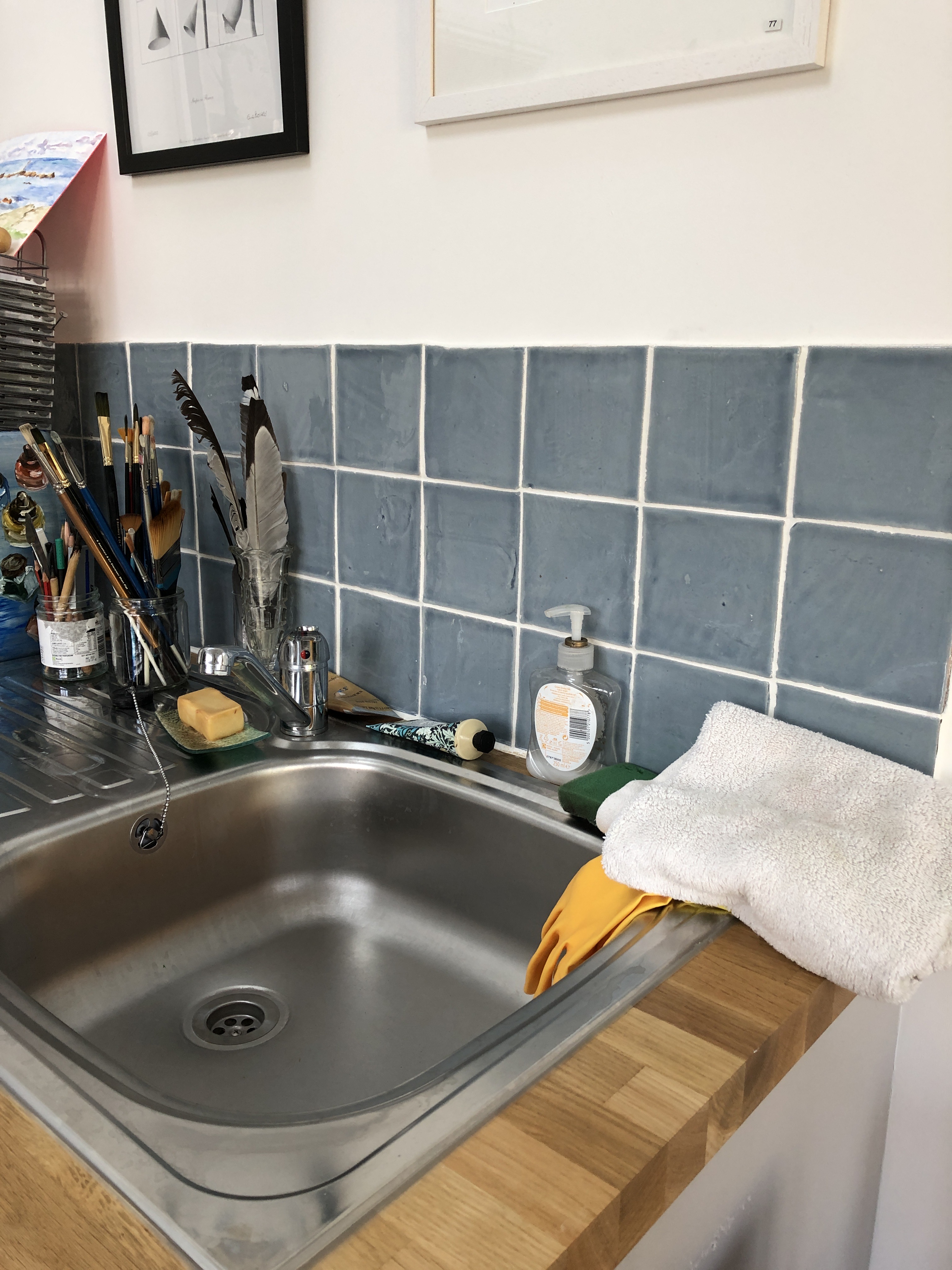
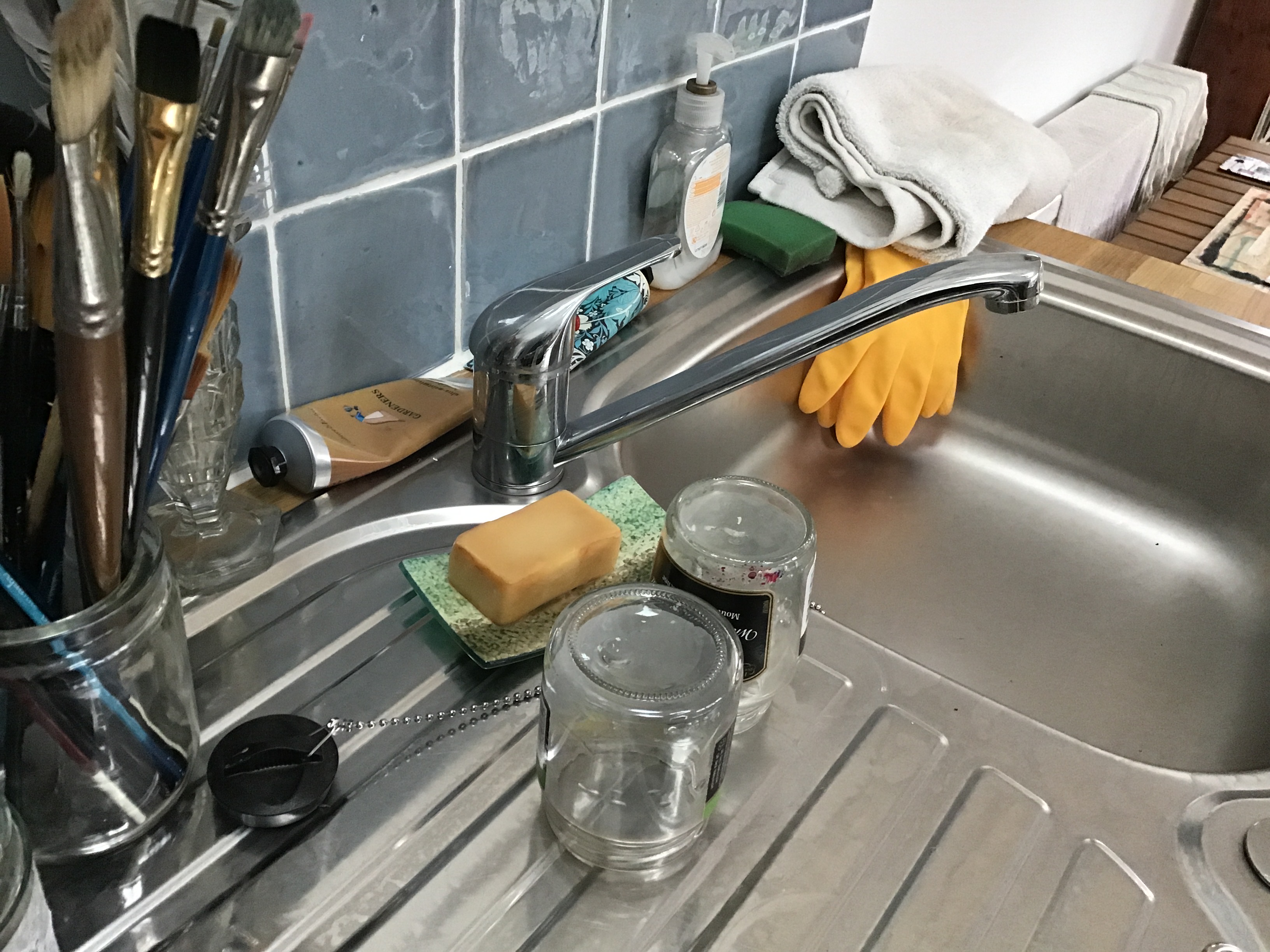
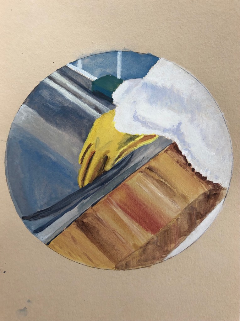
The next three had a dominant blue/orange theme, and were taken of the same sink edge from two different photos:
The first one of these felt a bit tight and overworked, so I tried to work more loosely with the second and third:
NOW WHAT?
Unregarded corners of a room can make for an image which tells little stories about the person who inhabits that space – almost demarcates that space! (see separate blog post, Call and Response with Hayley Lock)
I am loving this method of working with a viewfinder
I have also found that choosing a main colour pairing helps me to simplify an image where I would otherwise be tempted to fiddle and fuss
This involved a group of 16 students with Hayley. We were invited before the meeting to research the exhibits at PAMM (Perez Art Museum, Miami) and jot notes of any exhibits which caught our eye on a shared padlet. We then focused on an exhibition by Ebony G Patterson, who is also Professor of Painting at Kentucky Art School.
SO WHAT?
It was interesting to research the collection and exhibits at this museum which I had not previously come across; some of us found that their digital presence did not always include all the information we wanted, but we were very much encouraged not to be passive but to get in touch with museums and curators if we wanted to know more.
After looking at some of Ebony’s work, which uses beauty/bright colours/ garden images to draw a viewer in, with some more uncomfortable messages revealed upon closer inspection, we were invited to make our own work reflecting on the demarcation of space/the value of space.
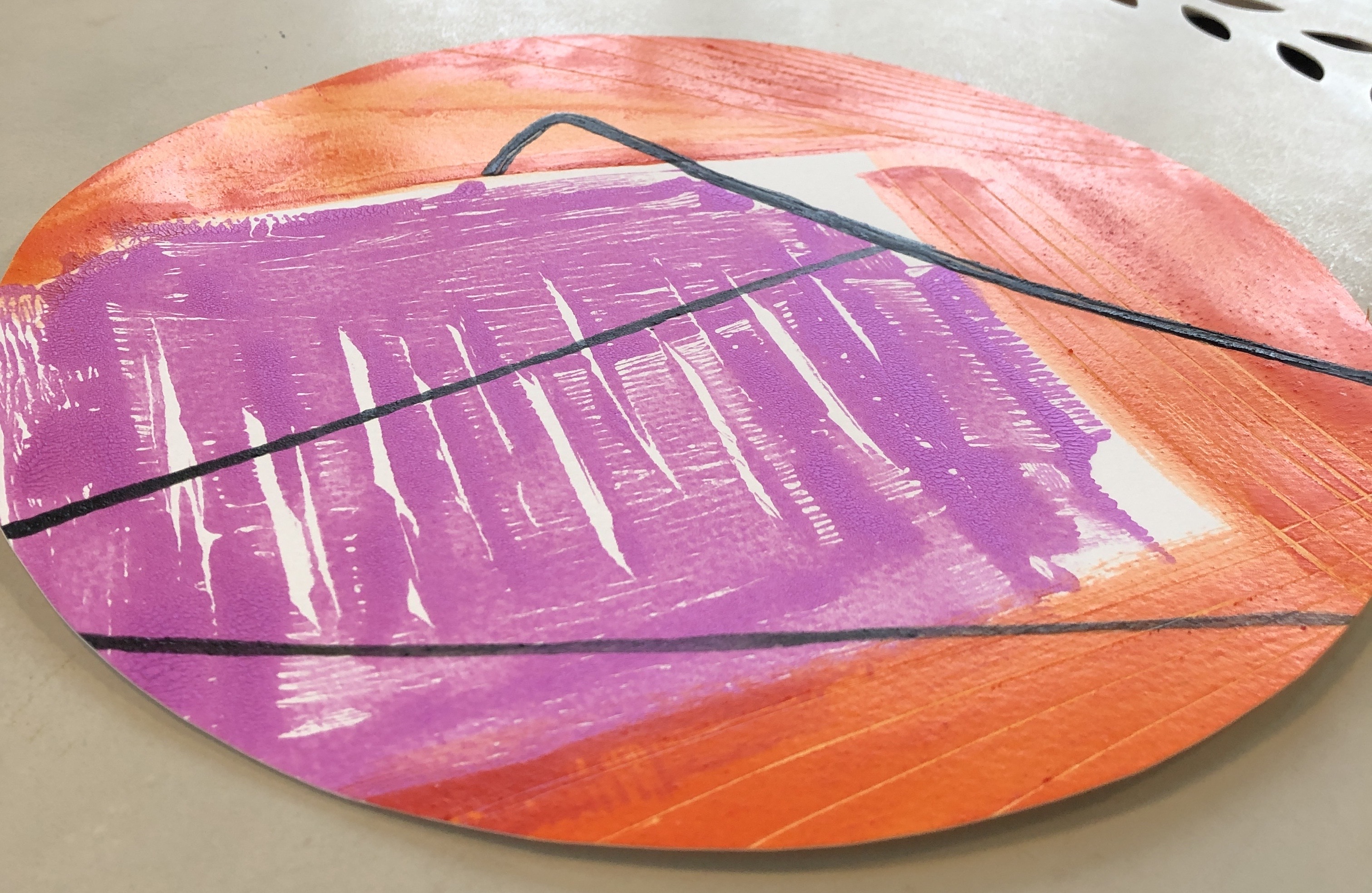
All the students approached this in very different ways. I wasn’t sure how to start so took inspiration from the “bling/garden/possibility of hidden things” aspects of Ebony’s work. I began to paint large, slightly unworldly flowers and foliage using enamel paint and gold acrylic liner on black pastel paper; I chose black for the background to help give the idea of things hidden in shadow. As the work grew I added some pieces of pot pourri stuck on with PVA to give a 3D element to the work. When it had dried I was uncertain where to take it, but then I thought what a striking tondo it would make:
NOW WHAT?
I’m not convinced I have met the brief, i.e. produced a piece which talked about the demarcation/value of space.
However, I enjoyed cutting loose with the enamel paint – everything I have tried to do with it so far has felt really structured. I was surprised how much it soaked into the pastel paper, I had to apply quite a bit of some colours, particularly blue and green, for it to show at all – so I have learnt another characteristic of this paint. And I have created a dramatic and vibrant tondo – although I’m not sure it has much of a message beyond the exuberent fun of letting rip.