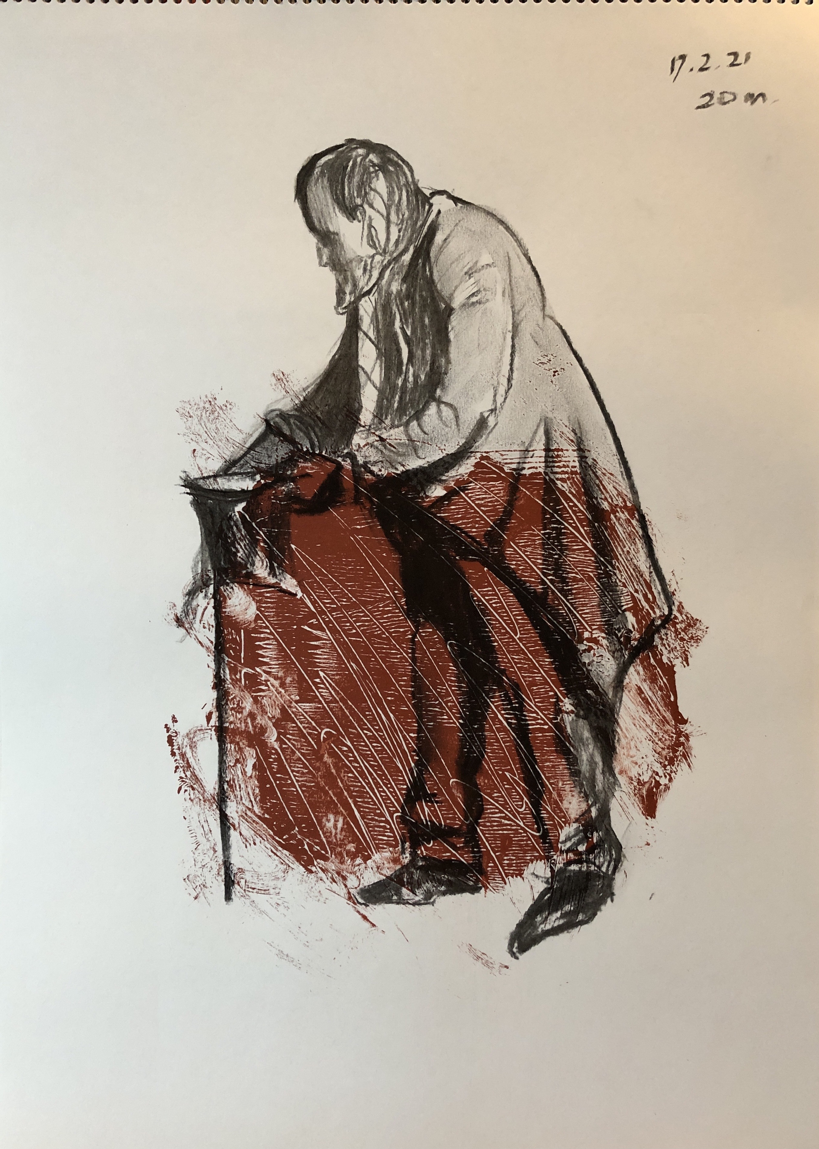
This was a two-hour practical session; we looked at a few examples of paintings demonstrating chiaroscuro, considering in particular the position of the light source and identifying where the light fell. We used charcoal on paper (I used ordinary willow charcoal in an A3 sketchpad, using a putty rubber to lift out), and worked on several poses of varying length held by a live model in a scene lit only by two candles.
SO WHAT?
There was so much to do in the time available for each drawing, and Tom modelled a process of drawing the basic forms first, then adding the really dark tones, and then developing a range of tones on the model and artefacts to describe form. I found it very challenging but was glad to have had a go, although the outcomes are not the greatest drawings I have done – but an effective exercise for making you think about light sources and tone.
NOW WHAT?
This exercise was really good for making one understand the benefits but limitations of willow charcoal – the darkest dark you could get on this surface was really the first mark you made, adding more didn’t seem to add darkness.
I think I should have tried Tom’s technique of “drawing in” the darks rather than shading the dark in with the side of the charcoal – there just seemed so much to put in! – but he did achieve a darker dark, more pressure I suppose.
It would be interesting to try out this chiaroscuro technique using ink.
I had wanted to look more at Winifred Nicholson’s work after learning about her understanding of colour in the St. Ives School of Painting course with Jill Eisele (see separate blog post). I was able to obtain the book of the exhibition of her work, “Winifred Nicholson – Liberation of Colour”, curated in 2016 by Jovan Nicholson, which was published by Philip Wilson Publishers, London. There I found the painting “Easter Monday”, c. 1950, oil on panel, Tullie House Museum and Art Gallery Trust, which I believe might have given Jill Eisele inspiration for the daffodil painting exercise we did.
I chose to look also in this blog post at Jacqueline Utley, to whom we were referred by the course materials for her jewel-like flower paintings, amongst others; I found information about her on her website, www.jacquelineutley.com
The two seemed to go together, not just because they painted flowers, but for their love of colour.
SO WHAT?
I began with Winifred Nicholson, who spent her working life studying colour and light. In “Liberation of Colour”, Jovan Nicholson says “The first thing I look for in a picture by Winifred is the colour she calls magenta pink, for this is almost invariably the key to the painting” – and he’s right, it’s almost invariably there, as Winifred thought of magenta violet as the colour on the spectrum as dark gives way to light.
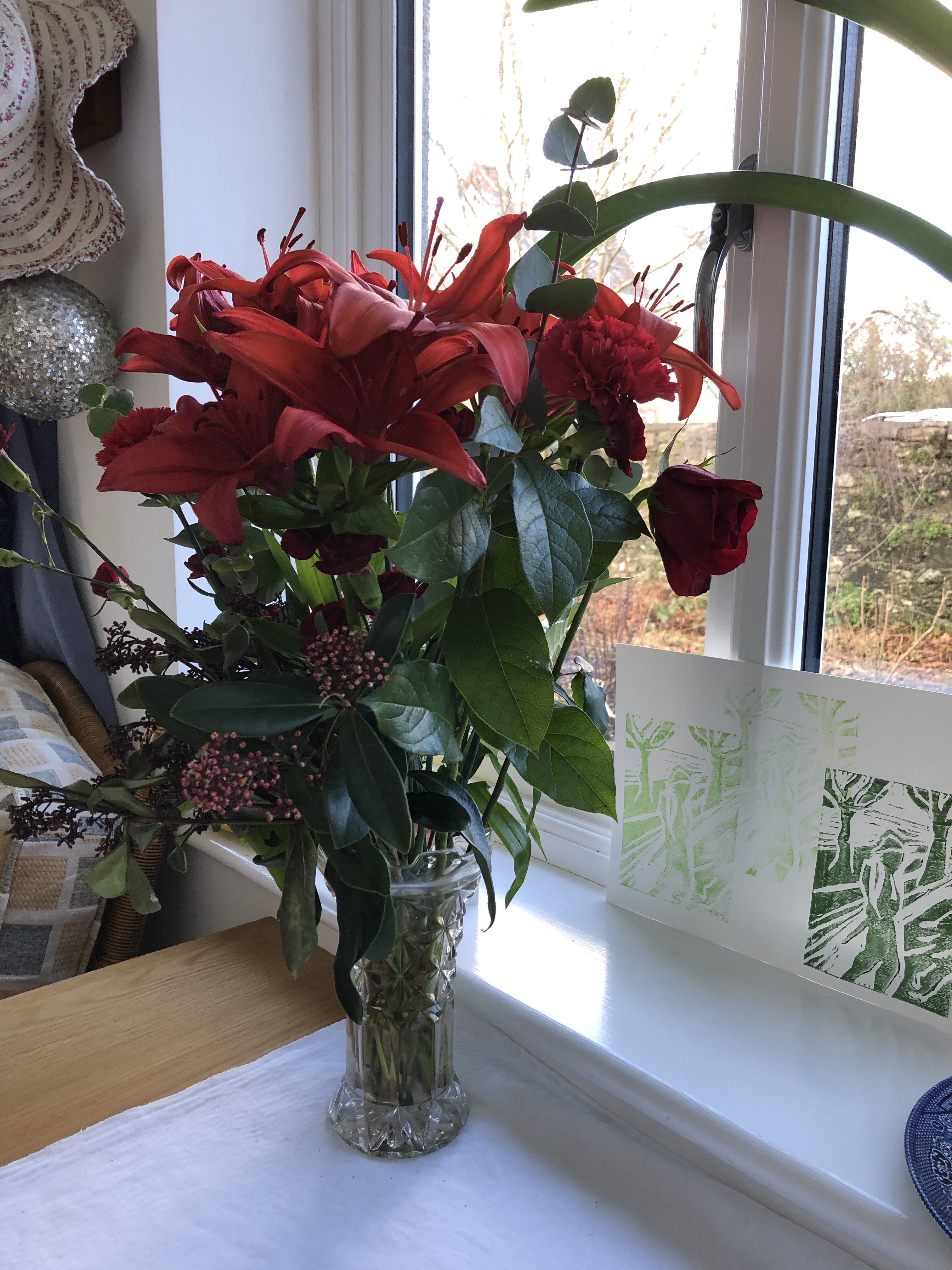
I’d been given some flowers which were just beginning to go over, so decided to capture them for posterity sitting on a windowsill, in a similar setting as that shown in Winifred’s painting:
“Amaryllis”
1967
Oil on canvas
Abbot Hall Art Gallery, Lakeland Arts Trust
You have to hunt for the magenta pink, but it’s there, around the top of the vase and the edges of the shutter.
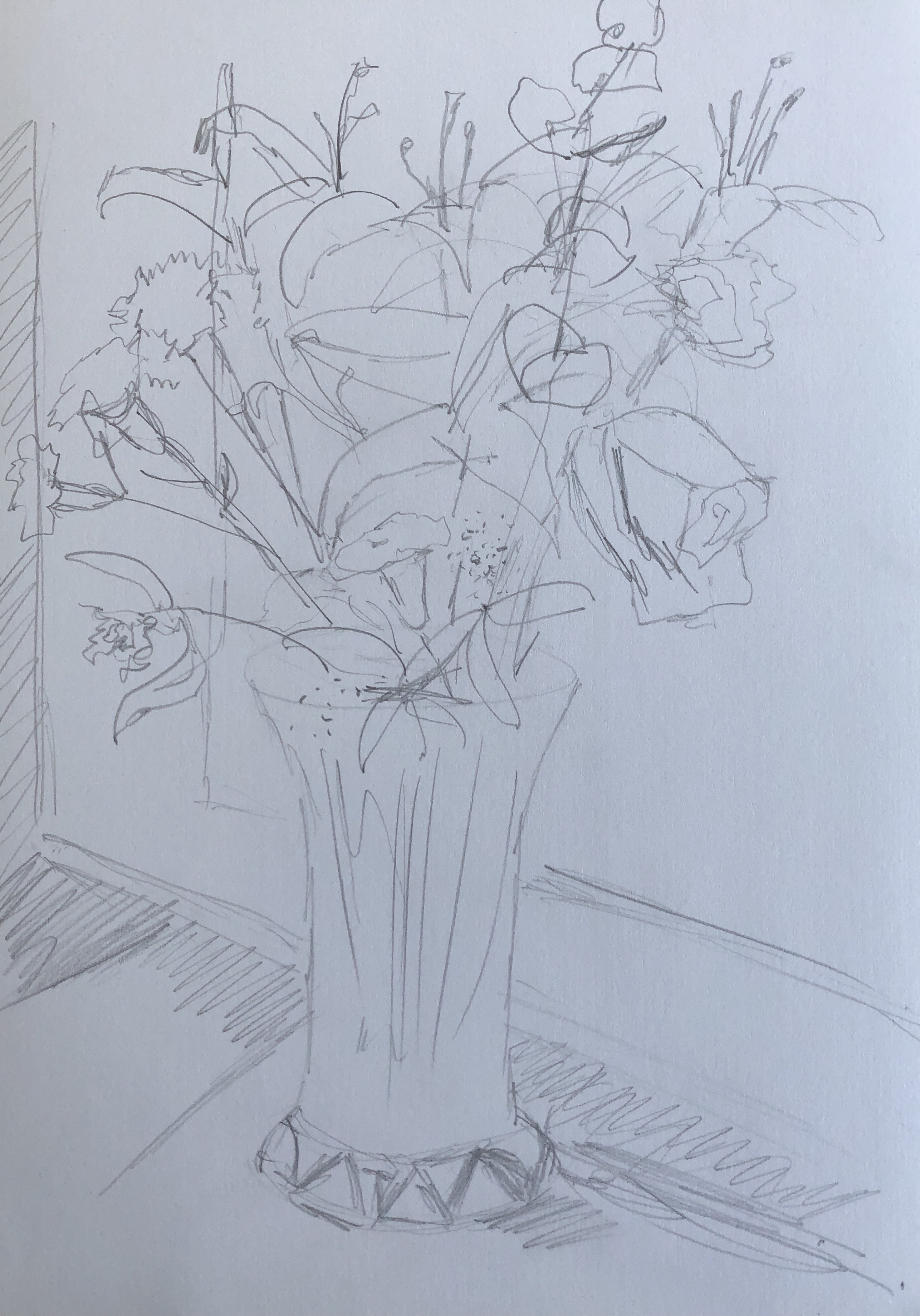
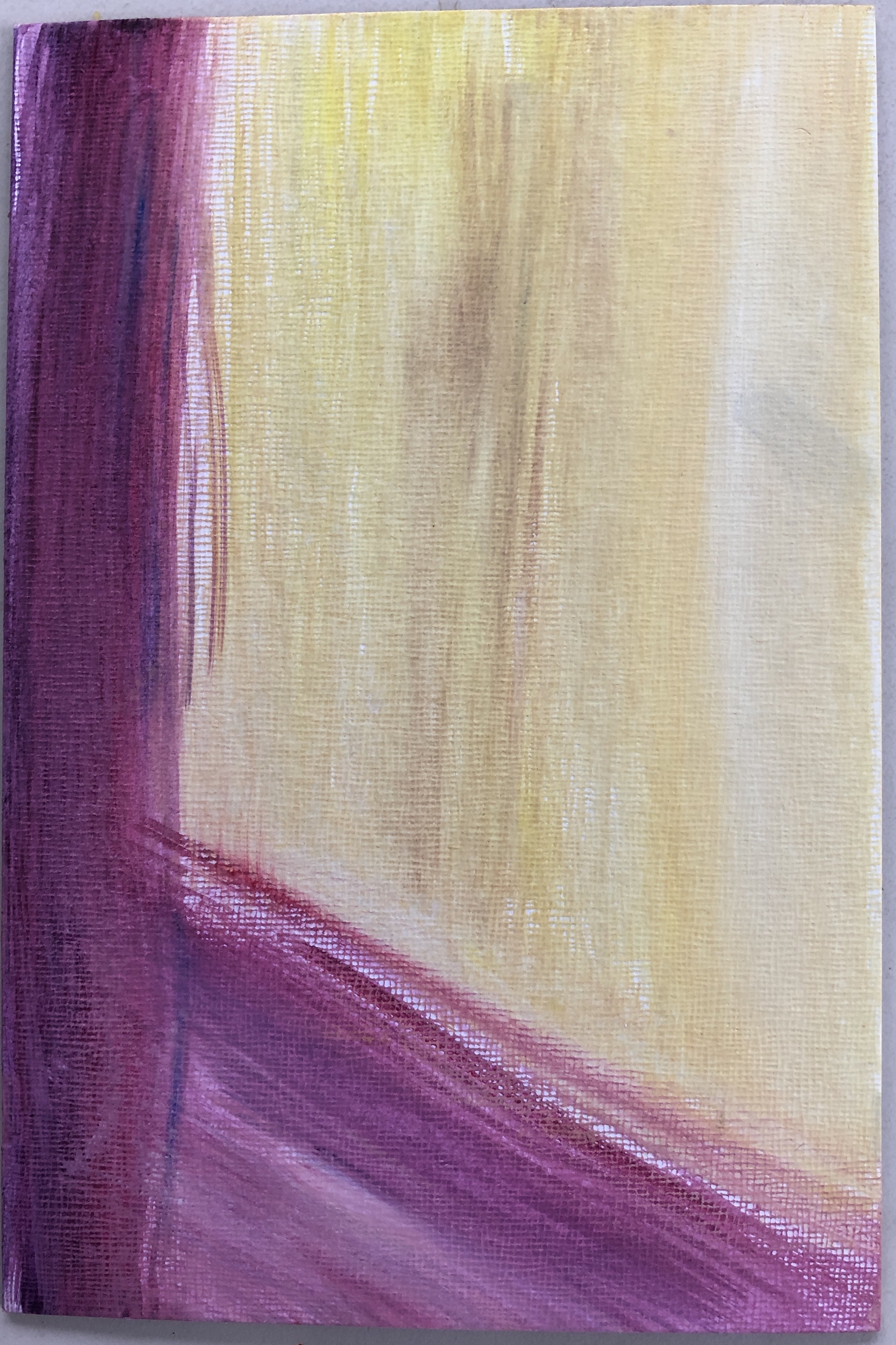
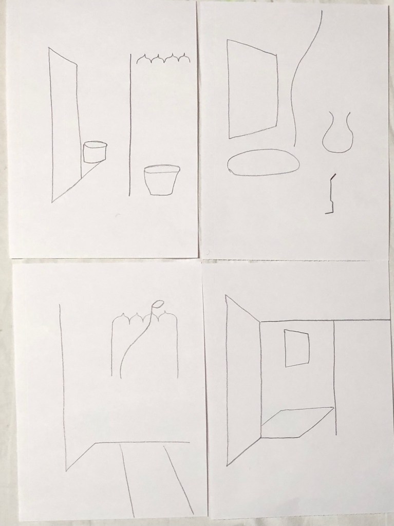
I did a quick sketch of the setup, trying to think as I did of what colours I would use where, as suggested by Jill Eisele. In her course we had looked at the pairs of complementary colours orange/blue and yellow/violet, so I wanted here to focus on the combination of red and green, whilst getting some of that yellow/violet combination (which I really enjoyed in the daffodil painting) into the background and sill. Here are the flowers in their original state, with my rough sketch:
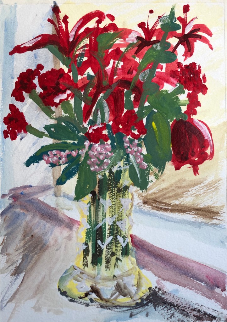
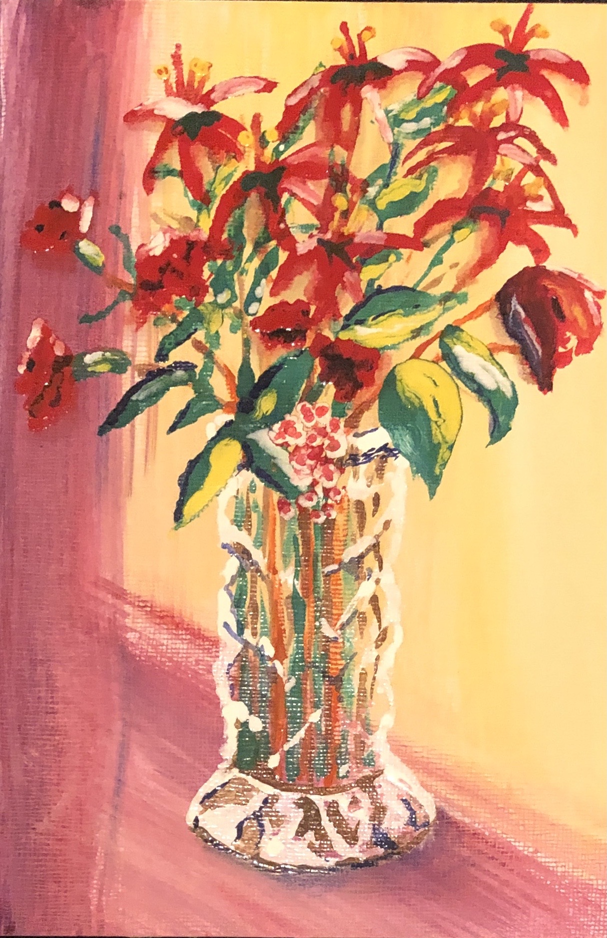
I worked on A4 NOT watercolour paper in egg tempera. I tried not to fuss about each leaf and petal, working quickly to catch the essence of each type of flower, as Winfred does. I also tried to indicate very roughly in white the design of the cut glass of the vase, as Winifred did in “Amaryllis”, above. Finally, I was determined to get my magenta pink in – a dash along the sill, and also centre stage with the little bobbly flowers (of whose name I am sadly ignorant), which I think pick out the yellow in the vase.
I have to say I’ve never gone in for drawing or painting flowers, knowing full well that I would get hopelessly bogged down in details right from the off…..but this way of painting them is great fun and allows me to focus on the colour and shape. Winifed said “My paint brush always gives a tremor of pleasure when I let it paint a flower.”
And so to Jacqueline Utley. Her website shows her recent paintings, many of which are of colourful interiors, large rooms containing small, slim people. I particularly enjoyed her paintings of flowers which are, indeed, jewel-like. For example:
“The bird flower vase”
2011
Oil on linen
18 x 13cm
The painting has a simple background – a vase on a table/shelf against a plain wall – but closer inspection shows that the background is painted in streaks of colour, many of which are then picked up, but more strongly, in the flowers, with those real pops of bright red to bring the whole thing to life. She does this with many of her paintings – rainbow chalky colours suddenly brought to life with just a touch or streak of brilliant red somewhere.
I wanted to try working on board with an egg tempera background, then adding the flowers and vase in enamel paint. Jacqueline’s painting is indeed small at 18 x 13cm, and the nearest I had was 22.5 x 15cm. Jill Eisele had suggested that, if you’ve really concentrated on thinking about colours whilst doing your preparatory sketch, you should be able to paint from memory; I wasn’t brave enough to try that the first time, above, but, having now done one version of the painting, I had a go at painting from memory here. Here is my egg tempera streaky background…….
…..and here is the painting completed with the enamel image:
Interesting to see the apparent difference between the colouration of the background in the two photos! – I think I took the first in bright sunlight, the second in interior light.
Well, not much like Jacqueline Utley…….but I have tried to use her way of picking up the background streaks where I could in a picture dominated by red and green.
NOW WHAT?
I have learned:
The difference between “painting in the style of…X”, and looking carefully at key features of an artist’s style (here I have focused on colour) then trying one of those features out in your own paintings
Painting flowers can be fun
I have been a bit slap-happy with colour up to now, but am beginning to see glimpses of how it can work for me
Enamel seems so rich and shiny, it draws me in as a painter – but the egg tempera allows for a depth of colour which I want to learn more about.
These were 2 hour sessions making up a 4-hour short course looking at colour.
Jill covered a massive amount of material in this first session – have tried to pick out some key points below. She tried to make us think in a “colourist” way.
SO WHAT? – FIRST SESSION
This was the “Minds” part of the title – an analytical look at colour.
Making a painting involves 4 steps (miss any out and the end result might not be what you hoped for):
Research
Experimentation
Consolidation
Making
This session will be based on some of Johannes Itten’s list of colour contrasts
Contrasts of hue
As soon as you add a colour to another, you’ve make it a “broken” colour and it will be a bit duller
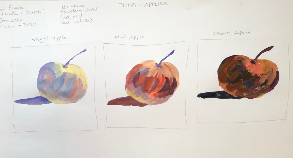
A standard colour wheel is based on cad red, cad yellow and ult blue, but you can make others (e.g. lemon yellow/cerulean/alizarin, or yellow ochre/indigo/Indian red)
Contrast of light and dark
Relating colour to tone – get this and you are then free from local colour! (Ie the colour that you actually see – you can substitute other colours of similar tone.
Where you have colours of the same tone, you don’t see the line between them if you half close your eyes.
Using these colours mixed with black and white to make their tints and shades: ultramarine blue, purple, cad red, alizarin and cad yellow, we tried to paint three apples, one light, one dark, and one mid-tone:
Cool and warm colours
These help to give you a sense of depth; cool colours recede, warm colours come forward – example – Cezanne’s mountain – cool colours at the top, warms at the bottom:
Important to try and make the four corners different for interest, and always take a little bit of the cool colour down into the warms, and vice versa, to harmonise the painting
We took the example of a Francis Bacon painting of Van Gogh, which we had in black and white, chosen for its strong composition – verticals, horizontals, V shape, contrasts of light and dark. Using oils, we tried to make this into a colourist painting
We looked at how you can use a rag to rub in, move colours about and create texture and interest
We also looked at “Tonking” – removing some paint by laying a sheet of paper over the painting (called that after Henry Tonks)
SO WHAT? – SECOND SESSION
This was the “Hearts” section of the title, and was based on the work of Winifred Nicholson. I did manage to obtain the recommended text by Jovan Nicholson from 2016, “Winifred Nicholson – Liberation of Colour”, Philip Wilson Publishers, London.
Consider thinking of, say, 5 artists whose work you are considering at the moment and start every day by thinking how their art relates to you
Working from black and white allows you explore colour relationships in a more emotional (less “botanical”) way
Today we worked particularly on pairs of complementary colours:
orange/blue has the greatest contrast of warm/cool
yellow/violet has the greatest contrast of light/dark
red/green are the most tonally equal.
First exercise:
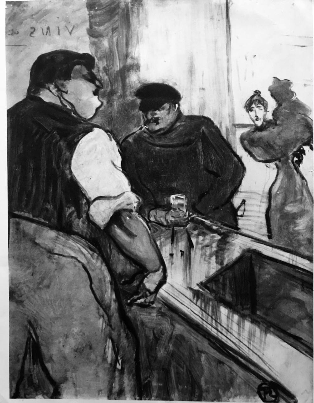
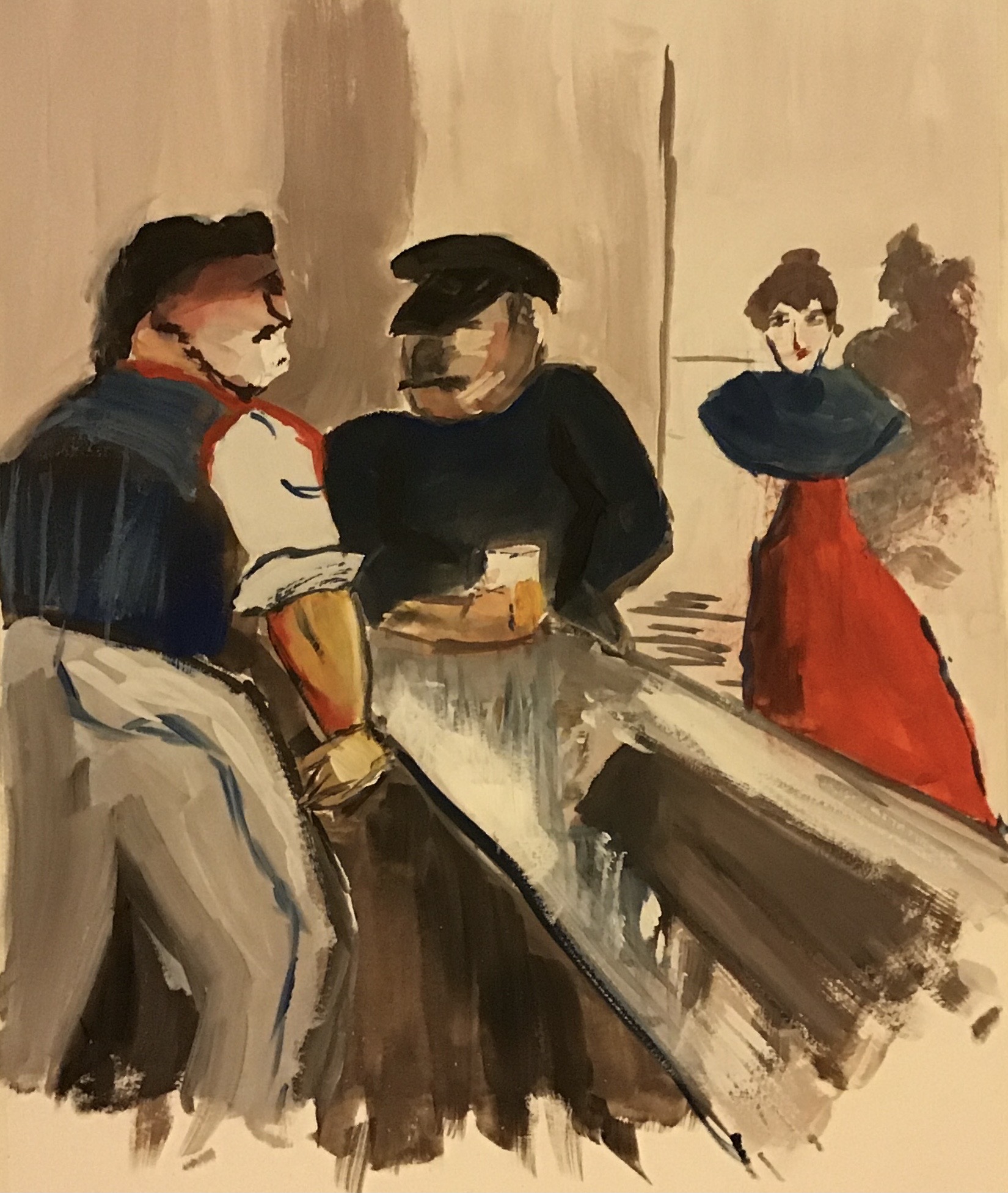
This was working from a black/white image of a Lautrec bar scene, and we tackled it in gouache using the greys mixed from orange and blue (plus black and white) with highlights of the two main colours.
Here is my version:
Second exercise:
This time we worked from a real image of a vase of daffodils, and two smaller vases, placed on a windowsill looking out onto the beach.
We made a quick drawing first, and the image was then removed from our screens and we were encouraged to paint from our sketch – Jill suggested that we thought about the colours we would use as we sketched, so we were ready to start.
We painted in oils using the complementary pairing of yellow and violet (plus some white). We worked on thick watercolour paper pre-prepared with a thin gesso ground with just a little lemon yellow. Jill said that she prefers to use big brushes, leading to gestural marks which show “a passage through time”.
Here is my piece:
NOW WHAT?
Some key things I have learned:
Think colour possibilities while you’re drawing – have the question of colour choice right there at the front of your mind – how will the colours work together?
I’ve a better idea about tone and how to vary it using colour
Think how to create a sense of depth using colour
I’ve learned a lot about working into the surface of a painting using paper, rag, palette knife, to break up the surface and add interest
Let go of your initial work, be prepared to change bits of a painting
Look more into Winifred N’s work as research for Part 4
I was really glad that my tutor saw an improvement in my life and portrait drawing
I feel I fell into a “line of enquiry” early on in the section which led to a particular set of outcomes; I am pleased with these outcomes, which filled the brief in an interesting way, but I think that, by pursuing this line, I missed out on an alternative set of monoprinting experiences. I found all the resources which my tutor supplied with my feedback both interesting and informative. As a result I have bought some more simple equipment as suggested and have been playing around some more with printing; I have made some lino prints and experimented, using acrylics, with ghost printing and adding more liquid and paint…
…and I have made loose abstract monoprints with the remnants of my rolled-out plate which I have then used as a ground for life drawing:
My tutor suggests that I could have made greater investment in colour. I felt anyway that my colour knowledge is not a strength, and have enrolled on a short course on colour with the St. Ives School of Painting, led by Jill Eisele (see separate blog post on “Hearts and Minds”).
NOW WHAT?
I feel I want to continue to explore printing, and as a result of my tutor’s interesting comment about taking it back into painting, I should like to try to do exactly that and incorporate some printing into my tondo paintings.
I need to practise using what I am learning in the ‘Hearts and Minds” course about colour.
I need to look ahead to Part 5 and firm up on my essay ideas.
I think of Johannes Vermeer when I think of interiors, having seen his “The Milkmaid”, c 1657-8, oil on canvas, at the Rijksmuseum in Amsterdam a couple of years ago. I consulted a book by Axel Ruger, (2001), Vermeer and Painting in Delft, National Gallery Company, London, looking in particular at the way Vermeer and the other artists discussed therein show the way light enters an interior space. The image which most struck me was a detail from Pieter de Hooch’s “A Mother and Child with Its Head in Her Lap (Maternal Duty)”, c. 1658-60, oil on canvas, also at the Rijksmuseum.
SO WHAT?
I decided to apply my method of abstracting (see separate blog post of “Ways of Abstracting”) to this section of painting.
I started my colour studies in gouache, using titanium white, natural grey, cadmium yellow and burnt sienna.
I then used pencil, charcoal and hand made natural red dye (applied with the wrong end of a paintbrush) to make my drawn studies.
Next, no longer referring to the original image, I made my set of 5-line drawings from the drawn studies and matched these with the painted studies.
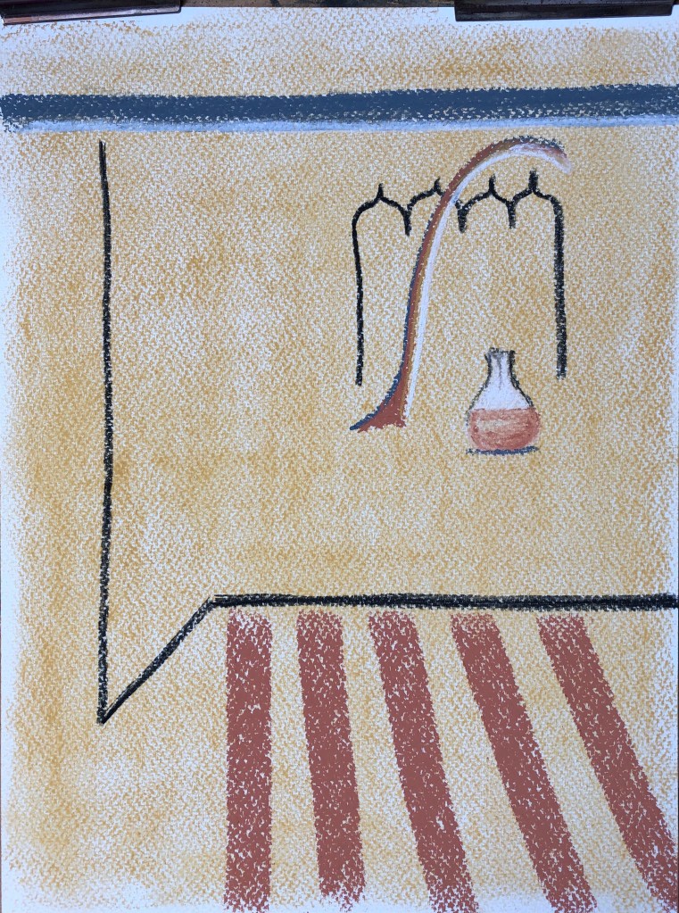
Something about the grainy nature of the original image (or at least, my reproduction of it) made me move to soft pastels for the final abstractions, and I tried to choose the same four colours as I had for the gouache studies. I made all the final abstractions on NOT watercolour paper.
The first picked up on the contrast between curves and straight lines and also various little motifs of pairs of people which had caught my eye on the wallpaper of the original.
I liked the textured effect of the pastel on the paper, but the overall image seemed “bitty” to me and I felt I hadn’t made the most of the pastel medium.
My next effort focused on the quadrilateral shapes in pastel, contrasted with the curved shapes in ink. I used a mixture of “raw” pastel and blended pastel. I think this is a stronger composition as the eye is led around the painting by the angled lines, with the three curved shapes providing interest along the way.
For my third abstraction, I covered the whole page with the yellow pastel first, rubbing it hard into the paper with the heel of my hand to make a base ground. I have placed the strong straight lines around the edges, and have an off-centre group of curved shapes in the space left. There still seemed a lot of space available to play with but I decided to leave it at that – I think that dark charcoal line is enough in itself to dominate, and I don’t think it leads the eye out of the picture on the right because the angled sienna lines underneath pull it back in.
For the fourth abstraction I covered the page first with rubbed-in burnt sienna pastel, leaving a white square of blank paper for the light from the window. This is then a picture of quadrilaterals (with one hexagon, the section of light on the floor). I think the eye goes straight to the area of greatest contrast (the dark doorpost against the light of the window) and can then travel around the picture in a figure of eight, always being sent back to the window by the angled floorboards. I think this is my favourite – they all refer back to the original to some extent, but this one does so most closely.
NOW WHAT?
This method of abstraction is quite formulaic – obviously it is aimed at those who haven’t tried much abstract work before; however, I feel I progressed as I moved through my series of paintings, so I think it is working.
I enjoyed working in pastels, not something I’ve done a lot of, and made quite a mess with them – you can make some lovely strong marks, and they do bring a vibrancy to what was actually quite a dark and gloomy interior.
This was a one-hour webinar presentation and demonstration.
Liz had her own “abstractometer” which is a continuum all the way from ultra-realism to complete abstraction.
She talked first through ideas worked out with other students over the years about abstraction and what it was, and illustrated each idea with a range of artists’ works. Abstraction involves:
freedom of colour and shape
Taken from nature
Deconstructing
She then went on to demonstrate a task which she suggested we try at home, which had several steps, but would enable us to begin abstracting a famous painting.
SO WHAT?
Knowing absolutely nothing about abstraction, I was very keen to seek enlightenment via the task, and I followed her steps to the letter:
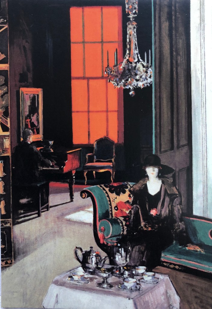
Select an image which you like, with some fairly distinctive bright colours. I chose a painting which I had seen at the Kelvingrove Museum in Glasgow a couple of years ago in an exhibition of Scottish colourists:
FCB Cadell
“The Orange Blind”
c.1928
Oil on canvas
Glasgow Museums Collection
You can have four colours – two should be white and Payne’s grey, and the other two are your choice – I used gouache, and had titanium white, natural grey (didn’t have Payne’s), flame orange and viridian.
Make four painted coloured studies of all/any part of the painting, noting which parts attract you – colour/shape/texture? I found myself most drawn to the figure on the chaise, especially the hat, the blind, the chandelier and the painting on the wall on the left. Here are my four quick studies:
Next make at least four drawing studies, one each in pencil, charcoal and ink, and one in all three.
Next, put the original image and the painted studies away, and make a 5-line drawing (ie. literally a drawing of five lines) from each of the drawn studies:
This makes you really look at the drawn studies and pick out the most important bits to you. Lay out your five-line drawings and your painted studies, and try to pair them up as seems best to you. Then, for each pair, combine them to make a final painted/drawn image – these are your abstracted images.
NOW WHAT?
I feel that I have had a bit of a eureka moment and have begun to have some small understanding of what abstraction can be
It has been revealing to see what aspects of a painting attract me – seems it is shape and colour
I feel the final pieces all refer clearly back to the original (least being the second, which is missing the hat & negative space head, along with the scroll of the chaise)
It’s a long process, but I can see that each step plays a different part. I should like to try it again – I think it might make for an interesting take on a tondo of a domestic interior!
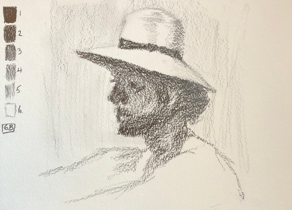
This was a two-hour session with a live model. Alice recommended trying to see Seurat’s small drawings in the National Gallery. We had four poses based on the Bathers in Asniere, 1884, oil on canvas, National Gallery.
SO WHAT?
We worked to three rules for this session:
Make a tonal range every time – should always start a drawing with this – use the colour of the paper as one of the tones
We used graphite sticks, 4B and 6B, on their sides to make blocks of tone
Using textured paper (we used NOT watercolour paper) – gives that slightly dotty effect, and also seems to hold onto the graphite better, so it is less likely to slide and smudge.
Here are my outcomes:
NOW WHAT?
Alice drew alongside us and was very good at talking through all her choices and decisions. I am going to try and take away some of her choices and try them out more:
Start with the thing that most interests you in the whole scene
Get the darkest thing in early
Getting things wrong and having to go in hard with the putty rubber and move elements around is OK
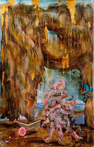
WHAT?I looked at his work as suggested by the course materials, particularly studying his web information on www.axisweb.org, where he has an informative page about his art. His Artist Statement explains his method, which very much links his work as an Art Psychotherapist with his interest in classical art and stories – here is a recent example from the website, entitled “Prophet in the Wilderness (St. John)”, acrylic and oil on canvas, 150x90cm:
That swirling, multicoloured mark-making reminded me of the work of two artists I had looked at earlier in the course, Mimei Thompson and Yuko Nasu.
I was particularly interested in his current method of working as described in his Artist Statement:
“Paint is now poured and manipulated to create areas of thick and crusted surfaces, that are allowed to wrinkle and pock mark as the various mediums used dry out. Once this process has reached a certain point, the image is again finely adjusted to create areas of shadow and recession, to a point where a form may begin to emerge, but hopefully not too much. The pause button is then pressed, to hopefully allow something to sit forever on the cusp of becoming – neither an abstract blob of raw sienna nor the fold of flesh in a stomach, but both, and neither.”
SO WHAT?
By the nature of his interests, Iain’s paintings generally involve figures telling part of a story. However, I wondered if I could adapt his method to domestic interiors.
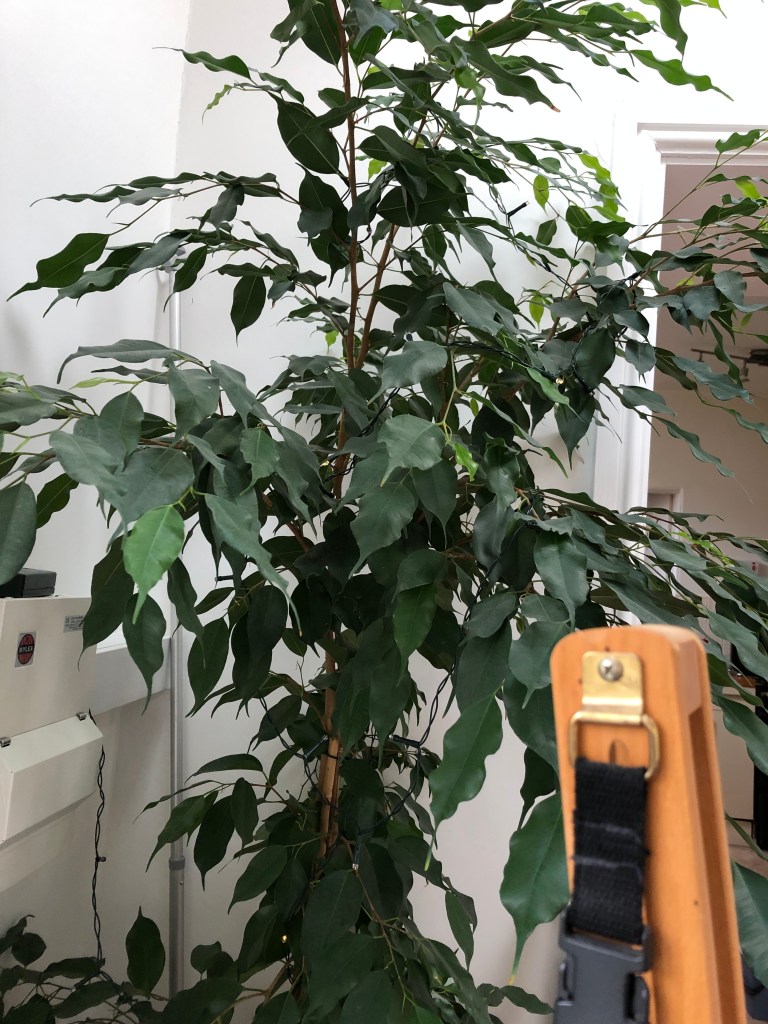
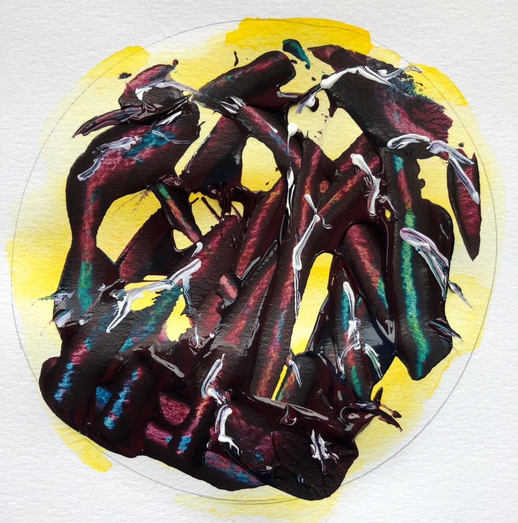
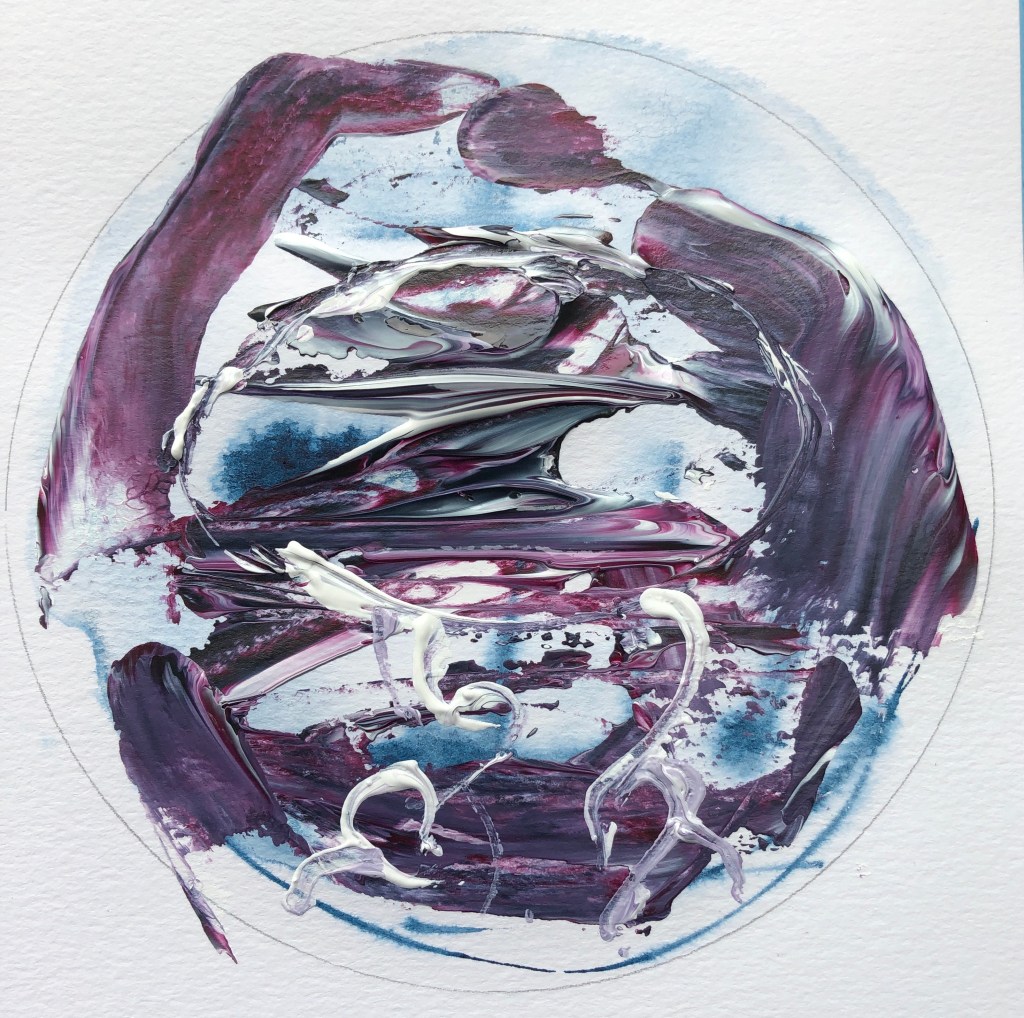
On an A3 sheet of multi-media paper I drew out some circles to get me in the tondo mindset; I flooded each with water, squiggled some streaks and blobs of acrylic ink in each (variously, brilliant yellow, sepia and indigo) and left them to dry, so that I would not have blank white circles to work into. I decided to work in acrylics, as Iain often does, and chose Liquitex soft acrylics, in particular their “muted” range – this paint is fairly liquid so wouldn’t need diluting, and comes in squirty bottles which would allow me to replicate Iain’s method of pouring paint on to start with. I squirted dollops of paint into each circle in different colour combinations and dragged them around in various random patterns using an ordinary table knife, sometimes using the flat of the knife and sometimes the edge. Then I left them to settle and partially dry while I looked at them for inspiration.
Iain says he looks at his paintings at this point hoping that a figure or story will emerge; I looked around my garden room, where I was working, to see if anything leapt out at me and, when it did, I worked into the semi-wet paint with either my table knife or a cocktail stick, moving paint around, removing it, or adding extra bits just to try and give a hint of some aspect of my interior. Results were interesting…..
…my old red chair…
…the mystery plant growing in the corner…
….the window frame…
…the tiled floor…
…….my lemon seedling (grown from a pip; lockdown makes you do strange things)..
…and, finally, the garden table.
My husband remarked upon my wonderful imagination, which I’m guessing means that he can’t see the objects in the paintings, so maybe I have taken Iain’s words about something being “on the cusp of being” slightly too much to heart.
NOW WHAT?
I was surprised by how much I enjoyed doing this, it was rather like a “spot the pattern” puzzle, matching up my initial random swirls and blobs with the reality around me
I think Iain was much cannier that I – he looks to be working a properly prepared background landscape so has chosen his swirly paint colours for his foreground with much more care, meaning that he has less head-scratching to do in a short time (acrylics drying as fast as they do) to decide what he was going to work into and how the image might develop
Is this a good method for tondos? – I think it is – I nearly always ended up with a big swirl somewhere round the edge (which was basically trying to get the accumulated paint off the knife at the end), but that turned out to be OK (except for the first painting, where it’s too obvious) as the bulk of the marks were curves anyway
Before I even embarked on the painting, I thought this would be a method of working which I would try and then write off – but I can see possibilities (especially in the “window frame” picture) so will keep it in the toolbox for later.
Historically, this seems to be a format which has been traditionally applied to landscapes, classical and religious scenes and portraiture.
A couple of my favourites which are a little different but seem well suited, almost enclosed and held, enfolded, by the tondo format are:
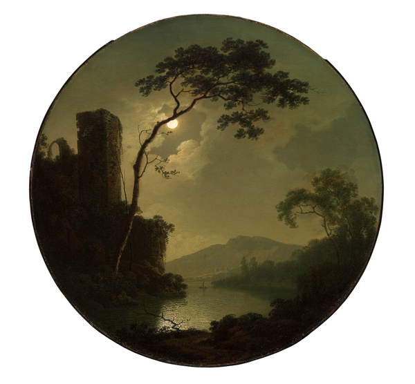
Wright of Derby, Joseph
“Lake with Castle on a Hill”
1781
Oil on canvas
Saint Louis Art Museum, Missouri, USA
Brueghel, Pieter the Younger
“If the Blind Lead the Blind, Both shall Fall into the Ditch”
c. 1594
Oil on panel
Koninklijk Museum voor Schone Kunsten, Antwerp, Belgium
Some contemporary artists have also embraced the form as offering possibilities for something with dynamic composition, for example:
Bolotowsky, Ilya
“Yellow Tondo, Variation 1”
1968
Acrylic on wood
Mead Art Museum, Amherst College, MA, USA
I started to focus my search on tondos of interior scenes; these were harder to spot but were there, for example:
Herring Snr, John Frederick
“Nanny”
1848
Oil on canvas
Blackburn Museum and Art Gallery, UK
Everything here is slightly off-centre; I thought the steps might lead your eye out of the picture, but actually they just take you round in a clockwise direction, checking off the various elements which surround the nanny.
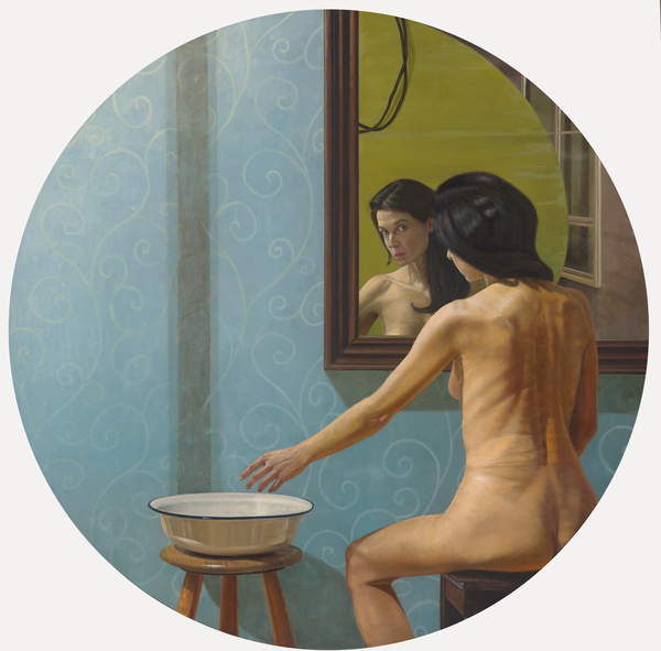
Kalaizis, Aris
‘Psemata I”
2006
Oil on wood
Bridgeman Images
This again had quite a rotating composition – start at the lady’s shoulder, down either her back/leg or her arm to the bowl, up the dark line to the mirror and reflection, and so on.
Alice Mumford of St Ives School of Painting has done a couple of webinars recently on composition (see separate blog posts) and she featured Giorgio Morandi in one, so I was interested to find this work of his in tondo format:
“Still Life”
1952
Oil on canvas
Bridgeman Images
I find this a slightly odd image; the surface on which the pots sit has no visible means of
support that we can see, and the jar at the front right-hand end is right on the edge, presumably by design, and I can’t help feeling anxious that the whole lot is going to come crashing down when knocked by a clumsy passer-by (such as myself). Hmmm…
SO WHAT?
I decided to take the Morandi tondo as a basis, intending to:
Get back into painting after all that printing in Part 3
Experience painting in a circular format
Try to understand this composition a bit better
Working in an A3 pad of mixed media paper, which has a surface somewhat like a NOT watercolour paper, I drew some circles on a page. Next came a small pencil drawing to get a feeling for the placement of the objects in space. Morandi did in fact make this an easy image to replicate – the horizontal diameter pretty well lines up with the horizon (in this case, the back of the surface) and the vertical diameter goes through the blue vase – making this a really easy place to start each time. He has also lined up the left-hand sides of the left-hand pot and jar, so that was very easy too.
I marked in the dark tones and then started off with egg tempera, using titanium white, Naples yellow, Van Dyck brown and ultramarine blue, working with sable brushes, mid- and fine. I had been suffering a bit with my back so had set up my working position seated, with the pad facing me almost vertical on an easel, and worked with my left hand; a little while since I’d done that, so the control took time to come back – but it allowed looser strokes than I might have been tempted to start with otherwise. I worked from my sketch and a photo of Morandi’s painting.
It was a little clunky and more coloured than Morandi’s very chalky pastel colours, but I was glad to get back into the swing.
Next, I had a go at using enamel paints. I painted standing with the pad lying flat on a dresser. I used quite a bit of Zest-it solvent where I wanted the paint fairly thin. I tried first wetting the paper where I was working and then adding the paint; this didn’t go so well because the absorbency of the paper “caught” at the paint, even though soaked in solvent, and it was hard to move around. I then tried wetting the brush with solvent and picking up a bit of paint to apply, and this worked much better.
The colours are difficult to identify because they’re not named on most of the tins I had – but it was a light and dark blue, an ochre-y and a sienna-y brown, and gloss white. I worked from my sketch and my egg tempera painting, not looking at Morandi’s original.
Next I turned to inks, which I haven’t used for ages. I had three acrylic inks – indigo, sepia and brilliant yellow – and some burnt sienna Indian ink, again working with thin and mid sable brushes.
Again, I worked from my sketch and my two previous paintings without referring to Morandi’s original. It’s interesting that the style seems to have become less like Morandi and more like Cezanne as I’ve gone along!
NOW WHAT?
The “Chinese whispers” effect (working from the previous painting and not the original) has been interesting to look back on, as I wasn’t aware of it as I was painting – I have gradually lost the wonky profile of the top three vases, which I think gave Morandi’s original some of its dynamic tension; on the other hand, I have moved to a fairly dominant blue/orange colour scheme which I personally like.
I enjoyed the experience of painting into circles; the shape automatically brings a feeling of movement with it, and solves the question of what to put in the corners. Possibly the challenge is then to compose your painting in a way that utilises this property, rather than putting a brake on it.
This was a one-hour webinar, a continuation of last week’s session on composition. Alice said that, if you thought about trump cards in a card game, they outshine everything else in the game, and that artists have techniques which they use in a similar way to make you look at what they actually want you to see.
SO WHAT?
Lighting: as an example she discussed Rembrandt’s “The Night Watch”, 1642, Rijksmuseum (which I am lucky enough to have seen, amazing). Apparently Rembrandt was commissioned to paint this group of people so he set them as a scene like this; the most important chap is front central, and your eye goes to him first because it looks for the point of highest contrast, which is his white ruff against the black clothing, and the eye is then led around the painting in order of decreasing contrast.
Line: here we looked at Tintoretto’s “The Miracle of the Slave”, 1548, and traced our way around the painting in a rough figure of eight, starting with St. Mark coming straight down in the centre and a line leading more or less directly down to the other key figure in this busy painting, the slave lying on the ground.
As a combination of lighting and line we looked at Caravaggio’s “The Calling of St. Matthew”, 1599-1600 which, as you would expect, has some dramatic shafts of light against a chiaroscuro background causing some strong contrasts which help the eye move around. Also it is not immediately apparent which character is St. Matthew – until Alice pointed out a set of hands, virtually in a line, all pointing to the end figure!
Hats and eyes: here we looked at a couple of paintings by Renoir, “Luncheon of the Boating Party”, 1882 and “Dance at Moulin de la Galette”, 1876. The “entry” point into both of these appears to be a character, or pair of characters, who are mid-ground and slightly in their own space, looking out towards the foreground, almost out of the painting. The way round the painting is then to follow their eyes, see whom they are looking at, where they are looking, and so on. One is also led to follow sets of matching hats around the picture; in the first of the above they all seem to be a matching bright yellowy/orange with blue ribbons which stand out and are really distinctive. In the second there is also the use of pairs following the colour pink (as discussed in the previous session).
The Golden Section: I hadn’t got to grips with this before and it might take a bit of practice!! To find the spot, fold one corner of a rectangle up to the edge and draw a line down to show the square; then fold the opposite top coroner down to the line to make another square – this leaves a rectangle. The two squares are static and the rectangle dynamic (see last session) and the point where they meet is the golden section, and this is where you want to place your key thing which leads the viewer in. Alice discussed this looking at David Hockney’s “Mr and Mrs Clark and Percy”, 1970-1, and Matisse’s “The Conversation”, 1908-12. Also, most of Ben Nicholson’s works use the golden section.
High Contrast: as well as being drawn to the point of highest contrast between light and dark, the eye will be attracted to contrasts in colour, which she illustrated by comparing and contrasting Ben Nicholson’s 1924 picture “First Abstract Painting, Chelsea”, c 1923-4, with Matisse’s “The Snail”, 1953.
NOW WHAT?
A lot to take in – was pleased I had remembered some of the points from last week (e.g. pairs) and could “see” them as Alice talked about them.
My takeaways from this session are going to be:
Think about that “high contrast of light and dark” point when I am building a composition of interiors in Part 4
Look at some paintings and try to spot the golden section.