

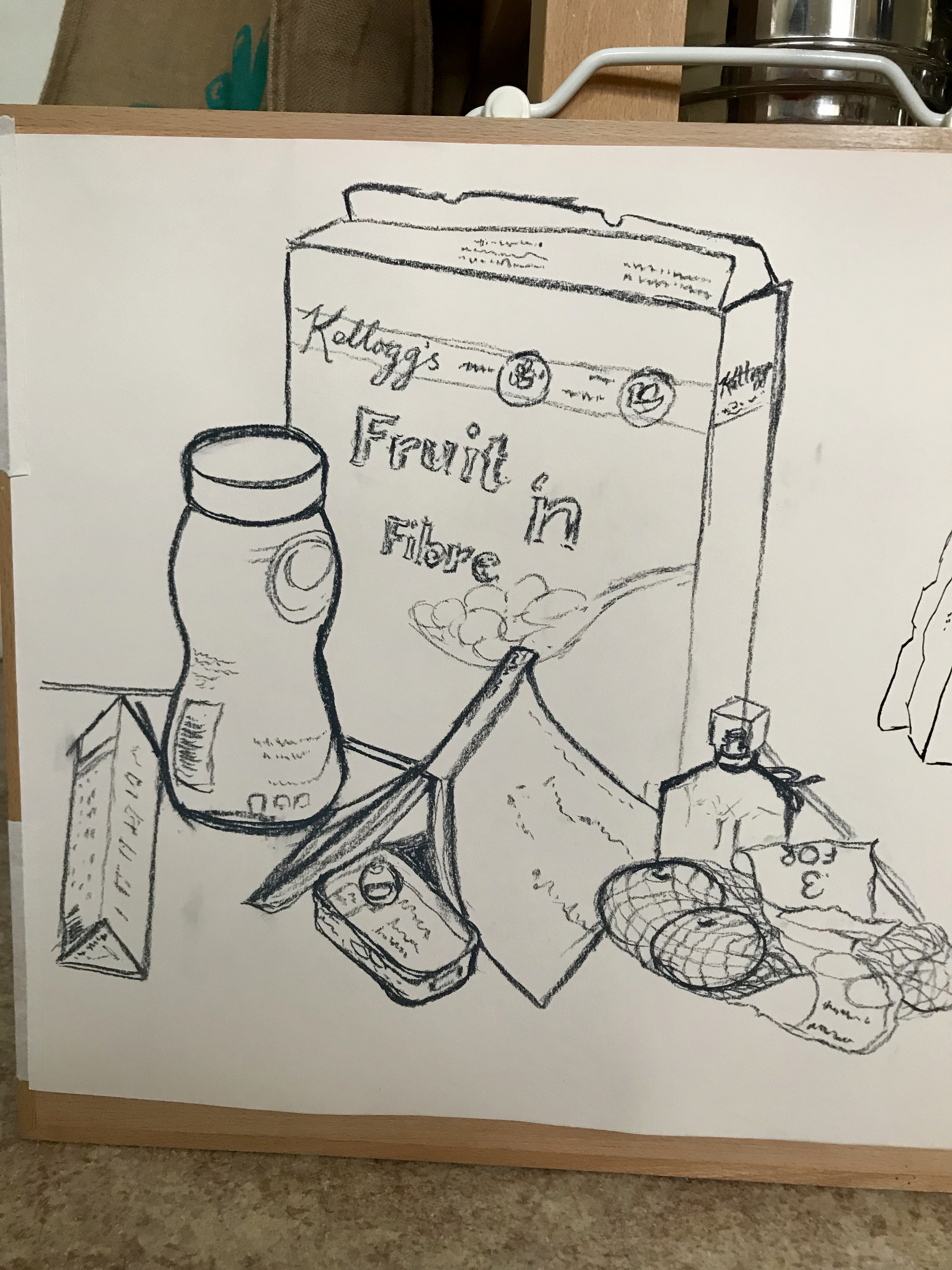
My initial approach to this was on A2 off-white paper using a Conte crayon. The paper felt big to me but I tried to use bold clear lines, without removing errors but just drawing over them. It was very tempting to do a quick light outline first in pencil to be “safe’, but I resisted it; I wanted to try to be bold and just go for it. These crayons are lovely to draw with, gliding across the page and allowing thick and thinner lines and grades of dark depending on the pressure you use, and I was soon immersed in the exercise. I tried to work top-left to bottom right to minimise smudging. I became aware part-way through the exercise, however, that the junctions between one item and the other were not falling in quite the right place; I tried to rectify this as I went along, but it has left one or two of the items looking a little misshapen.
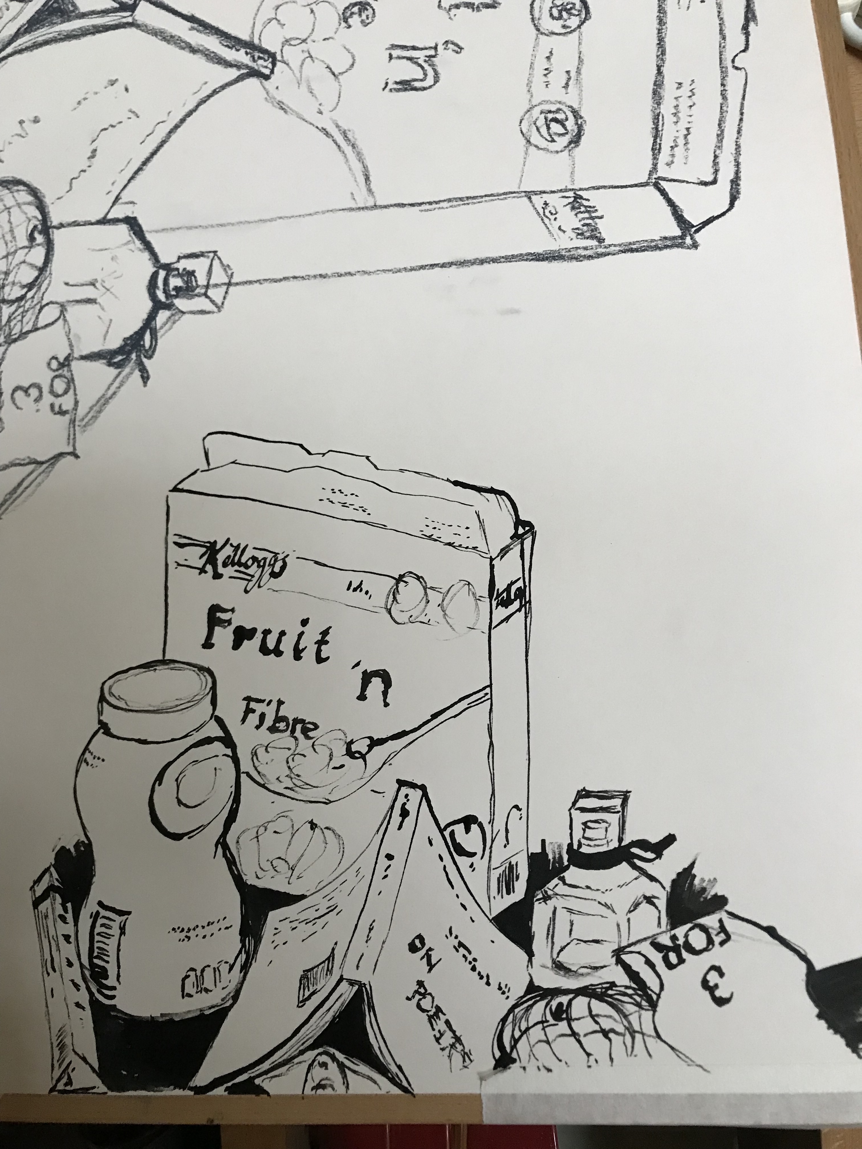
I decided to have another go with the same layout (the angle was fractionally different due to my change of position) using the medium I had most enjoyed in the previous exercise, namely a stick and ink; this time, however, my stick was the bevelled end of a pencil, which allowed for both broad and very fine lines, whilst still retaining the randomness of the strength of line depending on when the ink ran out. I felt a bit more confident with this. I also tried to look more carefully at the negative shapes around and between objects, which helped me to be a little more accurate. When I’d finished I filled in the negative shapes with ink so I could see them clearly and compared them with the real thing – not perfect, but much closer to it; even though I misjudged the space a little and went off the edge, I was more pleased with this latter effort.
I have been reflecting on the drawing styles I have admired so far in my research, and find that they are actually very contradictory – the smooth, clear, minimalist lines of Nuno DaCosta (see Proj 1 Ex 1)versus the busy, scrappy lines of Susan Kemenyffy (see notes on Downs et al – Drawing Now).Signs of schizophrenia? I decided to experiment a bit more, so I tried this exercise again with each style.
First, I had a go at the Da Costa style using charcoal so that I could get the dark/light contrast:
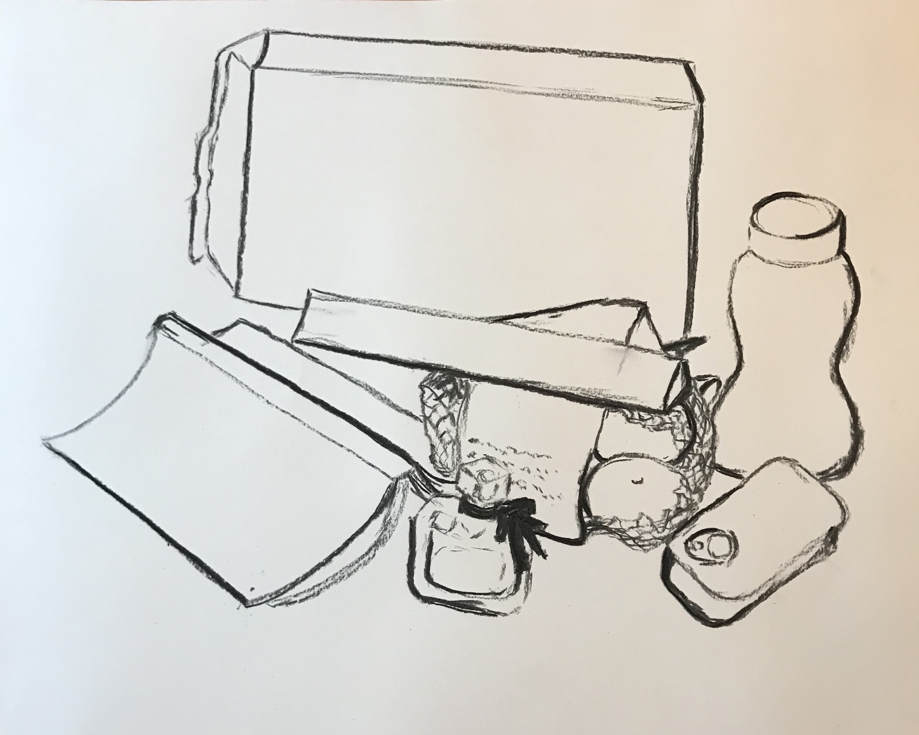
Deciding which should be light and which dark was made trickier by the fact that I had rather perversely set my still life up under an electric light but also in front of a window – note to self to think better about light sources when setting up next time. I was reasonably pleased with the effect (although less so with the shape of the sardine tin!), but think that it would have been even better using my ink-and-stick to get really sharp lines.
Next I tried the Kemenyffy style using a dip pen and ink:
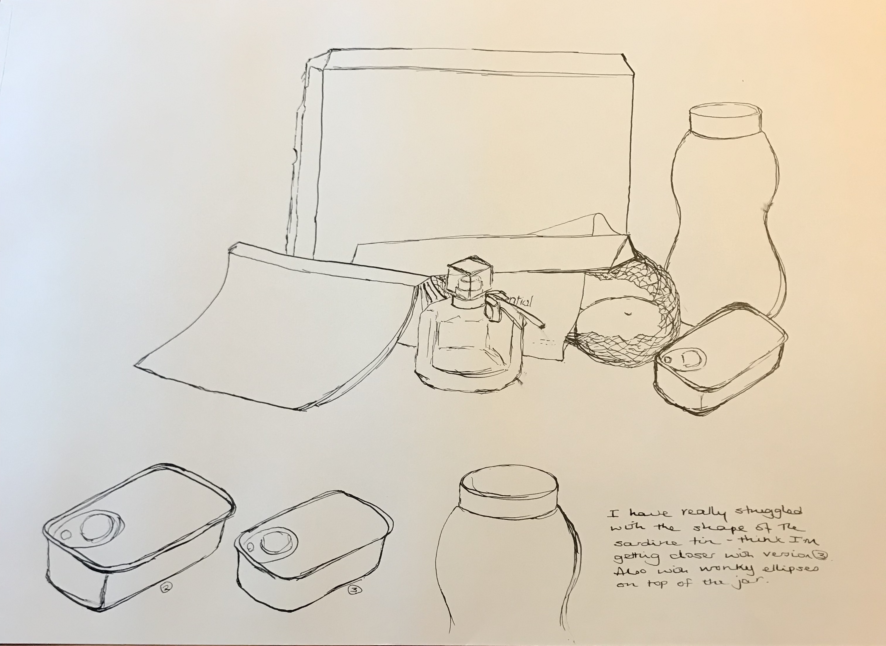
The drawing was ok except for the blessed sardine tin, although I haven’t achieved the busy effect that she does, I don’t think – but part of her effect comes from the hatching and shading, which I haven’t tried yet, so will continue to experiment. I feel that, drawing large like this, the scrappy style is more my thing at the moment, but this could just be because I haven’t done much drawing large with solid lines, and practice might improve and change this opinion.
Looking back over all four drawings, I think the one that actually has the most energy and “zing” is the second ink-and-stick one, even though not quite the most accurate. It seems odd that the medium I first thought of as a bit of a laugh has turned out to be the one I enjoy the most! I do however see in this medium a way of uniting the two styles (Da Costa and Kemenyffy), partly because of its unpredictability, which almost enforces a mixture of clear bold lines and broken lines within the same drawing.
