

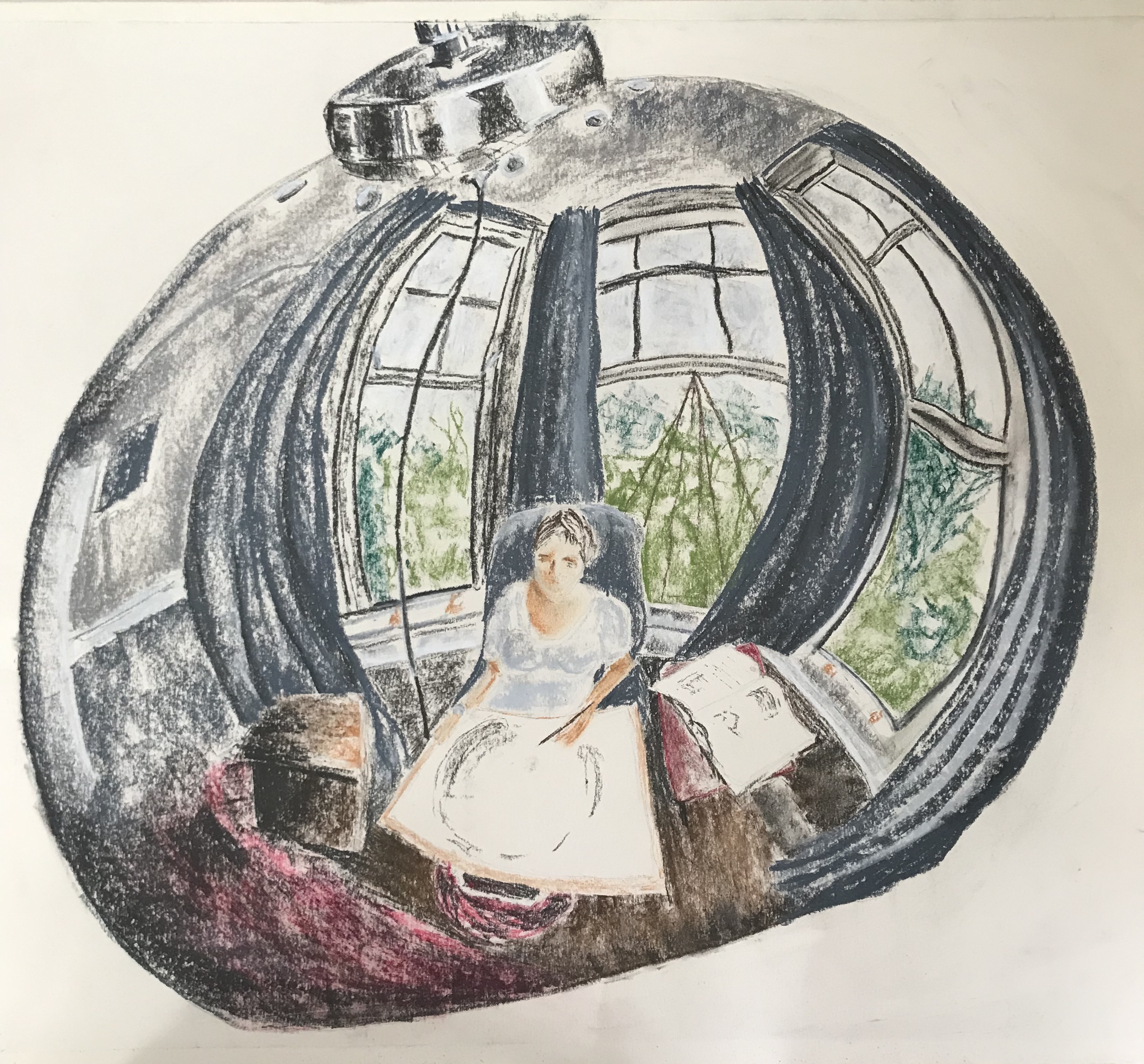
I agonised for a while over the choice of material for this picture. Had the format been smaller (A4 or less) I think I would have gone for something I felt confident with, such as ink with a light wash. However, I had been asked to work on a large scale and, on looking carefully at my subject, the reflections in the curved metal were very slightly “fuzzy” and not always true, i.e. small dents in the metal caused various distortions and wobbly lines. I decided to go for Conte crayons, as they would give the varied and “un-crisp” lines I was after. I had originally intended to work just with the greyscale crayons and add a tiny bit of watercolour or ink wash for the blues, reds and greens; however, when I got to that stage, it felt more appropriate to stay with the crayons…so, another change of mind!
I have to say, I am really pleased with the outcome, it is better than I had hoped for or envisaged. There are of course lots of niggles – e.g. the lamp is not quite symmetrical despite my best efforts (I drew it in 2H pencil and rubbed it out about 15 times!!) – but I think the overall effect is striking and I hope it draws the viewer in to try and identify details.
I was concerned that I had chickened out a bit of tackling my bete noir, perspective, but this image had other challenges thrown up by the convex surface, mainly because nothing was quite where you thought it would be. In several places, I found that the curvature really exaggerated the perspective, thus helping me out. A real learning curve! Terrible pun, apologies.
