
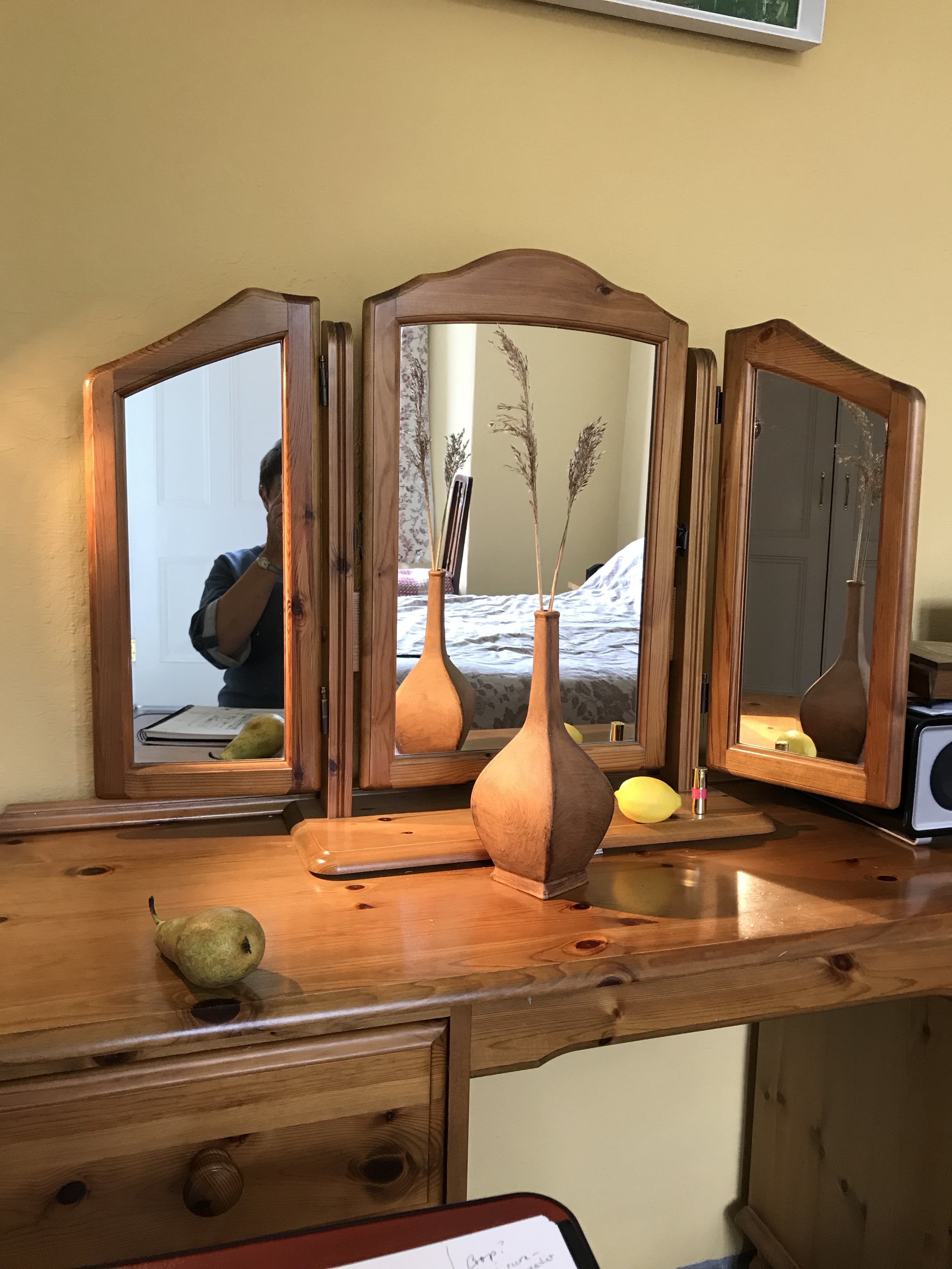
The subject of my drawing is a triptych-type mirror which sits on the dressing table in our bedroom, including the reflections in the three separate mirrors (all of which are facing in different directions) and a simple still life composition placed on the dressing table in front of it – see photo below.
My influences in setting up this particular still life/interior were many, and I can’t in all honesty say they were necessarily in the forefront of my mind as I put it together; images and ideas I have liked as I have worked through this section have obviously seeped into the subconscious, and it was only when it was set up that I have put everything together and thought, “Well…this is like that, and that reminds me of this…”. Not sure if that’s the way it’s meant to be, but there we are. Looking at the piece, I see bits of:
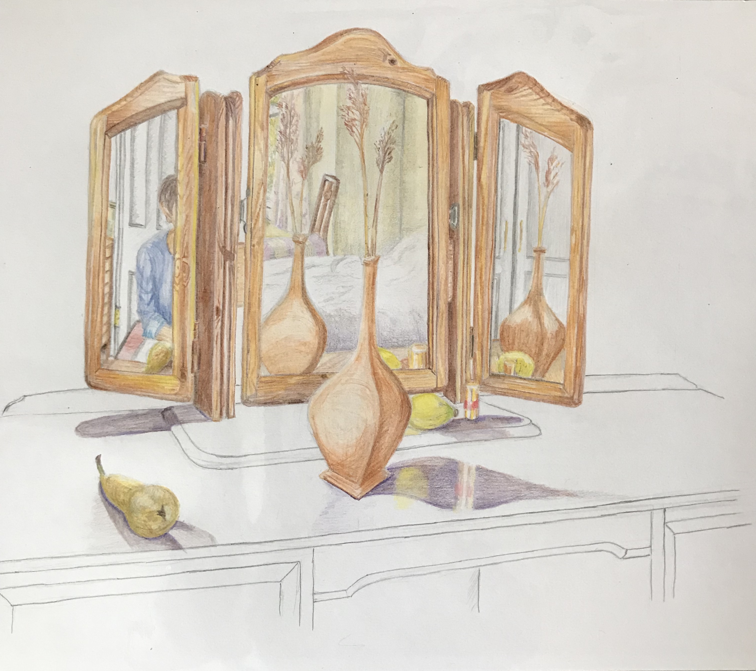
- Bonnard’s way of including a figure or part of a figure in a half-glimpsed way, so they are not the main focus of the picture but rather the viewer comes across them almost serendipitously (see A3 sketchbook) – this WAS an intentional feature of the set-up
- I liked the combination of plain drawn areas with coloured areas in Gary Hume’s “Flowered Hat” (see blog post on Positive and Negative spaces), and have tried it out here; this idea emerged part-way through
- I have been drawn to views looking through windows and doors (see A3 Sketchbook and Project 4 research blog post), so again this was an intentional part of the composition; also the use of devices for the showing of a wide range of the interior space as in the Anthony Green image in the text and the David Hockney Large Interior (see blog post on History of still life genre); also again the idea of representing an object from a variety of viewpoints (see research on the History of still life blog post, esp. Picasso and Braque)
- I really enjoyed doing my Project 4 Exercise 3 drawing of the reflection in the lamp
My reasoning for and construction of the exact composition is as follows:
- The basic idea came when I noticed repeated reflections in the dressing room mirror as I was passing. The motif of repeated images was talked about in the course notes as a way of drawing the viewer’s attention but is not something that I have consciously used much thus far, so this seemed like an opportunity to try and build it in – hence the vase, lemon and lipstick all appear at least in part 3 times
- By changing the angles of the side mirrors I found I could see through 2 doors (one out into the passageway and one into the bathroom) and a window
- I wanted to keep the still life aspect fairly simple (just the vase, the lemon, the pear and the lipstick) and try to do it well. The pear was included as I really like drawing the shape of pears; the lemon to give a bit of a colour lift, as the dominant colour is terracotta/wood; the lipstick because someone from an art group told me that paintings should always include a little patch of red to draw the eye; and the vase because I recently bought it in an antique shop and was keen to use it in a picture
- I wore a blue top for the self-portrait element to complement the orangey wood
- I drew the image over several days; the light was coming from the windows behind me, but the days were overcast and I wanted some clear shadows, so I set up a spot-lamp looking down diagonally from behind the top left corner
How have I done against the criteria for the work?
- The use of colour in drawing:I feel I have done fairly well in replicating the colours of the objects in the composition, often by blending and overlaying the coloured pencils. The use of the complementary blue has, I hope, lifted what is quite an orange/yellow/brown mode. The thing I really found difficult was replicating the gold of the lipstick, and I don’t think this has been as well done as I would have liked.
- The most appropriate medium for the subject: my original intention was to use line and wash on A3 cartridge paper as the composition has a lot of straight lines which I thought would be tricky in pastel or charcoal and could become confused/confusing; however, when it came to it, I decided that lots and lots of ink lines would not give the right feel, so decided to go for coloured pencil. I’m pleased with the overall choice of the pencils, but I did find that progress was very slow as I havered over exactly the right choice of pencil for each little section of wood.
- Composition and context: I wanted the foci of the picture to be the still life elements with the sections of interior, so didn’t try cropping the image any further, and kept everything else very simple. If I‘m honest, I think that, in my desire to get the proportions correct, I have made the image too small – I envisioned it filling the page a bit more.
- Mark-making and contrasts of line and tone: my marks within thecoloured part of the image are quite uniform, with much blending and overlaying. The lines in the uncoloured part I have tried to keep continuous – my natural default drawing style is somewhat sketchy and scribbly, but I felt this would take focus away from the coloured section. I coloured the whole thing in and then revisited with tone in mind, just to darken the darks and lighten the lights. The idea of the “floating” shadows came to me part-way through (to be honest, the pear was looking a bit dodgy and I thought I should get that bit of the image finished before the pear went off, and then I rather liked the stand-alone shadow, which then was the inspiration for the rest of the uncoloured section).
- Accurate and expressive depiction of form: generally I am pleased with the accuracy of the image – there are a few bits not quite right, e.g. the top surface of the mid-section of the mirror which is misshapen – the side panels of the mirror were set at unfamiliar angles (one back and one forward) and the mid-section was tilted ever so slightly, which made several parts not quite as one would have expected. Is it expressive? – I think my rendition has been very controlled, which I felt necessary at the time of working due to the need to make the interior sections clear with the medium I had chosen, and this was hampered by the fact that the whole thing was a bit smaller than I had intended – so possibly not. A bit of a learning curve here – I was a bit pressed for time so I pushed on with what I had – possibly choosing to start again with a larger and free-er drawing in a different medium would have made for an equally, or more, expressive outcome.
- Experimentation with idea, material and method: I have covered some of this above. Despite the fact that I have nit-picked the faults in my work, I feel the concept of the drawing that I have come up with is unusual and has arisen out of my learning over this section of the course – it is certainly experimental for me, and is something I would not have dreamt of tackling beforehand.
