

Comparison between Tacita Dean and Georges Seurat
I found the suggested images online, and also looked at two useful books; one on Georges Seurat’s drawings (for text reference, see notes in A3 sketchbook), and one on the work of Tacita Dean – Harris, Hollinghurst & Smith, 2018, Tacita Dean, Landscape, Portrait, Still Life, Royal Academy of Arts, National Portrait Gallery and National Gallery.
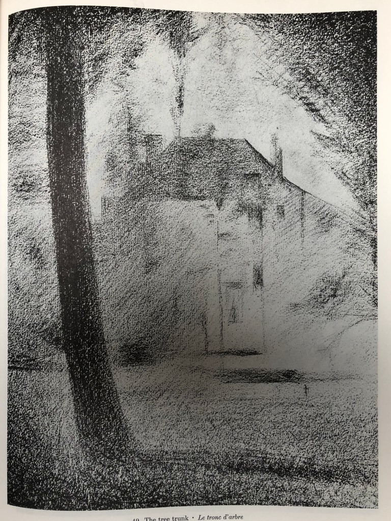
I tried to copy some images from these books in order to get a feel for their drawing styles and composition choices…see A3 sketchbook for exact details of the original drawings.

My quick attempt at The Montafon Letter (see sketchbook for details)……

…and Tacita Dean’s.
My quick sketches in the style of Georges Seurat………

…..and the originals (see sketchbook for details).

Seurat -v- Dean: Similarities…
- Their drawings are generally in black and white, often with strong contrasts
…and Differences
- Seurat started with a light background and drew onto it with charcoal; Dean uses a blackboard as a support and draws with chalk (sometimes using chalk spray which I hadn’t heard of), some gouache and charcoal pencil
- Having tried to draw in their style, Seurat’s drawings are quick, sketchy almost, very loose, suggesting their subject; Dean’s drawings are detailed and must surely take a great deal of time and care
- Seurat’s subject interest (from the set of over 150 drawings I looked at) seemed predominantly to be with people; for her drawings, Dean is very taken with natural objects (apparently she has an impressive collection of 4 and 5 leaf clovers) and phenomena – clouds, of course, and geological features (as seen in The Montafon Letter and Fatigues, the reference piece).
- Seurat’s compositions are of everyday scenes from the point of view of a passer-by; Dean’s drawings of mountains and clouds are set in lots of space, without a hint of the human race
****************
Comparison between Albrecht Durer and Ernesto Caivano
Despite my own (current) default style, best described as “sketchy”, I can draw with clear lines if I have to, and I always find myself personally drawn to clear, clean-lined drawings. I have chosen to compare two artists who draw in this style and whose work I greatly enjoy looking at, Durer and Caivano; in particular, Durer’s 1514 engraving, Melancolia I (see early research blog in this Part on landscape painters) and Caivano’s 2003 drawing The Land Inhibited, ink on paper, as seen in our recommended text – Dexter, 2005, Vitamin D, New Perspectives in Drawing, Phaidon Press Ltd.
Similarities…..
- Imaginary scenes
- Dramatic black/white drawings
- Meticulous and highly-detailed
….and differences
- Medium – Durer’s is an etching, whilst Caivano uses pen and ink
- Mark-making; Vitamin D describes Caivano’s as “a hyper-detailed accumulation of short, micro-thin lines”, whereas Durer’s etching shows a range of lines and dots
- Caivano produced blocks of flat uniform tone, whereas Durer’s tone is more “moulded”
******************
