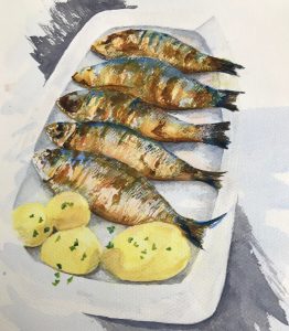
Graham Little’s portraits of striking women are frankly fabulous. Done in coloured pencil, they take – according to a Guardian review I read by Skye Sherwin (Nov 26th 2010) – many months to complete; remembering how stir-crazy I went trying to complete the first version of my Assignment 2 in coloured pencil, I think however that this method of drawing is not for me.
Elizabeth Peyton in some ways represents the opposite – her drawings and paintings appear much more rapidly rendered, using big watercolour strokes or strong and definite pencil/charcoal/crayon strokes. I found a book in the library about an exhibition of her work in New York’s New Museum entitled “Live Forever – Elizabeth Peyton” (pub Phaidon), and had a go at trying to draw in her style:

The charcoal drawing, using strong strokes, felt comfortable to me; the use of big brushstrokes in the copy of the Hockney portrait was less so, partly because it’s not how I’ve previously worked with a brush, and also because I haven’t done much brush work since breaking my shoulder as a brush feels more difficult to control with my left hand.
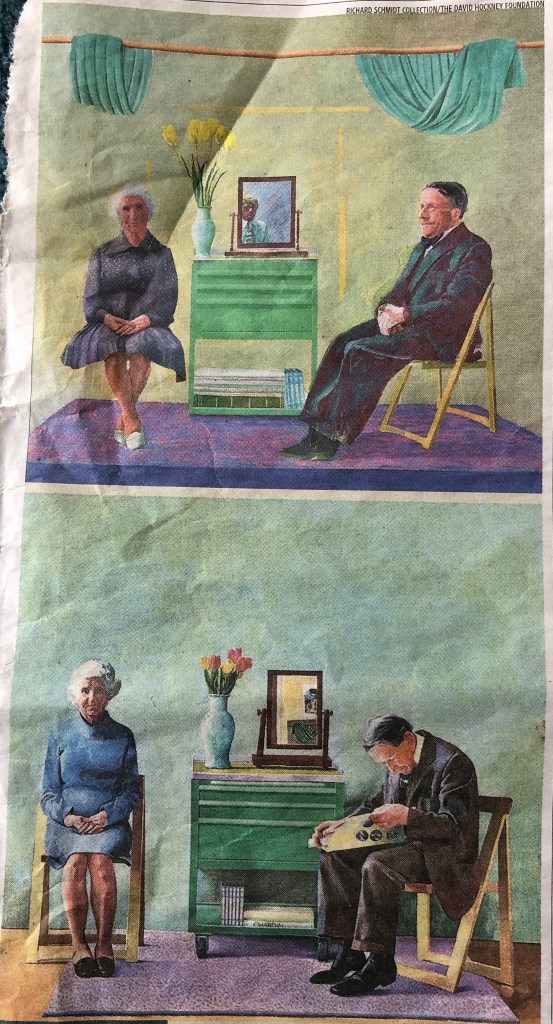
David Hockney’s upcoming exhibition at the National Portrait Gallery, “Drawing from Life” was favourably reviewed in the Daily Telegraph (26th Feb 2020 by Alastair Sooke), although at the end he remarks “Hockney is no Rembrandt, we realise, heroically grappling with old age. Unlike Lucian Freud, he can’t convey the coarse density of lived-in flesh. No, Hockney is – or rather was – all ethereal refinement and sunlight.” I have to agree with Alastair Sooke here – I find Hockney’s portraits quite flat, a little like Gaugin’s – I did see a retrospective of his work in the Pompidou Centre, Paris, a couple of years ago, and this was my abiding impression, which hasn’t changed. A friend gave me a cutting of a review in The Times (Feb 24 2020) which compared a previously unseen version of a portrait of Hockney’s parents with a version exhibited in the Hayward Gallery in 1977 – we had a bit of “spot-the-difference” fun wondering why subtle changes in composition had been decided upon. His father had clearly become fed up with sitting and was engrossed in a newspaper in one version – something to bear in mind when asking people to sit!
(See cuttings scrapbook for both articles).
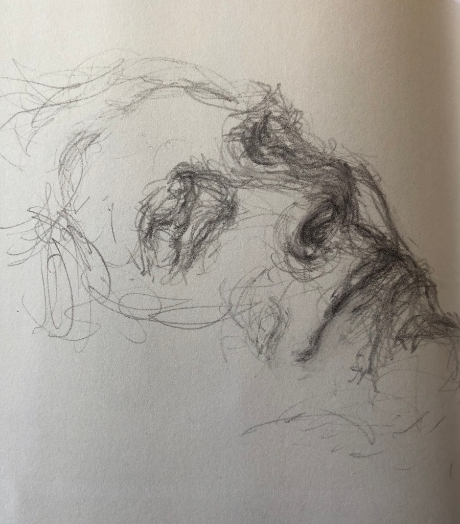
Looking back at the catalogue of the exhibition Pushing Paper – Contemporary drawing from 1970 to nowwhich I saw at the British Museum in January 2020 (see separate blog post on Museum visits), the portrait which still strikes me most is by Maggi Hambling, My Mother Dead, 7, 1988, graphite. The way the strokes are built up remind me a little of my own rather scribbly drawing style when I’m “reaching” for an image, and the fact that she has literally just drawn the face is very compelling.
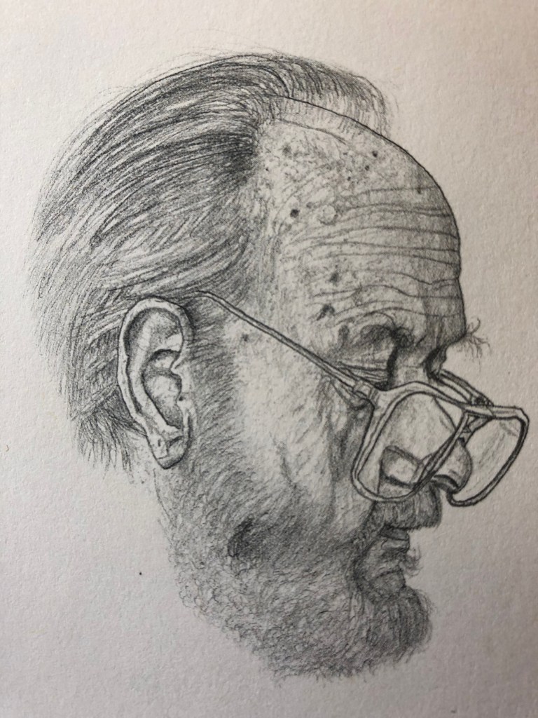
On the subject of “floating” faces and heads, I was struck by Michael Landy’s portrait of his father, Daily Mirror, from the series “Welcome to my World”, 2004, crayon on paper, as seen in our recommended text, Vitamin D – New Perspectives in drawing. The way the carefully-observed drawing stops at the jawline really focuses attention on the face as we try to work out the nature of the sitter without the prompts of clothes, props, background, etc – the only clue given being the title of the work.
I looked at Nina Mae Fowler’s work online after listening to a BBC Radio Four podcast of a broadcast conversation between her and Nick Park (Only Artists – 26th June 2019). Like me, she enjoys drawing in graphite and charcoal, and is slightly embarrassed – as am I – over her excitement about her wide variety of erasers. She says that she spends 50% of her drawing time taking graphite and charcoal off the page to make the image. Nick Park was talking about his attempts to make a portrait of his wife (“she looks like Yoda sometimes”, which I felt very encouraging), and said that the portrait artist was surely trying to depict something beyond a mere likeness – NMF agreed but said that she felt that this came with practice…back to work then….
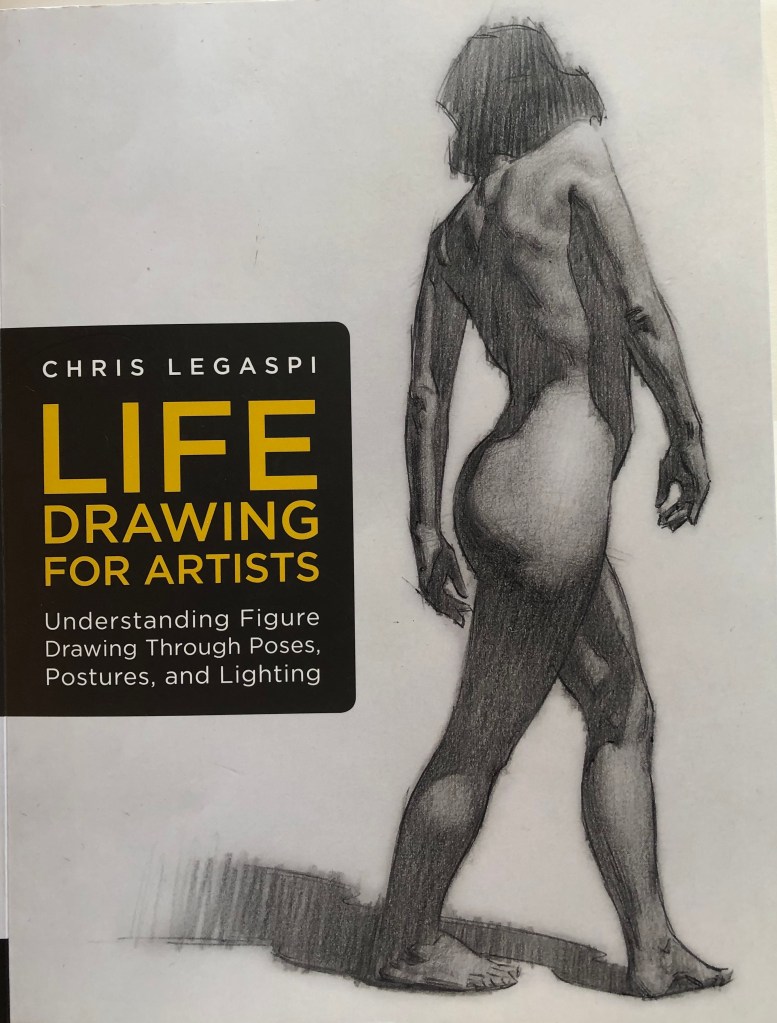
Chris Legaspi, author of Life Drawing for Artists – Understanding Figure Drawing Through Poses, Postures and Lighting, 2020, Quarto Publishing Group USA Inc, has honed his drawing method down to a formula of procedures which he can articulate and demonstrate, which has been very helpful for me as a beginner. His style has become recognisable to me, particularly I suppose because of his parallel shading technique using long lines – he sometimes uses these in his portraits to shade out a part of a face, which leaves the viewer to add in the details whilst highlighting the details in the rest of the face which is depicted.

 Sue J's blog