
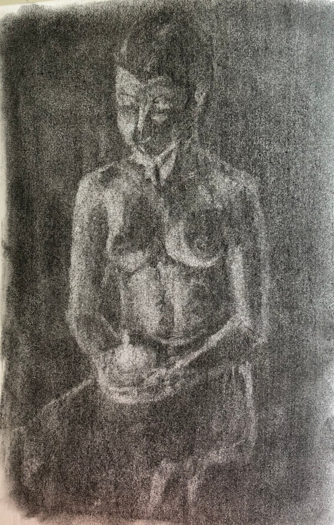
Figure study using line (A1) – Seated model in an upright chair
Working on A1 posed some issues for me, in that I could physically only cope with this by working at my easel, which had previously been lugged with some effort into my attic studio – so I decided a studio pose it had to be. My studio is snug but my husband had volunteered to be my model and he is a very neat and tidy sitter – he was very accommodating and sat perched on a small uncomfortable wooden chair for quite a while through my preliminary sketches and on into the main work. Taking a leaf out of David Hockney’s metaphorical book when he did portraits of his parents, I decided to give my husband something to do while he was sitting – some sudoku puzzles, which he loves – so that he could get involved in those and relax into his pose a little.
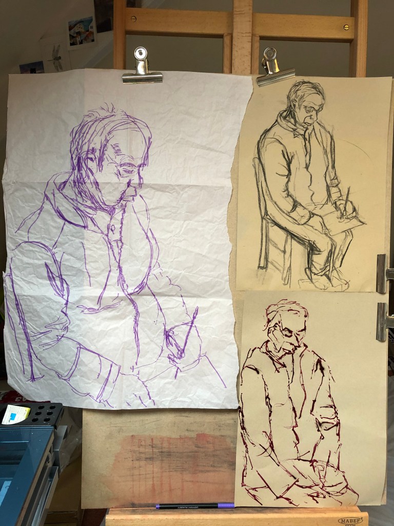
An A1 line drawing bellowed big sweeping charcoal marks to me, so that is what I turned to. The composition turned out to be quite a challenge for me as I was looking down and sideways on my husband who was right next to me, leading to a considerable degree of foreshortening, and much measuring was needed to get the proportions right.
I got the feel of the drawing using a few sketches (felt pen on packing paper, charcoal and natural ink dye applied with dropper on sugar paper), and I took a couple of photos for reference as well in case Tim got tired of sitting.
I started my main drawing on A1 heavy cartridge paper using Nitram charcoal; I have used this for most of my life drawing groups as I find it easy to hold and wield using my left hand, and it is forgiving of error as my fine motor control can be random. I have become very used to working through mistakes at the life group, and so I tried to do the same here and stay loose.
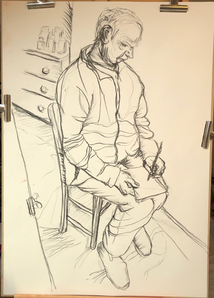
I was surprisingly pleased with the outcome – I have tried to use a range of marks, think I finally cracked the difficult composition and proportions, and it does actually look like Tim. He was wearing a chunky fleece which fell into many folds, but I think I have got these in the right places and have indicated them sufficiently rather than faithfully trying to represent each one.
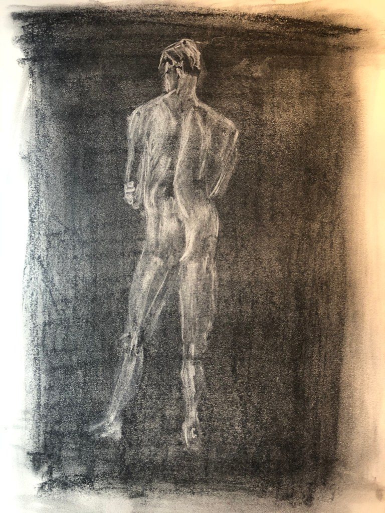
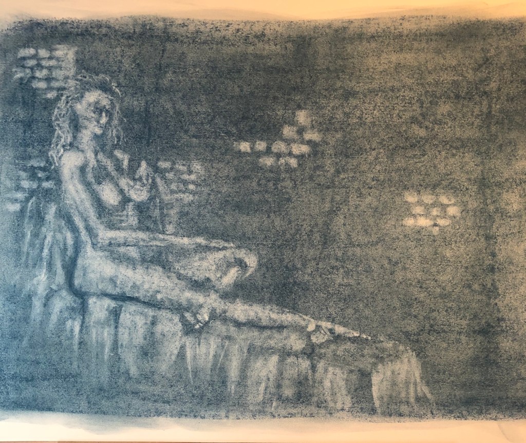
Figure study using tone (A1) – Reclining model
For the tone drawing, I was really keen to go back to a technique which I enjoyed back in Part 3, where I covered a page in charcoal and then drew into it with a putty rubber. This time however I had discovered, whilst tidying the studio a bit, my box of graphite chunks, so I played about with these and well as charcoal:
I loved Nina Mae Fowler’s charcoal drawings, for example her Luminary Drawings, some of which also appear to use a similar technique – see here : Charcoal on paper

29 x 44 cm, permanent collection of the National Portrait Gallery
By Nina Mae Fowler, 2019© National Portrait Gallery.
.
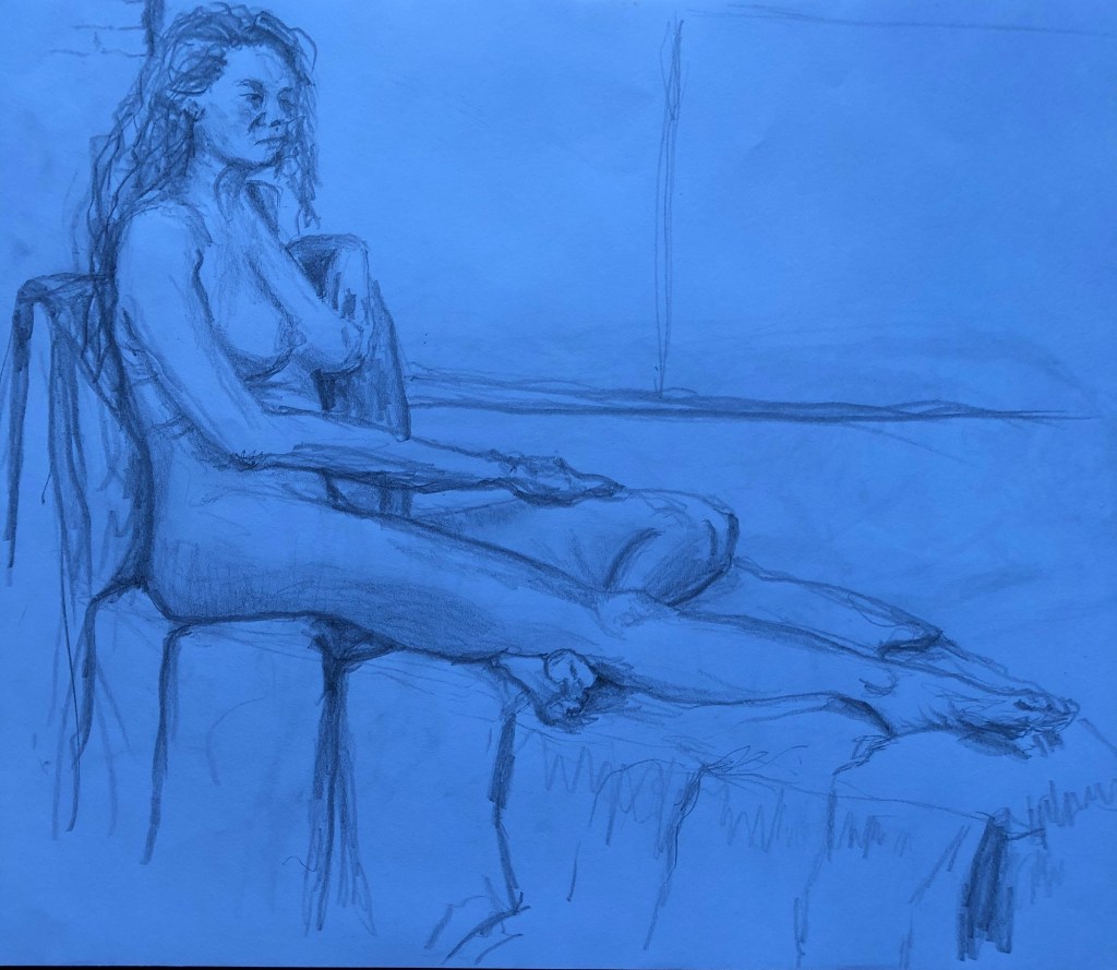
In the meantime the coronavirus restrictions began to bite, art groups fell away, and I was keen to social distance due to my predisposition to lung illnesses. Hence, I decided to take for my assignment piece a sketch I had done at an earlier life class – it had been a longer pose where I felt I had included enough tone details in my original drawing to work up into something bigger.
This was my original sketch (see first A3 sketchbook); I photographed it under an LED light and the photo came out unexpectedly blue. I rather liked the blue, so I decided to use a blue graphite block to lay down my background, rubbing it well into the paper with the heel of my hand before starting to lift out with the putty rubber.
This is the complete image…
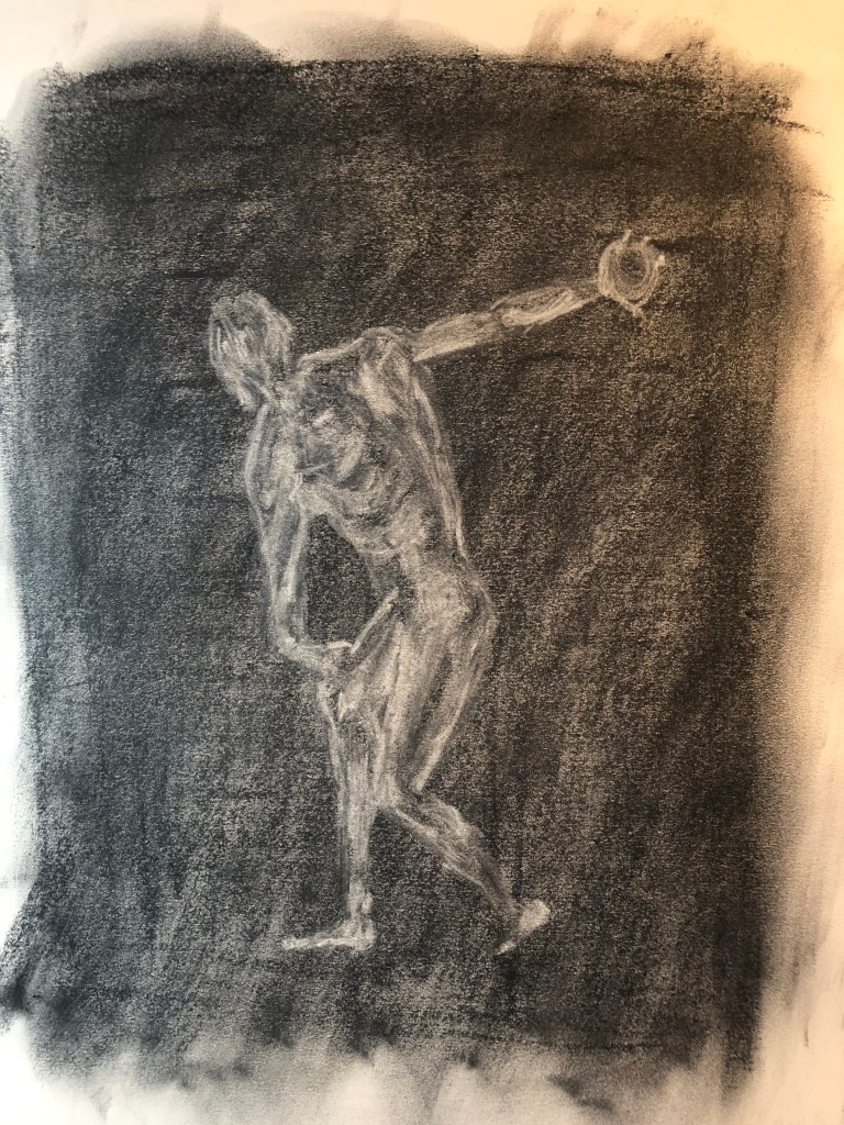
..and this is a slight close up focusing on the figure…..
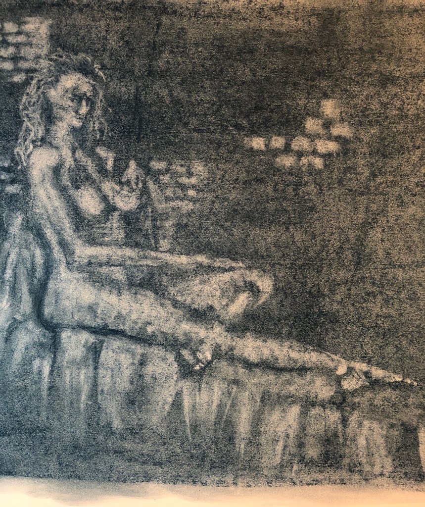
I really enjoyed doing this drawing – there was much standing back and looking, then stepping in to apply the rubber, then stepping back to look again. I don’t think I placed her quite correctly, there is a lot of blank wall (which unfortunately was just blank brick wall) in the top right quarter, but I left it like that as I felt the dark quarter set off the lightness of the figure and support, which were lit by windows on the left. I was especially pleased with the feet, I think I have got the light and dark tones of both of them well.
A portrait or self-portrait combining line and tone (any size)
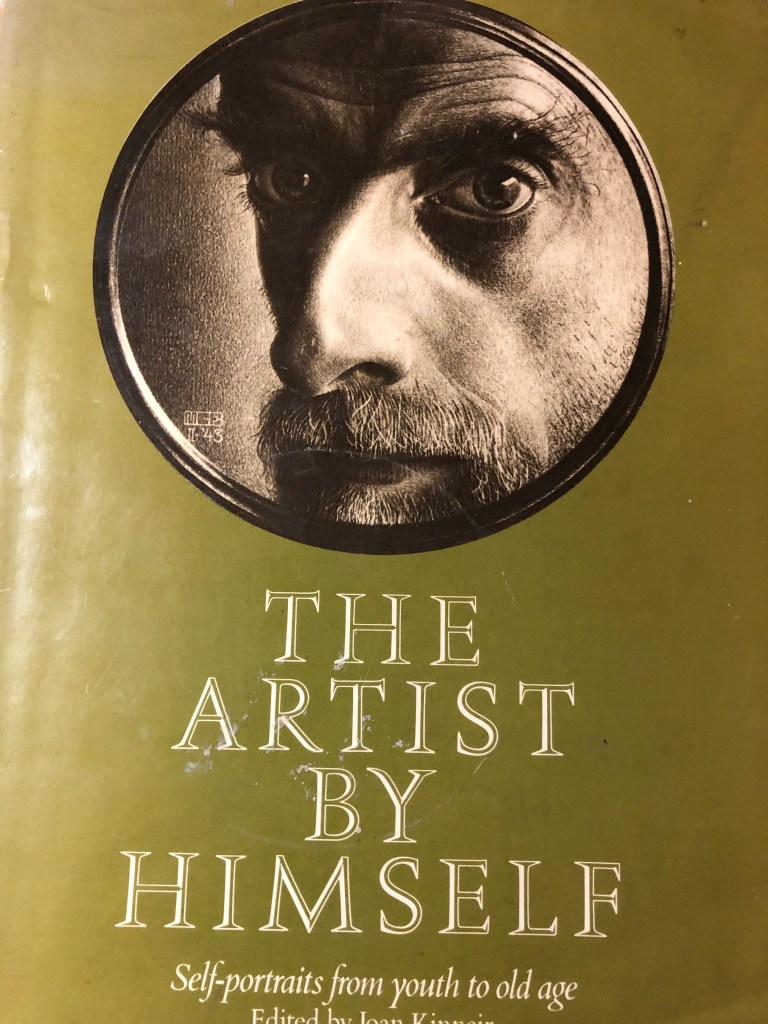
In my research on other artists’ approaches to both portraiture and self-portraiture (see separate blog posts) I had been attracted to cropped images, such as this one by Escher :
(Self-portrait in shaving mirror, 1943, “Scratch” drawing, brown lithographic crayon. Haags Gemeentemuseum, The Hague) – as seen in Joan Kinneir (ed), 1980, The Artist by Himself – self-portrait drawings from youth to old age, Granada Publishing Ltd, Herts and London.
Escher seemed quite taken with reflections of himself when drawing self-portraits – this one which I found reminds me of the self-portrait which I did in Part 2, when I was reflected in the metal dome of a lamp:
| Still Life with Spherical Mirror |
 1934, Lithography print. |
Also, when I tried my own self portrait in an earlier Exercise (see blog post), I tried an angled and cropped image, and thought it would be something I should like to try again in this task.
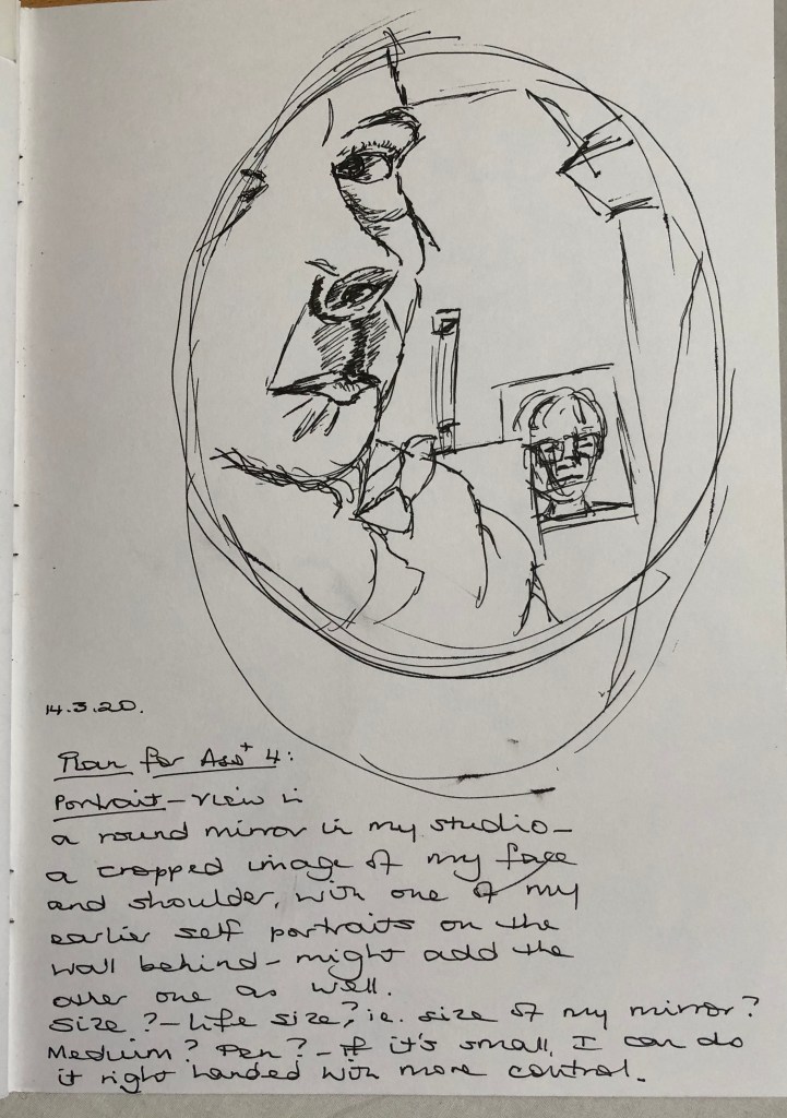
Based on the Escher drawing, I found a little shaving mirror and tried holding it up with one hand and drawing with the other….serendipitously I could also see one of my earlier self-portraits stuck up on the wall behind me, so included this as a double portrait. I did it on A4 with a drawing pen, thinking to roughly emulate the size of Escher’s portrait – it was OK but felt a bit cramped. Then I looked again at the terms of the assignment and saw that I had to demonstrate the proportion of the features in relation to shoulders and chest as well as head, so decided that this composition did not really meet the brief – but I learned that I needed to work a bit bigger, and also not with pen which is a bit unforgiving.
I decided that, if I was including more of myself than just face and head, I’d like the rest of me to be in an interesting position – I had enjoyed the self-portraits of Artemisia Gentileschi when she placed herself in unusual poses. In my studio I have a couple of old oval wood-framed mirrors which are there because we haven’t found a place for them anywhere else – I don’t have any hooks to hang them from in the studio (it’s on the to do list, along with a cork-board wall) so they live on the floor propped against the wall. I experimented with arrangements which included one of the oval mirrors, the little shaving mirror and an interesting position, and came up with sitting cross-legged on the floor drawing on a propped-up board on A2 – this is the set up:
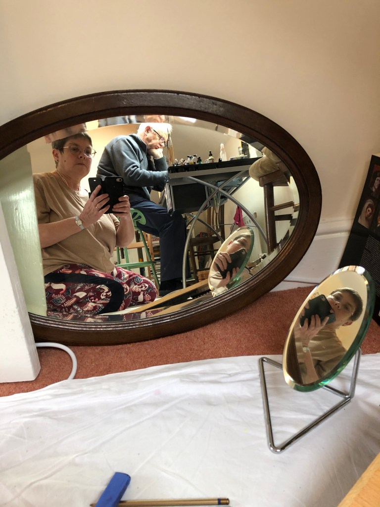
(excuse my husband sitting at my work table in the background marking a maths paper – we were self-isolating in the attic from workpeople downstairs). With this arrangement I could see two direct reflections of myself at different angles (in the big mirror and the small one) and also the reflection of the small mirror in the big one – so, a self portrait from three different angles.
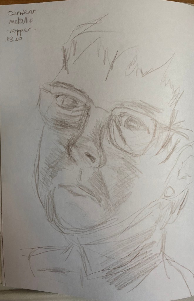
I tried the idea out by sketching the face as shown in each of the mirrors in my sketchbook in pencil:
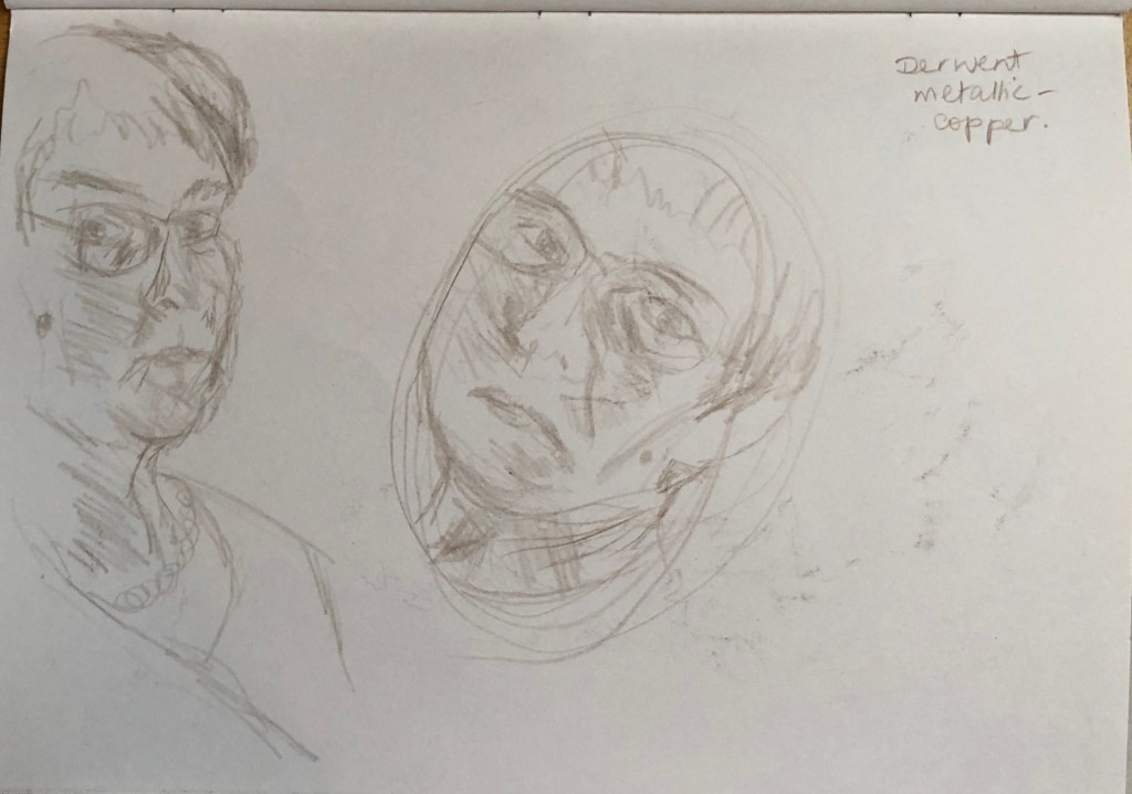
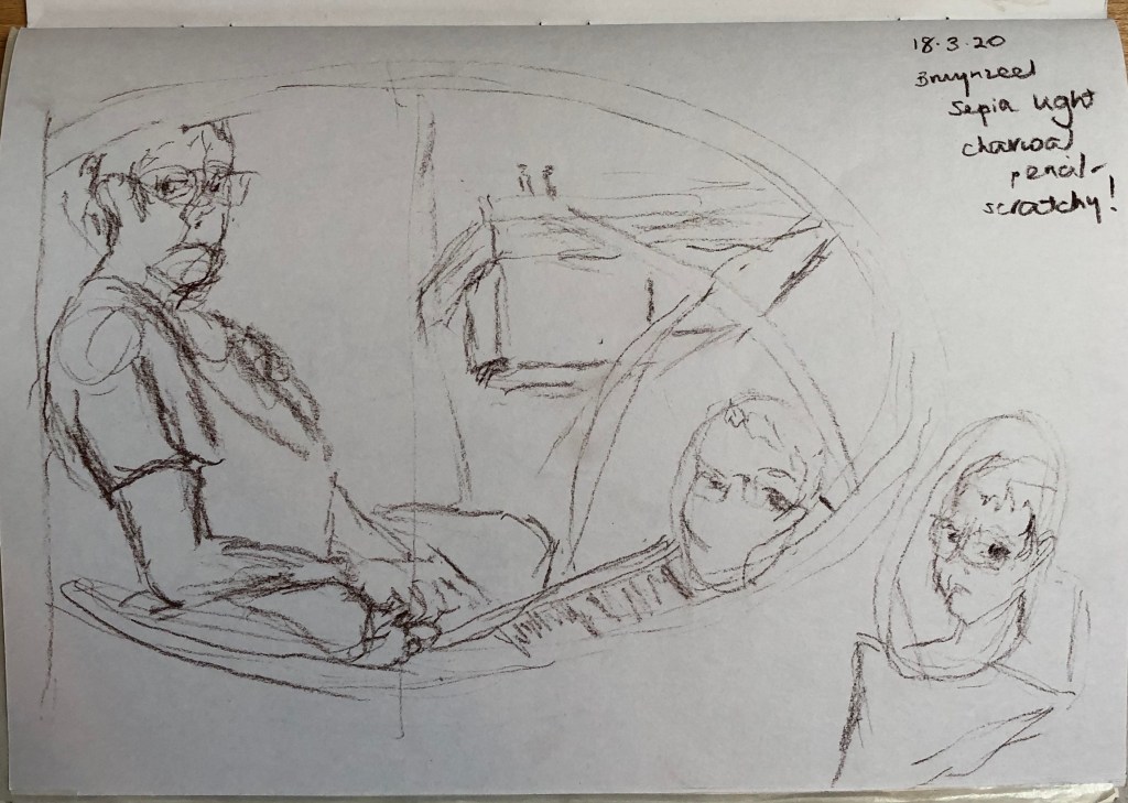
…and also the overall composition in my A4 sketchbook using a sepia charcoal pencil:
I started roughing the composition out lightly onto the A2 paper using a 4B pencil, which is the first thing which came to hand…..I would love to say that I dwelt on my medium for some time, but actually the 4B pencil felt fine so I stuck with it. I brought a lamp in and placed it on the floor to my right – I did try it out to see how it would look in the semi-dark, but my eyesight is not great and I just could not see things clearly enough for me to draw from – so my light sources were actually various on the day I drew the final version – I kept the lamp beside me on my right (not very strong); I have a skylight over my head to my right; and South-facing windows from the other attic room behind and to my left. The outcome of this is that the sides of the face are lit but the front of the face is more shadowed.
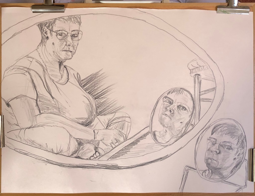
Well, I’m not sure how Artemisia did it – by the end I found I had “set” into a hunched forward-and-over position which I needed to reach the angled drawing board…shades of Yoda and Jabba the Hutt come to mind! Looking at it now, I do think overall I was this shape – I find I can always tell if it’s right if you go to draw a body part, and the other body parts which it meets up with are in roughly the right place.
I am pleased with bits – the main figure is the best, I think, because it was easier to see. Little details have gone well – the ear, the foot, the folds in the trousers around the knee. Other things are less good – eyes too close together in the main drawing, too far apart in the shaving mirror near me, best in the shaving mirror reflection – a bit like Goldilocks. Interestingly, I drew with my left hand, except for the shaving mirror image on the floor by me – without moving everything, I couldn’t really reach to draw this so switched to my right hand, and I think this is the weakest portrait of the three.
I hummed and ha-ed about how much background to include – it was very complicated and I thought I could lose the impact of the portraits, so I confined it to the mirror outlines, the chair and the drawing board – I think this works.
