WHAT?
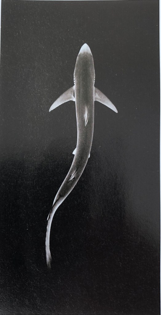
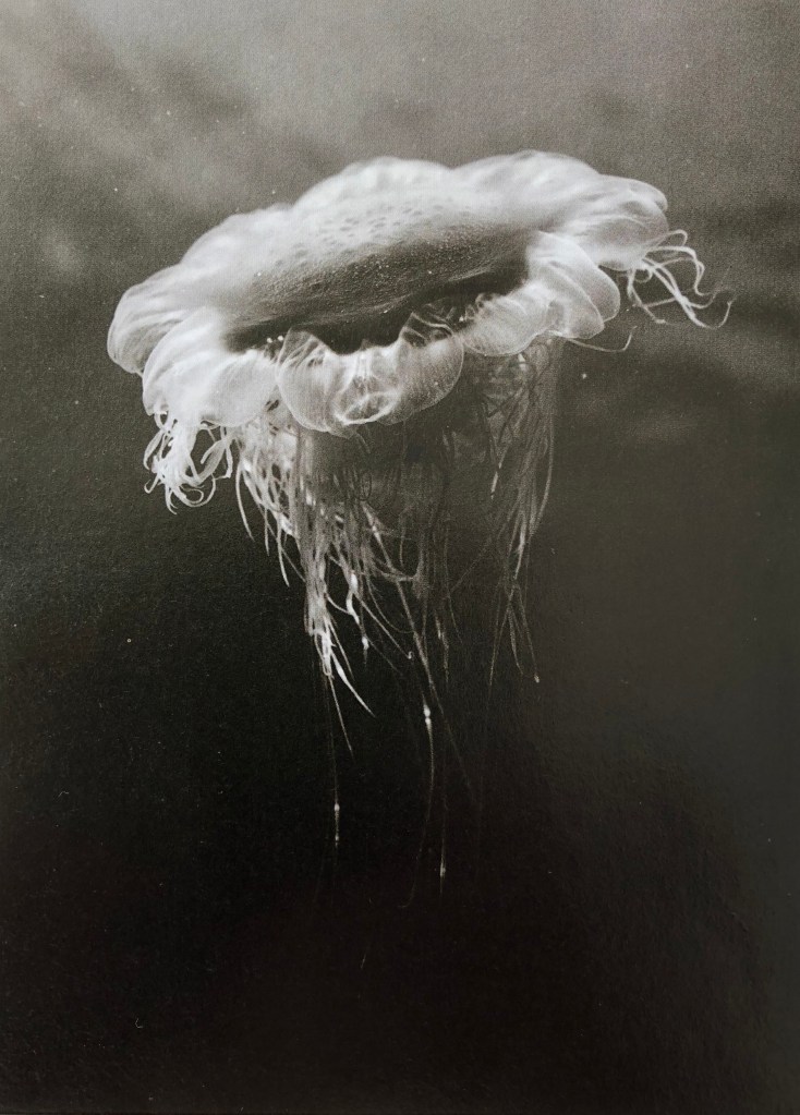
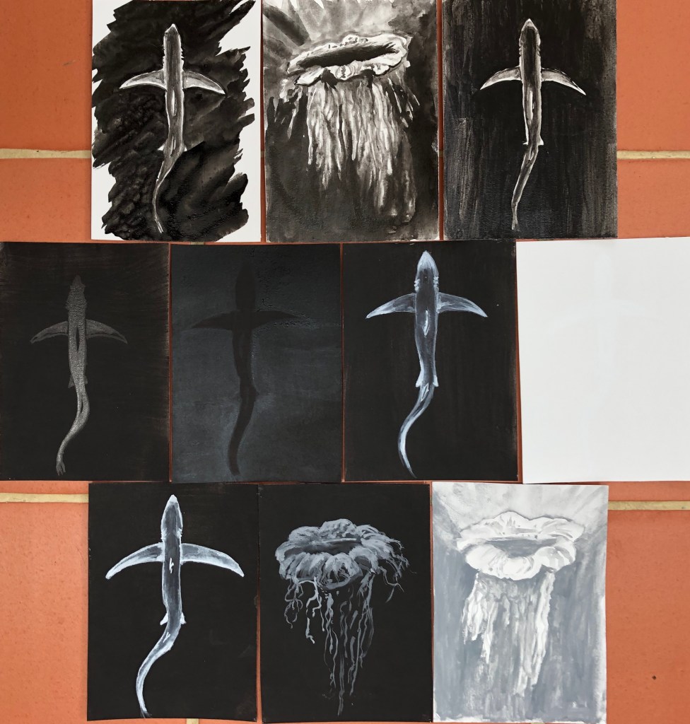
I prepared 10 pieces of hot pressed watercolour paper with black or white acrylic grounds. The two found images I chose to work from were black and white photographs taken by marine scientist and freediver, James Monnington. He dives all around the world but I have chosen two of his images taken down here in the South West; the lion’s mane jellyfish, found in seas around the West Country and Wales, and the blue shark, seen off the coast of Cornwall. I chose these two images as a contrast – one for its simple and elegant lines, and the other for a mass of detail of which I hoped to give an impression rather than an exact representation.
SO WHAT?
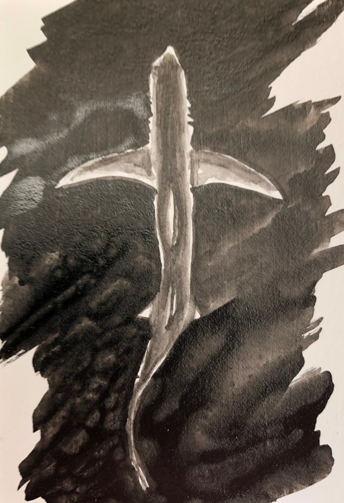
- Blue shark in black ink on a white background, using a size 6 round sable. Tried to paint this by putting in the negative shape first and then building up layers of diluted ink within the body of the shark, leaving the very outer edges of its body white. I always seem to find it hard to get crisp edges when painting negative shapes – done better here on the fins than the body, although pleased I managed to indicate the gill slits. Painted this on a hot day so the layers dried quickly and I didn’t get too many “cauliflowers”, which are easily forgotten until too late.

- Lion’s mane jellyfish on a white background using black ink using size 6 sable. Not sure how to tackle this; decided to put an extremely dilute ink wash around the body to preserve the white of that, then streaked the rest of the sheet with water, turned image upside down and dropped in lots of undiluted black ink and let it run down, trying to lead it with the tip of the brush and encourage it to go where I wanted. Then painted simple details of the body with a small amount of ink and almost dry brush. Not much like the original, but hopefully you’d recognise it as a jellyfish!
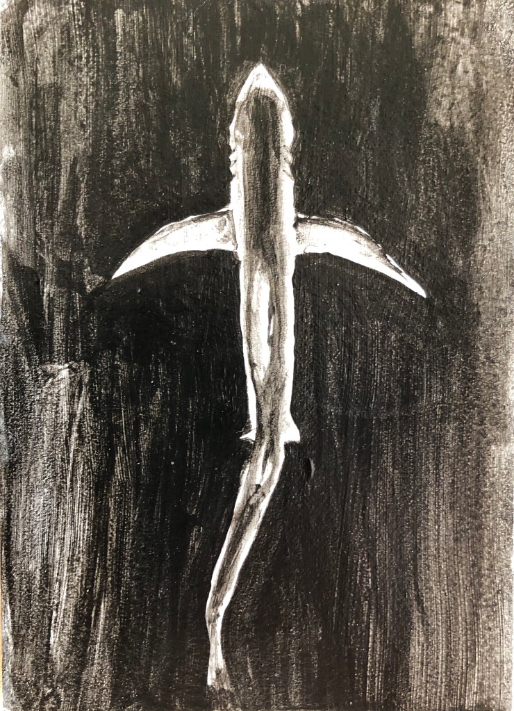
- Blue shark in black acrylic on white acrylic ground using size 6 sable. I found slightly dilute black paint hard to apply over the white acrylic ground – I thought I’d applied the ground evenly with vertical and then horizontal stokes, but the black acrylic showed up quite streaky in vertical lines and had to have a second coat applied in virtually undiluted paint, with just a damp brush. I haven’t got the shape of the shark sufficiently sinuous and, once the black is on, it’s hard to get off if in the wrong place. Live and learn.

- Blue shark in black Chinese ink on a black acrylic ground. This gave me permission to simplify the image as the light parts of the image could only be conveyed by the shininess of the ink against the matt background – but then it was hard to build up gradations of tone with the ink as it was all just shiny, and the tonal gradations can only be seen from certain angles. It is dramatic, however, when seen in the right light.
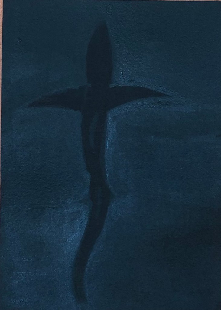
- Blue shark – Black acrylic on black acrylic ground, size 6 sable.Tried bit of dilute acrylic just to draw an outline – the second it dried it had been absorbed and was invisible. Decided to build up the background with several layers of black to leave a lighter reverse “silhouette” of the shark without any detail – this worked, although needed to go over it over and over – fortunately a hot day so it dried very quickly, although the paper became quite warped.
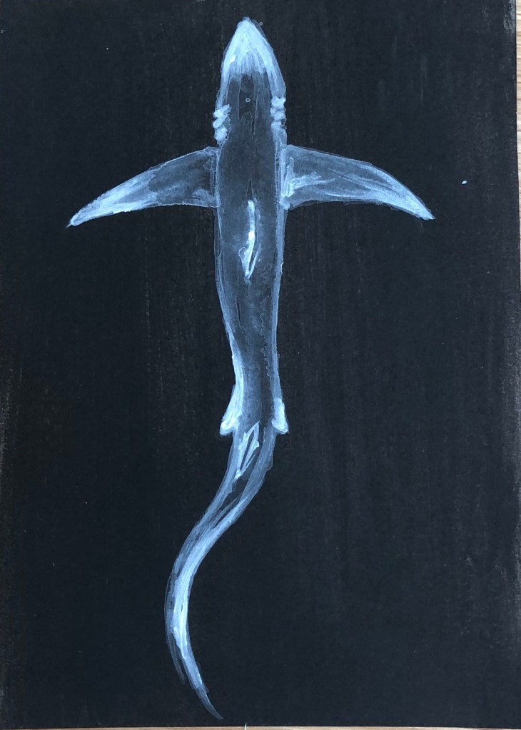
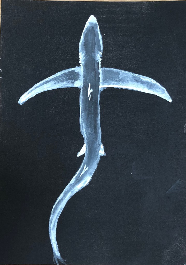
- Blue shark – White acrylic on black acrylic ground, size 2 rigger to allow detail. Built up the tones by starting with very dilute white – again, seemed to be absorbed very quickly and marks soon very ghostly – but gradually got thicker and thicker paint for the lighter whites. It’s still ghostly but I left it like that, seems appropriate for the stealthy subject matter.
- Blue shark in white gouache on white acrylic with size 6 sable. Again tried to go for a white silhouette against the white ground. The chalkiness of the gouache, combined with the fact that it is a whiter white than the acrylic, makes it just about visible, although not something that I would ever use, it’s difficult to make out and photograph.
- Blue shark in white gouache on black acrylic with a size 2 rigger. Managed to get a similar ghostly effect as with the white acrylic – stands out more, but slightly less ethereal because the permanent white gouache is a brighter white than my titanium white acrylic – so which you choose would depend on what effect you want.
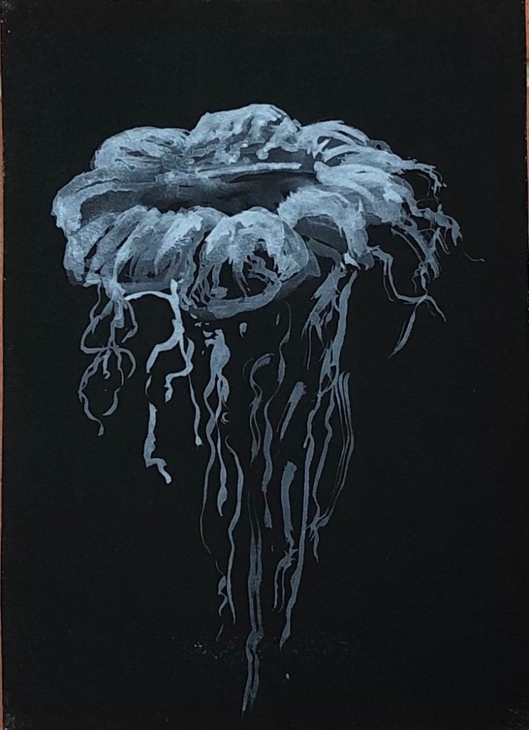
- Lion’s mane jellyfish in grey gouache on black acrylic with size 6 round sable. I’ve enjoyed this the most so far – adding grey to make an image lighter felt counter-intuitive but it’s turned out very jellyfish-y.
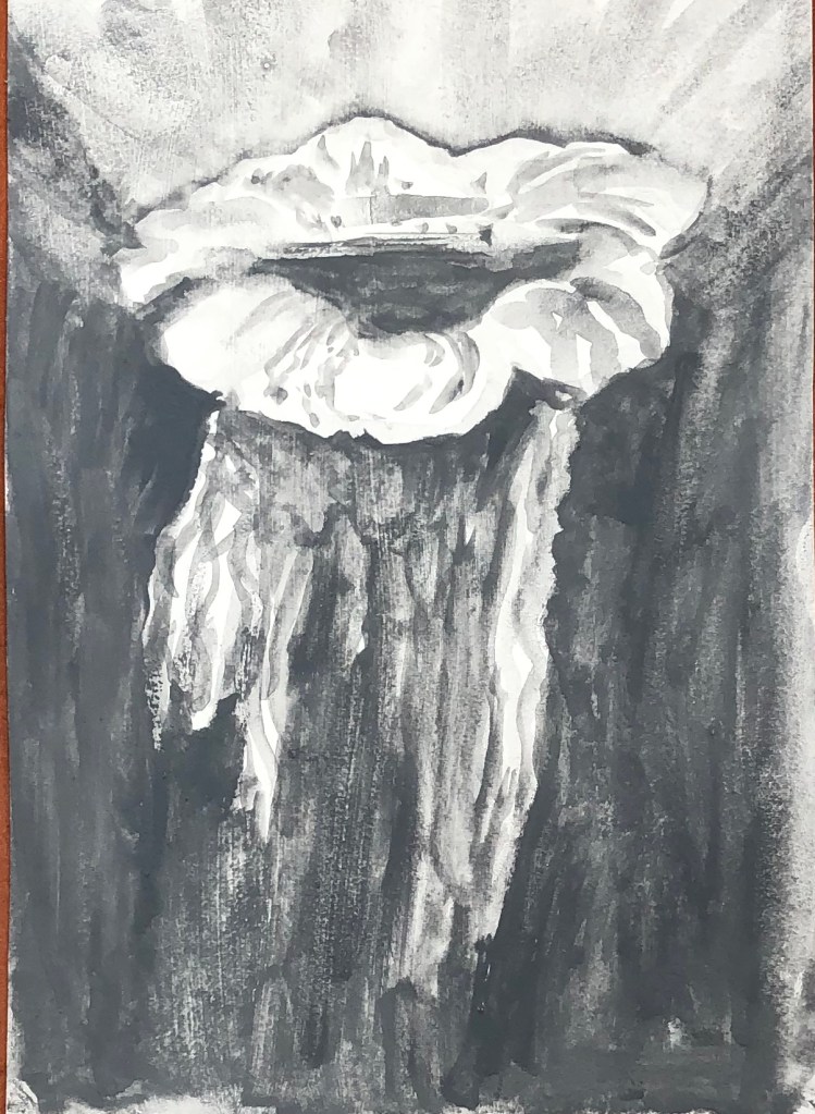
- Lion’s mane jellyfish in grey gouache on white acrylic using size 6 round sable. Oddly, having just used grey as my “light”, it felt tricky to now change back to the more traditional use of it as “dark” – I don’t think my end product is nearly as translucent.
NOW WHAT?
I haven’t previously done much black and white painting, apart from quite a bit of drawing with black ink on white paper. I’ve learned that:
- Shiny black (in this case, ink) onto matt black (in this case, acrylic) can give a distinctive and eye-catching outcome
- Paintings of ghostly, ethereal images are more easily achieved effectively on a dark background – specifically I liked thin white acrylic on black and grey gouache on black
- I need to give more careful thought to my backgrounds, both in terms of colour and tone, but also in terms of texture, e.g. matt or shiny.