Talk recommended on Instagram about his work generally, and in particular a forthcoming exhibition (Covid-permitting) for his 50th birthday entitled “Dead Reckoning”.
SO WHAT?
Exhibition is so titled because he wants this to be a marker point for his work so far in his life; for him to take stock and set out a new direction for his work for the next 30 years, knowing he can always come back to this point and set off in another direction if he needs to
He has been on a roll in the last 5 years and produced work he likes – now he feels he almost needs to “unlearn” that so that his future work can develop and his practice can progress
He produces a lot of smaller works, which he says are really good for growing your “artistic muscle memory” (this struck a chord with me after just finishing a series of 20 small paintings of parts of people – going back to life drawing suddenly felt much easier!)
He produces larger works when he manages to get larger studio space – he currently has had free use of a large studio for 40 days (and nights) – he is absolutely grabbing this as an opportunity and painting all hours of the day and night to make the most of it
He has a strong work ethic – he and some colleagues had a mantra up in their shared space saying “PAINT HARD”
He believes that an art degree is a good thing as it makes you try things out which you otherwise wouldn’t do – it frees you up
NOW WHAT?
Three key messages I’ll take away from this:
Build up my artistic muscle memory repeatedly
Don’t be afraid to go a new way or try something new
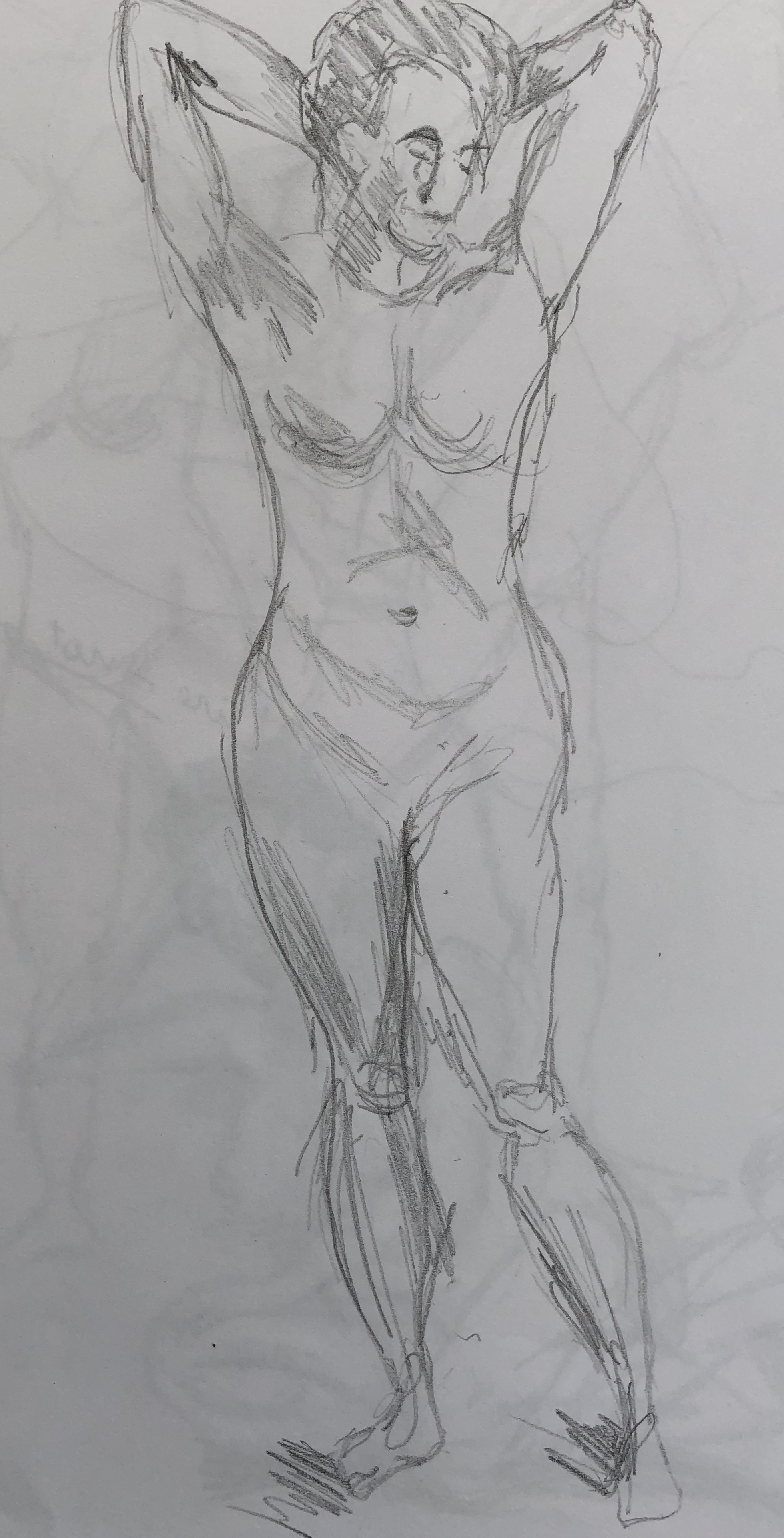
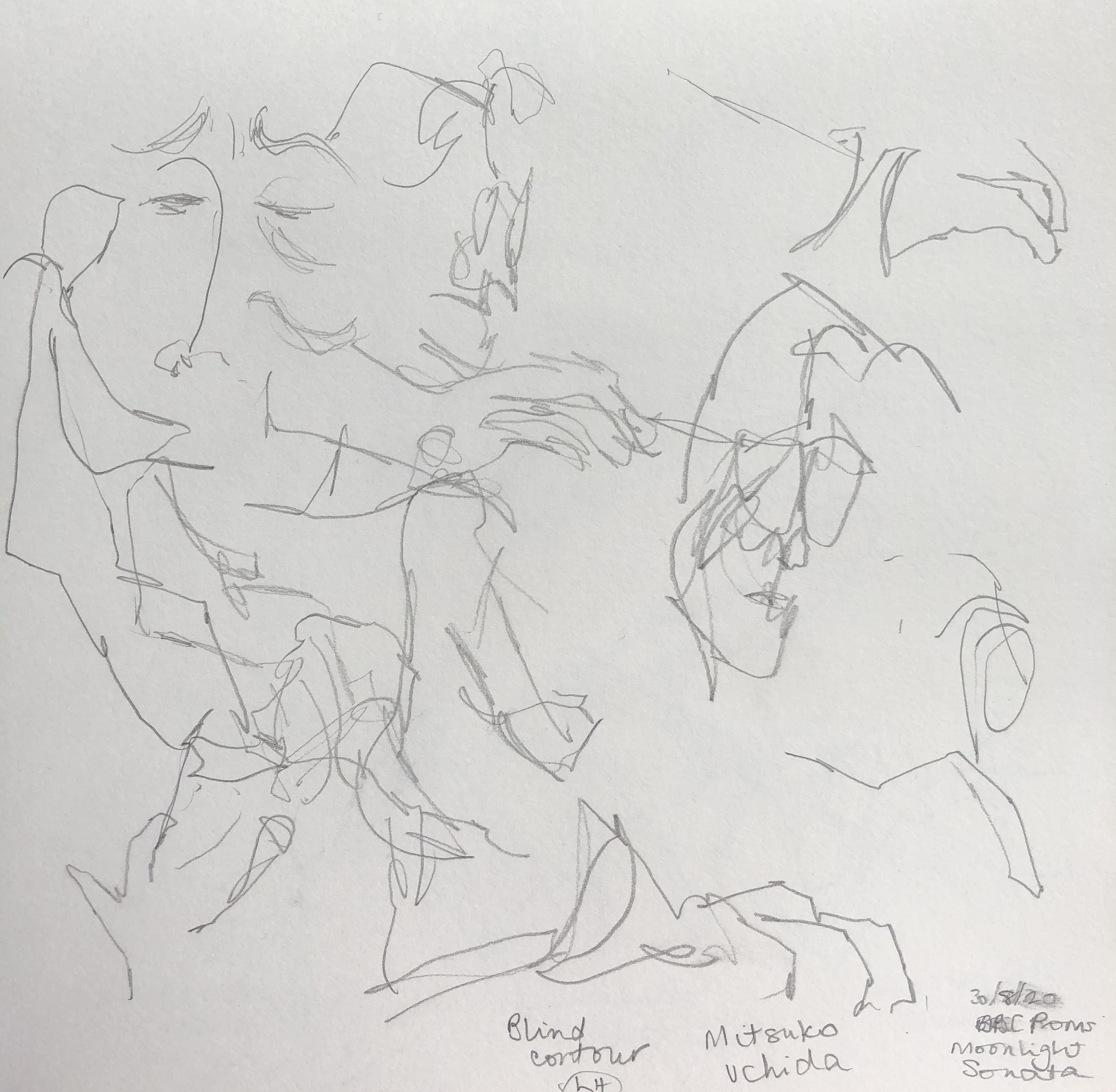
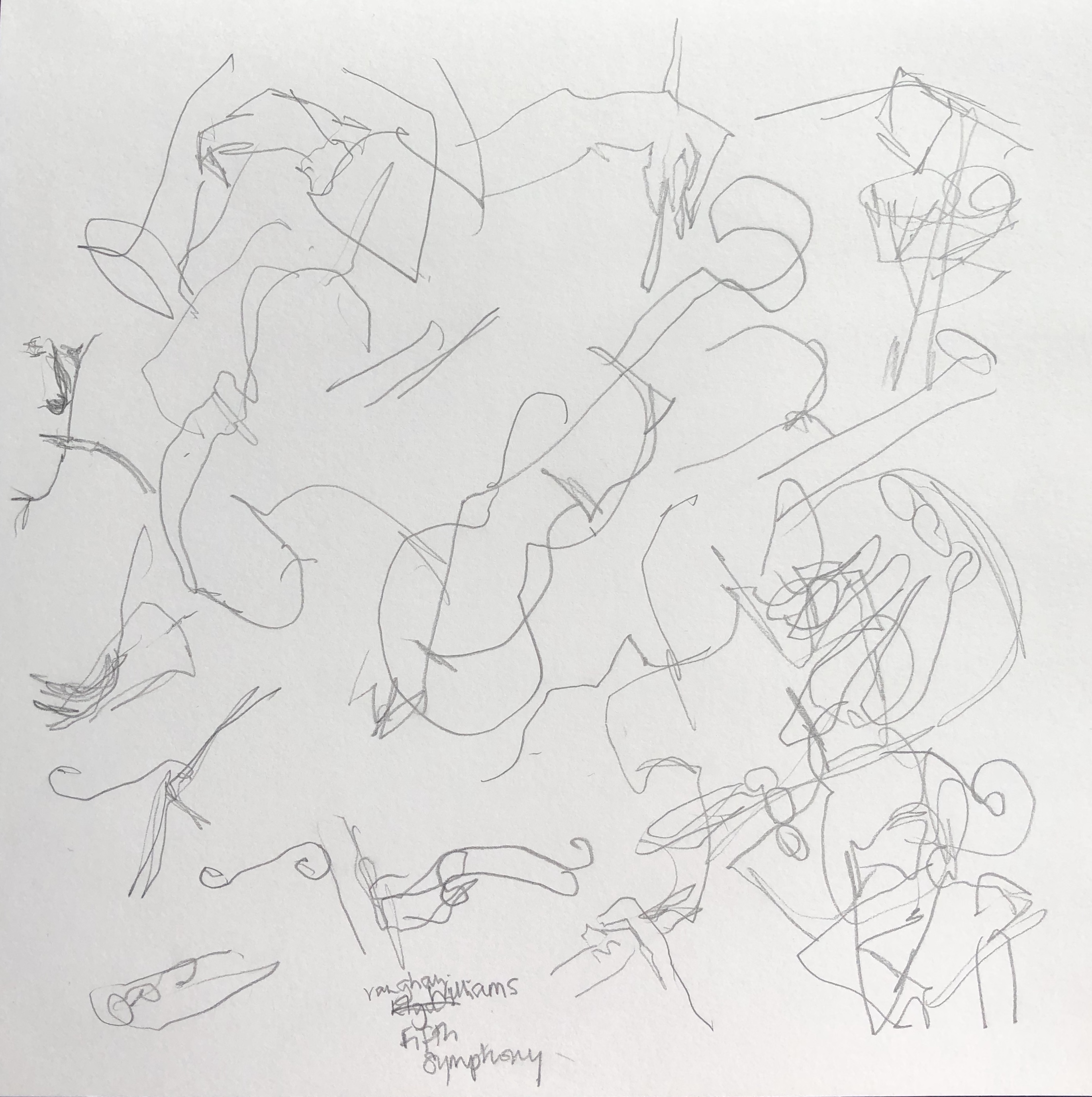
Back to life drawing group today (7th Sept 2020) at a new bigger venue – Clearbrook Village Hall – very light, whole of one wall is a picture window – so we could spread out and social distance. Only issues: not having doors and windows open so the life model doesn’t freeze (it’s bracing up on the moor….), and I did try to wear a mask but it really does fog my glasses up horribly and I gave it up – so it’s a risk.
SO WHAT?
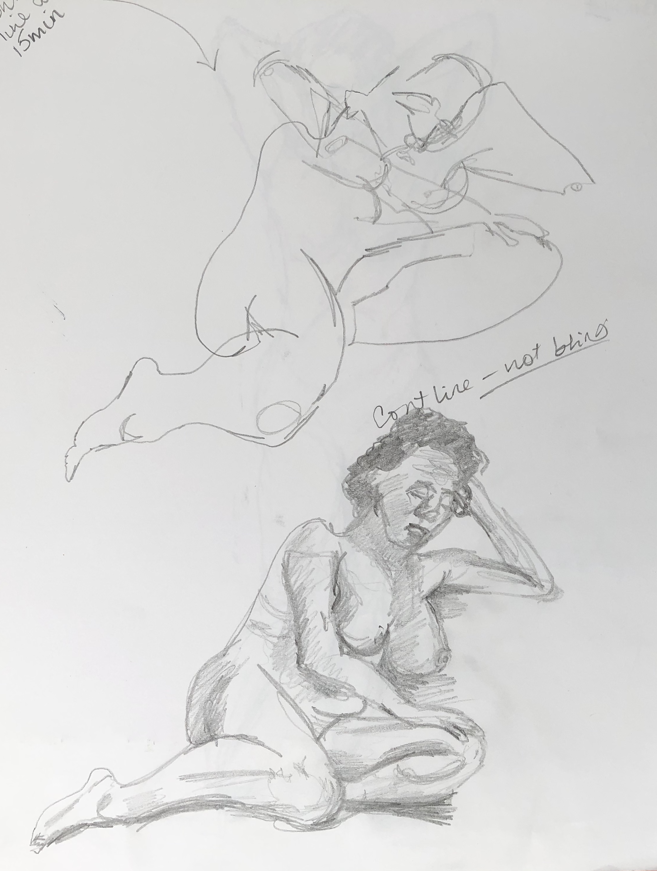
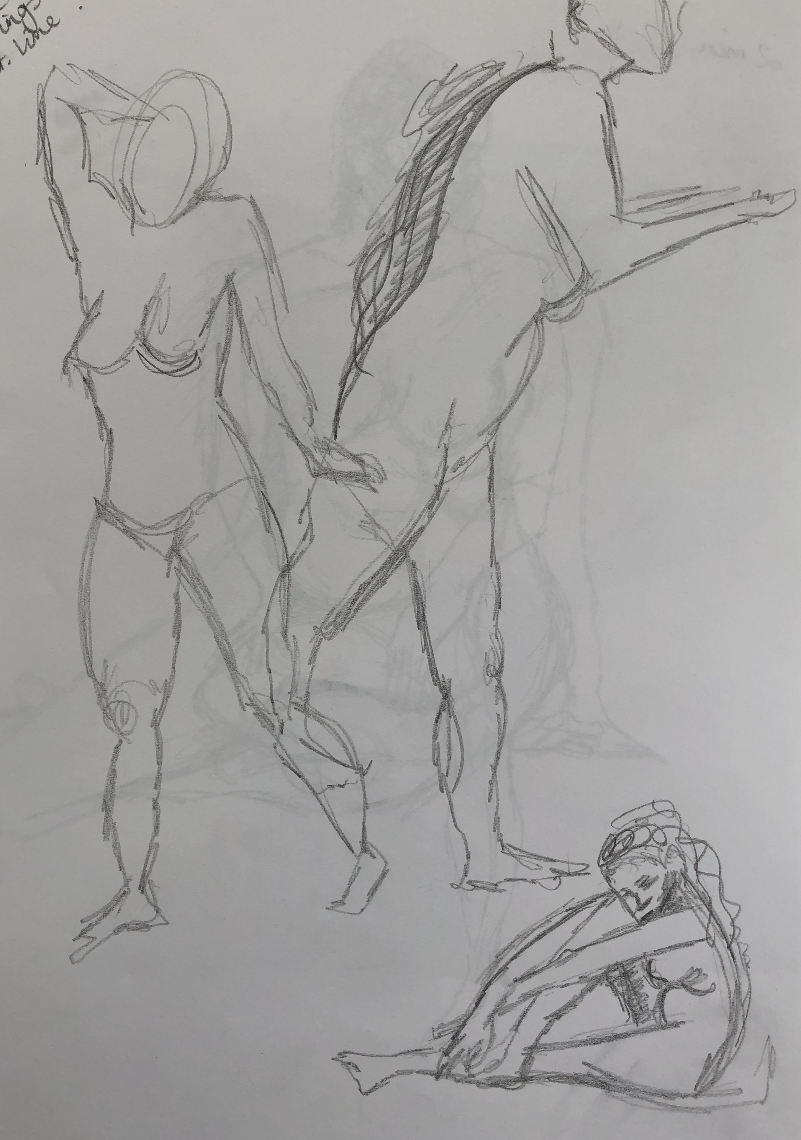
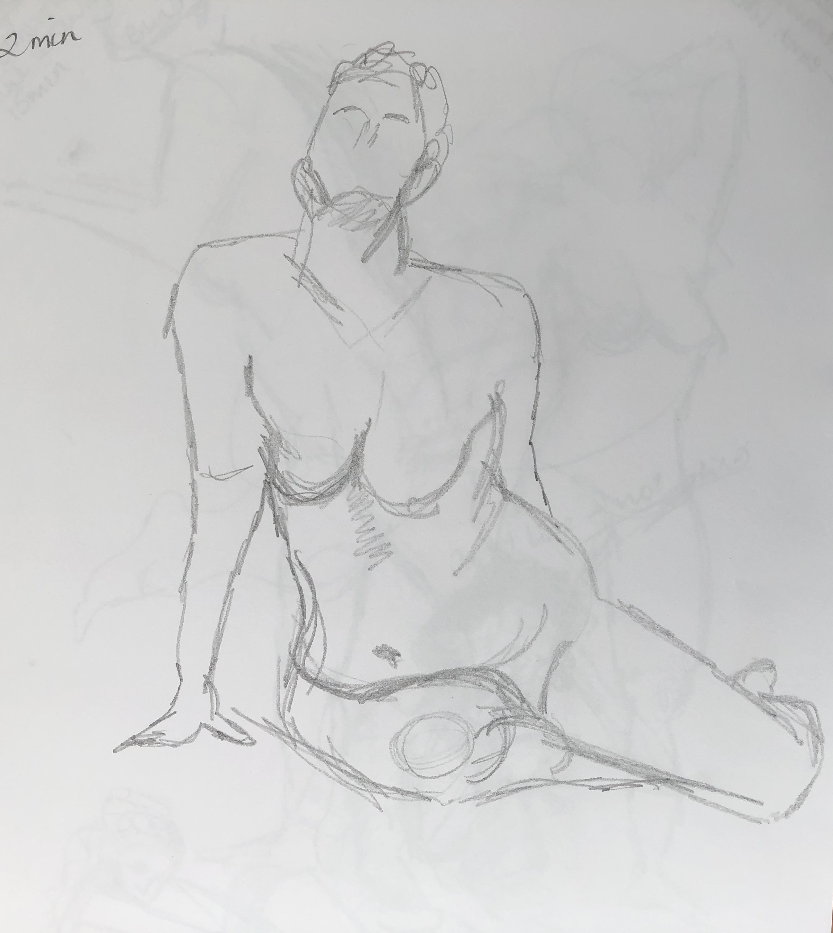
Got through several 2 min and 10 min sketches – tried to use some of the techniques I have been practising – continuous line drawing and blind drawing – although very tempting to return to the old scribbly style when up against the clock.
Also tried a Conte pastel painting for the longer pose, first I’ve done at life drawing…
NOW WHAT?
I have learned:
Continuous line drawing, especially blind, does work for quality of line – which I learned in my Assignment 1 prep – I must make more use of it in real life drawing
Faced with a box of multi-coloured Conte crayons, it’s tempting to go mad and throw the kitchen sink at a painting (which I will try one day, just to see what happens); however, a sticking to a few well chosen colours to harmonise your image is also a definite way forward (think I fell slightly between two stools here), so, take a minute to consider and size up the colours you are likely to want before diving in.
Demonstration of visual skills: Materials, techniques, observational skills, visual awareness, design and compositional skills.
I have been using continuous line drawing (often blind, sometimes not) regularly through this section as a way to hone my observational skills (see some sketchbook examples below), and of course, it was one of the key determinants in my composition selection for my assignment pieces (see video of the supporting work for my assignment). I have found the course notes, together with information online and in books, helpful in using the different media, and have been introduced to all the most common media in the course of the various exercises; I picked an unfamiliar medium, egg tempera, to work with for my assignment piece so that I could explore its properties and capabilities.
Quality of outcome: Content, application of knowledge, presentation of work in a coherent manner, discernment, conceptualisation of thoughts, communication of ideas
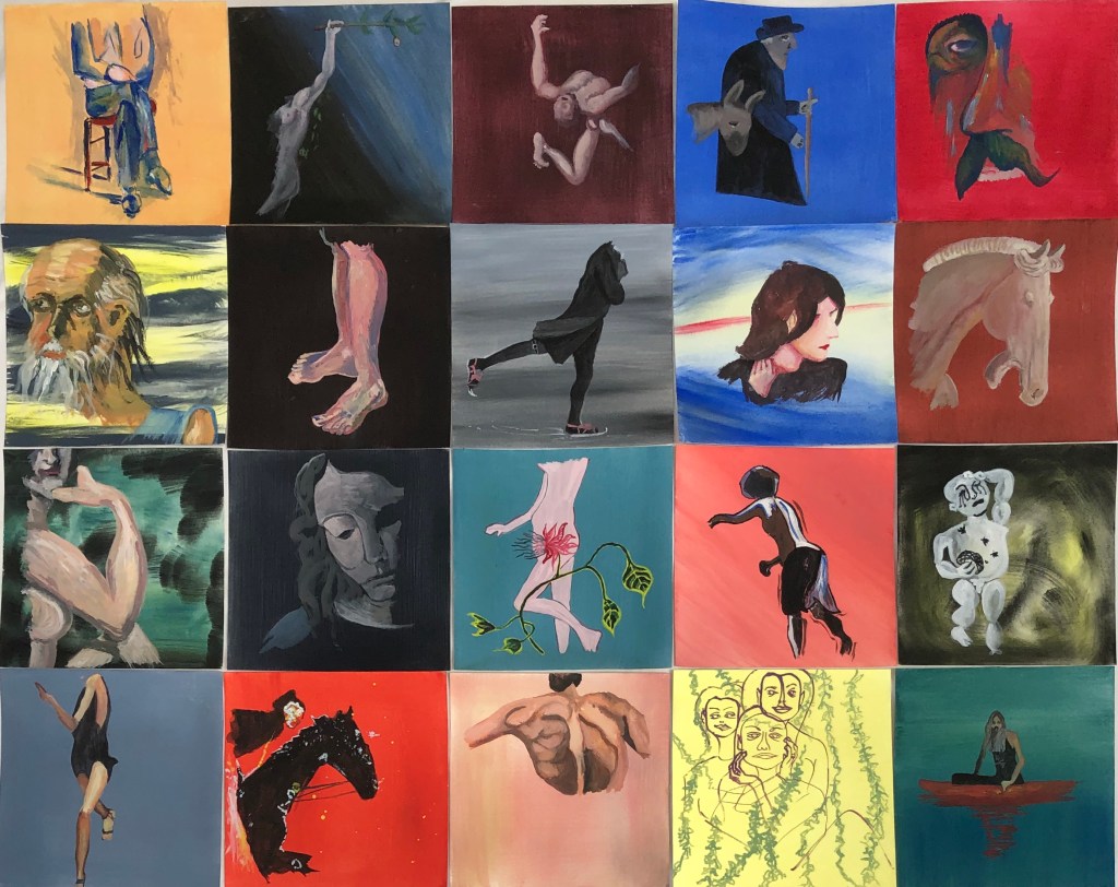
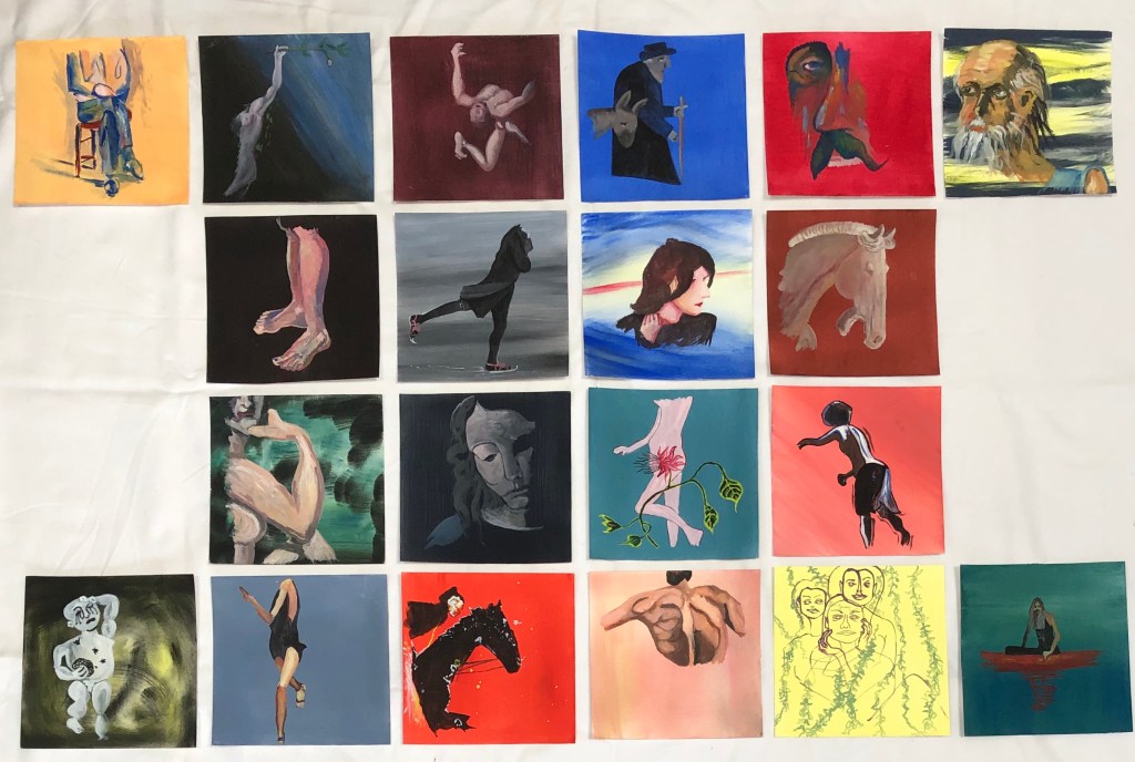
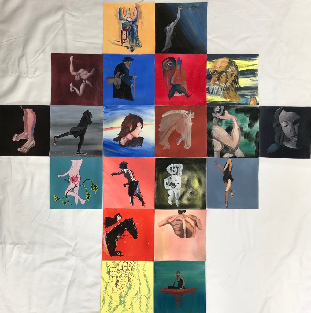
I am interested in people and the depiction of people; the former is a lifelong interest, the latter only developed since tackling Part 4 of Drawing 1, where I had to get over my fear of portraying people and get on with it – only to find, to my surprise, that I finally understood why so many artists have devoted themselves to portraiture and life drawing – I have found it compelling, even though I have had a massive amount to learn. I feel I am playing catch-up with this aspect of my art now, which is why I chose to investigate the work of various artists whose work depicting figures and faces I had collected as found images for this Part and for my assignment. I hope that my series of characters holds together as a single work as well as individual pieces, and shows my enthusiasm for the breadth of this aspect of art, and the wide variety of my research and reading. I tried listing and mind-mapping my way towards the decisions about the assignment – at the moment I am finding this writing down a useful tool just to express some basic thoughts for my subconscious to swill around until it eventually throws a finished idea out.
Demonstration of creativity: Imagination, experimentation, invention, development of a personal voice.
I found my sketchbook work invaluable when planning out the paintings for my assignment (see sketchbook video) – sometimes I had picked a found image and knew exactly what I wanted to do with it; but much more frequently I used my sketchbook to experiment with my found image, using blind continuous drawing, thumbnails and tonal drawings, in order to make decisions about image, ground and composition, sometimes discovering that what I had thought I was going to do turned out to be superseded by a much better idea.
• Context: Reflection, research, critical thinking (learning logs and essay).
I have used found images and looked at artists’ work from 700AD to the present day during the course of this Part, both in my research work and in particular for my assignment piece. I have greatly enjoyed depiction of the human form, but I am not wedded to this (not wanting to write myself out of still life, landscape and abstraction just yet) and, although I have tinkered and experimented with a wide range of styles, I do not yet feel that my own voice is emerging (apart from a fondness for bright, vibrant colours, apparently). All of the styles I have tried have been appealing on some level, although part of this is just the excitement of doing something unfamiliar.
I have enjoyed the challenge of working small. Thinking about both ends of the scale is not something I have grappled with too much before, and in Drawing 1 the drive was always to get bigger and more expressive – so the requirement to work small and in quantity in this Part has been fun. It is actually very convenient – you can set it up anywhere, almost no space is needed, and finish a piece quite quickly which gives a satisfactory sense of achievement (until you calculate how many more pieces are still needed to complete the work). Having said this, when I came to Part 5 of Drawing 1, I was very attracted to tessellated images such as those of John Virtue and Tyga Helme – so this was not a completely new thing to me. However, having been pushed by the end of Drawing 1 up to A1 and beyond, I am finding myself hankering to flex my muscles on something larger than 6 x6 in, even if just for a little while.
I spent a good while trying to decide the subject matter of my series of 20 paintings:
looking through a collection of found images I had started making at the start of this unit
making a mind map of material which had interested me throughout this part
making a list of subject matter I was drawn to
looking at the series of work by the artists recommended in the materials – of these I was most drawn to Roxy Walsh – I looked at her series called “The Lady Watercolourist at Home” (see www.roxywalsh.com), where each painting was the same size and in watercolour, but the subject matter differed in each.
Reflecting on my (alarmingly wide) range of “likes”, I thought back to a series of work by Viv Owens, an artist recommended to me during Drawing 1 by my then tutor, Rachel Forster – this series was a set of images of portraits drawn on square paper and arranged in a grid, and set me looking for found images of people (see Vivowen.wordpress.com).
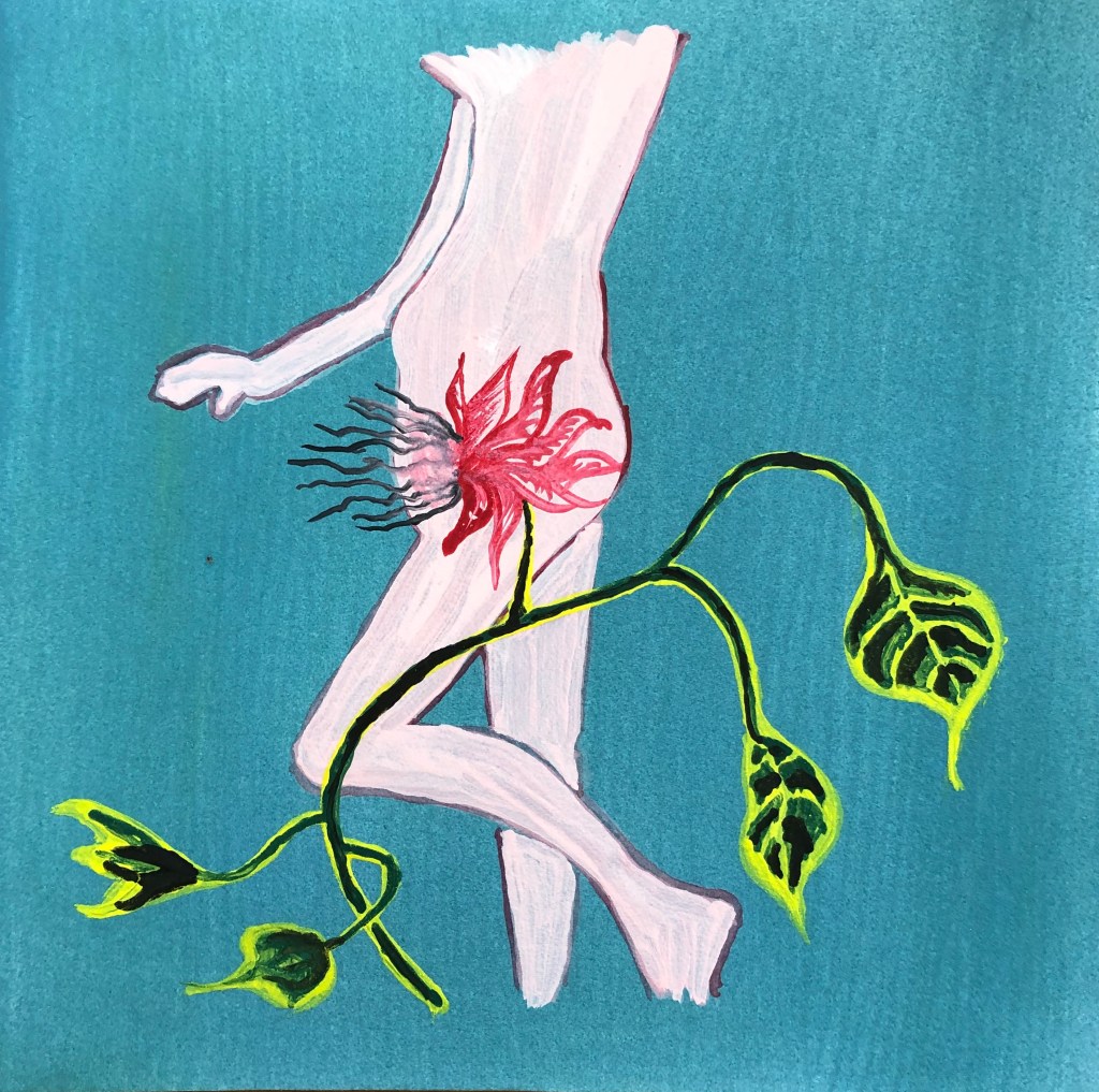
I decided to create a series of images of people I had encountered during this Part. One found image I selected – Lucian Freud’s “Untitled (Self-portrait)”, 1978, oil and charcoal on canvas, 60.1 x 60.1 cm, private collection – I had seen at the Royal Academy exhibition in January 2020, and it is striking because the majority of the canvas is blank (with evidence of an underpainting which has been covered) and only part of the figure, fully formed, looms out of this blankness. This made me decide to do something similar and only use part of the figure each time.
In Exercise 3 I enjoyed just painting lines and feeling their quality, so I decided to identify which “bit” of my figure to do each time by doing a set of blind continuous pencil drawings and choosing the part with the lines I liked drawing best. My sketchbook of pencil drawings, scale thumbnails, notes and ink tonal drawings can be seen in a separate video.
Now to choose my medium and ground. I had liked the depth of colour I found in the egg tempera work in earlier exercises, as well as its texture, so I decided to use this for both ground and medium. I had a Sennelier set of five tubes – ultramarine blue, alizarin crimson, lemon yellow, titanium white and ivory black – and it was my hope that using this restricted palette would help to unite the pieces into a series. For each painting I wetted the paper and then laid the ground colour on thickly and sweepingly with a fan brush (my favourite part), and then worked up the images in layers and small brushstrokes using a size 2 rigger and a size 6 round sable.
My aims were to:
Create a series which felt coherent
Learn about the use of egg tempera, a relatively new medium to me
Learn a little about other artists’ painting styles by replicating some of their work (without getting hung up on making exact copies)
SO WHAT?
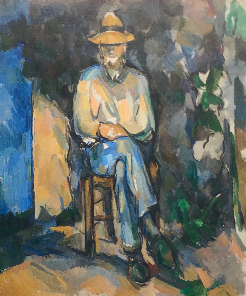
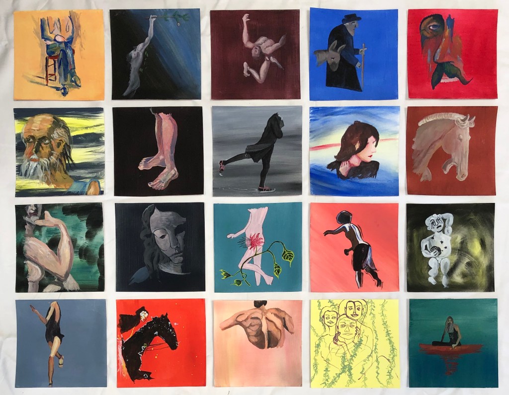
IMAGE 1
Paul Cezanne
“The Gardener Vallier”
C. 1906
Oil on canvas
65.4 x 54.9 cm
Tate
Cezanne is a favourite of mine – I like his loose areas of colour and his colour choices – here, attracted by the blue/orange. The section I chose was because of the sweeping lines of the legs.
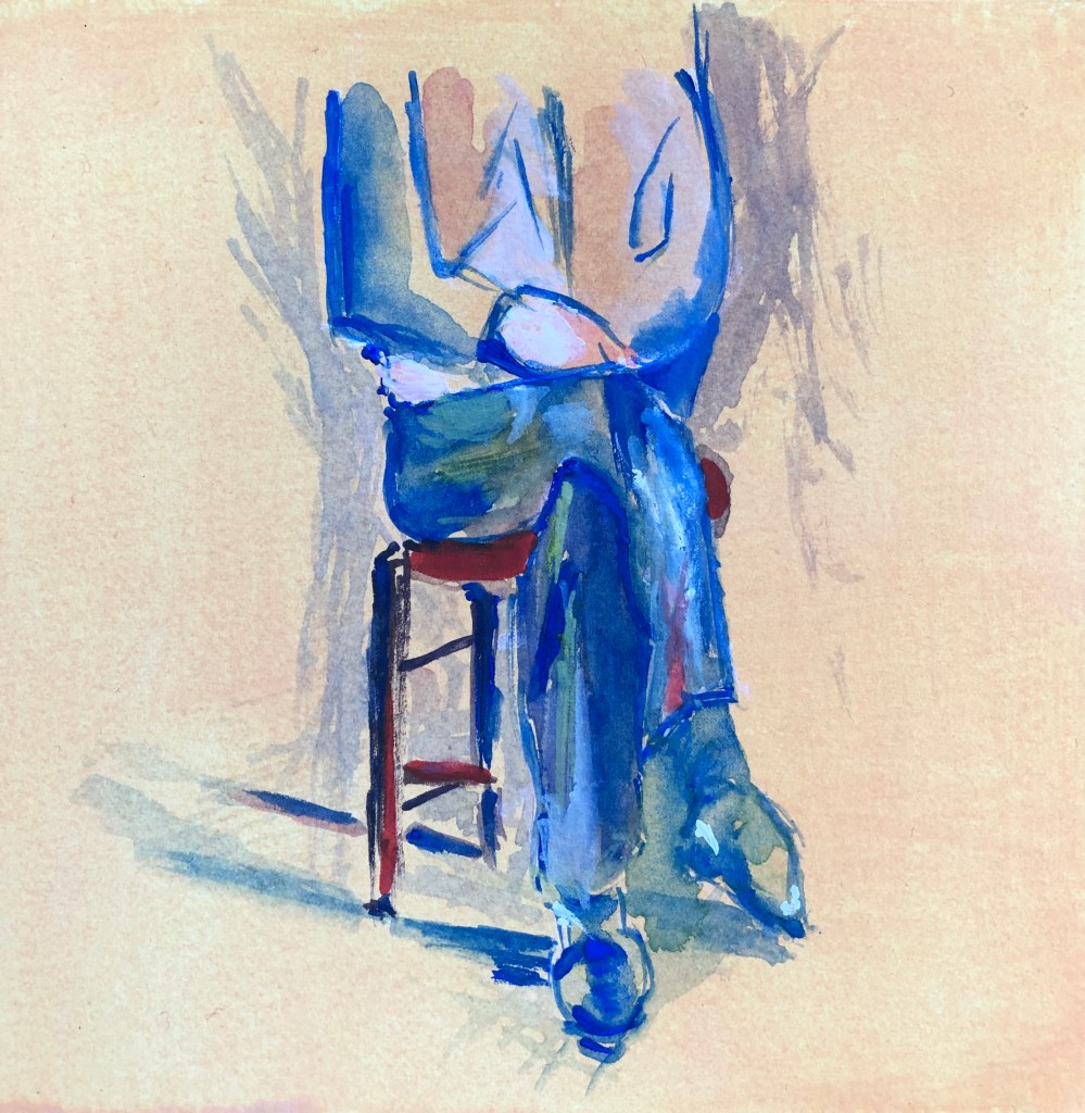
This is my version.
The background is actually more vibrant than it appears in the photograph – a chalky yellowy-orange very like the gardener’s jumper in the original; I think the camera has seen the chalk but not the yellow!
I liked the contrast between the straight lines of the chair and the curves of the legs. I omitted most other background, as it is my intention that the focus of all the paintings will be on the figure.
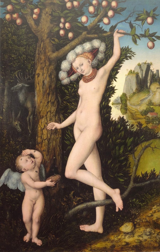
IMAGE 2
Lucas Cranach the Elder
“Cupid Complaining to Venus”
1526-7
Oil on panel
82.1 x 55.8 cm
National Gallery
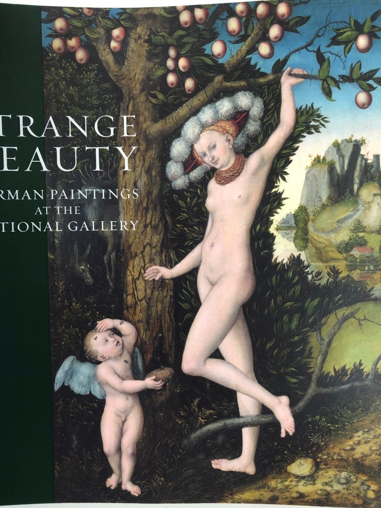
We were so excited to go to our first exhibition since lockdown. Compton Verney is a small gallery and this exhibition (on Cranach and then artists inspired by his work – see separate blog post) was a perfect size to take in for a first trip. I must confess to having been completely ignorant of Cranach’s work before attending – but I bet I’d pick him out in a crowd now. This image and its derivatives will feature several times in this series.
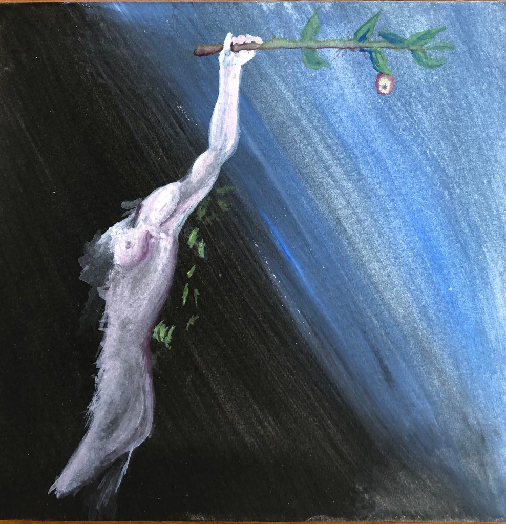
This is my version.
I was particularly taken with that line from her hand all the way down to her leg, so that was the section I chose. I chose a graduated ground, from black to light blue. The figure is off-centre, roughly on a vertical third, as I liked the idea of the curved diagonal meeting the straight horizontal branch with its one tempting apple. I included just a few leaves behind the figure to “place” her in front of a bush (otherwise I thought it might look as if she was hanging from the branch), although looking back at the image now I’m not sure these were necessary, and possibly look slightly out of place.
IMAGE 3
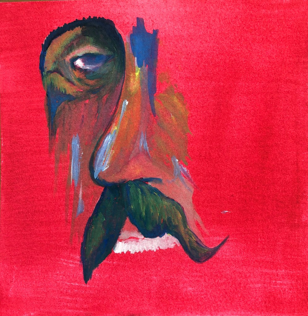
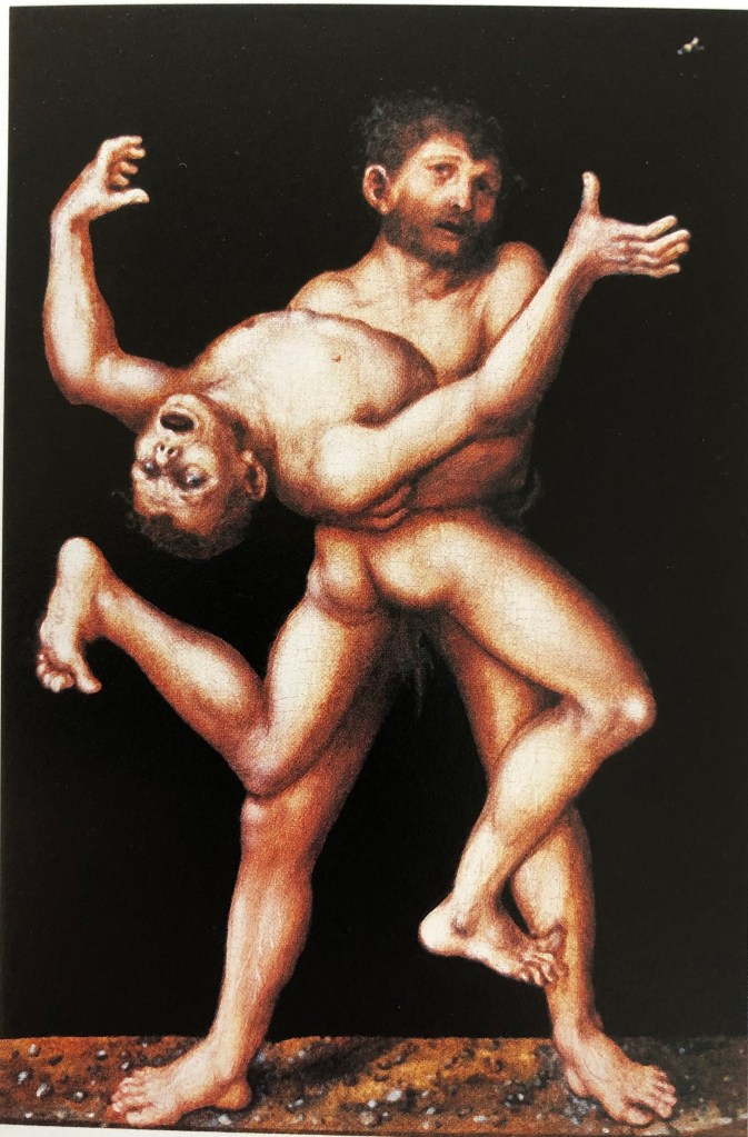
Lucas Cranach the Elder
“Hercules and Antaeus”
C 1530
Oil on panel
26.5 x 17.5 cm
Compton Verney
Another selection from the Cranach exhibition at Compton Verney – the original is actually really small for such a “big” subject matter. It has Cranach’s characteristic dark background and the main protagonist standing on a stony surface.
This is my version.
I decided that I didn’t want the background to be completely black – when you look at Cranach’s the black background has a reddish tinge to it – so I went for a mix of black and red. I was drawn to the figure of the giant with all those mirrored curves, so I chose him. It’s a strange pose, and takes a bit of getting your head around, but I hope I have captured some of the dynamism of the original. I originally meant to include Hercules’ arms, which are supporting the giant, but decided (having learnt from the extraneous leaves in my Image 2 painting that it wasn’t always necessary for a painting to be spelled out) that having him look as if he is in free fall adds to the sense of movement.
IMAGE 4
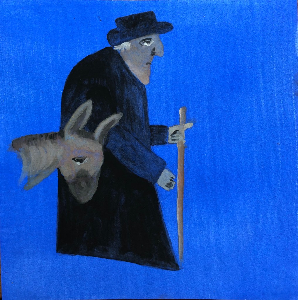
George Smart
“Old Man and Donkey”
1833
Collage on paper
37 x 31 cm
Compton Verney
This rather whimsical collage from Compton Verney caught my eye – it’s of an old postman doing his rounds. I’m struggling to say why it appealed to me, and have decided that it is the patient and slightly resigned expression on the faces of both man and beast, captured in the same handful of simple marks.
This is my version. I moved the donkey over as it was those expressions that I really wanted to try and catch. I originally intended to include some simplified elements of the background scene but then changed my mind and painted a simple mid-blue ground (rather startlingly blue in the photograph, the original being not quite so overwhelming). Not sure I’ve got the mirroring of the expressions exactly right – such a small difference of the flick of a brush can change the old man into a kindly old Moses and the donkey into looking distinctly woebegone!
IMAGE 5
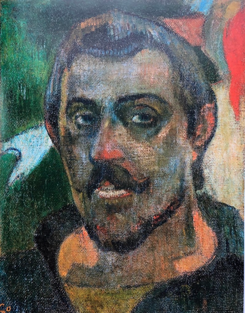
Paul Gaugin
“Self portrait”
1889-90
Oil on canvas
46 x 38 cm
The Pushkin State Museum of Fine Arts, Moscow
This is a reminder of a visit in January 2020 to the National Gallery to see the exhibition of Gaugin portraits. He painted a number of self-portraits, often dressed up as some character or other, but I liked this one for its straightforwardness. Like Cezanne, he often goes for pairs of complementary colours, and it was the huge range of colours in this image which made me choose it for this series.
This is my version.
The original seemed to have a reddish-orange underpainting, so I went for a glowing red background. I had been attracted by a pair of adjoining “2”s – the first a sweep of brow to nose and the other, on its side, the shape of the moustache – so that’s the part I chose. I feel I managed to come near the wide range of colours he uses and am pleased with the vibrancy of the piece, although (not that it matters) I don’t think I’ve quite got a likeness as I’ve made the eye too small.
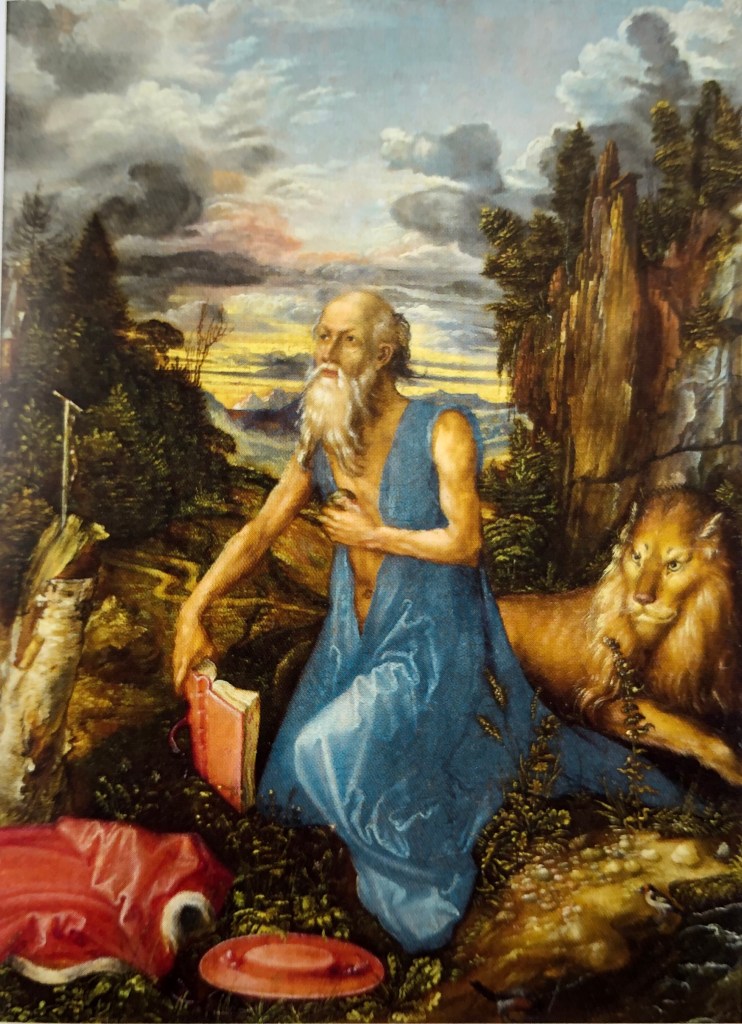
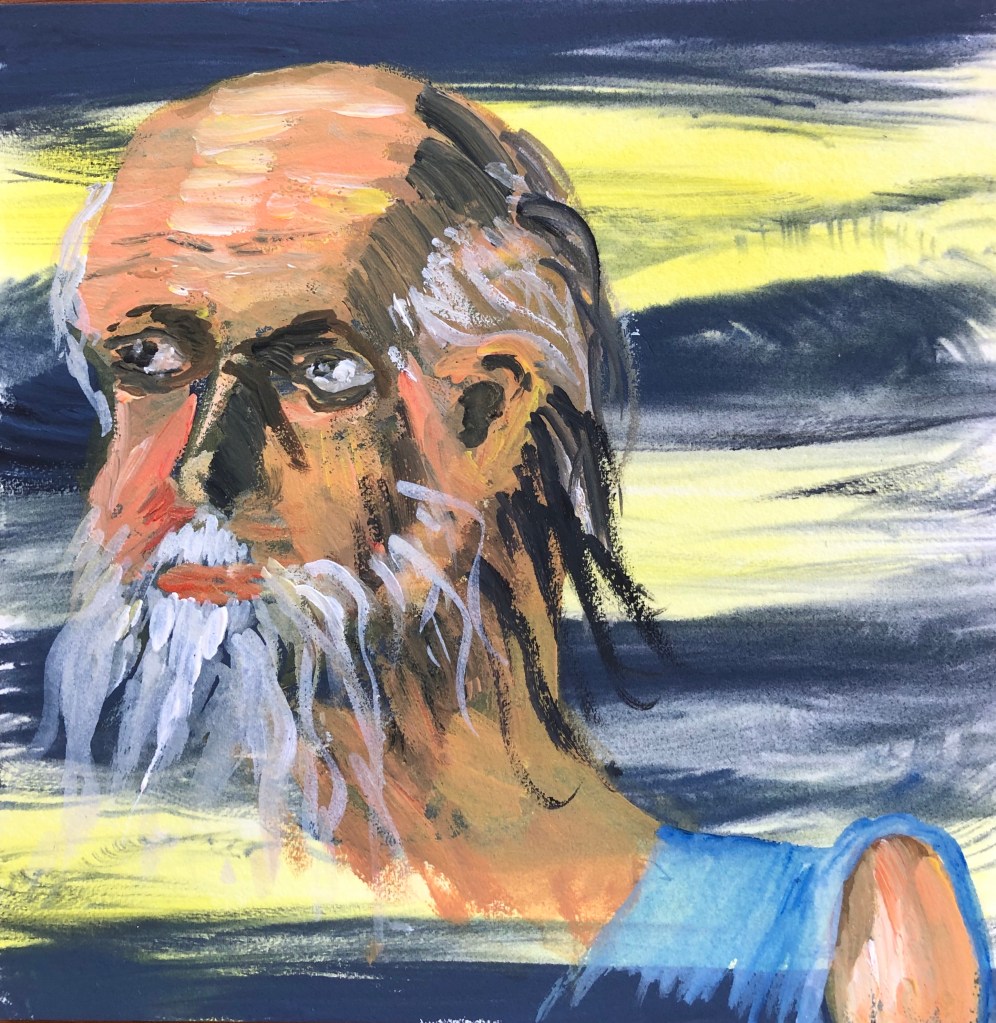
IMAGE 6
Albrecht Durer
“Saint Jerome”
C 1496
Oil on pearwood
23.1 x.17.4 cm
National Gallery
No series is complete without some reference to Durer. They had some of his prints, comparing them with Cranach’s, at Compton Verney as part of the exhibition, and I found this painting in the book I bought there. We have an etching of Durer’s Saint Jerome, along with his lion, in our study, so I always look out for him.
This is my version.
I had been drawn by the yellow of the sunset combined with the reflected ovals of the head and shoulder, so chose this section. I experimented with a more patterned background to reflect the sky I had liked – then panicked a little when I had to paint lighter colours over it. This pushed me to really experiment with the paint, applying it in small strokes but with more gesture and energy, and quite a bit thicker. Fortunately it worked and the head emerges from the background quite forcibly, I think, although I found I hadn’t left enough space to get the shoulder rounded as I had originally planned.
IMAGE 7
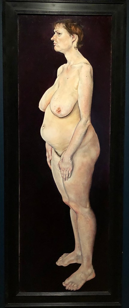
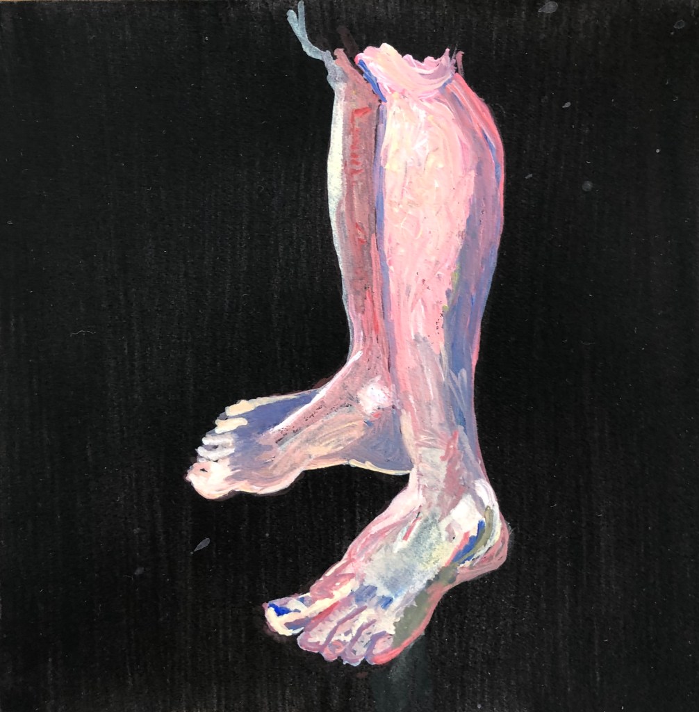
Ishbel Myerscough
“Untitled (Woman)”
1994
Oil on canvas
Flowers Gallery, New York & London
This painting, and one other, was at the Compton Verney exhibition in the section of “painters inspired by Lucas Cranach the Elder”. Ishbel has taken Cranach’s motif of a nude against a plain dark background but, whereas his ladies were beautiful in an idealised way, stretched-out to emphasise their womanly curves, she has painted her nude subjects exactly as they are, warts and all – they are very striking, and no less beautiful for being highly realistic.
This is my version.
I was drawn to the legs and feet: they are angled to plant the figure very firmly, I liked the curves, and, frankly, you can never draw (or paint) enough feet, they are the part of figure drawing (along with mouths) which I always find hardest.
The outcome is a bit Francis Bacon, looking slightly more like raw meat than legs and feet, but I really enjoyed building up the layers and putting in the highlights and shadows – I felt quite free about almost going over the top with my darks and lights.
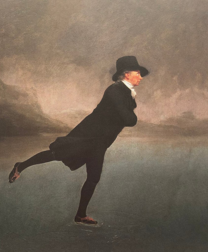
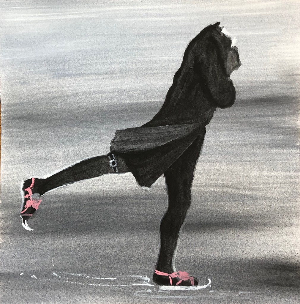
IMAGE 8
Henry Raeburn
“The Skating Minister”
c1790
Oil on canvas
76 x 64 cm
National Museums of Scotland
We saw this painting a couple of years ago in Edinburgh – the subject shows such poise and confidence – had to have him as a found image in any series of characters.
This is my version.
I liked the lines, shoulder to foot, down both the front and back, so they both needed to go in. I think I’ve got the lines, although not the correct angle of the overall figure, he is too upright – I did the inked tonal drawing in my sketchbook better (see video).
The background is a warm-ish grey, graduated from light to dark as you move down – could have got it a tiny bit darker right at the bottom to show up the skates better.
IMAGE 9
Elizabeth Peyton
“September (Ben)”
2001
Oil on board
30.8 x 23.2 cm
Private collection
Elizabeth Peyton was one of the artists I researched at the start of this Part. She manages to say a lot with a few well-placed brushmarks – something I could do well to learn from – so I picked this rather contemplative chap staring out over the water.
This is my version.
I was attracted by the repeated rhomboid shape of the face, the ear and the hand, so decided to try that section. I replicated the background very roughly with areas of blue, light yellow and a streak of red, although in my painting this red streak feels de trop and I should have painted over it. I have got the mirroring shapes enough, although the hand is too small. I failed somewhat with Elizabeth’s lesson of “less is more” by overworking the neck, which has doggedly remained the wrong shape and colour – in the end I left it, as I felt it was coming to dominate the whole painting. I managed to keep the face and hair much more lightly worked, and it shows to advantage beside the epic neck.
IMAGE 10
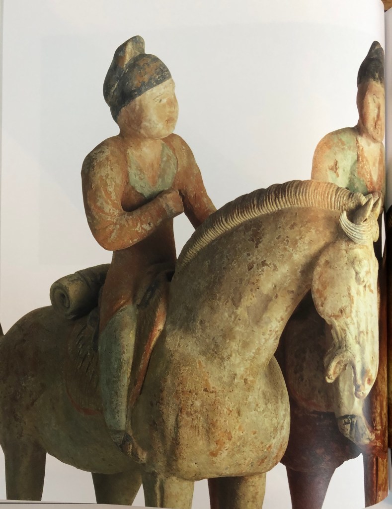
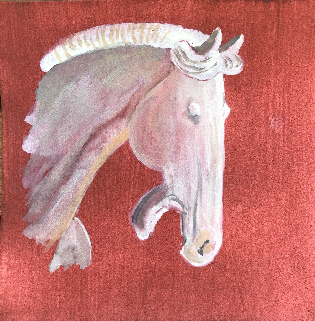
“Set of twelve painted equestrian figures”
c. AD 700-800
Tang Dynasty
Pottery, each 48.5 cm high
Compton Verney
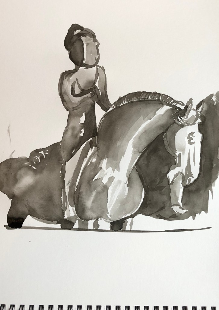
Compton Verney has a small but dramatic Oriental section, the doorway to that room being guarded by two rather fierce looking Samurai statues.
I chose this horse and rider for Exercise 4 and was pleased with my outcome – so it seemed that this pairing needed to be revisited for this project.
This is my version.
I had intended the horseman to be my character but, as I was doing my blind continuous line drawings, the horse kept pulling on my attention with that dramatic vertical head, until I gave in and decided that he had more character than his rider and so merited inclusion in his place.
The horse and rider behind him have quite a terracotta feel so I went for that colour as a ground. As I was building up my layers there came a point where I had to decide whether to add more or to stop – so I stopped. Hopefully he looks solid-and-yet-fading (he’s very old); this wasn’t what I was originally going for, but I suddenly came to a point where I looked at the image and thought – that’s it.
IMAGE 11
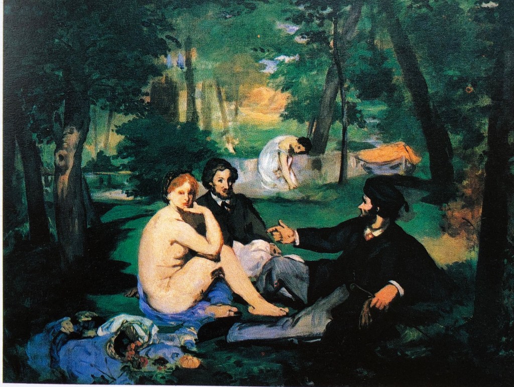
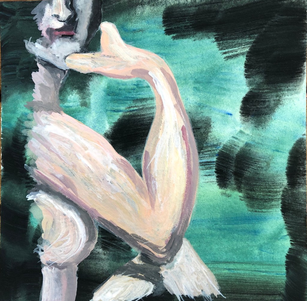
Edouard Manet
“Dejeuner sur l’herbe” – early version
1863
Oil on canvas
Final version was 205 x 264.5 cm
Courtauld Institute Galleries
I had come across this whilst looking at one of the “essential reading” books for the course: Waldemar Januszczak, 1980. “Techniques of the World’s Great Painters”. Chartwell Books, Inc, New Jersey.
I preferred this version to the final finished one, which is much more polished with all the fine detail – this felt much more rough and ready and you could follow the artist’s brushstrokes.
This is my version.
I was always going to have that insouciant shoulder in, and I was attracted, for the purposes of identifying a section, to the negative shapes between elbow and leg, elbow and chin, and hand and chin. I have tried to use the artist’s loose brushstrokes, both in the ground and in the figure. The dual colouring of the ground was, in retrospect, a mistake, it is too bold and detracts from the figure – it would have been better to have made it one or other of the colours. I think the arm and body went well and show that gestural quality of mark making; the leg does do that but is too small, and I could not resist overworking the face so that is all wrong – again, I think I did much better in the tonal ink drawing in my sketchbook (see video).
IMAGE 12
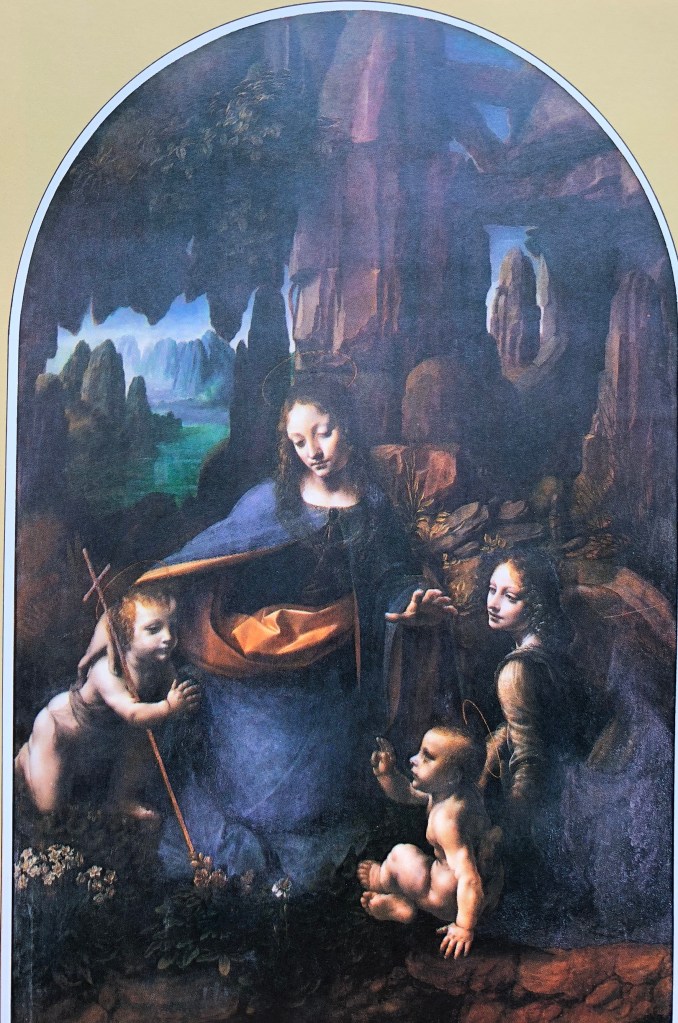
Leonardo da Vinci
“The Virgin of the Rocks”
C 1508
Oil on wood
189.5 x 120 cm
National Gallery
Again, I found this image in the essential reading (see reference in “Image 11”, above).
I particularly chose it because of the rocky entrance to the cave in the background, which reminded me of Mimei Thompson’s work, which I had researched earlier in this part and had liked.
This is my version.
I was originally going for the child on the left as I found his pose interesting, but kept being drawn back to the Virgin’s face – which is the idea of the painting, I suppose! – particularly the line of that lit side going down to the curve of her dress. I chose an indigo ground to reflect the shadowy rocks behind her, with some fairly strong vertical strokes. Again, much like the painting of the Chinese horse, I was building up layers and suddenly got the feeling that I needed to stop; the image was quite ethereal which seemed to suit the character of the subject, so I just built up the bits where the light would strike and then left it.
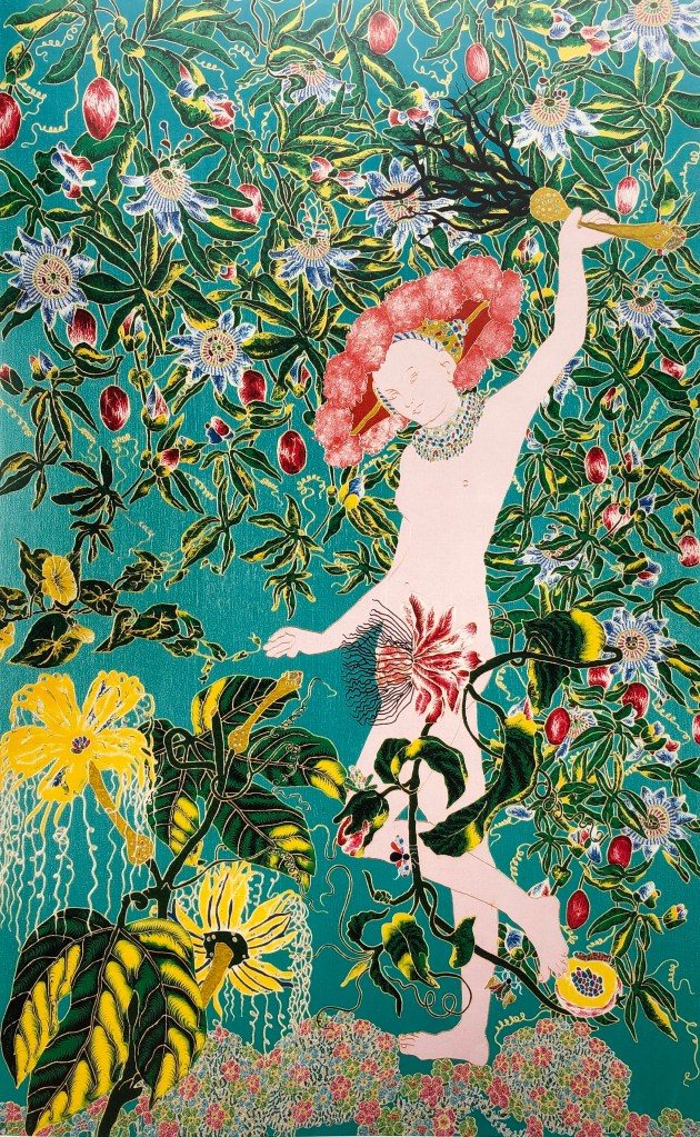
IMAGE 13
Raqib Shaw
“After Lucas Cranach the Elder”
2001
Oil, acrylic, enamel and glitter on board
166 x 104 cm
Central St. Martin’s College of Art and Design, London
Needless to say, Raqib Shaw’s work was included in the exhibition at Compton Verney as part of the group of artists who had been influenced by Lucas Cranach the Elder. He had taken just Venus, not Cupid, as an essentially flat image, and placed her in an exuberant garden of luxuriant, not to mention slightly sinister, plants.
This is my version.
I was interested in the lines around the hips and legs, so made this my main focus. The choice of background colour was easy. I just indicated the rather malevolent foliage – it would have been easy to get carried away with this and lose the central image. My only issue with this painting is that I haven’t quite managed to achieve an even coating of paint over the body – I wonder if I should have let the paint dry more before adding the next layer.
IMAGE 14
Peter Doig
‘Paragon”
2006
Colour digital print (oil on linen)
92 x 115.5 cm
Private collection
Peter Doig was one of the artists I was asked to research at the start of this Part. I liked his work as it looks simple at first glance but then seems to have lots of hidden layers. This seemed a joyful image of a game of cricket on a beach (albeit equipped only with a bat but no ball or wickets), and he has some interesting complementary colour contrasts going on (orange/blue, red/green). I picked it for my series as I was listening to the test match commentary on the radio whilst painting.
This is my version.
I chose this player because of the lovely line which runs down his back from the top of his head to the tip of his shorts. I made the ground an orangey-red graduated diagonally, light bottom left to dark top right. There were so many directional lines/patches in the original which again belied its simplicity, and I tried to get those. I feel this painting is a success – it’s striking, I’ve got the sense of movement whilst keeping clean lines and echoing the simple look.
IMAGE 15
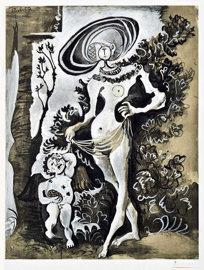
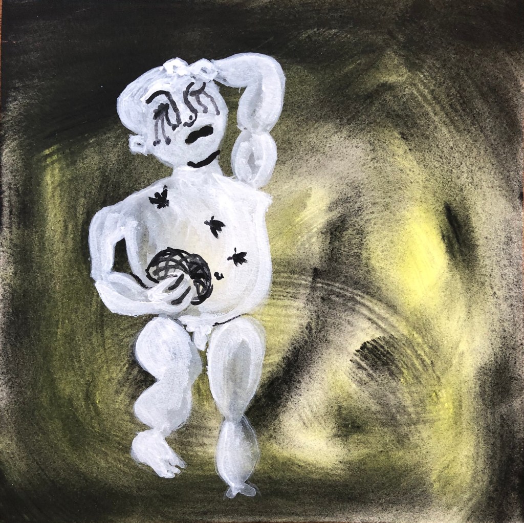
Pablo Picasso
“Venus et L’Amour d’apres Lucas Cranach L’Ancien”
1957
Colour lithograph on Arches wove watercolour paper
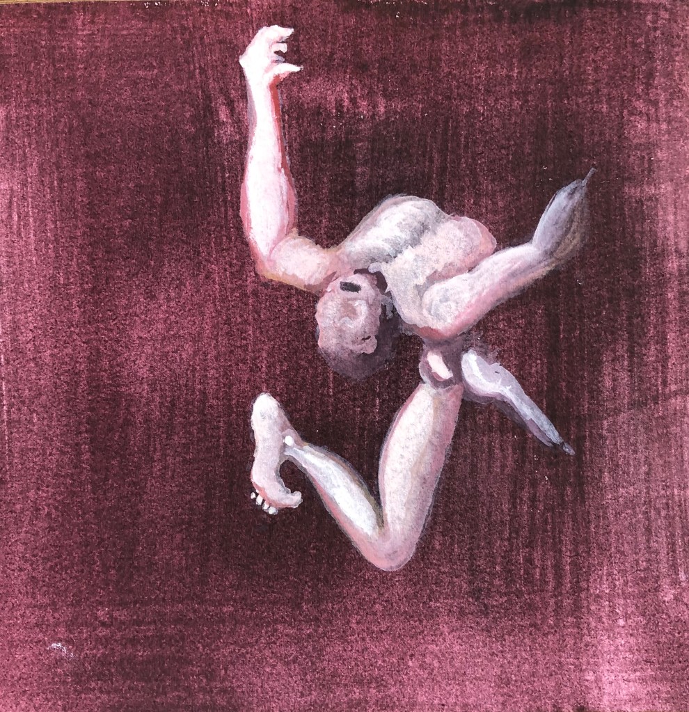
This again was in the Compton Verney exhibition in the gallery of “artists influenced by Lucas Cranach the Elder”. Picasso goes against Cranach by breaking the contours of Venus into sharp, unexpected angles. He has an interesting interpretation of her head and hat which I did think was going to be my choice when I was drawing, before I found curves on the figure of Cupid and decided to go for him instead.
This is my version.
I have to say this is my least favourite of the pictures. The background is too all over the place and I would have done better, still using the yellow and a tinge of black, but as a uniform layer. Also, I didn’t personally like the subject matter of a crying child – although it provided me with a puzzle trying to get all those interlocking ovoid body parts right – which I think I have mainly done. But I felt that he belonged in this series and was rather missing out to multiple representations of Venus.
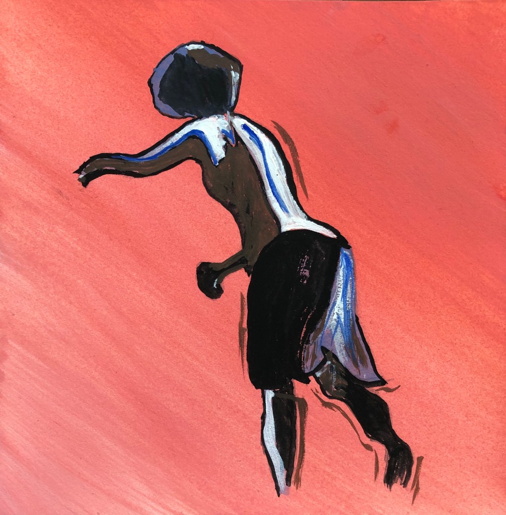
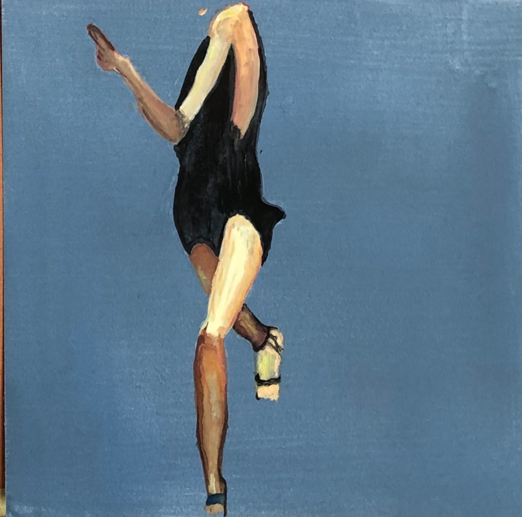
This is another artist I researched at the beginning of this Part. I was interested in this image at least in part because of the title which doesn’t seem to fit the image (surely she is not walking but running); also I listened to a really interesting interview with her on the Art Newspaper’s podcast “A brush with….” which went out on 19th August 2020, and which encouraged me to go back to her work and look at it afresh.
This is my version.
I liked the contrasting perspective of her legs and the way the line of the front leg was mirrored by the arm – so I needed to get nearly the whole length of her body in – quite a challenge on a 6 inch square piece of paper. I haven’t got the line of the front of her body quite right but don’t think this matters as there is still a sense of movement. I learned my lesson from the Picasso and resisted the temptation to break the ground into sections, keeping it plain instead.
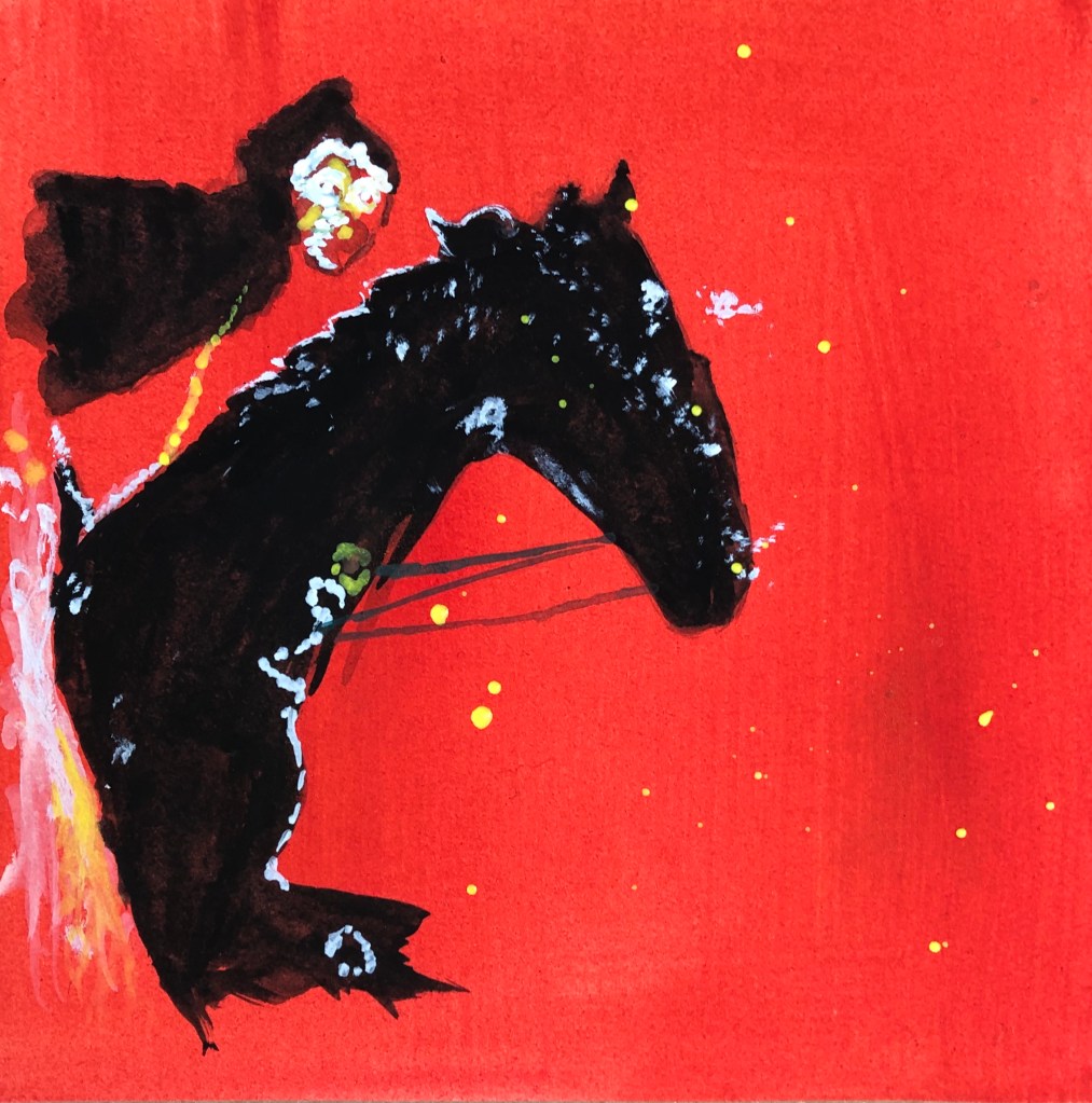
I researched this artist earlier on in Part 1. I found his images very strange, ghostly and otherworldly, but they do pull you in, and he does like a bright colour, as do I.
This is my version.
Flushed with success at horse-drawing after the Chinese horseman, I decided after some drawing practice that I could include horse and rider in this picture – it’s together that they provide the drama, and their shapes mirror each other. I resisted the temptation to go wild with colours in the ground, sticking to a vibrant red to contrast with the black figures. I included details on the figures, but minimal detail of the surroundings – it’s different from the original, but I believe it works.
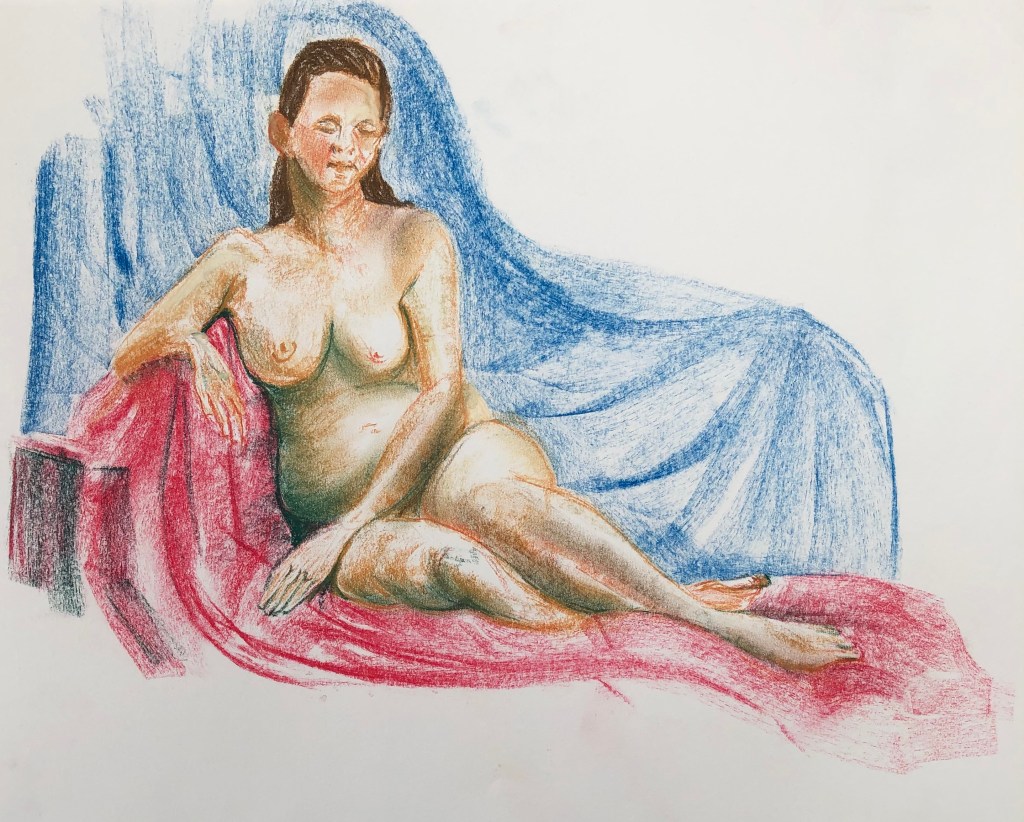
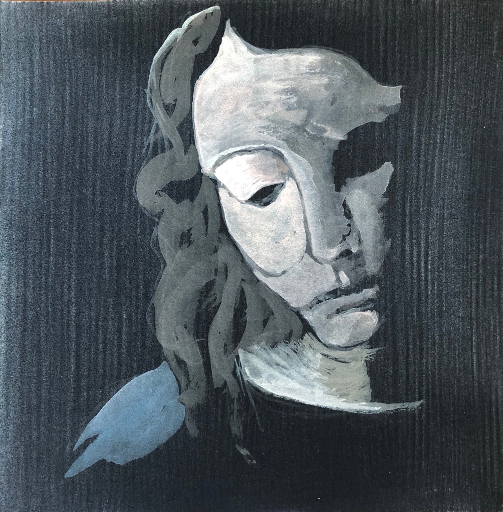
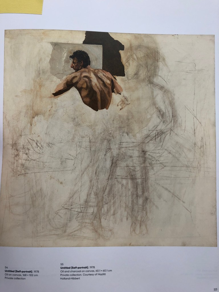
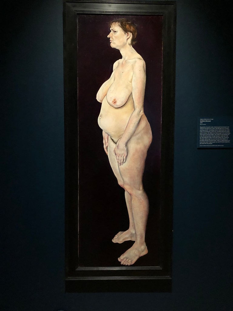
IMAGE 18
Lucian Freud
“Untitled (Self-portrait)”
1978
Oil and charcoal on canvas
60.1 x 60.1 cm
Private collection
This was the inspiration for my “part of the figure” idea – it’s such a striking image when you see it up close, and seems so strange that he paints creating perfectly formed sections.
This is my version.
This background is not completely plain – I wanted to give the impression of a work in progress going on underneath, and I think in this case the variegated ground works without dominating the painting. The photo looks a bit “brighter” than the original for some reason – this highlights the fact that I don’t think I have got the balance of lights and darks quite right – was very aware of my tendency to overfiddle.
IMAGE 19
Gary Hume
“Water Painting”
1999
Enamel paint on aluminium panel
300.5 x 244 cm
Seen in: Tony Godfrey (2009), “Painting Today”
Phaidon Press Ltd, London (one of our essential reading texts)
Another of the artists whose work I looked at at the start of this Part. It looked a bit like a continuous line drawing, and I chose it really because I thought it would challenge me to draw faces with one clear line, rather than my usual scribbly style.
This is my version.
Interestingly, another strange camera effect, as my original is a fairly violent bright yellow rather than green – I know lemon yellow is at the cool end of the yellows, so am guessing the camera has caught and emphasised the coolness so that it tumbles into green? This really did challenge me to draw the figures with a clear line, so I didn’t look at the original when painting (having practised already in my sketchbook in pencil and pen) but just went for it, having pre-mixed the paint (whereas in the other paintings I had been mixing on the go, sometimes on the paper). I have learned that drawing clear lines in this exposed way with a rigger goes much better once the initial paint load of the brush has been discharged.
IMAGE 20
Peter Doig
“One Hundred Years Ago (Carrere)”
2001
Oil on canvas
240 x 360 cm
Seen in the recommended text “Painting Today”
(see reference in Image 19, above)
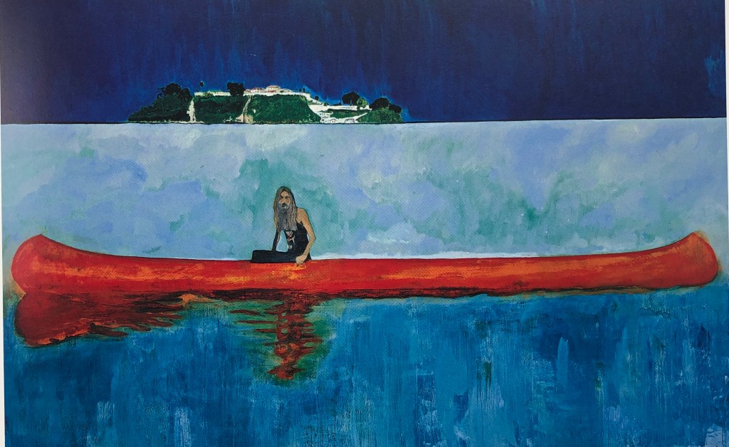
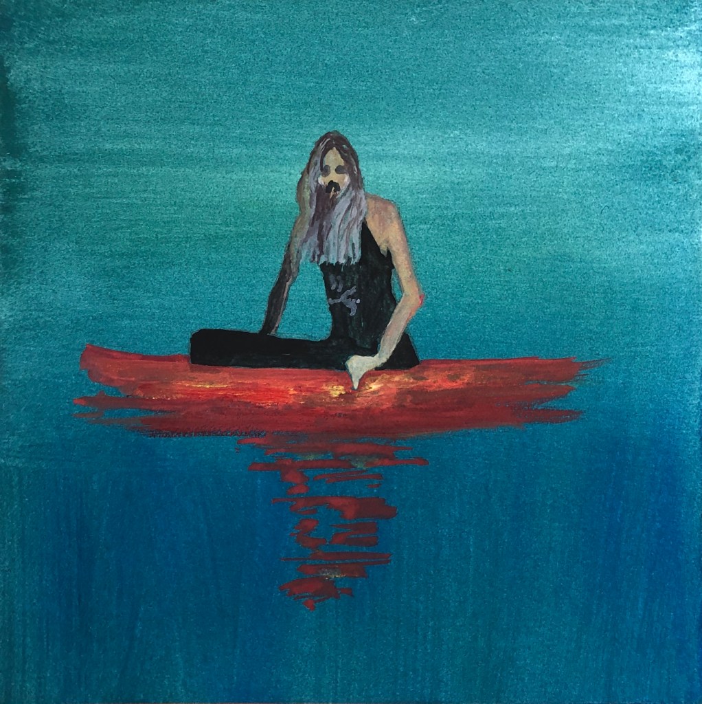
This was a typical Peter Doig painting to me – looks so simple at first glance, until you start thinking about it – why is this rather odd hippy-type chap floating around in the middle of nowhere in an epically large canoe and no visible means of propulsion? Peter Doig is the only artist to be in the series twice, but his images and characters are so varied that this felt within my self-appointed rules as not being repetitive.
This is my version.
Interestingly, as well as being the only duplicated artist in the series, this is the only time I have painted the figure entire, truncating only his canoe (so he now looks rather as though he’s sinking). It was that negative space triangle between arm and body that drew me in, but then I had to relate the other arm to it, and he has such an interesting head that I couldn’t think what to leave out. I am quite pleased with the graduated ground going light to dark as it goes down, but also switches part-way from horizontal to vertical strokes – I felt some subtlety was needed to be in keeping with the artist.
PRESENTATION OF THE SERIES
I tried various layouts….
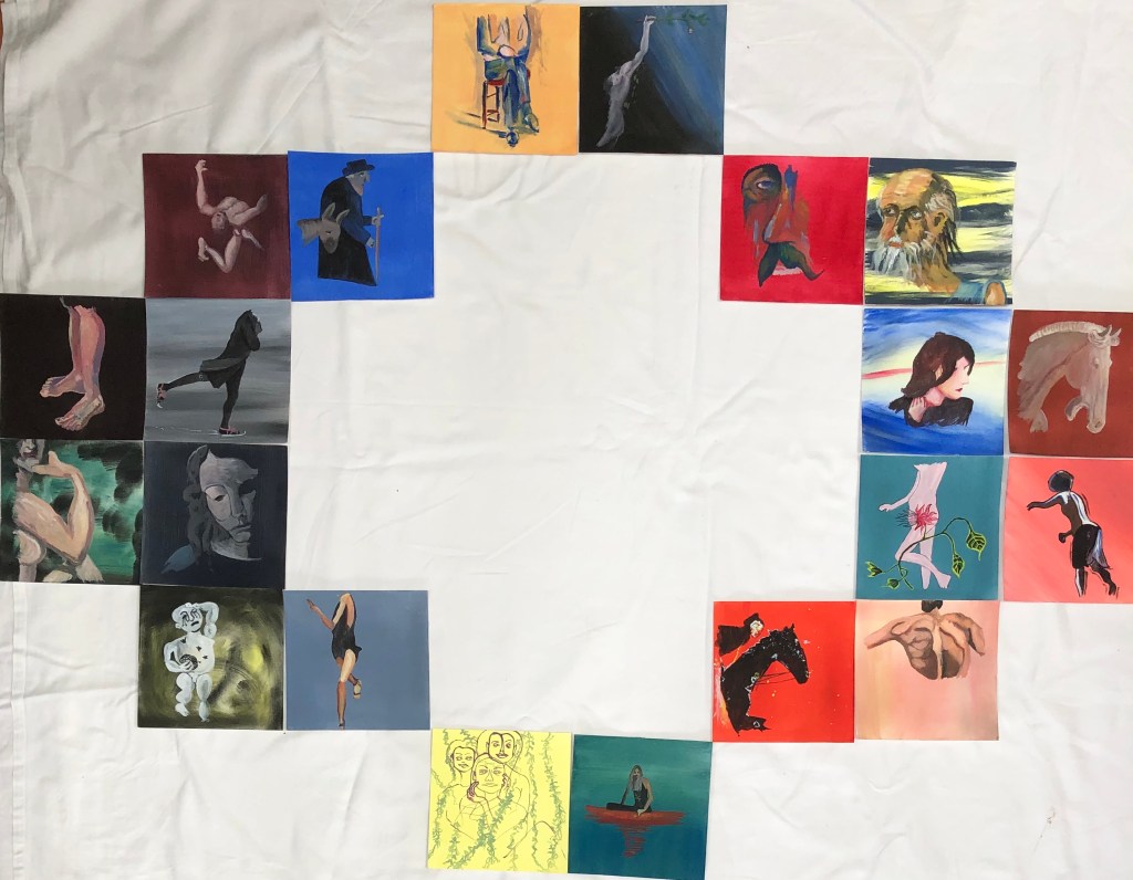
…….a grid with no spaces in between…
…a grid with spaces in between…
…and various other mathematical permutations and combinations:
These latter efforts did feel like fiddling for fiddling’s sake, there being no valid reason for presenting them other than as a block; the only decision then was to have spaces between or not. I came down in favour of yes and then consulted my family (without telling them my choice) and all of them picked the block with the spaces between – this way the pictures are all close together, so the eye can flick between them to compare and contrast, but each just has that little private space of its own to allow it to stand out and be considered on its own merits.
NOW WHAT?
I started out with three aims, and should like to reflect back on them here.
Create a series which felt coherent
I feel I have mainly succeeded. The images and styles are very different, and are chosen because of my personal learning journey, but they:
Are all the same size
All have a clear ground on which the figure was placed
Are all images of parts of figures
Are all created using the same medium
Are all created using the same limited palette of three primary colours plus black and white
I have made the most of my palette of colours, often using them in a very intense form, at other times more muted. Each painting is different and uses something of the style of the original artist, but my way of painting a simple background and then placing the figure onto it has created a series which is vibrant and clearly belongs together. I did consider ordering the pictures by date, or by colour…but this would be false as the paintings were not chosen for age or colour – they are a record of my learning, which was not ordered, but jumped around and wove back on itself, and I think my final presentation reflects this.
If I were to do this again I think that, to increase the coherence of the piece, I would simplify the one or two experimentally “wild” backgrounds and have them all either homogeneous or very subtly graduated.
Learn about the use of egg tempera, a relatively new medium to me
I have really enjoyed learning about this medium, my previous experience, prior to this course, being with watercolour. Hence my panic when I got to Durer’s St. Jerome with its rather strident background – but I found that, by applying the medium with a little “brio”, I could have the background only showing through where I wanted it, and not where I didn’t. The paint can be used very thinly and built up, or very robustly, as with the grounds. The paint I bought, made by Sennelier, has a good level of pigment, and some really vibrant colours can be achieved.
Taking the use of this paint on:
Of course, my experience of it is only in small paintings on paper – I now need to experiment with it on different supports (canvas, board, etc) and at larger sizes.
Learn a little about other artists’ painting styles by replicating some of their work (without getting hung up on making exact copies)
I have learned:
How hard all these artists must look at their subject matter
Detailed images are obviously closely observed, but those who apparently simplify and almost abstract must, it seems to me, almost look harder because they need to understand their subject matter but then think how to represent it (rather than just showing it as it is) so it is recognisable
Looking, thinking and then carefully placing a well-judged line is much more effective than a load of tinkering about!
Going forward with this: my preparatory drawings have shown me the beauty of a simple line, which all of these artists have demonstrated. To progress, I need to carry on with the continuous line drawing, preferably blind, so that I improve my confidence in the production of images which I (and hopefully others, too) find pleasing.
We met by Zoom to have an informal chat, feedback on experiences of those who had gone for July assessment, and to decide the future of the group next year, as the committee are reaching the ends of their courses.
SO WHAT?
People had a universally good experience of the July assessment and said so long as you read the instructions carefully and follow them, there are no issues; recommended that we all get better at making videos of our work!!
Look to see if there is a course module chat room – some have them
Ask OCA tutors to put out some sort of list of what they would be prepared to put on online sessions about – Holly to get in touch with OCASA for this
Agreed that we would carry on with monthly Zoom meet-ups for now; those who had been part of the group for some time obviously miss the physical meet-ups but, on the other hand, those who find it difficult to get there are benefiting from Zoom. The meetings will be on the 2nd Saturday of the month and, as well as chat supporting each other through tricky times, we shall:
Invite a tutor to give us a talk on something,even if short
Share work
Share experiences e.g. gallery visits
NOW WHAT?
I only got into the group last November but have found the one physical meeting and the various Zoom meetings I’ve attended useful and informative – so glad that the group is keeping going in some form.
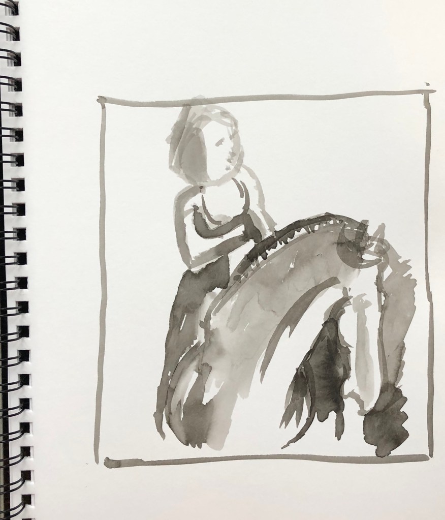
I chose an image of some Chinese pottery from the Compton Verney collection; I am interested in pottery and also Oriental art; as in, it intrinsically appeals, rather than knowing much about it. I focused on the left hand horse and rider for my 10 min upside-down drawing. The notes suggested I choose a different found image for the 20 min painting but I wanted to try and get this right, so stuck with the same picture for both.
SO WHAT?
I chose to use Chinese ink, partly because it seemed appropriate to depict a Chinese stimulus, and also because I am very familiar with it and felt it would be a medium that would respond quickly to a timed task. I used a size 6 round sable.
For my 10 min picture I drew myself a quick frame in my multimedia sketchbook approx the relative dimensions of the photo. I found it a bit discombobulating working upside down and decided to detach myself completely from the “meaning” of the image by painting in the negative spaces – however, I was conscious of working to a time limit and made some errors in placement which threw me out rather.
I therefore decided to stick with this image for the 20 min task, and worked a bit larger, in A3. I must confess to putting in some light (dilute) guiding lines to help me with my bolder wash areas, and I think this has allowed me to have more success in detailed areas like the horse’s head, ears and mane, where I got muddled previously. I managed to build a few washes to create form but would have developed this more had there not been a time limit.
NOW WHAT?
I have learned that:
This is quite a liberating technique for subjects where one had a bit of a mental block – I’ve always said I can’t draw horses to save my life, yet this is the best horse I ever done (even though it’s pottery)
Using negative space to define shapes only works if you really take the time to look; “slapdash” approximation doesn’t work
This exercise confirms my choice of ink as a good medium for rapid tone and form building as it dries so quickly, allowing you to apply the next layer within minutes
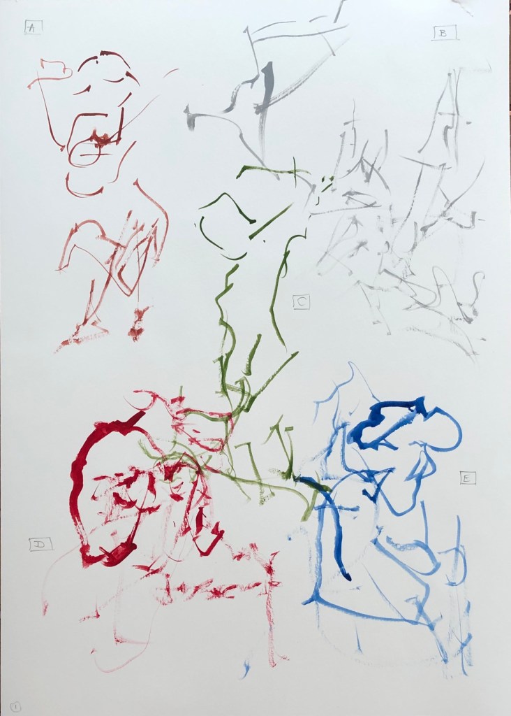
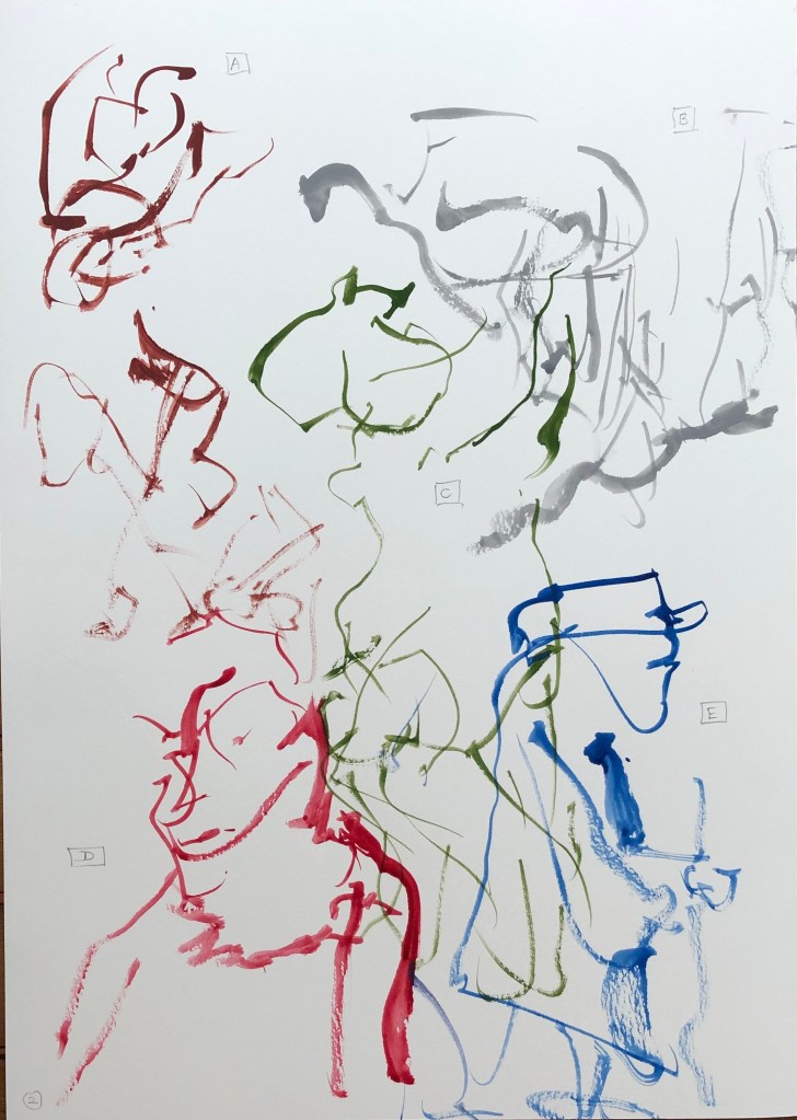
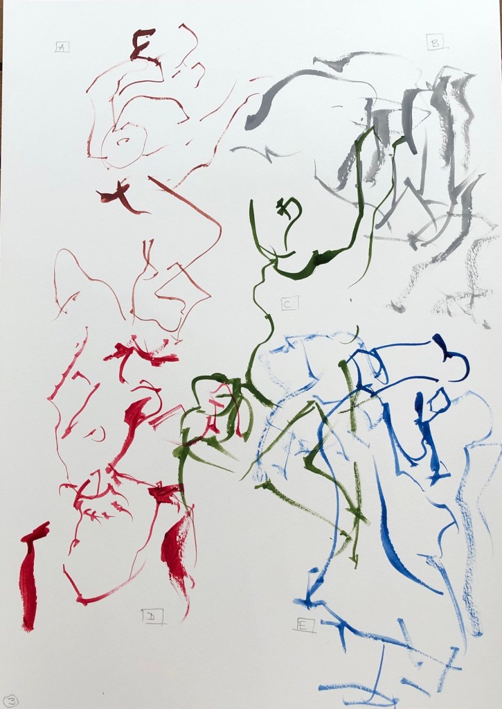
I decided to work with a size 2 rigger in gouache, which makes clear marks, and is quick drying – which to me was an advantage so I could see which picture was supposed to be which.
I maintained the same colours and positioning on the page for the three attempts:
A was Indian Red
B was Neutral Grey
C was Olive Green
D was Crimson
E was Rowney Blue
Attempt 1 was a learning curve in drawing with my left (non-dominant) hand with a rigger like a pencil, 1 minute per image, looking only at the found image and not at my page. Interestingly the one which is pretty unrecognisable is the landscape, the rest being (to my eyes) clearly figures of some sort.
In Attempt 2 I tried to vary the line thickness a bit to convey darker areas – but without looking at it I found this difficult; with a pencil you can feel whether you are making a heavier mark, but without looking at the rigger, you can feel the end of the brush bending but don’t know what sort of mark has resulted.
In Attempt 3 I persisted with my attempt to indicate tone with some heavier marks, and also began all but the first image in a different place to see if I could find an easier way to encapsulate the picture in one minute. Not a great improvement, just different.
NOW WHAT?
I have learned:
I need to practise this technique more – it is something I tried in Drawing 1 with pencils or pens, but these are rigid objects where you can “feel” your way; whereas a brush is a flexible tool and reacts differently – a lighter touch which I need to learn
Overlapping images are OK – not everything needs to be neat
I liked the flowing quality of some of my lines – these can’t be controlled in the same way as a pen or pencil, and feel looser as a result
A one-minute drawing/painting felt much easier with a figure which seems like a continuous whole – landscape was an assemblage of separate parts which were difficult to place without looking, especially when you took your brush away to reload with paint.
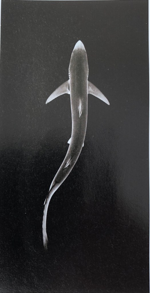
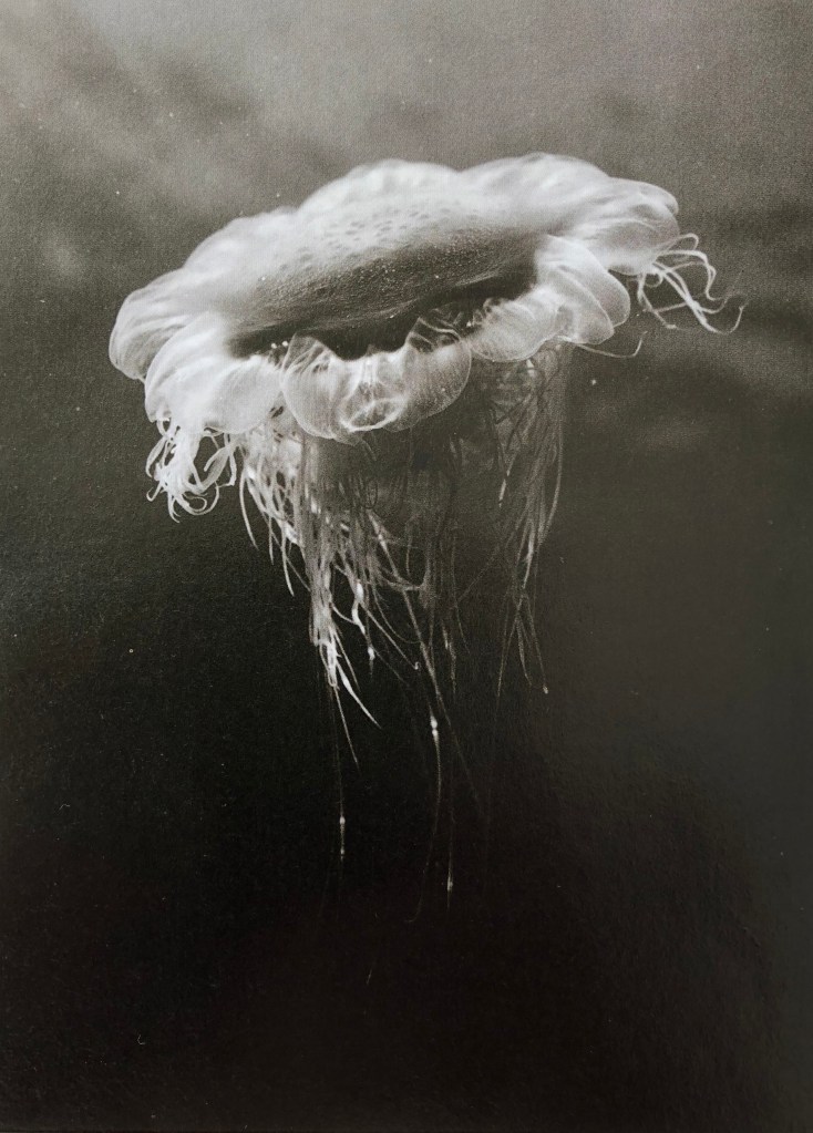
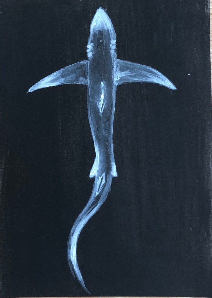
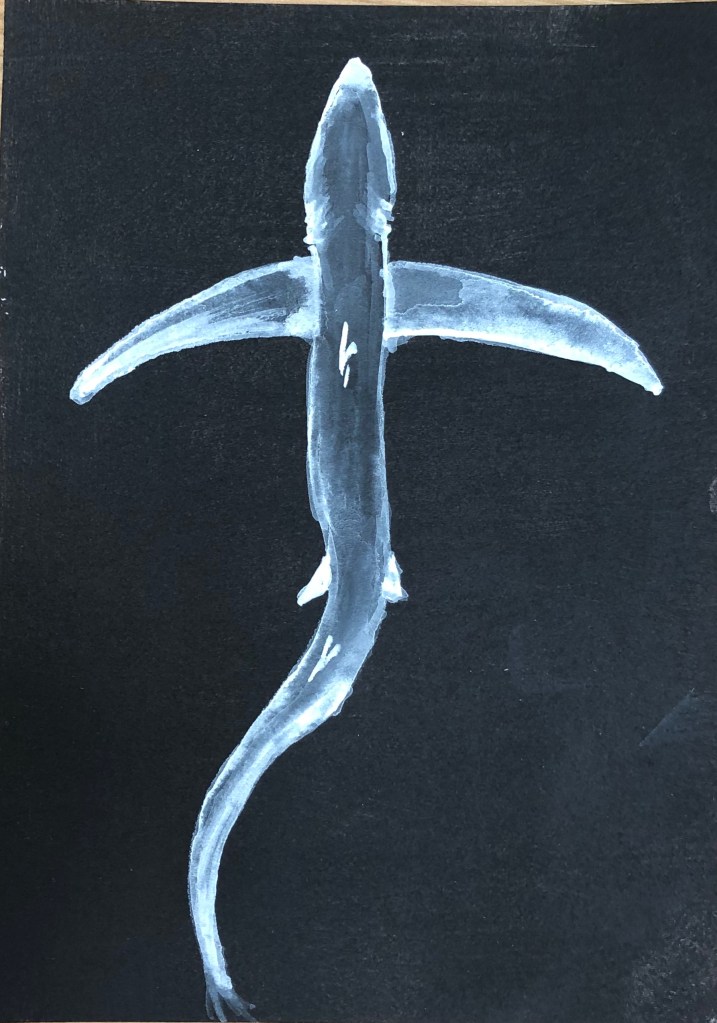
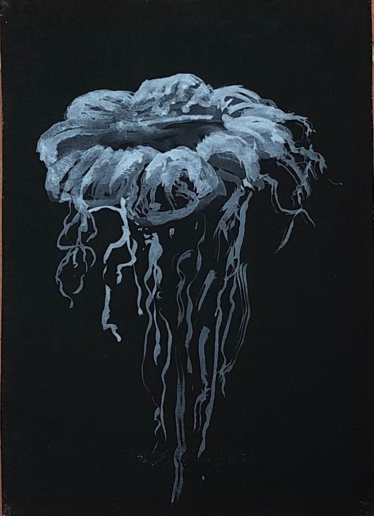
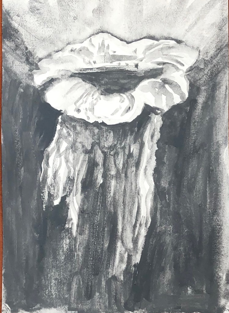
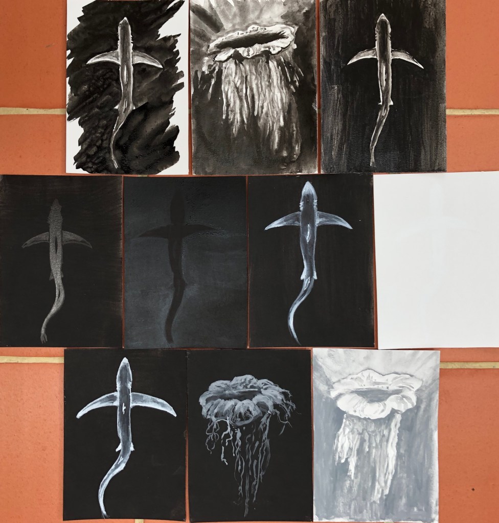
I prepared 10 pieces of hot pressed watercolour paper with black or white acrylic grounds. The two found images I chose to work from were black and white photographs taken by marine scientist and freediver, James Monnington. He dives all around the world but I have chosen two of his images taken down here in the South West; the lion’s mane jellyfish, found in seas around the West Country and Wales, and the blue shark, seen off the coast of Cornwall. I chose these two images as a contrast – one for its simple and elegant lines, and the other for a mass of detail of which I hoped to give an impression rather than an exact representation.
SO WHAT?
Blue shark in black ink on a white background, using a size 6 round sable. Tried to paint this by putting in the negative shape first and then building up layers of diluted ink within the body of the shark, leaving the very outer edges of its body white. I always seem to find it hard to get crisp edges when painting negative shapes – done better here on the fins than the body, although pleased I managed to indicate the gill slits. Painted this on a hot day so the layers dried quickly and I didn’t get too many “cauliflowers”, which are easily forgotten until too late.
Lion’s mane jellyfish on a white background using black ink using size 6 sable. Not sure how to tackle this; decided to put an extremely dilute ink wash around the body to preserve the white of that, then streaked the rest of the sheet with water, turned image upside down and dropped in lots of undiluted black ink and let it run down, trying to lead it with the tip of the brush and encourage it to go where I wanted. Then painted simple details of the body with a small amount of ink and almost dry brush. Not much like the original, but hopefully you’d recognise it as a jellyfish!
Blue shark in black acrylic on white acrylic ground using size 6 sable. I found slightly dilute black paint hard to apply over the white acrylic ground – I thought I’d applied the ground evenly with vertical and then horizontal stokes, but the black acrylic showed up quite streaky in vertical lines and had to have a second coat applied in virtually undiluted paint, with just a damp brush. I haven’t got the shape of the shark sufficiently sinuous and, once the black is on, it’s hard to get off if in the wrong place. Live and learn.
Blue shark in black Chinese ink on a black acrylic ground. This gave me permission to simplify the image as the light parts of the image could only be conveyed by the shininess of the ink against the matt background – but then it was hard to build up gradations of tone with the ink as it was all just shiny, and the tonal gradations can only be seen from certain angles. It is dramatic, however, when seen in the right light.
Blue shark – Black acrylic on black acrylic ground, size 6 sable.Tried bit of dilute acrylic just to draw an outline – the second it dried it had been absorbed and was invisible. Decided to build up the background with several layers of black to leave a lighter reverse “silhouette” of the shark without any detail – this worked, although needed to go over it over and over – fortunately a hot day so it dried very quickly, although the paper became quite warped.
Blue shark – White acrylic on black acrylic ground, size 2 rigger to allow detail. Built up the tones by starting with very dilute white – again, seemed to be absorbed very quickly and marks soon very ghostly – but gradually got thicker and thicker paint for the lighter whites. It’s still ghostly but I left it like that, seems appropriate for the stealthy subject matter.
Blue shark in white gouache on white acrylic with size 6 sable. Again tried to go for a white silhouette against the white ground. The chalkiness of the gouache, combined with the fact that it is a whiter white than the acrylic, makes it just about visible, although not something that I would ever use, it’s difficult to make out and photograph.
Blue shark in white gouache on black acrylic with a size 2 rigger. Managed to get a similar ghostly effect as with the white acrylic – stands out more, but slightly less ethereal because the permanent white gouache is a brighter white than my titanium white acrylic – so which you choose would depend on what effect you want.
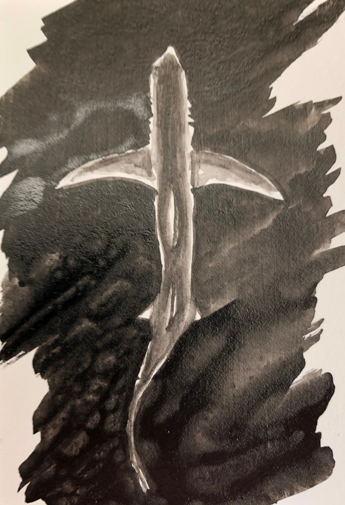
Lion’s mane jellyfish in grey gouache on black acrylic with size 6 round sable. I’ve enjoyed this the most so far – adding grey to make an image lighter felt counter-intuitive but it’s turned out very jellyfish-y.
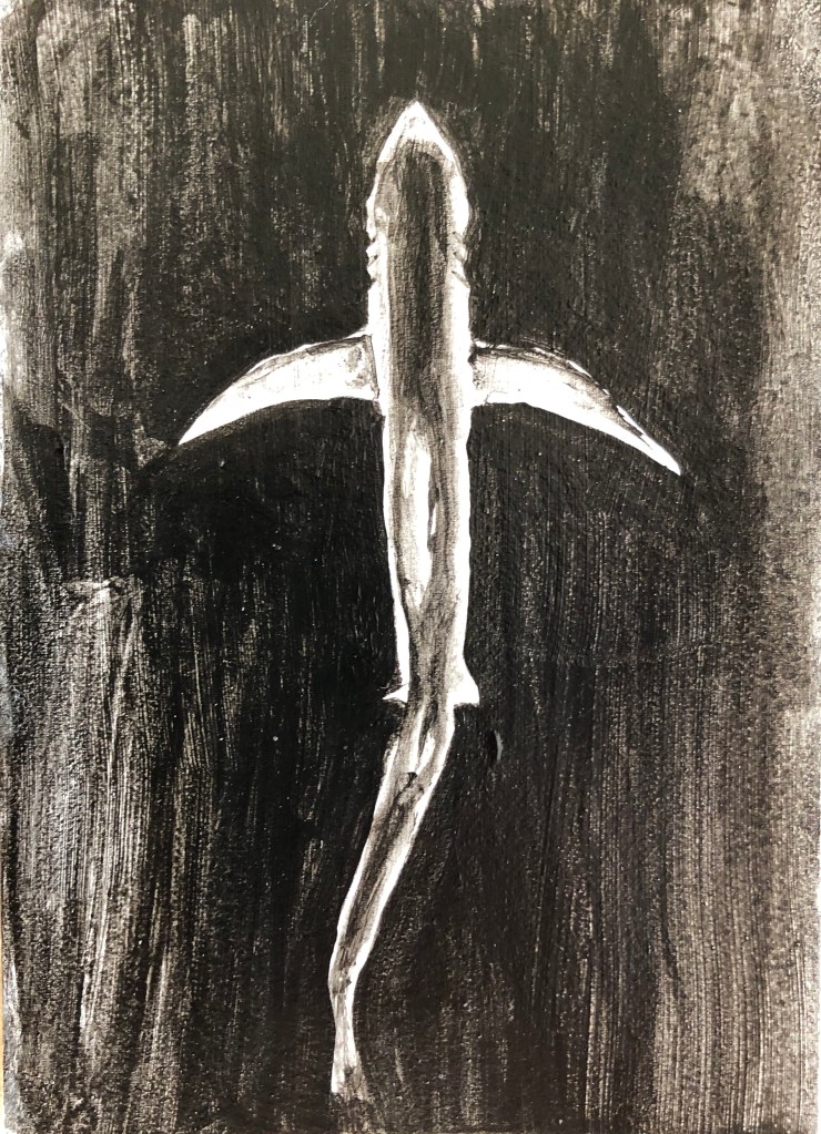
Lion’s mane jellyfish in grey gouache on white acrylic using size 6 round sable. Oddly, having just used grey as my “light”, it felt tricky to now change back to the more traditional use of it as “dark” – I don’t think my end product is nearly as translucent.
NOW WHAT?
I haven’t previously done much black and white painting, apart from quite a bit of drawing with black ink on white paper. I’ve learned that:
Shiny black (in this case, ink) onto matt black (in this case, acrylic) can give a distinctive and eye-catching outcome
Paintings of ghostly, ethereal images are more easily achieved effectively on a dark background – specifically I liked thin white acrylic on black and grey gouache on black
I need to give more careful thought to my backgrounds, both in terms of colour and tone, but also in terms of texture, e.g. matt or shiny.
First exhibition visit since coronavirus lockdown to Compton Verney gallery to see exhibition of Lucas Cranach the Elder’s work. We had an hour, in groups of 10, to look at two smaller rooms and a large gallery which was split into work by Cranach, and then more modern work by other artists inspired by Cranach.
SO WHAT?
“Cupid Complaining to Venus”, 1525, oil on wood. National Gallery, London.
This was one of my favourites, showing the elongated nude against the dark background standing on stones for which Cranach is known; Cupid’s aggrieved expression is very amusing.
There were examples of reactions to Cranach’s work by, amongst others, Picasso; his German dealer, Daniel-Henry Kahnweiler, remarked that “…one of Picasso’s notable characteristics was the need to transform existing works of art”.
I was taken with the work of Ishbel Myerscough, for example “Untitled (Woman)”, 1994, oil on canvas. Flowers Gallery, London, New York. She has taken Cranach’s “motif” of a nude figure against a dark background, but her figures are representational rather than idealised.
I also enjoyed the brightly coloured enamel paintings of Raqib Shaw, such as this example, “Exquisite Penance in Exile…after Cranach”, 2019-20, (based on Cranach’s painting The Penance of St. John Chrisostum), acrylic liner and enamel on aluminium. Raqib Shaw and White Cube.
Seen close up, these paintings are highly textured and reflective.
NOW WHAT?
This exhibition really brought home to me the way that many current and recent artists take the work of earlier masters and use them as a basis for their own work in so many different ways.
I am going to try and use some of Cranach’s paintings as “found images” for use in the exercises in Part 1 of Painting 1.
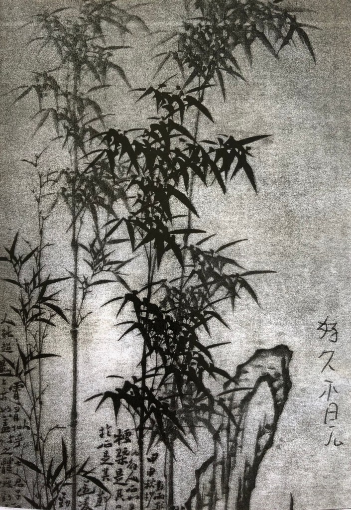
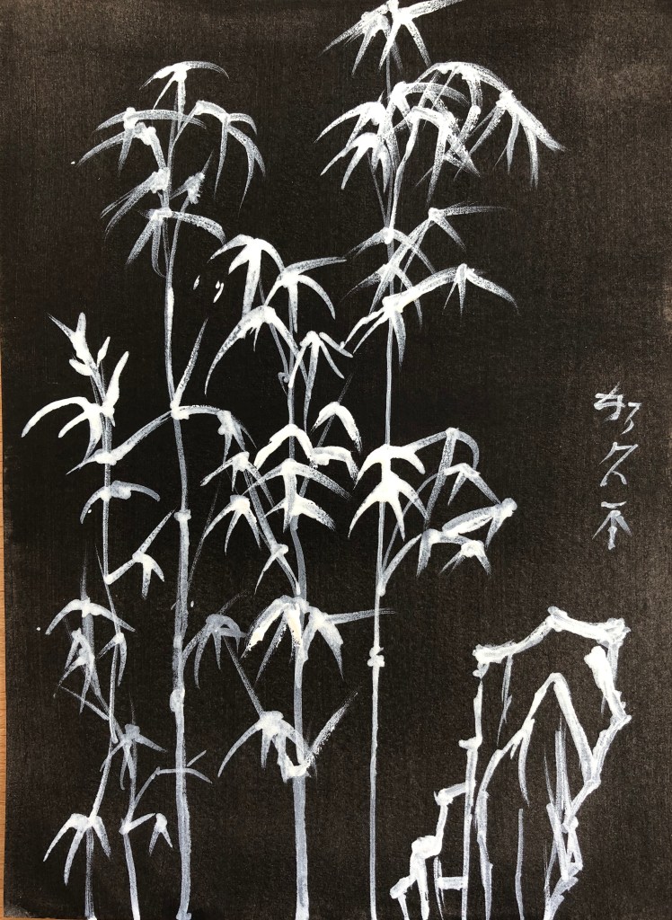
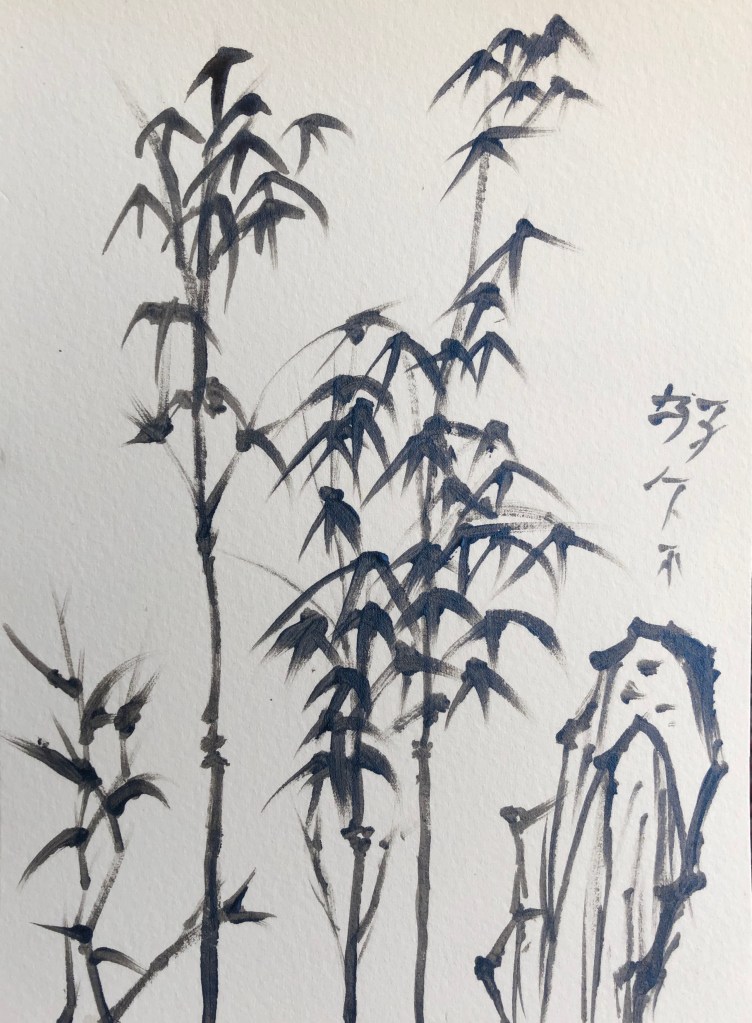
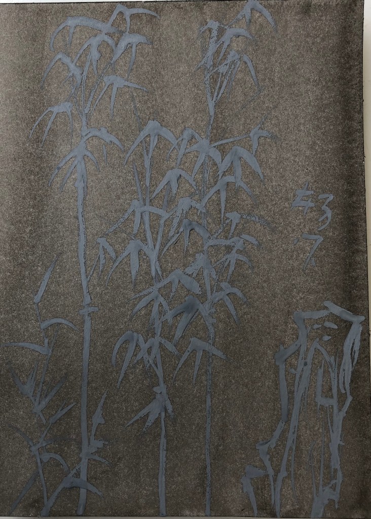
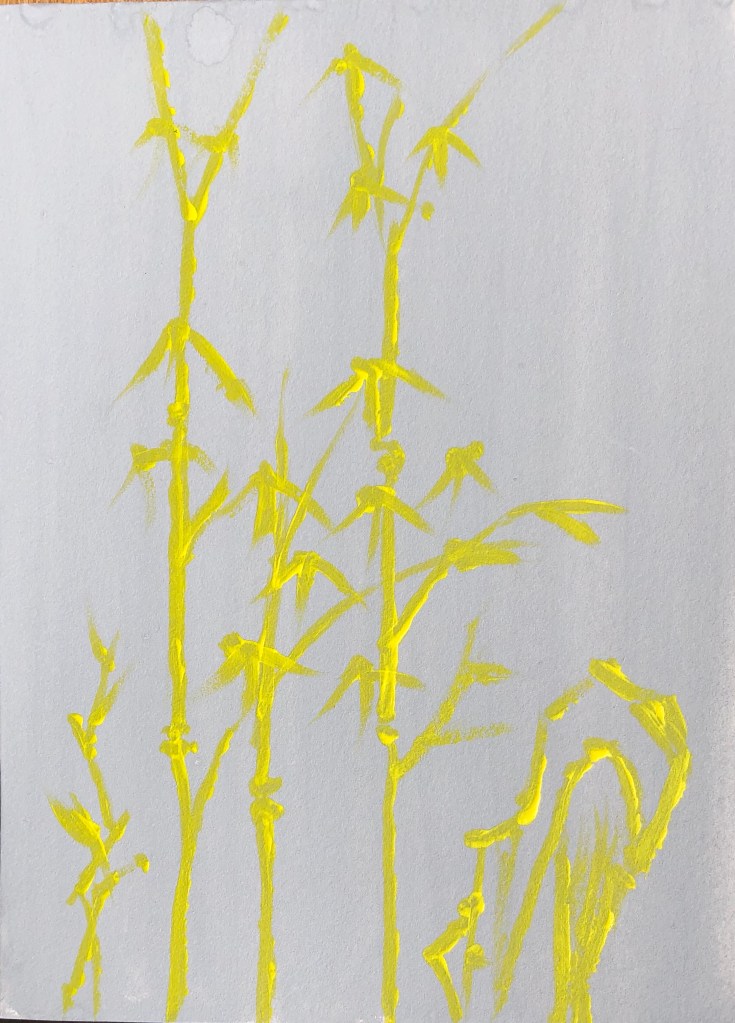
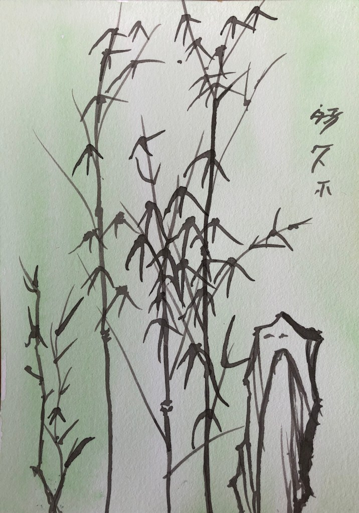
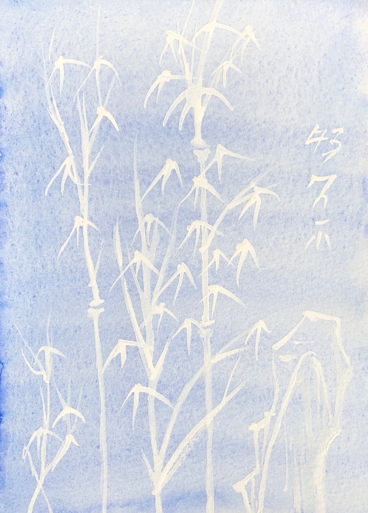
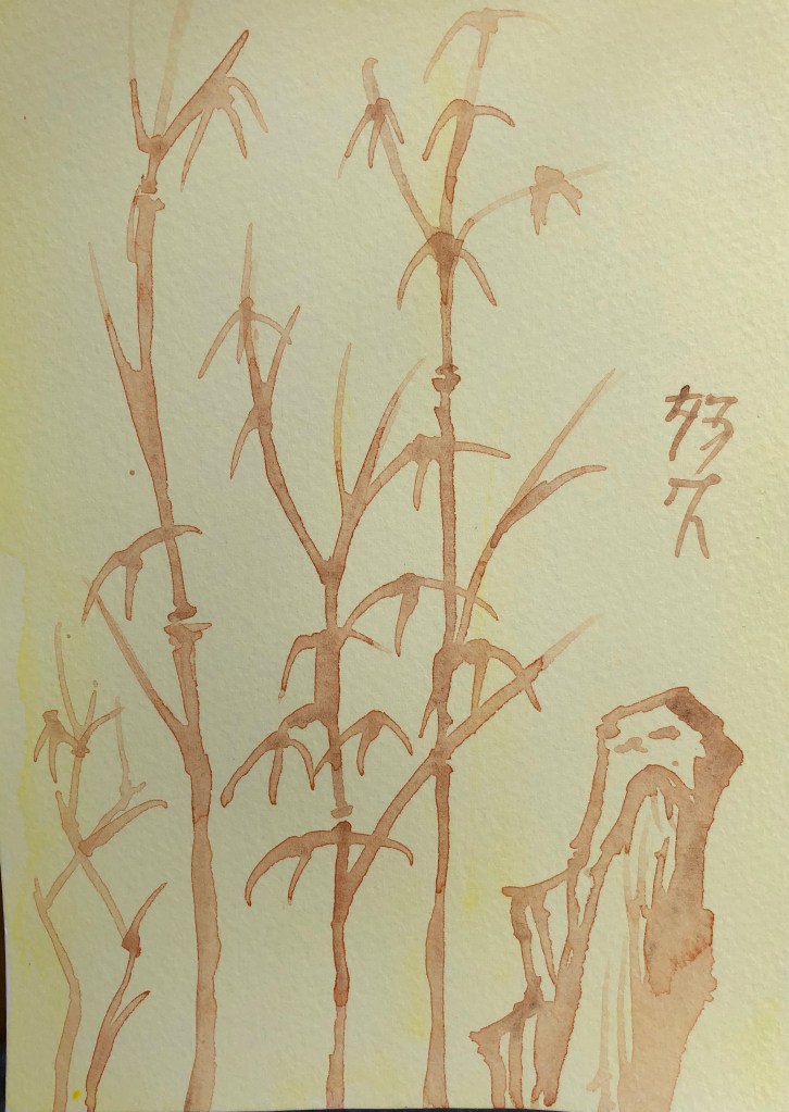
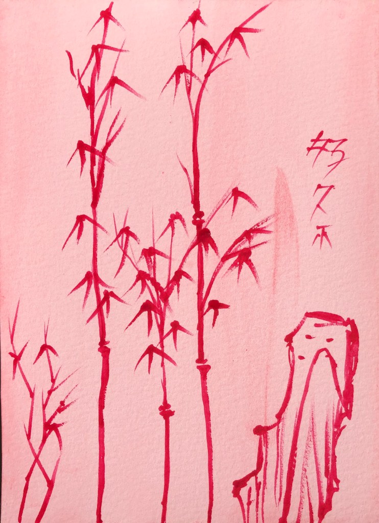
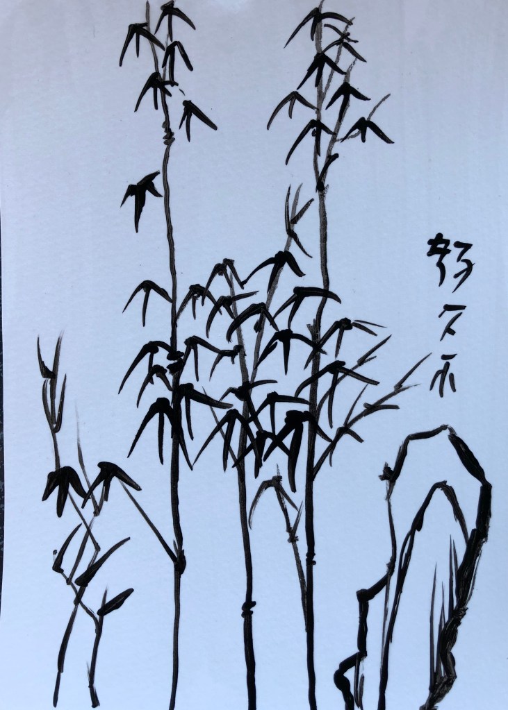
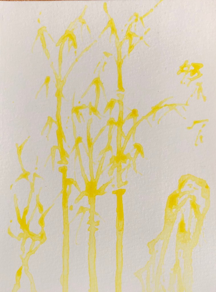
20 sheets HP watercolour paper prepared with various backgrounds as directed using fan brush to get even surface (except for the acrylic varnish, where I used a small hog flat as didn’t want to risk my fan brush). Found image selected to work on has been hoarded for years – bamboo with mountain background – person who sent it to me said “Everything in Chinese painting is symbolic….The painting of Bamboo is second only to landscape in prestige and is infinitely more important than the painting of birds or animals.”
SO WHAT?
Thin perylene maroon watercolour paint applied using rigger to splodgy thin black ink background. I made the paint very (too) watery – hard to make it show up.
Black egg tempera, only slightly dilute, on splodgy perylene maroon watercolour background, applied with rigger. Much more effective as far as clear line making concerned, also able to perfect my leaf-drawing action (press and flick)
White egg tempera, fairly neat, on black acrylic background, applied with rigger. Did this as a photo negative. Favourite so far.
Acrylic satin varnish on black egg tempera, took a chance using the rigger to apply, gave it a good wash and seems fine. Image clearly visible even when light not directly shining on it, and very dramatic when it is!
5.Black Chinese ink on white gouache. Struggled a bit to get pointy ends on this surface, and if the brush was wetted with water then the marks spread out – as if the surface was absorbing them as the brush hit the paper. Less good combo.
Blue iridescent acrylic on white watercolour. A weird one – very hard to spread the acrylic over the watercolour background, felt like painting dry-brush all the time, even though the rigger was wet – not sure if it’s because this acrylic paint very thick?
Experimented with grey gouache on thin black ink. From an oblique angle it’s quite an effective contrast of light on dark, whereas straight on it looks quite flat.
Well, this was weird – Pebeo high viscosity Buff Titanium acrylic on thin black ink. Any dilute acrylic marks just seemed to be absorbed into the inked paper and vanished- the only marks which I could keep clear were with neat acrylic, sometimes gone over several times. Paint colour creamy rather than white.
White acrylic on very thin green gouache. A similar tendency (though not so bad) for dilute paint to be absorbed – only thick undiluted acrylic stood out – but hard to be accurate with thick paint using a rigger.
Really thin white acrylic on thin gouache – this was too thin, had to ladle it on to make any impression at all. Clearly visible when wet, but virtually vanished when dry.
11. Thick watercolour (burnt sienna) over grey egg tempera. A pleasing combo – the egg tempera background offers enough resistance to the brush so that it doesn’t skid, without being a drag which makes making the mark you want difficult. Only downside is that the W/colour fades considerably as it dries – you’d need a few layers for it to really stand out.
Thick yellow high viscosity acrylic on grey gouache. This high visc acrylic really lives up to its name – tried using it with a damp rigger but it really didn’t want to be dragged – in the end dried the brush and just used the paint neat – gives an interesting uneven effect.
13. Thin black Chinese ink on thin watercolour – this went on and dried like a dream – an easy-to-use combo.
14. White egg tempera on very thin watercolour – I started off with some very thin egg tempera but could soon see that it was too watery to stand out, so I made it a bit thicker to get a good contrast.
15. Thin burnt sienna watercolour over very thin primary yellow acrylic. Again, a surface offering a pleasing but not overbearing resistance to a runny paint. The watercolour fades but is still clearly visible and layers could be built up.
16. Thick permanent rose watercolour on very thin acrylic (cadmium red). This was a good combo, both in terms of applying medium to background – right amount of resistance yet flow – and also dark red on light red.
17. Thin black acrylic over watercolour splodges (ultramarine and Hooker’s green). This ran well – have learnt not to make it too dilute, so it flowed well over the surface and was clearly visible. The splodges work effectively as a background, making it look from a distance as if there is a load more plant material behind.
18. Thin black gouache on thin acrylic yellow splodges. Pleasing dramatic colour combo. The gouache gave strong coverage even though very dilute.
19. Black acrylic on varnish, applied with a damp rigger – the acrylic seemed to glide smoothly over the surface, only breaking up a little when the paint load was low. Satisfying smooth service to paint on. Interesting that the background looks blue in the photo but bright white in real life.
20. Very thin high viscosity yellow acrylic on varnish. The brush runs well when loaded but, when asked to make a thinner more delicate line, the paint starts to break and bobble into droplets on the surface – as expected from a shiny surface.
NOW WHAT?
I have learned that:
If I am going to paint over a ground, particularly a chalky ground such as gouache, in acrylic, I need to make sure that the acrylic is thick enough not to disappear – although bits of “ghostliness” would be good for a mysterious image.
Unexpectedly, painting on varnish is easier than I thought, and the paint doesn’t slide everywhere; also, painting with varnish on a dark surface shows up surprisingly well
Ink and watercolour are good combinations (although I did know this already – but always good to have it confirmed!)
The medium I have most enjoyed using, both as a background and a medium, has been the egg tempera – it provides a matt, very slightly resistant surface for painting onto, and it has produced effective images over a range of backgrounds.