Painting 1 (UPM); Part 2 – Reflections on tutor feedback

WHAT?

My tutor fed back to me in a very helpful discussion via Zoom on 30th November 2020, and also sent me a summary of the points by email.

SO WHAT?

Particular key features of the discussion I want to reflect on:

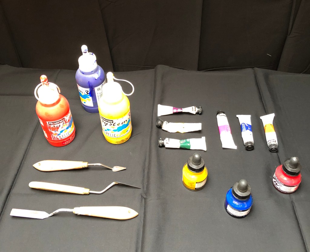
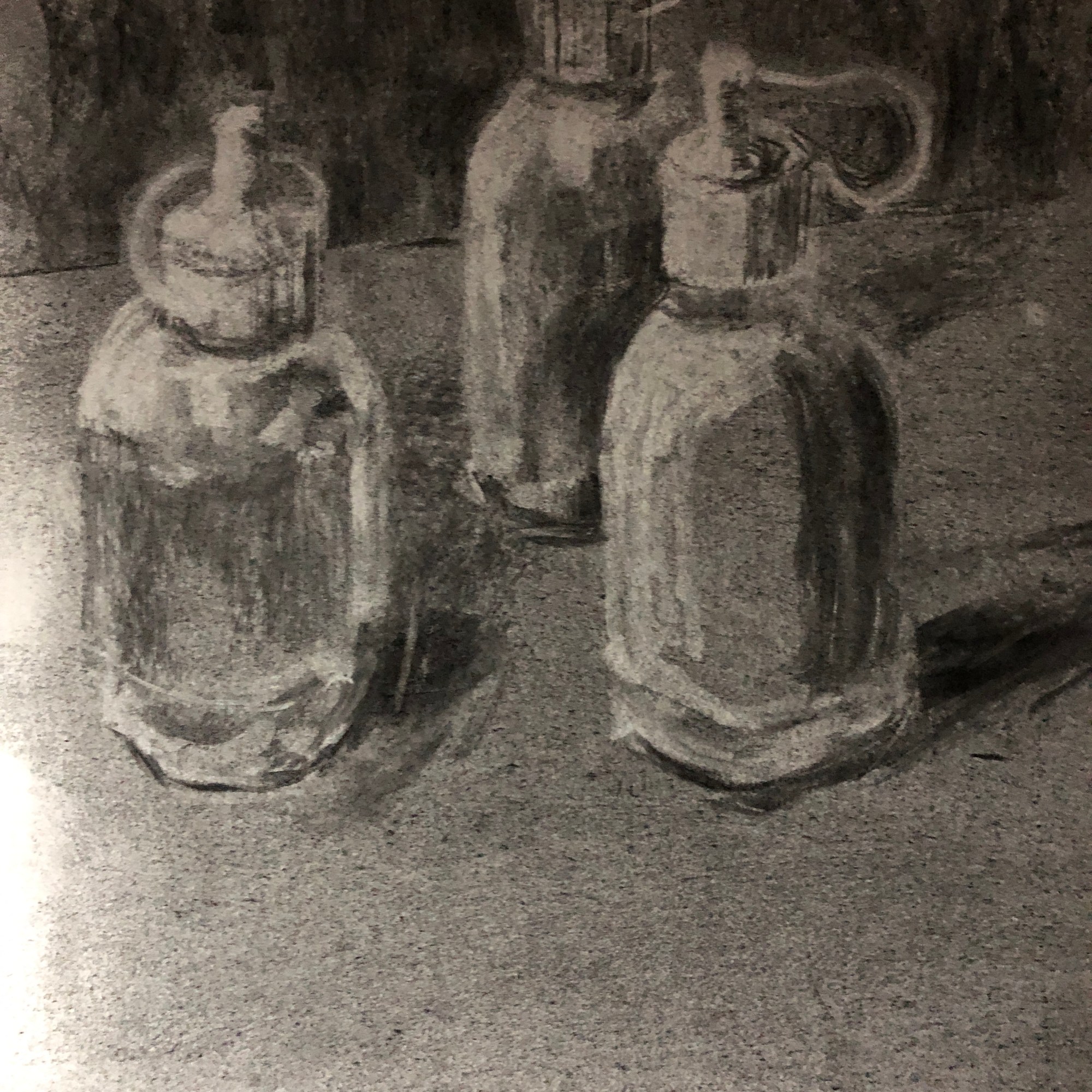
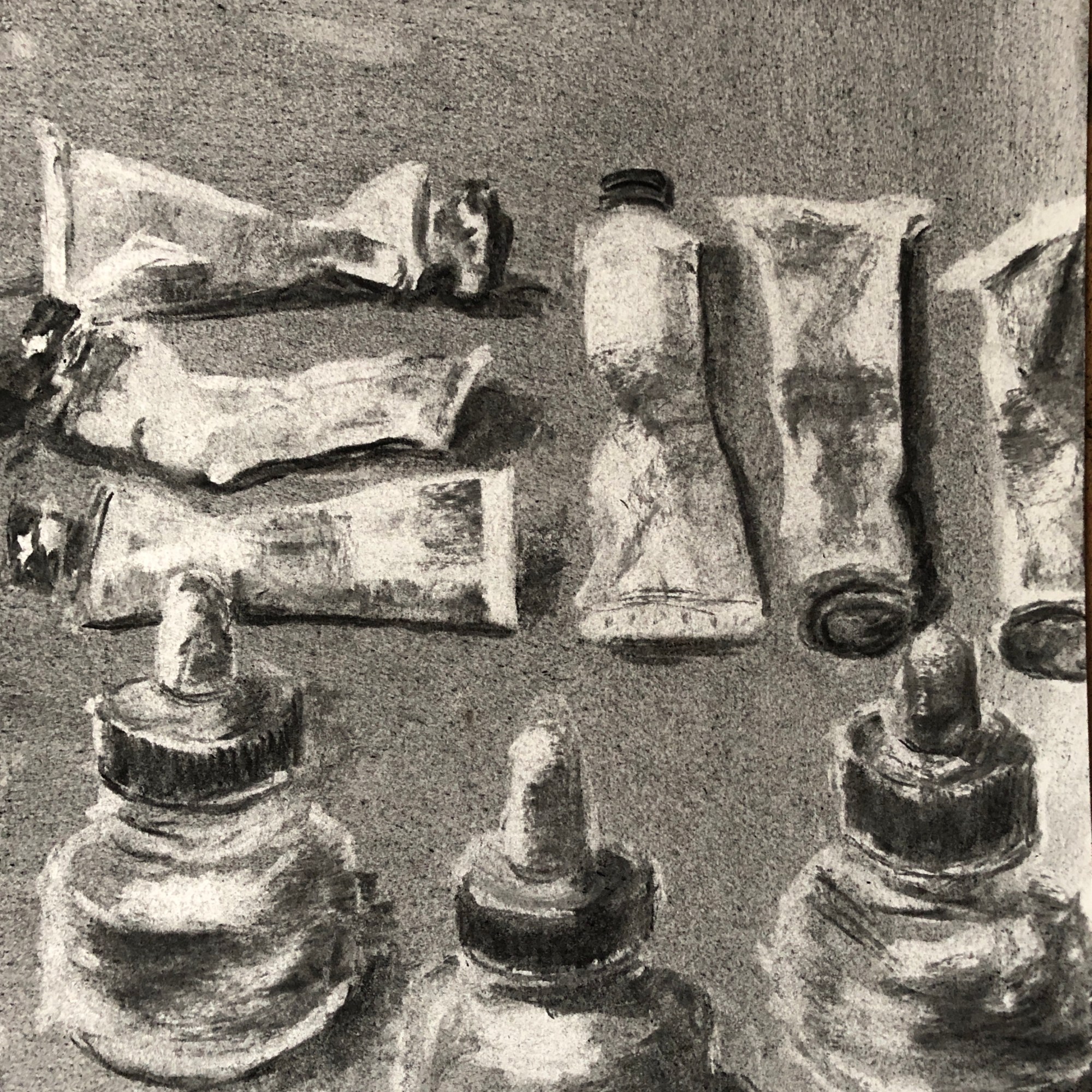
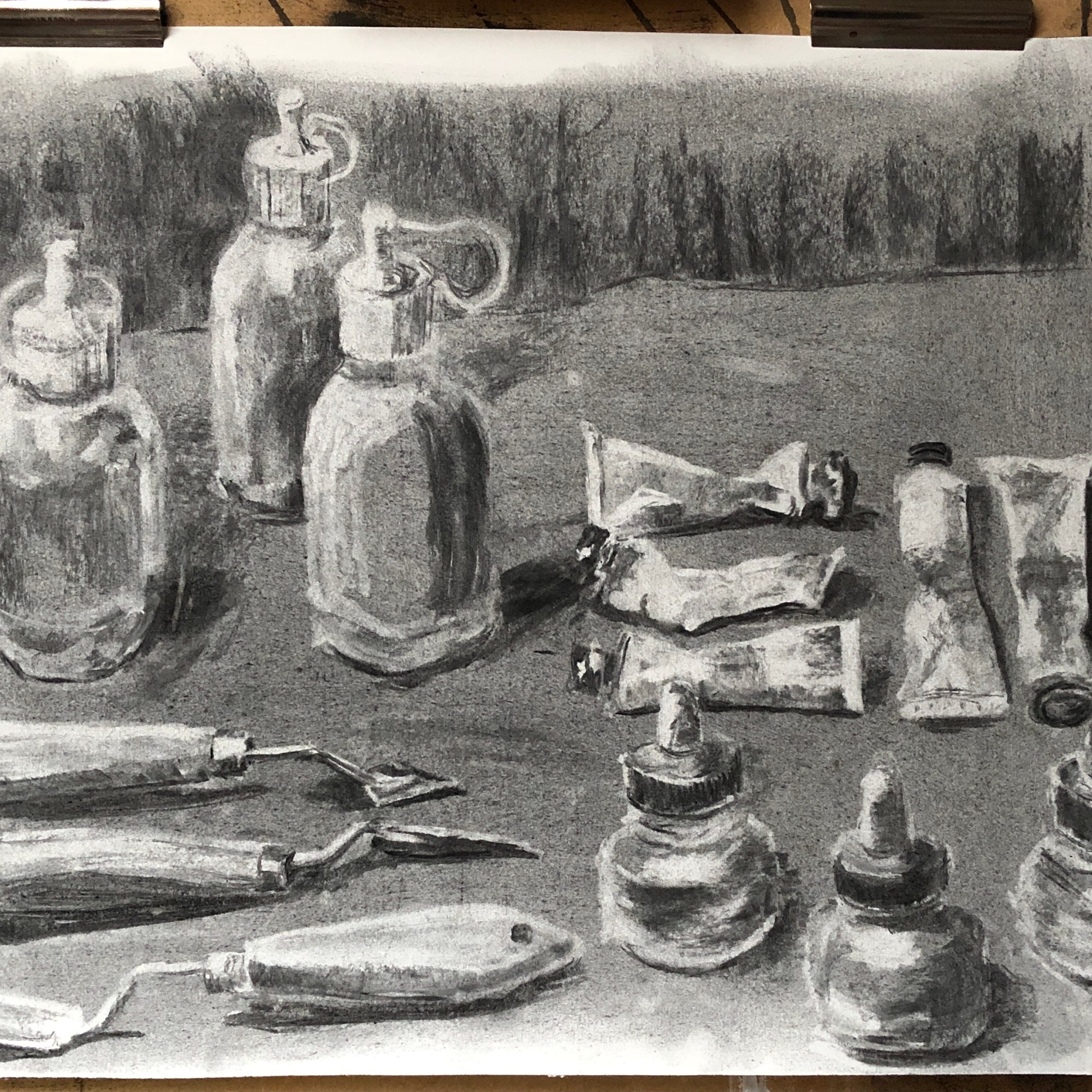
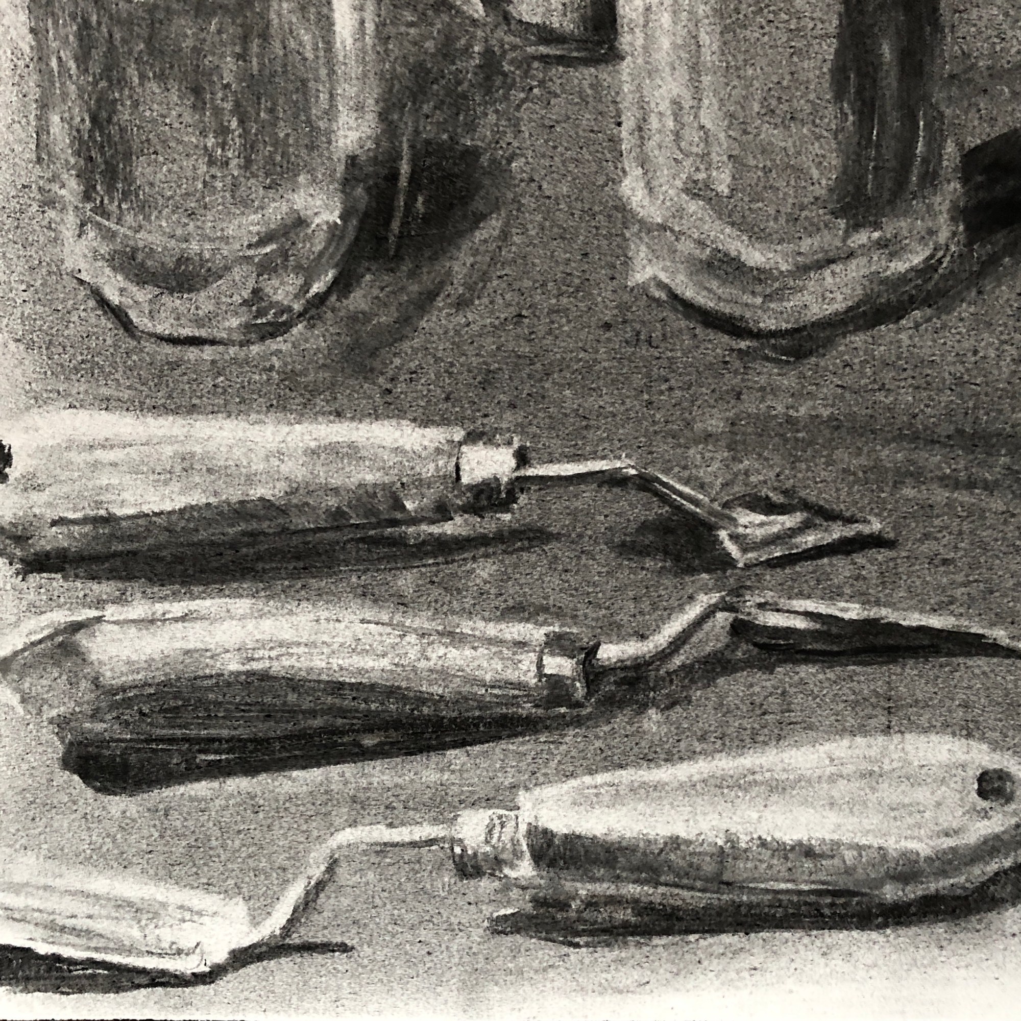
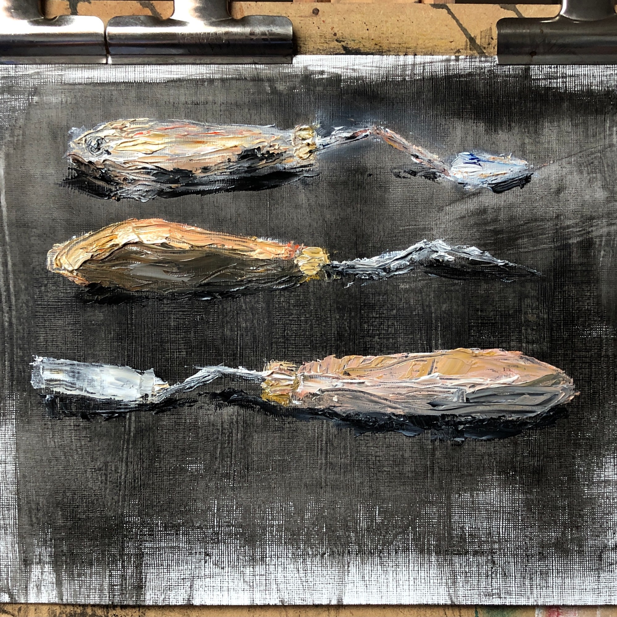
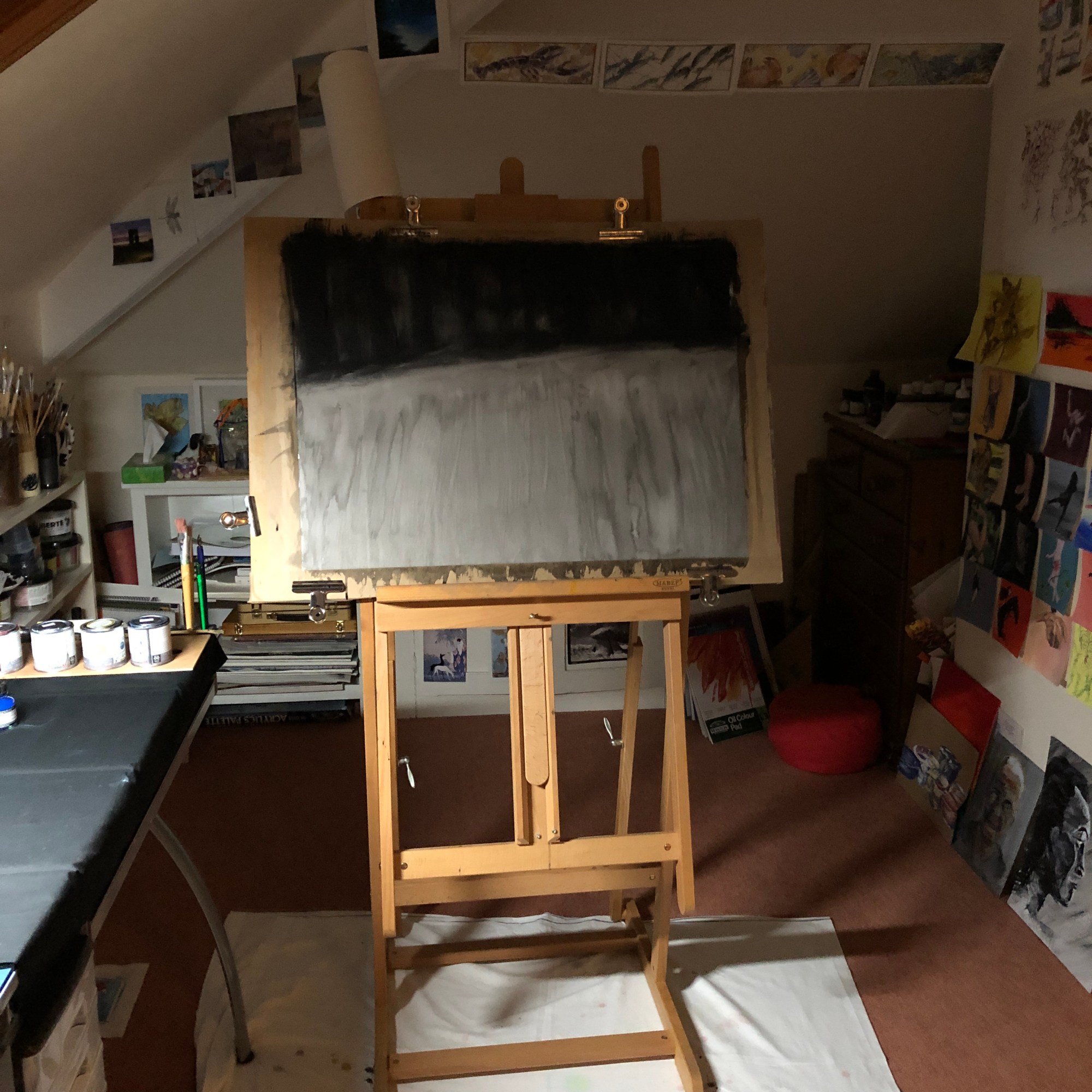
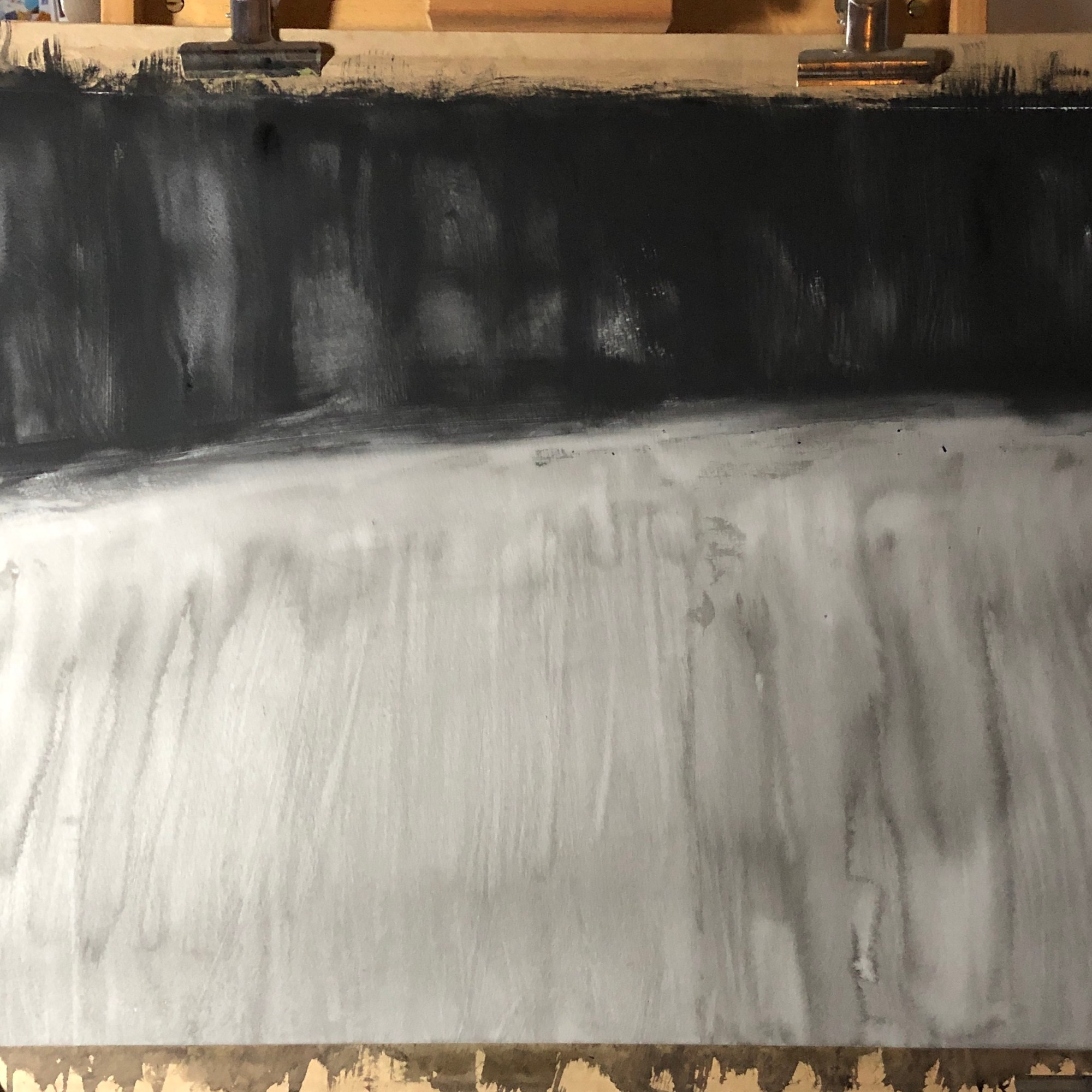
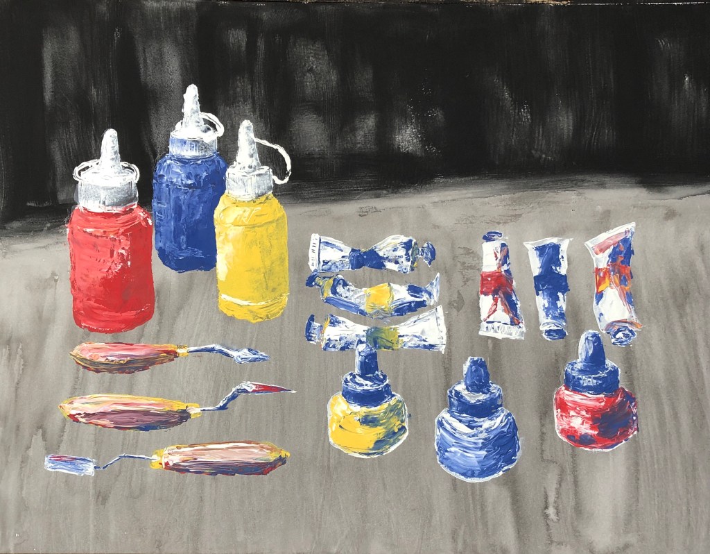
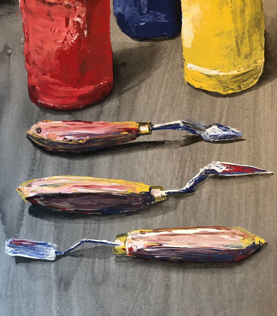
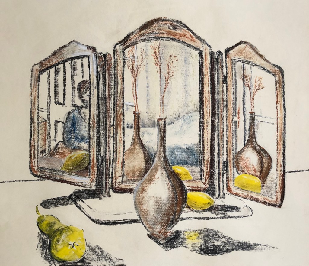
  • My assignment piece and preparatory work: I was glad she liked looking at it, which I guess is high praise to an artist. I too still find myself standing and staring at it – the chalk household paint does give a rather surreal effect which is increased by the black egg tempera background. I found the preparatory tone drawing with charcoal and putty rubber a really useful reference and will try this again in future work.
  • Tips: 
    • Important to give a viewer somewhere to rest in a painting – not something I’d thought about.
    • Beware of the term “loose” – it should imply fluid rather than chaotic marks – I think I can be a bit lazy with the distinction.
  • Figure and portraits:
    • My figure drawing is tentative. This has made me stop and think. I guess it is – I only started doing it because I was required to in Drawing 1, having studiously avoided it before through lack of confidence. Need more practice, clearly.
    • Use reference points in the background to help measure, and get your easel on an eyeline with your view
    • “You paint an awful lot of heads before you get to portraiture” – my job is to treat the head as a visual problem to solve
    • Consider painting in grisaille (greyscale, lightly) before going in with colour, and take the colour out again if it’s wrong

NOW WHAT?

  • Get in as much drawing (especially drawings of people) as I can to build confidence and experience
  • Remember the tonal charcoal drawing, it’s a useful problem solver
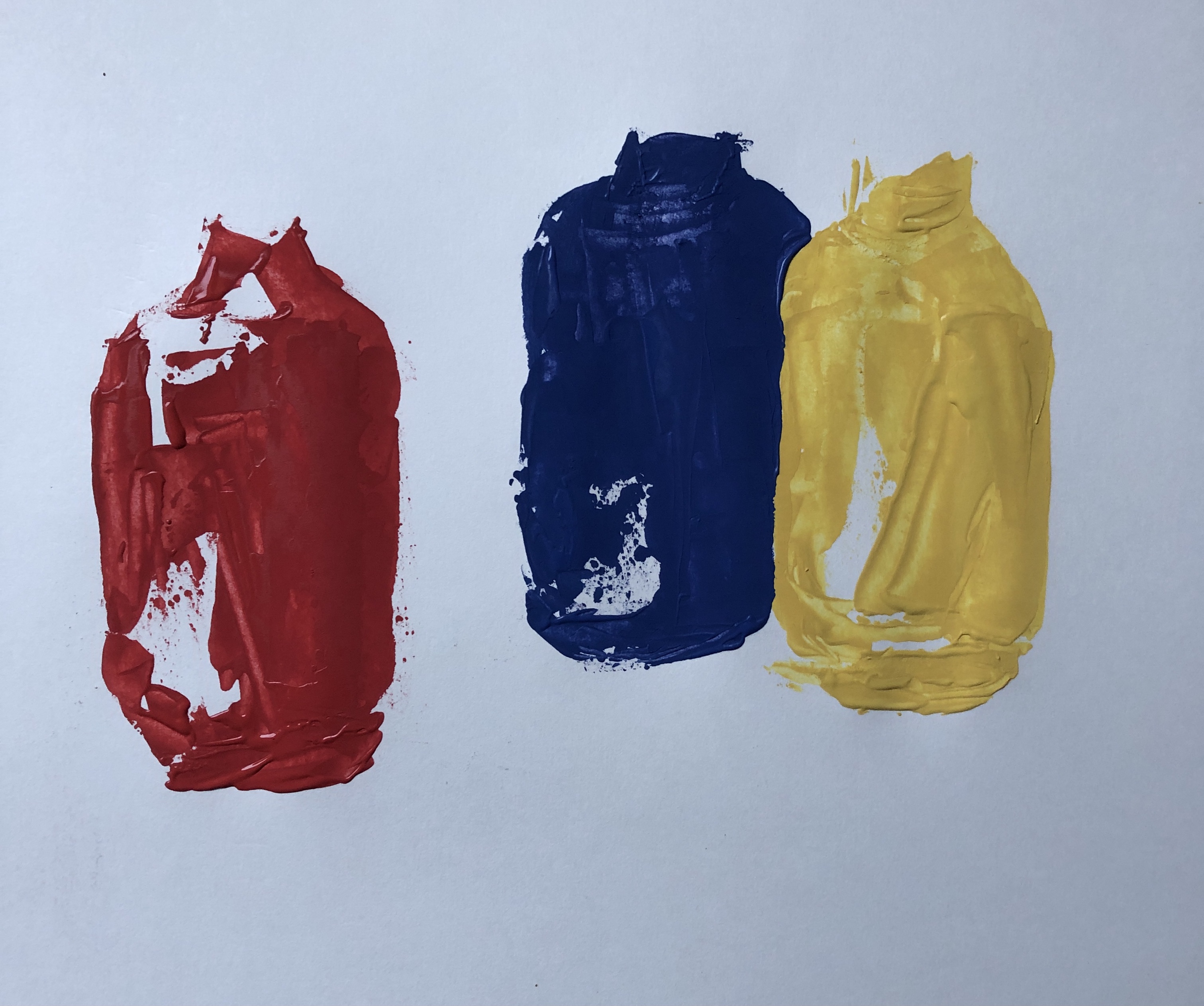
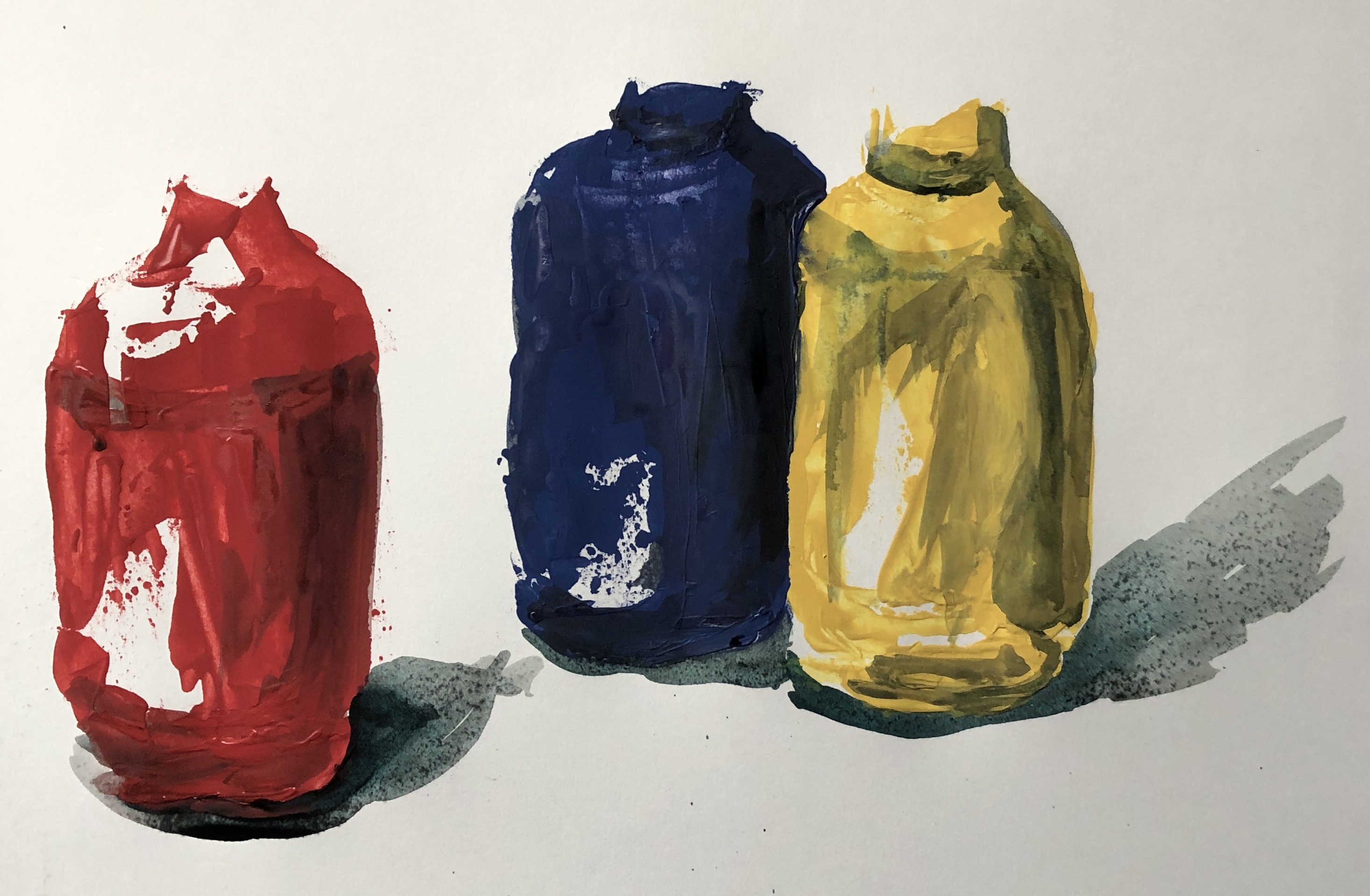
  • Work on understanding colour and what effect it has, rather than just grabbing the first tube that comes along

Painting 1(UPM); Part 2; Assignment

WHAT?

To recap:

My review of my learning so far from this unit had brought me to this point:

Things which have been tackled and are developing (but always needing more…):

  • Getting around tasks which don’t immediately appeal by finding a way to “get in from another angle”
  • Loosening up and being up for experimenting
  • Managing my impatience as a painter by managing my subject matter
  • Favourite media: oil paint, household chalk paint and enamel paint.
  • Favourite ground: egg tempera, ink
  • Favourite tools: sticks and knives
  • Favourite support: metal
  • Becoming aware of curation and your work as art out in the world

Issues which keep coming up and need more work:

  • Quality of mark making and brush strokes
  • “Decisive and economic”
  • Palette organisation and where to mix colours
  • Tone generally, but in particular:
    • Adding tone to drawing
    • Possible confusion of tone and colour in painting
    • Understanding the tonal range available
  • Controlling my style – should I? How do I develop it?

Things which appealed at the time but which I appear to have mentally parked:

  • A collection as being of quotes or ideas to investigate a subject – rather than just a load of actual “stuff”

Based on these, I made some decisions to tackle this assignment:

  • I had liked painting collections of art materials before in this section – art is my “escape” from the Covid-obsessed world
  • Apart from oils and inks,which are traditional painting media, I had enjoyed painting with the less common media of enamels and household paint
  • The size required for the task (A1 or A2) felt a little too daunting for enamels, given that I had only worked in this medium for small pieces, so I chose to work with the household paint as my main painting medium
  • I had just discovered painting with a palette knife – it is (to me) slightly unpredictable, and it is possible to apply the paint both thickly and thinly in a single stroke, which I found interesting, challenging, and wanted to do more of.

My main influence as far as composition was concerned was Lisa Milroy – her rather regimented still life layouts appealed to my need to organise. I selected a range of art materials and tools (in units of 3 for pattern-building) and played around with different layouts on a piece of black fabric, finding an arrangement which chimed with my sense of order and symmetry. I hung some more black fabric behind as a backdrop, and lit the scene from the top left hand side with a daylight lamp.

The lamp causes quite a bit of glare in the photograph which is not there in the original. Lisa paints her arrangements looking almost straight down on them, but I looked at them standing, as it were, at the bottom right of this picture, so that a couple of the items overlap slightly, which I felt added interest and stopped it all being too tidy.

My intention was to paint on a large sheet of hot pressed watercolour paper, somewhere between A2 and A1. The background was to be painted black – egg tempera for the backdrop, which gives a really good strong black, and dilute Chinese ink for the cloth on the table, to give a mid-tone. The main medium for painting would be Annie Sloan’s chalk household paint (red, yellow, blue and white) applied with a palette knife, and any necessary extra  darks needed would be washes of ink (or, if I felt I wasn’t getting a dark enough dark, maybe a little egg tempera).

SO WHAT?

My preparatory work before painting included:

  • Some continuous line drawing in pencil of a few of the paint tubes; I worked into these to add tone, as well as doing a couple of detailed studies of the caps which I was struggling to understand.

Having done this, I thought I needed a proper tonal drawing as a reference. I used willow charcoal and a putty rubber for this. I covered a sheet of paper with the charcoal and rubbed it into the surface with my hand – this created my mid-tone. Then I either lifted out with the rubber or drew in with the charcoal to make my lighter and darker tones.

  • A painting of this size would best be done vertically which would mean using my left hand (the amount of gestural movement being too much for my dominant, but previous broken and now too stiff, left shoulder) – so I felt I needed to practise using a palette knife with my left hand. Just as well, as I found it quite tricky! I did this painting of the palette knives, using a palette knife, with some oils left over on a palette.
  • Next, thinking about painting on a near vertical surface, I thought I should try experimenting again with the left-handed palette knife but this time using the Annie Sloan paints, which are significantly runnier than oil paint, to check they weren’t going to be unmanageable. I roughed out the three tall paint bottles, and found the household paint to be actually easier to control than the oils because they didn’t slip and slide so much. I also checked that overpainting with inks would allow for development of tone.

  • I felt ready to make a start on the main painting. I soaked and stretched my sheet of hot pressed watercolour paper, allowing it to dry completely, before applying my background of black egg tempera (top) and dilute Chinese ink (bottom) with a very large watercolour brush (an SAA “Whopper”!). I kept the background fairly loose, not worrying about runs and streaks, although trying to get them directional – I am aware that the layout of my composition is quite controlled and regimented, so wanted to counteract this potential impression of over-organisation. Again I left the whole thing to dry.
  • And then I began! The paint dries quickly, sot takes no prisoners – not a lot of time for standing back and looking whilst painting an element, you just have to get in there and hope for the best; it is only when considering adapting your work to take account of tonal values that you have the chance to take more time. I looked often at the physical composition but also relied heavily on the tonal drawing for support. Here are some images of the work after the painting stage was complete:
  • My next task was to add the darker tones and shadows in black Chinese ink, using a sable brush. This ink does dry lighter than it looks, so in some places I needed several layers. I was prepared to use the darker egg tempera if necessary, but decided against it as the ink shadows blended seamlessly with the ink ground, making them look more natural.

NOW WHAT?

I feel the painting is a success because:

  • I enjoyed painting it.
  • Getting to grips with the palette knife was a real challenge and I have learned more about the marks which are possible by doing it (I confess that I struggled with the curved sweeping lines of the paint bottle top hinges and I turned to my ash twig for those).
  • I thought hard about tone throughout and hope I have achieved enough of a range without the shadows being overbearing.

What could I have done differently?

  • I chose to make the background loose and undefined so that it literally “melted into the background”, as I wanted the clear focus to be on the art equipment. However, once it was finished and I looked at it as a whole, I wondered if it might have been improved by a more uniformly dark black backdrop to give a strong chiaroscuro effect.
  • I have fitted the collection neatly within the page; when I did my tonal drawing, however, I ran out of space a little and image just “fell off” the end of the page – looking back, I think this gave the picture a certain dynamism and perhaps I should have repeated it in the main painting.

Drawing 1: Assignment 2: Formal typed feedback from Tutor – notes thereon

Formal typed feedback from my tutor was only received on 27th October 2019, so these notes need to be read alongside those I made in August about our Meet talk on 23.8.19. I will only comment on remarks which are different from/additional to those already discussed.

  • Feedback on Assignment: I have indeed reworked my original in a different medium, making it larger and looser – more expressive I hope. The only suggestion I didn’t completely take up was to take part of the composition off the page; rather, I decided to take it right to the edge of the page, which I felt injected some energy.
  • Drawing down the stairs defeated me last time, but now that I have gained a more confidence from working through Part 3, Project 4 on Perspective, I am thinking in terms of a landscape composition looking down from the attic window of my house.
  • I have experimented throughout Part 3 with different backgrounds and supports – with various degrees of success – see e.g. blog notes on Part 3, Project 5, Ex 1.
  • Research: I must continue to include more of my reflections and analysis.
  • Learning log: Maintain balance between thoughts leading to a work, and reflection thereon.
  • Suggested reading: I’ve just managed to obtain a copy of Turkle, S. (2011) Evocative Objects: Things We Think With. London. MIT Press – just need to make time to read it now….

Reflections specifically on points for next assignment (tutor’s comments in italics):

Pointers for the next assignment

●      Reflect on this feedback in your learning log – herewith.

●    Keep developing how you are using your sketchbook and learning log – it is lovely that these are starting to link together well but this can always we stronger. Have tried throughout Part 3 to specify these links – guess this is the slight downside of an online log rather than a written one – you need a whole different piece of kit to write this, rather than a scribble in a book, so it’s not always automatic.

●      Trust your judgement – don’ let yourself fall back to things you feel safe doing, if you have a bold idea go for it. Well, in my head I’ve tried to go for things a bit more in Part 3 – will be interested to see what my tutor thinks!

Drawing 1; Part 2; Assignment 2 take 2

In our Google Meet discussion on my Assignment 2, my tutor and I agreed that my original submission did not really tick the “expressive” box – very much as I had indicated in my blog reflecting thereon.

I said as part our our discussion that I wanted to take bringing more expressiveness into my work as a target for my next unit – so, in that spirit, I decided to rework the Assignment piece. I went bigger (A2 as against the previous A3), choosing Canson pastel paper in a yellow shade which served two purposes – it was almost exactly the shade of the background walls reflected in the mirror, and also it acted as a light mid-tone rather than working on stark white.

I wanted to work more loosely as well – I became quite “buttoned up” and obsessive about colour choice with my coloured pencils – so I decided to set myself a little rule to just work with whatever was on my art table – serendipitously this comprised of a rather battered inch of charcoal and a handful of Conte crayons in white, greys, blues and browns – perfect, I thought. I decided that, rather than setting up the composition again, I would work from the photograph of my original – a good test of its accuracy! – but I simplified it by taking out some of the background clutter in the mid-section and losing the lipstick, which I had struggled with before. I also moved the pear right to the front edge of the picture to make a kind of pathway in – not quite sure whether this has completely worked as the natural diagonal of the composition is the other way, led by the angle of the mirrors – but worth a try as I think it’s made a bit of a zig-zag in now.

I didn’t have a yellow or green on my art table when I got to the fruit, so I just grabbed a yellow gouache from the nearby box (I had been using the white for my Part 3 cloud studies). This proved to be a lovely vibrant colour for the lemon and, mixed in with a bit of charcoal, made an acceptable green for the pear.

I tried to work quickly and loosely, although there was a need for some control as the mirror, with each section set at a different angle, was quite a complicated structure, and I wanted to convey it with some accuracy. It was definitely a good idea to simplify the central section; this was quite cluttered in the original.

The whole thing took me about 2 hours, rather than the two days of the first effort. Am I pleased with it? – yes, I think so – I certainly enjoyed doing it much more and I hope this shows through. I think perhaps the completed assignment should comprise both pieces as fairly distant points on a continuum from “tight detail” to “loose and free” – I’m not sure I could have gone too much further toward the “loose” end without making the structure of the mirror unclear.

What have I learnt from the re-working? First of all, trust your gut – when I was slogging through the pencil drawing my gut kept saying “Stop this and try something else” but my brain kept saying “You’ve put all this time in, you need to finish it.”

Also, I’ve learnt the value of starting again – I’ve always been someone who likes to finish a task and move on – but I have enjoyed going back and think I have improved as a result.

Drawing 1: Assignment 2: Tutor feedback via Meet – 23.8.19

  • Tutor was generally pleased and positive, especially with the scrapbook, which she had had most time to look at
  • Need to become more efficient in referencing research on work, and vice versa – just a note can be enough
  • Consider using a colour wash as a frame or a background, and draw over the top
  • Also consider putting down rough areas of tone and do line drawing over this (as, e.g. in the bark, moss and lichen line drawing)
  • Drawing from unusual angles, as in the house interior drawings, is going well; tutor particularly liked:
    •  the one from the top of the stairs – maybe try again with better foreshortening
    • The sketch in the bedroom with diagonal bed worth also working up, maybe in charcoal?
  • Tutor was interested in the research referencing “meaningful objects” – explore (both research and trying out) a self-portrait made from meaningful objects
  • Also reference to research – the curved staircase – consider a picture which contrasts correct/incorrect perspective
  • The inside/outside contrast, and light, are possible aspects of interest for me to develop
  • Saying I can’t draw fabric! – task to draw a screwed up piece of paper as a start; also using a charcoal background and rubber are helpful with folds and fabric
  • Try more pastels and more charcoal
  • Don’t worry about my “scribbly” style – can be used to create tone – need to find a way to use what I naturally do – embrace what I am! – don’t just focus on meeting the course tick-boxes
  • Think more about the surface I am working on and what it can do and whether I need to adapt it
  • Assignment 2 picture – she had hoped for more on the basis of the work that had gone before (e.g. the reflection in the lamp, which she really liked), and frankly I so had I – we discussed how I fell into the final piece and found myself a bit trapped in it by time constraints –  suggestion was to re-work it in a different medium to give it some zip, possibly considering some asymmetrical cropping
  • Target: I chose “work more expressively” – make the tasks suit me, not me suit the tasks – make my style and materials do what I want them to do. 

Drawing 1 Assignment 2 Reflection on assessment criteria

  • Demonstration of technical and visual skills – materials, techniques, observational skills, visual awareness, design and compositional skills
    • I have expanded my range of materials and techniques since Part 1; I have had a bit more of a go at using marker pens, I have experimented with mixed media, I have completed whole drawings in Conte crayon, finally dug out my Chinese brushes and inks and used them to pleasing effect, and I particularly enjoyed drawing with a putty rubber into a charcoal ground. My observational skills are quite good when I concentrate, although I am still having to consciously analyse perspective, which I suppose leads on to my visual awareness; I often used to think I walked around with my eyes shut, being so involved with what was in my head – but I found myself yesterday brushing my teeth whilst looking out of the window and analysing the perspective of the roof tiles on the house across the road, so the visual must be improving. My design and compositional skills are developing, particularly towards the latter end of this Part of the course.
  • Quality of outcome – content, application of knowledge, presentation of work in a coherent manner, discernment, conceptualisation of thoughts, communication of ideas
    • This Part of the course has been very spread out and disjointed for me – I started it waiting for the arrival of my granddaughter (gorgeous, thank you), had a long interruption caused by serious illness and a prolonged stay in hospital, and have slowly had to gear myself up again to studying. I suppose I have developed much more of a sense of what might make an interesting composition; subject matter which seems quite mundane can be made interesting with thoughtful composition. I hope my work is presented coherently. Conceptualisation of thought and communication of ideas…..I think I began this Part very much with the mindset “here’s a group of objects and I’m going to draw them”, but I do feel now, approaching the end of this part, that I am on the edge of something  rather more nebulous, which I’d like to talk about more in the two sections below.
  • Demonstration of creativity – imagination, experimentation, invention, development of a personal voice
    • I have to say that, the first time I read this criterion, I quailed as I thought that, frankly, I didn’t have a creative bone in my body. However, towards the latter stages of this Part, I have felt braver to depart from the norm, free up and try some things out. I really want to do some more Chinese brush painting, which has the potential to be wildly free and gestural yet minutely exact at the same time.  I also want to do more work with charcoal and a rubber; I listened to a podcast the other day, when the pencil artist Nina Mae Fowler was talking animatedly to Nick Park (of Wallace and Gromit fame) because she’d finally found someone who would be enthused about her wide collection of rubbers, and I felt a bit like that, having recently discovered the joys of the Derwent battery eraser. The red monochrome drawing was a departure for me in that I was not completely just drawing what I saw. Project 4 has made me look closer at things which have been in my house all this time (e.g. the lamp and the dressing table mirror), see them differently, and attempt drawing which I would have considered beyond me at the start. Not sure the personal voice is there yet, I still feel there are far too many avenues to explore, but now I at least see the potential for it.
  • Context reflection – research, critical thinking (learning logs etc)
    • My tutor has modelled the conscious use of research – hand on heart, I have not achieved much of that in this Part because of it’s broken-up nature and the need to crack on with the exercises. However, what I have found is the effect that my reading and research has had on me on a more subconscious and intuitive level; I have found myself interested by particular images and wanted to try out some aspect of them myself. I think this is a good thing and a development; my tutor described my research notes in Part 1 as book reviews, which is exactly how they felt to me – whereas now I feel I am on the road to understanding the point of research, and hope to move forward to being able to use it as a proper resource and jumping-off point for my own work.
    • I have found writing about my thinking has actually made me think in the first place. My writing can be a bit rambling and stream-of-consciousness, but I have always found writing a good way to work through a difficult place or problem; so, helpful for me, although possibly tiresome for the reader. My next step is more joined-up progress of thoughts – at the moment I am a bit like a child in a sweetshop, jumping from one thing to the next and forgetting what I had just discovered a few minutes earlier.

Drawing 1; Part 2; Assignment 2

The subject of my drawing is a triptych-type mirror which sits on the dressing table in our bedroom, including the reflections in the three separate mirrors (all of which are facing in different directions) and a simple still life composition placed on the dressing table in front of it – see photo below.

My influences in setting up this particular still life/interior were many, and I can’t in all honesty say they were necessarily in the forefront of my mind as I put it together; images and ideas I have liked as I have worked through this section have obviously seeped into the subconscious, and it was only when it was set up that I have put everything together and thought, “Well…this is like that, and that reminds me of this…”. Not sure if that’s the way it’s meant to be, but there we are. Looking at the piece, I see bits of:

  • Bonnard’s way of including a figure or part of a figure in a half-glimpsed way, so they are not the main focus of the picture but rather the viewer comes across them almost serendipitously (see A3 sketchbook) – this WAS an intentional feature of the set-up
  • I liked the combination of plain drawn areas with coloured areas in Gary Hume’s “Flowered Hat” (see blog post on Positive and Negative spaces), and have tried it out here; this idea emerged part-way through
  • I have been drawn to views looking through windows and doors (see A3 Sketchbook and Project 4 research blog post), so again this was an intentional part of the composition; also the use of devices for the showing of a wide range of the interior space as in the Anthony Green image in the text and the David Hockney Large Interior (see blog post on History of still life genre); also again the idea of representing an object from a variety of viewpoints (see research on the History of still life blog post, esp. Picasso and Braque)
  • I really enjoyed doing my Project 4 Exercise 3 drawing of the reflection in the lamp

My reasoning for and construction of the exact composition is as follows:

  • The basic idea came when I noticed repeated reflections in the dressing room mirror as I was passing. The motif of repeated images was talked about in the course notes as a way of drawing the viewer’s attention but is not something that I have consciously used much thus far, so this seemed like an opportunity to try and build it in – hence the vase, lemon and lipstick all appear at least in part 3 times
  • By changing the angles of the side mirrors I found I could see through 2 doors (one out into the passageway and one into the bathroom) and a window
  • I wanted to keep the still life aspect fairly simple (just the vase, the lemon, the pear and the lipstick) and try to do it well. The pear was included as I really like drawing the shape of pears; the lemon to give a bit of a colour lift, as the dominant colour is terracotta/wood; the lipstick because someone from an art group told me that paintings should always include a little patch of red to draw the eye; and the vase because I recently bought it in an antique shop and was keen to use it in a picture
  • I wore a blue top for the self-portrait element to complement the orangey wood
  • I drew the image over several days; the light was coming from the windows behind me, but the days were overcast and I wanted some clear shadows, so I set up a spot-lamp looking down diagonally from behind the top left corner

How have I done against the criteria for the work?

  • The use of colour in drawing:I feel I have done fairly well in replicating the colours of the objects in the composition, often by blending and overlaying the coloured pencils. The use of the complementary blue has, I hope, lifted what is quite an orange/yellow/brown mode. The thing I really found difficult was replicating the gold of the lipstick, and I don’t think this has been as well done as I would have liked.
  • The most appropriate medium for the subject: my original intention was to use line and wash on A3 cartridge paper as the composition has a lot of straight lines which I thought would be tricky in pastel or charcoal and could become confused/confusing; however, when it came to it, I decided that lots and lots of ink lines would not give the right feel, so decided to go for coloured pencil. I’m pleased with the overall choice of the pencils, but I did find that progress was very slow as I havered over exactly the right choice of pencil for each little section of wood.
  • Composition and context: I wanted the foci of the picture to be the still life elements with the sections of interior, so didn’t try cropping the image any further, and kept everything else very simple. If I‘m honest, I think that, in my desire to get the proportions correct, I have made the image too small – I envisioned it filling the page a bit more.
  • Mark-making and contrasts of line and tone: my marks within thecoloured part of the image are quite uniform, with much blending and overlaying. The lines in the uncoloured part I have tried to keep continuous – my natural default drawing style is somewhat sketchy and scribbly, but I felt this would take focus away from the coloured section. I coloured the whole thing in and then revisited with tone in mind, just to darken the darks and lighten the lights. The idea of the “floating” shadows came to me part-way through (to be honest, the pear was looking a bit dodgy and I thought I should get that bit of the image finished before the pear went off, and then I rather liked the stand-alone shadow, which then was the inspiration for the rest of the uncoloured section).
  • Accurate and expressive depiction of form: generally I am pleased with the accuracy of the image – there are a few bits not quite right, e.g. the top surface of the mid-section of the mirror which is misshapen – the side panels of the mirror were set at unfamiliar angles (one back and one forward) and the mid-section was tilted ever so slightly, which made several parts not quite as one would have expected. Is it expressive? – I think my rendition has been very controlled, which I felt necessary at the time of working due to the need to make the interior sections clear with the medium I had chosen, and this was hampered by the fact that the whole thing was a bit smaller than I had intended – so possibly not. A bit of a learning curve here – I was a bit pressed for time so I pushed on with what I had – possibly choosing to start again with a larger and free-er drawing in a different medium would have made for an equally, or more, expressive outcome. 
  • Experimentation with idea, material and method: I have covered some of this above. Despite the fact that I have nit-picked the faults in my work, I feel the concept of the drawing that I have come up with is unusual and has arisen out of my learning over this section of the course – it is certainly experimental for me, and is something I would not have dreamt of tackling beforehand.