I used photos of landscapes which went to a far distant horizon so I could really try and get the hang of this.
First up was a couple of views of St. Ives. The top drawing is a sunrise over Porthminster Beach to the distant headland by Godrevy lighthouse (of Virginia Woolf’s “To the Lighthouse” fame). The photo I worked from was taken from a hotel balcony, which has given it a rather “Titanic” feel. I worked with water-soluble pens in a limited range of colours – three blues, a yellow and a flesh-colour just to get the orangey cloud colour. I think it’s quite effective as an image, but the thing with felt pens is that it’s quite difficult to fade the colour in the distance – the colours more or less are what they are. I also had a photo over the roofs of St. Ives taken from the upstairs cafe in Tate St. Ives, so couldn’t resist a take-off of the Barnes-Graham illustration in the notes. Again a limited palette of water-soluble pens – black, yellow, light green and brick-red, together with a drawing pen for thin-line details. I kept detail to a minimum for all but the closest buildings, just suggesting the far buildings with a few lines, and added a bit of colour to the roofs of the near buildings to depict that classic greeny-orangey-yellow of St. Ives. I had indicated the clouds in black felt pen so put an experimental wash of water over these and was delighted with the resultant purplish result which I have then pulled down over bits of the town. Great fun.
Next up was an image of the cliffs off Fistral Beach at Newquay. I wanted to try oil pastels for this, and worked quite quickly.
By blending and overlaying the colours I have managed to get the changes in the sea colour (hazy blue to dark then to greenish blue coming from back to front), and the grain of the paper in my sketchbook gave quite an interesting broken effect of light reflecting from the water. However, that same effect rather did for my sky, which on that day was cloudy and actually rather a strange completely flat matt grey-blue, and I couldn’t get that flatness on this paper with this medium. A passing co-painter at my art group suggested that I put a watercolour wash over it; didn’t have watercolours with me, so I did a quick re-drawing in pastel and tried a wash using the water-soluble pens, but still not right – think I should actually not have attempted the sky in pastel at all, and just used a wash.
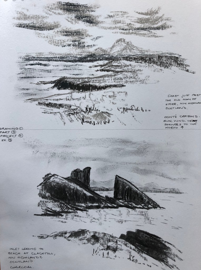
Finally, I tried a couple of photos from our trip in May up to the far North-West Coast of Scotland. Everything is quite dramatic up there – white beaches, black cliffs, looming mountains in the distance wherever you look – so this seemed a good opportunity to experiment with monochrome. The first drawing was done in Conte crayon using shades of grey. I have tried to vary the darkness of a single crayon so that the darkest dark is reserved for the nearest cliffs. The clouds were actually touching the far mountains on this particular day, so I hope I have caught that distant melding of cloud and land.
The final drawing has turned out to be my favourite of the lot, and probably the most effective in showing great distance. The drawing was done in charcoal with nothing else apart from the odd smudge with a finger. The near really dark rocks frame the entrance to the white sand beach of Clachtoll (“Broken Rock”), and by decreasing size and intensity I have tried to show the distant headlands and then the far mountains behind – they are quite hard to spot on this photograph – perhaps I have made them too faint – but they show up better on the original.
TAKE AWAY POINTS from this exercise:
Mediums with “pre-fixed” colours e.g. felt pens, oil pastels, can make it tricky to fade the distance, especially if you have a limited range
How is my support helping/hindering? – consider!
Charcoal gives real drama and makes an almost infinite variety of depth possible
Maybe therefore use a combination of charcoal for drama/depth, with ink/pen for detail and crispness? – try this combination out in the exercises in Project 5
I tried this exercise looking through from my kitchen to the garden room, which has a tiled floor. I did stand in the centre of the doorway to look but I can see that the drawing was slightly skewed sideways because I was resting the sketchbook on a work surface by my side.
The angles of the mat were not too bad – it’s such an optical illusion, isn’t it, you look at the mat and your brain tells you it’s a rectangular mat – so I tried to angle the lines a bit, but didn’t actually trust my measuring – a lesson there.
The doorway again was tricky – it was actually knocked through what was originally an outer wall so it’s quite thick, and again I didn’t trust my eye with the angles. This error has then thrown out the angle of the floor tiles – but at least I was fairly consistent with them, and they nearly all met at a point (just not the point where they should have met!)
I have tried some exercises in my sketchbook to practise this skill – see A3 sketchbook. Obviously using a ruler helps enormously, and I have also tried using a pin and string (pin at the horizon line and string leading from that to indicate the angle at which to draw your line) – see earlier blog entry on a talk on Perspective by Ian Pethers.
N.B. I was also interested to stumble across the artist Fred Ingramsafter seeing an example of his work in the Telegraph (see A3 sketchbook) – I Googled him and find that a lot of his work makes a real feature of converging “parallel” lines towards the horizon – see e.g. his drawings and paintings of the Fens at www.watermarkgallery.co.uk.
Raining again so I had a go at this exercise at art group, piling up boxes and tins from my art bag. Slightly discouraged when other members of the group went off into the mutters when they asked me what I was doing this week and I said a perspective exercise….
Attempt 1 – I wasn’t quite sure where I was going with this exercise at first, and it was only when I drew the eyeline in at the end that I could see where I had been accurate and where I was wildly out. I’d known the drawing wasn’t correct, but couldn’t see why. On the plus side…..when I sent my first assignment to my tutor, she drew lines like this all over it (a copy of it, I hasten to add!) so that I could see that my perspective had been very wide of the mark, and in several cases the continuations of my parallel lines were actually diverging, not converging – but at least I have managed to get them converging here!
Attempt 2 – I tried from the start to be more rigorous about the relationship of length versus width in the bottom box, and this led to a more successful drawing, although the second box up is significantly wrong. I had established the eye-line in my head from the start (couldn’t quite draw it on as it was a couple of cm above the top of the page), so as I was drawing I was tweaking the angles based on the rough relative trajectory of paired parallel lines, which generally worked well except right at the end for that second box, where tweaking in one direction threw the converging of the parallel lines at right angles way out…which must mean that the right angle at the front of the picture, which I drew first and didn’t measure and check, is incorrect. Amazing how just one wrong angle can come back to haunt you…just as well I’m not an architect.
Moving forwards, though, I can see that this is a useful check to have in the arsenal, and will try to continue to use it.
I found the suggested images online, and also looked at two useful books; one on Georges Seurat’s drawings (for text reference, see notes in A3 sketchbook), and one on the work of Tacita Dean – Harris, Hollinghurst & Smith, 2018, Tacita Dean, Landscape, Portrait, Still Life, Royal Academy of Arts, National Portrait Gallery and National Gallery.
I tried to copy some images from these books in order to get a feel for their drawing styles and composition choices…see A3 sketchbook for exact details of the original drawings.
My quick attempt at The Montafon Letter (see sketchbook for details)……
…and Tacita Dean’s.
My quick sketches in the style of Georges Seurat………
…..and the originals (see sketchbook for details).
Seurat -v- Dean: Similarities…
Their drawings are generally in black and white, often with strong contrasts
…and Differences
Seurat started with a light background and drew onto it with charcoal; Dean uses a blackboard as a support and draws with chalk (sometimes using chalk spray which I hadn’t heard of), some gouache and charcoal pencil
Having tried to draw in their style, Seurat’s drawings are quick, sketchy almost, very loose, suggesting their subject; Dean’s drawings are detailed and must surely take a great deal of time and care
Seurat’s subject interest (from the set of over 150 drawings I looked at) seemed predominantly to be with people; for her drawings, Dean is very taken with natural objects (apparently she has an impressive collection of 4 and 5 leaf clovers) and phenomena – clouds, of course, and geological features (as seen in The Montafon Letter and Fatigues, the reference piece).
Seurat’s compositions are of everyday scenes from the point of view of a passer-by; Dean’s drawings of mountains and clouds are set in lots of space, without a hint of the human race
****************
Comparison between Albrecht Durer and Ernesto Caivano
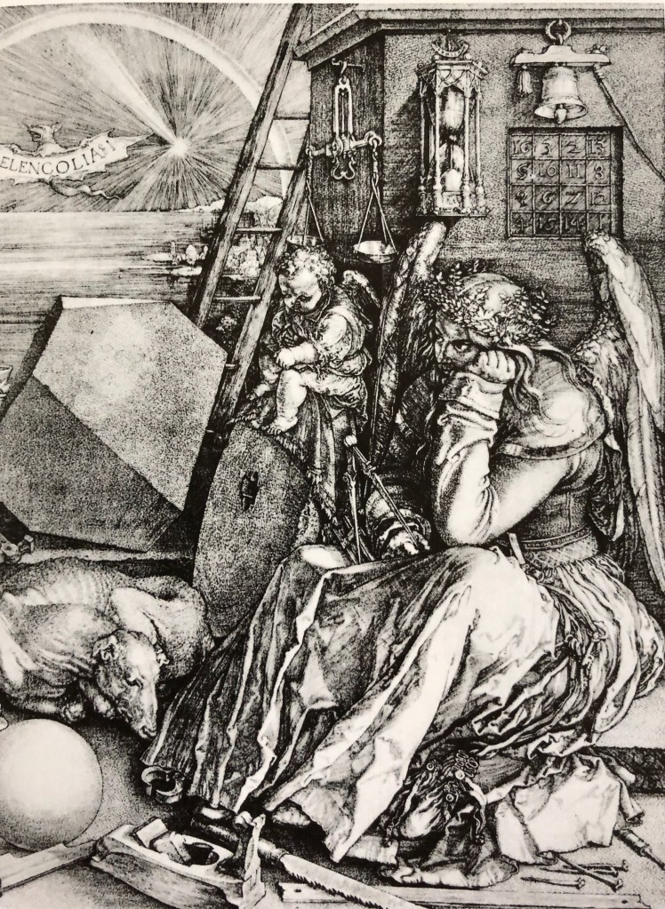
Despite my own (current) default style, best described as “sketchy”, I can draw with clear lines if I have to, and I always find myself personally drawn to clear, clean-lined drawings. I have chosen to compare two artists who draw in this style and whose work I greatly enjoy looking at, Durer and Caivano; in particular, Durer’s 1514 engraving, Melancolia I (see early research blog in this Part on landscape painters) and Caivano’s 2003 drawing The Land Inhibited, ink on paper, as seen in our recommended text – Dexter, 2005, Vitamin D, New Perspectives in Drawing, Phaidon Press Ltd.
Similarities…..
Imaginary scenes
Dramatic black/white drawings
Meticulous and highly-detailed
….and differences
Medium – Durer’s is an etching, whilst Caivano uses pen and ink
Mark-making; Vitamin D describes Caivano’s as “a hyper-detailed accumulation of short, micro-thin lines”, whereas Durer’s etching shows a range of lines and dots
Caivano produced blocks of flat uniform tone, whereas Durer’s tone is more “moulded”
On a recent visit to the far end of Cornwall we visited Bedruthan Steps – this is a dramatic section of coastline where the Cornish giant Bedruthan is said to have thrown huge boulders into the sea just off the cliffs so that he could use them as stepping stones from one headland to the next. Whilst my husband undertook a precipitous descent down to sea level, I decided that here was a good subject to use for this exercise.
My on-the-spot sketch from my perch on a rock at the cliff-top (see A4 sketchbook) was done with the only pencil I had in my pockets, a 4B, so it is dark and dramatic. I thought I had expertly dashed it off in the blink of an eye until a group of walkers came over and said “You’ve obviously been here ages – has the tide started going out yet?” Grr. I am finding that by far the greatest hazard in working outdoors is the random comments I get from passers-by.
This image seemed to have an obvious foreground (the fence and cliff-edge), middle ground (the rocks) and background (the far headland). When doing my drawing inside, I decided to work from the back forwards, starting with a very hard pencil (2H) and gradually changing to an HB and then up through the B range as I came further forward, with just a little colour in the immediate foreground. I have tried to use some directional marks and shading – on a visit to the Penwith gallery in St. Ives I found a card drawn by an artist called Mary Ann Green – see notes in A3 sketchbook. I googled her – she is not particularly famous, but I really liked the style of her landscapes, which depended on strong dark areas as against some light, almost blank, areas, directional lines, and the use of bits of colour. Thought I’d give it a go – what could go wrong?
So, how did that go?
Positive – I think the brief of demonstrating aerial perspective has been met in the drawing and I have established a sense of distance which was not so clear in the sketch.
Less positive – I feel the drama and energy of the original sketch has been lost to some extent in the worked-up drawing.
Reflections on exercises 1 & 2
Simplifying and selecting: this is always a struggle and I haven’t yet tried out the grid method which would provide, amongst other things, a natural frame. I have relied on looking at a wide landscape (as in the Ex1 ink pictures of the moor, and the coastal scene in Ex2), deciding which part of the landscape must be in the composition come hell or high water, then scanning the vista from there and deciding “well, I’ll go up to here and here but no further” so that I had mental boundary edges before I started. Simplifying is definitely a target to work on – I am starting to leave things out – think this went well with the moor pictures, less well with the charcoal/rubber garden drawing, where I needed to lose most of the background but faithfully put it in anyway….
Sense of distance and form – think I managed this better in the Ex 2 work – but then I had a BIG distance to work with. The “photo negative” style drawings in Ex 1 have got some nice 3D variations in tone which I am pleased with, although attempts to put less details in the background, especially the garden picture, have made it look a bit flat and child-like and would have been better omitted or just suggested.
Use of light and shade – I suppose it is because it’s October, but none of these drawings were done on bright sunny days which would have offered dramatic shadow areas; so shadows have been caused more by structures such as rock formations. I know that in the moor drawings (Ex 1), my inexperience with the Chinese brush technique led me to work very quickly and wetly which means that some of my shade is not consistent within the picture – live and learn.
Additional preliminary work – I did take a photo of Bedruthan Steps, although from slightly higher up than my initial viewpoint, so this was some use as reference. I had also been looking so hard at form, shape and shade that I didn’t pay too much attention to colour, and wished I had made a few notes about that on my initial sketch.
It’s been rainy so I started out working up some of my existing sketches. I have been interested in the work of John Virtue which I found in my research (see blog noteson artists working in series in the landscape), so I had a go at working in black and white. I used two different media, charcoal with a putty rubber, and Chinese ink and brush, but I have tried to use expressive strokes with both.
I re-worked two of my Dartmoor 360-degree views using the ink – tried to be very loose, working quickly using wide gestural strokes, suggesting rather than describing in detail. Both efforts look fairly awful close-up, but not bad from a distance, much more recognisable features.
I made the first effort too wet so it was a bit uncontrollable and I haven’t quite got the darks in the right place (e.g. the darks on the hill don’t match up with the darks under the clouds) so I tried to strike a bit of a balance in the second attempt – but looking back at it I think the drier foreground is the weakest feature. More practice needed! Once you start with this medium it seems to need to go very quickly, but I believe that is a consequence of my inexperience, and I need to think through each part of the painting before committing the ink.
The composition of the first picture is Ok but not gripping – Pew Tor, my main focus, is bang in the middle, although it is on the upper-third-line, but I think it might have been better a bit lower and moved slightly off centre, with some better-planned dramatic clouds as a counterpoint. In the second picture, Vixen Tor (lower, mid-ground) and Kings Tor (distant left) I had intended as a kind of paired focus (one very upright, the other much more rounded), but I have got a bit muddled in the contrast between mid- and fore-ground, and definitely think I needed to give more space for the sky – the whole picture feels a bit squashed.
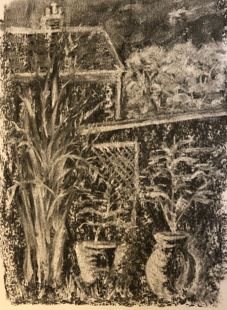
I had a go at drawing into a charcoal background using a putty rubber to work up two of my other sketches. The first was the interior of the mediterranean biome at the Eden Project – I had done a quick scribbly sketch of a cypress which caught my eye, so I tried to render it as a kind of “photo negative” image. I wanted the tree to dominate so I put it bang in the centre. The cypress itself was great fun and I could really use expressive strokes and swirls; I did it at an art group and was quite pleased with it until a fellow group member went by and said “I really like your waterfall.”
Back to the drawing board……
So I tried out the same technique with one of the views from the “garden” series of my 360-degree sets of sketches. I narrowed this one down to focus on the large pots and the bamboo at the end of the garden. I’m pleased with the pots and the trellis, but don’t think the bamboo is quite recognisable if you hadn’t been told what it was, and the neighbouring house (apart from the chimney which I like) looks a bit child-like – possibly the whole distant background would have been better off left much more undefined. I think it’s not missing an obvious foreground, though.It’s a really enjoyable technique – somehow drawing with a rubber is very freeing because if you do something wrong, you can easily replace the charcoal and carry on.
Hadn’t come across this artist or his work before. The webpage quoted in the notes actually took me to the artist’s Amalfi series – I have to say I first opened the pictures up on my iPad in a gloomy room and was slightly taken aback as I could hardly make them out at all….happily I am now in better light and really like his range of colours. You can clearly see he uses a wide range of materials and marks, and he says that sometimes works into the paper so hard it tears, which he feels is all part of the making of the picture. I also found the Chiltern series on a different site – he says he has considerably reduced his colour range here and deliberately chosen “…organic, natural, desaturated and and ‘unpretty’ pigments….” for these – I was tempted to have a go at re-interpreting a drawing of a familiar place using his style, but really not sure where or how to start – the process seems as important to him as the outcome…he says: “Creating these landscapes is instinctive and intuitive, a direct, visceral engagement. Through a process of mark-making, sedimentation of material, textural surface layering and modulated monochromes, I seek to interpret the fundamentals of the topography, in particular revealing its underlying, elemental nature…”(www.nicholasherbert-drawings.co.uk). You can certainly feel that he gets into the zone.
John Virtue
Enormously dramatic landscapes in black ink and white paint – apparently he regards colour as a distraction, and one can quite see why when he is able to produce these hugely atmospheric pictures without it. The landscape pictures give me a much better insight into how to go about abstracting a view, which is often suggested in our notes, but was not sure how to do.
Black ink, shellac and acrylic on canvas (see on Annandale Galleries website)
But my favourites are his scenes of London, possibly because they are sufficiently on that line between abstract and representational to allow me to pick out bits I can recognise.
When reading about him I also followed up on one of the artists from whom he draws inspiration – Philips Koninck, 1619-1688, whom I hadn’t previously come across – huge dramatic skies – for example his An Extensive Landscape with a Road by a River………– now that’s a study in clouds for you.
Monet
Monet is famous for his series paintings….I have sat in the Orangery in Paris and immersed myself in his lily ponds, and stood for a good while in the Musee d’Orsay staring at one of his Rouen Cathedral series – you have to see a painting like this close up to realise just how magical it is that artists turn something which looks like a random set of blobs and strokes close up into this fantastic picture full of light and shadow – there seems to be a key point as you gradually step back from it when it all snaps into focus.
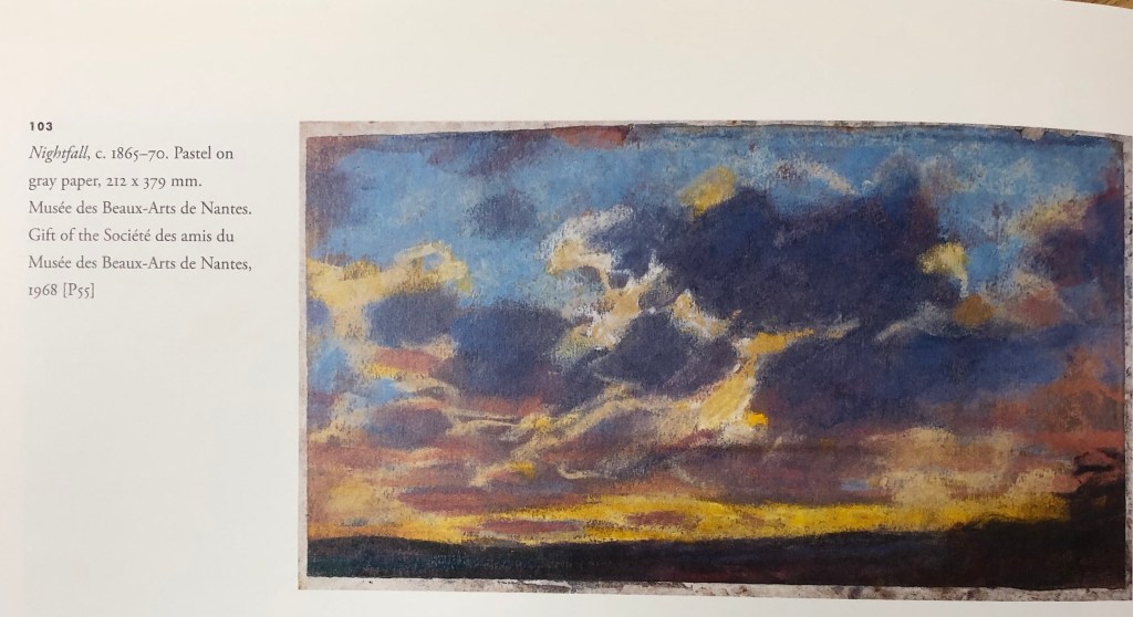
I found a great book – Ganz & Kendall (2007), The Unknown Monet, Pastels and Drawings,Yale University Press – which talked about the way Monet had “managed” his personal image, not liking to acknowledge that he drew, but that on a visit to London his canvases hadn’t arrived and so he did a series of drawings in pastels – this led the authors to seek out Monet’s other pastel drawings, many of which had gone almost unacknowledged by him and of which little is known about many. I found the book very heartening – his pastel drawings are loose and scribbly, rather like mine! – this one of several of clouds is an example.
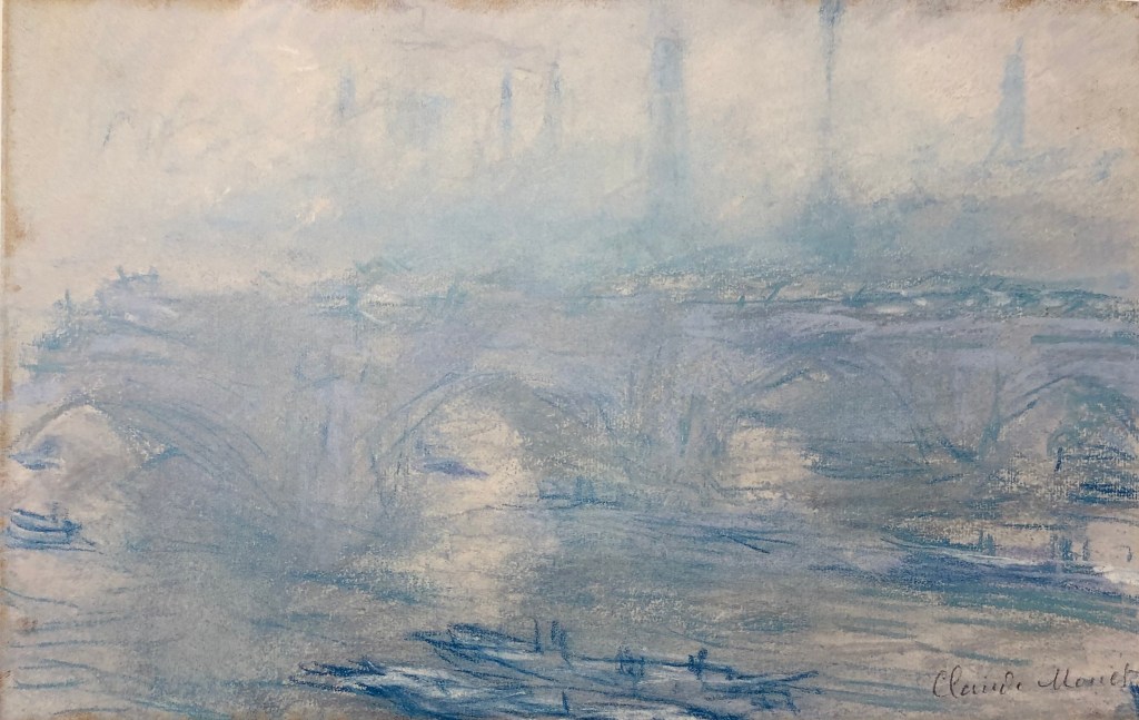
His Waterloo Bridge, (1901), Pastel, Villa Flora, Winterthur, Switzerland, has the same misty atmosphere with recognisable features emerging from the gloom the more you look, as the drawings of John Virtue a century later.
Cezanne
I looked for information about Cezanne’s works in series in the landscape in C. Lloyds, 2015, “Paul Cezanne, Drawings and Watercolours”, Thames and Hudson Ltd.
A good example was his Mont Sainte-Victoire pictures, “which soon became a symbol of such personal significance for the artist” – he would draw a range of different subjects, e.g. a Chateau, an abandoned quarry, his studio – all in view of Mont Sainte-Victoire. Gasquet wrote: “…..everywhere, at the horizon of every plain, at the end of every road, from one hill to another, the sight of Saint-Victoire entered Cezanne’s fresh eyes.”
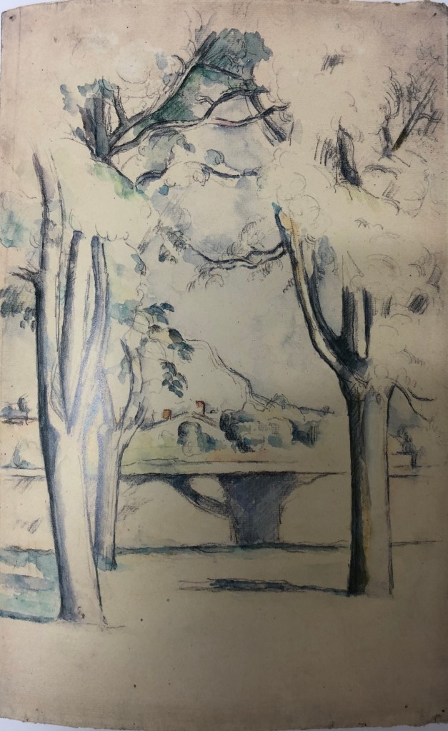
I particularly liked this drawing: Mont Sainte-Victoire seen beyond the wall of the Jas de Bouffan, 1885-88, pencil and watercolour, National Gallery of Art, Washington DC; I liked the way he has fitted his focus mountain in between the foreground tree trunks, showing minimal foliage except mid-top, effectively creating a framing arch for his focus, drawing the eye throughthe trees to the mountain in the distance.
Raymond Pettibon
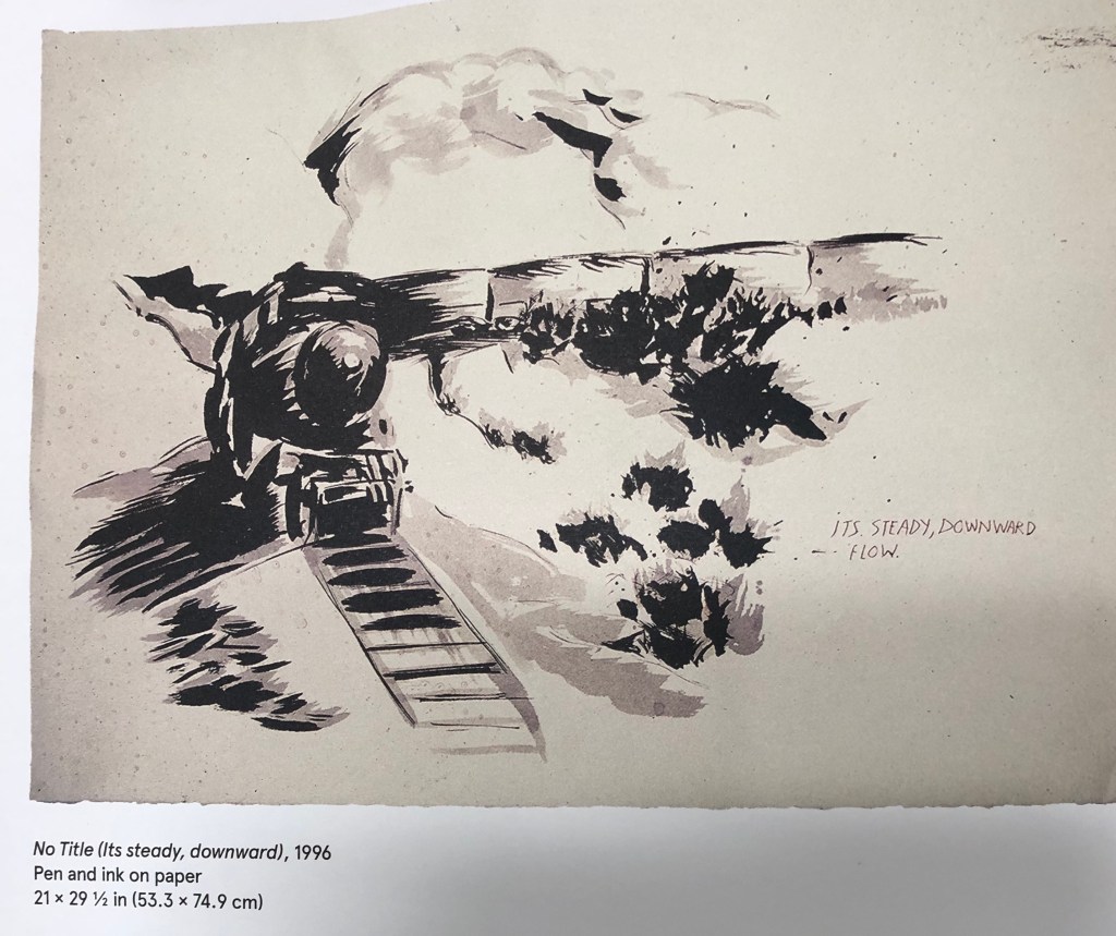
I hadn’t heard of this artist and didn’t know his work at all; but I soon found a massive book about his work: Gioni & Carrion-Murayari (eds)(2017), A Pen of all Work, Raymond Pettibon, Phaidon, The new Museum. All the artist’s work is annotated by him to a greater or lesser extent (although I have to confess that the messages the annotation was meant to convey weren’t always clear to me), and his works are mostly entitled “No Title” followed by remarks in brackets. The editors seem to have selected works around a theme and the book presents them together, e.g. the “train” pictures. This one: No Title (Its steady, downward), 1966, pen and ink on paper, reminded me a bit of the JMW Turner painting, Rain, Steam & Speed(1884), oil on canvas, National Gallery, London.
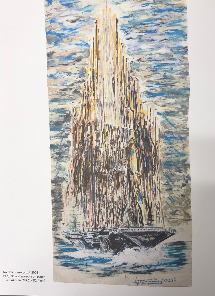
I also found a series of “cathedral” pictures (which made me think of Monet and his Rouen series), e.g. No Title (If we can…), 2008, pen, ink and gouache on paper, Private collection, courtesy Houser and Wirth.
Clearly speculating here, but looks as though Pettibon was good at what we art students are urged to try – studying the works of historic painters and then developing their ideas further to suit his own style and convey his own messages.
Kurt Jackson
This contemporary painter is a great favourite of mine and has been for many years; he was based in the far West of Cornwall and has now opened his own gallery in St-Just-in-Penwith. His current exhibition (see postcards and notes in my A4 sketchbook) is a whole series of paintings on the Helford River (Daphne du Maurier’s Frenchman’s Creek), which have been done at different times of day and night, different states of the tide, different times of year, and different viewpoints. I particularly enjoy his pictures depicting mud and rotting trees – he has been known to incorporate bits of the physical landscape (mud, twigs, stones, feathers, etc) into his work – something which I might consider trying.
David Hockney
I saw a David Hockney exhibition a couple of years ago in Paris at the Pompidou Centre – it was a retrospective going back to his very early pictures, but I have to say the work I liked best was his most recent iPad landscapes. I found out on www.royalacademy.org.uk that his series of pictures of Yorkshire was commissioned by them in advance – as he says in a video on the website, a gamble on their part and his, with so much space to fill; but fill it he did. His work is bright, vibrant, done with zingy acidic colours that often don’t quite fit the object/place they are depicting – but the images have defined a little-known area for many art-lovers.
Peter Doig
Some of Doig’s work seems very strange and otherworldly – more than a touch of Odilon Redon about him. He often has you looking through things or around things to get to the focal point of the picture. In the book J. Nesbitt (ed) 2008, Peter Doig, Tate, I found a series of landscapes where (rather in the fashion of Cezanne and his Mont Sainte-Victoire) a particular building is the focus but is seen from different angles and vantage points. Doig calls the building the “Concrete Cabin”, although it was actually l’Unite d’Habitation, the last of Le Corbusier’s buildings to be built, and intended for itinerant workers – see here, Concrete Cabin, 1991-2, oil on canvas, Leicester Arts & Museums Service.
Doig said: “instead of painting the facade of a building and then shrouding it with trees I would pick the architecture through the foliage, so that the picture would push itself up to your eye. I thought that was a much more real way of looking at things, because that is the way the eye looks: you are constantly looking through things, seeing the foreground and the background at the same time.”I can appreciate what he has done, but not sure I would want to draw or paint in his style; I find it somewhat unsettling, almost as if someone is standing right behind you whilst you’re looking at it – I think he means you to have an almost visceral reaction to his images, but to be drawn to look further into them despite yourself.
Just back from lovely St. Ives in Cornwall where we stayed for a couple of days to celebrate our anniversary.
Weather was mixed, sometimes glorious and sometimes pouring, but got some lovely photos from our hotel which I am considering for foreground-midground-background analysis at some stage.
We had a very arty time; some notes here, and see also those in myA4 and A3 sketchbooks.
Tate St. Ives was showing an exhibition of the work of Otobong Nkanga, called “From where I stand”; it’s been on since 21st Sept and will be there until 5th Jan 2020. I read the gallery’s introductory information leaflet over a cup of coffee upon arrival and decided that this was going to be the sort of rather worthy-yet-preachy sort of thing that I wasn’t going to enjoy – so I was delighted to find that I was absolutely wrong….her basic theme was on the taking of minerals from the ground and people’s consumption of those minerals and the effect thereof, but:
She works in a huge diverse range of media – performance, woven textiles, drawing, photography, video and audio, installation…..
The size and scale of her work – the new wing at Tate St. Ives is pretty big, but her work filled it
Her interest in mapping and representing complex interrelationships and connections between people and the land in map-like diagrams was something which appealed to me (being a bit of a map nerd myself) – her pictures really clearly laid out all aspects of a complicated, and global, issue, and presented them for the viewer to reflect on and draw their own conclusions, rather than attempting to impose the artist’s opinions
Her clean lines and neatness and attention to detail also appealed to my tidy nature
I loved her use of bright clear colours – it was interesting the way she had blobs of all the colours she used in the corner of a picture, almost as if recording her palette for posterity
************
We mountaineered up Stennack Hill in torrential rain to the Leach Pottery– erstwhile home of the potters Bernard Leach and Shoji Hamada, their work being continued today by many visiting and resident potters. Quality and style of pottery as wide as ever; was struck by a display about a local lady potter – shame on me, I was sure I would remember her correct name but can’t quite, it was something like Sarah Davidson (oh dear) – anyway, she says that all her designs are based on her drawings, and that even though sometimes it looks as if a design is coming out of her head, she finds she can invariably trace it back to an earlier drawing in one of her sketchbooks – they had a couple of examples of her sketchbooks there, which looked as if they had been constantly carried around in her pocket, they were very battered and absolutely stuffed with reference material – a role model if ever I saw one.
*************
The Penwith Gallery was having its 70th Anniversary Exhibition (5th October – 2nd November) – an old pilchard factory has been converted into a beautiful space, surprisingly large and well-lit. A wide range of paintings, ceramics and sculpture was there to wander amongst, but I found three contemporary artists, all of differing styles, whose work I liked, and whose styles were very clearly developed:
Sally Spens: she had a set of etchings on display relating to the Venice Biennale, where she had observed corners, gateways and so on – but she had a series of moon jar designs which I loved – the shape of moon jars has always appealed to me, and her oriental designs were very pleasing – she obviously draws carefully with clean lines. On her website,www.sallyspens.com, she says: “Drawing has always been central to my practice, both as a textile designer and as a painter/printmaker. It is important to me that the images are handmade, and originate from my drawings and experience. “
Mary Ann Green: I found a card of hers, a picture called “In the Silent Fold of the Land” – it’s a landscape with not much obviously going on, but she has made it interesting by shading some parts in detail and others not at all, and by introducing little bits of colour into what is overall a black and white drawing. I looked her up and found that she is a member of the St Ives Society of Artists; many of her other pictures include this same folded hillside motif.
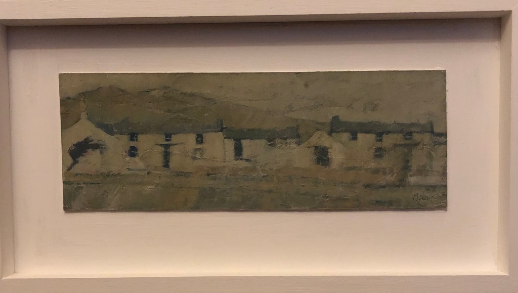
John Piper, a member of the Penwith Society, also has a motif that appears many times in his work – little rows of Cornish cottages, battered by wind and weather, hunkering into the landscape, absolutely characteristic of West Penwith, the far end of Cornwall. He paints in oil and we liked one of his paintings so much that we bought it! This is “Soft Carn”, and is painted in oils on board. First time I’ve ever owned a painting with a sealed provenance before! Its tones are muted but if you look at it carefully you find little patches of bright pinks and blues – and the view is of an area very close to my heart.
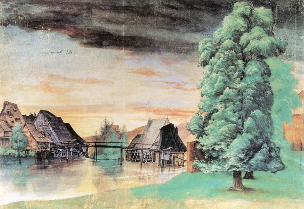
In Silver & Smith, 2011, The Essential Durer, University of Pennsylvania Press, reference is made to how central drawing was to Durer’s practice, and how he would draw every day regardless of the other work in which he was currently engaged, and this must have supported the accuracy and detail of his etching and engraving work in particular. His drawing materials were wide-ranging; basically all the materials we have been encouraged to use in the course so far with the exception, interestingly, of red chalk, which he is not known to have employed. It is said that his choice of drawing medium was always suited to the subject and that for natural subjects including landscapes he would use a brush (allowing for wide sweeps) and watercolour and body colour. His breadth of choice of subject matter is very wide, and no doubt partially dictated by the religious upheavals and scientific blossoming of this day, but apart from his print work he is also known for his watercolour landscapes including weather effects such as The Willow Mill:
Albrecht Dürer, The Willow Mill, 1498 or after 1506, watercolour, bodycolour, pen and ink on paper, 25.3 x 36.7 cm. , Bibliotheque Nationale, Paris
I particularly liked this one for it’s sky and it’s foreground tree, both of which I feel I am “working towards” being able to produce.
However, a lot of his landscape work in his etchings and engravings seems to be as the background to a foreground human event, either real or imagined; I watched a video on YouTube about the etching: Durer, 1518; Landscape with Cannonput up by the Clark Art Institute, Williamstown, Massachusetts, in which a huge amount of background landscape detail is put into a scene populated by numerous figures as well as said cannon.
I was fascinated also by the engraving: Durer, 1514; Melancolia I which, as pointed out by Hockney & Gayford in their 2016 work A History of Pictures, Thames and Hudson, contains a massive amount of hatching detail – just look, for example, at that calendar on the rear wall!
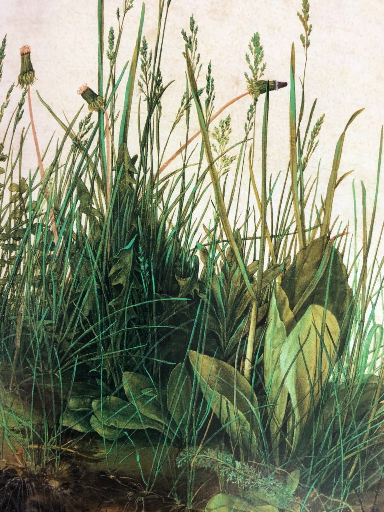
I was also attracted to Durer’s 1503 work, The Large Piece of Turf, watercolour and gouache on paper, Grafische Sammlung Albertina, Vienna – so fresh, looks as if it were painted yesterday. According to de Botton & Armstrong, Art as Therapy, Phaidon, “..Durer hoped that, having looked at his work, one would head outside and do what he had originally done: to look with great care and devotion at some significant aspect of the natural world.”
Well, it’s done it for me.
Claude Lorrain
Claude became famous for his works evoking “nostalgic beauty” (E.H. Gombrich, 1988, The Story of Art, Phaidon). He likes, as de Botton & Armstrong (see above) suggest, “…glimpsing a horizon through a cluster of trees,,,” – and his trees are certainly very lifelike. Gombrich says “It was Claude who first opened people’s eyes to the sublime beauty of nature, and for nearly a century after his death travellers used to judge a piece of real scenery against his standards. According to Franny Moyle, 2016 in The Extraordinary Life and Momentous Times of JMW Turner, Penguin, Turner was exposed to Claude’s print works as a child and, as an adult and already established artist he showed that he admired Claude’s work and tried to emulate something of his grand style.
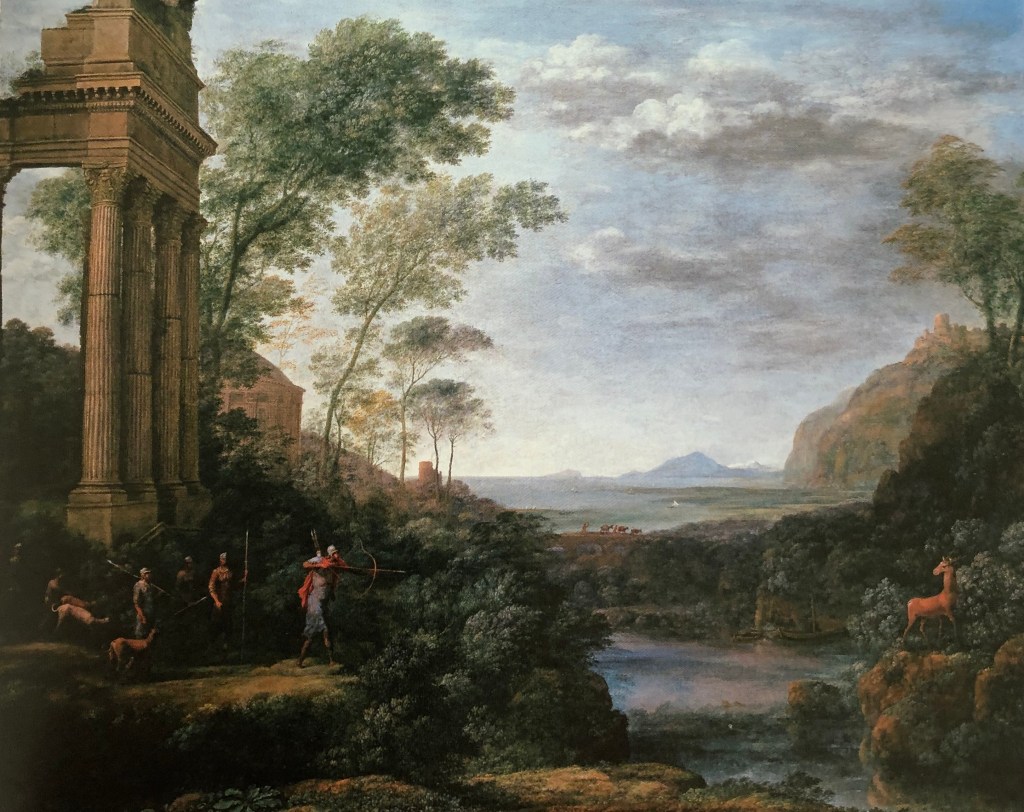
Hockney and Grayling (see above) point out the beauty of Claude’s composition, saying that his paintings were very theatrical: “His placing of trees or architecture on the right and left and the deep space in the middle is very much like a set behind a proscenium arch” – an example seen here in Claude’s 1682 painting, Landscape with Ascanius shooting the stag of Sylvia, oil on canvas, Ashmolean Museum.
I think this last remark chimes with me – I can appreciate the complete virtuosity of Claude’s rendition of trees, clouds and the like, but his paintings overall don’t particularly appeal to me as they feel very posed. I also have a horrible feeling that, if I sat down to paint “a landscape”, my initial attempts at composition would be very similar – something I must bear in mind.
In an online article by Jeanette Winterson from The Guardian, 13th June 2013 it quotes Lowry as saying: ““It would be about four o’clock and perhaps there was some peculiar condition of the atmosphere or something. But as I got to the top of the steps I saw the Acme Mill; a great square red block with the cottages running in rows right up to it – and suddenly I knew what I had to paint.” She describes him as “popular, but unfashionable – a deadly combination in the art world”, but she finds the rather repetitive nature of his paintings fascinating, showing what happens to people when they have to deal day-in-day-out with repetitive machines. I found her article brought him to life a bit for me and made me see the point of his flat paintings (she urges us to look for the flash of colour in the flowers in an upstairs window as a sign that the humans are secretly fighting back against the machines) – but I’m not sure that I would want to paint in his style.
George Shaw
I hadn’t come across George Shaw before, and I can see that, in a way, he is the natural successor of Lowry. My initial reactions to his landscape paintings were, I suppose, surprise – he paints realistically, yet why does he paint the landscapes he chooses? Apparently he paints in Humbrol modelling paint, which gives his pictures a modelled sheen – almost as if he were trying to preserve the crashingly mundane scenes around him for posterity, as images to be valued because they represented his life and environment exactly as he saw it. I found an interesting review of his exhibition at the Holborne Museum in Bath written by Johnathan Jones published in the Guardian on 7th February 2019 , very much trying to set Shaw as a product of the dreadful Brexit times we are all going through. This extract caught my eye:
“Yet his meditation on what the art historian Nikolaus Pevsner called “the Englishness of English art”goes deeper than that. Shaw revisits the landscape art of Gainsboroughand Constable that is so often taken as quintessentially British, or English. He haunts the same kinds of woodlands they did and shares their eye for nature; the trees in his paintings have such vivid personalities they can stand in for the absent people. Blossoming in spring or bereft in winter with black finger-like branches twisting against the sky, they are witnesses to his state of mind.
And what a troubled state of mind it is. John Constablesaid he was inspired to paint by his “boyhood scenes”, and so is Shaw. But while Constable grew up in the Suffolk countryside that his paintings immortalise, Shaw grew up in the 1970s and 80s on Tile Hill estate on the outskirts of Coventry. This is the place he obsessively paints. He depicts the house where he lived as a child, a tree he could see out of his window, and woods close to the houses. Tile Hill was designed as a pastoral blend of nature and modern planning. As it has decayed before Shaw’s eyes, it has become a monstrous landscape of disillusion and betrayal.”
In an extract from a statement by Shaw in 2002 I found on www.tate.org.uk, when he was talking about his series of pictures called “The Passion”, he said:
“I started to make these paintings out of a kind of mourning for the person I used to be: an enthusiastic, passionate teenager who read art books and novels and poems and biographies and watched films and TV and listened to music and dreamed. They are paintings of places that were familiar to me in my childhood and adolescence, places in which I found myself alone and thoughtful. They are places in which I forgot things. … I paint the paintings of all the times and all the thoughts I lack the language to describe.”
Many of his paintings do have that kind of “bemoaning lost youth” initial feel. However, many of his works seem to me to have a light corner or patch of sunshine somewhere or other which possibly points to a more cheerful, less morbidly fatalistic view of life….(just like Lowry with his flowers in the window)?
Sarah Woodfine
Sarah was another contemporary artist whose work I hadn’t come across before. I read a brief biography of her on the Wimbledon College of Arts website (www.arts.ac.uk). It talks about her “heavy and precise” pencil drawing, which combines with her chosen subject matter to “explore imaginary worlds that sit between the familiar and fantastical.”
A picture of hers which I was particularly drawn to (pun!!!) showed a black background with a full moon in one corner and a small caravan in front of what might be fence posts, or might be a stone circle – I can’t immediately find the name or reference for this – but it is a very striking image constructed out of a white circle, a whitish caravan and a few white lines, from which one could develop all sorts of stories.
I did like the recent work she had done using pencil on paper and a range of materials such as steel, perspex and MDF (see details of this work on the Danielle Arnaud gallery website, www.daniellearnaud.com), e.g. Untitled (Branch) II 2015 pencil on roll of Saunders Waterford paper, steel and perspex, apparently incorporating the careful looking and recording advocated by Albrecht Durer and Vija Celmins.
TAKE AWAY POINTS:
The artists that I most relate to from those I have looked at here are Albrecht Durer and Sarah Woodfine; some of their work I find rather fantastical and weird, but their look-see-record ethos (which chimes in also with Vija Celmins’ approach) is to be developed
From my rather unexpectedly adverse reaction to Claude (which I did have beforereading Hockney and Gayford, honestly…), I need to think more carefully about compositions other than the traditional which first present themselves
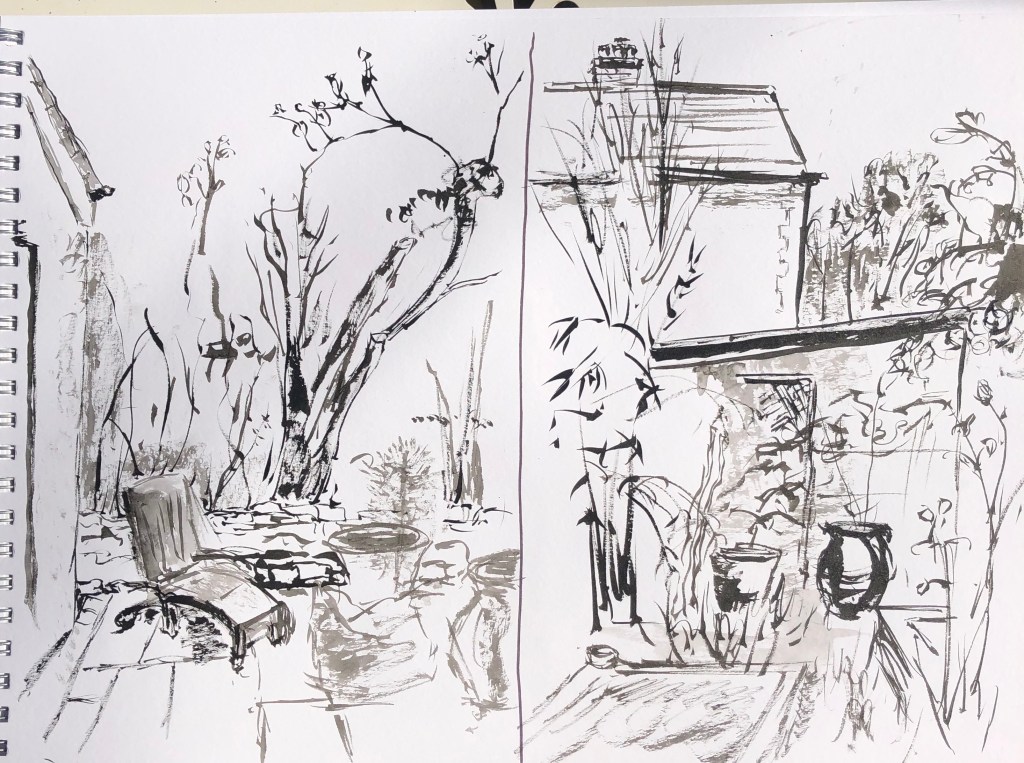
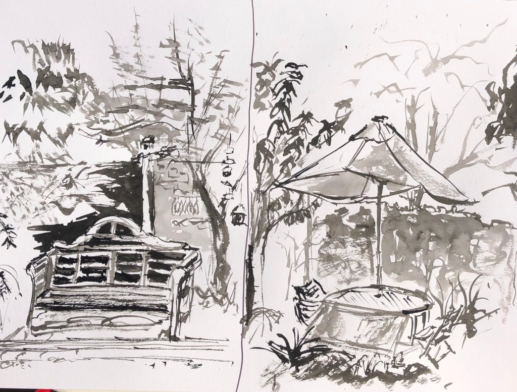
I started off with a distinctly unexpansive landscape, but one where I could sit comfortably at a table and chair – my back walled garden. It was a lovely sunny afternoon but shadows are stronger as the sun gets that little bit lower towards the end of September and the garden really is enclosed all the way round by walls and hedges except for one path through, so I felt that a bold medium was called for; I chose Chinese brush and ink. These are the views from West, North, East and South.
I actually went so far as to put the timer on 15 min each time on my phone – this did focus the mind and banished dithering but has led to some fairly wild brush strokes – expressive, certainly, but not always very clear. What I did enjoy was trying to find characteristic quick brush strokes to suggest the leaves of the different trees – bamboo (surprise!), cherry and maple came out the best, I think.
I have noticed, looking back at these drawings now as photographs, that my focal points have been distant (the old stumpy hazel in the first picture, although this wasn’t actually very far away, it just blocks the real distant view) or middle distant (the vase, the bench and the umbrella) – I have never chosen anything in the foreground and, indeed, I’ve made a fairly sketchy job of indicating the near ground, if I’ve done it at all. Not sure if this matters, but it’s an observation…..
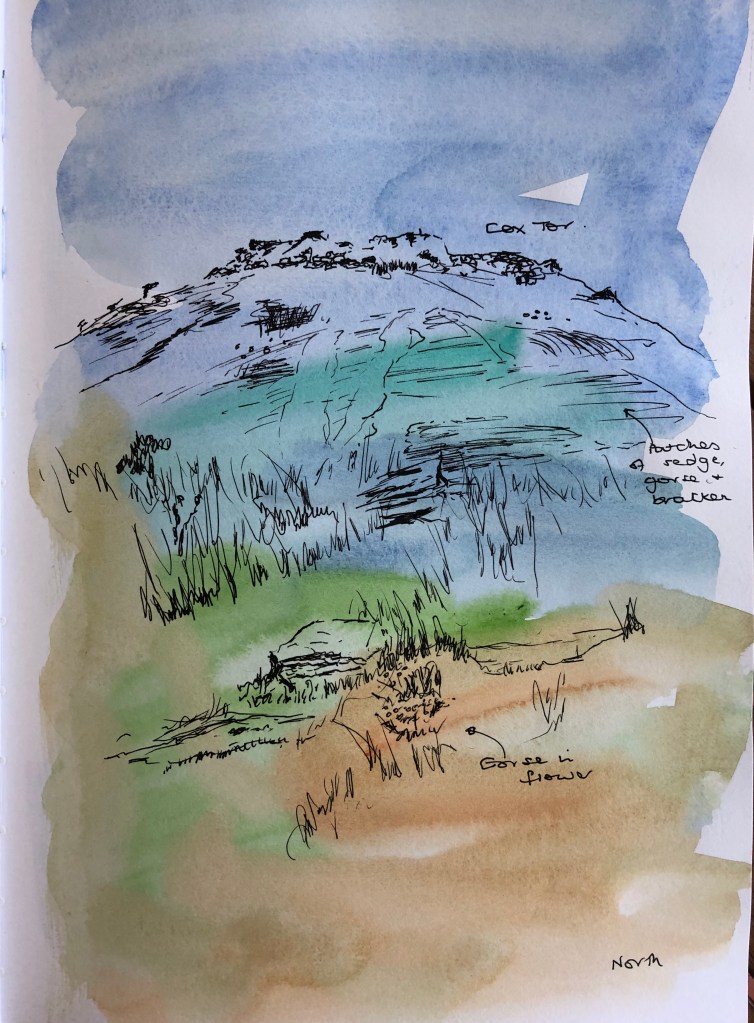
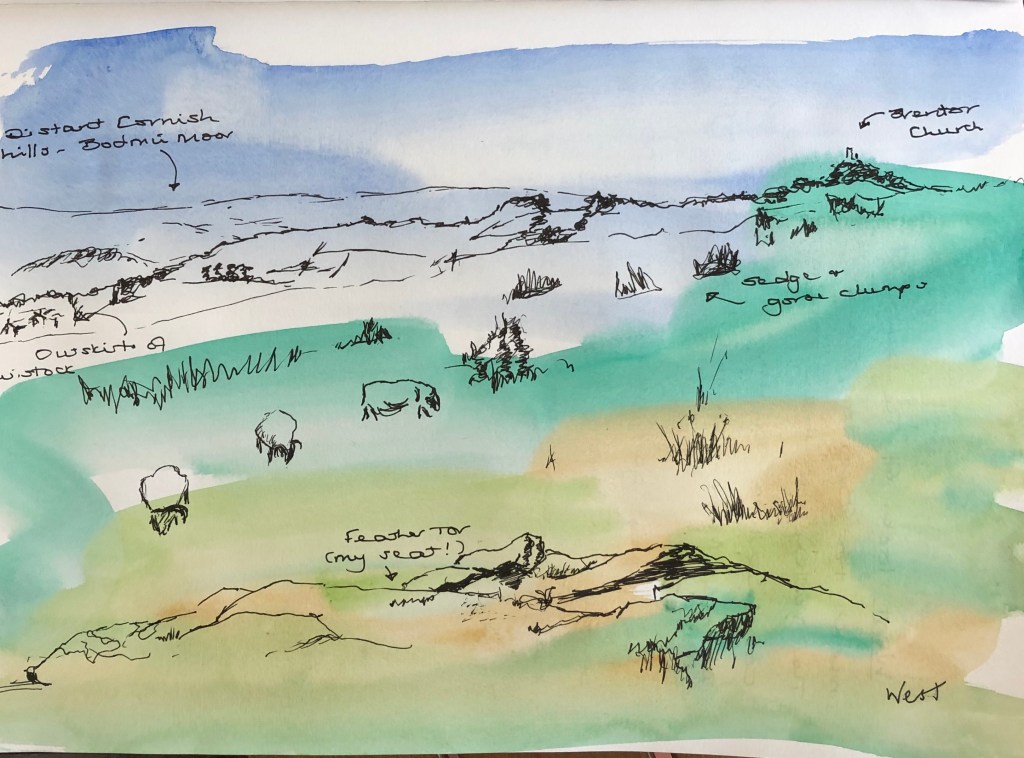
Yesterday looked like being a glorious day so my husband and I headed off up the road onto the edge of Dartmoor. We have a favourite place to sit about 10 min walk from the car park which offers panoramic views, so seemed perfect for this exercise – it is called Feather Tor, but we call it Bench Tor as it is a much-loved resting place before striding off deeper onto the moor. My husband duly strode whilst I set myself up to draw. Unfortunately, what was a glorious sunny day in Tavistock turned out to be the same on Feather Tor with the addition of a ferocious easterly wind so that everything had to be clutched in an iron grip – the joys of plein air.
I had prepared four pages in my sketchbook with a very loose watercolour wash of the characteristic colours of the moor – blue sky (sometimes), shades of green and brown. There is the grey of the granite as well but this is specific to the placement of the rocks and, as I didn’t want to limit myself to making the sketch fit the colours of the background, I didn’t include this. Sometimes the drawing serendipitously matched the background (e.g. the first picture), but in others it didn’t – I was pleased that this didn’t bother me too much; when I first started out on the course, it would have freaked me out slightly as not being perfect! – so some progress is being made….
I had taken a range of materials up with me but, in view of the howling gale, decided to stick with an unfussy drawing pen which I could keep hold of. I wondered if it would show up sufficiently against the background, but I think it does. I also set myself a timer and changed views every 15 min on the dot – partly to avoid hypothermia, it has to be said.
The landscape invites one to choose distant tors as a focal point, which I did in the first and third drawings; my focus in the second sketch was Vixen Tor which was more mid-ground, and in the final sketch I took Feather Tor, where I was sitting (hence very much foreground) as my focus. I had taken a viewfinder up with me intending to try it out – but because of the windy conditions I basically needed to sit on all my possessions apart from sketchbook in one hand and pen in the other.
Sheep abound on this part of the moor; they are very curious animals. When I started drawing they were some distance away; however, by the time I got to the fourth drawing they had sneaked so close as to be right in front of me – ostensibly ignoring me and cropping the turf but secretly, I think, hoping to eat anything that blew away whenever I moved.
What have I learned from this exercise? I’m not sure – I feel I already understood how a view can change just by turning a little. What would be more interesting would be to repeat a view in different weather conditions, and possibly without the bright and cheery background colouration, but just black and white – this would capture the same view but in different moods and lights (and allow me to work more on my developing library of clouds structures!)